Final
My name is
and I’m a Matchmaker
My name is
and I’m a Terrarium Artist
My name is
and I’m a Carnival Game Planner
My name is
and I’m a Fortune Teller

A place to keep my art and memories
My name is
and I’m a Matchmaker
My name is
and I’m a Terrarium Artist
My name is
and I’m a Carnival Game Planner
My name is
and I’m a Fortune Teller
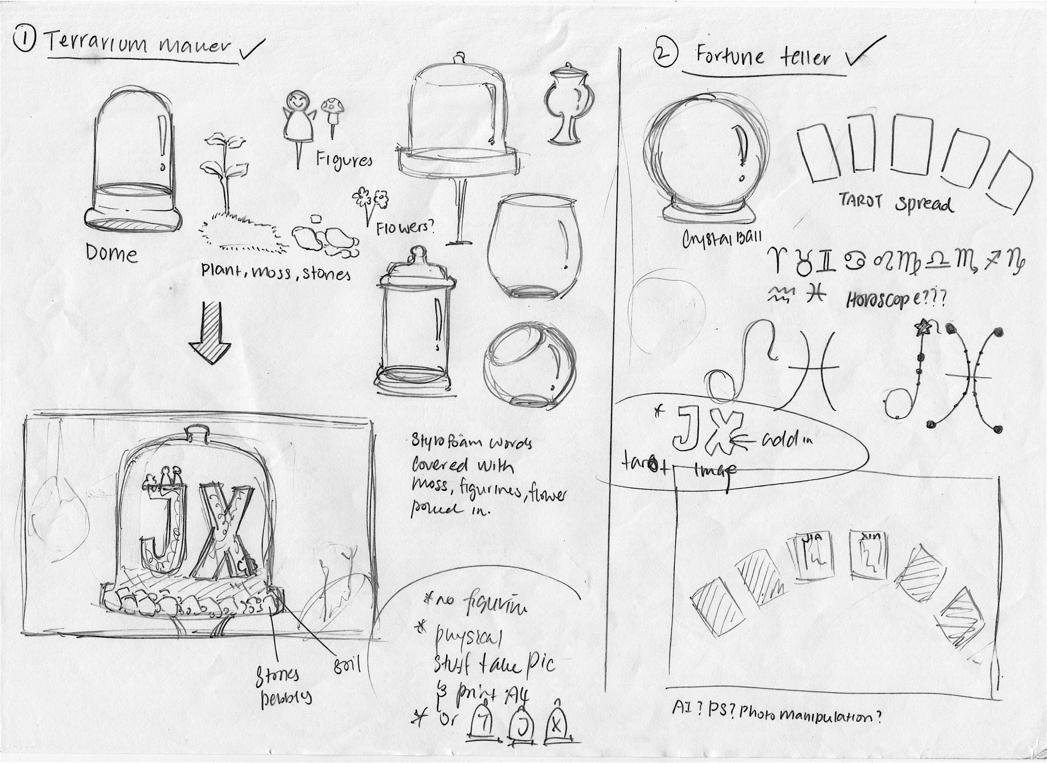
During the first few weeks of project 1, I have sketched out the visuals and written down some of the execution methods of the different jobs that I had in mind. I have also further research on the different related images to capture the different key essence of the jobs.
In my mind, I have thought of doing something different this time round from what I usually do(which is digital photoshop painting). I planned to do 2 physical and 2 digital art piece. As for the digital ones I will be using illustrator. It’s my first time creating artwork with illustrator!!! I was a little nervous at first as I was afraid that I couldn’t create pieces that are up to standard and also taking too much time as I was unfamiliar with the interphase 🙁 HOPE IT WILL TURN OUT FINE :”)
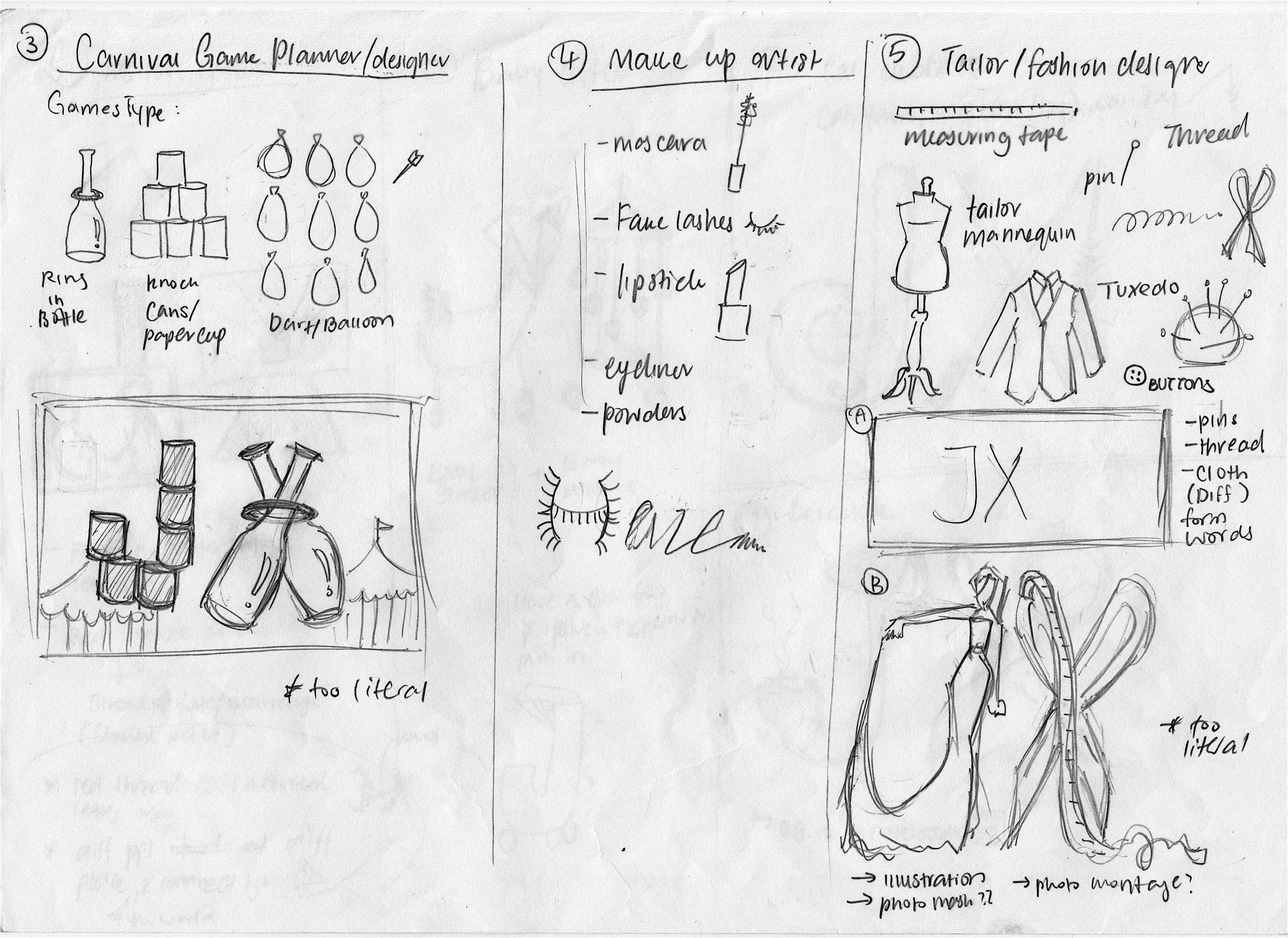

During this first few sketches, you can see there is a lot of ideas that are very literal. In the sense that take for example, the carnival game planner job, there is only the stacking of cans and bottles to make up my initials.
Before this project, I’m really clueless on how to truly integrating the essence with type! LOL, thinking back it was a little embarrassing as stacking things together to form words are rather basic, perhaps even pre-school kids are able to achieve it:( and that was what I did during the first few weeks of idea generation. Fortunately, halfway through I was enlightened by Ms. Shirley, and finally understand the “injecting essence” concept!
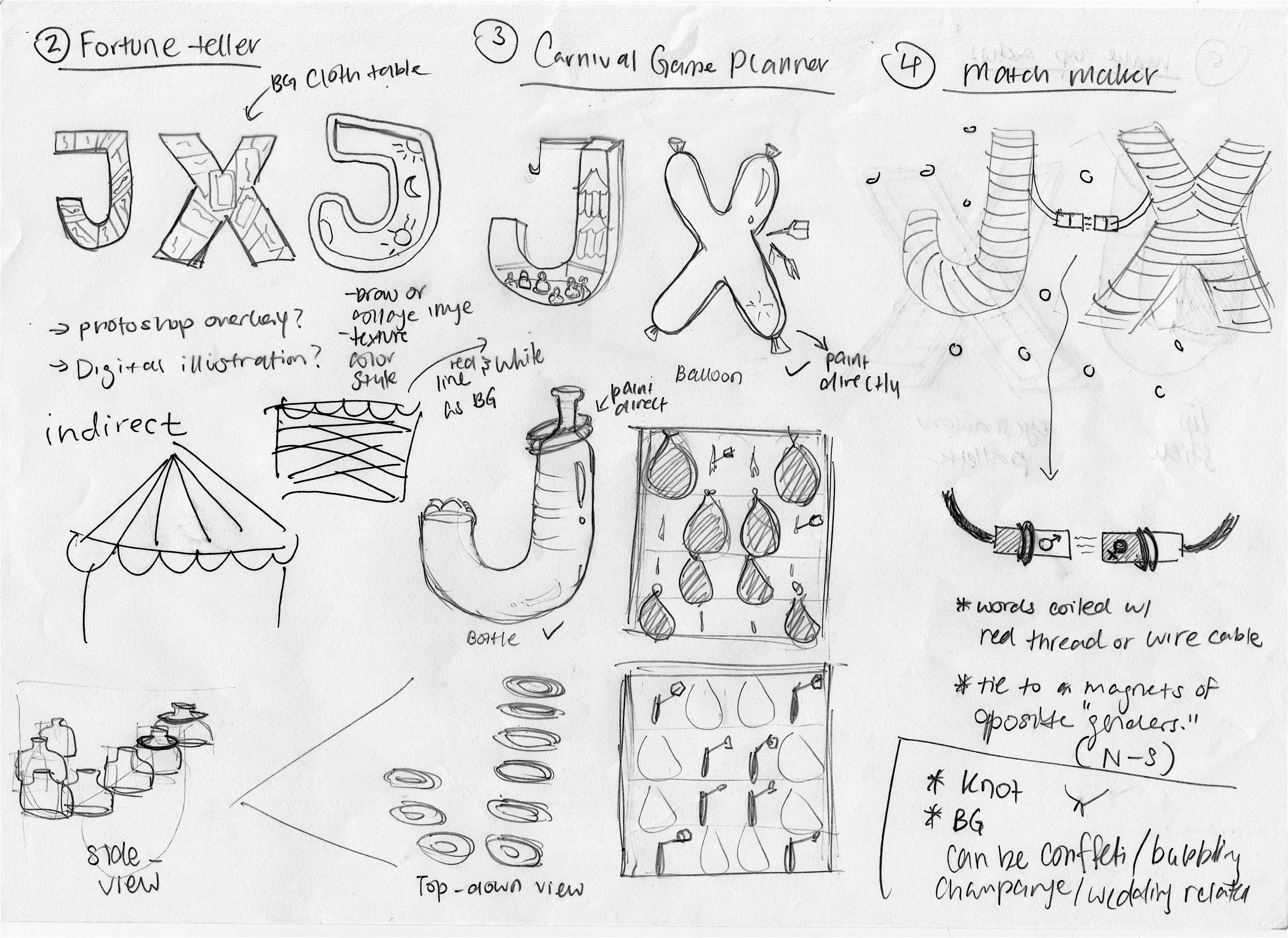
After the consultation, I have revamped some of the ideas into more of “injecting essence” instead of taking objects and placing them together. Such as by using typeface as the base and putting in the object’s texture, symbols, and its qualities.
In the end, I have decided on my four jobs that closely relates to me. They are the Matchmaker, Terrarium Artist, Fortune teller and Carnival Game Planner.
As mentioned, using my name’s initials to create the four panels inspired me to choose jobs that are more relatable to me such as my current or past hobbies and personalities.
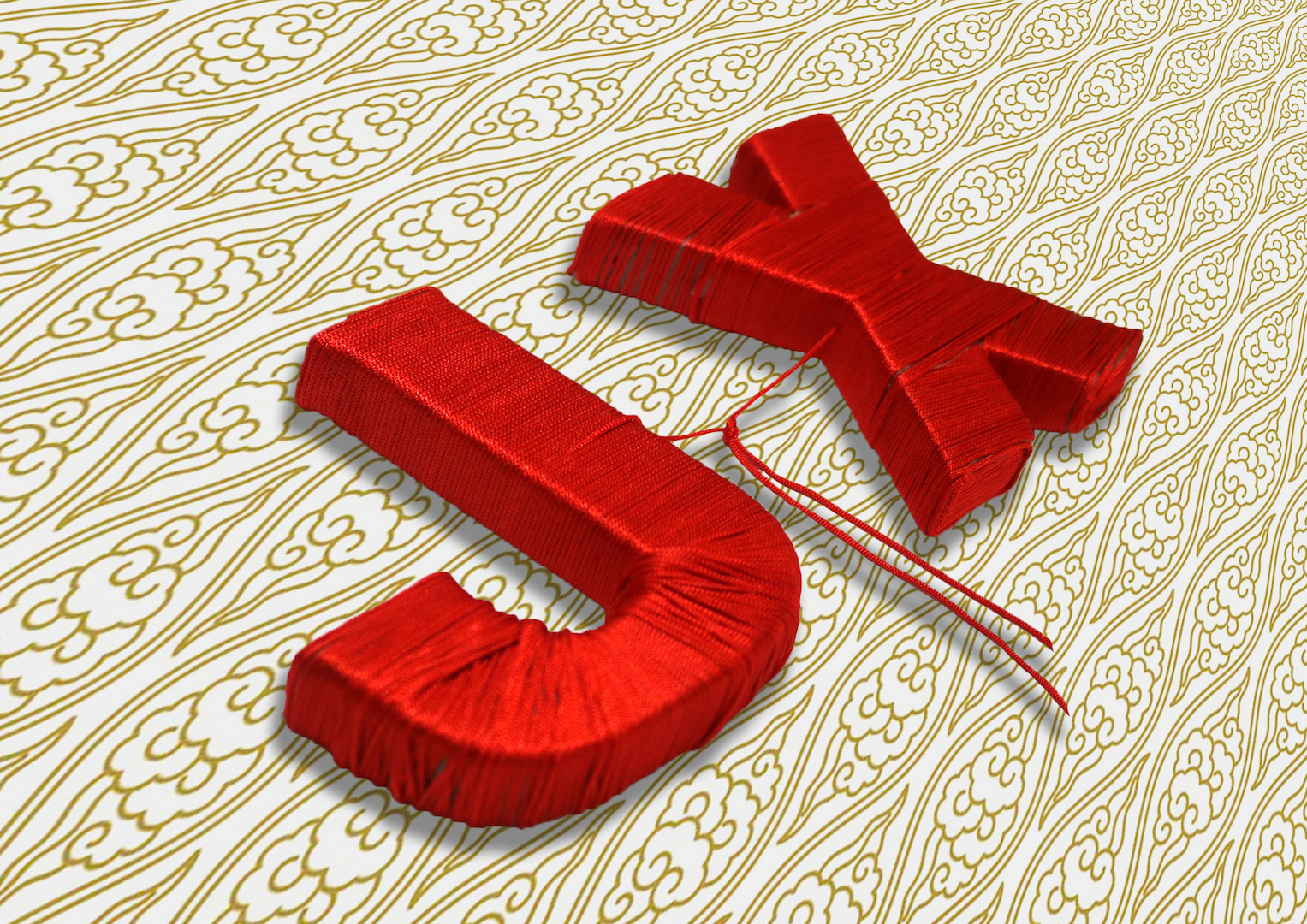
For the idea of matchmaker, I’m someone that likes to matchmake my friends up. I’m always very interested in my friend’s relationships and have been giving advice when needed to. Hence, I thought it would be interesting to portray my name in a matchmaker context!
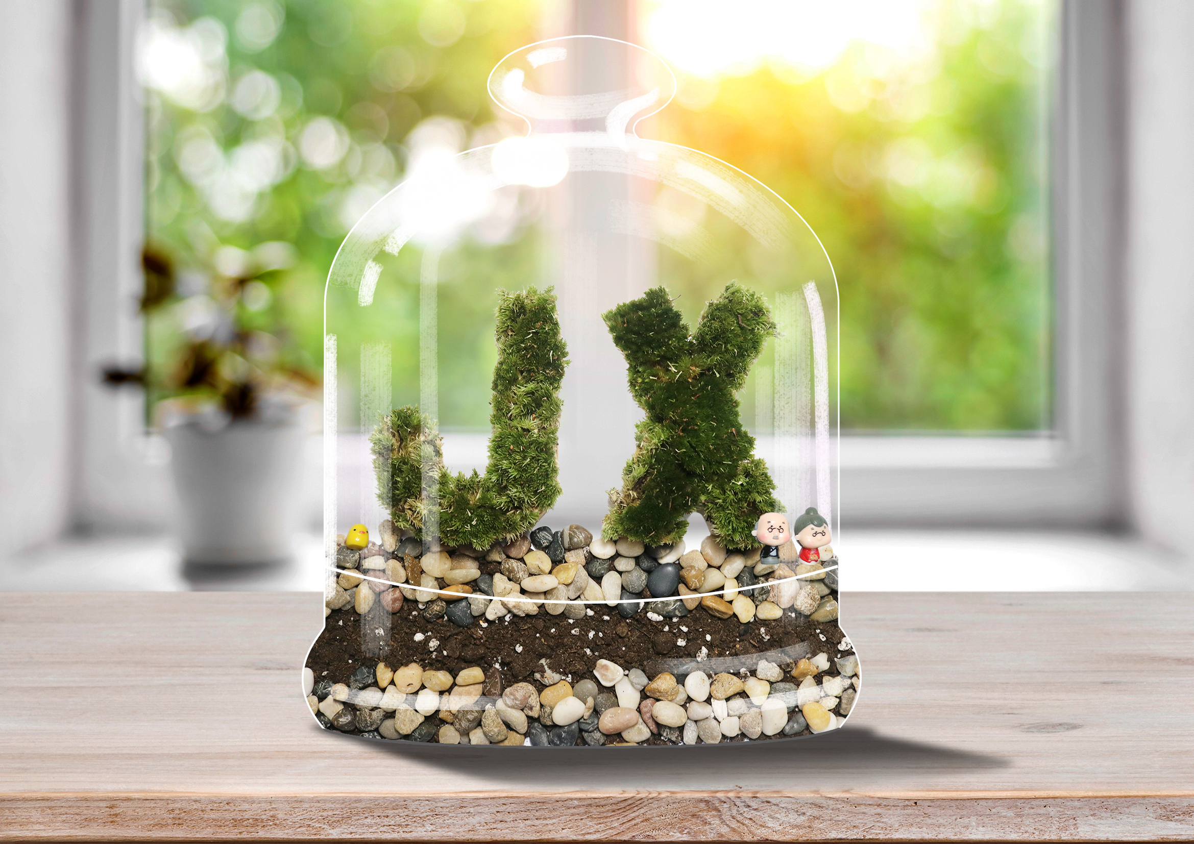
As for the terrarium artist, not long ago I’ve received a terrarium as a gift. Ever since then, I’ve become really interested in terrariums and creating my own terrarium has become a hobby I love to do!
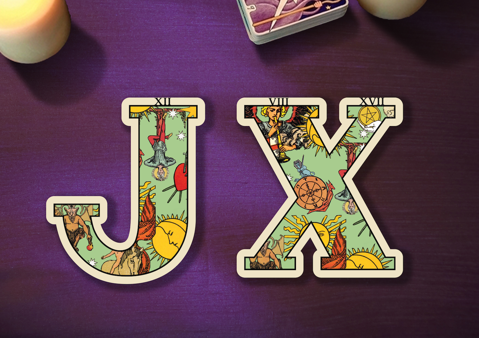
The idea of fortune teller is inspired from myself who used to be really interested in things like astrology and tarot readings.
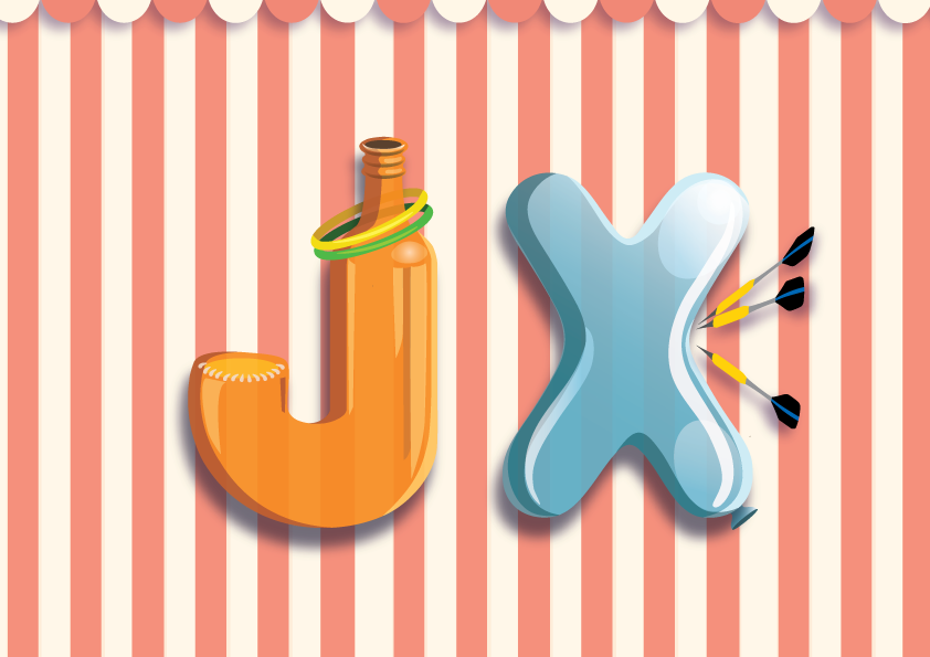
As for carnival game creator, I’ve picked this job because traditional physical carnival games really bring back a lot of memories I had and it is a place I love and enjoy going too. However, especially in Singapore, such old-school carnival places can hardly be found unless there is Pasar Malam or big events. Which all the rides and booth games can cost quite a lot as compared to the ones in the past. Hence, I wanted to be a “carnival game creator” to bring back the nostalgia. Expressing the appreciation of old-school games. At the same time, I thought that it would be great if I can be a carnival game creator too!
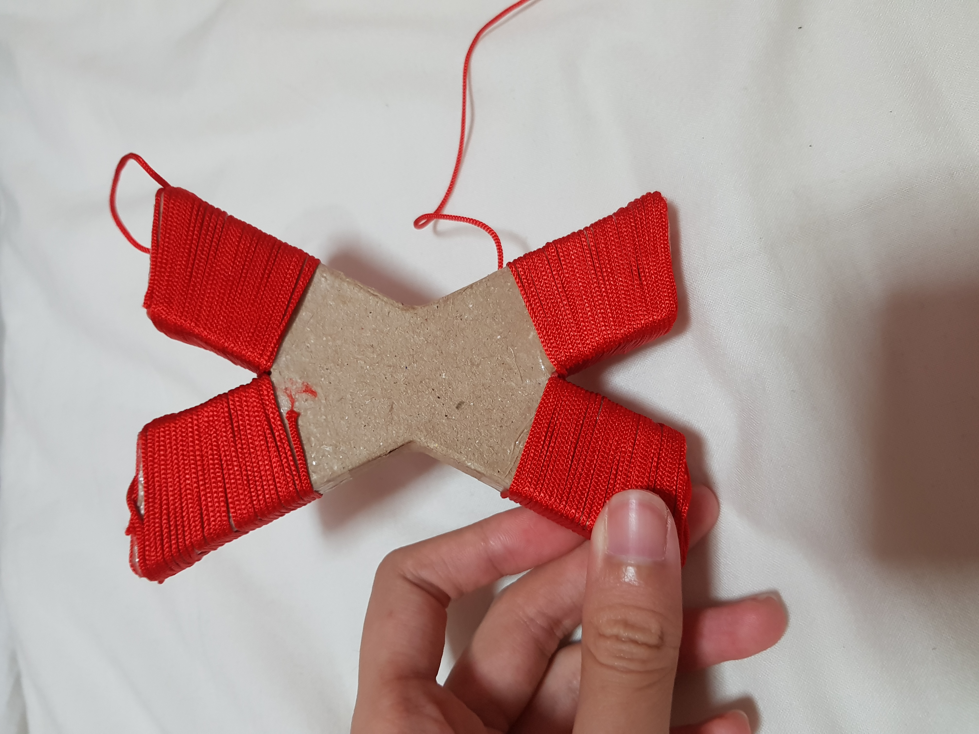
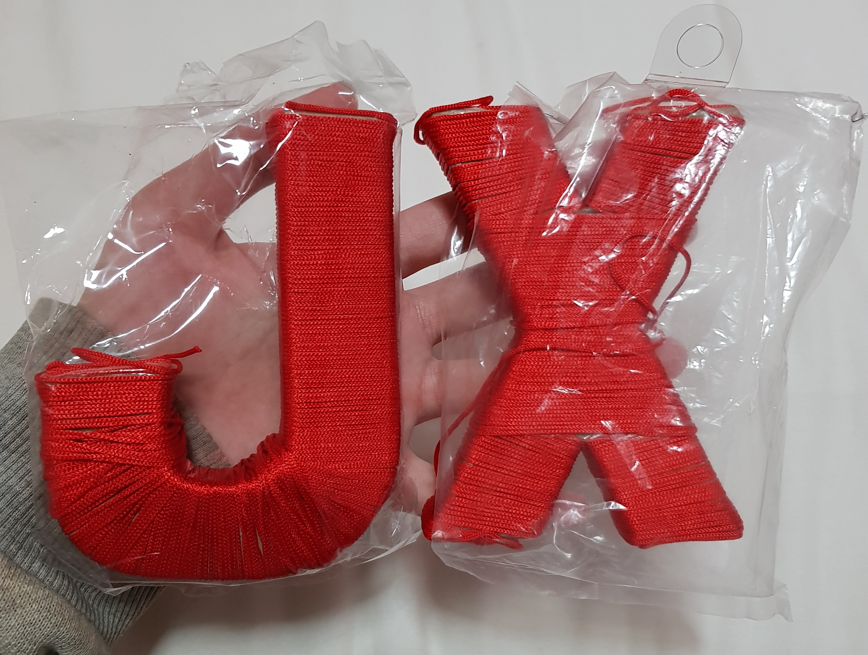
I have bought the cardboard initials from art friend. Puting double sided tape all over the cardboard letter and started coiling the red thread on to the letter.(It may seem easy, this was what I thought at the start too :”) But… I WAS WRONG :”) It takes forever to coil it and it’s no joke when all your thread starts to tangle in a bunch :”) not to mention the base and corners of the letter makes my thread keep coming off :”))
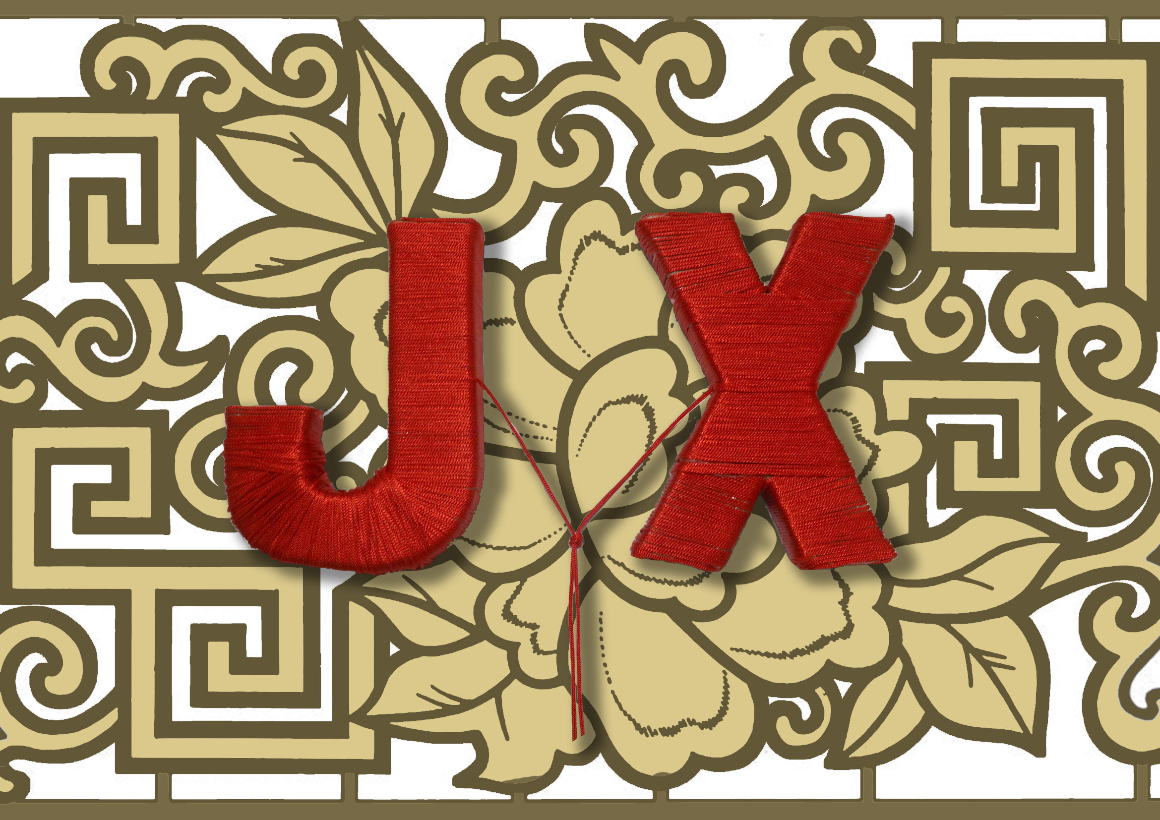
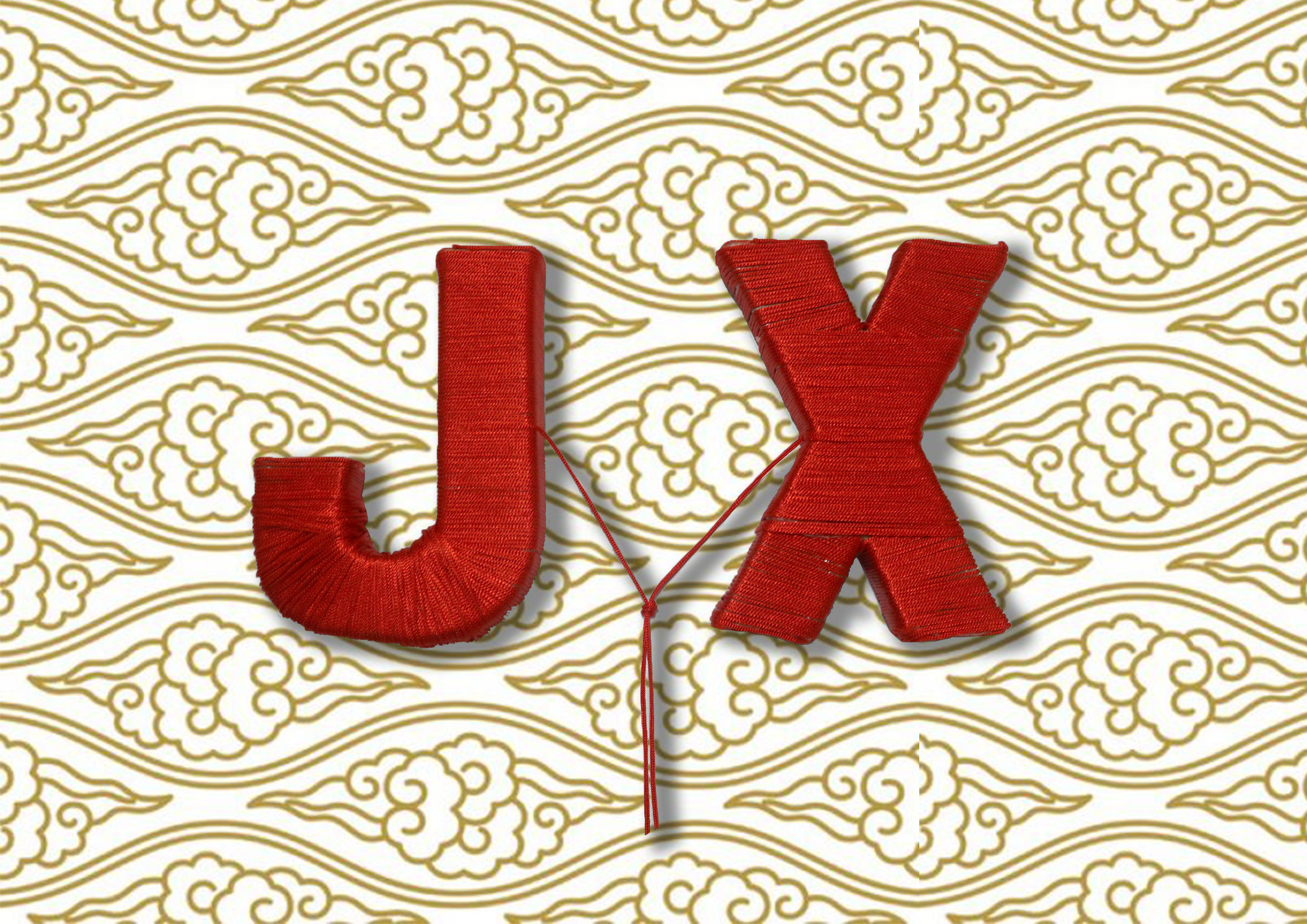
Since the red thread of fate is originated from Chinese culture, I wanted to use a background that has more Chinese essence to it. Hence, I’ve looked up references on paper cutting, Chinese embroidery prints and patterns inspired by the idea of the Chinese wedding. As for the background, I tried my best to look for something gold since my main subject is already in red. Furthermore, red and gold are the auspicious colors in Chinese cultures!

Explored different backgrounds!
TADA! My first version of the matchmaker type, but it looks too flat and boring.
After consultation, I have made the necessary amendments to the perspectives and now it looks more interesting in composition as compared to the original one!
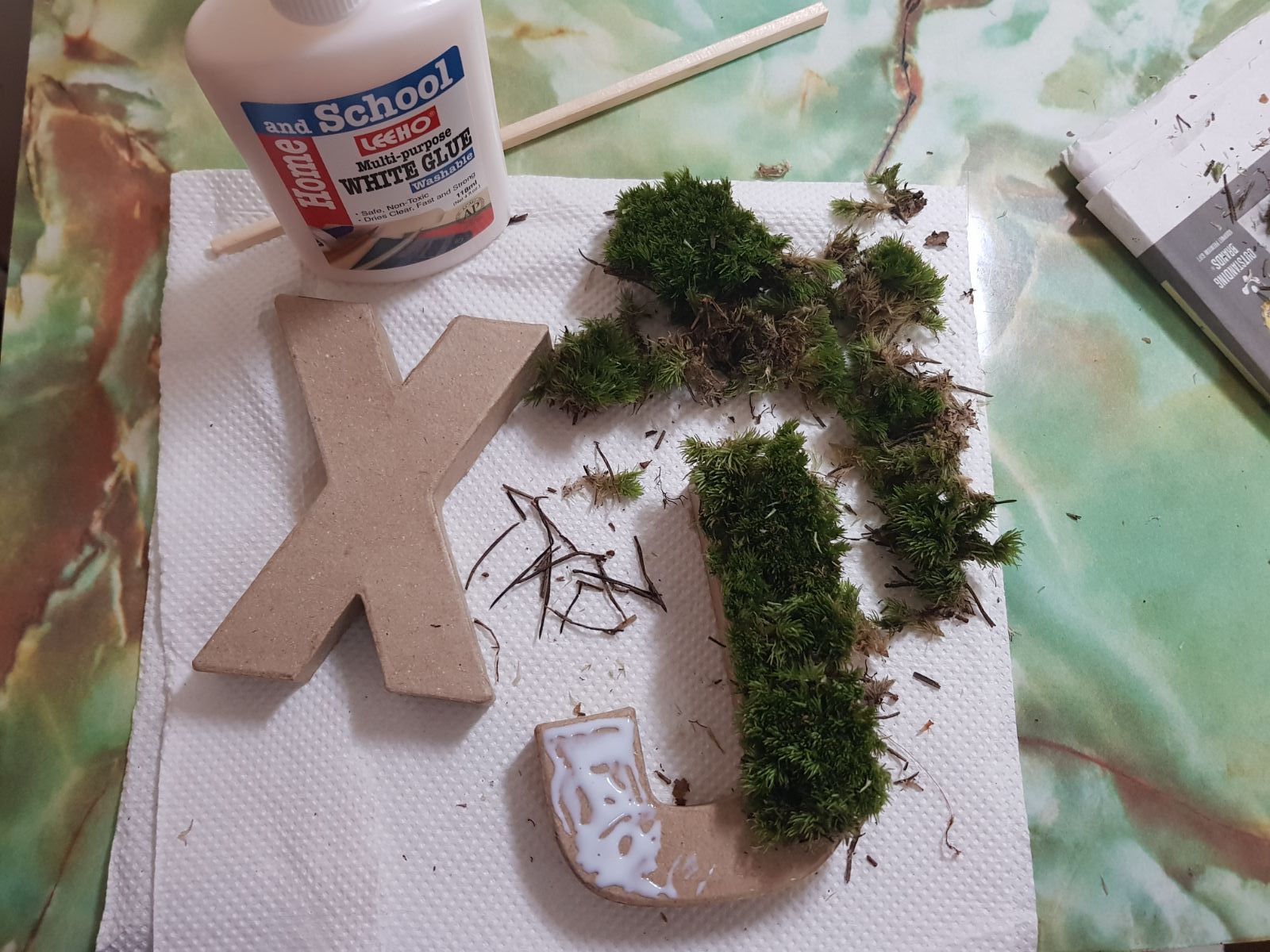
For the terrarium piece, I have bought real terrarium moss, soil, stones and figurines into creating it. With the same cardboard letters, I have put white glue and pasted the moss accordingly!
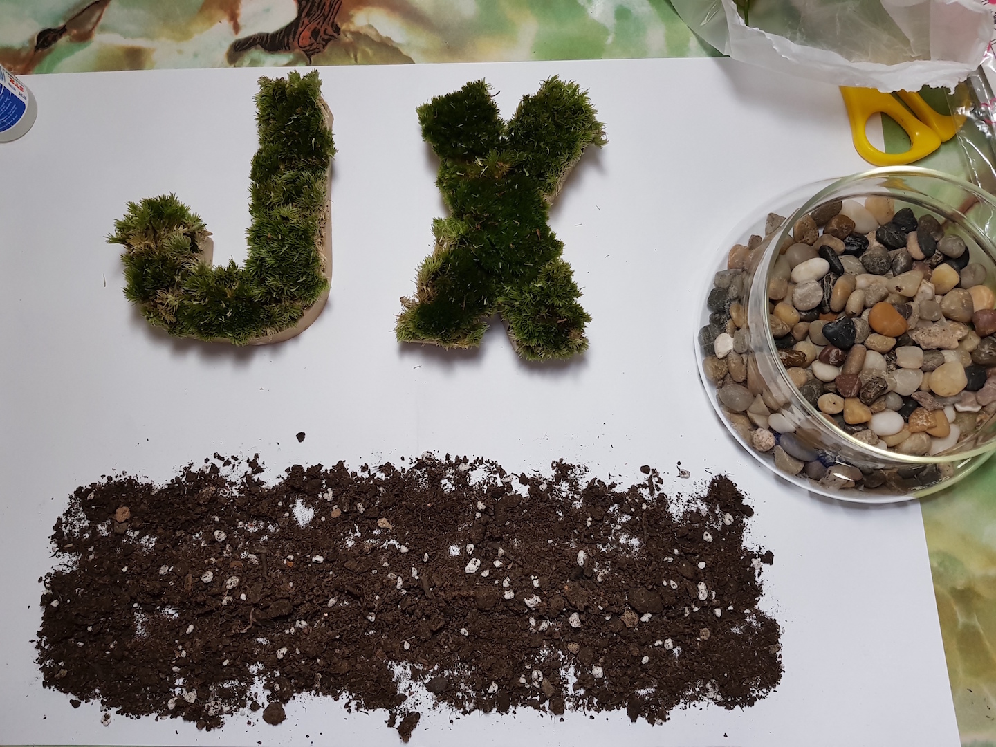
For the base, I have laid out the soil first.
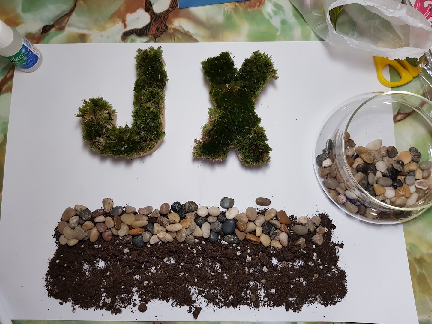
Followed by the top layer of pebbles.
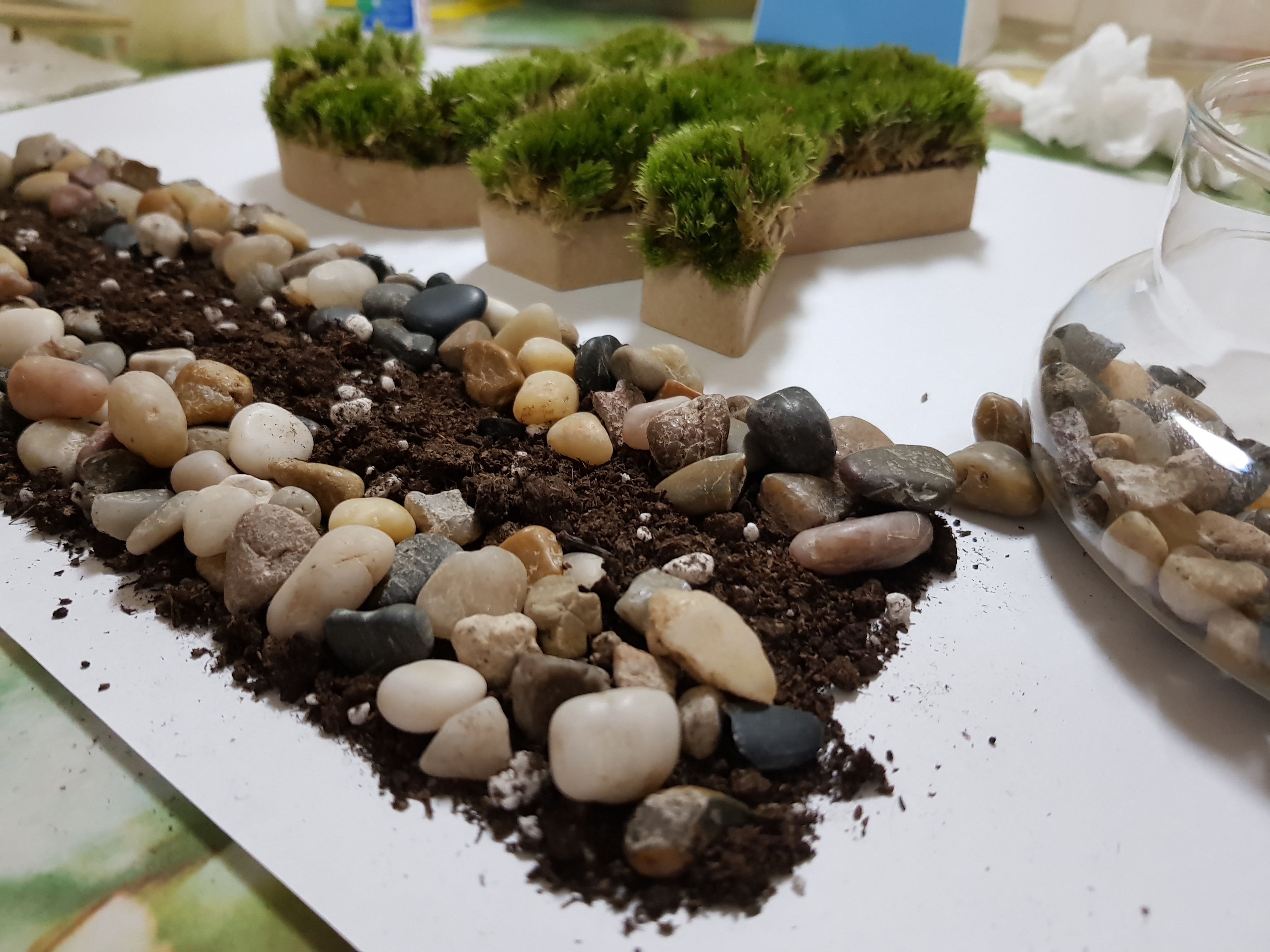
And then the bottom layer of pebbles!
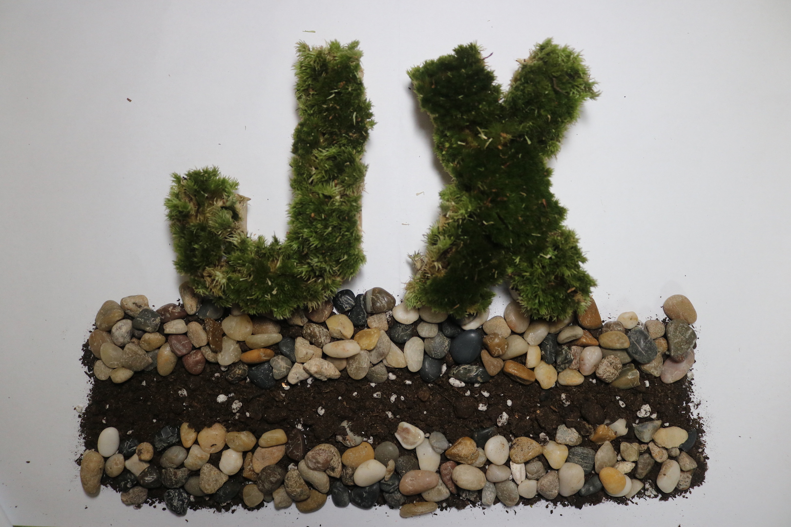
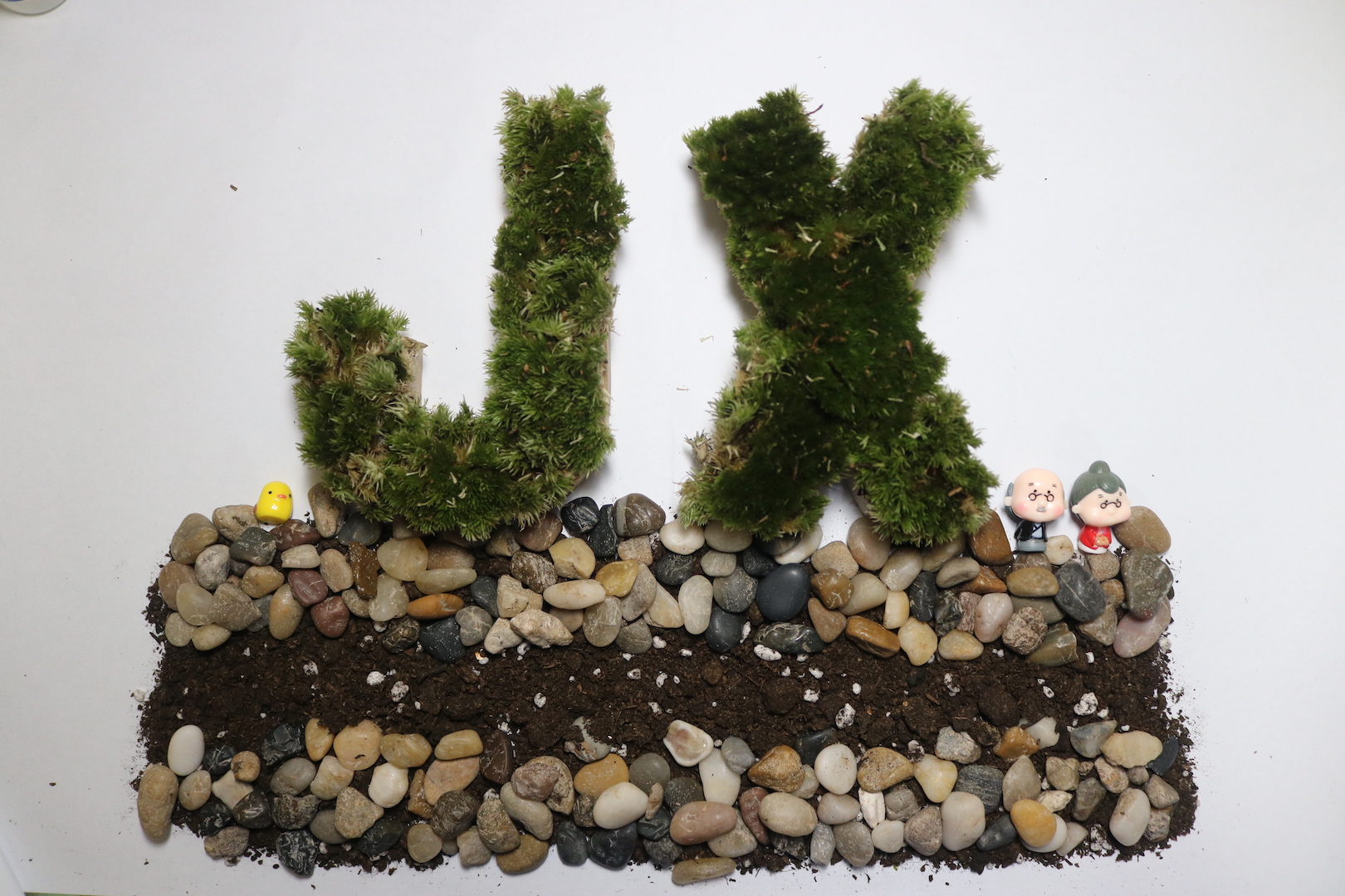
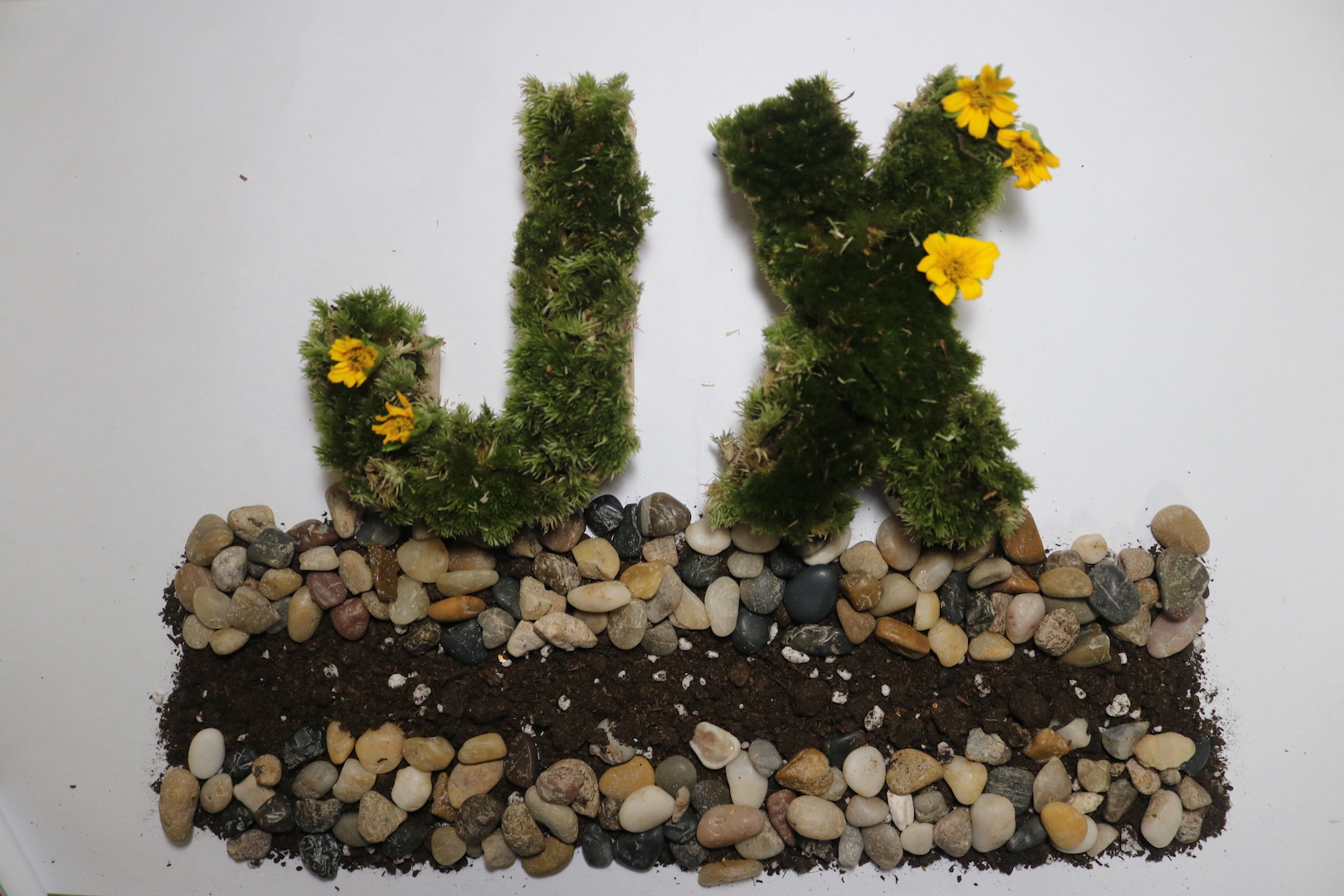
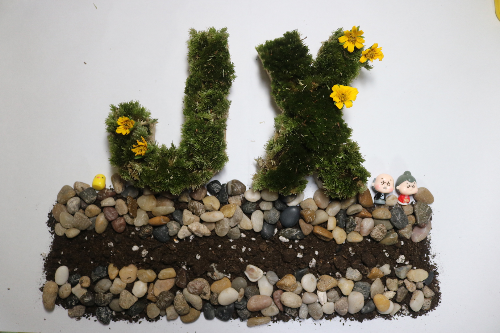
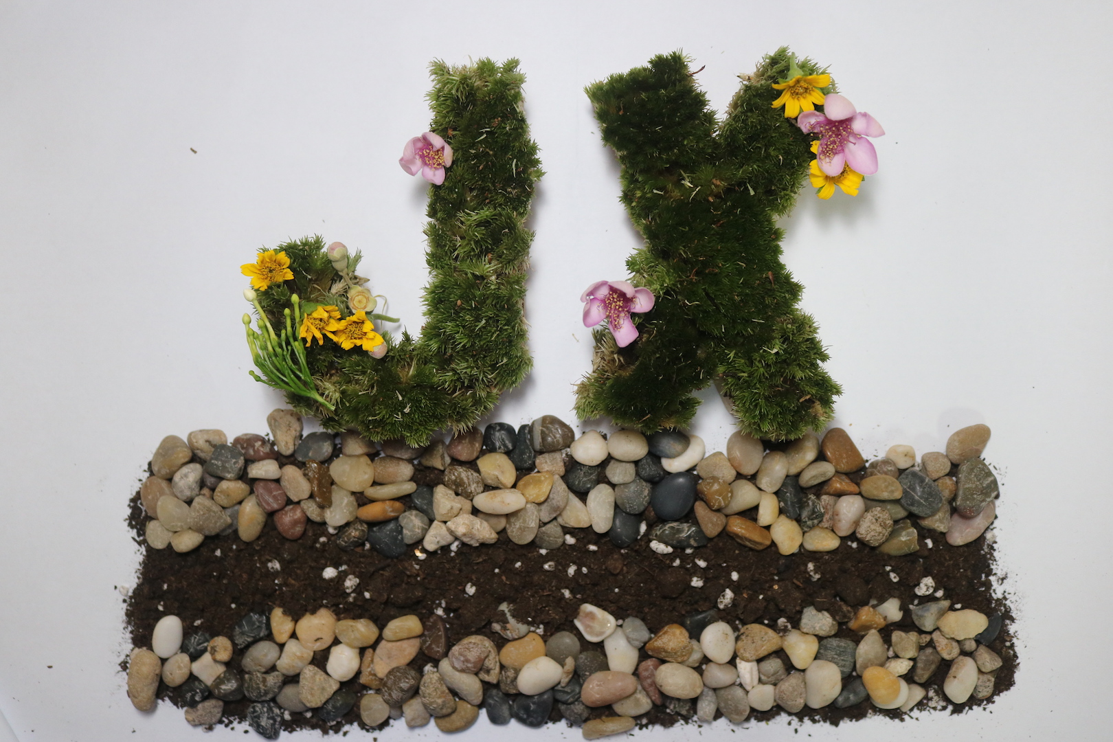
The flower ones looked more like a garden theme instead of a terrarium theme and it is too distracting while the plain one is too plain. Hence, in the end, I have decided to go with the one with the figurine 😀
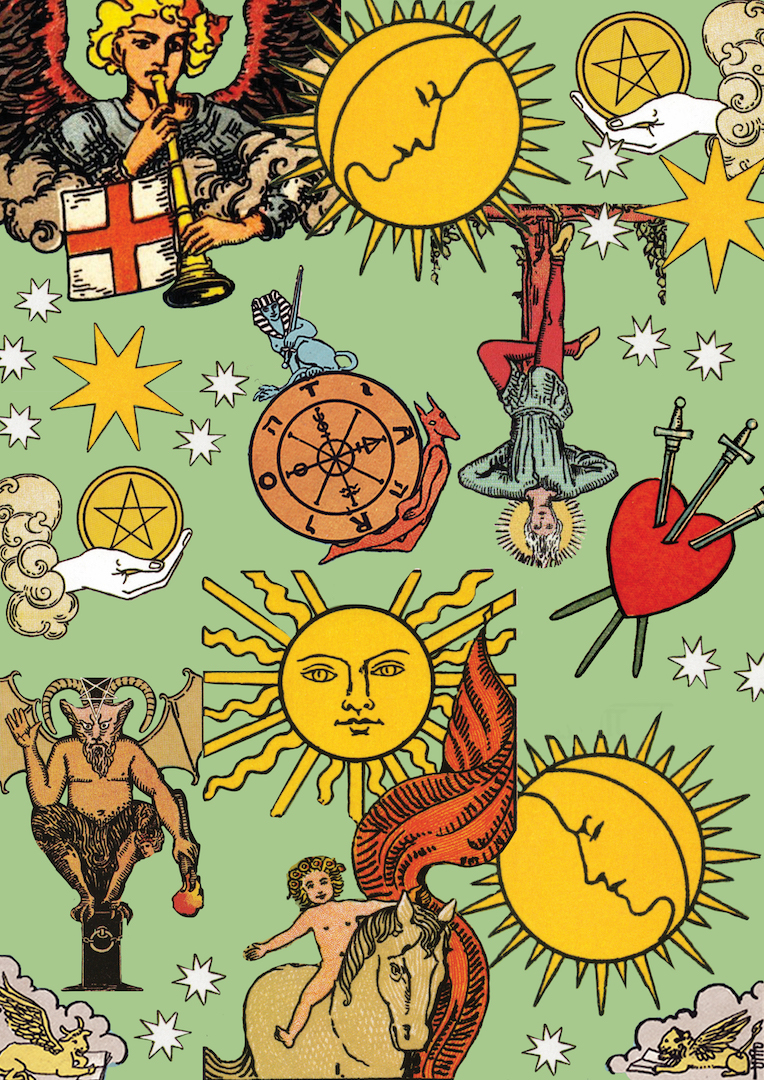
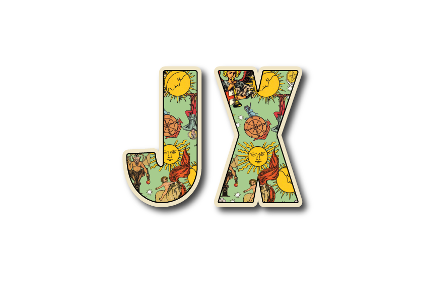
For this piece, I have extracted different images in the tarot cards and masking them collaging them all into one canvas. In general, I have used a more “dirty” nostalgic color for both the green background and tarots symbols in this collage to create a more vintage, olden days feel to it. Even the borders around the letter “JX” is made off white on purpose.
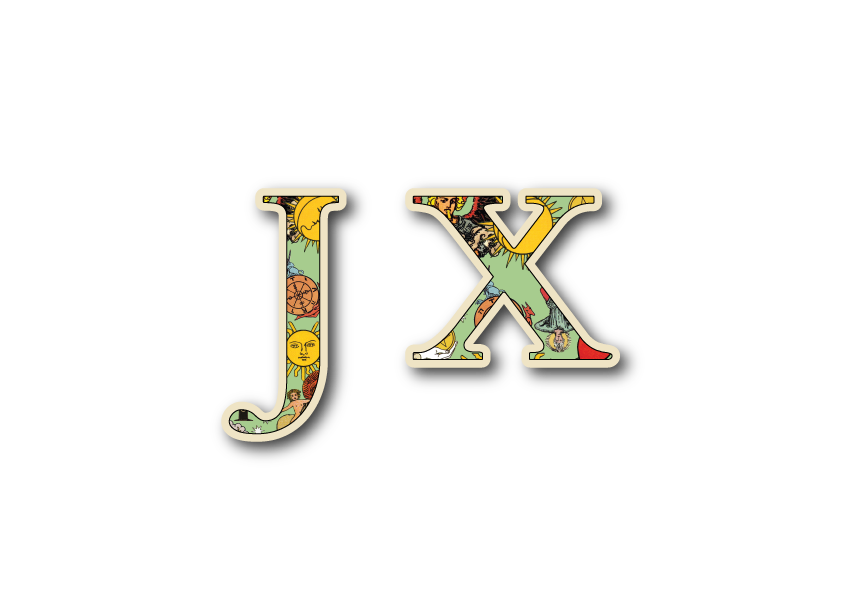
After which, I’ve looked up for different type phase and manage to find this serif one having the more mysterious olden era feel to it. However, the width of the type is too narrow, hence it couldn’t really portray the symbols and essence of the tarot card.
I further explored with a sans-serif squarish type that is much thicker showing more of the symbols and looking like a card at the same time. However, a peer commented that it looks like a badge instead of a tarot card and suggested that instead of just putting candles at the background, I should put a deck of cards to hint my viewers! It was a good suggestion and it kind of strikes me to further revise my typeface!
So, since tarot is something mystical from the olden days, I decided to go with a serif type that is also thick in width at the same time to achieve a win-win situation!
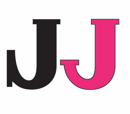
I’ve finally found the suitable fonts and downloaded it however halfway through, I realized the “J” ‘s serif looks really out of place and not to my liking. Hence, I tried to “create” my own font through illustrator by making changes to the serif. (Black J–the original font to Hotpink J–the one I edited)
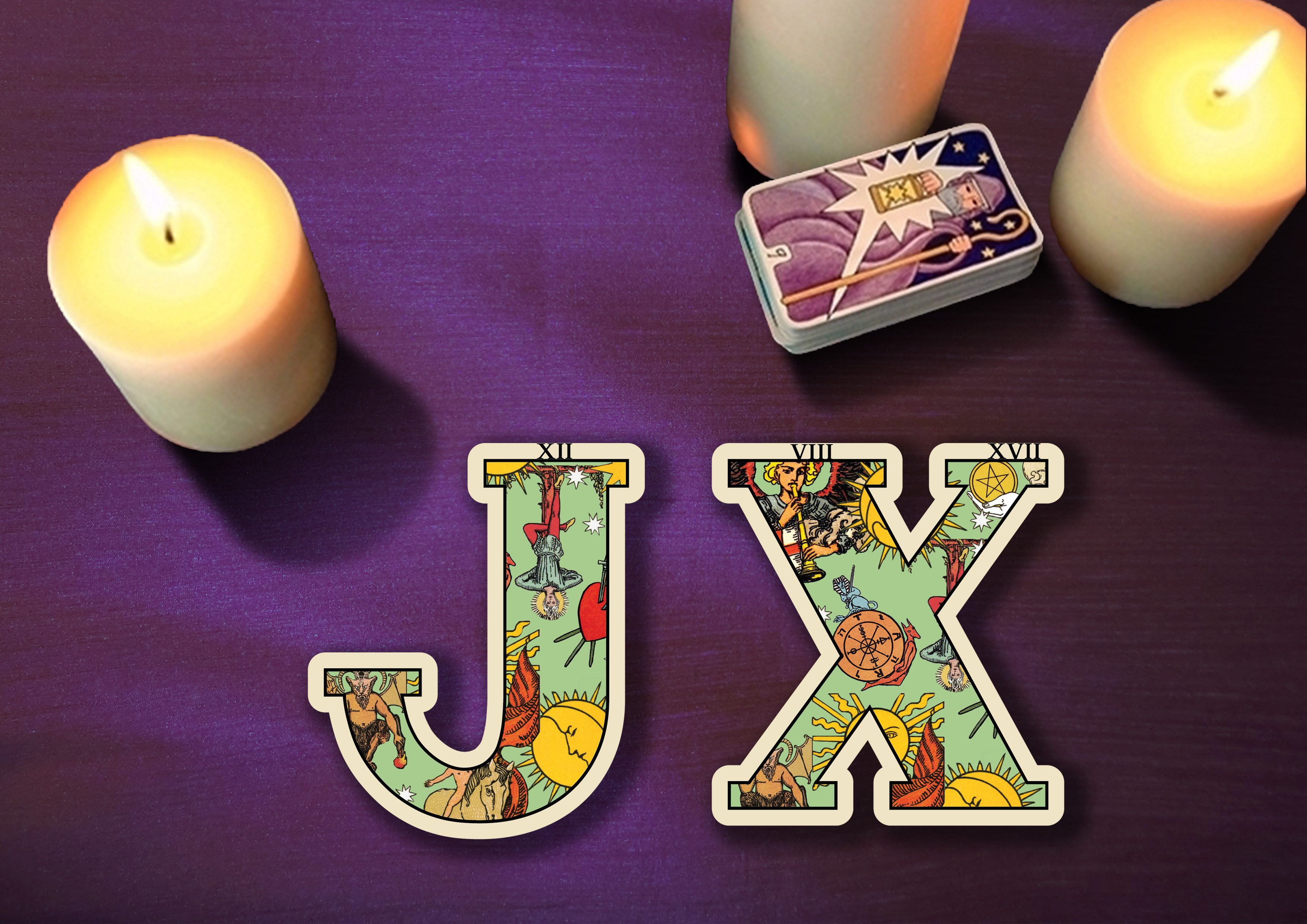
Taking the advice of my classmate, I have managed to find a deck of cards and included it in my piece. However, during the consultation, I’ve come to notice that I have the tendency to allow my background of stealing the focus of my main subject which is my type phase. Hence, taking suggestions from Ms. Shirley I further revamped my piece to allow my ‘JX’ to be more in focused.
As for the background, I have chosen purple as the color of the tablecloth to express the mysterious and magical nature of fortune telling.
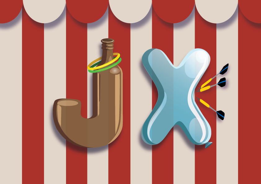
Hence, after consultation, I have made the background stripes smaller and lighter in color so that it is not as attention seeking and brighten up the bottle’s color to orange to lift up the mood. Using complimentary colors for my main subject, orange and blue allow the piece to be more interesting and harmonious in colors. I have also learned from this piece that sometimes, an object doesn’t have to stay to its color to bring out the essence of it, as long as certain elements are present.
Before this project, I have always been very fascinated by the different innovative typeface I see around me. I have always wondered how those designers actually integrated words and the essence of what they are advertising so well. Haha, I’m initially not trained as a designer as I was from an animator background. Therefore, I really admire typeface design and at the same time wonder how did the designers create it. However, I was extremely grateful for this project! Especially being enlightened by Miss Shirley HAHA! As I’ve learned so much on how to integrate intangible essence into rigid forms such as into a typeface!
Sometimes, I really think that especially for non-designers we have taken designs for granted. When you see a poster or a type, the first thing that hits u is the basic direct message of the advertisement is trying to convey, but not thinking twice about how incredible it is for designers to extract out the most basic essence of something and integrating them with other elements to make us understand messages immediately with one look.
I’m also grateful that finally, I’m stepping out of my comfort zone exploring and trying many different methods of creating my piece! Like I’ve mentioned, previously I’m trained as an animator thus I’m very used to doing digital painting/illustration with photoshop! However, this time round, I decided to go all out by not touching photoshop digital painting. I’ve mainly integrated a lot of physical craft with photos editing and vector painting in illustrator in this project. Through this project, it had really pushed me to look up for videos and learn the basics of illustrator.
As a start for this project, I have went on to find out more about what is typography to further help me in better understanding this project!
It is the visual art of creating type.
There are 3 main components to be considered while creating our own fonts.
There are basically 2 main basic fonts which are sans-serif and serif. These are the very first decisions we have to make before creating any type.

Serif: Considered as a more older typeface that is usually used in newspaper or book publishing. It is a typeface having a stroke that extends from letters. It can be in the form of a tail, sharp or blunt, decorative or plain.
Associated Mood: Classic, elegant, formal, confident and established.
Examples: Times Roman, Rockwell, Georgia, and Baskerville.
Sans-Serif: Typically considered as a more modern typeface. Sans-serif lacks strokes at the end of letters thus its name “Sans” serif. It is associated with simplicity and modernistic as it lacks the add-on details. The edges of a Sans-serif varies from sharp to rounded.
Associated Mood: Modern, friendly, direct, clean and minimal
Examples: Helvetica, Arial, Futura and Franklin Gothic.


For the brainstorming part, since we are using initials from our names, I wanted to take up jobs that are more in relation to me on a personal level. I wanted to choose jobs that define me as who I’m. Therefore, even though some of the jobs may not seem as out of the world and crazy, they represented some of my hobbies, personalities, and aspirations. Below are some of the jobs I’ve thought of that I feel are related to me and I’ve noted down some of the visual element/essence that has come to my mind when I thought of these jobs.
Moss letters, Soil and stone base, Glass dome background


Using real fake lashes, lipstick and mascara stains


Fur texture on letters
Games: Darts popping balloons, Ring on the bottleneck, Can knocking


Tarot spread, Opened tarot cards with my initials, Horoscope signs


Thread, Measuring tapes, Mannequin, Guiding needle


Red thread


Flower bouquet, Wedding gown, Grand venue
Baby mobile, Safety pins, Baby Pram
Notebook, Magnifying glass, Detective hat, Smoking pipe


My team’s telematics performance is about connecting with others that you don’t know through third space. In this project, it is performed in the 2d and 3d room. I’m supposed to “connect” to five other strangers by doing different actions with them. There are five levels to each action and as the level proceed the intimacy level of it increases. The five actions start off with E.T. finger pointing, Hi-Five, heart shape, scissors-paper-stone and finally followed by kissing through the third space. We combined both crowdsource and telematics performance together and came out with this idea.


To me, third space is a space that is formed when combining a physical space and a remote space together. It is a space that allows us to communicate and interact through any platform/mediums as long as it connects people from a different location that is far apart. Be it through games, virtual or non-virtually.
Boundaries of third space can be collapse by allowing people to have a real life, real-time experience despite staying at different location creates a form of an illusion of “realness”. For example, in my group’s telematics performance, the Facebook live was happening in real-time and interactions can be received and reacted instantaneously. As a result, it creates a connected space as if we are in the same space/environment interacting despite being at a different location. If our project happened to have any time lag, I believe the result will not be as believable. It breaks the illusion and unique experience of third space.
The intimacy of third space can be created by tricking ourselves of having the illusion of feeling intimate with our senses and real-time experience. For example, visually, anything that we see that is life size naturally we will find it realistic and believable. Such visuals in turns lead us into believing in the sense of touch. In addition, listening to the sound in a real-time manner further making us into believing that third space is a reality. Likewise in my project, we included a lot of such touching, visual and real-time experience which brings a new perspective towards intimacy whereby one does not need to be physically present to feel intimate. Rather, we create intimacy by sharing the same space. Even if the platform is different such as speaking or texting through phone, you will still feel the sense of sharing the same time or moment.
“The third space is a fluid matrix of potentiality and realizable connections to the most far-reaching remoteness.”
- “A space with no geographical boundaries.”
For my project, I have “touched” our participants by doing the action first and let them synchronize their action with me in the middle of the split screen. It has to be at the right distance and connecting point in order for it to work or feels real. Before we start our Facebook live, we have technical issues and we solve it by communicating in another third space platform which is Whatsapp. During the live video, we collaborate with one another by giving gesture hints or simply speak to each other through facebook live to work things out.
Our project is similar to examples such as the Telematics Dreaming by Paul Sermon and The Big Kiss by Annie Abrahams. Both our project and the given examples play with the idea of make using our sense of visual and touch to connect with strangers in an intimate manner. However, both projects differ in ours being able to speak and communicate, while the examples mentioned above doesn’t.


Before this project, I only view third space as a platform for communicating or socializing purposes. However, my role as the participant of this project makes me notice how “real” and “intimate” the experience could actually be in this third space. Doing all the other four action was fine but until the last part, which is kissing, deep down I hesitated a bit before I actually act upon it. I didn’t expect this as I thought I know very well that this space is “fake”. However, turns out that subconsciously I felt that it is rather “real”.


My team’s crowdsourced artwork is about other’s perception versus against our own self’s perception. We begin with asking our teammate about her self-perception. Followed by letting others write their first impression of her on her arms. However, we realized we should have asked people to write on her back instead so they won’t be afraid to write their honest opinions. The result turns out that people have positive impression of her instead of more negative ones which is how she has viewed herself.

In contrast to traditional art made by a single artist, we do not have control over the outcome of this project. The concept of crowdsourcing project is to “ allows space for an openness where a rich mixing of components from different source crossed over and build a hybrid experience.”. Therefore, the need for different responses is required in order to create this project.

This project is a departure from traditional artistic creation as it happens in a real-time manner which requires a direct interaction between the audience and the artist. Also, Different locations with different crowds could have resulted in a different outcome. People may react differently according to what other’s has already done in prior. Hence, there are many variables that are very uncertain as compared to traditional modes of artistic creation.
My team’s crowdsource artwork is very similar to Yoko Ono’s “Cut Piece”. It is similar in terms of requiring our teammate to become an “object” and allowing people to freely label her as to how they perceive her. Similarly, our work also brings an intended message.

Before being introduced to Yoko Ono’s work, I’ve come across another similar example years ago. “Rhythm 0” by Marina Abramovic in 1974. This crowdsource artwork had left me with a deep impression. It is about revealing the terrible side of humanity.


Personally, I felt that crowdsource artwork is not just about collaborating and creating amazing artwork of unexpected outcome or gathering of different responses. I felt that it also serve as an impactful art that reflects the society and ourselves. As stated in DIWO article, “Diwo is a collective approach that allows peers connect, communicate and collaborate, creating controversies”. Through the process of crowdsourcing artwork, it doesn’t just allow unlimited possibilities of ideas and fun. It also reveals how we as humans react in certain circumstances, which bring across social issues that we always tend to neglect on.
Hence, I was very inspired by Marina Abramovic artwork and have always wanted to try out such crowdsource artwork. Therefore derived to the perception idea that my group and I have. If there is one thing I could improve on our crowdsource artwork experiment is that to have the opportunity to experiment it at a different location. Having our subject to stand still and emotionless. Carrying a board saying “What is your first impression of me?”. I would be really curious to find out how will the outcome be like as the audience now are all strangers of different age and backgrounds.