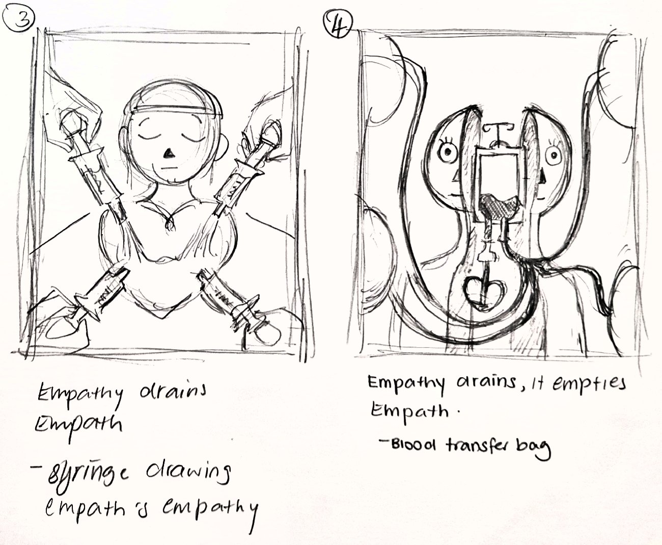
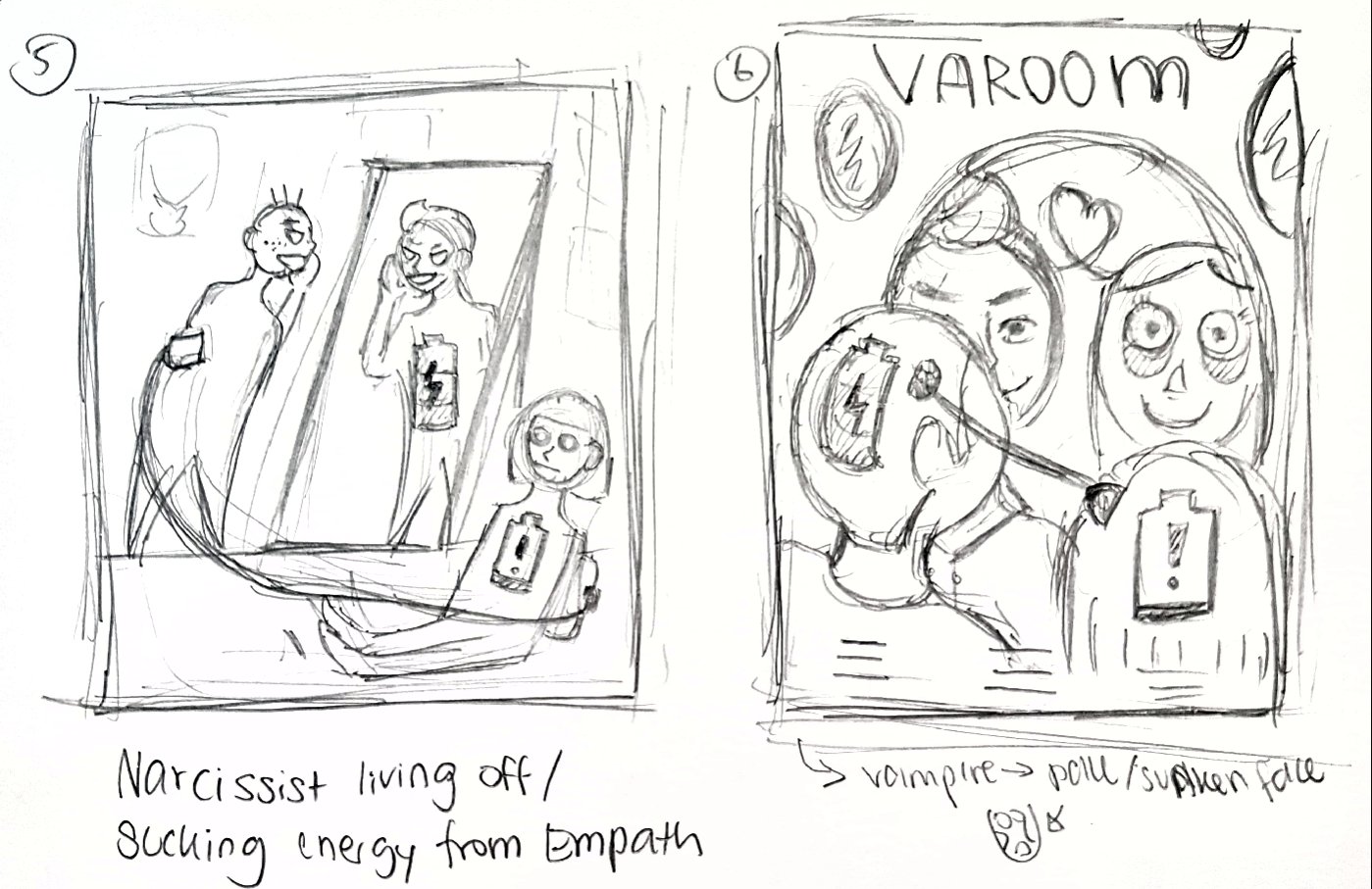
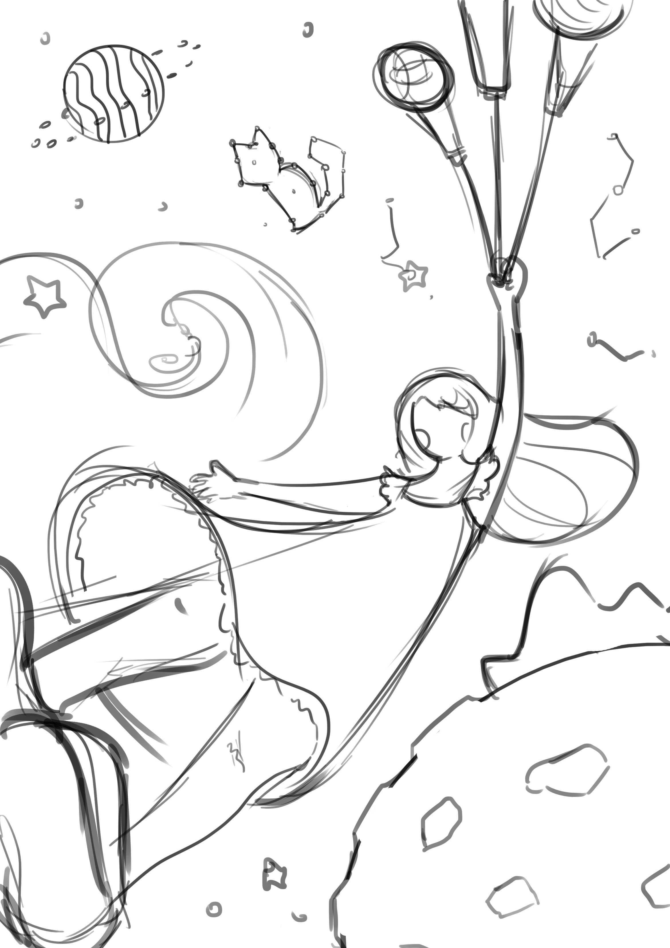
Sketches
[Camouflage Event]
Event Concept:
For the camouflage event, I have gone with a more playful concept. It is an event for all ages to have fun with camouflaging themselves and also to find this character that is hiding around all sorts of different types of disguise.
Items:
Invitation cards
Mystery gift bag
Tote bag
Ticket
Gift wrapper
Sketch:
I have come up with a character and 5 different thumbnail sketches of various patterns that camouflage the character in various ways.

[Superstition Event]
Event Concept:
The event aims to challenge visitors with their beliefs in Chinese superstitions. There will be games, installations and free goodie bags that stores inauspicious gifts such as pear juice, umbrella, and a handkerchief to play out the contradiction of the concept of giving the visitors gifts that shouldn’t be given.
Items:
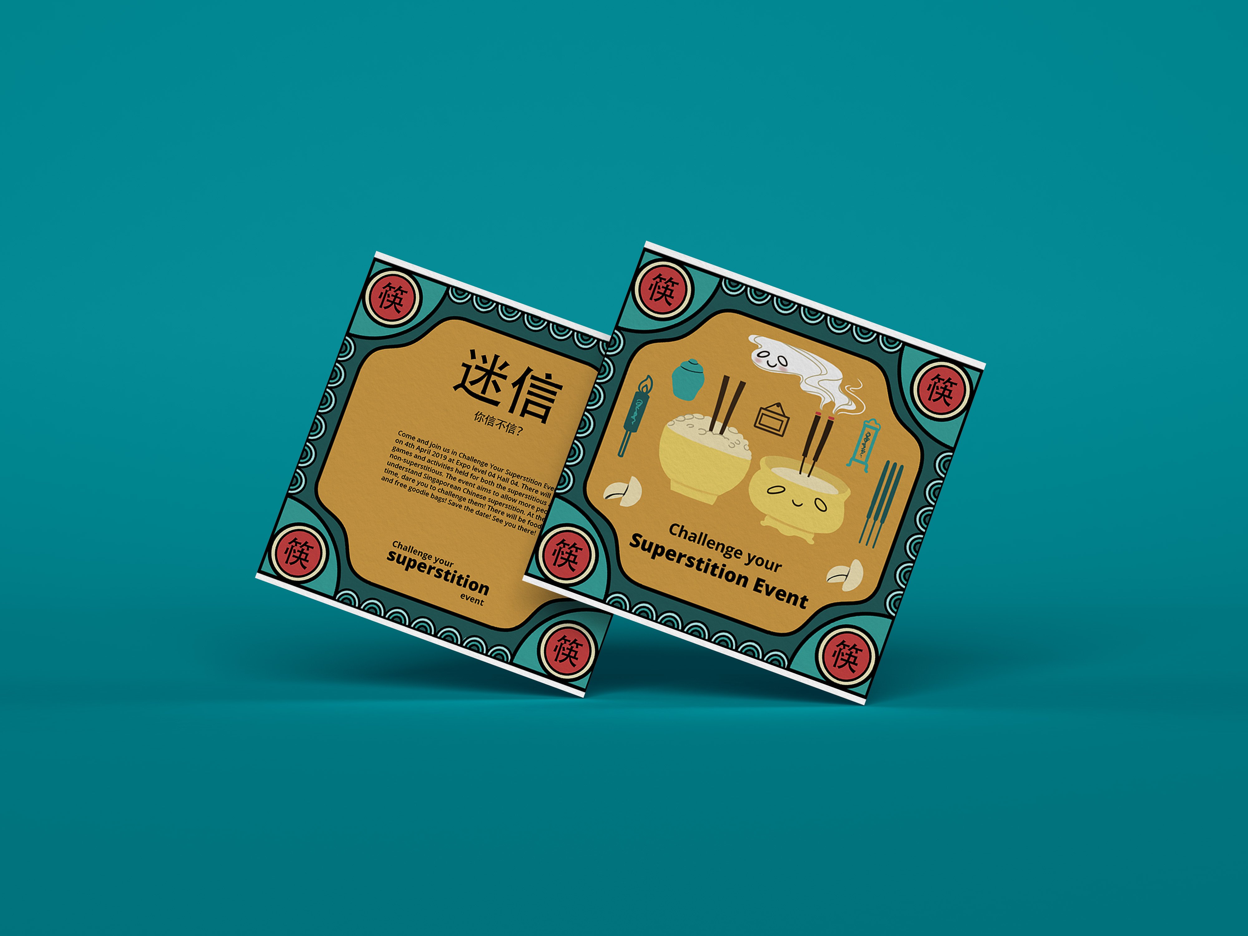
Invitation cards
Tickets
Tote bag (As the event goodie bag that stores all in inauspicious free goodies to be given out to visitors)
Umbrella → Pear Packaging → Pear Juice Label(Inauspicious goodies #1, changes made due to execution and aesthetics reasons)
Handkerchief(Inauspicious goodies #2, initial fifth item)
Sketch:
I have come up with 4 different thumbnail sketches for superstitions that are mainly from the spirits category as they are more interesting. I have also included one inauspicious gift(pear juice) to play out the idea of challenging people’s beliefs in superstition by giving them the inauspicious gift as a gift for the event itself.
Superstition 1: Don’t sleep facing mirrors
Superstition 2: Don’t stick chopsticks in your rice
Superstition 3: Don’t open umbrella in the house
Superstition 4(inauspicious gift): Don’t give pear(juice) as a gift.


Element:
Chinese border with 4 corners of different version of the main key themed item. However later on it was changed to Chinese characters that symbolized the key themed item instead as it brings out the theme better and it is more consistent. Main center superstition accompanied by floating daily item placed randomly that will be seen in such a scene to create a sense of place.
Superstition 1: Don’t sleep facing mirrors
I have drawn a person sleeping on a bed facing a huge mirror with ghostly figures that represented as her soul that is going towards into the mirror showing that her soul is being sucked inside.
Superstition 2: Don’t stick chopsticks in your rice
I have drawn a comparison by putting a rice bowl with chopsticks sticking inside and a Chinese incense burner to show the similarity of both and how they are being associated. The ghostly figures here represented the incencse is an offering for our ancestors.
Superstition 3: Don’t open umbrella in the house
I have drawn a house that is filled with household items with an opened umbrella and a ghostly figure floating out from it to show that opening an umbrella in the house attracts spirits.
Superstition 4(inauspicious gift): Don’t give pear(juice) as a gift.
I have drawn a pear and put the two Chinese character of “pear” lí and “separate”lí that sounded similar side by side as a comparison at the bottom shows a broken rope to represent the idea of separation.
After further consultation, I have decided to go with the superstition event concept as it is more interesting and unique. Also, its a concept that not a lot of people have explored it in illustration before, therefore, I would like to give it a try and see how it turns out.
Style

For the style that I’m going with, I have come across this Korean Illustrator Subin Yang. I felt that the way she illustrates is really interesting. It is very stylised in a way that gives this hand-drawn feeling. Her style also closely explores themes such as home, culture, and identity. Basically very daily life illustrations with a sense of playfulness in her illustration. I felt that it would be quite suitable for the theme that I am touching on as well since a superstition is something really cultural and close to our everyday life.
Some of her style’s traits
-flat vibrant colors
-simplistic facial features representation
-outline on the inside of the illustrations
-simple chunky body shapes
Color Palette
Since I’m doing something traditional, I have chosen to use those vintage Chinese color palette that is slightly desaturated to enhance the whole superstition theme.

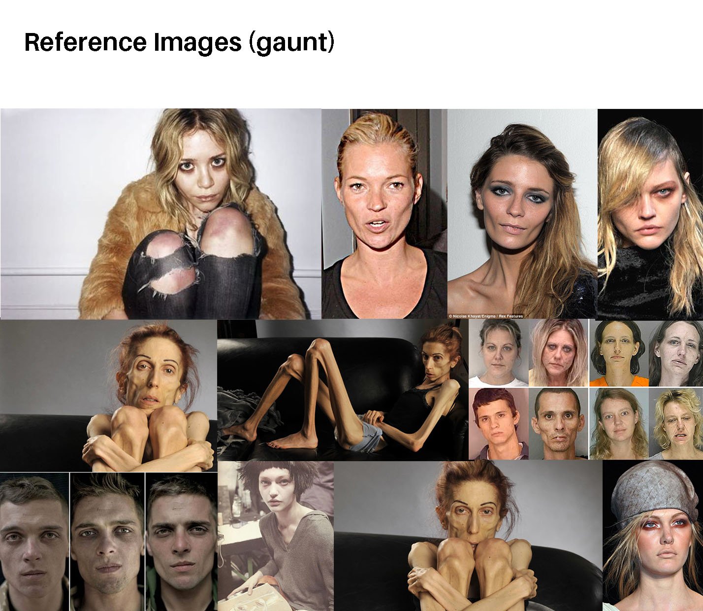
Initial Rough Sketch/ Color Test

The initial color test was not ideal as all the illustration does not look like they belong to the same family. Therefore, after consultation, Prof Lisa suggested going with the green, red and yellow palette that looks the most harmonious as a whole out of the 4 color test. The rest of it was either too bright or dull. Hence, I went on to look for more similar color palette references to better help me with my illustration.

Process


During the process of creating the illustration, I have decided to first use Illustrator to create the outer borders for all four superstitions. This is because I felt that Illustrator is better at creating borders and shapes with symmetrical style. The borders were later imported to Photoshop for painting the main elements and center illustrations in as I wanted to give my illustration a more textured hand drawn/painted feel to it.
Final


Mock Up


Reflection
Initially, I couldn’t imagine myself doing the superstition event as I find it difficult to convey superstition through illustration. Superstitions are usually an act of displaying a certain action, a belief or the combination of both rather than a scene or situation to be illustrated. Therefore I find it a little challenging at the start and unsure of how to translate it into illustrations. However, as I research more and tried to find references, I had a better idea of how to go about with the illustrations.
The second challenge for me was balancing the color for all 4 illustrations to look harmoniously. At the start, looking at vintage Chinese labels was really very colorful and I did not have a focused color palette. After some discussion with Prof Lisa, we manage to narrow down on focusing on just one color palette. Overall, I have sort of stepped out of my comfort zone a little and tried to illustrate something that I’ve not done before and I’m glad that I did!