Project 2 – Research and Development

Field trip: National Design Center 

[Part 1: Field Trip Oss]

There is various type of design practice of styles and focus throughout the Singapore Design timeline of different design categories ranging from visual communications, environmental, fashion accessories and product industrial design. The following documented some of the observations of the different themes, practice, styles that I have gathered from the National Design Centre, “50 years of Singapore design” exhibition.


[List of design practice]

1) Building a nation

Trend movement/style: Minimalistic, Industrial revolution/post-war poster, Retro, 60’s fashion, Logo, Icon, symbols
Color: Primary colors (red, yellow, blue, green), de-saturated, off-white
Brighter, different colors
Typography: San-serif, Big condensed, bolded, Decorative
Practice Focus: Building Singapore identity

2) Economic Boom

Trend movement/style: Pop art, Centralized, symmetrical, top-down design, Illustration, Graphics, Logo, Local architectural style, semi-circle, slanted
Color: Vibrant, colorful, Analogous
Typography: San-serif, slab-Serif
Practice Focus: the beginning flourishing of sg design scene, expansion in the local commercial market, tourism, package, and architecture design practice. Local branding


3) Technology

Trend movement/style: Photography, image edit manipulation, Modern aesthetics, Conceptual
Color: serious colors (blue, red, white)
Typography:3 hierarchy, mixture of different fonts in one poster
Practice Focus: Technology advancement


4) Going Global, gaining international recognition

Trend movement/style:Postmodernism
Color: red blue yellow white black wood
Typography:
Practice Focus: Environment and product design locally and internationally


5) Returning to the roots, preserving local identity

Trend movement/style: Modern, vintage
Color: Colourful
Typography: Use of Chinese words in the poster
Practice Focus: Sustainability, returning to roots (tradition and unique identity)


[Part 2: Field Trip Oss]

Throughout the years, as the millennial generation, I believe we have witnessed the vast changes and growth in Singapore’s design scene. During our younger days, we have always heard others saying how Design is “useless”. In general Singapore as a young developing country, focuses more on the economy rather than the arts sector. Despite small steps has been made ever since Singapore establish its independence, such as designing our own identity. Design was still not as recognized. After the Economy boom, more opportunity is provided for designers as commercial advertising, tourism, and architecture all required branding and design skills to further build on top of the expanding economy of Singapore.

Moving forward, as Singapore develops together with the rapid growth of globalization, local designers had the opportunities to expand our design overseas. Right now, as we progressed, there is a trend of designers starting to look back to appreciate and preserve the roots and identity of Singapore.

In summary, I have observed that throughout the years of design practice in Singapore, Singapore geared more towards the functionality of designs. It utilizes design to improve quality of living and create a better Singapore. Firstly the use of design to build an identity. Secondly the expansion of opportunities and possibilities of Singapore design. Thirdly, the use of design to appreciate traditions and the identity created. Lastly, the use of design to drive Singapore towards being a more sustainable country.


[Part 3: Field Trip Oss]

Some future key goals of designs in Singapore are to use design together with advanced technology to create a better Singapore. Design should consider user experience and suit the needs and lifestyle of Singaporean. Also, it should be forward-looking and interdisciplinary to help with Singapore’s sustainability, functionality, and preserving of our unique tradition qualities to distinguish ourselves and at the same time be on par on an international level.


[Part 4: Field Trip Oss]

Globally, the current design scene will move towards the trend of making use of more technology in their work to improve the lives of the world. Designs will move towards aiming in the direction of making their designs and creation more sustainable, in the sense of involving more biophilic environment, taking into consideration of increasing population and high-density living and thus the need to reclaim from air and underground which will change how the look and process of design are being shaped towards.

Locally, there will also be more design that showcases Singapore’s uniqueness. Having a strong identity style which would then bring our design scene further down the road to an international level.

In my opinion, the importance of design is slowly getting valued by more people. Design is being recognized slowly not just for its aesthetic value but also as a solution to cope with various daily living and environmental issues. Which in turns, it is something that can help to improve the lives of many in different areas.

Task 1A: Visual Research

1) The poster is communicating art and craft.
2) It gives out the emotion of fun, playful, DIY, handmade and creativity.
3) It uses colorful colors to express fun. It uses simple, cute craft visuals such as pencil, scissors, and thread to convey the purpose of the poster. The text treatment is creative. It incorporates elements of craft like ribbons and paper folding into the formation of the text. The body copy uses a more handwritten styled typeface to further illustrate the message of handmade and DIY crafts.
4) It generates visual interest by making the text as part of the imagery and creatively uses the image element to create some sort of border instead of boxing the title up. There is a clear hierarchy of different type sizes, which help me read from the center(“handmade”) to the bottom, and then back up again to the two little bubbles (“time” and “free entry”).
5) I feel that the execution conveys a clear message to the audience. It is also more harmonious and interesting to look at when the text unifies with the theme and surrounding visuals.

Task 1B: Slogan & Moodboard

[Keywords: ]

Technology
Mix culture
Futuristic
Interdisciplinary
Internationally
Mediate between east n west
Smart nation


Revival of Tradition

Back to roots
Old things new life
Differentiate sg from other countries
Reflection and continuity from the past

Sustainable
Functionality, practicality, help the world to be a better place
Eco
Recycle
Livable urban high rise
High-density living-reclaim from air, underground
Compact city
Creation of new value
New user experience
Responsive to market growth n change
Conceptual, societal
Lifestyle, delightful, surprising, uplifting, user experience, fun
Trans-urban, connect nature with city
Addressing the needs of communities
Design change mindset
Building facade come to life. Look n work like trees
Biophilic environment-nature n urban coexist harmoniously


[Rationale]

After gathering all the findings and keywords, I have come out with three big themes of Technology, Tradition, and Sustainability. Every year’s Singapore Design Week(SDW) has different themes. To me, I envision that one of the possible themes of SDW as making design prevalence in Singapore, SDW act as a platform that shows cases the uniqueness of Singapore Design. Hence, the three concepts that I came out with shows some of the possible future design scenes of Singapore.

As Singapore progresses, it aims to be the smart nation and I believe technologies are one of the big factors that will affect the design scene. As for the theme of tradition, I viewed it as the reinvention of the future because if there is no past there won’t be present and future. Hence the importance of embracing both qualities of the tradition and future. The last theme would be sustainability. Singapore is definitely using design on architectures etc to make our country more sustainable due to high-density living, pollution so on and so forth. Hence, I have observed that one of the future design scenes in Singapore focus a lot on utilizing design to create a better Singapore to live in.

[Concept Moodboard, Slogan and Typeface]

1) Theme 1: “Technology, the new future begins”

For the first theme, when I thought of technology, I think of futuristic neon colors aesthetics. Hence, proposing such color scheme and art direction.

2) Theme 2: Tradition – “The Reinvention Of Future”

When it comes to Singapore’s tradition, it reminds me of Chinese calendars, tingkats, and Peranakan patterns. Hence, I’m going for a more illustrated style with elements as shown above.

3) Theme 3: “The Age of Sustainability”

As for sustainability, I’m still unsure of the direction that I’m going for, but probably along the line of futuristic cityscape, eco or perhaps underground buildings.


[Sketches]

Initial Design Sketches – Technology
Initial Design Sketches – Tradition
Initial Design Sketches – Sustainability

Task 2: Design Exploration (1)

[Sketches]

After the first critique session, I further developed some sketches to improve on my ideas. For the theme of “Tradition–Reinvention of future”, I have tried to brainstorm a few ideas of fusion between the new and old. Such as merging Singapore’s iconic dragon playground together with the current playground. As for the flowery patterns on traditional Peranakan tiffin carrier, I have decided to use shapes to represent the sense of future. For the sustainability theme, I have decided to make it more eco looking with the use of nature and included some Singapore iconic flowers such as the Orchid, Bougainvillea, and Birdnest fern.

Exploration Sketch 1
Exploration Sketch 2


[Digital Design Explorations]

Exploration Design 1 – Tradition
Exploration Design 2 – Tradition
Exploration Design 1 – Sustainability

For this week’s critique session, the issue of how future is reinvented from tradition is still not resolved and clarified for both the tradition theme.  Fusion of new and old does not simply mean by hybridizing two elements together but rather the element itself has to convey the message and feelings instead of being so literal.

Also, the sustainability design is more preferred as compared to the other two as it is more ambiguous and less of “Singapore” and more of “Design week” since design week is not entirely only showcasing the works of Singapore. In addition, this design has more room to play with the different organic shapes and bringing out the sense of creativity of being the design week itself. Hence I have chosen this design to further explore the possibilities. However, for this design, it has too many plants and looks like a poster for Gardens by the bay instead of a Sustainability Design Week poster. Hence, I was advised to further define what is sustainability and look into sustainable materials as references to gain some inspirations.


Task 2: Design Exploration (2)

[Reference Images]

I have done some research regarding sustainability materials and the following are some of it:

–Timber
–Cellulose
–Recycled tire rubber
–Recycled plastic
–Wood
–Cork
–Vegetal fibres(bamboo,coconut)
–Straws bales
–Wool,linen,stone,sand,beeswax
–Clay
–Hemp or hempcrete
–Grasscrete
–Ferrock
–Structural Insulated Panels
–Cooling roof
–Synthetic spider thread
–Newspaper wood
–Mycelium
–Melted plastic
–Recycled glass

[Sketches]

[Digital Design Explorations]

I have extracted some features and texture from the materials and include them into my poster. Such as recycled melted plastic texture, bamboo, hemp and recycled newspaper in a plastic bottle. In this design, I tried to be more representative, abstract and ” less Singaporean”.

However. the feedback was that in general it gives off the feeling of germs and bacteria visuals and the element does not show sustainability. The color was too warm and red doesn’t remind people of sustainability too. So I was recommended to clarify the elements I have by keeping them nature related and also use more blue and greens to express sustainability. Also, using white as the body text background doesn’t blend and create a harmonious design together with the surrounding patterns. Hence, I was advised to use colors that are already in the palette instead and also try to put the two information much more closely together then placing them at extreme corners.

Task 3: Design Refinement

[Sketches]

Sketch – Layout and nature motif explorations

This time round, I begin by looking at different reference images of nature abstract shapes that express the qualities of sun, wood, cloud, globe, rivers, and mountain etc. After drawing visual inspiration from the references, I begin to start sketching my own style of all the different nature motif that I would like to include in my poster [left side of the image above]. I have also explored different “bubble” shape layout to contain my title and body text [right side of the image above]. After which, I proceed to include and combine all those elements that I have explored into my poster design sketch [bottom image].


Sketch – nature motif + layout

[Digital Design Explorations]

Digital exploration – Sustainability

I digitalized it, added a bit more details and chosen a color palette that is suitable for expressing sustainability [different shades of greens and blues].

Task 3: Color and Typeface Exploration

For the very first few drafts that looks like a poster for gardens and germs, I have used Gill Sans as my main typeface choice. However, as I move on, I felt that despite Gill Sans as a humanist typeface, It couldn’t match with the organicness of the surrounding patterns. Gill Sans is too clean cut. Hence, I changed it to Vag Rounded, a more geometric rounded and bubbly typeface which I thought might suit the poster better. After which, getting some feedback from my friends, I have also explored a more fluid, psychedelic-ish, self-designed font to try and compliment my design. The self-designed font adds on more characteristic and it more preferred than the Vag Rounded font. However, it needs to be further refined as it is just a rough version.


Color test 1 – Green blue & added orange
Color test 2 – Green & added orange
Color test 3 – Orange green & added blue

As for the color choices, besides the very first green and blue palette that I have done, I have tried to explore other color combination such as the orange-themed palette and the green-themed palette. Most of the colors that I used are mainly analogous colors that have a color theme on the left. While all the panels at the right-hand side of the above exploration, I tried to add in more fun by using a wider range of analogous color to give them either a punch of orange or blue hues into the poster color exploration. It turns out that the blue palette with a bit of added orange is more suitable for the feel of my poster design!

[Reflection & Takeway]

In conclusion, I have learned a lot about how the tiniest visuals may impact and lead to certain feelings or messages that viewers may link to other ideas. It is important to take note of prior notion of elements that we have subconsciously made connections with. Such as what sort of color palette is commonly related to sustainability or summer. What type of lines, motifs, and patterns visuals expresses a certain connection to things we have already know. Such as wavy tube shape with sectioned lines make people think of worms instead of bamboo.

Also, for this project, I tried to step out of my comfort zone a little and tried to go more abstract and have fun with organic abstract shapes. At first, it was a little difficult to grasp as it needs to be both ambiguous and yet recognizable to a certain level at the same time in the context for the style and theme of my poster. Also coming from an animation background, I find it interesting to see how both animation and design aims to communicate feelings but in very different ways. Animators focus on the color mood, dynamism of body and facial expression. However, on the other hand design relies a lot on motifs, visual imagery, the feeling of every single details, mark, lines, textures, text you put on the canvas makes a difference and convey messages. Hence, I have learn quite a lot from this project!

VC1 Project 1–Research and Development


Research

What is figure-ground?

It is the perception of the relationship between the figure (form) and the ground (backgrounds) that surrounds it.

Types of figure-ground relationship

Stable– It’s clear what’s figure and what’s ground. One or the other usually dominates the composition.

Reversible-Both figure and ground attract the viewer’s attention equally. This creates tension, whereby either can overtake the other, leading to a dynamic design.

Ambiguous-Elements can appear to be both figure and ground simultaneously. They form equally interesting shapes, and the viewer is left to find their own entry point into the composition.

Other influencing factors

Using space as a design element:

  • Proximity – Proximity uses space to connect and separate elements by enclosing some elements in space. An example we might take for granted is paragraphs of text on the page. The space between paragraphs is greater than the space between lines of text within a paragraph.
  • Closure – This makes use of space as gaps between elements. Viewers fill in the gaps with their own information to complete a whole from the parts. Too much space and no closure occurs. Too little space and no closure is needed. Only the correct balance between space and filled-in space will activate the space and lead to closure.


Dictionary definition of Hope:

  • a feeling of expectation and desire for a particular thing to happen.
  • “he looked through her belongings in the hope of coming across some information”
  • a person or thing that may help or save someone.
  • grounds for believing that something good may happen.
  • a feeling of trust
  • wants something to happen or be the case.

Personal interpretation of Hope:

It is a positive feeling of security, safety, and comfort. Believing and wishing that something in your favor might happen. Someone is there for you. The unfavorable situation will dissipate.

Keyword Generation:

+ve NOUNS

-ve NOUNS

·      Hands

·      Birds/ Dove

·      Rainbow (after rain)

·      Freedom

·      Plants/seedlings

·      Newborn/ Birth

·      Angel

·      Dream

·      Bloom

·      Stars

·      Santa

·      Sky

·      Sunrise

·      Love/heart

·      Thousand origami crane

·      Temple/ joss stick holder

·      Quilt

·      Sunflower/four leaf clover

·      Umbrella

·      Rain

·      Tears

·      Scars


+ve VERB

-ve VERB

·      Flying

·      Reaching out

·      Helping hand

·      Smile

·      Growth

·      Praying/ wishing

·      Believe

·      Wither

·      Pain

·      Isolation 


+ve ADJECTIVE

-ve ADJECTIVE

·      Yellow

·      Bright

·      Touched

·      Warmth

·      Soft

·      Full

·      Comfort

·      Security

·      Safe

·      Dark

·      Cold

·      Alone

·      Empty


Keyword Generation

3 Theme

(Exploration Sketch of 3 themes)

At the very beginning, generating figure-ground was really challenging for me as it is so difficult to grasp the concept of making 2 combined object together in order to look like the form you want to show. At the same time, the element chosen that you would like to inject in your form must be related to hope as well. I really not used to this. As coming from an animator background, I’m very used to illustration. I was stuck at this exploration stage for at least 3 days. Experiencing art block as you can see from all the above sketches that I’m struggling and really trying my best to grasp the idea of creating figure-ground.

However, I guess the research I have done has helped me a bit in this exploration process as I have learned to focus more on the outline and silhouette at this stage. After the exploring, I have finally came up with 3 final concept: Wishing lantern, Rainbow after the rain and The thousand cranes.


(Finalised 3 Theme)

1 ) Concept: Wishing Lantern (Chinese theme)

Wishing Lanterns

Keyword: Sky lantern, Clover (hope, love, faith, luck), Hope, Light in darkness, Wishing, Praying

Description: The first theme that I thought of was a Chinese theme and incooperate with the use of wishing lantern as a form. Wishing lantern in the Chinese culture symbolizes hope. People usually write down their wishes on the lantern and send it to the sky to hope that their wish will come true. I was inspired by that concept and went on to further explore with 3 main forms of it by tying up together in a Chinese culture theme. The first was a clover in a lantern, the second was a wishing hand that clasps together that forms the shape of the lantern and in between is the Chinese praying candle. The last was a lantern with a Buddhist Chinese goddess statue of “Guan Yin” (Goddess of mercy–associated with compassion/helping).

Feedback: However, this idea is being discouraged as it was not universal enough. Relating back to the idea of visual communication, at times in the brief of a hanging mobile of hope in the setting of the hospital. It would be more ideal that the element and form used are in a more universal visual language instead of something that not everyone might understand what is it or what it meant. Hence, after the feedback session with the class and Prof. Michael, I have decided to scrape off this idea.


2 ) Concept: Rainbow after the rain/ every cloud have a silver lining (雨过天晴)

Keyword: Rainbow, Umbrella, Raindrop, smile, Girl dancing in the rain, encouragement, support, perseverance

Description: The second idea was based off the chines phrase of “雨过天晴”. Meaning every cloud have a silver lining. After all the rain and storm (analogy of the bad things that happened), there will still be rainbow (symbolizes good weather, happiness, hope) showing and the bad weather will go, the good weather will eventually approach.

This saying analogy inspires me to have this concept of making a mobile that makes people feel hopeful by showing the juxtaposition between rainbow something that is hopeful versus umbrella and raindrop that is usually related to gloominess. The intended story that I would like to put across in this concept is that despite in life there are many hinderance and pessimistic events that might happen, eventually, all of these challenges and obstacle will soon be over and the “good” will come. It is a piece that I would like to show hope through encouragement to all the patients to be brave and to persevere. Stay hopeful, and things will eventually become better.

Feedback: The form of incorporating an umbrella within a rainbow is interesting. This form could be further explored and developed.


3 ) Concept: The Thousand Cranes (Senbazuru) (Japanese theme)

Keyword: Paper Crane, Wishing, Freedom, Support, Comfort, Peaceful, Calm, Hand

Description: The Thousand Origami Crane ( 千羽鶴 ) legend has said that if we were to fold 1000 origami crane, a wish would be granted by the god. This legend originally originated in Japan. In the present days, it is usually seen folded from families/friends to patients in the hospital as a symbolism of hoping their loved ones will get well soon. With this legend, I was inspired to create forms that show support from others with hand gestures that symbolize hope. In my mind, I pictured the entire mobile to be a very calming mobile that shows support and comfort. Hence, I have developed the first form of having 2 cranes forming a hand gesture of hope. The second, 3  cranes forming a silhouette profile of somebody wishing. The final form of 2 cranes forming a hand holding/grabbing/supporting another hand.

Feedback: The forms and message conveyed are clear and universally understandable. Instead of using 2-3 cranes to create the form of hand gesture within and make the cranes not very readable, try to keep the gesture within one crane and knock out shapes from it. In additional this look more like a dove then a crane, perhaps would like to consider using a more origami crane form. Continue working on this piece.


Moodboard

Moodboard-Thousand Crane
  • For the Crane idea, I wanted to choose something more down to earth and warm to depict the support and comfort feelings.
Moodboard-Rainbow after Rain
  • For the rainbow idea, perhaps something more colorful, either vibrant or pastel.
Moodboard-Wishing Lantern
  • For the wishing lantern, a color palette that is more like sunset color.

Form Development

Design Development Sketch


Design Development Digital

For the further development of the form, in general, the rainbow idea was more preferred than the crane one as the crane ones appeared as being too strong due to its hard sharp edges, it does not look hopeful at all. For the raindrop ones, the cloud is too heavy at the bottom too.

During the later part of the consultation, it was also being mention that the head is very out of place in this piece as compared to the other elements. Hence, I have squeeze and simplify the “girl dancing in rain” element into within one raindrop.

Simplified girl dancing in rain

Colour

Color exploration

pastel
Analogous
split complimentary
triadic
triadic variation (less vibrant)

After all the color testing, consultation and asking around for opinions. I have picked color test 4 and make amendments such as including all the 4 colors into the raindrop instead of just putting 2 out of the 4 colors.

Final Color palette

Decided to go with this final color palette. I have chosen this one as it is more vibrant and it does bring out the feeling of hope and happiness. Color test 1-pastel was too soft. Color test 2-analogous was too overpowering, passionate and strong. Color test 3-split complementary gave out the feeling of “save the earth” instead of hopeful. Hence, I have chosen color test 4-triadic.

Structure

For structure wise, I have decided to go with number 1 as it brings out the raining feeling visually with all the straight line going down in one direction.

Post-production Problems encountered

  • Printing issues:
    The first shop I went to print, the color was off from my original digital piece. I went to another printing shop and it achieved the color I wanted but I only realised I forgot to mirror the rainbow which caused a mis-match and is not aligned when pasted back to back. Causing extras on one side and not enough coverage on the other side. I tried to salvage by going back to print however the store that I went to is closed on that say. Therefore, left with no choice I had to use the remaining left over raindrop of the same color. Cutting out shapes and paste it on the the rainbow.
  • Craftsmanship: As a result it also affected the craftsmanship of the rainbow. The rain droplets also encountered craftsmanship issues as i use the wrong adhesive and material causing the edges not being able to stick together properly.

Reflection.

Fortunately, we were given one more week for the final submission and I was able to salvage the craftsmanship issues. I went back to the same shop to reprint, making sure there was no mistakes and redid my hanging mobile by repasting everything.

What I have learn from this project is that:
1) I really like how this project allow me to hone my visual design skills in the sense that it pushes me to think in a figure-ground perspectives instead of illustration perspective.

2) Something for me to takeaway is also that we must always learn to think ahead because as a designer its not just about doing things in the digital copy but also the hard copy. At many times, translating a digital copy to a hard copy will definitely encounter many issues. So it is really important to plan ahead in regarding to the materials and color/design that your want to use.

Bibliography

http://www.gdbasics.com/html/figure/figure.html

https://www.smashingmagazine.com/2014/05/design-principles-space-figure-ground-relationship/

The Principle of Figure-Ground

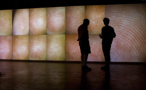
Hyperessay: Pulse Room – Rafael Lozano-Hemmer

Pulse Room(2006) – Rafael Lozano-Hemmer


Introduction

In this hyperessay, I would be elaborating on Rafael Lozano-Hemmer’s interactive artwork – Pulse Room. I will be briefly covering on the artist and artwork overview. Subsequently, I would further elaborate on the artwork in relation to the concept of interactivity, new media practice and in comparison to historical context.

Artist Overview

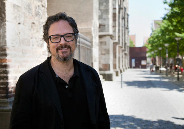
RAFAEL LOZANO-HEMMER

Rafael Lozano, previously from a science chemistry major background is now a Mexican-Canadian installation artist. In most of his installations, he involves technologies such as robotics, telematic networks, and computerized surveillance. His works usually combine technology, performance, architectures, sound, and light to create interactive art installations that aim to engage public’s participation. He is also interested in using technology to amplify people’s presence in the urban scale. His projects focus a lot on promoting the interaction between real and virtual structures in various timeframes.  Some of which, allow people to reconstruct certain ideas and get in touch with the idea of intimacy. Most of his work is done in public spaces. More recently, he started to move towards creating installations within the museum (Hemmer, R. L. (n.d.)).

Art Work Overview

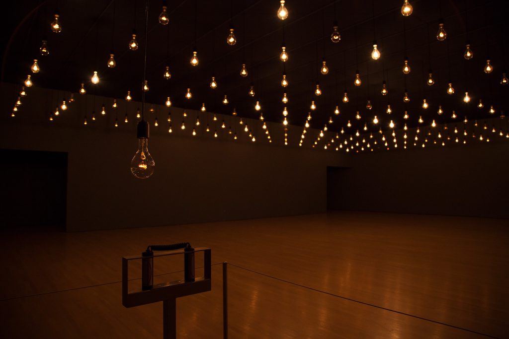
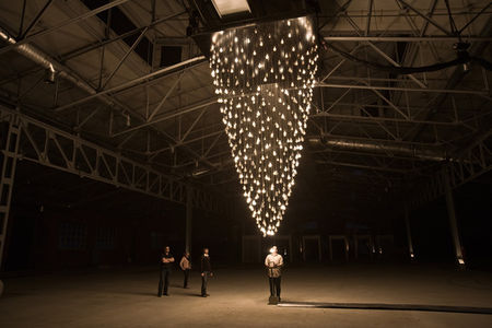
Pulse Room

I have come across Pulse Room and was intrigued by the concept of using visuals such as lights to represent the kinetic palpitation of the heart which is something that is usually only be felt or heard. After reading briefly about it, I felt that this piece is quite relevant to the concepts of interactivity that has mentioned during lesson. Hence I have chosen this piece as my selected artwork.

It is an interactive art inspired by Macario, directed by Roberto Gavaldón in 1960, a film that features the protagonist suffering from a hunger-induced hallucination and that each person is represented by a lit candle in a cave.

It consists of 100-300 light bulbs 300W each hanged by cables that are 3 meters above the ground. In a dark room, bulbs filled up the entire room in a consistent manner. There is a sensor metal bar placed in the room before the field of light bulbs. It recognizes and traces the heart rate of the participants. After which, the pulse is detected by the computer will be transmitted to the closest bulb in front of the participant/sensor that is hanged slightly lower approximately 1.7m above the ground, replicating the rhythm of the heart palpitation in the form of flashing light. After registering the palpitation rhythm, the whole room went dark briefly and the recorded flashing light palpitation goes forward by one position down the queue. Each time a new participant touches the sensor, the new palpitation pattern will push ahead the existing ones, showing the most recent palpitation pattern. All the way till it is out of the sequence and dissipates (Merete C, Ulrik S, 2012).

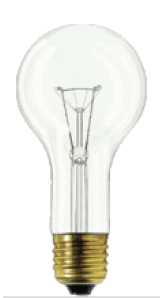
Incandescent light bulb
Metal sculpture sensor stand
DMX dimmer

Techniques & medium used:
Incandescent light bulb
Voltage controller
Heart rate sensors
Computer
Metal sculpture sensor stand
DMX circuit board
Dimmer packs
(Hemmer, R. L. (n.d.))

Collaborated with:
Programmer–Conroy Badger
Production support–David Lemieux, Natalie Bouchard, and Pierre Fournier
Technicians
(Hemmer, R. L. (n.d.)).

The rationale and idea behind this installation are to explore the concept of our existence and the meaning of life. Every individual is being represented by a light bulb that is uniquely flashing in the rhythm of heartbeat that only belongs to the individual. As it progresses, the room is filled with many people’s heartbeat, which represents a community. As time past, each individual’s initial pulse will eventually be gone and being replaced by the new participant’s heartbeat. The artist wanted to make use of technology and different medium of light and kinetic to allow the participant to make their own connection and interpretation of this piece (C.A., 2014).

Personally, I find this artwork very impactful as it closely mimics the cycle of life. How we are born into this world and slowly lost and immerse ourselves in our hectic everyday life with the others. Eventually coming to an end without noticing and is being replaced by “new lives”. It makes me reflect and ponder a lot.

In Relation To Interactivity

Cybernetics–The balanced two-way communication/relationship between human and machines. In this case, of how human sending a pulse message to the machine(sensor > computer > light bulb). How the machine received the message, reacted and replied by recording and translate to light flashing rhythm for the viewers to reflect upon this entire artwork.

Entropy & Indeterminancy–chaos & unpredictability. In this case, the chaos and unpredictability would be in terms of different people have different rhythm heartbeats which resulting unpredictability of the end result of the pool of light bulbs that flashes in a chaotic rhythm.

Behavioral Art– having the involvement of visitors/participants changes the artwork and audience is no longer passive. In terms of Pulse Room, without human participating and being part of the artwork, the artwork will not exist as the entire room will be dark. With no human, there is no pulse. With no pulse, there is no translation of heartbeat to flashing lights. With no lights, it is like any other room which defeats the purpose of having an installation. Installation is hence non-existence.

Reactions(Physical, Emotional, Conceptual)– In terms of Pulse Room, it involves all three reaction elements. Physically visitors are engaged by the sense of touch of the sensor to have a feel of transmitting heartbeat rhythm to the sensor. They are also visually engaged and immersed in watching their own pulse and being amidst in the room of flashing lights. Emotionally it allows participants to feel intimate and mesmerized by the environment. Conceptually, it allows viewers to question about life and relate to the intended message of what the artworks wished to convey – the cycle of life and how we often get lost in the midst of being busily engaged in life and with others. Therefore, all of the above factors above constitute to interactivity.


Quotes from Roy Ascott, “Behavioral Art and the Cybernetic Vision,” 1966 :

“Each artwork becomes a sort of creative tarot pack, presenting coordinates which can be endlessly reshuffled by the spectators, always to produce meaning.” – Roy Ascott

I find this analogy from the readings really interesting, on point and relatable. Artworks have taken up the role as a facilitating/reflecting tool like a tarot card. A picture that could be interpreted in a thousand meanings by different people in different situations that pays attention to the different aspect of life. At a different time, with different people or location, the same artwork produces different meaning. Both artwork and audiences correlate with each other as the artwork provides a facilitating role while the audiences give the artwork its meaning.


“We are moving towards a fully cybernated societywhere processes of retraction, instant communication, autonomic flexibility will inform every aspect of our environment. In that forming society, of which we are a part, the cybernetic spirit finds its expression in the Human Scienceand in Environmental Technology; the two poles between which we act out our existence. It is the spirit of our understanding of life at its simplest and most complex levels, and a large measure of our ability to control it.” – Roy Ascott

This paragraph is also interesting in the sense that it tells us that cybernetics is not just the balance relationship between human and technology. It is also related to our environment and society that shapes us as who we are. It allows us to further understand about ourselves.


Quotes from Rafael Lozano interview, “Exhibition of MCA” 2012, and “Open Air“, 2012 :

” It is only through the activation of the public that the project exists in the first place” – Rafael Lozano

I find that this quote by Rafael is very relevant to the concept we have mentioned in class about behavioral art only exist when audiences participate and become part of the artwork.


” What I talk about is relational specific, so my works try to establish constraints which are developing a performance on a particular site of space that is portable, as it lands at another place, the public reaction could create another piece. Hence the outcome of not knowing what’s gonna happen”– Rafael Lozano

From this quote, we can also see how much Rafael values Entropy and Indeterminacy.


“My work often uses technologies, not because its something that’s new, original or futuristic. But rather precisely its natural because it’s inevitable. “– Rafael Lozano

This quote shows exactly how Rafael as an artist values the ideology of accepting technology as a part of us and it is something that is inevitable. Which is part of his rationale on why his artwork consists of technologies to begin with.

In Relation To New Media Practice, Integration & Interdisciplinary

Before I begin the essay, I have researched about what is new media. There are quite a few definitions coming up. Some define it as a many to many communications, the use of new technologies such as VR, internet, mobile device, hypertext, email, blog etc. While some define it as using new media like human-computer interface, interactive computer installation etc in contrast to old media platform such as books, magazines, TV that only allows one-way communications. Which is very unspecific.

After looking through the reading, Rethinking Curating by Beryl Graham and Sarah Cook, they refer to new media as a terminology that is yet to be able to be defined specifically as it is something debatable due to the ever-changing society.  The readings mentioned New Media could be seen from different perspectives. In the context without art, it usually refers to commercial broadcast. In the context of art, some draw a line between art and technology while another school of thoughts was supporting the idea of media/digital art. Personally, I agree very much with the authors that it is difficult to define it. In my opinion, I felt that anything that uses advanced technologies of that period in time that we are living in and is a two-way communication would be my definition of New Media. While New Media Art could be any art form, usually installation, that uses new technology to create two-way communications between human together with new technology that is aesthetic or with impactful messages that leave visitors to ponder.

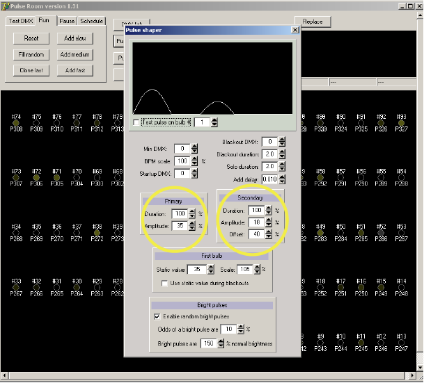
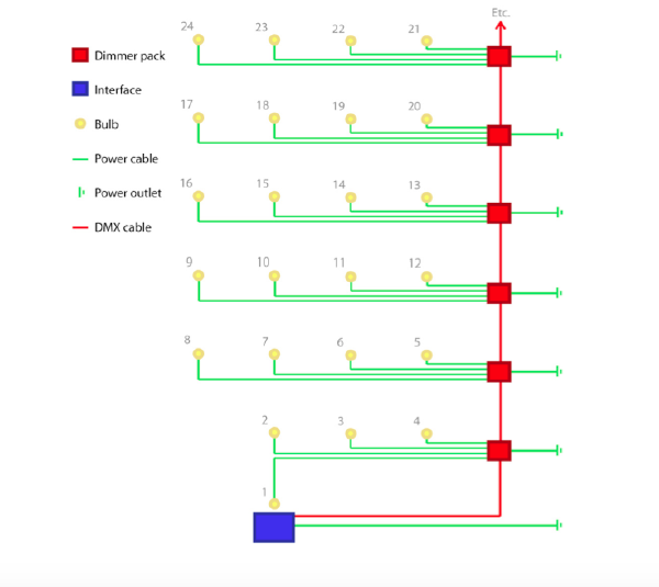
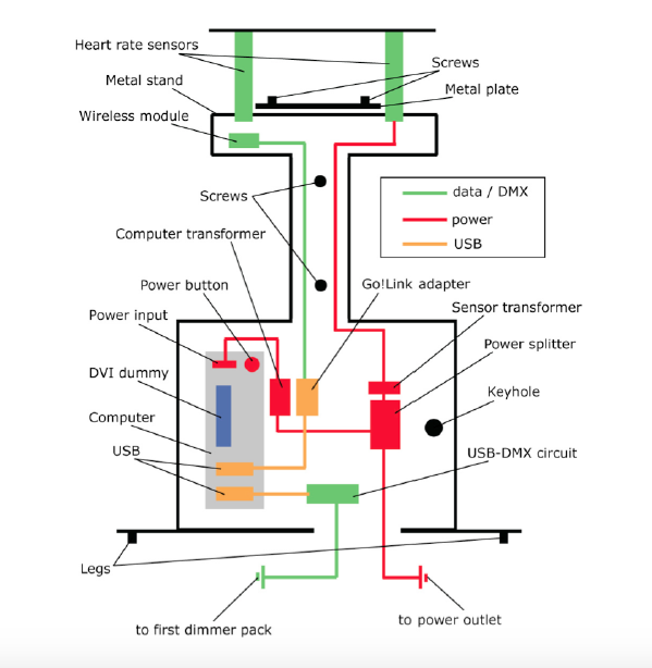
In the context of my selected artwork, the artist demonstrates the integration of art and technology through using computer programming interphase. The computer is used to receive the pulse fluctuating signals from the metal bar sensor. It is also used to control every single light bulb in the room. Data is updated through USB connection to a DMX circuit board. The  DMX circuit board sends signals to dimmer packs where the bulbs are. There are two cables one of which boots up the computers and sensors while the other translate signals to the dimmer pack which determine the amount of power that goes to the bulb. The artist made use of technologies to translate heartbeat rhythms into a room full of beautiful blinking lights that are aesthetically pleasing that conveys meanings that allow the audience to think about (Hemmer, R. L., 2010).

Bulb manipulating interface
Pulse dynamic shaper
Wiring diagram 1-light bulb
Wiring diagram 2-Metal stand sensor

Rafael Lozano has also worked with professionals of other disciplinary such as programmer Conroy Badger, to create the interphase of setting up and controlling the light bulbs. Technicians were also involved to complete the artwork by helping out in setting up the light bulbs, cables with precisions of distance and height with safety awareness.

In Comparison To Historical Art Work
(Nam jun park, Magnet Tv)

Pulse Room is actually quite similar to one of the historical work Magnet TV by Nam Jun Park. Both Pulse Room and Magnet Tv requires visitors to participate and be a part of the artwork installation. If none of the visitors participate, both the artwork installation would stay still, incomplete and non-existent.  In terms of Magnet TV, it would just be a still piece that seems like a normal magnet placed on top of a TV just like any others that we have seen before. Nothing meaningful about it, as the image of the screen is not altered, it is not even an interactive installation artwork anymore. Similarly, in Pulse Room, if there is no participant, there will not be any activator and the room will be just like any plain dark room with light bulbs that are not “working”. Hence both works become non-existent.

Therefore, the involvement of human participation does not just give life to the work itself. Human is the one that creates and gives meaning and interpret the meaning to the artwork. In such a context, human is an important part of the work and both technology artwork, and human needs to coexist in order to build add-on meanings on to each other forming the concept of cybernetics together. Whereby, there is a balanced two-way form of relationship and communications existing. Similarly, both artwork is rather unpredictable as different people have a different rhythm heartbeat and different combination forming all the light flashing in the rooms will be different everytime someone adds on too. Same for Magnet TV, different people manipulate the magnet differently resulting in different patterns outcome.

However, despite both artwork explored the human relationship to art and machines. They differ in their concepts and ideology behind their artworks. In terms of Magnet Tv, Nam June Paik is trying to reflect the relationship of human with technology and its effects or benefits on us in the modern days whereby technology is advancing. Believing technology could enhance the communications between cultures. Meanwhile, for Rafael Lozano, he stresses the fact that technology is inevitable, and that we should embrace it and intimacy could be shown through technology. Both artists have very different takes in regards to cybernetics.

” I reject that technology is a tool or something we can use, it is rather something that forms part of us.” – Rafael Lozano

Again this quotes shows Rafael’s values.

Conclusion

I felt that both Rafael Lozano as an artist and his art installation Pulse room did expand the idea of interactivity art. Pulse Room shows us another side of interactive installation whereby using technology to create installations is not necessarily having it to solely revolve around the concept of exploring how human relations with technology are like or how technologies are advancing etc.

Having new media technology being integrated with art and interactivity could be as intimate, personal and relatable to the public. He also expands on the idea of accepting technology as a part of us as a way of life like any other norm that is inevitable. Promoting the spirit of appreciation and acceptance, allowing technology and art to connect with us intimately and vice versa.

To end off the hyperessay, I would also like to mention that there are other similar works from the same biometric series as pulse room that is worth taking a look at.

Pulse Tank (2008)
Pulse Corniche (2015)
Pulse Index (2010)
Pulse Front (2007)
Pulse Park (2008)
Pulse Spiral (2008)


Bibliography

Claudia, A. (2014). Connecting Realities: Rafael Lozano-Hemmer’s Pulse-based Works. Journal Of Science And Technology Of The Arts, Vol 6, Iss 2, Pp 21-28 (2014), (2), 21. doi:10.7559/citarj.v6i2.117

Graham, B., & Cook, S. (2010). Rethinking curating : art after new media. Cambridge, Mass. : MIT Press, c2010.

Hemmer, R. L. (n.d.). Pulse Room. Retrieved August 31, 2018, from http://www.lozano-hemmer.com/pulse_room.php

Hemmer, R. L. (2010). Pulse Room. Pulse Room. Retrieved September 8, 2018, from http://www.lozano-hemmer.com/texts/manuals/pulse_room.pdf

Johung, J. (2011). Networked Dependencies: Rafael Lozano-Hemmer’s Relational Architecture. University of Minnesota Press. doi:10.5749/minnesota/9780816672875.003.0005

Merete C, Ulrik S. Pulse on pulse: modulation and signification in Rafael Lozano-Hemmer’s Pulse Room. Journal Of Aesthetics & Culture, Vol 4, Iss 0, Pp 1-7 (2012) [serial online]. 2012;(0):1. Available from: Directory of Open Access Journals, Ipswich, MA. Accessed September 7, 2018.

Neumann, C. E. (2015). Nam June Paik. Salem Press Biographical Encyclopedia

R. A. (2002). Multimedia From Wagner to Virtual Reality, Behaviourist Art and the Cybernetic Vision(Vol. 11). United States of America: Norton Paper Back. Retrieved September 8, 2018, from http://proteus.fau.edu/practicum/texts/ascott.pdf