Sound art is usually set as an installation, because they’re not really a better way to appreciate this type of artistic discipline by discipline ourselves before the medium. Just like any other art, sound art does not required to be publicly-accepted-melodious conventionally, we can find its inspiration from daily routines, places we can’t experience as we like, or places we will never be. Whether or not the sound art is engaging is what we can appreciate from the piece. What’s amazing that sound art can be appreciate with and without our vision, or more like, the audio experience are the main body of the art but enhanced by the visual aesthetics of the artwork.

Since the visit to SAM, I’ve encountered several pieces of sound art, such as

DSC_0854 DSC_0016

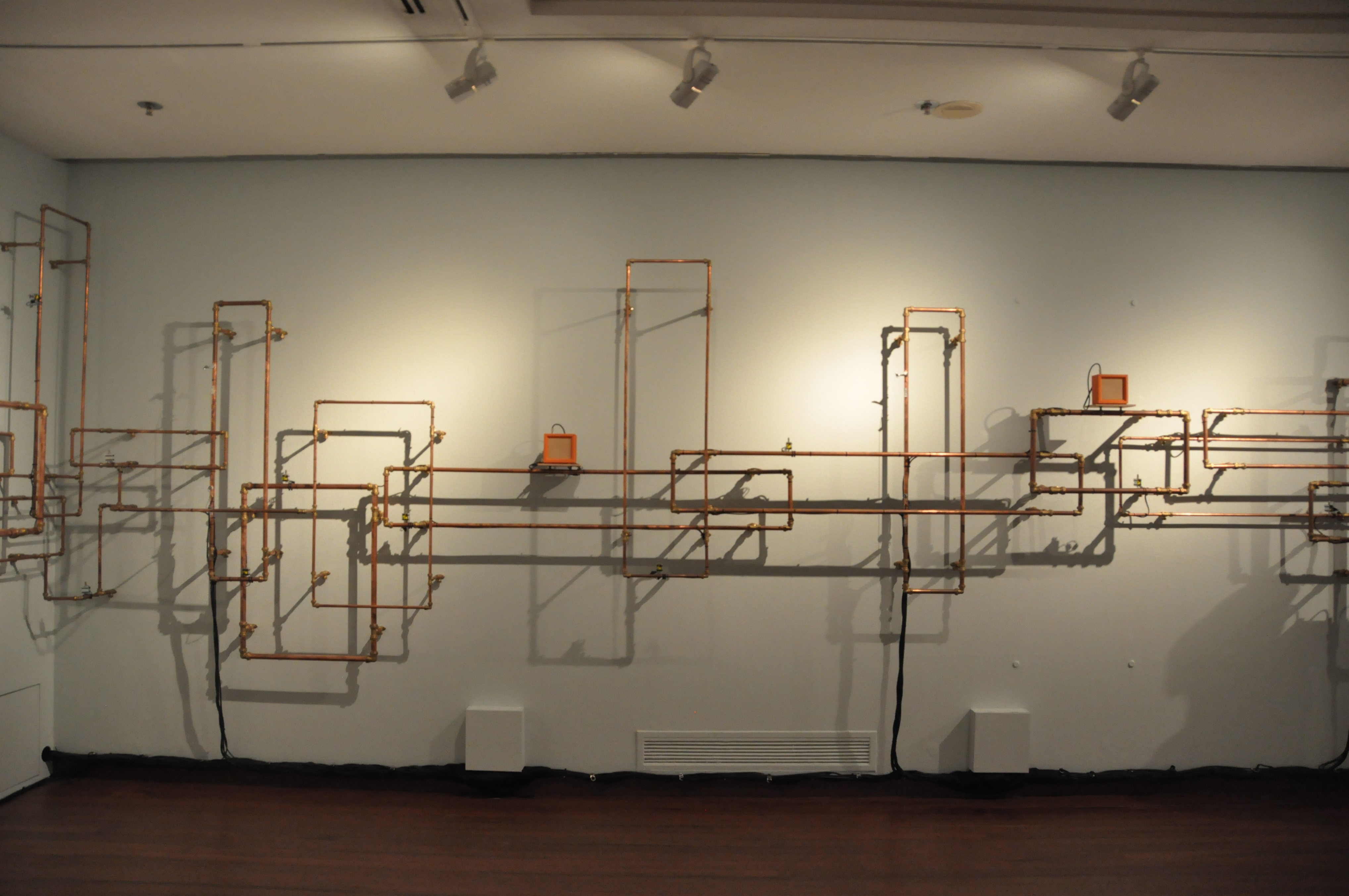
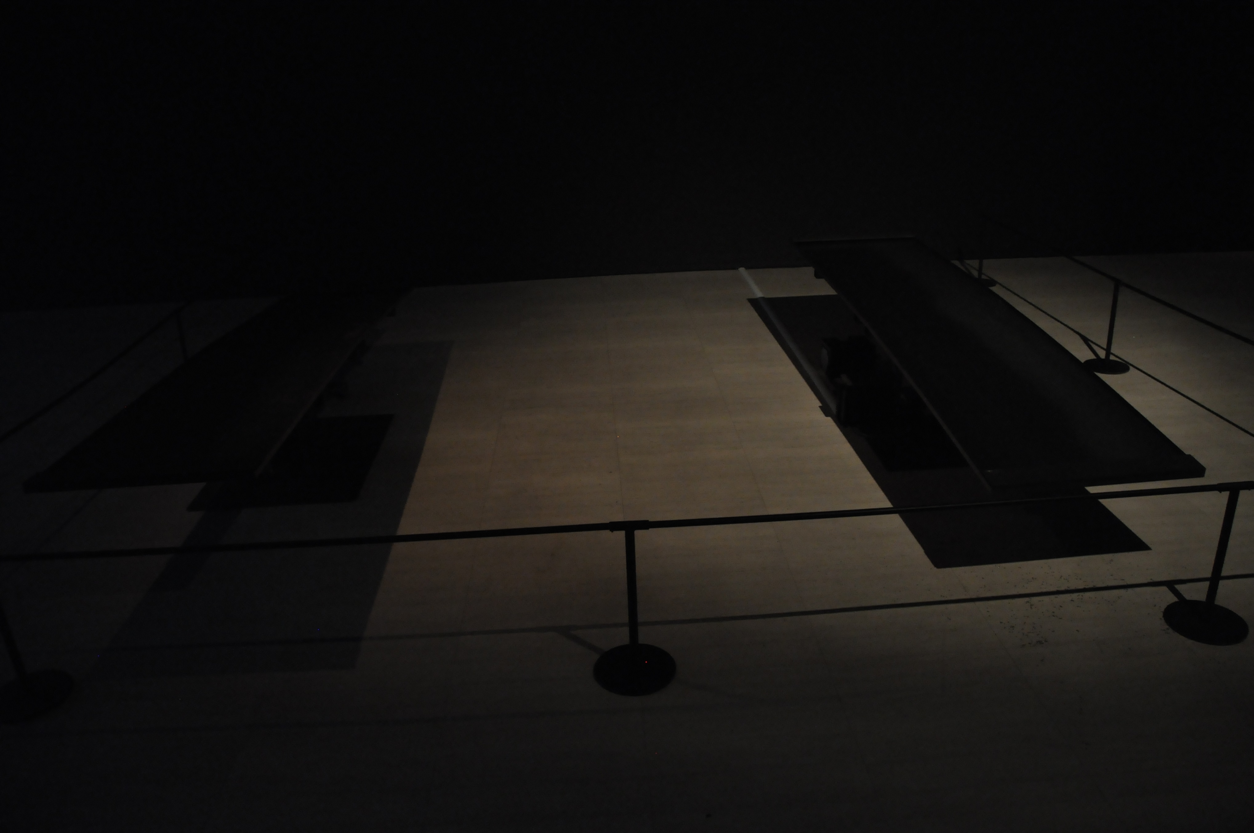
Raising Spirits and Restoring Souls (left, 2015) by Zulkifle Mahmod and Too Far, Too Near (right, 2015) by Ong Kian Peng. The two pieces are the first two sound art I’ve ever encountered, and they have always stuck in my head for sometimes after the visit. However, since I’m able to research for more sound art overseas, I decided to surf the web and explore this medium.

Among the results I found, I find Lola Gielen’s Neo (A music instrument everybody can play.) more interesting than others.

neo6

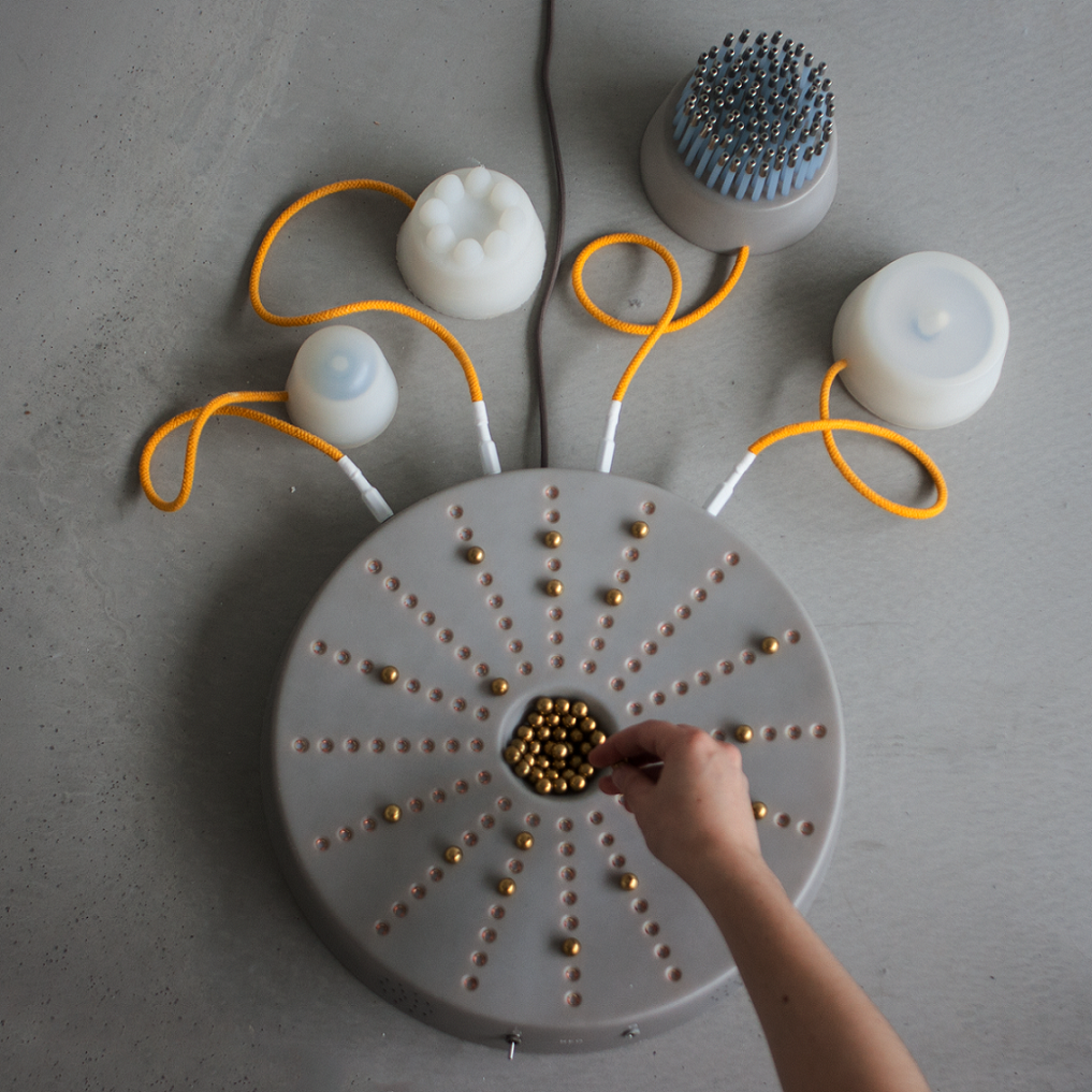
Lola Gielen, a newly graduated product designer from the Design Academy in Eindhoven, created her instrument named NEO with a Raspberry Pi computer running on Python script. The python allows the Raspberry CPU to process the sensors for both the instrument and extra attachments’ sensors. The instrument is simple to play by placing the beads contained in the center onto the little pits on the main body, a rhythmic looping music will then start playing accordingly to the placement of the beads. This music are just composed to simple notes and the tighter the beads are placed apart, the faster the rhythm will be.

The piece resonances with people who are not talented in musical instruments like me. The intention behind this piece are clearly claimed in the title, a musical instrument which everyone can play. The artist wanted to give a musical experience for people who don’t regularly have time and talent to play instruments. Viewers are able to interact with the instrument while create a unique piece of music through different arrangement of the beads. It is similar to computer coding/looping software but the users can make the simpler version of digital music on the spot without any computing devices. This blurs the line between the touchable traditional instruments and digital instruments.

I find this piece interesting as it has an attractive interactivity and functionality. It also breaks the limitation of music creation as creating music won’t be exclusive to people who can play instruments. It can be educational for children or music amateurs and introduced the wonders of sound and music effectively to both groups of people.

Thanks for reading.

20160411_133634 20160411_133136(0) 20160411_133148 20160411_133215 20160411_133131 20160411_133143 20160411_133200 20160411_133228 20160411_133247 20160411_133300 20160411_133305 20160411_133313 20160411_133319 20160411_133346 20160411_133353 20160411_133400 20160411_133406 20160411_133419 20160411_133555 20160411_133603 20160411_133618

Mini Bookshelf Visitors (2016)

Junyuan Loo

35 Paper-cut outs with colored paper stands.

Inspired by Michael Lee Hong Hwee’s mini figures, the installation is made up of 35 papercut mini figures, secured with paper-stands. Each mini figure is unique, symbolizing the 35 weeks of being an ADM student. Most mini figures are designed to be place on the head of various books with their paper stands stuck between the pages. Viewers are welcomed to place the figures in other books to have them interact with different books and other figures. (While placing these figures, some require the selected books to be pulled half way from the shelves for a better effect.) If viewers are interested to the books that the figures are placed, please place the figure to a new book or relevant location as its initial state instead of placing it aside. This will help to keep the installation in its intended installment.

The installation explores the feeling of intrigued and curiosity a library visitors can get through browsing the bookshelves. When one is browsing the book spine’s title without any library number codes in mind, one can always find book titles that is enticing the viewer, with hopes that the book’s content could surprise more.  The installation was designed to engage similar thoughts and anticipation, leading the viewers with its quirkiness from one figure to another, discovering fun and interest within the shelves.


The work is accompanied by instructions to have the viewers interacts with the figures but handle them with care while doing so. Many fellow classmates reviewed that they might be blocking people who are seeking books or neglected by people who look for books by the code numbers. Therefore, I consider this installation as a social experiment of the relationship between installations and library visitors. Since most installations were installed at the side of people’s daily routine, what interaction will produce if the installation was installed between the visitors and their targeted books?

At the end of the installation period, 12pm April 15th, I went to the location to collect my figures, and the following scenery was discovered.

20160415_124842 20160415_124818 20160415_124808 20160415_124804 20160415_124744 20160415_124729 20160415_124715 20160415_124707 20160415_124656 20160415_124638 20160415_124631

As you can see, many of them were misplaced, pulled out, attempted to be placed back the original locations, roughly handled and placed aside. (Fortunately, none of them went missing.) The phenomena are sort of within my expectation except the one with the book “From Pinewood to Hollywood”. I was delighted as I saw the book was placed by one of the visitors for the walk-and-browse figure. Although this is the only positive outcome from the attempted interaction, I was still cheered from previous frustration. My interest towards this form of art was thus heighten again.

The Library is one of the most interesting I had in 4D module because I have never approached with installation art before. I am grateful to Mr. Michael Tan for giving us this opportunity to try out this medium. I had a lot of fun (while exhausted in the making) as mentioned by Mr. Michael. This will be another experience of the module I won’t forget.

fb page

PS: I thank NTU Library for sharing my work onto their Facebook Page, it’s a great honor and thank Mr. Michael Tan for informing the good news!!

Thanks for reading!

20160414_183151

The excitement is inevitable!!!! And that’s not a realistic printed pen.

It’s completed!! I screamed internally when I finished pasting every beautifully printed pages together. The end result of the printing are glossy but the brilliance of the colors still stands out completely. The vivid colors wasn’t dull but pleasing to my eyes.The papers I’ve chosen from Fancy Papers Ltd are gampi papers (covers) and thick papers with the texture of my visual journal. The papers works well and maintained its flatness throughout the pasting and logistics.

All these excitement aside, I’ll be guiding you through my zine page by page to give you a full view.

I chose the Jokerman font for my title as I want a memorable font to be the first thing shown into the readers’ eyes. The font shall also give the impression of light-hearted-ness for the entire zine in the beginning as well. Adding the red spiky eclipse to make the cover interesting was decided early before the paper was chosen. Surprisingly the design fits perfectly with gampi’s certificate-like texture.

Throughout the contents, I chose the Huxtable and Hurry Up font for both my narrations and instructions to give them a quirky tone. The two fonts are not linearly aligned which produce a non-serious component for the work.

Originally I wanted to use metal pins to attach the supposedly-leather-made pen holder. Unable to find the suitable pin to fit the colored-paper-made holder, I made a pair of “pins” with yellow color papers and paste the whole thing together. Thinking back the decisions, the pen holder, in my opinion, suited the overall style of the illustrations.

20160414_183414 20160414_183314

Initially, I wanted to place a pen-outline subtly in the main pages in the left photo, which will be visible when fully expanded. However, the Pen-as-Arsenals composition made the lines blended too subtly into its background, which unfortunately hidden my initial intentions for the compositions. Inevitable, it’s considered a pity by me. For the compositions in the other side (right), I connected them together with various factors, such as mirroring compositing and connecting backgrounds. With these decision, the pages were held together visually, showing their identities in the same narration, even though their styles were different.

20160414_183212 20160414_183216 20160414_183223 20160414_183231

[Click into the thumbnails to get a full view of each pages.]

As most of the composition are explained, I shall move to the third composition where I wished to included the occupation perspectives I eliminated from the previous project. I was able to revive following the perspective:

A PEN from the point of view of MONK is MEDITATION

A PEN from the point of view of DRUMMER is DRUMSTICK

A PEN from the point of view of PENTURNERS is ART (The main contributor of the page’s interactivity.)

A PEN from the point of view of LAWYER is GUN

A PEN from the point of view of POLITICIAN is WMD (Donald Drumpf inspired?)

A PEN from the point of view of SCIENTIST is CAMERA

(For this I supposed many of you might recognize 2 of the most entertaining engineers/scientist in TV history. I chose them to replace white coats as one of them, Adam Savage once said: “Remember kids, the only difference between Science and screwing around is writing it down.”)

20160414_183235

I left this page to be enlarged as I wanted to point out specifically my mistake on it. Due to my neglect on proofreading, The paragraph in the page had terrible typos and mis-phrasing. While being anxious before submission, I decided to cover it with a plain printing paper as the school’s printing shops didn’t allow me to reprint the words on the extra paper I bought before print. During the class presentation, just as I recapping my pages, I thought of a better solution for this mistake as I mentioned on my presentation:

Adding an interactivity which requires the reader to correct the mis-phrased paragraph, because this page is a tribute to the line: A PEN from the point of view of TEACHER is STICK & CARROT and A WAY TO PASS DOWN OUR WISDOM AND KNOWLEDGE.

Lesson learned, always think through when fixing mistakes, avoid naive and stupid solution as well.

20160414_183255 20160414_183244

After the bad news, now for the good news. The back cover surprise turned up very well with the Pen-shaped compilation of PEN in various languages. When the zine is open as the right image with a pen the pen holder, a mirroring composition is formed and I was extremely satisfied with this outcome.

REFLECTION:

My fellow classmates like the illustration very much while Ms.Joy warned me about the consideration on font size. For instance, in the occupation composition, due to the fact that both instruction and narration are typed in the same font size, readers might confuse them over the similar font and take times to differentiate them via capitalization. Overall, the zine was regarded as nicely done. I am proud of it too!

This is the last project of the module Foundation 2D. Throughout the academic years, I’ve learned a lot from my classmates from different semesters and my tutor Ms.Joy. I got to challenged many methods of execution and styles for different themes. This is one of the modules I am glad I didn’t drop and I am looking forward to have the same excitement while being in my majors’ modules.

Thanks 2D, and thanks Ms.Joy for the guidance since 1st semester.

Thanks for reading!!

Since a zine is basically a magazine but smaller…… Is that what the MAGA means….????

(Definitely incorrect, if you did the research.)

Welcome to the end of our 2D journey, which I’ll repeat, the last project will be based on the recent projects we’ve done throughout our foundation year. My concept was officially announced as JOURNEY WITH PEN, a remake of my POV project but expanded and extended. I gotta to say that the whole process is crazy and fun as I’ve never rushed so many digital illustration within a short period of time before! The project reminded me the joy of my own hobby and while whacking the whole work out, I enjoyed every single pages of illustrating. Without further ado, let me lead you through the work, CHRONOLOGICALLY. Let’s start with the good old visual journal, shall we?

20160414_183510

My plan on my zine.

I thought of using 5 A4 papers to form the accordion booklet format I planned as it’s hard to find any paper that has the length to fit the width of 6 A5 papers. (Refer to the booklet figure in the image.) When I started planning the narration for the 8 pages given, I realized that I have the advantages of utilizing the Inside Cover Pages for both ends, because there’s no need to leave them blank for a zine. I’ve figured to give my zine a filling content, why not just include these inside cover pages as the space for my contents? Therefore I added a beginning or prequel to the main narration. This page included my line: A PEN from the point of view of CIVILIZATION is A TOOL OF COMMUNICATION.

20160414_183518

Following the first Inside Cover Page is the main contents of my zine. With the space to extend and expand my previous work, I’ve given myself the opportunity to include many of my eliminated ideas (due to the incoherent concepts. ) into the zine’s body content. During the planning, I found the contents are still lacking some excitement or attraction for the readers. Then an idea popped up as I pictured what if this is a mass publication? I then recalled the book “Wreck This Journal” by Keri Smith, a book series that is an extreme case of interactive books since “Where’s Waldo”. Yes, interactivity was what my zine needed. Thus, I added many instructions in the main content pages that won’t let the readers “wreck” my zine. (Yes, I am not that extreme for this.)

Soon after this, I start designing my zine front and back covers. I decided to keep the front simple to surprise the readers with the rich illustrations. With the same consideration for the back cover, I felt it would be too empty for it because I didn’t included any images in it. So I placed a little surprise for the back cover as well with the help of the glorious Google Translate.

20160414_183526

With a little drafting of my verbal narration and I’m done.

During the group consultation, Ms. Joy and my fellow classmates suggested me to consider more on the printing materials to ensure the bonding of the accordion booklet won’t influence too much on my zine’s final appearance. Thanks to the reliable paper distributor Fancy Papers and the kind people in Poster Connection @ Sunshine Plaza, my zine is completed.

To be continued……

Like, how the heck its inventor came out with a word that sounds so rad and futuristic??

The final project of this semester is a 8-paged ZINE. For me, this sort of looks like a project that requires us to compact everything we’ve learned in 2D into a small book, with the space of trying new stuff as usual. The project enables us to insert any recent projects we did throughout the academic year into the zine. Obviously under the spirit of holy market spoiler, no one is going to just copy and paste their recent work into the zine. Till the time this is composed, I’ve already saw a few of my fellow classmates posting complete research on the ZINE itself. Imagine what they can do by just introducing their title sequence!

Therefore, I’d not like to waste your time and tell you what a zine is. I meant a book with such rad name should have got you google it a while ago. What I’m going to show is the idea I’ve developed for the project. As we are able to insert recent projects into the zine, I was thinking this might be a chance to make use of the composition I left out in my last project, Point of View. The zine is my chance to expand and extend my ideas about the PEN. I view this as an opportunity to make something that’s finally not assignment-based work. (Yasss, this project is damn free to work around.)

My current concept: Create the world’s thinnest narrative book with simple eye-catching illustration style with the tone of children books. What differs this work from the recent project is that the compositions’ orientation are partially altered and the medium of coloring will be shifting to digital coloring as well. Due to it’s narrative nature, I’ll be facing challenges of fluent narration and planning that makes the book worth re-reading. As many of the composition is enlarged, I would like add more interesting element. Not to mentioned I’m now required to add words to the work which made it a typography work, too.

20160403_211558

This time, I’d like to make it more relevant to the public therefore I will be removing the ME elements from the previous project. This decision will leave out many spaces for unused or new compositions, expanding its potential to become a fresh new work itself. With a children book tone in mind, I need to declare that the book was not made for children who haven’t grasp on the concept of an accordion booklet layout, which is the style I am going after. The layout will extend the total length of my zine and potentially resembles the shape of a pen. (The same consideration I did in the teetorum idea.)

Originally I was going after the art direction of Dr. Seuss or the illustrators style I found on previous project. Then I came across this artist which was shared by my high school classmate on social media.

wakemeupathappyland_00 thegirlwithoutaringfinger_07-08 lyraswhisper_17-18

The artist’s name is Josef Lee and he writes and illustrates what he claimed “Bedtime Stories for Adults. Stories about Life, about Love, about Stuffs.” I have to apologize to Ms. Joy who tried to search “adult bedtime stories” after I described his work without remembering the artist’s name. The mentioned keywords are pretty risky to lead us to unwanted sites. Resume to Josef Lee. Not only the artist’s storytelling is so random yet compels emotionally, the artist changes his illustration style drastically after every work, giving his audience a fresh new look every update. What Josef Lee inspired me is his narrative, illustration styles, and also his willing to change in every new update. This prompts me to include such quality into my zine.

I’m currently pausing in compositing stage, there’s so many to considered before jumping to execution, so please wait patiently for further updates of this Zine project! See you soon and thanks for reading!


Since everyone was so far ahead of the updates, I am gonna do a quick summarized update for my project 3 – The Library in ONE post.

Thinking of an installation art about the library is no easy task. This location is very common to anyone who has been a student, yet many of the library visitor has different perspective of the place. The ADM library is rather the most special library among our universities library. This can be due to its special layout design, use of spaces, functionality of different region, and also the research materials it contains. It’s pretty obvious for ADM library’s specialty so I won’t talk too much about it.

When it comes to conceptualizing, I’ve always like to start from my point of view. For me, the library is a place for homework, individual concentration, research paper brainstorming, and research materials searching. I always spend my extra time in the library. (only if I waiting for certain event to start and I have no sustainable leisure alternatives such as my laptop around me. ) What I like to do in the library is surfing through the shelves, and see if there’s any book titles on their spines that catch my attention. It’s kinda like surfing the internet without intentions but you do it in the real life.

SO most of my ideas originate from the act of surfing the bookshelves.

1. see through the shelf 2. obstacle 3. obstacle 2 4. I rather 1 5. I rather 2 6. blind search

(From top left)

I thought about the views we’ve missed when we search for the books, the layers of space formed by the holes that’s formed by the books and the shelves. And then there’s the inevitable obstacle set by people who were too focus on their chosen books and unintentionally blocked the pathways. The space I’ve mentioned in the first one also caught my attention and I wonder if I can express how certain series of books have lost their timeliness due to constant technological upgrades. I’ve also wanted to play with searching action by deliberately covering the paths to increase the difficulty of my “bookshelves surfing”.

The responses from I got from Mr. Michael Tan, is that these works can be improved in terms of directed perspective, importance, and relational attributes. Several artist works are also introduced such as Michael Lee Hong Hwee and Robert Gober,

Finally I’ve chosen the idea of placing little figures around the shelves that stimulates my idea of bookshelves surfing. The decision is based on removing the installation ideas that isn’t manageable, completely curated, and relevant to the whole 4D modules. The little figures concept is inspired by Michael Lee Hong Hwee’s work as he printed out many scaled down versions of him and set them “free to play around”. I wanted to try the concept with my own interpretation and context.

The challenges of the work is the consideration I needed to take on about the work’s detailed presentation. This includes the amount of the little figures, their presentations, and their consistent actions to fit my theme. I will have the mock ups completed within the following week.

Thanks for reading and please look forward to my updates!