Last time, I spoke about Japanese photography painters. These terms are surprisingly new to me considering I’ve read many photography magazine but none of them mentioned these innovating styles. Like George Melies, these pioneering “color photographers” are the ones who proved photographs can be colorful as well.

War photographer Felice Beato was one of the first photographers who introduced journalist photography. He shot and reserved hundreds of rare war photographs from the east where and when the Qings still reluctantly ruling China, including the Opium war between British and Munching China. Later before he settled in Burma, he opened a photography studio in Japan, teaching Japanese citizen to learn photography. And among these disciples, there are Kusakabe Kimbei and T. Enami.

2966216_orig beato beato artist-with-a-brush-photographed-by-an-artist-with-a-camera-ca-1915-28-by-t-enami-1340429480_org japanesedream4-560x403_440 beatofelice-beato-19th-century-photos-japan

Felice Beato captured a variety of Japan during the Meiji period. He was permitted to shoot many of the unforeseen Samurai Culture, reserving the image of the real Samurais and Japanese soldier, and introducing this little country beside China to the Westerners. Therefore, the viewers felt like tourists, observing Japan as a foreigner, just like Beato.

kimbei Kusakabe_Kimbei_-_Writing_Letter_(large) Kusakabe_Kimbei_-_22._Girls_Dancing

Kusakabe Kimbei’s worked in a different style compared to Beato. As a local photographer, he mainly explored the world of Japan’s female, including the geishas. Kimbei used plenty of color to create a lively atmosphere of geishas’ dancing yet with the same techniques, he depicted various woman in their unique characteristics, such as a mother was painted green as a soothing character, a young woman with pink pigments to embrace her youth.

japan-vintage-farsari-tenami FUZZY_SLIGHTLY_WARPED_AND_LAZY_DAYS_in_TENAMIS_YOKOHAMA_STUDIO.123201755_std enami6559fb9682_ot enami fuji

T. Enami or Nobukuni Enami, also captured the life of Japanese, but as a local. Through the lens of Enami, viewers are able to see the daily life of Meiji’s Japan as Enami shows not only the famous samurais and geishas but common citizens as well, giving us a glance of the working society.

enami6559fb9682_o 2966216_orig beato felice-beato-19th-century-photos-japan t enami fuji Kusakabe_Kimbei_-_Writing_Letter_(large)beato

As you can see, the three photograph painters used almost the same blue in their photographs, yet they depicted different environment and meaning in their photographs’ characters. Such as the serenity around Mt. Fuji, the symbol of honor in a samurai towards his master, the commonness in working labors, and even the intelligence of a writing woman.

japan-vintage-farsari-tenami

beato

Even depicting almost the same theme, you can see the different expressions through the use of color. Their motto was not recreate realistic colorization but sending subtle messages to people who view the photographs. Thus they didn’t colorize the skins and unnecessary items. A little color altering can go a long way.

Inspired by their work, I combine the motives I had from the previous and attempted to colorized my photos in different possible ways. In the meantime, after some research I finally found a color wheel that simply summarized how we have been using color to express different emotions and environments.

emotional-and-psychological-meaning-of-colourWith the help of Photoshop, I am able to create a few colorization style by selecting different layering of my pure colors. These methods included layering a portion of B&W photos with semi-transparent color. (Sneak peak!)

test work

This is just a test photo.

better me 4

Or tinting them entirely with the hue to create a film style from the 60s. Movies in the 60s tends to tint their whole scene into certain color to express atmospheric tension, before color correcter was invented.

better me 1

By color correcting the photo’s, we can still see the original colors, but the tint can be seen as well. This is what movies nowadays usually do, but in a more subtle way.

me 5

The color scheme used in film has to be created using real props with similar colors and software editing. Since I can’t do that much during the production, I figured why not express my concept in an eye-catching way by covering the details in the same color. This way, viewers can see the colors far ways and able to capture the details when they’re near to it.

ideal me 5

Also, I tried to recreate the effects of the mentioned photograph painters. This effects only show color of the key element in the photo, providing each of their own meaning in the image.

Lastly, the pictures below are my journal’s snapshot showing my thought process. Don’t worry if you can’t recognized my handwriting. I’ll type them in my next post when the final results are uploaded as well.

20151115_195943 20151115_195953 20151115_195957Adaptable + Stubborn = ME, a lucky sonofagun that miraculously met great friends and survived.

20151115_200006 20151115_200010 20151115_200016Thoughtful (In any aspect) – Procrastination = BETTER ME, an anti-comfort person, at least willing to be defy comfort.

20151115_200153 20151115_200035 20151115_200039Creative x Experienced = IDEAL ME, standing out in an extraordinary way, with what I am, what I do, and what I left.

20151115_200054Skilled – Stubborn = ME IN 5 YEARS. Freed from my limitation, with infinite possibilities awaits.

[To be continued…….]

This video essay produced by Lewis Bond on Youtube has a great analysis on films’ color selection. It explained the color theories as well but in a more detailed and clarifying way than my amateur generalized analysis. Therefore, I recommended this for everyone to watch and discover the efforts the art directors and filmmakers put in order to produce an extraordinary movie experience for the public. I am not 100% sure the colors are intentional but they certainly performed their own purpose.

I like video essays for films. They give out the knowledge without using big words to prove they’re intellectual and provide the great teaching and demonstration on the suitable platform. It’s a lot more effective than reading the film theories on books because films are meant to move, thus it’s better than the screenshots on manual books. The timing of video essays is always spot on so the voice over is never boring.

Below are the video essay channels about films I recommend.

  1. Every frame a painting
  2. Movies I love and so can you
  3. Now You See It
  4. Nerdwritter1
  5. Channel Criswell

They all have their reasons to spend 8+ minutes to learn. You may disagree with some of them but it’s always good to see how people do their homework.

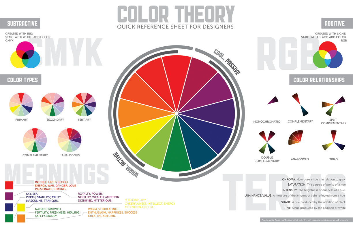
color-theory-infographic-paper-leaf

Bless the people who make info-graphics, they’ve saved and produced people with short attention span like me.

Secondly, I need to personally thank Ms. Joy for providing us the color wheel so I don’t have to switch on electronic devices just to get the colors right. I think it’ll be useful in many ways.

Thirdly, let’s take a moment and appreciate the efforts of the researchers that define some thing we take for granted intellectually. Imagine if there’s a whole aspect of the world out there and we are missing it because we don’t have the organ to perceive it? (—The internet) I’m glad we had eyes.

Let’s talk about colors from the things I love, films. My fellow classmates have been doing a lot of research on colors so I don’t think repetition will be the best choice.

So first stop, monochromatic. There are great films in the colored movie decades use monochrome like Schindler’s list or The Artist. Sadly I didn’t get time to watch this masterpiece. So I will be mentioning 500 days of Summer as my point. It uses monochrome in one of the scene where the lead characters were placed in foreign European movies, saying ambiguous dialogues. Monochromatic sets the mood of seriousness, every colors are either absent or fully combined. The lack of vibrancy leads the viewers to focus on the context rather than the pictures. It also focuses meaning from the scene so viewers won’t get another idea from the color.

Analogous are be often found in unified movie settings like Harry Potter franchise, and Zack Snyder films. I found they are usually chose to set the overall mood like how chaotic and dim the wizardry world has become after the resurrection of Voldemort in the fourth movie. After Nolan’s Dark Knight trilogy, superhero movies tend to go dark. Zack Snyder’s Man of Steel went to the extreme and was criticized for darkening the symbol of bright and pure justice.

Complementary can be found on every commercialized franchise movie poster. i.e. Bourne series, Mission Impossible series, James Cameron Avatar, and M.Night Shyamalan shameful Avatar. The dark blue and orange makes every component stands out of one another. The combo makes them a memorable poster, and a reason to add excitement in it like fire, explosion, and scotching L.A.

Split complementary, triads, and tetradics, schemes that used more than 2 colors are usually found in Marvel movies, animations, and light-hearted genres. The combinations create richness to the scenes and emphasized on their aesthetics. They don’t intentionally imply the mood, but try to achieve realism, so you can feel that you’re in the settings and related to the environment.

These just show how important is color grading/correcting.

(The research is based on generalized knowledge and personal analysis. You, who have a better knowledge of the aspect, might disagree with some.)

To be frank, I am not a colorful person at all. Emotionally, I don’t express much. Verbally, I can’t express much. Technically, colored media just isn’t my best tools. Since I was young, I felt that the god of color materials must have something against my pass-life and cursed my ability to use His creations. Just kidding, but I’d always screw up in coloring. I have the sense of color but my last art exams screwed up badly due to my color practice. (Yep there’s other reasons too.) That’s why I’ve always envious about how my sister who’s an artist too utilized her color so well in her works.

But thanks to our eyes, we’re able to appreciate color. So I am not going to repel it but to work with it. THIS is one of my challenge for this next project. To be honest, I never realized or understood how these theory exist. Maybe I’m oblivious about them even if I found some combinations of them in various media and thought, “this is nice.” So the discovery for the theories fascinates me and makes me wonder how will I apply them into my Project 3.

I’ve once read a book about color psychology. The author made her point well on how colors affect us. As people who uses color as tools, artist possesses great power to affect people. Why reject it just because I not good at it? And to start with painting myself is indeed a good way to learn to control the colors.

Whether to stand out like complementary, or harmonious like analogous, or as vibrant as triad, or less tension like split-complementary, the overall goal of my colors will have to be balanced and making sense, and more importantly, represent myself. Either way, it’s all going to be determined by my concept, my ego equations, which will be revealed in another post next time.

Thanks for reading!

POST-BLOG

The awkward feeling when everyone did an incredible job in conceptualizing their project in such amount of time, even though they’ve told you they’re just getting started. Damn productive guys….They just can’t stop making me think I didn’t write enough 😀

Okay maybe just because I’m a little late for my project 2 wrapping up. {That featured image looks desperate to let everyone know who wrote this post…….}

It’s the start of something new this week and Ms. Joy gave us a head start for our following project — EGO. The familiarity in G1 is just right to explore everyone’s ego and mess with them as well. I mean, we’ve been together long enough to realize everyone’s hidden side they’d never show on social media. We just can’t hide that long.

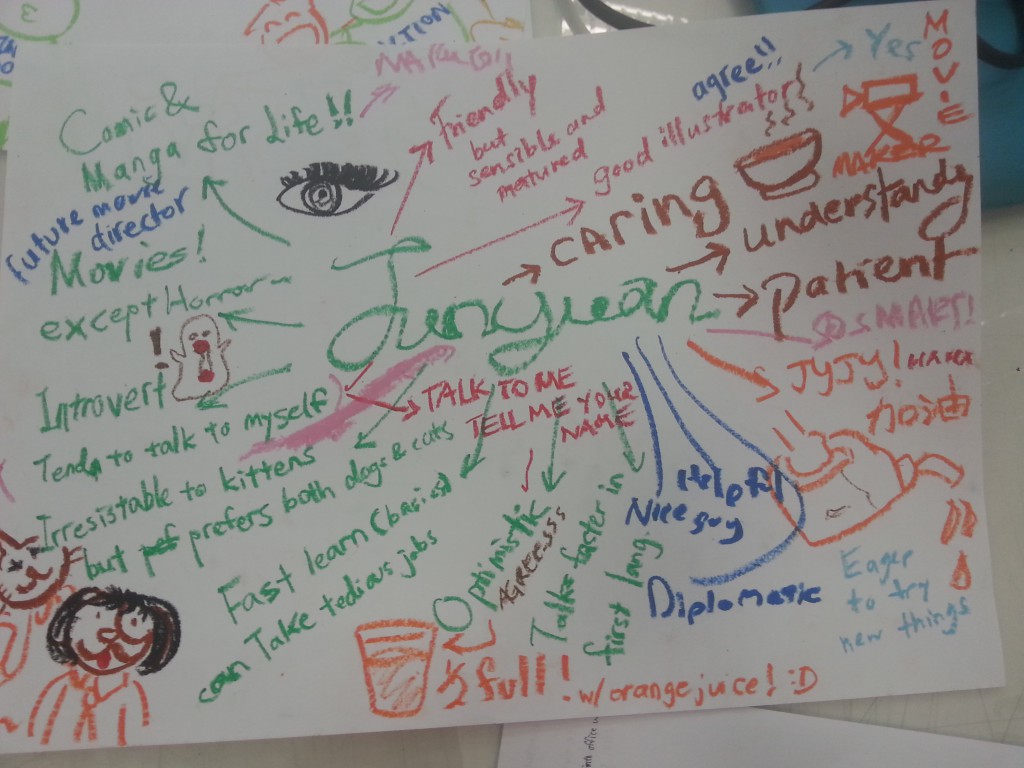
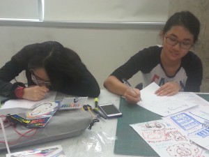
For the first activity, we got old pastel as the nostalgic to present what we know (and wanted to show) about ourselves. So, I wrote about what I liked, what I hated, what I irresistible with, what I care, what I’m confident about, and what I ain’t confident about. After a round of passing, the paper returned as this.

20151022_153529

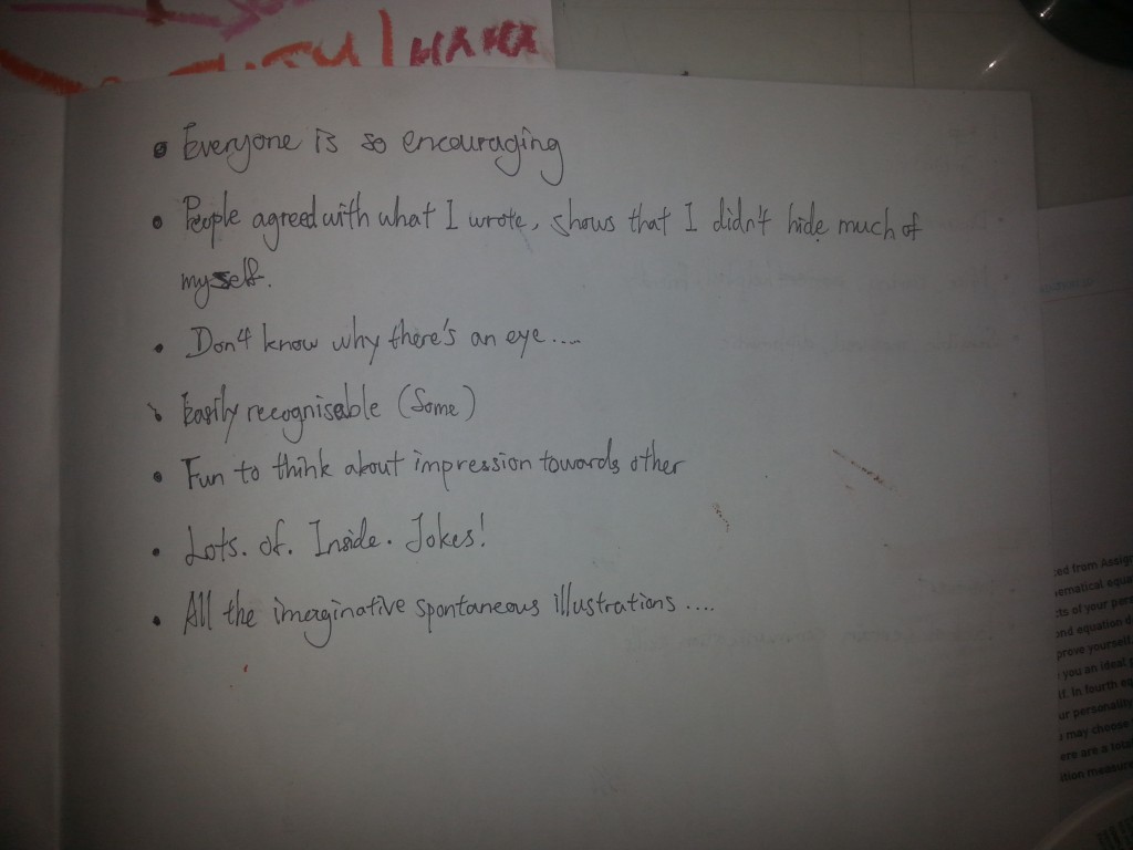
How about my writings on others’ paper. I wrote about all I know about them and the impressions they gave throughout the semester, and what I got are the most beautiful words I’ve see about me since my arrival! Be satisfied b*tch [me]. This is so freaking encouraging that I felt good being myself. Ain’t G1 great?

So all the journey I had for the activity got concluded into point form.

20151022_153725

I repeat! Lots. Of. Inside. Jokes!

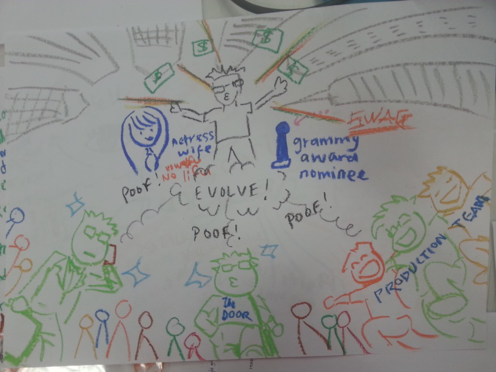
The next activity is to picture the world 5 years from now. At first I felt the world won’t change drastically in 5 years so I scaled it down and think, “My view in Singapore would probably filled up by skyscrapers because they are building a lot right now. ” Then I drew myself, in suit, probably finding a job after graduation. [Who had never try to seize the stability standardize by modern society before leaping out of the box?] This might shows the pessimistic thinking of mine, but I believe that is just a safety net keeping me from screwing up. Then I drew myself, partnering with my friends, in T-shirts, working as free (as in independent) production team. Only the clients and inspiration start our work. I considered this as my initial ambition after graduation. I’ve always envy those who are 100% in charge of their own work, and happy to do so too. Thirdly I drew a myself alone not in a suit in between. I’d probably end up someway in between my previous visions. Freelance? Part-timer? There’s no absolute in life.

Same process occurred and this came back.

20151022_153510

Ain’t great friends always put a smile on your face? Damn this is just optimism at its best. Thanks guys for picturing an exquisite future for me.

20151022_153729

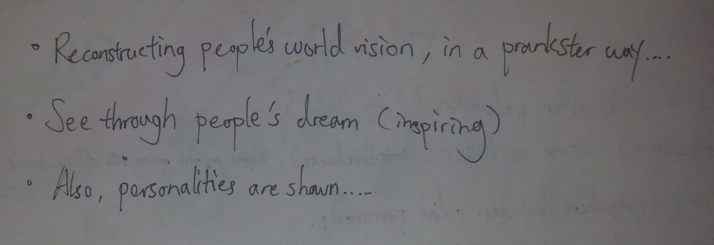
Within limited time, this is the summarize conclusion for the activity.

I was able to see more inner-self of my classmates, and understanding about their vision as well. Okay, some of the paintings ended up an opposite direction but who knows? The future might end up what they joked about. The uncertainty about future is just exciting sometimes.

20151025_215216

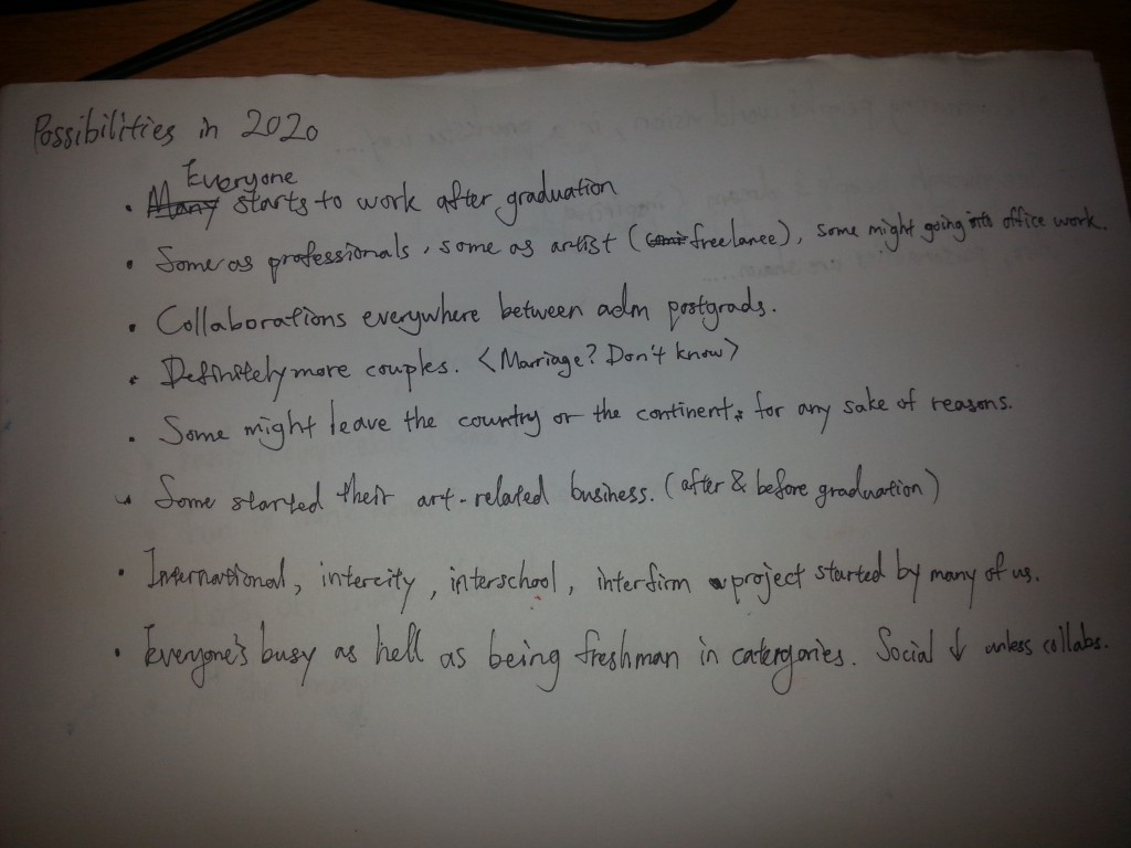
Lastly we had to picture the future in words. I took it serious as I think it won’t differ much from what I see in the people around me. Many friendship throughout my life faded but didn’t disappear. They just don’t shine as bright as they used to. I once believed that the common cliched reality won’t happen to me. Yet there’s a reason people keep producing ‘”so true” post on the internet. It happens, to everyone. I guess if the down side of future reality happens, we just have to improvise. But liked I said, future is exciting for its uncertainty. The list above isn’t that gray as well. Art peeps tend to create opportunities for each other and I think that will be the ones that spark excitement in my future-5-years.

The activities was fun and it’s been a while since I think about these topic sitting besides the toilet. (I thought about them on the toilet, I forgets about them after washing my hands. True story.) I like it when it doesn’t require too much brainstorming but letting my imagination run wild at the same time. It reminded me of how much I know myself and how anticipating I am towards the future. However, to integrate all of these into the EGO project, well, that’s a whole lot of process to go through. Hope it’ll be as amusing as this.

POST-BLOG

20151022_153630

There are two kinds of people in a self exploring activity.

20151022_153644

Finding yourself

20151022_153639

Being yourself