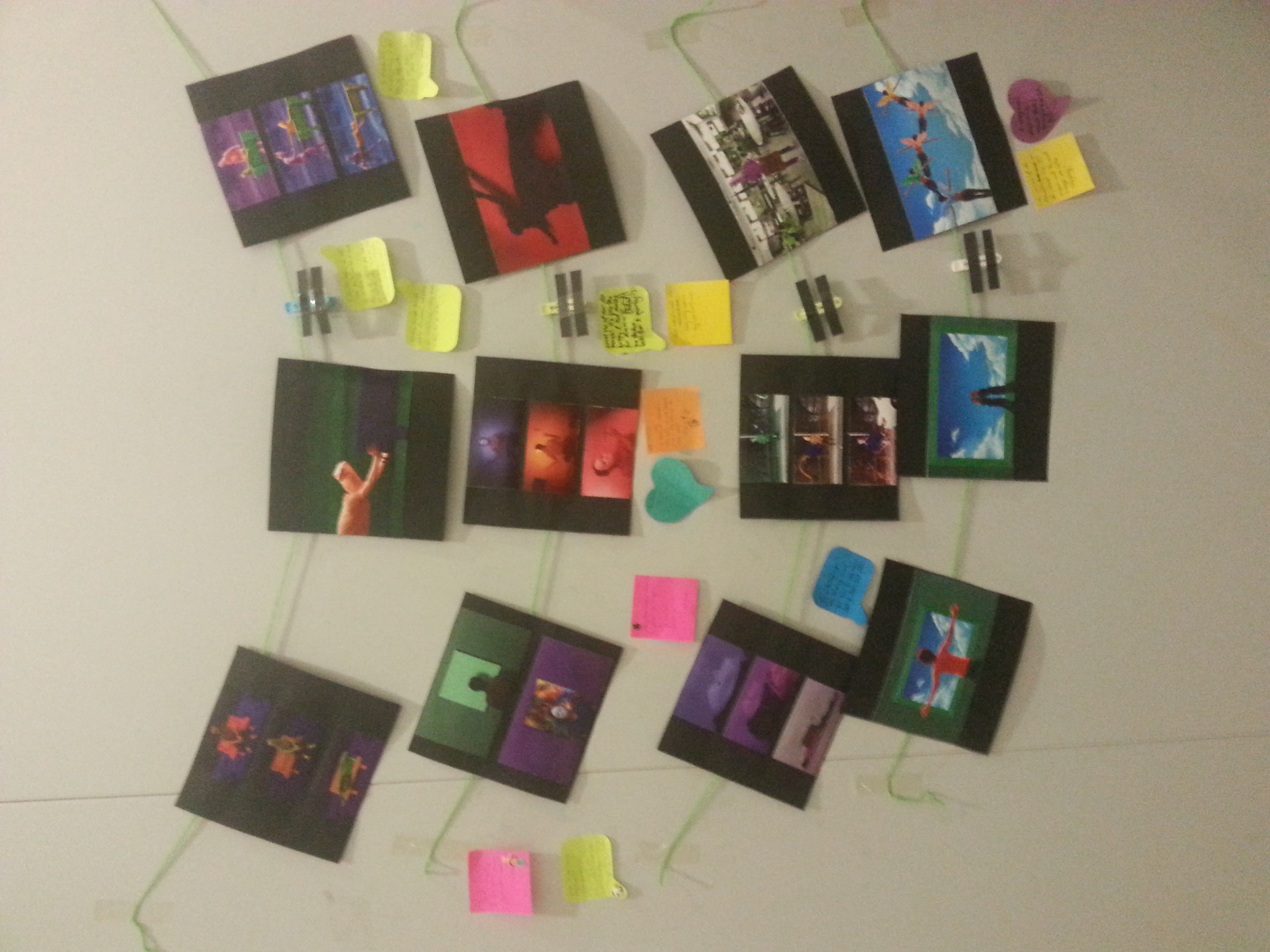
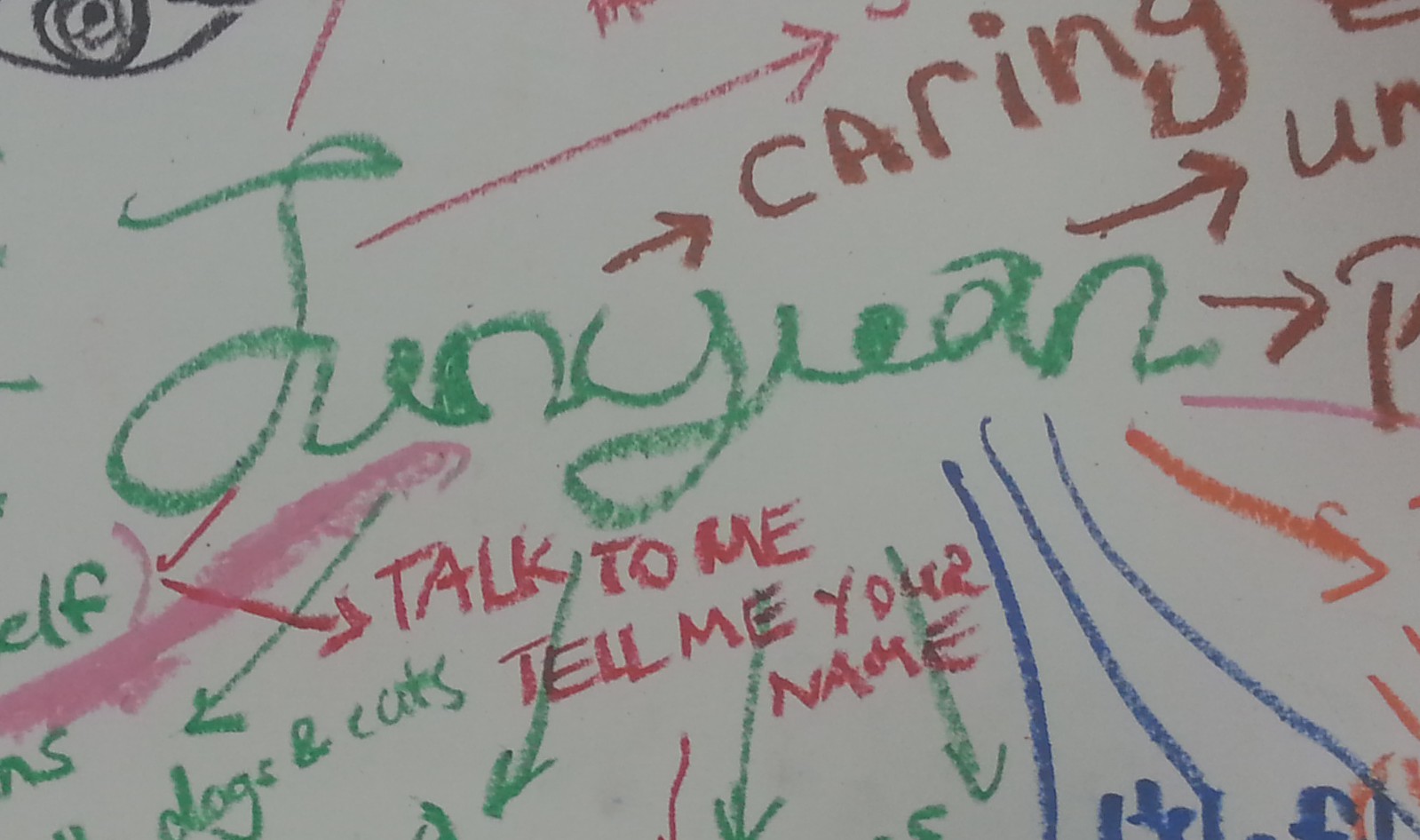
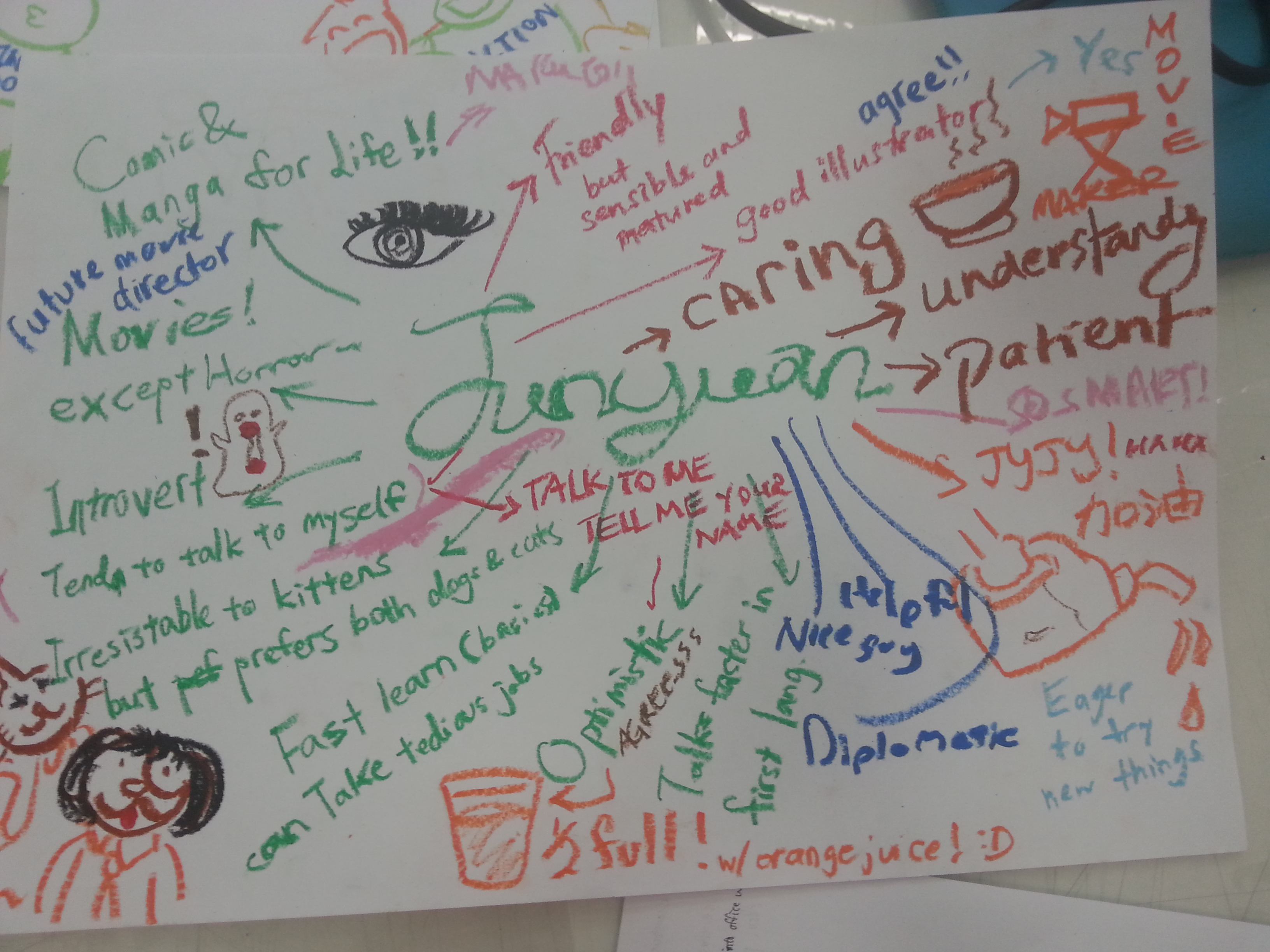
Project Point of View is over and it’s been fun. To show how much fun I’ve been, let me show you my whole final work and progress. Click in, scroll down, do what ya need to do.

The theme I’ve chosen is concept number 3, The Journey of the Pen, with ME. The reason I chose this theme is not only it’s complete but also how thought-out the composition is. A hypothetical transition from the past to the future, categorized in 3 periods of time, two for each. This transition shows how the PEN has accompanied me over the years, and how I hope it continues to do so.

A traditional pen is hard to be replaced as long as handwriting is still cool. A traditional pen, sure, leaves the mistake on, but we are able learn from these mistakes as long as it stays appeared to remind us. IT shows our process of thinking, proving our humane improvement. Okay, I sounded like a person who denies technological advancement, but these pen still has its value until the day Apple pencil doesn’t need to be recharged.

Let’s start walking through my final work, shall we? So the first journey from the past of the PEN with ME, is being through my childhood.

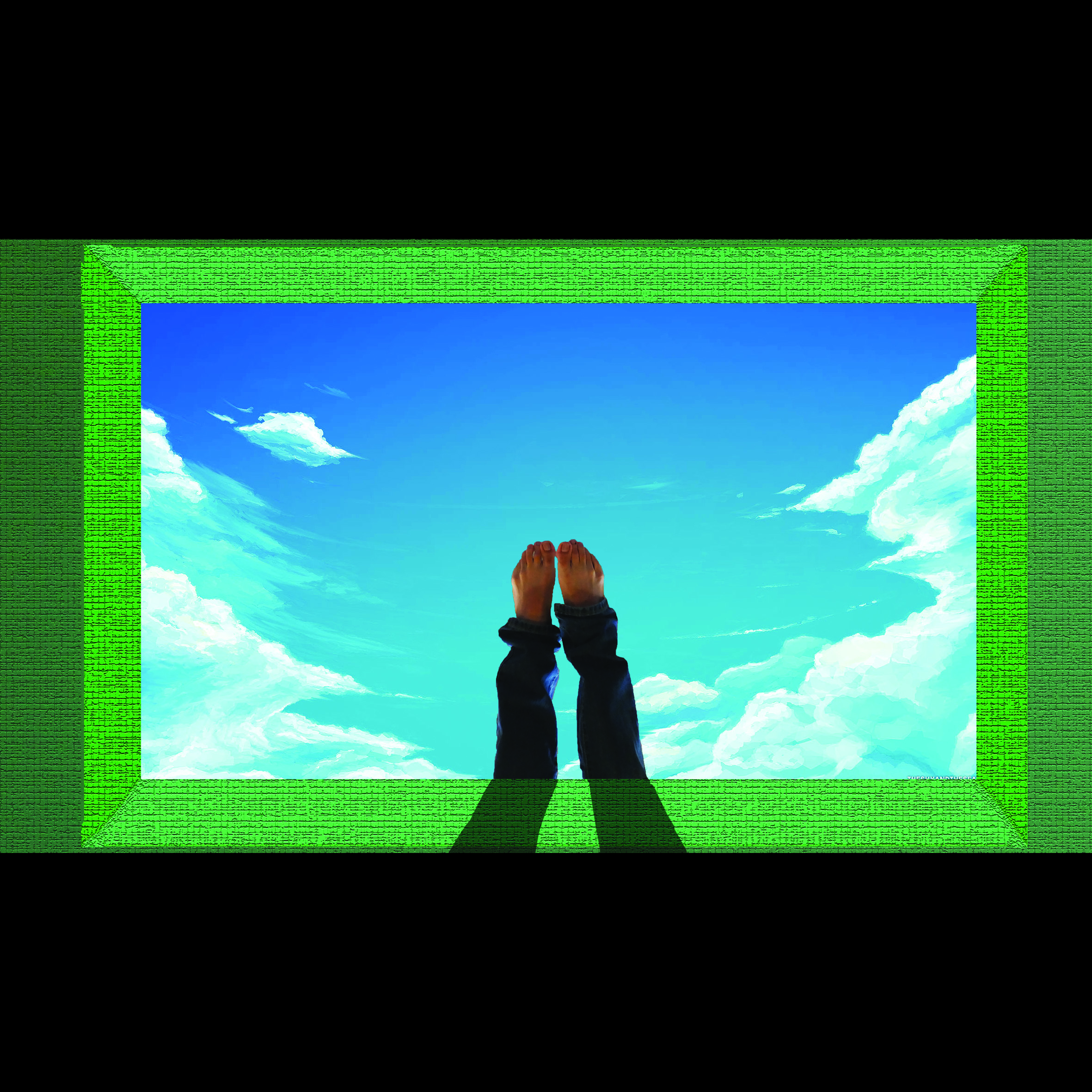
A PEN from the point of view of A CHILD is PENCIL YOU CAN’T ERASED

20160320_165732

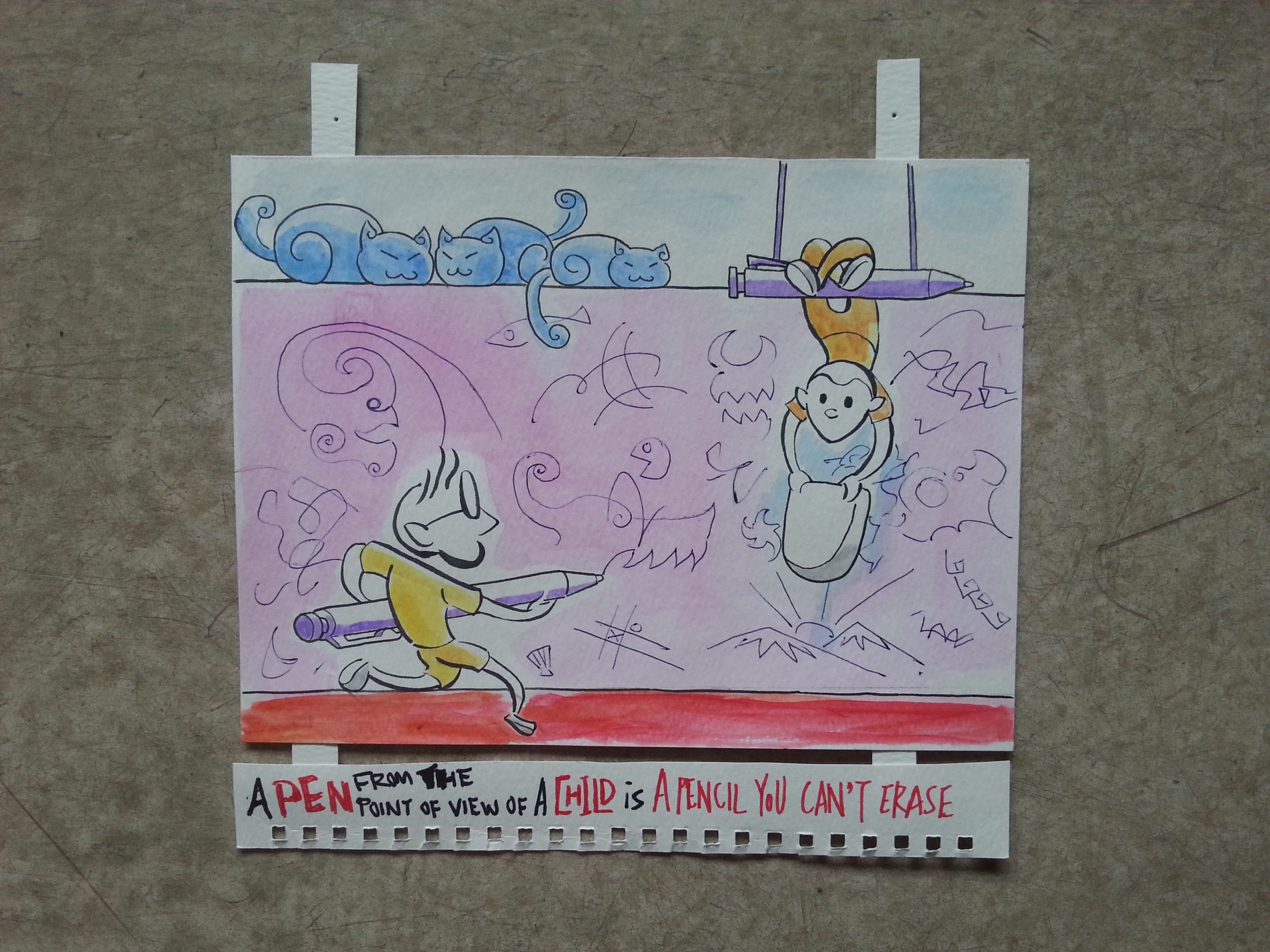
I won’t represent myself to everybody’s childhood, so I’ll just show my own version with my first meeting with the pen. After I learnt how to hold a pencil as a child, I love to doodle in the papers with my bad handwriting and my juvenile drawings. When I first picked up a pen, I was excited and drew so much stuff with it. My curiosity was shown in my naive strokes. I was shocked by the fact that how pen marks can’t be erased. If I make a mistake, it will be there forever. Thus I was very careful with the pen till the day I discover correction tape. However, I find correction tape ruins the papers so I started use strikethrough. Since, I have no fear while using a pen. (But we still can use our pens till secondary school years.)

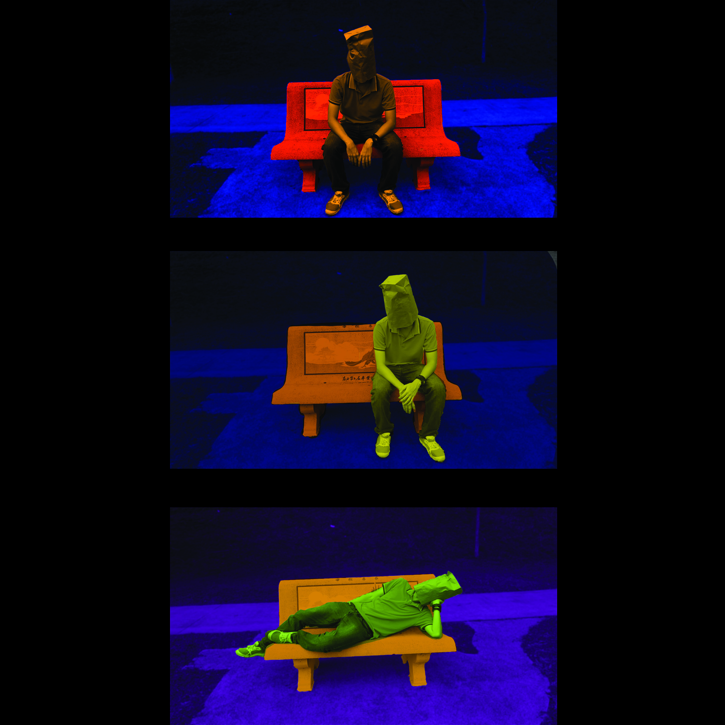
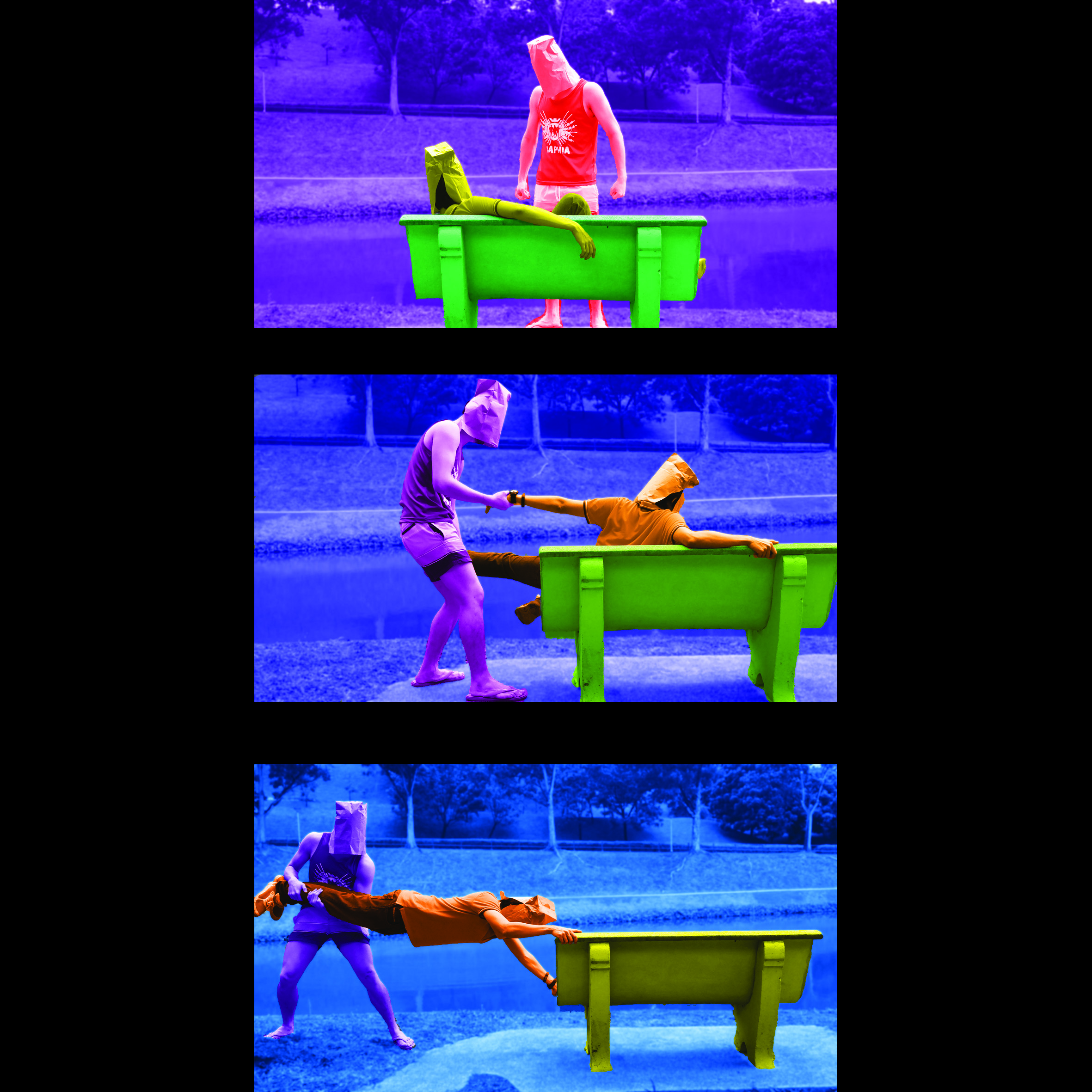
A PEN from the point of view of STUDENT is ARSENALS.

20160320_165755

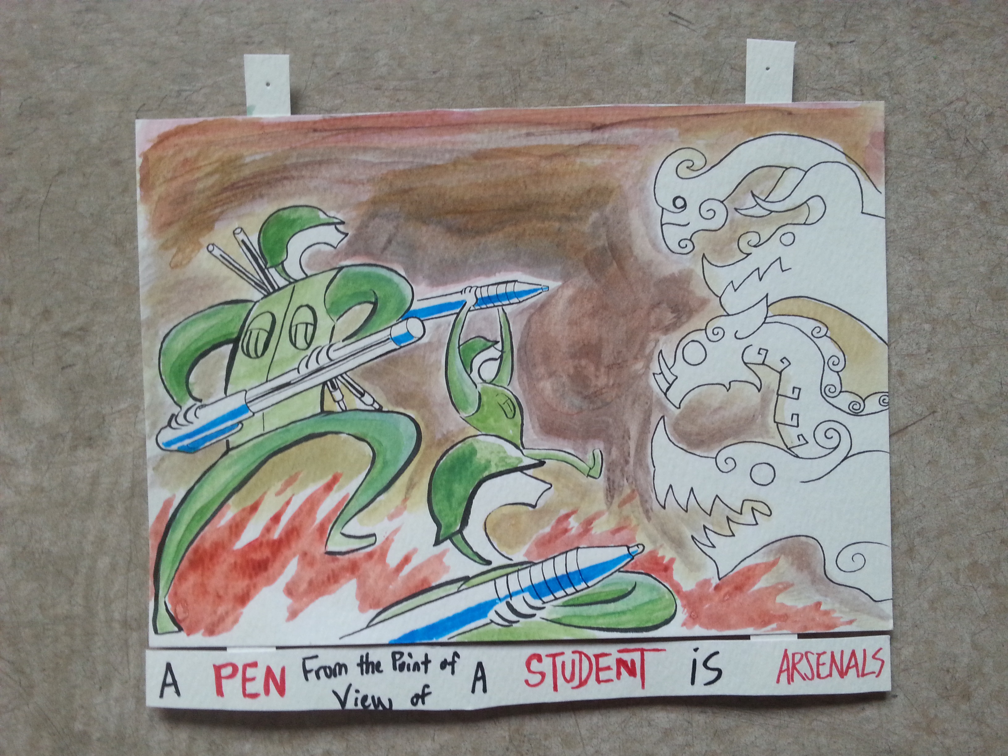
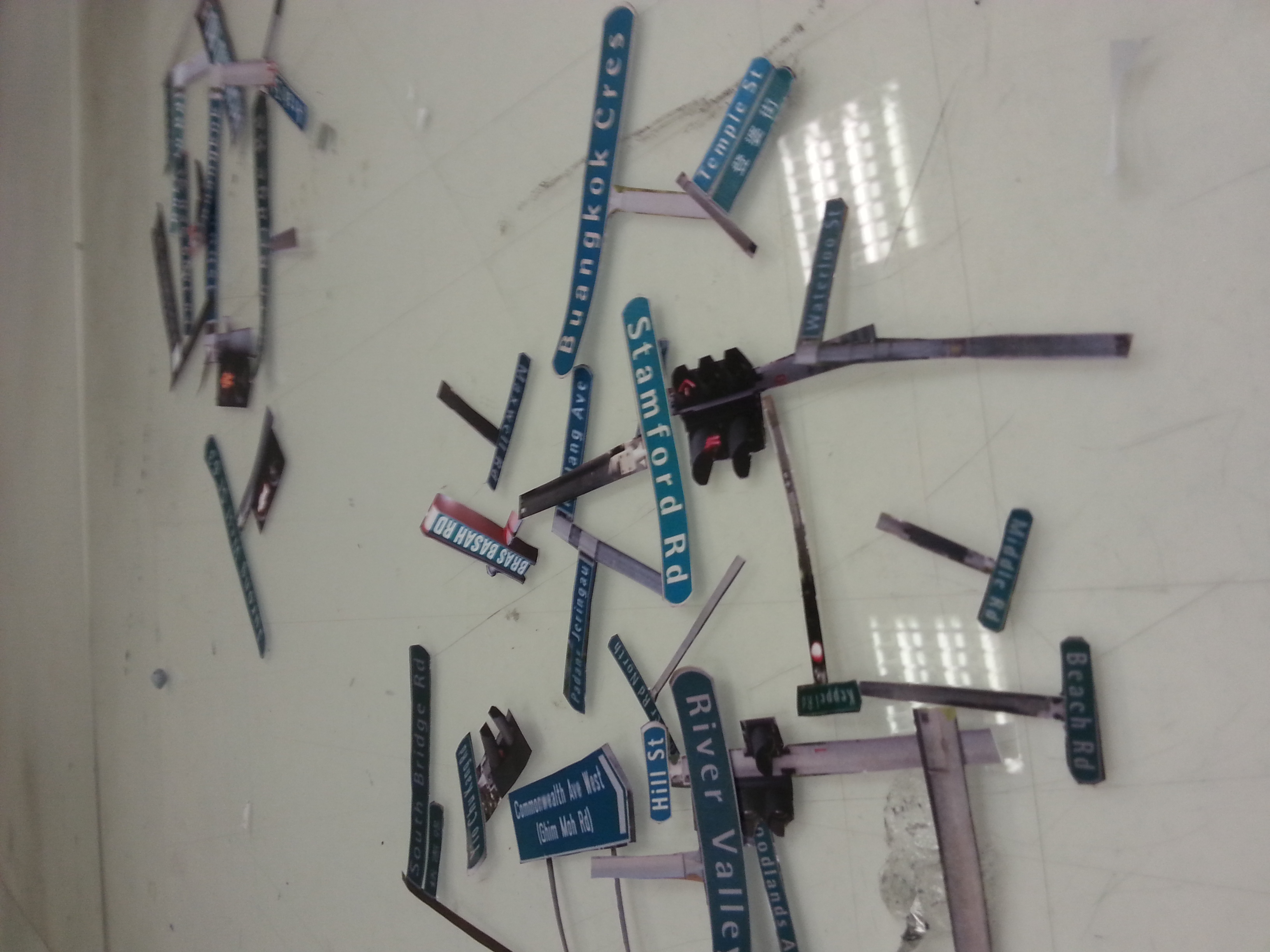
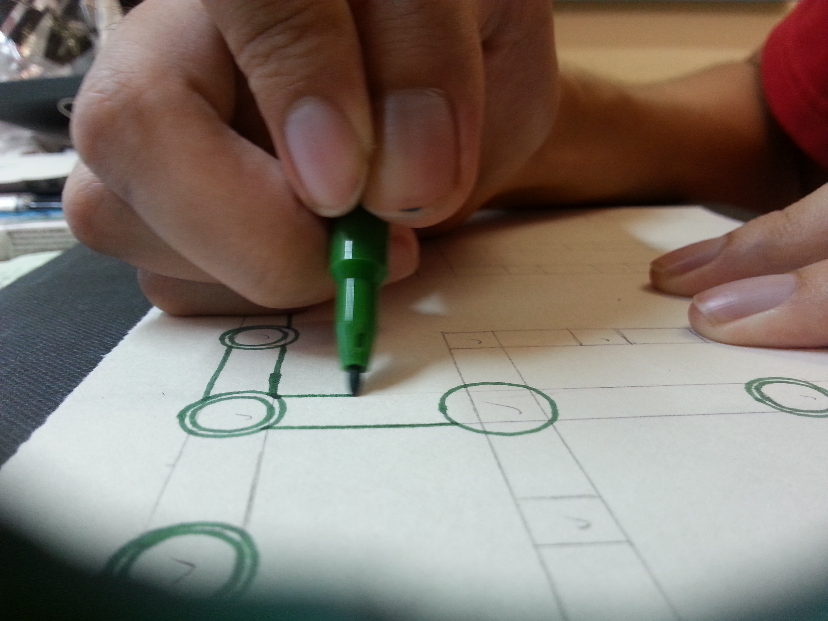
I got my inspiration from a popular manga called “Assassination Classroom”, which stated no matter what our ultimate targets or dreams are, we shall always have our “second knife (weapon)” ready. Even though I wrote “manga artist/filmmaker” countless in my essays, I was living under the hood of a rather strict-about-academics family. I’ve never regretted striving for good academic results as they’ve lead me far enough till now. University is the furthest a good report card can take us to, but I’ll never forget the hellish war we’ve been through in the examination halls. (I said it in the critique session, I’ll say it again. Our real soldiers fight in more hellish war and training, and they fight harder.) The pen is our only offense in exams, and we should never walk into the halls without extra ammunition (extra refills as shown in the illustrations.) Initially, I was going to insert textbook formulae into the white monster on the right, but then I decided, leave it to simplicity and imagination.

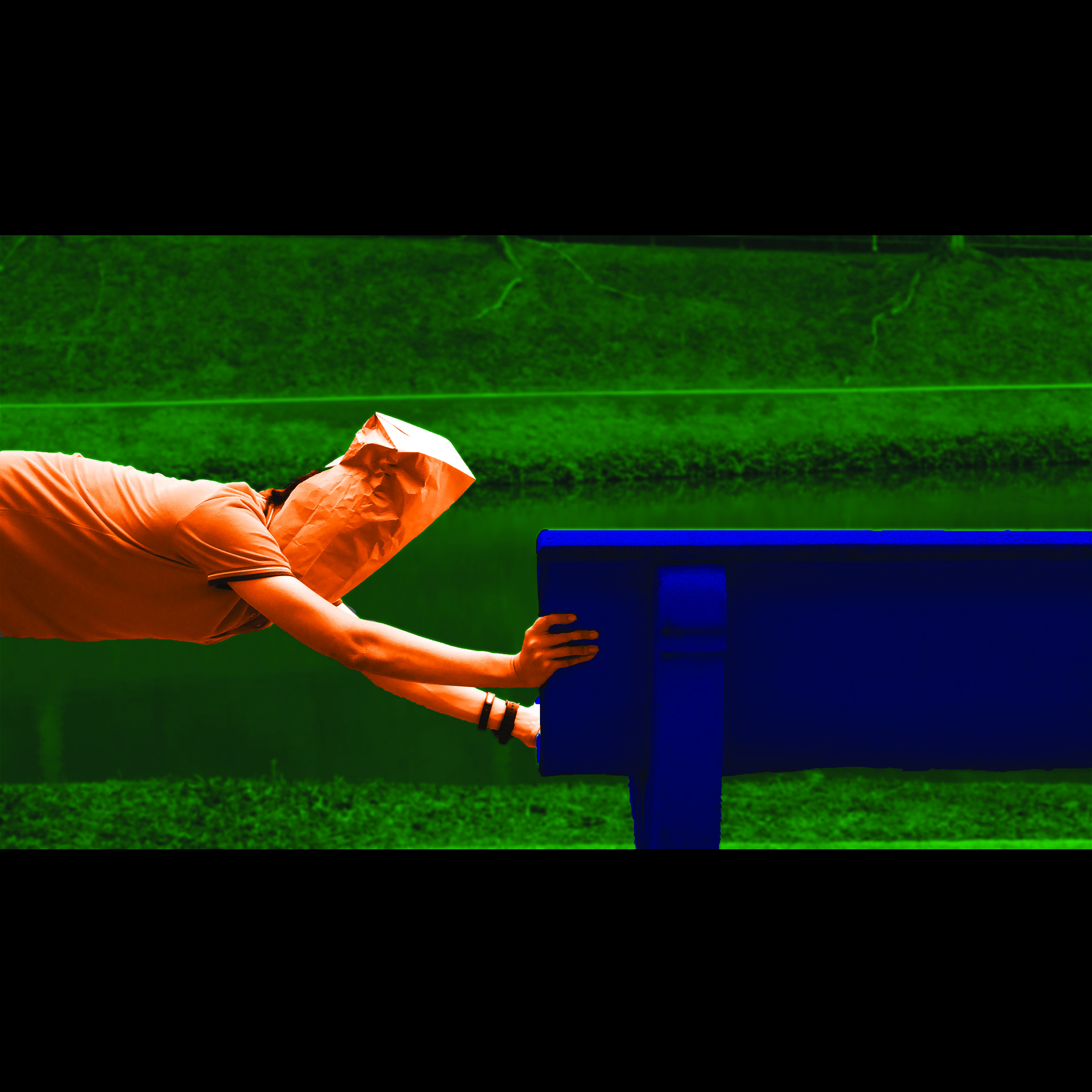
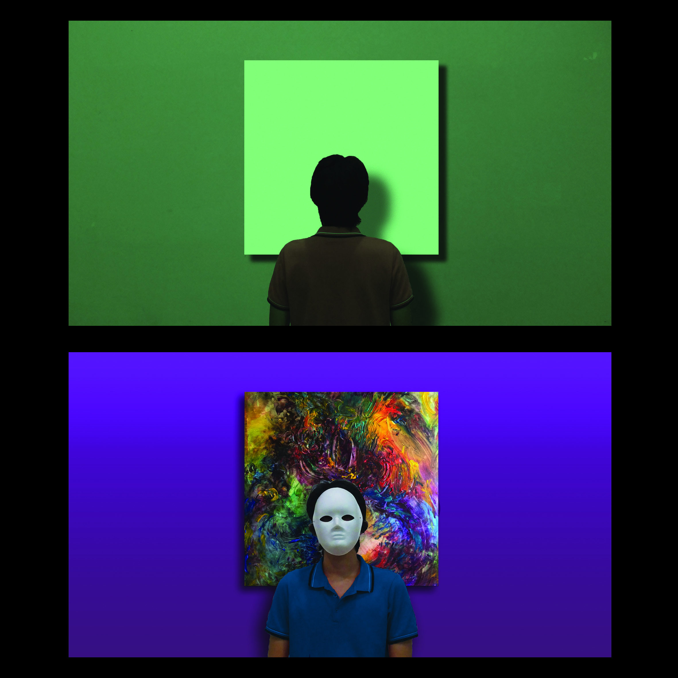
A PEN from the point of view of ME is MIND PROJECTOR

20160320_165846

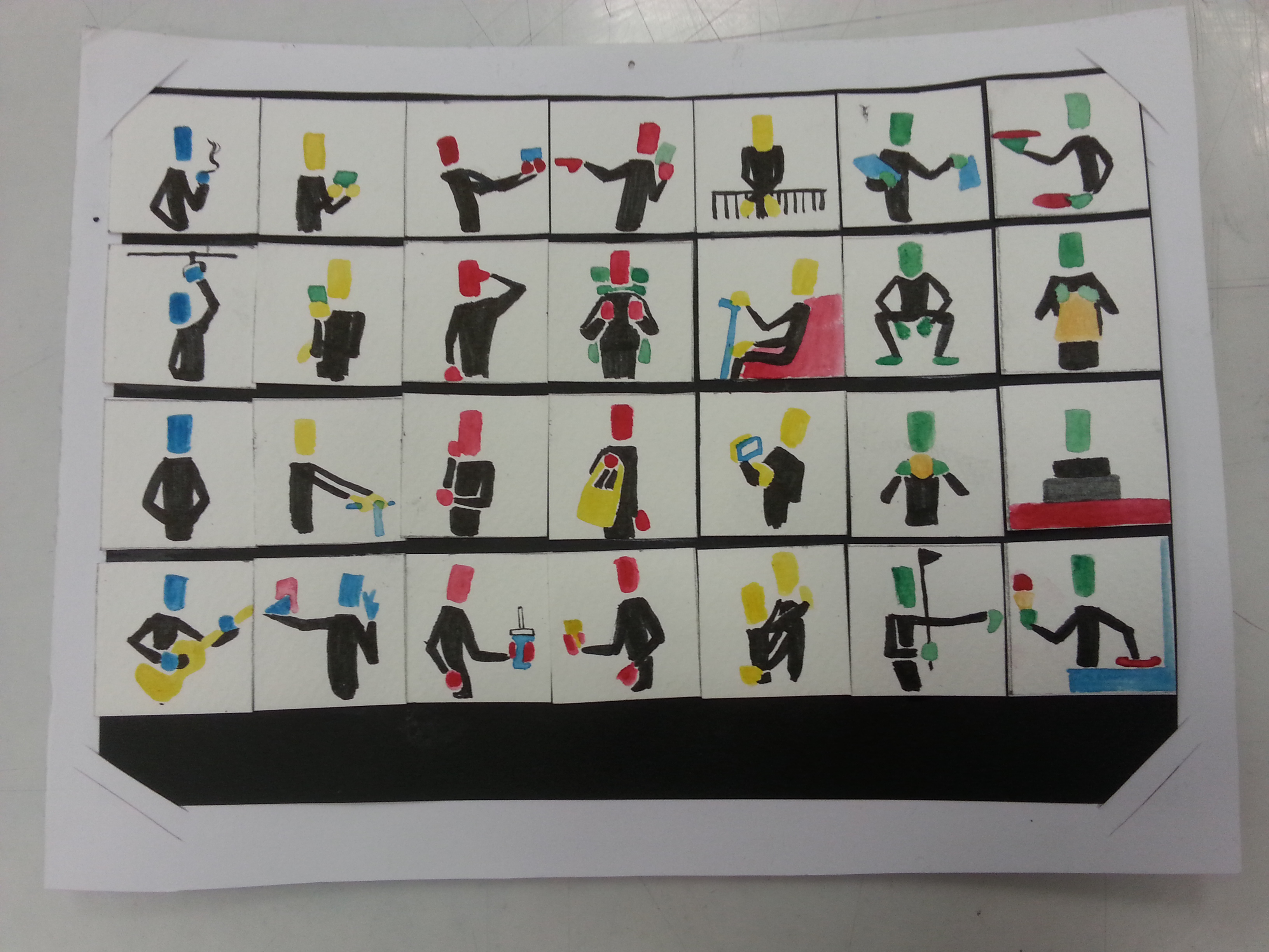
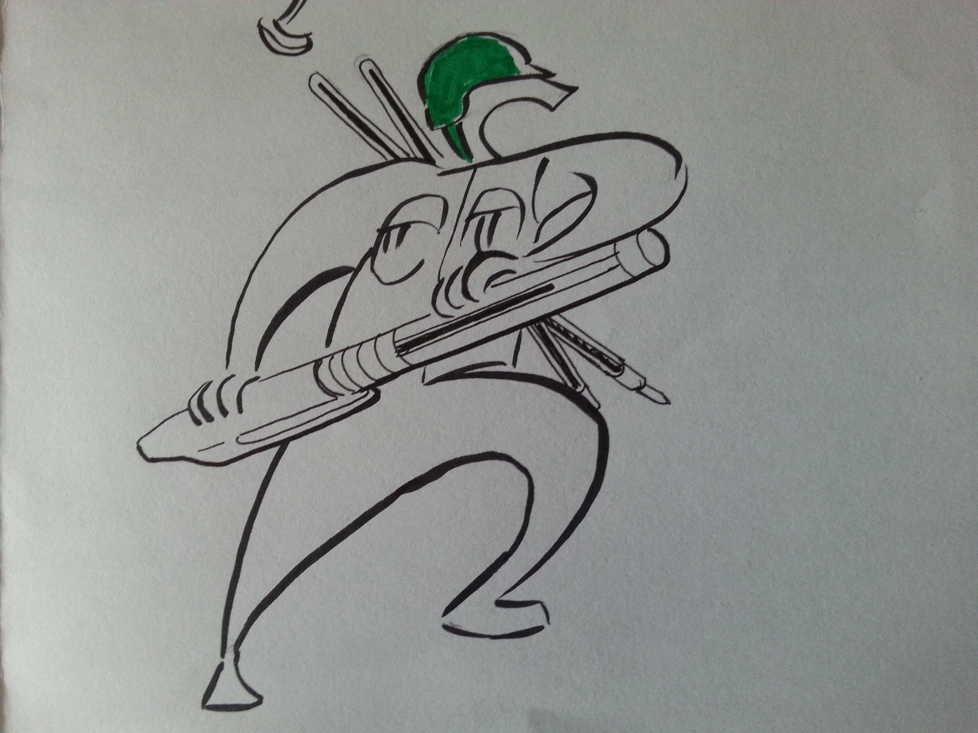
Most of the time, my brainstorming only starts when my pen (especially my ARTLINE fine tip pen, as illustrated.) touches my visual journal. That’s how all my project started since the last semester. Not only it’s my motivator to my procrastination, it also made me take a look about what popped in my mind before revising. For instance, this gruesome composition popped in my head and my pen visualized it. Perhaps this is the best way to show how mind is projected through the pen, in terms of my style.

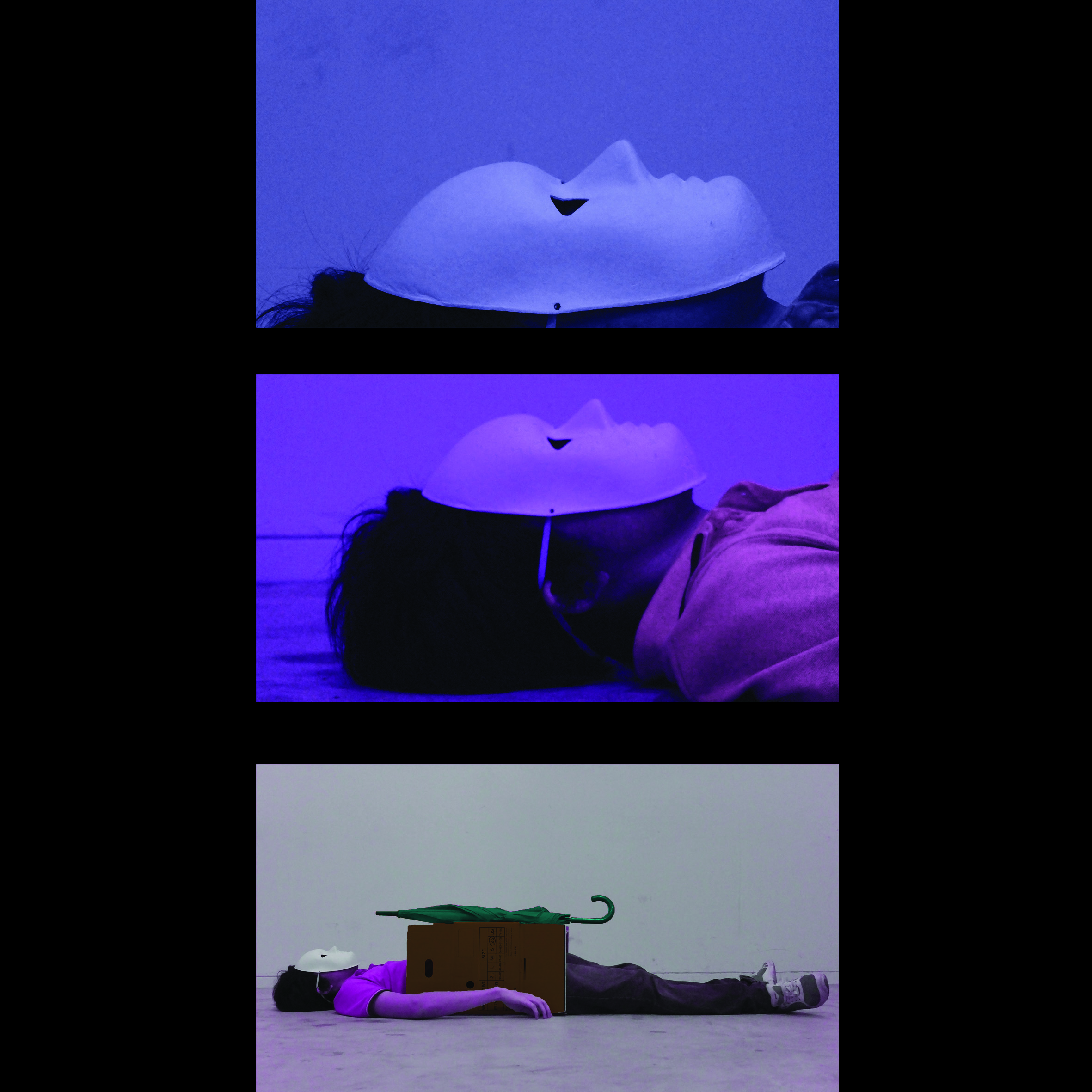
A PEN from the point of view of MY FACE is A FACE MASSAGER

20160320_165901

In present times, as ADM student like every other ADMers, I have tons of assignments to brainstorm, and my mind is not a firecracker that can pops idea every minute it burns. Therefore, there’s definitely times when my mind is as blank as a paper. What does it do whenever I can’t think anything? A face massager, of course, as it pokes every acupuncture points I can assume in hopes to boost creativity. Whoever learnt science here is going to confirm, it won’t work. Poking my skull through layers of meat definitely describes my current state as a learner.

A PEN from the point of view of MY FUTURE is A TEETORUM

20160320_165917

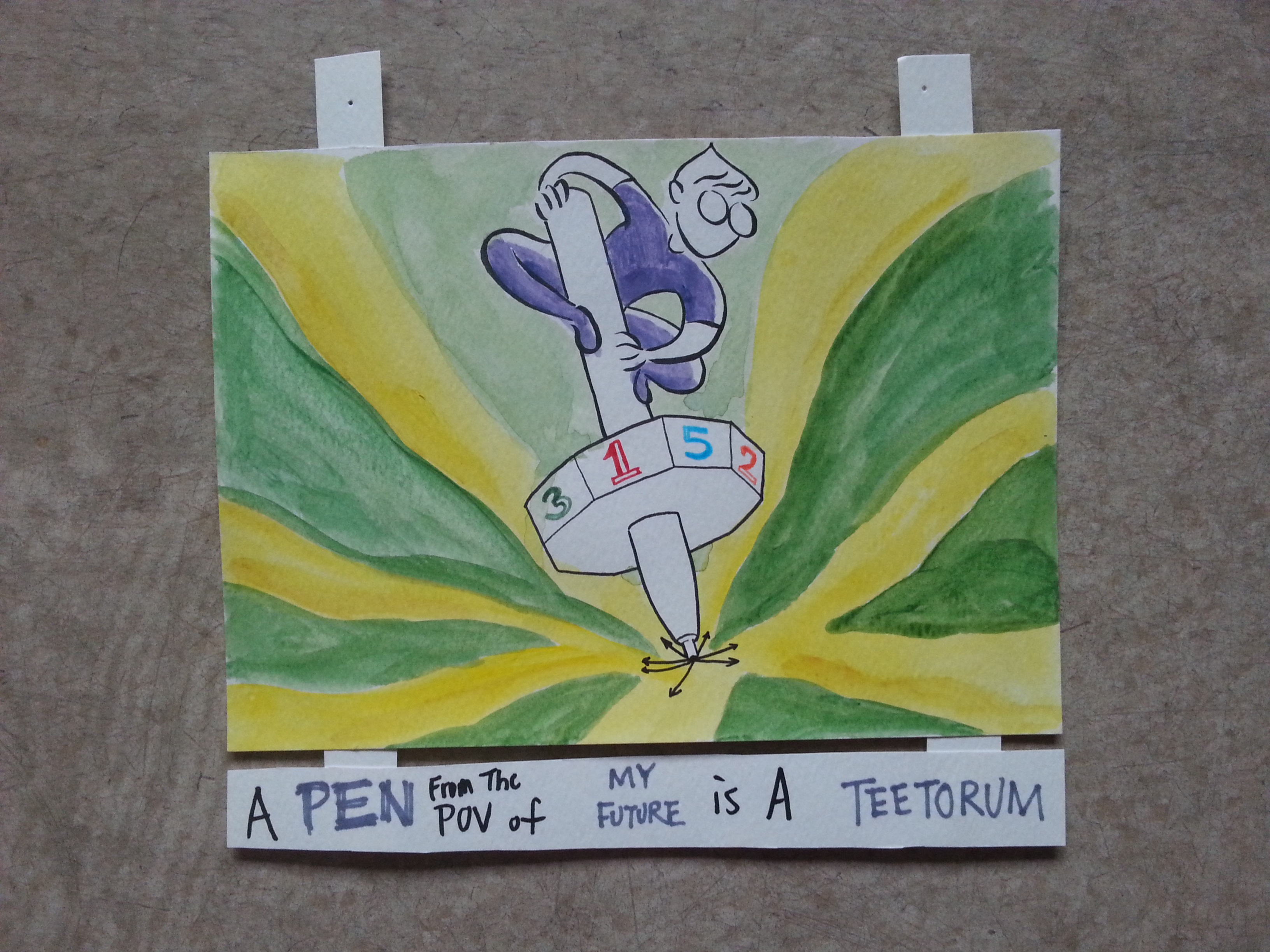
Why a teetorum? Pronouncing makes me giggle too. I doubt that I pronounced it correctly. Teetorum is the given name of a spinning dice. I chose spinning dice as it is a fate decider/diviner that resembles a pen with its stick-like figure. Thus I combined the two together and formed the one in the illustration. As I am unsure of where my future go because things don’t go 100% with plans. But that doesn’t mean I can’t control my fate of where’s my career heading. I believed not only the pen helps me determining my future, but also gives me the authority to do so. Many of my fellow dreamers might holding different version of pens, but I’m sure our ambition about fate will likely be the same.

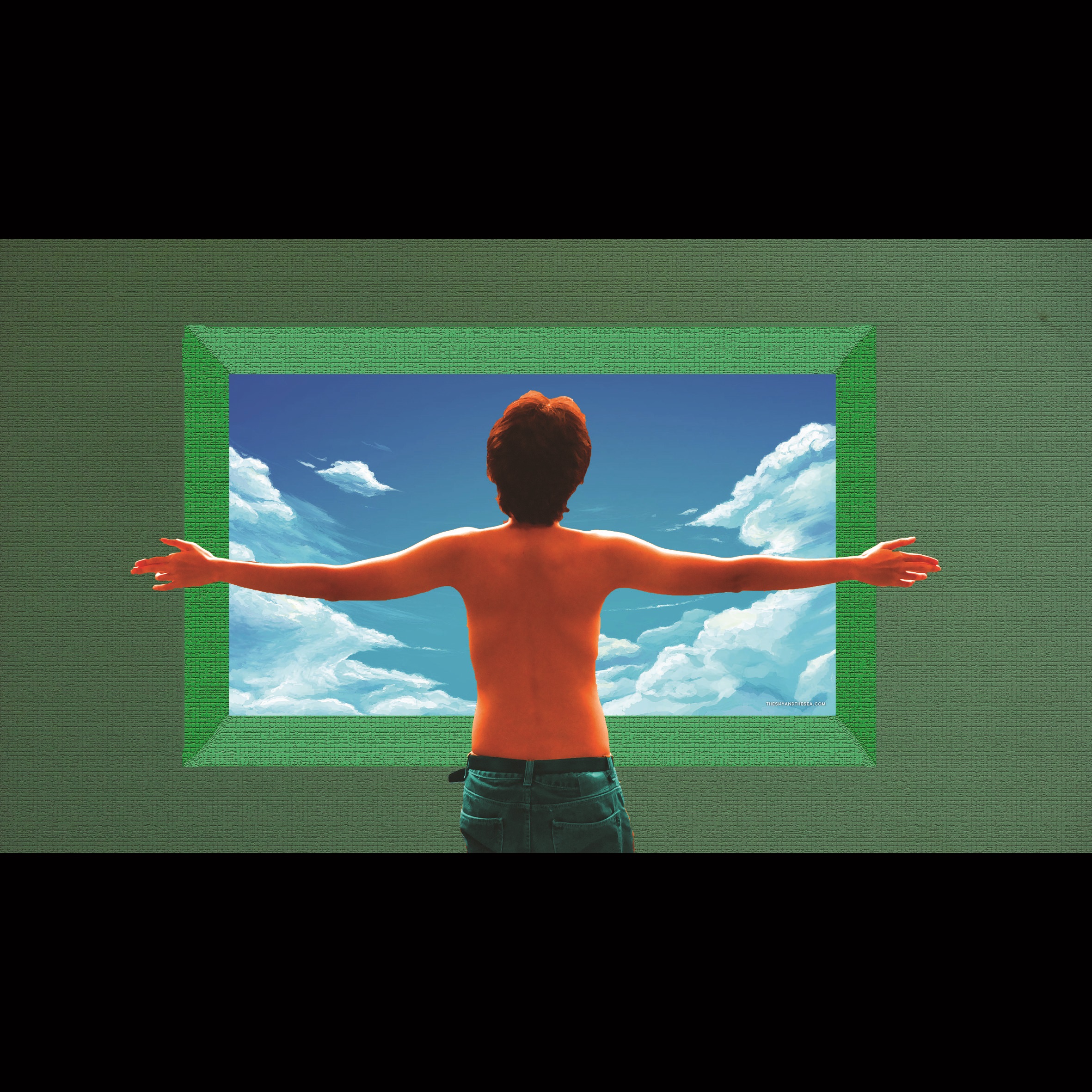
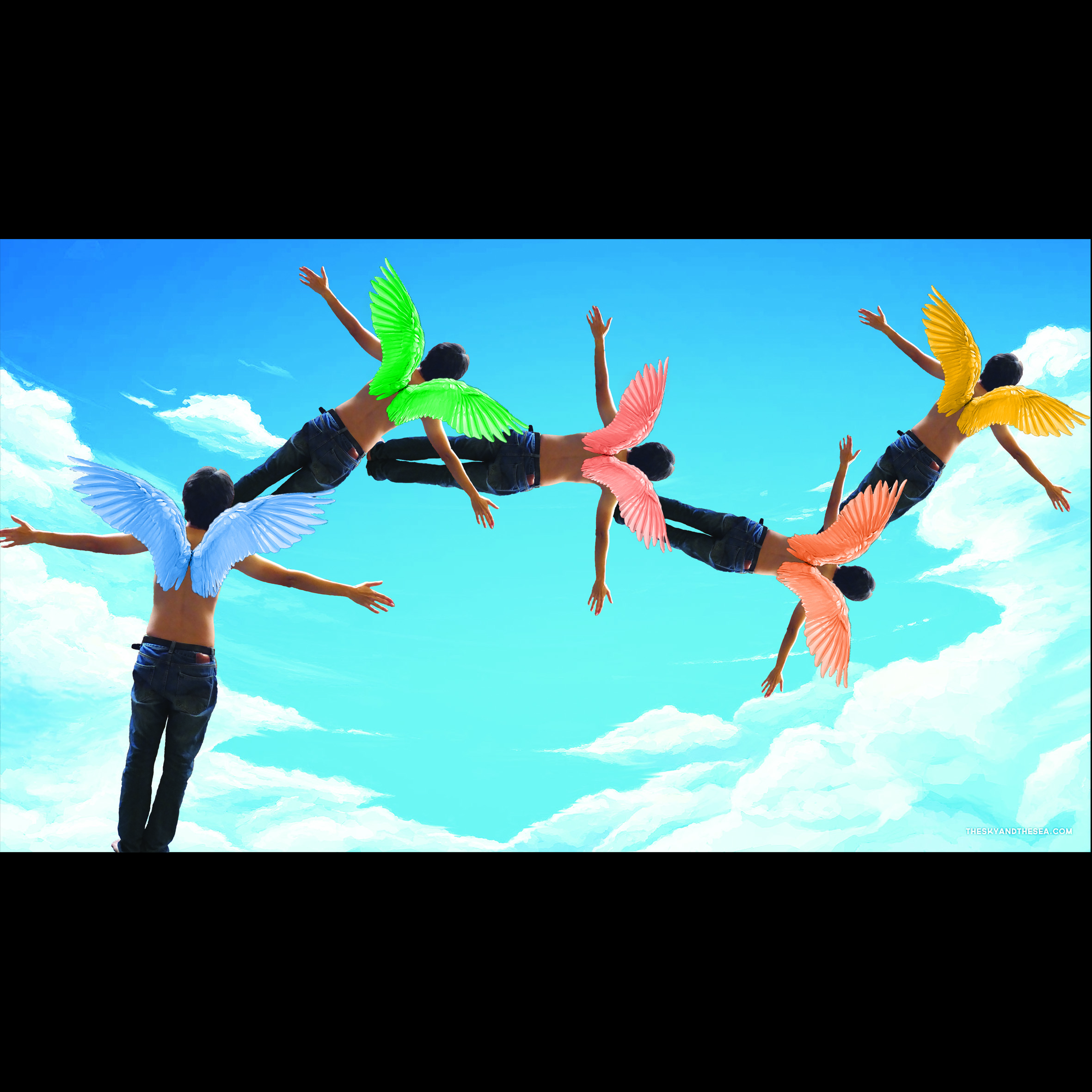
A PEN from the point of view of FUTURE ME is A BELL JAR.

20160320_165930

The future is like a ball of unwove thread. Knowing myself the best, I believed my future will need a fortress of solitude under the possible pressure of my future jobs. Thus my own version of terrarium is formed. Even in my present days, I find my time-to-time fan art ink illustration meditating and relaxing. The pen shields me from all mental disturbance ever since and I hope it will do so in the future. And what’s not a better way than placing the pen as best inanimate buddy in the last panel to wrap this all up?

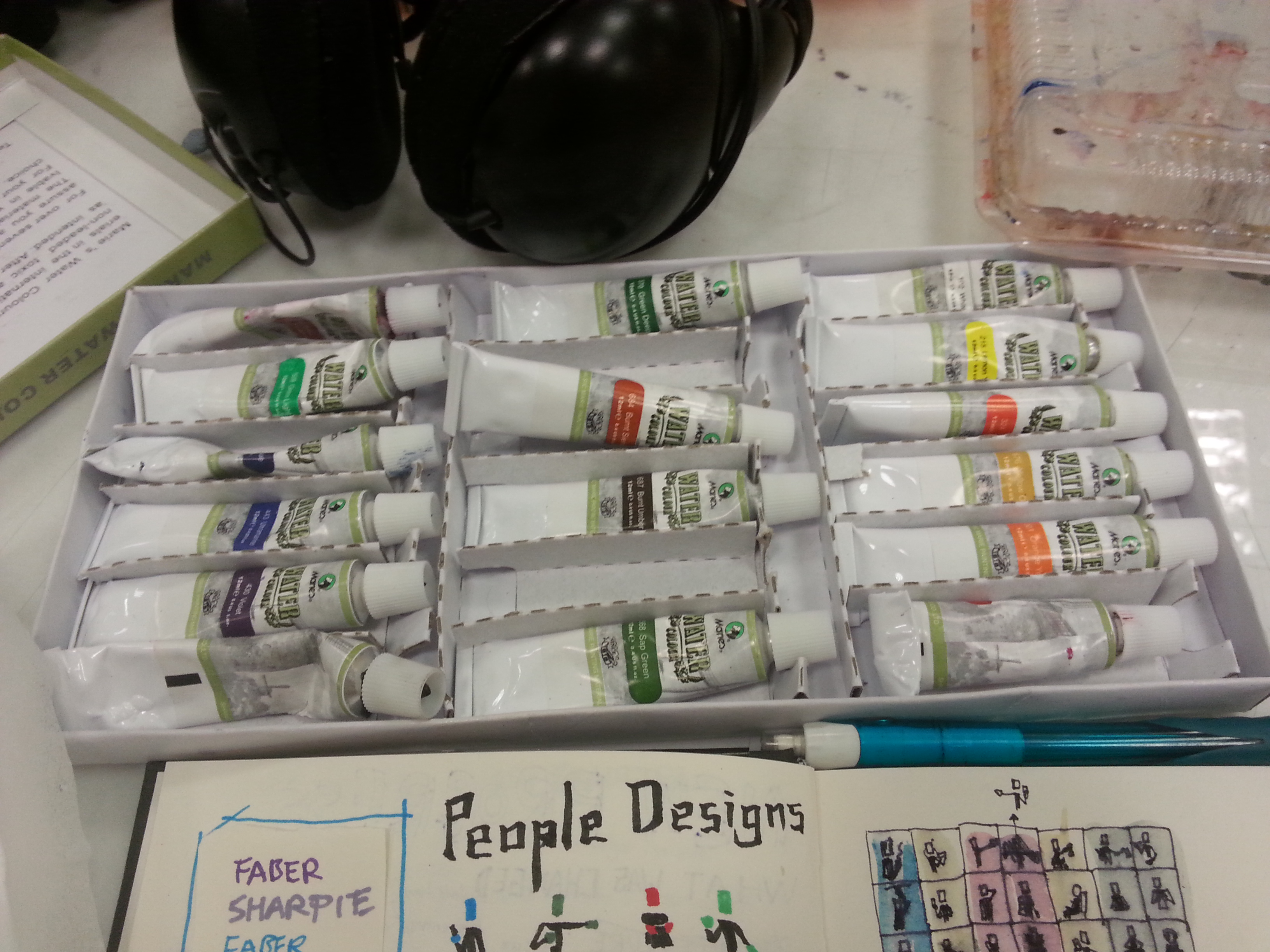
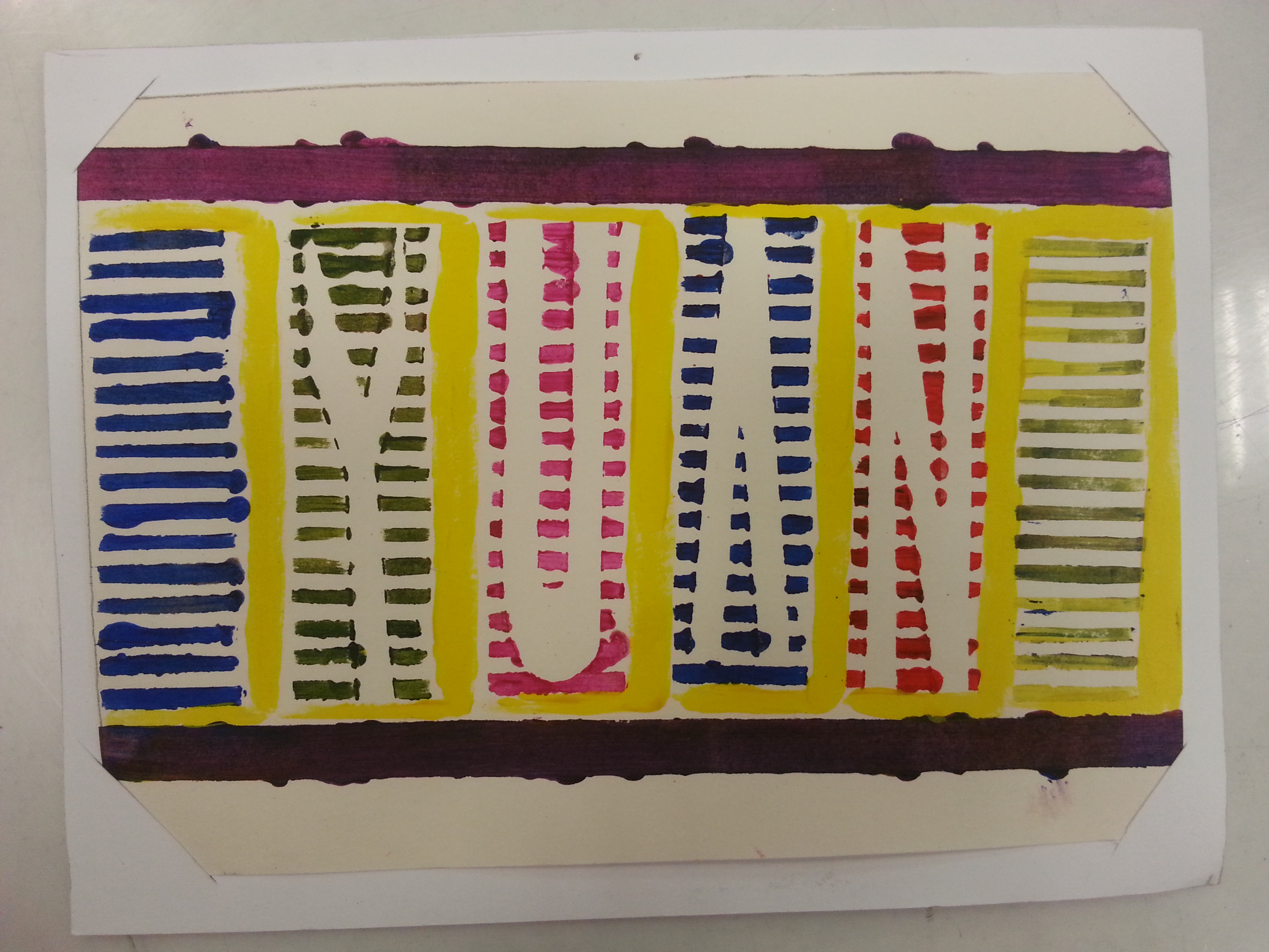
I decided to go with diluted acrylic because it greatly resembles the effect of water colors and acrylic is the most abundant art material I have. Diluted acrylics to me is like a pen to my childhood. Why? Acrylics can be corrected in its oily state but once a mistake is made in its dilute form, a saturated form is needed but it will then destroy the effect I intended. Fortunately, they all worked out like a charm. This is probably the first I resisted the urge of fully covering an illustration with colors because I found there is an effect of dragging attention to those blank space by not coloring them. The work also trained me well in using brush pen as the main inking tool.

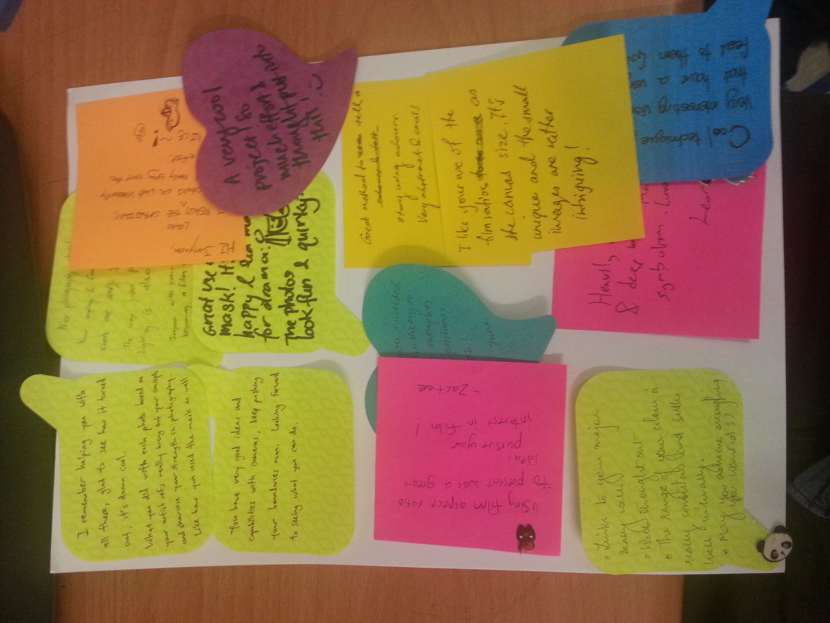
Overall, my fellow classmates like my use of the thick and thin ink strokes. Even though I’ve used the character style of Adam Lurkam and the attempted imitation of Jacqueline Bissett’s strokes, the viewers in the critiques agreed that the work projected my personal attributes. Moreover, it does succeed the children illustration look I wanted. I am satisfied with the outcome and the traditional medium I’ve challenged.

I have to mention everyone else in my class did a splendid job in their work as well. I am going to miss the times we get to spend in such eye-opening critique sessions. Looking forward as usual to everybody’s zine works!

Thanks for reading!

You’re God**** right. —- Walter White, Breaking Bad. (Not a fan yet, just because it kinda fits.)

Project 1, TYPOGRAPHIC Portrait Problem has finally ended, and there goes my first presentation of the semester.

So, to make up the whole progress, I’m gonna start from where I stopped.

20160215_204502

I’m not a big nerd on architecture, so I decided to stay as an interested audience of the art of buildings and cut off the composition from my set to fit the 4-frame-project. Moreover, filling up the building’s shape did not work as strong as my other compositions in terms of subtleties, and fine tip pens are not challenging enough either. Cutting away the pedestrian paths and underground tunnels are due to the potentially overcrowded components. Since its idea was started from the escalator itself, so I just simplified it as the medium is a tough tool to control as well.

TYPOGRAPHIC PORTRAIT PROBLEM

My Name is

20160218_182525and I’m a logical person.

During my city exploration, I was unable to use internet data or GPS due to my financial restrictions. Thus, all I can rely on from getting lost are the locality maps from the MRT stations, and the STREET SIGNS on my way. This method of navigating shows my logical attributes when finding my way in the city.

20160217_202406 20160217_210626

Once I am familiarized with addressing format of a town, I won’t worry about not finding the certain locations as these street signs aided me big time. Also, I think I got my directional sense from my dad, so retracing my route was never a problem either. (Unless the scale and complexity of the city was too overwhelming.) I’ve paired the idea with collage making, the medium used by DADA when they first establish. Therefore, I considered it as a form of real life photoshopping as it requires certain amount of logic to piece every component together. The street signs are chosen based on all the streets I’ve been during my stay in Singapore. Some were photographed on the spot, some were screen-shot from the blessed Google Street, therefore resulted the major difference in their brightness. To find my name, just simply spell out the missing letters that were replaced by the white boxes, and you’ll be logically reading my name, just as the piece intended to be.

20160217_230055

However, it certainly has flaws. From the feedback of my fellow classmates, they were distracted by the sign posts thinking that my name hide between the negative spaces. After my clarification, they liked the idea of hiding what I wanted to show in this typographic portrait.

My Name is

20160218_182512and I’m not afraid to be weird in front of the citizens.

Why the caption? This is because I often (not always) ask stupid questions when I’m exploring around the city. I am thankful to every pedestrians who’ve helped me when I was confused or oblivious about the directions. (Yes, despite how confident I sounded just now, that do happens.)

20160216_221417 20160216_221350 20160216_221435

There are different faces in every trip, and I definitely can’t remember how they all look like, that’s why I chose to design them in monochromatic black-clothed figures, which symbolized how rare we meet each other again. I wanted to present many identities, therefore I scratched through all my memories on the streets, in the train, or in certain locations. The figures are designed with identifiable common gestures. There are arranged in a way that you are able to see my surname LOO for a certain distance, which achieved how unrecognizable I was in a big city. The medium I used for this piece is water color. Mistakes made by water color can be easily covered or blended out, thus suiting my piece of not afraid to ask the wrong questions. (Mainly also because I am less likely to see these individual again.)

How my classmates mistaken it as a printed work was a compliment to me, even though some have commented that this was a little out of place among my whole project. Moreover, not everyone are able to see the hidden surname in it. Perhaps a better design need to be implement for a better effect next time.

My Name is

20160218_182423and I’m a confident person.

That’s some big words to say. I believe my confidence are shown clearly in my previous piece, but the confidence is difficult to build. It requires many assuring factors and abilities to form my confidence, just like how the Singapore MRT connects the cities. (This is not an advertisement.)

20160215_204449 (1)

Testing for the right hue

I resembles confidence with MRT not only due to they’re confident that no station was wasted in terms of utilization, but also due to how confident they are with their arrival time estimation. Back in Malaysia, it was until the 2010s that our public transport placed the arrival time in their clocks as they are constantly late and delayed in the previous decades. Singapore MRT did not disappoint me with its estimated arrival time almost every time. (Yes, almost, because there was some breakdowns.) I picked the piece to represent my middle name JUN as this attribute only can be seen by people who began to know me.

20160215_205544 20160215_210617

The piece was drawn by Sharpie and Faber Castell’s markers. Their ink penetrates the paper easily therefore it needs to be used lightly. Using it tested my limits in controlling their color tone, perfecting the circles, (I’m still a human after all.)and maintaining the straight lines without any ruler. (Many illustrator are able to do this, so I considered an challenge from my idols.)

20160215_210225

The feedback for this are mostly positive, so I was relieved the whole composition worked out. The bigger challenge is to make it recognizable to the viewers but avoid making it too complicated.

My Name is

20160218_182410

and I’m a curious person.

An escalator form a bird eyes’ view is how I express my curiosity. During my exploration, most of the MRT are either in the elevated or placed underground. Thus much of my exploration time was spent on this particular transportation. It is the fundamental portal I must go through to see a new street, a new surrounding, and a new city. Within half a minute taking the escalator, my curiosity towards the scenery I’m gonna witness elevated as well for the next 30 seconds. For this new found attribute that’s been hidden a long time, I paired it with my YUAN as it probably can be seen by people who knew me well or solely myself.

20160217_215642

To suit such special attribute I found in the escalator and myself, I’ve chose the method of print-making. I’ve cut a template out of a slightly heavier paper and cover a piece of an alphabet shaped paper with the template. I believe my curiosity is not as black as the machine’s original color, so I chose my acrylics as the coloring medium. Acrylics are way thicker that water colors but their saturation resulted a ideal tone for this piece. The thicker they are, the easier it became a disaster. I had to redo a couple of times before I am happy with the end results, and the disaster happened during a desperate times. (the night before submission, my friends.)

20160218_013038

Some of my classmates are intrigued by the idea of taking a new perspective for the neglected machine. The overall project was appreciated and I am happy for what I’m able to do with my new limitations. (not doing the film things.) Ms.Joy has commented that the work accomplished its purpose for leading the viewers to a new perspective of my hobby, and it can be further enhanced by placing the piece in different spots.

The work was a success for me despite the aesthetic aspect of my classmate works are better. However,  I could learn more in contextualized my future work from the beautiful works of my classmates, through this project. (Perhaps a better time management would be good as well.) As always, I am looking forward to everyone’s next project.

Thanks for reading!

20151119_201922Finally we submitted the most tedious working, RAM/traditional skill consuming and brain consuming assignment of the module so far. It’s fun in the process, I am not gonna lie, and I’d like to thank again my fellow classmate JORDAN LEONG for helping me with the photo-shoot and being the cameo in parts of my project. Both of us are glad how they turned out in the end.

From the photo you can see how it was hanged on the wall. I didn’t want it to be tucked by 48 bobby pins as it would not differ from my previous projects. Therefore I improvised with the remaining yawns I have from the 3D module and some of my laundry clips. My classmates reminded me during the presentation that how they looked like developed films from the darkroom, which linked them with my concept perfectly. Overall, the presentation was a success for me because I was able to explain every point of their creation without leaving anything vital. (A flaw I am slowly correcting.)

Ms.Joy was very satisfied with my concept, artist references, color usage, strength of subtleties within the continuing items and how I tied everything together. It can’t be flawless, but the whole project has completed its function: explored my inner self and conveyed them to the viewers. I once again have to thank Ms.Joy for guiding me throughout the process, providing many artist references and context to look out in my work.

20151119_225240My fellow classmates have been a great audience from the start of my presentation. They left encouraging comments as usual in either verbal or written forms. Having such encouragement from them has always been a motivation for me to improve.

Even though today’s presentation has occupied 7 and a half hours, but I felt enriched from seeing how everybody put so much effort into their project. Everyone has developed a strong and distinct style of themselves, broken each every restriction they had and presented an extraordinary show today. I can see how they have worked and brainstormed restlessly to make their best final project. The spirit of “SPOIL MARKET” seems to be spread throughout the class and flourished. However, I have to improvise the quote from The Incredibles’ character Syndrome, “When everyone’s spoiled the market, no one is.” But the “market” has been raised.

The greatest thing about ADM classes so far is, we always look forward to what our classmates going to present in the next project.

To Ms.Joy and everyone from G1: Thanks for everything throughout the semester, hope to see you guys and your masterpieces next semester!

{END}

Our lecturer Ms.Joy commented on my previous and quoted, “What about, then, the role of ‘tinting’ due to their own upbringing or indigenous use of colours prior to commencing on these portrait photography works? How then does this insider, or even, inside-the-insider (since this is such an introspective project) internal ‘lens’ guide you in your compositions and/or colour usage? “. In Japanese photography painting, there was Felice Beato who expressed his view as a foreigner in Japan, and there were Kimbei and Enami who defined their works as a local. Their difference in nationality shaped a contrast of presentation in their works. Now, the country is myself, and I’m the ghost slash resident of my body. Therefore, you are able to see how the following work can be differentiate as how others see me, and how I see myself. Disclaimer: For those who didn’t read through the visual journal scans in the previous post, here’s a recap and elaboration of my concept. Sit tight, it’s going to be a long ride.

There’s always something on my face as it signifies my current commonness in the world. I’m nobody yet, I’ve not construct a final form, a true self to face the world. But I’m the lead character of the following frames, therefore the objects can be eye-catching to the viewers and leave an impression. Plus, it covers my face, so my actions speak the loudest.

ME

adaptable ADAPTABLE: I am adaptable, which I am proud of in terms of changing living location. Growing up in a hostel since secondary school, like everyone else, I developed a self disciplinary adjustment to suit myself in strange environment. Well, of course Singaporean post-army are trained better. (Explanation of each frame’s composition.)

  1. However, I never like to be put into strange environments, so is anyone. When I first arrived Singapore, I haven’t met any friends from either local or my home country. I don’t like to be alone, especially being at somewhere I don’t know yet. The RED ORANGE bench signifies a new community breed in the complementary BLUE, an insecure faith that can be either exciting or disappointing place. I am sitting awkwardly on the bench, in YELLOW ORANGE, unable to fit in yet as I am slightly different from the new community.
  2. Sometimes, I can be desperate to resolve my loneliness. I need someone to deal with the new life with me. But, usually, it doesn’t always go the way I want. The BLUE VIOLET dominated the whole environment and appeared to be darker than the previous frame. The ORANGE bench changed lighter in hue but the darker environment signifies a worsen situation I am in. A YELLOW me is trying to optimize my attitude towards the surrounding. Usually, my optimistic view takes time to construct. A really long time.
  3. My own color changed along the color wheel, indicating my change to be a better adapter as well. The environment turned VIOLET as it can be worsen or improved depending on my own perspective. The bench turned YELLOW ORANGE, offering a YELLOW GREEN me, an newly independent being a chance to settle in it.

+

stubbornSTUBBORN: I am stubborn sometimes, and always uses my own ways to complete certain task. Usually trapped by my own opinions and thoughts, my overthinking is so imaginative, it can be write down onto a script. I’m currently not flexible enough to go further as I am still letting my emotions to control many aspects in my life instead of my logic. After adapting the environment, which turned GREEN as it became ideal and comfortable, the ORANGE me is in a vibrant satisfaction, (As you can see through the tinting.) does not let go of the VIOLET bench, the past and old things I found favorable.

=

meME: One lucky sonofagun that managed to survive with a conformist attitude because he met great human beings throughout his life who help him through his worst moments. I’ve met so many great people that most of my life owe a great debt to them. My family, friends, ex-crushes, teachers, you name it. I caused most of my downs in my life but it was them who pushed and advanced me to a better place. The color changes in the frames are following the TETRAD order in the color wheel. The VIOLET background signifies my immense in my own favorites and my RED friend is the driving element for me to shift from the safe GREEN bench another environment. As the for the last frame, the BLUE background foreshadows my arrival to another strange environment.

BETTER ME

thoughtful

THOUGHTFUL: The painting used was my sister’s (www.sijieloo.com) painting Listening to the Orishas, acrylic on canvas. 36×36″. I regarded myself being not as thoughtful as a member of a society should be. I’m only thoughtful towards the categories I’m interested in. So thoughtful is the trait that makes me a better person, for the ones I love, and the ones who love me. Staring at an empty canvas with rich expression and thoughts projecting in the back of my head is how I wanted to express this personality. The mundane GREEN was lightened up by my thoughts and the VIOLET hue hinted inspiration possessed by me in a trustworthy BLUE shirt.

minus

minus procrastination

PROCRASTINATE:  I tend to do this a lot. By removing it, I can achieve more, be what I want and do what’s necessary for my better future, before giving myself too many excuses. In the frames, my enjoyments in the serene BLUE was taken away within the change of TRIAD colors. The pen is my necessities to advance forward in a climatic energized RED.

=

better meBETTER ME: An anti-conformist. I was pulled away by responsibilities (The pen.) in an analogous colored path. I painted myself in BLUE as it doesn’t fit in the color set, meaning I won’t be settling down until I achieved what I want.

IDEAL ME

creativeCREATIVE: As a wannabe creator or rather an artist, creativity is one of the things I craved the most. The ideal me will constantly be able to see the world in many perspectives and always think out of the box. Creativity is so abstract that it can’t be obtained instantly, but to gain through training and gaining knowledge. The BROWN box is a discordance to the purple analogous series starting from BLUE VIOLET to RED VIOLET.  Yet a BLUE GREEN umbrella appears to harmonized the frame by forming a TRIAD, symbolizing my ideal flexibility within being creative. Without it, there will be stubbornness.

x

experienced

EXPERIENCED: An ideal me should always be prepared for any circumstances, be resourceful and thoughtful while meeting certain problems. This might take a long time to achieve as experience varies with time, but comparatively we are wiser everyday. It’s not necessary to boost my experiences instantly, but the more of it the more I can advanced. The color of wisdom BLUE VIOLET is painted on the umbrella, protecting the ideal me through the rest of the TETRAD color as they advanced from a safer minor GREEN obstacle to greater influential YELLOW ORANGE and finally to an intense obstacle colorized as RED.

=

ideal meUNIQUE: Perhaps an ideal me is a unique being. Recognized by all and ignored by none, or maybe on the contrary? Perhaps an ideal me can stand out from the crowd being unique for being extraordinary, for what I am? What I do? Or, What I left? The idea of that expressed with me in a creative RED VIOLET, still be able to stand within the COMPLEMENTARY YELLOW GREEN, with the previous items remaining the same for continuity.

ME IN 5 YEARS

Here’s the part where I was inspired by Edward Hopper’s walls that restrict his paintings’ characters.

minue stubbornminus STUBBORN: Me in 5 years is an ambiguous stage. Who knows? Maybe I removed my stubbornness, letting go what I’ve been desired for too much, embracing what I was given. DARK YELLOW GREEN wall as my spiritual obstacle, BLUE GREEN pants signifies my freedom, an ORANGE me embracing the sky without restrictions.

+

skilledSKILLED: Perhaps after 5 years of learning from the great people around me, I potentially surpass the teachings and be skilled enough to challenge the vast world. My color painting ends when the ME IN 5 YEARS left the window, as nothing can define myself who’s in the outside world.

=

me in 5 yearsME IN FIVE YEARS: There will be infinite possibilities occurring on me, maybe going up, maybe tumbling down. These possibilities are determined by, as I fly through the sky (outside world) with different colored wings. (Many version of myself. Sounds poetic?)

[To be continued…..]

color-theory-infographic-paper-leaf

Bless the people who make info-graphics, they’ve saved and produced people with short attention span like me.

Secondly, I need to personally thank Ms. Joy for providing us the color wheel so I don’t have to switch on electronic devices just to get the colors right. I think it’ll be useful in many ways.

Thirdly, let’s take a moment and appreciate the efforts of the researchers that define some thing we take for granted intellectually. Imagine if there’s a whole aspect of the world out there and we are missing it because we don’t have the organ to perceive it? (—The internet) I’m glad we had eyes.

Let’s talk about colors from the things I love, films. My fellow classmates have been doing a lot of research on colors so I don’t think repetition will be the best choice.

So first stop, monochromatic. There are great films in the colored movie decades use monochrome like Schindler’s list or The Artist. Sadly I didn’t get time to watch this masterpiece. So I will be mentioning 500 days of Summer as my point. It uses monochrome in one of the scene where the lead characters were placed in foreign European movies, saying ambiguous dialogues. Monochromatic sets the mood of seriousness, every colors are either absent or fully combined. The lack of vibrancy leads the viewers to focus on the context rather than the pictures. It also focuses meaning from the scene so viewers won’t get another idea from the color.

Analogous are be often found in unified movie settings like Harry Potter franchise, and Zack Snyder films. I found they are usually chose to set the overall mood like how chaotic and dim the wizardry world has become after the resurrection of Voldemort in the fourth movie. After Nolan’s Dark Knight trilogy, superhero movies tend to go dark. Zack Snyder’s Man of Steel went to the extreme and was criticized for darkening the symbol of bright and pure justice.

Complementary can be found on every commercialized franchise movie poster. i.e. Bourne series, Mission Impossible series, James Cameron Avatar, and M.Night Shyamalan shameful Avatar. The dark blue and orange makes every component stands out of one another. The combo makes them a memorable poster, and a reason to add excitement in it like fire, explosion, and scotching L.A.

Split complementary, triads, and tetradics, schemes that used more than 2 colors are usually found in Marvel movies, animations, and light-hearted genres. The combinations create richness to the scenes and emphasized on their aesthetics. They don’t intentionally imply the mood, but try to achieve realism, so you can feel that you’re in the settings and related to the environment.

These just show how important is color grading/correcting.

(The research is based on generalized knowledge and personal analysis. You, who have a better knowledge of the aspect, might disagree with some.)

To be frank, I am not a colorful person at all. Emotionally, I don’t express much. Verbally, I can’t express much. Technically, colored media just isn’t my best tools. Since I was young, I felt that the god of color materials must have something against my pass-life and cursed my ability to use His creations. Just kidding, but I’d always screw up in coloring. I have the sense of color but my last art exams screwed up badly due to my color practice. (Yep there’s other reasons too.) That’s why I’ve always envious about how my sister who’s an artist too utilized her color so well in her works.

But thanks to our eyes, we’re able to appreciate color. So I am not going to repel it but to work with it. THIS is one of my challenge for this next project. To be honest, I never realized or understood how these theory exist. Maybe I’m oblivious about them even if I found some combinations of them in various media and thought, “this is nice.” So the discovery for the theories fascinates me and makes me wonder how will I apply them into my Project 3.

I’ve once read a book about color psychology. The author made her point well on how colors affect us. As people who uses color as tools, artist possesses great power to affect people. Why reject it just because I not good at it? And to start with painting myself is indeed a good way to learn to control the colors.

Whether to stand out like complementary, or harmonious like analogous, or as vibrant as triad, or less tension like split-complementary, the overall goal of my colors will have to be balanced and making sense, and more importantly, represent myself. Either way, it’s all going to be determined by my concept, my ego equations, which will be revealed in another post next time.

Thanks for reading!

POST-BLOG

The awkward feeling when everyone did an incredible job in conceptualizing their project in such amount of time, even though they’ve told you they’re just getting started. Damn productive guys….They just can’t stop making me think I didn’t write enough 😀

Okay maybe just because I’m a little late for my project 2 wrapping up. {That featured image looks desperate to let everyone know who wrote this post…….}

It’s the start of something new this week and Ms. Joy gave us a head start for our following project — EGO. The familiarity in G1 is just right to explore everyone’s ego and mess with them as well. I mean, we’ve been together long enough to realize everyone’s hidden side they’d never show on social media. We just can’t hide that long.

For the first activity, we got old pastel as the nostalgic to present what we know (and wanted to show) about ourselves. So, I wrote about what I liked, what I hated, what I irresistible with, what I care, what I’m confident about, and what I ain’t confident about. After a round of passing, the paper returned as this.

20151022_153529

How about my writings on others’ paper. I wrote about all I know about them and the impressions they gave throughout the semester, and what I got are the most beautiful words I’ve see about me since my arrival! Be satisfied b*tch [me]. This is so freaking encouraging that I felt good being myself. Ain’t G1 great?

So all the journey I had for the activity got concluded into point form.

20151022_153725

I repeat! Lots. Of. Inside. Jokes!

The next activity is to picture the world 5 years from now. At first I felt the world won’t change drastically in 5 years so I scaled it down and think, “My view in Singapore would probably filled up by skyscrapers because they are building a lot right now. ” Then I drew myself, in suit, probably finding a job after graduation. [Who had never try to seize the stability standardize by modern society before leaping out of the box?] This might shows the pessimistic thinking of mine, but I believe that is just a safety net keeping me from screwing up. Then I drew myself, partnering with my friends, in T-shirts, working as free (as in independent) production team. Only the clients and inspiration start our work. I considered this as my initial ambition after graduation. I’ve always envy those who are 100% in charge of their own work, and happy to do so too. Thirdly I drew a myself alone not in a suit in between. I’d probably end up someway in between my previous visions. Freelance? Part-timer? There’s no absolute in life.

Same process occurred and this came back.

20151022_153510

Ain’t great friends always put a smile on your face? Damn this is just optimism at its best. Thanks guys for picturing an exquisite future for me.

20151022_153729

Within limited time, this is the summarize conclusion for the activity.

I was able to see more inner-self of my classmates, and understanding about their vision as well. Okay, some of the paintings ended up an opposite direction but who knows? The future might end up what they joked about. The uncertainty about future is just exciting sometimes.

20151025_215216

Lastly we had to picture the future in words. I took it serious as I think it won’t differ much from what I see in the people around me. Many friendship throughout my life faded but didn’t disappear. They just don’t shine as bright as they used to. I once believed that the common cliched reality won’t happen to me. Yet there’s a reason people keep producing ‘”so true” post on the internet. It happens, to everyone. I guess if the down side of future reality happens, we just have to improvise. But liked I said, future is exciting for its uncertainty. The list above isn’t that gray as well. Art peeps tend to create opportunities for each other and I think that will be the ones that spark excitement in my future-5-years.

The activities was fun and it’s been a while since I think about these topic sitting besides the toilet. (I thought about them on the toilet, I forgets about them after washing my hands. True story.) I like it when it doesn’t require too much brainstorming but letting my imagination run wild at the same time. It reminded me of how much I know myself and how anticipating I am towards the future. However, to integrate all of these into the EGO project, well, that’s a whole lot of process to go through. Hope it’ll be as amusing as this.

POST-BLOG

20151022_153630

There are two kinds of people in a self exploring activity.

20151022_153644

Finding yourself

20151022_153639

Being yourself