You’re God**** right. —- Walter White, Breaking Bad. (Not a fan yet, just because it kinda fits.)

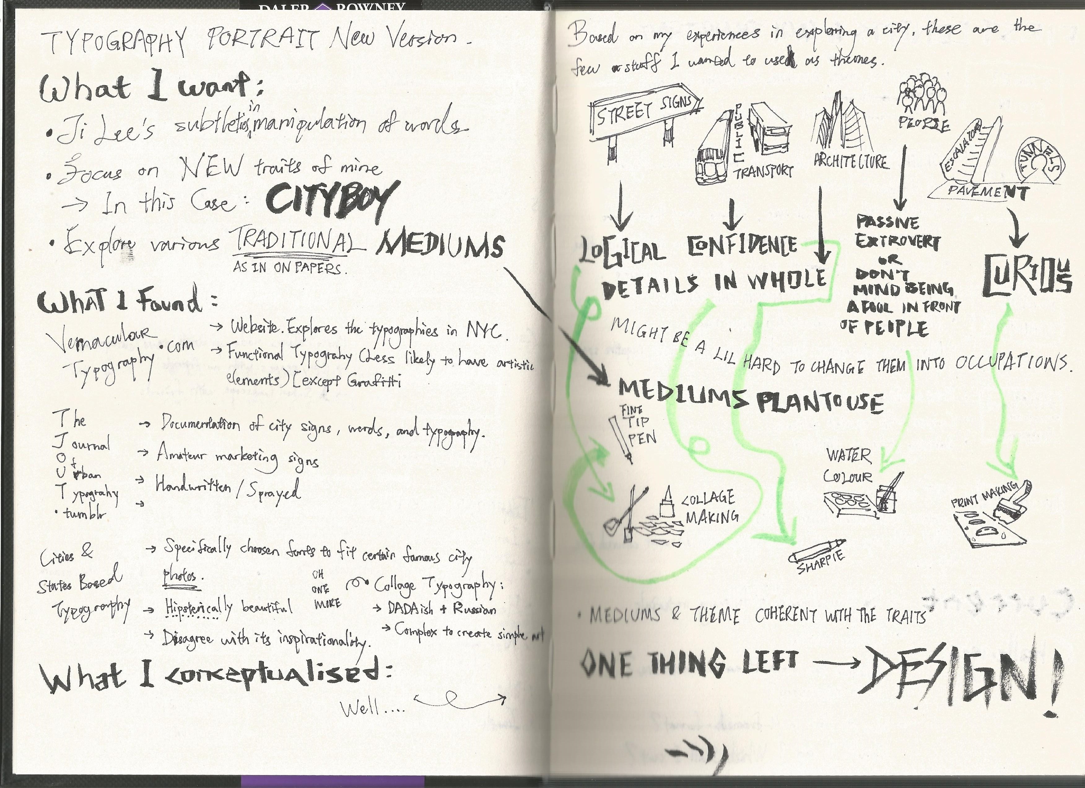
Project 1, TYPOGRAPHIC Portrait Problem has finally ended, and there goes my first presentation of the semester.

So, to make up the whole progress, I’m gonna start from where I stopped.

20160215_204502

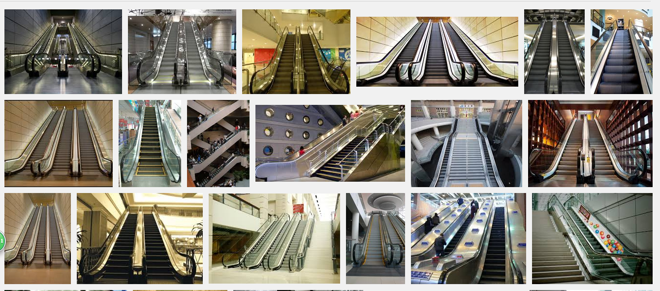
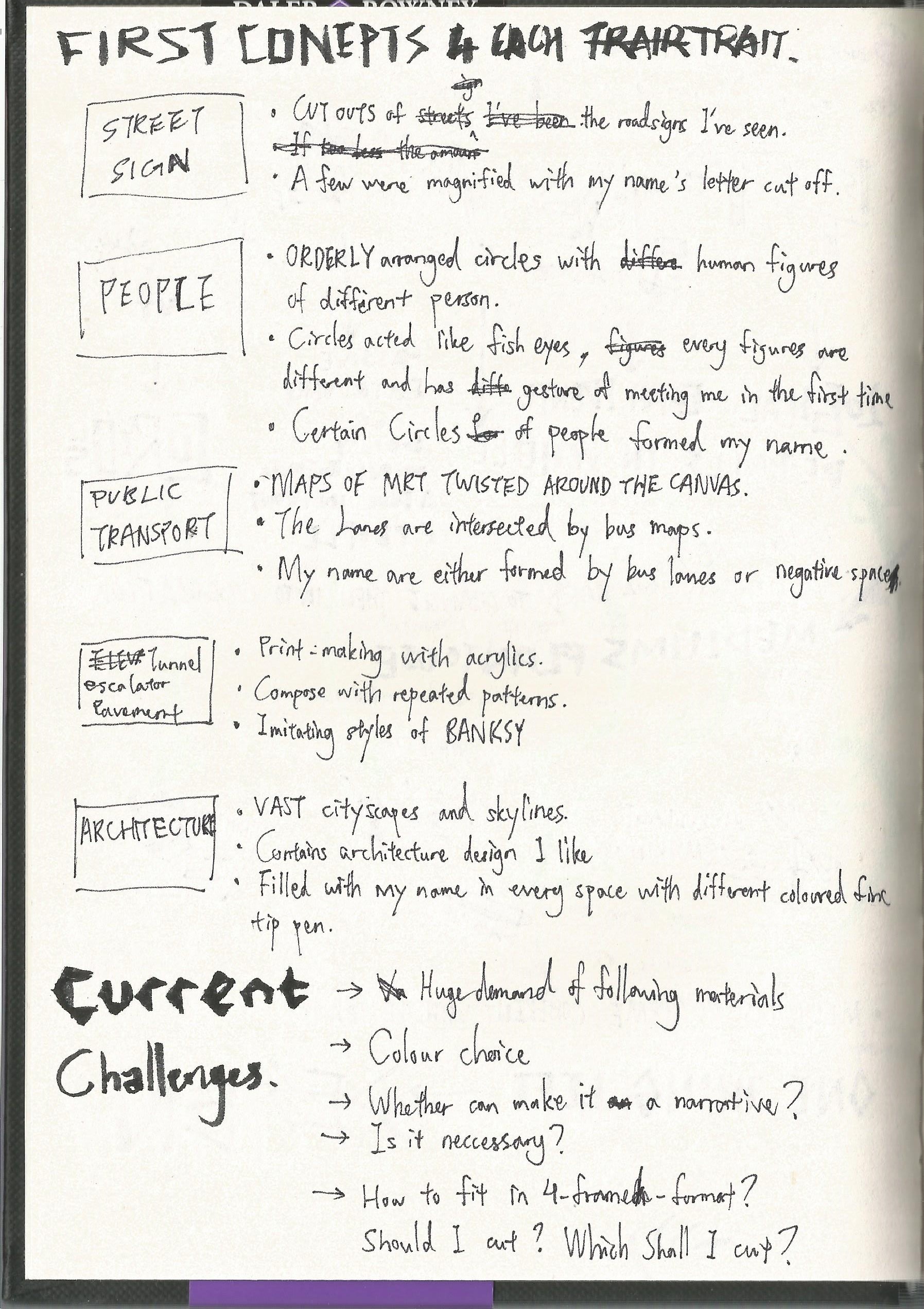
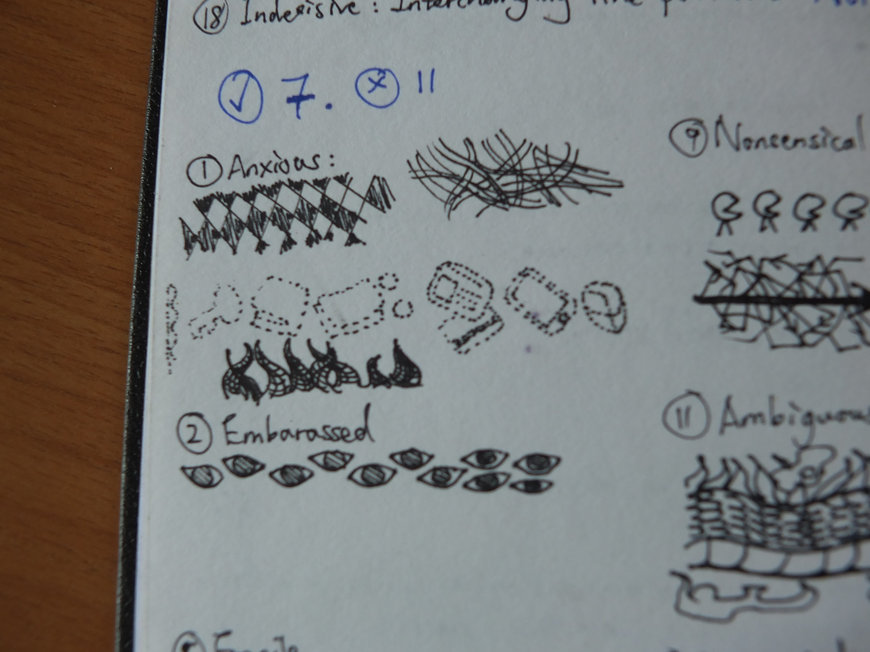
I’m not a big nerd on architecture, so I decided to stay as an interested audience of the art of buildings and cut off the composition from my set to fit the 4-frame-project. Moreover, filling up the building’s shape did not work as strong as my other compositions in terms of subtleties, and fine tip pens are not challenging enough either. Cutting away the pedestrian paths and underground tunnels are due to the potentially overcrowded components. Since its idea was started from the escalator itself, so I just simplified it as the medium is a tough tool to control as well.

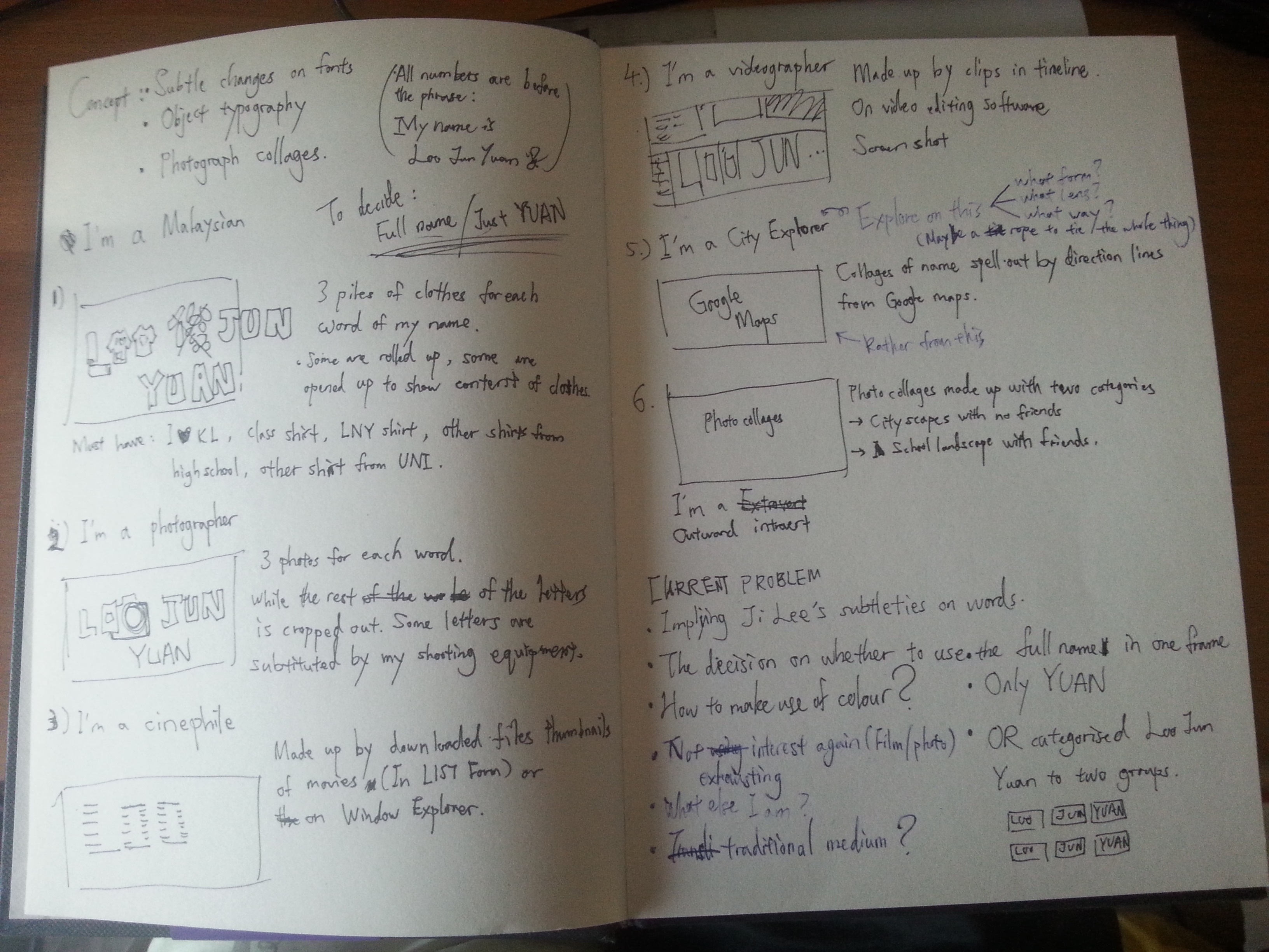
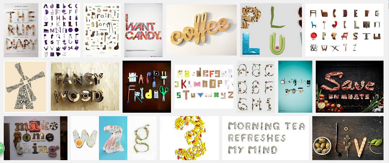
TYPOGRAPHIC PORTRAIT PROBLEM

My Name is

20160218_182525and I’m a logical person.

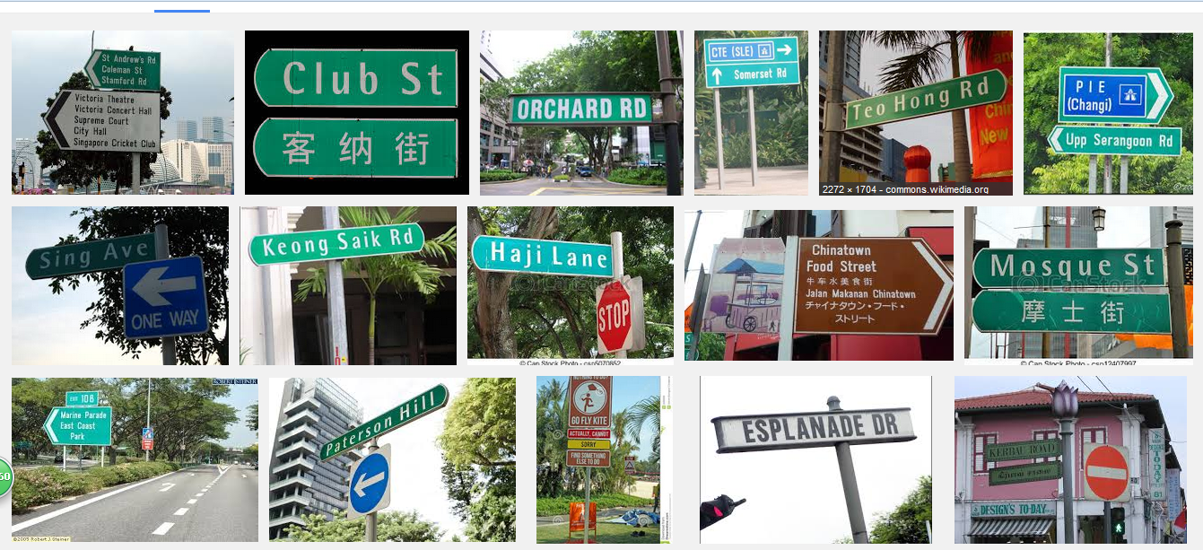
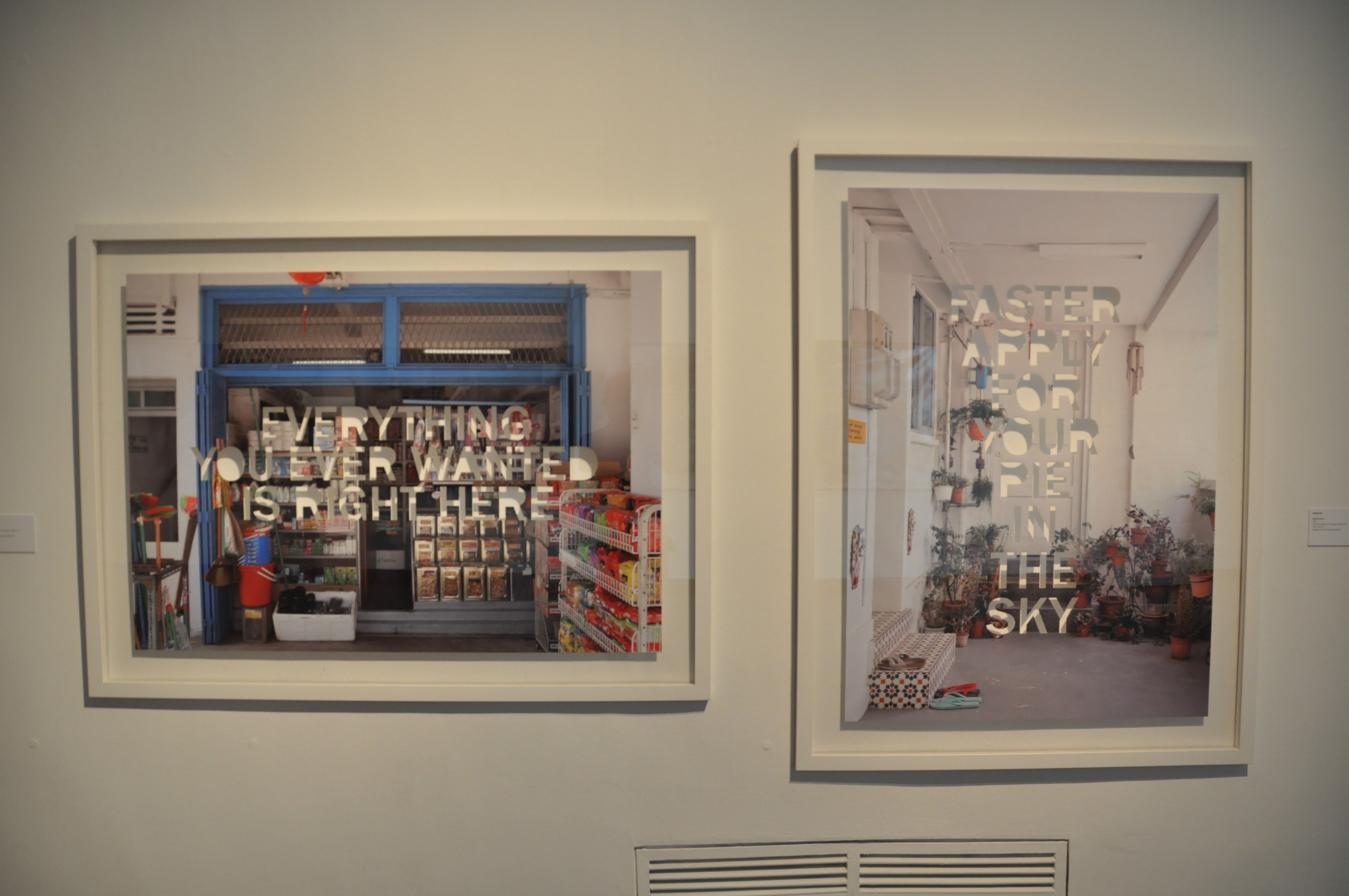
During my city exploration, I was unable to use internet data or GPS due to my financial restrictions. Thus, all I can rely on from getting lost are the locality maps from the MRT stations, and the STREET SIGNS on my way. This method of navigating shows my logical attributes when finding my way in the city.

20160217_202406 20160217_210626

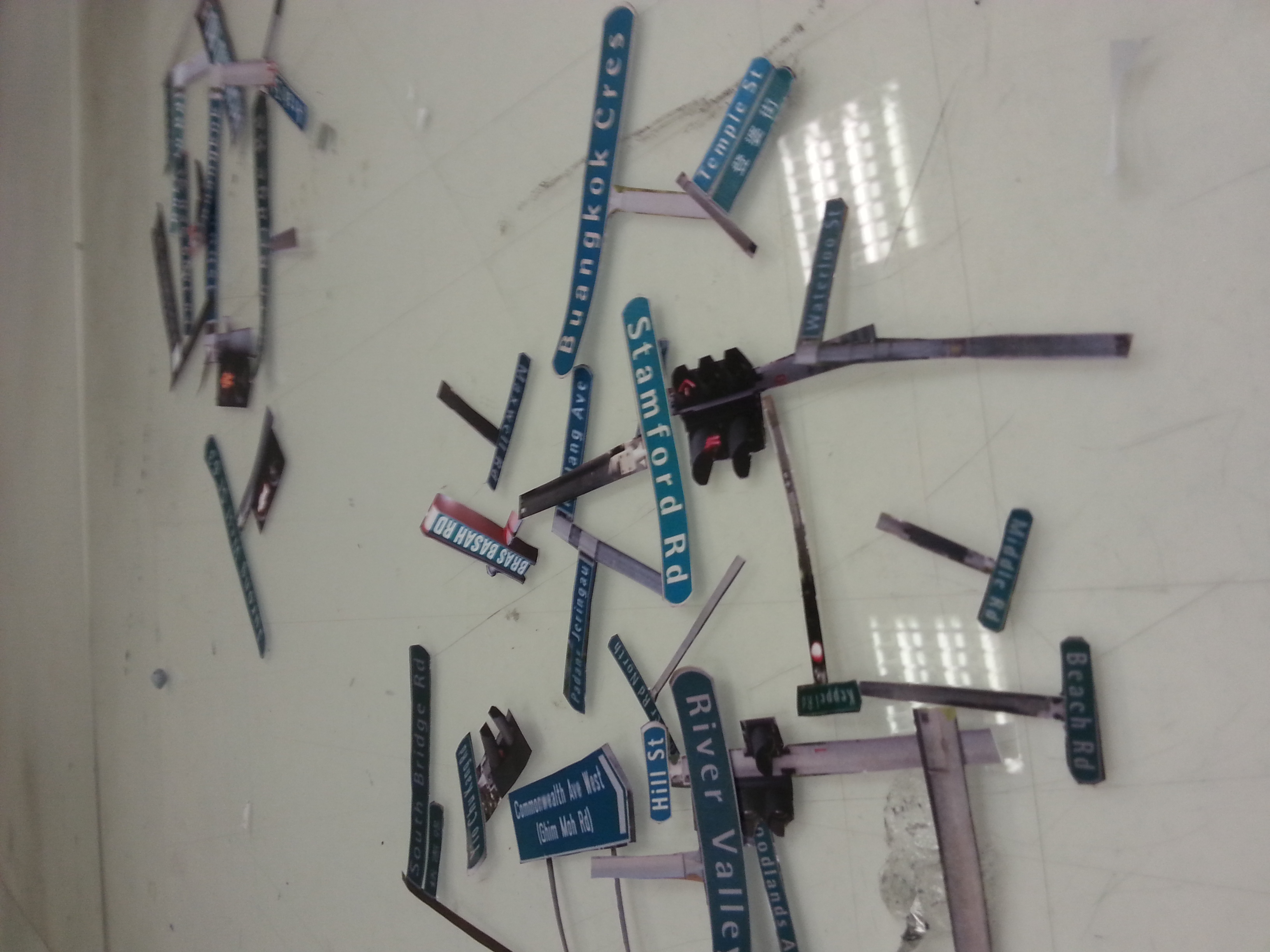
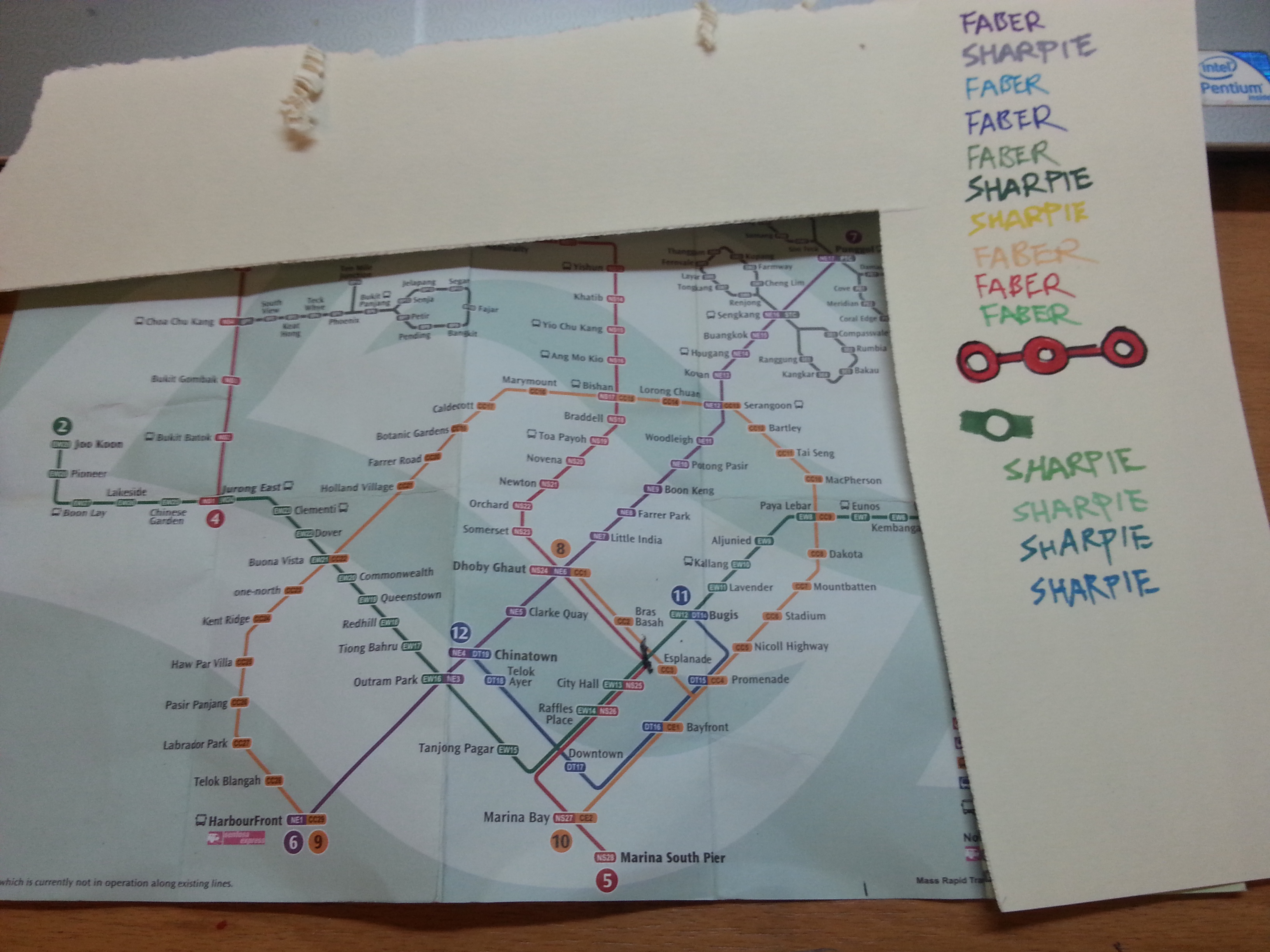
Once I am familiarized with addressing format of a town, I won’t worry about not finding the certain locations as these street signs aided me big time. Also, I think I got my directional sense from my dad, so retracing my route was never a problem either. (Unless the scale and complexity of the city was too overwhelming.) I’ve paired the idea with collage making, the medium used by DADA when they first establish. Therefore, I considered it as a form of real life photoshopping as it requires certain amount of logic to piece every component together. The street signs are chosen based on all the streets I’ve been during my stay in Singapore. Some were photographed on the spot, some were screen-shot from the blessed Google Street, therefore resulted the major difference in their brightness. To find my name, just simply spell out the missing letters that were replaced by the white boxes, and you’ll be logically reading my name, just as the piece intended to be.

20160217_230055

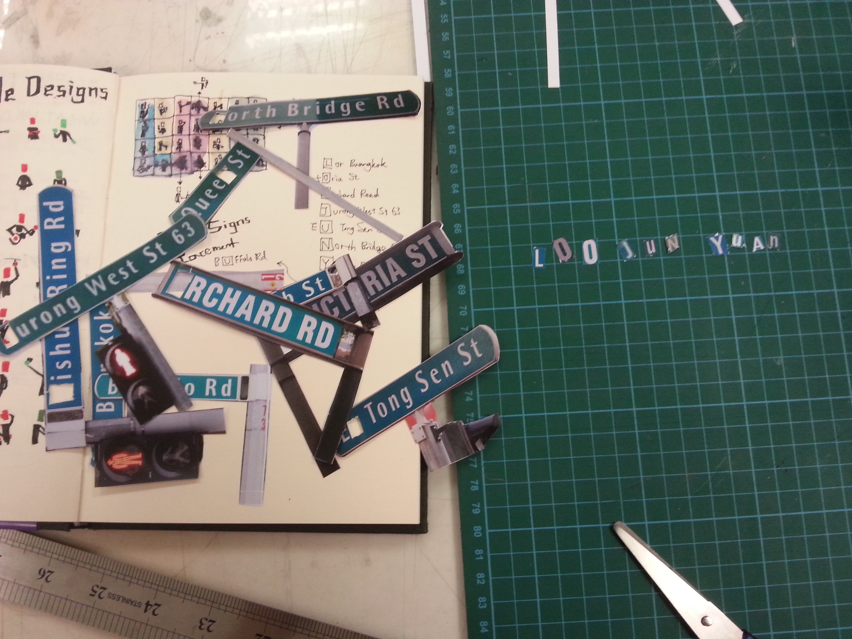
However, it certainly has flaws. From the feedback of my fellow classmates, they were distracted by the sign posts thinking that my name hide between the negative spaces. After my clarification, they liked the idea of hiding what I wanted to show in this typographic portrait.

My Name is

20160218_182512and I’m not afraid to be weird in front of the citizens.

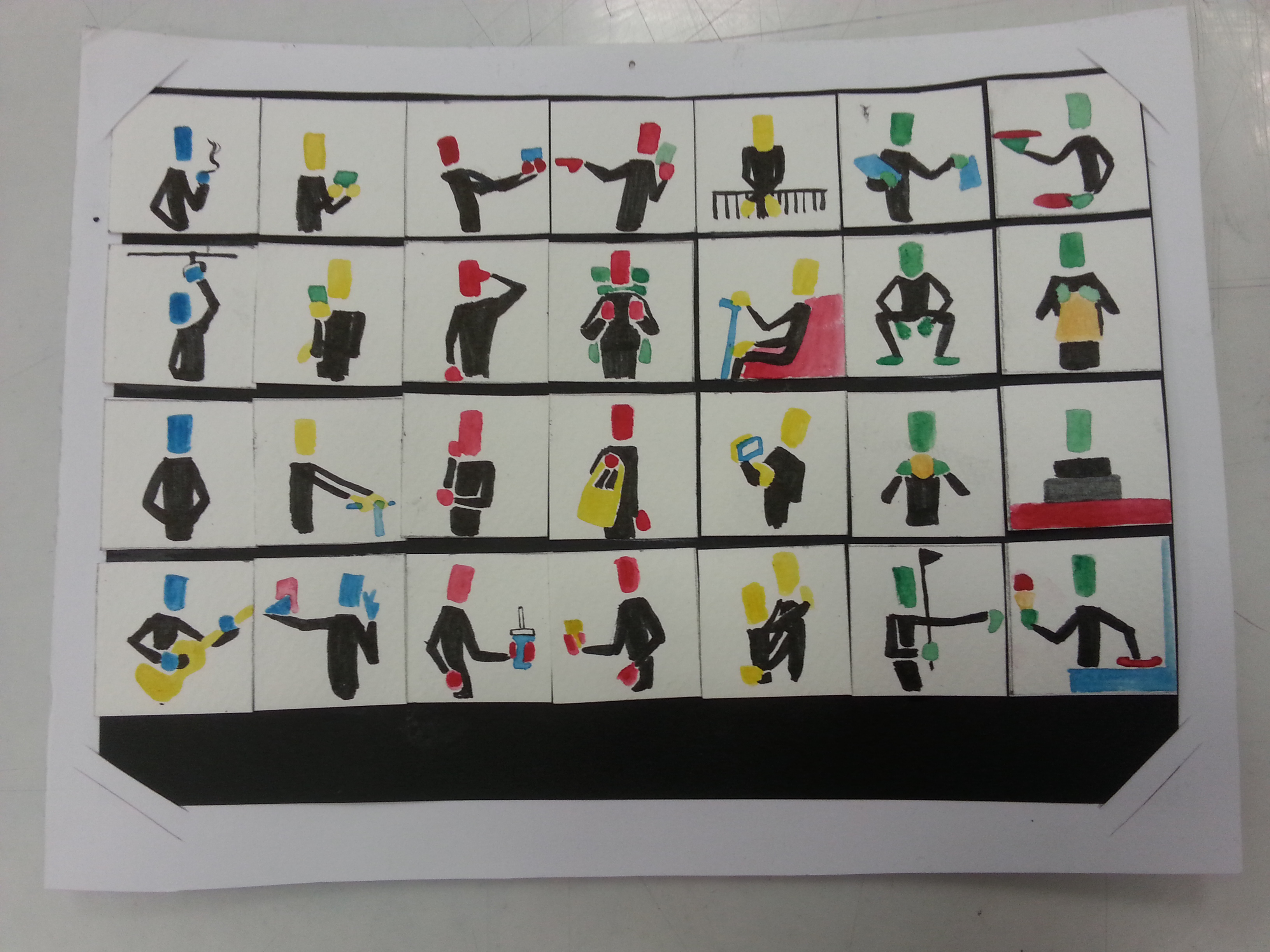
Why the caption? This is because I often (not always) ask stupid questions when I’m exploring around the city. I am thankful to every pedestrians who’ve helped me when I was confused or oblivious about the directions. (Yes, despite how confident I sounded just now, that do happens.)

20160216_221417 20160216_221350 20160216_221435

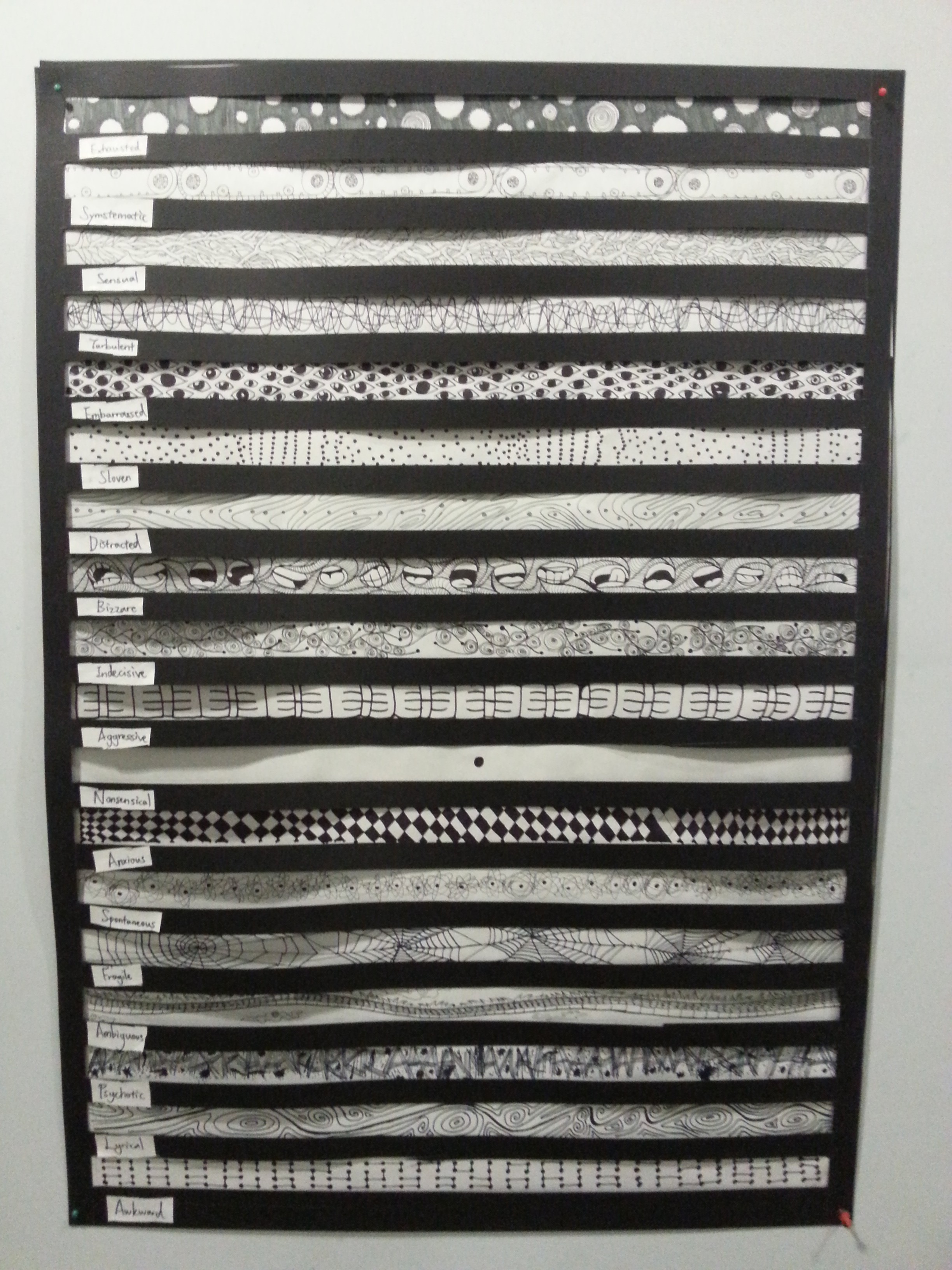
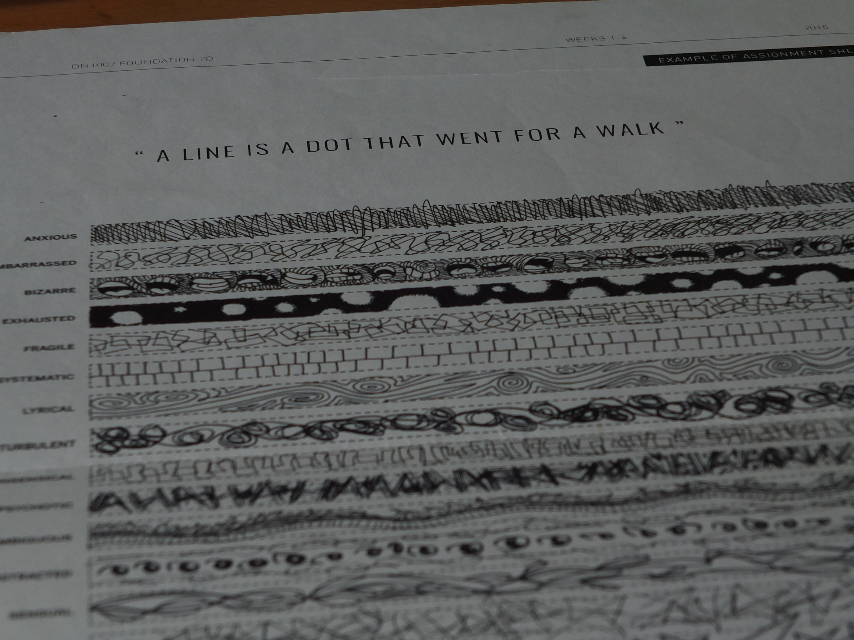
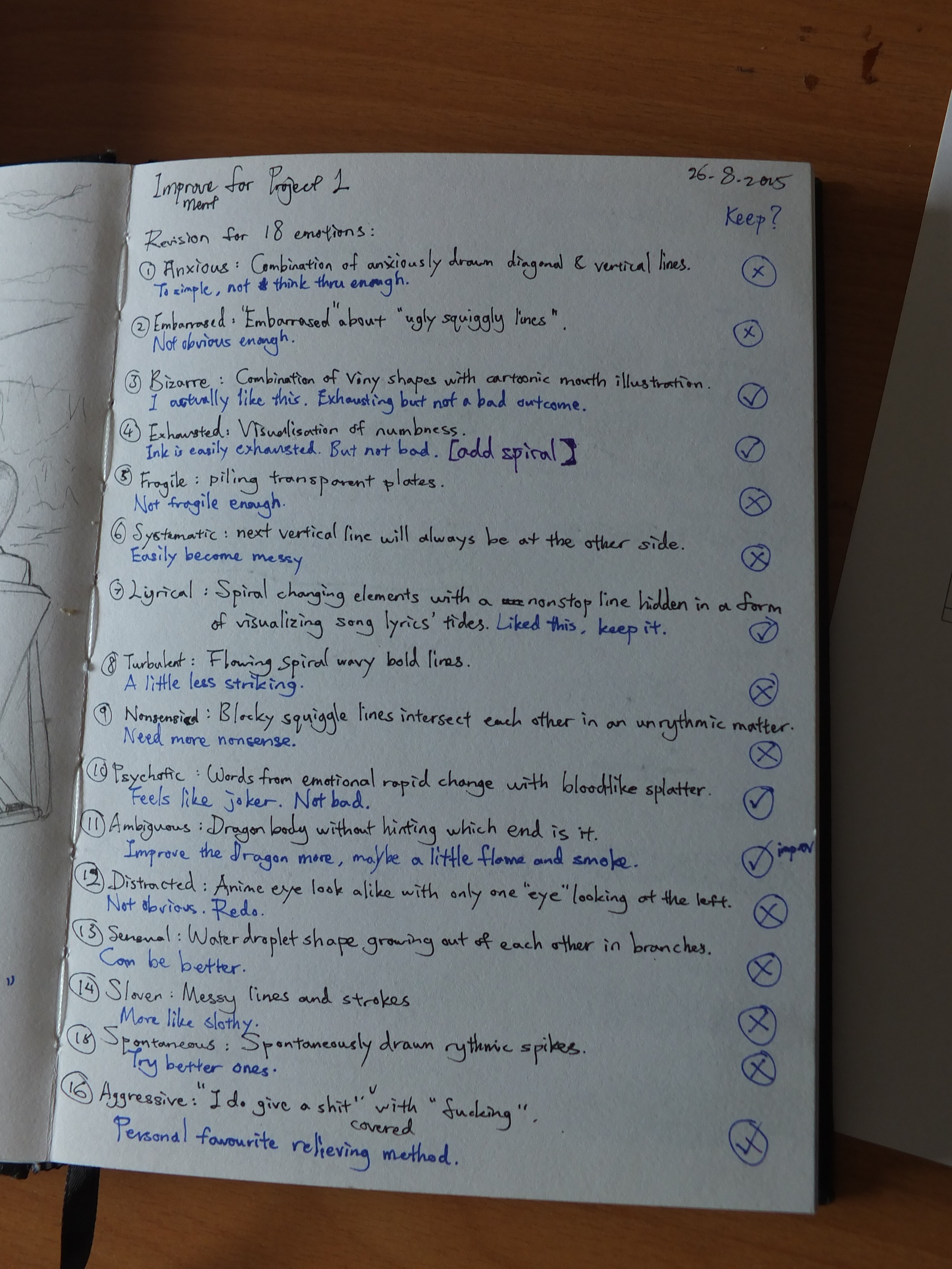
There are different faces in every trip, and I definitely can’t remember how they all look like, that’s why I chose to design them in monochromatic black-clothed figures, which symbolized how rare we meet each other again. I wanted to present many identities, therefore I scratched through all my memories on the streets, in the train, or in certain locations. The figures are designed with identifiable common gestures. There are arranged in a way that you are able to see my surname LOO for a certain distance, which achieved how unrecognizable I was in a big city. The medium I used for this piece is water color. Mistakes made by water color can be easily covered or blended out, thus suiting my piece of not afraid to ask the wrong questions. (Mainly also because I am less likely to see these individual again.)

How my classmates mistaken it as a printed work was a compliment to me, even though some have commented that this was a little out of place among my whole project. Moreover, not everyone are able to see the hidden surname in it. Perhaps a better design need to be implement for a better effect next time.

My Name is

20160218_182423and I’m a confident person.

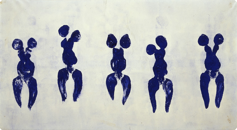
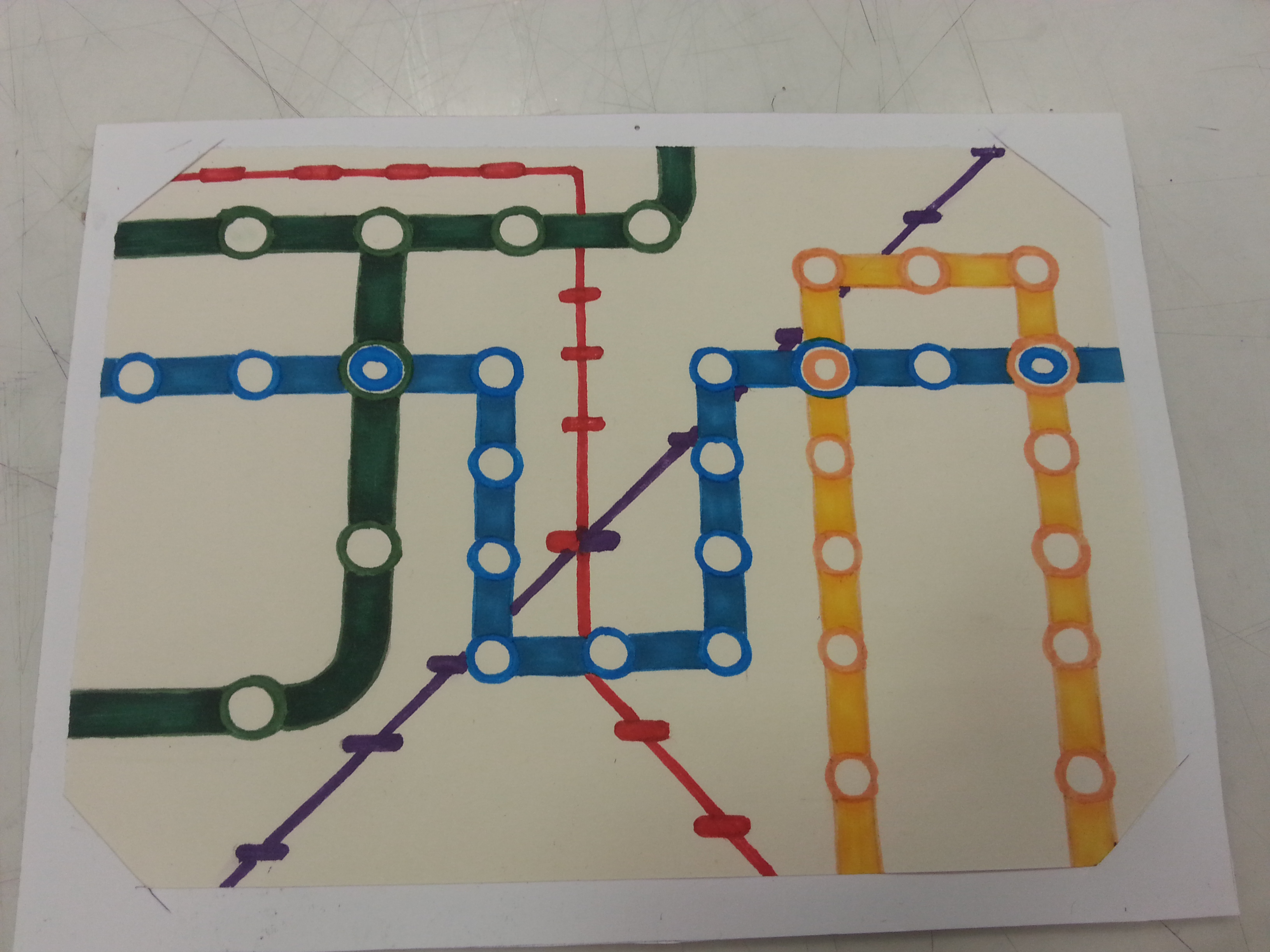
That’s some big words to say. I believe my confidence are shown clearly in my previous piece, but the confidence is difficult to build. It requires many assuring factors and abilities to form my confidence, just like how the Singapore MRT connects the cities. (This is not an advertisement.)

20160215_204449 (1)

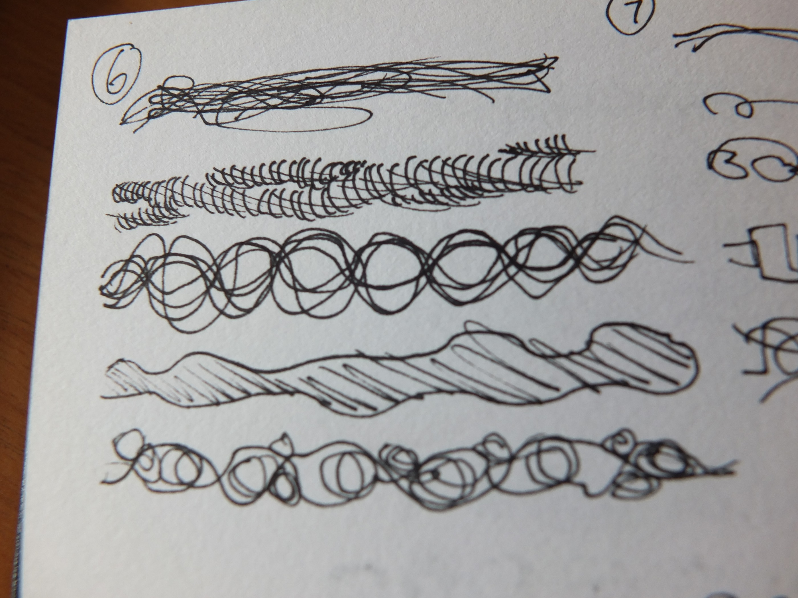
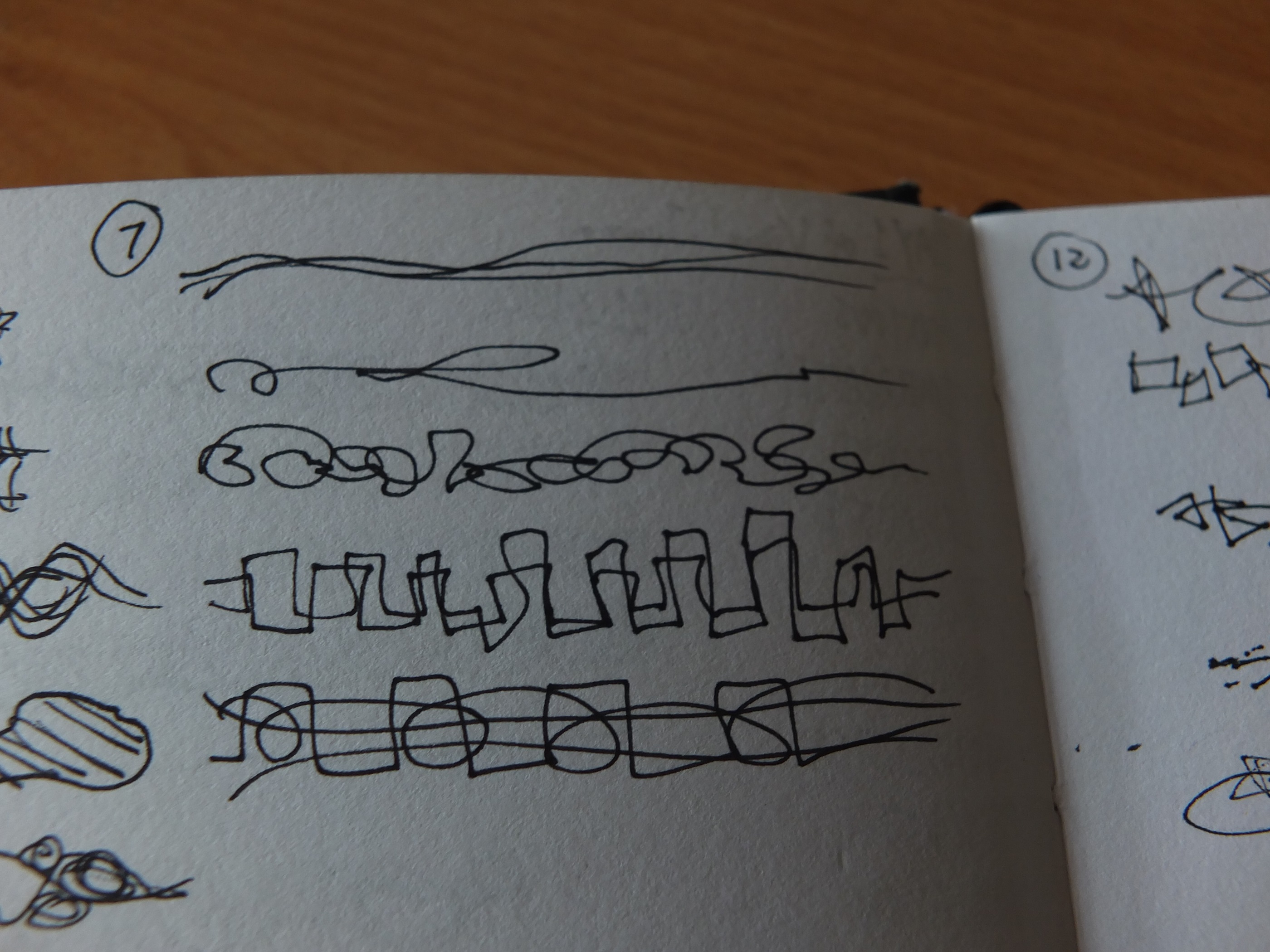
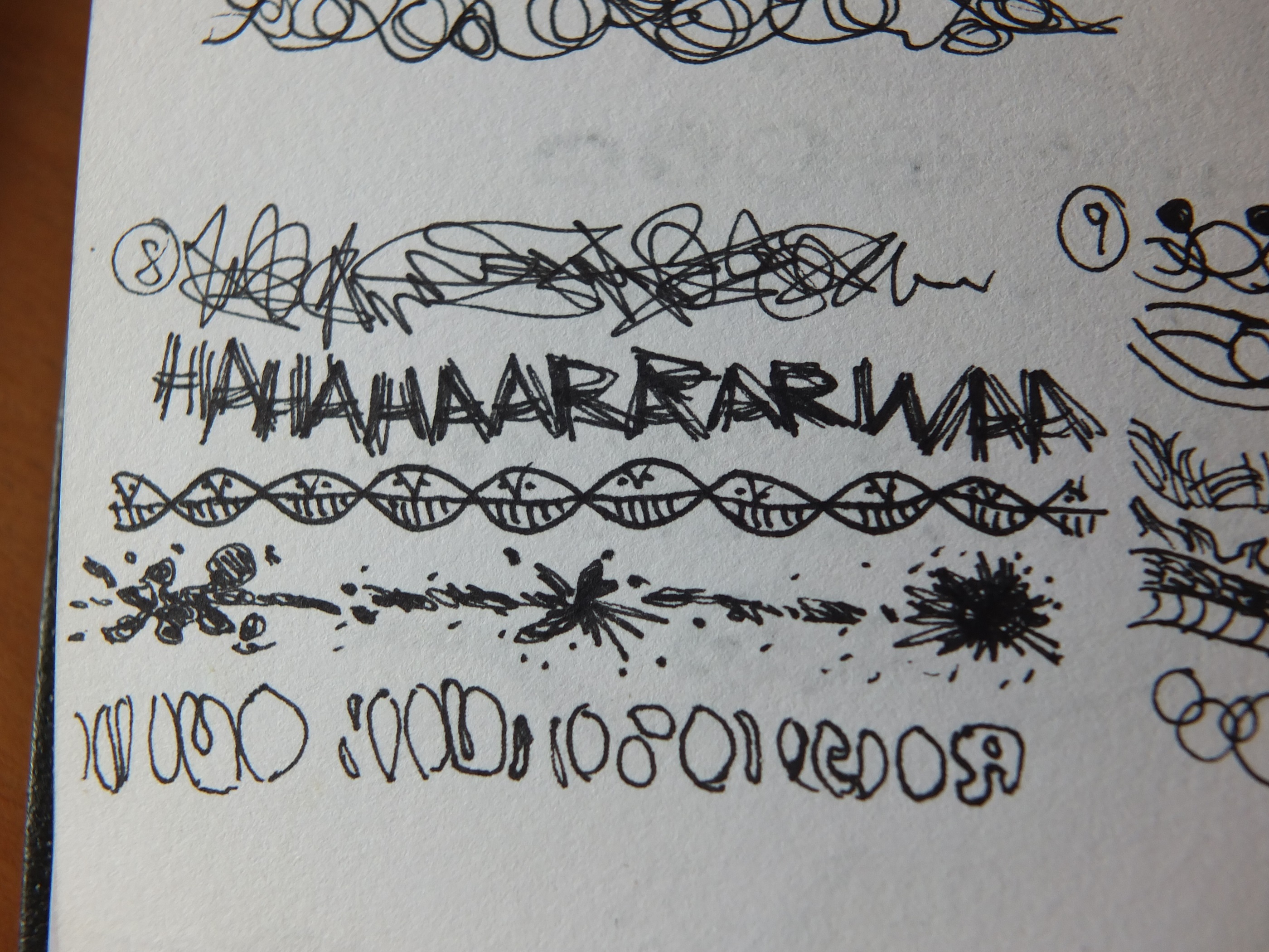
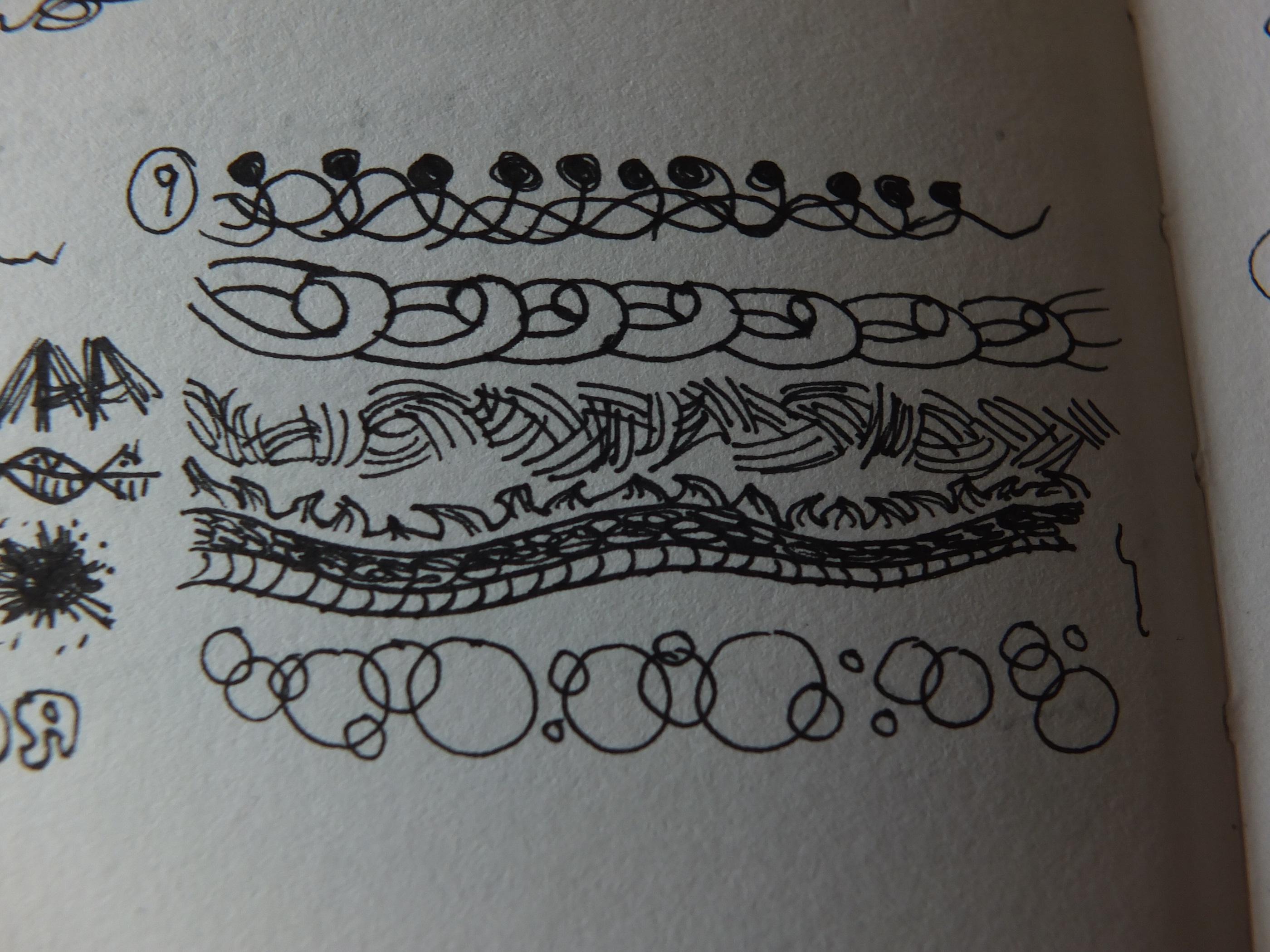
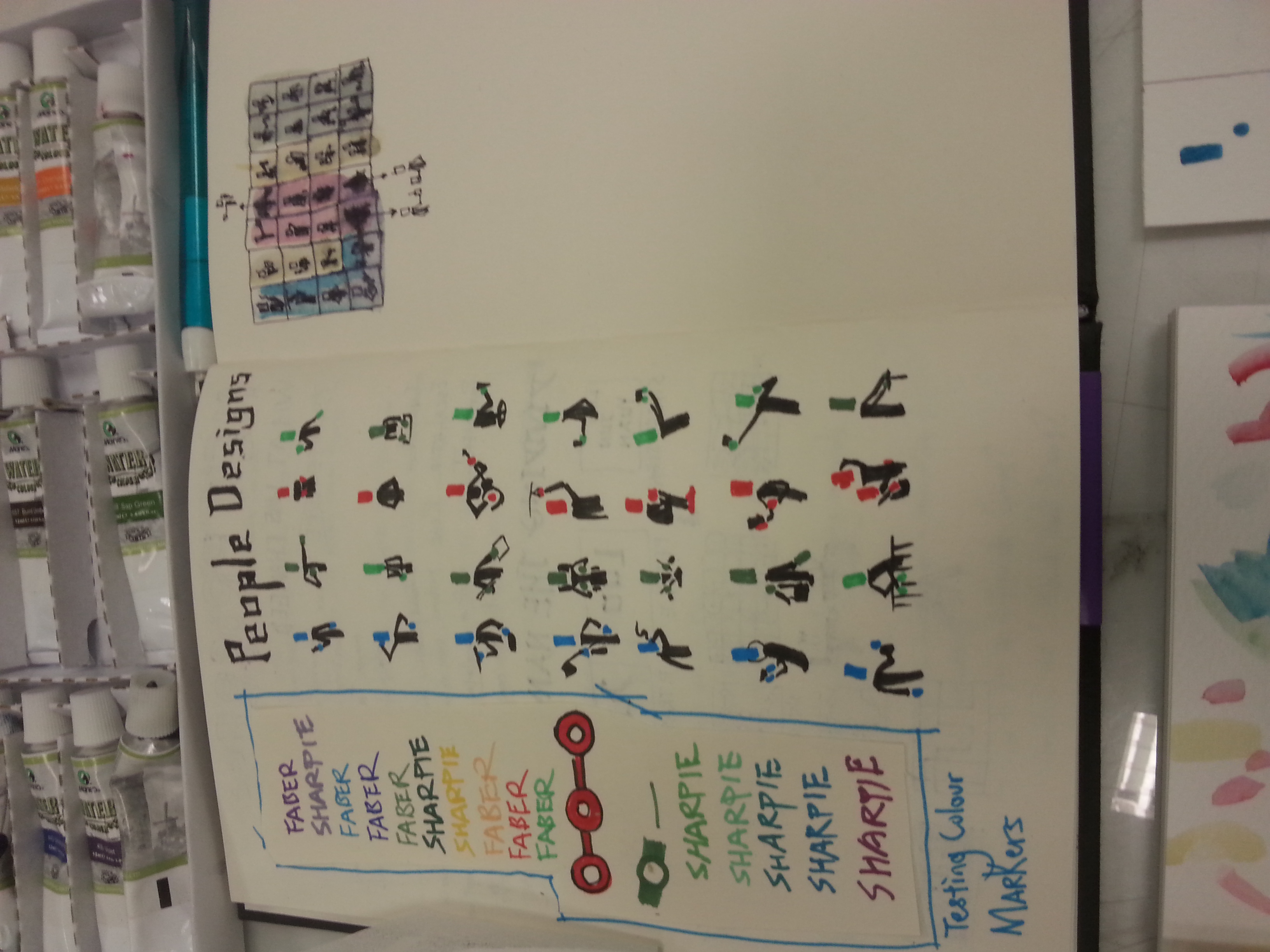
Testing for the right hue

I resembles confidence with MRT not only due to they’re confident that no station was wasted in terms of utilization, but also due to how confident they are with their arrival time estimation. Back in Malaysia, it was until the 2010s that our public transport placed the arrival time in their clocks as they are constantly late and delayed in the previous decades. Singapore MRT did not disappoint me with its estimated arrival time almost every time. (Yes, almost, because there was some breakdowns.) I picked the piece to represent my middle name JUN as this attribute only can be seen by people who began to know me.

20160215_205544 20160215_210617

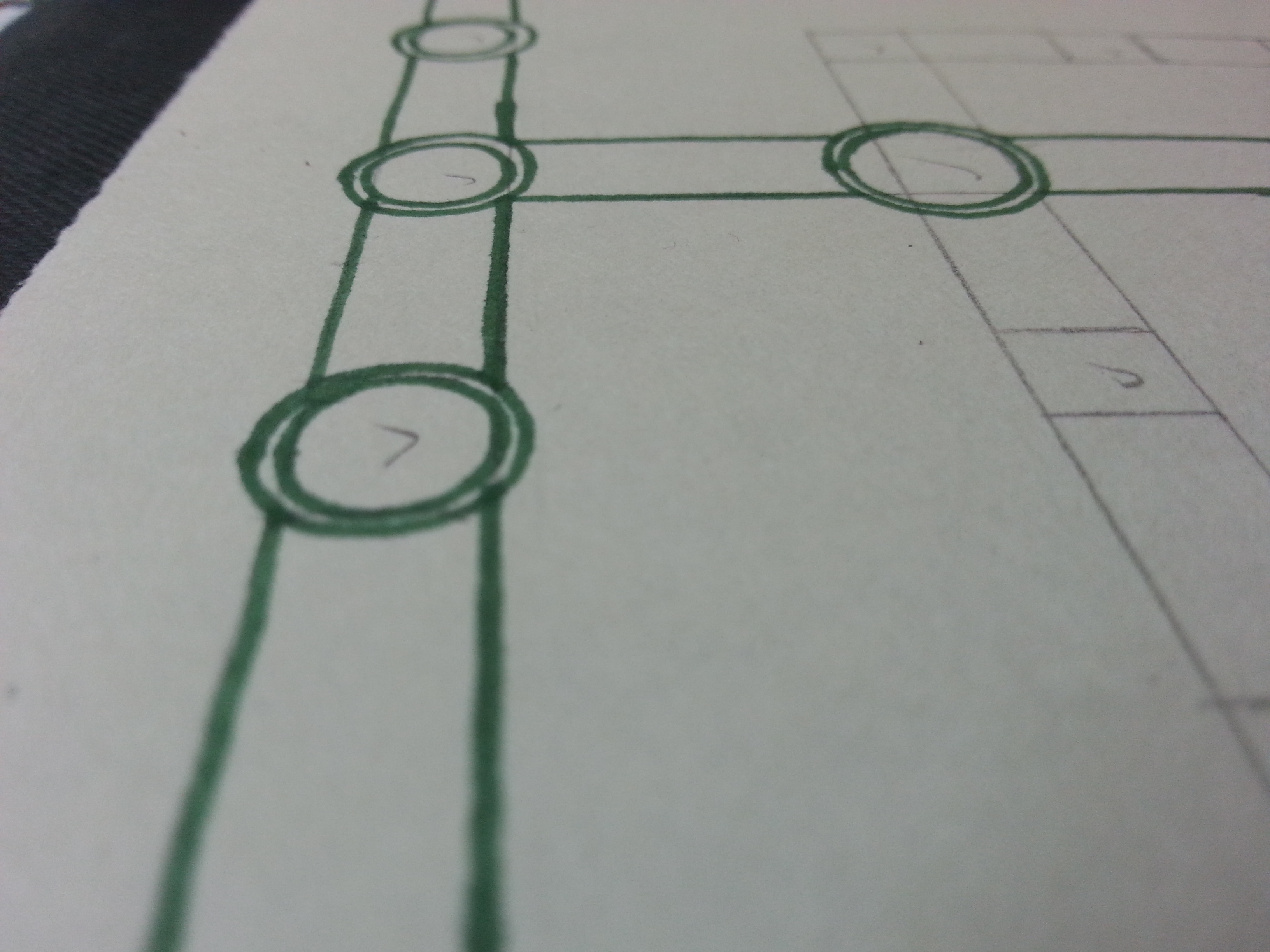
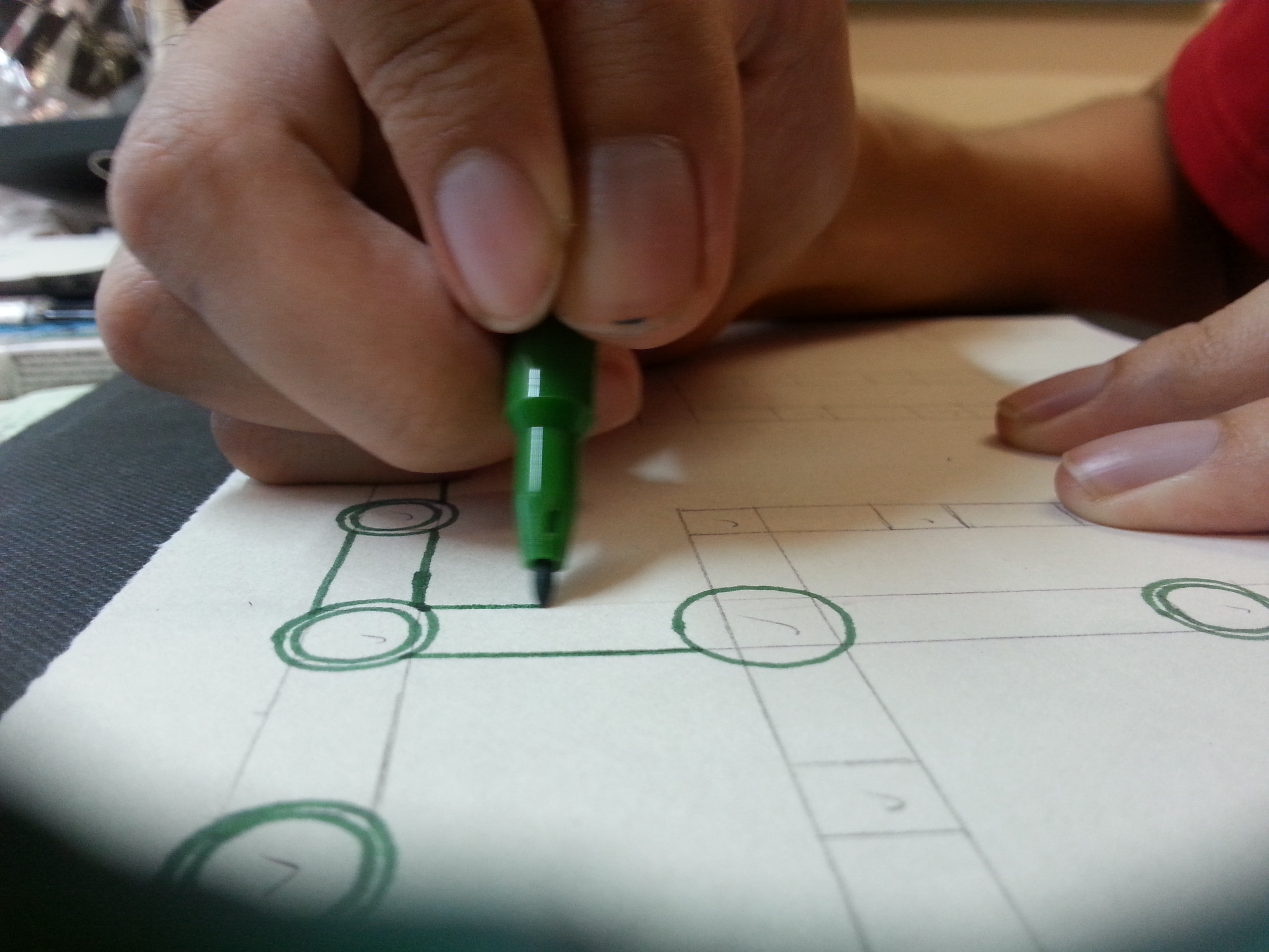
The piece was drawn by Sharpie and Faber Castell’s markers. Their ink penetrates the paper easily therefore it needs to be used lightly. Using it tested my limits in controlling their color tone, perfecting the circles, (I’m still a human after all.)and maintaining the straight lines without any ruler. (Many illustrator are able to do this, so I considered an challenge from my idols.)

20160215_210225

The feedback for this are mostly positive, so I was relieved the whole composition worked out. The bigger challenge is to make it recognizable to the viewers but avoid making it too complicated.

My Name is

20160218_182410

and I’m a curious person.

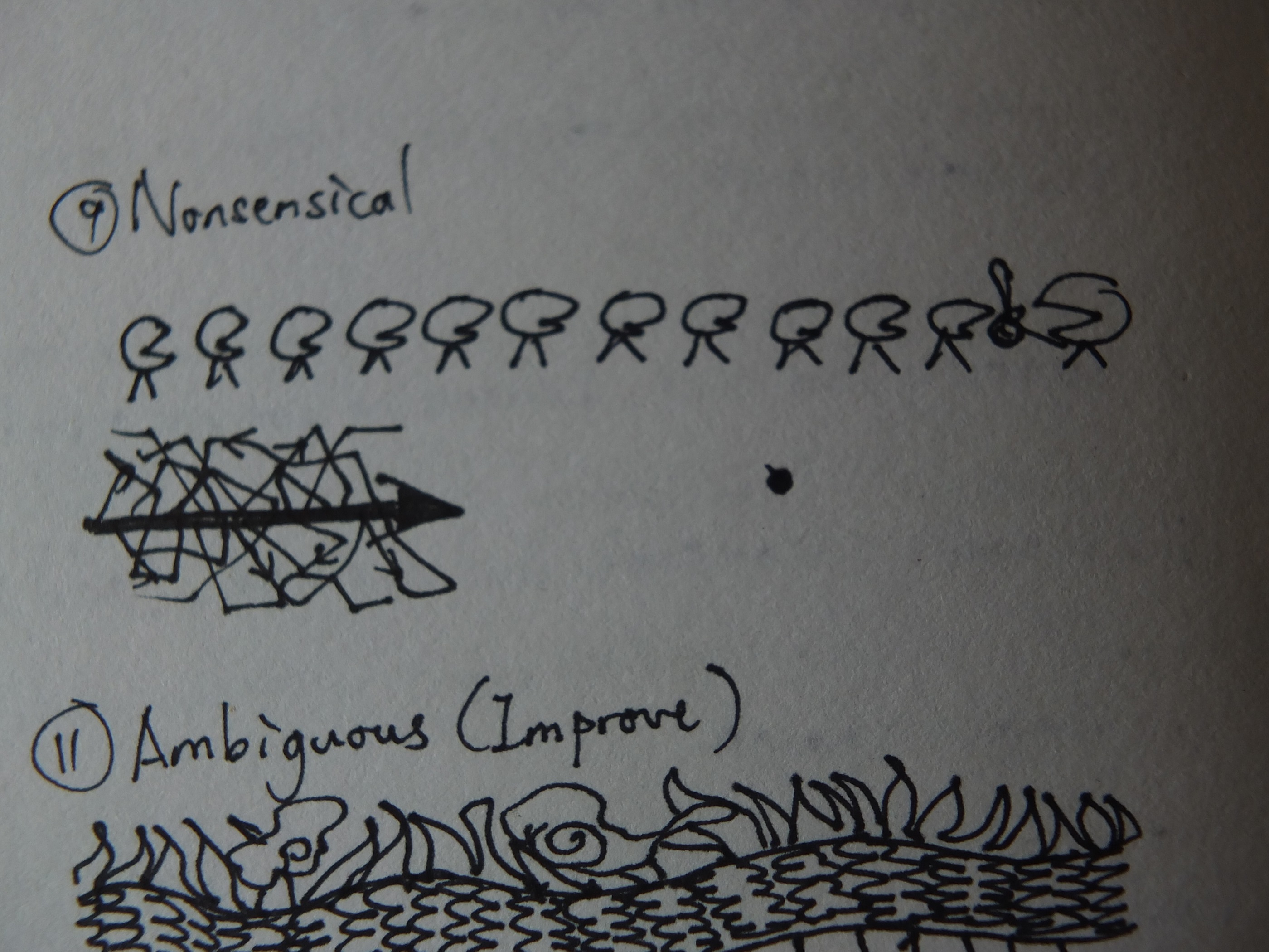
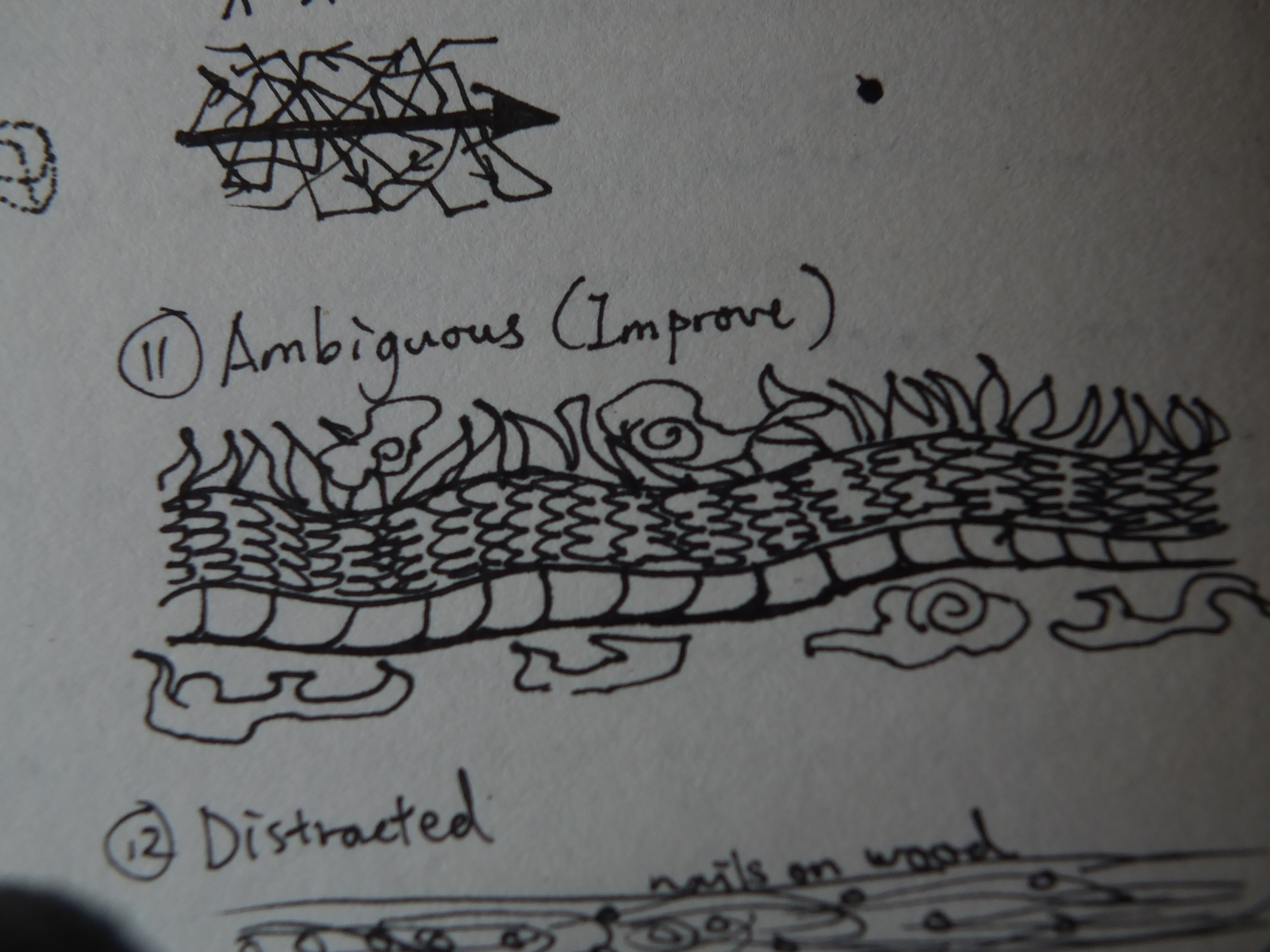
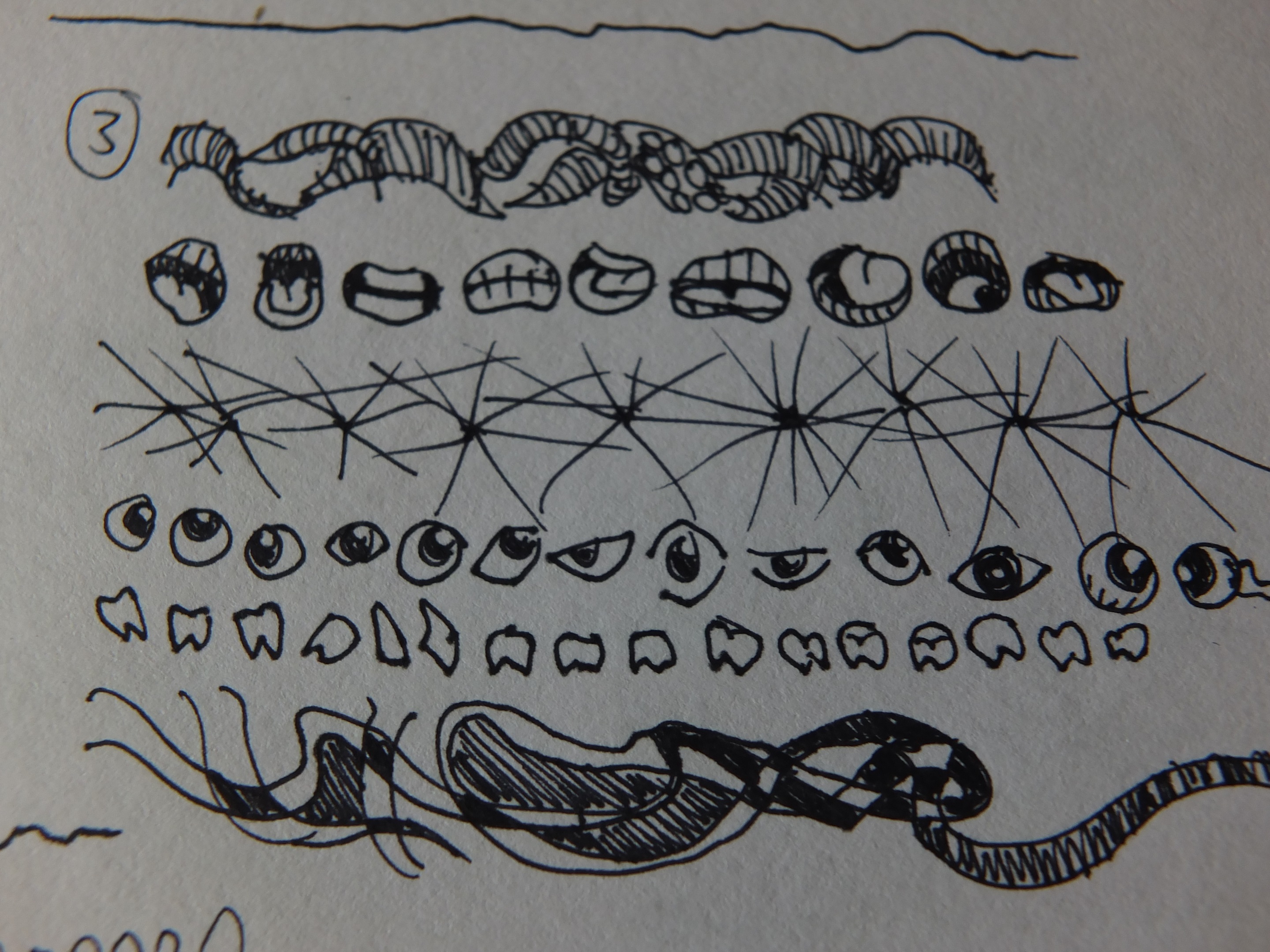
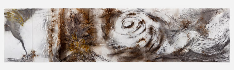
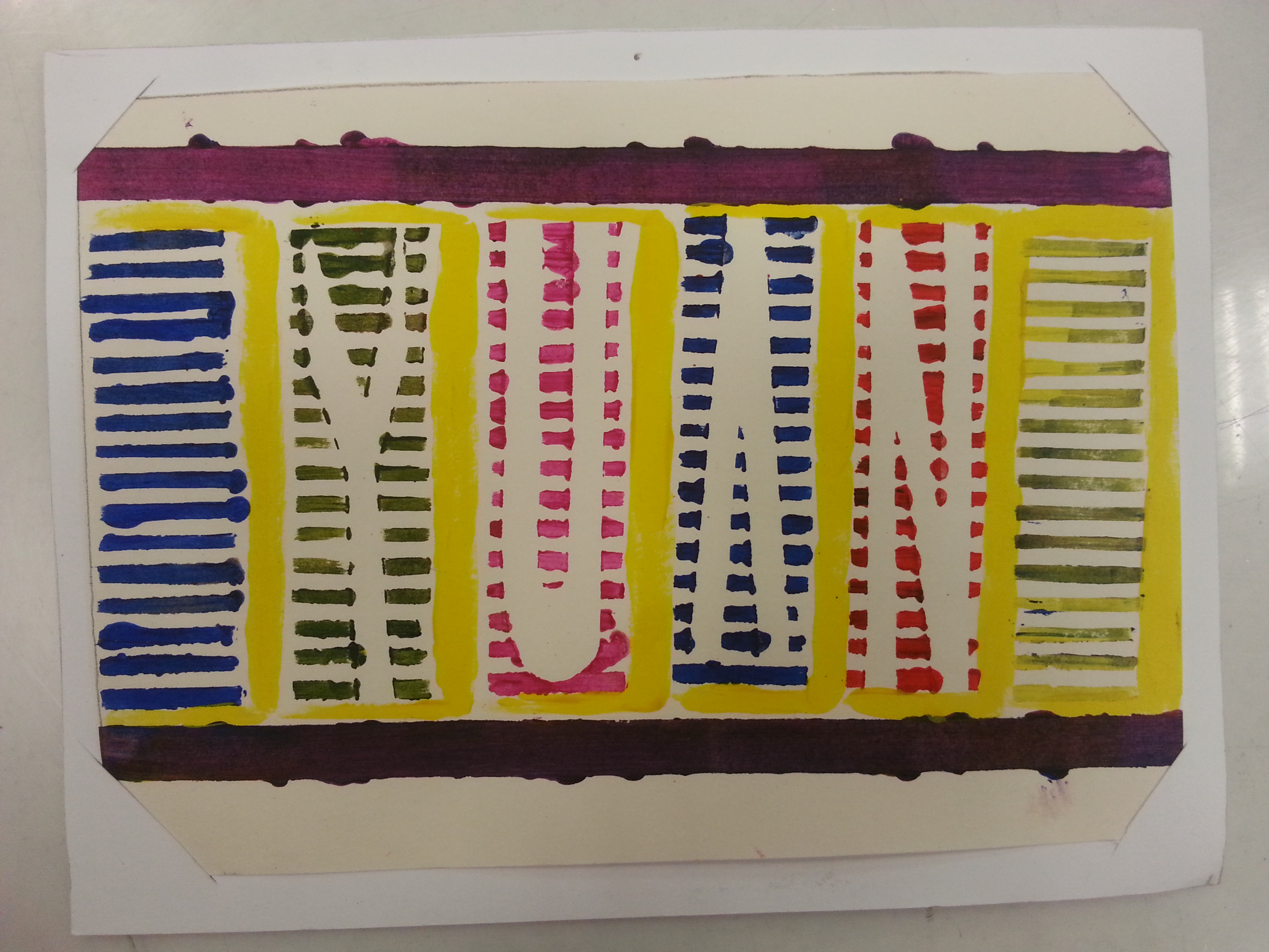
An escalator form a bird eyes’ view is how I express my curiosity. During my exploration, most of the MRT are either in the elevated or placed underground. Thus much of my exploration time was spent on this particular transportation. It is the fundamental portal I must go through to see a new street, a new surrounding, and a new city. Within half a minute taking the escalator, my curiosity towards the scenery I’m gonna witness elevated as well for the next 30 seconds. For this new found attribute that’s been hidden a long time, I paired it with my YUAN as it probably can be seen by people who knew me well or solely myself.

20160217_215642

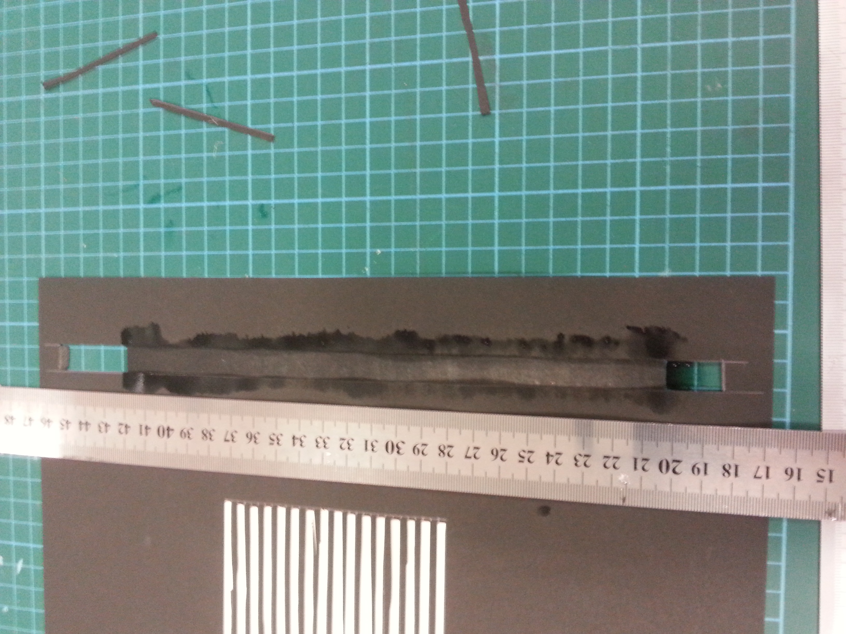
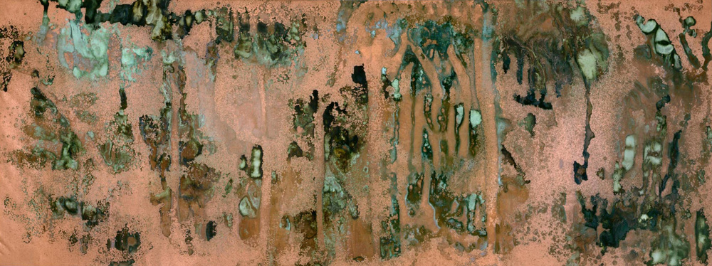
To suit such special attribute I found in the escalator and myself, I’ve chose the method of print-making. I’ve cut a template out of a slightly heavier paper and cover a piece of an alphabet shaped paper with the template. I believe my curiosity is not as black as the machine’s original color, so I chose my acrylics as the coloring medium. Acrylics are way thicker that water colors but their saturation resulted a ideal tone for this piece. The thicker they are, the easier it became a disaster. I had to redo a couple of times before I am happy with the end results, and the disaster happened during a desperate times. (the night before submission, my friends.)

20160218_013038

Some of my classmates are intrigued by the idea of taking a new perspective for the neglected machine. The overall project was appreciated and I am happy for what I’m able to do with my new limitations. (not doing the film things.) Ms.Joy has commented that the work accomplished its purpose for leading the viewers to a new perspective of my hobby, and it can be further enhanced by placing the piece in different spots.

The work was a success for me despite the aesthetic aspect of my classmate works are better. However,  I could learn more in contextualized my future work from the beautiful works of my classmates, through this project. (Perhaps a better time management would be good as well.) As always, I am looking forward to everyone’s next project.

Thanks for reading!

My concept for typography portrait has finally progressed and an idea worth anticipating is formed. YAY! My new concept is: CITY-BOY, where my personalities are shown in the forms of urban facilities illustrated by various traditional mediums.

City culture is one of the things that KL and Singapore had in common. It shows how far human being had advanced and how human community thrives for a better living. The city shows a more distinct variation of forms and views for me. Don’t get me wrong, I like natural sceneries as well but natural landscapes shows the trails left by the elements; cityscapes shows the trails left by the human society. Therefore I find the city interesting when you can deduce human nature in through their physical creations.

I wanted to explore subtleties again in this project after inspired by Ji Lee’s “Word as Image”. Subtleties wasn’t shown in my last concept even though Ji Lee was one of the artist I’m trying to refer. Therefore I want to make sure that his subtle manipulation of words was in my new concept. While doing so, I also want to try out more traditional mediums since the LINE project in order to step out from my photography media.

vernacular typography

Vernacular Typography

I searched for a few sites related to my new ideas. Most of the city/urban typographies shown are the ones produced by citizens for occupation/marketing purpose. Vernacular typography.com and The Journal of Urban Typography tumblr documented many handwritten signs, sprayed signs, billboards, and gold signs in NYC.

tjout

The Journal of Urban Typography (tjout@tumblr)

There’s a form of city typography created with special fonts on beautiful city photos. These Instagram-worthy photos did not fit my concepts very well. Later, I caught a glimpse of collage typography which impressed me with its dada-ish and constructivist style.

city typo 3 city typo 2 city typo 1

collage typography

Collage typography, advanced? version of Constructivist Typography

Some of the G-1 folks also gave me some instant suggestions. (As in what pops up in their head after hearing my title.) Since my arrival in Singapore, I’ve always feel that every outing trip to the cities is like going into a new world. There’s a different atmosphere for each city so I have to think of something that conclude my explorations along with traits I hope to show. I shall choose the aspects of the city that I approached the most. Therefore I picked the following aspects.

visual journal 1

  1. Street signs
  2. Public transport
  3. Architectures
  4. People
  5. The public paths: Pedestrian roads, escalators, and tunnels.

street signs escalator

These aspects are the ones that show up in every of my trips, and they represented some new traits I’ve never presented. I’ll explain their relevance in the future.

I match these new traits with the traditional mediums’ specialty. Collage making is paired with STREET SIGNS; Sharpie art with PUBLIC TRANSPORTATION; water colors will be the execution for PEOPLE; fine tip suits best with ARCHITECTURE; and print making is matched with THE PUBLIC PATHS.

visual journal 2

I wrote the properties for the designs only as I haven’t figure out the details until I have enough resources and experiments. Other problems included my demand of traditional materials, (tools and paper types.) how I plan the color choices, (again) and how to fit/cut my concepts into the newly announced 4-frame-format. Despite all of the above, trials and execution time will be the greatest challenge for this project. Perhaps my future post for this project will include a lot of my fails attempts. Hope not. (Crossing fingers.)

Thanks for reading my renewed conceptualizing stage. See you in my next progress post!

(Imitating dramas narrators in the title.)

First stage of conceptualization!

Due to an unattended class trip for 4D, I went to visit SAM with 2D inspiration searching as another reason. Turns out there is some interesting reference worth exploring.

Based on my last research/exploration on the Internet typographers which impressed me, my initial concept for the typography portrait are:

  • Subtle changes on fonts to match the content.
  • Performs object typography.
  • IF required, the object typography will be made of photograph collages.

20160130_164100

The first group ideas of all the portraits varies in styles. They included

DSC_1035

Green Zeng’s Siapa Nama Saya?

DSC_1043

Dawn Ng’s Mamashop and HDB Corridor.

  1. Compositing my name with T-shirts, showing my identities as a Malaysia, who has an enjoyable memories in high school, came to NTU, getting use of uni-life. (Inspired by a piece (top) from the installation ONCE UPON THIS ISLAND)
  2. Using another piece (bottom) from the installation ONCE UPON THIS ISLAND, a photo with all my items of interest compositing some of my name’s letters while the rest are cropped out like the piece above.
  3. Arrange my downloaded movie files into my name via Window Explorer.
  4. Arrange clips into my name in an editing software’s timeline. Captured with screenshot.
  5. Collages of my name’s letter made of directional lines in Google Maps.
  6. Photo collages of cityscapes and school’s landscape with and without my friends.

You must be wondering, why didn’t I elaborate more?

After a consultation session with Ms. Joy, I realized (with the confirmation of Ms. Joy,) not only my concept, in terms of content, does not have a solid theme. Moreover, I exploit again on my interest in films, which Ms. Joy warned me to not exhaust the subject before I even enter my major courses. I was advised to find potentials in other traits of mine to explore, in many other ways, even in my current concepts. Such as, in what kind of lens viewers can view through? What sort of medium can I utilized rather than photos? Is it absolute to use human as the subjective?

Thus, I have new objectives to pursue for this semester, which are, try to explore other versions of me, what else can I show myself as? Try NOT to imply things that people knew about me into my work again. Give my audience a fresh new impressions.

Oh my, I have a lot to brainstorm this week. Hope I progress!

Two weeks in and HELLLLLLOOOOOOO project number 1!!!

Remember what we do about projects? Research! This time, we get to do Typography, the area of art that I’ve seen a lot but still being strange about it. Initially to me, typography are art pieces with fonts that had been created by the mass and was decorated with or immersed into forms, shapes and colors to give the words an eye-catching properties. Usually this kind of art are seen in webpages that likes to quote famous figures, or simple short do-you-know facts. Not only it’s eye-catching but also effective for netizens with short attention span.

Personal views aside, the lesson I had been on last Thursday had opened my eyes to the diversity of Typography. After listening to all the researches my classmates did, I saw the subtle side of the genre, that Typography doesn’t have to be literal, yet being contextual in the meantime.

SO, back to my research. Technically, they’re not intended research materials, but originally typography posts from the Internet that I was impressed of.

ji kee

The first artist I wanted to talk about is Ji Lee, a Communication designer in Facebook. You know this guy has some talent in him to be able take on an important position in one of the biggest company in the world. The series that impressed me the most was his Words as Images. Most of the words in these images use the same font and were only tweaked a little to match the properties of the words. However, viewers got its point almost instantly as it’s not too obvious, yet not too subtle for the public. I admired its brilliance of balance both and the entertainment it gave. Also, the minimalistic style it possesses certain is a plus from distracting the viewers compared to other over-exaggerated typographies.

meganleescienceThe prints above are the second piece I’d like to talk about. Megan Lee’s  Rock Star Scientists also consist of uniformed fonts but accompanied by again, minimalistic illustrations or silhouette of achievements of each famous scientist respectively. Viewers who love science instantly recognized this names and understood its context. The design doesn’t seemed too nerdy and in contrary gave these influential achievements a fashionable makeover. Science seems so cool again! (Correction: Science IS cool.)

dangerdustThe works above are done by two anonymous students who named themselves Dangerdust. These work varies in fonts and styles, suiting the figures they’re quoting. Although some of their designs are too complicated that they sometimes covered the quotes, but most of them are well balanced in terms of scales and positioning. Most impressive of all is that they are done on blackboards, giving the context of educating the next generations with words of wisdom.

object typography

Lastly I want to talk about the methods. I came across these styles of typography and they stayed in my head as a genre. Building typography with everyday objects has interested me, and made me wonder if I can do the same. Ms. Joy later suggested me to look into whether they should be done by put together like a puzzle to form an alphabet, OR using objects that suits the content and yet has the form of the alphabets I wanted. This methods of typography is certainly something worth exploration.

In conclusion, these art works above I found impressive have the potential to influence my next project. Hopefully I’d be able to create something as contextual as Ji Lee, as mind-changing as Megan Lee, as thoughtful in terms of medium and aesthetically beautiful as Dangerdust, and possibly done in object typography. (Cross fingers.)

Side note: The reason I don’t prefer DADAism as a reference is the fact that I want it to have a meaning. The fact that it creates great effect is undoubtedly true, but this time, alongside Russian Constructivism, they’re not the right style for my current project. Although their ways of positioning the components to attract viewers attentions is marvelous and worth studying.

Thanks for reading!

Due to the fact that it would be pretty much a blur after zoom for the photo. Here’s the video that goes through each and every lines in my final work! (Unframed.)

I’d say this project is a satisfied work for me. Yet there’s definitely some flaws in my final work, such as the aesthetic of the work. It’s a pity that I didn’t choose to try more methods of creating the patterns. Compared to my classmates works, my work lacks variety of materials and techniques. I believe some of the lines can be improved through different types of approach. This project has taught a lot to me and I hope that I can jump out of my own restrictions in my next project.

-END-

DSCF7409

The first thing I did was reviewing every lines I chose for the first inked draft. The review was performed with conversation between me and myself. Sounds depressing, but I found this quite useful in terms of concentrating. So I wrote out every verbal description of my lines. (The good thing about describable work is I can know what am I doing. haha.) Next, I commented on each of the description and determined whether they should leave or stay. Feels like the judges on any reality shows.

What’s next? Back to the thinking chair. In this case, the visual journal.

DSCF7410

Anxious: Missing stuff might cause anxiousness yet not serious and obvious enough. Embarrassed: Finalized.

DSCF7411

Nonsensical: First I thought of politicians but this concept is more of a picture than a line. The arrow with messy vectors signifies the messy side-plots in nonsense movie and yet again not in favor.

DSCF7412

Ambiguous: The dragon body was finalized with a room of improvement. The flames and clouds can be the hint of direction but it did not function like I expected.

DSCF7413

Fragile: It got its new inspiration from Exhausted’s spider web, with some little details added in the finalization.

DSCF7414

Systematic: The original line didn’t worked out as I hoped. So the line was revised and got a new symbolic answer.

DSCF7416

Turbulent: The new version is tricky to think because not much of fresh representation came into mind. These designs also lack subtleties.

DSCF7418

Distracted: What if someone got distracted when drawing crosses? Exaggerated and reluctant.

DSCF7420

Sensual: This is a finalized idea but it would only work if the branches are completed in full size.

DSCF7421

Sloven: The idea is tough as its definition can only be seen in a larger picture. Yet I don’t want it to be too simplified.

DSCF7422

Sloven: This was done by pencil sometimes later.

DSCF7424

Spontaneous: Finalized idea.

DSCF7425

Indecisive: I’m indecisive about this as well. The main inspiration comes from the theory of multi-verse and story plot possibilities.

DSCF7426

Aggressive: The emotion can be easily defined with lacking of depth. So the phrase was discontinued although it’s expressive for me.

DSCF7429

Turbulent: It was revised again at this point.

After listing out the ideas, I recalled one of the suggestion Ms.Joy gave. Since the depth of the lines are not equal, viewers might found it not interesting as it contains sudden drops of subtlety. Therefore, I can make a spectrum of subtleties to give out an ascending impressions of my work, hence the rearrangement in the last photo. This is also one of the reasons that I chose the A1 format. Moreover, the my concept doesn’t not consist of pairing and comparisons. I intended to show the whole picture in one so viewers can read the lines one by one.

[To be continued]

A visual journal to me is a compilation of my ideas, outcome of inspirations and observations. It can be a record of my creative progress for different assignments which can influence each and other. It can also be a room for conversation with myself, in terms of discovering what the heck I am thinking. There are a few challenges for my visual journal. One, whether or not I can keep up the habit. Two, I will possibly be limited by my own definition of image creating. Three, the uncertainty I have on the direction of my recording style. — Me in NTU Blackboard.

.It’s been a long journey from scratch till the presentation. In the beginning, I intend to let my hand do all the work, which is imagine myself into that certain emotions and let the pen creates the pattern instinctively.


DSCF7393

Anxious. Impatiently drawn with no consistency, including the straight lines.

DSCF7394

Bizarre. Trying to be as random as possible, but with regulations.

DSCF7395

Embarrassed. The line is drawn by a shy person. Constantly covers the line he drew.

DSCF7396

Fragile. Visualized with cracks, thin lines, glass panels, splitting string, muscle tissue, heartbeat, and loose sand.

DSCF7397

Exhausted. Visualizing the perception of exhaustion.

DSCF7399

Turbulent. My first thought was the flowing elements like liquids and air movement. But it could be projected as insecurity.

DSCF7400

Nonsensical. Do not make sense, do not need to. So I went without any rules.

DSCF7401

Psychotic. Can be portrayed by the results of splatting or the gooey feeling that needs to be released. OR, just use the words of sound made by a psychotic man who ran wild.

DSCF7402

Ambiguous. Supposedly drawn to avoid comprehension and conclusion of the shape. Like where do they face? what are they?

DSCF7403

Distracted. Intended to let the viewers to get distracted by something.

DSCF7404

Sensual. This one went on by instant flow of the pen.

DSCF7405

Sloven. Nothing is regulated by any sort. I attempted to produce something messy.

DSCF7406

Spontaneous. Inspired by fireworks, cell division, smoke and jumping dots.

DSCF7407

Aggressive. My pen was highly abused at this point. “I do give a shit” is the phrase I always shout in mind when I’m (and by the time WAS) angry.

DSCF7408

Indecisive. The regulations of the line keep on changing. They just can’t make up their minds.

All the premature lines are made in the moment, so their starting point are just as naive as I was. And so the end result of the first inked draft was presented with different intention.

DSCF7433 DSCF7435 DSCF7434

Our instructor, Ms. Joy found subtleties in some of the lines, especially those which ended up in the final work. She encouraged me to work on the new discovered strength of mine in the project. Therefore, a new orientation has appeared.

[To be continued]

First and foremost, I would like to admit I do not possess the knowledge and experience to appreciate abstract art. I agree most of the paintings are visually stunning, and I do feel the impacts conveyed from the components on the canvas, such as its shapes, lines, compositions and colours, instead of its hidden emotions. At least, it made me realise its own beauty and brilliance, which is what art is supposed to be able to do.

Among the artists that have been shown in the last session, I found interest in the following artworks, or furthermore, impressed. These artworks are Cai Guo Qiang’s gunpowder drawings, Andy Warhol’s Oxidations, and Yves Klein Anthropometries.

2012-chaosnature-a3034-001h

Let’s start from Cai’s drawings. Gunpowder is known as one of the four great inventions of China which symbolised wars and chaos throughout the histories of any parts of the world. Yet Cai used it as his painting material. However, Cai managed to create fine arts without just burning up his canvas but using different types of (mostly traditionally made) gunpowder to produce various textures and colours. Some of the patterns created were peaceful, still and sometimes dynamic, which create a conflict with their material. Gunpowder finally has a new function besides destruction in the hands of Cai Guo Qiang.
Andy-Warhol---cropped

Next, we have Andy Warhol, the pop artist who won’t stop redefining the popular art culture of his time. When I first saw Warhol’s oxidation painting, I thought the series were his attempts to move on to other types of painting. After reading the fact that these oxidised stains on the metallic paint were created by his and his friends’ urine, I was shocked. A lot of thoughts ran through my mind at the moment. Was he trying to imitate the motion of liquid but he couldn’t thus the method was thought? Were there buyers who wanted to buy the series solely because they have urine on it or they have Andy Warhol’s urine on it? One thing for sure is that he did managed to create a unique pattern that can’t be done by merely paint brushes. It may not impressed me for its artistry, but it certainly made itself unforgettable.

ant82

Similarly, Yves Klein created art in his own non-traditional way. By directing models to paint with their body, he created a unique series of art that acted as performing art as well, the Anthropometries, with the blue he used so much that people named the blue after him.

Through the artworks mentioned above, I realised that the methods to express have absolutely no limitations in art. Not only the outcome on the canvas can be an art, but the process of making it as well. These act of creativity inspired me to think out of the box and be willing to express my ideas and emotions, regardless the methods of painting. However, one thing for sure, urination is not on the list.