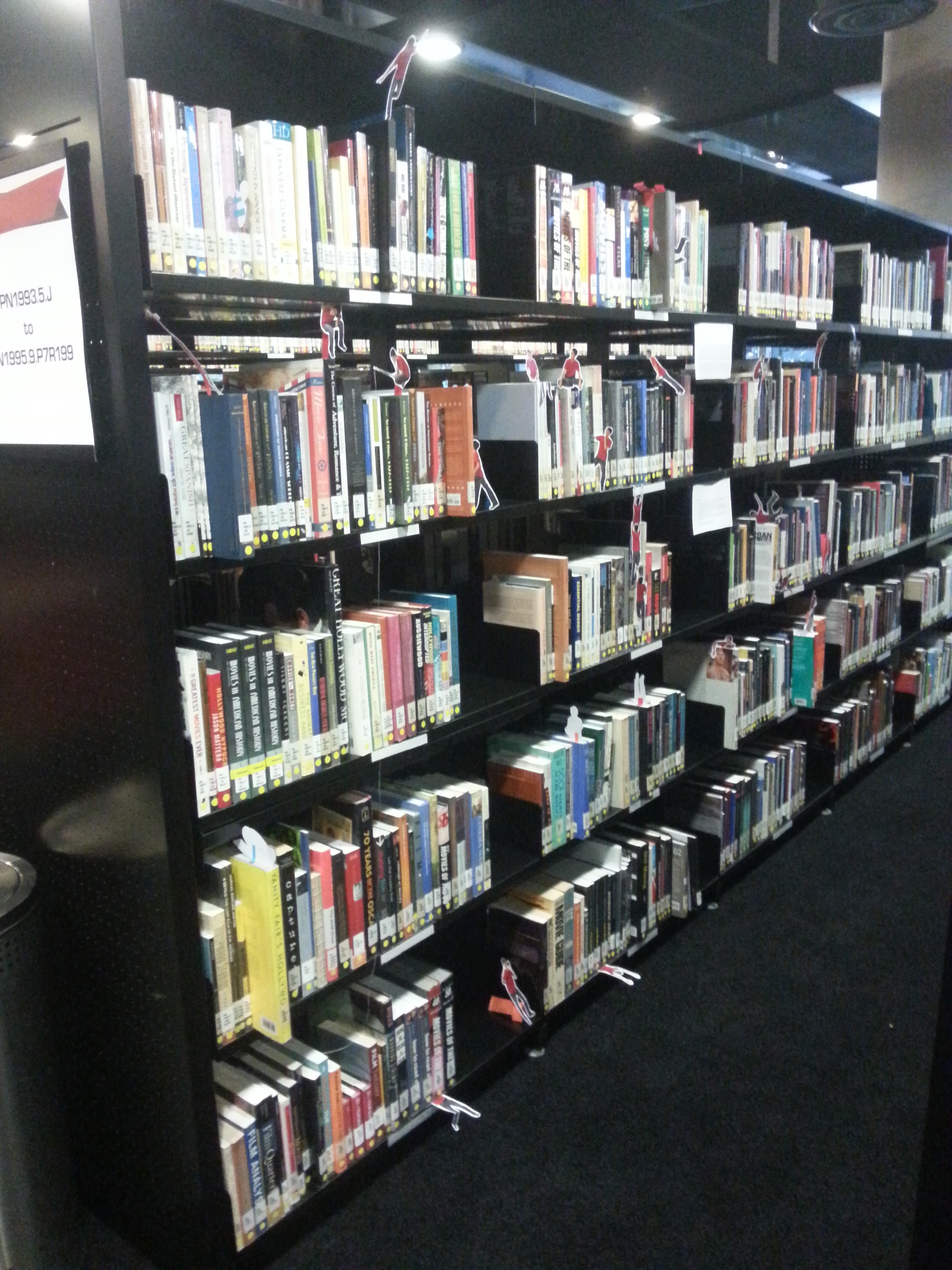
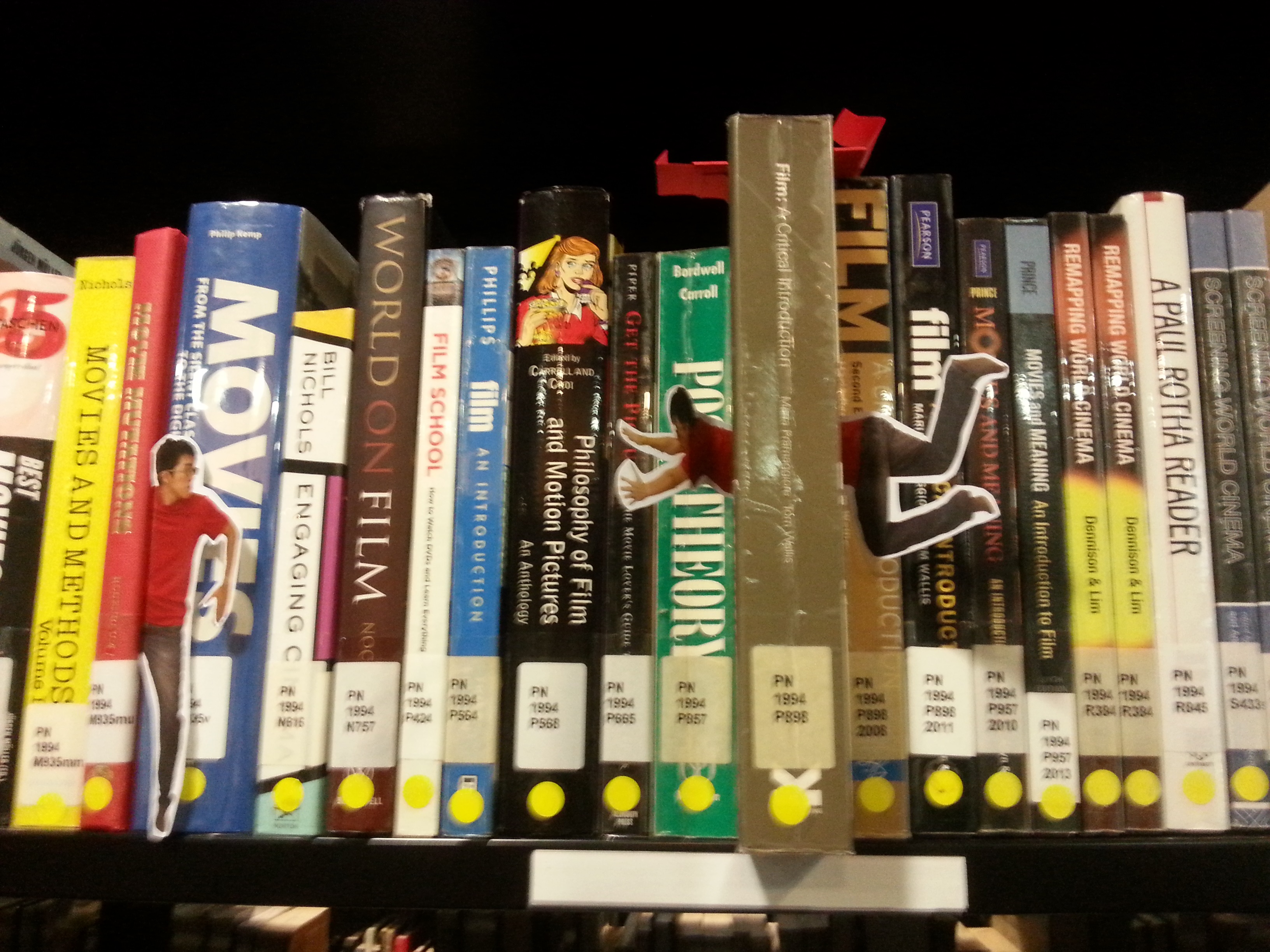
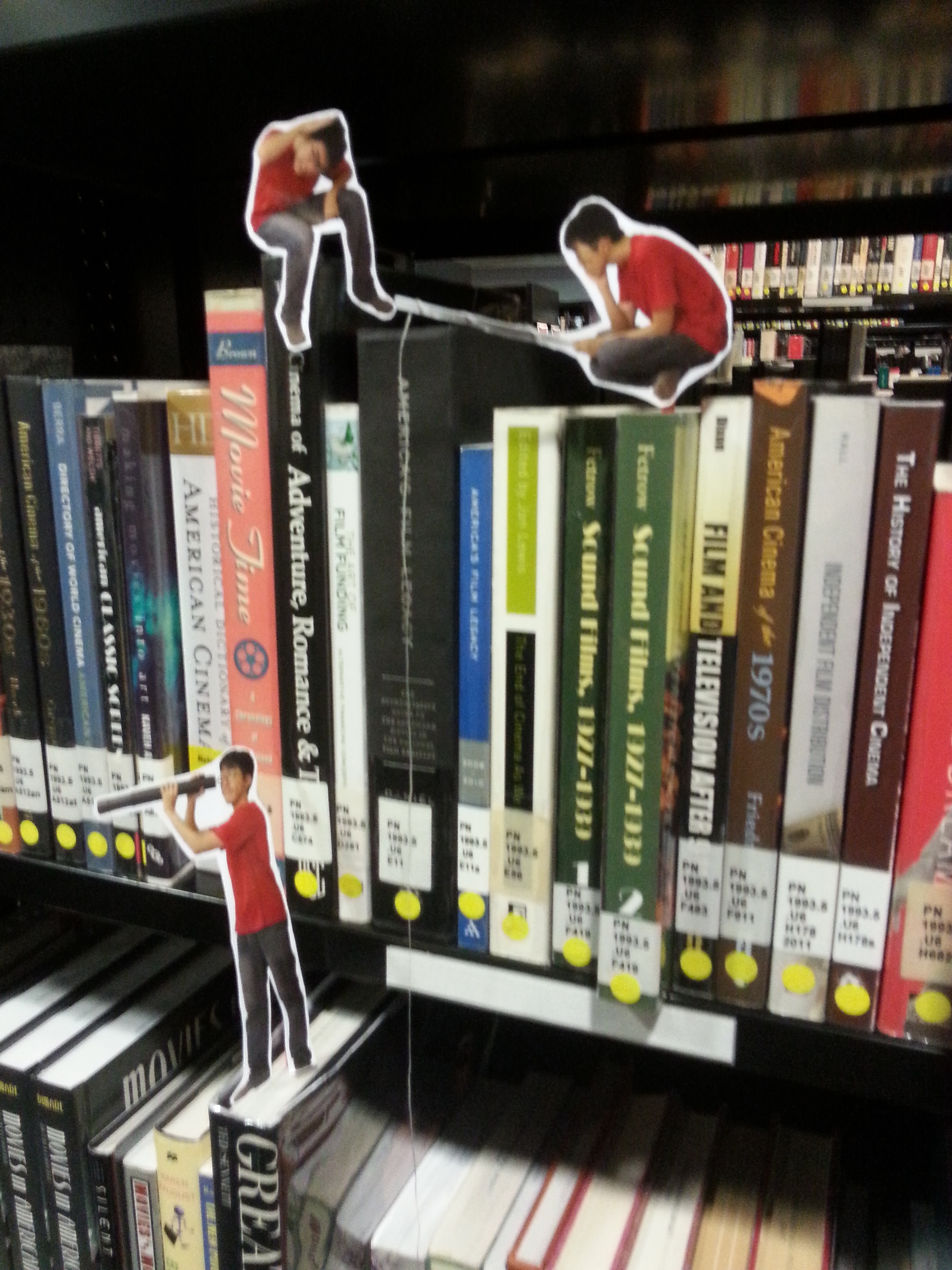
With the worries of missing the TIME OF OTHERS exhibition, I went to the Singapore Art Museum on the day it ends, 28th February 2016. I missed the group visit on Monday, but I found visiting the museum alone had its perks. I do like to go in groups, but going solo has the same feeling you get when you watch a movie alone. Maybe I’ll talk about this in the future.
The two pieces I wanted to review are both for the TIME OF OTHERS.
Herman Chong
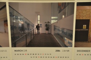
Calendars (2020-2096)
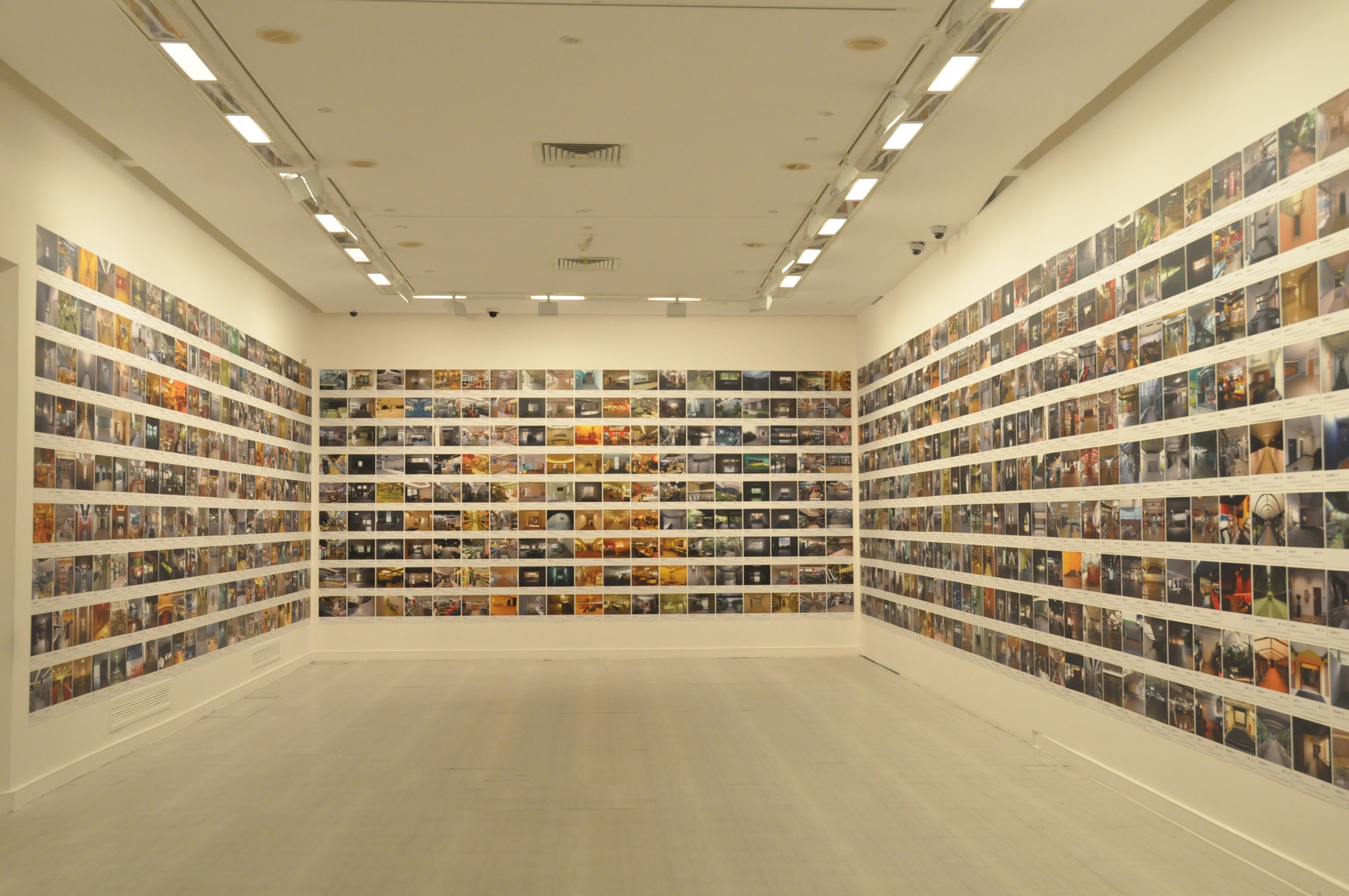
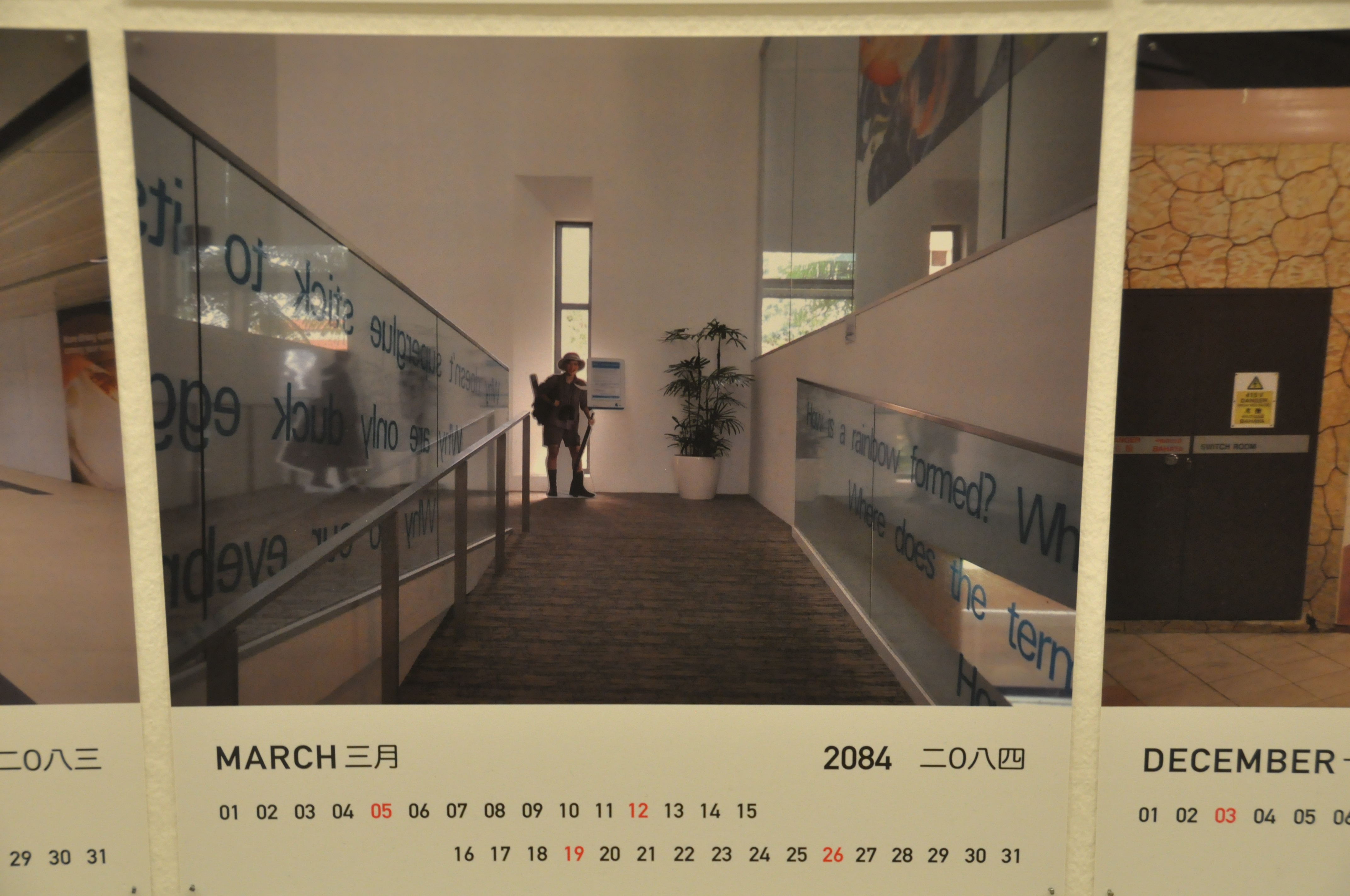
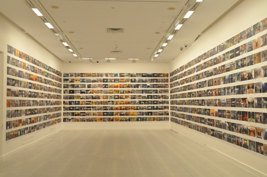
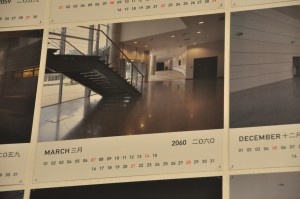
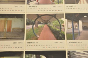
1001 pages of usable future calendars, installed in a grid covering the walls of the entire room. All pages are offset prints with matte lamination. Within the 30x30cm surface, 80 percent of the prints are covered with photos of Singapore street views. The other 20 percent are calendars for 77 years starting from 2020. Due to the size and amount of its single pages, the whole piece is enormous and eye catching. With its photography components, it attracts viewers who have the effort to look through every single photo on the calendars. Seeing the piece not as a whole but as an album.
The initial impression I got from the piece is its scale and number. I gasped for its enormity at first, then I try to find its specialty. In my common impression, calendars are full with breathtaking iconic city-scape photos or beautiful illustration. (Usually related to the calendars’ company products.) However, the piece chooses unconventional photos as its content. The locations shown in the photos are not remarkable landmarks or at least not worth a selfie to be taken in. These place are street image from a citizen perspective. (Mostly one-point-perspective, probably the artist’s obsessive style of shooting.) My initial guess is, the artist wanted us to be aware of these places. Through the attachment of calendars, perhaps the artist tries to remind us that these neglected places will not remain the same as shown in the photos. This is our current generation’s version of commemorating-sceneries-in-the-past calendar for the future. The calendar format also explained why none of the location overlapped or repeated.
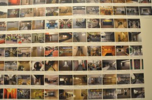
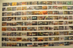
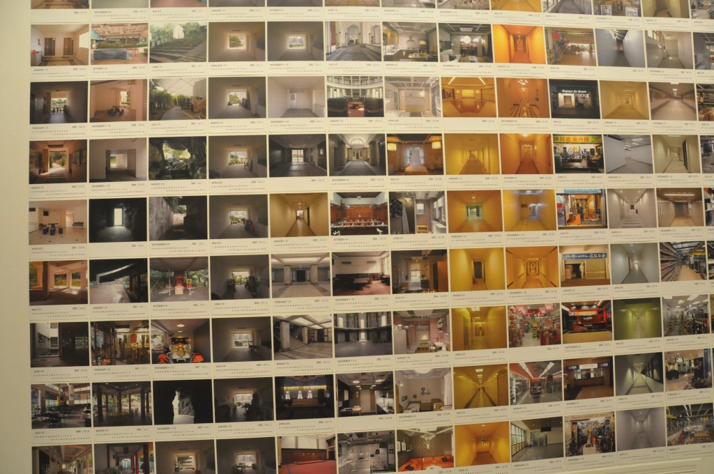
I supposed choosing locations from all over Singapore is a way to engage interaction with the audience. Audience will be delighted if a place they knew was shown on within the 1001 pages, just like I did for these two locations.
Once I saw a familiar locations, I’ll continue to finish the viewing to find more. Either it’s intentional or not, it certainly propose such effect with the viewers.
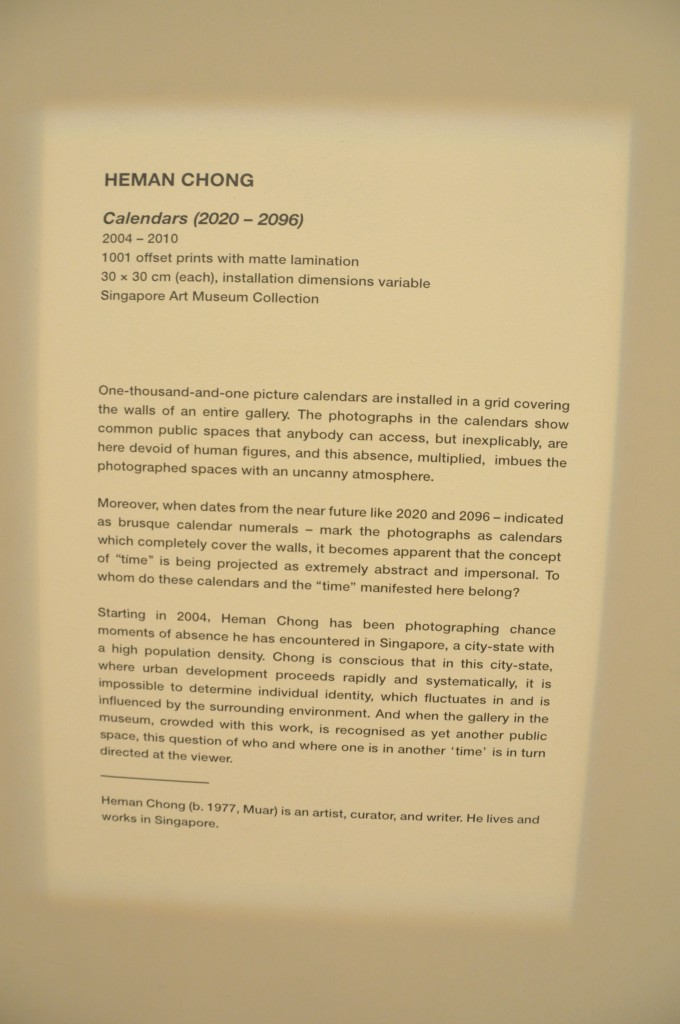
After the reading of the descriptions, I find a new perspective of the piece. It does hit me with another point of view, when I finally realized there’s no human figures in each photo.
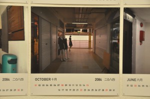
I thought these are exceptions at first glance. (Turns out they’re a paper model and a mannequin.)
I was impressed on how the artist take advantages on Singapore city traits to create a contrasting work to ask questions about urbanized space. My first guess deviated a lot from the artist intent mainly because I focused on what the artist trying to show, not what the artist trying to question. I wouldn’t be able to ask the same question as the artist as we see things differently. But the description certainly helps my understanding and invoke the artist’s question into my mind while I watch the piece again.
The medium was effective, as the description stated, the calendar format did show the “time” concept of the work. But it’s difficult for me to ask questions about belonging of manifested “time” and calendars or representing of spaces, as I can’t tell from the clues. I do think maybe exhibit the work in the form of actual usable calendars might improve my understanding of the mentioned questions.
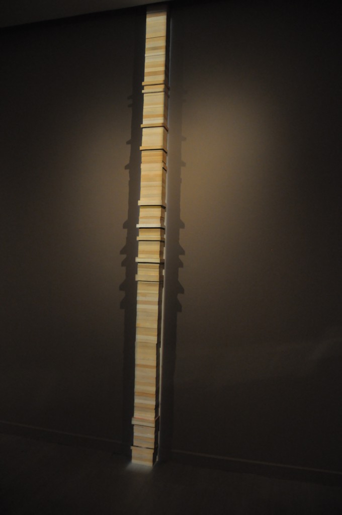
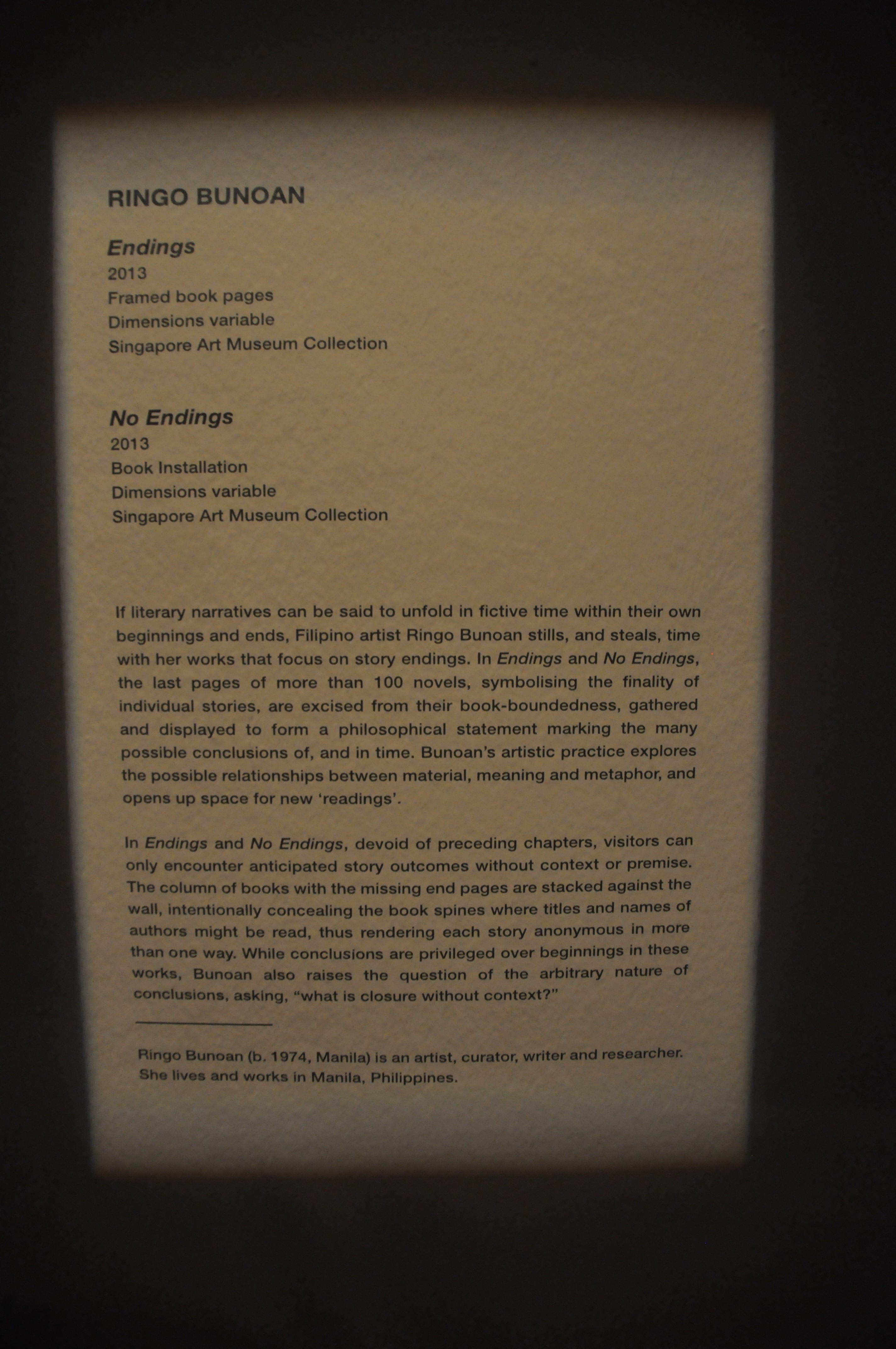
No Endings
Ringo Bunoan
Endings and No Endings.
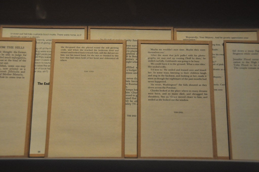
Endings
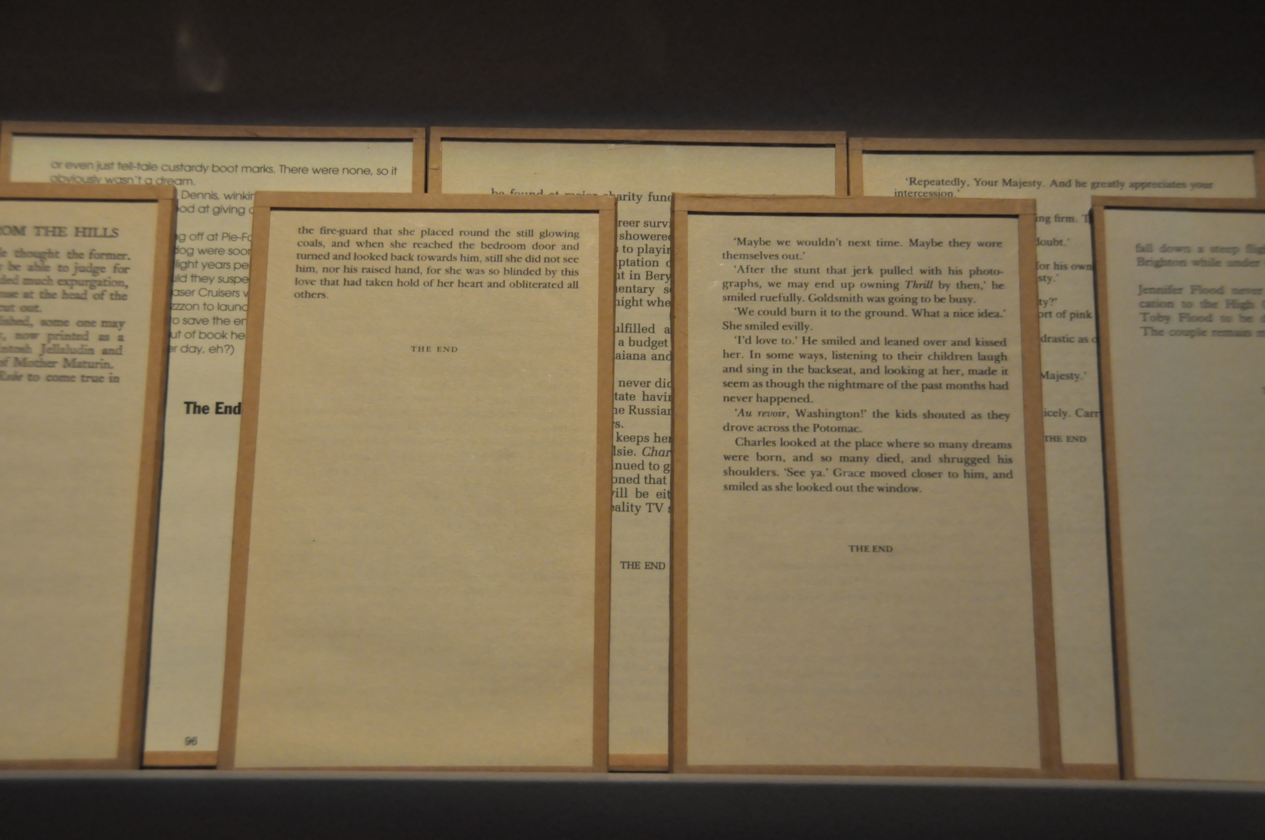
Endings, framed book pages of possible the last pages of novels and fictions. Arranged and attached in a way that the origins of the pages are unclear. Viewers can definitely confirm they’re last pages as the phrase “THE END” was constantly shown. The pages are placed on one long rack, overlapping on each other.
No Endings, on the other hand, is a pile of at least 100 books stacked till the pile reaches the ceiling. The varying thickness and color of their pages shows each and every book are different and yet the most interesting part of the work is, every spine of the books was facing the wall, leaving no clue for each book’s identity.
The dim light setting and my hurried pacing gave me no motivation to read through every words. There are even half of the pages are blocked. Therefore I concluded from first glance that the work are not for reading but to observe it as a whole, in contrary with my previous reviewed piece.
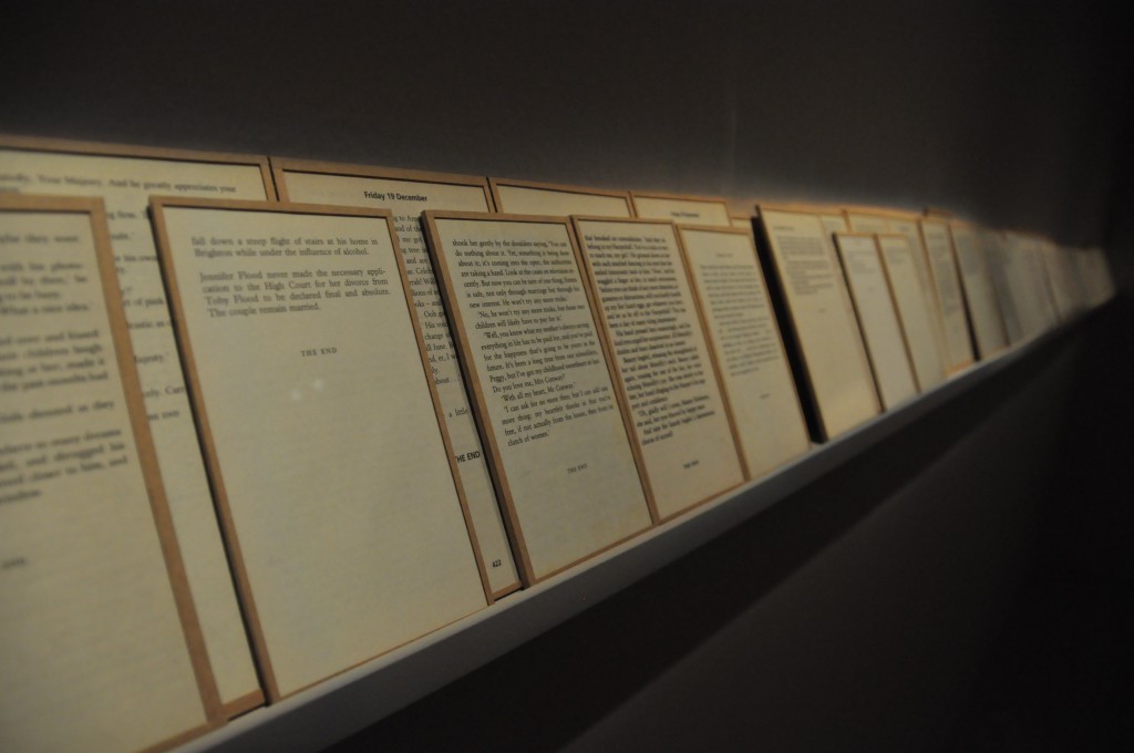
The pages from Endings were framed and placed on a long horizontal rack. From the installment, I’ve wondered, is it trying to be a long narrative? A narrative without any beginnings, progresses, but endings, is maybe the work’s inspiration. As for the tower of stacked books, I was guessing whether if the last pages from Endings were in fact from these pile of books, which explains the second work’s title, ‘all these books have no endings, as the endings are removed.’ That’s a literal interpretation. With the urge of wanting to know what questions the artist propose, I read the description right away.

“What is closure without context?” That’s the final question. The description actually clarified my wonders. IT does proposed a question and that question can be applied in many aspects of life. What is closure without context to me is like asking what answer without questions is? In contrary, what’s a question without an answer? Questions without an answer are thought to be ambiguous, like story without endings, like the final question the artist had asked. Ambiguity works for certain people who like to imagine their version of endings, engaging a discussion about which version is legitimate or closer to the author’s intention. Endings or closure without premises and context are interesting as well. They spark imaginations and proposed more stories that lead to the same ending. Books especially published fictions are indeed the best medium to convey the artist, and I think the artist chose well. I personally think showing only the last pages is an interesting idea. It can be a collection of literature to start various creations, like how many lyricists from the Song Dynasty created many version of Ci 词 (lyrics) for the same melody. (Ci Pai 词牌)
In conclusion, I chose 2 pieces from the same exhibition as I find TIME OF OTHERS are more compelling than the other installations. It is mostly because I am keener in reading stories of others. Also, it’s better to visit the other two installations in groups for the best experience as they require group activities and discussion on the spot. TIME OF OTHERS as a narrative installation, is more suitable for solo visitors to read the stories in their own pace.
Thanks for reading.