Since a zine is basically a magazine but smaller…… Is that what the MAGA means….????

(Definitely incorrect, if you did the research.)

Welcome to the end of our 2D journey, which I’ll repeat, the last project will be based on the recent projects we’ve done throughout our foundation year. My concept was officially announced as JOURNEY WITH PEN, a remake of my POV project but expanded and extended. I gotta to say that the whole process is crazy and fun as I’ve never rushed so many digital illustration within a short period of time before! The project reminded me the joy of my own hobby and while whacking the whole work out, I enjoyed every single pages of illustrating. Without further ado, let me lead you through the work, CHRONOLOGICALLY. Let’s start with the good old visual journal, shall we?

20160414_183510

My plan on my zine.

I thought of using 5 A4 papers to form the accordion booklet format I planned as it’s hard to find any paper that has the length to fit the width of 6 A5 papers. (Refer to the booklet figure in the image.) When I started planning the narration for the 8 pages given, I realized that I have the advantages of utilizing the Inside Cover Pages for both ends, because there’s no need to leave them blank for a zine. I’ve figured to give my zine a filling content, why not just include these inside cover pages as the space for my contents? Therefore I added a beginning or prequel to the main narration. This page included my line: A PEN from the point of view of CIVILIZATION is A TOOL OF COMMUNICATION.

20160414_183518

Following the first Inside Cover Page is the main contents of my zine. With the space to extend and expand my previous work, I’ve given myself the opportunity to include many of my eliminated ideas (due to the incoherent concepts. ) into the zine’s body content. During the planning, I found the contents are still lacking some excitement or attraction for the readers. Then an idea popped up as I pictured what if this is a mass publication? I then recalled the book “Wreck This Journal” by Keri Smith, a book series that is an extreme case of interactive books since “Where’s Waldo”. Yes, interactivity was what my zine needed. Thus, I added many instructions in the main content pages that won’t let the readers “wreck” my zine. (Yes, I am not that extreme for this.)

Soon after this, I start designing my zine front and back covers. I decided to keep the front simple to surprise the readers with the rich illustrations. With the same consideration for the back cover, I felt it would be too empty for it because I didn’t included any images in it. So I placed a little surprise for the back cover as well with the help of the glorious Google Translate.

20160414_183526

With a little drafting of my verbal narration and I’m done.

During the group consultation, Ms. Joy and my fellow classmates suggested me to consider more on the printing materials to ensure the bonding of the accordion booklet won’t influence too much on my zine’s final appearance. Thanks to the reliable paper distributor Fancy Papers and the kind people in Poster Connection @ Sunshine Plaza, my zine is completed.

To be continued……

Like, how the heck its inventor came out with a word that sounds so rad and futuristic??

The final project of this semester is a 8-paged ZINE. For me, this sort of looks like a project that requires us to compact everything we’ve learned in 2D into a small book, with the space of trying new stuff as usual. The project enables us to insert any recent projects we did throughout the academic year into the zine. Obviously under the spirit of holy market spoiler, no one is going to just copy and paste their recent work into the zine. Till the time this is composed, I’ve already saw a few of my fellow classmates posting complete research on the ZINE itself. Imagine what they can do by just introducing their title sequence!

Therefore, I’d not like to waste your time and tell you what a zine is. I meant a book with such rad name should have got you google it a while ago. What I’m going to show is the idea I’ve developed for the project. As we are able to insert recent projects into the zine, I was thinking this might be a chance to make use of the composition I left out in my last project, Point of View. The zine is my chance to expand and extend my ideas about the PEN. I view this as an opportunity to make something that’s finally not assignment-based work. (Yasss, this project is damn free to work around.)

My current concept: Create the world’s thinnest narrative book with simple eye-catching illustration style with the tone of children books. What differs this work from the recent project is that the compositions’ orientation are partially altered and the medium of coloring will be shifting to digital coloring as well. Due to it’s narrative nature, I’ll be facing challenges of fluent narration and planning that makes the book worth re-reading. As many of the composition is enlarged, I would like add more interesting element. Not to mentioned I’m now required to add words to the work which made it a typography work, too.

20160403_211558

This time, I’d like to make it more relevant to the public therefore I will be removing the ME elements from the previous project. This decision will leave out many spaces for unused or new compositions, expanding its potential to become a fresh new work itself. With a children book tone in mind, I need to declare that the book was not made for children who haven’t grasp on the concept of an accordion booklet layout, which is the style I am going after. The layout will extend the total length of my zine and potentially resembles the shape of a pen. (The same consideration I did in the teetorum idea.)

Originally I was going after the art direction of Dr. Seuss or the illustrators style I found on previous project. Then I came across this artist which was shared by my high school classmate on social media.

wakemeupathappyland_00 thegirlwithoutaringfinger_07-08 lyraswhisper_17-18

The artist’s name is Josef Lee and he writes and illustrates what he claimed “Bedtime Stories for Adults. Stories about Life, about Love, about Stuffs.” I have to apologize to Ms. Joy who tried to search “adult bedtime stories” after I described his work without remembering the artist’s name. The mentioned keywords are pretty risky to lead us to unwanted sites. Resume to Josef Lee. Not only the artist’s storytelling is so random yet compels emotionally, the artist changes his illustration style drastically after every work, giving his audience a fresh new look every update. What Josef Lee inspired me is his narrative, illustration styles, and also his willing to change in every new update. This prompts me to include such quality into my zine.

I’m currently pausing in compositing stage, there’s so many to considered before jumping to execution, so please wait patiently for further updates of this Zine project! See you soon and thanks for reading!


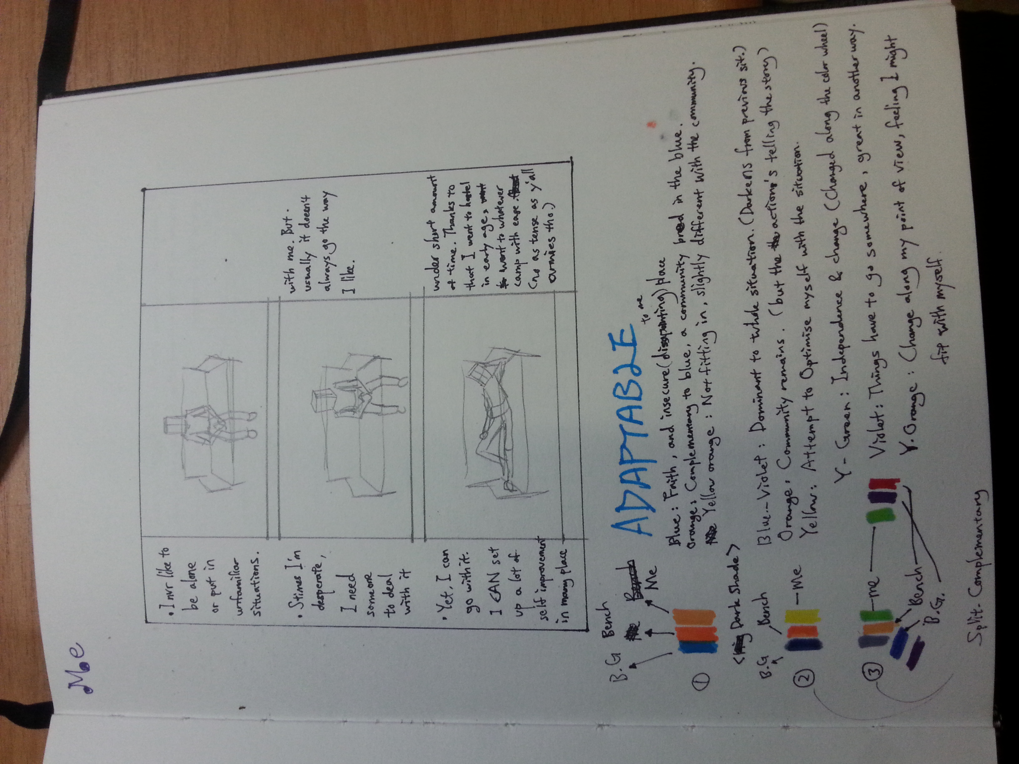
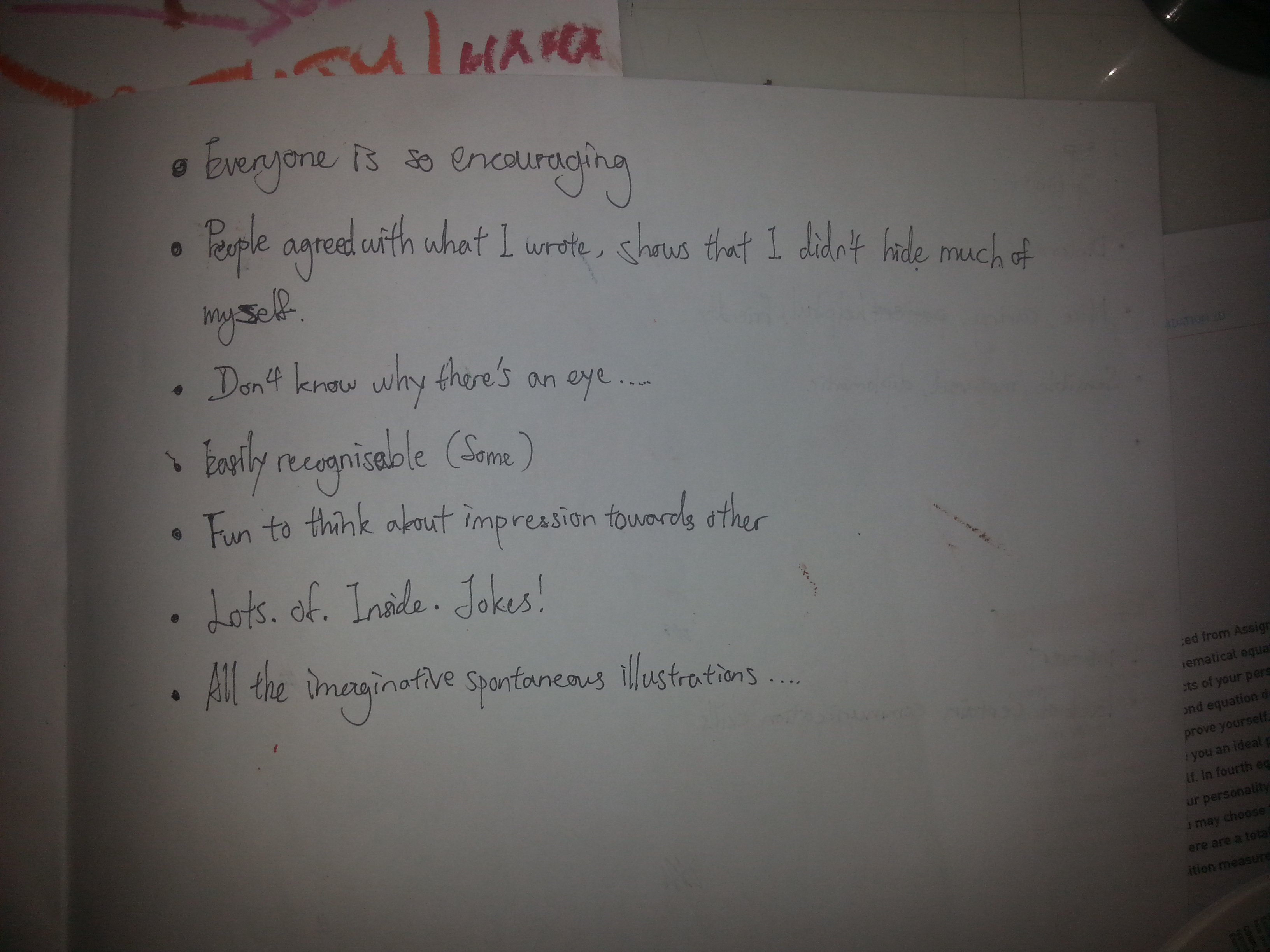
Yes, the current progress I’m gonna show is my concepts. Through the brainstorming of the point of views, I found I’m easily restricted by the 18 points I brought up. Well, it’s the easiest to start from, which soon enough caused me some trouble.

types of pen

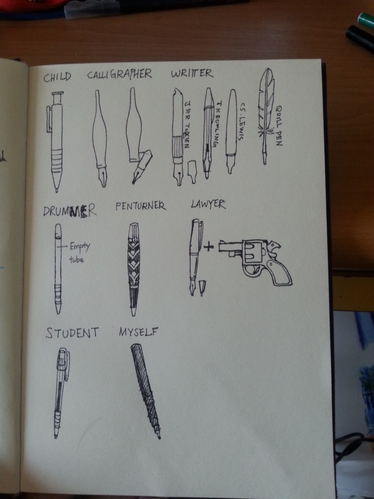
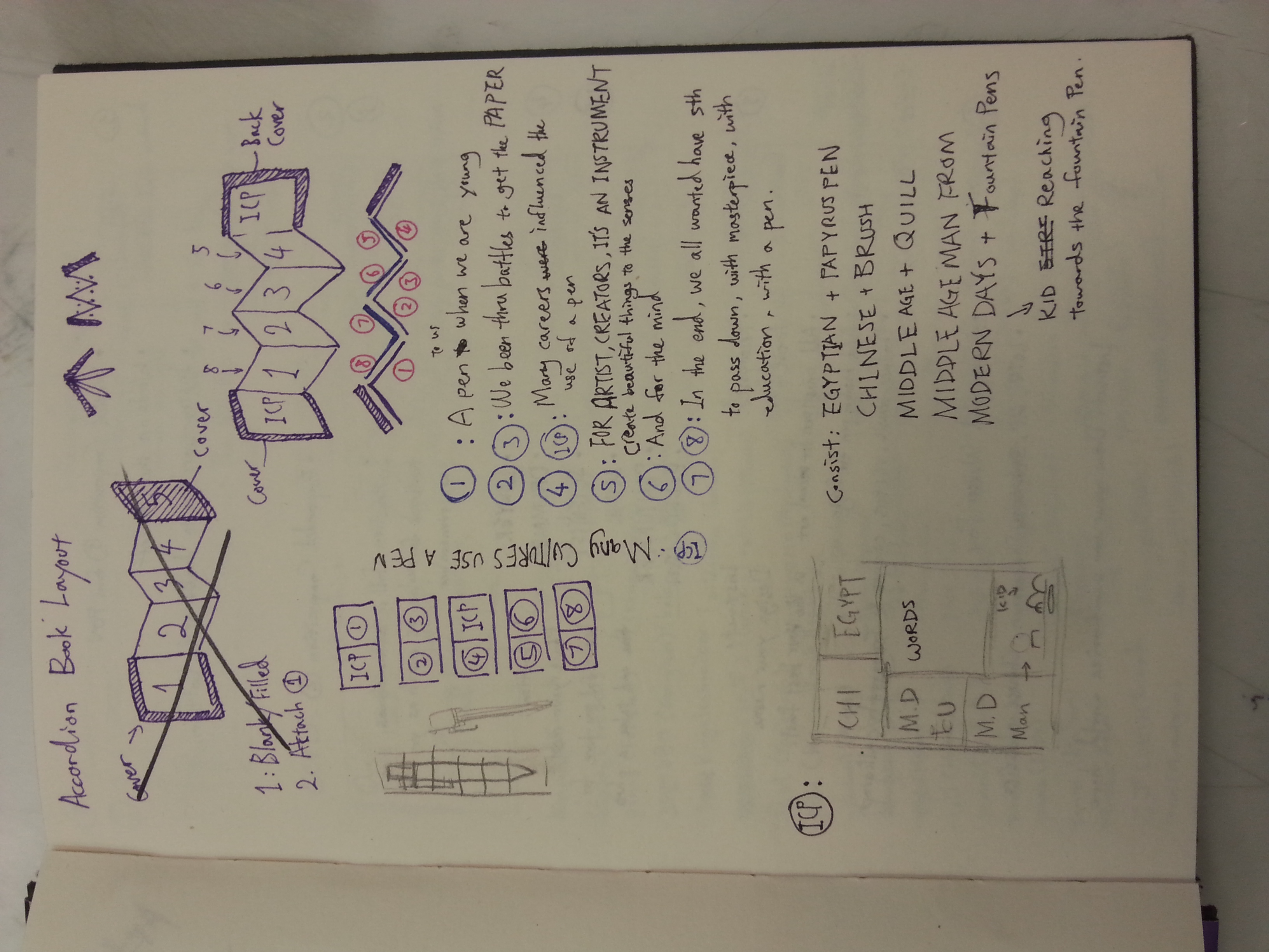
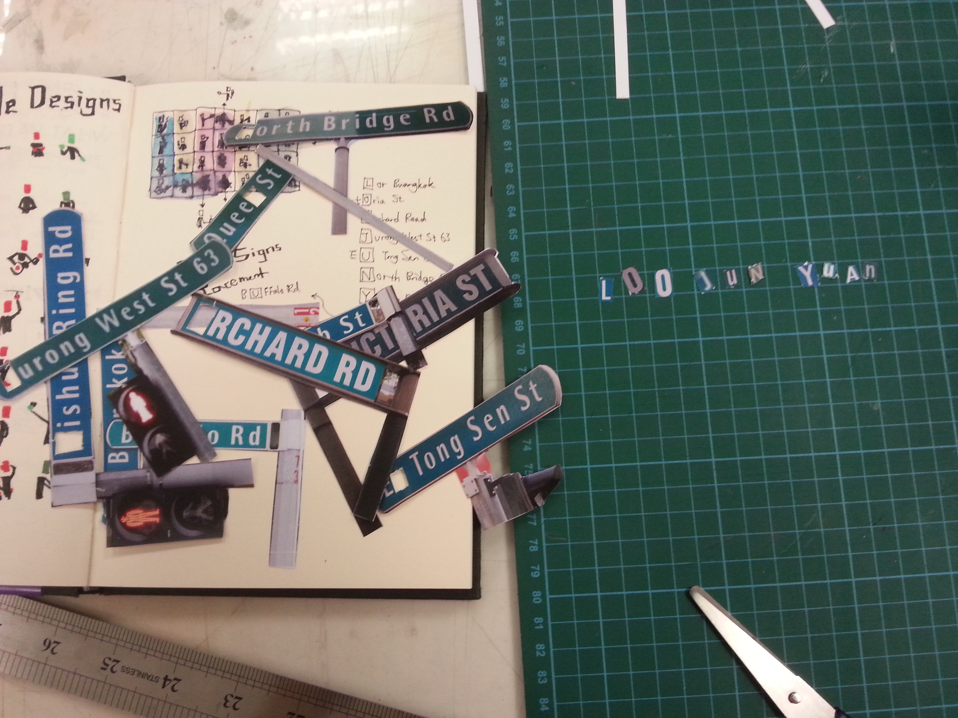
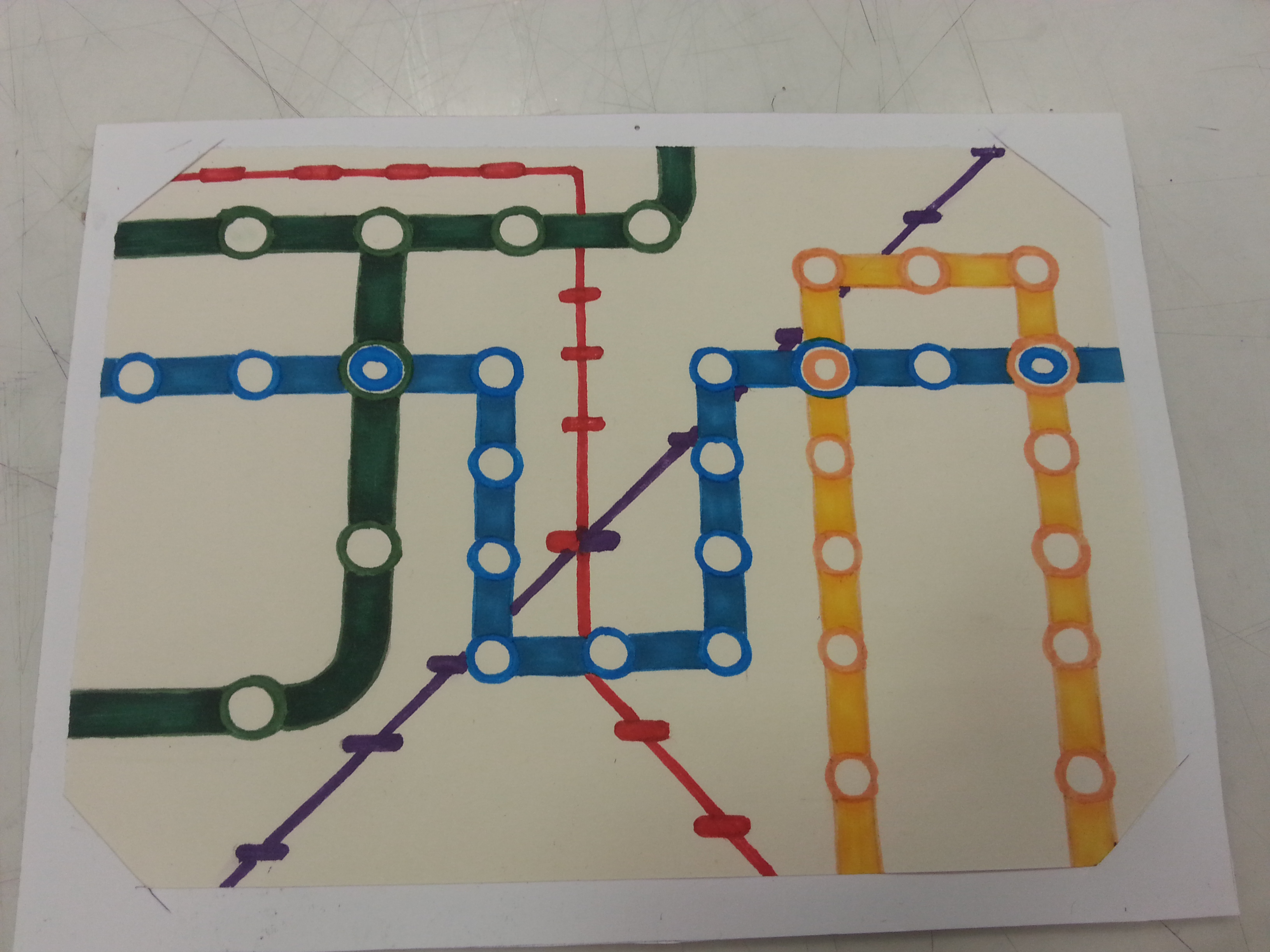
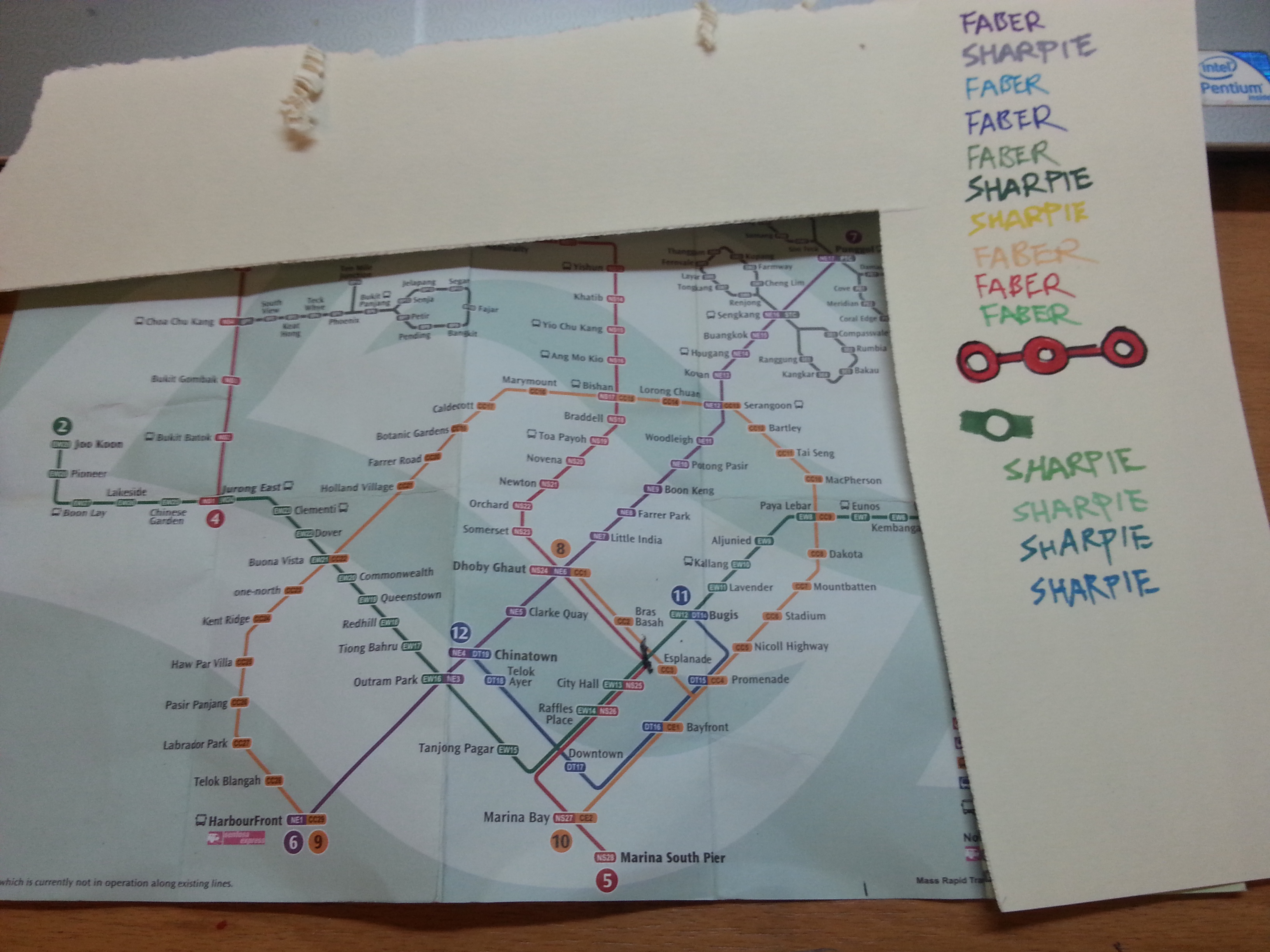
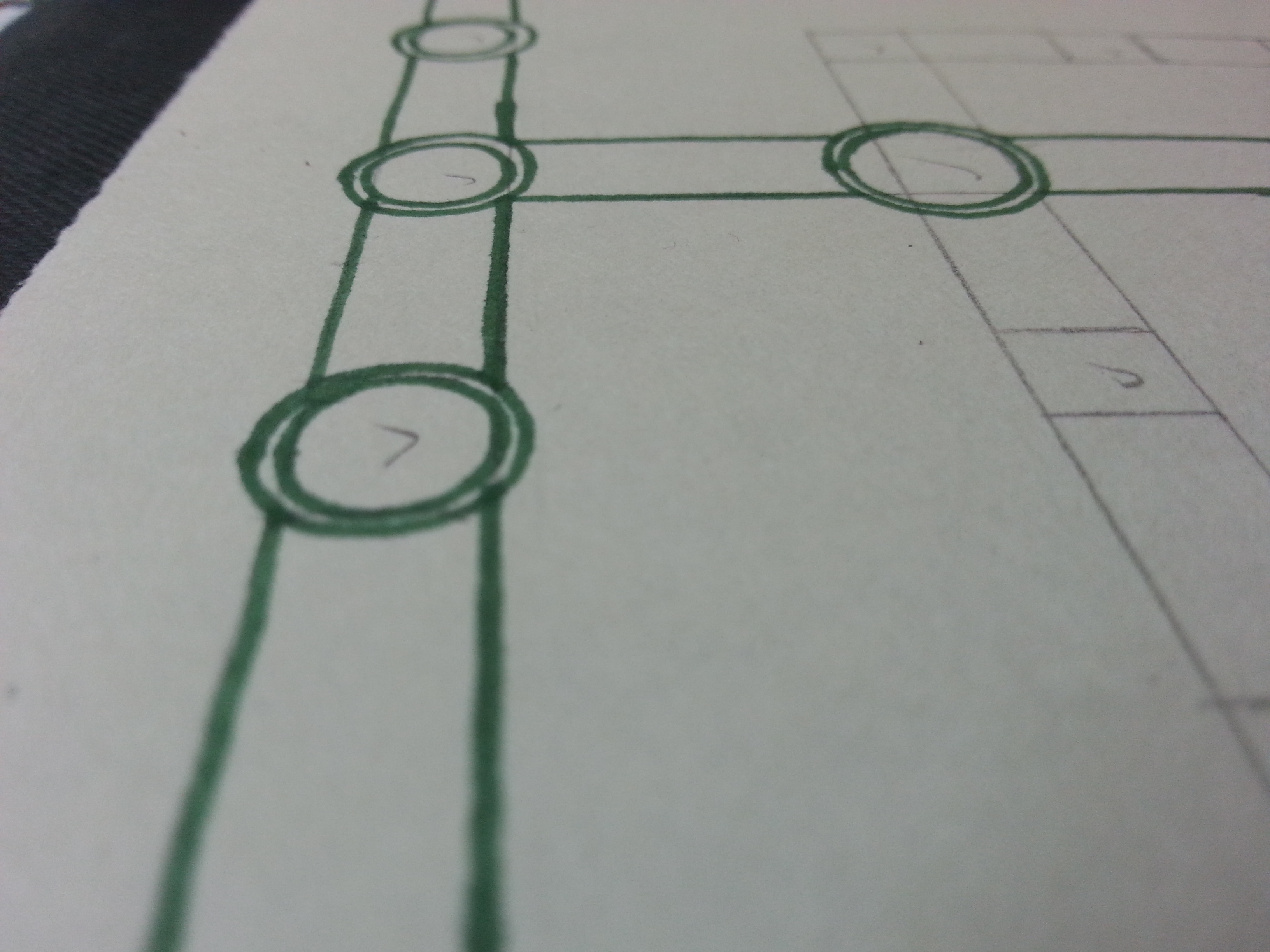
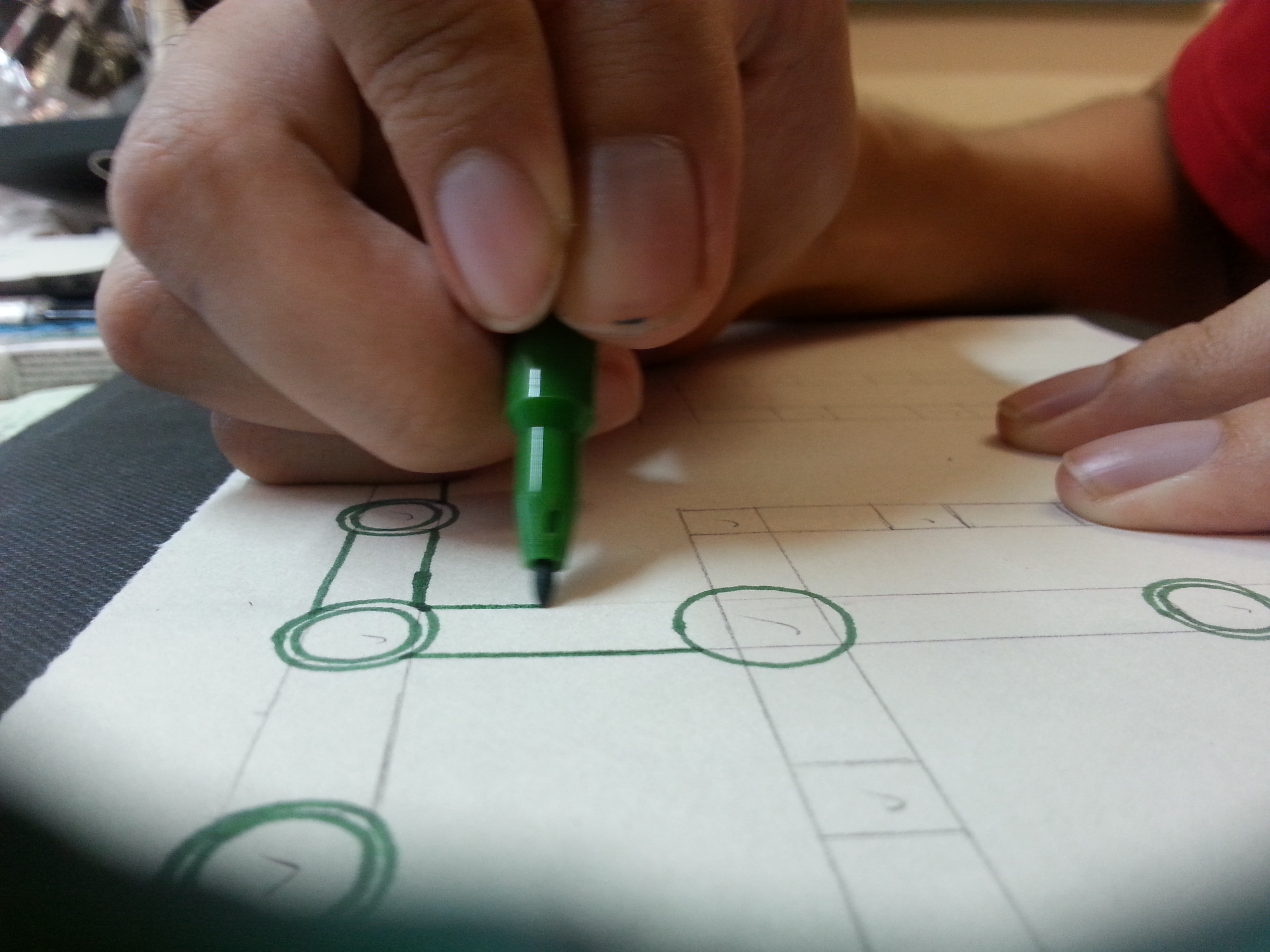
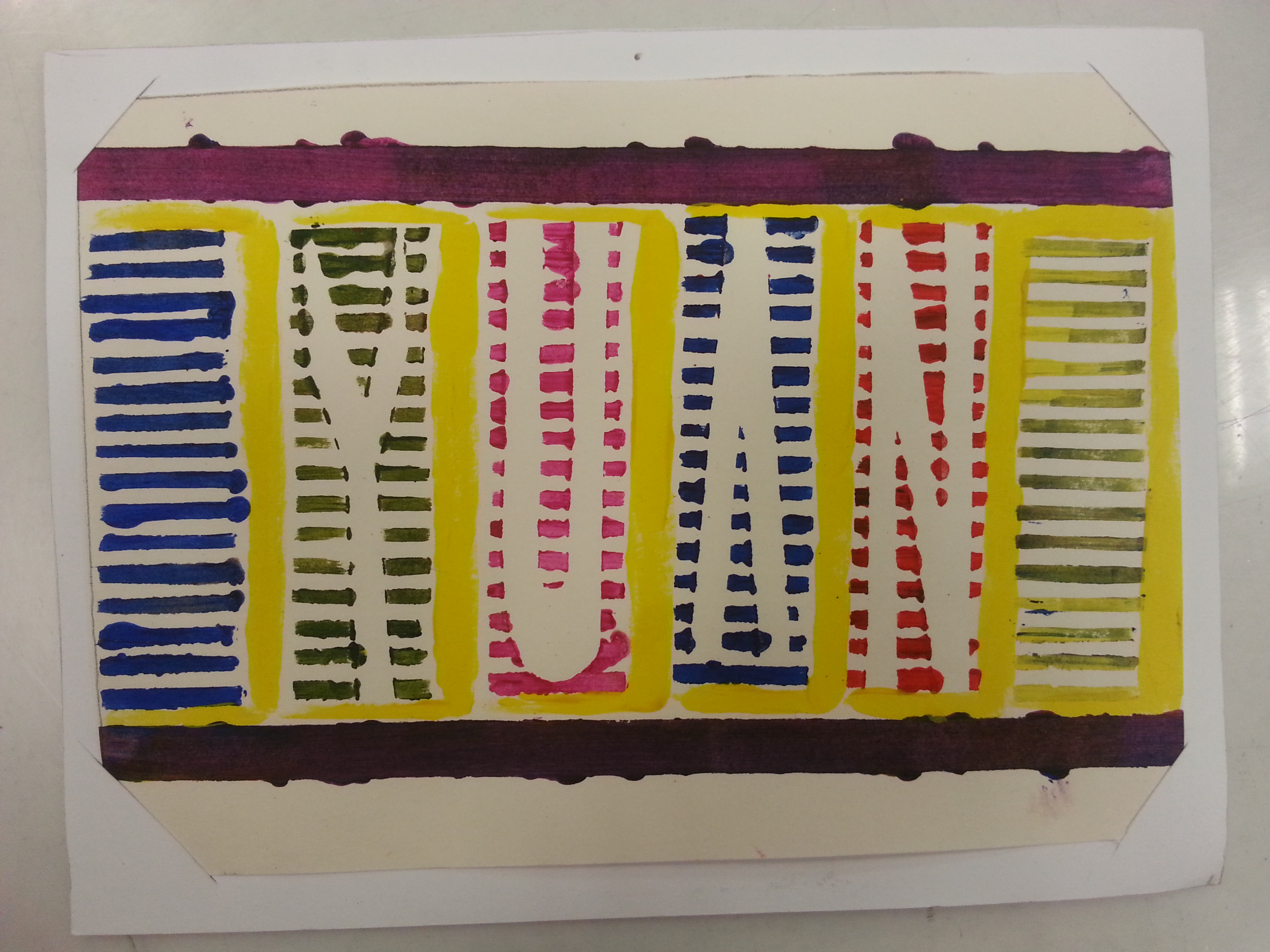
Selecting a suitable pen for each compositions.

Concept 1

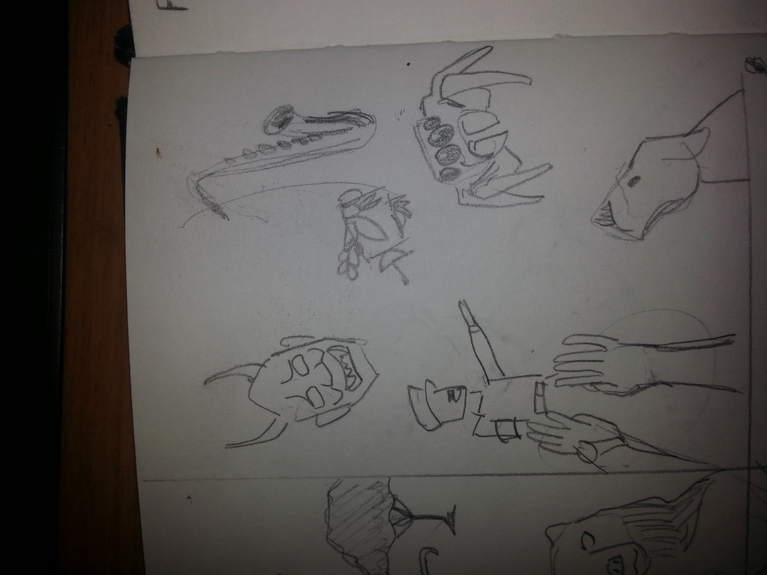
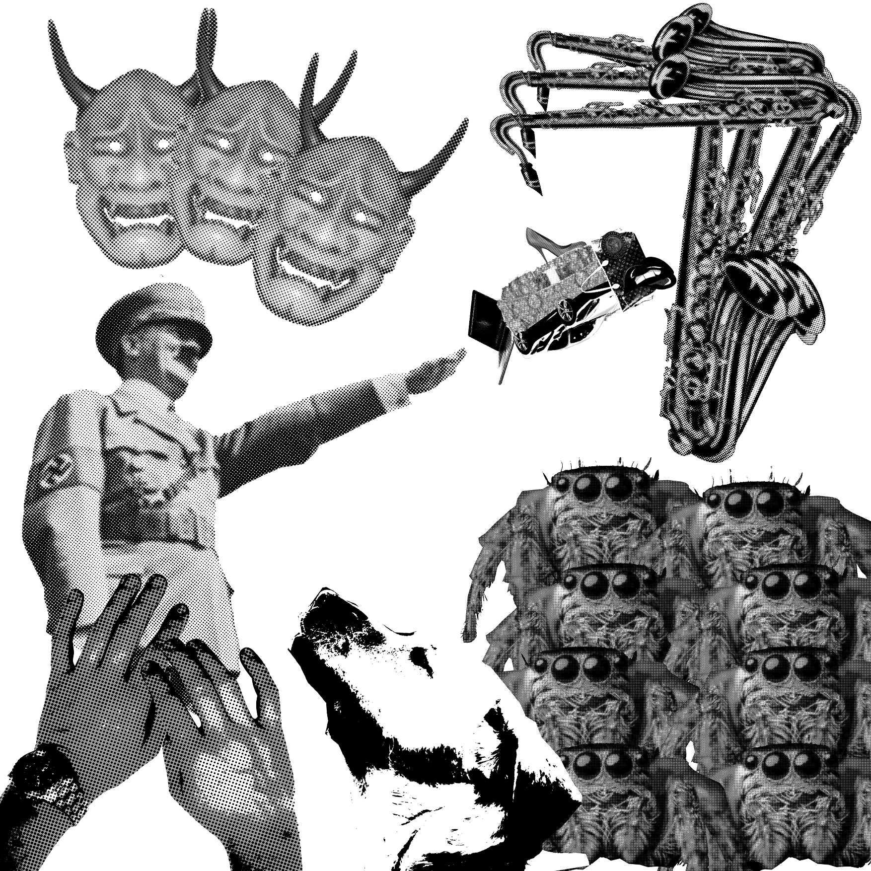
First concept I thought up is based on the professions. After rereading my POVs in the previous presentation, I found some of them could not easily visualized with illustrations, especially from the subject RED. The PEN is rather visual to express as I compared it as other objects. Therefore I’ve filtered the 18 points into 8, not only because they can be visualized but also because that they are from my daily observations, comprehensions, and imaginations.

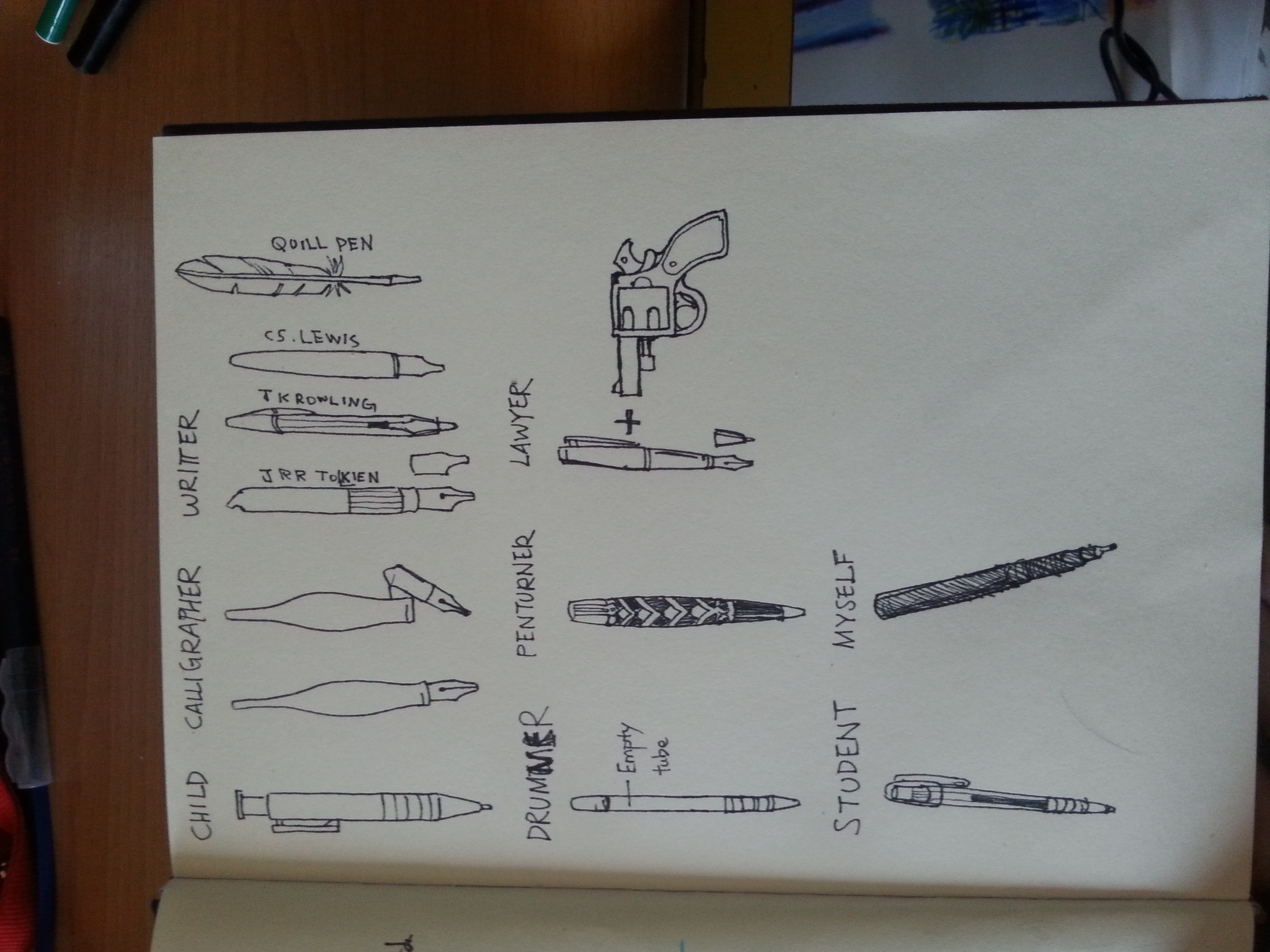
I listed out the following subjects and their POVs towards a pen that would likely to be in the final project.

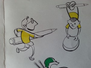
  • A PEN from the point of view of CHILD is PENCIL YOU CAN’T ERASED
  • A PEN from the point of view of CALLIGRAPHER is MUSIC INSTRUMENT
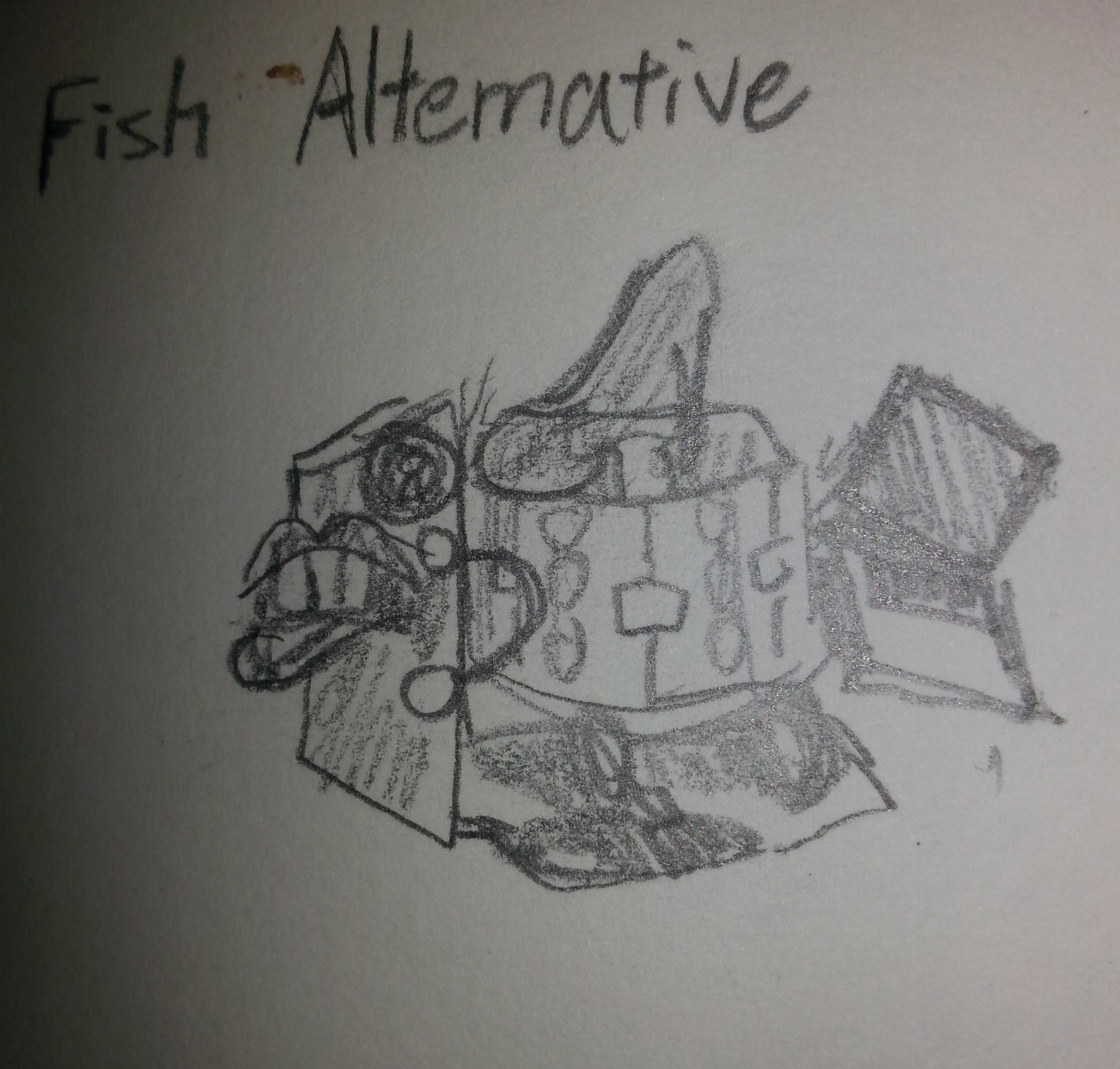
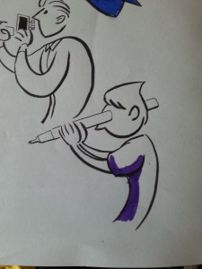
  • A PEN from the point of view of WRITER is PAINTBRUSH
  • A PEN from the point of view of DRUMMER is DRUMSTICK
  • A PEN from the point of view of PENTURNERS is ART
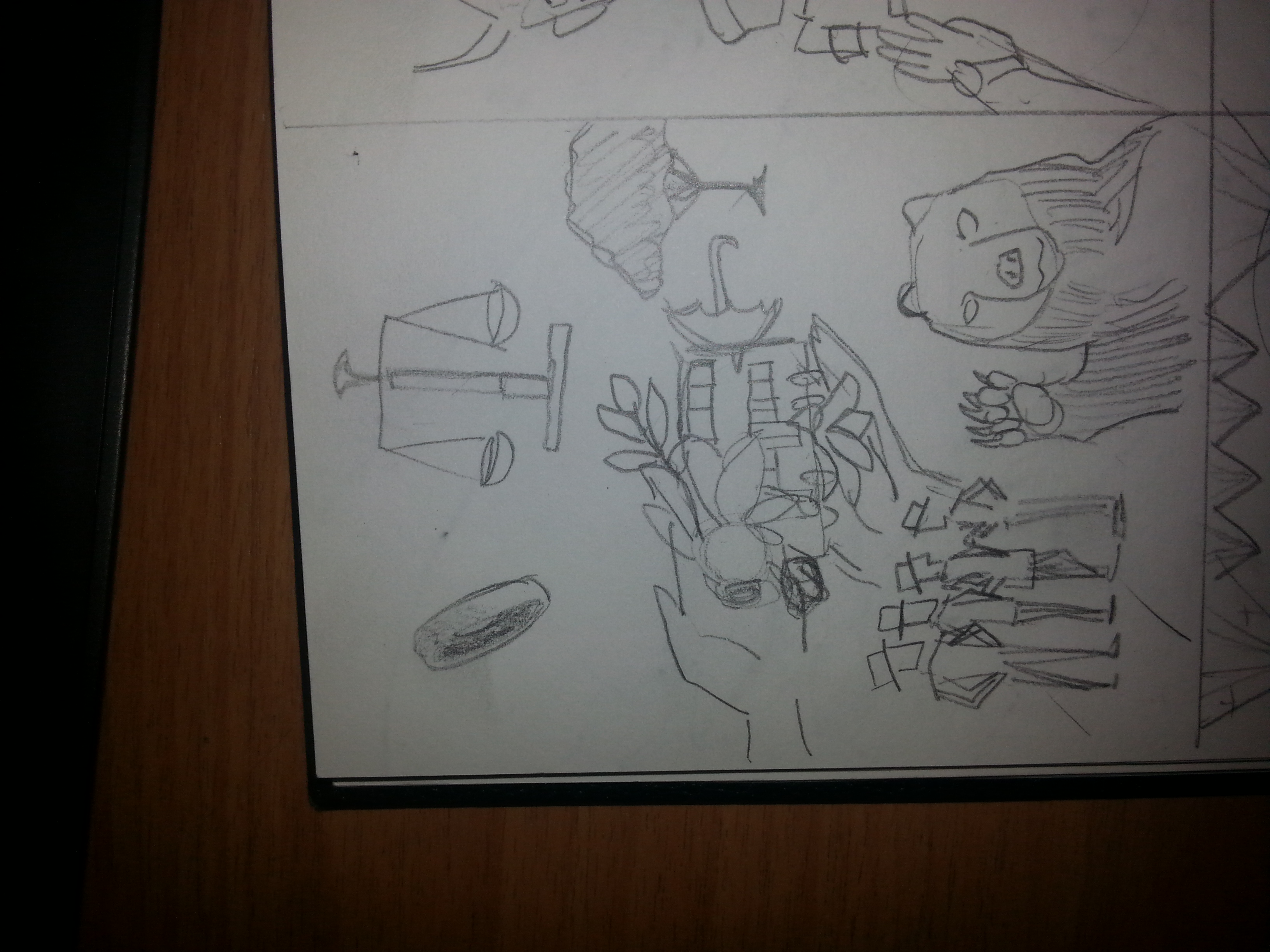
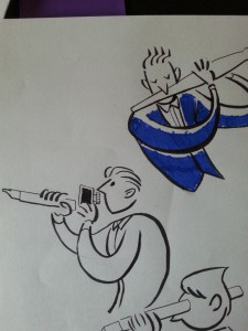
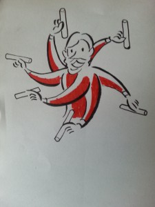
  • A PEN from the point of view of LAWYER is GUN
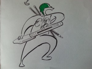
  • A PEN from the point of view of STUDENT is ARSENALS.
  • A PEN from the point of view of ME is MIND PROJECTOR

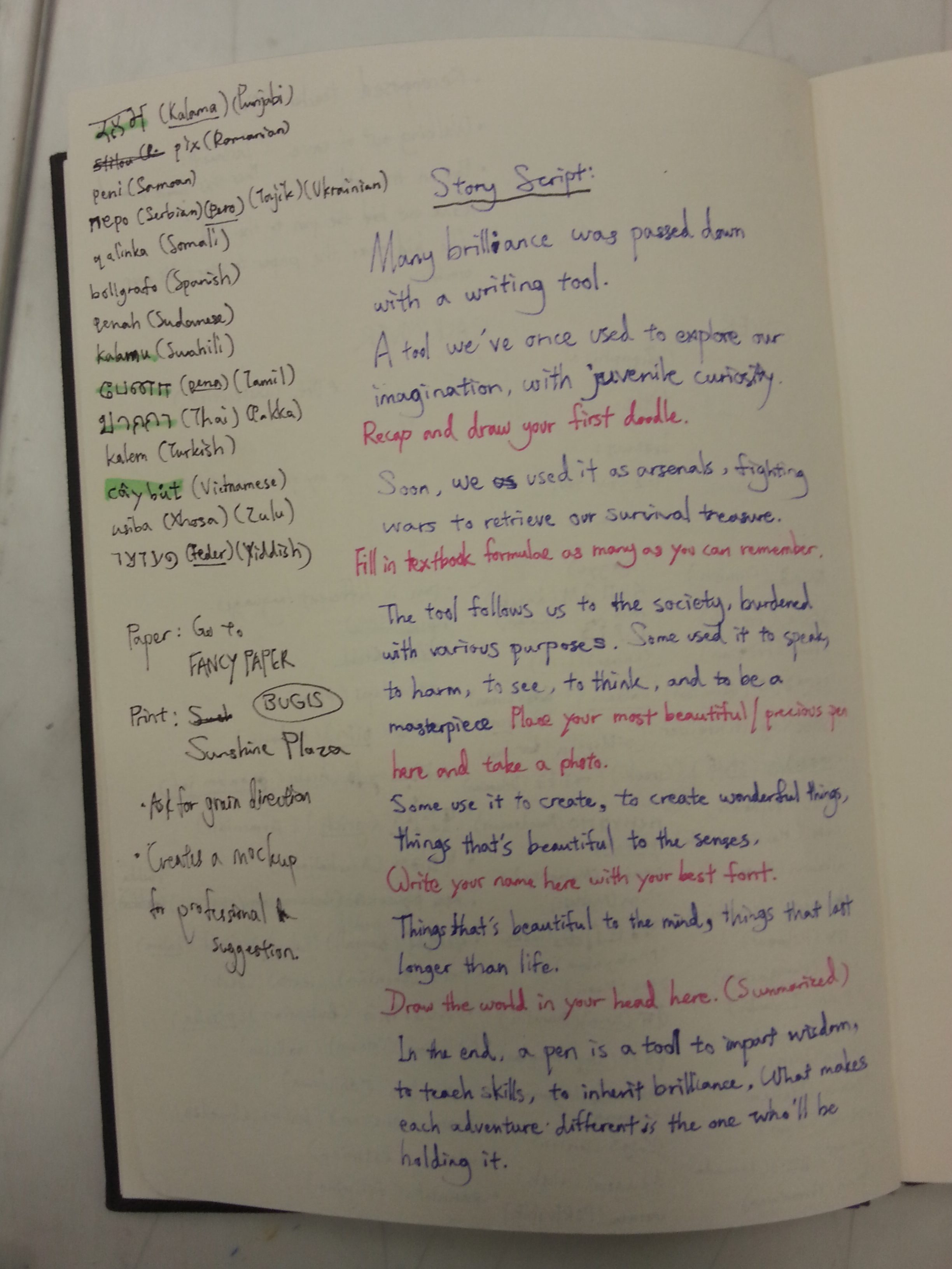
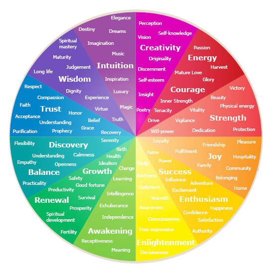
Reason to select a PEN: A pen to me is ambiguous as it shows what I think. Either an image, a story, an answer, or a plan can’t be confirmed until the tip glides through the paper.

20160312_155745

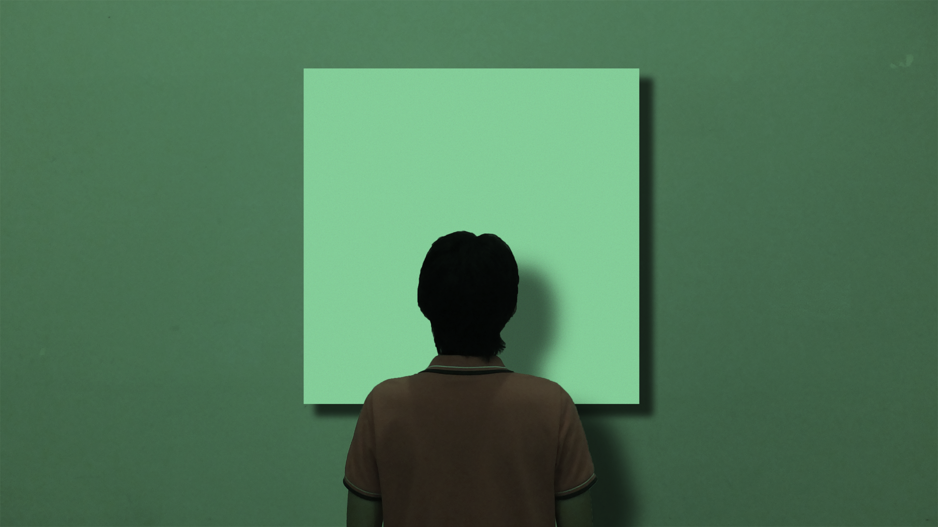
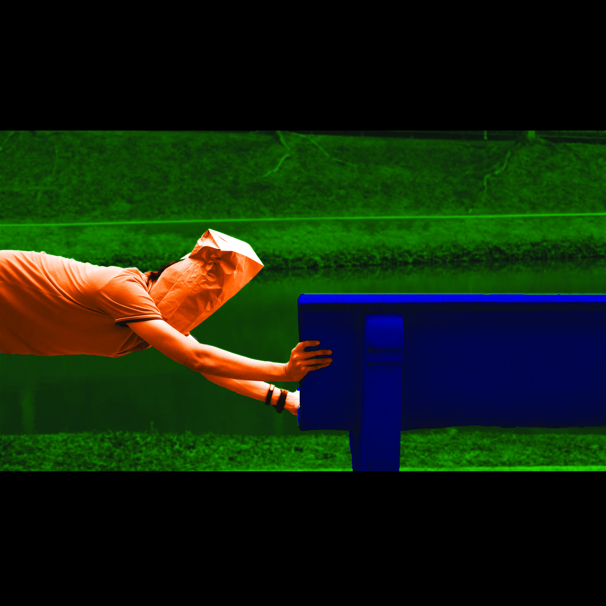
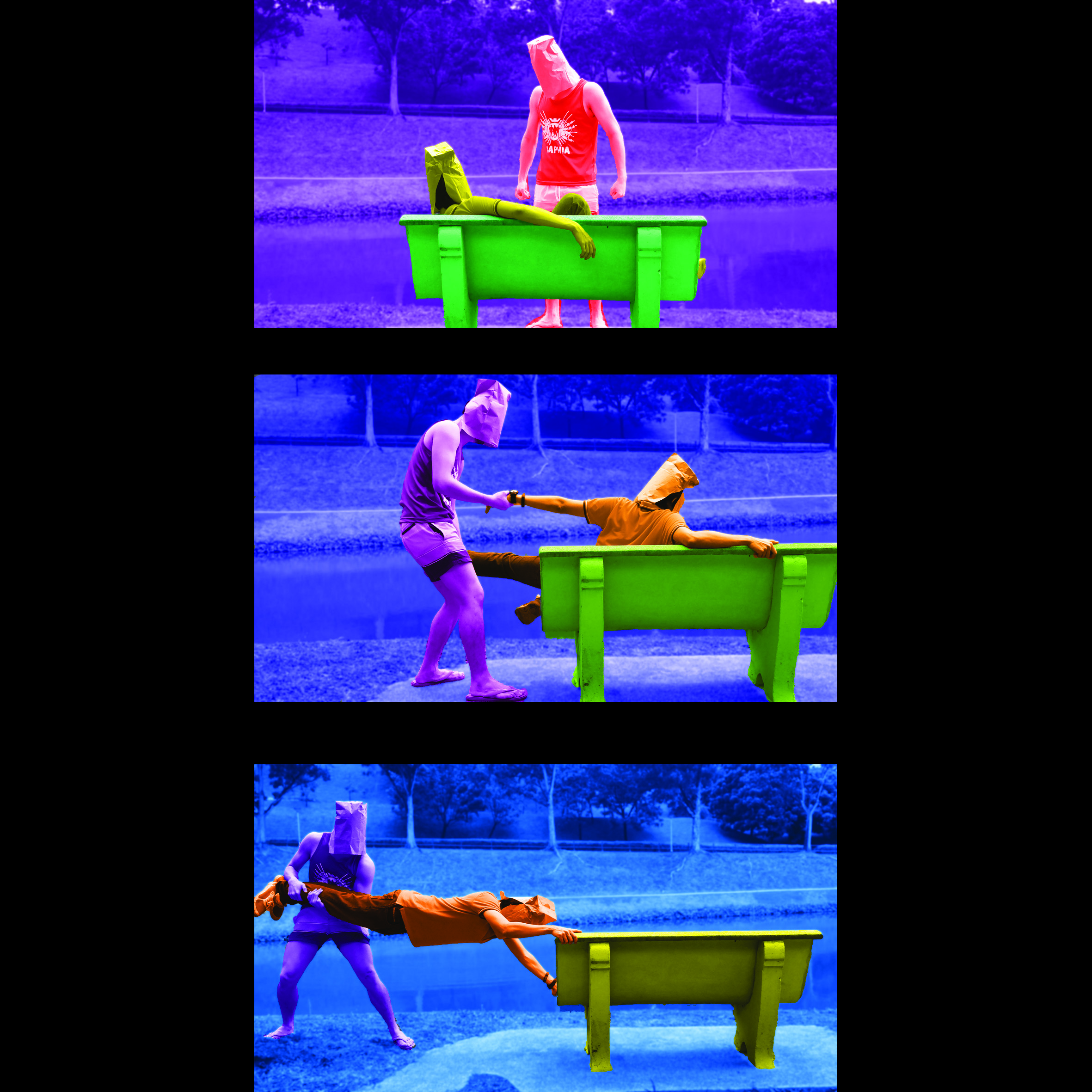
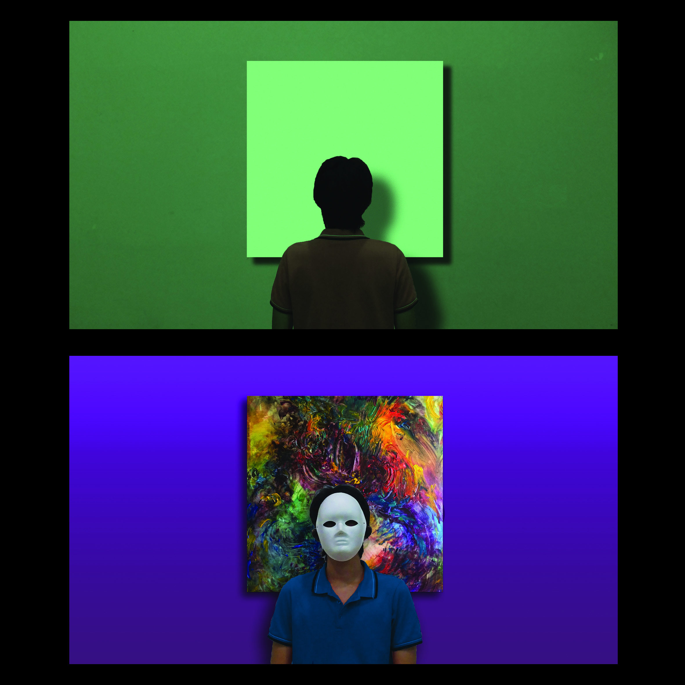
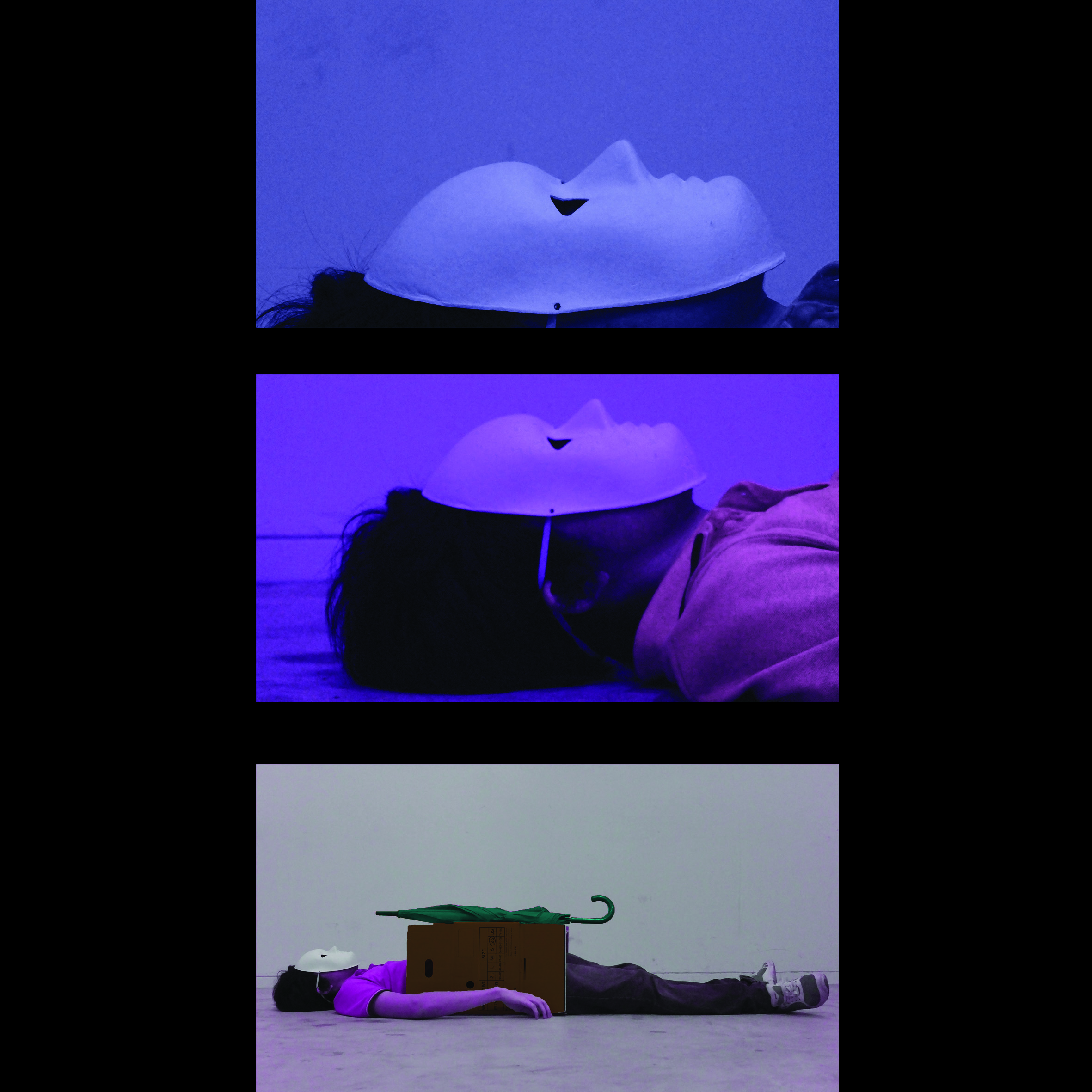
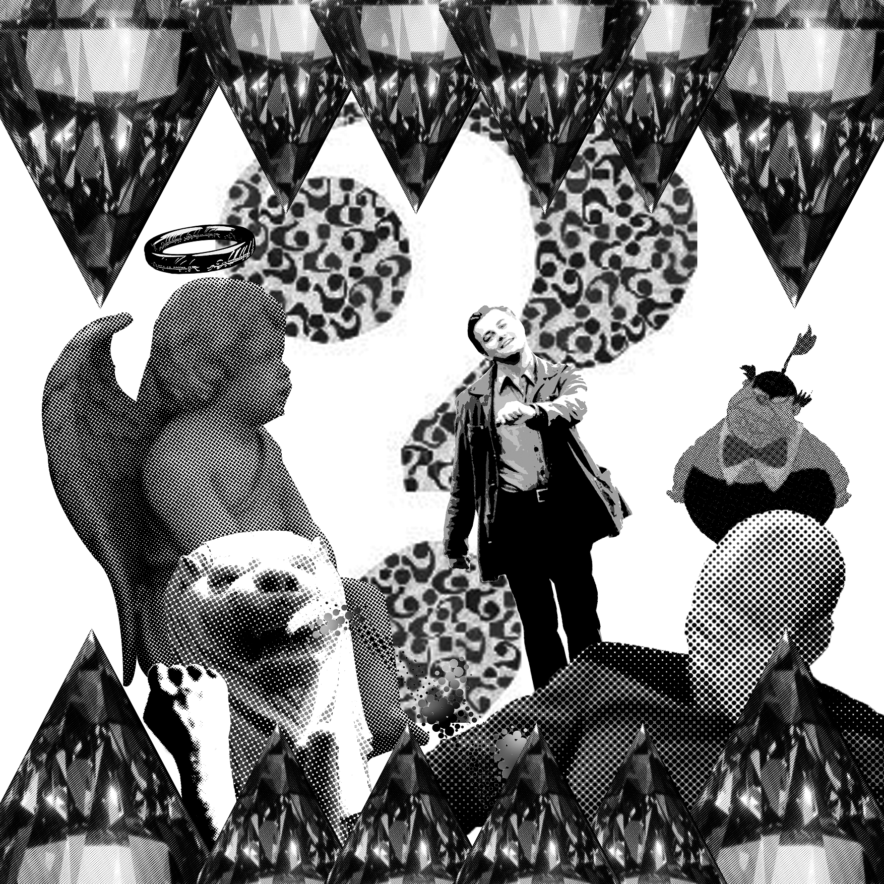
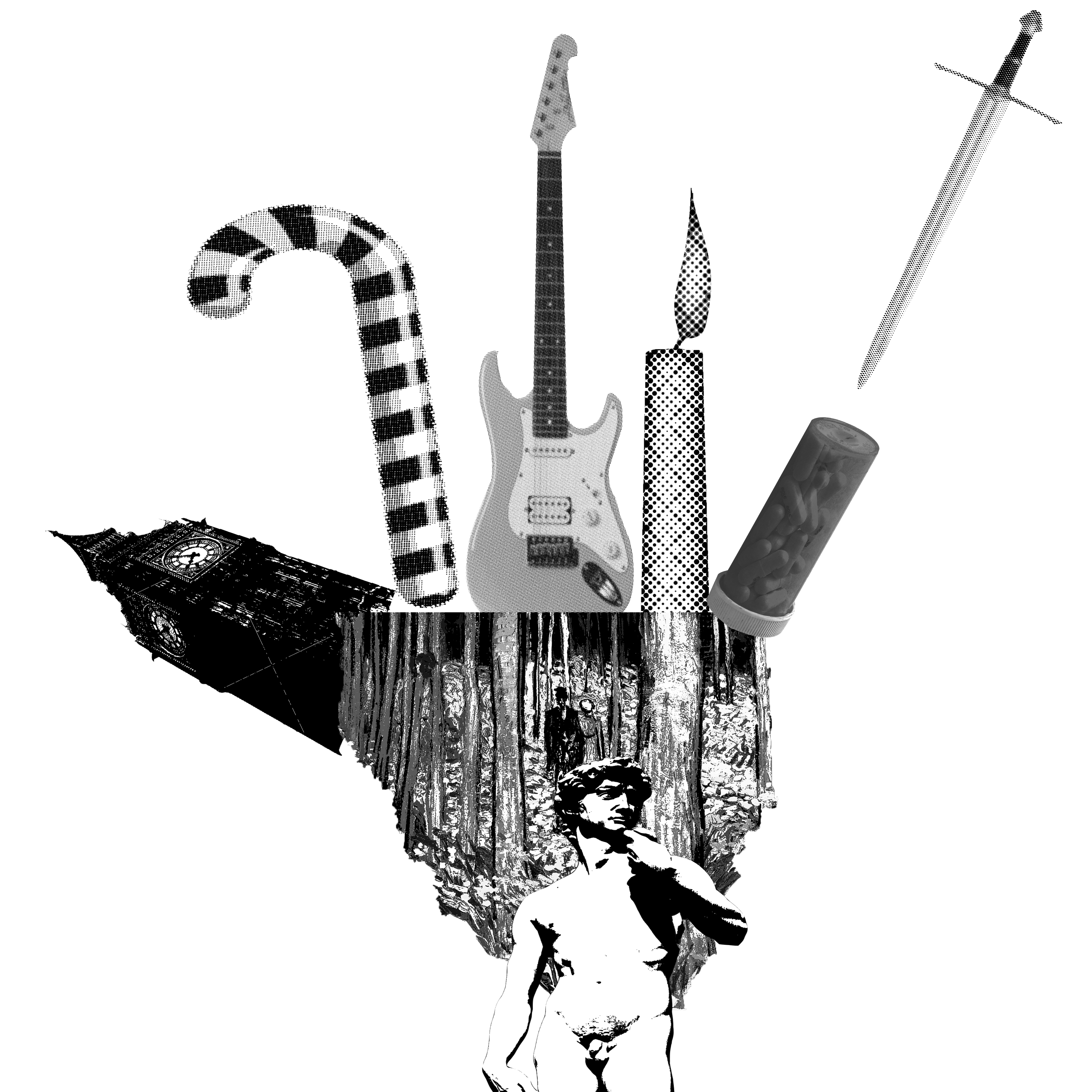
Material contain spoilers. (If you can read it ;P)

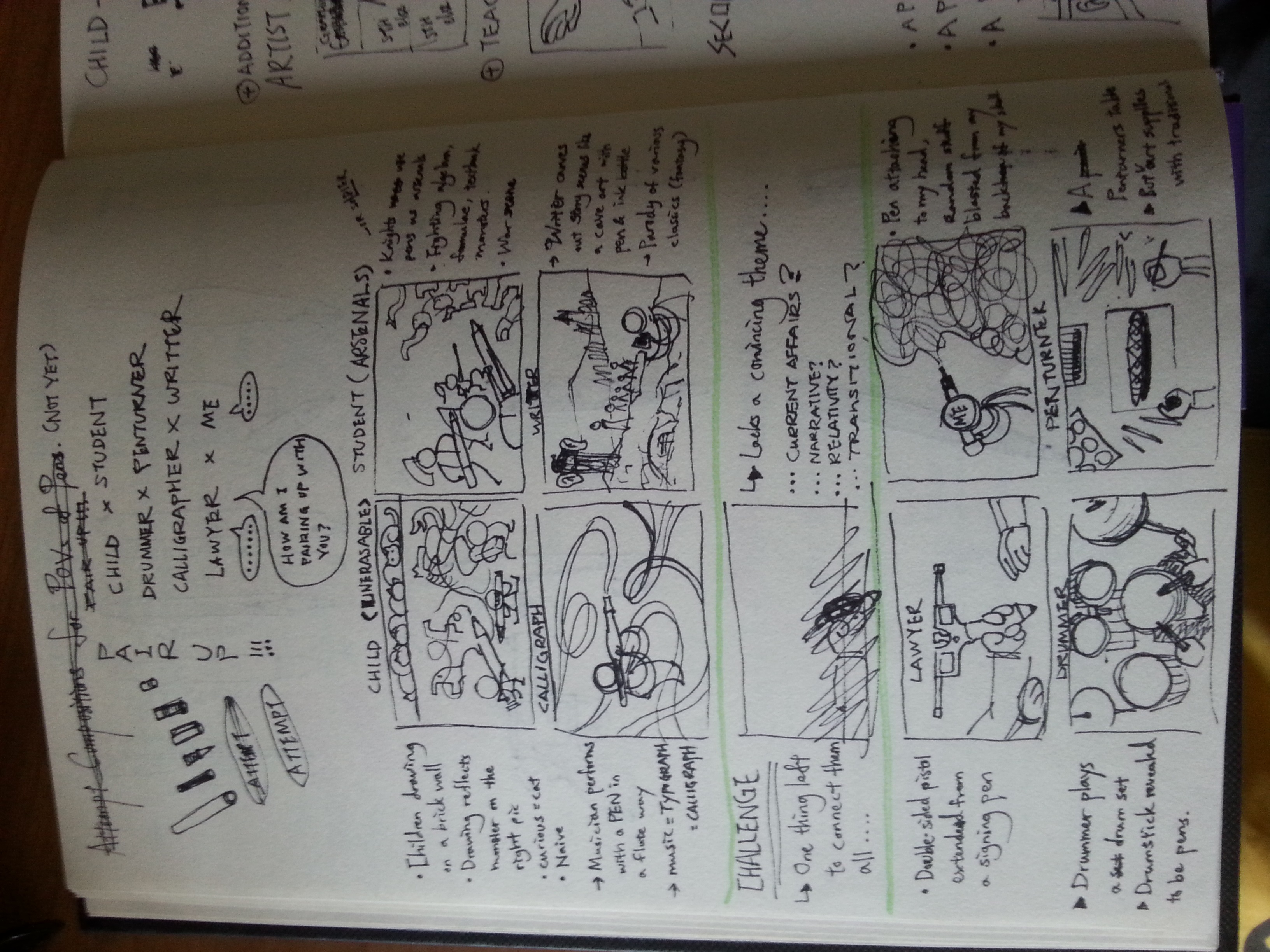
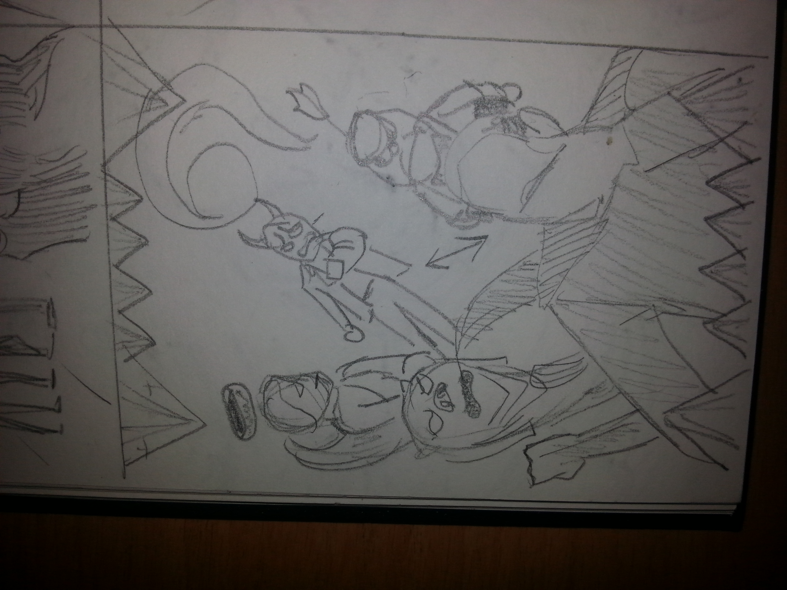
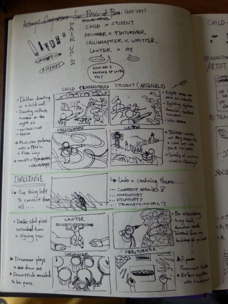
I’ve paired them up in order to see if there’s any comparisons or contrasts shown, in such that

  • Children vs Students (They’re stages of growth everyone must’ve been through.)
  • Calligraphers vs Writers (They create things beautiful to the eye and the mind respectively.)
  • Drummers vs Penturners (One uses it not for its original purpose, the other made it as an art.)
  • Lawyer vs Me (This pairing make no sense, at all.)

The problem with concept ONE is it lacks a convincing theme, and it’s difficult to think of something to tie them together. Based on past experiences, it’s better not to push too much into a concept that can’t work or only work reluctantly. Therefore, I had to brainstorm another concept.

20160312_155649

Spoilers alert!

Concept 2

Perhaps I can direct the project into a narrative or transitional? This is what I thought. Ms. Joy suggested building my concept on current affairs, using pens a metaphoric medium. However, due to my lack of sensitivity on the mentioned theme, a self-exploring theme might be a more suitable theme that I am able to handle.

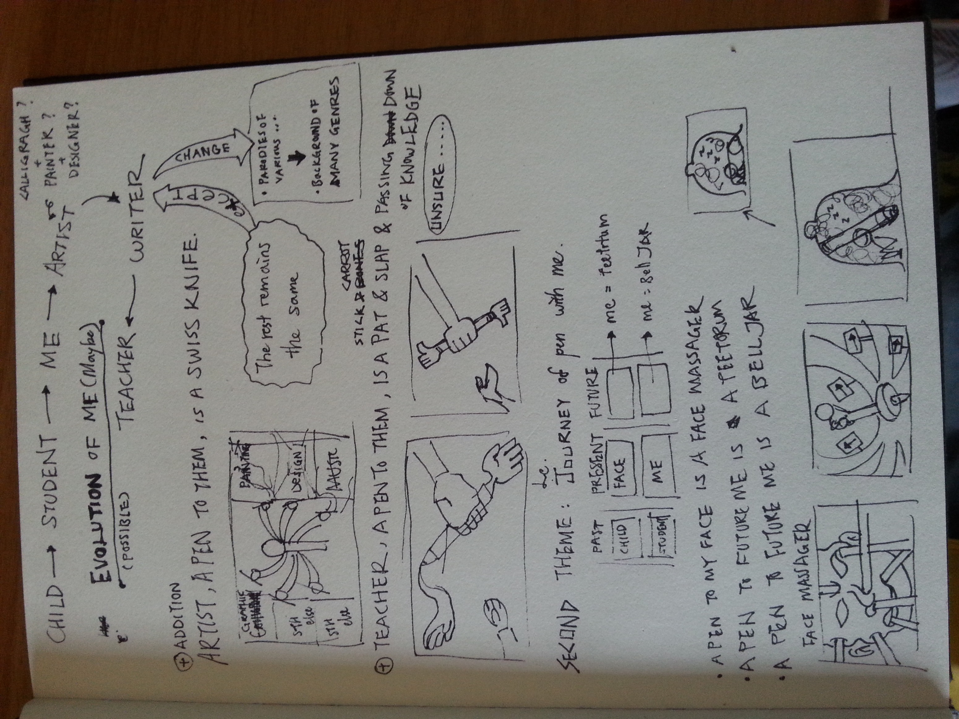
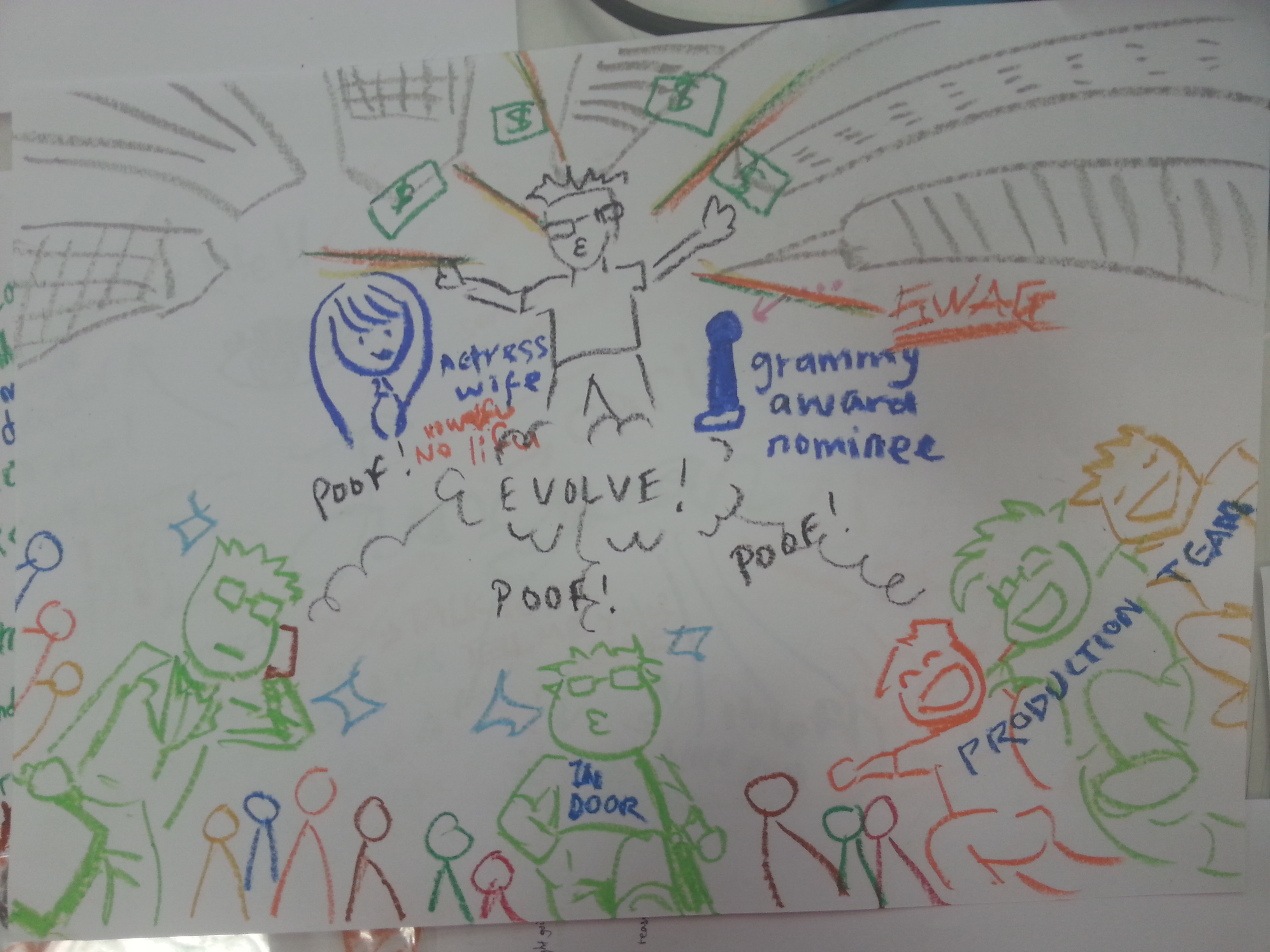
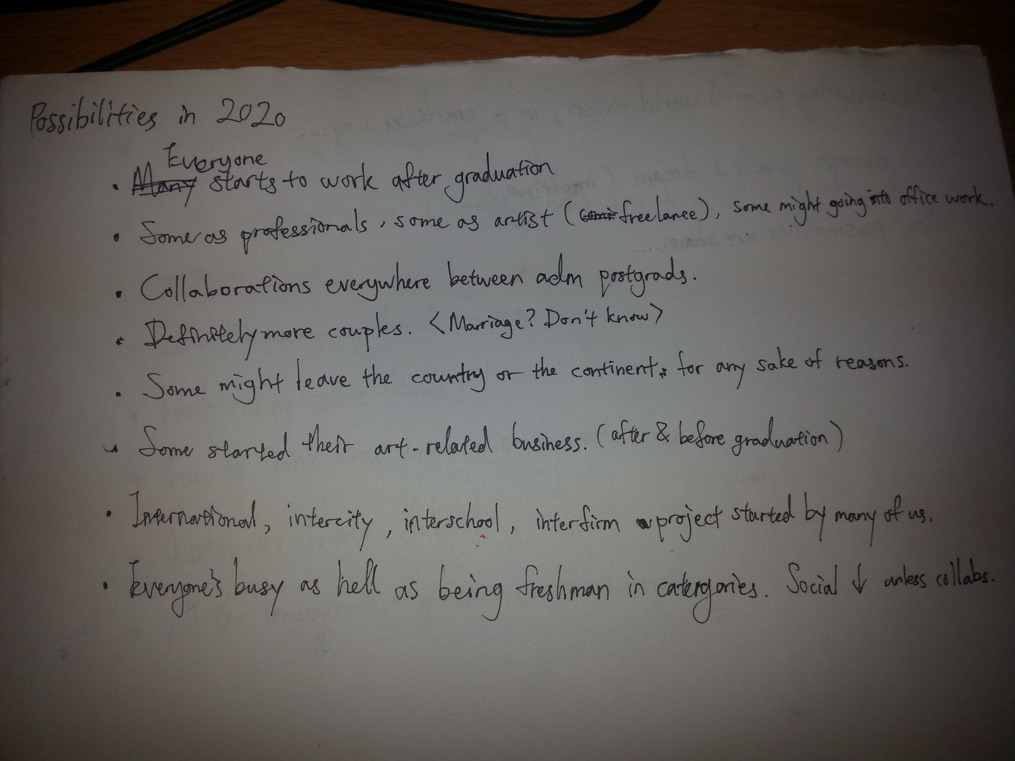
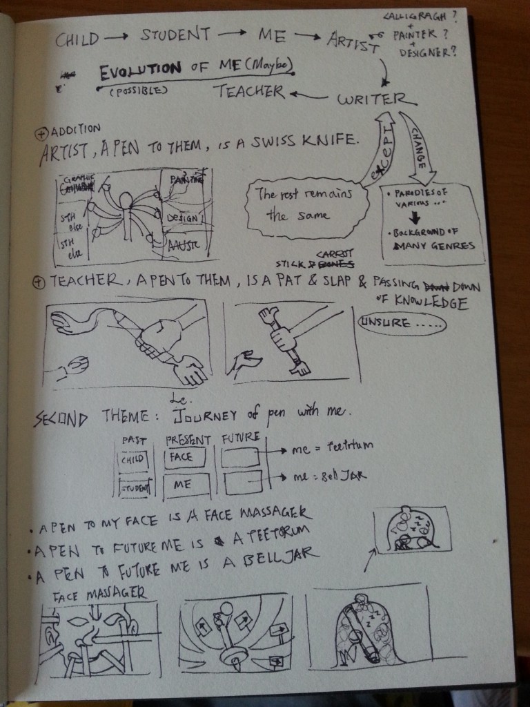
Focusing on stages of growth in the first concept, I based this concept on the object: CHILD, STUDENT, and ME. Thus, the new concept: EVOLUTION OF ME (Maybe) is formed. Why the bracketed maybe? This is because my current stage stop on ME, it’s only half way there. (NOT in terms of biological life-time.) The next half has to be hypothetical, hypothetical about what comes after ME?

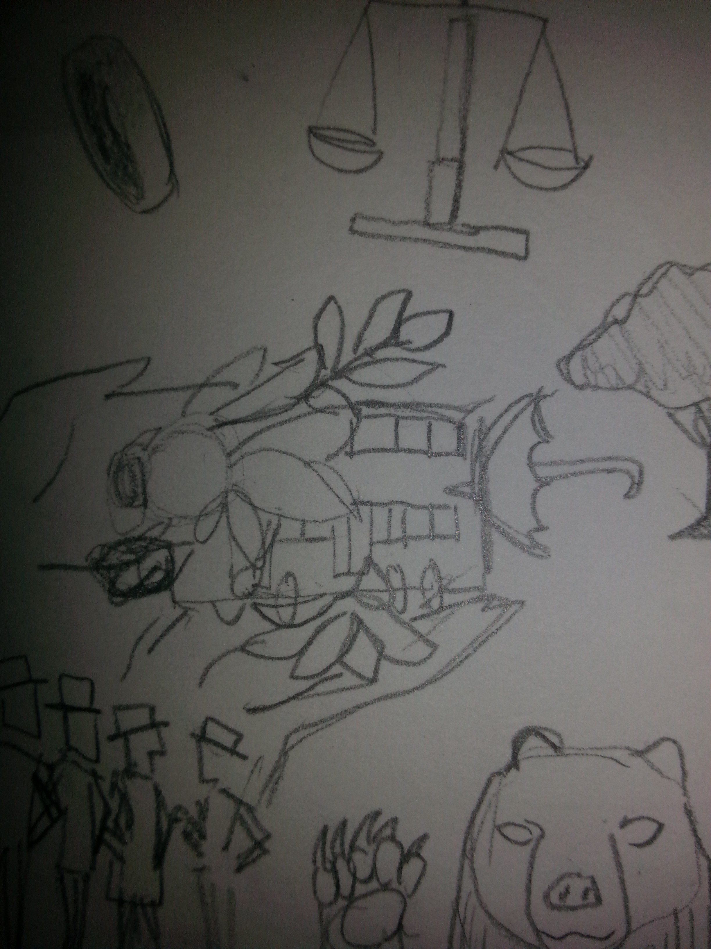
I wrote ARTIST first under the obvious reasons. The word ARTIST is generic, it can be painter, designer, musicians, calligraphers, performing actors, and so on. Meanwhile, feeling the previous statement for ARTIST isn’t suitable, I came up with a new statement:

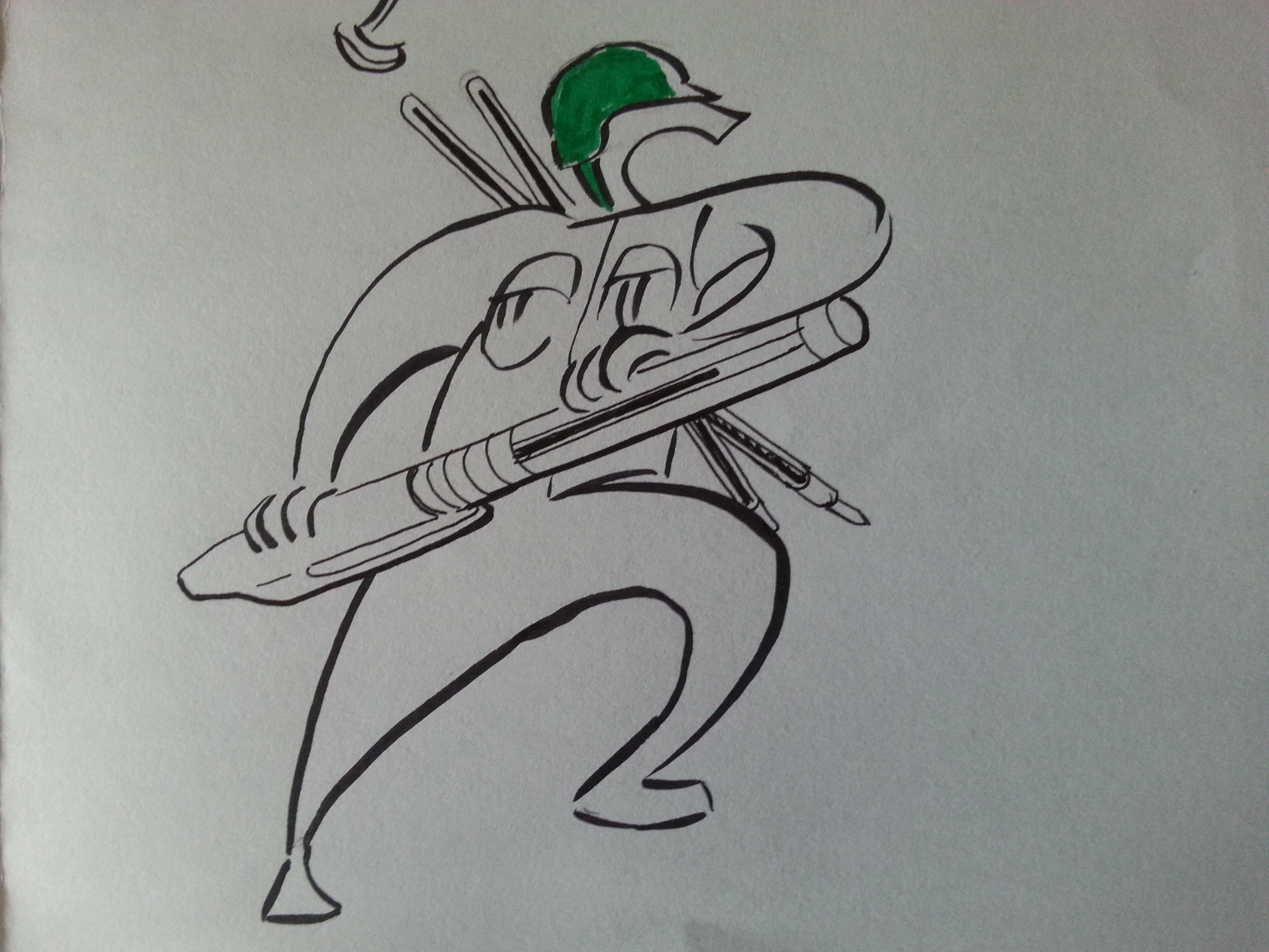
A PEN from the point of view of ARTIST is A SWISS ARMY KNIFE.

Then, I added WRITER in a generic term. It’s an alternate term for creator, any ideas: a film, a piece of music, literature, installations, or biopics, they all started with writing. Therefore, this stage of our creative career is the stage when we are creating our legacies, or masterpiece. The fun part is, this stage can coexist with the ARTIST stage.

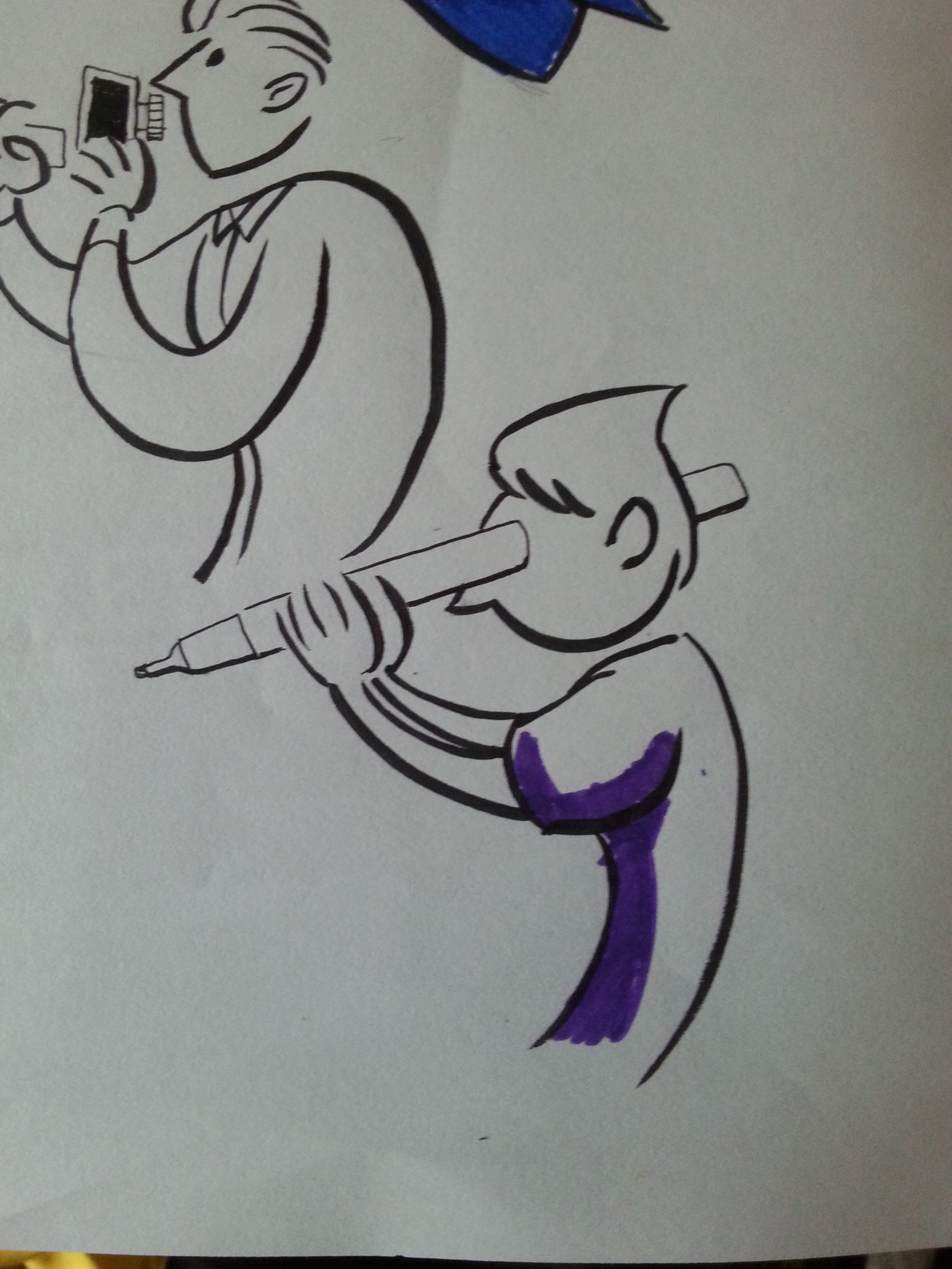
What follows is TEACHER, an educator. Not only we’re leaving something behind, we have to leave our skills, ideas and wisdom, things that are hard to be inherited completely. What can we do about it? We teach, we pass it to the next generation. Thus:

A PEN from the point of view of TEACHER is STICK & CARROT and A WAY TO PASS DOWN OUR WISDOM AND KNOWLEDGE.

However, even in such concept, there are some composition created aren’t consistent with the whole project. Some of composition created left me uncertain as I felt they did not do the statement justice. The uncertainty worries me, so I created another concept on the same transitional theme.

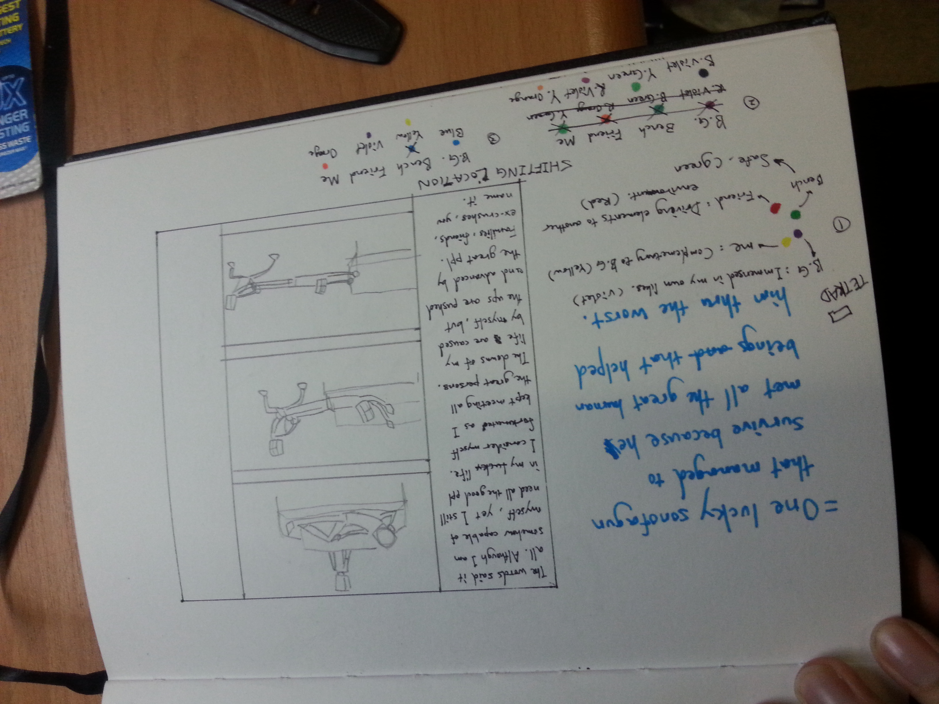
Concept 3: The Journey of pen WITH me.

A theme with a hypothetical transition for the future, this future is more realistic, and less philosophical. (Am I philosophical for the previous theme……?? HAHA) Parted with three time periods: past, present, and future, this theme focused more on myself personally instead of the generic profession. (Which kinda opposed to what I said in past posts.)

New components are added such as new object: MY FACE and FUTURE ME. With the new objects, new statement are formed:

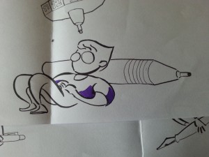
A PEN from the point of view of MY FACE is A FACE MASSAGER

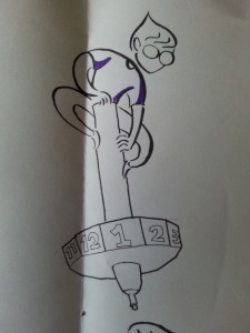
A PEN from the point of view of MY FUTURE-SELF is A TEETORUM

A PEN from the point of view of FUTURE ME is A BELL JAR.

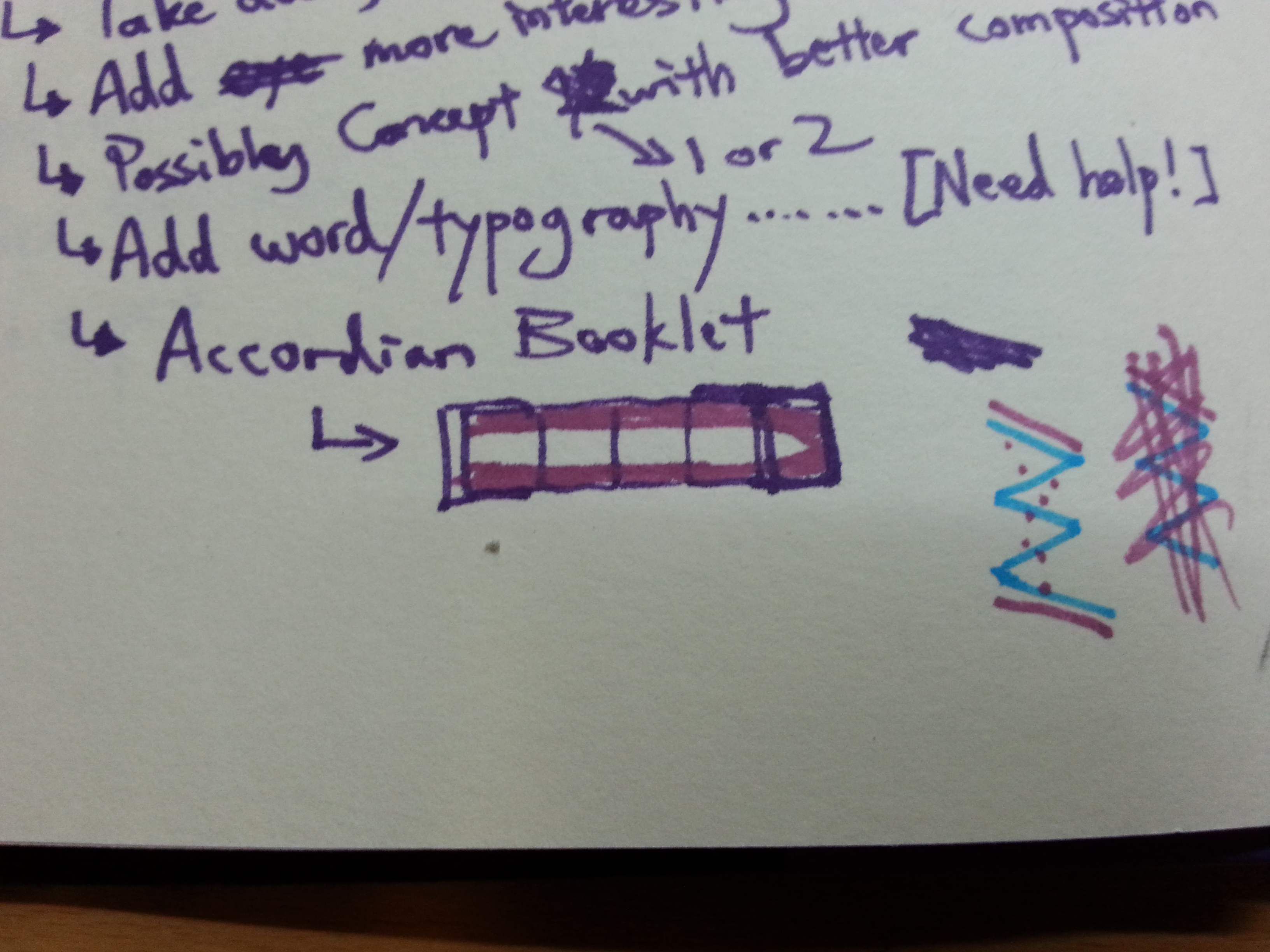
The concept was said to be more curated, but the theme is still young and there’s a lot to think in terms of presentation and compositions.

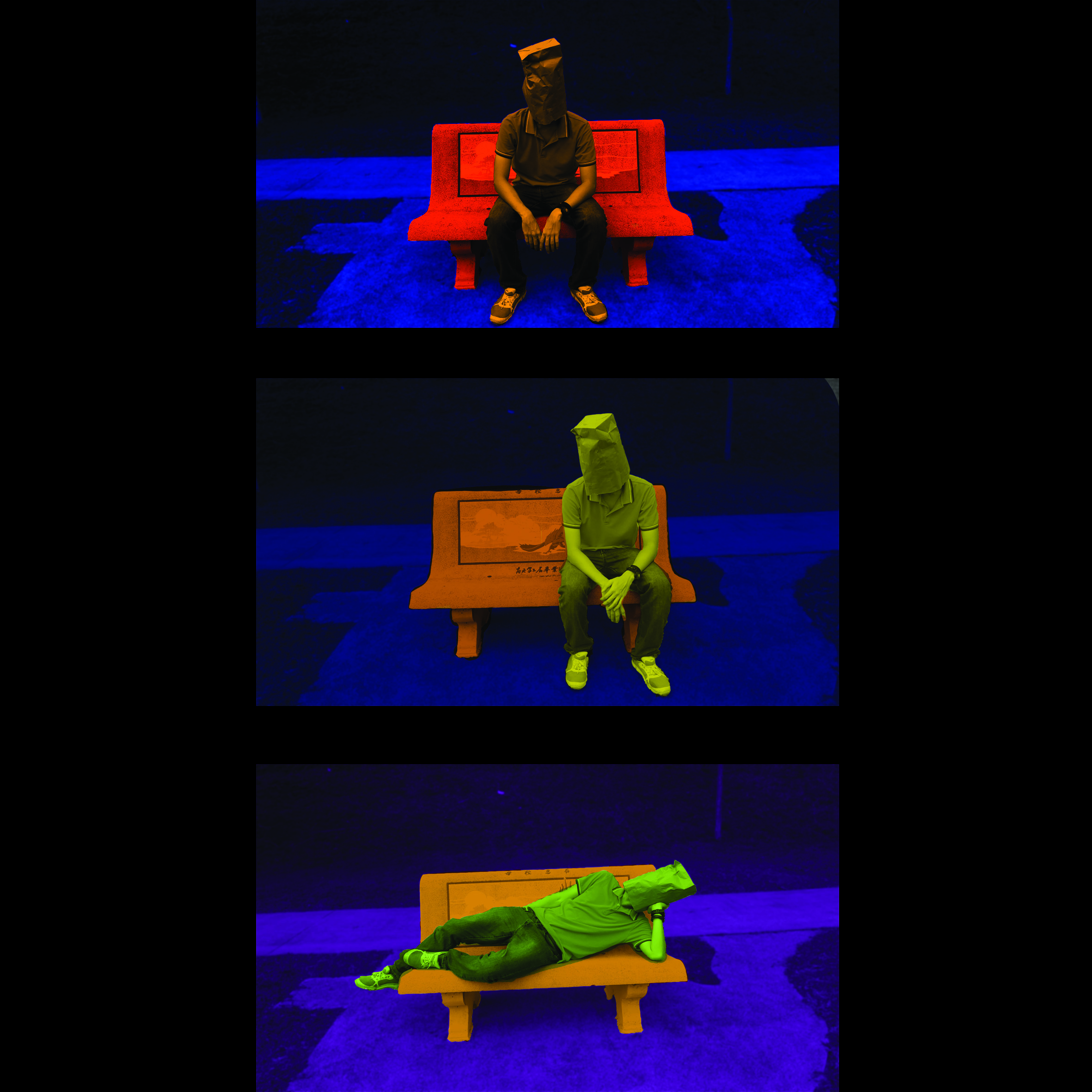
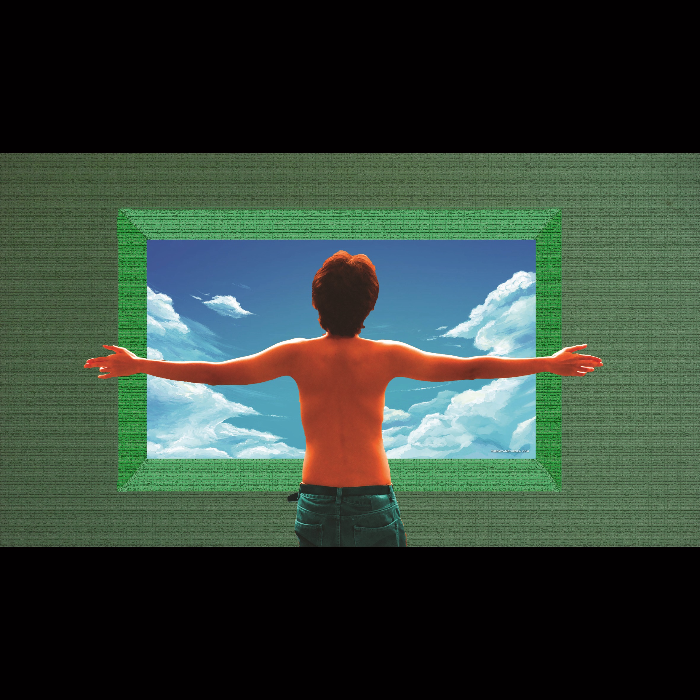
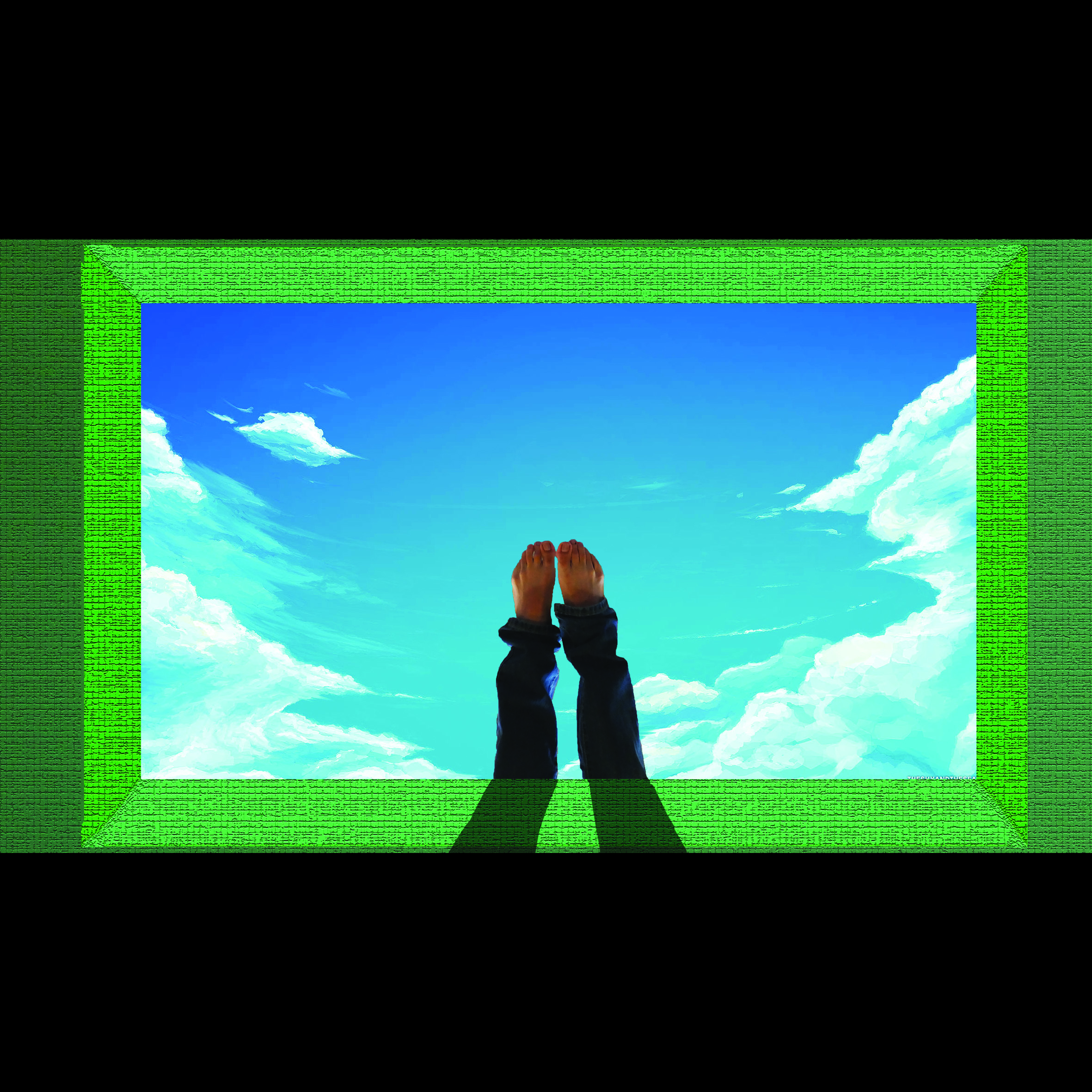
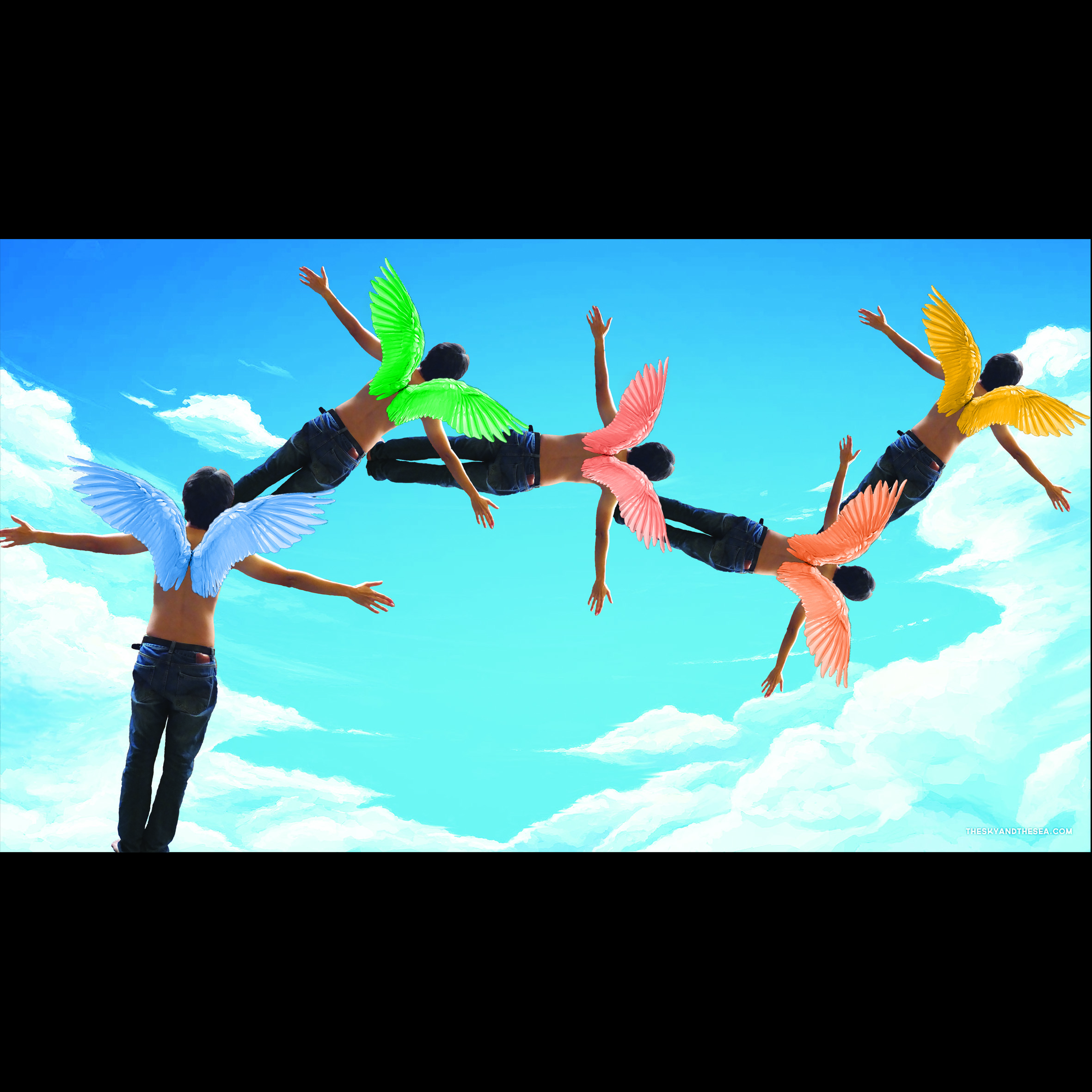
I try to be secretive for my statement explanation as not only I try not to spoil everything in case the statements are selected, and also I wanted to let the illustrations speaks for themselves.
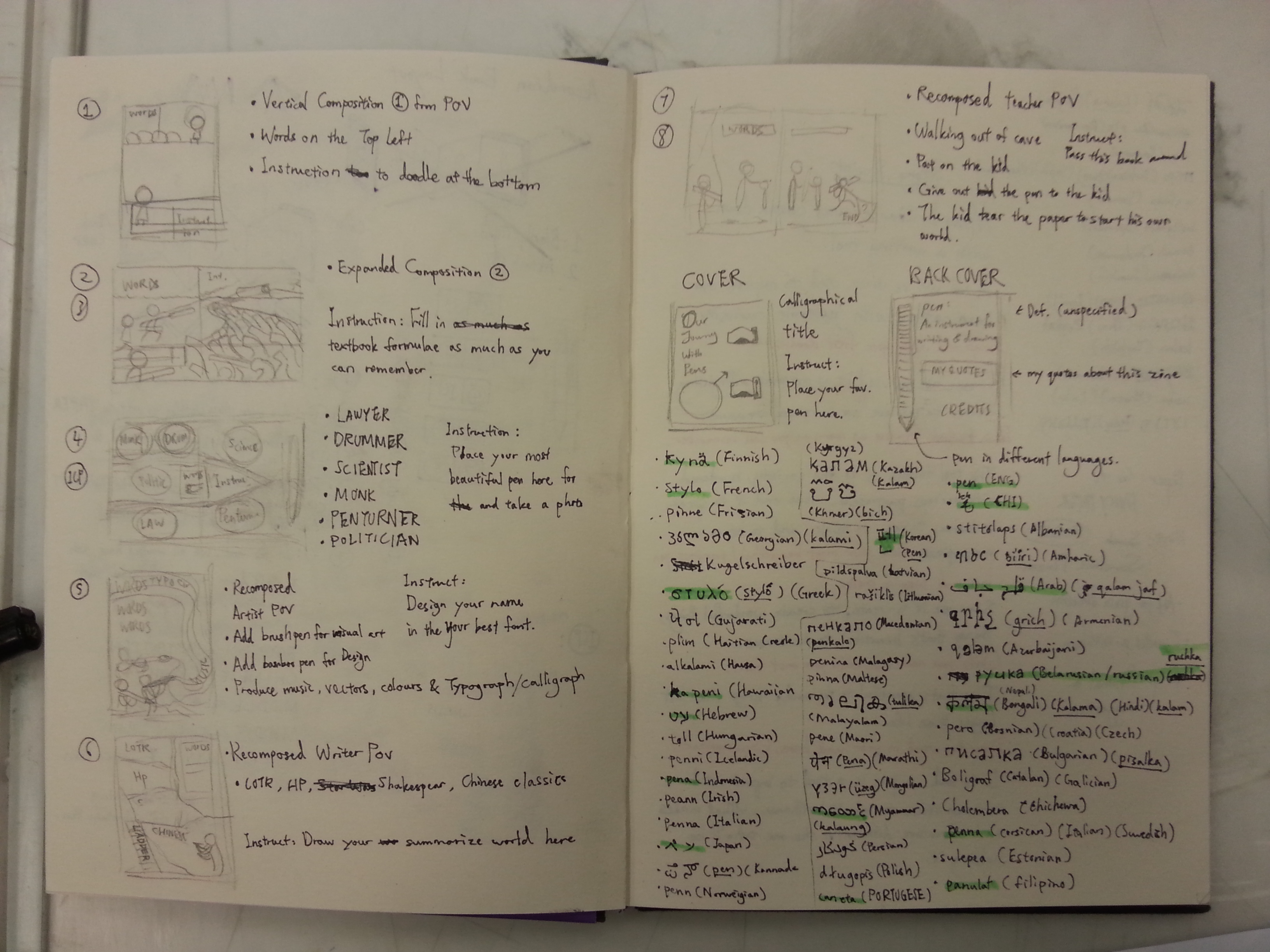
 

EXECUTION

For style, I’ll be referring to the artists/illustrators I’ve found for the previous presentation. I’ve experiment with the styles and with the tools I find interesting, a brush pen. I’ve would wanted to try different types of pens for the work too just to emphasize my works.
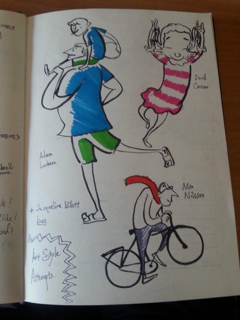
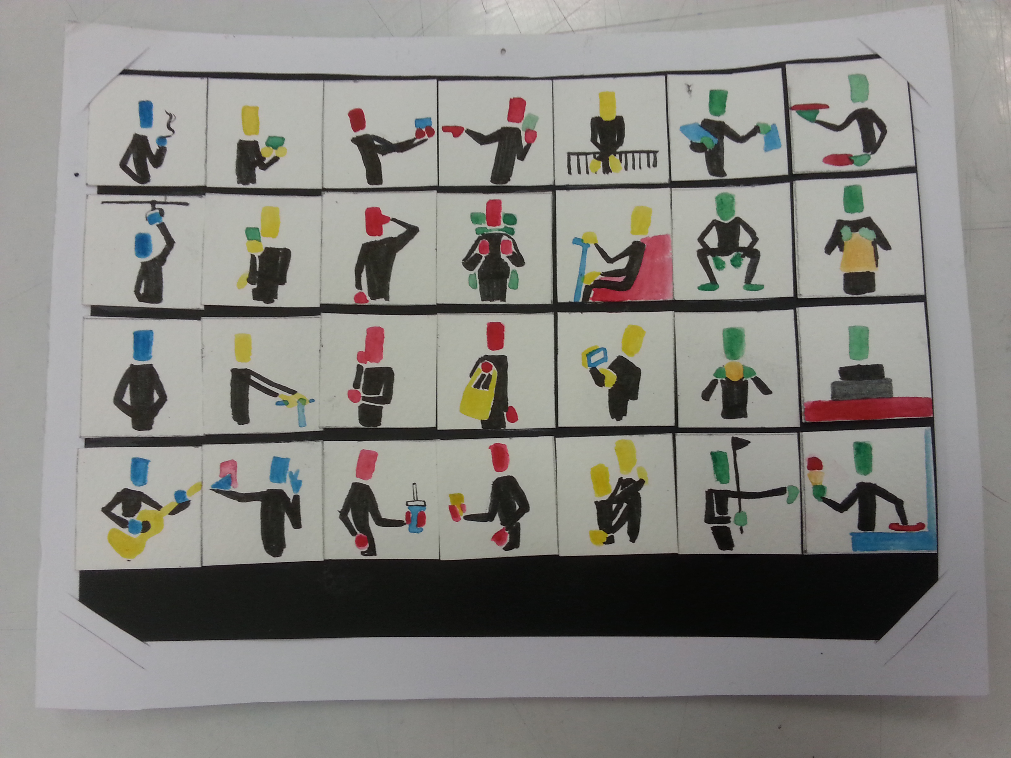
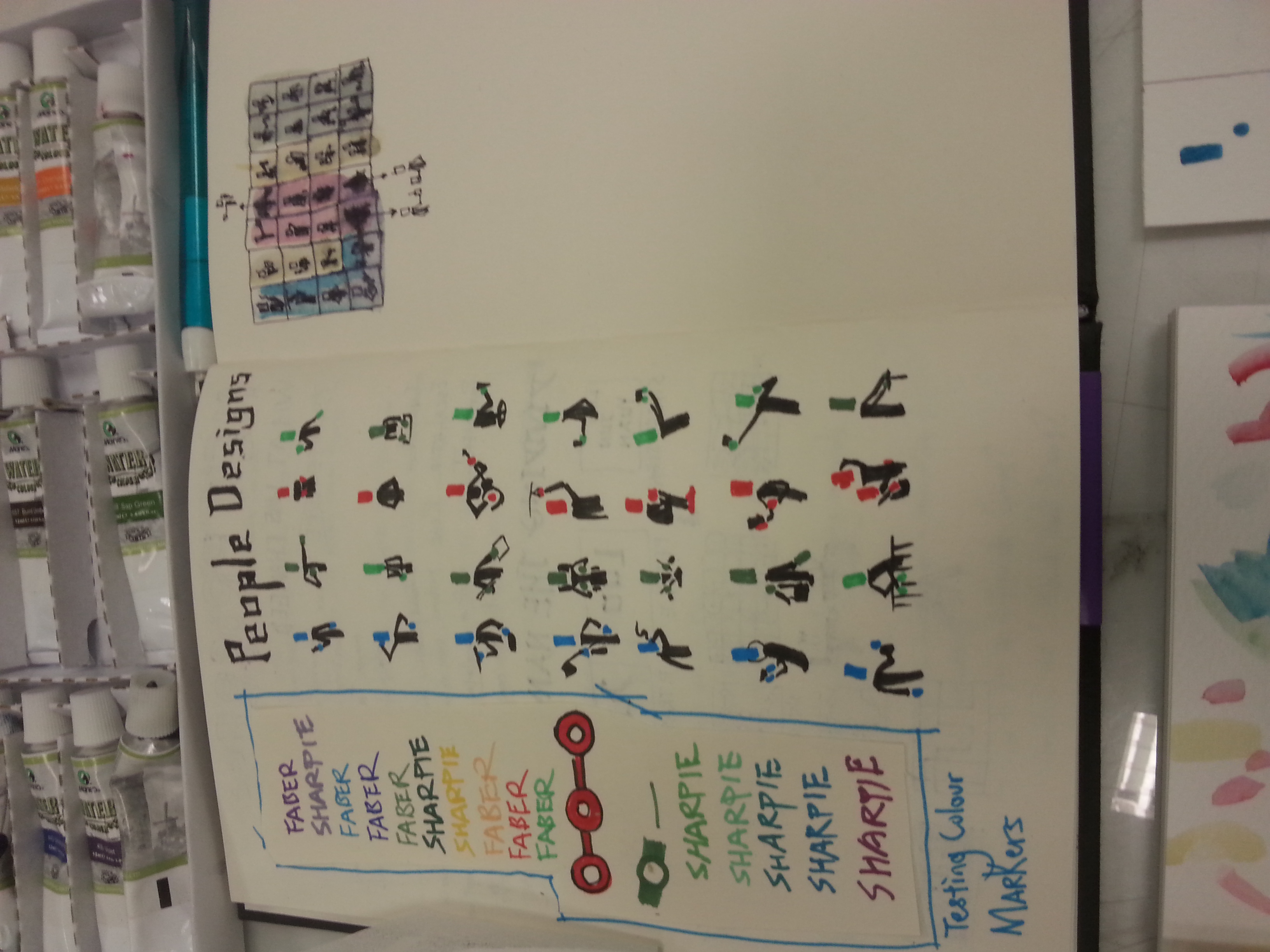
art style attempts

Art Style Attempts

The project will be a combinations of various artists’ styles that can be seen in first glance. I’d love to try an illustration with

  • Jacqueline Bissett strokes for the main character.
  • Adam Lurkam’s style for the main character designs, and Mia Nilsson‘s for the supporting ones.
  • Chrissy Lau and Rohan Eason styles with detailed background illustration.
  • Maguma’s or Alexandra Ball’s 2 dimensional compositing.
  • Andy Gellenberg’s solid coloring if required.

They either can be done with wet mediums or digital post production. Perhaps it’d be like the decision of my previous project, regarding mediums attributes.

20160312_155815 20160312_155822 20160312_155834 20160312_155848 20160312_155854 20160312_155811 20160312_155838

After the group consultation, some composition attempts, and the execution trials, I was advised to not adding too much complicated components in the works to make my main characters stand out more. Simplicity is the best brilliancy I supposed. We’ve also decided that computer scanned watercolor medium can be used to avoid any technical issues.

Next week, the project will be completed, so I have to keep it spoiler-free, but please look forward to my selected concept.

Thanks for reading!

You’re God**** right. —- Walter White, Breaking Bad. (Not a fan yet, just because it kinda fits.)

Project 1, TYPOGRAPHIC Portrait Problem has finally ended, and there goes my first presentation of the semester.

So, to make up the whole progress, I’m gonna start from where I stopped.

20160215_204502

I’m not a big nerd on architecture, so I decided to stay as an interested audience of the art of buildings and cut off the composition from my set to fit the 4-frame-project. Moreover, filling up the building’s shape did not work as strong as my other compositions in terms of subtleties, and fine tip pens are not challenging enough either. Cutting away the pedestrian paths and underground tunnels are due to the potentially overcrowded components. Since its idea was started from the escalator itself, so I just simplified it as the medium is a tough tool to control as well.

TYPOGRAPHIC PORTRAIT PROBLEM

My Name is

20160218_182525and I’m a logical person.

During my city exploration, I was unable to use internet data or GPS due to my financial restrictions. Thus, all I can rely on from getting lost are the locality maps from the MRT stations, and the STREET SIGNS on my way. This method of navigating shows my logical attributes when finding my way in the city.

20160217_202406 20160217_210626

Once I am familiarized with addressing format of a town, I won’t worry about not finding the certain locations as these street signs aided me big time. Also, I think I got my directional sense from my dad, so retracing my route was never a problem either. (Unless the scale and complexity of the city was too overwhelming.) I’ve paired the idea with collage making, the medium used by DADA when they first establish. Therefore, I considered it as a form of real life photoshopping as it requires certain amount of logic to piece every component together. The street signs are chosen based on all the streets I’ve been during my stay in Singapore. Some were photographed on the spot, some were screen-shot from the blessed Google Street, therefore resulted the major difference in their brightness. To find my name, just simply spell out the missing letters that were replaced by the white boxes, and you’ll be logically reading my name, just as the piece intended to be.

20160217_230055

However, it certainly has flaws. From the feedback of my fellow classmates, they were distracted by the sign posts thinking that my name hide between the negative spaces. After my clarification, they liked the idea of hiding what I wanted to show in this typographic portrait.

My Name is

20160218_182512and I’m not afraid to be weird in front of the citizens.

Why the caption? This is because I often (not always) ask stupid questions when I’m exploring around the city. I am thankful to every pedestrians who’ve helped me when I was confused or oblivious about the directions. (Yes, despite how confident I sounded just now, that do happens.)

20160216_221417 20160216_221350 20160216_221435

There are different faces in every trip, and I definitely can’t remember how they all look like, that’s why I chose to design them in monochromatic black-clothed figures, which symbolized how rare we meet each other again. I wanted to present many identities, therefore I scratched through all my memories on the streets, in the train, or in certain locations. The figures are designed with identifiable common gestures. There are arranged in a way that you are able to see my surname LOO for a certain distance, which achieved how unrecognizable I was in a big city. The medium I used for this piece is water color. Mistakes made by water color can be easily covered or blended out, thus suiting my piece of not afraid to ask the wrong questions. (Mainly also because I am less likely to see these individual again.)

How my classmates mistaken it as a printed work was a compliment to me, even though some have commented that this was a little out of place among my whole project. Moreover, not everyone are able to see the hidden surname in it. Perhaps a better design need to be implement for a better effect next time.

My Name is

20160218_182423and I’m a confident person.

That’s some big words to say. I believe my confidence are shown clearly in my previous piece, but the confidence is difficult to build. It requires many assuring factors and abilities to form my confidence, just like how the Singapore MRT connects the cities. (This is not an advertisement.)

20160215_204449 (1)

Testing for the right hue

I resembles confidence with MRT not only due to they’re confident that no station was wasted in terms of utilization, but also due to how confident they are with their arrival time estimation. Back in Malaysia, it was until the 2010s that our public transport placed the arrival time in their clocks as they are constantly late and delayed in the previous decades. Singapore MRT did not disappoint me with its estimated arrival time almost every time. (Yes, almost, because there was some breakdowns.) I picked the piece to represent my middle name JUN as this attribute only can be seen by people who began to know me.

20160215_205544 20160215_210617

The piece was drawn by Sharpie and Faber Castell’s markers. Their ink penetrates the paper easily therefore it needs to be used lightly. Using it tested my limits in controlling their color tone, perfecting the circles, (I’m still a human after all.)and maintaining the straight lines without any ruler. (Many illustrator are able to do this, so I considered an challenge from my idols.)

20160215_210225

The feedback for this are mostly positive, so I was relieved the whole composition worked out. The bigger challenge is to make it recognizable to the viewers but avoid making it too complicated.

My Name is

20160218_182410

and I’m a curious person.

An escalator form a bird eyes’ view is how I express my curiosity. During my exploration, most of the MRT are either in the elevated or placed underground. Thus much of my exploration time was spent on this particular transportation. It is the fundamental portal I must go through to see a new street, a new surrounding, and a new city. Within half a minute taking the escalator, my curiosity towards the scenery I’m gonna witness elevated as well for the next 30 seconds. For this new found attribute that’s been hidden a long time, I paired it with my YUAN as it probably can be seen by people who knew me well or solely myself.

20160217_215642

To suit such special attribute I found in the escalator and myself, I’ve chose the method of print-making. I’ve cut a template out of a slightly heavier paper and cover a piece of an alphabet shaped paper with the template. I believe my curiosity is not as black as the machine’s original color, so I chose my acrylics as the coloring medium. Acrylics are way thicker that water colors but their saturation resulted a ideal tone for this piece. The thicker they are, the easier it became a disaster. I had to redo a couple of times before I am happy with the end results, and the disaster happened during a desperate times. (the night before submission, my friends.)

20160218_013038

Some of my classmates are intrigued by the idea of taking a new perspective for the neglected machine. The overall project was appreciated and I am happy for what I’m able to do with my new limitations. (not doing the film things.) Ms.Joy has commented that the work accomplished its purpose for leading the viewers to a new perspective of my hobby, and it can be further enhanced by placing the piece in different spots.

The work was a success for me despite the aesthetic aspect of my classmate works are better. However,  I could learn more in contextualized my future work from the beautiful works of my classmates, through this project. (Perhaps a better time management would be good as well.) As always, I am looking forward to everyone’s next project.

Thanks for reading!

Our lecturer Ms.Joy commented on my previous and quoted, “What about, then, the role of ‘tinting’ due to their own upbringing or indigenous use of colours prior to commencing on these portrait photography works? How then does this insider, or even, inside-the-insider (since this is such an introspective project) internal ‘lens’ guide you in your compositions and/or colour usage? “. In Japanese photography painting, there was Felice Beato who expressed his view as a foreigner in Japan, and there were Kimbei and Enami who defined their works as a local. Their difference in nationality shaped a contrast of presentation in their works. Now, the country is myself, and I’m the ghost slash resident of my body. Therefore, you are able to see how the following work can be differentiate as how others see me, and how I see myself. Disclaimer: For those who didn’t read through the visual journal scans in the previous post, here’s a recap and elaboration of my concept. Sit tight, it’s going to be a long ride.

There’s always something on my face as it signifies my current commonness in the world. I’m nobody yet, I’ve not construct a final form, a true self to face the world. But I’m the lead character of the following frames, therefore the objects can be eye-catching to the viewers and leave an impression. Plus, it covers my face, so my actions speak the loudest.

ME

adaptable ADAPTABLE: I am adaptable, which I am proud of in terms of changing living location. Growing up in a hostel since secondary school, like everyone else, I developed a self disciplinary adjustment to suit myself in strange environment. Well, of course Singaporean post-army are trained better. (Explanation of each frame’s composition.)

  1. However, I never like to be put into strange environments, so is anyone. When I first arrived Singapore, I haven’t met any friends from either local or my home country. I don’t like to be alone, especially being at somewhere I don’t know yet. The RED ORANGE bench signifies a new community breed in the complementary BLUE, an insecure faith that can be either exciting or disappointing place. I am sitting awkwardly on the bench, in YELLOW ORANGE, unable to fit in yet as I am slightly different from the new community.
  2. Sometimes, I can be desperate to resolve my loneliness. I need someone to deal with the new life with me. But, usually, it doesn’t always go the way I want. The BLUE VIOLET dominated the whole environment and appeared to be darker than the previous frame. The ORANGE bench changed lighter in hue but the darker environment signifies a worsen situation I am in. A YELLOW me is trying to optimize my attitude towards the surrounding. Usually, my optimistic view takes time to construct. A really long time.
  3. My own color changed along the color wheel, indicating my change to be a better adapter as well. The environment turned VIOLET as it can be worsen or improved depending on my own perspective. The bench turned YELLOW ORANGE, offering a YELLOW GREEN me, an newly independent being a chance to settle in it.

+

stubbornSTUBBORN: I am stubborn sometimes, and always uses my own ways to complete certain task. Usually trapped by my own opinions and thoughts, my overthinking is so imaginative, it can be write down onto a script. I’m currently not flexible enough to go further as I am still letting my emotions to control many aspects in my life instead of my logic. After adapting the environment, which turned GREEN as it became ideal and comfortable, the ORANGE me is in a vibrant satisfaction, (As you can see through the tinting.) does not let go of the VIOLET bench, the past and old things I found favorable.

=

meME: One lucky sonofagun that managed to survive with a conformist attitude because he met great human beings throughout his life who help him through his worst moments. I’ve met so many great people that most of my life owe a great debt to them. My family, friends, ex-crushes, teachers, you name it. I caused most of my downs in my life but it was them who pushed and advanced me to a better place. The color changes in the frames are following the TETRAD order in the color wheel. The VIOLET background signifies my immense in my own favorites and my RED friend is the driving element for me to shift from the safe GREEN bench another environment. As the for the last frame, the BLUE background foreshadows my arrival to another strange environment.

BETTER ME

thoughtful

THOUGHTFUL: The painting used was my sister’s (www.sijieloo.com) painting Listening to the Orishas, acrylic on canvas. 36×36″. I regarded myself being not as thoughtful as a member of a society should be. I’m only thoughtful towards the categories I’m interested in. So thoughtful is the trait that makes me a better person, for the ones I love, and the ones who love me. Staring at an empty canvas with rich expression and thoughts projecting in the back of my head is how I wanted to express this personality. The mundane GREEN was lightened up by my thoughts and the VIOLET hue hinted inspiration possessed by me in a trustworthy BLUE shirt.

minus

minus procrastination

PROCRASTINATE:  I tend to do this a lot. By removing it, I can achieve more, be what I want and do what’s necessary for my better future, before giving myself too many excuses. In the frames, my enjoyments in the serene BLUE was taken away within the change of TRIAD colors. The pen is my necessities to advance forward in a climatic energized RED.

=

better meBETTER ME: An anti-conformist. I was pulled away by responsibilities (The pen.) in an analogous colored path. I painted myself in BLUE as it doesn’t fit in the color set, meaning I won’t be settling down until I achieved what I want.

IDEAL ME

creativeCREATIVE: As a wannabe creator or rather an artist, creativity is one of the things I craved the most. The ideal me will constantly be able to see the world in many perspectives and always think out of the box. Creativity is so abstract that it can’t be obtained instantly, but to gain through training and gaining knowledge. The BROWN box is a discordance to the purple analogous series starting from BLUE VIOLET to RED VIOLET.  Yet a BLUE GREEN umbrella appears to harmonized the frame by forming a TRIAD, symbolizing my ideal flexibility within being creative. Without it, there will be stubbornness.

x

experienced

EXPERIENCED: An ideal me should always be prepared for any circumstances, be resourceful and thoughtful while meeting certain problems. This might take a long time to achieve as experience varies with time, but comparatively we are wiser everyday. It’s not necessary to boost my experiences instantly, but the more of it the more I can advanced. The color of wisdom BLUE VIOLET is painted on the umbrella, protecting the ideal me through the rest of the TETRAD color as they advanced from a safer minor GREEN obstacle to greater influential YELLOW ORANGE and finally to an intense obstacle colorized as RED.

=

ideal meUNIQUE: Perhaps an ideal me is a unique being. Recognized by all and ignored by none, or maybe on the contrary? Perhaps an ideal me can stand out from the crowd being unique for being extraordinary, for what I am? What I do? Or, What I left? The idea of that expressed with me in a creative RED VIOLET, still be able to stand within the COMPLEMENTARY YELLOW GREEN, with the previous items remaining the same for continuity.

ME IN 5 YEARS

Here’s the part where I was inspired by Edward Hopper’s walls that restrict his paintings’ characters.

minue stubbornminus STUBBORN: Me in 5 years is an ambiguous stage. Who knows? Maybe I removed my stubbornness, letting go what I’ve been desired for too much, embracing what I was given. DARK YELLOW GREEN wall as my spiritual obstacle, BLUE GREEN pants signifies my freedom, an ORANGE me embracing the sky without restrictions.

+

skilledSKILLED: Perhaps after 5 years of learning from the great people around me, I potentially surpass the teachings and be skilled enough to challenge the vast world. My color painting ends when the ME IN 5 YEARS left the window, as nothing can define myself who’s in the outside world.

=

me in 5 yearsME IN FIVE YEARS: There will be infinite possibilities occurring on me, maybe going up, maybe tumbling down. These possibilities are determined by, as I fly through the sky (outside world) with different colored wings. (Many version of myself. Sounds poetic?)

[To be continued…..]

Last time, I spoke about Japanese photography painters. These terms are surprisingly new to me considering I’ve read many photography magazine but none of them mentioned these innovating styles. Like George Melies, these pioneering “color photographers” are the ones who proved photographs can be colorful as well.

War photographer Felice Beato was one of the first photographers who introduced journalist photography. He shot and reserved hundreds of rare war photographs from the east where and when the Qings still reluctantly ruling China, including the Opium war between British and Munching China. Later before he settled in Burma, he opened a photography studio in Japan, teaching Japanese citizen to learn photography. And among these disciples, there are Kusakabe Kimbei and T. Enami.

2966216_orig beato beato artist-with-a-brush-photographed-by-an-artist-with-a-camera-ca-1915-28-by-t-enami-1340429480_org japanesedream4-560x403_440 beatofelice-beato-19th-century-photos-japan

Felice Beato captured a variety of Japan during the Meiji period. He was permitted to shoot many of the unforeseen Samurai Culture, reserving the image of the real Samurais and Japanese soldier, and introducing this little country beside China to the Westerners. Therefore, the viewers felt like tourists, observing Japan as a foreigner, just like Beato.

kimbei Kusakabe_Kimbei_-_Writing_Letter_(large) Kusakabe_Kimbei_-_22._Girls_Dancing

Kusakabe Kimbei’s worked in a different style compared to Beato. As a local photographer, he mainly explored the world of Japan’s female, including the geishas. Kimbei used plenty of color to create a lively atmosphere of geishas’ dancing yet with the same techniques, he depicted various woman in their unique characteristics, such as a mother was painted green as a soothing character, a young woman with pink pigments to embrace her youth.

japan-vintage-farsari-tenami FUZZY_SLIGHTLY_WARPED_AND_LAZY_DAYS_in_TENAMIS_YOKOHAMA_STUDIO.123201755_std enami6559fb9682_ot enami fuji

T. Enami or Nobukuni Enami, also captured the life of Japanese, but as a local. Through the lens of Enami, viewers are able to see the daily life of Meiji’s Japan as Enami shows not only the famous samurais and geishas but common citizens as well, giving us a glance of the working society.

enami6559fb9682_o 2966216_orig beato felice-beato-19th-century-photos-japan t enami fuji Kusakabe_Kimbei_-_Writing_Letter_(large)beato

As you can see, the three photograph painters used almost the same blue in their photographs, yet they depicted different environment and meaning in their photographs’ characters. Such as the serenity around Mt. Fuji, the symbol of honor in a samurai towards his master, the commonness in working labors, and even the intelligence of a writing woman.

japan-vintage-farsari-tenami

beato

Even depicting almost the same theme, you can see the different expressions through the use of color. Their motto was not recreate realistic colorization but sending subtle messages to people who view the photographs. Thus they didn’t colorize the skins and unnecessary items. A little color altering can go a long way.

Inspired by their work, I combine the motives I had from the previous and attempted to colorized my photos in different possible ways. In the meantime, after some research I finally found a color wheel that simply summarized how we have been using color to express different emotions and environments.

emotional-and-psychological-meaning-of-colourWith the help of Photoshop, I am able to create a few colorization style by selecting different layering of my pure colors. These methods included layering a portion of B&W photos with semi-transparent color. (Sneak peak!)

test work

This is just a test photo.

better me 4

Or tinting them entirely with the hue to create a film style from the 60s. Movies in the 60s tends to tint their whole scene into certain color to express atmospheric tension, before color correcter was invented.

better me 1

By color correcting the photo’s, we can still see the original colors, but the tint can be seen as well. This is what movies nowadays usually do, but in a more subtle way.

me 5

The color scheme used in film has to be created using real props with similar colors and software editing. Since I can’t do that much during the production, I figured why not express my concept in an eye-catching way by covering the details in the same color. This way, viewers can see the colors far ways and able to capture the details when they’re near to it.

ideal me 5

Also, I tried to recreate the effects of the mentioned photograph painters. This effects only show color of the key element in the photo, providing each of their own meaning in the image.

Lastly, the pictures below are my journal’s snapshot showing my thought process. Don’t worry if you can’t recognized my handwriting. I’ll type them in my next post when the final results are uploaded as well.

20151115_195943 20151115_195953 20151115_195957Adaptable + Stubborn = ME, a lucky sonofagun that miraculously met great friends and survived.

20151115_200006 20151115_200010 20151115_200016Thoughtful (In any aspect) – Procrastination = BETTER ME, an anti-comfort person, at least willing to be defy comfort.

20151115_200153 20151115_200035 20151115_200039Creative x Experienced = IDEAL ME, standing out in an extraordinary way, with what I am, what I do, and what I left.

20151115_200054Skilled – Stubborn = ME IN 5 YEARS. Freed from my limitation, with infinite possibilities awaits.

[To be continued…….]

Not the literal meaning though! So after two weeks of intense brainstorming. (Which basically for me is staring at my visual journal MOST OF THE TIME, am I being too honest?) Okay back to the point! Here’s my progress of conceptualizing my EGO.

So, what is me? what am I? Looks like we are never too early to experience existential dilemma. To sum up all my thoughts, I preferred to refer the conclusions of me from the previous activity.

20151022_153529

Yep, this one.

Here’s me summarizing all the properties of me that was shown to my classmates throughout the semester.20151108_151048

There’s a saying that bystanders see the game better, so I assume this is the almost accurate depiction of me. However, living with myself since birth, I (supposed to) know myself best. After a few hours of revisiting my memories of two decades, I concluded that some of these personalities shown cannot fully depict what I am YET. This is because they’re built up through my experiences and mistakes, and some are just specifically shown to certain persons, what really catalyze them may not be on the list. Then it hit me. These catalysts maybe are the one that formed what I am, and some of them is just not that good to admit.

20151108_151051

These little jottings really helps me to understand what I need. Sorta like talking to myself.

20151108_151056

It may looked you-don’t-say, but at least it clarifies me better than my cluttered brain.

To explore the catalyst that might hidden in my subconscious, I forced myself to write down at least 7 of the equations I can formed with the properties written in the previous page as nominees for the finalist. This seemingly effective self exploration exercise took hours to finish, but it certainly aid my understanding to myself.

20151108_151056

Hope it helps YOU to understand more about me as well.

20151108_151128

I used color markers to indicate repeated properties I used. Some of them are what I have, some are what I wish to have, some are what I wish to not have.

Gradually all the catalysts, properties I wish to have, and properties I hope to remove surfaced. Just as I was writing all these equations, a concept was formed in my head thanks to the video I shared in the previous post. It was at first sounded a bit troublesome, but in some way I knew it can represents myself. Right after I finished the tedious equation forming, I quickly jotted down the concept that was freshly unfolded.

20151108_151151

Hope you don’t mind its blurriness.

This concept is a freaking challenge for me. After conceptualizing it, I asked myself, can I really find a way to express it. Some part of me screamed, “YOU FREAKING MORON, HOW ARE YOU GONNA STAGE THESE SHOT INTO WHAT YOU WANT AND DO YOU THINK IT’LL BE CLARIFYING?”

One week later, I proved myself wrong.

(To be continued…..)

Okay maybe just because I’m a little late for my project 2 wrapping up. {That featured image looks desperate to let everyone know who wrote this post…….}

It’s the start of something new this week and Ms. Joy gave us a head start for our following project — EGO. The familiarity in G1 is just right to explore everyone’s ego and mess with them as well. I mean, we’ve been together long enough to realize everyone’s hidden side they’d never show on social media. We just can’t hide that long.

For the first activity, we got old pastel as the nostalgic to present what we know (and wanted to show) about ourselves. So, I wrote about what I liked, what I hated, what I irresistible with, what I care, what I’m confident about, and what I ain’t confident about. After a round of passing, the paper returned as this.

20151022_153529

How about my writings on others’ paper. I wrote about all I know about them and the impressions they gave throughout the semester, and what I got are the most beautiful words I’ve see about me since my arrival! Be satisfied b*tch [me]. This is so freaking encouraging that I felt good being myself. Ain’t G1 great?

So all the journey I had for the activity got concluded into point form.

20151022_153725

I repeat! Lots. Of. Inside. Jokes!

The next activity is to picture the world 5 years from now. At first I felt the world won’t change drastically in 5 years so I scaled it down and think, “My view in Singapore would probably filled up by skyscrapers because they are building a lot right now. ” Then I drew myself, in suit, probably finding a job after graduation. [Who had never try to seize the stability standardize by modern society before leaping out of the box?] This might shows the pessimistic thinking of mine, but I believe that is just a safety net keeping me from screwing up. Then I drew myself, partnering with my friends, in T-shirts, working as free (as in independent) production team. Only the clients and inspiration start our work. I considered this as my initial ambition after graduation. I’ve always envy those who are 100% in charge of their own work, and happy to do so too. Thirdly I drew a myself alone not in a suit in between. I’d probably end up someway in between my previous visions. Freelance? Part-timer? There’s no absolute in life.

Same process occurred and this came back.

20151022_153510

Ain’t great friends always put a smile on your face? Damn this is just optimism at its best. Thanks guys for picturing an exquisite future for me.

20151022_153729

Within limited time, this is the summarize conclusion for the activity.

I was able to see more inner-self of my classmates, and understanding about their vision as well. Okay, some of the paintings ended up an opposite direction but who knows? The future might end up what they joked about. The uncertainty about future is just exciting sometimes.

20151025_215216

Lastly we had to picture the future in words. I took it serious as I think it won’t differ much from what I see in the people around me. Many friendship throughout my life faded but didn’t disappear. They just don’t shine as bright as they used to. I once believed that the common cliched reality won’t happen to me. Yet there’s a reason people keep producing ‘”so true” post on the internet. It happens, to everyone. I guess if the down side of future reality happens, we just have to improvise. But liked I said, future is exciting for its uncertainty. The list above isn’t that gray as well. Art peeps tend to create opportunities for each other and I think that will be the ones that spark excitement in my future-5-years.

The activities was fun and it’s been a while since I think about these topic sitting besides the toilet. (I thought about them on the toilet, I forgets about them after washing my hands. True story.) I like it when it doesn’t require too much brainstorming but letting my imagination run wild at the same time. It reminded me of how much I know myself and how anticipating I am towards the future. However, to integrate all of these into the EGO project, well, that’s a whole lot of process to go through. Hope it’ll be as amusing as this.

POST-BLOG

20151022_153630

There are two kinds of people in a self exploring activity.

20151022_153644

Finding yourself

20151022_153639

Being yourself

Finally after a week of considerations, my nursery rhyme was set to be ONE TWO THREE FOUR FIVE. I don’t need to explain that this IS a rhyme since almost everyone who was born before the millennium knows it. A progress is a progress, so I shall place the full rhyme below.

One, two, three, four, five,
Once I caught a fish alive,
Six, seven, eight, nine, ten,
Then I let it go again.
Why did you let it go?
Because it bit my finger so.
Which finger did it bite?
This little finger on the right.

I felt nostalgic when I saw this rhyme during my research as it was one of the English nursery rhymes I first encountered in the language. So I figured, it has a perfect flow of story and able to be visualized with real objects, suitable for my choice of nursery rhyme.

The first challenge I faced was the concept. Then I remembered that DADA artists uses things we can immediately recognize to convey their intentions in a unconventional way. In other words, try to be indirect with iconic symbols, in this case, dingbats. So my orientation will describe the words indirectly even for “one”. Thus the following visual journal sketches were created.

20151012_223013 20151012_223018 20151012_223024 20151012_223032The arrangements were made by copying the selected dingbats on my computer screen. I figured this way of planning can shorten my processing time. Also, I always have a clearer mind with it comes to hand-drawn sketches. After a few modifications, I am happy with my sketches and thus moved on to the software.


One of the main character of the rhyme is the fish. It got caught and bit its catcher for its own escape. I can’t just find a fish dingbat to fill this badass place. To be honest, I just can’t find any fishes in the dingbats collection considering it is a basic creature. Thus I thought of being ‘resourceful’ in my own way and built a fish from the remaining dingbats. As you can see, this fish was made out of a bee, a pair of woman lips, leaves, flower petals, SBS double decked bus, and an umbrella.

20151012_223047

I had fun composing the fish. Suddenly, I thought, why not substitute it with the luxurious items I found among the dingbats? The fish in the rhyme can be interpreted as the material needs that we occasionally obtain. Sometimes these needs cost a certain price, therefore “bit” us in the finger. We can’t keep what wasn’t ours.

20151012_223040
Therefore, a fish composed from a bracelet, an unknown branded handbag, a sport car, a high heels, a Mac, an ancient coin, and another set of lips just to make it lifelike.

12345 once i caught a fish alive - Copy

A bear holding up a high five. Four well dressed lads. Three Trees. A balance scale which require two sides like the justice it represents. The one ring to rule them all.

678910 then i let it go again2 - Copy

Ten fingers. A howling caNINE. Eight spiders. Seven saxophones (Saxophone is the closest thing I can get to shape like the number). 3 Satans’ mask, for the sake of satan’s phone number.

Why Hitler? Hitler was one of the victim of the needs — power. Also, his gesture looked like he was releasing a fish.

wdylig bibmfs wfdib - Copy

“Why did you let it go?” Captain Picard says to the strutting Leo as the questioned tweedle dum/dee looks at him. Leo might think he’s an angel in heart for releasing the fish who secretly celebrates its victory. But Leo reveals the truth with diamonds.

Diamonds may not shape like fish teeth, but they certainly have the shape to form a vicious set.

delittlefingeronmyright - Copy

The little finger on my right, represented with a can of pills, signifies it’s the one in pain at the time.

Thanks for reading my whole process. I really had great fun doing the pictures. It’d be a good experience if it wasn’t constantly interrupted by my laptop’s faulty back-light. Hope you find my exploration interesting. See you soon in my next project!