(Imitating dramas narrators in the title.)

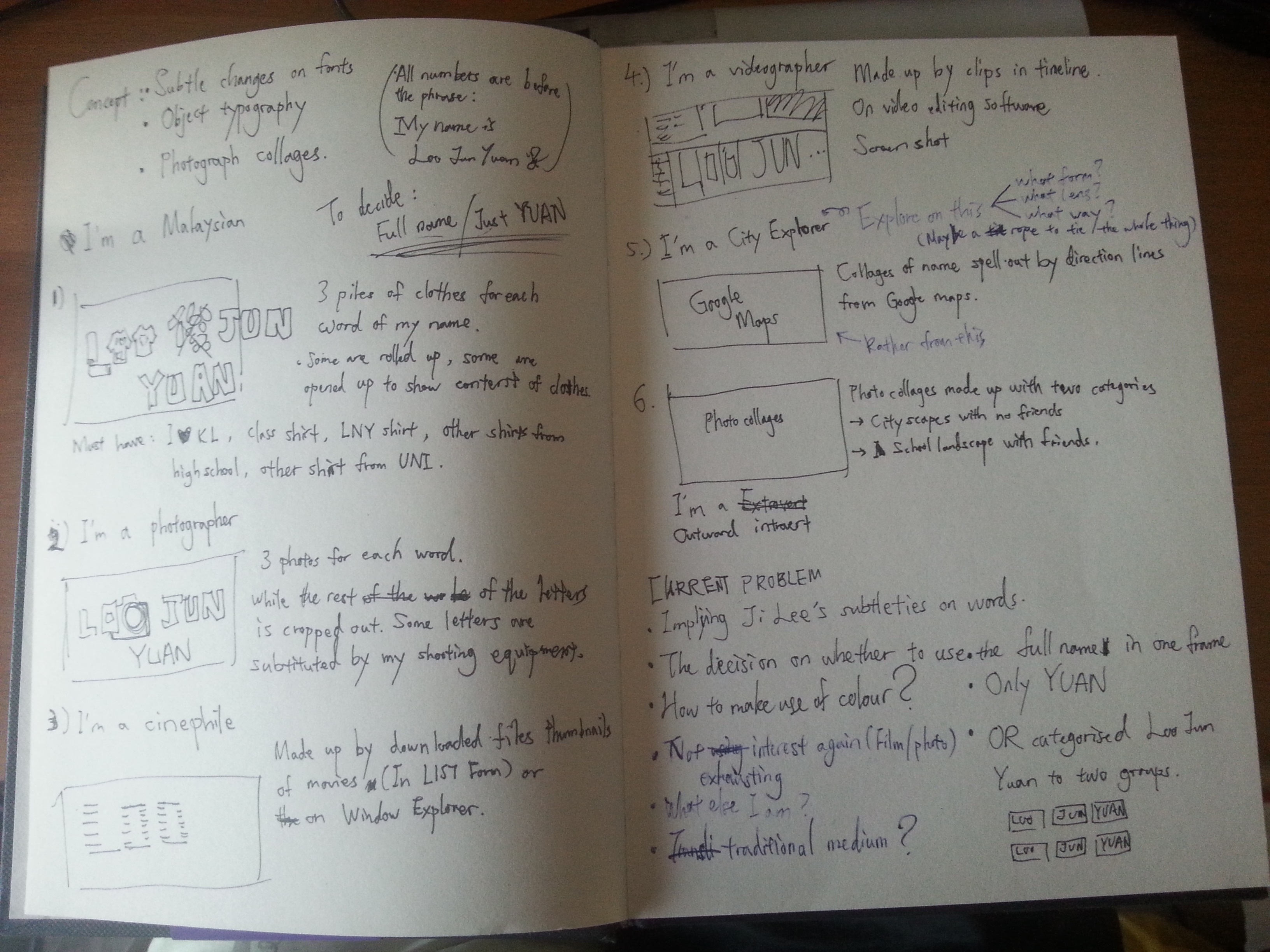
First stage of conceptualization!

Due to an unattended class trip for 4D, I went to visit SAM with 2D inspiration searching as another reason. Turns out there is some interesting reference worth exploring.

Based on my last research/exploration on the Internet typographers which impressed me, my initial concept for the typography portrait are:

  • Subtle changes on fonts to match the content.
  • Performs object typography.
  • IF required, the object typography will be made of photograph collages.

20160130_164100

The first group ideas of all the portraits varies in styles. They included

DSC_1035

Green Zeng’s Siapa Nama Saya?

DSC_1043

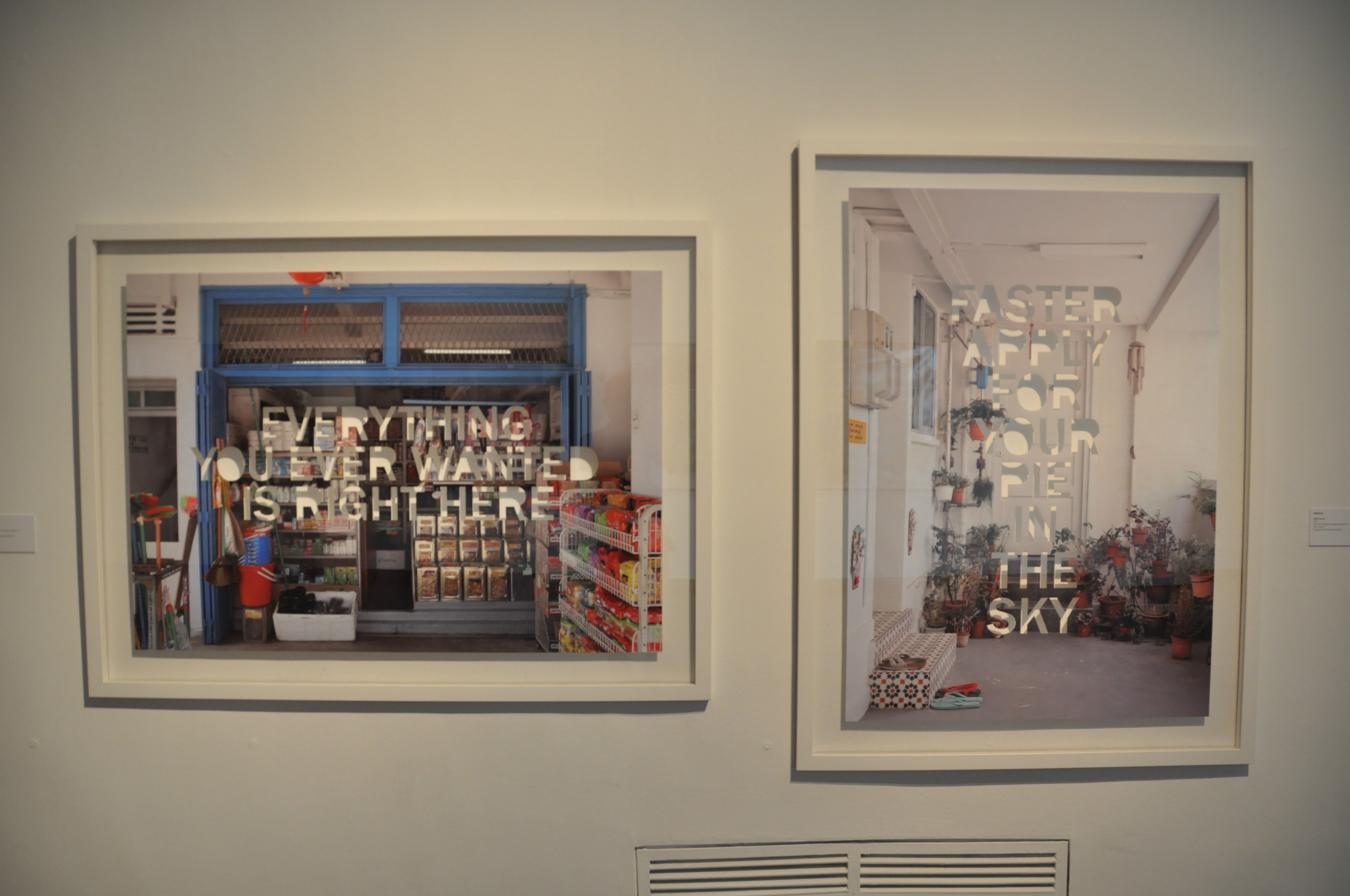
Dawn Ng’s Mamashop and HDB Corridor.

  1. Compositing my name with T-shirts, showing my identities as a Malaysia, who has an enjoyable memories in high school, came to NTU, getting use of uni-life. (Inspired by a piece (top) from the installation ONCE UPON THIS ISLAND)
  2. Using another piece (bottom) from the installation ONCE UPON THIS ISLAND, a photo with all my items of interest compositing some of my name’s letters while the rest are cropped out like the piece above.
  3. Arrange my downloaded movie files into my name via Window Explorer.
  4. Arrange clips into my name in an editing software’s timeline. Captured with screenshot.
  5. Collages of my name’s letter made of directional lines in Google Maps.
  6. Photo collages of cityscapes and school’s landscape with and without my friends.

You must be wondering, why didn’t I elaborate more?

After a consultation session with Ms. Joy, I realized (with the confirmation of Ms. Joy,) not only my concept, in terms of content, does not have a solid theme. Moreover, I exploit again on my interest in films, which Ms. Joy warned me to not exhaust the subject before I even enter my major courses. I was advised to find potentials in other traits of mine to explore, in many other ways, even in my current concepts. Such as, in what kind of lens viewers can view through? What sort of medium can I utilized rather than photos? Is it absolute to use human as the subjective?

Thus, I have new objectives to pursue for this semester, which are, try to explore other versions of me, what else can I show myself as? Try NOT to imply things that people knew about me into my work again. Give my audience a fresh new impressions.

Oh my, I have a lot to brainstorm this week. Hope I progress!

Two weeks in and HELLLLLLOOOOOOO project number 1!!!

Remember what we do about projects? Research! This time, we get to do Typography, the area of art that I’ve seen a lot but still being strange about it. Initially to me, typography are art pieces with fonts that had been created by the mass and was decorated with or immersed into forms, shapes and colors to give the words an eye-catching properties. Usually this kind of art are seen in webpages that likes to quote famous figures, or simple short do-you-know facts. Not only it’s eye-catching but also effective for netizens with short attention span.

Personal views aside, the lesson I had been on last Thursday had opened my eyes to the diversity of Typography. After listening to all the researches my classmates did, I saw the subtle side of the genre, that Typography doesn’t have to be literal, yet being contextual in the meantime.

SO, back to my research. Technically, they’re not intended research materials, but originally typography posts from the Internet that I was impressed of.

ji kee

The first artist I wanted to talk about is Ji Lee, a Communication designer in Facebook. You know this guy has some talent in him to be able take on an important position in one of the biggest company in the world. The series that impressed me the most was his Words as Images. Most of the words in these images use the same font and were only tweaked a little to match the properties of the words. However, viewers got its point almost instantly as it’s not too obvious, yet not too subtle for the public. I admired its brilliance of balance both and the entertainment it gave. Also, the minimalistic style it possesses certain is a plus from distracting the viewers compared to other over-exaggerated typographies.

meganleescienceThe prints above are the second piece I’d like to talk about. Megan Lee’s  Rock Star Scientists also consist of uniformed fonts but accompanied by again, minimalistic illustrations or silhouette of achievements of each famous scientist respectively. Viewers who love science instantly recognized this names and understood its context. The design doesn’t seemed too nerdy and in contrary gave these influential achievements a fashionable makeover. Science seems so cool again! (Correction: Science IS cool.)

dangerdustThe works above are done by two anonymous students who named themselves Dangerdust. These work varies in fonts and styles, suiting the figures they’re quoting. Although some of their designs are too complicated that they sometimes covered the quotes, but most of them are well balanced in terms of scales and positioning. Most impressive of all is that they are done on blackboards, giving the context of educating the next generations with words of wisdom.

object typography

Lastly I want to talk about the methods. I came across these styles of typography and they stayed in my head as a genre. Building typography with everyday objects has interested me, and made me wonder if I can do the same. Ms. Joy later suggested me to look into whether they should be done by put together like a puzzle to form an alphabet, OR using objects that suits the content and yet has the form of the alphabets I wanted. This methods of typography is certainly something worth exploration.

In conclusion, these art works above I found impressive have the potential to influence my next project. Hopefully I’d be able to create something as contextual as Ji Lee, as mind-changing as Megan Lee, as thoughtful in terms of medium and aesthetically beautiful as Dangerdust, and possibly done in object typography. (Cross fingers.)

Side note: The reason I don’t prefer DADAism as a reference is the fact that I want it to have a meaning. The fact that it creates great effect is undoubtedly true, but this time, alongside Russian Constructivism, they’re not the right style for my current project. Although their ways of positioning the components to attract viewers attentions is marvelous and worth studying.

Thanks for reading!