20160414_183151

The excitement is inevitable!!!! And that’s not a realistic printed pen.

It’s completed!! I screamed internally when I finished pasting every beautifully printed pages together. The end result of the printing are glossy but the brilliance of the colors still stands out completely. The vivid colors wasn’t dull but pleasing to my eyes.The papers I’ve chosen from Fancy Papers Ltd are gampi papers (covers) and thick papers with the texture of my visual journal. The papers works well and maintained its flatness throughout the pasting and logistics.

All these excitement aside, I’ll be guiding you through my zine page by page to give you a full view.

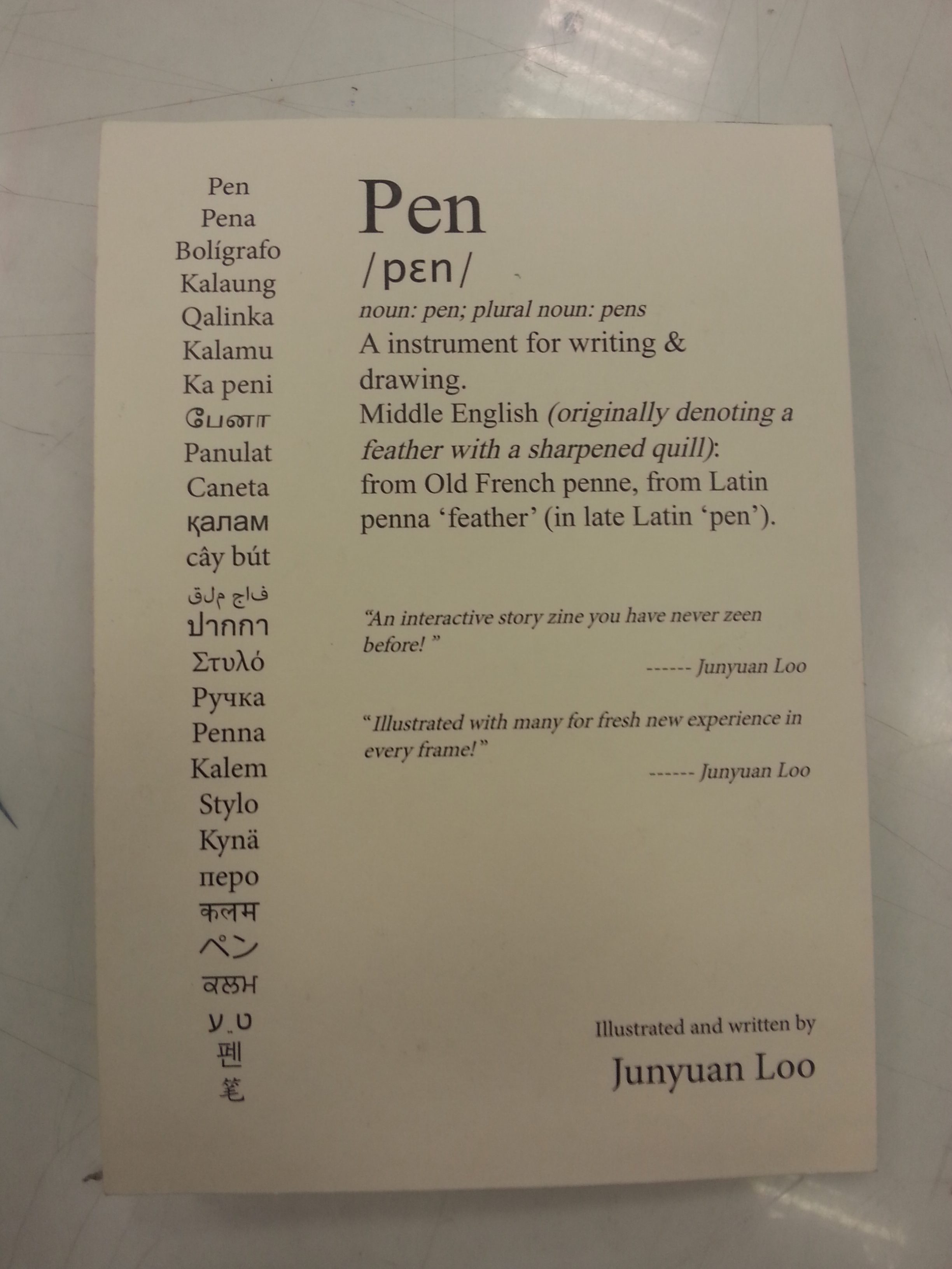
I chose the Jokerman font for my title as I want a memorable font to be the first thing shown into the readers’ eyes. The font shall also give the impression of light-hearted-ness for the entire zine in the beginning as well. Adding the red spiky eclipse to make the cover interesting was decided early before the paper was chosen. Surprisingly the design fits perfectly with gampi’s certificate-like texture.

Throughout the contents, I chose the Huxtable and Hurry Up font for both my narrations and instructions to give them a quirky tone. The two fonts are not linearly aligned which produce a non-serious component for the work.

Originally I wanted to use metal pins to attach the supposedly-leather-made pen holder. Unable to find the suitable pin to fit the colored-paper-made holder, I made a pair of “pins” with yellow color papers and paste the whole thing together. Thinking back the decisions, the pen holder, in my opinion, suited the overall style of the illustrations.

20160414_183414 20160414_183314

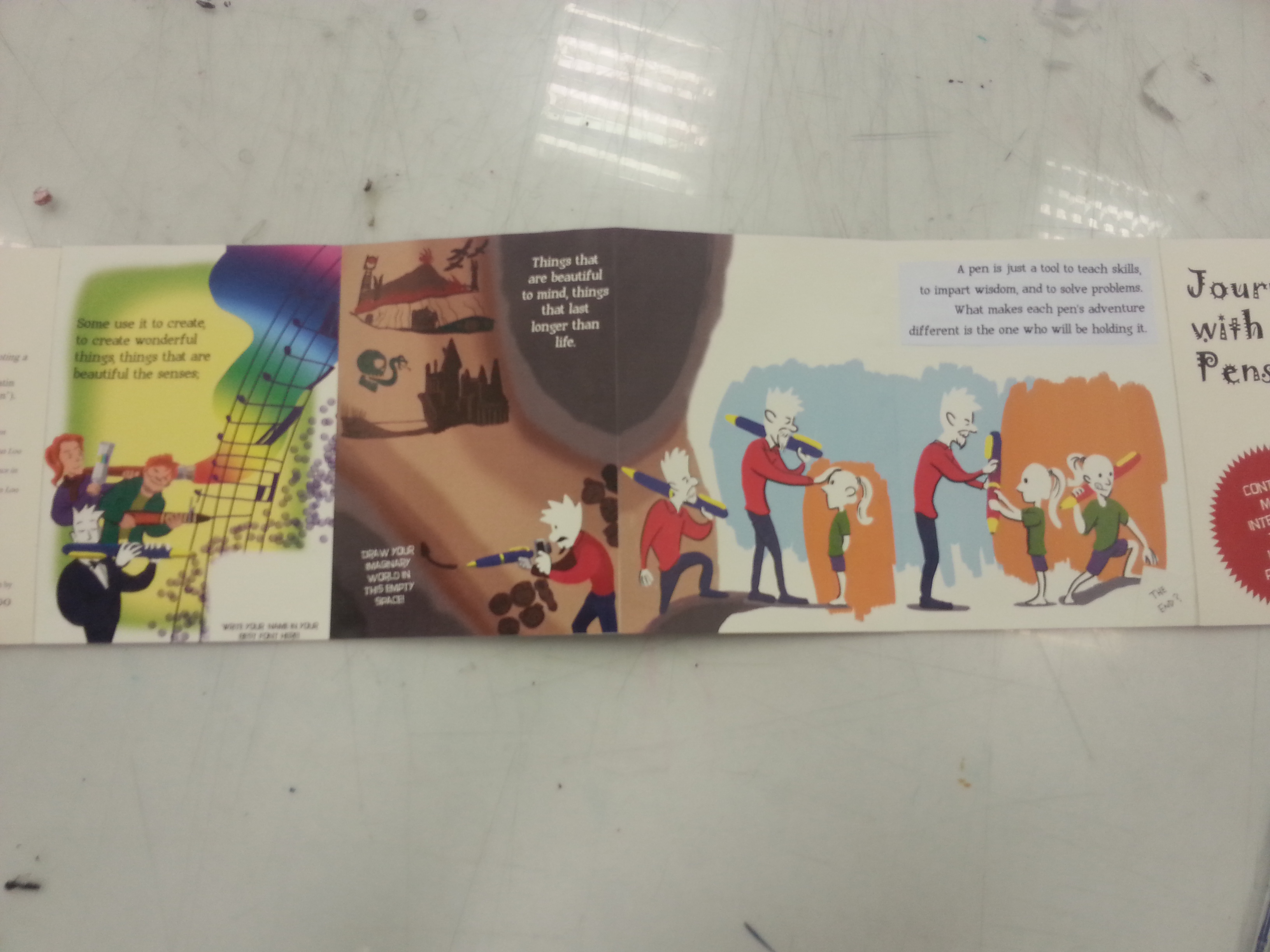
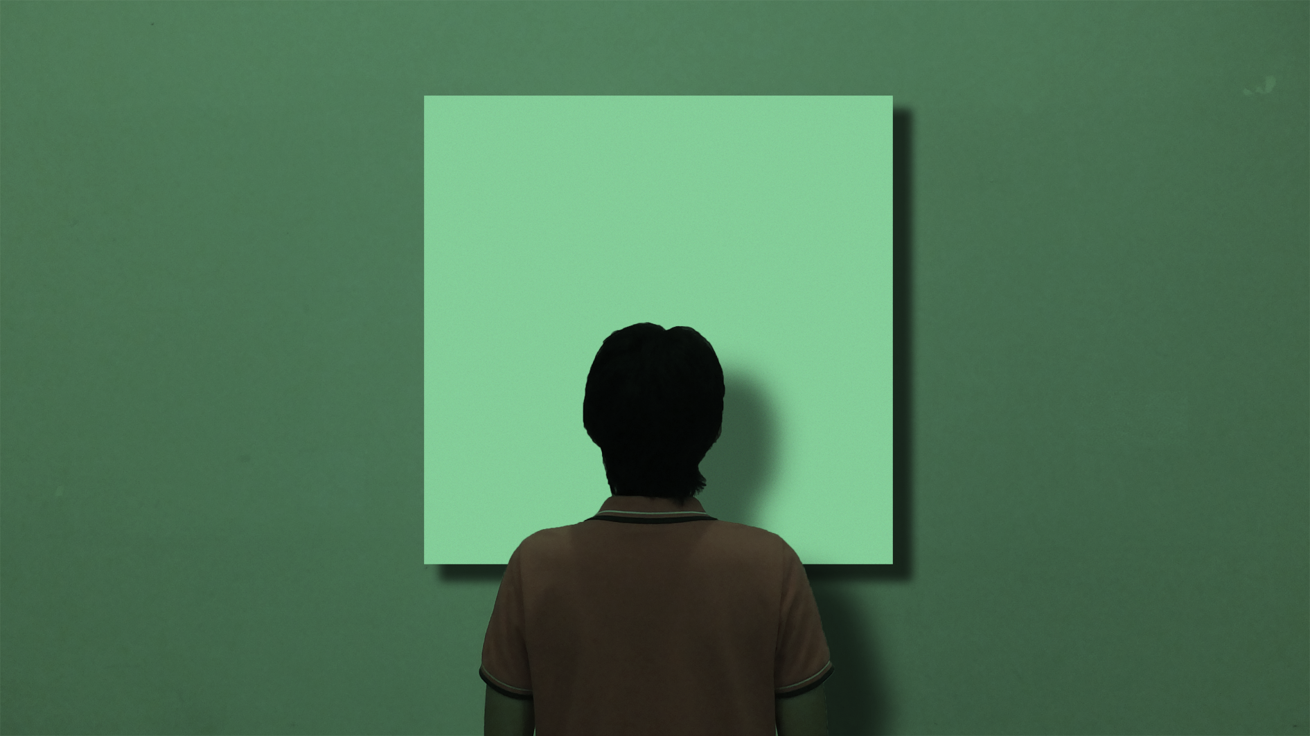
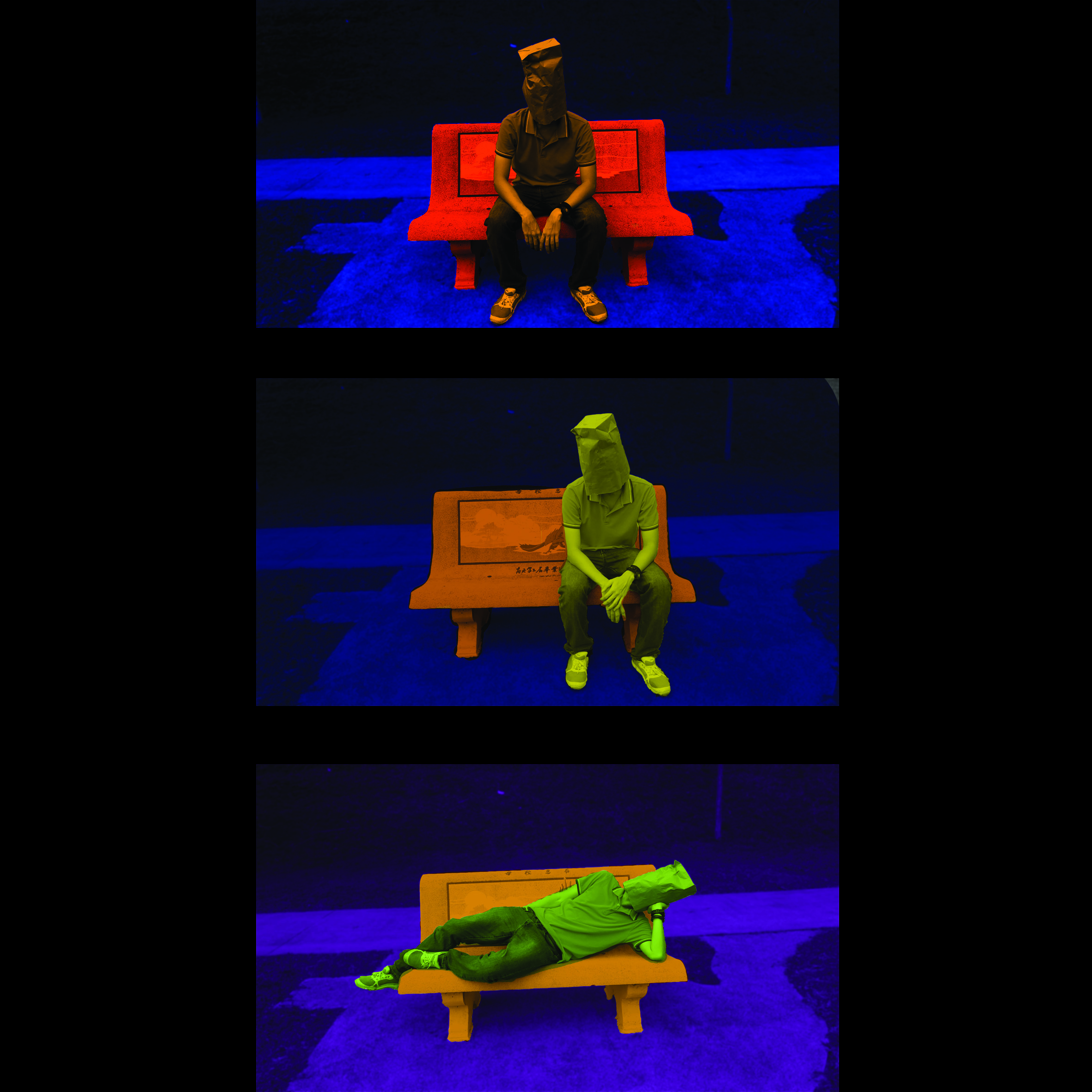
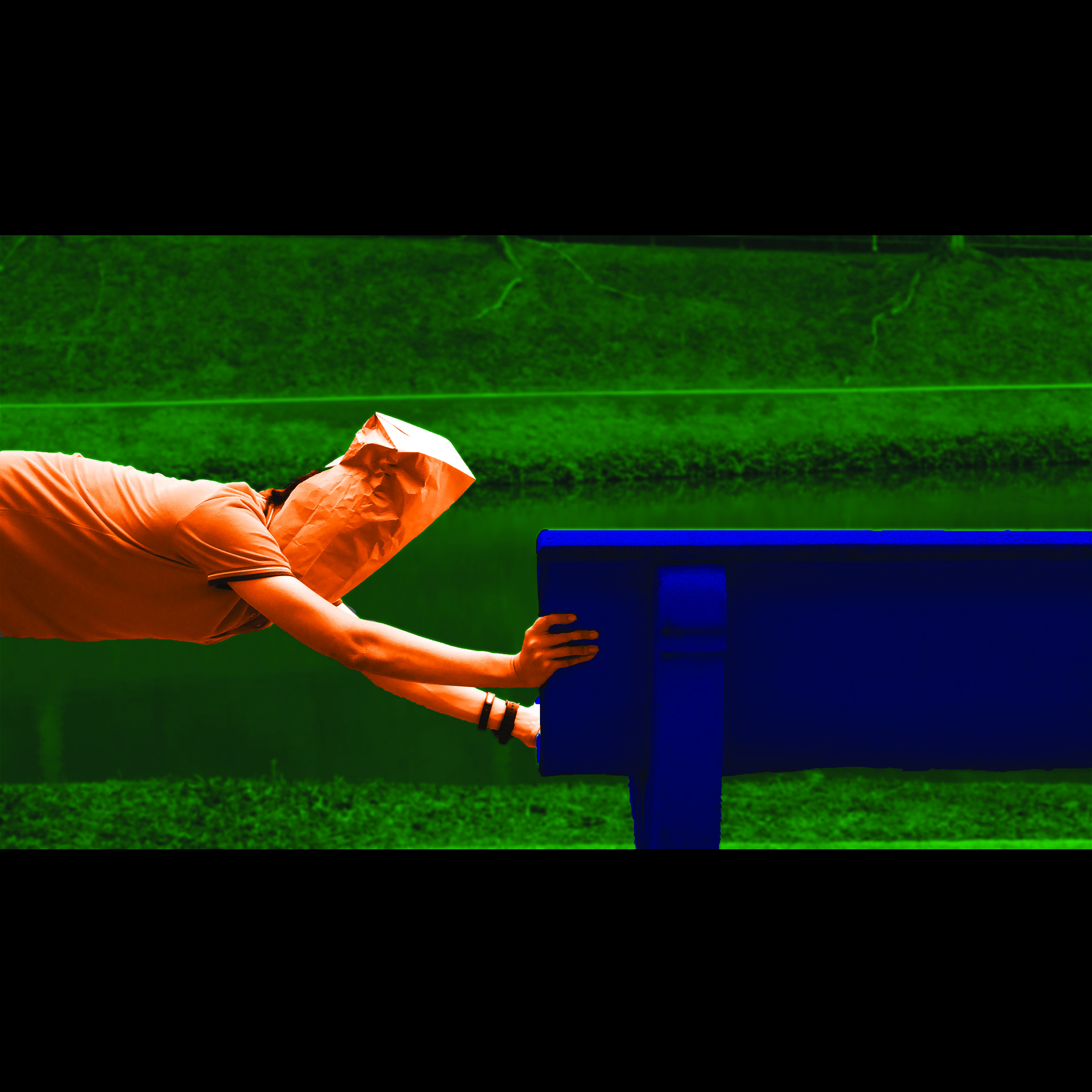
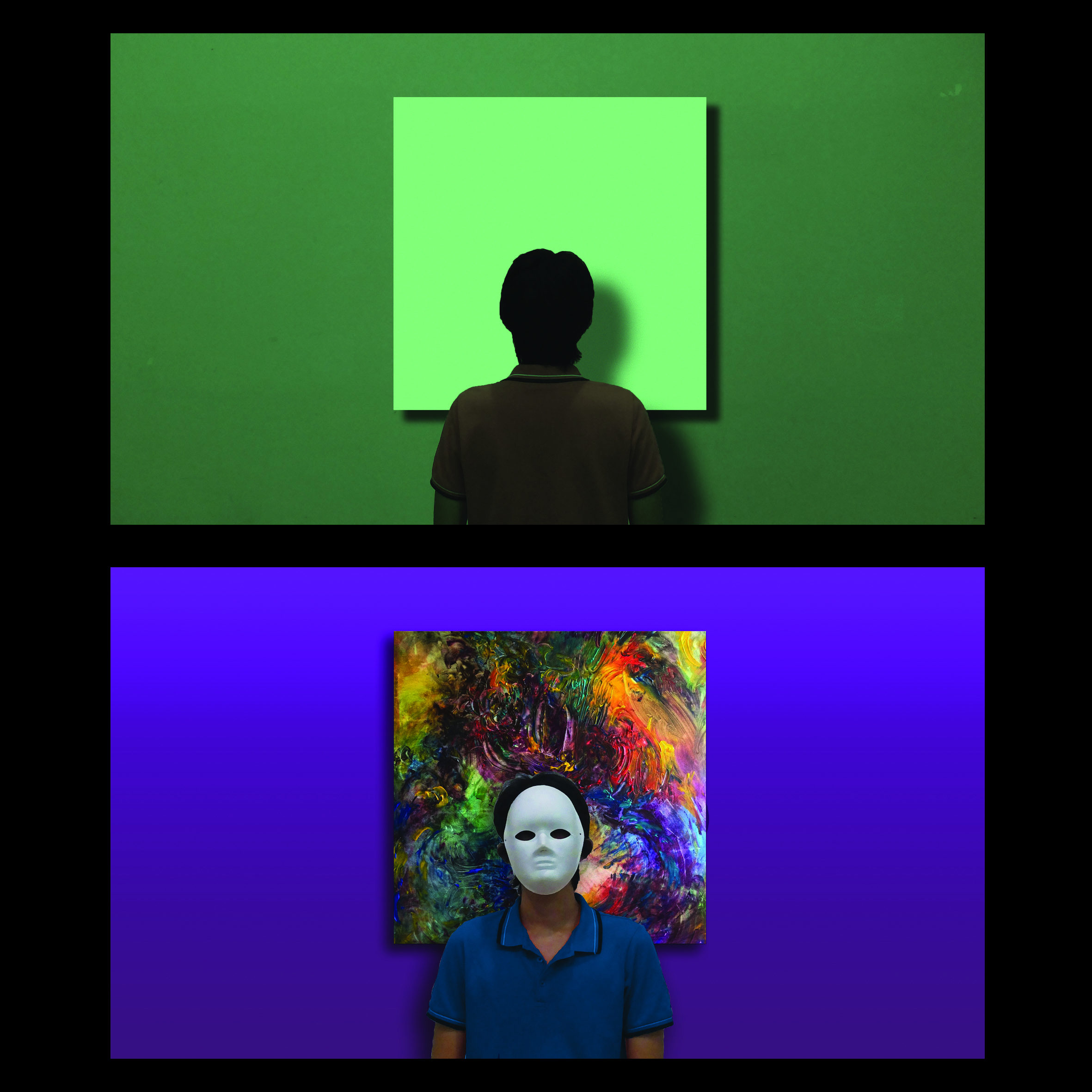
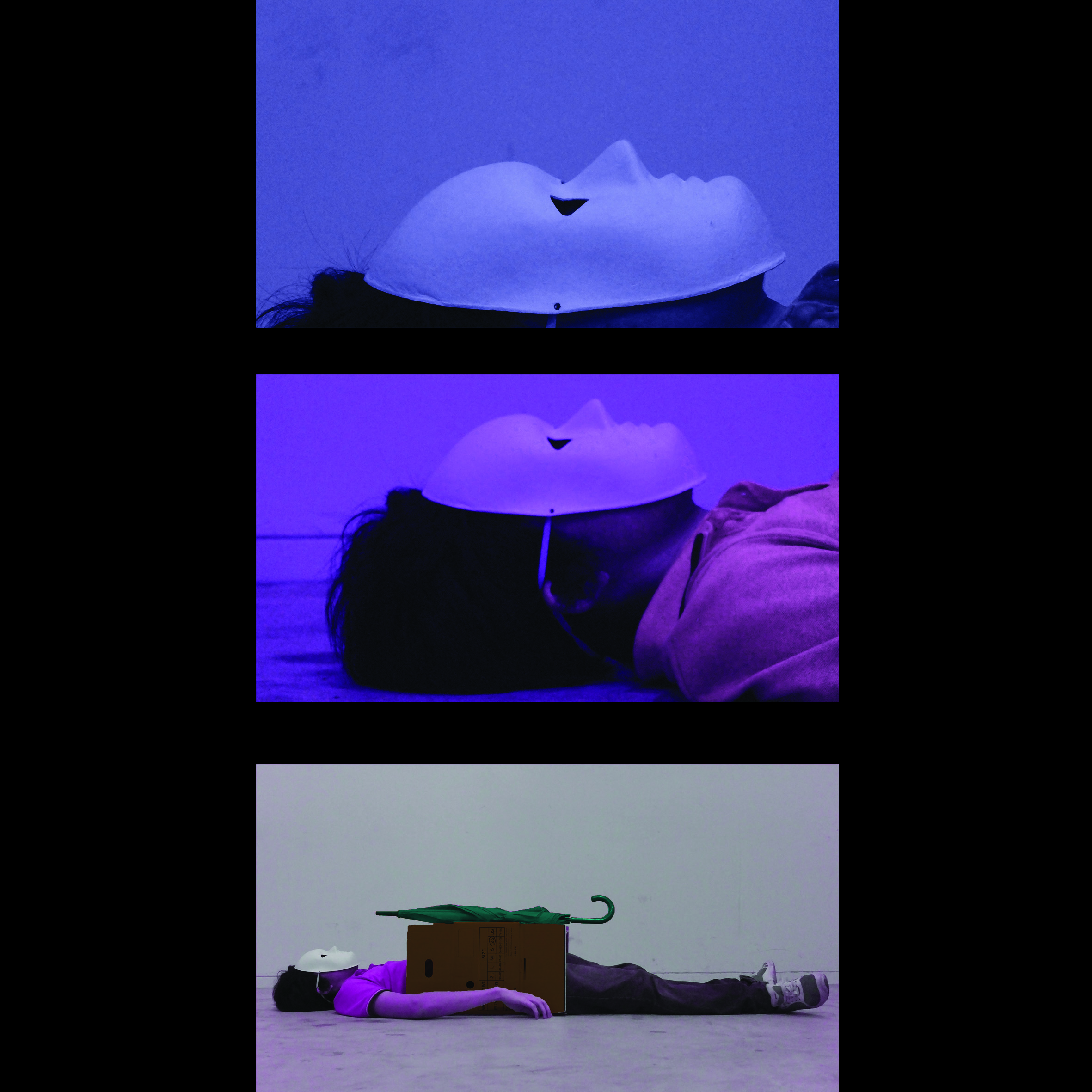
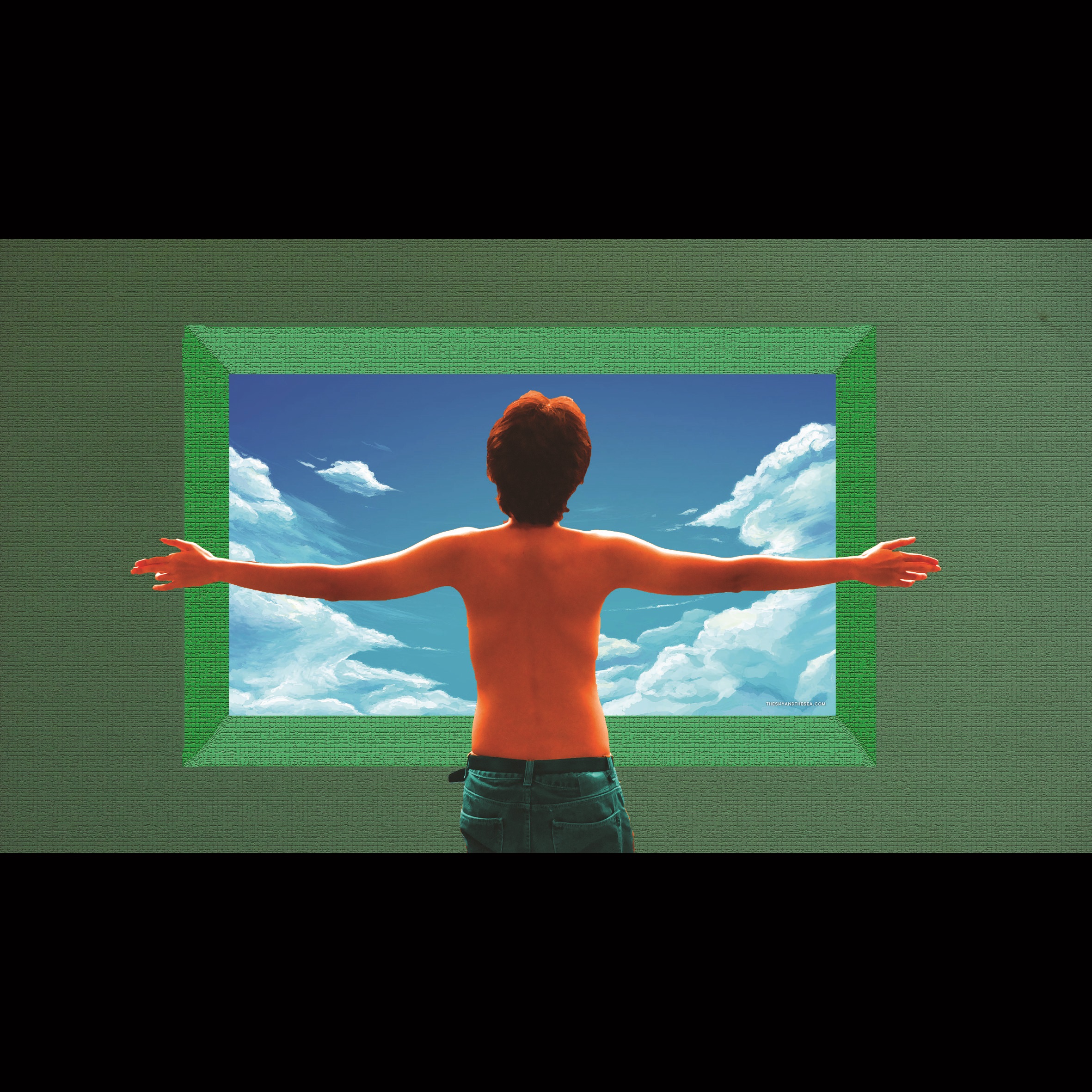
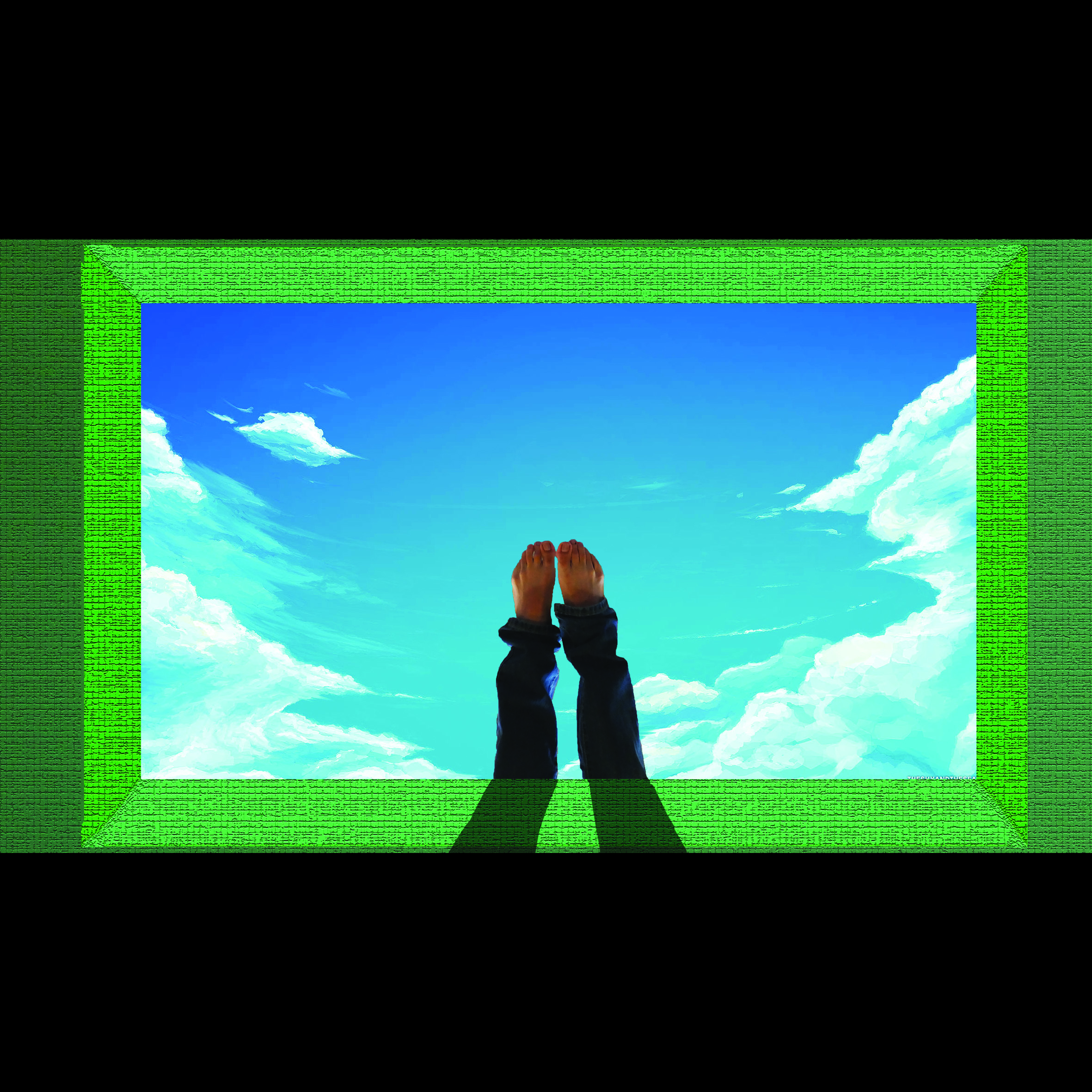
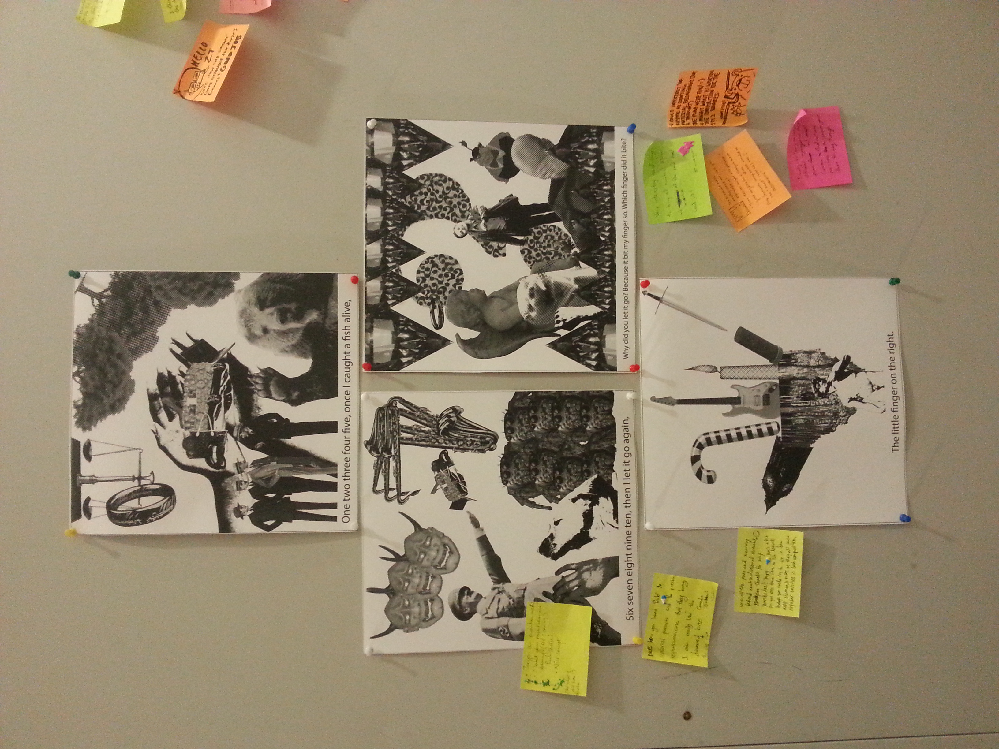
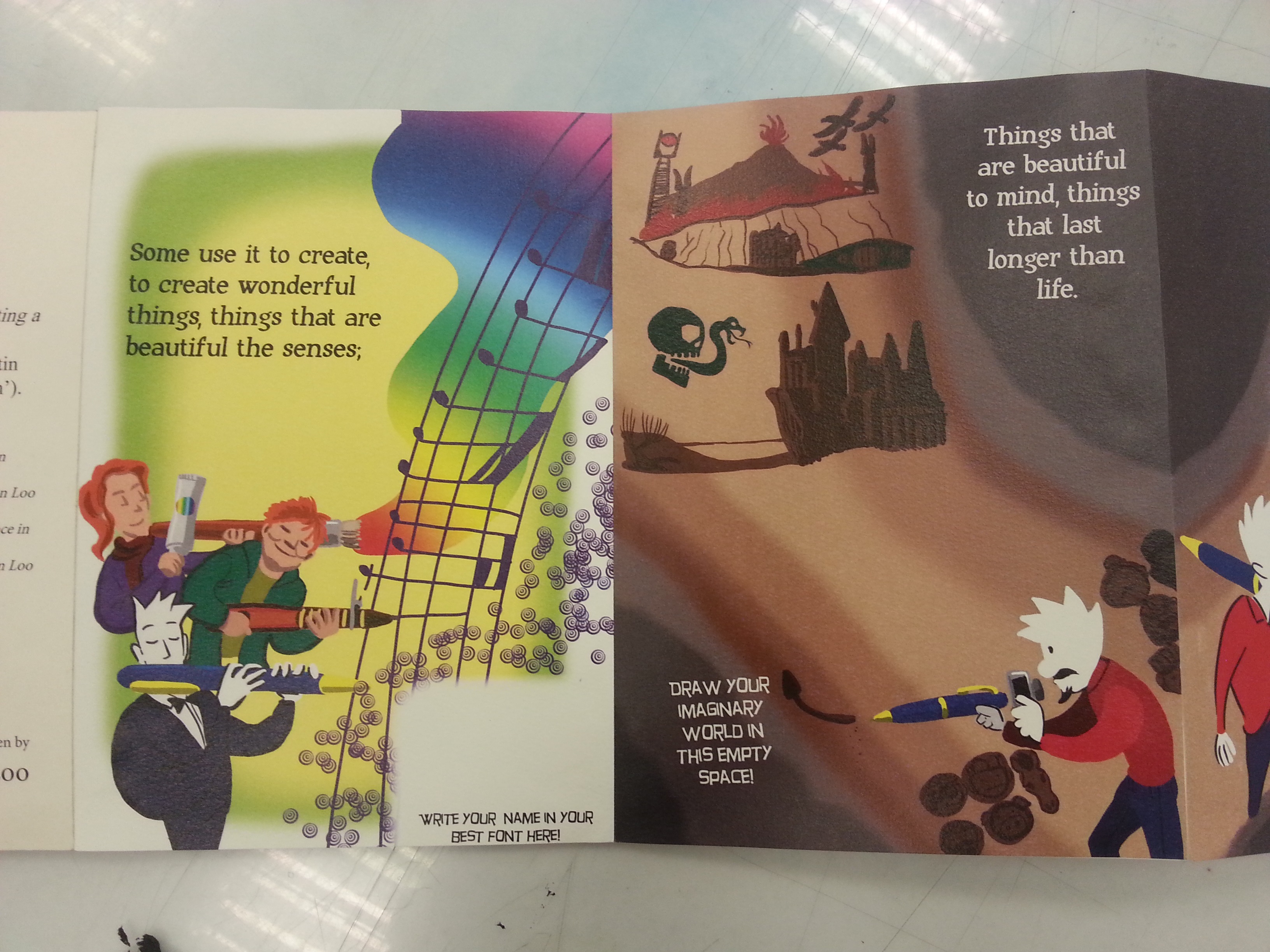
Initially, I wanted to place a pen-outline subtly in the main pages in the left photo, which will be visible when fully expanded. However, the Pen-as-Arsenals composition made the lines blended too subtly into its background, which unfortunately hidden my initial intentions for the compositions. Inevitable, it’s considered a pity by me. For the compositions in the other side (right), I connected them together with various factors, such as mirroring compositing and connecting backgrounds. With these decision, the pages were held together visually, showing their identities in the same narration, even though their styles were different.

20160414_183212 20160414_183216 20160414_183223 20160414_183231

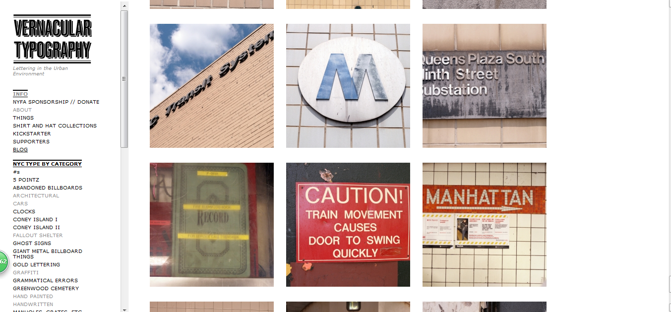
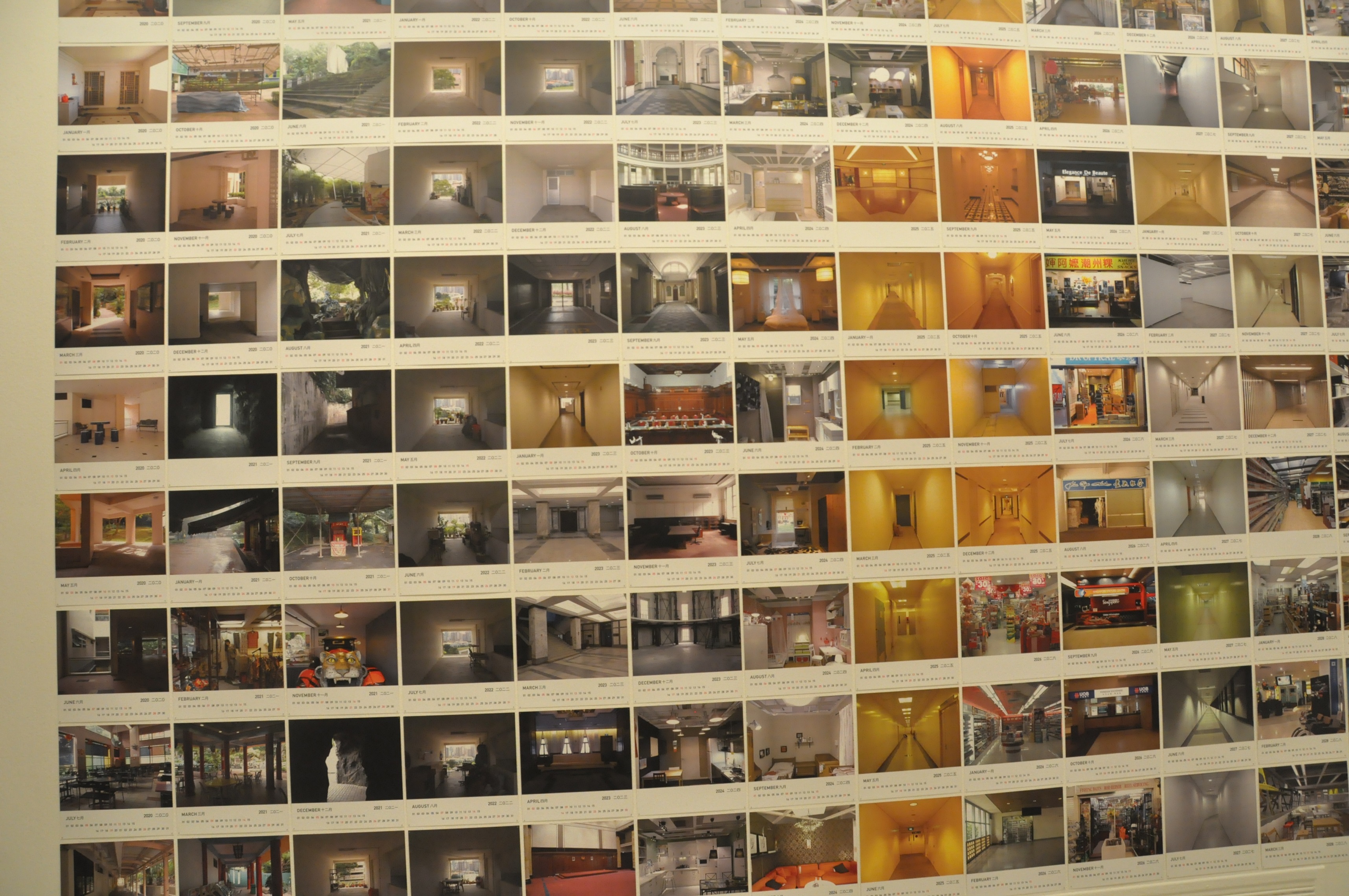
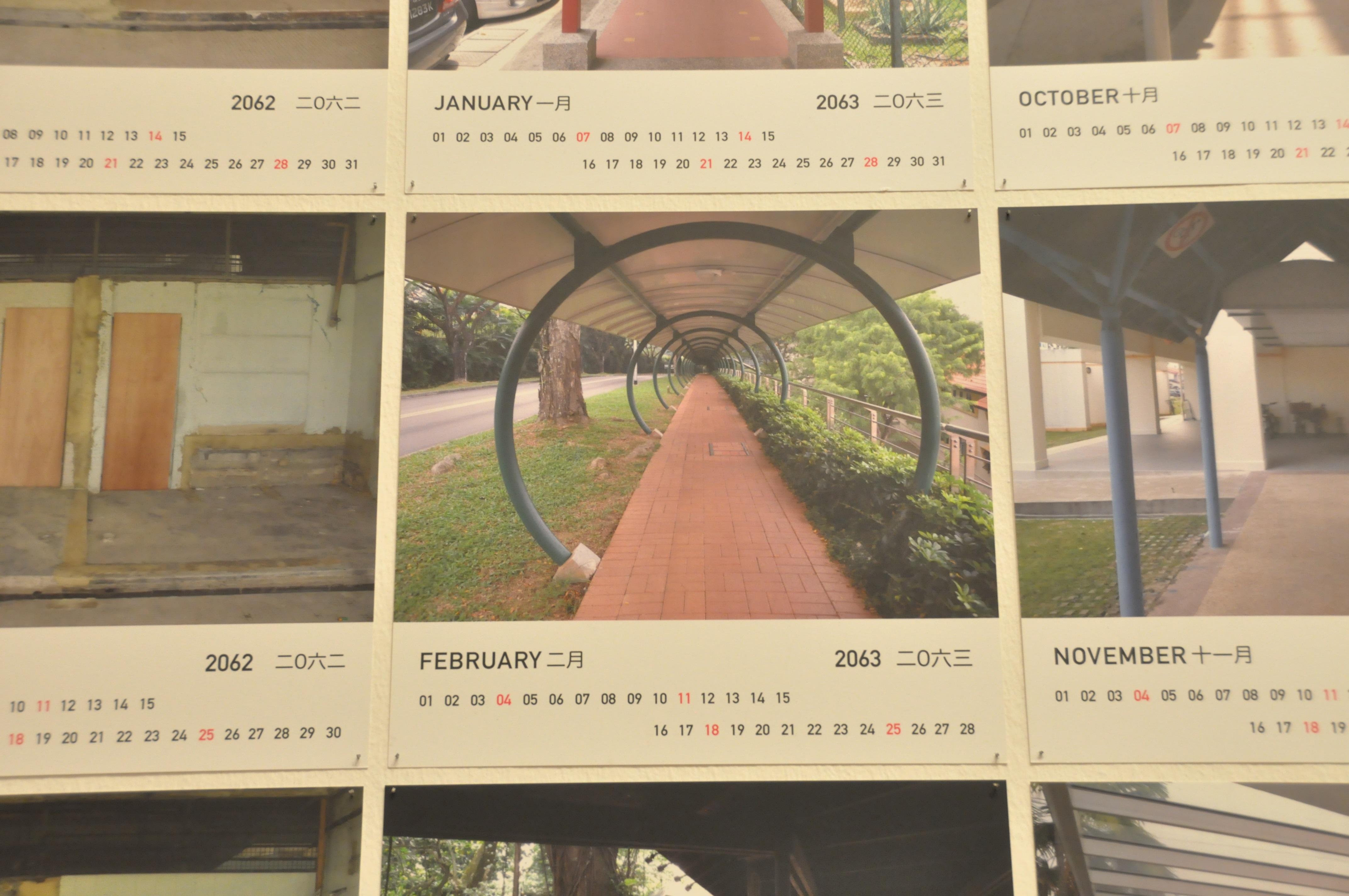
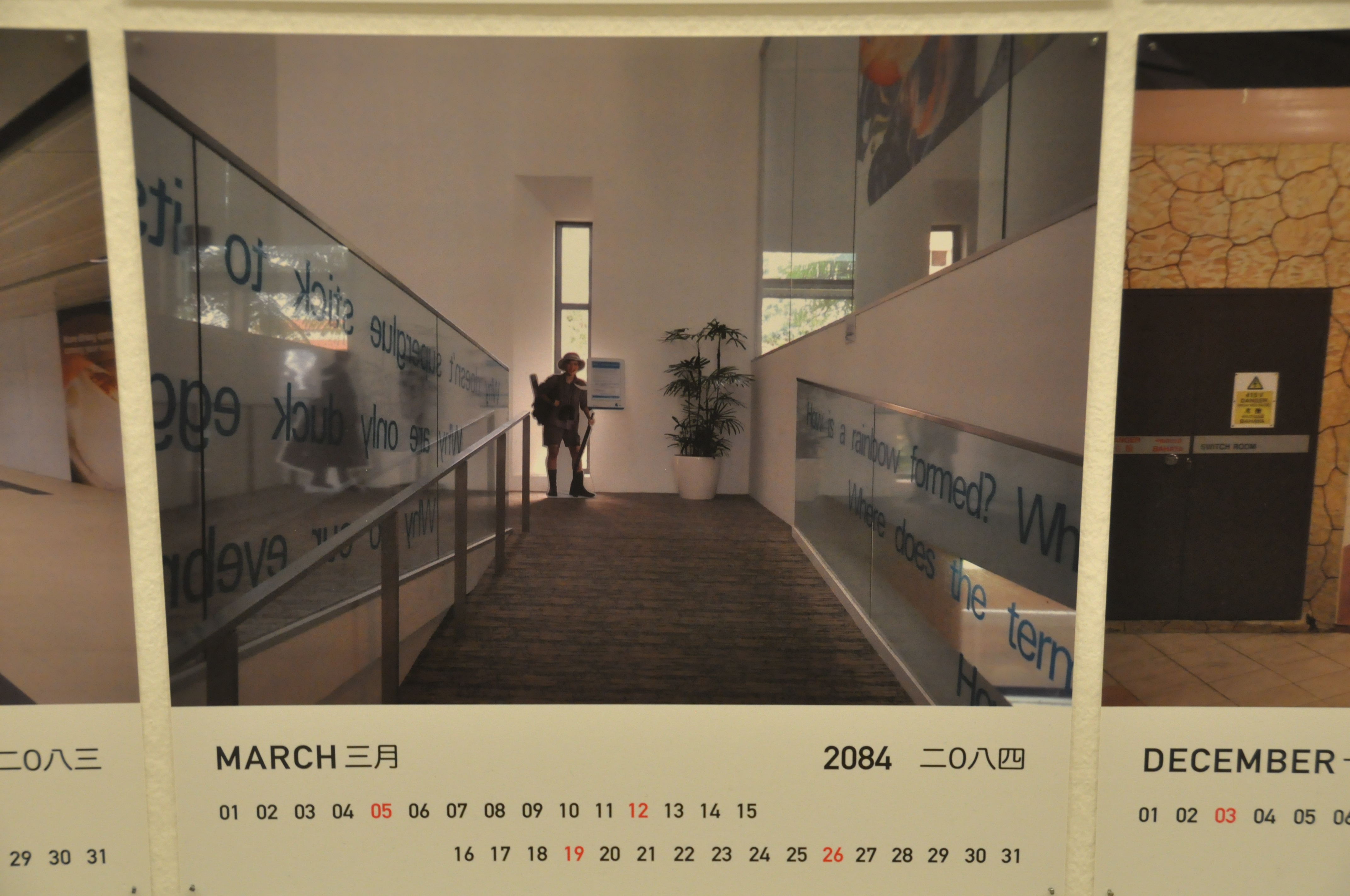
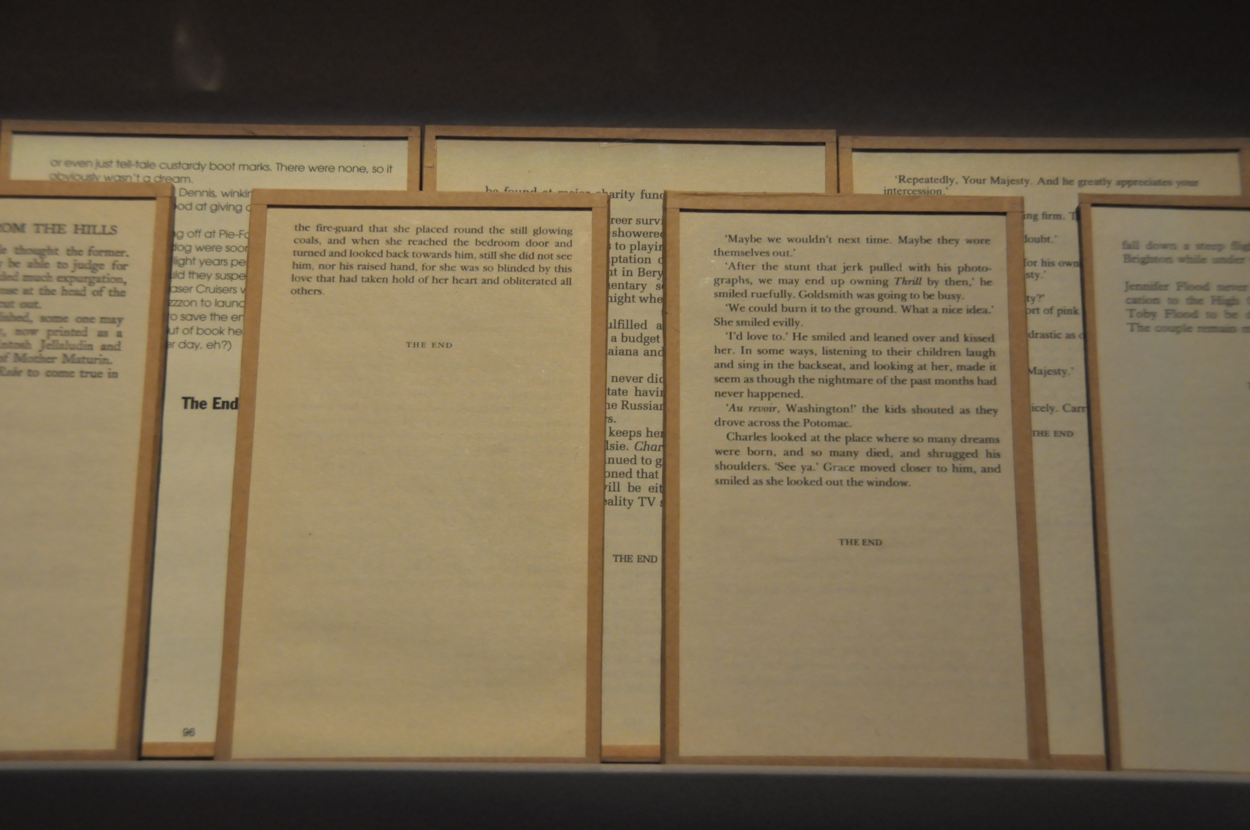
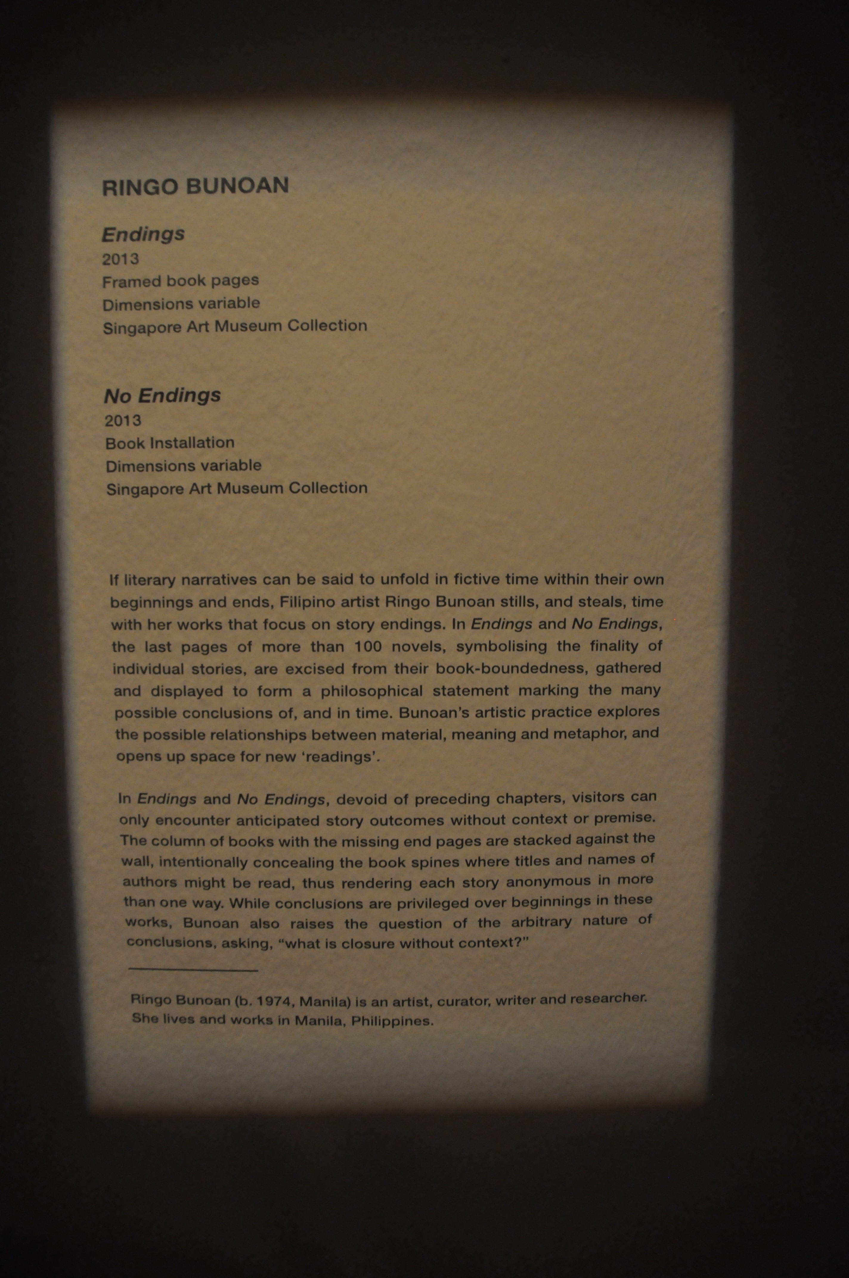
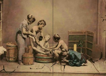
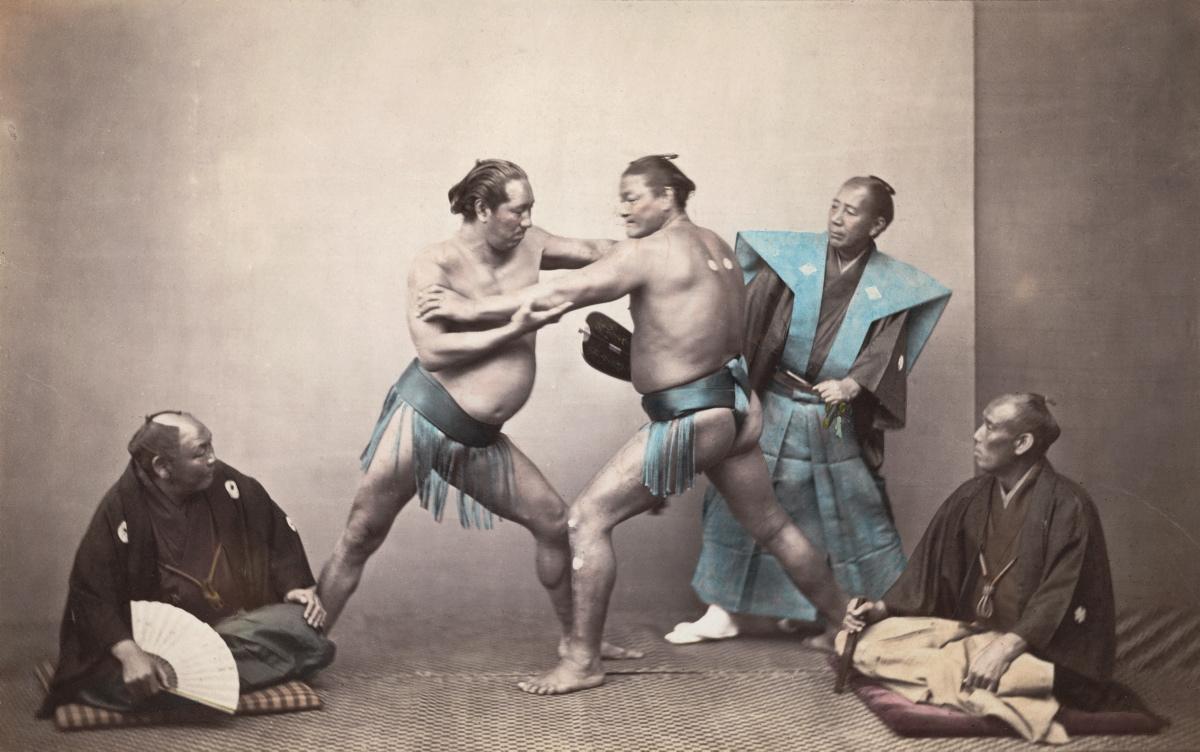
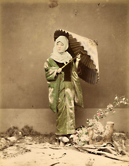
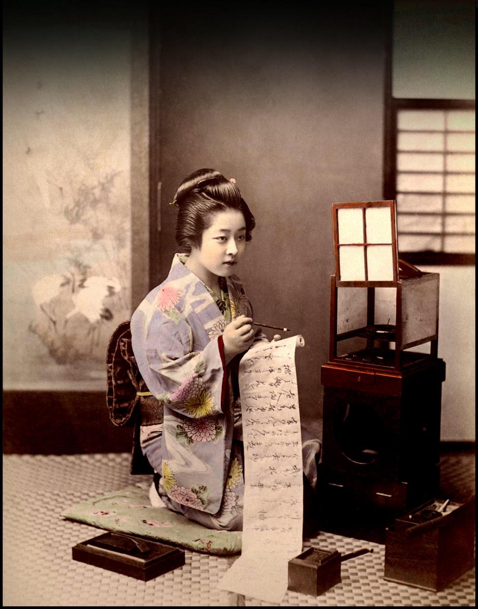
[Click into the thumbnails to get a full view of each pages.]

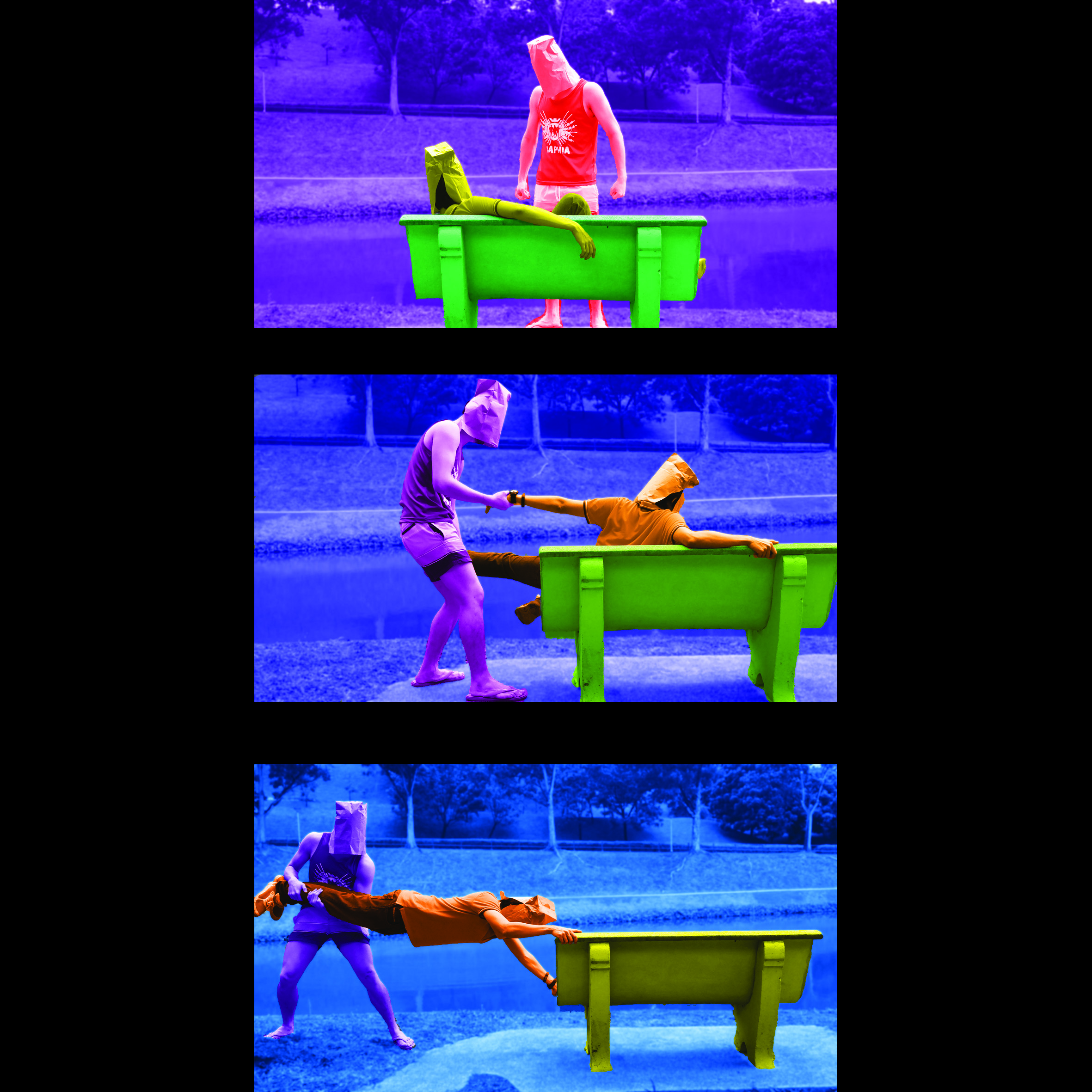
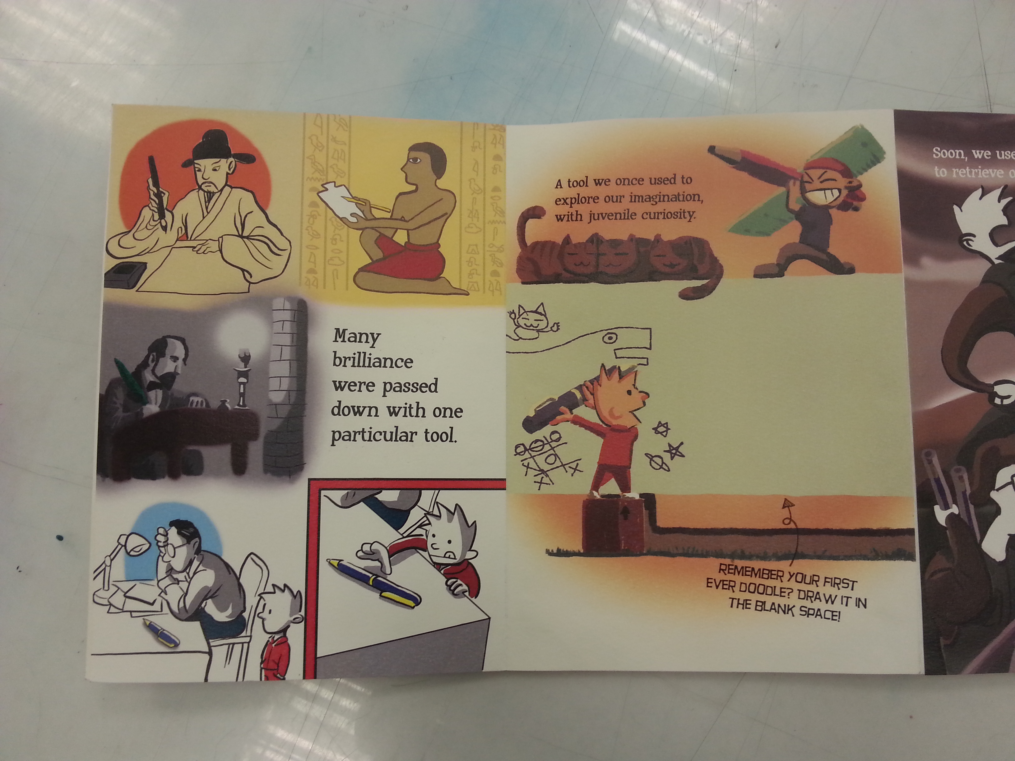
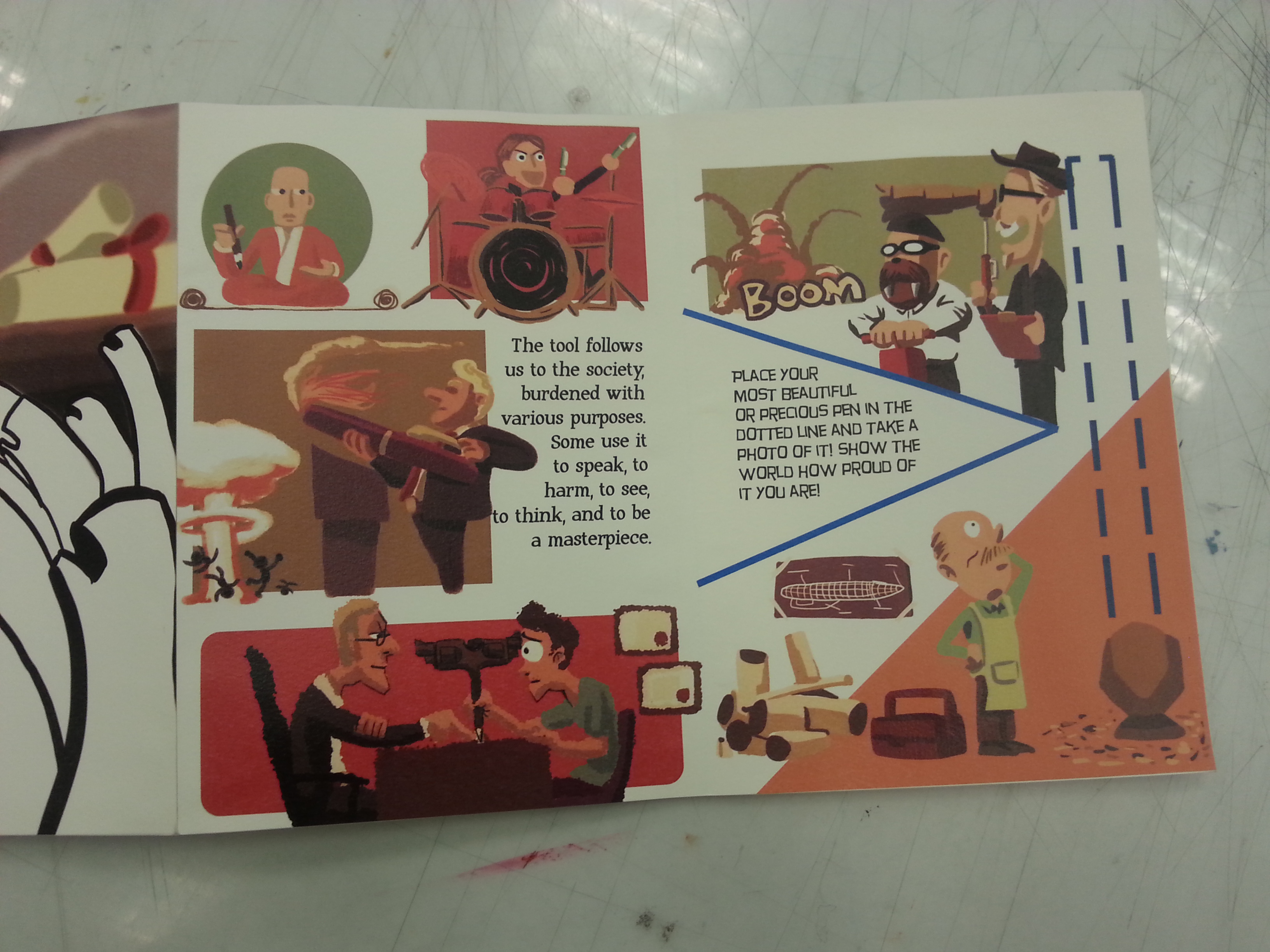
As most of the composition are explained, I shall move to the third composition where I wished to included the occupation perspectives I eliminated from the previous project. I was able to revive following the perspective:

A PEN from the point of view of MONK is MEDITATION

A PEN from the point of view of DRUMMER is DRUMSTICK

A PEN from the point of view of PENTURNERS is ART (The main contributor of the page’s interactivity.)

A PEN from the point of view of LAWYER is GUN

A PEN from the point of view of POLITICIAN is WMD (Donald Drumpf inspired?)

A PEN from the point of view of SCIENTIST is CAMERA

(For this I supposed many of you might recognize 2 of the most entertaining engineers/scientist in TV history. I chose them to replace white coats as one of them, Adam Savage once said: “Remember kids, the only difference between Science and screwing around is writing it down.”)

20160414_183235

I left this page to be enlarged as I wanted to point out specifically my mistake on it. Due to my neglect on proofreading, The paragraph in the page had terrible typos and mis-phrasing. While being anxious before submission, I decided to cover it with a plain printing paper as the school’s printing shops didn’t allow me to reprint the words on the extra paper I bought before print. During the class presentation, just as I recapping my pages, I thought of a better solution for this mistake as I mentioned on my presentation:

Adding an interactivity which requires the reader to correct the mis-phrased paragraph, because this page is a tribute to the line: A PEN from the point of view of TEACHER is STICK & CARROT and A WAY TO PASS DOWN OUR WISDOM AND KNOWLEDGE.

Lesson learned, always think through when fixing mistakes, avoid naive and stupid solution as well.

20160414_183255 20160414_183244

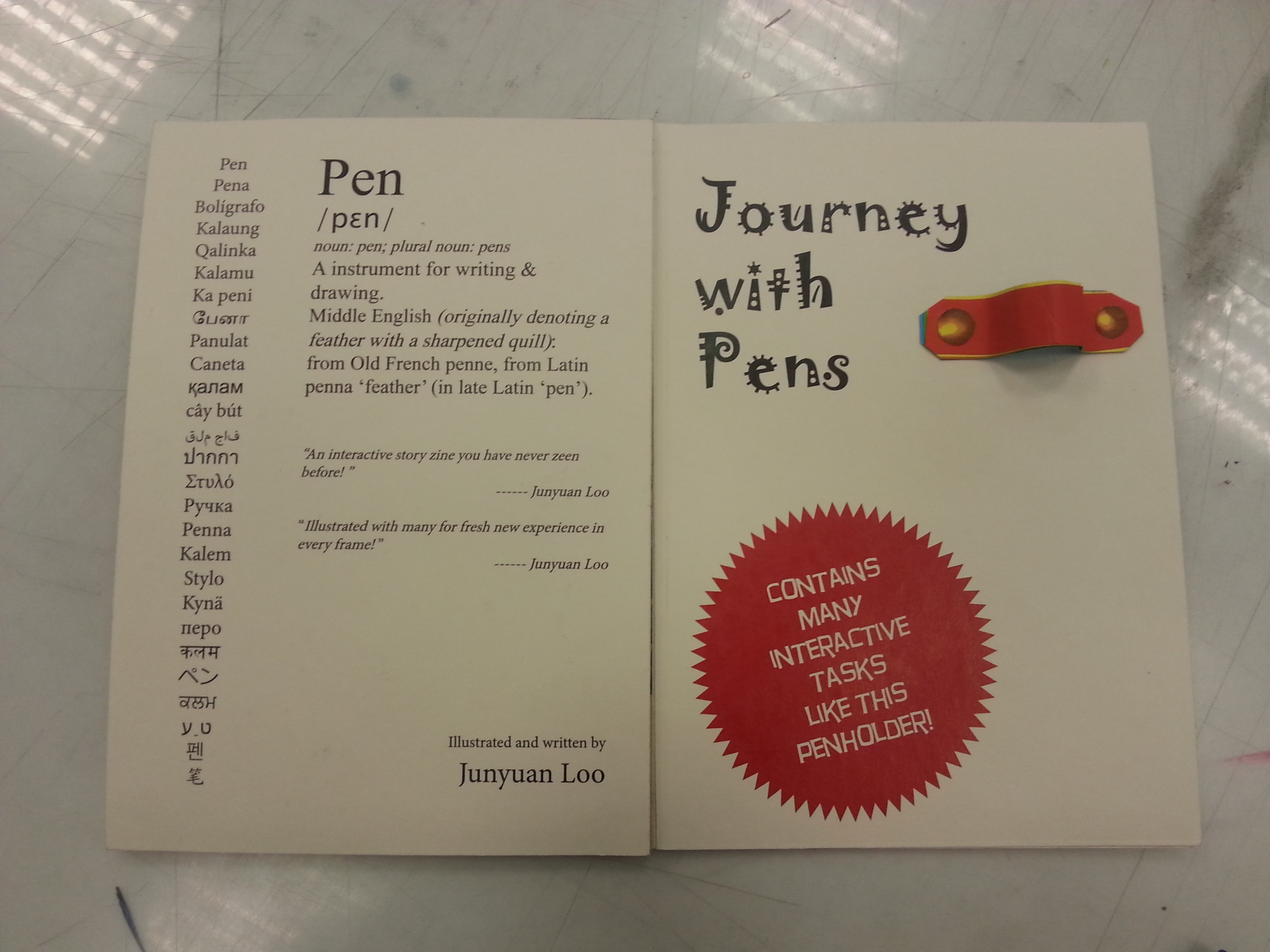
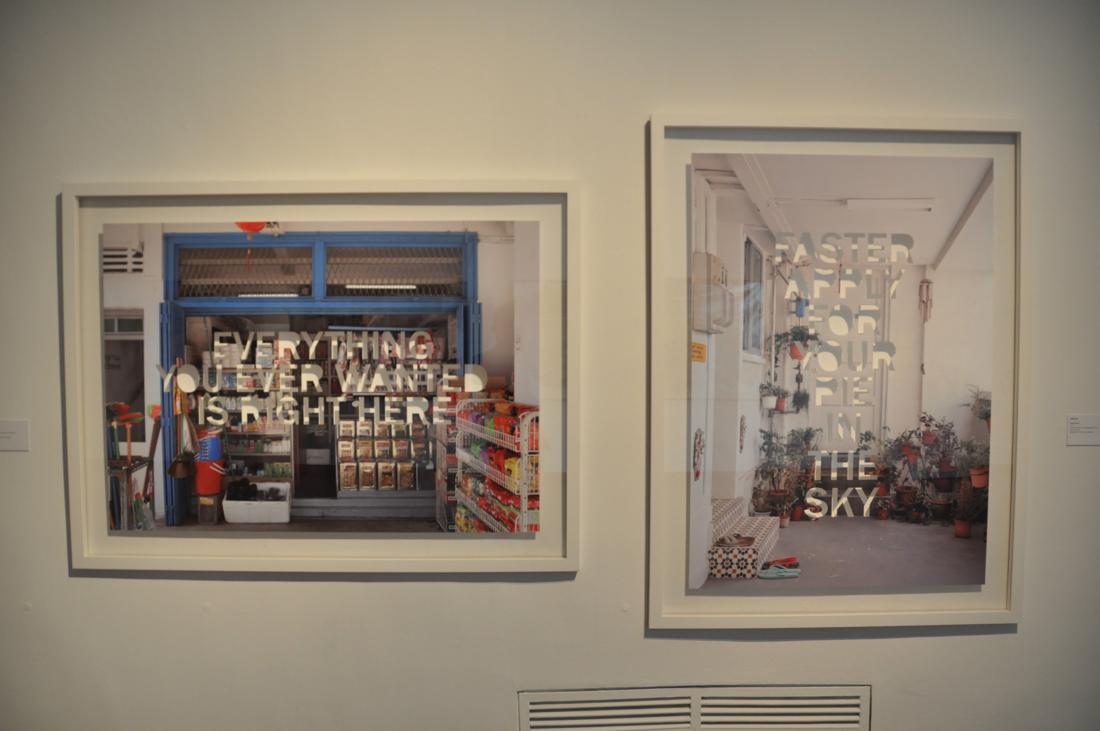
After the bad news, now for the good news. The back cover surprise turned up very well with the Pen-shaped compilation of PEN in various languages. When the zine is open as the right image with a pen the pen holder, a mirroring composition is formed and I was extremely satisfied with this outcome.

REFLECTION:

My fellow classmates like the illustration very much while Ms.Joy warned me about the consideration on font size. For instance, in the occupation composition, due to the fact that both instruction and narration are typed in the same font size, readers might confuse them over the similar font and take times to differentiate them via capitalization. Overall, the zine was regarded as nicely done. I am proud of it too!

This is the last project of the module Foundation 2D. Throughout the academic years, I’ve learned a lot from my classmates from different semesters and my tutor Ms.Joy. I got to challenged many methods of execution and styles for different themes. This is one of the modules I am glad I didn’t drop and I am looking forward to have the same excitement while being in my majors’ modules.

Thanks 2D, and thanks Ms.Joy for the guidance since 1st semester.

Thanks for reading!!

Since everyone was so far ahead of the updates, I am gonna do a quick summarized update for my project 3 – The Library in ONE post.

Thinking of an installation art about the library is no easy task. This location is very common to anyone who has been a student, yet many of the library visitor has different perspective of the place. The ADM library is rather the most special library among our universities library. This can be due to its special layout design, use of spaces, functionality of different region, and also the research materials it contains. It’s pretty obvious for ADM library’s specialty so I won’t talk too much about it.

When it comes to conceptualizing, I’ve always like to start from my point of view. For me, the library is a place for homework, individual concentration, research paper brainstorming, and research materials searching. I always spend my extra time in the library. (only if I waiting for certain event to start and I have no sustainable leisure alternatives such as my laptop around me. ) What I like to do in the library is surfing through the shelves, and see if there’s any book titles on their spines that catch my attention. It’s kinda like surfing the internet without intentions but you do it in the real life.

SO most of my ideas originate from the act of surfing the bookshelves.

1. see through the shelf 2. obstacle 3. obstacle 2 4. I rather 1 5. I rather 2 6. blind search

(From top left)

I thought about the views we’ve missed when we search for the books, the layers of space formed by the holes that’s formed by the books and the shelves. And then there’s the inevitable obstacle set by people who were too focus on their chosen books and unintentionally blocked the pathways. The space I’ve mentioned in the first one also caught my attention and I wonder if I can express how certain series of books have lost their timeliness due to constant technological upgrades. I’ve also wanted to play with searching action by deliberately covering the paths to increase the difficulty of my “bookshelves surfing”.

The responses from I got from Mr. Michael Tan, is that these works can be improved in terms of directed perspective, importance, and relational attributes. Several artist works are also introduced such as Michael Lee Hong Hwee and Robert Gober,

Finally I’ve chosen the idea of placing little figures around the shelves that stimulates my idea of bookshelves surfing. The decision is based on removing the installation ideas that isn’t manageable, completely curated, and relevant to the whole 4D modules. The little figures concept is inspired by Michael Lee Hong Hwee’s work as he printed out many scaled down versions of him and set them “free to play around”. I wanted to try the concept with my own interpretation and context.

The challenges of the work is the consideration I needed to take on about the work’s detailed presentation. This includes the amount of the little figures, their presentations, and their consistent actions to fit my theme. I will have the mock ups completed within the following week.

Thanks for reading and please look forward to my updates!

My concept for typography portrait has finally progressed and an idea worth anticipating is formed. YAY! My new concept is: CITY-BOY, where my personalities are shown in the forms of urban facilities illustrated by various traditional mediums.

City culture is one of the things that KL and Singapore had in common. It shows how far human being had advanced and how human community thrives for a better living. The city shows a more distinct variation of forms and views for me. Don’t get me wrong, I like natural sceneries as well but natural landscapes shows the trails left by the elements; cityscapes shows the trails left by the human society. Therefore I find the city interesting when you can deduce human nature in through their physical creations.

I wanted to explore subtleties again in this project after inspired by Ji Lee’s “Word as Image”. Subtleties wasn’t shown in my last concept even though Ji Lee was one of the artist I’m trying to refer. Therefore I want to make sure that his subtle manipulation of words was in my new concept. While doing so, I also want to try out more traditional mediums since the LINE project in order to step out from my photography media.

vernacular typography

Vernacular Typography

I searched for a few sites related to my new ideas. Most of the city/urban typographies shown are the ones produced by citizens for occupation/marketing purpose. Vernacular typography.com and The Journal of Urban Typography tumblr documented many handwritten signs, sprayed signs, billboards, and gold signs in NYC.

tjout

The Journal of Urban Typography (tjout@tumblr)

There’s a form of city typography created with special fonts on beautiful city photos. These Instagram-worthy photos did not fit my concepts very well. Later, I caught a glimpse of collage typography which impressed me with its dada-ish and constructivist style.

city typo 3 city typo 2 city typo 1

collage typography

Collage typography, advanced? version of Constructivist Typography

Some of the G-1 folks also gave me some instant suggestions. (As in what pops up in their head after hearing my title.) Since my arrival in Singapore, I’ve always feel that every outing trip to the cities is like going into a new world. There’s a different atmosphere for each city so I have to think of something that conclude my explorations along with traits I hope to show. I shall choose the aspects of the city that I approached the most. Therefore I picked the following aspects.

visual journal 1

  1. Street signs
  2. Public transport
  3. Architectures
  4. People
  5. The public paths: Pedestrian roads, escalators, and tunnels.

street signs escalator

These aspects are the ones that show up in every of my trips, and they represented some new traits I’ve never presented. I’ll explain their relevance in the future.

I match these new traits with the traditional mediums’ specialty. Collage making is paired with STREET SIGNS; Sharpie art with PUBLIC TRANSPORTATION; water colors will be the execution for PEOPLE; fine tip suits best with ARCHITECTURE; and print making is matched with THE PUBLIC PATHS.

visual journal 2

I wrote the properties for the designs only as I haven’t figure out the details until I have enough resources and experiments. Other problems included my demand of traditional materials, (tools and paper types.) how I plan the color choices, (again) and how to fit/cut my concepts into the newly announced 4-frame-format. Despite all of the above, trials and execution time will be the greatest challenge for this project. Perhaps my future post for this project will include a lot of my fails attempts. Hope not. (Crossing fingers.)

Thanks for reading my renewed conceptualizing stage. See you in my next progress post!

How This Is NOT My Home (Yet)

8 A4 size photos on plain papers.

So this was the original title I had in mind. Although not as far as from China, my hometown is far enough to stimulate homesickness. I adapted the hostel living with my own set of routine in order to help me stimulate how I lived in my home sweet home. Yes, home is a comfortable place, but is not always the most exciting place. To show and tell, I decided on using a first person view to let the viewers see what I see. I found using my most wide-angled lens won’t achieved the stimulating effect I wanted, therefore I thought, I should include my arms into the shots as we don’t always put our arms behind our backs. It also created the effect of impossible POV shots, which later responded during the presentation in January 18th.


DSC_0735

This is not my home because I woke up knowing my family members is not under the same roof.

DSC_0740

This is not my home because my breakfast is almost the same everyday and I can surf the internet while eating without being nagged.

DSC_0753

This is not my home because I am paranoid about whether if I locked my door. I invented a way to keep my future-self reminded by leaving a red mark that will last at least 30 minutes with the blades of my keys after I double checked my lock.

DSC_0744

This is not my home because this is not the most comfortable place for my personal business.

DSC_0796

This is not my home because I have to buy my own meals and definitely having people to eat dinner with isn’t guaranteed. Therefore buying a takeaway to my room is justification of the later.

DSC_0057

This is not my home because I get to see my friends whenever I wanted and tend to be more available for hanging outs. Friends have always been the family from outside, they’re the ones that get me through the strangeness in new environments.

DSC_0878

This is not my home because I don’t have to maintain the decent tidiness in my bedroom. I developed the habit of throwing my keys on my bed whenever I enter my room. Although it’s a small gesture, but this shows I’m gradually adapting this new HOME-to-be.

DSC_0894

This is not my home because taking a shower indicates the end of my day while at home, a shower is a preparation for a trip. A shower have became the moment to recap my day.

For task 2, I edited the photos into a slideshow, accompanied with sounds I’ve collected with my phone, in order to enhance the imitation of my life experiences.

However, there are many limitations in my work, such as what I described for my task 1 are tough to be seen in the photos noted composition without my presentation. In the video, the lack of variation of still images make it hard for viewers to stay through. I intended to show the silence I adapted with sounds but without further informative signs, it can be misinterpreted as showing my loneliness with daily life. I admit there was loneliness in the first few months but I later found being alone isn’t always an unendurable situation. Yet I was not able to convey this message through my slideshows, proving it’s not enough with simple sounds and limited amount of still image. There are many more signs to add for my video to be understandable. As the reviewing of my class said, “A layer of me, my context and content is needed.”

Thanks for reading.

(Imitating dramas narrators in the title.)

First stage of conceptualization!

Due to an unattended class trip for 4D, I went to visit SAM with 2D inspiration searching as another reason. Turns out there is some interesting reference worth exploring.

Based on my last research/exploration on the Internet typographers which impressed me, my initial concept for the typography portrait are:

  • Subtle changes on fonts to match the content.
  • Performs object typography.
  • IF required, the object typography will be made of photograph collages.

20160130_164100

The first group ideas of all the portraits varies in styles. They included

DSC_1035

Green Zeng’s Siapa Nama Saya?

DSC_1043

Dawn Ng’s Mamashop and HDB Corridor.

  1. Compositing my name with T-shirts, showing my identities as a Malaysia, who has an enjoyable memories in high school, came to NTU, getting use of uni-life. (Inspired by a piece (top) from the installation ONCE UPON THIS ISLAND)
  2. Using another piece (bottom) from the installation ONCE UPON THIS ISLAND, a photo with all my items of interest compositing some of my name’s letters while the rest are cropped out like the piece above.
  3. Arrange my downloaded movie files into my name via Window Explorer.
  4. Arrange clips into my name in an editing software’s timeline. Captured with screenshot.
  5. Collages of my name’s letter made of directional lines in Google Maps.
  6. Photo collages of cityscapes and school’s landscape with and without my friends.

You must be wondering, why didn’t I elaborate more?

After a consultation session with Ms. Joy, I realized (with the confirmation of Ms. Joy,) not only my concept, in terms of content, does not have a solid theme. Moreover, I exploit again on my interest in films, which Ms. Joy warned me to not exhaust the subject before I even enter my major courses. I was advised to find potentials in other traits of mine to explore, in many other ways, even in my current concepts. Such as, in what kind of lens viewers can view through? What sort of medium can I utilized rather than photos? Is it absolute to use human as the subjective?

Thus, I have new objectives to pursue for this semester, which are, try to explore other versions of me, what else can I show myself as? Try NOT to imply things that people knew about me into my work again. Give my audience a fresh new impressions.

Oh my, I have a lot to brainstorm this week. Hope I progress!

With the worries of missing the TIME OF OTHERS exhibition, I went to the Singapore Art Museum on the day it ends, 28th February 2016. I missed the group visit on Monday, but I found visiting the museum alone had its perks. I do like to go in groups, but going solo has the same feeling you get when you watch a movie alone. Maybe I’ll talk about this in the future.

The two pieces I wanted to review are both for the TIME OF OTHERS.

DSC_0884

Herman Chong

Calendars (2020-2096)

1001 pages of usable future calendars, installed in a grid covering the walls of the entire room. All pages are offset prints with matte lamination. Within the 30x30cm surface, 80 percent of the prints are covered with photos of Singapore street views. The other 20 percent are calendars for 77 years starting from 2020. Due to the size and amount of its single pages, the whole piece is enormous and eye catching. With its photography components, it attracts viewers who have the effort to look through every single photo on the calendars. Seeing the piece not as a whole but as an album.

The initial impression I got from the piece is its scale and number. I gasped for its enormity at first, then I try to find its specialty. In my common impression, calendars are full with breathtaking iconic city-scape photos or beautiful illustration. (Usually related to the calendars’ company products.) However, the piece chooses unconventional photos as its content. The locations shown in the photos are not remarkable landmarks or at least not worth a selfie to be taken in. These place are street image from a citizen perspective. (Mostly one-point-perspective, probably the artist’s obsessive style of shooting.) My initial guess is, the artist wanted us to be aware of these places. Through the attachment of calendars, perhaps the artist tries to remind us that these neglected places will not remain the same as shown in the photos. This is our current generation’s version of commemorating-sceneries-in-the-past calendar for the future. The calendar format also explained why none of the location overlapped or repeated.

DSC_0885 DSC_0888 DSC_0886

I supposed choosing locations from all over Singapore is a way to engage interaction with the audience. Audience will be delighted if a place they knew was shown on within the 1001 pages, just like I did for these two locations.

DSC_0890 DSC_0889

Once I saw a familiar locations, I’ll continue to finish the viewing to find more. Either it’s intentional or not, it certainly propose such effect with the viewers.

DSC_0882

After the reading of the descriptions, I find a new perspective of the piece. It does hit me with another point of view, when I finally realized there’s no human figures in each photo.

DSC_0893 DSC_0892

I thought these are exceptions at first glance. (Turns out they’re a paper model and a mannequin.)

I was impressed on how the artist take advantages on Singapore city traits to create a contrasting work to ask questions about urbanized space. My first guess deviated a lot from the artist intent mainly because I focused on what the artist trying to show, not what the artist trying to question. I wouldn’t be able to ask the same question as the artist as we see things differently. But the description certainly helps my understanding and invoke the artist’s question into my mind while I watch the piece again.

The medium was effective, as the description stated, the calendar format did show the “time” concept of the work. But it’s difficult for me to ask questions about belonging of manifested “time” and calendars or representing of spaces, as I can’t tell from the clues. I do think maybe exhibit the work in the form of actual usable calendars might improve my understanding of the mentioned questions.

DSC_0900

No Endings

Ringo Bunoan

Endings and No Endings.

DSC_0904

Endings

Endings, framed book pages of possible the last pages of novels and fictions. Arranged and attached in a way that the origins of the pages are unclear. Viewers can definitely confirm they’re last pages as the phrase “THE END” was constantly shown. The pages are placed on one long rack, overlapping on each other.

No Endings, on the other hand, is a pile of at least 100 books stacked till the pile reaches the ceiling. The varying thickness and color of their pages shows each and every book are different and yet the most interesting part of the work is, every spine of the books was facing the wall, leaving no clue for each book’s identity.

The dim light setting and my hurried pacing gave me no motivation to read through every words. There are even half of the pages are blocked. Therefore I concluded from first glance that the work are not for reading but to observe it as a whole, in contrary with my previous reviewed piece.

DSC_0901

The pages from Endings were framed and placed on a long horizontal rack. From the installment, I’ve wondered, is it trying to be a long narrative? A narrative without any beginnings, progresses, but endings, is maybe the work’s inspiration. As for the tower of stacked books, I was guessing whether if the last pages from Endings were in fact from these pile of books, which explains the second work’s title, ‘all these books have no endings, as the endings are removed.’ That’s a literal interpretation. With the urge of wanting to know what questions the artist propose, I read the description right away.

DSC_0899

“What is closure without context?” That’s the final question. The description actually clarified my wonders. IT does proposed a question and that question can be applied in many aspects of life. What is closure without context to me is like asking what answer without questions is? In contrary, what’s a question without an answer? Questions without an answer are thought to be ambiguous, like story without endings, like the final question the artist had asked. Ambiguity works for certain people who like to imagine their version of endings, engaging a discussion about which version is legitimate or closer to the author’s intention. Endings or closure without premises and context are interesting as well. They spark imaginations and proposed more stories that lead to the same ending. Books especially published fictions are indeed the best medium to convey the artist, and I think the artist chose well. I personally think showing only the last pages is an interesting idea. It can be a collection of literature to start various creations, like how many lyricists from the Song Dynasty created many version of Ci 词 (lyrics) for the same melody. (Ci Pai 词牌)

In conclusion, I chose 2 pieces from the same exhibition as I find TIME OF OTHERS are more compelling than the other installations. It is mostly because I am keener in reading stories of others. Also, it’s better to visit the other two installations in groups for the best experience as they require group activities and discussion on the spot. TIME OF OTHERS as a narrative installation, is more suitable for solo visitors to read the stories in their own pace.

Thanks for reading.

20151119_201922Finally we submitted the most tedious working, RAM/traditional skill consuming and brain consuming assignment of the module so far. It’s fun in the process, I am not gonna lie, and I’d like to thank again my fellow classmate JORDAN LEONG for helping me with the photo-shoot and being the cameo in parts of my project. Both of us are glad how they turned out in the end.

From the photo you can see how it was hanged on the wall. I didn’t want it to be tucked by 48 bobby pins as it would not differ from my previous projects. Therefore I improvised with the remaining yawns I have from the 3D module and some of my laundry clips. My classmates reminded me during the presentation that how they looked like developed films from the darkroom, which linked them with my concept perfectly. Overall, the presentation was a success for me because I was able to explain every point of their creation without leaving anything vital. (A flaw I am slowly correcting.)

Ms.Joy was very satisfied with my concept, artist references, color usage, strength of subtleties within the continuing items and how I tied everything together. It can’t be flawless, but the whole project has completed its function: explored my inner self and conveyed them to the viewers. I once again have to thank Ms.Joy for guiding me throughout the process, providing many artist references and context to look out in my work.

20151119_225240My fellow classmates have been a great audience from the start of my presentation. They left encouraging comments as usual in either verbal or written forms. Having such encouragement from them has always been a motivation for me to improve.

Even though today’s presentation has occupied 7 and a half hours, but I felt enriched from seeing how everybody put so much effort into their project. Everyone has developed a strong and distinct style of themselves, broken each every restriction they had and presented an extraordinary show today. I can see how they have worked and brainstormed restlessly to make their best final project. The spirit of “SPOIL MARKET” seems to be spread throughout the class and flourished. However, I have to improvise the quote from The Incredibles’ character Syndrome, “When everyone’s spoiled the market, no one is.” But the “market” has been raised.

The greatest thing about ADM classes so far is, we always look forward to what our classmates going to present in the next project.

To Ms.Joy and everyone from G1: Thanks for everything throughout the semester, hope to see you guys and your masterpieces next semester!

{END}

Our lecturer Ms.Joy commented on my previous and quoted, “What about, then, the role of ‘tinting’ due to their own upbringing or indigenous use of colours prior to commencing on these portrait photography works? How then does this insider, or even, inside-the-insider (since this is such an introspective project) internal ‘lens’ guide you in your compositions and/or colour usage? “. In Japanese photography painting, there was Felice Beato who expressed his view as a foreigner in Japan, and there were Kimbei and Enami who defined their works as a local. Their difference in nationality shaped a contrast of presentation in their works. Now, the country is myself, and I’m the ghost slash resident of my body. Therefore, you are able to see how the following work can be differentiate as how others see me, and how I see myself. Disclaimer: For those who didn’t read through the visual journal scans in the previous post, here’s a recap and elaboration of my concept. Sit tight, it’s going to be a long ride.

There’s always something on my face as it signifies my current commonness in the world. I’m nobody yet, I’ve not construct a final form, a true self to face the world. But I’m the lead character of the following frames, therefore the objects can be eye-catching to the viewers and leave an impression. Plus, it covers my face, so my actions speak the loudest.

ME

adaptable ADAPTABLE: I am adaptable, which I am proud of in terms of changing living location. Growing up in a hostel since secondary school, like everyone else, I developed a self disciplinary adjustment to suit myself in strange environment. Well, of course Singaporean post-army are trained better. (Explanation of each frame’s composition.)

  1. However, I never like to be put into strange environments, so is anyone. When I first arrived Singapore, I haven’t met any friends from either local or my home country. I don’t like to be alone, especially being at somewhere I don’t know yet. The RED ORANGE bench signifies a new community breed in the complementary BLUE, an insecure faith that can be either exciting or disappointing place. I am sitting awkwardly on the bench, in YELLOW ORANGE, unable to fit in yet as I am slightly different from the new community.
  2. Sometimes, I can be desperate to resolve my loneliness. I need someone to deal with the new life with me. But, usually, it doesn’t always go the way I want. The BLUE VIOLET dominated the whole environment and appeared to be darker than the previous frame. The ORANGE bench changed lighter in hue but the darker environment signifies a worsen situation I am in. A YELLOW me is trying to optimize my attitude towards the surrounding. Usually, my optimistic view takes time to construct. A really long time.
  3. My own color changed along the color wheel, indicating my change to be a better adapter as well. The environment turned VIOLET as it can be worsen or improved depending on my own perspective. The bench turned YELLOW ORANGE, offering a YELLOW GREEN me, an newly independent being a chance to settle in it.

+

stubbornSTUBBORN: I am stubborn sometimes, and always uses my own ways to complete certain task. Usually trapped by my own opinions and thoughts, my overthinking is so imaginative, it can be write down onto a script. I’m currently not flexible enough to go further as I am still letting my emotions to control many aspects in my life instead of my logic. After adapting the environment, which turned GREEN as it became ideal and comfortable, the ORANGE me is in a vibrant satisfaction, (As you can see through the tinting.) does not let go of the VIOLET bench, the past and old things I found favorable.

=

meME: One lucky sonofagun that managed to survive with a conformist attitude because he met great human beings throughout his life who help him through his worst moments. I’ve met so many great people that most of my life owe a great debt to them. My family, friends, ex-crushes, teachers, you name it. I caused most of my downs in my life but it was them who pushed and advanced me to a better place. The color changes in the frames are following the TETRAD order in the color wheel. The VIOLET background signifies my immense in my own favorites and my RED friend is the driving element for me to shift from the safe GREEN bench another environment. As the for the last frame, the BLUE background foreshadows my arrival to another strange environment.

BETTER ME

thoughtful

THOUGHTFUL: The painting used was my sister’s (www.sijieloo.com) painting Listening to the Orishas, acrylic on canvas. 36×36″. I regarded myself being not as thoughtful as a member of a society should be. I’m only thoughtful towards the categories I’m interested in. So thoughtful is the trait that makes me a better person, for the ones I love, and the ones who love me. Staring at an empty canvas with rich expression and thoughts projecting in the back of my head is how I wanted to express this personality. The mundane GREEN was lightened up by my thoughts and the VIOLET hue hinted inspiration possessed by me in a trustworthy BLUE shirt.

minus

minus procrastination

PROCRASTINATE:  I tend to do this a lot. By removing it, I can achieve more, be what I want and do what’s necessary for my better future, before giving myself too many excuses. In the frames, my enjoyments in the serene BLUE was taken away within the change of TRIAD colors. The pen is my necessities to advance forward in a climatic energized RED.

=

better meBETTER ME: An anti-conformist. I was pulled away by responsibilities (The pen.) in an analogous colored path. I painted myself in BLUE as it doesn’t fit in the color set, meaning I won’t be settling down until I achieved what I want.

IDEAL ME

creativeCREATIVE: As a wannabe creator or rather an artist, creativity is one of the things I craved the most. The ideal me will constantly be able to see the world in many perspectives and always think out of the box. Creativity is so abstract that it can’t be obtained instantly, but to gain through training and gaining knowledge. The BROWN box is a discordance to the purple analogous series starting from BLUE VIOLET to RED VIOLET.  Yet a BLUE GREEN umbrella appears to harmonized the frame by forming a TRIAD, symbolizing my ideal flexibility within being creative. Without it, there will be stubbornness.

x

experienced

EXPERIENCED: An ideal me should always be prepared for any circumstances, be resourceful and thoughtful while meeting certain problems. This might take a long time to achieve as experience varies with time, but comparatively we are wiser everyday. It’s not necessary to boost my experiences instantly, but the more of it the more I can advanced. The color of wisdom BLUE VIOLET is painted on the umbrella, protecting the ideal me through the rest of the TETRAD color as they advanced from a safer minor GREEN obstacle to greater influential YELLOW ORANGE and finally to an intense obstacle colorized as RED.

=

ideal meUNIQUE: Perhaps an ideal me is a unique being. Recognized by all and ignored by none, or maybe on the contrary? Perhaps an ideal me can stand out from the crowd being unique for being extraordinary, for what I am? What I do? Or, What I left? The idea of that expressed with me in a creative RED VIOLET, still be able to stand within the COMPLEMENTARY YELLOW GREEN, with the previous items remaining the same for continuity.

ME IN 5 YEARS

Here’s the part where I was inspired by Edward Hopper’s walls that restrict his paintings’ characters.

minue stubbornminus STUBBORN: Me in 5 years is an ambiguous stage. Who knows? Maybe I removed my stubbornness, letting go what I’ve been desired for too much, embracing what I was given. DARK YELLOW GREEN wall as my spiritual obstacle, BLUE GREEN pants signifies my freedom, an ORANGE me embracing the sky without restrictions.

+

skilledSKILLED: Perhaps after 5 years of learning from the great people around me, I potentially surpass the teachings and be skilled enough to challenge the vast world. My color painting ends when the ME IN 5 YEARS left the window, as nothing can define myself who’s in the outside world.

=

me in 5 yearsME IN FIVE YEARS: There will be infinite possibilities occurring on me, maybe going up, maybe tumbling down. These possibilities are determined by, as I fly through the sky (outside world) with different colored wings. (Many version of myself. Sounds poetic?)

[To be continued…..]

Last time, I spoke about Japanese photography painters. These terms are surprisingly new to me considering I’ve read many photography magazine but none of them mentioned these innovating styles. Like George Melies, these pioneering “color photographers” are the ones who proved photographs can be colorful as well.

War photographer Felice Beato was one of the first photographers who introduced journalist photography. He shot and reserved hundreds of rare war photographs from the east where and when the Qings still reluctantly ruling China, including the Opium war between British and Munching China. Later before he settled in Burma, he opened a photography studio in Japan, teaching Japanese citizen to learn photography. And among these disciples, there are Kusakabe Kimbei and T. Enami.

2966216_orig beato beato artist-with-a-brush-photographed-by-an-artist-with-a-camera-ca-1915-28-by-t-enami-1340429480_org japanesedream4-560x403_440 beatofelice-beato-19th-century-photos-japan

Felice Beato captured a variety of Japan during the Meiji period. He was permitted to shoot many of the unforeseen Samurai Culture, reserving the image of the real Samurais and Japanese soldier, and introducing this little country beside China to the Westerners. Therefore, the viewers felt like tourists, observing Japan as a foreigner, just like Beato.

kimbei Kusakabe_Kimbei_-_Writing_Letter_(large) Kusakabe_Kimbei_-_22._Girls_Dancing

Kusakabe Kimbei’s worked in a different style compared to Beato. As a local photographer, he mainly explored the world of Japan’s female, including the geishas. Kimbei used plenty of color to create a lively atmosphere of geishas’ dancing yet with the same techniques, he depicted various woman in their unique characteristics, such as a mother was painted green as a soothing character, a young woman with pink pigments to embrace her youth.

japan-vintage-farsari-tenami FUZZY_SLIGHTLY_WARPED_AND_LAZY_DAYS_in_TENAMIS_YOKOHAMA_STUDIO.123201755_std enami6559fb9682_ot enami fuji

T. Enami or Nobukuni Enami, also captured the life of Japanese, but as a local. Through the lens of Enami, viewers are able to see the daily life of Meiji’s Japan as Enami shows not only the famous samurais and geishas but common citizens as well, giving us a glance of the working society.

enami6559fb9682_o 2966216_orig beato felice-beato-19th-century-photos-japan t enami fuji Kusakabe_Kimbei_-_Writing_Letter_(large)beato

As you can see, the three photograph painters used almost the same blue in their photographs, yet they depicted different environment and meaning in their photographs’ characters. Such as the serenity around Mt. Fuji, the symbol of honor in a samurai towards his master, the commonness in working labors, and even the intelligence of a writing woman.

japan-vintage-farsari-tenami

beato

Even depicting almost the same theme, you can see the different expressions through the use of color. Their motto was not recreate realistic colorization but sending subtle messages to people who view the photographs. Thus they didn’t colorize the skins and unnecessary items. A little color altering can go a long way.

Inspired by their work, I combine the motives I had from the previous and attempted to colorized my photos in different possible ways. In the meantime, after some research I finally found a color wheel that simply summarized how we have been using color to express different emotions and environments.

emotional-and-psychological-meaning-of-colourWith the help of Photoshop, I am able to create a few colorization style by selecting different layering of my pure colors. These methods included layering a portion of B&W photos with semi-transparent color. (Sneak peak!)

test work

This is just a test photo.

better me 4

Or tinting them entirely with the hue to create a film style from the 60s. Movies in the 60s tends to tint their whole scene into certain color to express atmospheric tension, before color correcter was invented.

better me 1

By color correcting the photo’s, we can still see the original colors, but the tint can be seen as well. This is what movies nowadays usually do, but in a more subtle way.

me 5

The color scheme used in film has to be created using real props with similar colors and software editing. Since I can’t do that much during the production, I figured why not express my concept in an eye-catching way by covering the details in the same color. This way, viewers can see the colors far ways and able to capture the details when they’re near to it.

ideal me 5

Also, I tried to recreate the effects of the mentioned photograph painters. This effects only show color of the key element in the photo, providing each of their own meaning in the image.

Lastly, the pictures below are my journal’s snapshot showing my thought process. Don’t worry if you can’t recognized my handwriting. I’ll type them in my next post when the final results are uploaded as well.

20151115_195943 20151115_195953 20151115_195957Adaptable + Stubborn = ME, a lucky sonofagun that miraculously met great friends and survived.

20151115_200006 20151115_200010 20151115_200016Thoughtful (In any aspect) – Procrastination = BETTER ME, an anti-comfort person, at least willing to be defy comfort.

20151115_200153 20151115_200035 20151115_200039Creative x Experienced = IDEAL ME, standing out in an extraordinary way, with what I am, what I do, and what I left.

20151115_200054Skilled – Stubborn = ME IN 5 YEARS. Freed from my limitation, with infinite possibilities awaits.

[To be continued…….]

You’ve saw the title. Project 2 ended as everyone planned and my classmates never cease to surprise me with their wonderful job. Everyone has been using the same supplies of Dingbats but the results are unique, thought-out, and mind blowing. They saw their own shortcoming in the process and resolved the problems by creating more astonishing dingbats. With new dingbats, their new product covered their themes perfectly. It’s always fun and inspiring to see how my classmates think of their final product as you can literally see their thinking process in their works.

I’d say our presentations were a success as every of them was clarifying and intriguing to us. The amount of post-it notes pasted during the session proved everyone’s concentration and cooperation as listeners. I finished the challenge I gave myself before the session as well, which was comment on everyone’s work, whether compliments or suggestions. Although they’re not well written, yet that was the longest attention span I ever had within the decade.

20151015_182500

I’m actually quite satisfied with my work too. Comparing to my last project, I put more thoughts and did some unconventional attempts in my work. These are the action that considered rare in my past products. The printing did a great justice to my work, and so are the others’. They all looked better than on screen in my opinion.

20151025_211421Fortunately, Ms. Joy and my classmates liked the ways I introduced my concept and at least understood every part of my work. (Which is honestly a relief.) In fact, they offered some great suggestions in their comments, which formed another challenge for my next project.

I’m glad I paid efforts in the project as the satisfaction is a big deal for  me. Although there are still A LOT OF space of improvement in the project, I felt willing to take my next project in a more serious manner, push it to the next level.


20151025_211452

Every comment is so damn encouraging. Not only in mine, but others as well. I wish this wonderful spirit of G1 will forever live on.