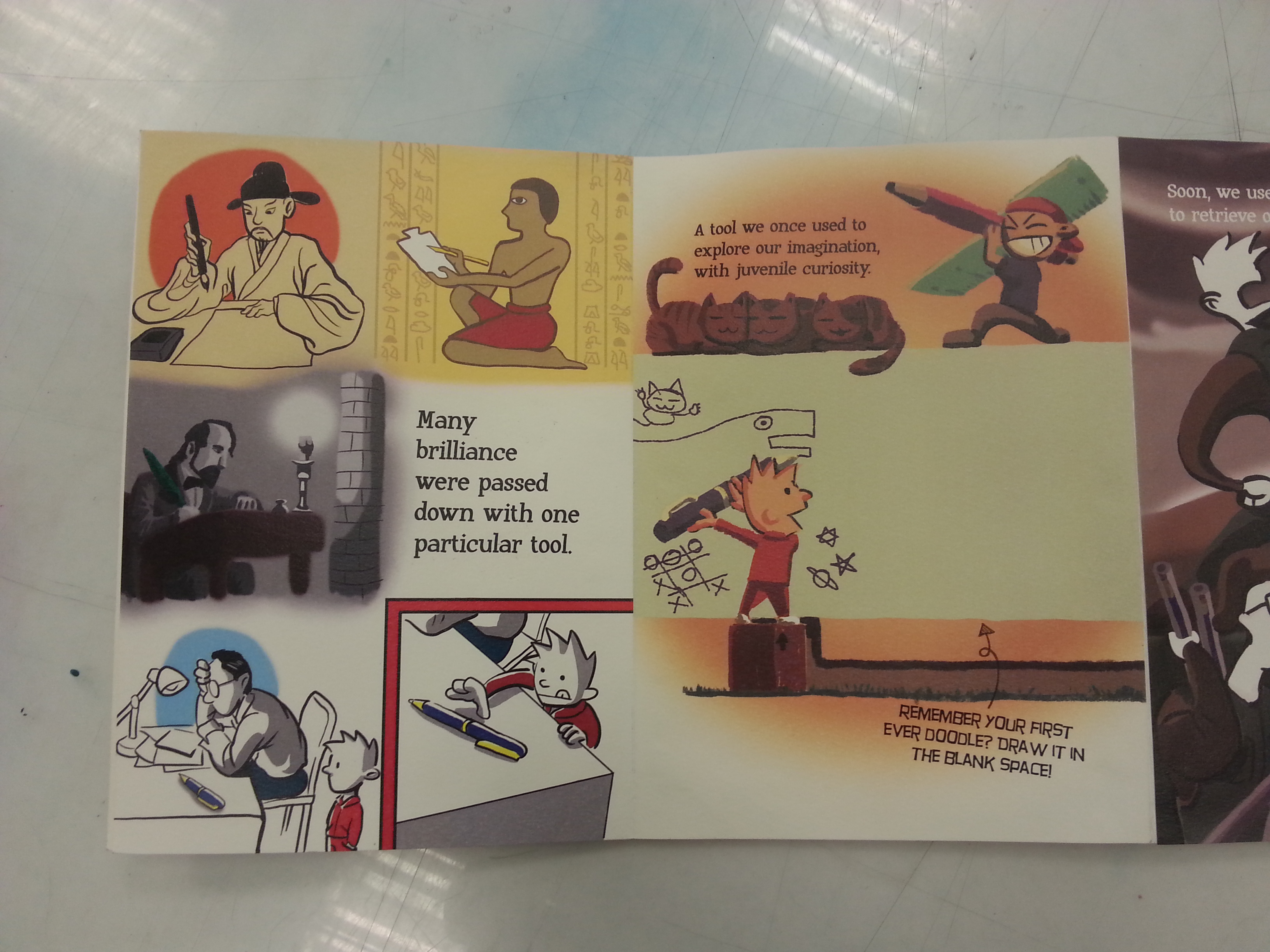
My concept of Chess surrounds with “Coping a normal lifestyle”.

Initially, the story was created from a high concept setting (mafia, hitmen, etc) which I found not suitable for production. So I thought how can I take the theme to a real-life setting. Thus, CHESS is written and pitched.

CHESS is a story of an old accountant who can’t cope with post-retirement life tries to win his favorite void deck table from a secondary school student in a game of chess. During the process, their stubbornness changes both perspectives of each other’s generation.

So, not only it’s building on the theme “Coping a normal lifestyle”, it also tries to visualize the overall tension and difference between the older generation and the current generations. (This part of the story still needs to be strengthened. )

It has a few elements that I would like to try to spice up a little story like this, such as

  • working with a teenage actor;
  • a convincing annoying old character;
  • board game montage with tons of ECU backed with crazy SFX;
  • match cut transitions from scene to scene;
  • possibly a visual comedy genre;
  • The dialogue will be simple and mixed with Hokkien Singlish and well-versed English.

Most importantly, the two characters won’t be courteous towards each other from the start which might challenge the actors to create chemistry based on their quarrels. I hope the actors are able to improvise more on the chemistry to build up their personalities confliction.

It’s my first time working with Munn as director and director of photography, so it would be interesting to see how our visions will work out. We will work on the storyboard/shot list together. My usual style with lots of shot setup will get me killed by my DP but I try to describe all the special shots I need in the script this time so that our production duration can be controlled. (Munn will provide me the rough visuals for the 14th February class session.)

For locations, we will be scouting for void decks with stone tables and chairs. It doesn’t matter if it’s round or square or complicatedly designed as long as it has chessboard painted on it. If the old accountant’s bedroom scene stays, we will need to scout for a simple CPF-maintained housing unit that’s convincing for a lonely old man to live in. We will potentially share the same unit with CLEANING IN PROGRESS. (still in discussion) We’ll also look for an office and a chess clubroom for the flashback scenes but these two locations are expected to be found within our campus area. (hopefully.)

For art department, all needed props are mentioned in the script except for wardrobe. The old man is expected to change different colored office attire to show day difference. (Can be repeated) But as the story progressed to the meeting up of the characters, the shirt’s conditions will worsen because the old man starting to care less about his attire. The teenager, however, wears a secondary school uniform and has to be in the good condition as he’s from a family with a maid. (Will be discussed with our art director.)

For sound preparation, it will be up to my discussion with my soundperson Natasha to decide whether to execute the battle cries in the chess matches as I pitched before. There also many exaggerate SFX needed for comedic effects. However, these will be planned along with our shot list/storyboard.

This is all my concepts and decision made so far. Thanks for reading!


I find it hard to tell a whole story within a scene, so my approach was taking a scene out of a built-up story. (In the meantime, insert as many backstories as I can. ) My story is about a phone thief found out the phone’s owner is having an affair with his elder brother’s girlfriend. As this story is about revealing a bunch of truths, I thought that the best scene to act shall be the turning point, where the brother found out that his own younger brother is the theft and the affair.

The thief is named Andrew Lee while his elder brother, a discipline officer of the student committee is named Bradley. The phone owner who made a big news about the stolen phone, not knowing his secret was cracked by Andrew, is named Simon Heng.

The scene exchanges the status between the brothers. Andrew who knew things became clueless, while his chill brother has a secret plan in the end. Bradley is strict and disciplined but snaps during the conversation, turning him into a furious beast. Andrew is an indecisive yet naive person who didn’t think his plan thoroughly. He was relieved that he spoke out the truth in the end but he was worried by the unpredictable plan of his brother.

I wanted to act as Bradley as I hope to release the wrath out of me, but my partner Fish Png Chen Yu thinks the role doesn’t suit me well. Therefore, I will go after Andrew since I’m okay with both characters from the beginning.

Script: CELL 1b

Character 1

A student stole a mobile phone from his friend. He successfully guessed the passcode of the phone. He stole the phone is because he was pranked by this friend recently. With the phone, he can find something for revenge.

Upon searching, he found out that this friend is hooking up with his brother’s girlfriend. The friend, whose phone was stolen, made a huge fuzz about the thievery, causing the involvement of the police. Character 1 struggled to return the phone. He tried to get rid of the phone. However, he could not bear the secret for long and kept it as evidence. Soon, he told his brother the truth. His brother gets his gang to interrogate the friend and expose character 1’s crime in the process.

The key scene for this character: After some dilemmas, He called his brother to his dorm. His brother warned him about the thievery before he took out the phone and admitted his misdeed. His brother was furious and scolded him. He frantically explained his motives but it did not stop his brother to report, so he unveiled the cheating messages to his brother. His brother was in denial at first but was convinced by the evidence. After some thinking, his brother decided to take care of it personally, leaving character 1 in a harder situation than before.


https://drive.google.com/file/d/0B2XNFNpkXcCAZHFNd3J6ZzY0NlU/view?usp=sharing

Please open the link above as it is not accepted by any video websites. Thank you.

Director: Rusyaidee Rasdeen
Camera:  Jerry Lim
Producer: Leon Tai
Art Director: Jaze Phua
Sound: Daniel Choo
Editor: Junyuan Loo

Formal Analysis

DSC_0082

The artifact which I found stood out the most was the one in the center of the gallery, the Walking Buddha from Thailand. The bronze statue was thought to be made since 15th to 16th century Sukhothai period. The bronze material used and the probable lost-wax process used in the production showed the statue was possibly used in temples built by the rich and powerful.

DSC_0088DSC_0092  DSC_0086

The Walking Buddha heights less than a meter but it was elevated by the museum platform so viewers can observe every detail of the statue. Contrary to other Buddha statues in the gallery, the Walking Buddha was supported by two feet with different postures. The statue depicted the instance of the Buddha walking forward by showing the Buddha’s left heel elevated along, with the left foot placed slightly towards the back, and the left leg bent to the back. The Walking Buddha’s arms were longer than usual as if the Buddha can reach to anyone with ease. The left palm was relaxed while the right palm posed the fearless mudra frontwards. The Buddha’s facial features showed a peaceful expression, soothing to those who gazed upon it. The wisdom knot was replaced a flame top-knot that can be seen in other Thailand Buddha statue as well.

DSC_0114

The robe wore by the Buddha is thin enough to show the Buddha’s physique after enlightenment. However, a robe that was supposed to be light and thin remained static in the walking posture. Perhaps this shows that the Buddha walking speed was neither fast nor slow.DSC_0097

(256 words)

Do you know those notorius loansharks that roams in south east asia especially in Singapore and Malaysia?

This story sets in an alternate world where libraries are allowed to have violent team of retrievers who return overdued books no matter what it takes. The story happened when the library system was renewing and a precious rare book was not returned yet. So the library sent an elite macho retriever along with a newbie to get the book before time is running out.

The whole story is going to be presented in a comedic mixed with mature violent actions.

BooksContinue reading

Sound art is usually set as an installation, because they’re not really a better way to appreciate this type of artistic discipline by discipline ourselves before the medium. Just like any other art, sound art does not required to be publicly-accepted-melodious conventionally, we can find its inspiration from daily routines, places we can’t experience as we like, or places we will never be. Whether or not the sound art is engaging is what we can appreciate from the piece. What’s amazing that sound art can be appreciate with and without our vision, or more like, the audio experience are the main body of the art but enhanced by the visual aesthetics of the artwork.

Since the visit to SAM, I’ve encountered several pieces of sound art, such as

DSC_0854 DSC_0016

Raising Spirits and Restoring Souls (left, 2015) by Zulkifle Mahmod and Too Far, Too Near (right, 2015) by Ong Kian Peng. The two pieces are the first two sound art I’ve ever encountered, and they have always stuck in my head for sometimes after the visit. However, since I’m able to research for more sound art overseas, I decided to surf the web and explore this medium.

Among the results I found, I find Lola Gielen’s Neo (A music instrument everybody can play.) more interesting than others.

neo6

Lola Gielen, a newly graduated product designer from the Design Academy in Eindhoven, created her instrument named NEO with a Raspberry Pi computer running on Python script. The python allows the Raspberry CPU to process the sensors for both the instrument and extra attachments’ sensors. The instrument is simple to play by placing the beads contained in the center onto the little pits on the main body, a rhythmic looping music will then start playing accordingly to the placement of the beads. This music are just composed to simple notes and the tighter the beads are placed apart, the faster the rhythm will be.

The piece resonances with people who are not talented in musical instruments like me. The intention behind this piece are clearly claimed in the title, a musical instrument which everyone can play. The artist wanted to give a musical experience for people who don’t regularly have time and talent to play instruments. Viewers are able to interact with the instrument while create a unique piece of music through different arrangement of the beads. It is similar to computer coding/looping software but the users can make the simpler version of digital music on the spot without any computing devices. This blurs the line between the touchable traditional instruments and digital instruments.

I find this piece interesting as it has an attractive interactivity and functionality. It also breaks the limitation of music creation as creating music won’t be exclusive to people who can play instruments. It can be educational for children or music amateurs and introduced the wonders of sound and music effectively to both groups of people.

Thanks for reading.

20160411_133634 20160411_133136(0) 20160411_133148 20160411_133215 20160411_133131 20160411_133143 20160411_133200 20160411_133228 20160411_133247 20160411_133300 20160411_133305 20160411_133313 20160411_133319 20160411_133346 20160411_133353 20160411_133400 20160411_133406 20160411_133419 20160411_133555 20160411_133603 20160411_133618

Mini Bookshelf Visitors (2016)

Junyuan Loo

35 Paper-cut outs with colored paper stands.

Inspired by Michael Lee Hong Hwee’s mini figures, the installation is made up of 35 papercut mini figures, secured with paper-stands. Each mini figure is unique, symbolizing the 35 weeks of being an ADM student. Most mini figures are designed to be place on the head of various books with their paper stands stuck between the pages. Viewers are welcomed to place the figures in other books to have them interact with different books and other figures. (While placing these figures, some require the selected books to be pulled half way from the shelves for a better effect.) If viewers are interested to the books that the figures are placed, please place the figure to a new book or relevant location as its initial state instead of placing it aside. This will help to keep the installation in its intended installment.

The installation explores the feeling of intrigued and curiosity a library visitors can get through browsing the bookshelves. When one is browsing the book spine’s title without any library number codes in mind, one can always find book titles that is enticing the viewer, with hopes that the book’s content could surprise more.  The installation was designed to engage similar thoughts and anticipation, leading the viewers with its quirkiness from one figure to another, discovering fun and interest within the shelves.


The work is accompanied by instructions to have the viewers interacts with the figures but handle them with care while doing so. Many fellow classmates reviewed that they might be blocking people who are seeking books or neglected by people who look for books by the code numbers. Therefore, I consider this installation as a social experiment of the relationship between installations and library visitors. Since most installations were installed at the side of people’s daily routine, what interaction will produce if the installation was installed between the visitors and their targeted books?

At the end of the installation period, 12pm April 15th, I went to the location to collect my figures, and the following scenery was discovered.

20160415_124842 20160415_124818 20160415_124808 20160415_124804 20160415_124744 20160415_124729 20160415_124715 20160415_124707 20160415_124656 20160415_124638 20160415_124631

As you can see, many of them were misplaced, pulled out, attempted to be placed back the original locations, roughly handled and placed aside. (Fortunately, none of them went missing.) The phenomena are sort of within my expectation except the one with the book “From Pinewood to Hollywood”. I was delighted as I saw the book was placed by one of the visitors for the walk-and-browse figure. Although this is the only positive outcome from the attempted interaction, I was still cheered from previous frustration. My interest towards this form of art was thus heighten again.

The Library is one of the most interesting I had in 4D module because I have never approached with installation art before. I am grateful to Mr. Michael Tan for giving us this opportunity to try out this medium. I had a lot of fun (while exhausted in the making) as mentioned by Mr. Michael. This will be another experience of the module I won’t forget.

fb page

PS: I thank NTU Library for sharing my work onto their Facebook Page, it’s a great honor and thank Mr. Michael Tan for informing the good news!!

Thanks for reading!

20160414_183151

The excitement is inevitable!!!! And that’s not a realistic printed pen.

It’s completed!! I screamed internally when I finished pasting every beautifully printed pages together. The end result of the printing are glossy but the brilliance of the colors still stands out completely. The vivid colors wasn’t dull but pleasing to my eyes.The papers I’ve chosen from Fancy Papers Ltd are gampi papers (covers) and thick papers with the texture of my visual journal. The papers works well and maintained its flatness throughout the pasting and logistics.

All these excitement aside, I’ll be guiding you through my zine page by page to give you a full view.

I chose the Jokerman font for my title as I want a memorable font to be the first thing shown into the readers’ eyes. The font shall also give the impression of light-hearted-ness for the entire zine in the beginning as well. Adding the red spiky eclipse to make the cover interesting was decided early before the paper was chosen. Surprisingly the design fits perfectly with gampi’s certificate-like texture.

Throughout the contents, I chose the Huxtable and Hurry Up font for both my narrations and instructions to give them a quirky tone. The two fonts are not linearly aligned which produce a non-serious component for the work.

Originally I wanted to use metal pins to attach the supposedly-leather-made pen holder. Unable to find the suitable pin to fit the colored-paper-made holder, I made a pair of “pins” with yellow color papers and paste the whole thing together. Thinking back the decisions, the pen holder, in my opinion, suited the overall style of the illustrations.

20160414_183414 20160414_183314

Initially, I wanted to place a pen-outline subtly in the main pages in the left photo, which will be visible when fully expanded. However, the Pen-as-Arsenals composition made the lines blended too subtly into its background, which unfortunately hidden my initial intentions for the compositions. Inevitable, it’s considered a pity by me. For the compositions in the other side (right), I connected them together with various factors, such as mirroring compositing and connecting backgrounds. With these decision, the pages were held together visually, showing their identities in the same narration, even though their styles were different.

20160414_183212 20160414_183216 20160414_183223 20160414_183231

[Click into the thumbnails to get a full view of each pages.]

As most of the composition are explained, I shall move to the third composition where I wished to included the occupation perspectives I eliminated from the previous project. I was able to revive following the perspective:

A PEN from the point of view of MONK is MEDITATION

A PEN from the point of view of DRUMMER is DRUMSTICK

A PEN from the point of view of PENTURNERS is ART (The main contributor of the page’s interactivity.)

A PEN from the point of view of LAWYER is GUN

A PEN from the point of view of POLITICIAN is WMD (Donald Drumpf inspired?)

A PEN from the point of view of SCIENTIST is CAMERA

(For this I supposed many of you might recognize 2 of the most entertaining engineers/scientist in TV history. I chose them to replace white coats as one of them, Adam Savage once said: “Remember kids, the only difference between Science and screwing around is writing it down.”)

20160414_183235

I left this page to be enlarged as I wanted to point out specifically my mistake on it. Due to my neglect on proofreading, The paragraph in the page had terrible typos and mis-phrasing. While being anxious before submission, I decided to cover it with a plain printing paper as the school’s printing shops didn’t allow me to reprint the words on the extra paper I bought before print. During the class presentation, just as I recapping my pages, I thought of a better solution for this mistake as I mentioned on my presentation:

Adding an interactivity which requires the reader to correct the mis-phrased paragraph, because this page is a tribute to the line: A PEN from the point of view of TEACHER is STICK & CARROT and A WAY TO PASS DOWN OUR WISDOM AND KNOWLEDGE.

Lesson learned, always think through when fixing mistakes, avoid naive and stupid solution as well.

20160414_183255 20160414_183244

After the bad news, now for the good news. The back cover surprise turned up very well with the Pen-shaped compilation of PEN in various languages. When the zine is open as the right image with a pen the pen holder, a mirroring composition is formed and I was extremely satisfied with this outcome.

REFLECTION:

My fellow classmates like the illustration very much while Ms.Joy warned me about the consideration on font size. For instance, in the occupation composition, due to the fact that both instruction and narration are typed in the same font size, readers might confuse them over the similar font and take times to differentiate them via capitalization. Overall, the zine was regarded as nicely done. I am proud of it too!

This is the last project of the module Foundation 2D. Throughout the academic years, I’ve learned a lot from my classmates from different semesters and my tutor Ms.Joy. I got to challenged many methods of execution and styles for different themes. This is one of the modules I am glad I didn’t drop and I am looking forward to have the same excitement while being in my majors’ modules.

Thanks 2D, and thanks Ms.Joy for the guidance since 1st semester.

Thanks for reading!!

Since a zine is basically a magazine but smaller…… Is that what the MAGA means….????

(Definitely incorrect, if you did the research.)

Welcome to the end of our 2D journey, which I’ll repeat, the last project will be based on the recent projects we’ve done throughout our foundation year. My concept was officially announced as JOURNEY WITH PEN, a remake of my POV project but expanded and extended. I gotta to say that the whole process is crazy and fun as I’ve never rushed so many digital illustration within a short period of time before! The project reminded me the joy of my own hobby and while whacking the whole work out, I enjoyed every single pages of illustrating. Without further ado, let me lead you through the work, CHRONOLOGICALLY. Let’s start with the good old visual journal, shall we?

20160414_183510

My plan on my zine.

I thought of using 5 A4 papers to form the accordion booklet format I planned as it’s hard to find any paper that has the length to fit the width of 6 A5 papers. (Refer to the booklet figure in the image.) When I started planning the narration for the 8 pages given, I realized that I have the advantages of utilizing the Inside Cover Pages for both ends, because there’s no need to leave them blank for a zine. I’ve figured to give my zine a filling content, why not just include these inside cover pages as the space for my contents? Therefore I added a beginning or prequel to the main narration. This page included my line: A PEN from the point of view of CIVILIZATION is A TOOL OF COMMUNICATION.

20160414_183518

Following the first Inside Cover Page is the main contents of my zine. With the space to extend and expand my previous work, I’ve given myself the opportunity to include many of my eliminated ideas (due to the incoherent concepts. ) into the zine’s body content. During the planning, I found the contents are still lacking some excitement or attraction for the readers. Then an idea popped up as I pictured what if this is a mass publication? I then recalled the book “Wreck This Journal” by Keri Smith, a book series that is an extreme case of interactive books since “Where’s Waldo”. Yes, interactivity was what my zine needed. Thus, I added many instructions in the main content pages that won’t let the readers “wreck” my zine. (Yes, I am not that extreme for this.)

Soon after this, I start designing my zine front and back covers. I decided to keep the front simple to surprise the readers with the rich illustrations. With the same consideration for the back cover, I felt it would be too empty for it because I didn’t included any images in it. So I placed a little surprise for the back cover as well with the help of the glorious Google Translate.

20160414_183526

With a little drafting of my verbal narration and I’m done.

During the group consultation, Ms. Joy and my fellow classmates suggested me to consider more on the printing materials to ensure the bonding of the accordion booklet won’t influence too much on my zine’s final appearance. Thanks to the reliable paper distributor Fancy Papers and the kind people in Poster Connection @ Sunshine Plaza, my zine is completed.

To be continued……