(I just couldn’t resist)

I admit I kind of gotten rusty after the semester break, so hopefully the new semester will get me back on track again. Soon enough, the first homework of 2D second semester has been appointed by Ms. Joy.

HELLO MY NAME IS_________

While resisting the temptation to gag about the title with Adele’s latest hit, this exercise prompted me to elaborate myself who am I again. (Well, resistance is futile.) Throughout the module, I am able to express my personalities and interests with ease, which I think is a good start. All my ideas sprung instantly from my mind during the exercise briefing, regardless of whether it’s interesting enough for others.

DSC_0778

Final draft of TYPOGRAPHY

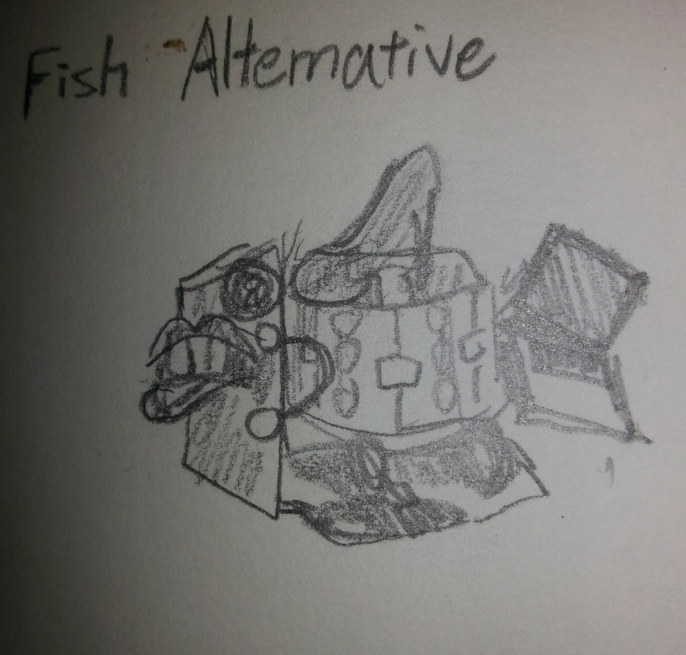
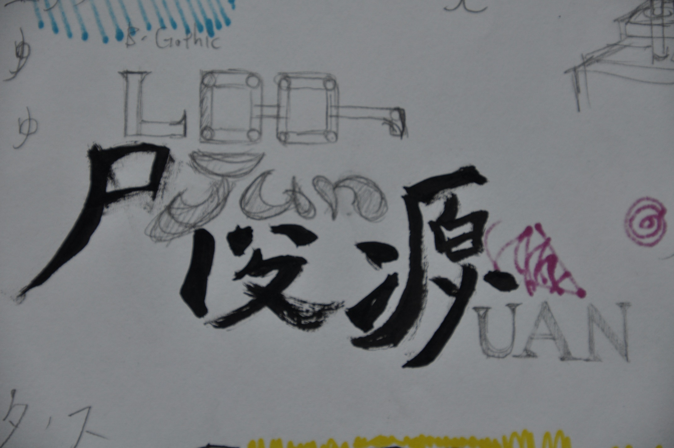
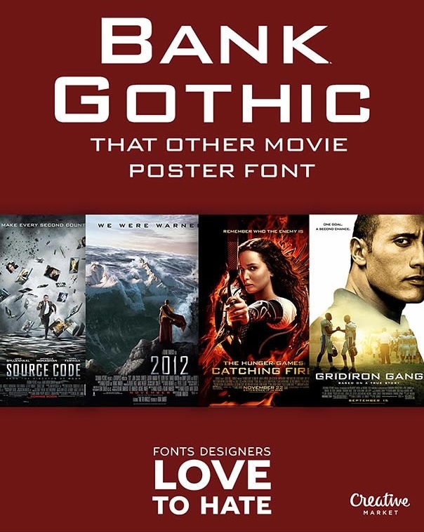
In the first nametag, I have to represent my subject with TYPOGRAPHY. So for this, I’ve used a few fonts to associate my interest for films. Through an Internet post, I found the most popular for movie posters are BANK GOTHIC and TRAJAN. Thus, I decided to make my last film interest reference into my English names.

trajan bank gothic

The whole piece is created by combining my Chinese name in the calligraphy font KAITI and English names together. I’ve tried to do this a long time ago but usually it ended up kinky. Fortunately this one worked out except I can’t figure what to do with my JUN. Then I just decided to create my own typeface for it as my uniqueness between references and interest. After that I halved the whole thing into black and white to show that there’s both side of me waiting for the viewers to discover. Adding a pair of glasses and voila, here’s a typeface that explains many basic information about me.

DSC_0783

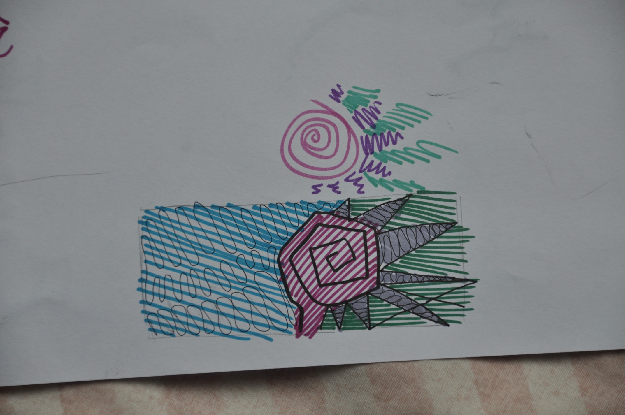
Final draft of ABSTRACT SOLUTION

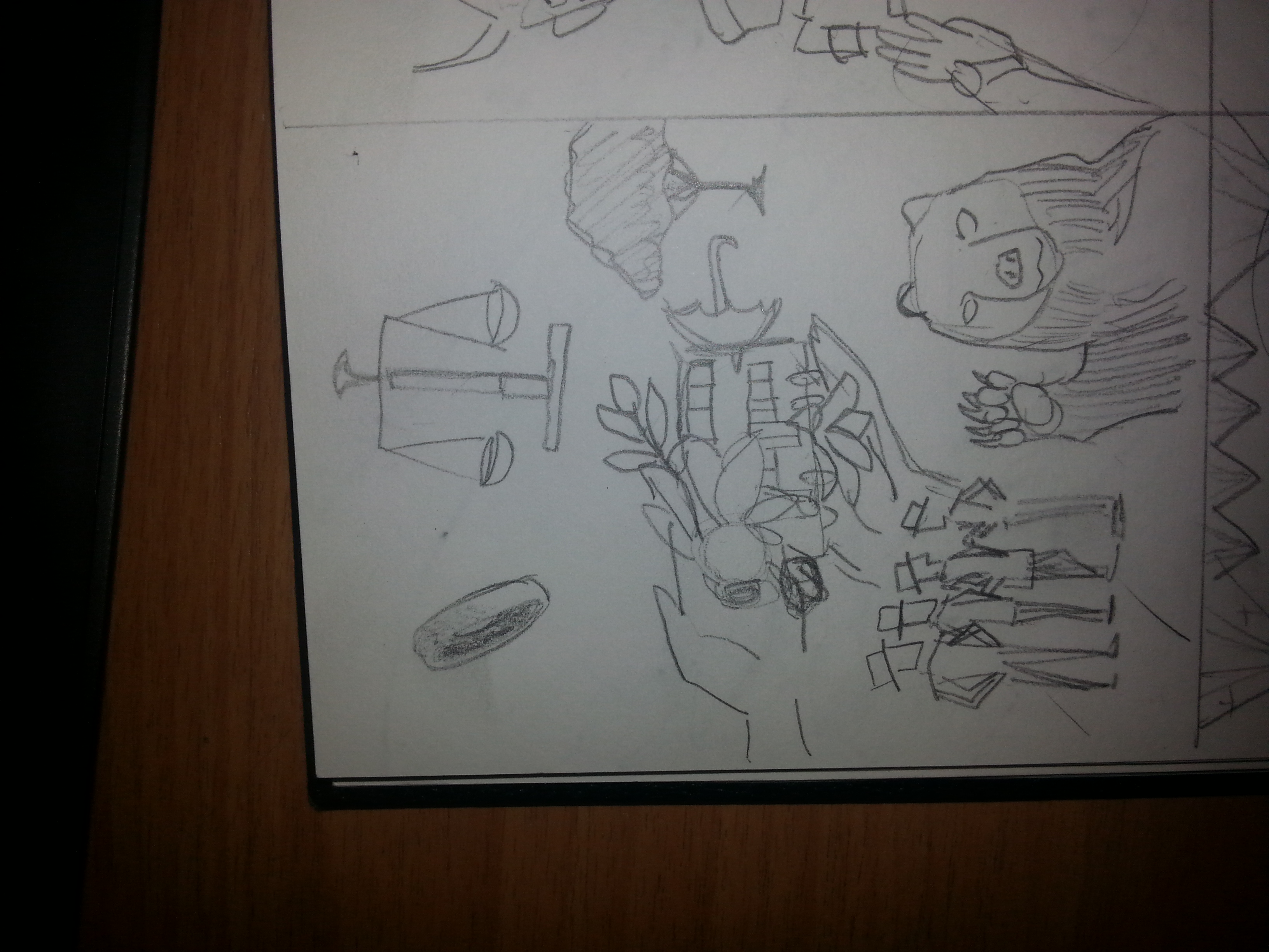
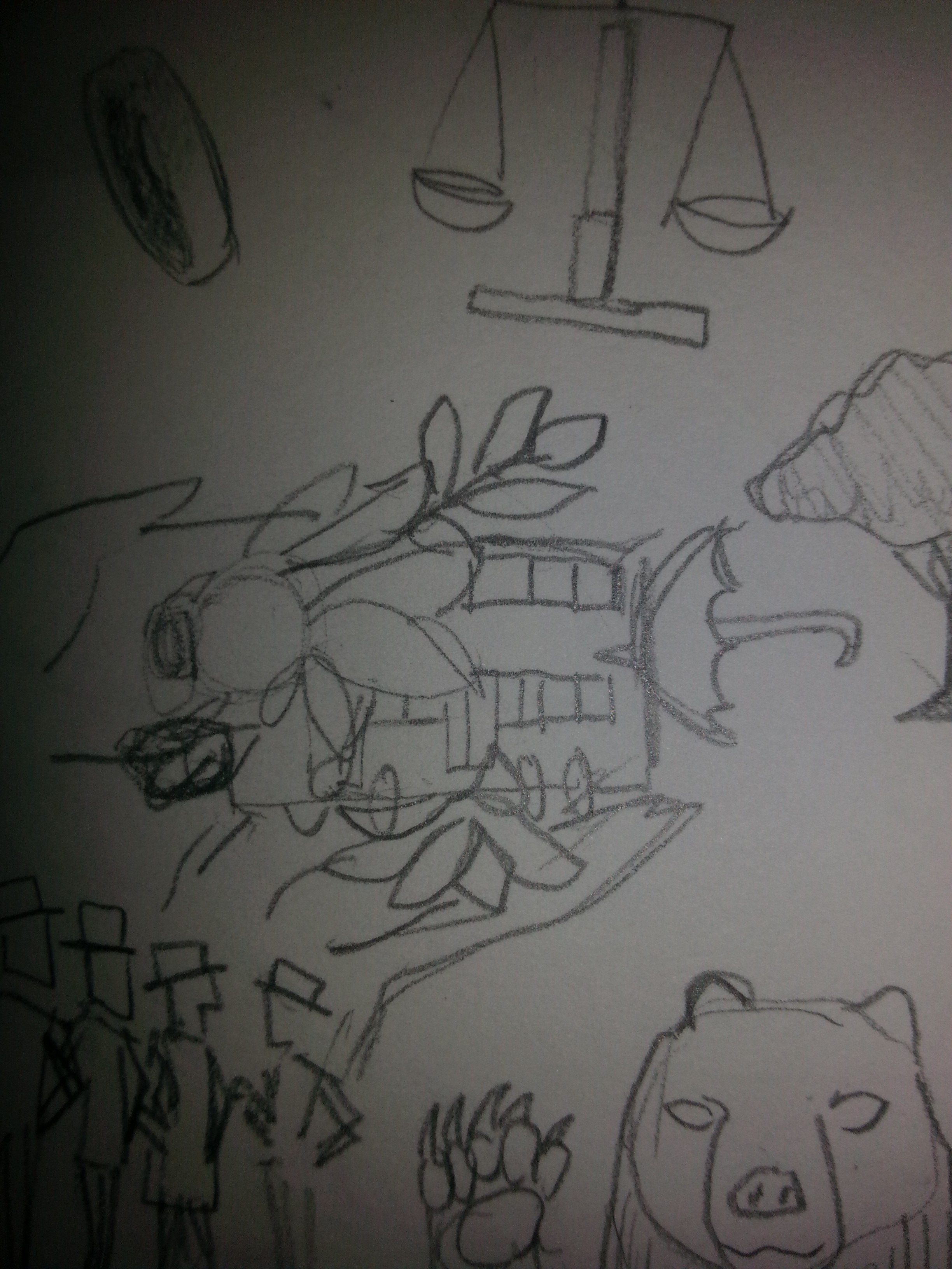
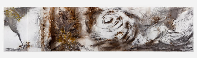
For the second nametag, it have to be ABSTRACT solution. This part took the longest time to construct. The first idea that hit me was the assignment “LINES”. However, I was thinking of using the process of drawing as the intention. I planned to do tedious patterns to show how I view complexity. Ms. Joy encouraged me to make more out of my content. So, I revised it and came with another concept. The structure was simple patterns filled with patches of my favorite/spirit colors. These colors are close in temperature and value, yet covering different portion of the space. Each color patches seems to have their own function or existence in the solution yet performed differently in terms of standing out. The reddish purple seems to stand out more than the cyan even though the cyan covers more. This idea suggested different aspect of me standing out in different extents. These aspect might be my talents or maybe my good traits. The visibility of these aspect can only be decided by the viewers, they will see some aspect of me first, but that doesn’t mean my other aspects are gone.

DSC_0779 DSC_0780

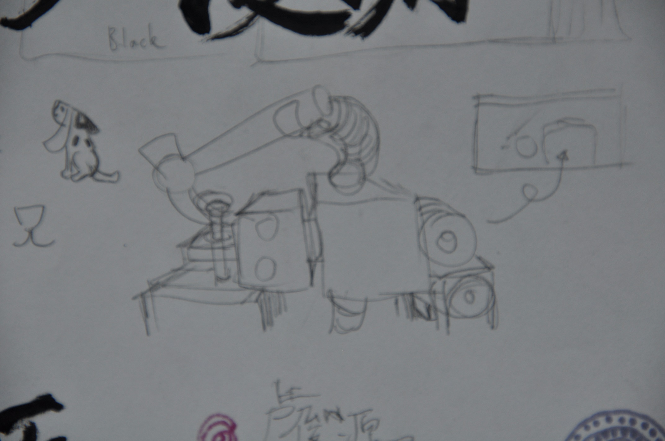
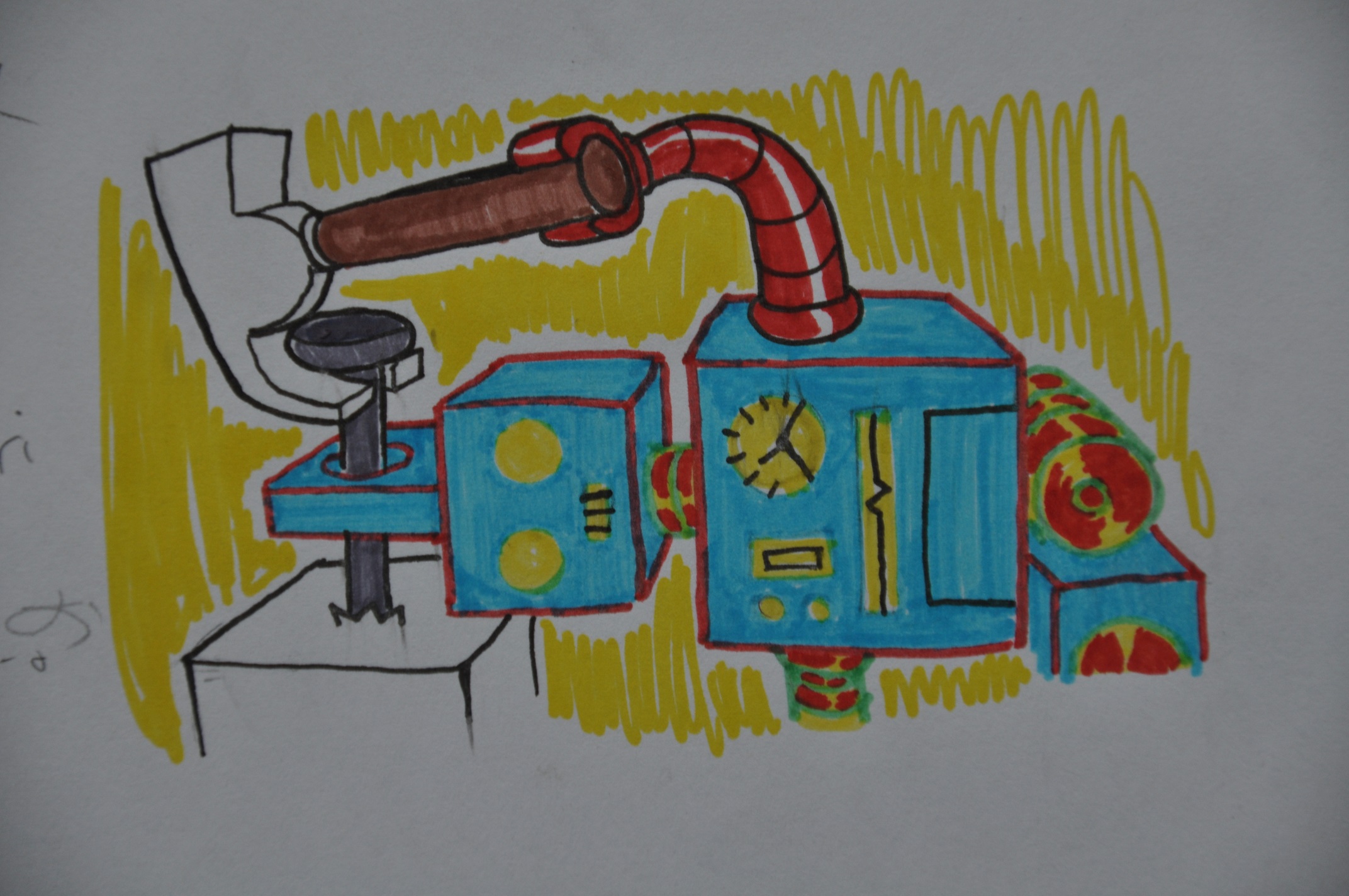
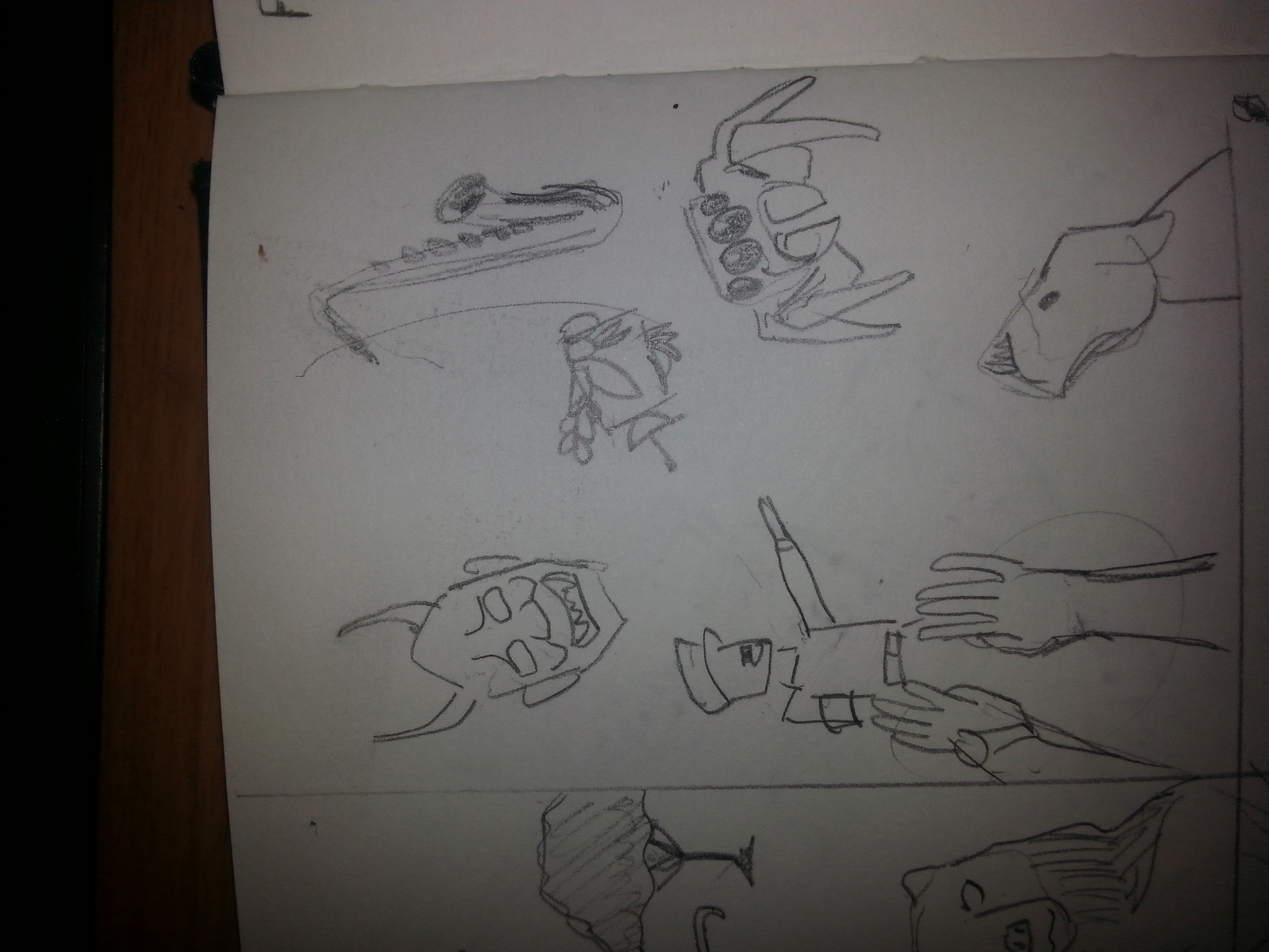
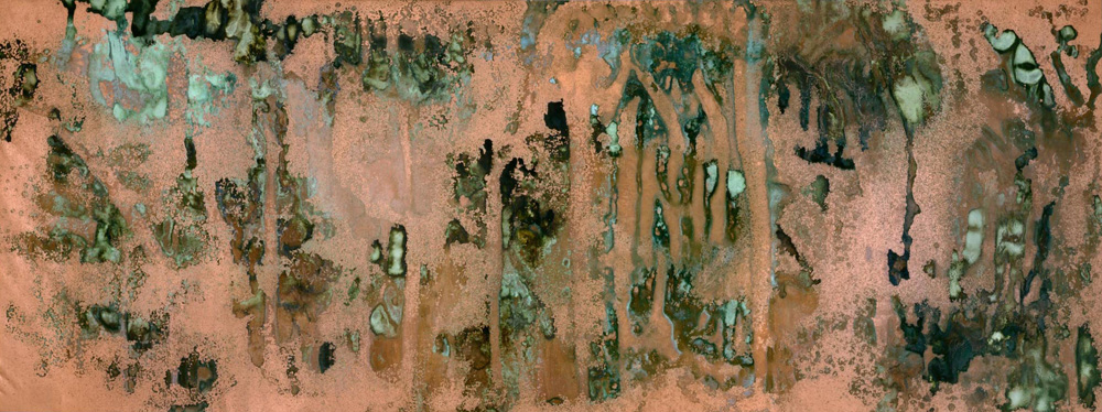
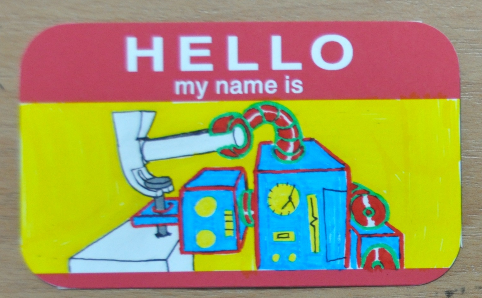
As for the CONCEPTUAL nametag, the part which I tried to think like Salvador Dali, but then my mind told me, “not in a million lifetimes.” I was inspired by how I brought up the unsatisfying LINE concept a few minutes ago. I’ve realized how easy I am to get stuck onto certain mindset or thoughts that can be easily proven bad. So, to express such personality of mine, I used this retro toy robot as the medium. Instead of an advance tech robot, retro toy robot shows how young and inexperienced my skills and thoughts are, yet there’s plenty room for improvement. The light-hearted colors were chosen to suit the expression. The robot design made the ring on its head logical, and can be assumed this might happen again. The colorless objects showed they are not the possession of the robot, signifying they’re probably others’ tools of assistant.

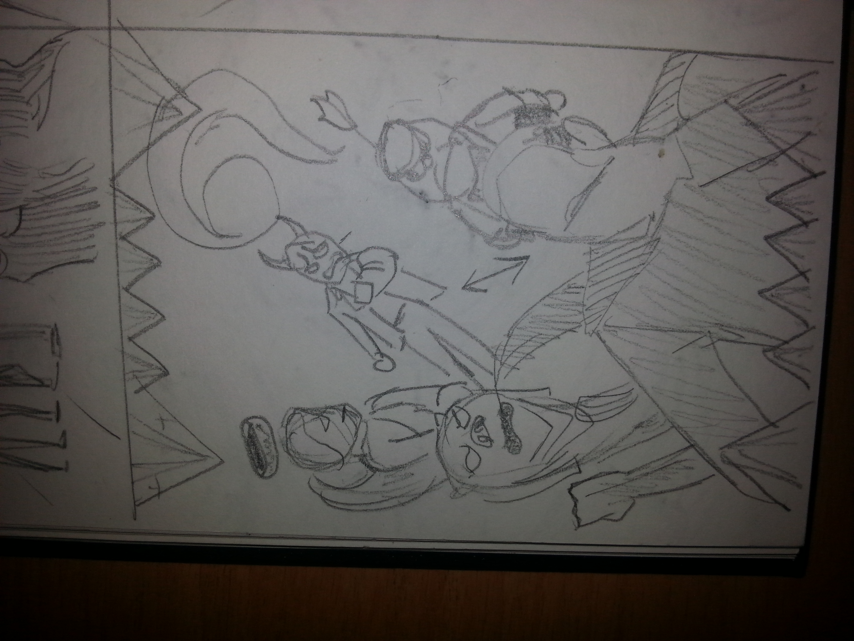
Before, I finalized my concept, Ms. Joy suggested that transition in terms of timeline can be implied into my concept to link them together. So here’s how time is implied. I’ve placed Chinese calligraphic fonts alongside ancient English fonts together to show they’re creation from the past. TYPOGRAPHY shows what I am already. typographyAs we progress, the percentages of blacks and whites reduced into lines, wobbly lines, inducing uncertainty. Just like how abstract art considered modern art, ABSTRACT SOLUTION shows a present me but have to be defined by others. abstract

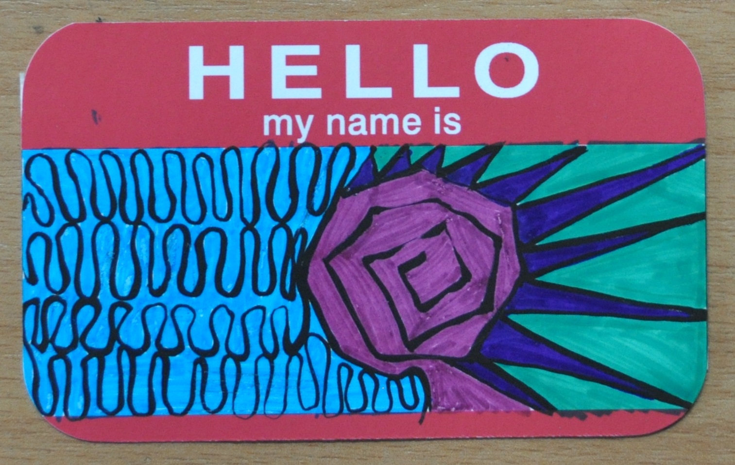
You may say robots can symbolized future, so CONCEPTUAL is the future part of the timeline. As the black lines greatly substituted by colored lines, CONCEPTUAL contained my wish for an astonishing future, and what I will be. A resolution to escape the mundane ordinaries.

conceptual

It’s nice to be back to foundation 2D and the brainstorming. I have to remind myself, this is just the warm-ups.

Thanks for reading.

Finally after a week of considerations, my nursery rhyme was set to be ONE TWO THREE FOUR FIVE. I don’t need to explain that this IS a rhyme since almost everyone who was born before the millennium knows it. A progress is a progress, so I shall place the full rhyme below.

One, two, three, four, five,
Once I caught a fish alive,
Six, seven, eight, nine, ten,
Then I let it go again.
Why did you let it go?
Because it bit my finger so.
Which finger did it bite?
This little finger on the right.

I felt nostalgic when I saw this rhyme during my research as it was one of the English nursery rhymes I first encountered in the language. So I figured, it has a perfect flow of story and able to be visualized with real objects, suitable for my choice of nursery rhyme.

The first challenge I faced was the concept. Then I remembered that DADA artists uses things we can immediately recognize to convey their intentions in a unconventional way. In other words, try to be indirect with iconic symbols, in this case, dingbats. So my orientation will describe the words indirectly even for “one”. Thus the following visual journal sketches were created.

20151012_223013 20151012_223018 20151012_223024 20151012_223032The arrangements were made by copying the selected dingbats on my computer screen. I figured this way of planning can shorten my processing time. Also, I always have a clearer mind with it comes to hand-drawn sketches. After a few modifications, I am happy with my sketches and thus moved on to the software.


One of the main character of the rhyme is the fish. It got caught and bit its catcher for its own escape. I can’t just find a fish dingbat to fill this badass place. To be honest, I just can’t find any fishes in the dingbats collection considering it is a basic creature. Thus I thought of being ‘resourceful’ in my own way and built a fish from the remaining dingbats. As you can see, this fish was made out of a bee, a pair of woman lips, leaves, flower petals, SBS double decked bus, and an umbrella.

20151012_223047

I had fun composing the fish. Suddenly, I thought, why not substitute it with the luxurious items I found among the dingbats? The fish in the rhyme can be interpreted as the material needs that we occasionally obtain. Sometimes these needs cost a certain price, therefore “bit” us in the finger. We can’t keep what wasn’t ours.

20151012_223040
Therefore, a fish composed from a bracelet, an unknown branded handbag, a sport car, a high heels, a Mac, an ancient coin, and another set of lips just to make it lifelike.

12345 once i caught a fish alive - Copy

A bear holding up a high five. Four well dressed lads. Three Trees. A balance scale which require two sides like the justice it represents. The one ring to rule them all.

678910 then i let it go again2 - Copy

Ten fingers. A howling caNINE. Eight spiders. Seven saxophones (Saxophone is the closest thing I can get to shape like the number). 3 Satans’ mask, for the sake of satan’s phone number.

Why Hitler? Hitler was one of the victim of the needs — power. Also, his gesture looked like he was releasing a fish.

wdylig bibmfs wfdib - Copy

“Why did you let it go?” Captain Picard says to the strutting Leo as the questioned tweedle dum/dee looks at him. Leo might think he’s an angel in heart for releasing the fish who secretly celebrates its victory. But Leo reveals the truth with diamonds.

Diamonds may not shape like fish teeth, but they certainly have the shape to form a vicious set.

delittlefingeronmyright - Copy

The little finger on my right, represented with a can of pills, signifies it’s the one in pain at the time.

Thanks for reading my whole process. I really had great fun doing the pictures. It’d be a good experience if it wasn’t constantly interrupted by my laptop’s faulty back-light. Hope you find my exploration interesting. See you soon in my next project!

First and foremost, I would like to admit I do not possess the knowledge and experience to appreciate abstract art. I agree most of the paintings are visually stunning, and I do feel the impacts conveyed from the components on the canvas, such as its shapes, lines, compositions and colours, instead of its hidden emotions. At least, it made me realise its own beauty and brilliance, which is what art is supposed to be able to do.

Among the artists that have been shown in the last session, I found interest in the following artworks, or furthermore, impressed. These artworks are Cai Guo Qiang’s gunpowder drawings, Andy Warhol’s Oxidations, and Yves Klein Anthropometries.

2012-chaosnature-a3034-001h

Let’s start from Cai’s drawings. Gunpowder is known as one of the four great inventions of China which symbolised wars and chaos throughout the histories of any parts of the world. Yet Cai used it as his painting material. However, Cai managed to create fine arts without just burning up his canvas but using different types of (mostly traditionally made) gunpowder to produce various textures and colours. Some of the patterns created were peaceful, still and sometimes dynamic, which create a conflict with their material. Gunpowder finally has a new function besides destruction in the hands of Cai Guo Qiang.
Andy-Warhol---cropped

Next, we have Andy Warhol, the pop artist who won’t stop redefining the popular art culture of his time. When I first saw Warhol’s oxidation painting, I thought the series were his attempts to move on to other types of painting. After reading the fact that these oxidised stains on the metallic paint were created by his and his friends’ urine, I was shocked. A lot of thoughts ran through my mind at the moment. Was he trying to imitate the motion of liquid but he couldn’t thus the method was thought? Were there buyers who wanted to buy the series solely because they have urine on it or they have Andy Warhol’s urine on it? One thing for sure is that he did managed to create a unique pattern that can’t be done by merely paint brushes. It may not impressed me for its artistry, but it certainly made itself unforgettable.

ant82

Similarly, Yves Klein created art in his own non-traditional way. By directing models to paint with their body, he created a unique series of art that acted as performing art as well, the Anthropometries, with the blue he used so much that people named the blue after him.

Through the artworks mentioned above, I realised that the methods to express have absolutely no limitations in art. Not only the outcome on the canvas can be an art, but the process of making it as well. These act of creativity inspired me to think out of the box and be willing to express my ideas and emotions, regardless the methods of painting. However, one thing for sure, urination is not on the list.