(Imitating dramas narrators in the title.)

First stage of conceptualization!

Due to an unattended class trip for 4D, I went to visit SAM with 2D inspiration searching as another reason. Turns out there is some interesting reference worth exploring.

Based on my last research/exploration on the Internet typographers which impressed me, my initial concept for the typography portrait are:

  • Subtle changes on fonts to match the content.
  • Performs object typography.
  • IF required, the object typography will be made of photograph collages.

20160130_164100

The first group ideas of all the portraits varies in styles. They included

DSC_1035

Green Zeng’s Siapa Nama Saya?

DSC_1043

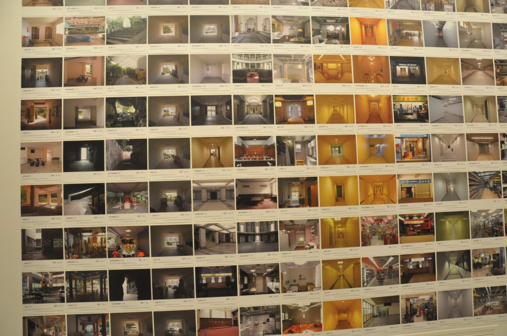
Dawn Ng’s Mamashop and HDB Corridor.

  1. Compositing my name with T-shirts, showing my identities as a Malaysia, who has an enjoyable memories in high school, came to NTU, getting use of uni-life. (Inspired by a piece (top) from the installation ONCE UPON THIS ISLAND)
  2. Using another piece (bottom) from the installation ONCE UPON THIS ISLAND, a photo with all my items of interest compositing some of my name’s letters while the rest are cropped out like the piece above.
  3. Arrange my downloaded movie files into my name via Window Explorer.
  4. Arrange clips into my name in an editing software’s timeline. Captured with screenshot.
  5. Collages of my name’s letter made of directional lines in Google Maps.
  6. Photo collages of cityscapes and school’s landscape with and without my friends.

You must be wondering, why didn’t I elaborate more?

After a consultation session with Ms. Joy, I realized (with the confirmation of Ms. Joy,) not only my concept, in terms of content, does not have a solid theme. Moreover, I exploit again on my interest in films, which Ms. Joy warned me to not exhaust the subject before I even enter my major courses. I was advised to find potentials in other traits of mine to explore, in many other ways, even in my current concepts. Such as, in what kind of lens viewers can view through? What sort of medium can I utilized rather than photos? Is it absolute to use human as the subjective?

Thus, I have new objectives to pursue for this semester, which are, try to explore other versions of me, what else can I show myself as? Try NOT to imply things that people knew about me into my work again. Give my audience a fresh new impressions.

Oh my, I have a lot to brainstorm this week. Hope I progress!

With the worries of missing the TIME OF OTHERS exhibition, I went to the Singapore Art Museum on the day it ends, 28th February 2016. I missed the group visit on Monday, but I found visiting the museum alone had its perks. I do like to go in groups, but going solo has the same feeling you get when you watch a movie alone. Maybe I’ll talk about this in the future.

The two pieces I wanted to review are both for the TIME OF OTHERS.
DSC_0884

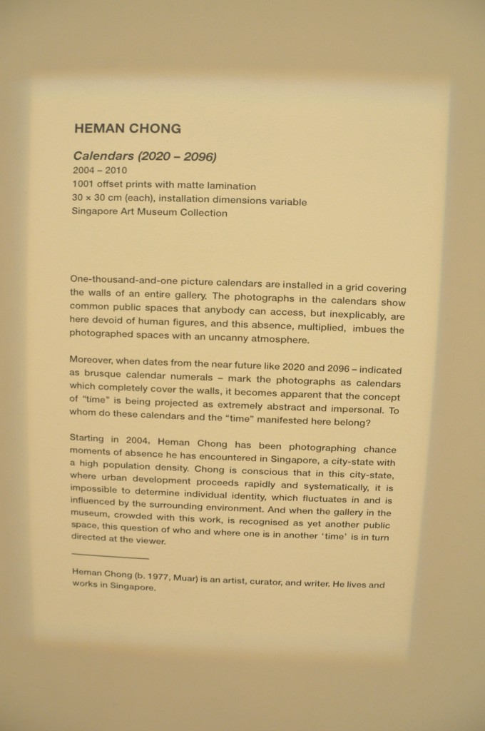
Herman Chong

Calendars (2020-2096)

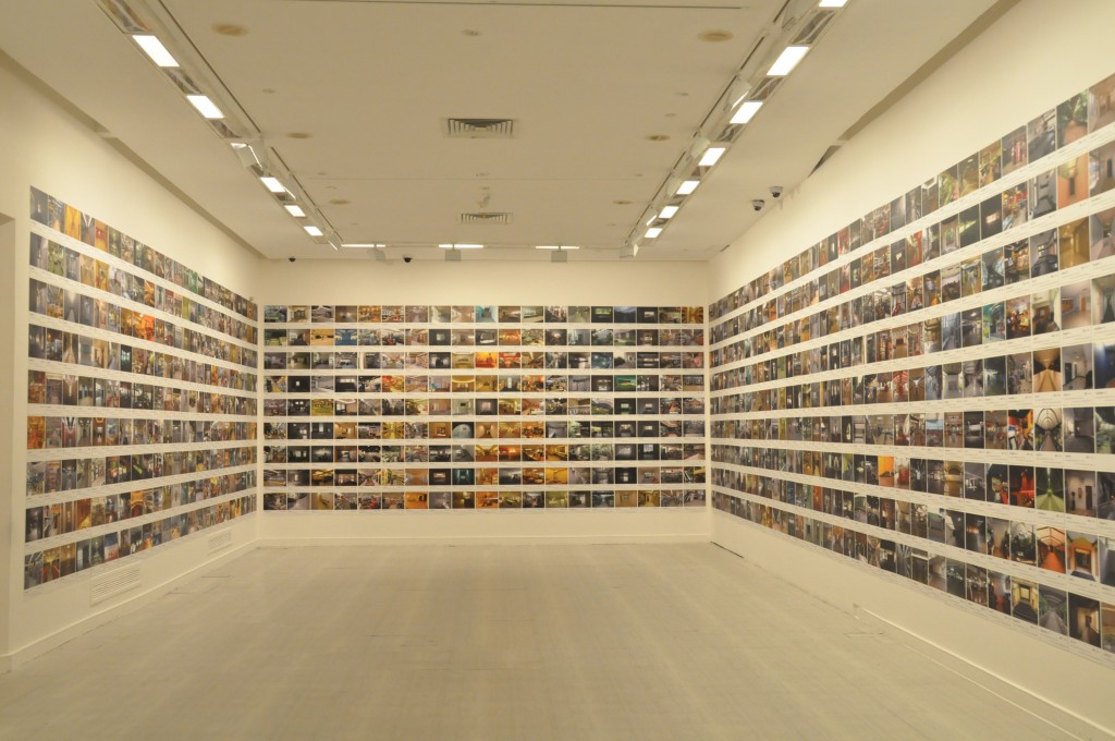
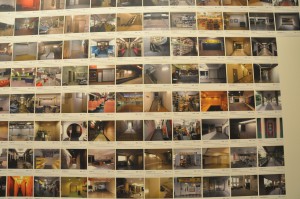
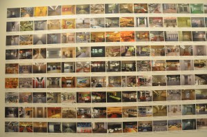
1001 pages of usable future calendars, installed in a grid covering the walls of the entire room. All pages are offset prints with matte lamination. Within the 30x30cm surface, 80 percent of the prints are covered with photos of Singapore street views. The other 20 percent are calendars for 77 years starting from 2020. Due to the size and amount of its single pages, the whole piece is enormous and eye catching. With its photography components, it attracts viewers who have the effort to look through every single photo on the calendars. Seeing the piece not as a whole but as an album.

The initial impression I got from the piece is its scale and number. I gasped for its enormity at first, then I try to find its specialty. In my common impression, calendars are full with breathtaking iconic city-scape photos or beautiful illustration. (Usually related to the calendars’ company products.) However, the piece chooses unconventional photos as its content. The locations shown in the photos are not remarkable landmarks or at least not worth a selfie to be taken in. These place are street image from a citizen perspective. (Mostly one-point-perspective, probably the artist’s obsessive style of shooting.) My initial guess is, the artist wanted us to be aware of these places. Through the attachment of calendars, perhaps the artist tries to remind us that these neglected places will not remain the same as shown in the photos. This is our current generation’s version of commemorating-sceneries-in-the-past calendar for the future. The calendar format also explained why none of the location overlapped or repeated.
DSC_0885 DSC_0888 DSC_0886

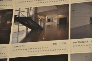
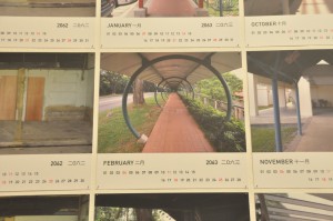
I supposed choosing locations from all over Singapore is a way to engage interaction with the audience. Audience will be delighted if a place they knew was shown on within the 1001 pages, just like I did for these two locations.
DSC_0890 DSC_0889

Once I saw a familiar locations, I’ll continue to finish the viewing to find more. Either it’s intentional or not, it certainly propose such effect with the viewers.
DSC_0882

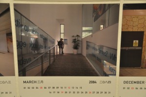
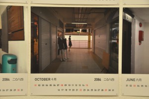
After the reading of the descriptions, I find a new perspective of the piece. It does hit me with another point of view, when I finally realized there’s no human figures in each photo.
DSC_0893 DSC_0892

I thought these are exceptions at first glance. (Turns out they’re a paper model and a mannequin.)

I was impressed on how the artist take advantages on Singapore city traits to create a contrasting work to ask questions about urbanized space. My first guess deviated a lot from the artist intent mainly because I focused on what the artist trying to show, not what the artist trying to question. I wouldn’t be able to ask the same question as the artist as we see things differently. But the description certainly helps my understanding and invoke the artist’s question into my mind while I watch the piece again.

The medium was effective, as the description stated, the calendar format did show the “time” concept of the work. But it’s difficult for me to ask questions about belonging of manifested “time” and calendars or representing of spaces, as I can’t tell from the clues. I do think maybe exhibit the work in the form of actual usable calendars might improve my understanding of the mentioned questions.
DSC_0900

No Endings

Ringo Bunoan

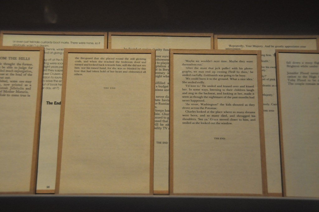
Endings and No Endings.
DSC_0904

Endings

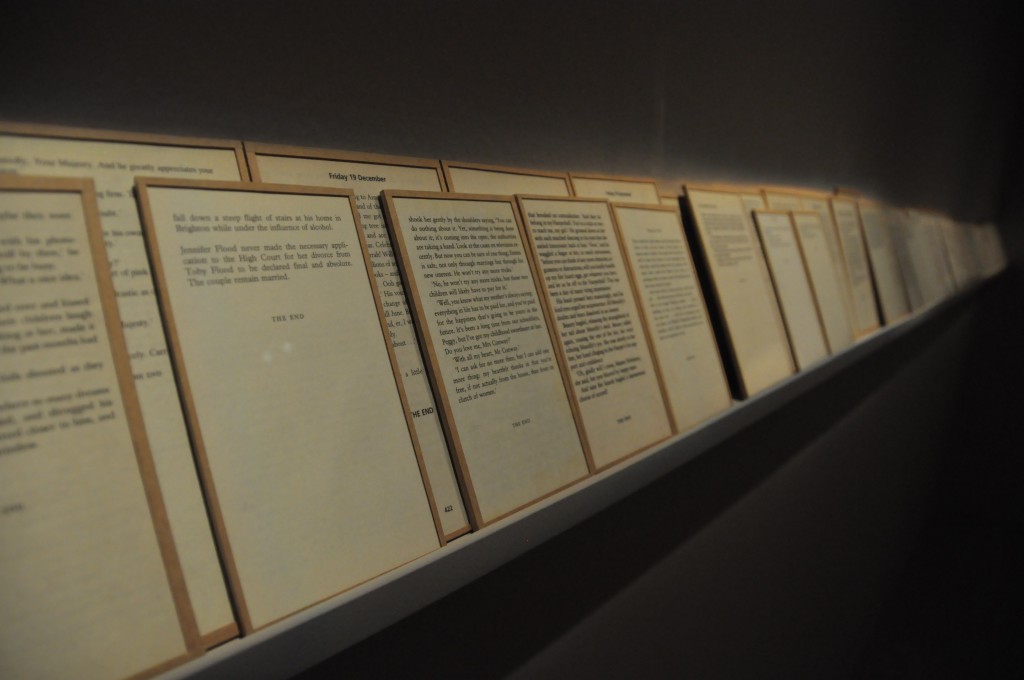
Endings, framed book pages of possible the last pages of novels and fictions. Arranged and attached in a way that the origins of the pages are unclear. Viewers can definitely confirm they’re last pages as the phrase “THE END” was constantly shown. The pages are placed on one long rack, overlapping on each other.

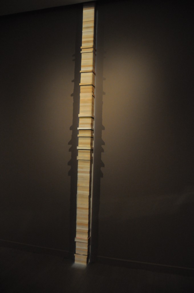
No Endings, on the other hand, is a pile of at least 100 books stacked till the pile reaches the ceiling. The varying thickness and color of their pages shows each and every book are different and yet the most interesting part of the work is, every spine of the books was facing the wall, leaving no clue for each book’s identity.

The dim light setting and my hurried pacing gave me no motivation to read through every words. There are even half of the pages are blocked. Therefore I concluded from first glance that the work are not for reading but to observe it as a whole, in contrary with my previous reviewed piece.
DSC_0901

The pages from Endings were framed and placed on a long horizontal rack. From the installment, I’ve wondered, is it trying to be a long narrative? A narrative without any beginnings, progresses, but endings, is maybe the work’s inspiration. As for the tower of stacked books, I was guessing whether if the last pages from Endings were in fact from these pile of books, which explains the second work’s title, ‘all these books have no endings, as the endings are removed.’ That’s a literal interpretation. With the urge of wanting to know what questions the artist propose, I read the description right away.

DSC_0899

“What is closure without context?” That’s the final question. The description actually clarified my wonders. IT does proposed a question and that question can be applied in many aspects of life. What is closure without context to me is like asking what answer without questions is? In contrary, what’s a question without an answer? Questions without an answer are thought to be ambiguous, like story without endings, like the final question the artist had asked. Ambiguity works for certain people who like to imagine their version of endings, engaging a discussion about which version is legitimate or closer to the author’s intention. Endings or closure without premises and context are interesting as well. They spark imaginations and proposed more stories that lead to the same ending. Books especially published fictions are indeed the best medium to convey the artist, and I think the artist chose well. I personally think showing only the last pages is an interesting idea. It can be a collection of literature to start various creations, like how many lyricists from the Song Dynasty created many version of Ci 词 (lyrics) for the same melody. (Ci Pai 词牌)

In conclusion, I chose 2 pieces from the same exhibition as I find TIME OF OTHERS are more compelling than the other installations. It is mostly because I am keener in reading stories of others. Also, it’s better to visit the other two installations in groups for the best experience as they require group activities and discussion on the spot. TIME OF OTHERS as a narrative installation, is more suitable for solo visitors to read the stories in their own pace.

Thanks for reading.

Two weeks in and HELLLLLLOOOOOOO project number 1!!!

Remember what we do about projects? Research! This time, we get to do Typography, the area of art that I’ve seen a lot but still being strange about it. Initially to me, typography are art pieces with fonts that had been created by the mass and was decorated with or immersed into forms, shapes and colors to give the words an eye-catching properties. Usually this kind of art are seen in webpages that likes to quote famous figures, or simple short do-you-know facts. Not only it’s eye-catching but also effective for netizens with short attention span.

Personal views aside, the lesson I had been on last Thursday had opened my eyes to the diversity of Typography. After listening to all the researches my classmates did, I saw the subtle side of the genre, that Typography doesn’t have to be literal, yet being contextual in the meantime.

SO, back to my research. Technically, they’re not intended research materials, but originally typography posts from the Internet that I was impressed of.

ji kee

The first artist I wanted to talk about is Ji Lee, a Communication designer in Facebook. You know this guy has some talent in him to be able take on an important position in one of the biggest company in the world. The series that impressed me the most was his Words as Images. Most of the words in these images use the same font and were only tweaked a little to match the properties of the words. However, viewers got its point almost instantly as it’s not too obvious, yet not too subtle for the public. I admired its brilliance of balance both and the entertainment it gave. Also, the minimalistic style it possesses certain is a plus from distracting the viewers compared to other over-exaggerated typographies.

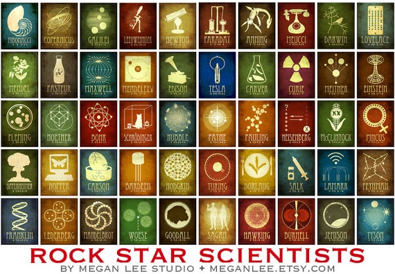
meganleescienceThe prints above are the second piece I’d like to talk about. Megan Lee’s  Rock Star Scientists also consist of uniformed fonts but accompanied by again, minimalistic illustrations or silhouette of achievements of each famous scientist respectively. Viewers who love science instantly recognized this names and understood its context. The design doesn’t seemed too nerdy and in contrary gave these influential achievements a fashionable makeover. Science seems so cool again! (Correction: Science IS cool.)

dangerdustThe works above are done by two anonymous students who named themselves Dangerdust. These work varies in fonts and styles, suiting the figures they’re quoting. Although some of their designs are too complicated that they sometimes covered the quotes, but most of them are well balanced in terms of scales and positioning. Most impressive of all is that they are done on blackboards, giving the context of educating the next generations with words of wisdom.

object typography

Lastly I want to talk about the methods. I came across these styles of typography and they stayed in my head as a genre. Building typography with everyday objects has interested me, and made me wonder if I can do the same. Ms. Joy later suggested me to look into whether they should be done by put together like a puzzle to form an alphabet, OR using objects that suits the content and yet has the form of the alphabets I wanted. This methods of typography is certainly something worth exploration.

In conclusion, these art works above I found impressive have the potential to influence my next project. Hopefully I’d be able to create something as contextual as Ji Lee, as mind-changing as Megan Lee, as thoughtful in terms of medium and aesthetically beautiful as Dangerdust, and possibly done in object typography. (Cross fingers.)

Side note: The reason I don’t prefer DADAism as a reference is the fact that I want it to have a meaning. The fact that it creates great effect is undoubtedly true, but this time, alongside Russian Constructivism, they’re not the right style for my current project. Although their ways of positioning the components to attract viewers attentions is marvelous and worth studying.

Thanks for reading!

(I just couldn’t resist)

I admit I kind of gotten rusty after the semester break, so hopefully the new semester will get me back on track again. Soon enough, the first homework of 2D second semester has been appointed by Ms. Joy.

HELLO MY NAME IS_________

While resisting the temptation to gag about the title with Adele’s latest hit, this exercise prompted me to elaborate myself who am I again. (Well, resistance is futile.) Throughout the module, I am able to express my personalities and interests with ease, which I think is a good start. All my ideas sprung instantly from my mind during the exercise briefing, regardless of whether it’s interesting enough for others.

DSC_0778

Final draft of TYPOGRAPHY

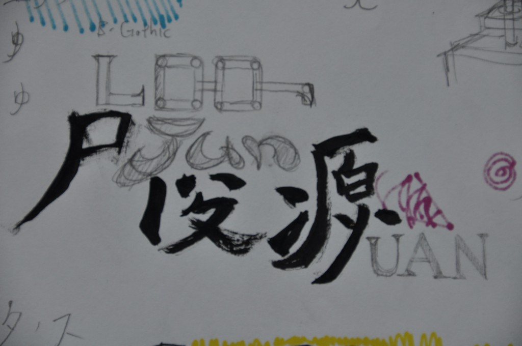
In the first nametag, I have to represent my subject with TYPOGRAPHY. So for this, I’ve used a few fonts to associate my interest for films. Through an Internet post, I found the most popular for movie posters are BANK GOTHIC and TRAJAN. Thus, I decided to make my last film interest reference into my English names.

trajan bank gothic

The whole piece is created by combining my Chinese name in the calligraphy font KAITI and English names together. I’ve tried to do this a long time ago but usually it ended up kinky. Fortunately this one worked out except I can’t figure what to do with my JUN. Then I just decided to create my own typeface for it as my uniqueness between references and interest. After that I halved the whole thing into black and white to show that there’s both side of me waiting for the viewers to discover. Adding a pair of glasses and voila, here’s a typeface that explains many basic information about me.

DSC_0783

Final draft of ABSTRACT SOLUTION

For the second nametag, it have to be ABSTRACT solution. This part took the longest time to construct. The first idea that hit me was the assignment “LINES”. However, I was thinking of using the process of drawing as the intention. I planned to do tedious patterns to show how I view complexity. Ms. Joy encouraged me to make more out of my content. So, I revised it and came with another concept. The structure was simple patterns filled with patches of my favorite/spirit colors. These colors are close in temperature and value, yet covering different portion of the space. Each color patches seems to have their own function or existence in the solution yet performed differently in terms of standing out. The reddish purple seems to stand out more than the cyan even though the cyan covers more. This idea suggested different aspect of me standing out in different extents. These aspect might be my talents or maybe my good traits. The visibility of these aspect can only be decided by the viewers, they will see some aspect of me first, but that doesn’t mean my other aspects are gone.

DSC_0779 DSC_0780

As for the CONCEPTUAL nametag, the part which I tried to think like Salvador Dali, but then my mind told me, “not in a million lifetimes.” I was inspired by how I brought up the unsatisfying LINE concept a few minutes ago. I’ve realized how easy I am to get stuck onto certain mindset or thoughts that can be easily proven bad. So, to express such personality of mine, I used this retro toy robot as the medium. Instead of an advance tech robot, retro toy robot shows how young and inexperienced my skills and thoughts are, yet there’s plenty room for improvement. The light-hearted colors were chosen to suit the expression. The robot design made the ring on its head logical, and can be assumed this might happen again. The colorless objects showed they are not the possession of the robot, signifying they’re probably others’ tools of assistant.

Before, I finalized my concept, Ms. Joy suggested that transition in terms of timeline can be implied into my concept to link them together. So here’s how time is implied. I’ve placed Chinese calligraphic fonts alongside ancient English fonts together to show they’re creation from the past. TYPOGRAPHY shows what I am already. typographyAs we progress, the percentages of blacks and whites reduced into lines, wobbly lines, inducing uncertainty. Just like how abstract art considered modern art, ABSTRACT SOLUTION shows a present me but have to be defined by others. abstract

You may say robots can symbolized future, so CONCEPTUAL is the future part of the timeline. As the black lines greatly substituted by colored lines, CONCEPTUAL contained my wish for an astonishing future, and what I will be. A resolution to escape the mundane ordinaries.

conceptual

It’s nice to be back to foundation 2D and the brainstorming. I have to remind myself, this is just the warm-ups.

Thanks for reading.
The following “dance movements” are rated PG-13. A “dance” for our first class activity of our first module of our second semester. Based on some of my personality traits, such as randomness, laziness, and interest in improvisations. Many thanks to my buddies, Zactee and JOAN for helping me out with the video.

Previous project:

The Emerald City – Trailer.