Concept
My main concept for this project was Irony. I wanted the audience to discover the real me by themselves through these pieces. For all of the four panels, I had use a ‘base’ as the background and ‘cut-off’ sections to the typography itself to symbolise that there were more than just that.
The Work Pieces
1. “My name is Dina and I am a gardener but..”

For this work, I did a combination of fresh and healthy brown soil as the base with bright and colour flowers to represent myself as a ‘gardener’. I had used different flowers for the main name and thin vines for the extensions to make the former stood out more.
“I am bad at it”
Although I love planting and nature in general, the plants seemed to die at my touch. Hence, I wanted to create the same scenario for the pull out section. I had converted the base to a dried and cracked light brown soil with dead flowers and some bugs coming out of the soil like earthworms.
2. “My name is Dina and I love cats but..”
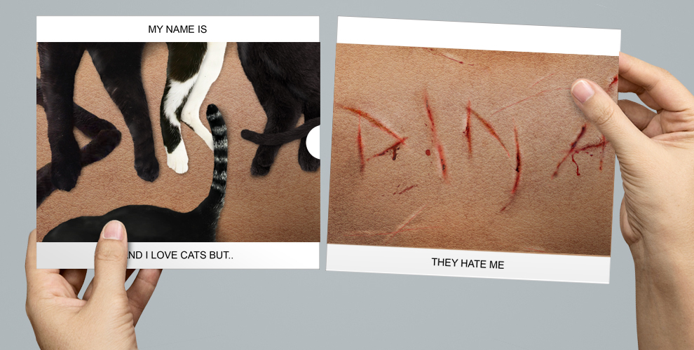
I tried to depict the relationship the cats had with the human by using human skin texture as the base background, as if they were holding ‘paws/hands’. The reason why I used black and white cats was not only because they looked minimal against the base, I also had a strong attraction towards black cats.
“They hate me”
Under those paws and tails were actually scratches they cats gave! I wanted to create a grotesque look so I added in some blood, highlights and bruises to make it more realistic. During my presentation, I had told the class that right after I completed this work, I really received a scratch from one my cat. Probably a bad sign? Haha
3. “My name is Dina and I am a sweet person but..”
 I had used a variety of candies, mainly gummies (because I love them), in different bright colours to represent the ‘sweetness’. I also implemented a candy wrapper as the base background to add more emphasis.
“I attract insects instead”
Yes, not human but insects. I always got bitten by these insects, ants and mosquitoes to be exact, and would start scratching my arms and legs. Therefore, I am somewhat a sweet to them. For the pull out panel, i added a whole lot of ants biting and eating the candies to depict that. Some sections were fully covered by them to spark a disgust reaction from my audience. Probably they would start feeling itchy too 🙂
4. “My name is Dina and I love food but..”

For this work, I wanted to create one of my favourite food, pizza! Therefore, I used a tomato sauce as the base background and my name spelt out using bacon. Also, I added in some vegetables like tomatoes and green capsicum bits in my initial ‘D’.
“I am a picky eater”
However, I tend to pick the vegetables out while I eat the whole pizza. So I left some tomato stains on the table and did not touch the vegetables until they turned mouldy.
Real Images


Conclusion
I decided to use the pull out method because I thought I could use the same concept in the future. As I used to take Interactive Media back in Polytechnic, I could not help but create something that interacts with the public.
By using the same concept, they could be Direct Mailers as part of a campaign to raise awareness on what the public sees versus what the actual reality is. For example, a campaign on bully or domestic abuse where I could use a similar art direction like my cat-scratch piece.
Lastly, I enjoyed doing this assignment very much and appreciated the feedbacks that my tutor and classmates had given me. Thank you!
Hi! I really love your work and you photoshop skills were amazing! Initially I thought your first gardener composition was actually a real picture taken by you! The deliverables were also very professionally printed and made, as if its ready for mass production LOL. Really creative idea about irony there and i look forward to seeing what you are going to come up with in project 2!
Hey Zactee! Thanks for your feedback! Your works are great too, I love any interaction with the audience. I am looking forward to your project 2 as well 🙂
Dina, Dina…
I AM A FAN!
OMG REALLY SUPERB WORK \(TvT)/ Looking forward to seeing more great stuff from you 😀
Siqi, Siqi..
THANK YOU!
Hahahaha I love your game console as well! So creative and it brought back my childhood memories.
I am looking forward to your future works too! Good job 🙂