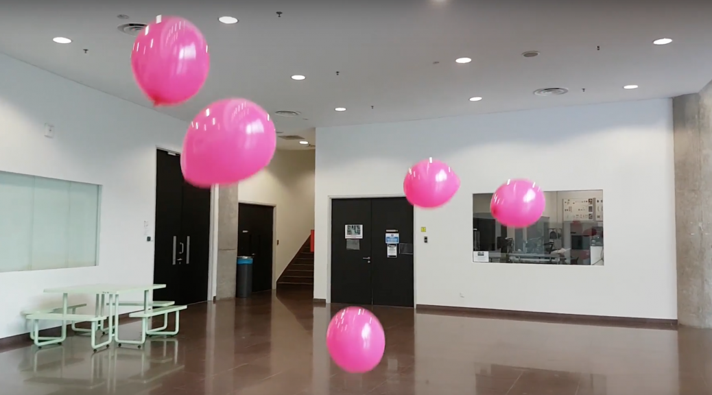
This video walk leads the viewer around the familiar and routine school space. Along the way, they will encounter an unexpected spectacle of moving balloons which seem to appear from nowhere.
After a few hours of bicep curls, I pumped about 60 bright pink balloons and positioned them in 3 locations around basement 1, the lift lobby and outdoor shallow pool. This is a development of an initial idea which involved the addition of objects to alter the space. Instead of using static objects which the participant would walk around, I opted for balloons as they have an organic movement i.e. they float down slowly when released from a height. With force, balloons can also make dynamic and quick movements and
Documentation of video walk experience
(The documentation shows 2/3 locations featured in the video walk)
Original video participants’ view while going through the space
Löwgren and Stolterman have presented a convincing and comprehensive argument for the need to be a thoughtful and reflective designer. Although they are writing specifically about how users interact with digital artefacts, we can apply their key principles to other types of design.
Although they may not have articulated and categorised the process as Löwgren and Stolterman have done, I do believe all creators and designers have an intrinsic understanding of the design process and situation. When approaching a problem, good designers would ask themselves similar questions along the way; how will users interact with it? What skills do the target users possess? How will my design alter user behaviour? Nonetheless, having the design process, motivations and effects analysed and verbalised is helpful as it quantifies the importance of good design.
I enjoyed the idea of design as knowledge construction. Designers do not just create products, services or experiences, but instead creating new behaviour and perspectives, which we internalise, and then use to interact with other people and artefacts. Löwgren and Stolterman highlight the influence of design and its power in shaping our behaviour, our lives and our future. It brings to mind digital features such as emojis that may have seemed alien or niche in the past but are now ubiquitous and an integral part of our communication norms. These tiny yellow faces have managed to classify a large range of our human emotions, forever altering our mode of written communication 🙂 😮 😉 😀
“A designer’s most important task is to develop her judgement, by critically and independently formulating her own assumptions and beliefs.”
After some deliberation, Löwgren and Stolterman do not conclude what makes good design. More than technical skills and qualities (which can be developed with time and practice), they stress the need for highly developed judgement skills. I’ve understood this as developing a good eye for design and user interaction. How does one achieve this? By continuous, conscious perception and reflection.
To clarify, seeing is not the same as perceiving! Seeing allows us to obtain visual and formal information such as shape or colour without understanding the needs the product fulfils, and what it requires from us as users. Instead we must constantly look at products, artefacts and behaviour, and reflect why it is good or lacking. However, developing good taste alone would make us good critics, but not designers or artists. While training our eye, we must also hone our craft by practicing, producing and learning from our mistakes.
“The thoughtful designer dares to challenge her own thinking and assumptions as a way to develop her competence and design ability.”
Lastly, I appreciate this disclaimer at the end of the section. Especially in our present era, where knowledge and tools are rapidly developing and ever-changing, it is important to keep improving and not be stagnant. After developing critical design judgement, we must then be open to breaking these set beliefs if they become limiting.
3 thoughtfully designed interactive experiences
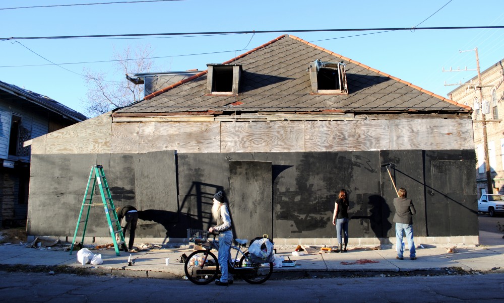
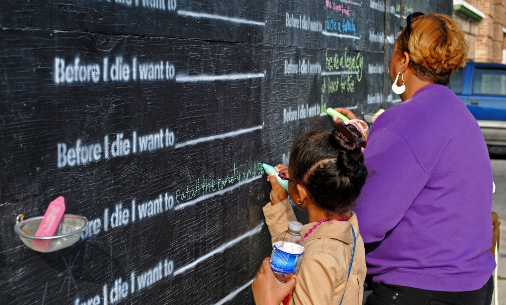
Before I Die (2011) by Candy Chang
Before I Die by Candy Chang is a thoughtful interactive design experience. Chang repurposed an abandon building in her city of New Orleans, painted a wall with chalkboard paint and stencilled on the prompt ‘Before I die I want to _______.’ The premise is simple but effective in inspiring participation and community spirit. Although formed by many individual sentiments, the collaborative work comes together as a coherent image of a community. The interface is just enough for the intended outcome and the work also recognises the influence of good design on a social level.
Construction process, Before I Die (2011) by Candy Chang
Before I Die (2011) by Candy Chang
Before I Die (2011) by Candy Chang
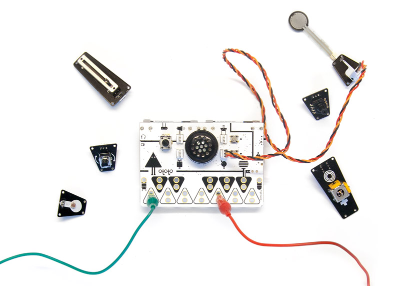
Ototo by the the Japanese sound artist Yuri Suzuki is another instance of a thoughtfully designed interactive experience that potentially revolutionises our way of learning music.
Ototo by Yuri Suzuki
It is a music kit that transforms day to day objects into instruments. Although it has limitations and is not a replacement for traditional music making, it has reimagined our interactions with everyday objects and our definition of musical instruments. It presents a possible future, and can be a complementary tool for music education (especially for people who are intimidated by music-making).
Nowhere and Everywhere at the Same Time by William Forsythe
Lastly, another example would be William Forsythe’s ‘choreographic objects’ installation Nowhere and Everywhere at the Same Time, No.2 (2013). This series of interactive installations consist of hundreds of pendulums swinging simultaneously. The piece invites participants to manoeuvre around the swinging pendulums, inevitably making dance-like movements as they try to avoid them. The experience is physically engaging, fascinating and encourages a playful art experience in the typically solemn museum setting.
This week’s reading is Goal-directed Product and Service Design (Chapter 1 of Designing for the Digital Age by Kim Goodwin).
Goodwin has broken down and presented to us a step-by-step methodology for effective project planning and execution. Although she writes in the context of design and business, we can extract many useful learning points that are applicable to other types of creative projects, even if they are non-commercial and lean closer towards art than design.
Goodwin expands on the common definition and scope of design. She goes beyond functional products and rightly includes services and experiences. Perhaps, all kinds of design should be viewed not as standalone products, but more broadly as experiences. When we think of a product, the hardware becomes a little irrelevant. Instead, we recall the memory and the good feelings associated with its use.
One of the models which Goodwin encourages brings to life the old saying ‘to walk in another’s shoes’. By thinking of how another user would view the same product, service or artwork, with a different set of memories, associations and skill set, we would gain a deeper understanding of what is lacking from our initial prototypes and proposals. For example, how would someone in a wheelchair, or someone with limited knowledge of technology interact with our art installation, service or game? Tweaking the experience for different types of users would make the work more accessible and inclusive.
Furthermore, interaction should influence design and functionality. Ideally, core ideas and interaction should not be compromised for ease of execution. Goodwin proposes a broad to narrow approach to design and ideation which I find very helpful. When starting on a new project idea, I often get bogged down by details and practical limitations. While these considerations are good, taking them into account in the early stages of the ideation process can be self-limiting and overwhelming, and may stomp out potential ideas. Instead, she suggests starting on a higher and broader level to work out a clear and simple core concept before banging out the details and execution.
After ideation, Goodwin also distinguishes and explains the three different design frameworks (interaction, visual and industrial design) and how they influence one another. This was very interesting as I often use a singular approach when designing devices and experiences (i.e. I try to make a ‘good’ experience without stating clearly what ‘good’ is or what factors make it ‘good’). However, dissecting this into distinct frameworks seems like a more holistic way to think of the same problem from different angles, ultimately creating a comprehensive view of our design goals and the intended user experience.
Some food for thought
Q1. Besides thinking about design and interaction from the perspective of different personas, what other models can we use specifically to create interactive art works?
Q2. Goodwin explains the goal-directed design process in the context of larger-scale projects with multiple stakeholders. How can we synthesise and streamline the goal-directed process to smaller projects?
Documentation for pan n’ tilt prototype. This setup allows the participant to control the movement and dispersal of sound in the room using the gyroscope. Each of the four corners of the gyroscope correspond to each of the four speakers in the room. The effect is immediate; for example, tilting the top right corner of the gyroscope downwards will increase the volume of the ‘front-right’ speaker (position when the participant faces the screen projection).
The accompanying graphics on the screen are a visual representation of the sound dispersal. The free-flowing polygon has 4 corners which correspond to the 4 speakers in each corner of the room. Tilting the gyroscope in one corner will alter the shape of the polygon and stretch it furthest in the same direction of the speaker. Conversely, keeping the gyroscope leveled will produce equal volume in all 4 speakers and the polygon will become a rectangle shape.
3D graphics and a more balanced sound increment (using the table object) could be applied for the next iteration of this prototype to enhance the experience.