Category Archives: 2017_S1 Project Development & Planning

Emporium | FYP Proposal Update | week 12

This week, I’m having some doubts about the feasibility of a Rube Goldberg machine as the focal point of the work, but more on that below. I also thought of some possible objects and devices to include in the installation. I’m starting to see some common strands but overall the installation will present an eclectic mix of curios within a surreal space. Perhaps it’s becoming a compilation of things I like and am fascinated by. However, I guess there’s nothing wrong with that either.

List of (possible) items to display

1. Interactive devices

A past prototype of a machine that offers tissues when you sneeze

This will be the most varied part of the project. These devices may be digital, analog, inventions, re-imagining of existing products etc.

Some possible rules, themes and constraints I could start from (evolving list):

– Reimagine common household items e.g. cups, saucers, clock
– A device that is made within a time limit e.g. 6 (wo)man-hours
– A device that solves a common problem
– A device that hurts
– A device that heals
–  ………..

2. Private slide show cameras

Mini slideshow camera toy

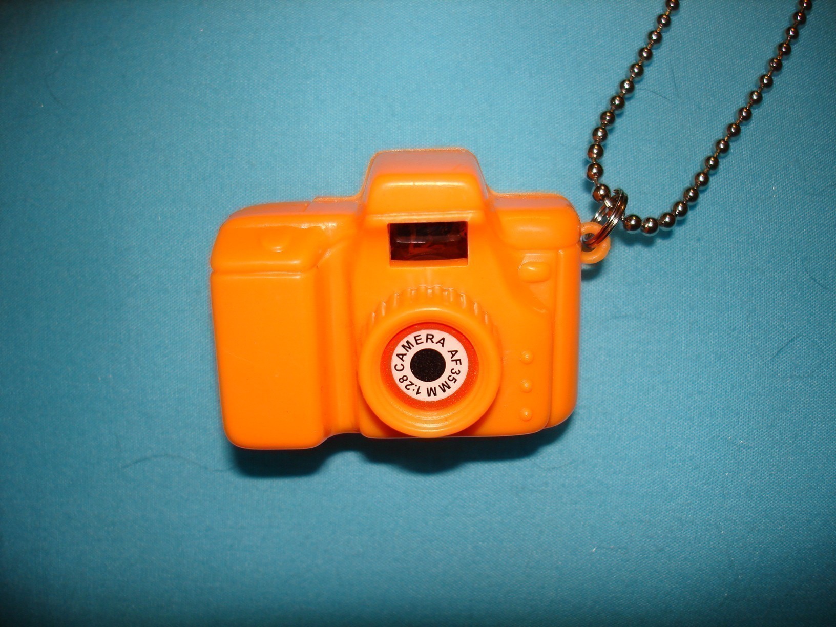
Sometimes referred to as ‘view-masters’, these toy cameras usually come with a rotation of several pictures illustrating a children’s story. There are many types; full-size, tiny, single view, stereoscopic etc.

View-master with dinosaur pictures

I like how we use these simple toys in open spaces (in a shop, among others) but we alone watch the story unfold. Instead of the typical ‘3 little pigs’ or ‘elephant goes to the market’ images, these unassuming toy cameras will present alternative images and narratives which may be somewhat private or unsightly. They may show images of war, current affairs, childhood scenes, nudes, my ongoing semi-serious photo series of people who take insta photos in museums etc.

Perhaps I could use these as a form of documentation as well, showing my FYP process of conception and construction.

3. Sketches, blueprints, instructional diagrams (2D)

Blueprint of an airplane

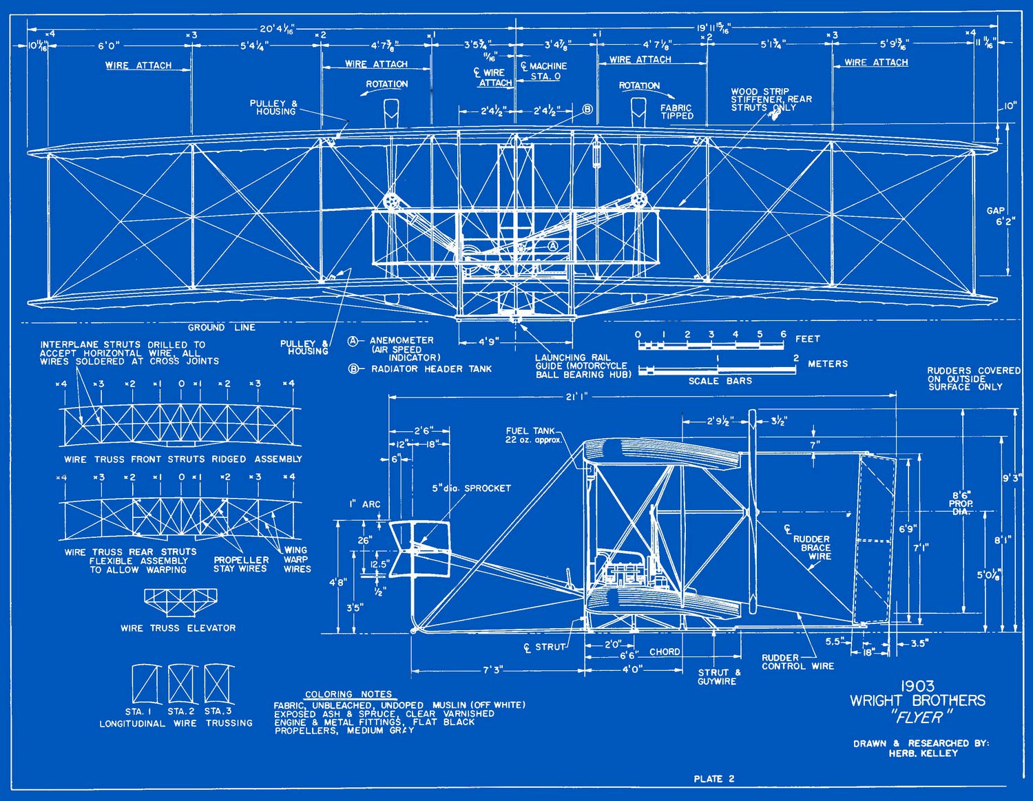
As part of process and idea documentation, as well as decoration to build up the workshop atmosphere. These paper works and images will be high curated and mounted onto the walls or scrapbooked.

4. Secret stereograms

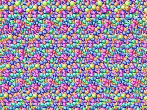
I could create stereograms and mount them on the Emporium wall at eye-level without explicit instructions. At first glance they will appear to be just print patterns or postcards. The 2 guiding dots on top of the image will help visitors ‘see’ and also serve to hint that they are stereograms.

5. Tiny boxes / environments that we peep into…

6. Something with living creatures…

Concerns regarding the Rube Goldberg Machine & other options?

Repeatability and automation

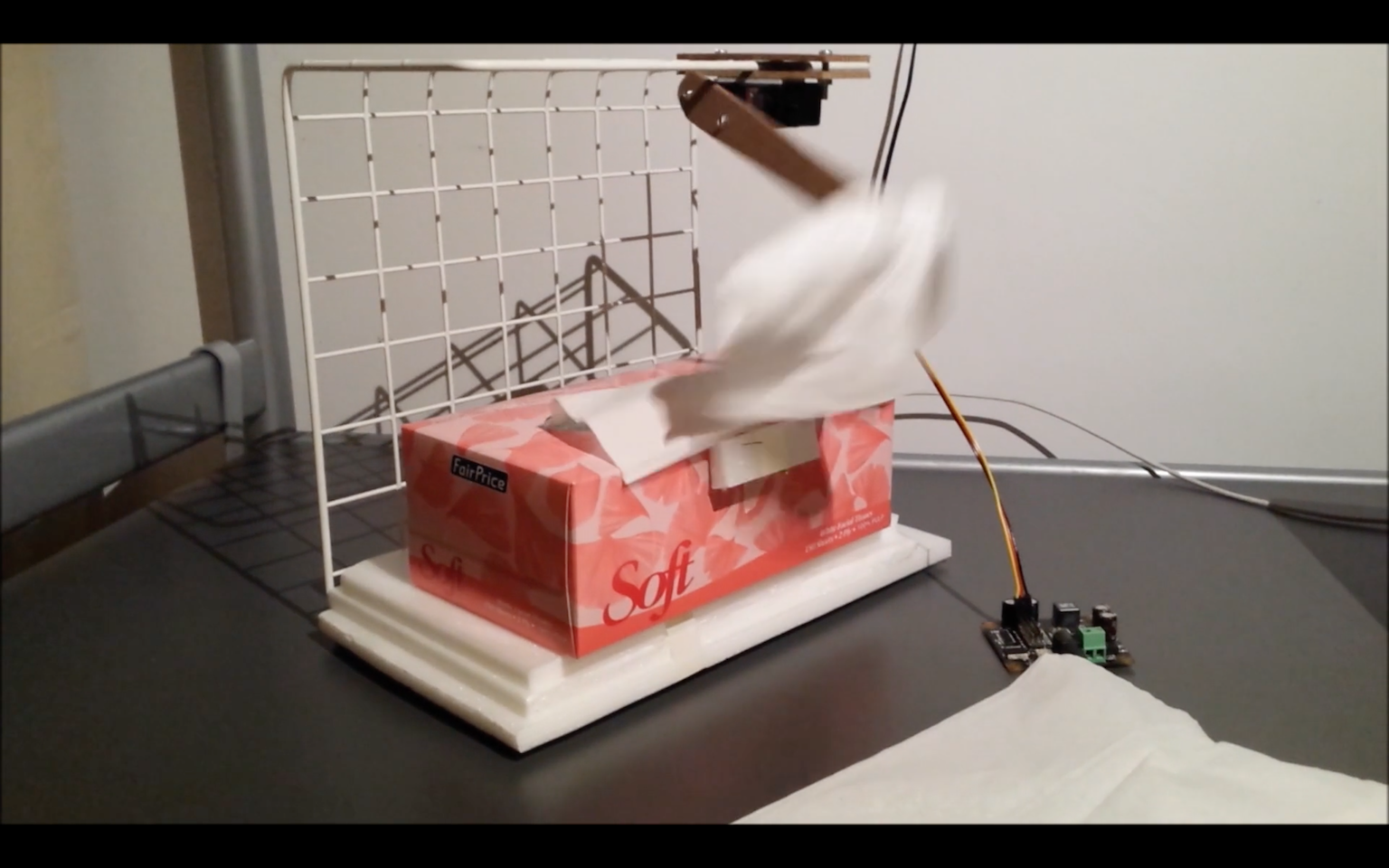
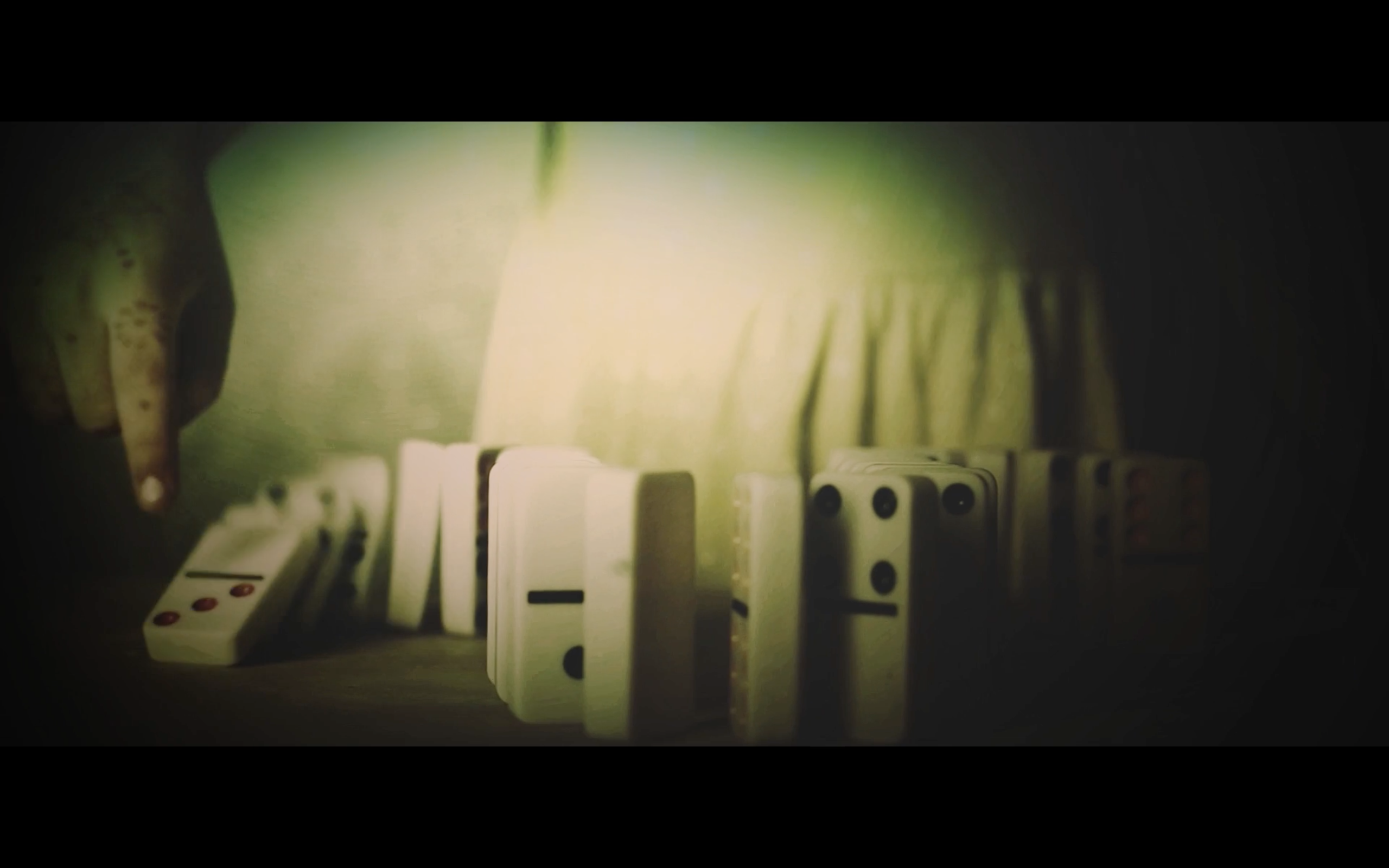
The strength of a Rube Goldberg Machines (RGM) arguably lies in how innovative the triggers and connections are. Creators often employ materials such as weights, liquids, fire that need to be repositioned and replaced after each run. This reset process usually takes a long time and is done by teams of people during competitions. As the installation will be up for an extended duration, the RGM must be able to reset simply, and preferably, automatically after each step of the sequence.

An alternative would be to record it beforehand and present the video with the stationary setup, as part of the installation. This isn’t a great option as screening a video will interrupt the illusion of the shop space.

Feasibility

The mechanics may not always work smoothly during the final show, with new hiccups occurring each run. A lot of time (at least 6 weeks) needs to be reserved for fine-tuning and banging out the hiccups.

Rube Goldberg Machines are usually built by a team of people, whether by engineers for competitions or by creative agencies for special projects. Automated resetting and fine-tuning aside, building a large RGM will be very difficult and time-consuming for a beginner to accomplish single-handedly. Creating precise motions is way more difficult than it seems. It requires an excellent understanding of physics and science, which can be acquired with time.

However, I’m weighing whether the steep difficulties of building an RGM will detract from the purpose of a final year project? While I’d love to build a RGM, it’s important to remember that becoming great at mechanical design shouldn’t be the goal, but rather a stepping stone and tool used to create a great interactive experience. It’s not about backing away from a challenge but rather picking suitable challenges to invest in.

Other options?

One option is to remove the Rube-Goldberg machine entirely. This is a bit sad, and I will need to find something to replace it to create focus in the installation. As of now, I don’t think that having many small and distinct devices is enough to create a rich experience. The project needs a central unifying focus to tie the disparate elements together.

Another option: Instead of having the RGM as the main installation, an option is to build a mini-RGM / kinetic sculpture as one of the smaller curios.

What fascinates me most about RGMs is the unexpected and whimsical motion. Perhaps I could further explore the topic of motion in another direction?

Some notes to self

RGMs are often humorous, satirical, reliable and made out of spare materials. Other than the challenges above, should more interaction should be included into the RGM? If so, how so? Also, some thoughts after watching many different RGMs:

  • Aesthetics, visuals, rhythm choreography! Although its important to get from A to B or create a specific action, these motions can be more than that, not unlike a dance or narrative with suspense, climax, build up etc.
  • Being slow is not a bad thing
  • Show the audience everything; design visual sequences
  • Local materials?

Documentation

As the installation is very much a product of process, good documentation is necessary. This will be done using various methods such as:

  • OSS progress updates (every 1 – 2 weeks)
  • A process log of what is done / accomplished each working day This will be useful in tracking progress and creating accountability.
  • Success and failure log
    This will log how many iterations it took for a prototype to work.

Emporium | FYP Proposal | week 11

Project Description and Working Title

Project Description and Overview

Emporium (working title) is an immersive interactive installation. It will take the form of a mini emporium of curios and oddities. The installation will invite visitors into a surreal shophouse space where they can discover and interact with various invented objects.

Installation Components

Although the curios on display will vary in terms of scale, use and material, they will be thematically linked by an underlying ludicrousness. These interactive devices will be impractical, humorous and seemingly ridiculous inventions. They will likely be simple and at different degrees of finish. One may be entirely analogue. The shop space will also be decorated with blueprints, drawings and sketches from the ideation and building process.

The primary focus of the installation will be a larger kinetic sculpture, similar to a Rube Goldberg machine. Its mechanism may incorporate the other smaller devices on display in the shop. As the machine will be displayed during the show, ideally, it will be able to reset itself and loop with each interaction. Given this constraint, an alternative would be to film it beforehand and screen the video as part of the installation. The scale of the project will be adjusted based on feasibility.

Technique

The devices will be programmed using either Arduino or Max.

Mood and setting

The emporium will have a modest atmosphere; a blend between a workshop and vintage collectibles store. The curated space will also reflect the process of creation and construction.

Purpose

Rooted in process, Emporium is a sequence of exercises in doing, failing and learning. It seeks to move away from a single final deliverable, instead giving equal weight to documentation, process, and final product. Furthermore, by creating and realising these devices, however rough or unfiltered the ideas may be, I hope to alter my thinking and working methods. The project will also test the possibility of conditioning one’s behaviour over a span of a year.

Artist References

Maywa Denki
Maywa Denki
Instructions for Otamatone by Maywa Denki

Mawya Denki’s device art is presented in a comprehensive manner, which includes product, performance and persona. They also create accompanying design collaterals such as catalogues and instructions, which enrich the context of the work and add to the illusion. Their unique way of presentation can be a useful study for the development of my project.

Joseph Herscher

Herscher specialises in making Rube Goldberg machines which aim to solve everyday problems. His work typically uses common objects and simple cause-and-effect mechanisms. It will be useful to study these simple techniques to create directed and precise movement.

Herscher’s work, like many Rube Goldberg machines, are typically documented through video. Some parts are one-time use such as a fallen weight, or poured liquid. Can some parts be replaced with electronic sensors? Can some parts be reset so it can be looped?

His work reminds me of chindogu, a concept by Japanese inventor Kenji Kawakami. The concepts are playful and genuine as they seek to solve everyday problems inventively. Although these contraptions are analogue, there’s much to be learnt in Kawakami’s way of problem-solving.

Example of chindogu. ‘Shoe’s Umbrella’ by Kenji Kawakami

The Cornershop (2014) & Madame Roxy’s Erotic Emporium (2015) by Lucy Sparrow
‘The Cornershop’ (2014), Lucy Sparrow
‘Madame Roxy’s Erotic Emporium’ (2015), Lucy Sparrow
Felt products on shelves in ‘Madame Roxy’s Erotic Emporium’ (2015), Lucy Sparrow
Posters lining the stairs in ‘Madame Roxy’s Erotic Emporium’ (2015)

Sparrow’s interactive installations are characterised by shop spaces made entirely out of felt. She works realistically recreate objects and environments using felt, and often deal with themes such as consumer culture and contemporary lifestyle. It’s interesting to note how Sparrow uses contrast in her work (e.g. material contrast between felt and packaged food or rubber and leather sex toys).

Her works are good examples of creating thematically coherent spaces which immerse viewers into the illusion. Sparrow keenly observes actual spaces of a convenience store and sex shop and expertly replicates the minute details, moods and atmosphere in her felt environments. This is done through recreating objects, decoration, lighting, signage, and even persona (she often dresses the part and acts as the shop clerk).

This attention to detail and creating a relatable atmosphere will be important in my installation when setting up shop. I will have to decide on a mood and atmosphere, observe the styles and layouts of actual emporiums, and emulate this through lighting and detail.

Gantt Chart & Project Timeline

Mar – Apr 2017

Please click here for the master plan 🙂

FYP Ideas | Seed Stage

There’s this wise line that goes something like “I’ve spent so much of my life regretting the past, and worrying about the future, that I forgot to live in the present”. This, coupled with an incapacitating indecisiveness and overthinking, pretty much sums up a large part of my life. However, after reaching a recent turning point, I try to live by this motto each day.

Regretting past mistakes, worrying about the unknown and indecision share a common trait — stagnation. Although I’m in the process of tweaking these habits through trial and error, the best counter measure I’ve developed to combat overthinking and inaction is simply, doing.

I’d like to continue this personal exploration and extend it to my work as an artist. Stemming from the Art of Doing, I’ve come up with 2 initial FYP possibilities. Despite having the same starting point, these take different directions which I hope to be able to reconnect after more research and exploration.

1. (working title)__

Final deliverable
A full body immersive installation

The work will play with ideas such as sensuousness, feeling, and engage the physical body over the thinking mind. It aims to create an environment for visitors to experience simple, physical pleasures; to concentrate more on the experience than themes and narrative. Some simple yet gratifying pleasures that come to mind:

Still from the movie ‘Amelie’ (2001), uncoiling a ribbon
Still from the movie ‘Amelie’ (2001), falling dominos
Still from the movie ‘Amelie’ (2001), peeling dried glue

The installation would alter aspects of experience possibly through suspension, instability, weightlessness, textures, tactile sensations and smell. It will also employ sound to enhance the environment.

On scale
The large scale of the installation will allow visitors to engage with the environment using many different faculties. More than just sight or hearing, when users put their whole body into action in something bigger than one’s self, they may feel small and even disembodied. User’s will also tend to test the limits of this large and unfamiliar space, not unlike how a child would explore the full potentials of a new toy.

 2. Emporium of the Ludicrous

A small emporium with varied offerings
Maywa Denki

On Form, Process and Medium
I’m looking for ways to move away from a single final installation and incorporate the process, performance, prototypes video and installation into an inclusive 12 month long project. I feel that Maywa Denki’s cohesive presentation methods is an excellent example of this.

Final deliverable(s)
Series of seemingly ridiculous inventions and prototypes + a final installation which would integrate these devices into an emporium space along with a final more developed kinetic and mechanical installation.

The final installation which will be shown alongside the interactive devices will primarily be a mechanical and kinetic interactive installation with a domino effect. Sound (either generated digitally or mechanically) will be an important element in creating mood.

Related research topics: Kinetic art, kinetic sculpture, mechanical art.

For both these potential ideas, I don’t wish for the viewers to engage in literal ‘doing’, which is more a personal aspiration and starting point for the works. Rather, it will prompt visitors to experience the space through instinct and sense, and let intellect take a back seat.


Thoughts about teamLab ‘Future World’ Exhibition | week 6

This weekend we visited teamLab’s ‘Future World’ exhibition at the ArtScience Museum. We were kindly guided by Takasu, a member of teamLab.

The ‘blackbox’ exhibition space has a linear structure; we walk through and view the different works in a planned sequence, starting from the floral room and ending at Crystal Universe. The exhibition almost mirrors an entire universe as visitors navigate through various environments (garden, city, ocean, space). 

The floral room (comprising three works, ‘Flowers and People, Cannot be Controlled but Live Together’, ‘Ever Blossoming Life II’ and ‘Flutter of Butterflies Beyond Borders’) engages our senses on multiple levels— sight, sound, smell, climate etc.— to create an immersive space. The projections react to our presence and vary with the current climate. This is a thoughtful feature as galleries often seek to create a sense of ‘timelessness’ which disconnects the space from the outside environment. However, the changing flora and fauna makes the work feel like an extension of the real world.

teamlab
‘Universe of Water Particles’ by teamLab

The digitally rendered Universe of Water Particles recalls East Asian landscape paintings. The massive cascading waterfall has a strong sense of gravity and vertical dynamism as the water particles flow down. Its large scale makes us feel small in comparison and aptly captures man’s humility before nature and the elements. I like how the work incorporates Eastern aesthetics and retells classical subject matter like landscape painting.

Many of the works employ soundscapes to intensify our experience of the environment. In 100 Years Sea, the soundscape becomes more solemn and severe as water levels rise, submerging the islands. Similarly in Crystal Universe, sound is used to emphasise the movement of the lights as they rise and fall to form constellations. It also uses mirrors and repetition to mimic the effect of infinite space, lending an impactful ending to the exhibition.

Future World does not explicitly deal with divisive issues commonly discussed in contemporary art such as politics, gender or race. Instead, it highlights the importance of play through relatable topics which are common to everyone such as our way of living, transportation, nature and collaboration. Perhaps in our increasingly tense and divided world, we need some collaborative ludic play to let our opinions and intellects take a step back and let our senses come forward. The works are easy to appreciate, if not for the ideas and concepts they embody, then at least for their beauty as a visual spectacle. Spectacle isn’t a bad thing. TeamLab aims to make people happy and I think they succeed in doing so. 

20170219_113003
My squid uncle

20/20 Tunnel Vision | A Smart Nation Public Art proposal | week 4

Part II: Propose a media art intervention to complement the Smart Nation initiative

Other than the occasional MRT breakdown, train rides in Singapore are extremely comfortable. The carriages are clean, brightly lit and air-conditioned, especially on the newer underground MRT lines such as the Circle line and Downtown line. While riding the underground trains on long journeys, we may feel detached from the outside environment. Many people are familiar with that moment when one exits a train station only to find it’s raining cats and dogs.

MRT train tunnel. Image credit: themiddleground.sg

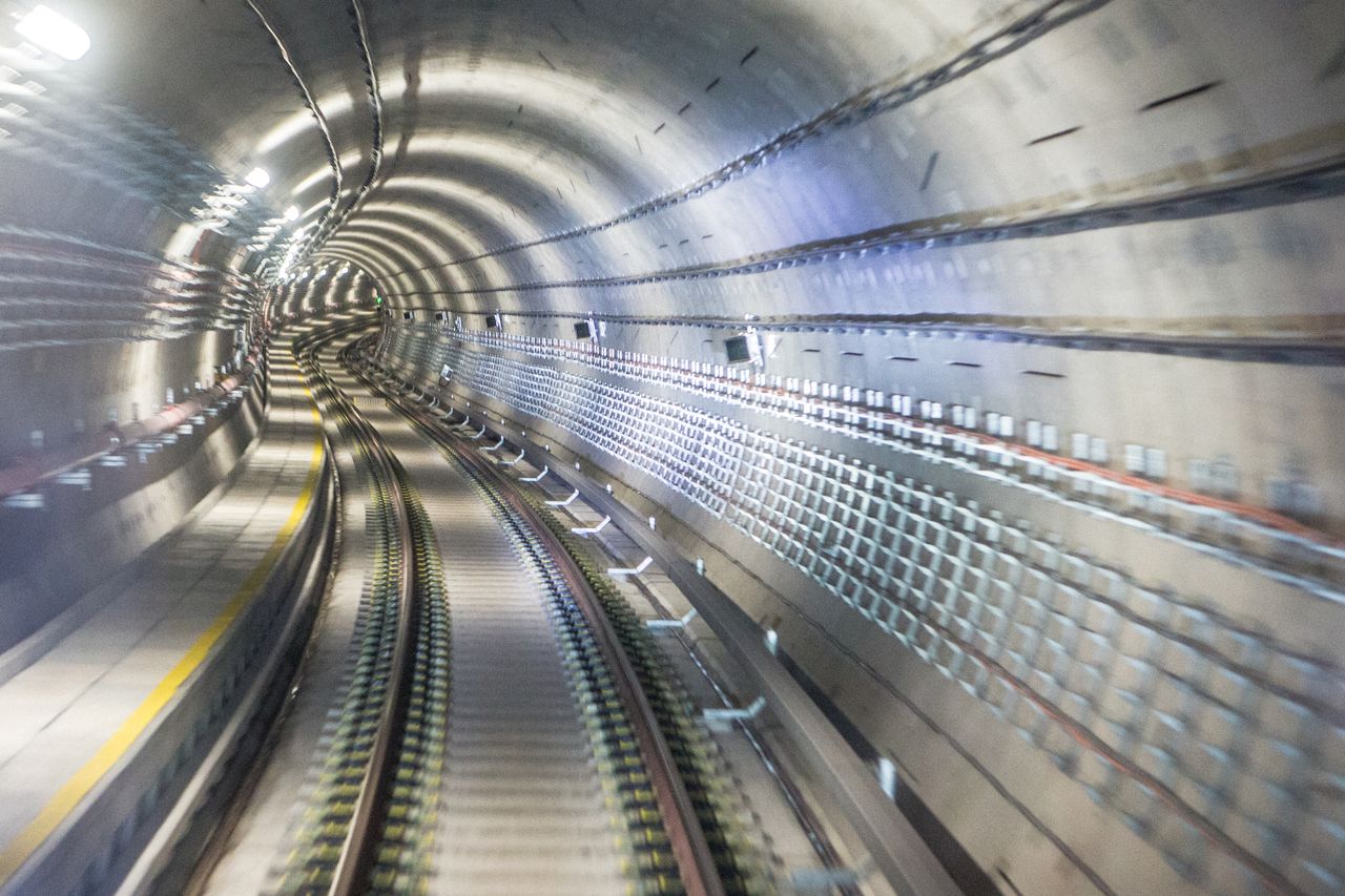
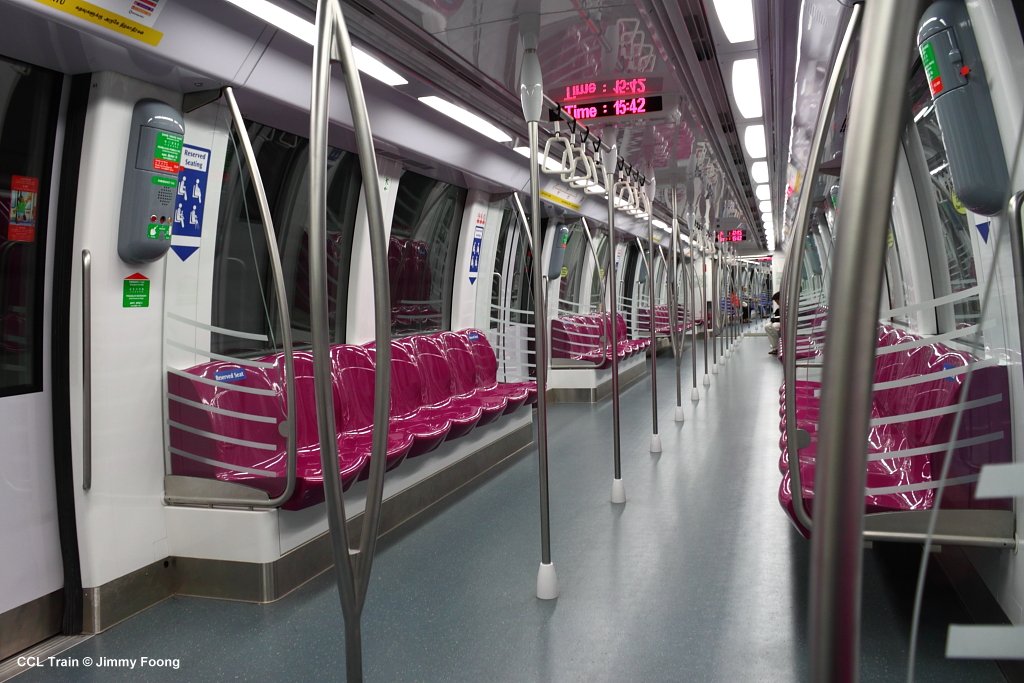
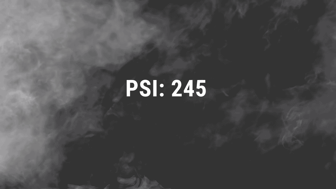
20/20 Tunnel Vision is a media art intervention installed in underground train tunnels. It aims to enrich our daily commute with public art while giving passengers a real-time report of the environmental conditions above ground. Instead of the usual vague darkness, commuters on the underground Circle and Downtown lines will see simple graphic animations outside the carriage windows.

Inside a Circle Line train carriage. Image credit: Jimmy Foong. http://www.urbanrail.net/
Updated in real-time, these immersive graphics will reflect the current weather conditions (e.g. rain, cloudy, brightness of the sky, temperature, sunset, sunrise, and PSI level during the haze). Being aware of the above ground conditions, commuters can adjust their travel routes along the way (perhaps to take a longer but sheltered path to their destination on a rainy day).
A mockup of an animation that indicates rain at the moment
A mockup indicating current PSI levels in the area
Mechanism at a glance
20/20 Tunnel Vision will use the moving image technique of the zoetrope, a mechanical optical toy. Instead of using printed images in a cylindrical configuration, the frames of the animation will be projected onto the running tunnel walls as still images (which can be updated instantly according to weather conditions).
With appropriate spacing and lighting, the projected images will have an illusion of movement, ‘playing’ the animation as the train speeds through the tunnel. These simple animations will differ from station to station and may change along the way. Their fluid forms and vibrant colours will be visually engaging as they seemingly move with the train. Instead of staring at their mobile devices, I believe these moving images will engage commuters while delivering useful and reliable information.

Example of a Zoetrope:

Thoughts on our Smart Nation | week 4

This week’s assignment is about the Smart Nation initiative, which was launched in late 2014. Part II can be found here.
A Brief Overview

The Smart Nation seeks to improve the way we live, work, play and interact with each other through the use of data analysis and information communication technology. These technologies are gradually being implemented in our public infrastructure, transport networks, housing environments, businesses as well as healthcare and day-to-day services. These innovative solutions aim to create a sustainable and comfortable way of life, which simultaneously connects members of society and strengthens community ties.

“I think for Singapore, what we really want to look at is how do you use technology, networks, big data to deliver the benefits to citizens in terms of improving their quality of life, to forge stronger communities, to improve productivity and industry and how technology can be an enabler as we move towards an ageing population. At the end of the day, what defines a smart city is whether technology has made a positive difference in the lives of the citizens.”

— Chay Pui San, Deputy Head of Smart Nation Programme Office

A well-designed Smart Nation initiative

I think the Smart Nation tele-health initiative is a thoughtfully designed improvement to eldercare, especially in our aging society. It understands the needs of our fast-paced society where working adults are divided among many commitments such as their career, children and elderly parents. The elderly monitoring systems allows family members to monitor their parents or grandparents remotely. The system monitors movement patterns, notifying caretakers of their whereabouts and any unusual activity within the home through a mobile application.

Elderly can also wear panic buttons around their necks to alert caretakers of an emergency. If they were to fall, the elderly person can immediately signal for help using the button. This is rather
well-designed as it is portable, physical and works well regardless of one’s digital competency. Although simple, it makes far more sense than a sleek mobile application.

Connectivity and Openness

Seamless connectivity is an integral aspect of Smart Nation. This ensures reliable real-time data which can be used to monitor transport networks, crowd patterns and environmental conditions.

So what can be done with all this data? It works hand in hand with openness to build a smarter nation and encourage innovation. Businesses and individuals can access government data to co-create solutions. We see these independent initiatives manifest as popular transport applications like SG BusLeh and the Facebook chatbot Singapore Bus Uncle, which can track real-time bus locations, arrival times and measure how packed a bus is. These applications were made in the spirit of open source and their interfaces even have a local flavour.

Screenshot of SG BusLeh smartphone application


Screenshot of sgbusuncle. Image credit: mothership.sg

Apart from being open and transparent, these initiatives can also be improved through continuous community contributions and feedback. Although not everyone can develop chatbots and apps, members of a town can contribute by sending on-the-ground updates (e.g. lift breakdowns, mosquito breeding grounds etc.) to alert agencies about municipal issues.

Becoming a Smart Nation: Potential Problems and Possible Solutions

As a society, we will have to alter our behaviour and way of living in order to fully utilise this technology. To achieve this, we will need bridging schemes to encourage people to embrace these new technologies and way of life. For example in 2016, new modes of contactless payment such as Apple pay and Android pay were made available in Singapore. Exclusive incentives such as timbre+ $1 Good Eats were set up, which encouraged people to try the new system. 

Timbre+ November 2016 Good Eats promotion

More importantly, the technology should be embedded in a seamless and non-intrusive fashion. This is where good, people-driven design comes into play. With the development of a smart nation, members of the community also need to play an active role so as to not feel detached or herded. 

Many of these initiatives are implemented using smartphone applications, typically with graphical user interfaces (GUI). Although these are a great start, how will we prevent marginalised groups of people in our society from being left behind as Singapore develops into a smart nation? Perhaps, some of these digital technology solutions should be installed in public spaces for people who lack access to smart devices. Furthermore, to aid members of our community with low computer competency, we should aim to go beyond GUI, and incorporate more tangible media interfaces.

Singapore’s future as a Smart Nation is exciting and promising. Nonetheless, we have to be aware of such limitations and work towards minimising any gaps in society created by technological differences. 

Thoughts on Thoughtful Interaction Design | week 3

This week’s reading is chapter 1 of Thoughtful Interaction Design: A Design Perspective on Information Technology (MIT Press) by Jonas Löwgren and Erik Stolterman. For part 1 of this week’s assignment, click here!

Löwgren and Stolterman have presented a convincing and comprehensive argument for the need to be a thoughtful and reflective designer. Although they are writing specifically about how users interact with digital artefacts, we can apply their key principles to other types of design.

Although they may not have articulated and categorised the process as Löwgren and Stolterman have done, I do believe all creators and designers have an intrinsic understanding of the design process and situation. When approaching a problem, good designers would ask themselves similar questions along the way; how will users interact with it? What skills do the target users possess? How will my design alter user behaviour? Nonetheless, having the design process, motivations and effects analysed and verbalised is helpful as it quantifies the importance of good design.

I enjoyed the idea of design as knowledge construction. Designers do not just create products, services or experiences, but instead creating new behaviour and perspectives, which we internalise, and then use to interact with other people and artefacts. Löwgren and Stolterman highlight the influence of design and its power in shaping our behaviour, our lives and our future. It brings to mind digital features such as emojis that may have seemed alien or niche in the past but are now ubiquitous and an integral part of our communication norms. These tiny yellow faces have managed to classify a large range of our human emotions, forever altering our mode of written communication 🙂 😮 😉 😀

“A designer’s most important task is to develop her judgement, by critically and independently formulating her own assumptions and beliefs.”

After some deliberation, Löwgren and Stolterman do not conclude what makes good design. More than technical skills and qualities (which can be developed with time and practice), they stress the need for highly developed judgement skills. I’ve understood this as developing a good eye for design and user interaction. How does one achieve this? By continuous, conscious perception and reflection.

To clarify, seeing is not the same as perceiving! Seeing allows us to obtain visual and formal information such as shape or colour without understanding the needs the product fulfils, and what it requires from us as users. Instead we must constantly look at products, artefacts and behaviour, and reflect why it is good or lacking. However, developing good taste alone would make us good critics, but not designers or artists. While training our eye, we must also hone our craft by practicing, producing and learning from our mistakes.

“The thoughtful designer dares to challenge her own thinking and assumptions as a way to develop her competence and design ability.”

Lastly, I appreciate this disclaimer at the end of the section. Especially in our present era, where knowledge and tools are rapidly developing and ever-changing, it is important to keep improving and not be stagnant. After developing critical design judgement, we must then be open to breaking these set beliefs if they become limiting.

3 thoughtfully designed interactive experiences

Before I Die (2011) by Candy Chang

Before I Die by Candy Chang is a thoughtful interactive design experience. Chang repurposed an abandon building in her city of New Orleans, painted a wall with chalkboard paint and stencilled on the prompt ‘Before I die I want to _______.’ The premise is simple but effective in inspiring participation and community spirit. Although formed by many individual sentiments, the collaborative work comes together as a coherent image of a community. The interface is just enough for the intended outcome and the work also recognises the influence of good design on a social level.

Ototo by the the Japanese sound artist Yuri Suzuki is another instance of a thoughtfully designed interactive experience that potentially revolutionises our way of learning music.

Ototo by Yuri Suzuki

It is a music kit that transforms day to day objects into instruments. Although it has limitations and is not a replacement for traditional music making, it has reimagined our interactions with everyday objects and our definition of musical instruments. It presents a possible future, and can be a complementary tool for music education (especially for people who are intimidated by music-making).

Nowhere and Everywhere at the Same Time by William Forsythe

Lastly, another example would be William Forsythe’s ‘choreographic objects’ installation Nowhere and Everywhere at the Same Time, No.2 (2013). This series of  interactive installations consist of hundreds of pendulums swinging simultaneously. The piece invites participants to manoeuvre around the swinging pendulums, inevitably making dance-like movements as they try to avoid them. The experience is physically engaging, fascinating and encourages a playful art experience in the typically solemn museum setting.


thoughts on goal-directed design | week 2

This week’s reading is Goal-directed Product and Service Design (Chapter 1 of Designing for the Digital Age by Kim Goodwin).

Goodwin has broken down and presented to us a step-by-step methodology for effective project planning and execution. Although she writes in the context of design and business, we can extract many useful learning points that are applicable to other types of creative projects, even if they are non-commercial and lean closer towards art than design.

Goodwin expands on the common definition and scope of design. She goes beyond functional products and rightly includes services and experiences. Perhaps, all kinds of design should be viewed not as standalone products, but more broadly as experiences. When we think of a product, the hardware becomes a little irrelevant. Instead, we recall the memory and the good feelings associated with its use.

One of the models which Goodwin encourages brings to life the old saying ‘to walk in another’s shoes’. By thinking of how another user would view the same product, service or artwork, with a different set of memories, associations and skill set, we would gain a deeper understanding of what is lacking from our initial prototypes and proposals. For example, how would someone in a wheelchair, or someone with limited knowledge of technology interact with our art installation, service or game? Tweaking the experience for different types of users would make the work more accessible and inclusive.

Furthermore, interaction should influence design and functionality. Ideally, core ideas and interaction should not be compromised for ease of execution. Goodwin proposes a broad to narrow approach to design and ideation which I find very helpful. When starting on a new project idea, I often get bogged down by details and practical limitations. While these considerations are good, taking them into account in the early stages of the ideation process can be self-limiting and overwhelming, and may stomp out potential ideas. Instead, she suggests starting on a higher and broader level to work out a clear and simple core concept before banging out the details and execution.

After ideation, Goodwin also distinguishes and explains the three different design frameworks (interaction, visual and industrial design) and how they influence one another. This was very interesting as I often use a singular approach when designing devices and experiences (i.e. I try to make a ‘good’ experience without stating clearly what ‘good’ is or what factors make it ‘good’). However, dissecting this into distinct frameworks seems like a more holistic way to think of the same problem from different angles, ultimately creating a comprehensive view of our design goals and the intended user experience.

Some food for thought

Q1. Besides thinking about design and interaction from the perspective of different personas, what other models can we use specifically to create interactive art works?

Q2. Goodwin explains the goal-directed design process in the context of larger-scale projects with multiple stakeholders. How can we synthesise and streamline the goal-directed process to smaller projects?


You and I, Horizontal | WHAT IS NOT VISIBLE IS NOT INVISIBLE | week 3 update

WHAT IS NOT VISIBLE IS NOT INVISIBLE is an ongoing exhibition at the National Museum of Singapore featuring works from the French Regional Collections of Contemporary Art (FRAC). The space is set up as a black box and presents 34 works by 32 French and international artists. The exhibition is titled after Julien Discrit’s work What is not Visible is not Invisible (2008) which is strategically displayed in front of the exhibition entrance.

What is not visible is not invisible (2008), Julien Discrit

The exhibition features a diverse body of video, sculptural, immersive and interactive installations. For example, Martin Creed’s Work No. 262, Half the Air in a Given Space (2001) is a room filled with large green balloons till waist-level. From Here To Ear (2008) by Celeste Boursier-Mougenot and Ariane Michel shows the video documentation of an interactive installation where songbirds ‘play’ music on electric guitars. The selected works are very accessible, in terms of content and as a visual spectacle, making the exhibition a great introduction for viewers who are new to interactive art.

The work that most inspired me in the exhibition is You and I, Horizontal (2005) by Anthony McCall. I first encountered a similar work by McCall, titled You and I, Horizontal II (2006), last summer at the Australian Centre for the Moving Image in Melbourne, Australia. I was mesmerised by it then and am thankful to be able to experience his work once more in person.

The installation setup is relatively uncomplicated and comprises a computer, computer script, a video projector and haze machine set in a very dark room. The video projector on one end of the room projects white curved lines onto a blank wall. The curve patterns slowly morph between ‘S’-shaped curves, full circles and colliding lines (visualised from math equations) in 50 minute cycles. A curtain is installed at the entrance to block out external light, creating an intensely dark environment.

You and I, Horizontal (2005), Anthony McCall

The hazey atmosphere (due to the smoke machine) sharpens the projected light beams and forms an ephemeral membrane-like space. The darkness further distorts our sense of space and we likely perceive the room to be much larger than it actually is.

Starting out as an experimental filmmaker in the 1970s, McCall is known for his iconic ‘Solid Light’ installations which combine installation, sculpture and the moving image. I think these works are brilliant as although they use relatively simple materials and methods of intervention, they are impactful and compelling. The space naturally encourages interaction and participants would try to tests the limit and boundary of this artificial space.

These immersive ‘Solid Light’ installations seem contradictory; they present the sculptural potential of light and its ability to create and define space, despite being intangible. The experience is also very sensuous and engages our senses of sight, touch, smell and time.

Week 3 updates: Installation setup & similar works

Installation setup
Installation setup
Spatial requirements
  • You and I, Horizontal is setup in an enclosed ‘blackbox’ space. The size of the room may vary depending on the gallery, but should be approximately 6 – 9 metres long to allow ample projection space.
  • The space should be extremely dark and only illuminated by the projection itself. A heavy curtain should be installed over the entrance to block out external light.
  • The vents of the projector also emit residual light which can be distracting in a dark room. Hence, the projector body should be covered up either using a plinth and box, or behind a hoarding wall with an opening for the lens as seen in the diagram above. This may vary depending on the layout of the room.
  • A smoke machine is used to reinforce the light beams. It should be placed on the floor in the far corner to prevent participants from accidentally tripping over it.
  • The wall opposite the projector is the projection surface. It should be blank and primed so the projected image will be crisp.
Comparison with other interactive light installations

Assmeblance (2014) by Umbrellium is a collaborative and interactive light installation. It is similar to McCall’s work in its sculptural use of light to create space. Created by the participants’ gestures, the boundaries are more fluid as they can be built up or disrupted by the interaction between participants.

Test Pattern (100 metre) by Ryoji Ikeda

Similarly, Test Pattern (2008) by Ryoji Ikeda is an audio-visual installation that visualises data into black and white barcode patterns. The flickering images react to a soundtrack and change at rapid speed. The largest edition of this work has been installed in a large 100 metre runway space.

Although both McCall’s and Ikeda’s works are immersive, the latter engages our auditory and visual senses more intensely due to its highly-synchronised soundscape and rapidly changing contrasting projections. However, McCall’s work is arguably more intimate as the participant’s interactions have greater influence over the space as they move within the projection. The large expanse of Ikeda’s Test Pattern creates a very different atmosphere and instead makes viewers feel smaller and thoroughly immersed in a fast-paced artificial environment.

an impactful intervention | OSS workshop

Maria Anwander‘s The Kiss is a performance art piece and intervention at the Museum of Modern Art (MoMA) in New York. Entering as a visitor, Anwander ‘donated’ the work to MoMA without its authorisation by passionately kissing a gallery wall and mounting a fake wall label (which imitated official MoMA labels) next to it.

Despite starting out as a subversive intervention, it can be argued that the piece has become recognised and accepted by the museum as a work of art and not vandalism. Though humorous, this work engages with pertinent contemporary issues such as the artist’s role in the museum as well as the fetishization and authority of the institution.

Here are some other art interventions at the MoMA over the years!