Visiting the Human+ exhibit was very enjoyable and thought-provoking. Many of the works present possibilities for the way we may live and work in the future. My takeaway from the exhibition is that it invites viewers to ponder about the implications of rapid technological development, and how it alters our relationship with technology.
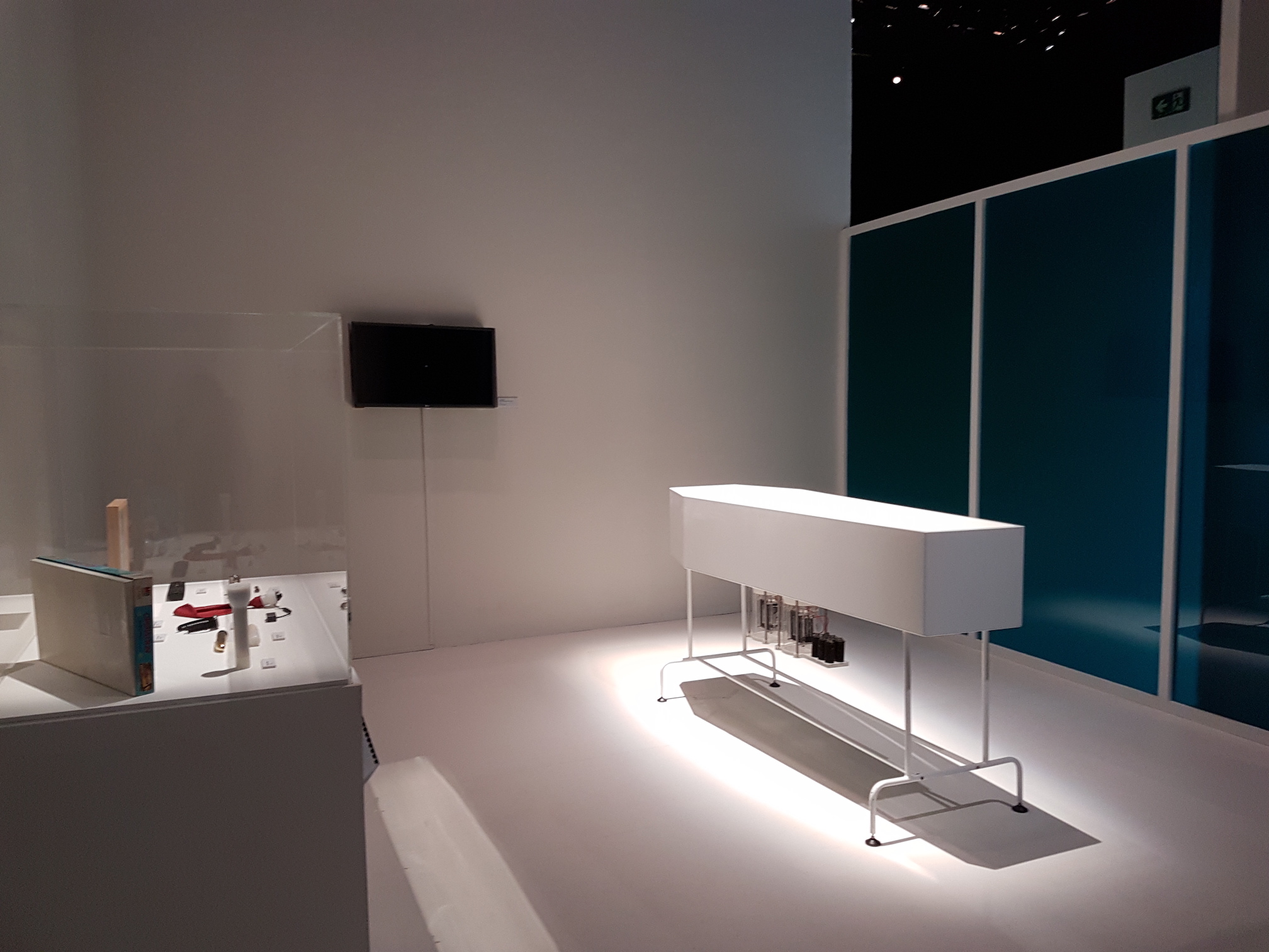
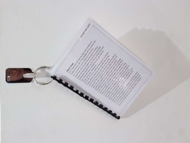
One of the works which caught my eye was Afterlife by design duo James Auger and Jimmy Loizeau. Afterlife is a speculative art installation which proposes an alternative life after death. It details how the remaining energy from dead bodies can be transformed into batteries, which can then be used by loved ones after one’s passing.
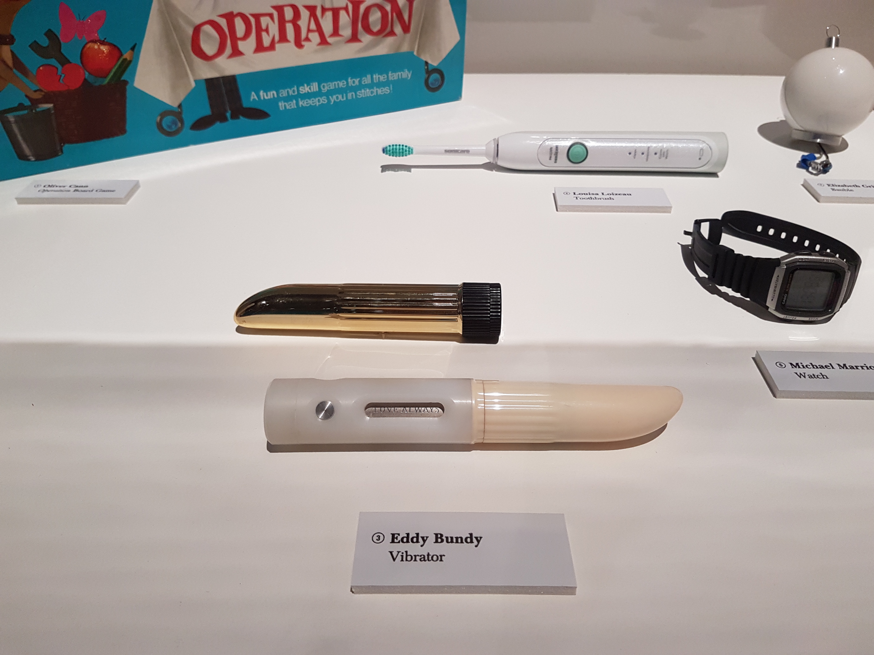
Bounded by medical privacy screens, the installation setup is sterile and clinical. We are presented with a white casket-shaped centre piece, presumably the device used to convert dead bodies into battery cells. Alongside this pristine machine are testimonials, surveys and several rather everyday objects in a display case.
Upon closer inspection, these objects (e.g. clocks, common batteries, vibrators, electronic toothbrush) are examples of vessels that people want to embody after their deaths. Their lives become repurposed as a functional object which serve a purpose even after their deaths.
The question of what happens after death is such an intrinsic human concern. Cultures and religions across the world have all come up with something in response to this weighty question. Intertwined with faith and religion, this subject of an afterlife is often surrounded by mystique and mythology. In contrast, Auger and Loizeau present an alternative option devoid of spiritual belief; their vision of life after death is based on scientific fact, certainty and utility. It also creates an opening for viewers to explore the potential of science and technology beyond the realm of the living.
It also makes us think about the extent to which a person is represented by their physical body. Although the idea of giving the physical body a second lease of life is very intriguing, I can’t help but question whether this scientific approach glosses over the importance of one’s mind, soul and thoughts.
The artworks at the Human+ exhibition present imagined realities that aren’t that far off. These advancements are exciting yet terrifying, and invite viewers to consider the trajectory of our relationship with technology. Would recommend all to visit if you get the chance! 🙂
What technique is Kusama using to unify her canvases?
Kusama uses a grid format to display these various canvases, creating a composite image. Other unifying elements include a monochrome colour palette, use of lines, geometric and fluid shapes, and a free-flowing almost automatic style of drawing.
Describe her use of space
Kusama uses both positive and negative space to convey meaning and create focus in her compositions. Although the drawings are packed with multiple repetitive elements, the images do not feel clustered or suffocating. The individual canvases create a spatial dialogue with each other.
What emotional responses do you have when standing in front of her paintings? Can you observe anything about the relationship of the size of the paintings to your own body?
I feel that the wall of canvases is very immersive. I feel happily overwhelmed by their scale and intensity. They feel very energetic, wild and erratic.
What do the marks and forms in these black and white paintings remind you of?
They remind me of visions and a whirl of monochromatic symbols. The eye motif feels voyeuristic. The shapes and imagery are rather abject, yet also peaceful and meditative due to the repetition.
2nd Room: Walk into the Tulip Room
How does your emotional response change going from Love Forever to the Tulip Room?
Going from the largely monochromatic Love Forever gallery to the technicolour tulip installation, the visual juxtaposition was stark and heightened the effect of both rooms. In the Tulip room, I felt lighter albeit a little cloistered. The repetitive high-key polka dot pattern is pretty but rather plastic and manufactured.
Does the Tulip Room evoke any memories? What are the sculptural forms telling you?
The large sculptural forms make me feel miniature, like Alice in Kusama’s strange, obsessive Wonderland.
3rd Room: My Eternal Soul
Compare the use of colour to the black and white painting in Forever Love. How does the colour affect you differently? How do you feel?
The vibrant high-key colour scheme feels brighter and more inviting. The paintings are singing a cheery visual melody. They feel dynamic and bold.
What techniques does Kusama use to unite the colour canvases?
They are arranged in a grid format. They largely follow a high-key colour palette, and share common recurring motifs such as the eyes, sac-like forms and suggestions of the female genitalia.
Compare the right and left walls. What are the differences in the emotions evoked by these different walls?
The shapes in these paintings are rather similar, however the left wall feels more rigid and grounded due to the use of black to delineate the shapes. The colour palette is also darker and cooler. It feels more defined compared to the right wall which employs a complementary colour scheme in each painting (e.g. orange and blue). This right wall feels more subtle and understated.
4th Room: Narcissus Garden
What differences do you see between experiencing the Narcissus Garden on its own and knowing/imagining Kusama’s actions during the Venice Biennale where she wore the kimono and sold the balls?
The knowledge that they were once used to make a statement about the art market and its commodification enrich the content of the installation. Without knowing this, it feels simply like a pretty visual spectacle of metal balls. However, it feels kinda sad that these metal spheres are now displayed ‘out of context’ like artefacts in a museum, regardless of their initial stand.
Infinity Nets
What is meant by the term ‘Repetitive All-over Approach’?
Kusama takes a single element and repeats this unit to span large areas. The painting’s massive scale are highly immersive and fill our filed of vision, engulfing us in the dense pattern.
Compare your emotional responses of the white Infinity Net paintings to the coloured Infinity Net paintings on the oposite walls. What happens when you stare at these paintings?
I feel overwhelmed and engulfed in these Infinity Nets. My focus drifts around the web network, moving from unit to unit. The white nets feel very calming and create a fluffy tactile sensation. The coloured nets feel more intense due to the contrasting colour schemes. They give me a lot of ‘after-image’ after staring at them.
Describe 1 of the Infinity Net paintings
‘Infinity-Nets HSO’ (2016) is a large acrylic on canvas painting which depicts a white-cloud like mass. The painting consists of a dense repetition of a single circular nit applied through the entire canvas. This obsessive working process allowed Kusama to reintegrate herself into the world through ‘self-obliteration’. It also reflects Kusama’s highly disciplined and meditative working style.
Death of a Nerve
How does the title affect your understanding and response to the piece?
Despite the playful polka-dot plushy forms, the title immediately gives the work a more grim tone, hinting at themes of death and loss.
Pumpkins
Kusama’s pumpkins represent “comfort and security” for her. Talk about an object that would serve as a meaningful representation of a part of your past or signifies your family history. What is the object and why?
For as long as I can remember, during birthdays or Christmas my grandmother would always give me pig-related gifts. Pig coins, pig figurines, pig paperweights and even pig gag gifts. This yearly routine is both sweet and amusing. On my 10th birthday, she rightly gave me 10 miniature glass pigs. They were handmade so each piglet had a distinct look and colour. When playing with them one day, I accidentally dropped one and its curly tail broke off. At the time, I thought it was a great idea to put a band-aid on its butt, which remains till this day.
Pigs are often associated with laziness and gluttony. However, to me, pigs represent a joyful simplicity, and bring to mind my relationship with my grandma, and her quirky yearly tradition.
This week we visited the Modern Colony exhibition at the National Museum of Singapore. It featured many local everyday objects such as clothing, entertainment, household items and furniture from 1925 – 1935 used by people of different socio-economic classes. This decade can be viewed as a turning point in culture amalgamation as well as women’s rights and education. Together, these various objects represent the rich visual and material culture of early 20th century Singapore which was then a fast-developing cosmopolitan city.
1920s: Style and Aesthetics
Embroidery samplesCotton dress with sash and ladies silver mesh purseGlass epergne (decorative vase with floral stems)Hanging lights with fluted lamp shades
During this decade, there seems to be a general stylistic preference for ornamental and intricate details. Floral and curvilinear motifs were popular choices to decorate furniture, lights and vases (either painted on flat or attached). There was also a focus on handicraft and embroidery during this period. This contrasts with today’s more minimal aesthetics which lean towards clean lines and crisp shapes.
I really like these decorative lamp shapes and vases. Their fluted rims resemble flowers. The firm glass contrasts with the fluid folds. The colours are also applied in gradient.
Women’s Identity and Blending Cultures
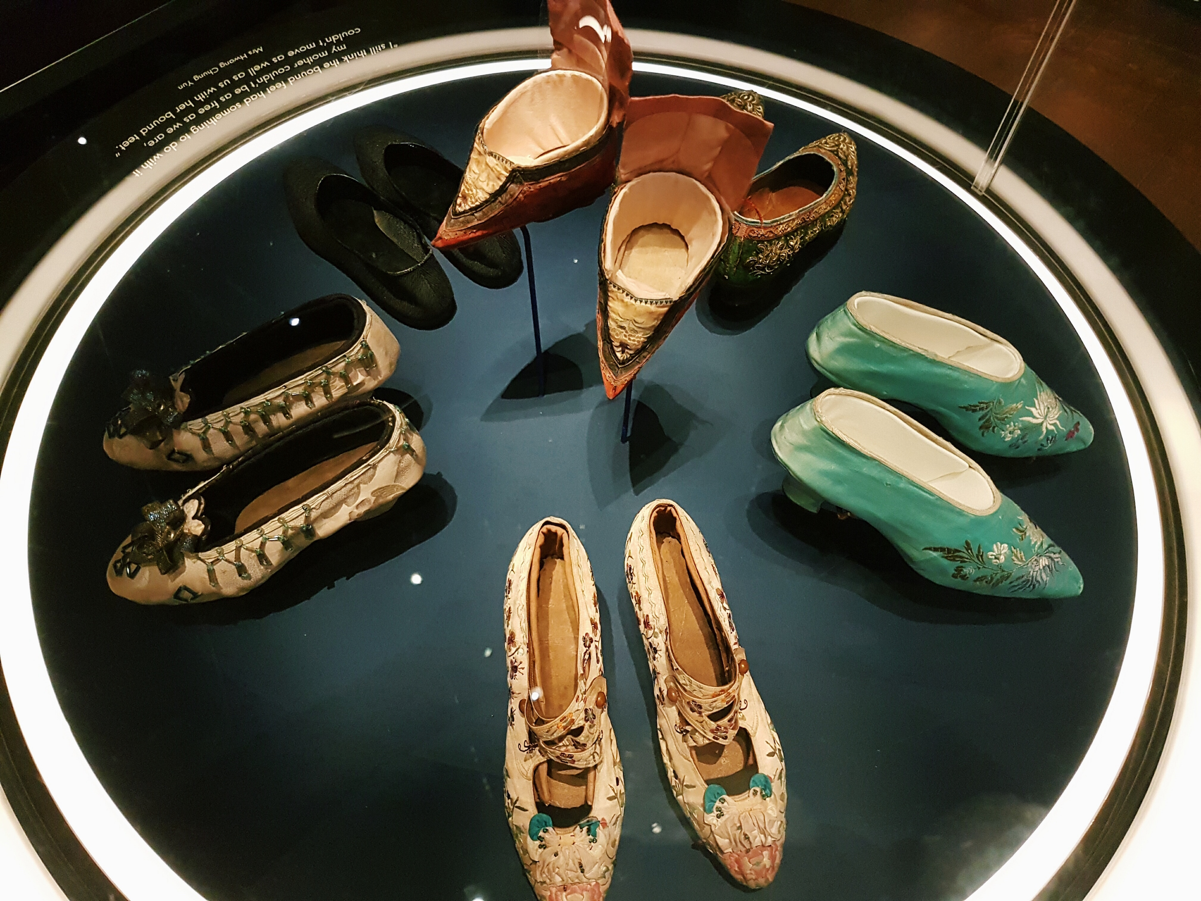
Many of the objects on display illustrate the dichotomy between east and west in the pre-war British colony of Singapore. These two influences are seen in clothing, shoes and household items, especially from wealthier households.
Women’s shoes in the 1920s – 1930s
Although traditional bound feet shoes (centre) were very pretty, they hindered movement and resulted in many women staying at home. By the 1920s, they were replaced by these exquisitely embroidered high-heeled shoes which were favoured by the modern women in Singapore.
Social dancing shoes with both western and eastern style elements
These shoes did not hinder movement and conversely were used for social and ballroom dancing. This change reflects the evolving role of women at the time and their increasing rights and freedom.
Furthermore, these shoes represent the combination of eastern and western influences, a hallmark of the cosmopolitan city. The designer appropriated style elements from the east and west and applied them to a pair of shoes as seen by the frilly bow (western) and embroidered peony (Chinese) on the toe caps.
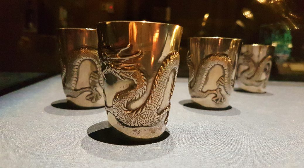
Cocktail shakerCocktail glasses
Household and luxury items also reflect this blend of East and West such as this golden cocktail shaker and beakers with a four-clawed dragon chasing a pearl. The cocktail shaker, originally an invention of western culture, is here remade with Chinese aesthetic elements and motifs.
This weekend we visited teamLab’s ‘Future World’ exhibition at the ArtScience Museum. We were kindly guided by Takasu, a member of teamLab.
The ‘blackbox’ exhibition space has a linear structure; we walk through and view the different works in a planned sequence, starting from the floral room and ending at Crystal Universe. The exhibition almost mirrors an entire universe as visitors navigate through various environments (garden, city, ocean, space).
The floral room (comprising three works, ‘Flowers and People, Cannot be Controlled but Live Together’, ‘Ever Blossoming Life II’ and ‘Flutter of Butterflies Beyond Borders’) engages our senses on multiple levels— sight, sound, smell, climate etc.— to create an immersive space. The projections react to our presence and vary with the current climate. This is a thoughtful feature as galleries often seek to create a sense of ‘timelessness’ which disconnects the space from the outside environment. However, the changing flora and fauna makes the work feel like an extension of the real world.
‘Universe of Water Particles’ by teamLab
The digitally rendered Universe of Water Particles recalls East Asian landscape paintings. The massive cascading waterfall has a strong sense of gravity and vertical dynamism as the water particles flow down. Its large scale makes us feel small in comparison and aptly captures man’s humility before nature and the elements. I like how the work incorporates Eastern aesthetics and retells classical subject matter like landscape painting.
Many of the works employ soundscapes to intensify our experience of the environment. In 100 Years Sea, the soundscape becomes more solemn and severe as water levels rise, submerging the islands. Similarly in Crystal Universe, sound is used to emphasise the movement of the lights as they rise and fall to form constellations. It also uses mirrors and repetition to mimic the effect of infinite space, lending an impactful ending to the exhibition.
Future World does not explicitly deal with divisive issues commonly discussed in contemporary art such as politics, gender or race. Instead, it highlights the importance of play through relatable topics which are common to everyone such as our way of living, transportation, nature and collaboration. Perhaps in our increasingly tense and divided world, we need some collaborative ludic play to let our opinions and intellects take a step back and let our senses come forward. The works are easy to appreciate, if not for the ideas and concepts they embody, then at least for their beauty as a visual spectacle. Spectacle isn’t a bad thing. TeamLab aims to make people happy and I think they succeed in doing so.
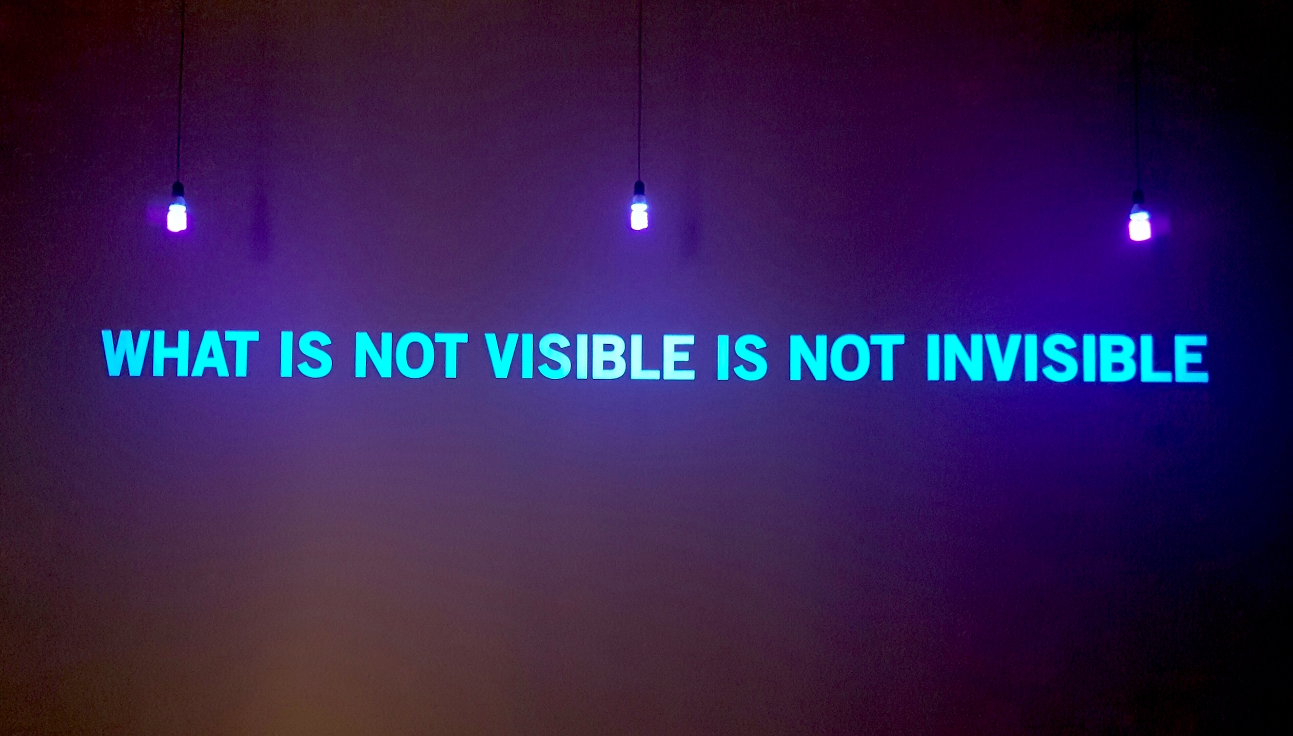
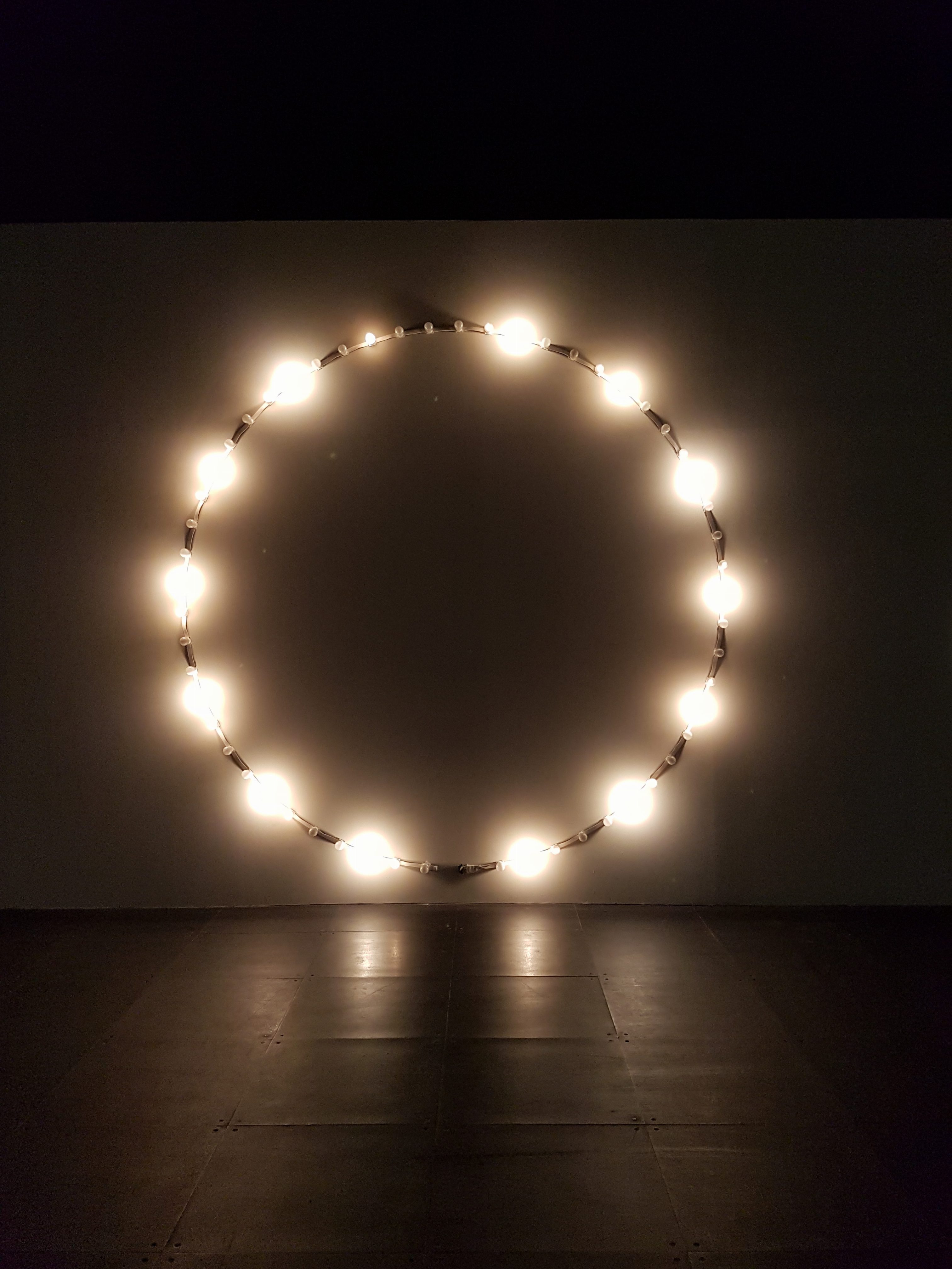
WHAT IS NOT VISIBLE IS NOT INVISIBLE is an ongoing exhibition at the National Museum of Singapore featuring works from the French Regional Collections of Contemporary Art (FRAC). The space is set up as a black box and presents 34 works by 32 French and international artists. The exhibition is titled after Julien Discrit’s work What is not Visible is not Invisible (2008) which is strategically displayed in front of the exhibition entrance.
What is not visible is not invisible (2008), Julien Discrit
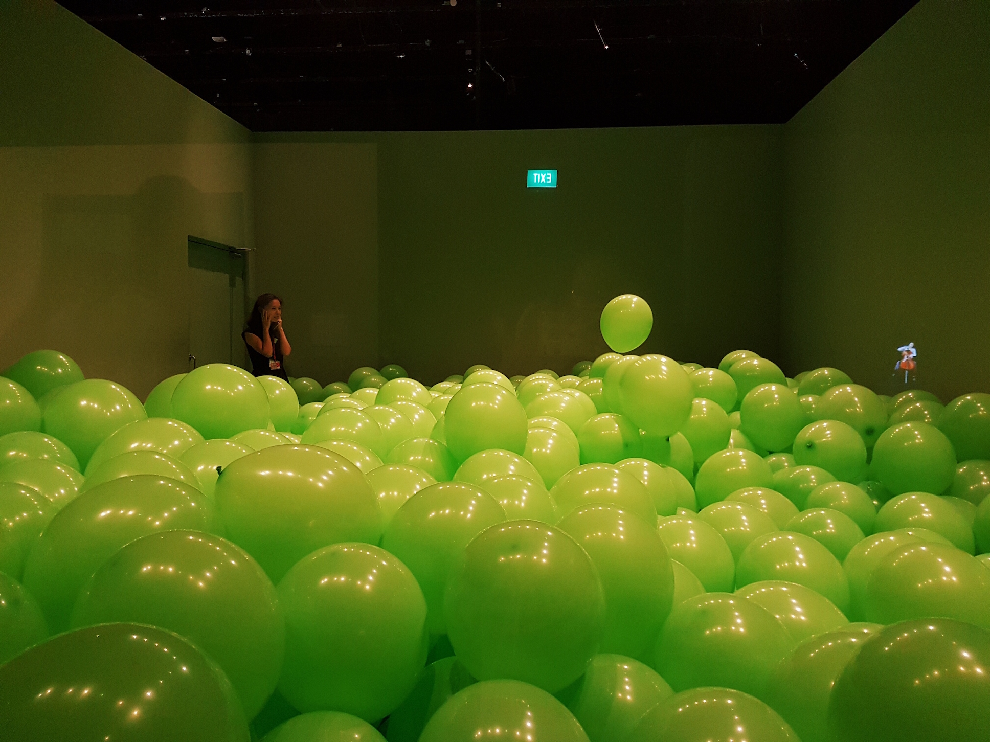
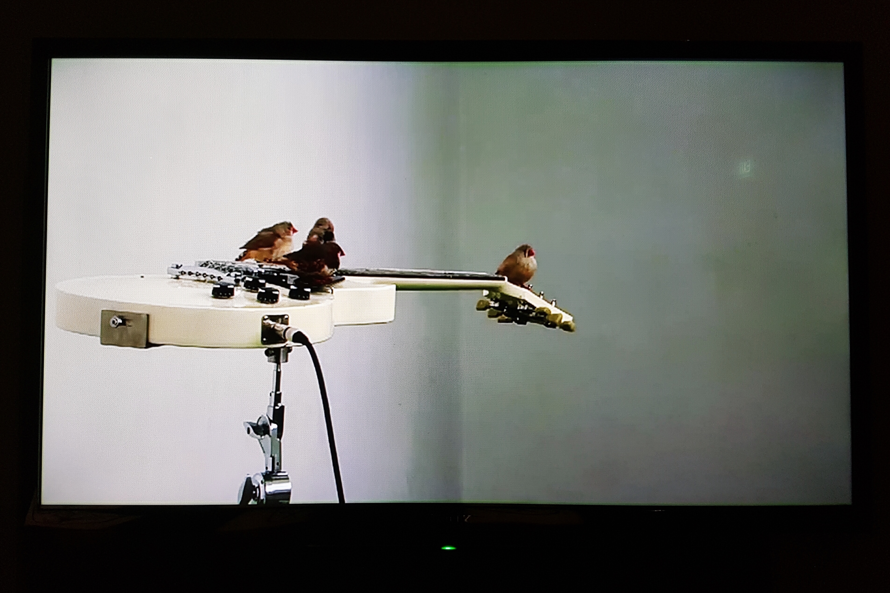
The exhibition features a diverse body of video, sculptural, immersive and interactive installations. For example, Martin Creed’s Work No. 262, Half the Air in a Given Space (2001) is a room filled with large green balloons till waist-level. From Here To Ear (2008) by Celeste Boursier-Mougenot and Ariane Michel shows the video documentation of an interactive installation where songbirds ‘play’ music on electric guitars. The selected works are very accessible, in terms of content and as a visual spectacle, making the exhibition a great introduction for viewers who are new to interactive art.
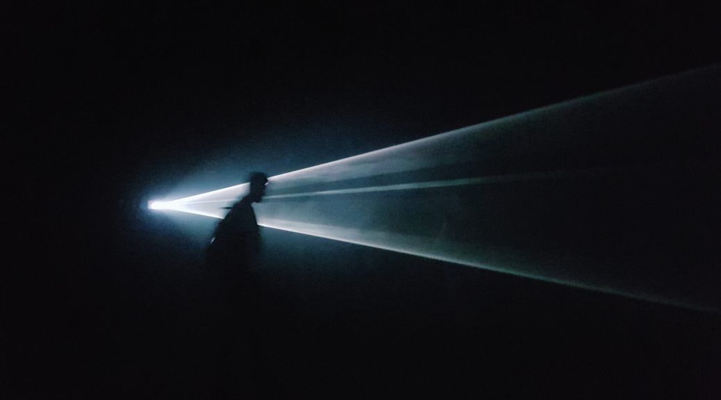
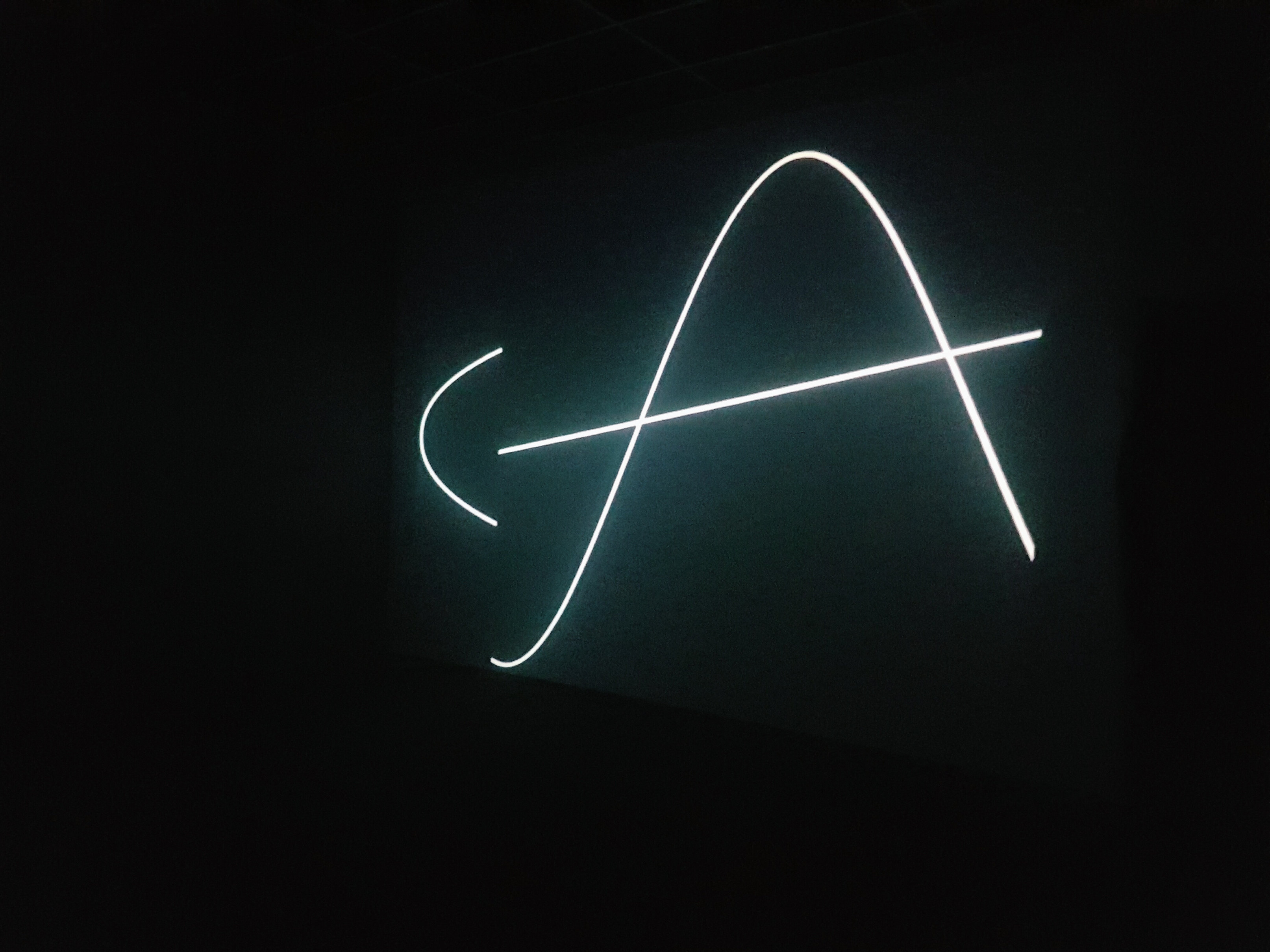
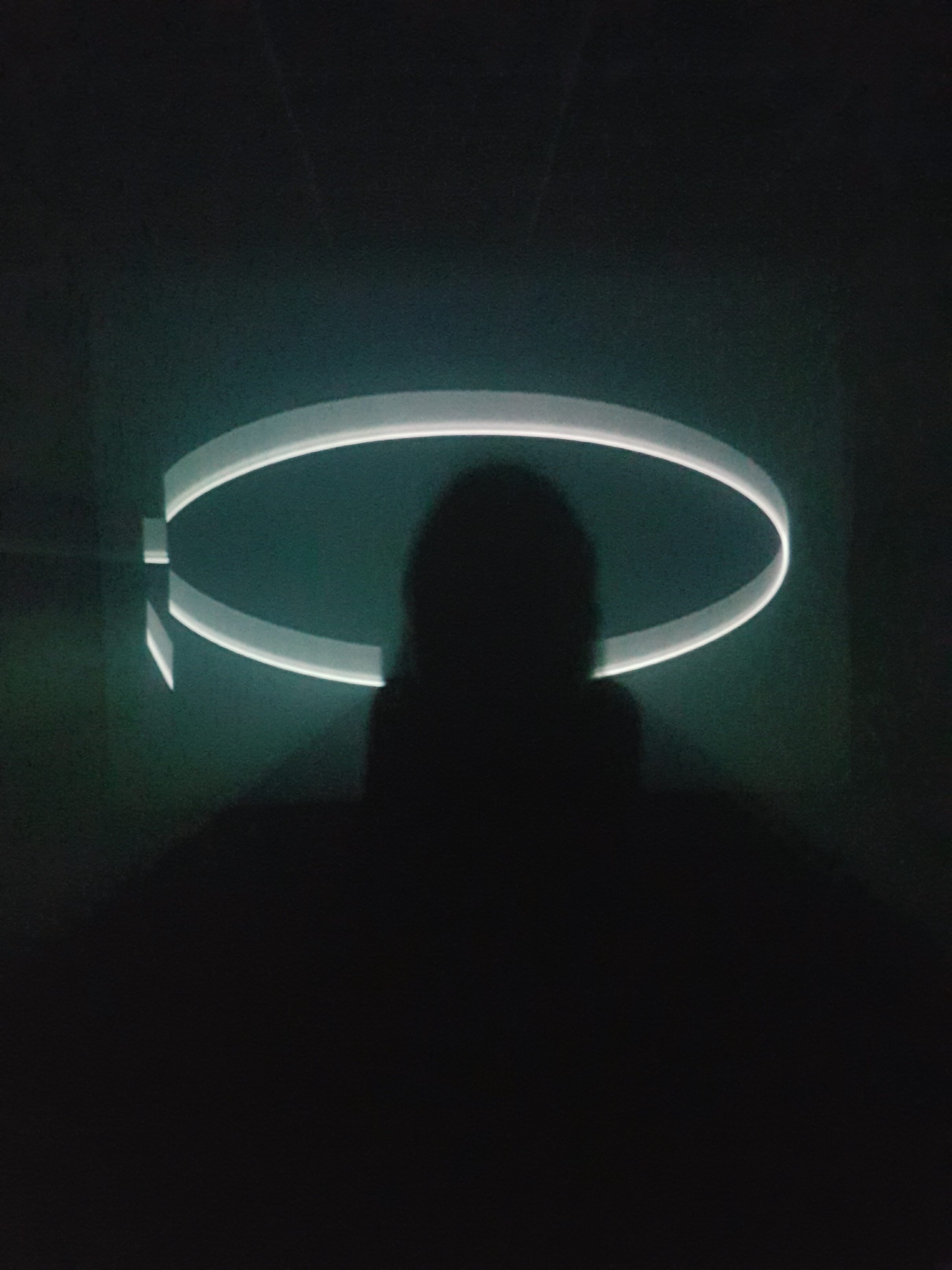
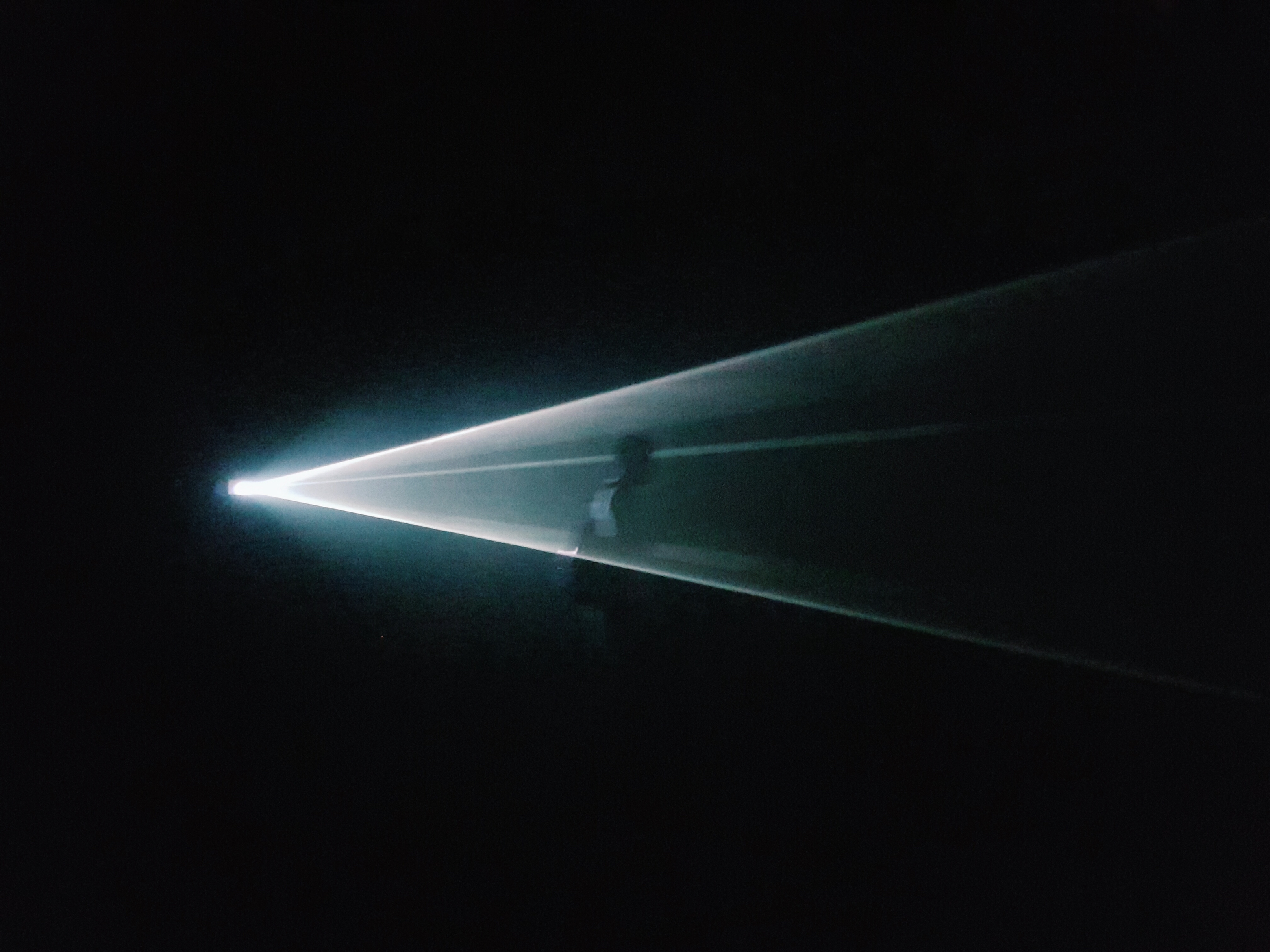
The work that most inspired me in the exhibition is You and I, Horizontal (2005) by Anthony McCall. I first encountered a similar work by McCall, titled You and I, Horizontal II (2006), last summer at the Australian Centre for the Moving Image in Melbourne, Australia. I was mesmerised by it then and am thankful to be able to experience his work once more in person.
The installation setup is relatively uncomplicated and comprises a computer, computer script, a video projector and haze machine set in a very dark room. The video projector on one end of the room projects white curved lines onto a blank wall. The curve patterns slowly morph between ‘S’-shaped curves, full circles and colliding lines (visualised from math equations) in 50 minute cycles. A curtain is installed at the entrance to block out external light, creating an intensely dark environment.
You and I, Horizontal (2005), Anthony McCall
The hazey atmosphere (due to the smoke machine) sharpens the projected light beams and forms an ephemeral membrane-like space. The darkness further distorts our sense of space and we likely perceive the room to be much larger than it actually is.
Starting out as an experimental filmmaker in the 1970s, McCall is known for his iconic ‘Solid Light’ installations which combine installation, sculpture and the moving image. I think these works are brilliant as although they use relatively simple materials and methods of intervention, they are impactful and compelling. The space naturally encourages interaction and participants would try to tests the limit and boundary of this artificial space.
These immersive ‘Solid Light’ installations seem contradictory; they present the sculptural potential of light and its ability to create and define space, despite being intangible. The experience is also very sensuous and engages our senses of sight, touch, smell and time.
What is not Visible is not Invisible (2008), Julien Discrit
Work No. 262, Half the Air in a Given Space (2001), Martin Creed
Video still from From Here To Ear (2008), Celeste Boursier-Mougenot and Ariane Michel
Plus de lumière (1998), Claude Levêque
You and I, Horizontal (2005), Anthony McCall
You and I, Horizontal (2005), Anthony McCall
You and I, Horizontal (2005), Anthony McCall
You and I, Horizontal (2005), Anthony McCall
Week 3 updates: Installation setup & similar works
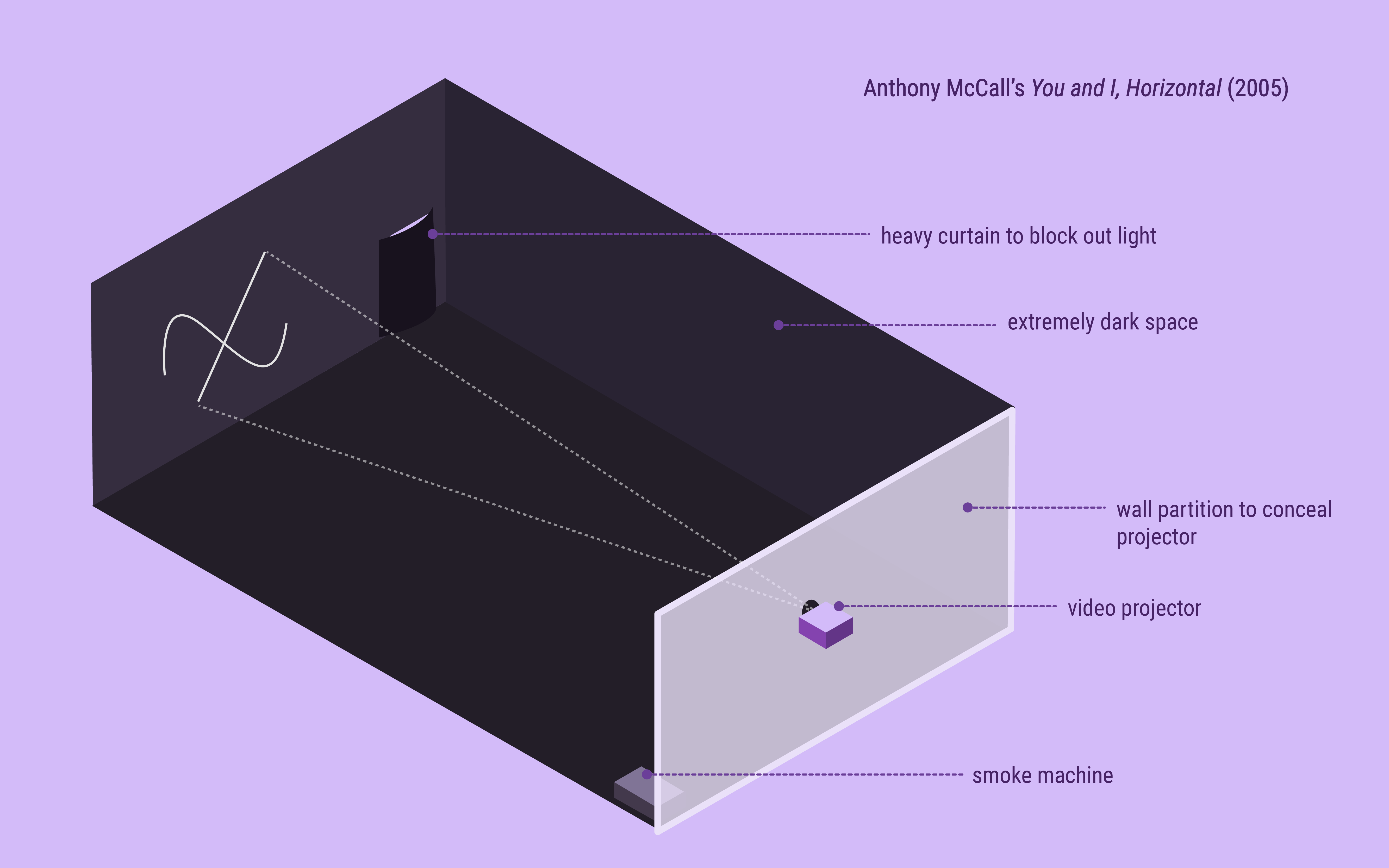
Installation setup
Spatial requirements
You and I, Horizontal is setup in an enclosed ‘blackbox’ space. The size of the room may vary depending on the gallery, but should be approximately 6 – 9 metres long to allow ample projection space.
The space should be extremely dark and only illuminated by the projection itself. A heavy curtain should be installed over the entrance to block out external light.
The vents of the projector also emit residual light which can be distracting in a dark room. Hence, the projector body should be covered up either using a plinth and box, or behind a hoarding wall with an opening for the lens as seen in the diagram above. This may vary depending on the layout of the room.
A smoke machine is used to reinforce the light beams. It should be placed on the floor in the far corner to prevent participants from accidentally tripping over it.
The wall opposite the projector is the projection surface. It should be blank and primed so the projected image will be crisp.
Comparison with other interactive light installations
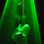
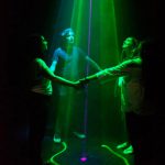
Assemblance (2014) by Umbrellium
Assemblance (2014) by Umbrellium
Assemblance (2014) by Umbrellium
Assmeblance(2014) by Umbrellium is a collaborative and interactive light installation. It is similar to McCall’s work in its sculptural use of light to create space. Created by the participants’ gestures, the boundaries are more fluid as they can be built up or disrupted by the interaction between participants.
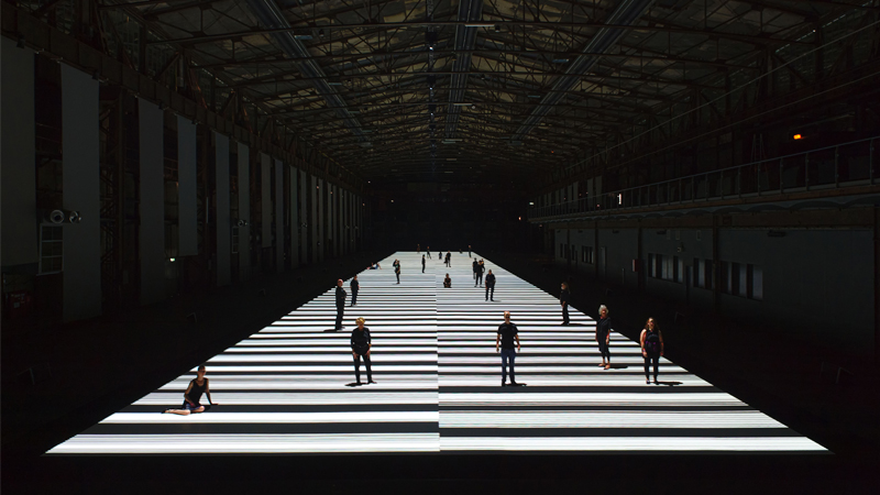
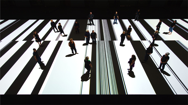
Test Pattern (100 metre) by Ryoji IkedaTest Pattern (100 metre) by Ryoji Ikeda
Similarly, Test Pattern (2008) by Ryoji Ikedais an audio-visual installation that visualises data into black and white barcode patterns. The flickering images react to a soundtrack and change at rapid speed. The largest edition of this work has been installed in a large 100 metre runway space.
Although both McCall’s and Ikeda’s works are immersive, the latter engages our auditory and visual senses more intensely due to its highly-synchronised soundscape and rapidly changing contrasting projections. However, McCall’s work is arguably more intimate as the participant’s interactions have greater influence over the space as they move within the projection. The large expanse of Ikeda’s Test Pattern creates a very different atmosphere and instead makes viewers feel smaller and thoroughly immersed in a fast-paced artificial environment.