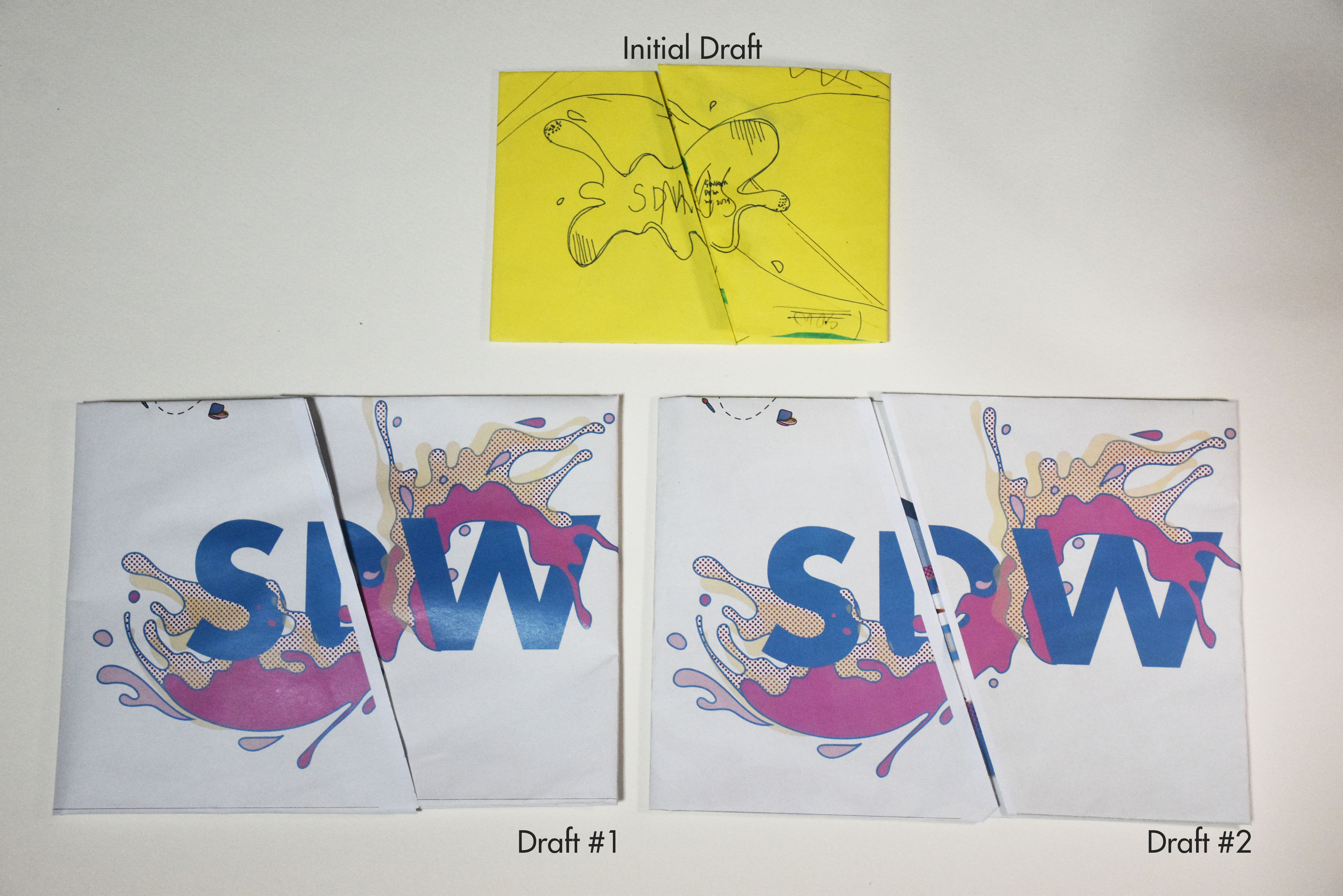
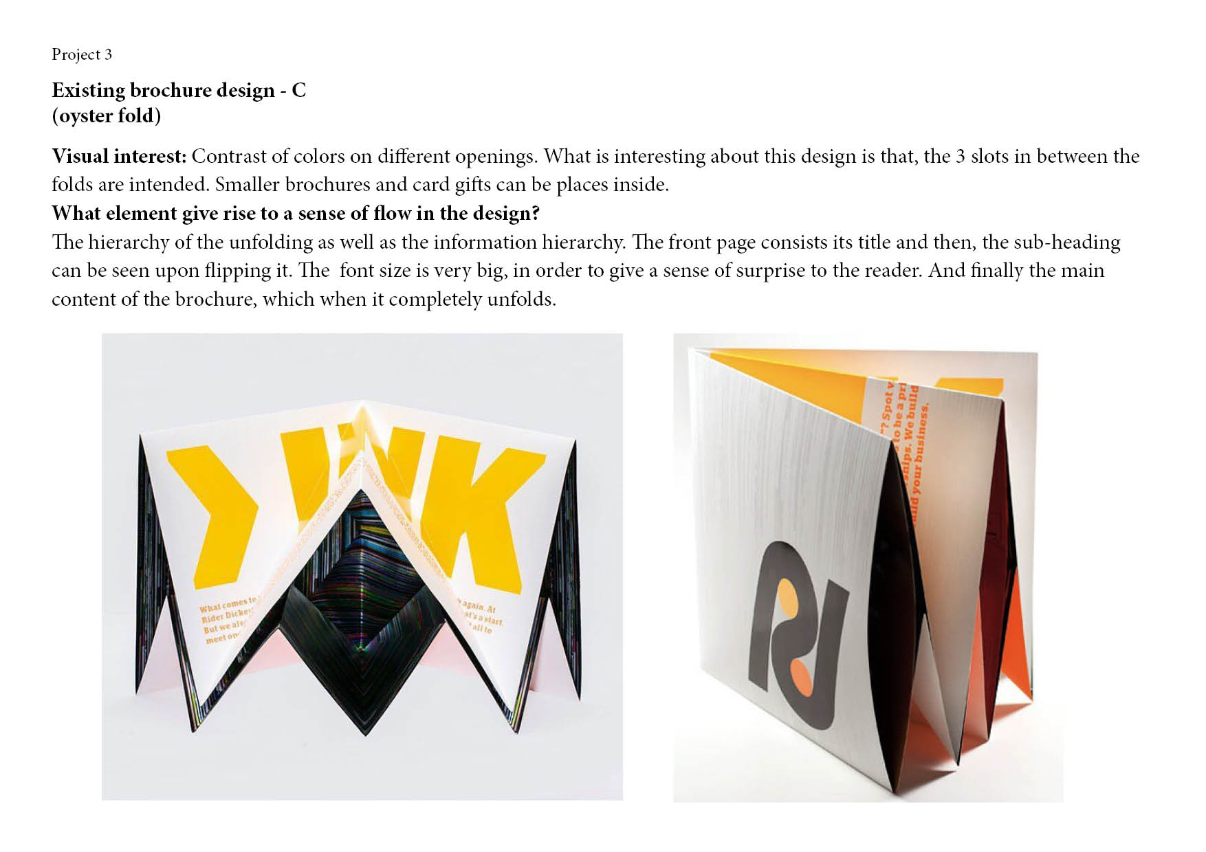
Drafts for first consultation
Problems:
- There was major misalignment. The folding lines are not accurate as I draw out the fold lines on an A4 and then scan it to import it as vector lines on illustrator.
- Besides that, the page above seems to be very unstable. The letters should not be cut off and also it does not give a sense of ‘surprise’ when the user opens it.
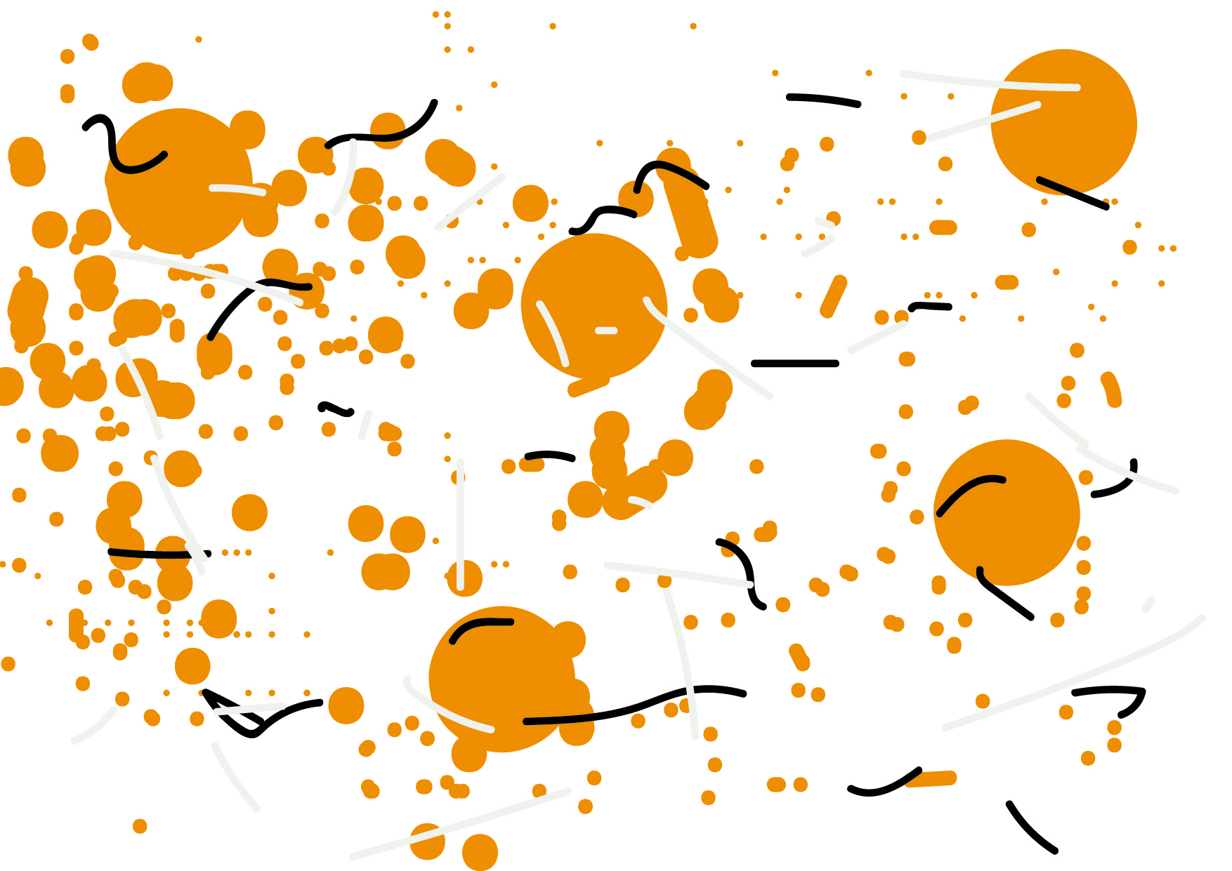
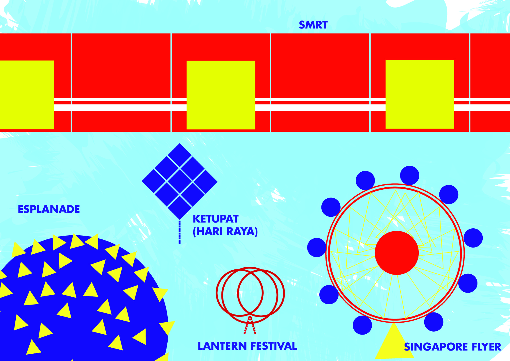
- For the content of the brochure, I had make use of my previous poster’s element graphic – which are the splashes.
- The play of angular and diagonal crops for the images, seems to be good. But due to this overall shape, there are some weird empty spaces. The blue ‘filler’ also does not serve any purpose and necessary for the design intent. Hence, for my next draft I decided to remove it.
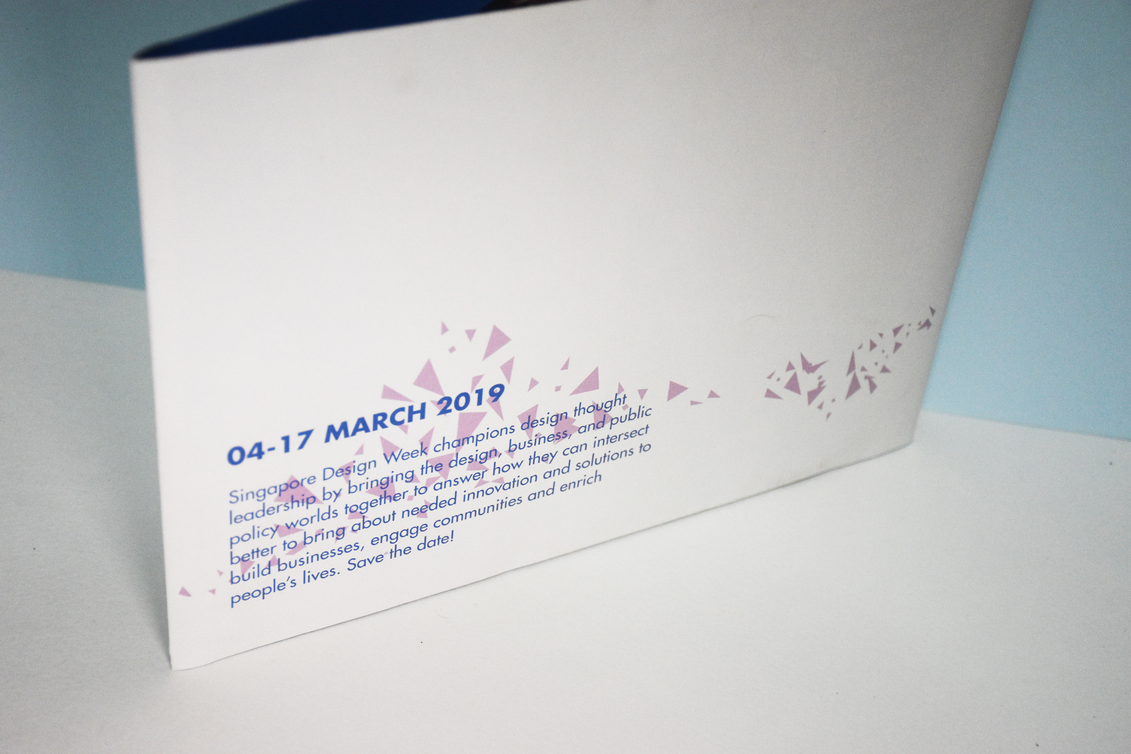
- The event description was placed on top of the brochure. It was suggested to be placed at the back of the brochure instead. So that the user will know what’s the event is about without having to open and open another page.
Rectify:
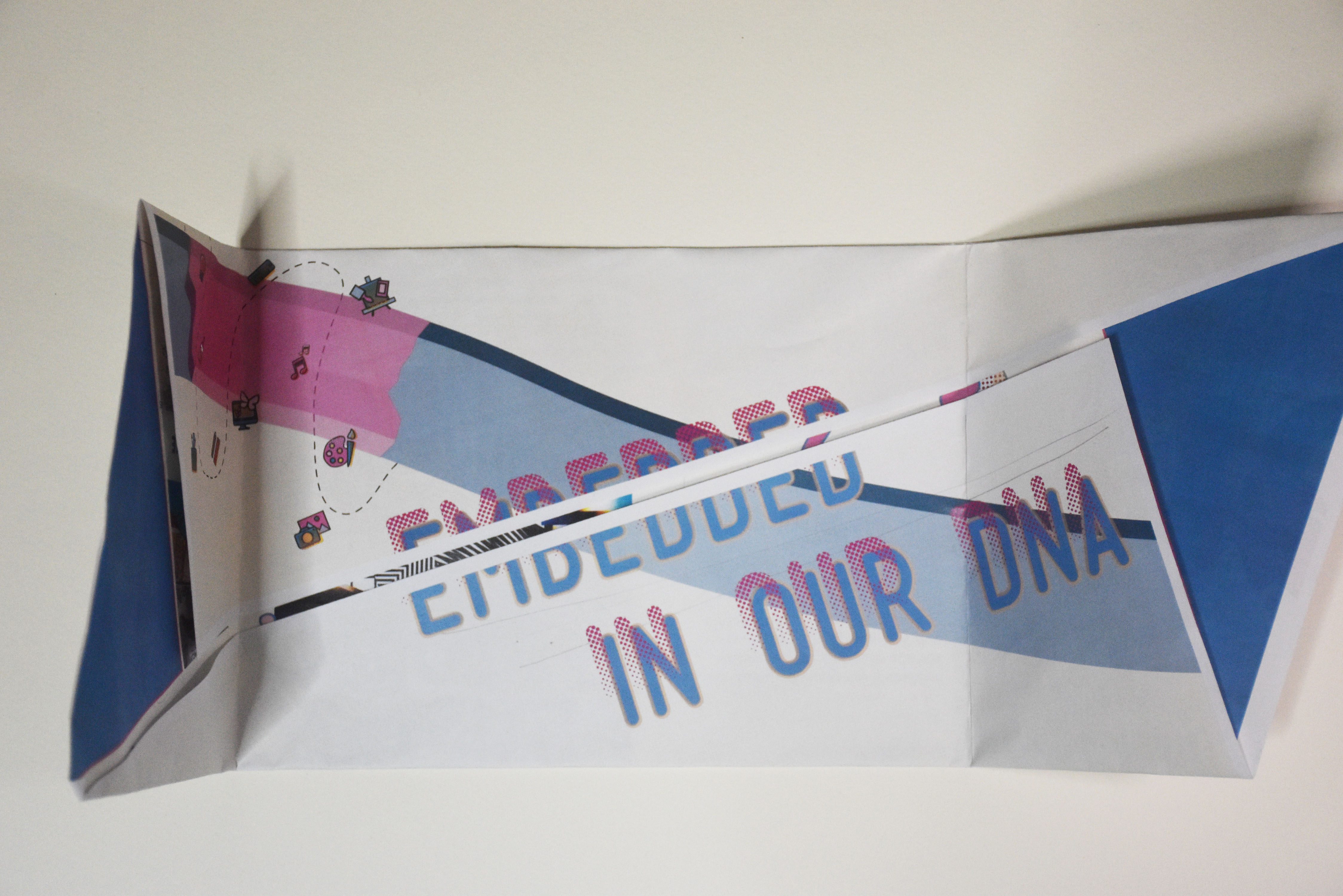
Hence to rectify the problems listed, I decided to use a much accurate method to draw out the fold lines – which is by using autocad. And it works. Even though it is really difficult to make it as accurate as possible. This is because my design is on both sides and a little shift in printing it will affect the whole grid layout design of the brochure. (*apparently ‘true colors’ print it perfectly than ‘colorvizio’ )
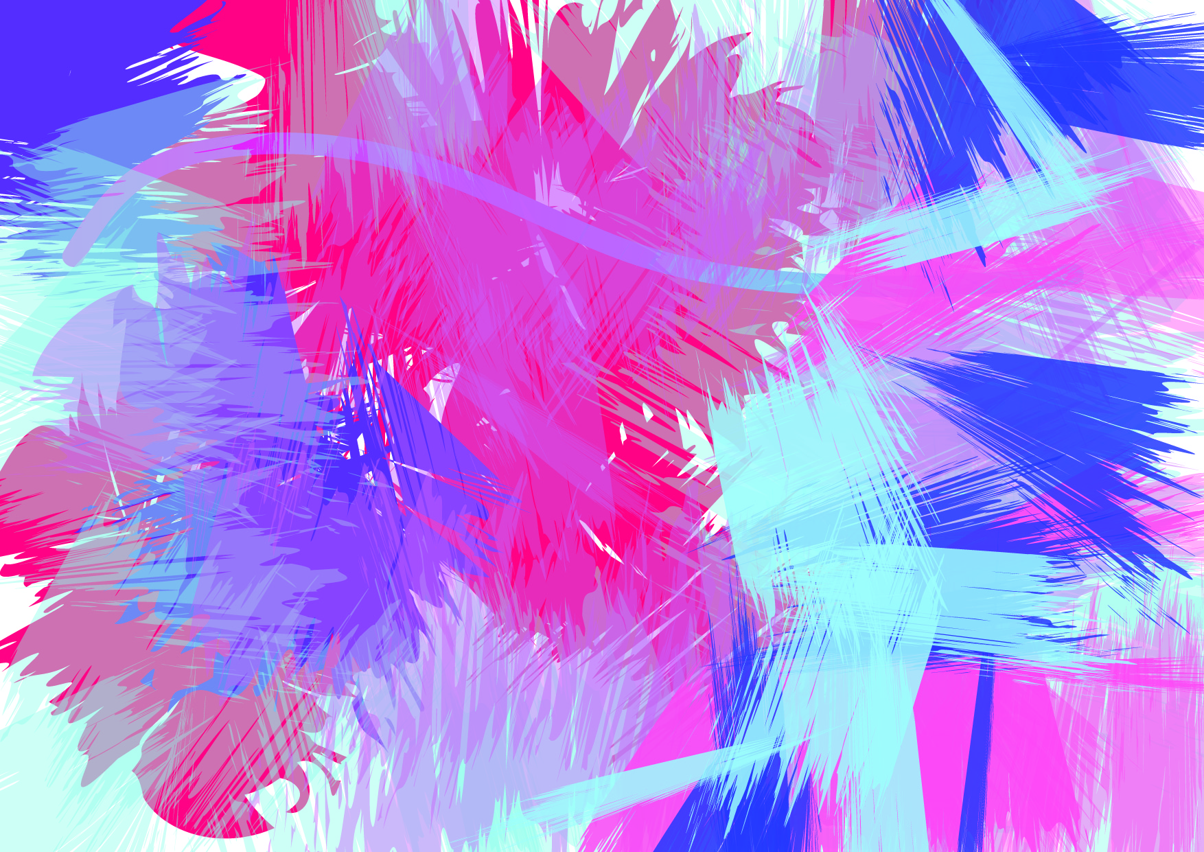
As for the ‘surprise’ element, I decided to play with the contrast of colors. The user will see a huge paint of blue, as contrast to the front page of the brochure. I intended to pique the user’s curiosity to find out more what’s inside.
However, again, the alignment problem is still there. It was suggested that I totally removed the flaps if I could not make it work somehow. Simple folds with good design layout will holds the information better than a complicated one.
Another version of the design (without flaps)


Hence, I decided to just make another version, which is without the flaps. Personally I prefer this as the content inside is very neat and clean. The slogan is then placed at the back of the brochure since the flaps are now gone. However, I feel the brochure is not really impactful. So I decided to go with my original idea and try to make the flaps design work.
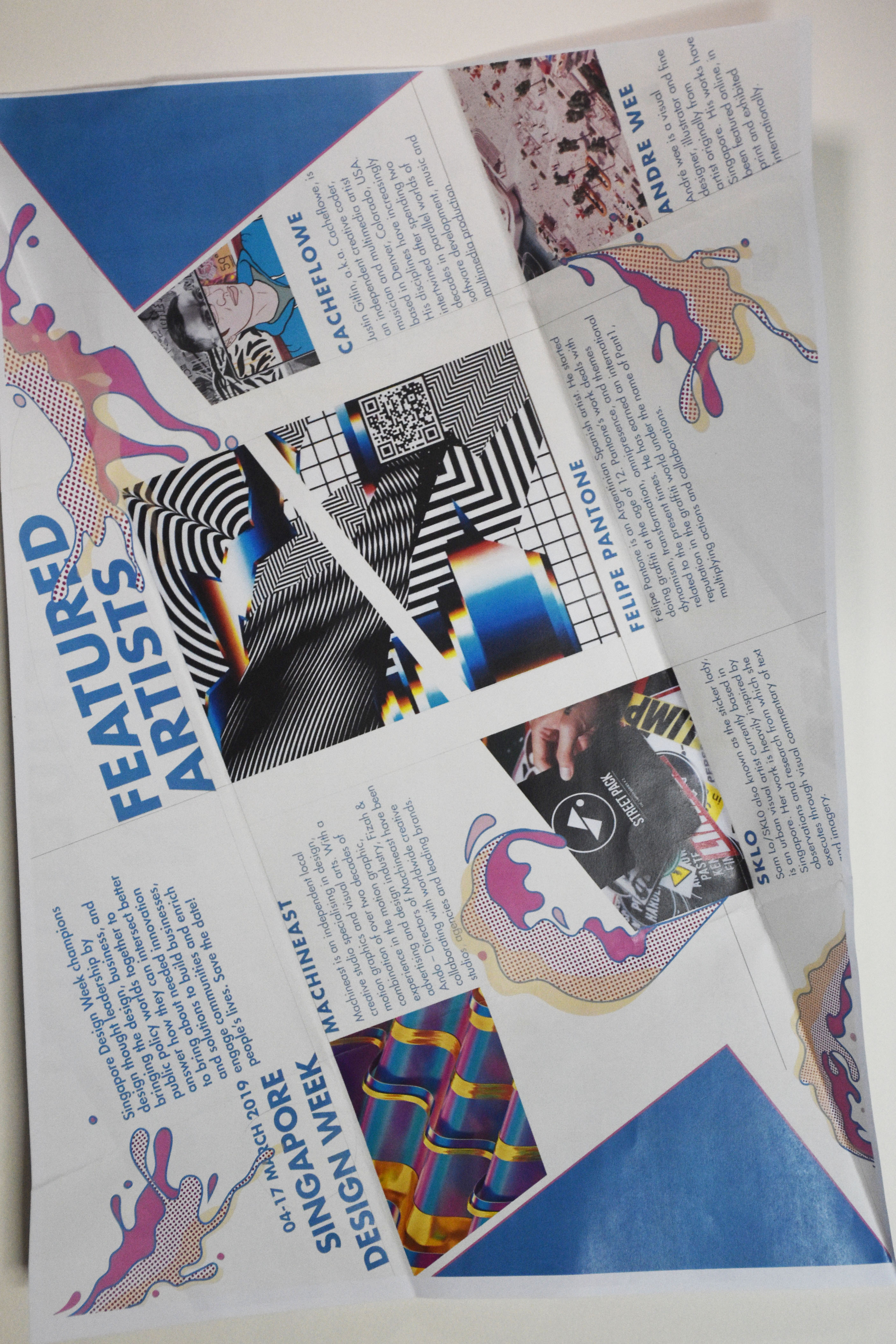
final design


Concept & ideas:
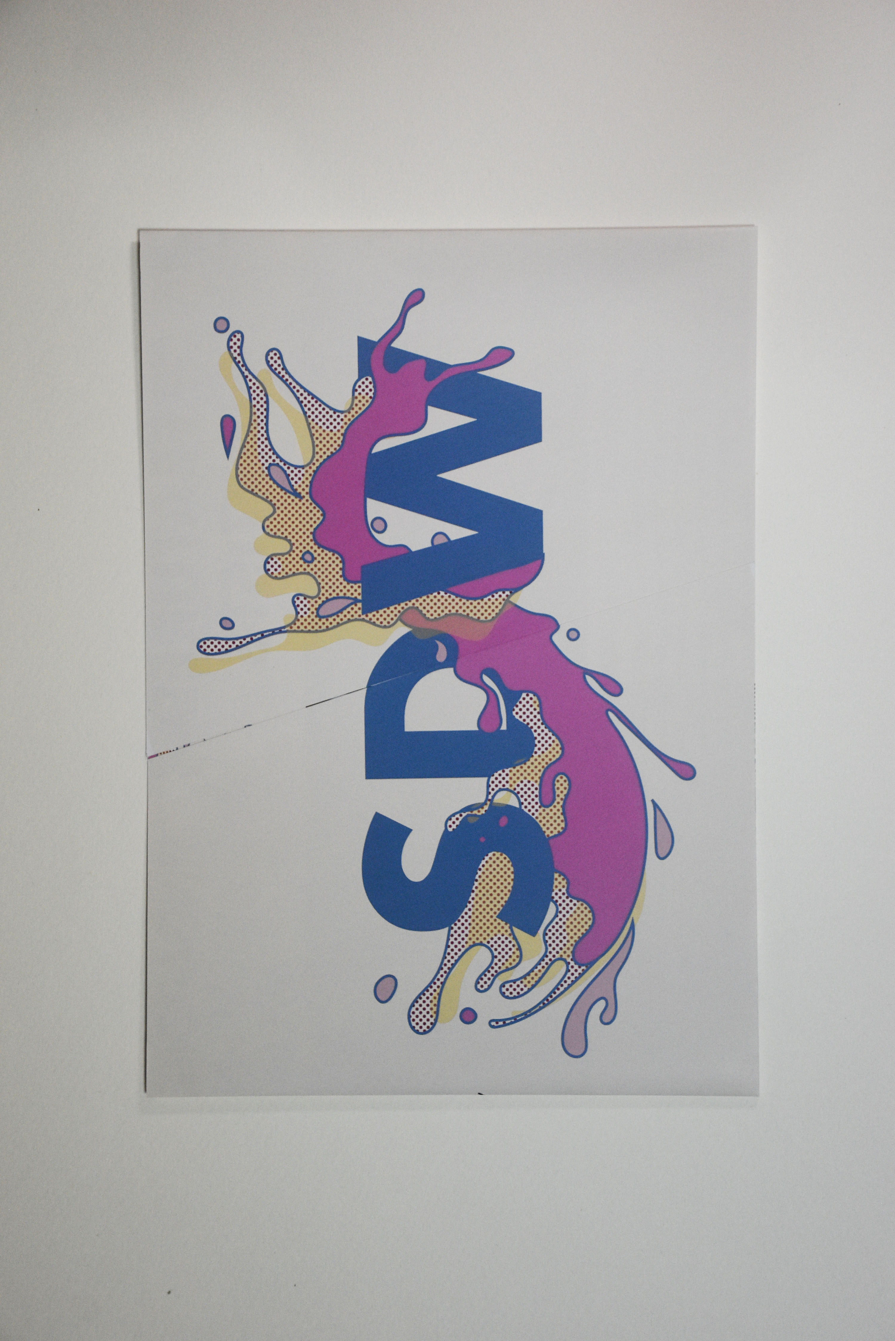
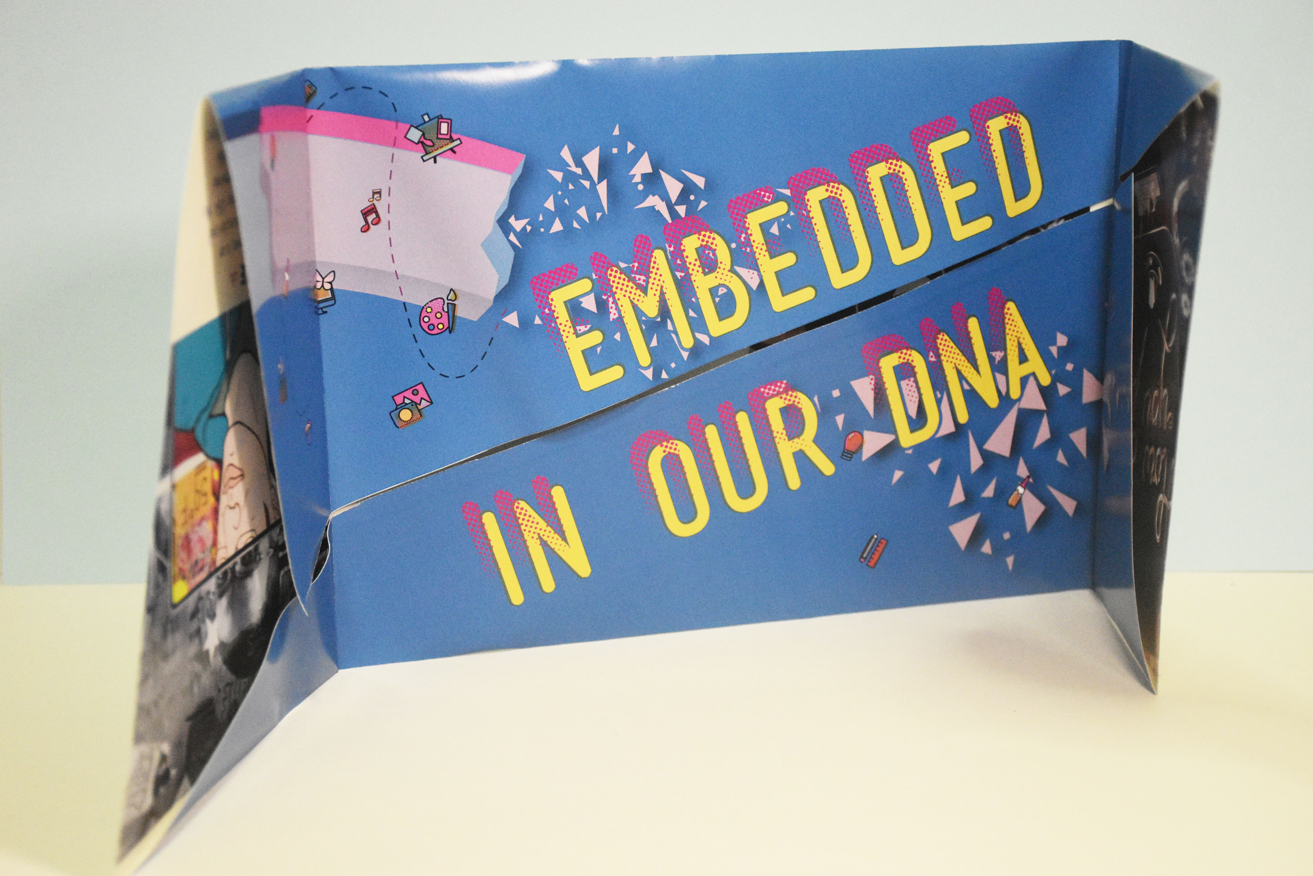
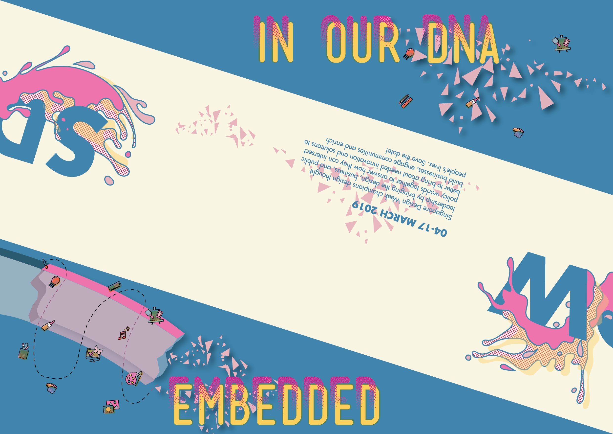
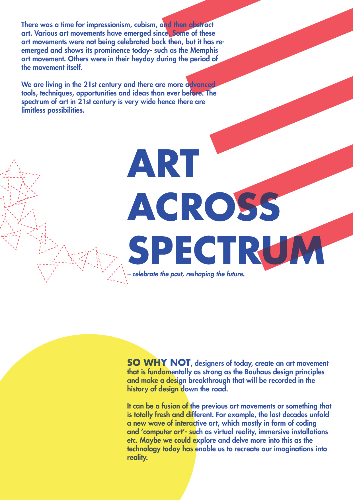
- Once the user opens up the front page, they will see the slogan ’embedded in our DNA’. This slogans seeks the user to peek inside what’s embedded in that DNA. So the visuals – as you can see, is a strand of DNA that is in dispersed form in order to reveal what is inside/implanted in that DNA.
- The play of contrasting colors is very important to create a visual interest of the reader.
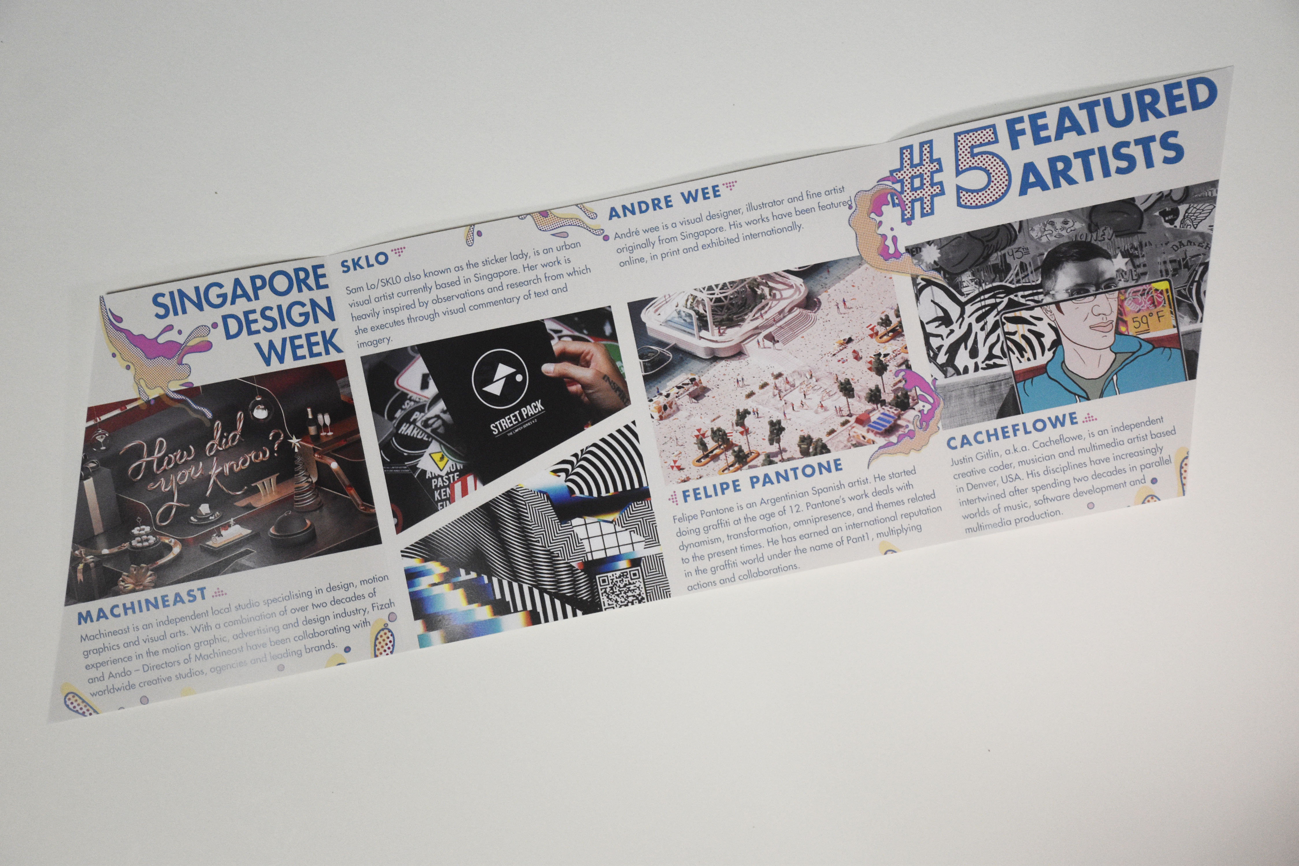
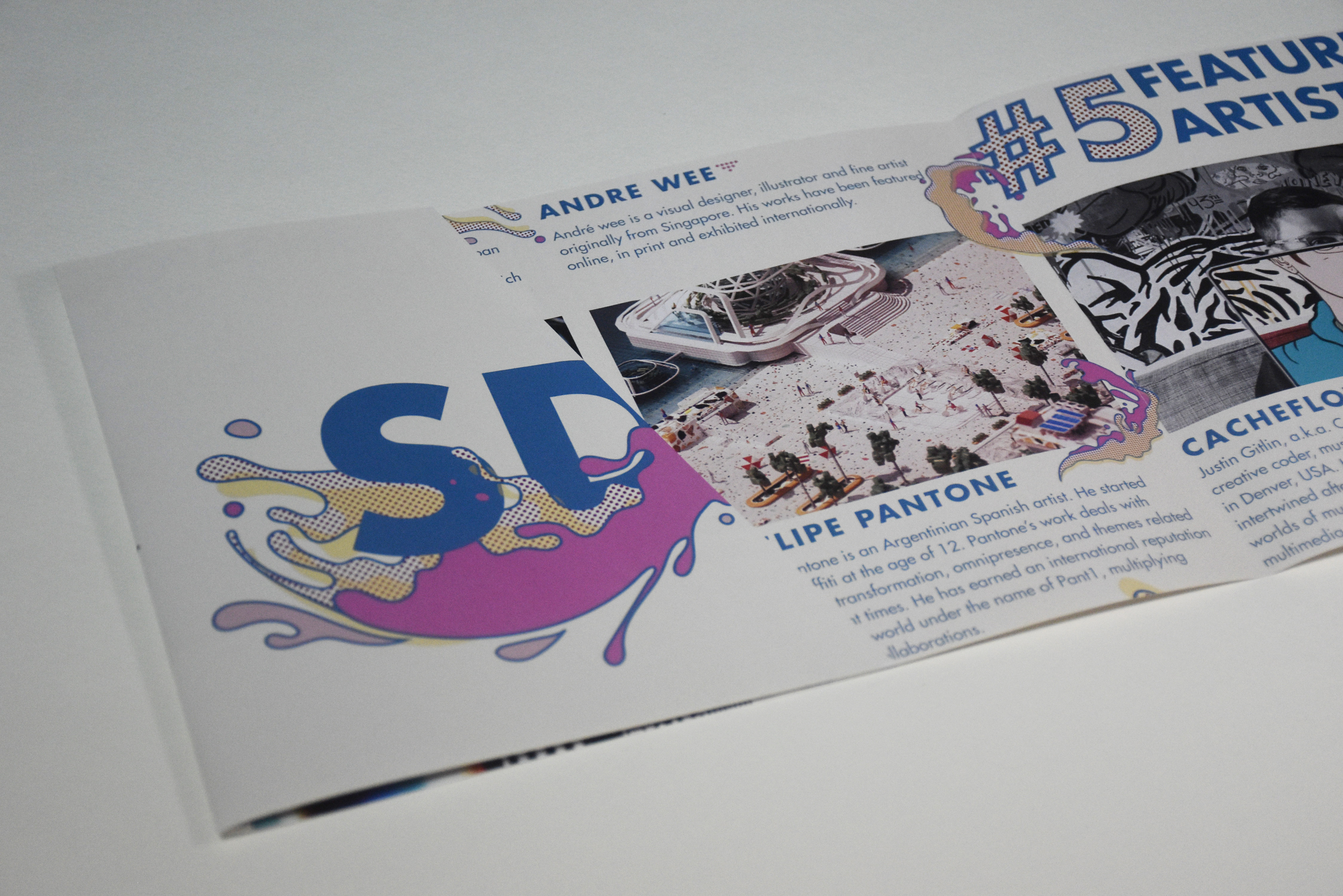
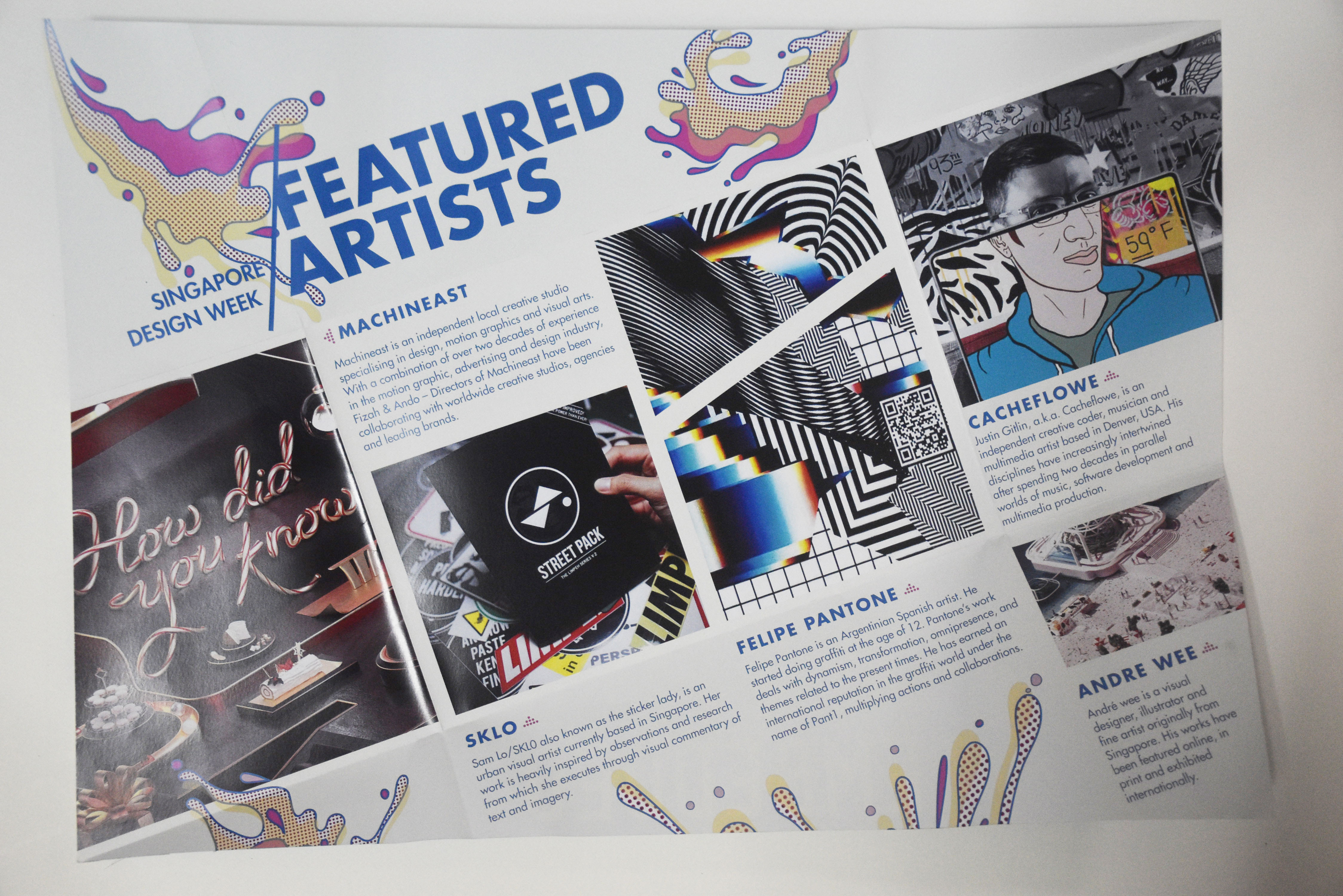
- Continuity of visuals, which are the ‘splash’ element. This is to ensure that it gives the consistent message and theme throughout the brochure.
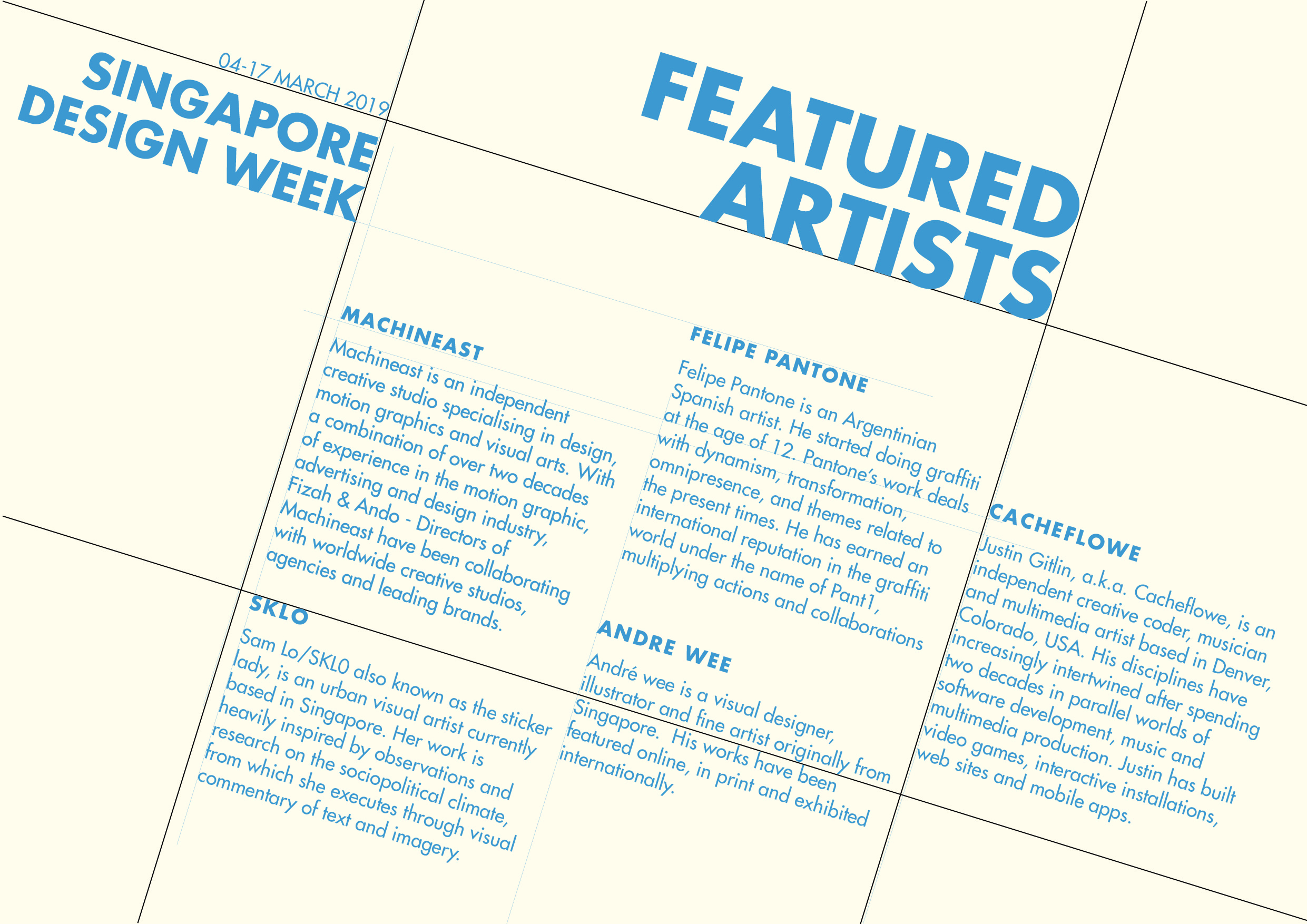
feedbacks
- The size of the brochure (A3) is too big. Perhaps can reduce the size as there are some empty spaces at the back of the brochure.
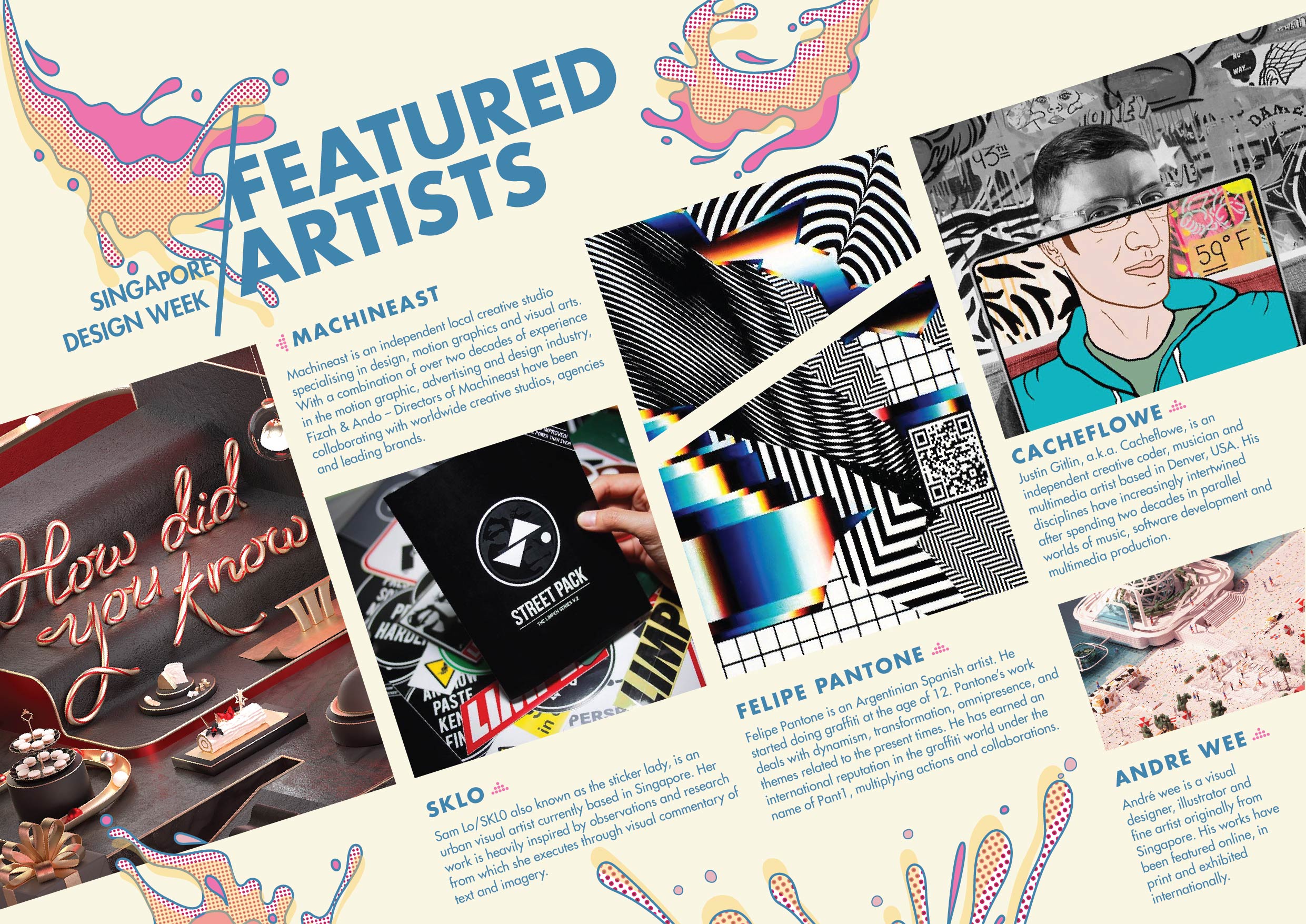
- One of the artist, Andre Wee, body text is too close to the margin and seems out of place. Suggestion is that reduce the overall text size for every artists’ description by 1 point and squeeze in Andre Wee’s part in middle part.
- Accuracy in alignment can be improved on.
- Include “Singapore Design Week” on front page as SDW acronym might be unfamiliar to some.
- At the back, include in the location.
- The arrows to indicate the images are very helpful.
- The stark contrast between the front page and the one after, is successful. ^^


Recent Comments