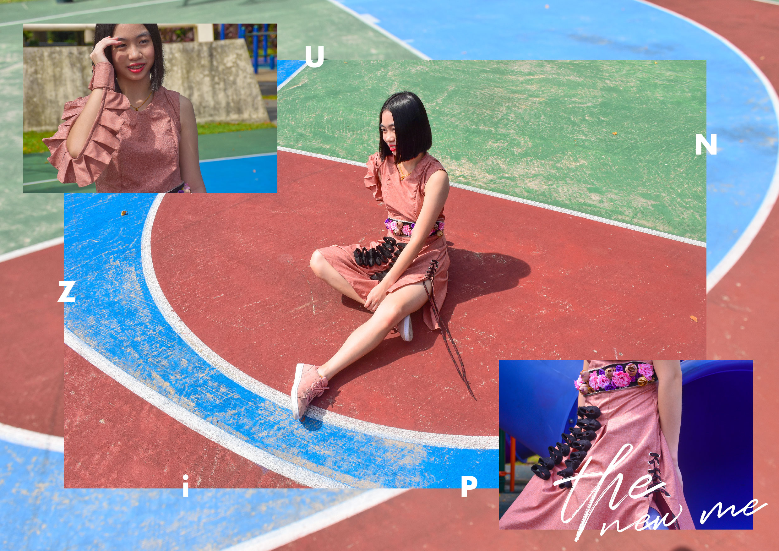
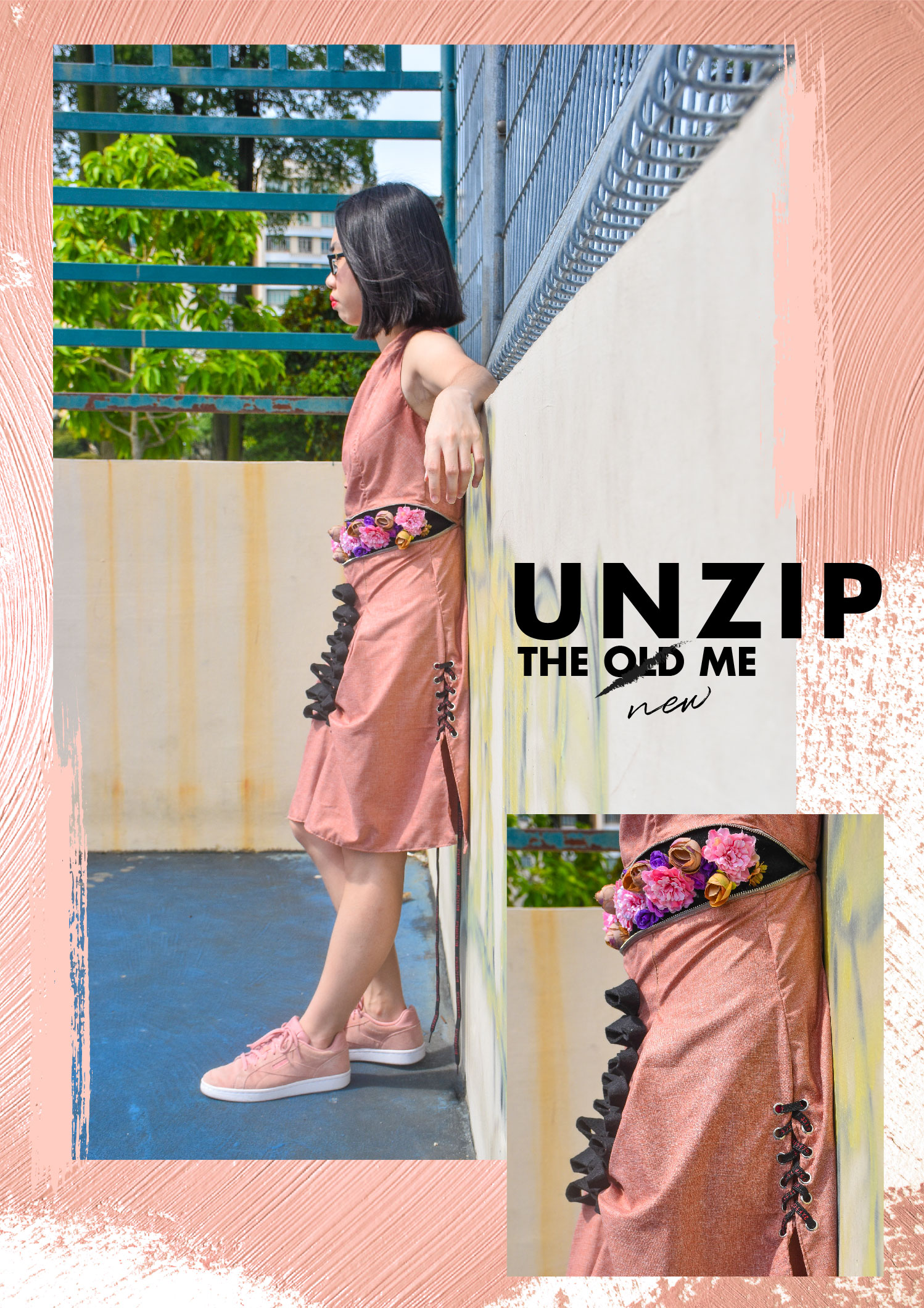
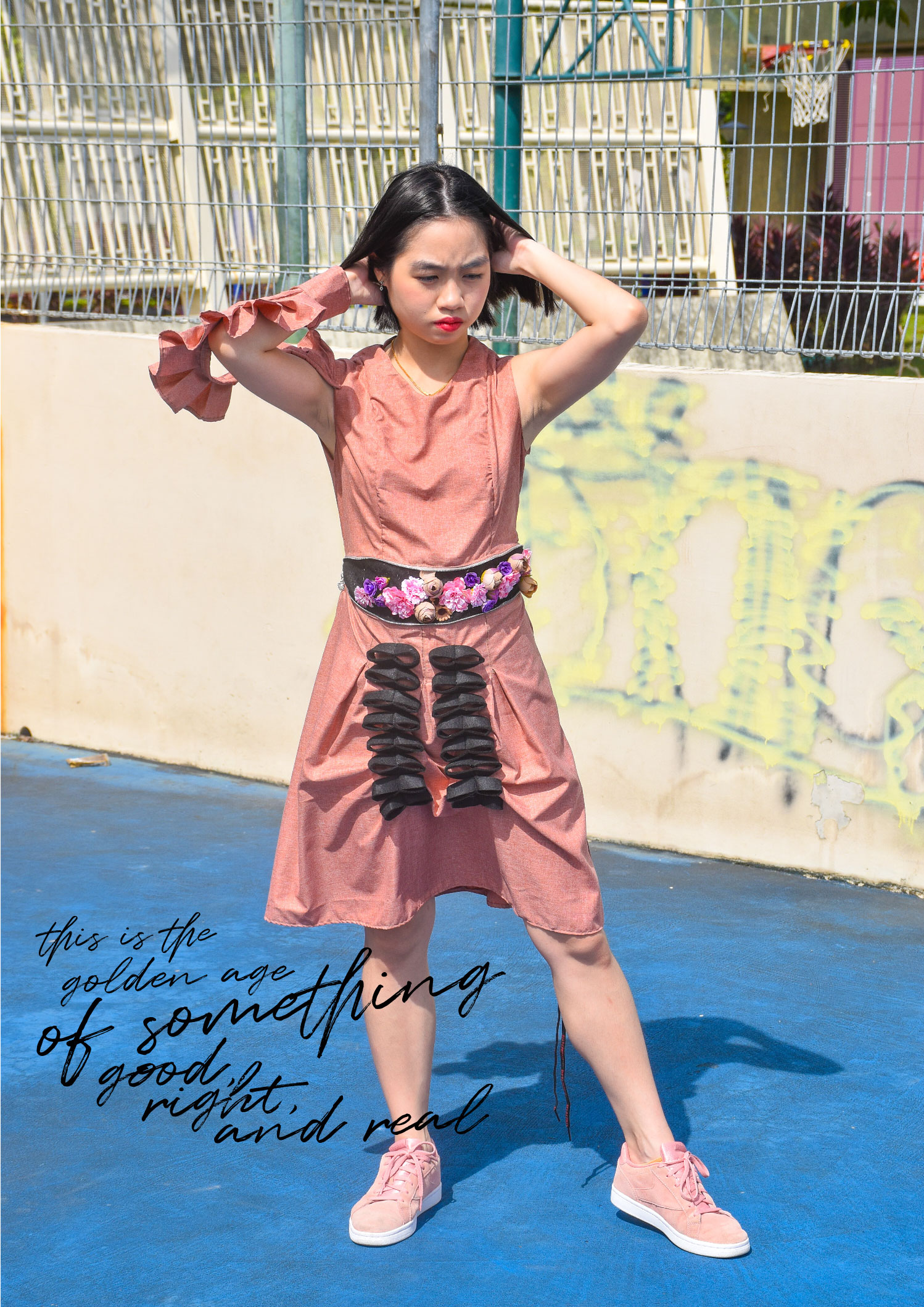
Artist statement: The concept behind this design revolves around the idea of coming of age. The certain age at which this transition takes place changes in society, as does the nature of the change. Upon unlocking the zip, the flowers bloom and this marks a new chapter in her life. A new beginning. A golden age of something good, right and real. This is to portray the narrative whereby the girl has finally graduated from high school and gained her freedom. The inspiration behind this design was spontaneous and I wanted to deal with daily normal uniforms/dresses to create something abnormal and unique. A design that breaks the norm. Hence, the base design is sleeveless high school uniform with pleats. I had incorporated certain elements such as detachable hand sleeves and eyelets with laces to tie up with the whole narrative.
Surveillance is the practice of the powerful monitoring people under their dominion, especially people who are suspects or prisoners – or today, simply citizens. The word derived from the French direct translated to “watching over“.
Steve Mann, the fellow who coined the term “sousveillance” which simply means “to watch from below”. The concept of sousveillance is whereby we shift the camera/surveillance to a much lower level.
Sousveillance has come to represent a challenge against the rising occurrence of digital surveillance and allows for a policing of the ‘police’.
This practice has become widespread and of course, it has implications on the society as well as on cultural issues.In one of Steve Mann’s essay, he writes,
“We now live in a society in which we have both ‘the few watching the many’ (surveillance), AND ‘the many watching the few’ (sousveillance).”
The practice of sousveillance has been fuelled by access to cameras in smartphones, meaning almost everyone in the western world has the tools to sousveil at arms reach wherever they go.
However, the act of capturing something takes away its freedom. Now that we live entirely in a world of recorded activities, where everything visible about us is being noted somewhere, what remains of our freedom? This is something for us to ponder upon.
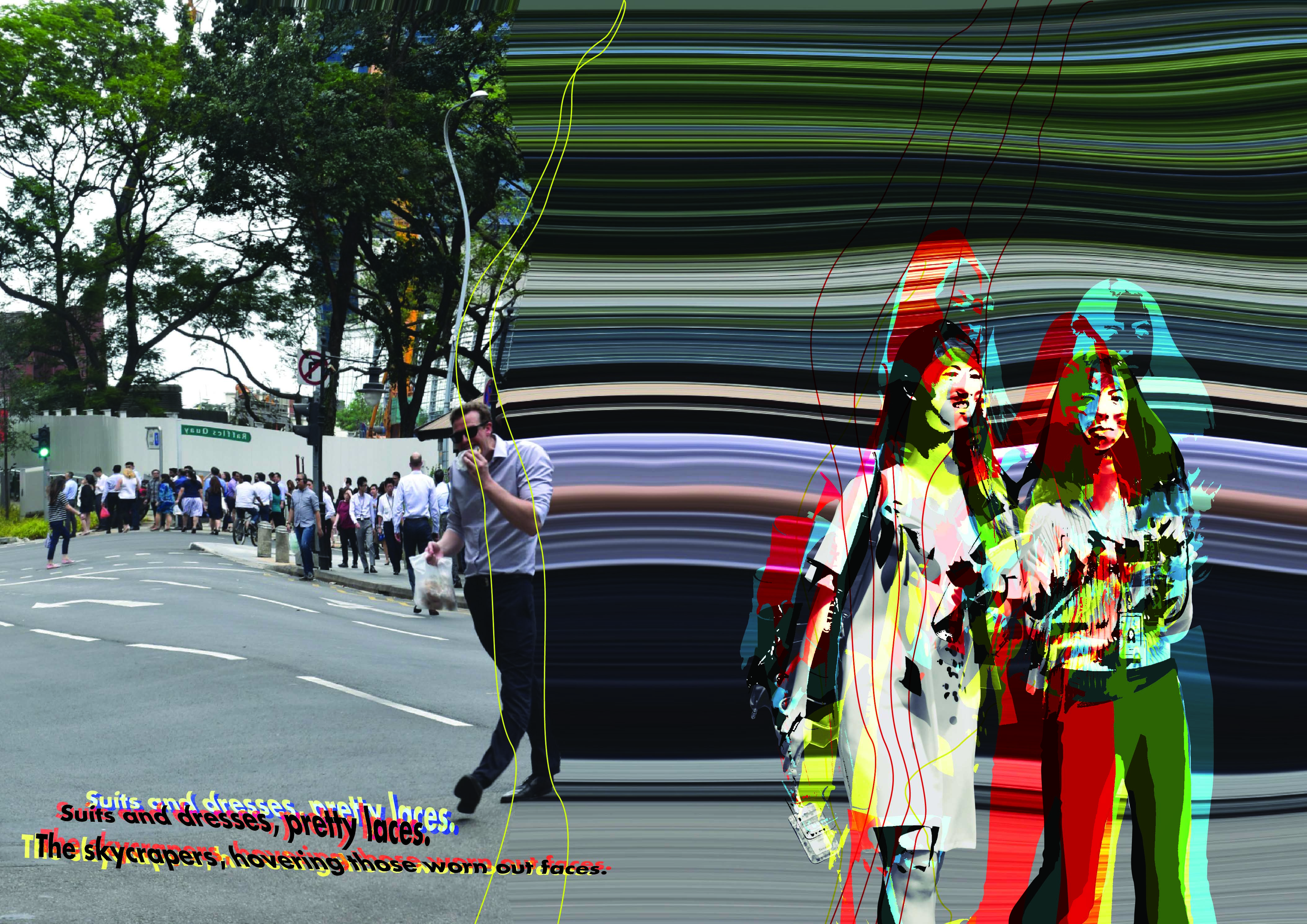
Suits and dresses, pretty laces. The skycrapers, hovers those worn out faces. Trudging along with faceless souls, living in the city that are both fair and foul. Appointments, meetings, from nine to six. This is the lifestyle of the twisted and sick. Any fool can criticize, complain, and condemn. It’s not an easy task, for they’d left their life behind them.
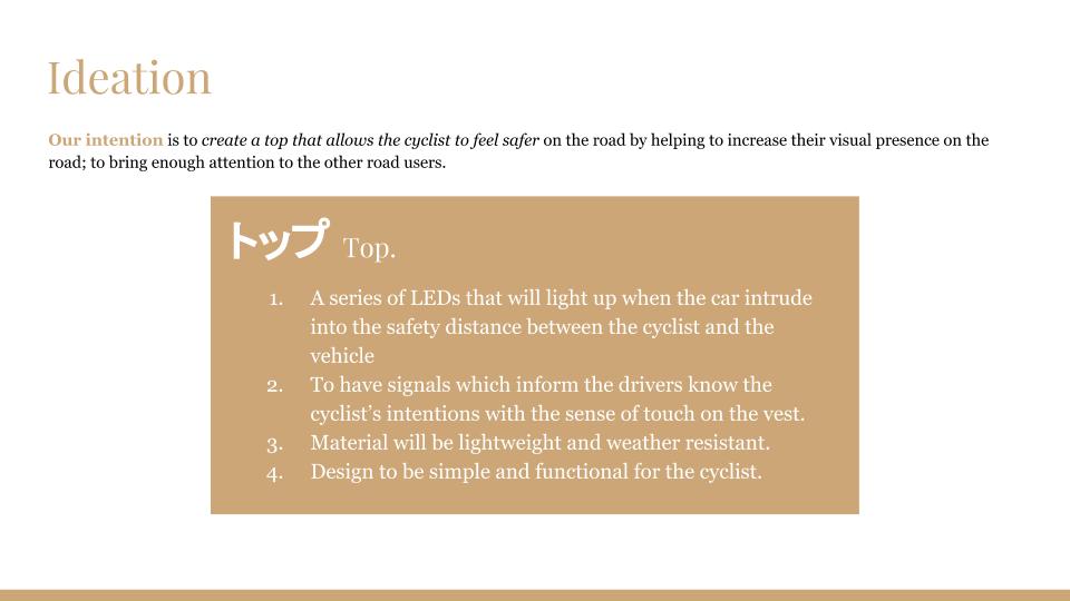
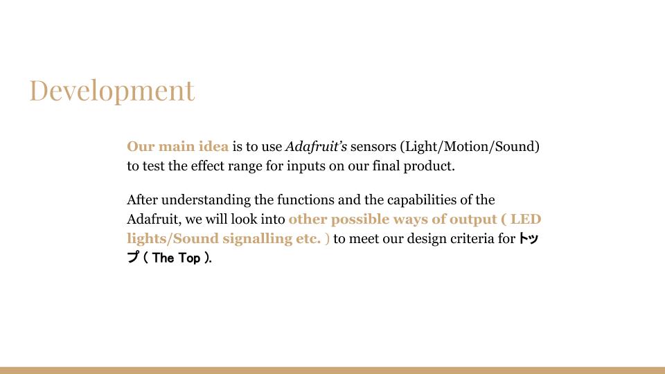
Ideation
Listing down the key words and brainstorming for ideas based on the observations that I had noted down when visited the assigned place- Raffles Place.
Process I – page 2,3
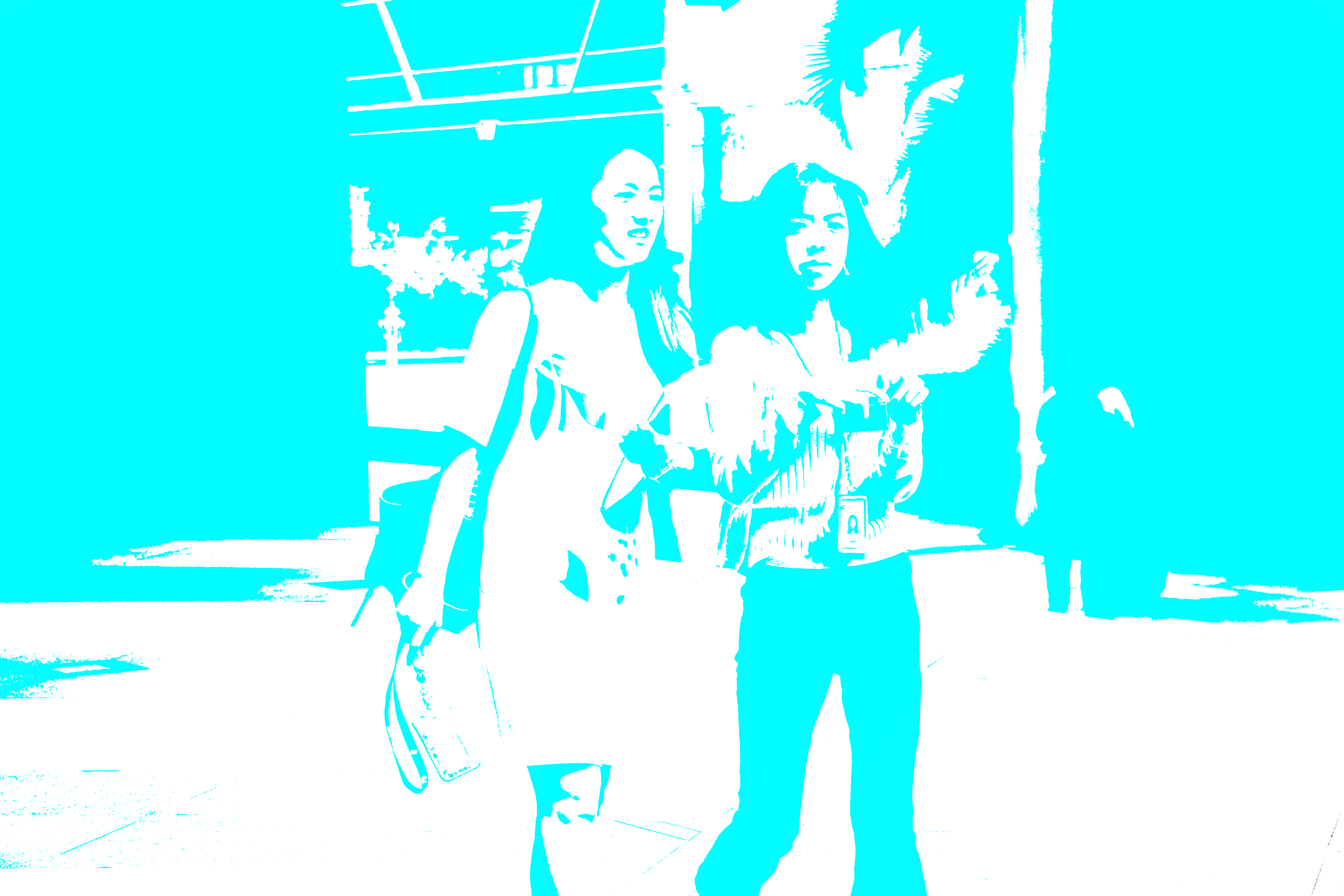
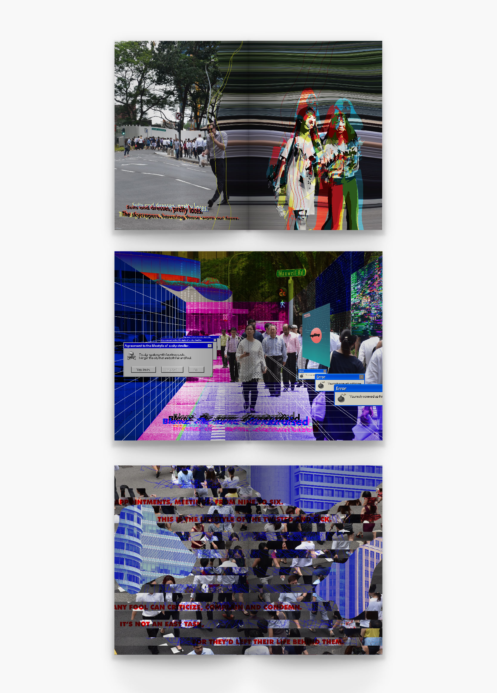
The colors that I will be using will be bold and loud, in order to relay their thoughts and emotion through my zine. Since the art direction is glitch art, I decided to play around with the color layerings.
First, I had deconstructed the images using Photoshop, as the images have to be in png format and this way I am able to select a certain color range to replace with other colors. (CMYK)
Initially, this was one of the designs that I had come up with but personally, I felt that there was too much going on and messy. Hence, I decided to tone it down a notch and below is the final design that I had came up with.
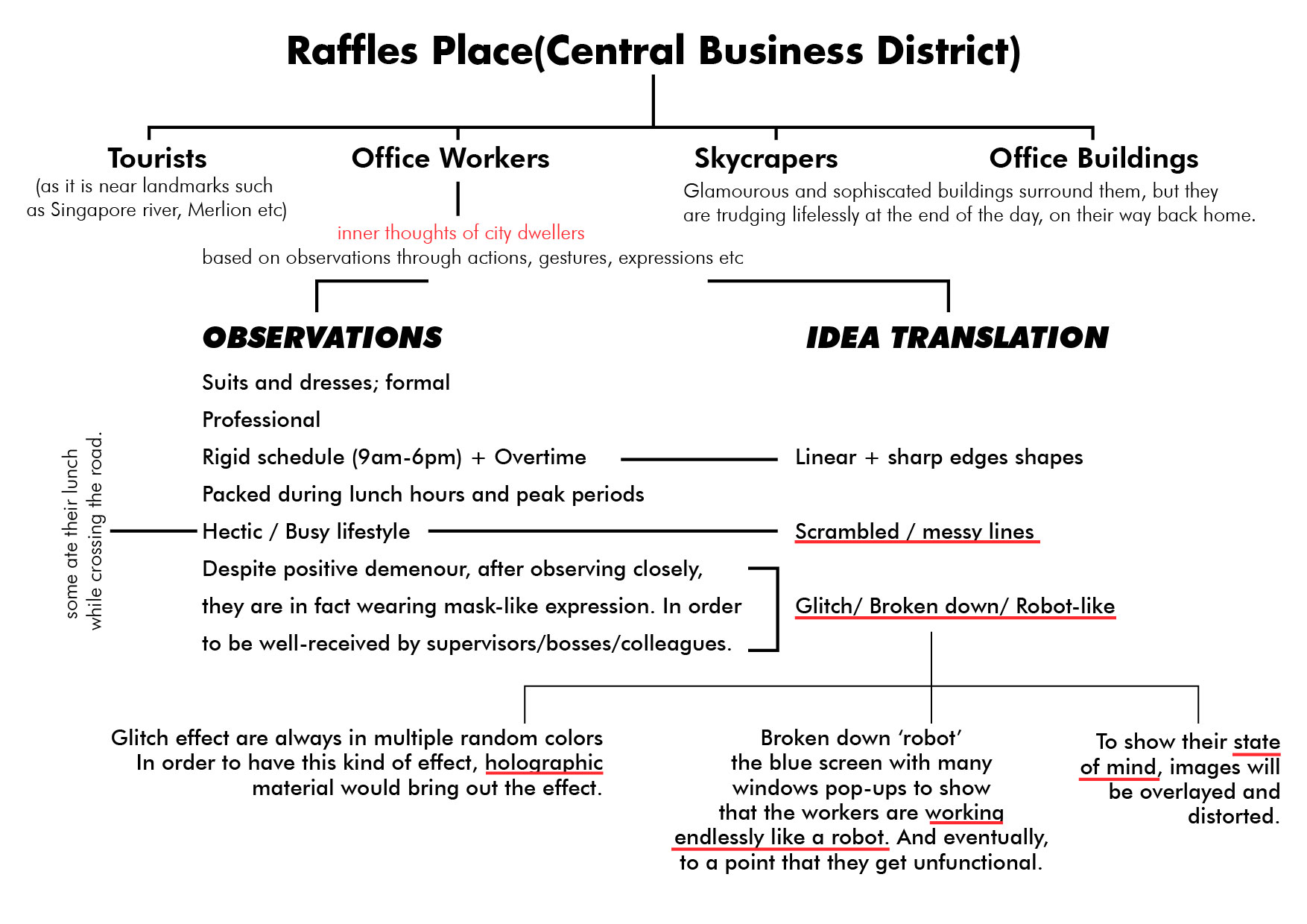
The background image shows an English office guy jaywalking across the road while holding onto his sandwich, probably his lunch. This spread page is like the beginning before entering into the hectic lifestyle of an office worker. Hence, as you can see the left side of the composition is normal. However as it goes onto the next page 3, it is slowly distorted(wavy) and the cut-out of the two ladies are heavily distorted (the 2 ladies were discussing intensely while walking, probably about work). I wanted to portray that this is the start of the ‘glitching/broken down’ process.
I tried complementing with normal plain font but the whole composition does not match well together. Hence,the typography that I decided upon with were in distorted form too.
Process II – page 4,5
This spread page is whereby the readers are able to see as the first point of view of one of the office workers. Hence, the environment and graphics placed using one point perspective. I had used the perspective grid function in Illustrator for this. Below is the very short gif/clip on the process of the whole composition. Bold colors are used to bring out the whole ‘glitching’ vibes.
Some of the designs that I had integrated into the compositions are perspective lines (which shows the one-point perspective view of the office worker), blue screen theme, windows pop-up errors, matrix numbers and the play of bold colors.
I wanted to portray their current state of mind whereby, the office workers had work endlessly non-stop like a robot to a point that they will be malfunction. The image speaks for itself, countless of office workers rushing for time and use every possible minute to discuss about work – even while walking.
For this spread, the narrative part was included inside the windowsXP pop up box. Hence, the typography matches with the typical windowsXP fonts.
Process III- page 6,7
Lastly, for this spread I wanted to portray a total destruction. As the narrative begins with a normal lifestyle and slowly started to distort and ‘break down’, the 2 last pages would be the end-consequences. The colors that I had intended to use will be mainly blue as it shows the ‘blue screen’ effect which is quite typically seen whenever devices-ie. laptop- malfunctioned.
Process III- cover and back pages
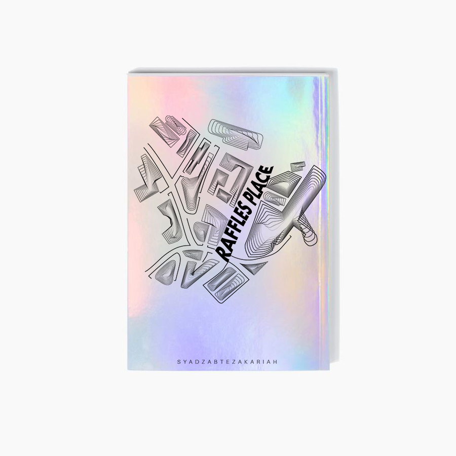
The back page is the map of the Raffles Place. (the text is where the MRT station is) I decided to use lines of different lineweight to show the density and complexity of each buildings.
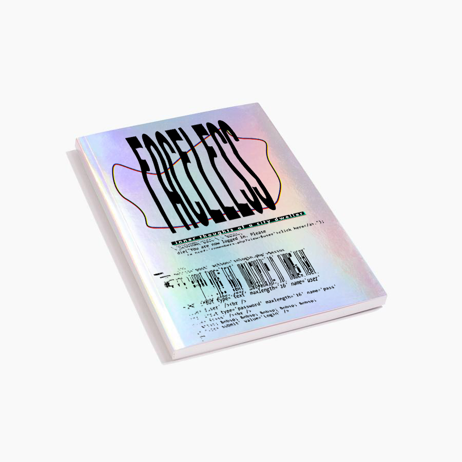
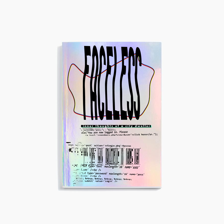
Whereas, the front cover shows the beginning as the caption says ‘you are now logged in’. The “whole malfunctioning” will start as soon as you flipped the zine.
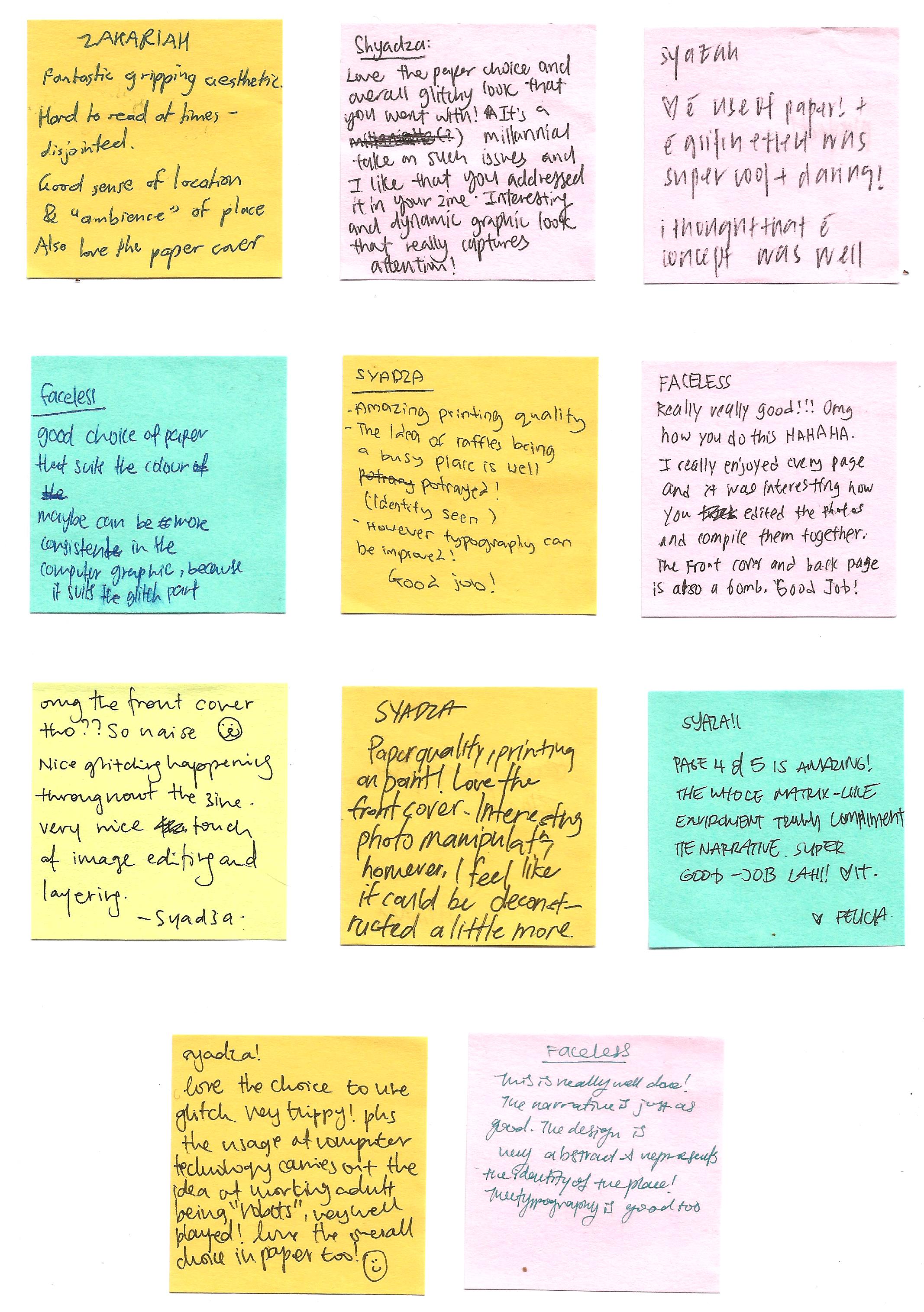
FEEDBACK from peers
Some of the repetitive feedbacks/comments that I had received was about the choice of paper as well as about typography.
The choice of paper material that I had used was great, as mentioned by a few of them. I had used linen paper which able to bring out the bold colors as well as the thickness is just right. -not too thick as well as too flimsy. Both front cover and back page of my zine is in holographic material + transparency. I decided to use holographic because I find it very suitable to show the whole idea of glitching effect.
Typography– can be improve as some are hard to read at times. It clashes with the design as there are too much things going on. I think I should keep the fonts simple throughout- page 4 and 5 are the good examples.
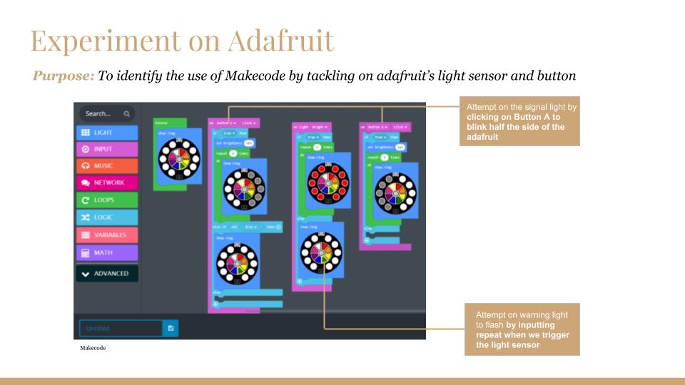
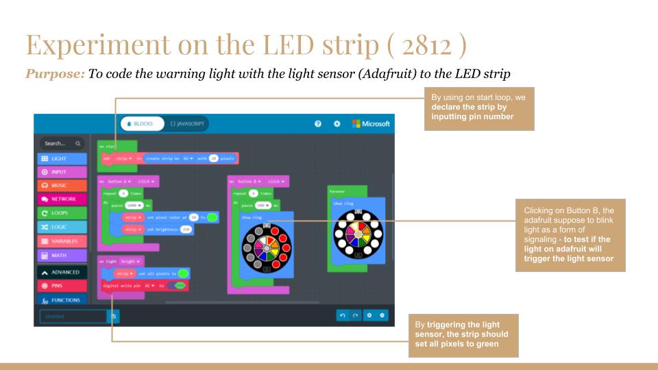
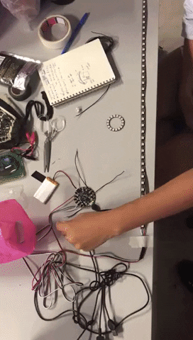
Upon pushing Button A the animation that is programmed will play. We also tested the circuit if it can be powered by an external power source.
(Refer to the below GIF)
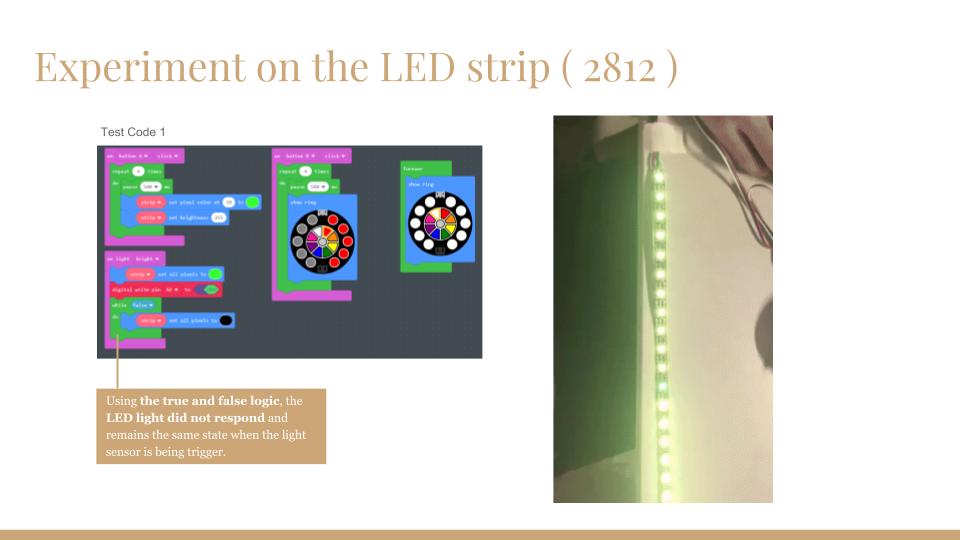
LEDs were responding randomly with the power output.
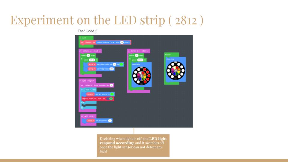
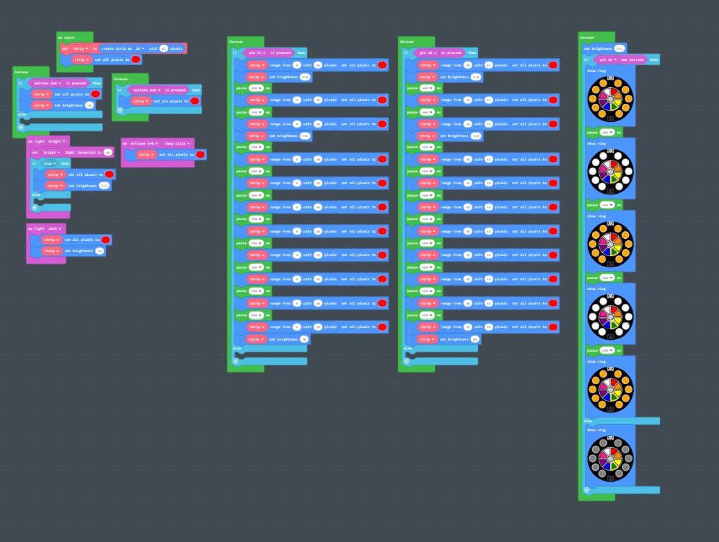
We also were figuring out the number of LEDs that were on the strip and how to program it individually. And also the testing of the light sensor which flickered for about 0.5 second.
Experimenting with the light sensitivity along with the buttons.
The distance of light source and threshold of light detected.
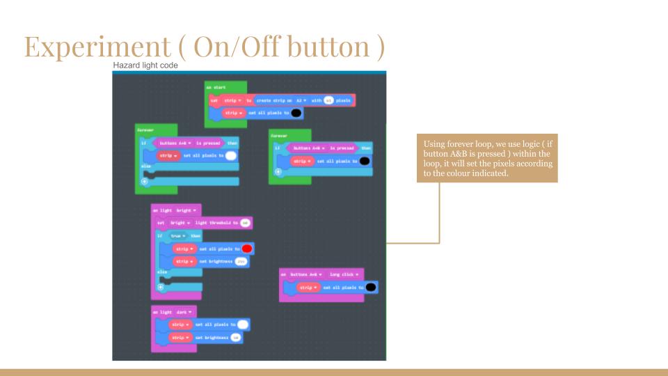
Pressing on the A&B button, the LED strip will twitch before on/off.
Finalization of the coding
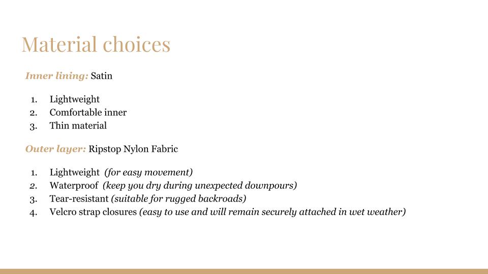
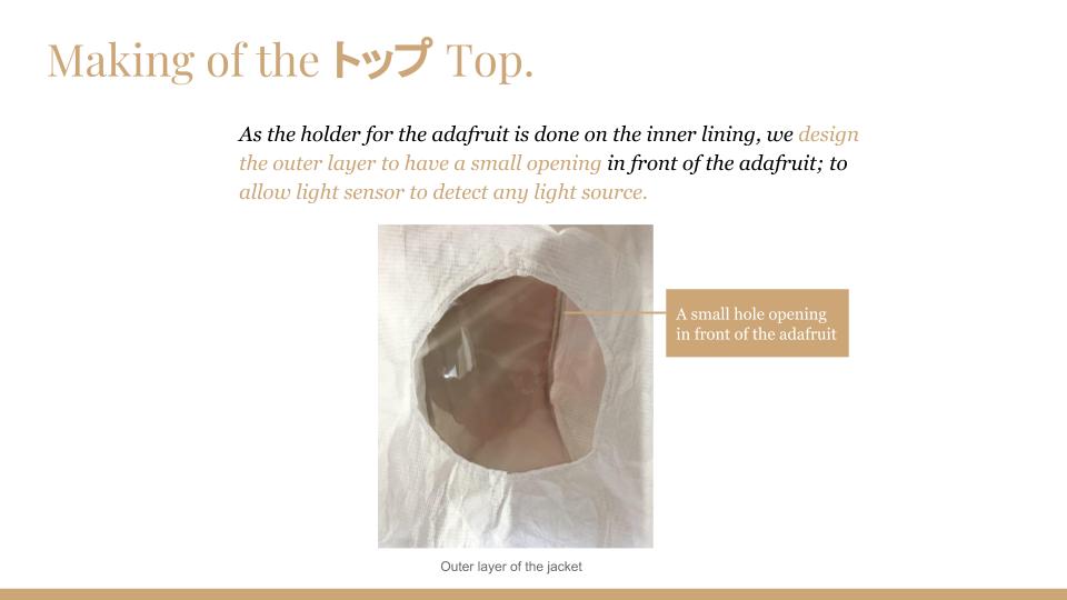
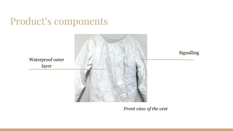
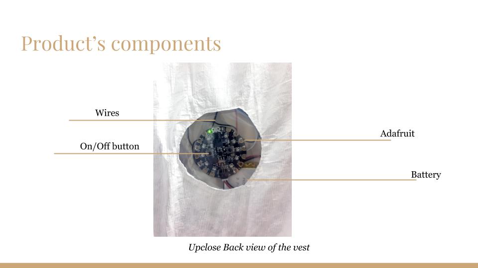
The main idea is to create a simple basic jacket that caters the Adafruit, the battery and the wires.Most importantly, the jackethas to be waterproof at all times.
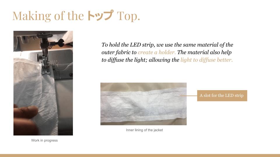
(The first trial attempt of incorporating the LEDs in together with the material)
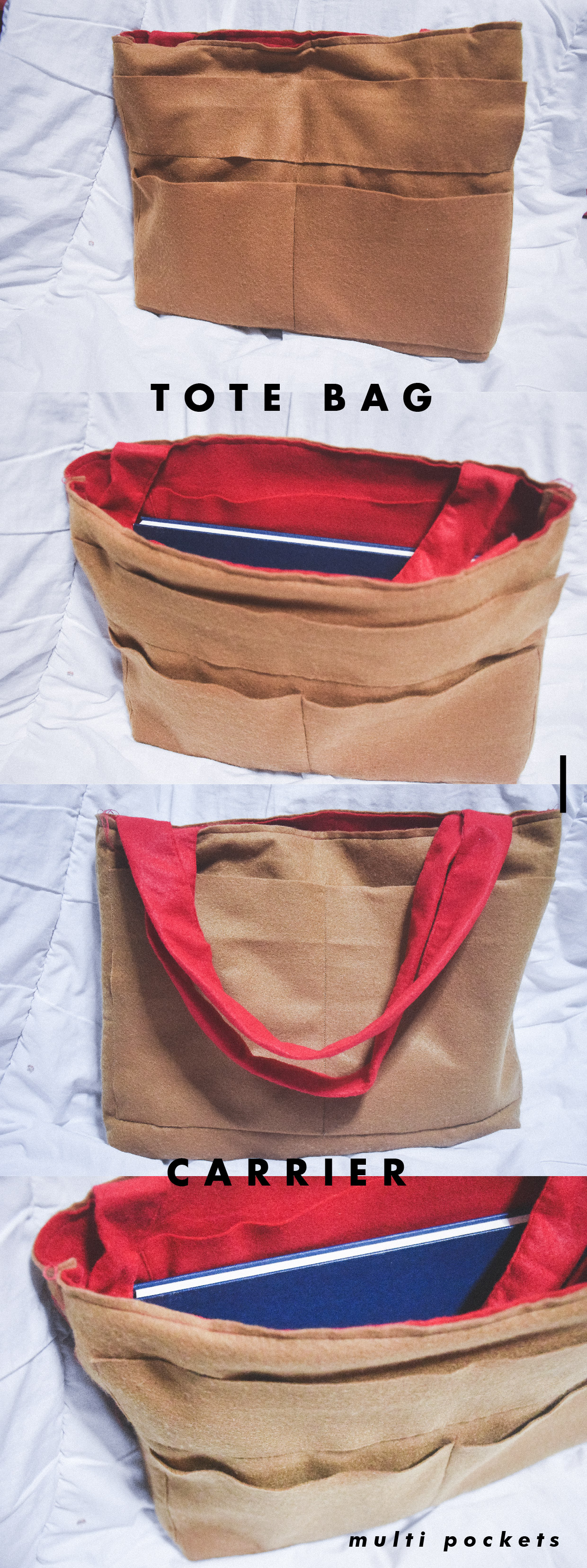
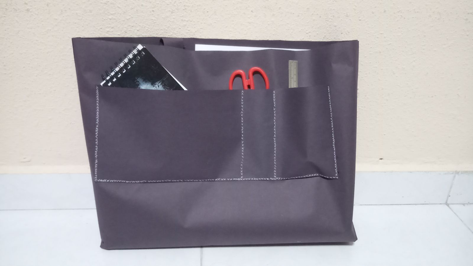
Features: Different compartment sizes for different things. Fit A4 sizes and for tablets/iPad.
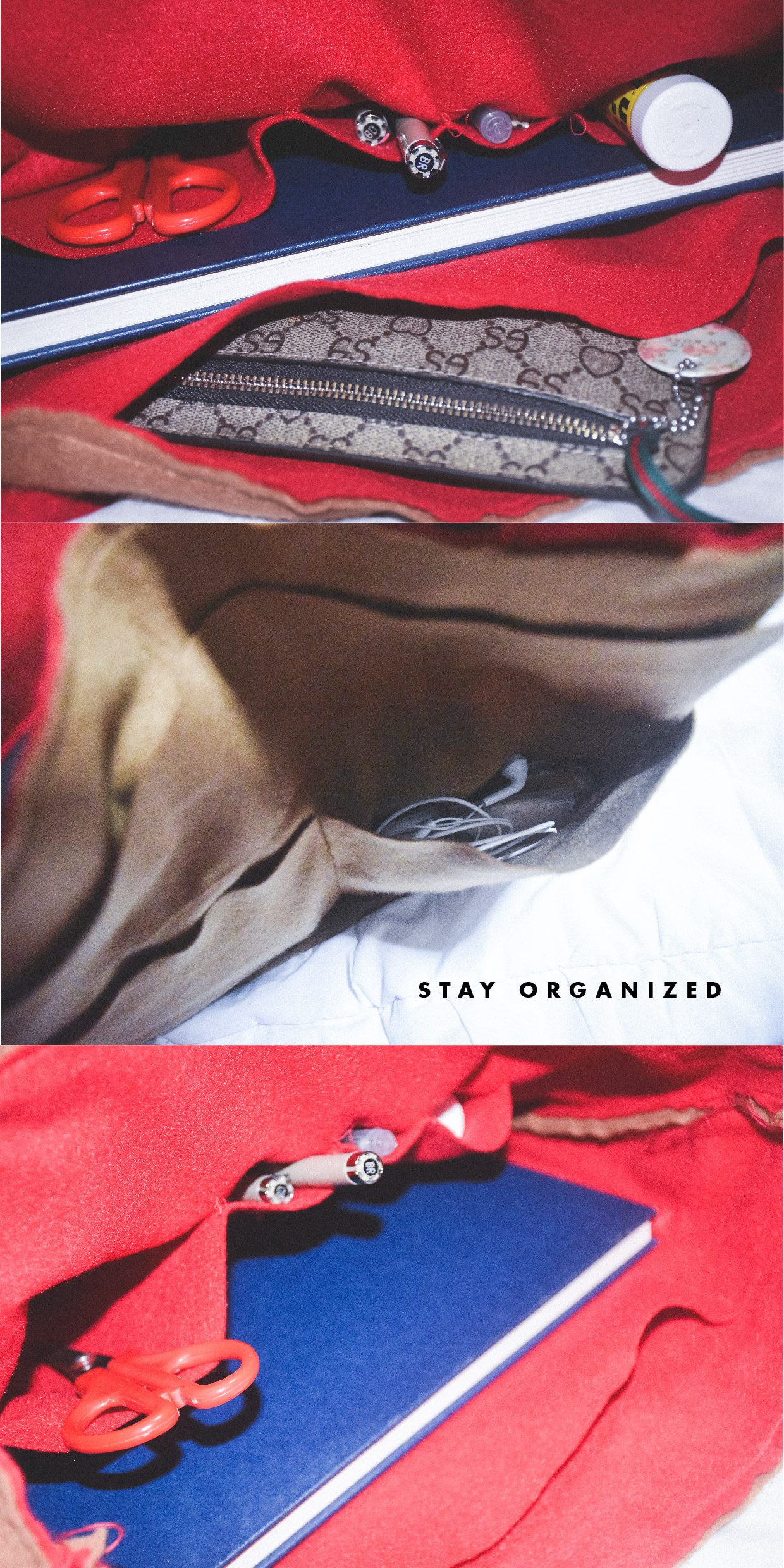
Compatible for: People who likes to stay organized without bringing extra smaller compartments. The ‘built-in’ compartments/pockets minimizes space.
Things to consider: Ezlink card, makeup, earpiece, brooches, pens, accessories, ruler(very important for designer), notebook, tissue, penknife, scissors etc.
Process
Initially started with the idea of simply aesthetic. However, it changes along the way in my ideations as I wanted the tote bag to be more functional- especially for people like me. (who prefer to have different compartments in bag)
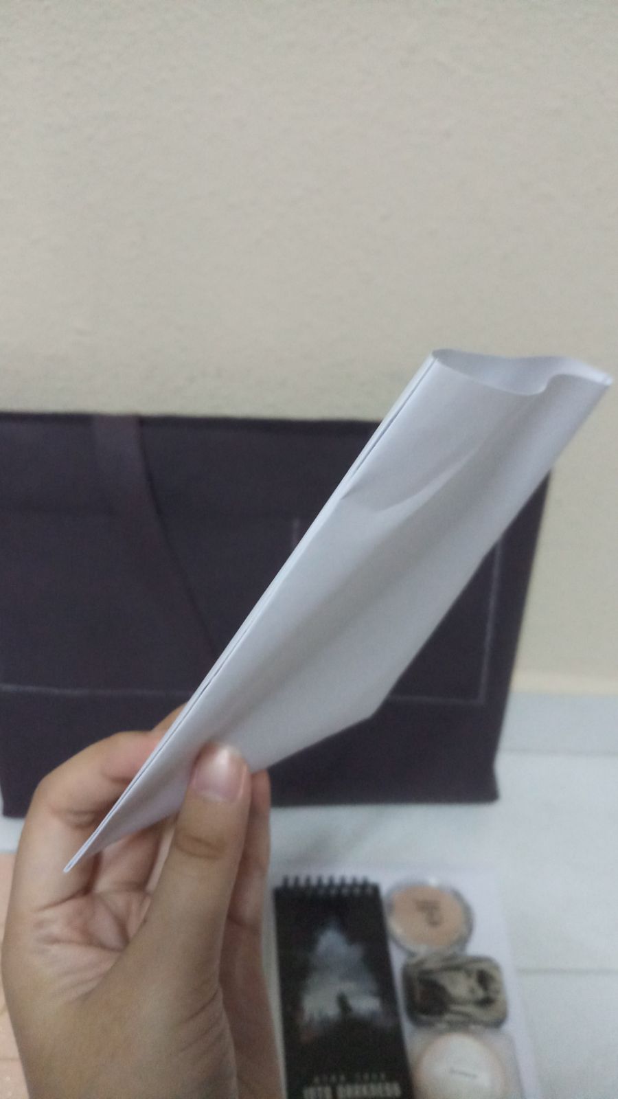
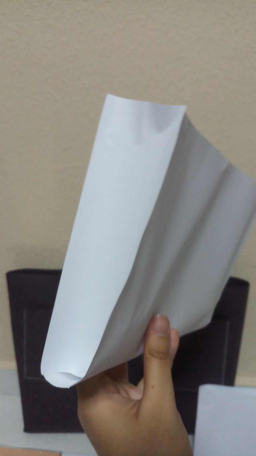
I had also explored the different types of joining the sides together. Below are the some smaller scale mock ups of different types of joining of the tote bag.
Afterwards, I chose one of the joining methods and began working on the mockup scale 1:1 using the black paper provided.
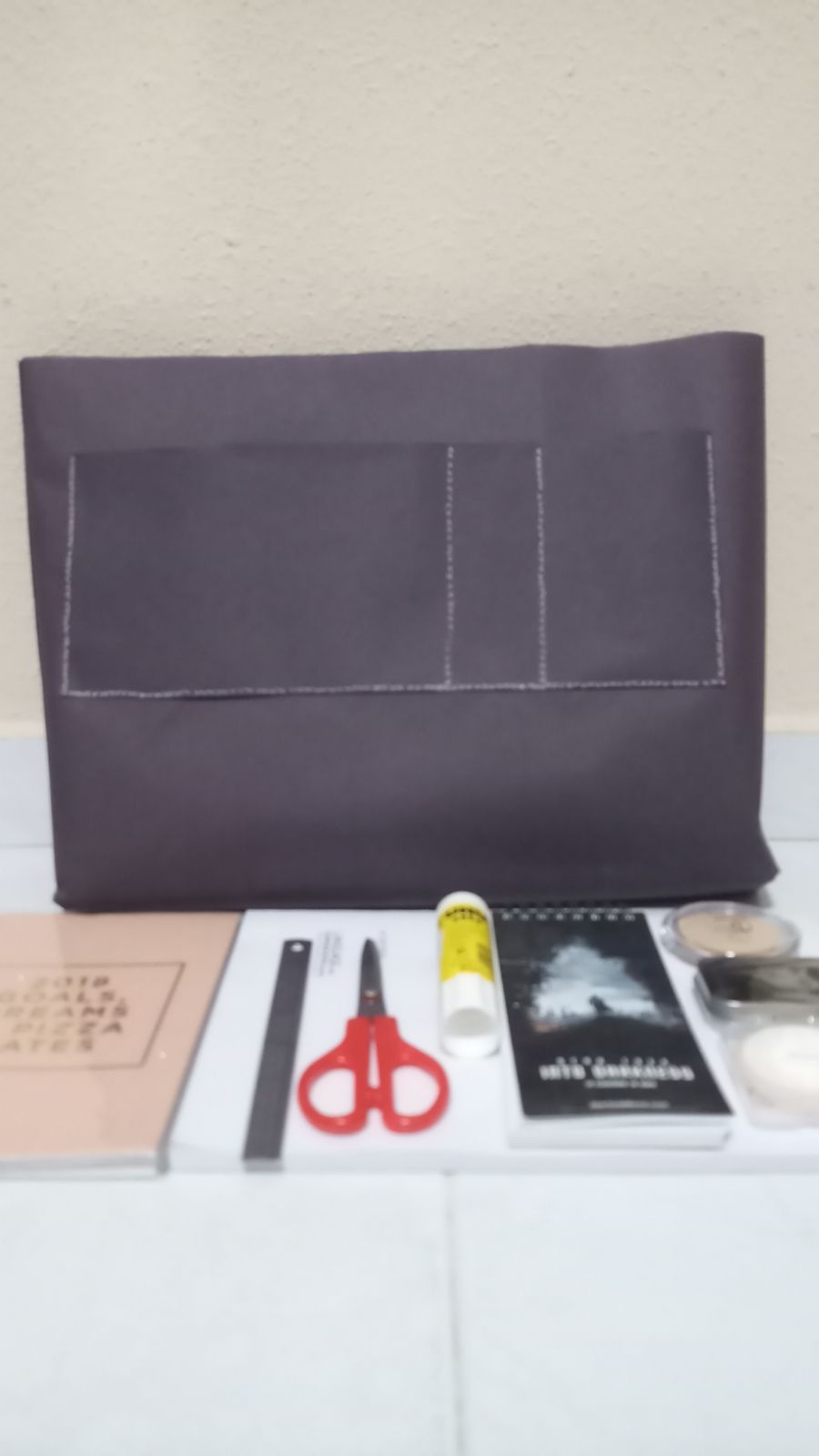
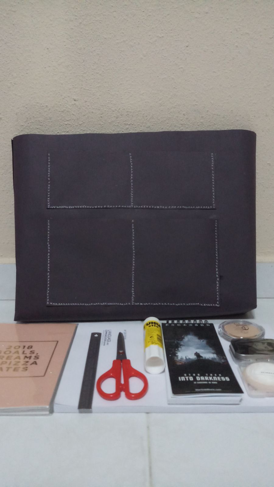
(back of the tote bag)
(front of the tote bag)
(tote bag with stuffs inside)
Sizes
As the compartments are the main selling point of the tote bag, I decided to explore the different sizes for the compartments. First, I listed down the things that considered highest priority / most importance. (based on my personal judgement)
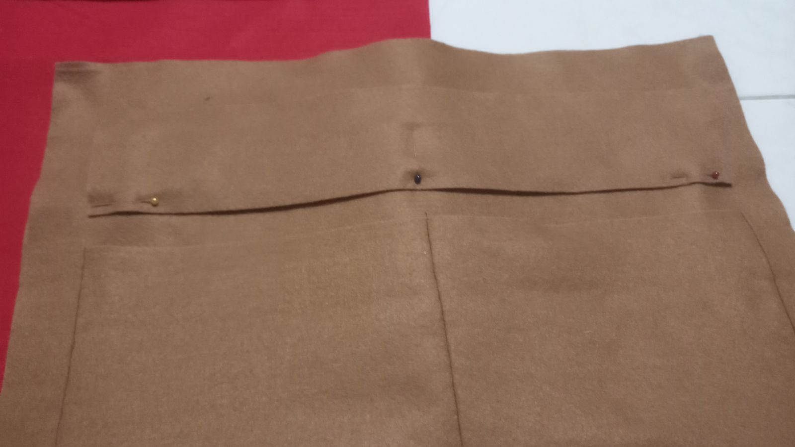
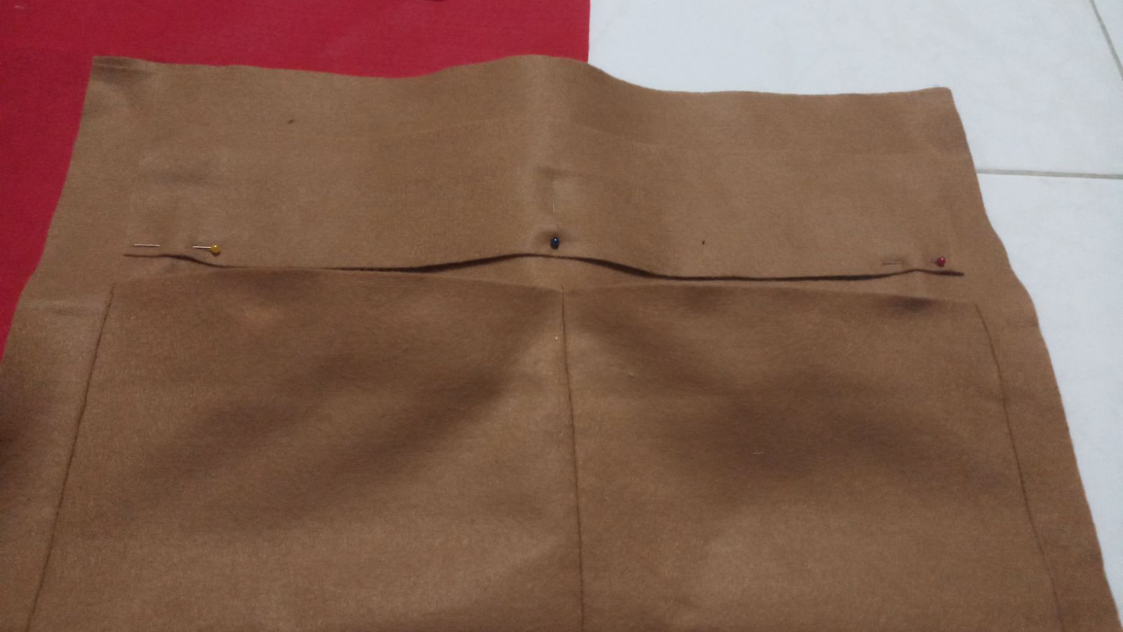
And then I proceed to source out for the materials needed. Ideally it would be in synthetic leather- so that it can holds the weight of the things inside. However, I tried out the final product in felt as it is cheaper and easy to sew.
Things to improve/take note: For further improvement on this design, I could explore in different material- more rigid and could hold weight.
Images below are some of the different cuts of felt- in order to combine them as one.


 We also were figuring out the number of LEDs


Recent Comments