Month: November 2017

Ego: Final Outcome

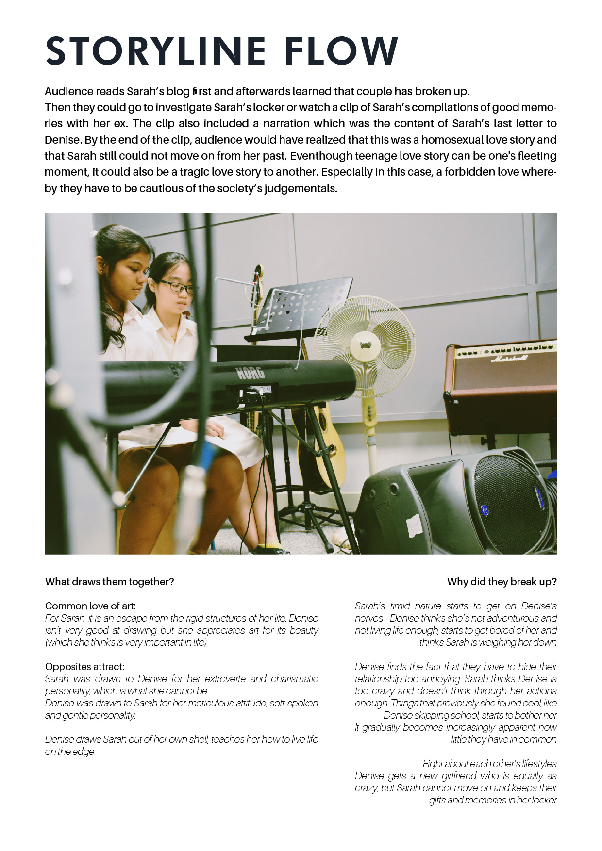
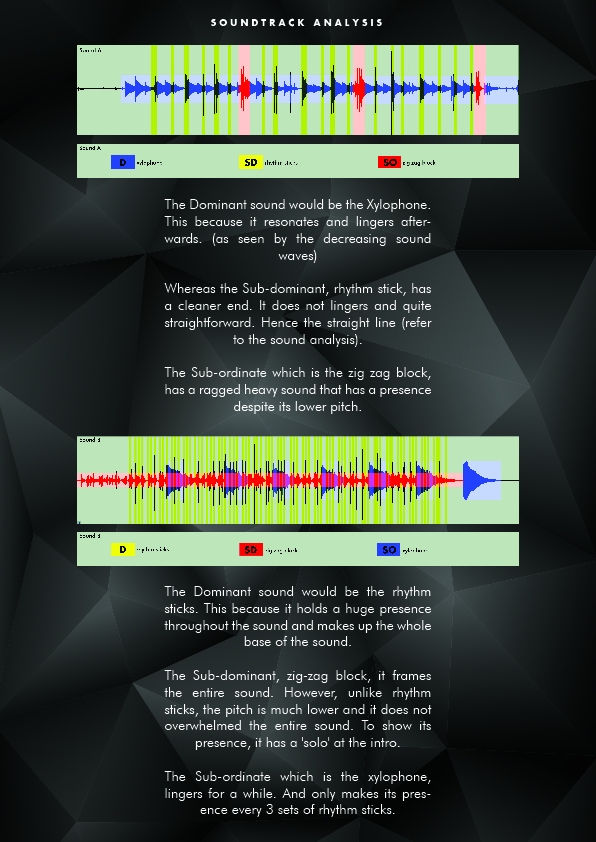
Analogous color scheme: Different shades and tone of magenta and blue

These 4 equations represents the 4 sets of different lifestyles that I have.

School life, work life, spiritual life andddd fun life.

Blue implies the gloomy/quiet setting environment of the place.

Whereas, pink/purple has a much vibrant energy and also exudes femininity.


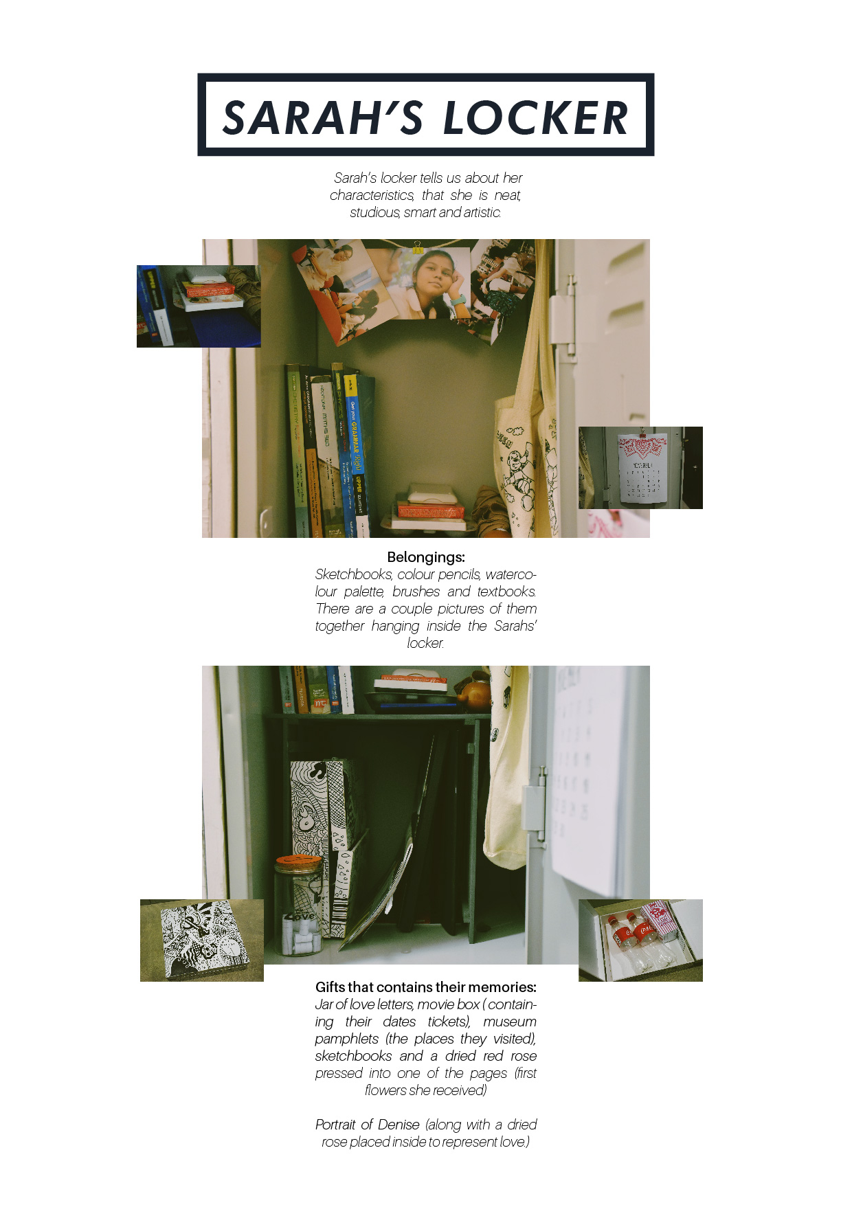
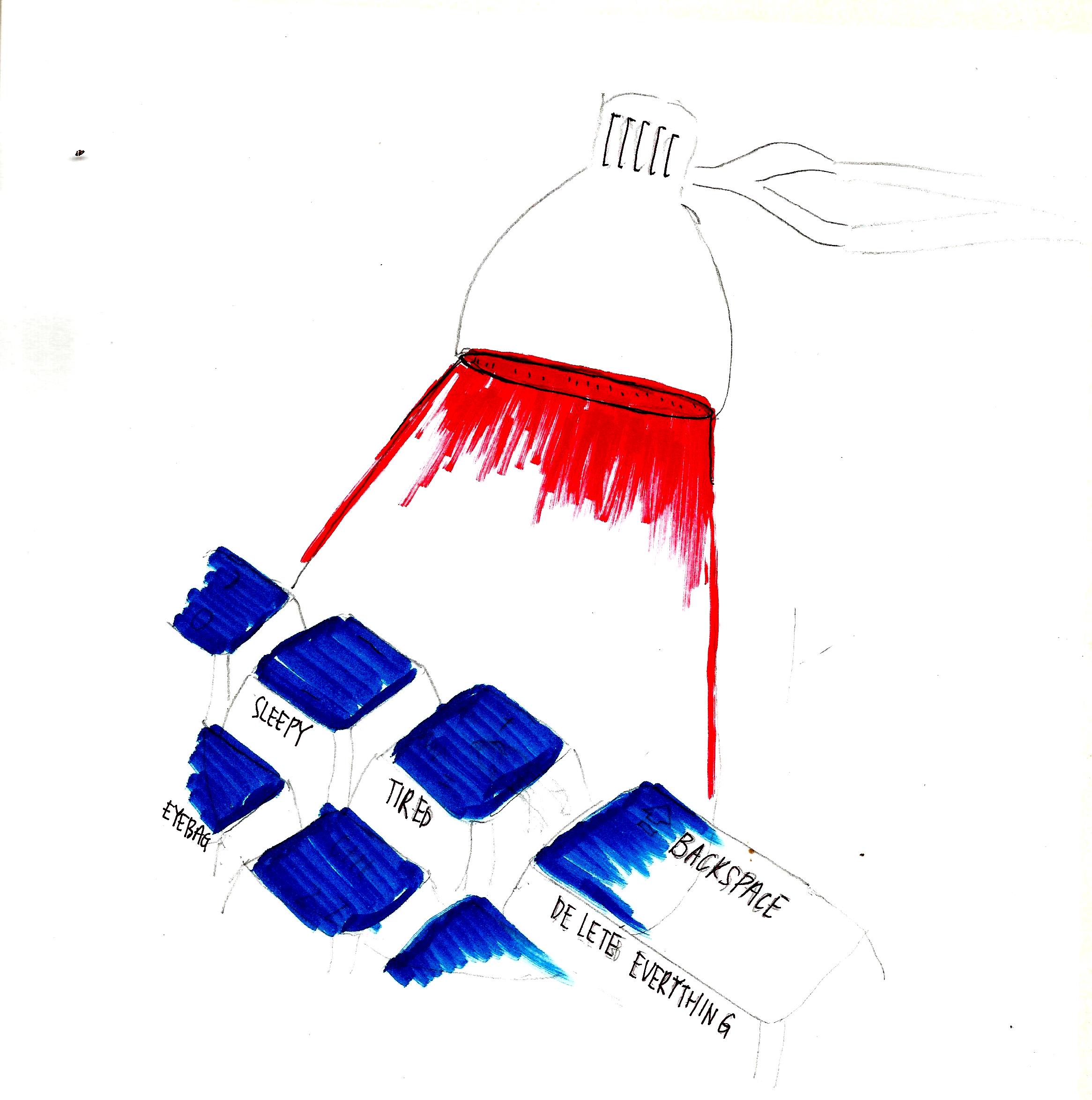
Equation 1  (school life)

Me staying up late during school submissions week.

Dunk into cups of coffees.

All-night boost.

For equation 1, I intended to portray about how my addiction to coffee starts whenever the submission period starts to creep in. Initially I don’t enjoy coffee, teas and any type of sweet beverages – only plain water is my favourite. However, in order to survive the night awake, I had to drink several cups of coffees in order to combat my sleepiness.  This is how I managed to pull up an all-nighter – all thanks to the caffeine boost.

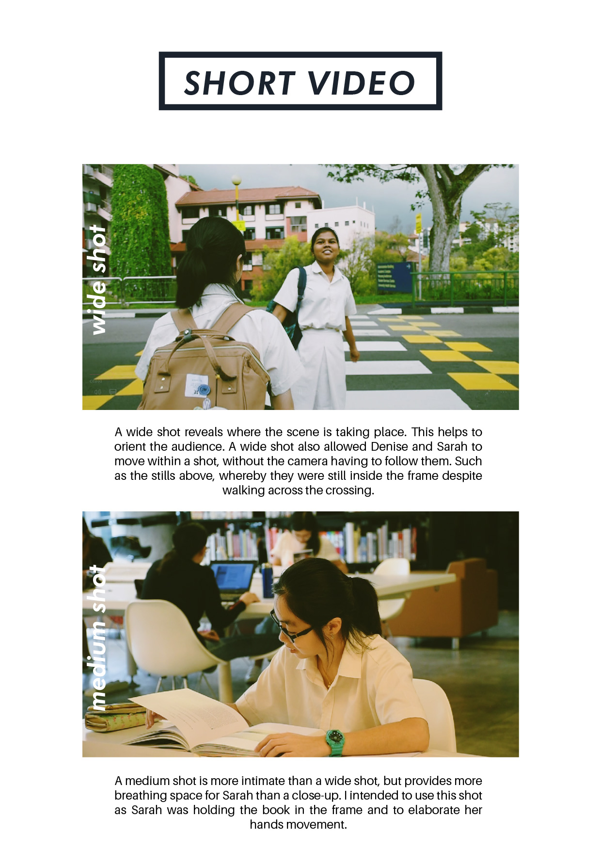
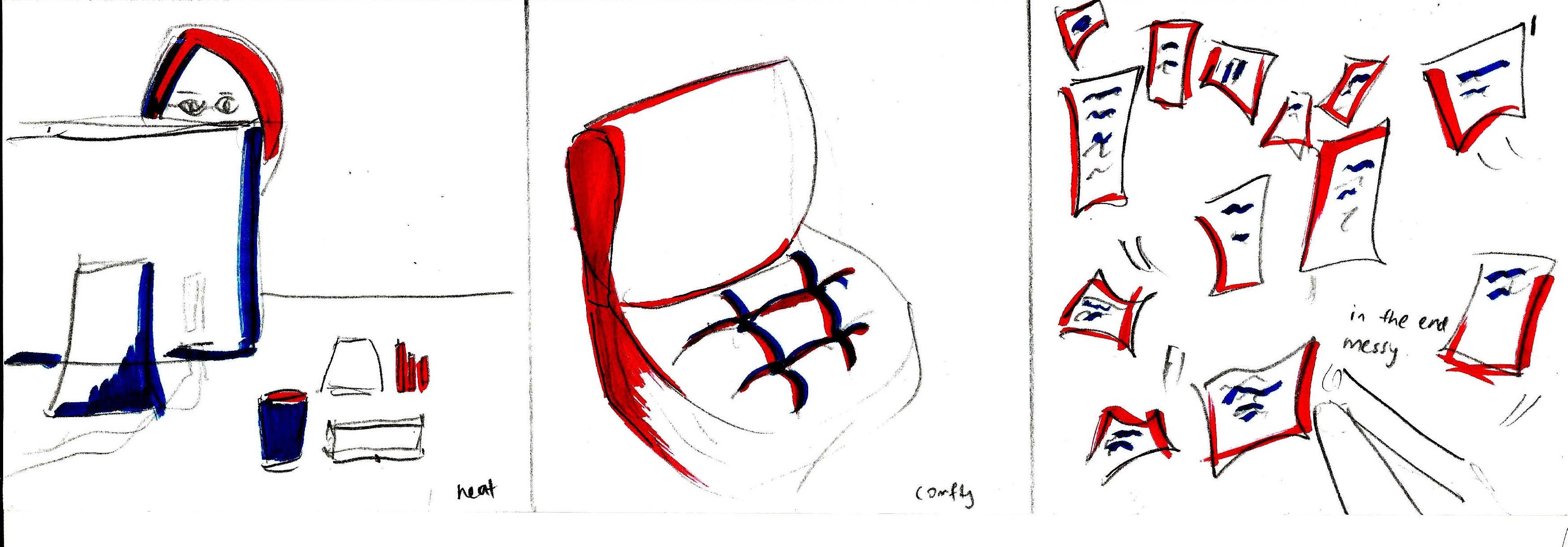
Equation 2  (work life)

Start of the day. Neat and uncluttered work desk.

At a chill and comfortable work studio (too comfy that you can lie under the sofa)

End of the day. Messy piles of work.

For equation 2, it is mostly based on the experience that I had working at a small interior design firm. At the beginning of the day, my work desk is always neat and tidy. The setting of my workplace is also comfortable and informal as I am the only employee there.

Anyways, as an interior designer, there are a lot of paperworks to be done, as many floorplans of different elevations, plans, side elevations, detailing interior, etc etc had to be printed out for the contractors and also for documentation. Thus, by the end of the day, my work desk will be a pile of mess.

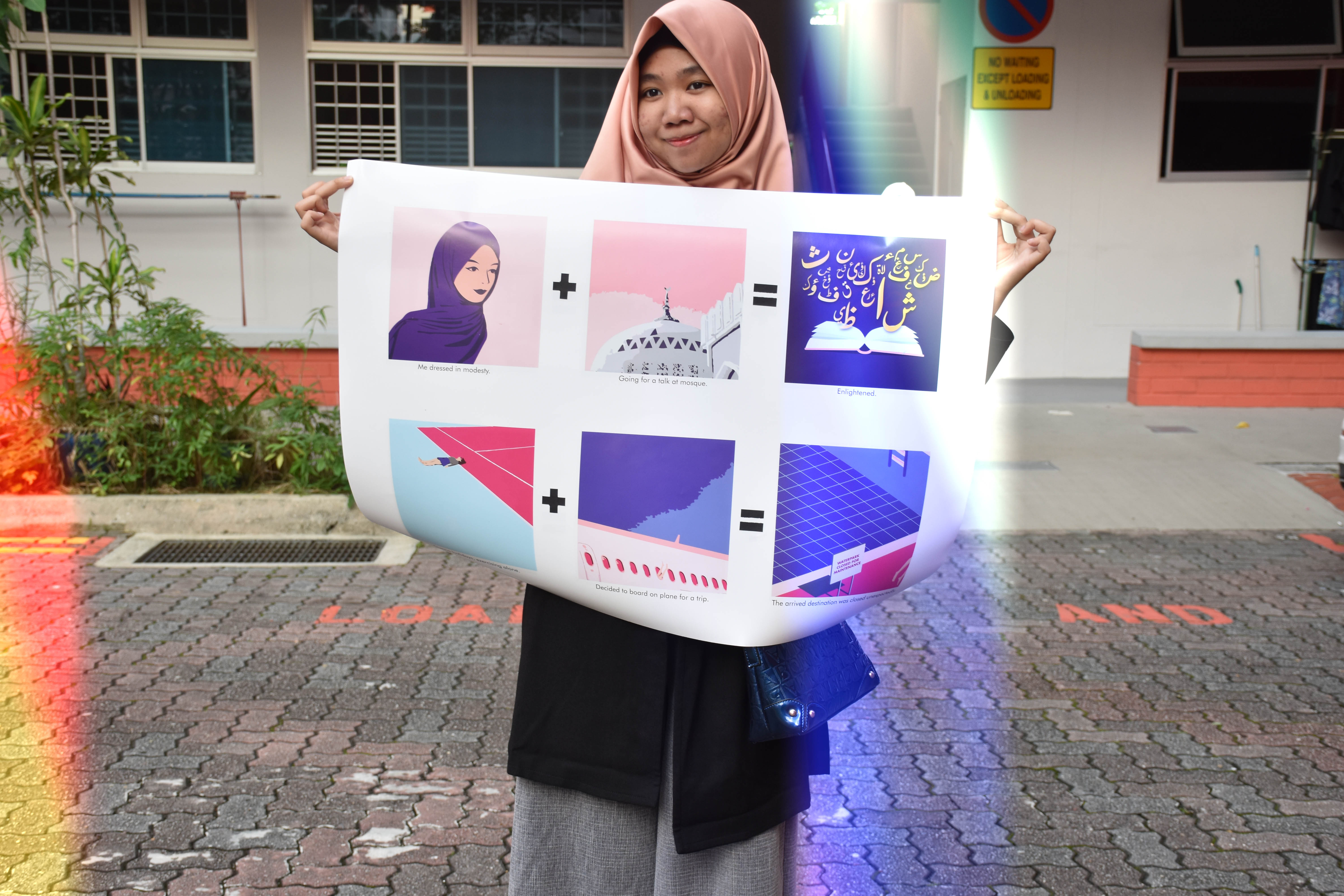
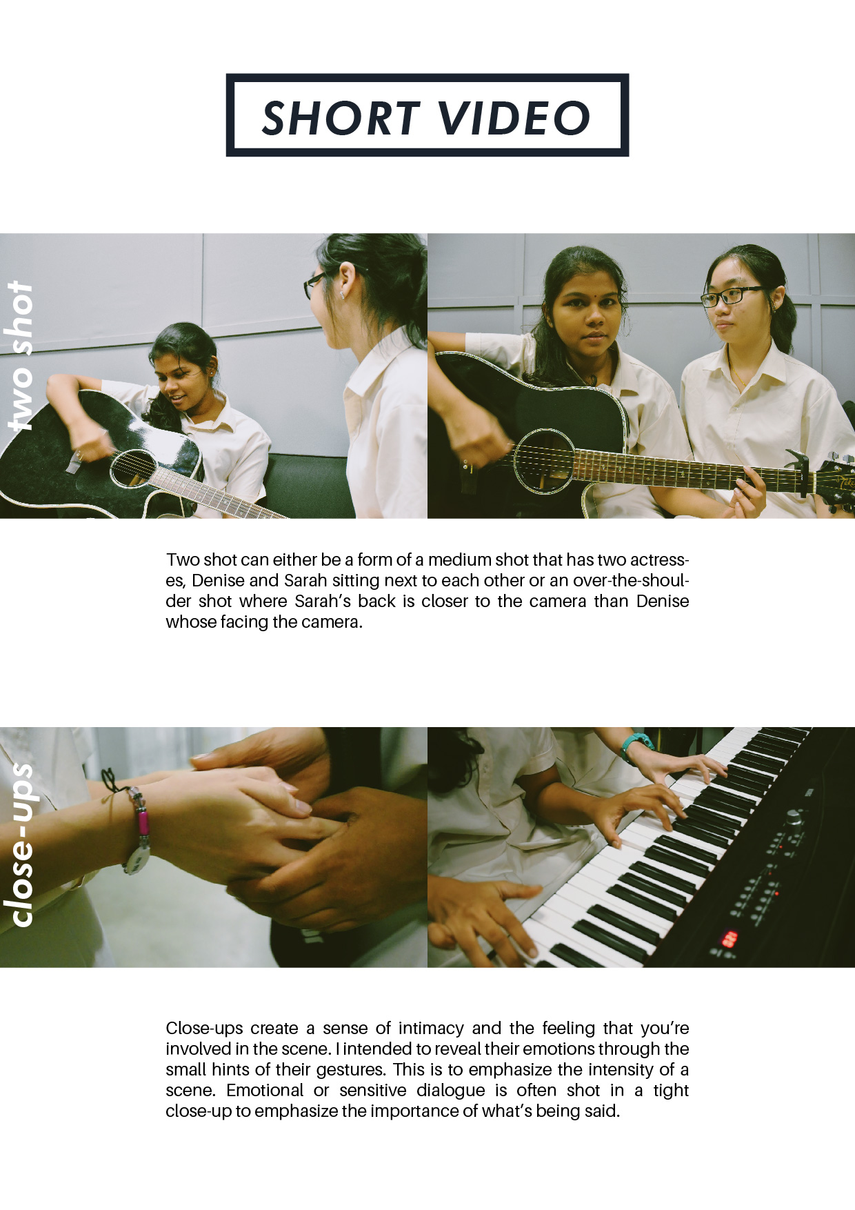
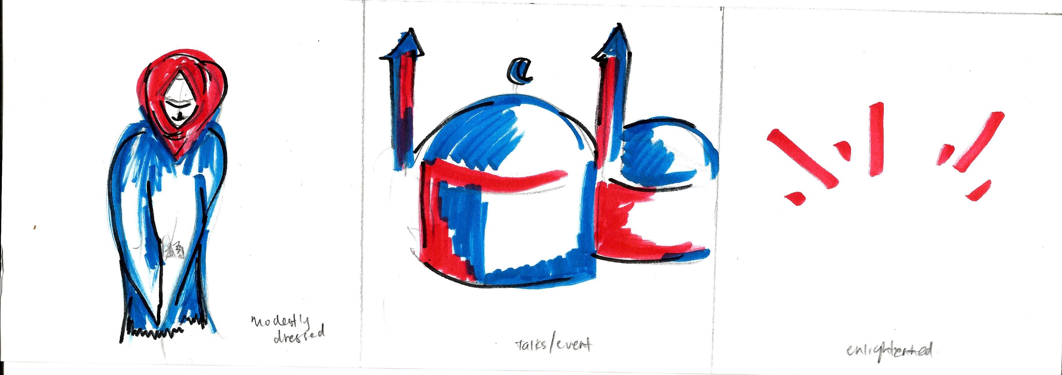
Equation 3  (spiritual life)


Me dressed in modesty.

Going for a talk/event at a mosque.

Enlightened.

For equation 3, it is about the spiritual life that I am leading, the peace and calamity. Whenever things gets difficult, I always find comfort and peace by listening to talks held at mosque or stadiums. The first step is to dress in modesty and appropriately. After attending talks/events at mosque, often I felt enlightened by the new things that I had just learnt-about morals and creed in life.

Oh by the way, try to spot my name in Arabic for the above illustration. (sya-dza)

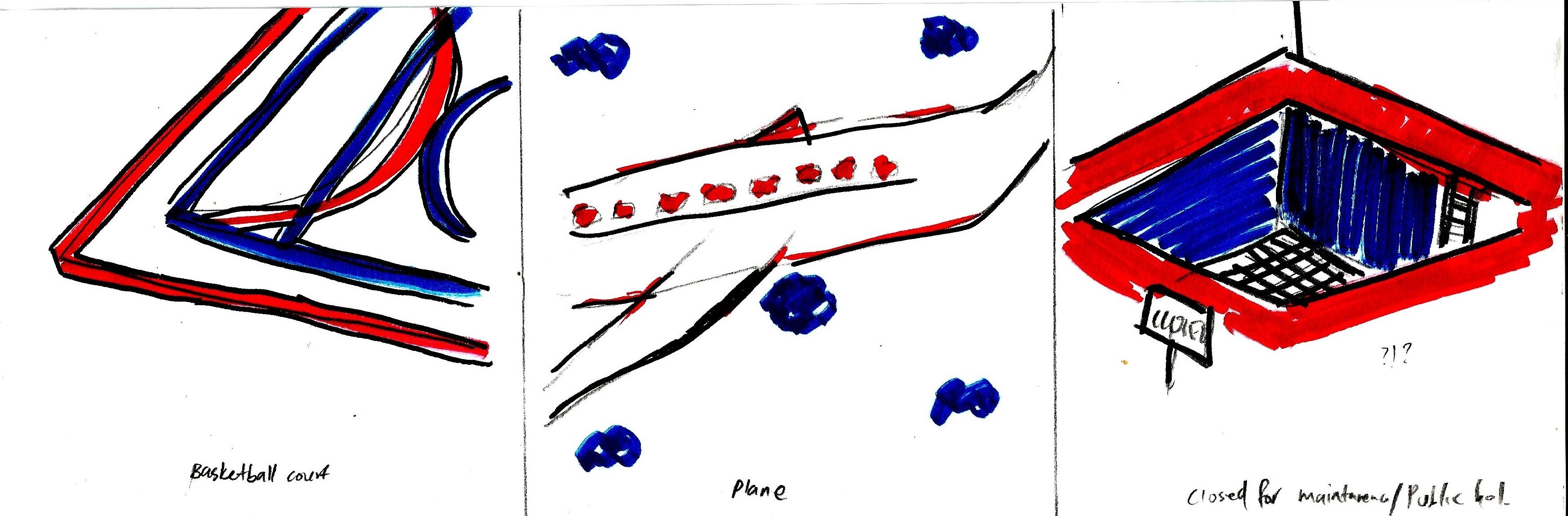
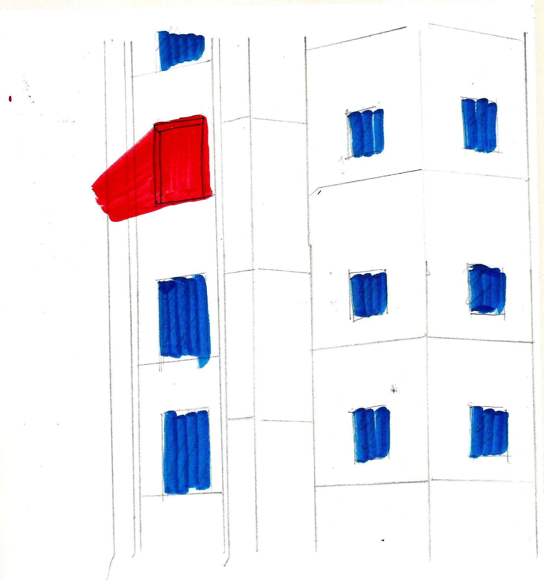
Equation 4  (fun life)

During holidays, me exercising alone.

Decided to board on a plane, for a family trip.

Plot twist: The arrived destination was closed!

Last equation! During holidays, I liked to cycle and play basketball (my favorite sports) However, as my 2 elder sisters are already working, thus I had to exercise alone around my neighbourhood. Hence, the first picture was me in despair as I had no one to accompany me while exercising. Then after waiting for my sisters and parents to take off days, we decided to board on a plane for a family trip!

However, all of the excitement washed off when we arrived at the destination. It was closed unexpectedly 🙁 This is based on real story event, during that time when my family and I went to Bandung,Indonesia. The themepark was closed due to some reasons. And hence, we had to U-turn in front of the entrance of the themepark.

Reflections

Overall, I really enjoyed in doing the illustrations and coming out with these ideas. Though it may not be as perfect as I envisioned, I am still satisfied with my work. There are several things to improve on such as the color intensity and also the legs could be a signature throughout the 4 equations. I probably should include a concealed-modesty legs for my 3rd equation to ensure that there is a constant signature. Through this project, I also learnt about how CMYK and RGB could make a huge difference and affect my artworks. The importance of color scheme too, can make a huge impact for the audience.


Thank you :>


Ego: Process

Here’s are some of my initial ideations and sketches! I also included several “REJECTED ideas” as part of my process making. First of all, brainstorming the ideas!


Next, finalizing my ideas in sketches before illustrate them. Some of it might have changed and are different from the finals one.

Below are the rejected ideas illustrations:

Ego: Artist References

DFTdifferantly

An artist duo. One line minimalism,deconstruction.

These 2 artists are known for their minimalist distinctive single line drawing. They deconstructs a complex imagery into two-dimensional minimalist art. I really liked how they could create such an impactful illustration in a form of minimalism. Their works inspires me alot but drawing a single line without stopping might be too difficult for me to achieve.

Nabilazirus 

An illustrator and makes collages of herself.


Her illustrations reflects much about herself and her interests. It is a combination of collages of real images and her own doodly illustrations.  Most of her works, she used varieties of colors without a fixed color scheme. I really liked her style as it looks quirky and fun!

TOMMY PARKER
he’s an illustrator in UK. Most of his works have a fixed color scheme, such as complementary color scheme or analogous color scheme, etc.
TommyParker_BrothersSisters
TommyParker_RewardPerformersTommyParker_NeverDelegate
TommyParker_Raven_Web
Some of his works are taken at a unique perspective (such as the previous 2 images), which I personally think that is the focus point and makes it more interesting. I really liked a view from a high perspective as it is different.
TommyParker_JealousStaffersTommyParker_RaceWins
TommyParker_MaidConfessionsTommyParker_Platforms_Thumb
He used analogous color scheme, shades of pink, purple and a hint of orange. I intended to use this color scheme too, but of different intensity and tone.
VINCENT MAHE
A Paris-based illustrator. And his most popular award wining series is what captures my attention and inspires me alot too! The series, Neighbours, in which he illustrates the various characters he spots while watching nosily from the window of his Paris apartment. Subjects include a bewildered-looking window cleaner, a raucous-looking house party – a collection which makes me feel like as if I am in London, part of this busy happening street with much activities.
.
125New6
His choice of colors are amazing. I’m intrigued at how the overall composition and the whole series looks like. There is a constant theme throughout and the use of colors also creates a focus for a certain part of the illustrations. This color scheme is complementary harmony which consists of different shades/ tones of blue and orange.
Some of his works also includes outline of the drawings, which doesn’t necessarily a bad thing. It is a style that he created and makes it cartoon-ish.

PROCESS— Hidden City: Kongōseki 金剛石

Initial ideas

Initially our group moodbox was based on A but it was changed to B to suits the Final. The images below are the processes and our PREVIOUS Group’s Moodbox.

We had many different ideas and test for the modulars. And one of it was this- a cylinder modular structure. However, we decided to forgo this ideation as it is too big and not executable.

Process

We used different material for the habitats (matte & reflective) to give texture experience for audience to experience and interact. (note that there is a slight difference in temperature for cooler surface of reflective material as compared to the matte)

The highway for transportation have cable car of “diamond beads” for the elves to move and transport the mined diamonds. Users can interact with this part of installation.

Reflections

A series of mirrors, reflective surfaces can be used to better reflect the light. Also, the highway links are too little, we should add in more to create much more ‘activeness’ of the city. And lastly, thanks to my groupmates, Xuan Wei and Huien for cooperating and work together as a group! Thanks Cheryl for the great 3D lessons too.

MA’s Individual Moodbox

Sound A

The Dominant sound would be the Xylophone. This because it resonates and lingers afterwards. (as seen by the decreasing sound waves)

Whereas the Sub-dominant, rhythm stick, has a cleaner end. It does not lingers and quite straightforward. Hence the straight line(refer to the sound analysis).

The Sub-ordinate which is the zig zag block, has a ragged heavy sound that has a presence despite its lower pitch. 


Sound B

The Dominant sound would be the rhythm sticks. This because it holds a huge presence throughout the sound(as seen by the concentrated yellow lines) and makes up the whole base of the sound.

The Sub-dominant, zig-zag block, it frames the entire sound. However, unlike rhythm sticks, the pitch is much lower and it does not overwhelmed the entire sound. To show its presence, it has a ‘solo’ at the intro. The direction of which the zig-zag block going, was round and round.

The Sub-ordinate which is the xylophone,  lingers for a while. And only makes its presence every 3 sets of rhythm sticks.

Instruments used


Syadza’s moodbox

Please listen to Soundtrack A above while viewing the GIF below

This moodbox is based on Sound A.

Interpret Sound A as calming, airy and associate with pure/white.

The dominant element are the resonating bars. This resembles the flowy effect of the tissue papers – the sound resonates through the fluidity movement of tissue papers. This movement of fluidity happened throughout the music, hence, the tissue papers are the most prominent element in the moodbox.

Sub-dominant element which is the rhythm sticks, represents by the neat arrangement of the wooden chopsticks. The chopsticks have a clean straight lines, which resembles the sound wave of the rhythm sticks.

Sub-ordinate element would be the framing that holds the entire frame. The frame are sturdy and heavy, which replicates the heavy sound of the zig zag block. The white frame are not too thick as the zig zag block has a lower pitch and the flatness of the frame

Reflections
Spacing arrangement of chopsticks can be widen, according to the rhythm. 

The Sub-Ordinate element can be further improved, and better represent.