Month: October 2017

Exploring colours

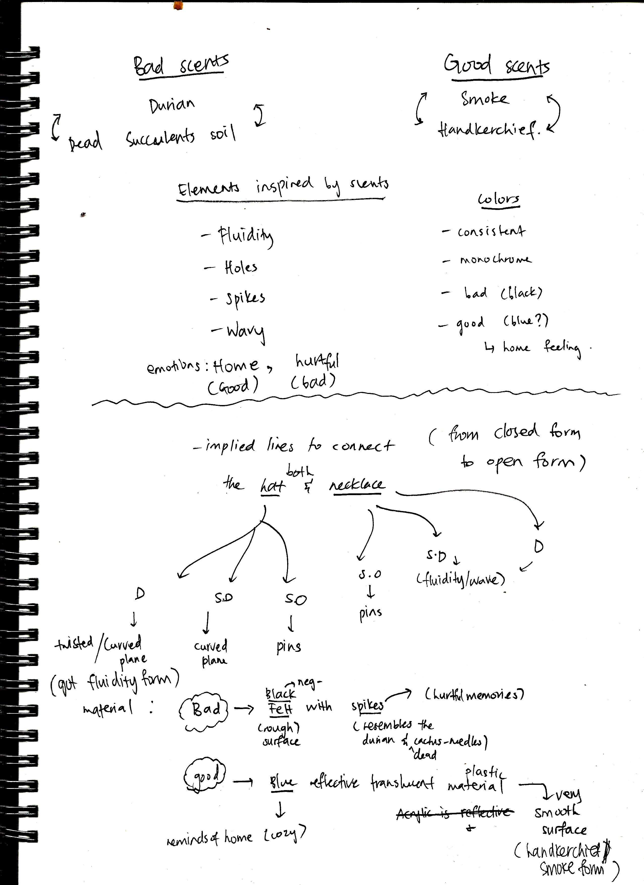
Color is one of the most basic tools to communicate thoughts, feelings, and emotions. So, I’ll be exploring more about colours and colour theory.

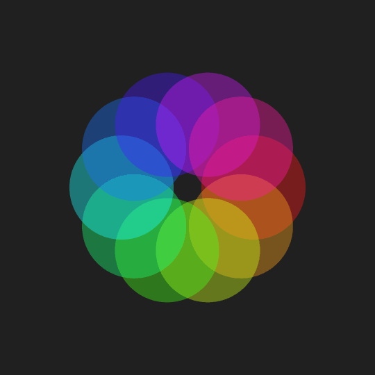
Color wheel describes the relationships between colors. It shows primary, secondary, complementary and intermediate colors. 

The colour wheel is a basic but completely essential tool for combining colours.

Primary colours – red, yellow and blue02a

Secondary colours – mixing the primary colours02b

Warm coloursred, orange, yellow (vibrant and energetic)

Cool coloursgreen, blue and violet  (calm and tranquility)

Colour has three properties: hue, value and intensity (saturation)

02c

02d

And three basic colour concepts: tints, shades and tones

Now, moving on to the colour harmonies


 Complementary colors opposite each other on the color wheelImage credit: [TwoTales](http://twotales.org/)


Analogous – colours lie next to each other on the colour wheelImage credit: [TwoTales](http://twotales.org/)


Triad – colours are those that are evenly spaced out around the colour wheel

Image credit: [TwoTales](http://twotales.org/)


Split-Complementary a base colour, then uses the two adjacent colours as its complement. Image credit: [TwoTales](http://twotales.org/)


Last but not least, CMYK & RGB. 

CMYK is subtractive – add more colours it eventually turns black.

(cyan, magenta, yellow and black) For printing.

RGB is a additive, projected light color system.

(red, green, blue) For web design.


Images used

Moreno, C. (2017). A brief, animated lesson on color theory. Retrieved from https://www.freepik.com/blog/brief-animated-lesson-color-theory/

Cowan, K. (2017). Essential Colour Guide for Designers: Understanding Colour Theory. Retrieved from https://www.creativeboom.com/resources/essential-colour-guide-for-designers-understanding-colour-theory/

K, J. (2017). COLOR THEORY PART 2: EXPLORING HUE, VALUE, TINT, SHADE AND TONE. Retrieved from http://blog.knitpicks.com/color-theory-part-2-exploring-hue-value-tint-shade-tone/

Designs Outcomes

(To view my research and references first, please click on this link here)

(To view my printmaking on tote bag, please view here)

The ultimate chosen design for my tote bag: Click here to view the process and details on the design above^


Next, design #01(below)Click here to view the process and details on the design above^


Next, design #02(below)Click here to view the process and details on the design above^


Next, design #03(below)Click here to view the process and details on the design above^

-Thank you-

Printmaking processes

Here’s some pictures of me behind the making of my tote bag design :>

My first time experiencing silkscreen technique using darkroom. Back in poly days, I had to draw on transparencies and manually cut my design. Luckily, this time the process is much easier. By just printing my design and applying the blue emulsion in the darkroom then exposing it to light.

I decided to print my designs on newsprint first to ensure that I am able to execute it properly on tote bag. The amount of ink, the pressure and also the determination to complete it in a go. All of these factors plays an important role in producing a nice clean cut silkscreen-printing. Overall, it was a very nice and wonderful experience.

Modular Structures references

This post is to explore modular structures found on architectures and installations.

Cloud City by Tomas Saraceno

Cloud City by Tomas Saraceno

“Cloud City” by Argentinian artist Tomás Saraceno is a futuristic modular structure  installed on the roof of the Metropolitan Museum of Art in New York City. The structure consists of 16 connected modules of stainless steel and acrylic. A constellation of large, interconnected modules constructed with transparent and reflective materials.

Antony Gormley, Chord, 2015 (above). Cellular stainless steel structure that comprises 33 polyhedrons that make up a vertical helical chain 905 stainless steel elements of varying section sizes and 541 stainless steel balls.

Karis Boutique by Suppose Design Office / Location: Higashi Hiroshima city / Photographs by Toshiyuki Yano

The concept of the store is space that is changing its view or atmosphere depending on where you are standing, such as caves or limestone caves. The purpose of the design is to offer a new shopping experience that people could see products through strolling in nature.The materials of the partitions are paper tubes that are strong and easy to work with, and moreover, they are using for tubes to roll up cloths. The tubes are layered randomly as to be uneven surfaces and create arch shapes as partition.

Cloud installationTara Donovan
(using plastic cups to create modular structures)

In her site-specific installations, Tara Donovan assembles man-made materials into large sculptural constructions. The piece is comprised of over 500,000 drinking cups, methodically prepared in a formula of varying stacked heights, presenting the appearance of flowing water or a cloud formation as viewed from above.

iGNANT_Art_Tara_Donovan_Plastic_Cups_2

Another installation by Tara Donovan – using acrylic rods.(below image)

The illusion of soft and fluffy texture.

tara donovan - installation (acrylic rods!) So, so beautiful. The illusion of soft and fluffy texture.Tara Donovan at the ICA

Her works includes rolls of adding machine paper piled on the floor, styrofoam cups suspended from the ceiling, and enough plastic drinking straws to cover a wall. Donovan revels the unrealized sculptural potential of pins, cups and plates.

Cheryl Pope, Up Against, 2010/2013Cheryl Pope, Up Against, 2010/2013  (above image)

wooden fabric by German artist Elisa Strozyk.

Wooden fabric by German artist Elisa Strozyk. (above image)


Design #03

Design #03

Miss Peregrine’s Home for Peculiar Children // Movie Synopsis

This is the latest movie that I had watched. It is about a sixteen-year-old Jacob Portman grew up listening to his grandfather tell him stories of living on an island in a children’s home where each child had a supernatural ability of some sort.
Grandpa Abe tells Jacob fantastic stories and shows him photos of peculiar children—invisible boys, strong girls, and people with mouths in the back of their heads. Jacob believes these tall tales until he gets old enough not to.
When his beloved grandfather passed away, Jake clues to a mystery that spans different worlds and times, he finds a magical place known as Miss Peregrine’s School for Peculiar Children. But the mystery and danger deepen as he gets to know the residents and learns about their special powers – and their terrifying enemies. Ultimately, Jake discovers that only his own special peculiarity can save his new friends.

Keyword: children, peculiar

Some stills/posters from the movie;

For my design, I wanted to combine all of the children’s characteristics in a single image. I thought that it will be not be meaningful if I just create characters that represent themselves in a straightforward manner, from the movie itself.

This first draft looks clustered and chaotic, with disorderly manner, hence, for second draft, I aligned the children at the background. This can also portray a message which says that the children looks normal from afar, but as you get to know their secrets/ability, they are different. They are peculiar. 

Peculiarities are special powers syndrigasti are gifted with. As said in Library of Souls, a peculiar’s soul (containing their peculiarity) is precious.

List of known Peculiarities:

As for my last draft(below), I had included the abilities of levitation, invisibility, bee control and dream manipulation into one form. As they were all different, they had a sense of comradeship as they knew the difficulties of being different. They are united as one, hence, I placed all of the different abilities/powers into a single form.

Chosen Design

Chosen Design

Romeo & Juliet // Movie Synopsis

‘Romeo and Juliet’ is set in Verona, Italy, where there is an ongoing feud between the Montague and Capulet families. The play opens with servants from both houses engaged in a street brawl that eventually draws in the family patriarchs and the city officials, including Prince Escalus. This feud causes tragic results for the main characters in the play,Romeo and Juliet.

Keyword: heart love, forswear it,sight, true beauty, night.

When you forswear, you abandon something completely. In Romeo and Juliet, Romeo is at first smitten by the maiden Rosaline, but once he lays eyes on Juliet, Rosaline is history. He says of Juliet, “Did my heart love till now? Forswear it, sight, for I ne’er saw true beauty till this night.”

Initally I was not sure of its meaning, but as I went research into it, it supposed to mean that he has never seen true beauty until that point. Meaning that his idea of “beauty” has changed and was nothing when compared to the beauty in front of him at that moment.

This movie focuses on romantic love, specifically the intense passion that springs up at first sight between Romeo and Juliet. Hence, the main characters in my design consisted of a female and male, looking intimately with each other. The ‘night’ from the quote is represented by the backdrop and also the stars on the lower part of the design..

Then I moved on creating a wavy lines which represents the difficulties that they faced. Ok, these difficulties happened after they first met, whereby their families had involved in a feud together, interfering with their relationship.

I extended the wavy lines outside of its frame, to reiterate that the family’s feud is slowly ‘eating them up’ and eventually will break off their relationship. These wavy lines are the ‘ups and down’ of the whole situation that they were in.

Additionally, to make the whole composition more relatable and interesting, I add in stars in the ‘wave of difficulties’ that they were in. This is because, their first meeting/ sight was during that night dance. And hence, I want to reiterate their first meeting together.


-DN-

Design #02

Design #02 (other designs will be uploaded in next few days)

The Face of Another (他人の顔, Tanin no kao) // Movie Synopsis

The story follows an engineer, Okuyama, whose face is severely burnt in an unspecified work-related accident. He is given a new face in the form of a lifelike mask from his doctor, but the mask starts altering his personality. He was warned  that the mask may change his behavior and personality so much that he will cease to be the same person that he was.

Keyword: monsters act like people, people act like monsters.

Anyways the 2 important keywords are monsters and people. Hence, I want to create a “creature” in half monster and half human form. This can be interpreted as a human in monster’s form or monster in human’s form. This interpretation best suits the movie quote which goes “There are monsters who act like people and people who act like monsters.” (this is quite similar to the famous quote ‘the glass is half empty or half full?’) It depends on the one’s perspective.

Hence, the composition I eventually produced is made up of upper body parts- human and the lower body parts-octopus (which considered ‘monster’ to me due to its weird/eerie looking shape). And the legs of the octopus, each holding a normal daily things such as pots, teacups, garden pails, flowers, kitchen utensils and etc. This is to show the human side of the creature. I also insert a kitchen area as the background of the whole composition to gives off the idea that the monster is disguised in human form, doing normal daily stuffs just like any other human beings. (I thought it should not have been mattered whether the character in my design is a female, as the quote was directed to his girlfriend, which noticed the changes in his personality.)

Initially, there was a kitchen in the background. But I discarded it as it seems out of place. Below are my discarded/rejected ideas:

Anyways after consultation, I realised that I should change the character in my design to a male instead of a female, as the main character in the movie is male. Also, the octopus seems too ‘octopus-ish’ and my intention was for it to look like a monster. Hence, I create another draft for design #02 as shown below;

Since the main character in the movie disfigured his face due to a burn, I intentionally placed a skull instead of a normal human’s head. And the main character’s personality began to distort and change, creating a monster inside him whenever he wears the “life-mask”. Hence to represent his monster soul that trapped within himself, I inserted the eerie-looking tentacles that pours out from the hollow eyes.

The rest part of the design such as the suit and hat, is just to further reiterate that it is a guy, based on the movie itself.

Production Film Process

(above screenshots from Azizah’s phone)

First, each of us contribute a story that we would like to share. After which, we decided upon a story that mixed with our ideas and combined them into a storyline. Below is the storyboard that we had done. The above is our initial storyboard and as we go on shooting, we revised our storyboard  according to practicality and budget.

As our story revolves around a group of ‘peculiar’ students, we decided to look for animal masks. Some of my groupmates went to Daiso, halloween stores and the shops located along Bugis. We found masks that are as expensive as $25 for each mask. We were lucky to chance upon mask that cost $5 each and it looks legit.

One of the challenges that we had faced during the production of this film would be the weather. Some of our scenes are taken outdoors and due to the rainy weather in the past few days, our shooting got delayed. We took a lot of photos on several days, using 2 different cameras of different settings.

For my camera’s setting, it is with bright/normal lighting. I intend to edit it in Lightroom afterwards as I thought it would be less grainy to use normal lighting photos. Lightroom has helped me a lot in achieving the kind of color tone- overall ambience of my photo stills.

Left (Alina’s camera), right (Syadza’s camera)

We also took using Alina’s camera whereby her settings are set at much lower iso, to create dark, gloomy atmosphere. This is good too as it gives off the mood. However, it is too dark for my personal use and also need to be edited in Lightroom to adjust the exposure and the overall mood. I feel that it produce ‘grainy’ effect when adjusting the exposure due to the lack of light.

As for the production images, we took photos at different angles and vantage points.  This is because as a group, some of us may be using shots at different angles and thus, we need to work as a  team to help one another. Below are one scene that are being shot at different angles for our different usage.

Challenges that I faced individually would be the usage of Adobe Premiere. As this is the first time me using Premiere, I would always google for tutorials as I have a lot of ideas but I just do not know how to use the functions and tools in Premiere. For example the glitch effect, transitions, volume mixer, etc. As I get used to these tools, I find that it is quite easy to use and actually like this software. I might use this to edit my videos in future. In addition, the Premiere on my laptop is of another version and till now, I still unsure about the settings sequence. Hence, I decided to use Premiere in school’s lab throughout the whole editing.