
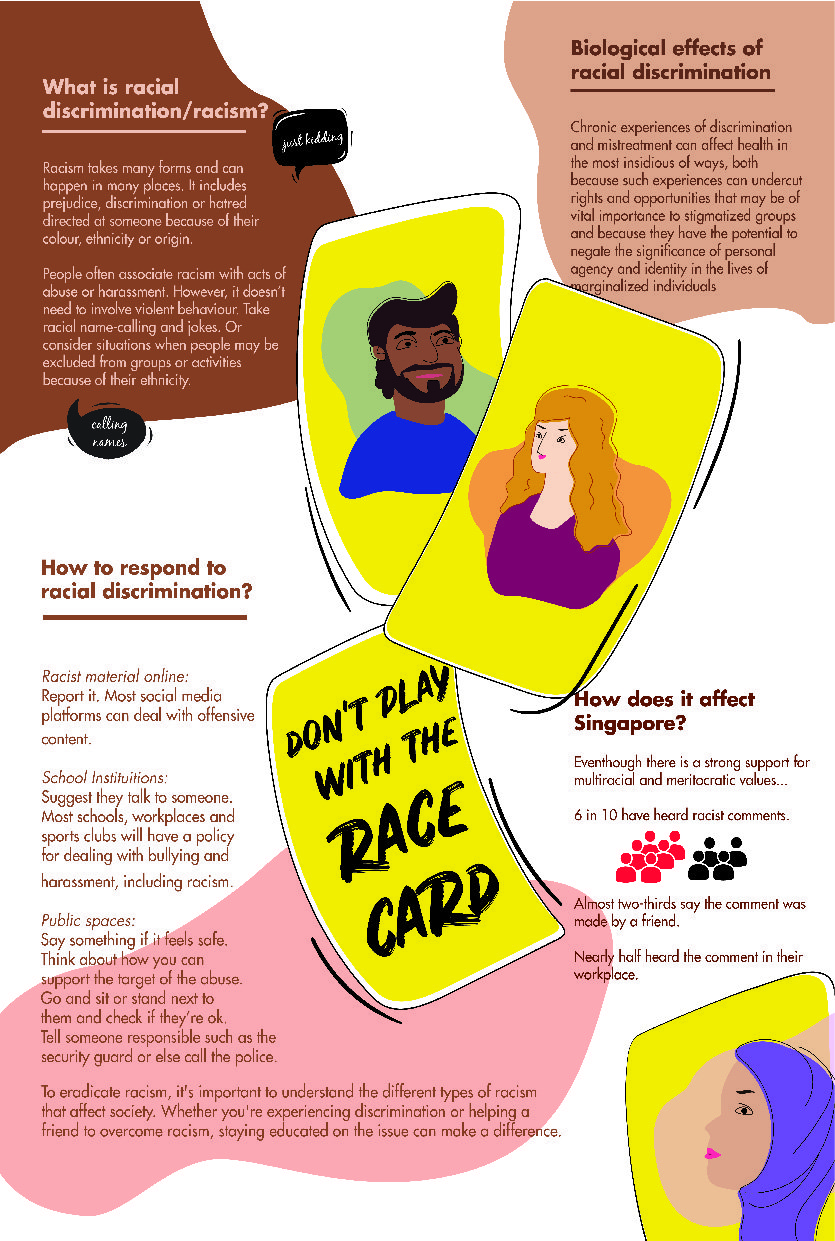
First of all, the content of the brochure should provide more information regarding workplace discrimination and also provides “solution” or assistance for those who might be experiencing such issues.
Drafts 1.1 and 1.2:
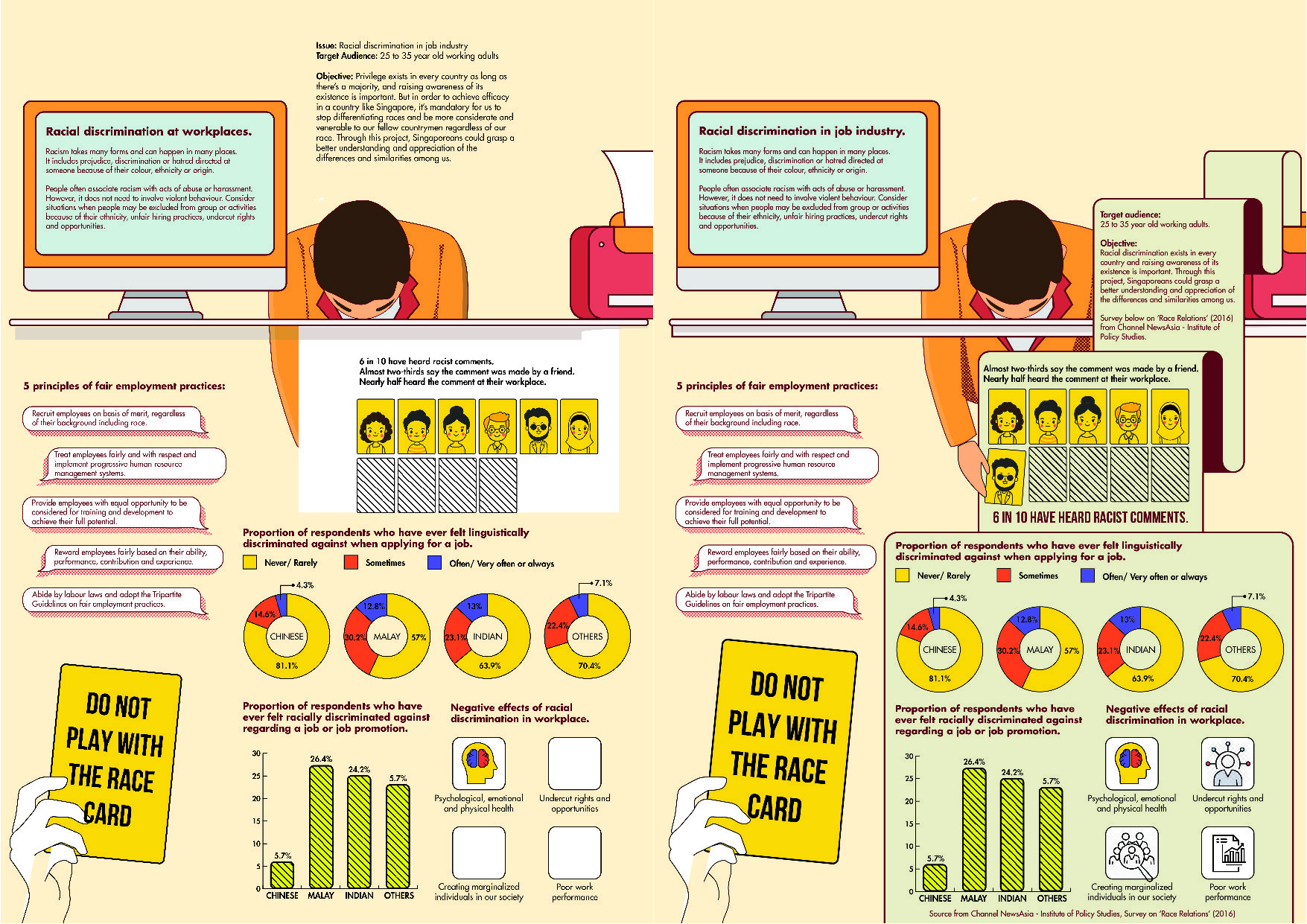
A and B differs in their information content. I was contemplating on what content that is relevant to the target audience.
Feedbacks:
- target audience choose 1; either for employers or for employees.
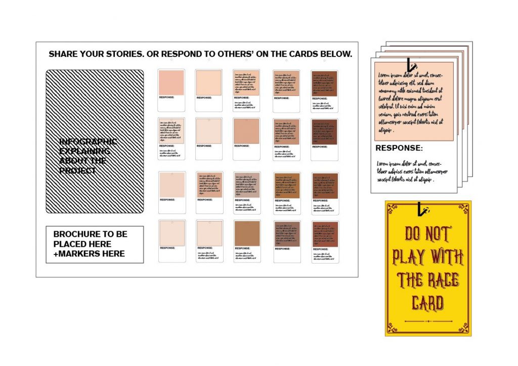
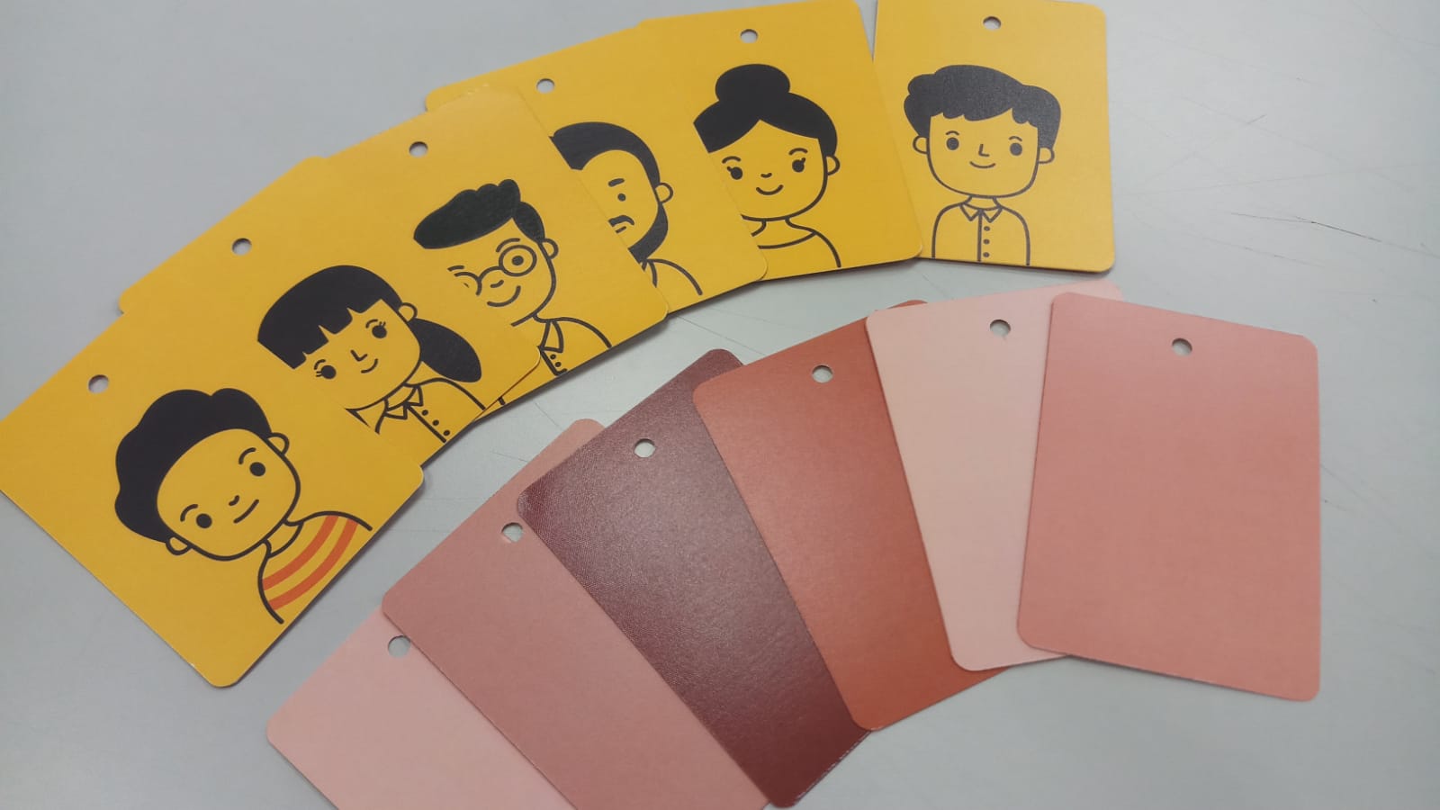
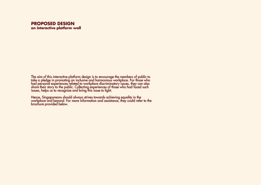
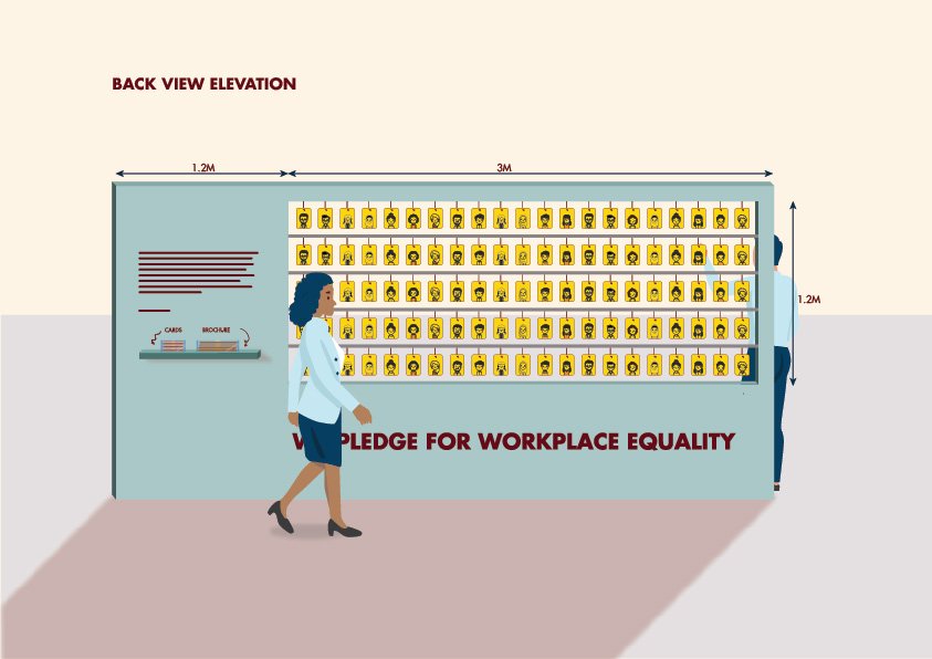
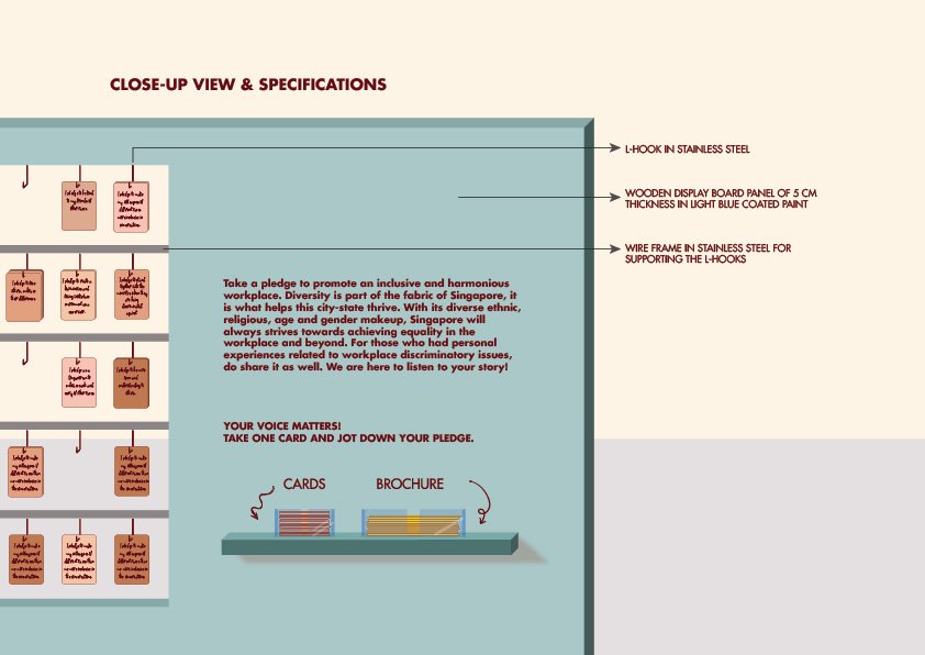
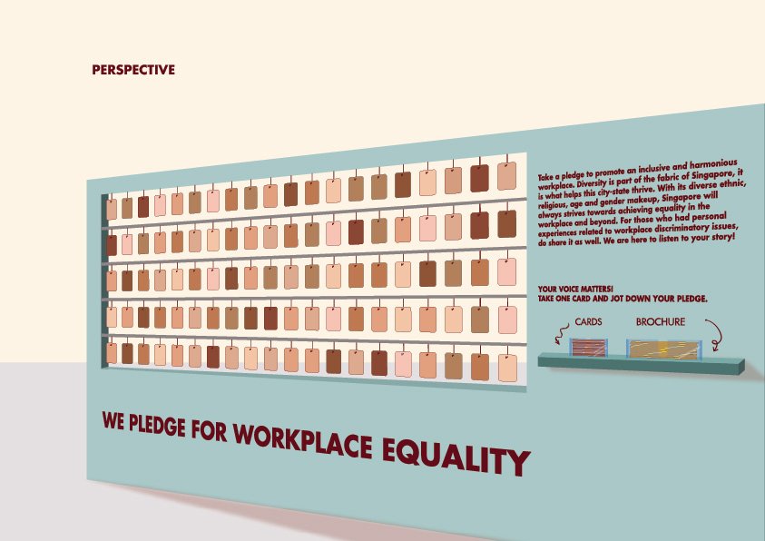
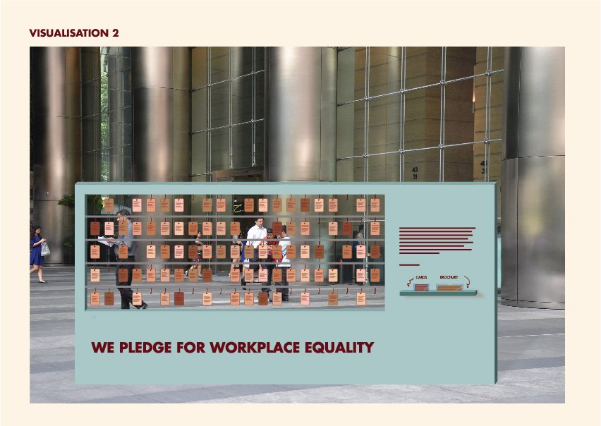
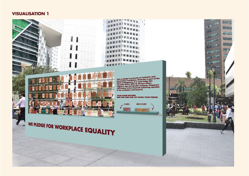
- the 2 deliverables must complement each other and hold together. Since my other deliverable outcome is a spatial exhibition that aims to get the public converse and take a pledge in promoting a harmonious workplace, maybe I could use this brochure as a solution (for them to reach out for assistance). And also to highlight the important information in order to bring the issue to attention.
Drafts 2.1 and 2.2:
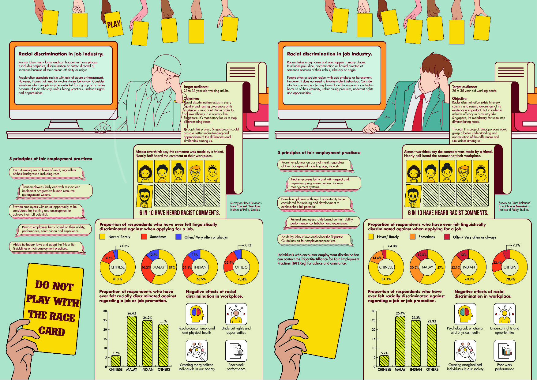
The placement of the people are weirdly spaced out, hence I changed the layout to:
Feedbacks:
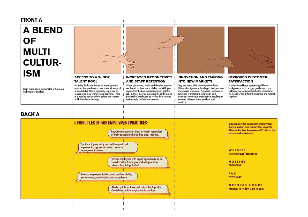
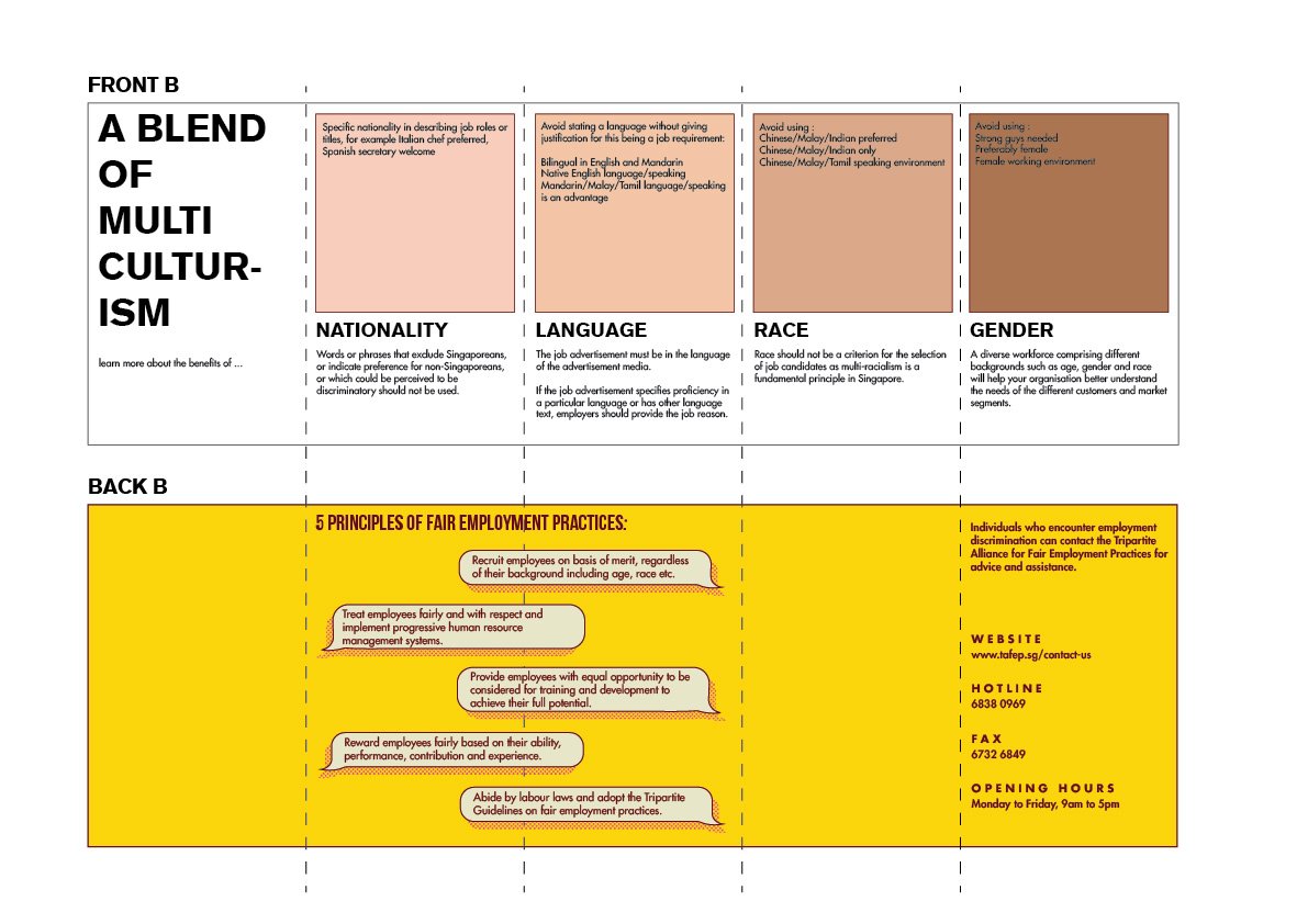
- This is an eight-fold brochure. Perhaps could explore 4-page brochure
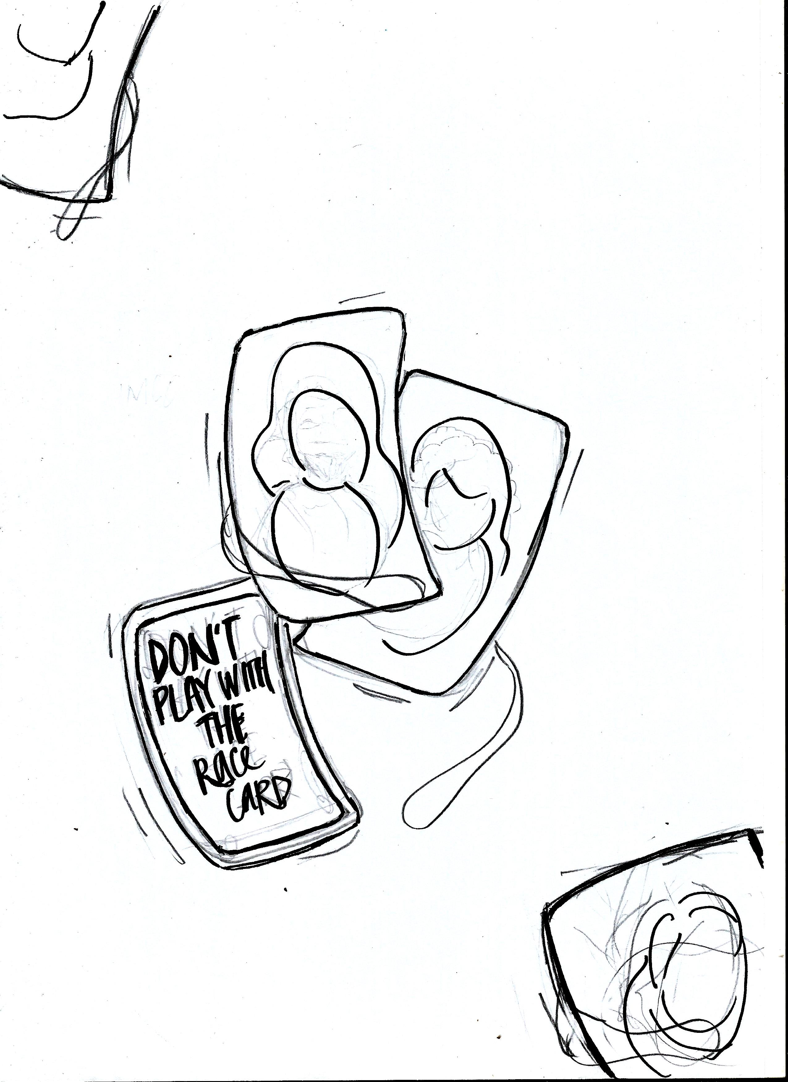
- The front cover could extend till the back of the brochure instead. Let the slogan intersect with the human figures.
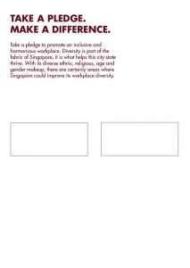
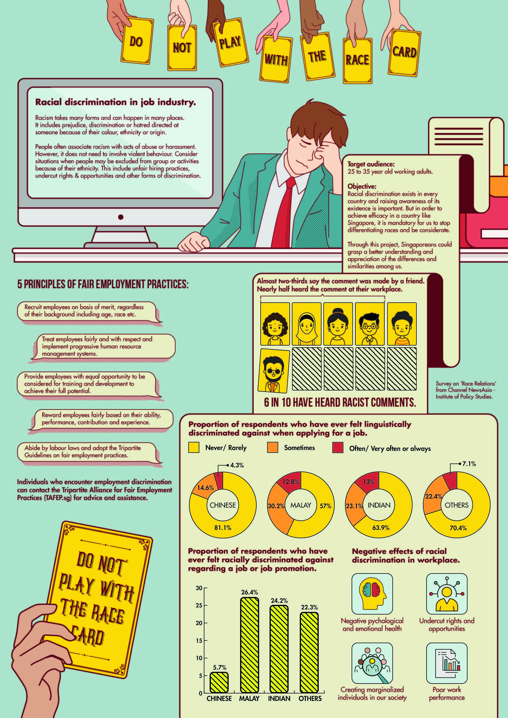
FINAL OUTCOME: BROCHURE
Front:
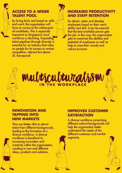
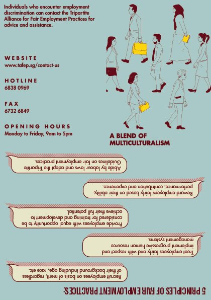
Back:
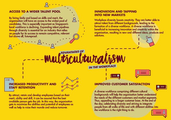
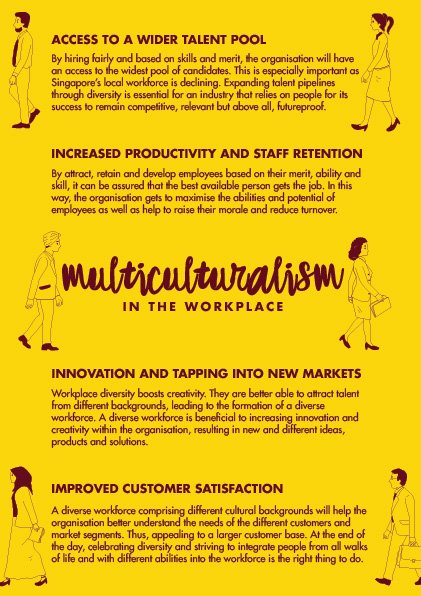
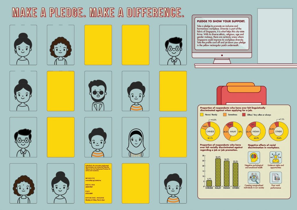
Added some key visuals that explains the body text information.


Recent Comments