Author: Syadza Z.

An avid fan of H.P.

Creative Industry Report: Izzy Wheels

(PRESENTATION SLIDES HERE)
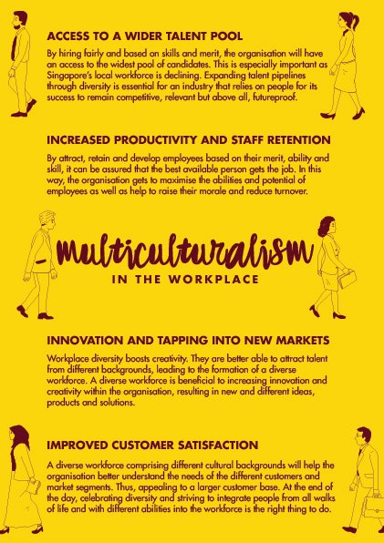
About

Launched in 2016, Izzy Wheels sells stylish, playful wheel covers for wheelchair users. The Dublin-based startup was founded by the 2 sisters, Ailbhe and Izzy. Ailbhe the creative director of Izzy wheels had one goal in mind when she started this, which is to make wheelchairs look nicer for their users.

Their story

The idea was inspired by her younger sister Izzy who was born with Spina Bifida and is paralyzed from her waist down. Izzy has always seen her wheelchair in a positive light but felt that it never reflects her bright and bubbly personality. Hence Ailbhe decided to create a range of interchangeable colourful wheel cover designs for her sister’s chair as her final year college project in The National College of Art and Design in 2016. She worked closely with her sister to get the right material and durability of the wheel covers to achieve lightweight, waterproof and scratch-proof design. Together they tested out various ways to fasten the wheel covers. And that’s how Izzy Wheels successfully takes off.

(fig. 1)

Izzy Wheels aims to bridge the gap between fashion and disability, all while armed with creativity. The wheel covers are an excellent conversation starter and it may break down stigmas. It transforms a medical device as a piece of fashion statement and self-expression that speaks the individuality of its users. They use their own platform to smash stigmas and empower people with disabilities with this tagline.: ‘If you can’t stand up, stand out.’

They had made a collaboration with Barbie back in 2019, for their 60th anniversary. For the collaboration, Barbie had expanded the “Fashionistas” line to include dolls with physical disabilities, including a doll with a wheelchair and a doll with a prosthetic limb. The collection has four limited edition wheelchair covers, designed by various artists. This collection is made especially for children with such condition and to explore dolls with more diversity.

What I really admire of Izzy Wheels is their ethos which speaks about Empowerment, self-expression, freedom, collaboration and confidence. And their whole brand built around the concept of bridging fashion and disability closer together.  Their definition of success is not about money or being famous but it’s about setting a new industry standard for future generations of designers, ones who can infuse their lived experiences into their work and that’s something I hope to strive for in the future.

References

Izzy Wheels: Bringing Beautiful Design To Wheelchairs Around The World. (2020). [fig 1]. Retrieved from http://natashalipman.com/izzy-wheels-wheelchair-design-disability/

Fletcher, H. (2020). Retrieved 5 October 2020, from https://www.10magazine.com/news/barbie-mattel-anniversary-izzy-wheels-art-school-malika-favre/

How Two Sisters Reinvented the Wheelchair. (2020). Retrieved 5 October 2020, from https://www.papermag.com/izzy-wheels-wheelchair-covers-wear-me-out-2646440220.html?rebelltitem=18#rebelltitem18

IZZY WHEELS. (2020). Retrieved 5 October 2020, from https://www.thinkhousehq.com/features/izzy-wheels

Munroe, N. (2020). The Most Diverse Doll In The World Just Took Another Leap Forward In Its Quest For True Inclusivity. Retrieved 5 October 2020, from https://www.vogue.co.uk/miss-vogue/article/barbie-and-izzy-wheels-collaboration

O’hear, S. (2020). TechCrunch is now a part of Verizon Media. Retrieved 5 October 2020, from https://techcrunch.com/2017/05/04/pimp-my-ride/

Pike, N. (2020). Girl On A Mission: Izzy Wheels Founder Ailbhe Keane. Retrieved 5 October 2020, from https://www.vogue.co.uk/article/izzy-wheels-founder-interview

Avenging Sea Conquerors

ABOUT

A warm water blob was sitting off the coast, throwing the ecosystem into turmoil. The marine life scrambles to adapt to lethal waste dumped by humans. However, not all species able to adapt to these rapid changes as they do not have high levels of genetic variation.

Few years later, raging unknown mutant species of sea mammals roam about in the sea. They suffered harrowing tragedies as they watched their friends dying in the toxic ocean. They swore to avenge humans. They are the sea conquerors.

BANNER @ ADM EXHIBIT

MEDIA NEXUS WALL

SWATCHES


MOCKUPS

TAKEAWAYS/FUTURE IMPROVEMENT

Approaching this topic/theme on Supernatural Naturalist, I realized I could be more innovative and creative.. This is because I noticed that most of my peers had ideas that similarly along the line – mostly on deep sea creatures and environmental issues caused by humans. Nevertheless, I had fun creating imaginary creatures that are weirdly dangerous looking. At start I wanted to try something new- acrylic pour but it does not work out like it suppose to after running few trials. Hence, that is the reason why I decided to drop that and just continuing illustrations and using photoshop. However despite that, i got to experience acrylic pour and will definitely explore more on that for my future projects. (below are some of the acrylic pours I made)

This sem had been a great and meaningful journey despite the COVID outbreak and all. I am satisfied when my banner was being printed out as the colors are gorgeous and wonderful. Thank you Prof Ina for the guidance, suggestions and ideas during consultations and in-class activities!


Moodboard

Concept 1 explores the hidden magical garden that exists outside of real world and thus, it focuses on the details and intricacy of the flora & fauna. Daryl Feril works combine 2 techniques: Illustration and watercolor effect. Hence, concept 1 could be the illustrations + acrylic pour technique.

For concept 2, motifs focuses around mythical sea creatures such as hippocampus, and other supernatural sea creatures, generally a hybrid, sometimes part human, whose existence has not or cannot be proved. Possible illustrations could be weird-looking mutations of sea creatures that we generally familiar of. Eg. Seashells, octopus, blowfish etc.

Moodboard/ theme: Vintage style, textured effect to give off this ‘old folklore tale’ vibes about the creatures living deep down in the sea.


Reading assignment: Internet Art

“Internet Art” by Rachel Greene shows how artists have used online technologies to engage with the traditions of art history, to create new forms of art, and to move beyond the artistic realm. When the Internet emerged as a mass global communication network in the mid-1990s, artists immediately recognized the exciting possibilities for creative innovation that came with it. 

This book will show how the shifts in information technologies that began during the 1990s have affected, impacted on and, in turn, been influenced by artistic practices. Internet art is sometimes viewed by the establishment as emblematic of how we live now, but at other times is taken as derivative, immature art practice. For curators and viewers who take an interest in internet art, the field represents fresh aesthetic possibilities and contribute to contemporary art contemporary art discourse . For those who do not support it, internet art is often thought to lack of craft and and challenge the authentic meaningful art.

It is important to explore parallels between net art and ideas in the work of earlier artists and movements – for example, Nam June Park’s (b. 1932) Participation TV (1963), which took the television, traditionally a broadcast platform, and shaped it into an interactive canvas. Paik’s apparatus for reception and production prefigured browser art , which treats browsers as fodder for experimentation.

Art Science Museum

Art Science Museum: Future world – is a futuristic world of high-tech interactive artworks created in collaboration with teamLab, a renowned interdisciplinary art collective.

My favorite piece in ASM will be the ‘Sketch Piston – Playing Music’ interactive LED installation. This installation allows us to compose our own musical masterpiece by drawing lines on the screens with our fingers to tapping the screens to drop a ball onto the drawn lines, the different actions will result in a symphony of joyous sounds.

With the more lines drawn and more balls being dropped, the more vibrant, animated and lively the environment become. And it is quite exciting to see the end results!


Another one of my favourite installation would be the interactive LED ‘hopscotch’. I had so much fun playing and bring out the inner child in me. First, I had to create my own ‘hopscotch’ on the standing screen in front. Afterwards I could play the hopscotch that I’ve created.

The most elegant and wondrous installation would be ‘Space’.  Infinite number of light particles inside the scintillating Crystal Universe. With over 170,000 LED lights, giving the illusion of stars moving in space. To conclude I really enjoyed my first trip to ASM as it gives me ideas and inspirations on how creative interactive installations could be.

INTER-MISSION interactive installation

THE LAPSE PROJECT

Singapore International Festival of Arts 2018, The Arts House Gallery


The Lapse Project imagines a world that is constituted through interfaces where places of artistic and cultural identities become editable, and can just as easily be switched on or off. The familiar monuments and landmarks of Singapore– The Arts House, National Gallery Singapore, National Museum of Singapore – through processes of digital manipulation, it “erases” them and lets the visitors experience and question their memory, space and legacy through lapses in structure, time, particle, text and image. Visitors are invited to embody these lapses, contemplating the presence and absence of sights and sites.

The Lapse Project moves back and forth, to and fro. Its VR immersion is futuristic and propels us forward, yet its visions take us back. Lapse conjures memories, transporting us to the past, and the imagined open landscapes that existed before the nation’s art museums and buildings appeared. It presents “the aesthetics of disappearance.”

The Lapse Project were subdivided into 5 lapses. Firstly,

1. VR LAPSE

VR constructed new domains for us to experience an alternate reality in the virtual realm. Basically VR lapse suspends the viewer in a 360-degree view of the vicinity, as they situate themselves around the blank expanse of a cultural and heritage building that considered as monuments of Singapore. What emotions would evoke with the absence of a historical monument?

Intended experience/message: To consider the emotions triggered by the experience of such a disappearance. What happens when a local landmark is no longer extant and more importantly, how do we feel in the event of its absence?

2. particle LAPSE

Particles are tiny bits of matter that make up everything in the universe. They vibrate and atoms are in a constant state of motion with their speed determining different states. Sound and thought are also vibration, an indication of life. Synergising with VR Lapse, the micro vibrations collected from the visitors via contact microphones and amplified as feedback directly to the viewer. They intended to do so to confuse the
confusing the experience of a singular reality through spectral sounds that suggest
other variations of embodied experiences.

3. 24hour LAPSE

From the CCTV camera, visitors from exactly 24 hours ago ‘float’ into the gallery on the CRT monitor. Implies that the people of the past appear to coexist in the same space and time, showing no clear distinction between the past or the present.

Intended experience/message: To challenge our perception of reality in a complex web of algorithmic analysis which converges the space and people of different time zone into one.

4. panaroma LAPSE

Historical monuments were erased digitally from their respective locations in the
city, as though they were never extant within the Singaporean landscape.  Presented as a video projection that shows three major cultural institutions being absent in that projected space. In this altered world, people were still seen going about the usual interactions.

Intended experience/message: In this altered world where these 3 buildings are absent, what would Singapore’s art/cultural scene would have been?

5. journal LAPSE

The Lapse Journal simply extends the work beyond the experiential interaction to featuring writings of Steve,Seng Yu Jin and Christina. These 3 key people shares their ideas and thoughts in regards to reality and time and present their final aesthetic interpretations of the Lapse Project.

Below are some images showing 3 major Singapore’s cultural institutions being ‘erased’ in the alternate world.


Inspiring works/projects

Refer to this link for more information regarding this project:  https://www.hovercraftstudio.com/hoi-nyc-adapt-bb

Hovercraft created an interactive basketball trialing experience at Nike NYC’s House of Innovation. Found this project while scrolling through the Instagram page of @cacheflowe, a tech director at Hovercraft. His works and experiments are always creative, refreshing and intriguing.

About this project “nike adapt bb”:

Hovercraft created an interactive basketball trialing experience at Nike NYC’s House of Innovation. Focusing on the shoe’s performance and ease of use, Hovercraft created and developed a visual style that led users through various skill challenges. After the experience, consumers could take away a printed poster highlighting data from their actual performance.

This immersive game-play inspired trial experience was outfitted with motion-tracking cameras closed-circuit feeds and sensors to capture their gestures to display the visual effects on screen. Its a whole complex and detailed immersive project installation that is very successful.

Coaches could then tailor the experience based on participants interest & ability levels which allows consumers to experience the product and find their perfect fit.

About this project “interference pool”:

Interference Pool is an interactive audiovisual installation that aesthetically and conceptually explores the idea of virtual and physical space. This artwork installation is a collaboration of Cuppetelli and Mendoza as well as a sound designer artist, Peter Segerstrom. This is an extension of their previous collaboration, Transposition, which is a further development of Cuppetelli and Mendoza’s past works which were Nervous Structure and Notional Field. This artwork was first exhibited at the Muskegon Museum of Art, Muskegon in 2014.

The work consists of two floor sculptures, faced with a series of parallel elastic cord lines. The materials and equipment used in this in installations are plywood, elastic cord, video projectors, video cameras, sound system, computer and custom software. These sculptures are lit up by two video projectors, which output a computer generated graphic consisting of a set of white lines equal to the physical lines in the structure. With the aid of a video camera and custom software, the video projections react to audience’s motion. As the audience moves, the computer determines the direction of the motion by interpreting and even anticipating their actions. Then it generates a set of virtual forces that affect the lines, which curves and bend in a highly naturalistic way, as if they were being disturbed by wind or waves. In addition, the viewers triggered sounds as the system detects motions from their movements, therefore creating an ultimate immersive and responsive sound environment.

The purpose of this artwork is to contrast two very distinct aesthetics and ideas, the highly rational stiff grid against the organic essence of forces. Based on the title of this installation, it has reference to the optical effect that happens when these two elements interact. As two of these elements combine, an “interference pattern” is created. Hence, the audience could see their actions directly affects the straight rigid grid lines projected which resulted in an organic wave pattern.

Here’s another interactive experience project by Nike, an interactive playground for their customers to try out the promoted shoes: https://adage.com/creativity/work/nike-joyride-installation/2193081

Task 4: Brochure process & final

First of all, the content of the brochure should provide more information regarding workplace discrimination and also provides “solution” or assistance for those who might be experiencing such issues.

Drafts 1.1 and 1.2:

A and B differs in their information content. I was contemplating on what content that is relevant to the target audience.

Feedbacks:

  • target audience choose 1; either for employers or for employees.
  • the 2 deliverables must complement each other and hold together. Since my other deliverable outcome is a spatial exhibition that aims to get the public converse and take a pledge in promoting a harmonious workplace, maybe I could use this brochure as a solution (for them to reach out for assistance). And also to highlight the important information in order to bring the issue to attention.


Drafts 2.1 and 2.2:

The placement of the people are weirdly spaced out, hence I changed the layout to:

Feedbacks:

  • This is an eight-fold brochure. Perhaps could explore 4-page brochure
  • The front cover could extend till the back of the brochure instead. Let the slogan intersect with the human figures.
FINAL OUTCOME: BROCHURE

Front:

Back:

Added some key visuals that explains the body text information.


Task 3 process & final

As my topic is about racial discrimination in workplace, I thought a spatial design would works best to get people to engage in conversations related to the issue. This can be placed around Central Business District targeting the working adults.

First draft exploration:

  • the slogan should change
  • instead of just collecting responses, how about engage people to take a pledge

Second draft:

  • must be practical. currently the cards are not as enough (limitations of cards exists as the cards need to be torn off and could not be replenish instantly)
  • data of the survey does not need to be included.
  • instructions ?

Third draft:

  • i thought i should just make the whole thing simpler
  • added some new avatars – covers the 4 main ethnic races in Singapore – of different attires/ appearances / beliefs.


Feedbacks gathered to move forward towards final draft:

  • It raises and highlights the discriminatory practices but provide no solutions.
  • Recall the aim/purpose.
  • Change the slogan. It is not suitable with the current concept.
  • This can be an outlet for sharing personal stories/ collecting their experiences related to discriminatory in workplace.
  • The “solution” or assistance can be provided in the brochure.
  • At a glance, people should know what does this interactive wall is about.
  • Conversation starter for the crowd, to interact, to take a pledge – make them think what they are capable of doing in helping this issue.


FINAL DESIGN OUTCOME: 

Cards:


Exhibit space:


FEEDBACKS FROM PEERS:

  • Maybe could have a guide which helps to promote the brochure and reach out to the people to participate.
  • Rather than just taking a pledge, how about ” How they could help/ tackle the issue..”
  • How about markers? Are they provided with markers? This probably can be solve by having a guide that helps out with the overall flow of the user experience. The guide could explain and provide markers as well as giving out the brochures.