Category: My Work

Moodboard

Concept 1 explores the hidden magical garden that exists outside of real world and thus, it focuses on the details and intricacy of the flora & fauna. Daryl Feril works combine 2 techniques: Illustration and watercolor effect. Hence, concept 1 could be the illustrations + acrylic pour technique.

For concept 2, motifs focuses around mythical sea creatures such as hippocampus, and other supernatural sea creatures, generally a hybrid, sometimes part human, whose existence has not or cannot be proved. Possible illustrations could be weird-looking mutations of sea creatures that we generally familiar of. Eg. Seashells, octopus, blowfish etc.

Moodboard/ theme: Vintage style, textured effect to give off this ‘old folklore tale’ vibes about the creatures living deep down in the sea.


Task 4: Brochure process & final

First of all, the content of the brochure should provide more information regarding workplace discrimination and also provides “solution” or assistance for those who might be experiencing such issues.

Drafts 1.1 and 1.2:

A and B differs in their information content. I was contemplating on what content that is relevant to the target audience.

Feedbacks:

  • target audience choose 1; either for employers or for employees.
  • the 2 deliverables must complement each other and hold together. Since my other deliverable outcome is a spatial exhibition that aims to get the public converse and take a pledge in promoting a harmonious workplace, maybe I could use this brochure as a solution (for them to reach out for assistance). And also to highlight the important information in order to bring the issue to attention.


Drafts 2.1 and 2.2:

The placement of the people are weirdly spaced out, hence I changed the layout to:

Feedbacks:

  • This is an eight-fold brochure. Perhaps could explore 4-page brochure
  • The front cover could extend till the back of the brochure instead. Let the slogan intersect with the human figures.
FINAL OUTCOME: BROCHURE

Front:

Back:

Added some key visuals that explains the body text information.


Task 3 process & final

As my topic is about racial discrimination in workplace, I thought a spatial design would works best to get people to engage in conversations related to the issue. This can be placed around Central Business District targeting the working adults.

First draft exploration:

  • the slogan should change
  • instead of just collecting responses, how about engage people to take a pledge

Second draft:

  • must be practical. currently the cards are not as enough (limitations of cards exists as the cards need to be torn off and could not be replenish instantly)
  • data of the survey does not need to be included.
  • instructions ?

Third draft:

  • i thought i should just make the whole thing simpler
  • added some new avatars – covers the 4 main ethnic races in Singapore – of different attires/ appearances / beliefs.


Feedbacks gathered to move forward towards final draft:

  • It raises and highlights the discriminatory practices but provide no solutions.
  • Recall the aim/purpose.
  • Change the slogan. It is not suitable with the current concept.
  • This can be an outlet for sharing personal stories/ collecting their experiences related to discriminatory in workplace.
  • The “solution” or assistance can be provided in the brochure.
  • At a glance, people should know what does this interactive wall is about.
  • Conversation starter for the crowd, to interact, to take a pledge – make them think what they are capable of doing in helping this issue.


FINAL DESIGN OUTCOME: 

Cards:


Exhibit space:


FEEDBACKS FROM PEERS:

  • Maybe could have a guide which helps to promote the brochure and reach out to the people to participate.
  • Rather than just taking a pledge, how about ” How they could help/ tackle the issue..”
  • How about markers? Are they provided with markers? This probably can be solve by having a guide that helps out with the overall flow of the user experience. The guide could explain and provide markers as well as giving out the brochures.

Exploratory Research 1B

Chosen issue: Racial discrimination across the globe

Target audience: Every human race of diversities.

What is racism?

Racism takes many forms and can happen in many places. It includes prejudice, discrimination or hatred directed at someone because of their colour, ethnicity or origin.

People often associate racism with acts of abuse or harassment. However, it doesn’t need to involve violent behaviour. Take racial name-calling and jokes. Or consider situations when people may be excluded from groups or activities because of their ethnicity.

Objective of this survey:

  • Check the awareness of public regarding this issue
  • Getting know their personal experiences (if any) in order to get a better view on the different types of racism exists
  • Whether they know how to respond to racism.  For example, in a scenario whereby someone is being discriminated openly in the public. Online too.
  • To get to know what is the effective design solutions to address this issue, even though it is difficult to completely eradicate it in our society, at least it could be reduce to a minimal percentage.

Participants are of diverse races that includes Chinese, Malays, Indians, Arabs, Pakistani and Burmese. Mostly in 20s but it ranges from 20s to 40s. And most of them have usual or frequent contact with the ethnic minorities.

Based on the interviews using the questionnaire,

1. All respondents generally aware that racism is negative and mostly associated the word racism to anger, disappointment and unfairness. More than half respond that the trend of this issue is increasing across the globe. With the advance use of technologies, there has been a rise of hate speech and racism on social media platforms.

The United Nations Human Rights Council warns that the dissemination of hateful discourses in the online environment can lead people towards their naturalisation and acceptance as something normal.

In other words, if hate speech becomes the ‘new normal’, we can gradually witness online intolerance eventually becoming tolerable and an enduring component of the social landscape.

Articles are dated at least in 2017, 2018. Relatively new and still relevant.

2. More than half of the respondents personally experience racial discrimination, with a high occurrence at workplace and during job interviews.

Based on my research online, there are also many cases regarding racial discrimination at school institutions. Those cases are as below:

3. Many stated that if they were confronted a situation, such as when someone is being discriminated racially in public, most of them would stepped forward and speak up for them. The second most voted answer is that they would just stay silent and be on lookout; only intervene if things get worse. 

While silence from passersby often feels to victims as if the public is offering its tacit approval of abuse, some of the respondents said they stayed silent because they did not know what an appropriate response was and felt guilty afterwards for not doing more.

4. Getting know which medium is the most effective in addressing this issue. Mostly voted for raising awareness through prints, posters, brochures etc. And through interactive platforms/kits that encourages interaction between different races and cultures. Often racism is borne out of a lack of proper understanding between races.

The annual event by OnePeople.sg – the ground-up national body for racial and religious harmony – rallies Singaporeans to make a stand against racism and combat racial discrimination and prejudice. The Orange Ribbon Movement symbolizes friendship, brotherhood and kinship underpinned by values of respect, understanding and trust. The event also featured a Tea Talk Corner, where young people had facilitated discussions about racial harmony.

Article: https://www.straitstimes.com/singapore/3000-people-in-anti-racism-walk-at-marina-bay

And there are already existing laws in Singapore.

According to Section 298 of the Penal Code: “Uttering words, etc., with deliberate intent to wound the religious or racial feelings of any person” is an offence punishable by up to 3 years in jail and/or a fine. 


Still, racism remains a huge social and economic problem globally. In the US, it remains a major contributory factor to outcomes including depression, ill health, lower employment and wages. Even though in Singapore, the issue is not as pressing as in other countries, according to the survey commissioned by Channel NewsAsia and the Institute of Policy Studies, where almost half of the 2,000 respondents felt that “racism is still an issue in Singapore”.

Conclusion

Hence, based on the gathered survey, I am able to analyse the opinions of different races about this issue and raise new important concerns that I may overlooked before conducting this survey. This way I could provide an informative and effective design solutions for the general public.

Moodboards & Visual Research

Visual research
1) what is the poster communicating?
‘Living Under the Arcade’ is established to boost public interest in Guangzhou’s arcades. As a shop the initiative invites locals and tourists to contemplate the architecture as they visit the place for local and arcade-themed products. 
2) WHAT EMOTION DOES THE DESIGN ELICIT?
The use of typeface as well as the signage / architecture design, gives an overall  message that it is something fun, traditional, has Chinese influence and this kind of vibes can be seen in town/city area.
3) WHAT MAKES THE POSTER CAPTIVATING?
Only 2 main colors are used (green and red), this poster manage to create an impactful message and design visuals.
Moodboard – digital imaging
Moodboard – illustrations

Comic Sans trial

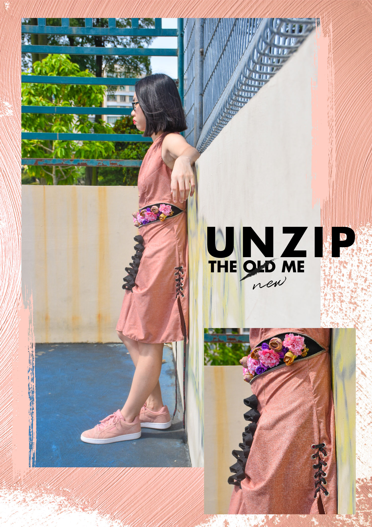
Group members: Kee Yong, Bala, Felicia Chua, Tiffany & Syadza


27 Aug: Discussion on how we could conduct the presentation

  • Felicia kickstarted the discussion by suggesting that we could do a talk show with a participatory game element
    • Bala suggested that talk show might be a bit formal for a fun font like Comic Sans
    • Hence Keeyong suggested that we can have a font talk show and act as different fonts; Comic Sans would be a guest speaker, act very ‘random’ and disrupts the interview.
    • Felicia suggested that the host could be Times New Roman, whilst Bala also suggested that Comic Sans could be a disruptive audience member
  • Bala suggested another idea on the basis of how Comic Sans has a bad reputation, and how the presentation could be a protest by designers/other fonts against Comic Sans. It could be about Comic Sans should indeed be used less.
    • This led to the court case suggested by Keeyong! (Photos below)
    • The court case would present the controversy that surrounds Comic Sans in the form of
    • After this, we assigned roles for research
  • Origins: Felicia
  • Significance: Keeyong
  • Prosecution: Syadza and Tiffany
  • Defense: Bala
  • Examples: Everyone


29 Aug: We had consult with Angeline, she gave us feedback that we were on the right track!


3 Sep: Writing of script, identification and delegating of props, assigning of roles

Props/Role Delegation:

  • Hanging Name Card Sign: Felicia
  • A4 papers with memes: Tiffany
  • Gavel: Syadza
  • Blog: Bala
  • Video taking: Bala
  • Video editing: Keeyong
  • Refining of script: Keeyong, Bala to help


Costumes: Everyone to wear black except for Comic Sans!


Skit set up & references:

  • Soundtrack: https://www.youtube.com/playlist?list=PL6akIKaXBeU3hPzULIPfnFptaAsnEdNMN
  • Mock trial script example: https://anyflip.com/hnui/ebmu http://www.courts.ca.gov/documents/mocktrialscript-contra.pdf

Dramatis Personae

The Judge, Times New Roman, played by Syadza

The Prosecuting Attorney, Arial Black, played by Felicia

The Defense Attorney, Gill Sans, played by Tiffany

The Defendant, Comic Sans, played by Kee Yong

Inspector Baskerville, played by Bala

Helvetica Neue, played by Bala

Wingdings, played by Bala

Dr. Courier New, played by Bala

Scene

5 Sept: Updated script @ Comic Sans Script

7 Sept: Updated presentation slides @ https://tinyurl.com/comicsanslides


How we have answered the project requirements:

Origins

  • The context in which it originated
  • Who designed it?
  • Why was it designed (reason of existence)?
We answered this requirement in Comic Sans’ soliloquy and Gill Sans’ final defense for Comic Sans:

“My maker was a Microsoft designer, Vincent Connare. He made me for a program called Microsoft Bob, which was a graphical interface for people who didn’t know how to use computers. I was made to be displayed in speech bubbles on a pixelated screen. He only designed me in three days, but he wanted to make something that people could read on small monitors. That would make kids want to use computers.”

”This is because he is the only free default font on Windows with undeniably friendly character, the only font with an element of humor and fun at that time in 1994.”

Context in which it originated:

  • In 1994, in a program called Microsoft Bob

Who designed it?

  • Vincent Connare

Why was it designed?

  • For kids and for people who didn’t know how to use speech bubbles; Windows needed a ‘friendly’ font
  • Specifically made for the screen (Windows 95 did not have anti-aliasing) does much better than Garamond
Examples of application and existence We have given examples where it was used more appropriately (memes, Microsoft Bob) as well as less appropriately (police cards, newspaper headlines etc as shown in the Helvetica video)
How has this typeface influenced us?  (researched + personal views) i.e. significance in both historical and contemporary context It’s significance lies in the controversy surrounding Comic Sans, which we have expressed in the cases for and against Comic Sans, to have the audience judge for themselves whether the hate towards Comic Sans today is warranted.

Comic Sans in historical context

  • Symbol of new technology in design – technology affecting all aspects of life, even children
  • Microsoft’s take on the classic comic lettering font used in comics of the 30s all the way up to 90s
    • Original comic fonts were hand-lettered by letterers and developed a distinctive handwriting style of their own
    • Popularized by newspaper comics and osmosis of superhero/detective comics into popular culture
  • Designed for Microsoft Bob as an attempt to make computers more relatable to humans

In contemporary context

  • Divorced from original comics context
  • Seen as a childish badly designed font, esp. in comparison with modern typefaces
  • Often found in inappropriate contexts
  • Status as Microsoft default font makes it extremely common, recognizable, and “basic”

Cases against:

  • Overused, and inappropriately
  • Not a great font visually
    • Bad kerning
    • Poor weight distribution

Cases for:

  • Not necessarily overused: In the usage of Comic Sans, people display an awareness of fonts’ ability to communicate
  • Accessible
  • Very legible, and tests have shown that it makes complex information easier to understand; used by dyslexia coaches as it facilitates reading.
  • Undeniable character: friendly, laid-back


Reflections

Syadza

Initially before conducting a research topic on Comic Sans, my judgement on Comic Sans has always been neutral. Though I dislike using it, I do not jump onto that hate bandwagon. Particularly because I do not find it amusing to hate a font. Comic Sans is one of the most frequently used fonts in the world, but at the same time, it is widely hated and ridiculed. Through this research and presentation, I finally got to know the reasons behind all the hatred as well as the initial motives of Comic Sans.

The history of Comic Sans, however, is a great way to be introduced to typography and fonts. This is because one has to learn about the kerning as well as the effective weight distribution which what makes a font looks presentable and legible. However, people use Comic Sans everywhere without much thought or care. The inappropriate usage of Comic Sans is the main reason to the massive hatred that it had receive from around the world – till today. Hence, after this research, I found it understandable and it serves a great lesson for all.

Tiffany

Through this research on Comic Sans, I have started to see the font in a different light and realised that it is a widely misunderstood font. At the same time, empathizing with it after reading on its background. It was the only ‘friendly-looking’ default font available during that time, hence it is understandable that people wanted to use it to express themselves in the least hostile way. It has also become clear to me that others, not just graphic designers, know that fonts give different moods and feelings.

Due to the misuse and overuse of the font, it is often portrayed in a negative light. However, I have learned that we can’t judge how people use the font in whatever context because everyone has a different way of expressing themselves.

Kee Yong

Comic Sans is an interesting case study because it’s one of the fonts almost universally considered to be “bad.” Where other fonts were created with purpose, Comic Sans was a throwaway font designed for a niche use case.

In my opinion, learning what not to do as a designer is often more informative than learning what to do. Comic Sans is a perfect example: it reinforces the lessons of typography and graphic design by showing the results when graphic design is ignored.

Despite this it’s surprisingly good when used in its intended role — small pixelated onscreen text — which shows that the rules of typography can also sometimes be broken.

Bala

I’d always liked Comic Sans. I’ve very fond memories of my ICT classes back in kindergarten, where my classmates, along with myself, would use Comic Sans and WordArt for everything. Since then, I’ve always felt that the hate for Comic Sans was much too extreme for the fun, friendly font of my childhood – which is why I researched on the Defense of Comic Sans portion for this presentation.

I was pretty stressed about the start about contributing enough for the presentation as I was going to be away for the debate tournament, but I’m glad we worked it out with the videos – I’m glad I was able to be part of the presentation even though I was not able to be physically there. I’m really glad that the videos gelled with the format too. Working with the group was really smooth, I really appreciated how everyone got things done on time, took initiative with the costumes and arrived punctually for our meetings. Writing the script and brainstorming ideas with Keeyong in particular was a really memorable experience for me as we bounced ideas off each other. Overall, it was a great experience being able to verbalize my reasons for liking Comic Sans in the script and learning more about the font.

Memphis

Memphis is a movement which took place during the postmodernism period. Inspired by a few converging similar movements such as Art Deco, Pop Art, Op Art, Anti-design and the emerging postmodernism which would come to pervade everything from furniture to film to music. Despite its name, the movement begun in Milan, Italy. It is distinguished by the aesthetics of Memphis Group, an Italian Postmodern design collective founded by Ettore Sottsass in 1981. The signature of Memphis piece combined geometric shapes from an array of materials in funky bright, contrasting colours. It was a remarkable departure from the underrated modernist design that had been in trend for decades. Their first work was formally introduced at the 1981 Milan Furniture Fair, an outrageous display of furnishings mocking the presentations of ‘Good Designs’. Later in 1986, Sottsass left the group with a thought that the group will evolve once its principal members leave. Though the Memphis group disbanded after a mere seven years, their legacy had left a powerful impact in design world. The designs that emerged from the Memphis Group had defined the boundary-pushing postmodernism of the ’80s.

Back to the 60s, it was a decade of revolutionary change which was mainly due to the baby boomers and their student movement. The media and design industries started to cater to this new audience. They drew ideas from within the art world to attract attention. A few emerging movements began to influence how Memphis style is later formed.  Memphis style has been described as “a shotgun wedding between Bauhaus and Fisher-Price”. The main key characteristics of their playful design includes the use of bold expressive texture, unorthodox shapes and contrasting materials which results to a cartoonish, wacky and whimsical appearance. Memphis movement is inspired by the bold geometric forms of Art Deco, the colour palette of Pop Art. Pop art (1958-1972) was originated in United States and United Kingdom. It is inspired by mass consumerism, popular culture and explosions of popular prints. They place emphasis on fun, change, variety, irreverence and disposability. Pop Art openly questioned the law of good design, rejecting modernism and its values. It is cheap and often poor quality which favoured expendability over durability. These values of Pop Art can be seen in Memphis style.

Besides Pop Art, Op Art (1965-1973) was one of the key inspirations of Memphis style. The characteristics of Op Art is that they put a strong emphasis on geometrical abstraction and repetition of pattern and lines. First, they started off in black and white and then began to transit in vibrant colour, making use of both positive and negative spaces. Anti-Design movement also came about in the 60s, in 1966. It was originated in Italy, also known as the Radical Design. They embraced exaggerated and expressive qualities to derail the functional value of an object. Ettore Sottsass Jr. was a key spokesman of the Anti-Design movement. He later became one of the key founding members of Memphis movement. The characteristics of anti-design are vibrant colours, unusual form and design and the use of irony and kitsch. These characteristics would later become the hallmarks of Postmodern design and then influence Memphis design.

Postmodernism was originated in Italy. It is a broad movement that emerged in the 1960s, become prominent in the late 1970s/1980s and remained a dominant force till today. The movement largely has been a reaction against the simplicity and structural design approach of the modern architecture and international style. This movement emerge after World War II as a backlash to the perceived failings of modernism. Some graphic design styles that emerged in the postmodernist era were New Wave Typography including the Italian Memphis Group. Postmodern design did not consist of one unified graphic style, the movement was an expressive and playful time for designers. Recently there is a comeback of Memphis Design in 2005 and 2006 in fashion, ceramic, sculpture, graphic. After Ettore’s death in 2007, interest in Memphis design was re-awakened in a big way. A founding member of the group, Nathalie Du Pasquier — designed a collection of patterns for American Apparel 2014 collection. This marks an indication that Memphis style is back.


Reference

Anti-Design. (1970) Retrieved from http://antidesignn.blogspot.com/2014/02/anti-design-was-italian-movement-around.html

Anti-Design Movement – Aestheticism of the Modern Era. (2018). Retrieved from https://www.widewalls.ch/anti-design-italian-movement/

Encyclopædia Britannica, Op art. (2018). Retrieved from https://www.britannica.com/art/Op-art

Feroleto, P. (2018). Memphis Design Information and Photographs. Retrieved from https://italychronicles.com/italian-design-focus-on-the-memphis-design-movement/

From Modernism to the Memphis Group. (2018). Retrieved from http://www.abc.net.au/radionational/programs/archived/bydesign/5017088

Frida Kahlo – The Mexican Surrealist Artist, Biography and Quotes – The Art History Archive, Anti-Design. (2018). Retrieved from http://www.arthistoryarchive.com/arthistory/antidesign/

Op Art (fl. 1965-70): Definition, Characteristics, History. (2018). Retrieved from http://www.visual-arts-cork.com/history-of-art/op-art.htm

Op Art History Part III: Origins and Influences on Op Art. (2018). Retrieved from http://www.op-art.co.uk/history/op-art-history-part-iii/

Postmodernism – Art Term | Tate. (2018). Retrieved from https://www.tate.org.uk/art/art-terms/p/postmodernism

Postmodernist Art: Definition, Characteristics, History. (2018). Retrieved from http://www.visual-arts-cork.com/postmodernism.htm#postmodernistart

User Data and Cookie Consent. (2018). Retrieved from https://www.thecut.com/2017/05/the-memphis-design-movement-is-having-a-moment.html


Artwear Fashion

Title of artwork: ‘Unzip the new me’

Artist statement: The concept behind this design revolves around the idea of coming of age. The certain age at which this transition takes place changes in society, as does the nature of the change. Upon unlocking the zip, the flowers bloom and this marks a new chapter in her life. A new beginning. A golden age of something good, right and real. This is to portray the narrative whereby the girl has finally graduated from high school and gained her freedom. The inspiration behind this design was spontaneous and I wanted to deal with daily normal uniforms/dresses to create something abnormal and unique. A design that breaks the norm. Hence, the base design is sleeveless high school uniform with pleats. I had incorporated certain elements such as detachable hand sleeves and eyelets with laces to tie up with the whole narrative.


Process of Zine – Faceless

Faceless

Suits and dresses, pretty laces.
The skycrapers, hovers those worn out faces.
Trudging along with faceless souls,
living in the city that are both fair and foul.
Appointments, meetings, from nine to six.
This is the lifestyle of the twisted and sick.
Any fool can criticize, complain, and condemn.
It’s not an easy task, for they’d left their life behind them.

Ideation

Listing down the key words and brainstorming for ideas based on the observations that I had noted down when visited the assigned place- Raffles Place.


Process I – page 2,3

The colors that I will be using will be bold and loud, in order to relay their thoughts and emotion through my zine. Since the art direction is glitch art, I decided to play around with the color layerings.

First, I had deconstructed the images using Photoshop, as the images have to be in png format and this way I am able to select a certain color range to replace with other colors. (CMYK)

Initially, this was one of the designs that I had come up with but personally, I felt that there was too much going on and messy. Hence, I decided to tone it down a notch and below is the final design that I had came up with.

The background image shows an English office guy jaywalking across the road while holding onto his sandwich, probably his lunch. This spread page is like the beginning before entering into the hectic lifestyle of an office worker. Hence, as you can see the left side of the composition is normal. However as it goes onto the next page 3, it is slowly distorted(wavy) and the cut-out of the two ladies are heavily distorted (the 2 ladies were discussing intensely while walking, probably about work). I wanted to portray that this is the start of the ‘glitching/broken down’ process.

I tried complementing with normal plain font but the whole composition does not match well together. Hence,the typography that I decided upon with were in distorted form too.

Process II – page 4,5

This spread page is whereby the readers are able to see as the first point of view of one of the office workers. Hence, the environment and graphics placed using one point perspective. I had used the perspective grid function in Illustrator for this. Below is the very short gif/clip on the process of the whole composition. Bold colors are used to bring out the whole ‘glitching’ vibes.

Some of the designs that I had integrated into the compositions are perspective lines (which shows the one-point perspective view of the office worker), blue screen theme, windows pop-up errors, matrix numbers and the play of bold colors.

I wanted to portray their current state of mind whereby, the office workers had work endlessly non-stop like a robot to a point that they will be malfunction. The image speaks for itself, countless of office workers rushing for time and use every possible minute to discuss about work – even while walking.

For this spread, the narrative part was included inside the windowsXP pop up box. Hence, the typography matches with the typical windowsXP fonts.

Process III- page 6,7

Lastly, for this spread I wanted to portray a total destruction. As the narrative begins with a normal lifestyle and slowly started to distort and ‘break down’, the 2 last pages would be the end-consequences. The colors that I had intended to use will be mainly blue as it shows the ‘blue screen’ effect which is quite typically seen whenever devices-ie. laptop- malfunctioned.

Process III- cover and back pages

The back page is the map of the Raffles Place. (the text is where the MRT station is) I decided to use lines of different lineweight to show the density and complexity of each buildings.

Whereas, the front cover shows the beginning as the caption says ‘you are now logged in’. The “whole malfunctioning” will start as soon as you flipped the zine.

FEEDBACK from peers

Some of the repetitive feedbacks/comments that I had received was about the choice of paper as well as about typography.

The choice of paper material that I had used was great, as mentioned by a few of them. I had used linen paper which able to bring out the bold colors as well as the thickness is just right. -not too thick as well as too flimsy. Both front cover and back page of my zine is in holographic material + transparency. I decided to use holographic because I find it very suitable to show the whole idea of glitching effect.

Typography– can be improve as some are hard to read at times. It clashes with the design as there are too much things going on. I think I should keep the fonts simple throughout- page 4 and 5 are the good examples.


Syadza