Faceless
Suits and dresses, pretty laces.
The skycrapers, hovers those worn out faces.
Trudging along with faceless souls,
living in the city that are both fair and foul.
Appointments, meetings, from nine to six.
This is the lifestyle of the twisted and sick.
Any fool can criticize, complain, and condemn.
It’s not an easy task, for they’d left their life behind them.
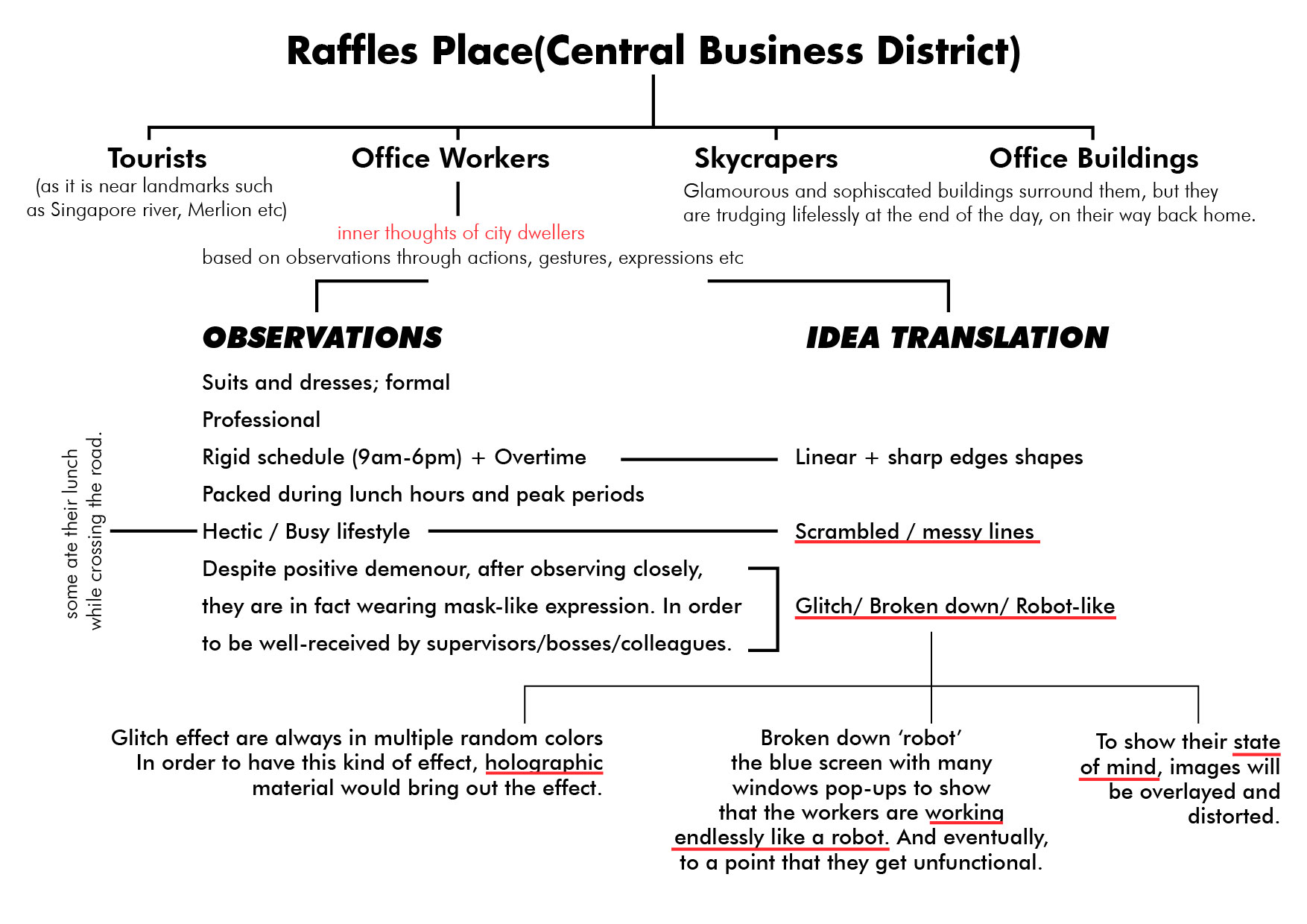
Ideation
Listing down the key words and brainstorming for ideas based on the observations that I had noted down when visited the assigned place- Raffles Place.
Process I – page 2,3


The colors that I will be using will be bold and loud, in order to relay their thoughts and emotion through my zine. Since the art direction is glitch art, I decided to play around with the color layerings.
First, I had deconstructed the images using Photoshop, as the images have to be in png format and this way I am able to select a certain color range to replace with other colors. (CMYK)
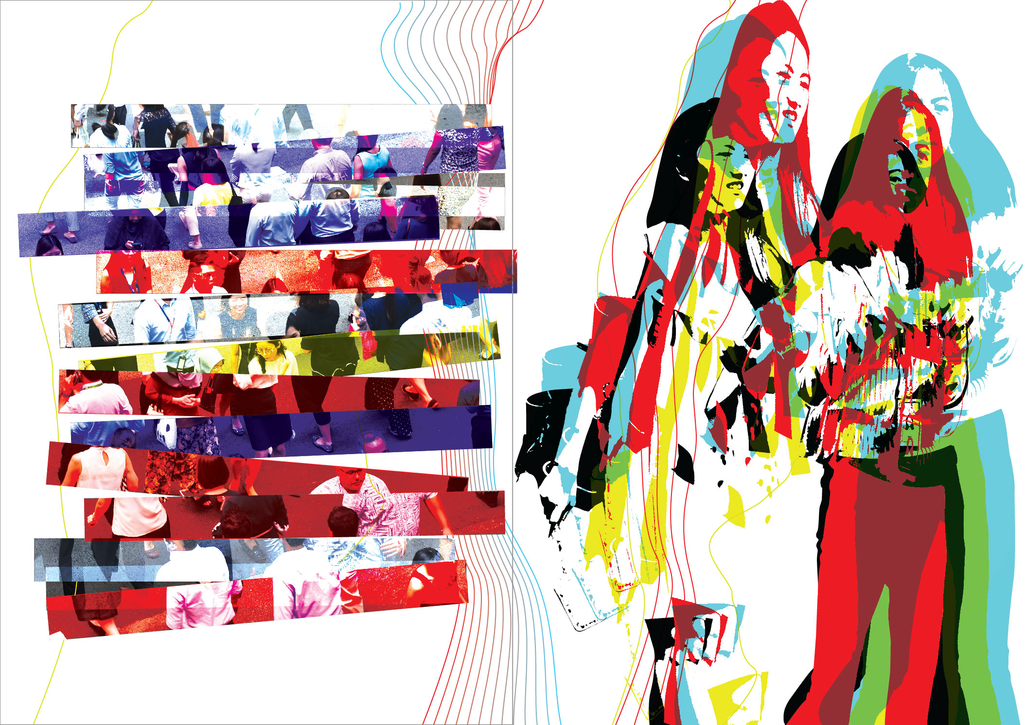
Initially, this was one of the designs that I had come up with but personally, I felt that there was too much going on and messy. Hence, I decided to tone it down a notch and below is the final design that I had came up with.
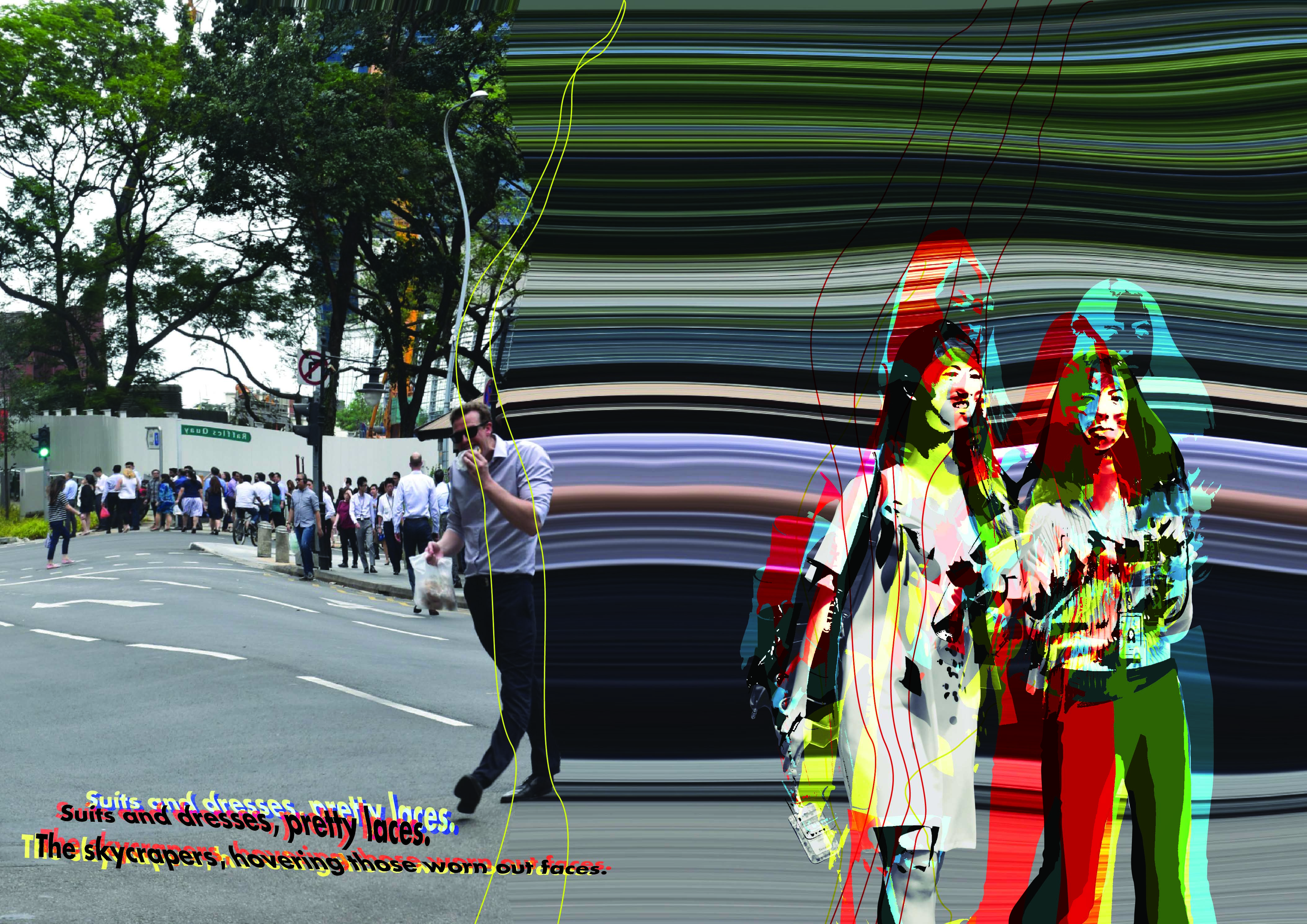
The background image shows an English office guy jaywalking across the road while holding onto his sandwich, probably his lunch. This spread page is like the beginning before entering into the hectic lifestyle of an office worker. Hence, as you can see the left side of the composition is normal. However as it goes onto the next page 3, it is slowly distorted(wavy) and the cut-out of the two ladies are heavily distorted (the 2 ladies were discussing intensely while walking, probably about work). I wanted to portray that this is the start of the ‘glitching/broken down’ process.
I tried complementing with normal plain font but the whole composition does not match well together. Hence,the typography that I decided upon with were in distorted form too.
Process II – page 4,5
This spread page is whereby the readers are able to see as the first point of view of one of the office workers. Hence, the environment and graphics placed using one point perspective. I had used the perspective grid function in Illustrator for this. Below is the very short gif/clip on the process of the whole composition. Bold colors are used to bring out the whole ‘glitching’ vibes.
Some of the designs that I had integrated into the compositions are perspective lines (which shows the one-point perspective view of the office worker), blue screen theme, windows pop-up errors, matrix numbers and the play of bold colors.
I wanted to portray their current state of mind whereby, the office workers had work endlessly non-stop like a robot to a point that they will be malfunction. The image speaks for itself, countless of office workers rushing for time and use every possible minute to discuss about work – even while walking.
For this spread, the narrative part was included inside the windowsXP pop up box. Hence, the typography matches with the typical windowsXP fonts.

Process III- page 6,7
Lastly, for this spread I wanted to portray a total destruction. As the narrative begins with a normal lifestyle and slowly started to distort and ‘break down’, the 2 last pages would be the end-consequences. The colors that I had intended to use will be mainly blue as it shows the ‘blue screen’ effect which is quite typically seen whenever devices-ie. laptop- malfunctioned.

Process III- cover and back pages

The back page is the map of the Raffles Place. (the text is where the MRT station is) I decided to use lines of different lineweight to show the density and complexity of each buildings.
Whereas, the front cover shows the beginning as the caption says ‘you are now logged in’. The “whole malfunctioning” will start as soon as you flipped the zine.
FEEDBACK from peers
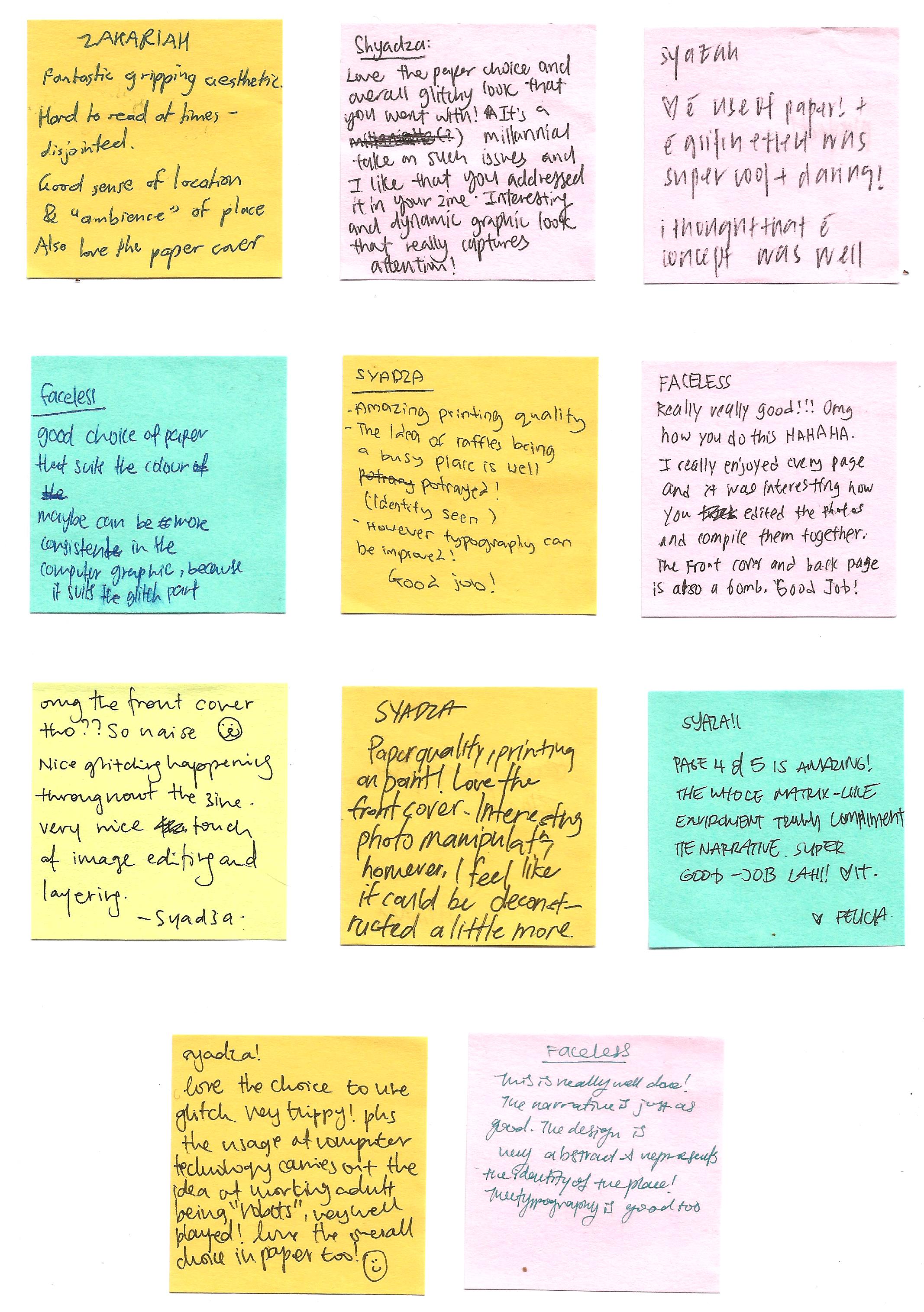
Some of the repetitive feedbacks/comments that I had received was about the choice of paper as well as about typography.
The choice of paper material that I had used was great, as mentioned by a few of them. I had used linen paper which able to bring out the bold colors as well as the thickness is just right. -not too thick as well as too flimsy. Both front cover and back page of my zine is in holographic material + transparency. I decided to use holographic because I find it very suitable to show the whole idea of glitching effect.
Typography– can be improve as some are hard to read at times. It clashes with the design as there are too much things going on. I think I should keep the fonts simple throughout- page 4 and 5 are the good examples.
Syadza
Recent Comments