Project 1 “Therapeutic Graphics” – Further Exploration and Final

After getting feedback from the class, I decided to do more research on the kinds of landscapes that could inspire me to create new forms of therapeutic art.

I turned to Japanese woodblock prints, both traditional (e.g. Hokusai) and modern as I felt that the clean shapes and natural forms depicted in the prints suited the style of my work.

ExportedVision_2004_177e

8498140_1

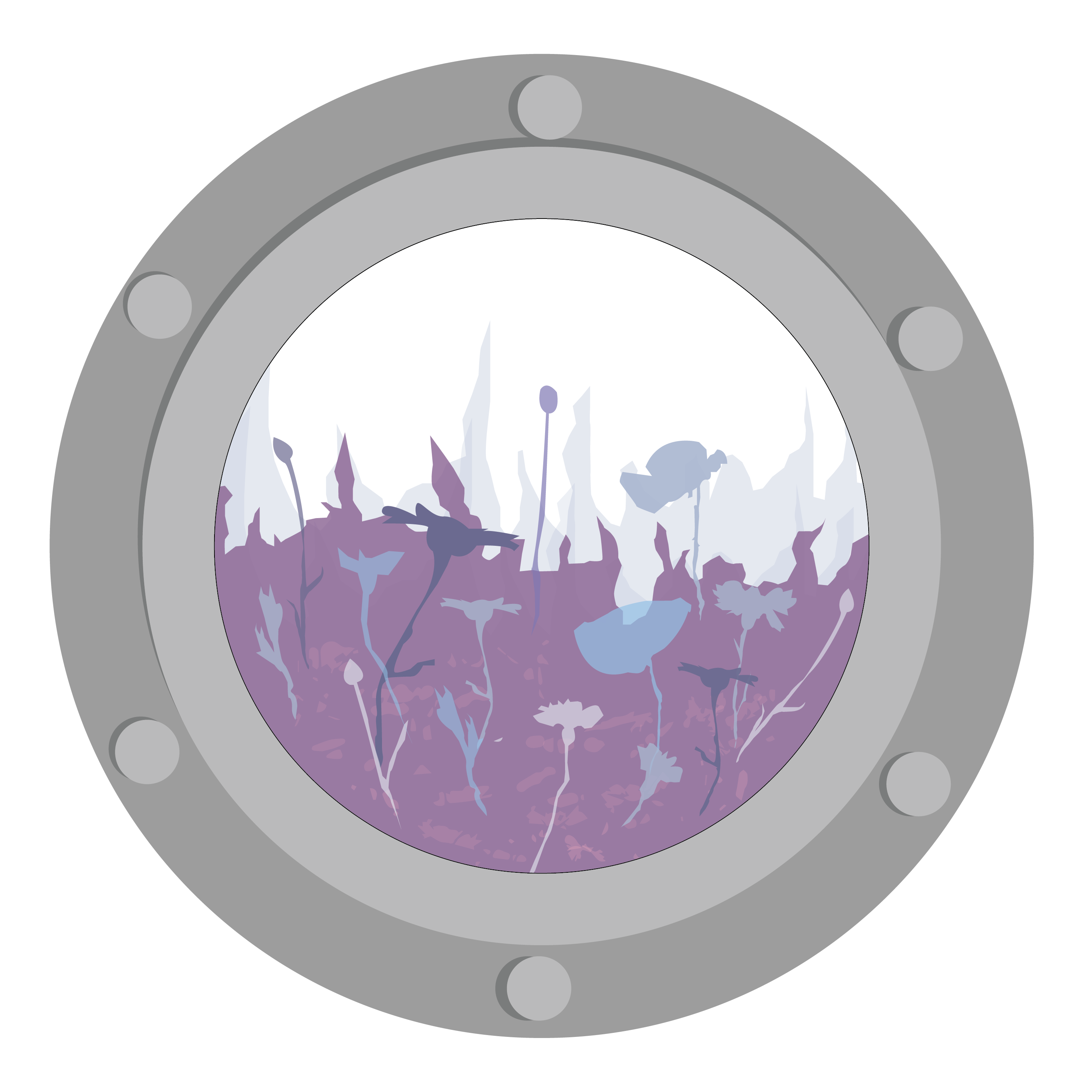
While both styles of Japanese woodblock prints often derived inspiration and subject matter from scenes in nature, he more modern woodblock print works were even more simplistic in style than the traditional ones and often reduced the landscape into simple silhouettes.

15092g1

bird-with-trees

40576g1

There were also a lot of overlapping shapes and colours to create texture. Hence, emulating that, I created my piece based on the idea of depicting one of the 4 seasons, spring.

colour test 02-01

Spring – Field of Flowers

For this piece, I chose to depict spring as I wanted to explore a series based on the 4 seasons, and I felt that spring fitted the purple colour scheme the most. I played around with the various opacities and colour combinations to create variation in the work while still maintaining the clean cut shapes similar to the style of the woodblock prints.


I also explored an alternative composition (Summer) to explore the possibility of developing the format of the work into a series.

summer-01

Summer – Dunes of Sand


Project 1 “Therapeutic Graphics” – Initial Colour and Composition

After the initial experimentation with abstract compositions, I was dissatisfied with what I came up with and hence decided to branch into more narrative-based compositions.

I came up with a basic composition of a character within an imaginary landscape to create a dreamy atmosphere that the viewer could immerse within. To frame the image, I used the idea of a window-within-a-window by creating a porthole frame – to give the experience of peering out from a vessel (e.g. a submarine) to see new lands.

For the colour palettes, I picked colours from various nature photographs to compose a variety of colour palettes. Then I superimposed that colour palettes on the composition to test out the mood each colour palette could create.

Colour Palette

Colour Palette

(From top) Earth/Forest

Sky

Woods

Sunset

Colour Composition 1 (Earth/ Forest)

Colour Composition 1 (Earth/ Forest)

Colour Composition 02 - Sky

Colour Composition 02 (Sky)

Colour Composition 02

Colour Composition 03 (Woods)

Colour Composition 04 (Sunset)

Colour Composition 04 (Sunset)

Based on the critique from the class, most of them liked the second colour palette (sky) and thought it to be the most dreamy (and thus the most therapeutic). In contrast, many people found the presence of the figure slightly disturbing and to hold pretty negative connotations with regards to the viewer and the hospital environment – something that I didn’t really notice until I was done with the work.

Hence, I decided to

  1. Branch out on purple/ blue colour scheme
  2. Do up a more general landscape (without the character)

(to be continued in next post!)

Project 1 “Therapeutic Graphics” – Research and Observations

Therapeutic Art

An art form that allows the viewer to seek “meaning, clarity  and healing”

For this project, we were meant to create an artwork for the J- Walk space within the Ng Teng Fong Hospital – the work was meant to adorn the windows of the public walkway that connected the hospital to Westgate.

We visited there during our first lesson (yay field trip!) and I took down some observations of the space:

20160808_112421

J – Walk

From the short trip there, I noticed firstly that the windows along the walkway were blocked out by very angular, rigid structures (including the thick window frames, V shaped pillars and bars on the exterior).

20160808_112429

20160808_112638

The sharp angular nature of the bars made the environment feel very cold and corporate.

Another thing that I noticed was that the space was mainly dominated by cool- toned/ neutral colours – the walls were painted white with grey fixtures and floors, and the light coming in from the windows also tended to wash out the area, making it seem cold and drab. Hence, both the colour and the structure of the space made it very clean, detached and sterile.

Thus, a graphic for the space would need to be able to combat the regular blocky nature of the space, as well as its lack of colour vibrancy.


After the field trip, I went back and did some brainstorming for ideas:

20160819_021621

Through my brainstorming, I decided to center my therapeutic graphic around organic textures found in nature to combat the harsh angular line found in the space. From there, I looked for inspiration online to create a moodboard on potential visual qualities I could use.

(All moodboard images can be found here: link)

moodboard 01 01 w

moodboard 01 02 w

I also did some research on the ways to depict these textures as artwork: while most of these textures seem pretty abstract, I realised that a lot of hospital artwork tended to be more narrative/ illustrative in nature:

Some examples of hospital graphics

Some examples of hospital graphics

Thus I also branched out on 2 ways of presentation for my research: I looked to collage style works as a way of integrating different organic textures, and illustration for the whimsical narrative style.

md w

md w

From there, I did a few little thumbnails to try out different abstract compositions.

20160826_203755 ZZ

I wan’t happy with the abstract compositions that I came up with, so I decided to go for a more narrative style in the work (more in the next post!).