The portrayal of violence in Bonnie and Clyde

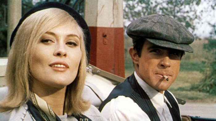
Bonnie and Clyde (1967, dir. Arthur Penn) remains one of the landmark films marking the start of the New Hollywood era, breaking many cinematic taboos, especially in the portrayal of crime, sex and violence. With improvements in technology, cameras became lighter and easier to carry around, as well as creating new ways to film (such as the zoom lens creating dramatic zoom effects). Penn uses these new possibilities in camera movement and filming along with editing techniques prominent in French New Wave to not only overwhelm and shock the viewer, but also portray it realistically – Bonnie and Clyde was notably one of the first films to use blood extensively in their violent scenes. In this way, the violence is not seen as theatrics on the screen but rather one that is weighted with consequence and message – especially in the era of the highly visible and televised Vietnam War.

The first scene of ‘violence’ starts out relatively tame, and can even be argued as to whether it is ‘violent’ at all – Clyde shooting at a row of bottles for shooting practice, and then later inducting Bonnie into the act. The interesting thing about this shot is that the camera shoots from the perspective of the bottle, facing Clyde, essentially bringing the audience to gunpoint. While there is no harm done, the way the shot is framed makes it direct and confrontational, setting the ground for further violence later in the film.

The next scene where Clyde shoots is the sign of possession placed by the bank at the front of the abandoned house. Under that particular context, the shooting can be seen as an anti-establishment act of rebellion: it is here that Clyde formally declares, ‘We rob banks.’ Hence, the violence here is used as a way to cement the path of Bonnie and Clyde – their resolve is decided by their declaration, which continues to their death. It is also interesting to note the constant attention that the camera gives to signs (road signs, shop signs, etc), often devoting exclusive close-ups to them. This use of the zoom not only helps to give context for the start of each scene, but more importantly establishes symbols/places of authority, and Bonnie and Clyde as defying that authority – in their first ‘real’ bank heist, Clyde takes the time to shoot the signboard at the bank’s entrance even when they were in a haste to get away.

And all the acts of violence culminates into the finale – the camera starts off at a slow pace, alternating from Bonnie and Clyde’s point of view and establishing shots to show their car pulling to the side, while gradually zooming into their faces as they realise their predicament, distorting the viewpoint for added dramatic flair. At the same time, the shots become quicker and shorter, focusing on very short, staccatoed movements such as the actions of heads moving and turning, the flock of pigeons flying from the tree and the disturbance in the tress, intercutting between them to create a rhythmic tension to build up to the climax. This then escalates to the final shooting – where the durations of the shots become longer, the shots with the bodies of Bonnie and Clyde falling intentionally slowed down to show the extent of the violence and carnage on their defenceless bodies. Here the rhythm of the scene is replaced by the sound of the guns, keeping the height of the tension and thus allowing for the editor to play around with longer cuts. The shots also become longer and further away, to better show to movement of the corpses as they hit the ground. In this way, the camera and the editing work together in a tight montage to showcase the final escalation of violence – despite the lack of a musical score, the tension is successfully built up with the intercutting shots right until the climax, where it then gets stretched out (and played over again – the montage included shots of the same action from different vantage points and angles) for the audience to fully take in the horror of the couples’ deaths – unlike their meeting and journey together, their final death is far from romantic – and the use of physical effects and blood makes sure that the stark nature of the violence is clear. The message of this portrayal of violence seems to be ambivalent as well – is the violent end of Bonnie and Clyde their just desserts for their life of crime, or is this level of violence unwarranted for two small time robbers? Either way, the violence marks an end to their young lives and their life of romance, sex and crime.

The visualisation of gothic horror in Rebecca

Rebecca (1940) was Hitchcock’s first American project, and was itself an adaptation of the 1938 novel by Daphne Du Maurier. As an adaptation of a novel, Rebecca is interesting in the way it visualises the genre of gothic horror (or in this case, more of a thriller) for the big screen. Hitchcock uses careful camera movements, mise-en-scene, and set lighting to create a compelling narrative of tension, suspense and cinematic moments filled with visual symbolism, very much faithful to the brooding, ominous nature of the literary genre.

The movie opens with the static shot of a moon slowly shrouded with clouds, before fading to a shot of the Menderley manor gates. The gate to the Menderley manor looks elaborate and old, yet sinister with a sense of foreboding, further amplified with the setting of the shot being at night. The voyeuristic shot peering through the branches to look at the house is reminiscent of the ominous scene setting shots at the beginning of The Cabinet of Dr Caligari, but Hitchcock takes that shot one step further. As the scene proceeds with a young woman’s narrative voiceover (Joan Fontaine), we are slowly led into the manor through the gate and into a long twisted lane, filled with fog that slowly part to reveal the grand Menderley manor. It is interesting to note that this slow-moving, roving long shot through the gate and the grand reveal of the manor is paired faithfully scene by scene with Joan Fontaine’s voiceover of a dream that she had of her walking into the place, e.g. from her at first being unable to enter (coupled with the hesitant movement of the camera at the front of the gate) before slowly moving in. Coupled together, the visuals and the sound produce an eerie, first-person viewpoint as if that of a spirit, allowing the viewer to be the in the shoes of the young woman experiencing the dream itself, creating a surreal, dream-like suspense that builds the atmosphere of the film. With this opening shot alone, the viewer is able to understand – this is not a plain romantic film, rather there lies deeper undercurrents within.

This sense of foreboding is carried into the next shot of the film – the first meeting of Maxim de Winter and the young woman starts with a shot staring straight at Maxim’s shoes at the edge of the cliff, as if he is about to jump. With the escalating music, it seems so until his concentration is broken by the young woman, who he then brushes off brusquely as he walks away. This less than romantic encounter (or rather one could even say ominous) gives a hint of the tension between the two people as well as the general mood of the film, once again playing very well into the gothic horror genre.

The scenes of Maxim’s courtship of the young woman stay generally cheerful, but take a stark turn as they arrive back at the manor after the honeymoon. The Menderley manor is typical of the gothic genre – old and historical and possibly harbouring lots of secrets, and Hitchcock successfully uses the grandiose set to create an effective juxtaposition with the helpless naiveté of the new wife. In the manor, everything seems to be built larger than life – the large doors that servants open for her, the huge windows and staircases that seem to loom over her, the tables laden with lavish silverware, even the table where she has breakfast at – seems to be built so much larger that Joan Fontaine’s figure shrinks in comparison. In the scene where she has breakfast right after she arrived at the manor, the camera follows her figure from the spread as she walks to her seat, before panning out to show the audience the full scale of the grand dining table of which she only takes a corner of. This careful planning and execution of camera movement, along with the lavish mise-en-scene, effectively exaggerates the scene to highlight the metaphorical displacement of the young woman in her new and unfamiliar environment.

As the story develops, the uses of lighting and mise-en-scene become more dramatic. In the scene where the heroine views some films strips with Maxim, the scene seems to tighten in tension unknowingly. As the heroine converses with Maxim, the light of the film projector flickers on their faces, showing only momentary glimpses of facial expressions. Along with the flickering noise of the moving film strip, the scene slowly builds tension until Maxim abruptly stands in front of the projector, essentially blocking most of the only source of light and creating strong and stark silhouettes on his face, showing only one side. This dramatic shift in lighting also brings about sudden change in mood, leading to the climax of the scene – where Maxim visibly angers and demands to know of the ‘gossip’ that the heroine speaks of. With the harsh lighting on Maxim’s face, he develops a menacing side previously unknown, throwing new possibilities to the viewer – is it possible that Maxim holds secrets that he does not want her to know? With this effective use of lighting to create a sudden shift in mood, along with the eerie soundtrack and flickering sound effects, Hitchcock builds up the scene much like how a gothic novel would, subtly and slowly to build up tension only to heighten to a dramatic climax. The coupling of lighting and sounds also contributes to the general ominous mood of the film as the heroine slowly learns more about her new spouse and the narrative moves on.

Thus, by carefully planning out the camera movement, mise-en-scene and the lighting of each shot, Hitchcock is able to slowly build a world of dream-like world of secrets and suspense that not only escalates the tension towards the climax, but also expresses visually the mental state as well as the relationships of the characters in the film.

My favourite work from Iskandar Jalil’s “Clay Travels”

selectedselected-2

Out of all the works there, it was extremely hard to pick one true favourite as there were many works that stood out to me and piqued my interest. In the end, I decided to pick this piece – I like how it is unassuming at first glance, with its earthen textures and dull colours, but a closer inspection of the work reveals a teeny little frog sitting on the wooden edge, adding a whimsical flair to the work. Much like the concept of wabi-sabi, this work must be carefully observed for one to gain a full appreciation for it. I also love the use of both treated material (as seen in the cut and treated wooden handle) and the material in its natural state (as seen in the piece of wood propped on top of the handle). The juxtaposition of the two different states of the same type of material is very interesting to me.

Reflection – Art Nouveau and Orientalism

Out of the many different aspects of the Art Nouveau movement that we covered in class, one detail that stood out to me was the introduction of Japanese art and oriental elements into (up till then) a primarily Euro-centric narrative of graphic design history, and how it drastically changed the aesthetics and graphic elements for graphic design of that time.

Orientalism was not really new to art – in works from the Renaissance and Baroque era, there were already Oriental subjects present: from figures in Middle Eastern dress to scenes of Turkish, Greek, African and even Egyptian cultures, to suit the patrons with a more exotic palette. However, what really stood out to me in Art Nouveau was that artists did not merely copy (or attempt to imagine) Oriental subjects, but instead assimilated uniquely Japanese styles of expression to create a new approach to their work.

With the Meiji Restoration, the opening of Japan’s ports to Europe caused a large influx of Japanese art, culture and crafts into Europe. Among those, woodblock prints such as those from the likes of Hokusai proved to be the most popular and influential, with its flat, linear style and blocky colours greatly influencing the poster artists of the time (e.g. Beardsley and Toulouse-Lautrec).

To me, this was really interesting as it was the first time we see Asian art being put on the same level as its European counterparts. With the very Euro-centric narrative of graphic design, it is easy to toss aside Asian-style art and graphics as mere craft, with little to no individual aesthetic sense. Thus, it is fascinating to see Japanese work being appreciated and mimicked to the point where it helped to direct an entire art movement with styles and ideas entirely foreign to its origin.

Reflection – The Industrial Revolution

It was interesting to learn about the industrial revolution at a more in depth level – previously, I studied history but focused more on modern world history (1900-) and I could not help but see similarities between the industrial revolution and what later happened (again) with the industrialisation and urbanization in the States in the 1920s. Once again, with the advancements in technology and production, the worker is alienated from the fruits of his labour and is delegated to a disposable role in the spirit of mass production to satisfy the growing demand for cheap consumer goods.

Perhaps that is why even with the ever improving technology and means of production, many traditions and handicraft skills still live on – despite their relative inefficiency, the ability to return to the tactile nature of the raw materials, to feel, touch and work with the crafts is something that humans crave; the authenticity of the handicraft is something we all need in the coldly productive and competent era of the machine.

And perhaps that was what William Morris was trying to achieve – in the Victorian period where everything was loud and excessive, he yearned for a return to the simplicity of the medieval ages where things were carefully and preciously made by hand, and handicraft was at its peak.

It is ironic though, that in his pursuit for this utopia, William Morris recreated the assembly line, albeit in another form – while the workshops he created to make his work were meant to cultivate the camaraderie of the collective and the artist guild in spirit, his top down control of the work meant that any kind of autonomy held by them was probably lost.

Pop Art Haniwa – Reflections

DD1004: Introduction to the Histories of Art II
Final Research and Practice Project

Title of the Work: Pop Art Haniwa

Team Member: Cheng Shao Meng (Merlin), Ong Ting Hui, Amy, Seth Devanshi

Soooo it’s already the end of the semester – it’s been a long and arduous journey but I sure learned a lot! For this project, I got to team up with my amazing team mates Devanshi and Merlin to create a visual response to an artwork or art form in China/ Japan/ India. Initially, it was hard for us to find a topic to work on – all of us did research but we didn’t find anything that resonated with us.

Then, Merlin brought up the case study of the Haniwa – being a gamer, he had quite a wide knowledge base on Japanese games and he found out that Haniwa was appropriated pretty heavily in Japanese video games. I remembered the Haniwa from lecture – I loved the cute form of it, and it was interesting to learn that it was actually adapted into cartoon characters in video games. As all of us really liked this topic, we decided on our topic pretty quickly.

Our initial idea was to adapt pop icons – we eventually picked Marilyn Monroe, but after feedback from Sujatha, we decided to revise our concept and contextualise it further to be more specific. So we picked Hello Kitty, which had better mass appeal and fits better into our concept.

Throughout the whole process of fleshing out the idea and executing it, Merlin and Devanshi were very helpful and we split the work evenly between us to do. All of us put in our own ideas and it was really fun and interesting to discuss this project with them!

All in all it was a really lighthearted and fun project and a great way to end the semester – it was hands on and great to do and we all learned many things in the process!


Postcards that we made for this project

Postcards that we made for this project

The Haniwa Kitty stands tall

The Haniwa Kitty stands tall

The super awesome Team Haniwa!

The super awesome Team Haniwa!

Reading Workshop – The Brush and the Burin

What are Mughal Albums?

Rice writes how Mughal albums “are in essence collections of disparate drawings, paintings of South Asian and Persian origins, specimens of Persian calligraphy and European engravings” – basically a book like display of select art pieces from various sources.

To me this seems pretty interesting and unusual – the curation of works indicated the Mughal court/king’s openness towards the influx of foreign cultures and practices, and the lack of a unifying narrative in the album seemed really distinct in a region that produces art heavily focused on visual narrative.

How can we understand painting in the Mughal context?

Personally, I feel that the painting in the Mughal context (within royal Mughal albums) can be understood in two ways – chronologically, and visually/ aesthetically.

Chronologically, a change in the Islamic attitude towards paintings as an art form can be seen – historically, paintings were looked upon with scorn due to their very literal figurative depiction, which was seen as a direct challenge to the creative authority of God. In comparison, calligraphy with its abstract brush strokes were often hailed as superior. However, this attitude can be seen to have changed upon examination of the royal Jahangir albums. In  these albums, paintings were collected and displayed alongside specimens of calligraphy, with attempts made to unify the two within the composition of the verso/ recto of the folios. The attention given to these paintings shown that painting was accorded a significant amount recognition as an art form, possibly even to be on par with the status of calligraphy. Hence it can be said that painting was viewed to be a prized form of art in the royal Mughal court, despite the contrary Islamic tradition.

Visually, the paintings can be compared to its counterparts (engravings and calligraphy) found alongside it in the royal Mughal albums. As Rice noted in her text, “Attempts to historicise the illuminator’s art closely echo…earlier discourse on the six styles of calligraphy.” Thus, it can be seen that visually, heavy emphasis was placed on the brushstrokes of the paintings, much like the tradition of calligraphy, and attempts have been made to base the illuminator’s craft on that of the calligrapher’s.

The paintings also bear a strong resemblance to engravings, with both sharing the trait of depicting figural images. In addition, the albums seem to have been carefully curated by grouping similar compositions together in engravings and painting, despite their apparent differences in sources and depicted narrative. This focus on aesthetic similarities suggests that the curation of royal Mughal albums (and thus paintings) were based primarily on visual bases rather than content.

How does the author conclude?

Rice concludes by reiterating the main arguments she proposed in her article – firstly, that European engravings were easily  assimilated into the Mughal albums due to Mughal focus on aesthetic quality over content; secondly, that the Mughal albums themselves present compelling evidence on the way royal Mughal art was created and curated, with the inclusion of European engravings revealing the fluidity of categorization between the different art forms.