Impossibilities of Being

Research links:

http://www.greeka.com/greece-myths/king-midas.htm

Reference:

My storyline came from the myth of “King Midas and his golden touch”.

Similar to Midas, while his desire for fortune comes at the price of his love one (his touch transformed his daughter into gold) my dream narrates how my desire for vanity comes at the price of beauty in nature.

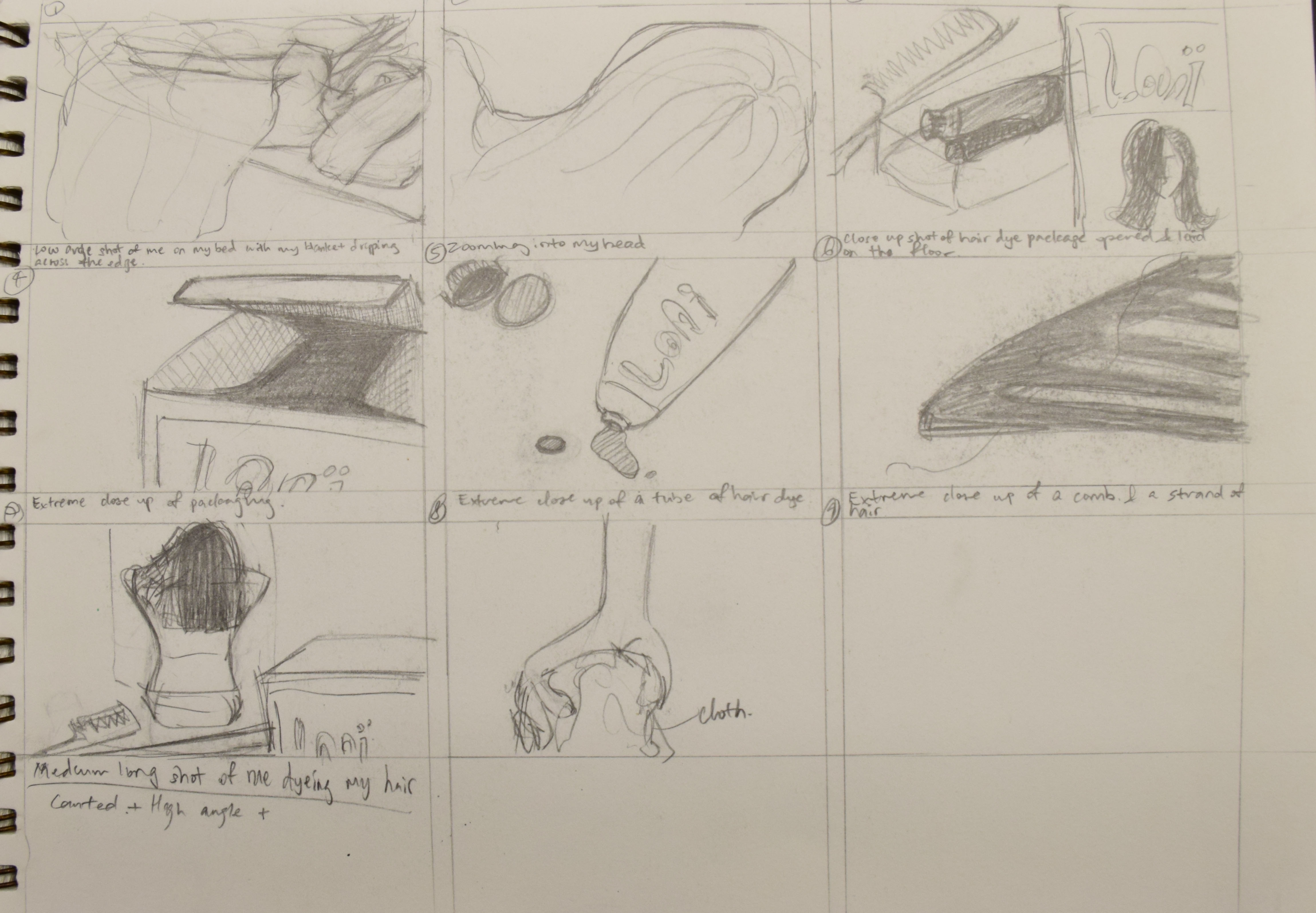
My dream talks about the foreboding feelings I have after dying my hair for the first time.

The cause for my negative feelings came from the pessimistic views of people on the topic of ‘dying hair’. Some of the common pessimistic views are that dying hair would result in hair loss, dry and damaged hair.

Objectives of project:

In my dream state, I explore between effect of photographic sequence and meaning through the use of symbolism described by the use of objects, subjects and space.

My dream follows a clear sequence:

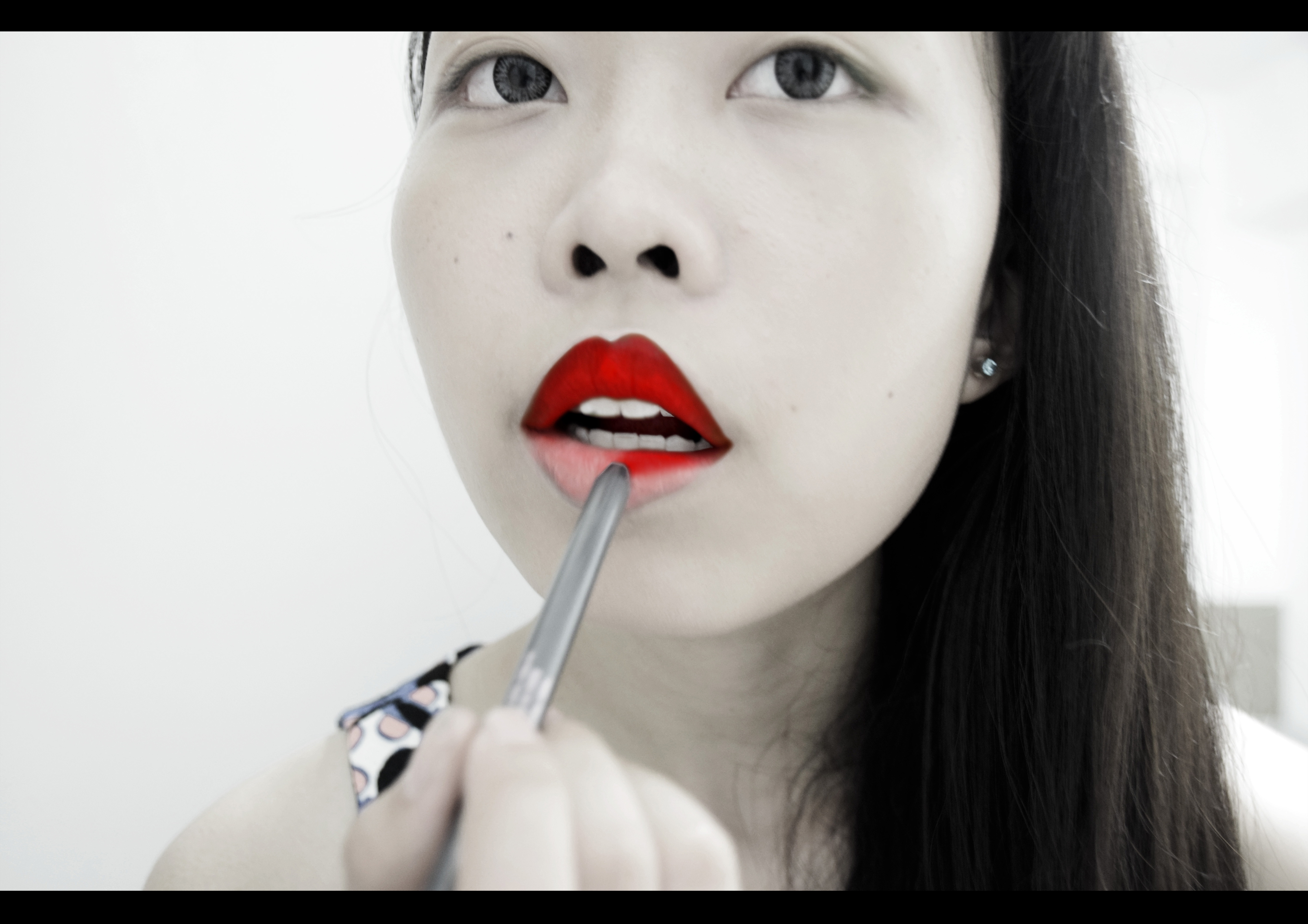
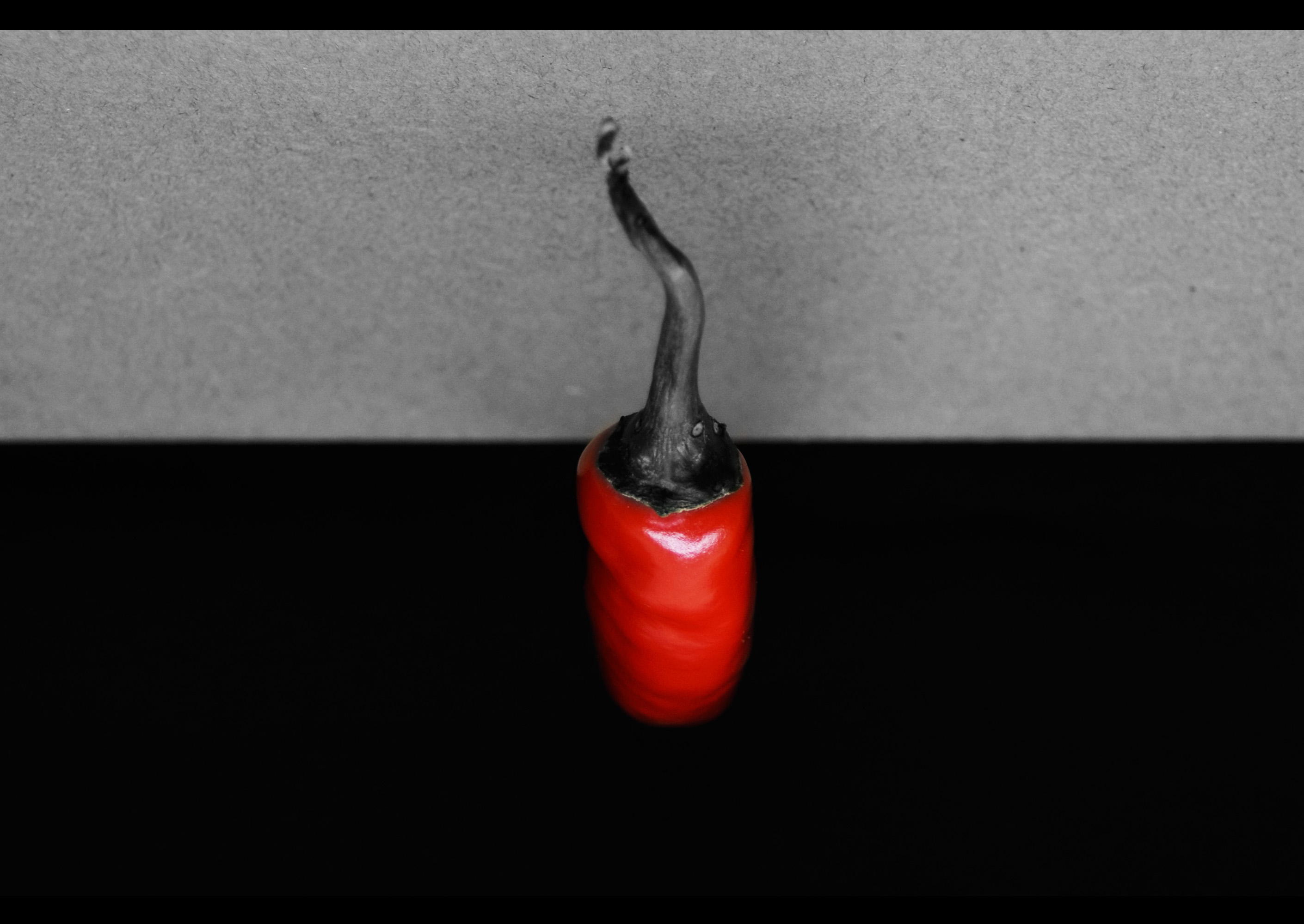
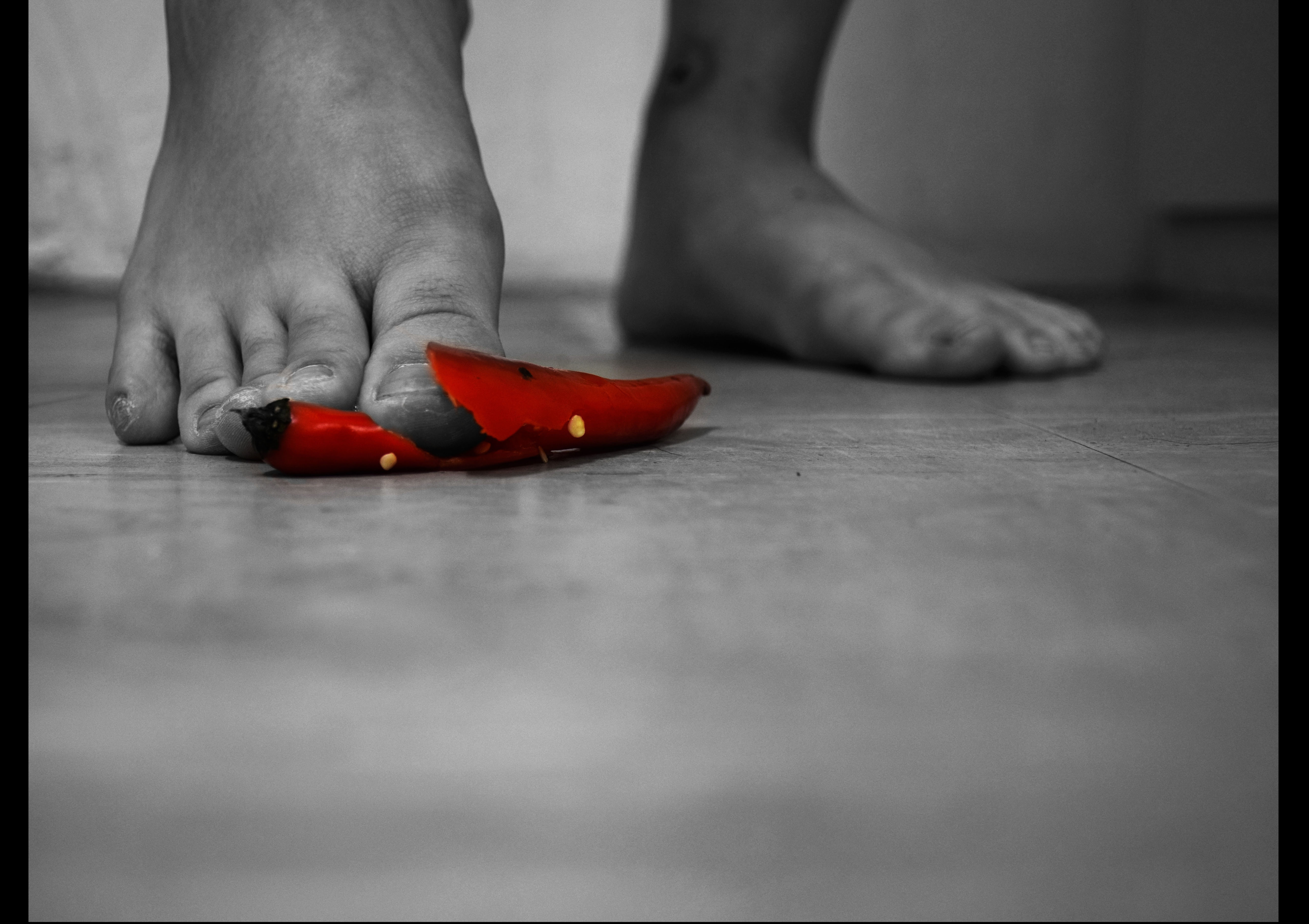
  1. The first part of the sequence started with me dying my hair, then moves on to the first occurrence of colour change with my touch on my earpiece, followed by a packet of soybean milk and the chair I was sitting on.
  2. Next, I exit from the door of the room I am in.
  3. Consecutively, I appear magically outside, in green foliage.
  4. Lastly, looking up, I meet my closest friend.

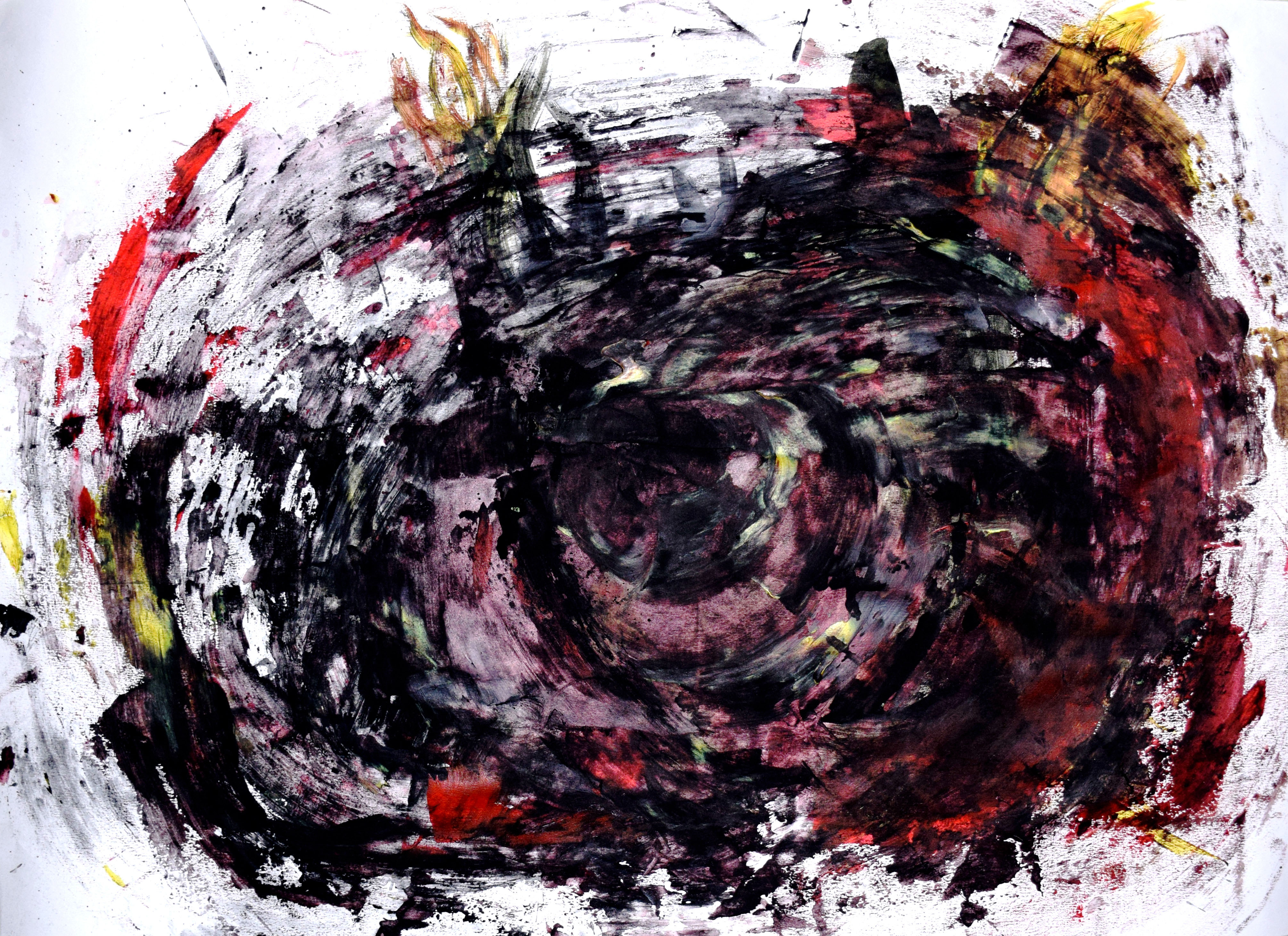
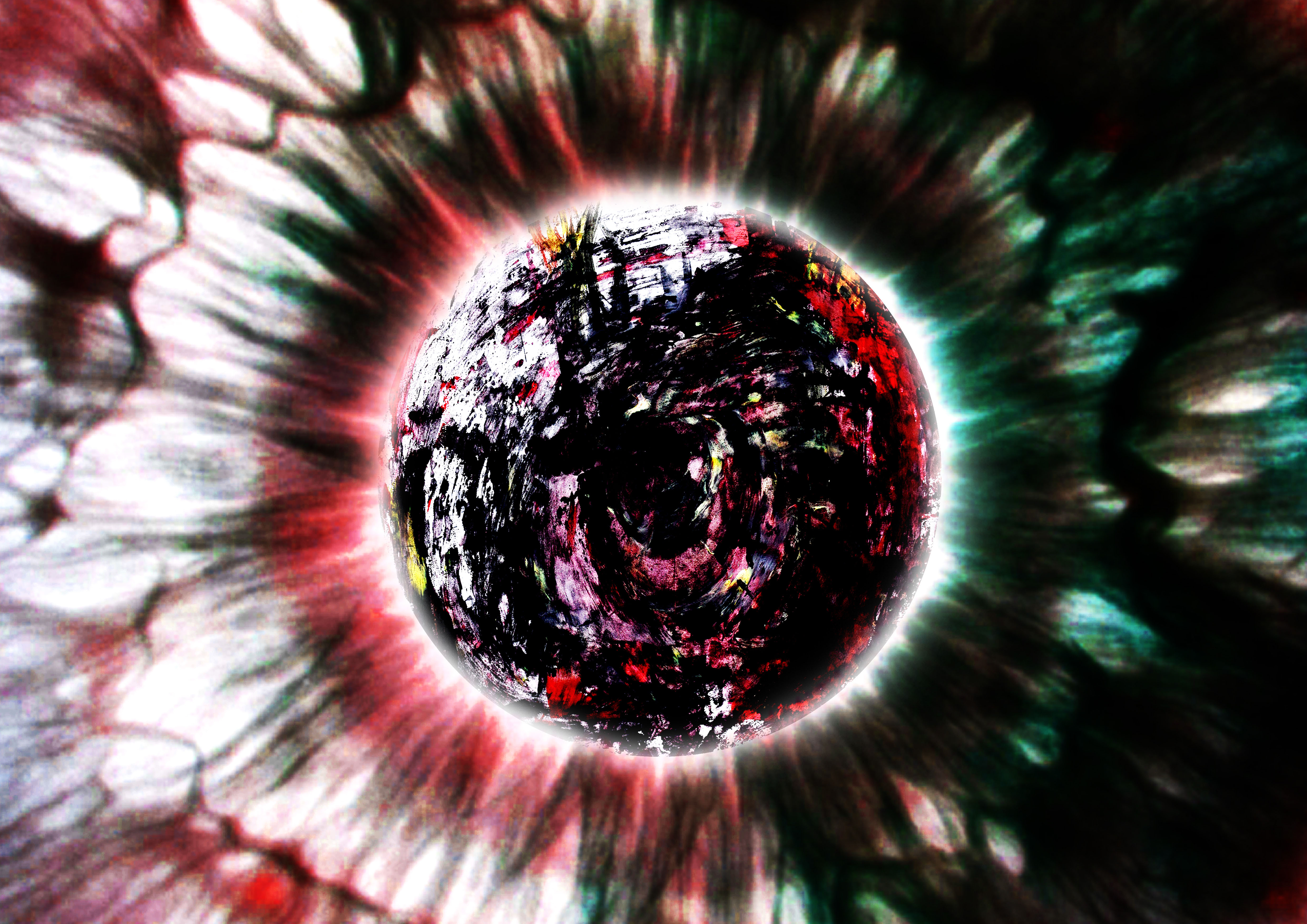
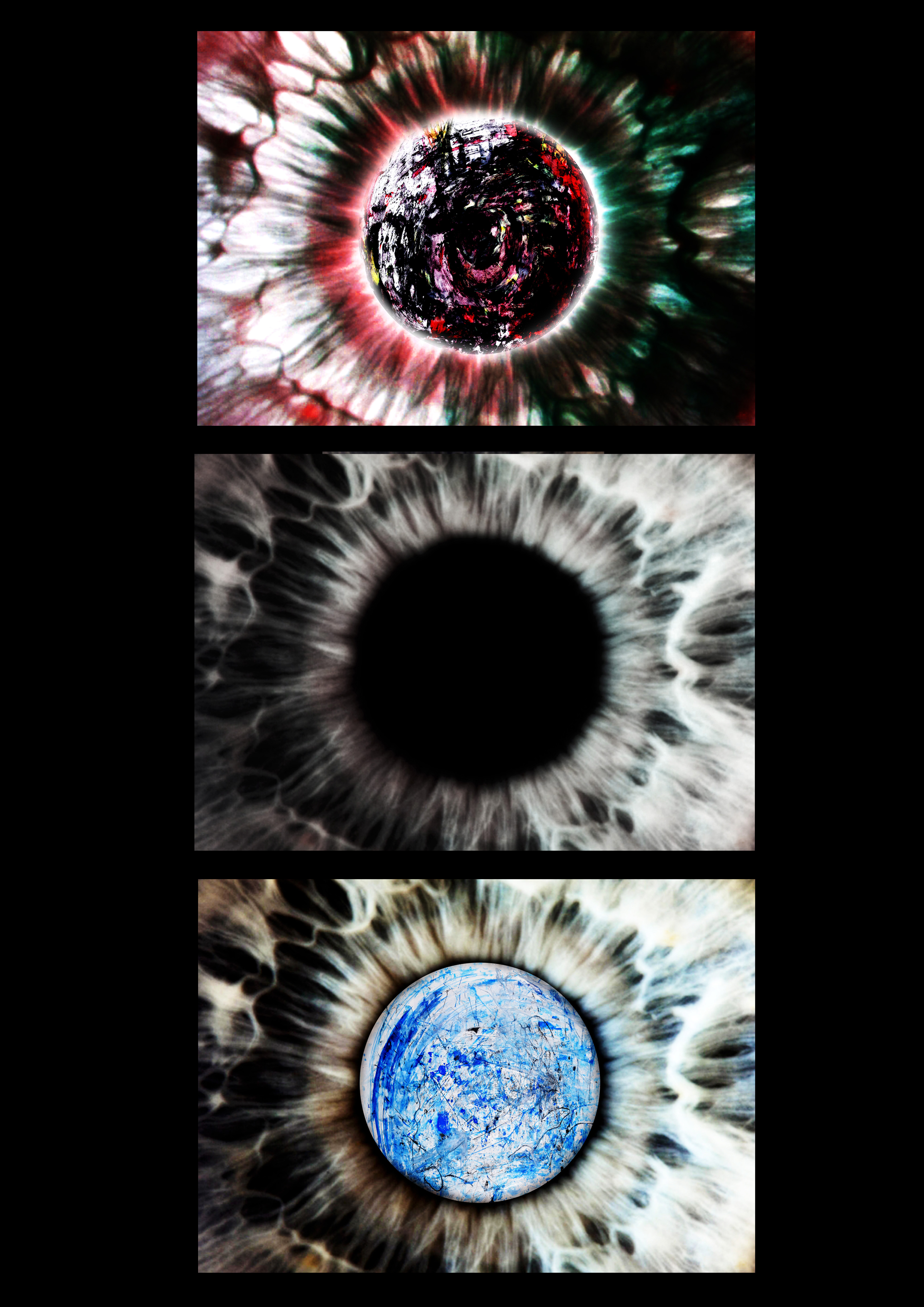
Also, I study how visual rhythm can be achieved through the use of exploring composition, transformation in photographic sequence. One example of how I achieved visual rhythm is through the use of a crimson hue as I transit along the film stills.

Use of symbolism:

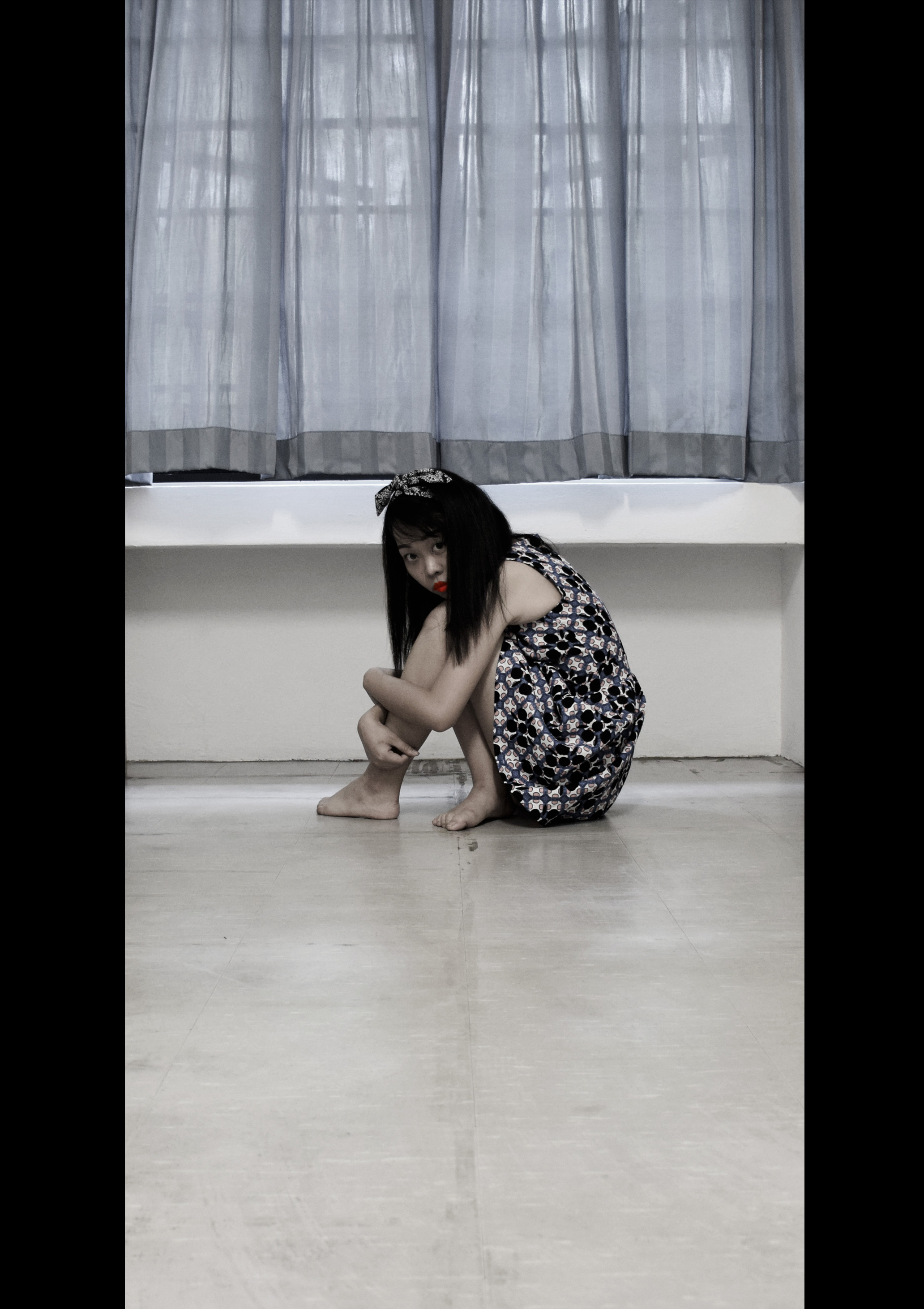
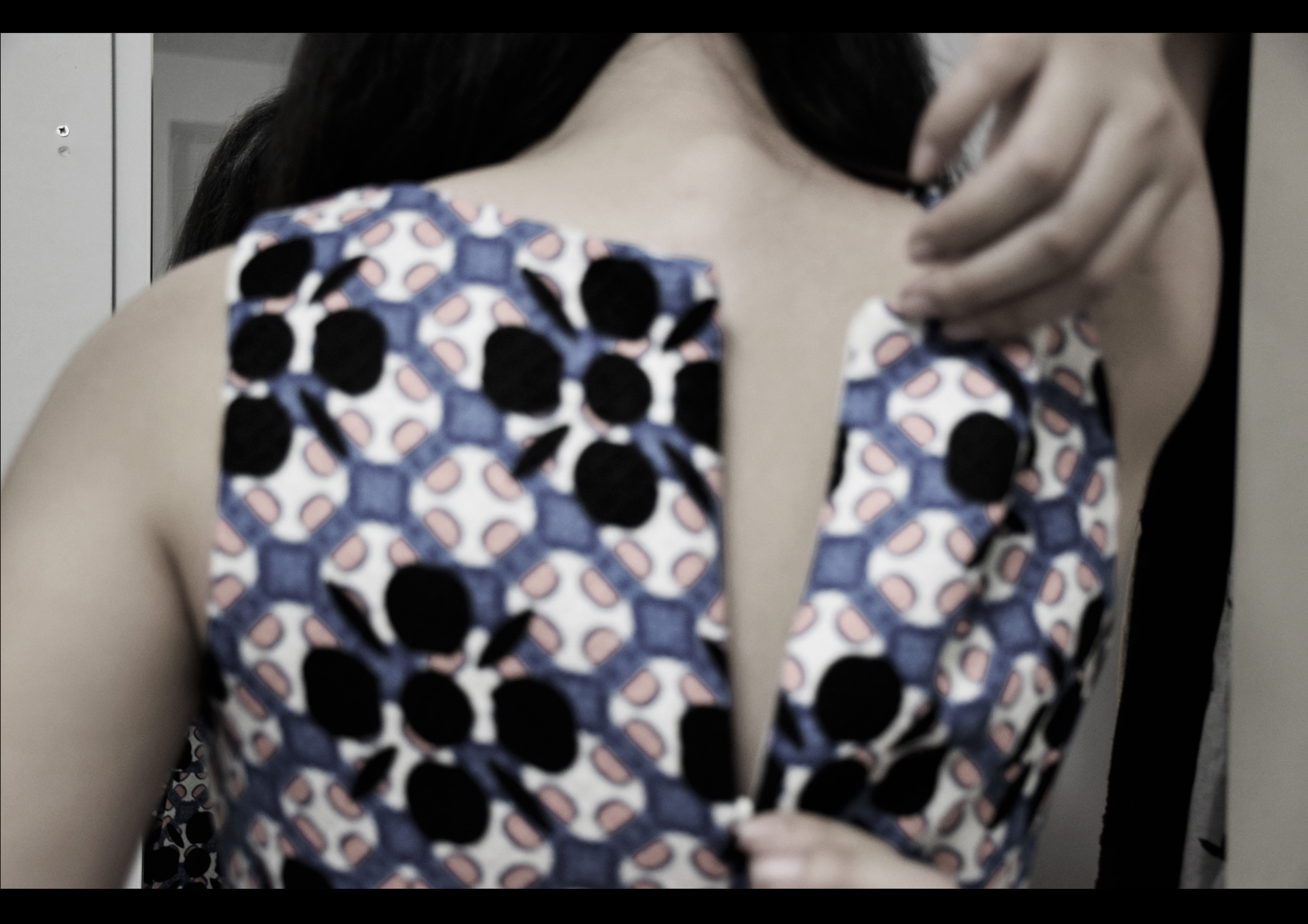
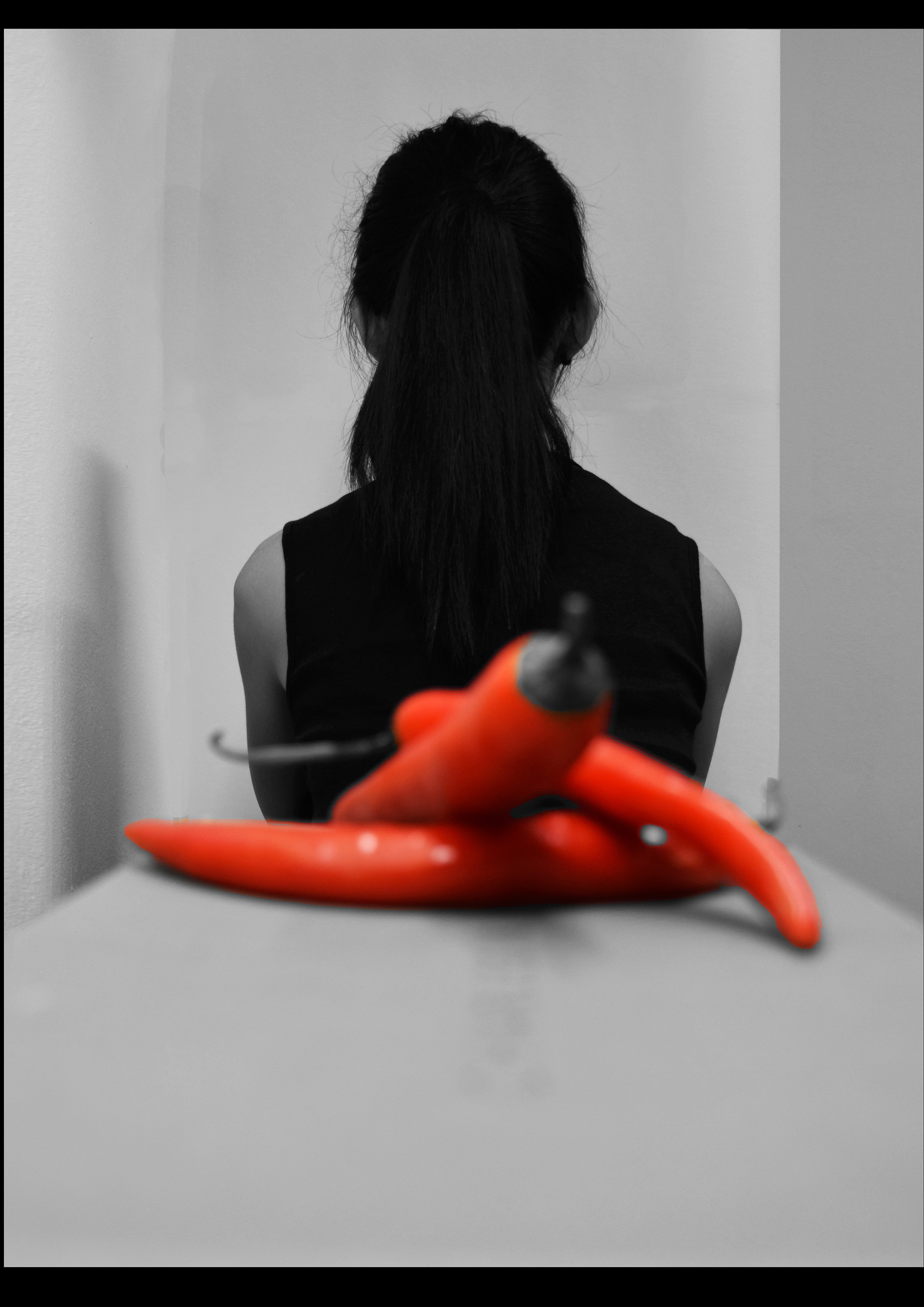
The first part of the sequence depicts me in my room with my earpiece, a packet of soybean milk and a chair I lean on for support. My earpiece and the chair represents my source of comfort, whereby I use my earpiece to listen to music which soothes my raging emotions and I rest on a chair to relax my aching body. The package soybean milk is a representation of the food we eat to sustain our lives in relation to today’s world of consumer products.

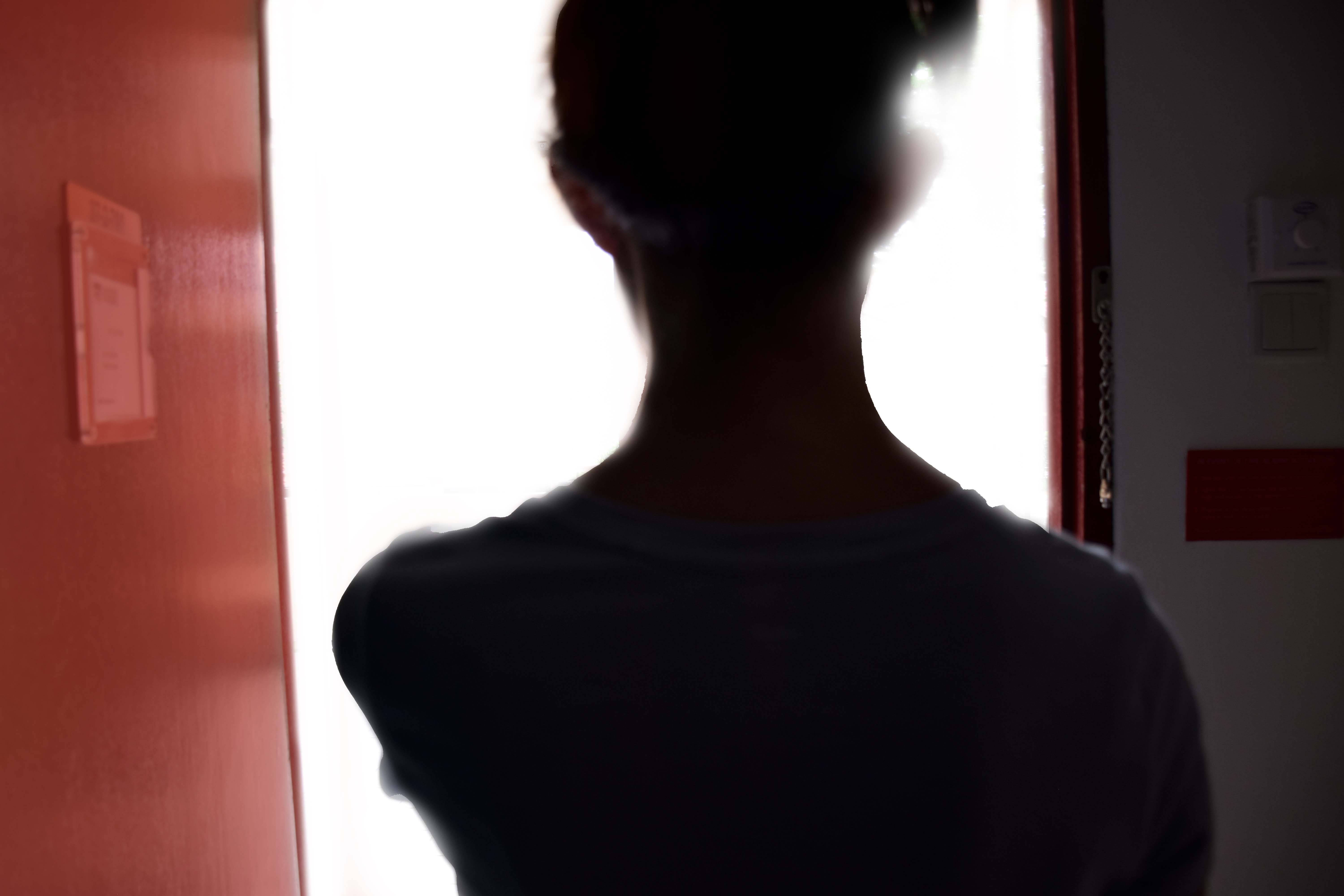
In the second part of the sequence, I exit from a door to enter another space. In a deeper context, the door signifies a crossing and a transition; the entry and exit from one part of my memory to another and also into and out of another person’s life (with relation to fourth part of the sequence).

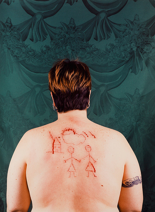
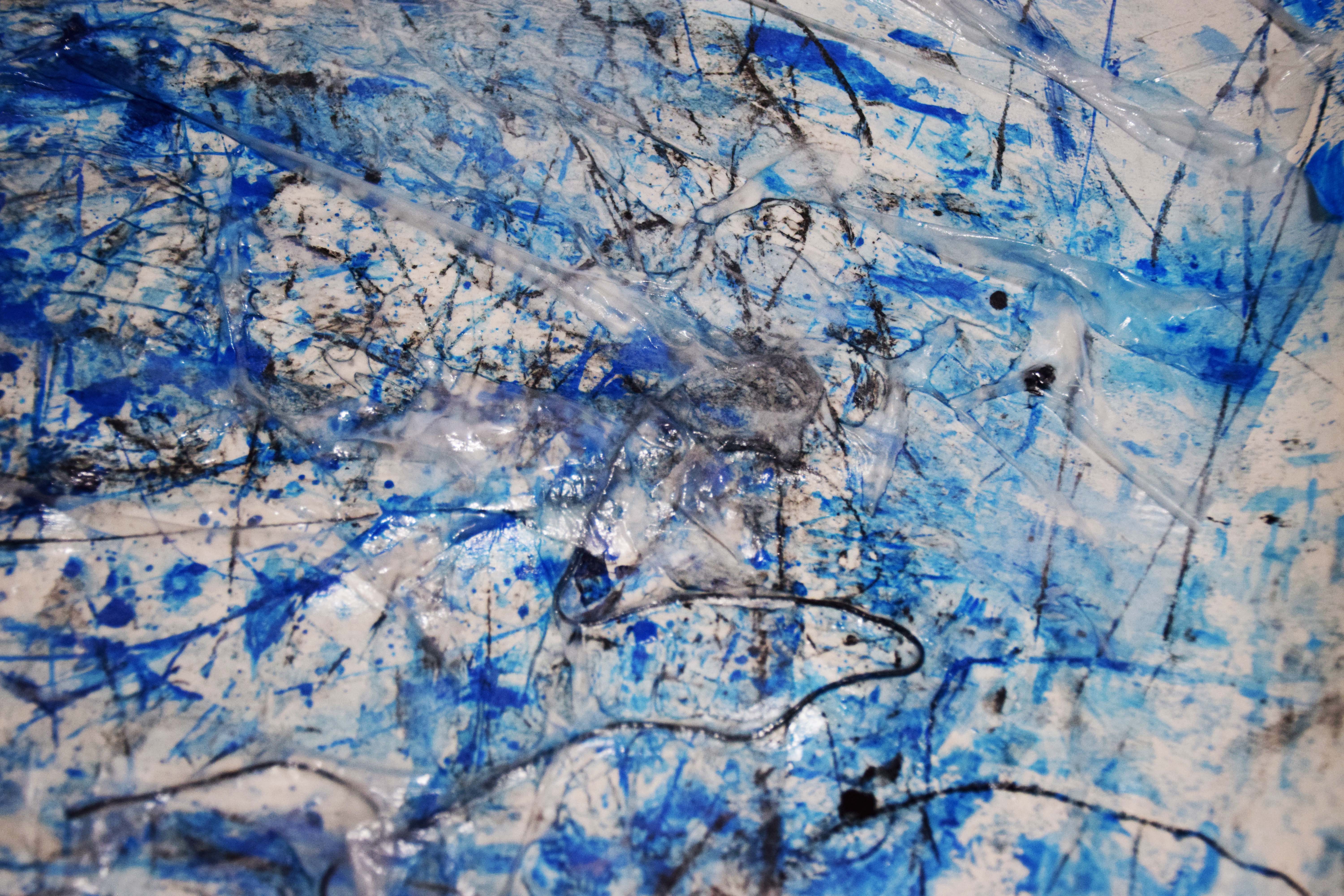
In the third part of the sequence, I altered nature with my touch, changing it from its natural green into a contrasting crimson red hue. I drew a parallel between the destruction of nature and the loss of natural beauty when I dyed my hair.

Lastly, my close friend in the fourth part of the sequence represents someone I sought to confide in from the distorted world I have created for myself. She wears a white shirt, a symbolic colour for peace. Reaching out to her shows my yearning for inner peace, yet the same action brought to me a nightmarish outcome when I influenced/ affected her with my touch. I started to fear that seeking her was not a right choice. My selfishness in the attainment of what I desire may bring harm to my friend in return.

Composing images + Reflection:

This project was enriching and I learnt a lot as I direct, edit and produce the final work.

I am really thankful to my best friend who was willing to participate as my subject for my project.

I made use of long shots to establish distance and the space I am in, such as the scene when I magically appear on green land after exiting from the door of my room in the third part of the sequence.

Also, I made use of close up shots to give focus to objects I want the audience to pay full attention to, such as the toppled packet of soybean milk in the first part of the sequence.

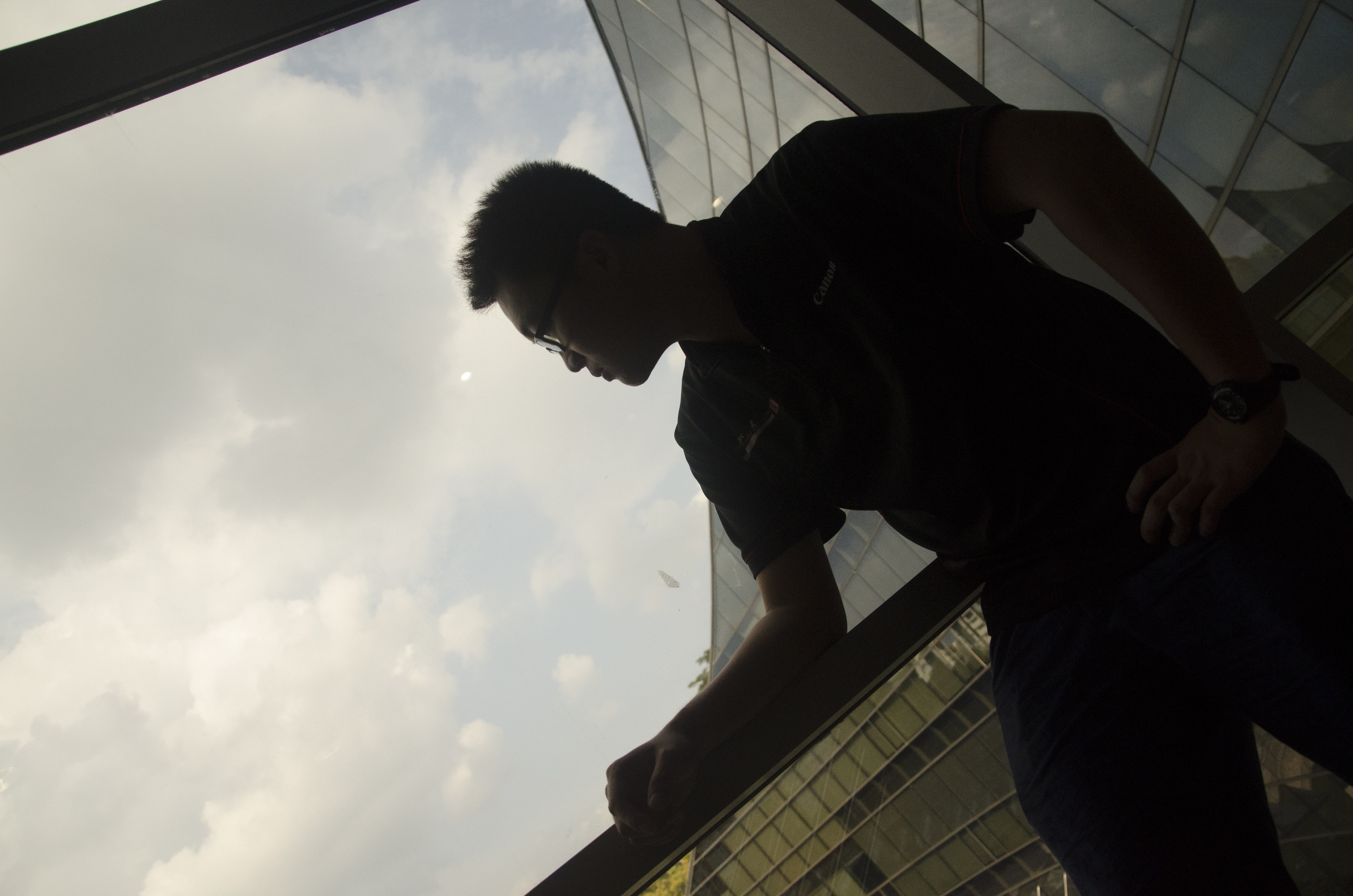
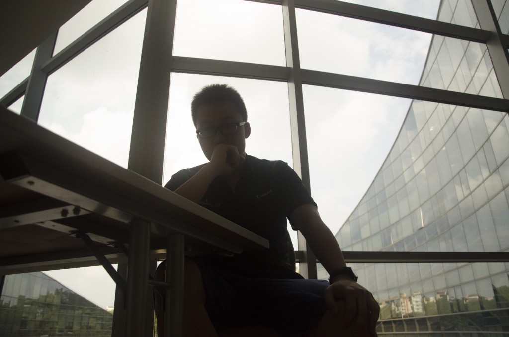
I had a lot of fun composing the point of view (POV) shots, especially when I waved my hands before the camera lens as I stood behind it. I felt that I have connected with the camera physically, like the camera has become my eye.

I would also like to give credits to Photoshop for giving life to my photographs. Without it, I will have a hard time altering the colour of specific forms in my photographs and create the scene where I was consumed by light as I walked through the door in the third part of the sequence.

Personally, I learnt to construct stories with the use of symbolism and create rhythm in my sequence through the consistent use of crimson hue.

Storyboarding to visualise scenes
A page full of words on ideation because I had no time to complete my storyboard
A page full of words on ideation because I had no time to complete my storyboard 😀

Shooting James

DSC_2736-min

Anchor: Hi, I am James. (Medium close-up shot)

Relay: It takes a charming smile to get a girl.

Oh didn’t I tell you I have a girlfriend?

DSC_2743-min

Anchor: Sitting by the glass windows at level 2 of ADM building. (Low angle shot)

Relay: My mind…is really a complex world on its own.

I don’t even know what I am thinking of sometimes.

DSC_2744-min

Anchor: Looking out from the glass window at ADM building. (Canted/ Slanted shot)

Relay: I wonder if my girlfriend is going to be here any time soon…

I miss her already…

Featured: James

To see ridiculous photos of me (shot by James) go to here

So ‘Queer’

Who is Catherine Opie?

Catherine Opie
Catherine Opie


Born in Sandusky, Ohio, in 1961, Catherine Opie is an American fine-art photographer who specialises in portraitures, studios and landscape photography. She rose to prominence as a photographer at the height of the culture wars between traditional and conservative values in the 1990s.

Her works explore the relationships between mainstream and infrequent society by mixing traditional portrait photography with less traditional subjects. In doing so, she provides a social and political commentary of different communities such as the LGBT (lesbian, gay, bisexual, and transgender) community. As Opie identifies as part of the LGBT community, she sought to provide visibility and representation to her friends and the community at large, bringing queers to a forefront normally silenced by societal norms. At the core of her investigations are questions about relationships between individual and the community.


Self-portrait/Cutting, 1993 Chromogenic print, 40 inches x 29 7/16 inches (101.6 x 74.8 cm)
Self-portrait/Cutting, 1993
Chromogenic print, 40 inches x 29 7/16 inches (101.6 x 74.8 cm)


How did she feel during the time she did ‘Self-portrait/cutting’?

In her portrait, Opie offers something deeply personal, even confessional, revealing extremely strong yearnings that are magnified by the great physical fragility of the sadomasochistic acts the photographs portray. At that point in time, Opie had recently broken up with her partner. Then, she was longing very deeply to start a family, which at that era was still condemned by many. The rawness of the cut amplifies her pure and burning desire. The bleeding, juvenile, stick-figure drawing of lesbian domestic bliss cut into the flesh of her back radiates all the painful contradictions that were innate in such situations.


What is her intention?

Opie aims to address contemporary concerns of queer identity, where ‘queer’ has been used as a derogatory term for individuals with non-normative sexual or gender identities in her work.

Back-facing nude:

Self-portrait/ Cutting shows a female nude seen from behind. In Opie’s work, she moves away from traditional representation of ‘Self’ by omitting her face from her viewers. Firstly, instead of showing distinct unique features of her face, she chose to present herself in a non-confrontational way with her back facing her viewers to allow viewers to enter her art invitingly, and look at something they might not otherwise look at. Secondly, her intention may be to make us look into homosexual identity in general, not specific to herself, by disallowing us to associate her face with her identity.

On her skin:

She has treated her skin as a canvas to express herself in Self-portrait/ Cutting. With her blood still fresh in red bleeding through the cuts on her back during the time she photographed herself tells of her deliberate intention to portray her pain at that moment in time. Her weeping blood is also representational of the inner conflicts she have with her inner self in relation to her physical body.


Other works by Opie:

Self-portrait/Nursing, 2004 Chromogenic print, 40 x 31 inches (101.6 x 78.7 cm)
Self-portrait/Nursing, 2004
Chromogenic print, 40 x 31 inches (101.6 x 78.7 cm)
Self-portrait/Pervert, 1994 Chromogenic print, 40 inches x 29 7/8 inches (101.6 x 75.9 cm)
Self-portrait/Pervert, 1994
Chromogenic print, 40 inches x 29 7/8 inches (101.6 x 75.9 cm)


Citations:

  1. “The Face, the Flesh, the Cut: The Art of Catherine Opie’s Queer Self-Portraiture.” Accessed September 14, 2015. http://www.academia.edu/2139626/The_Face_the_Flesh_the_Cut_The_Art_of_Catherine_Opies_Queer_Self-Portraiture.
  2. “Guggenheim.” Collection Online. Accessed September 14, 2015. http://www.guggenheim.org/new-york/collections/collection-online/artwork/30354.
  3. “Guggenheim.” Arts Curriculum. Accessed September 14, 2015. http://www.guggenheim.org/new-york/education/school-educator-programs/teacher-resources/arts-curriculum-online?view=item&catid=728&id=99.
  4. “Catherine Opie.” Wikipedia. Accessed September 14, 2015. https://en.wikipedia.org/wiki/Catherine_Opie.
  5. “Catherine Opie.” ART21. Accessed September 14, 2015. http://www.art21.org/artists/catherine-opie.
  6. “Guggenheim.” Collection Online. Accessed September 14, 2015. http://www.guggenheim.org/new-york/collections/collection-online/artwork/30354.
  7. “Guggenheim.” Collection Online. Accessed September 14, 2015. http://www.guggenheim.org/new-york/collections/collection-online/artwork/14666.
  8. “Guggenheim.” Collection Online. Accessed September 14, 2015. http://www.guggenheim.org/new-york/collections/collection-online/artwork/12201.


~Brought to you by Rene, Charliemae & Liying

A peculiar pair…

In Project 1b, I worked on three parts, namely: ‘Fire’, ‘Perish’ and ‘Ice’ in relation to the poem, ‘Fire and Ice’ by Robert Frost. I embarked on this project by thinking of the cause-effect relationship that the two elements have with emotions and visual evidences. For the process, I made use of painting in an abstract way to bring out the emotions I have for each element. I chose to present my final work digitally by incorporating my first hand images with a second hand image of an eye through digital manipulation.


My Idea in translating texts in the poem into images:

  • Eye as a medium to convey the poem because we see the world through our eyes; our eyes are windows into the world we see
  • Use of circular/ round form to represent a sphere, the form of a globe, like Earth, and to represent a continuous line, unity, balance, a shape that links the three images together


‘Fire’:

  • fiery, hot tempered, passionate, bright, destructive (Emotions)
  • ashes, disintegration, light, melt things, sparks, steam, smoothen, friction, burn (Visual evidences)
Abstract painting for my interpretation of 'Fire'
An abstract painting I did for my interpretation of ‘Fire’

Medium:

  • Charcoal powder – consist of carbon and ash, produced by the heating of wood or other substances in the absence of oxygen,
  • Acrylic paint (crimson red and lemon yellow) – warm and bright colours,
  • Impasto gel (matt) – Easy to manipulate with to create thick textures resembling ground
'Some say the world will end in fire'
‘Some say the world will end in fire’


‘Perish’:

  • The word that links/ strikes a harmony between the two elements in the poem in the middle line (5th line)
  • Represents emptiness, a void, to be gone/ away
  • My choice of a neutral hue to show that the word is not specific to any of the elements
  • Suggests my unwillingness to have any of the two elements in sight; that I deny both fire and ice to be in my sight
'But if it had to perish twice'
‘But if it had to perish twice’
Link: http://photos-images.net/%D8%B5%D9%88%D8%B1_%D9%85%D9%82%D8%B1%D8%A8%D8%A9_%D9%84%D8%A8%D9%88%D8%A8%D9%88%D8%A9_%D8%A7%D9%84%D8%B9%D9%8A%D9%86_%D8%A7%D8%AD%D8%AF%D8%AB_%D8%B5%D9%88%D8%B1_%D8%A7%D8%AD%D8%AF%D8%AB_%D8%A7%D9%84/
Second hand image of an eye


I used only the iris from the second hand image in my final work because I liked the abstract quality of the iris when I zoom into it.


'Eye of History II', Etching Edition of 50 by Marc Quinn
‘Eye of History II’, Etching Edition of 50 by Marc Quinn


My idea was mainly inspired by Marc Quinn’s Eye series, depicting an eye in each edition like the one shown in ‘Eye of history II’.


‘Ice’:

  • Cold, icy, aloof, dark, alone, disharmony (Emotions)
  • Cracks, cold, melts into water/ gas (dry ice), reflective, burn (Visual evidences)
An abstract painting I did for my interpretation of 'Ice'
An abstract painting I did for my interpretation of ‘Ice’
Close-up on painting to show reflection of gloss
Close-up on painting to show reflection of gloss 1
Close-up of painting to show reflection of gloss 2
Close-up on painting to show reflection of gloss 2


Medium:

  • Tracing paper – for its inherent quality of translucency to represent ice,
  • Painting lines with strings – to create thin uneven & irregular lines, which resembles cracks in ice that tells of the tension in something cold; the emotional strain between relationships,
  • String – an object that appear to be frozen in time, stuck onto the paper,
  • Gloss medium & varnish – layered onto strings and tracing paper. To serve as an adhesive for them to be stuck onto the paper and to provide shine as a reflective surface similar to that of ice
'To say that for destruction ice Is also great'
‘To say that for destruction ice
Is also great’


Final Presentation for Project 1b:

Digital layout for final presentation for Project 1b


My reflection: I thought that fire and ice are elements that should never go together. In my struggle to create a set of definition for each element, I realised the two elements could actually go together. They are both destructive, or at least to me. I have been burnt by a fog machine once so I could empathize with the definition of the words, especially that of ‘burn’.


Citation:

  1. “صور مقربة لبوبوة العين احدث صور احدث الصور – اجمل الصور × صور جميلة HD.” اجمل الصور × صور جميلة HD. September 25, 2014. Accessed September 14, 2015. http://photos-images.net/%D8%B5%D9%88%D8%B1_%D9%85%D9%82%D8%B1%D8%A8%D8%A9_%D9%84%D8%A8%D9%88%D8%A8%D9%88%D8%A9_%D8%A7%D9%84%D8%B9%D9%8A%D9%86_%D8%A7%D8%AD%D8%AF%D8%AB_%D8%B5%D9%88%D8%B1_%D8%A7%D8%AD%D8%AF%D8%AB_%D8%A7%D9%84/
  2. Accessed September 14, 2015. http://www.thedranggallery.com/index.php/artists/marc-quinn

9 images to talk about ‘Me’

In Project 1a, I worked on three tasks, namely: Me, Me interacting with an object that is significant to me, and My World. Each tasks are composed of three images.


For task 1, I narrate the sides of me that I usually hide.


Me 1
Me 1

In the first image for task 1, I want to express myself in my vulnerable/defensive/introverted state by presenting myself in a crouching position. I implemented the use of long shot to establish distance, to suggest a wall that I put up against others; against their criticism and judgement. I used a narrow crop, giving the space a claustrophobic atmosphere, to express confinement; how I feel trapped within myself.


Me 2
Me 2

In the second image for task 1, I present myself looking out of the frame in a close-up shot. I want to touch on the topic of ‘Fear of judgement’ – not just of others’ but my own judgement too. I wanted to show how outward appearance really makes a huge difference – ‘Will my friends accept me when I remove my makeup?’ I masked myself in a layer of cosmetics so as to hide whatever flaws I see in myself. I want to suggest the space I am in, by looking out of the frame – I am looking at a mirror.


Me 3
Me 3

In the third image for task 1, I am revealing my inner self shown through the action of me stripping in a medium close-up shot. Yet the focus is on my reflection in the mirror – ‘What you see is just a reflection of me. Not really me.’


For task 2, I depicted myself interacting with red chilli(es).


Me + Object 1
Me + Object 1

The first image shows a close-up of a chilli composed by placing a shoe box above it to keep it in an upright position.


Me + Object 2
Me + Object 2

The second image shows a ground angle shot of me stepping on the chilli in a brutal act of dislike towards it.


Me + Object 3
Me + Object 3

The third image shows me back-facing the chilli, an act influenced by Catherine Opie’s ‘Self-portrait/cutting’, 1993. Similar to Opie, I appear non-confrontational. In my case, I do not want to confront the chillies at the foreground. The chillies are larger than me in perspective to represent how large a threat they are to me. The spiciness of chilli stings and burns my tongue, numbing my senses. I wanted to convey the message that I don’t like chilli, but it is a big challenge I have to live with.


'Self-portrait/ Cutting', 1993 by Catherine Opie
‘Self-portrait/ Cutting’, 1993 by Catherine Opie


Links: http://www.guggenheim.org/new-york/collections/collection-online/artwork/30354


For task 3, I chose to share on my hall for it is the ‘world’ I am currently staying at.


My World 1
My World 1

The first image depicts the pigeon hole for my room at my hall in a close-up shot. It represents my new identity, an identity that tells me: I am officially free from any restraints set for me by the people close to me, such as a curfew. That also means, I have to be self-reliant and self-disciplined.


My World 2
My World 2

In the second image taken with a high-angle shot, I want to show the presence of human habitation observed in the things that we dispose, like newspapers, old socks and clothing. They tell me that I am not alone physically.


My World 3
My World 3

However, I feel alone emotionally. My feelings of loneliness can be seen in the third image depicting a round stone table. I feel like I am looking at an empty table even if people sat around it, because they are strangers to me.


My reflection: All in all, I learnt to make use of various framing and photo-editing techniques such as cropping to bring across my message in every image. In the process of photographing myself, I learnt how to present myself visually in the way I want to see myself. The process required a lot of time and effort in the setting up of equipment and formulating of concepts. I learnt to focus on an idea and not deviate from the message that I want to convey in every image in relation to the tasks. Also, I took a few learning points from my group’s presentation on Catherine Opie’s ‘Self-portrait/cutting’. Through our presentation, I learnt to interpret Opie’s work by breaking down her work visually: Why is she in nude and seen from behind? Why did she photographed her freshly cut skin? What is she trying to convey in her stick-figure drawing of a house and two women holding hands? — that eventually became a skill I put to use when I photographed myself. I asked myself: What kind of posture should I adopt? What kind of action do I want to document? What do I want to convey in my images?


Final Presentation for Project 1a:

In my presentation, I deliberately saturated red in every image to emphasize that they are a series. My choice to highlight the red colour was also because red appeared as the most striking colour in every photo. My choice for placement of the images is so that it gives an overall form of a roof. I want to convey the idea that the images are about me under one roof. The following images shows the exhibition area for my final work:


Final Presentation for Project (1a)
Final Presentation for Project 1a
I asked my audience to back-face me in participation
Digital copy of intended layout for Project 1a