
Featured image adapted from: https://www.pinterest.com/pin/308778118177456479/
Category: Research
When colours meet

Featured image from: http://www.dummies.com/how-to/content/acrylic-painting-for-dummies-cheat-sheet.html
The way I feel colours

Colours
Featured Image adapted from: http://wallpaperbeta.com/color_figure_oil_michael_jackson_style_hd-wallpaper-12994/
Design Principles
Balance
The distribution of the visual weight of objects, colours, texture, and space to make a design feel stable.
Symmetrical balance
Elements on one side of the design are similar to those on the other side.

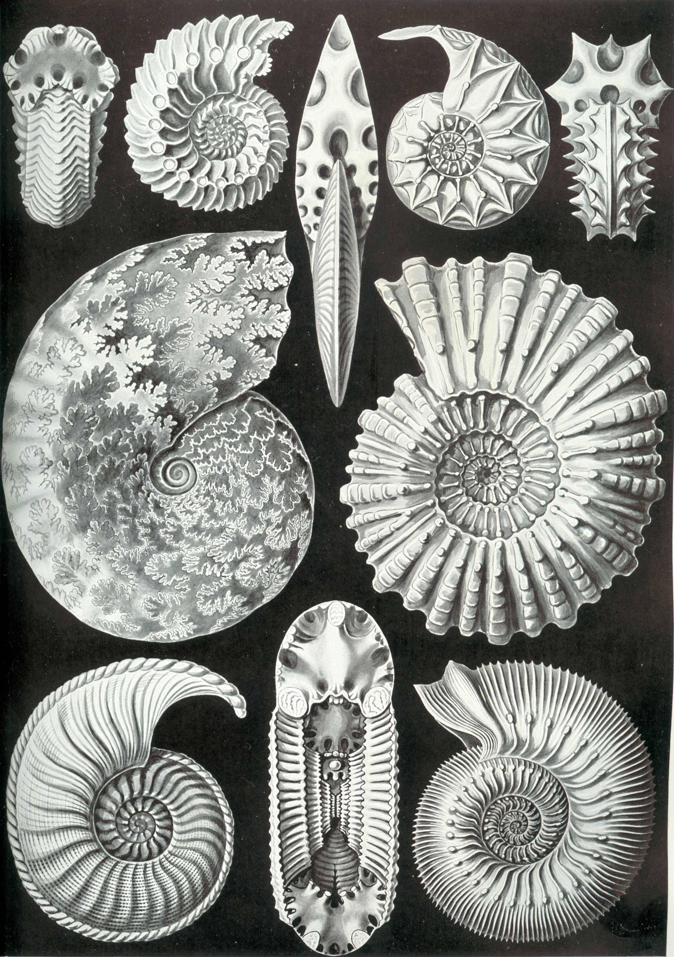
Art Forms of Nature (English) is a book containing lithographic and halftone prints by Ernst Haeckel, a German Biologist.
Image adapted from: https://upload.wikimedia.org/wikipedia/commons/d/da/Haeckel_Ammonitida.jpg
For more prints, go to: https://commons.wikimedia.org/wiki/Kunstformen_der_Natur
Asymmetrical balance
Elements on each side are different but the overall structure still look balanced.

Asymmetrical balance observed from the difference in the scale of the pincers of a fiddler crab.
Image adapted from: http://www.vistaalmar.es/especies-marinas/general/1772-cangrejos-violinistas-refrescan-pinza-gigante.html
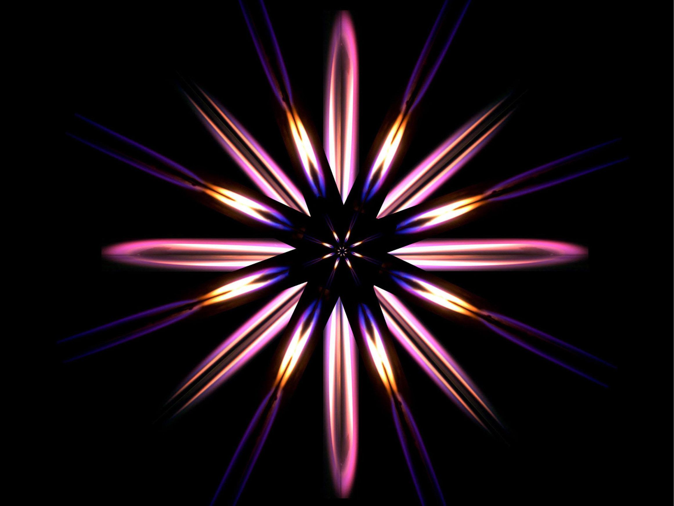
Radial Balance
Elements which are usually similar (can be different too) are arranged around a central point.

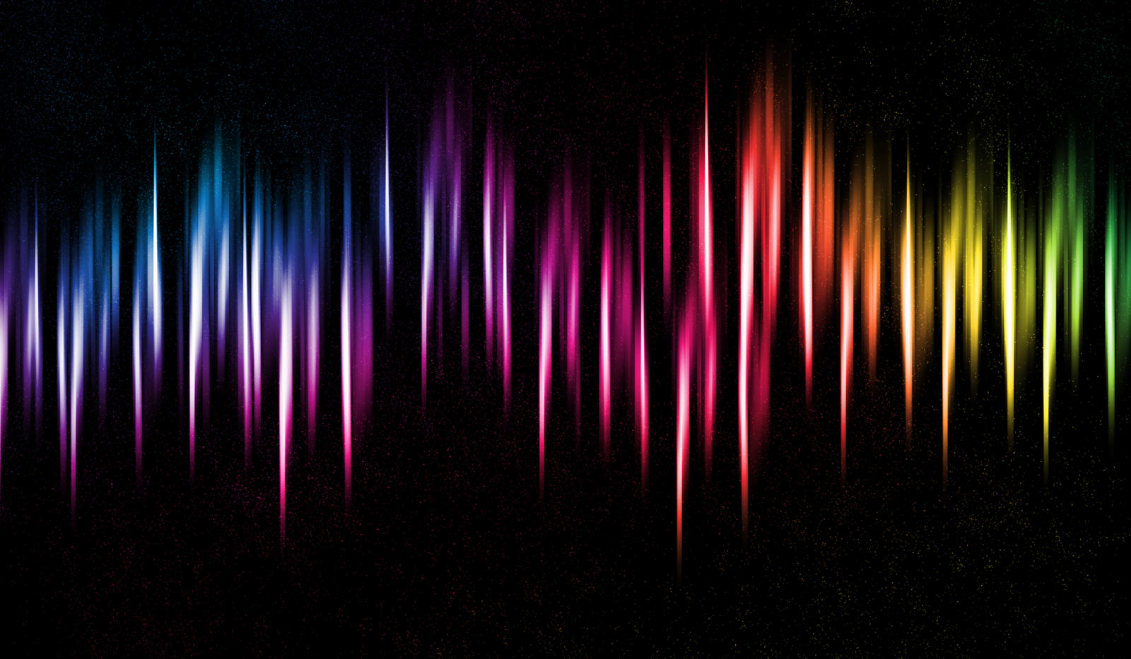
First place in the 2011 Combustion Art Competition at United States
Executed by overlaying three separate microgravity flame images where the different colors represent different chemical reactions.
Image adapted from: https://www.newscientist.com/gallery/combustion-art/
Emphasis
Makes up the point of focus in a design. Usually an emphasized subject is juxtaposed against an environment or other objects that may be different in size, color, texture, shape, etc.

Image adapted from: http://phictures.co/wp-content/uploads/2013/06/1329068643.jpg
Dominance
Created by contrasting size, positioning, color, style, or shape. The focal point should dominate the design with scale and contrast without sacrificing the unity of the whole.
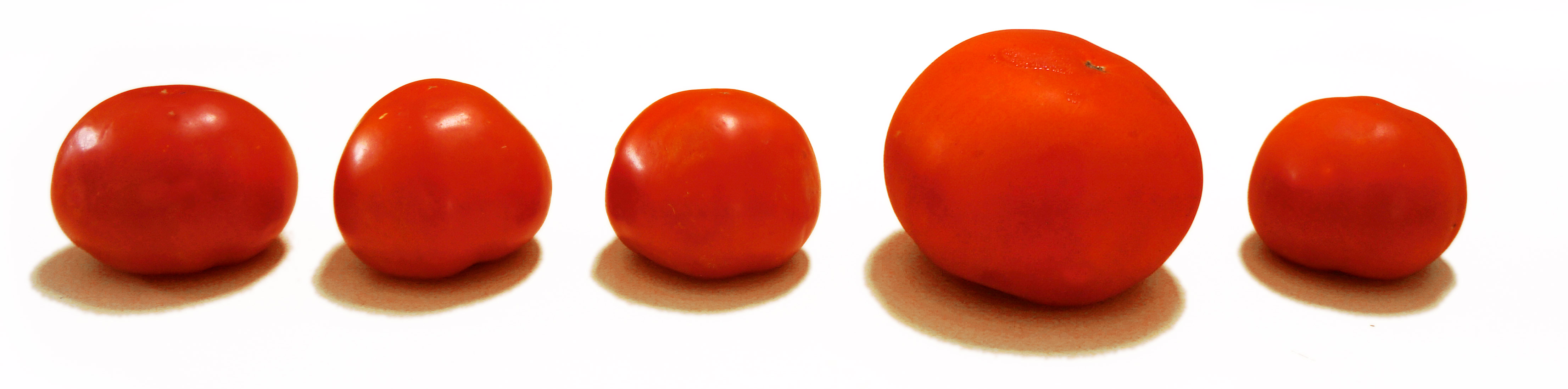
Image adapted from: http://johnlovett.com/design/wp-content/uploads/2012/06/tom1.jpg
Movement
Movement takes the viewer’s eye through a path, often to areas of emphasis. Movement can be directed along lines, edges, shape, and color.
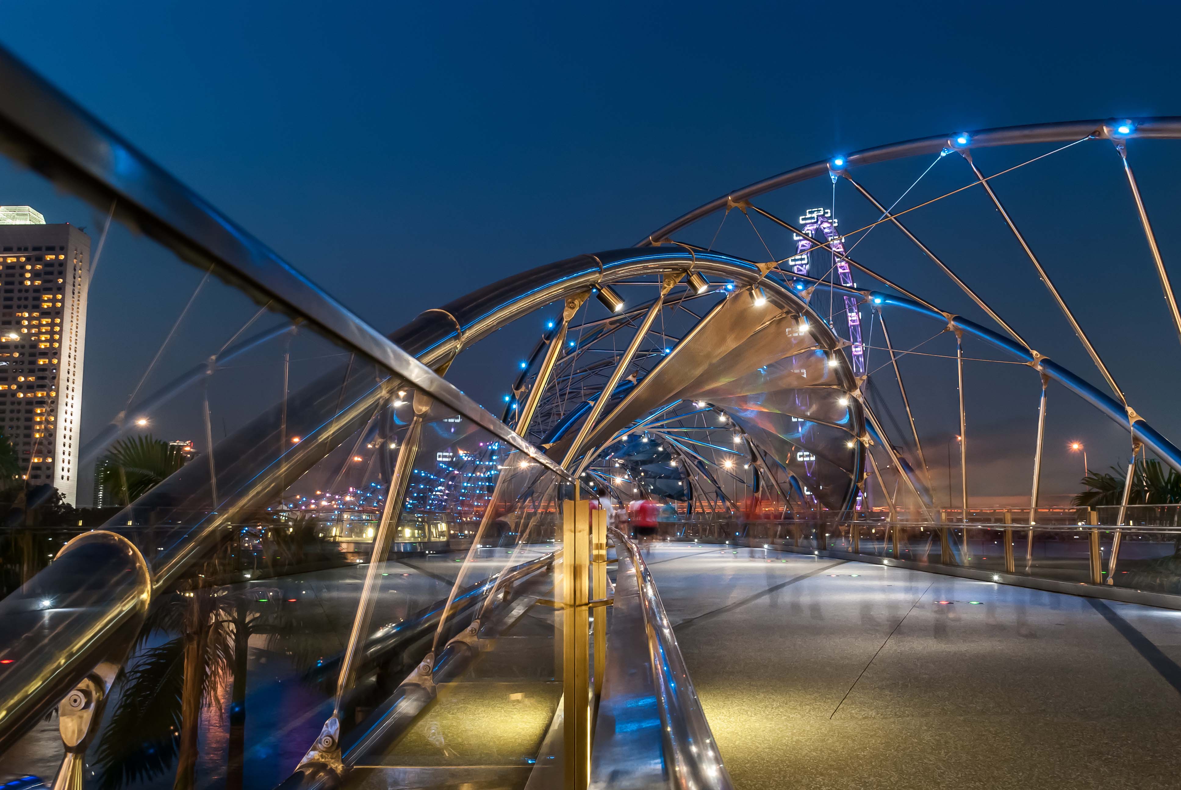
Photographed by Angelo Pereira
Image adapted from: http://whenonearth.net/singapores-helix-bridge/
Rhythm
Rhythm creates a mood like music or dancing. Rhythm may not lead us to any focal point unlike movement, however, it must have a direction.

Image adapted from: http://img10.deviantart.net/6515/i/2012/128/1/1/rhythm_by_thefluffyonion-d4yzerf.jpg
Repetition/ Pattern
Repetition works with pattern to make the work seem active. The repetition of elements of design can also give a sense of unity within the work.

Image from: http://www.desktopwallpapers8.com/images/36259-pretty-black-and-white-patterns.jpg
Proportion/ Scale
When all parts (sizes, amounts, or number) relate well with each other, the design becomes realistic; believable. However, when proportion is distorted, the design will appear surrealistic.
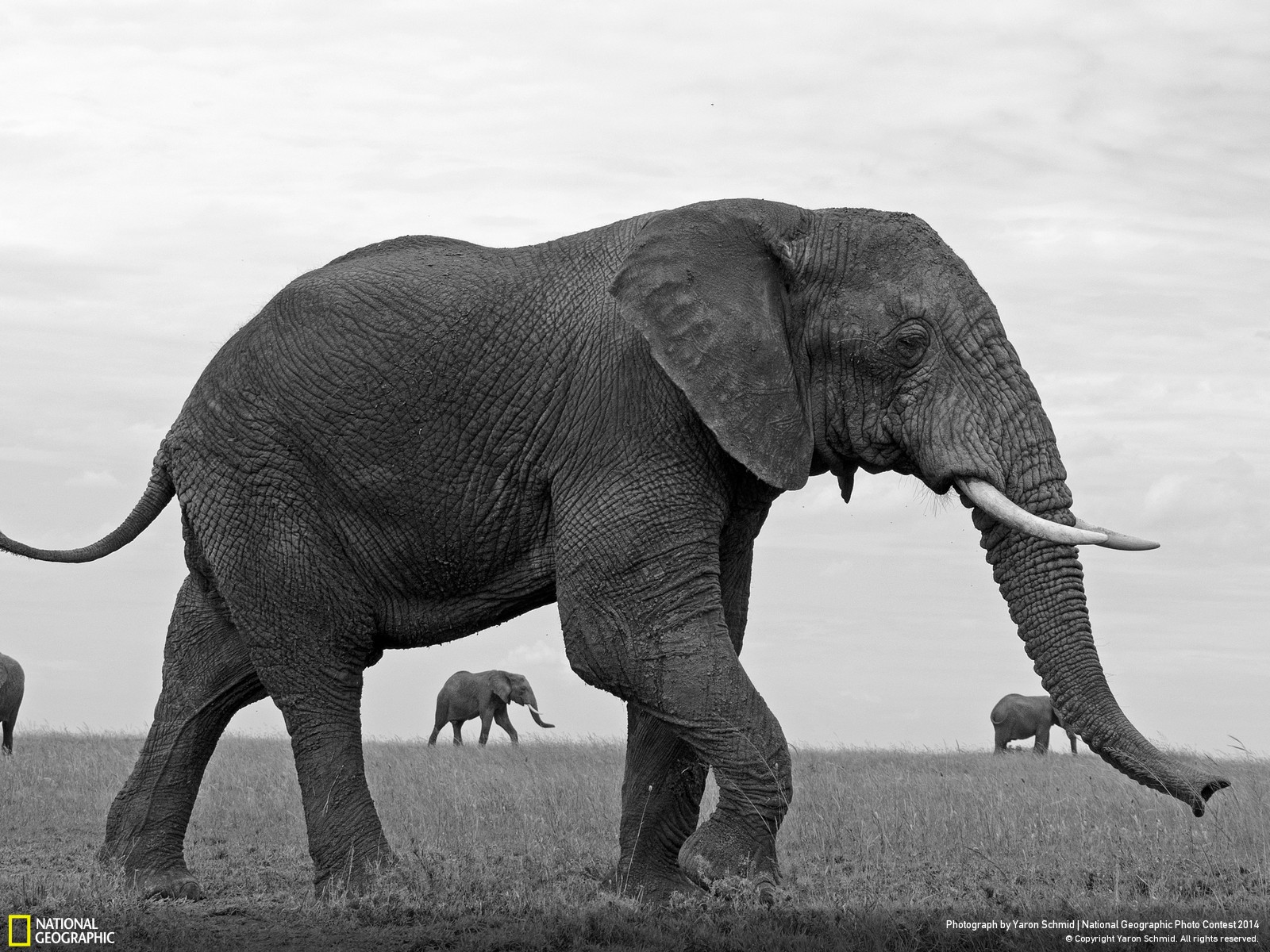
The image shows a big elephant in contrast to small elephants. The proportion gives us a sense of reality through the suggestion of depth, where the big elephant appears close to us while the small elephants appear at a distance.
Image adapted from: http://photography.nationalgeographic.com/photography/photo-contest/2014/entries/284041/view/
Variety
The use of several elements of design to hold the viewer’s attention and to guide the viewer’s eye through and around the work of art.
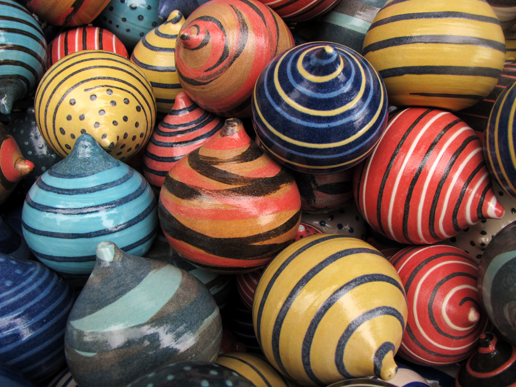
Colours (red, blue and yellow), lines and dots, depth suggested through overlapping, common shape of a spinning top and constant reflective texture of the coat of gloss paint are the different elements of designs that the image encompasses to give us a sense of variety.
Image from: https://c1.staticflickr.com/9/8386/8545771230_e44071e334_b.jpg
Unity/ harmony
The feeling of harmony between all the elements making up the design. Creates a sense of completeness.
Image adapted from: http://smhttp.33994.nexcesscdn.net/80FA0F/magento/media/catalog/product/cache/1/image/9df78eab33525d08d6e5fb8d27136e95/u/t/utm19439.jpg
Hierarchy
Use of elements that lead the viewer through the image in order of their significance – starting from most important to least important.

“The Maestà” (Maestà of Duccio),
2.13 m x 4.0 m,
Tempera, Gold,
Duccio di Buoninsegna
An altarpiece composed of many individual paintings commissioned by the city of Siena in 1308 (period of Byzantine art). A sense of hierarchy observed from the sides (represented by saints and angels) towards the centre (represented by Madonna and Child) of the image.
Image adapted from: https://upload.wikimedia.org/wikipedia/commons/f/f0/Duccio_maesta1021.jpg
Zooming into each background of the 18 subjects…
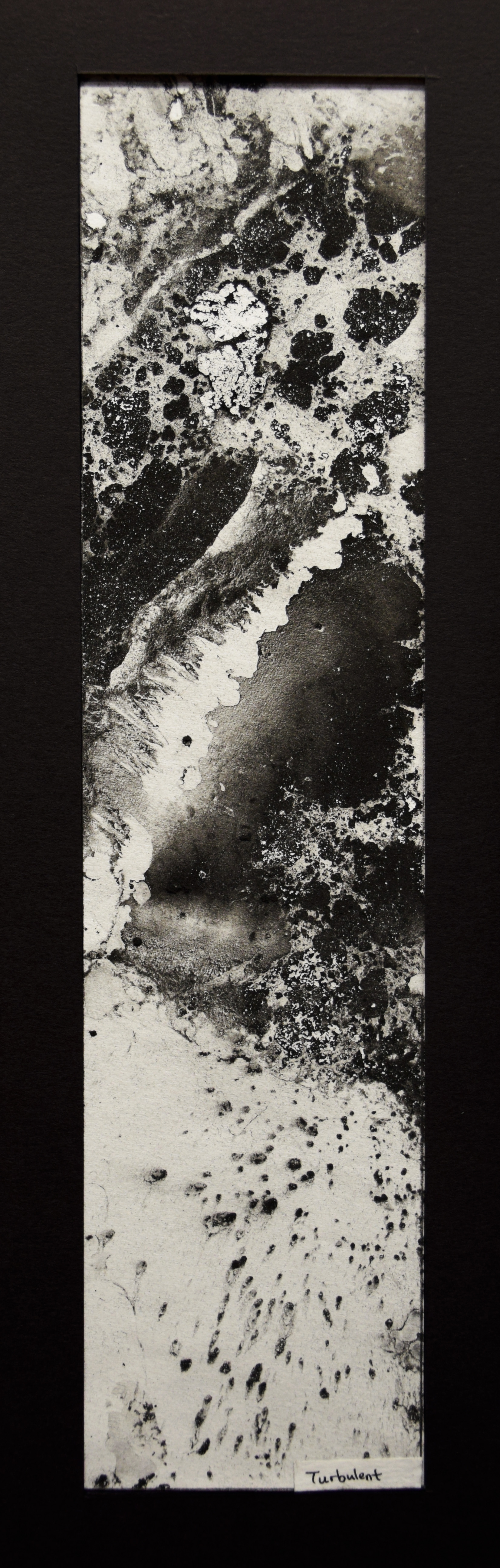

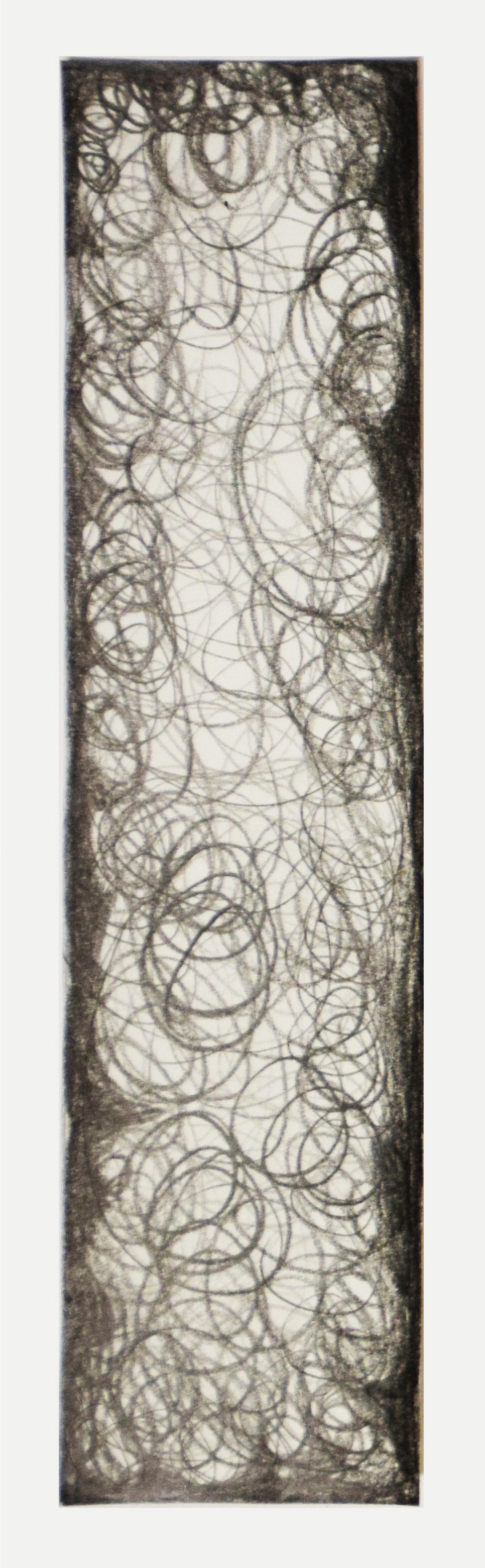
Medium: Turbulence reflected in the reaction between water and charcoal powder on paper.
Process: After sprinkling charcoal powder on the surface of the water, in a wide tub, I pushed the paper across the water immediately to create movement in the water. The paper absorbs water due to osmosis effect and the charcoal powder clings onto the surface of the paper. Turbulence is then captured in the marks made by the charcoal powder.
Evaluation: Turbulence as a violent movement of fluid. Placement of strip in a vertical manner with two-third of positive space at the top to suggest waves splashing towards or away from me at a distance. Juxtaposition of minute spots (bottom) against huge patches (top).
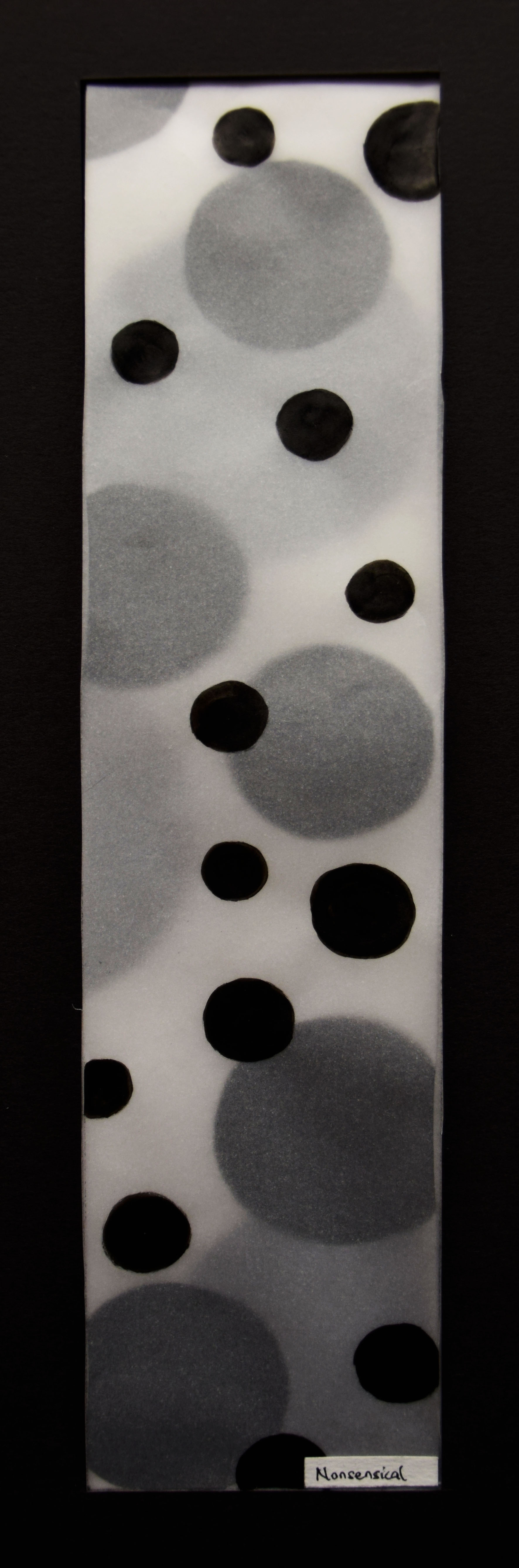
Medium: Nonsensical represented with polka dots drawn with a calligraphy brush pen on tracing paper.
Process: First, I vary the scales of the circles by having them in three different set of sizes: Big, Medium and Small. Then I layered the three tracing papers with the set of big circles at the bottom, the set of medium circles in the middle and the set of small circles on top.
Evaluation: Polka dots appear as very silly and fatuous to me. The random spacing and senseless repetition in irregular scales make polka dots nonsensical. The choice of tracing paper for its inherent quality of translucency to create a sense of depth through varying opacity of dots. Big dots seem far away and small dots seem near. My main reason for rejecting the ‘Runner-up strip’ for nonsensical is because it is not as interesting as polka dots in its overall presentation.
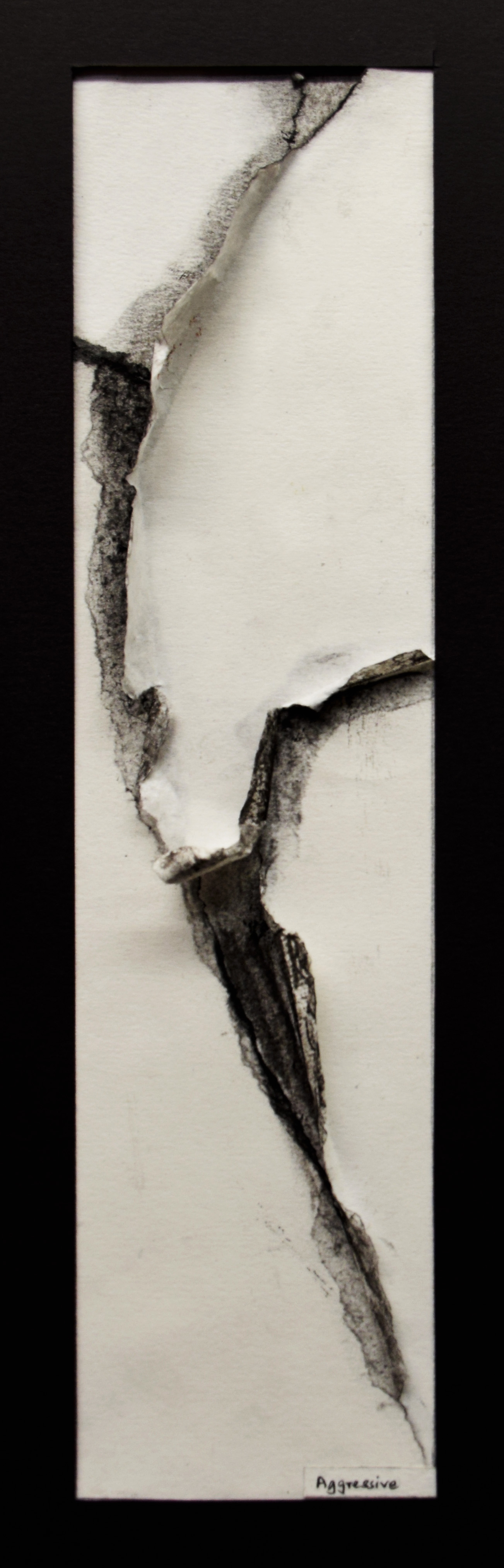

Medium: Torn paper pasted on paper with torn lines emphasized by shading in folds with charcoal sticks.
Process: Tearing paper into four parts to suggest aggressiveness in action.
Evaluation: Paper torn in uneven lines to show an impulsive act of violence. Torn folded outwards to suggest freshly torn edges.
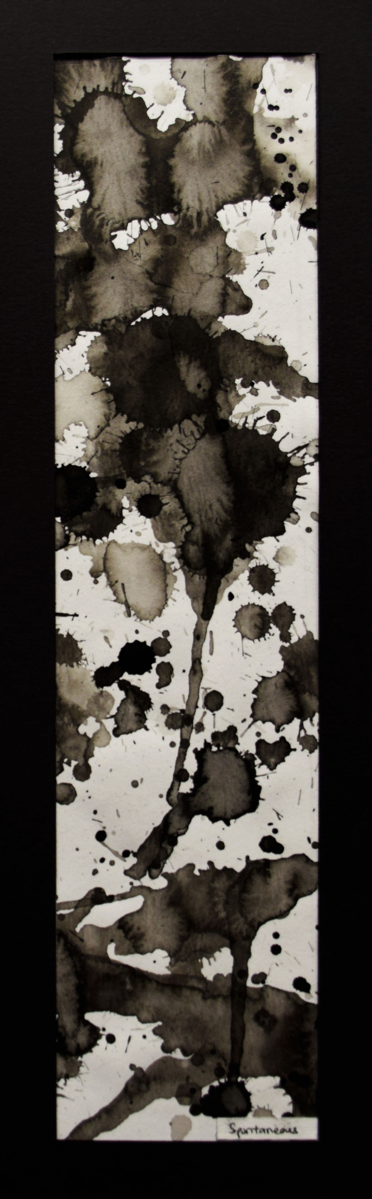
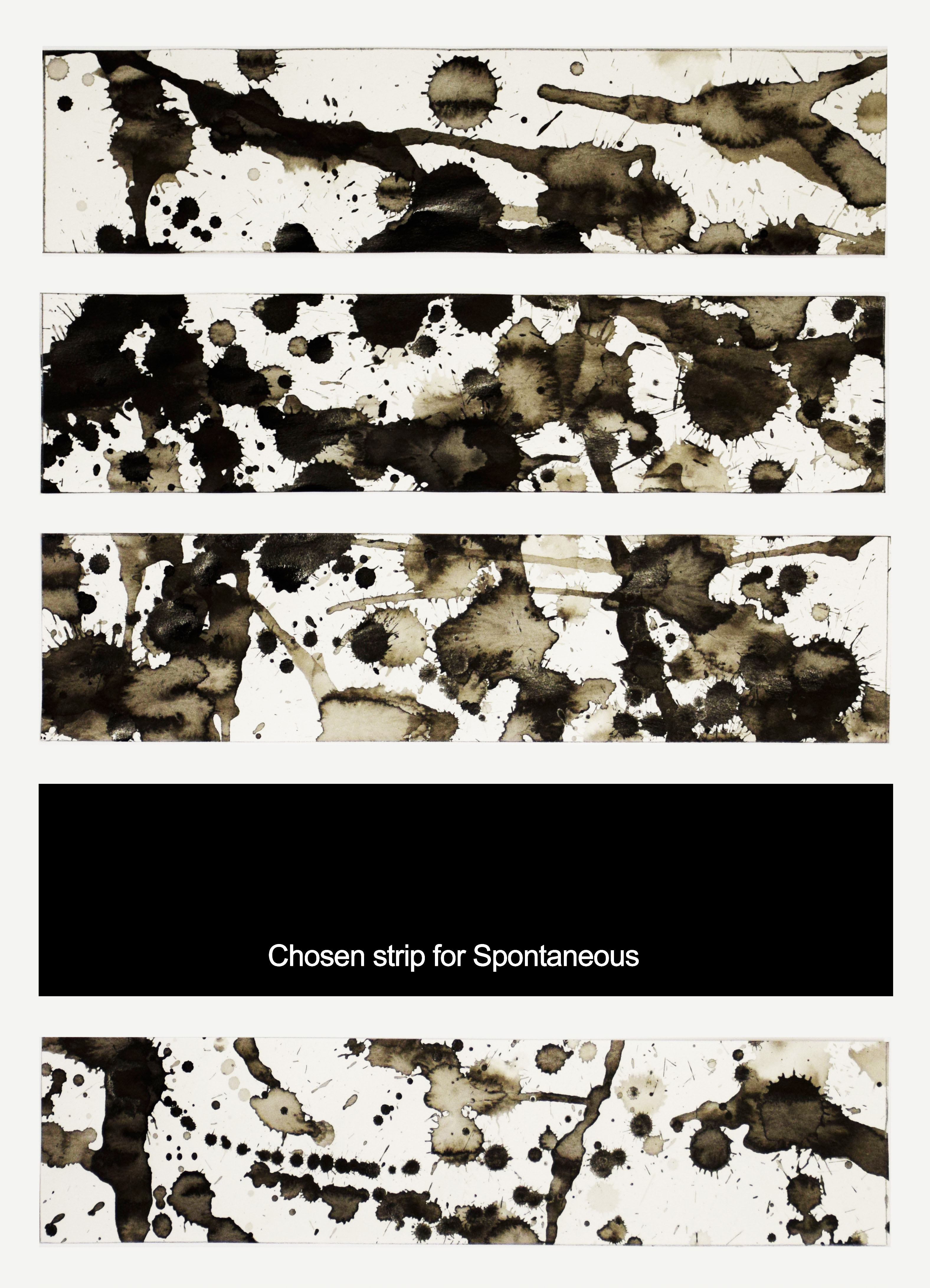
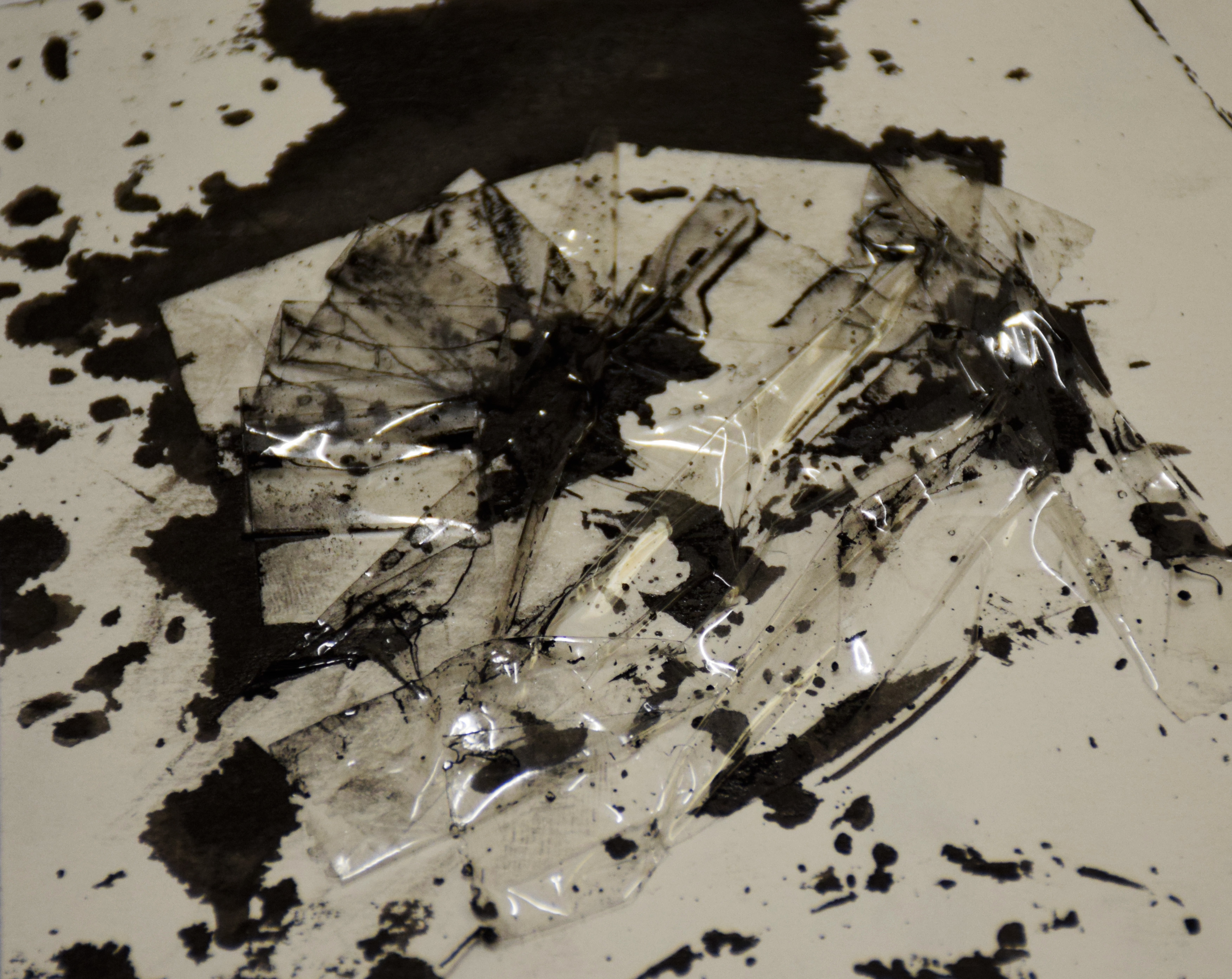
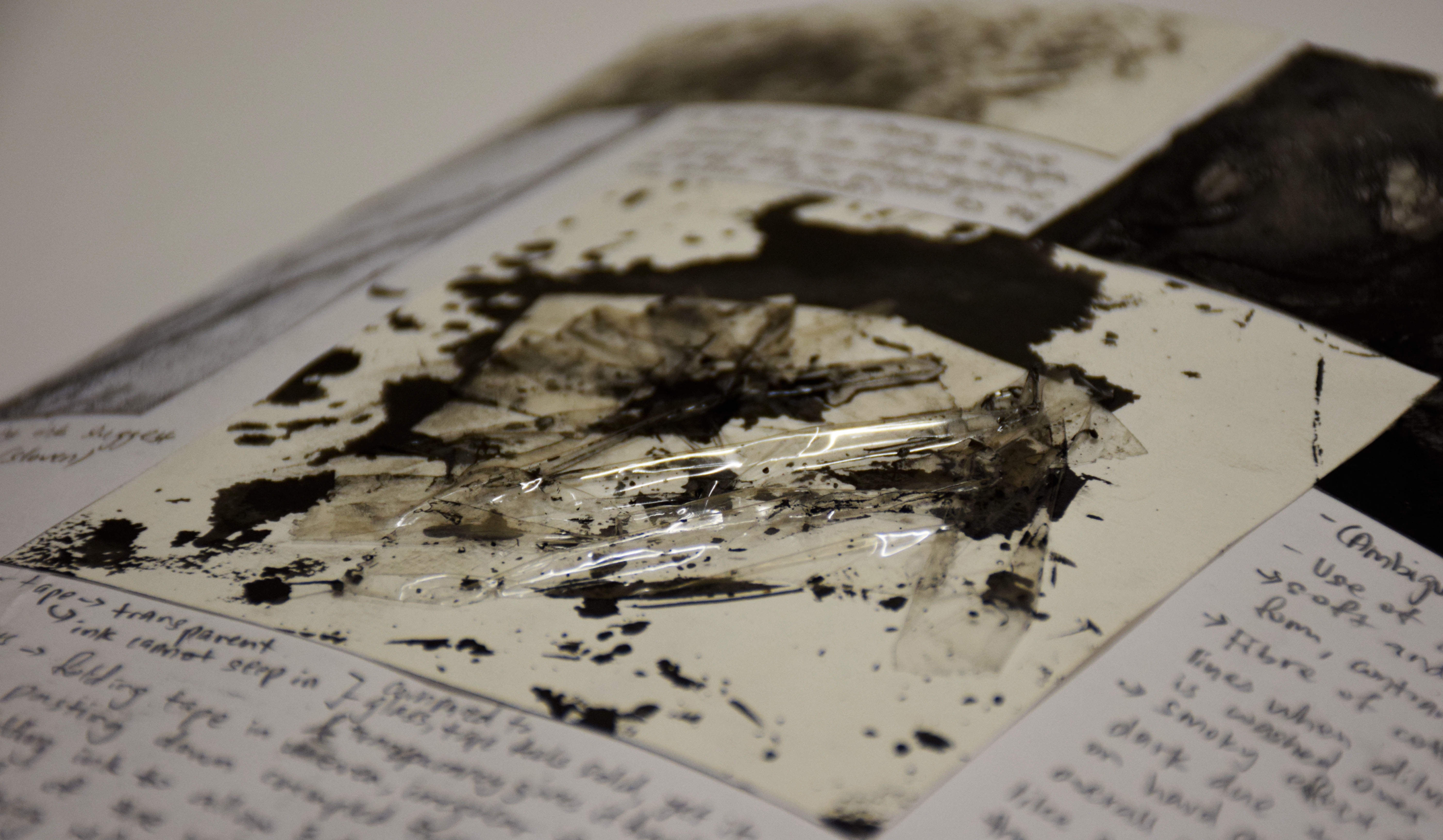
Medium: Chinese ink splattered on paper using bristle brush and watercolour (nylon) brush.
Process: Switching between different types of brushes for their different capacity in water absorption. Bristle brush appear to absorb lesser water as compared to watercolour brushes, thus they create small and big splatter respectively. Tilting the paper to allow excess ink in splatters to flow voluntarily in the direction I desire (because I am spontaneous).
Evaluation: The action of spattering ink on paper is spontaneous to me. After my spontaneous act, I thought I am in deep trouble because it’s so hard to find sense in spontaneous art. After consulting my instructor, I decided on the chosen strip for the contrast between drips in the vertical and horizontal axis which are thin and thick respectively. The difference in density of splatters with those of lower density at one-third (top) and higher density at two-third (bottom). Choice of placement with higher density at the bottom to suggest heaviness of splatter.

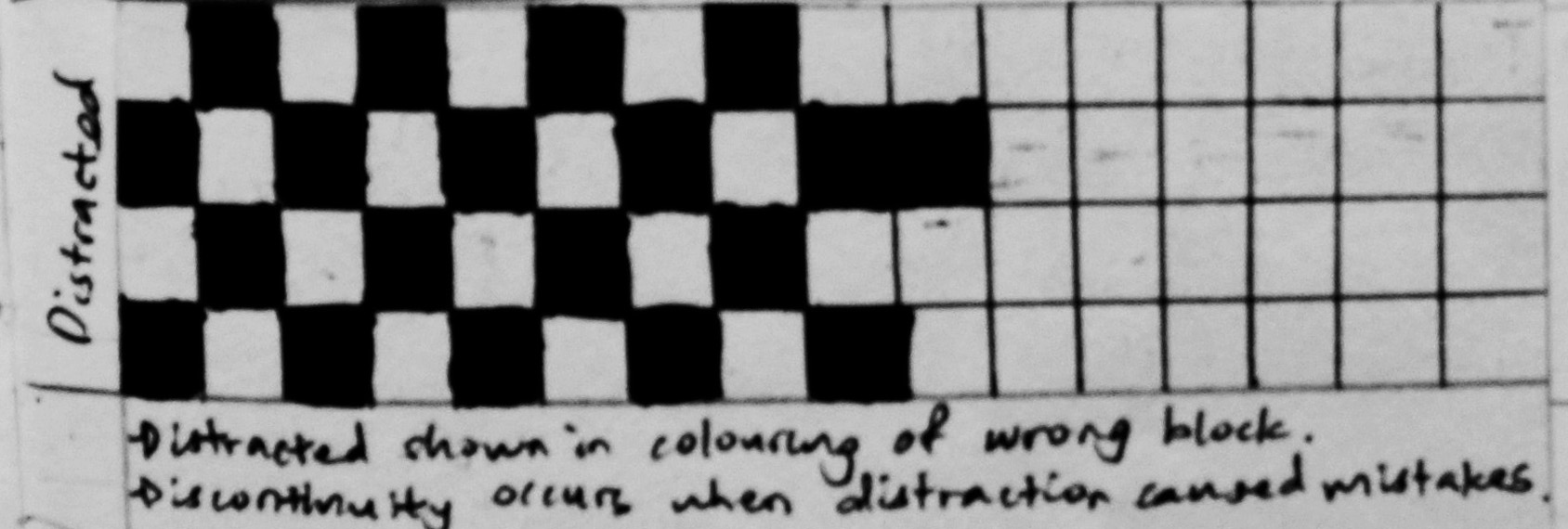
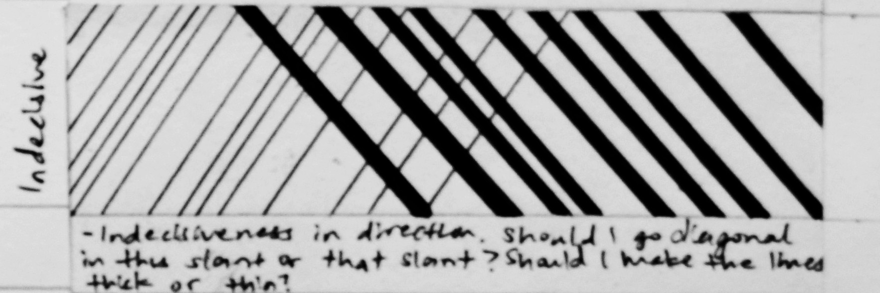
Medium: Black marker pen on paper.
Process: Swirls created free handed from top cautiously, then carelessly mid-way through by drawing without looking at the paper.
Evaluation: Swirls composing two-third of the strip and empty portion composing one-third. Empty portion as a representation of halting in work, because of the error (flawed swirls) caused when I was distracted by my idols dancing on screen. Okay…tmi.
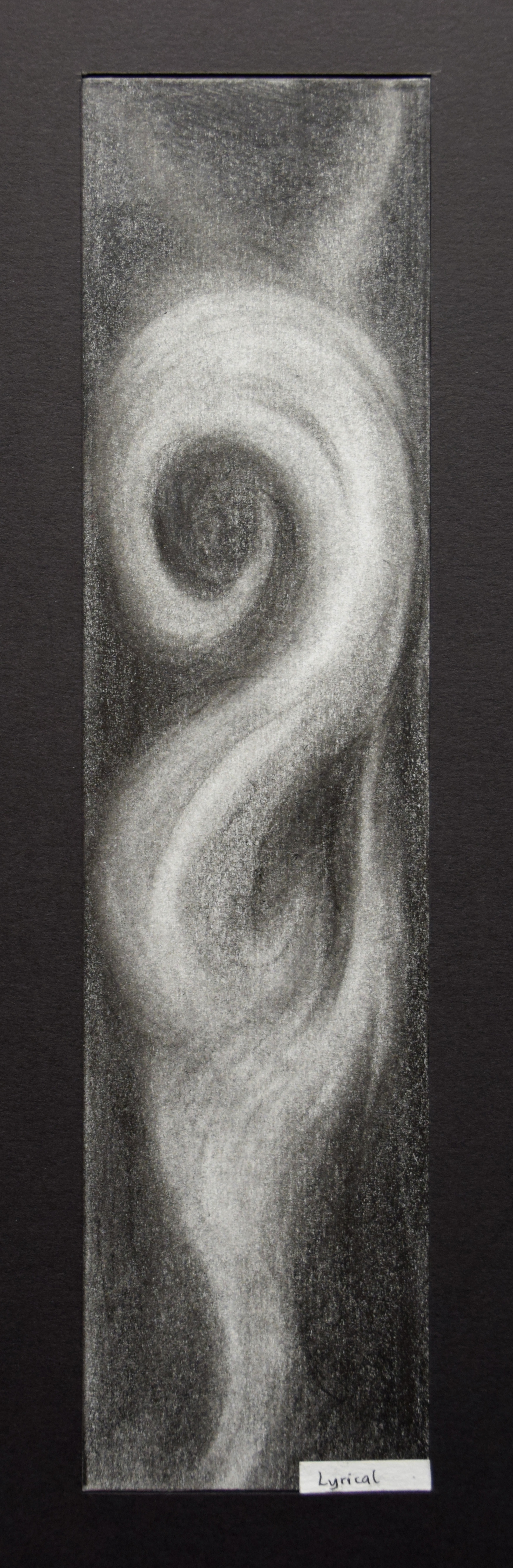

Medium: Eraser, 2B and 4B pencil.
Process: Erasure on 2B pencil then darkening with 4B to create greater contrast in light and dark.
Evaluation: Inspired from the movement of smoke in the atmosphere, suggestive of relaxation. Implied lines observed in a slow tempo, like adagio. Erasure to bring out the white of the paper and blurred/ blended contours to suggest softness. Adagio feels soft to me.
Medium: Black marker pen on paper.
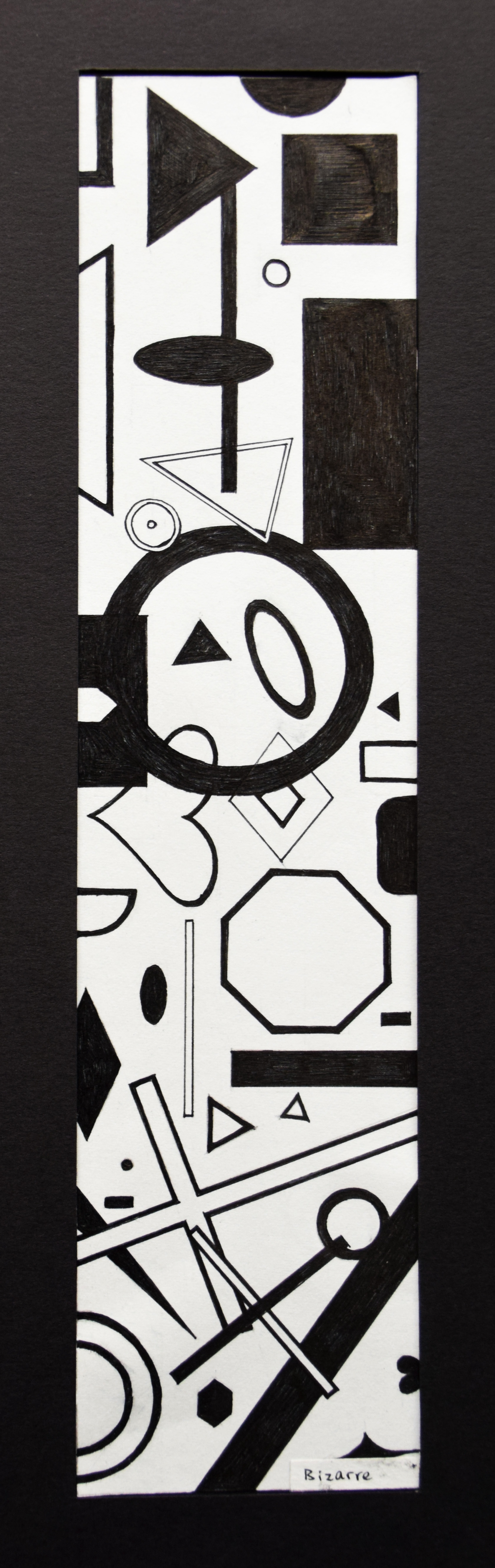
Process: Drawing different geometric shapes in a whimsical manner such that they appear unexpected and unusual with no symbolic meaning.
Evaluation: Overlapping positive and negative shapes and varying sizes of shapes to suggest depth. Distributing weight represented in solid shapes (heavy) as compared to outline of shapes. (empty and light).

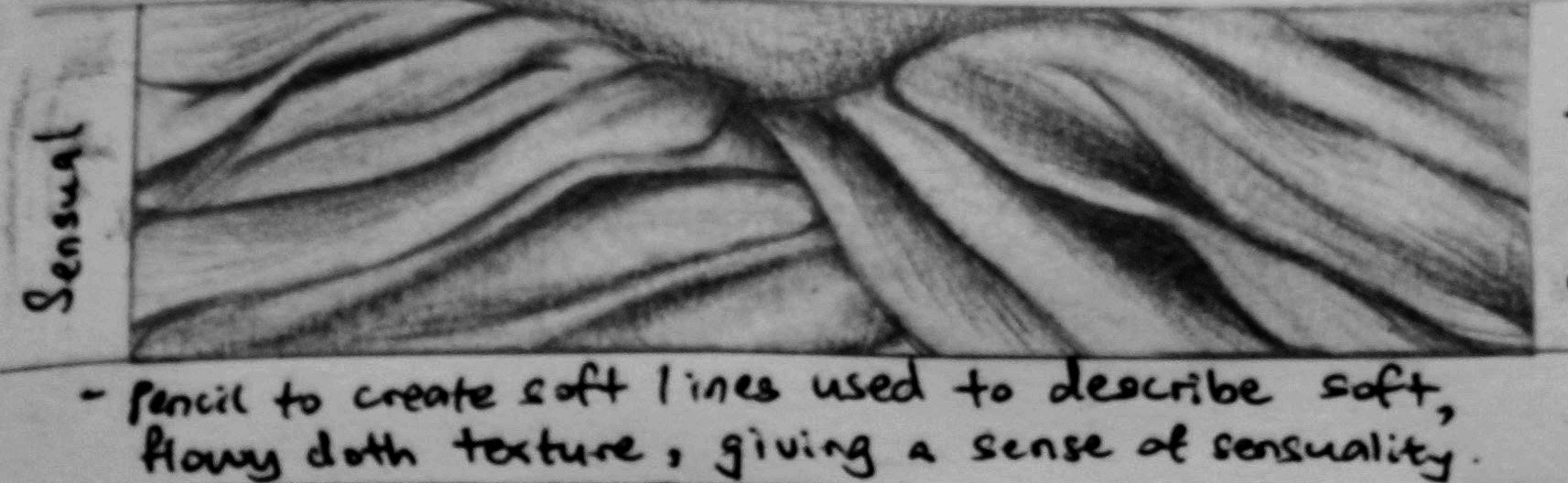
Medium: 2B, 4B, 8B graphite pencils.
Process: Creating thin lines with a sharp point of a pencil, and thick lines with a blunt edge or through shading.
Evaluation: Experimenting with a range of pencils to create a light and heavy line weight. The reflective quality of graphite pencils suggest smooth, silky hair. Placement of strip to suggest long hair flowing downwards. Hair suggest something very sensual to me, which is perhaps a reason why hair plays a great role in physical attraction.

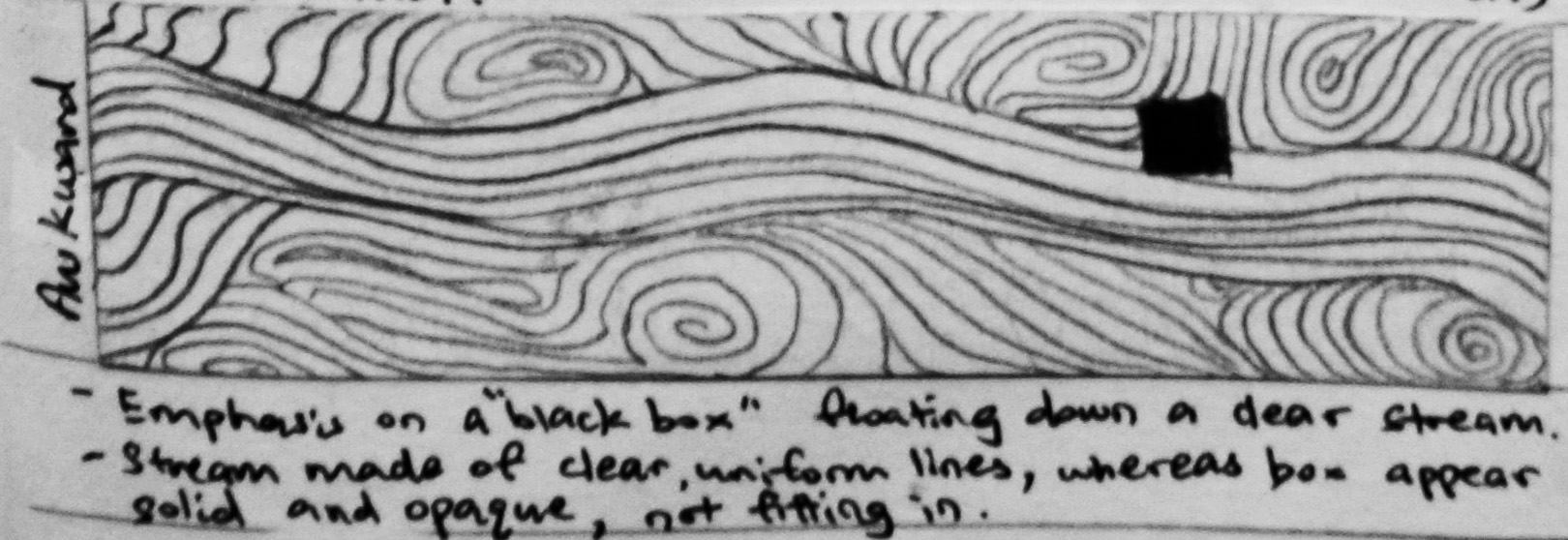
Medium: Black marker pen on paper.
Process: Drawing straight straw-like sticks overlapping one another with a crooked one in the middle.
Evaluation: Overlapping suggest depth. I feel awkward when I stand out in a group. The crooked straw is a representative of a person who feels awkward. It does not mingle with other straws and appears noticeable in the spot light even though it is also a straw, mainly, because it is not straight. I am not going into homosexuality here.
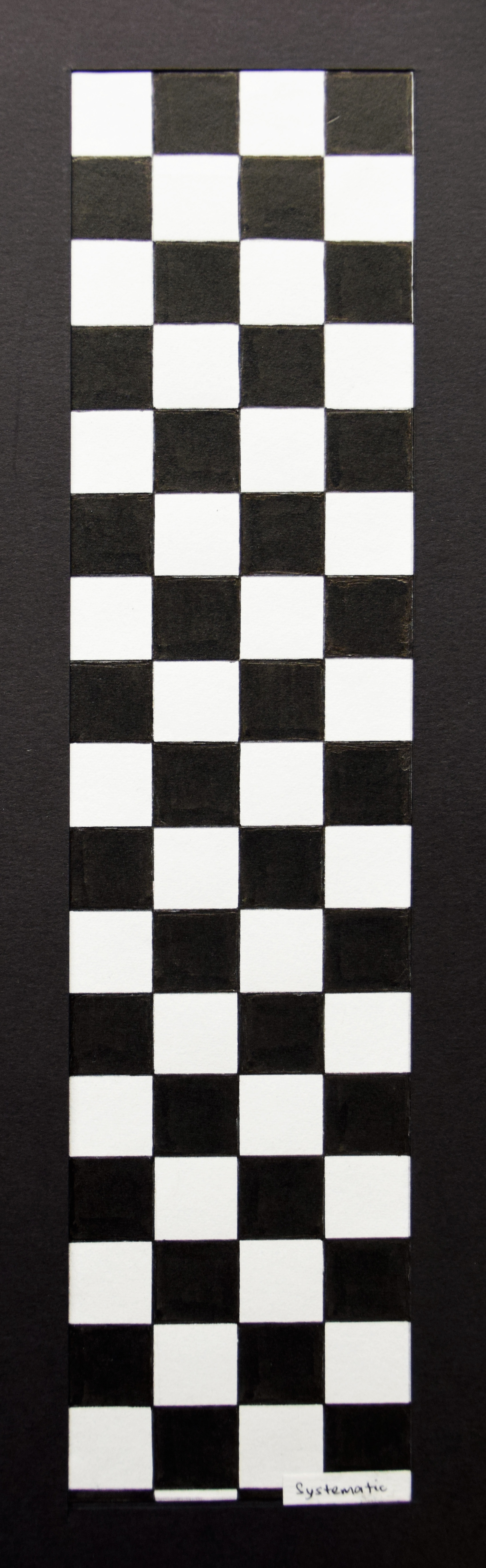

Medium: Black marker pen on paper.
Process: Repetitive drawing of squares in a chequer arrangement.
Evaluation: Systematic appears to be something very rigid to me. To be systematic is to follow an order, a grid, a format.

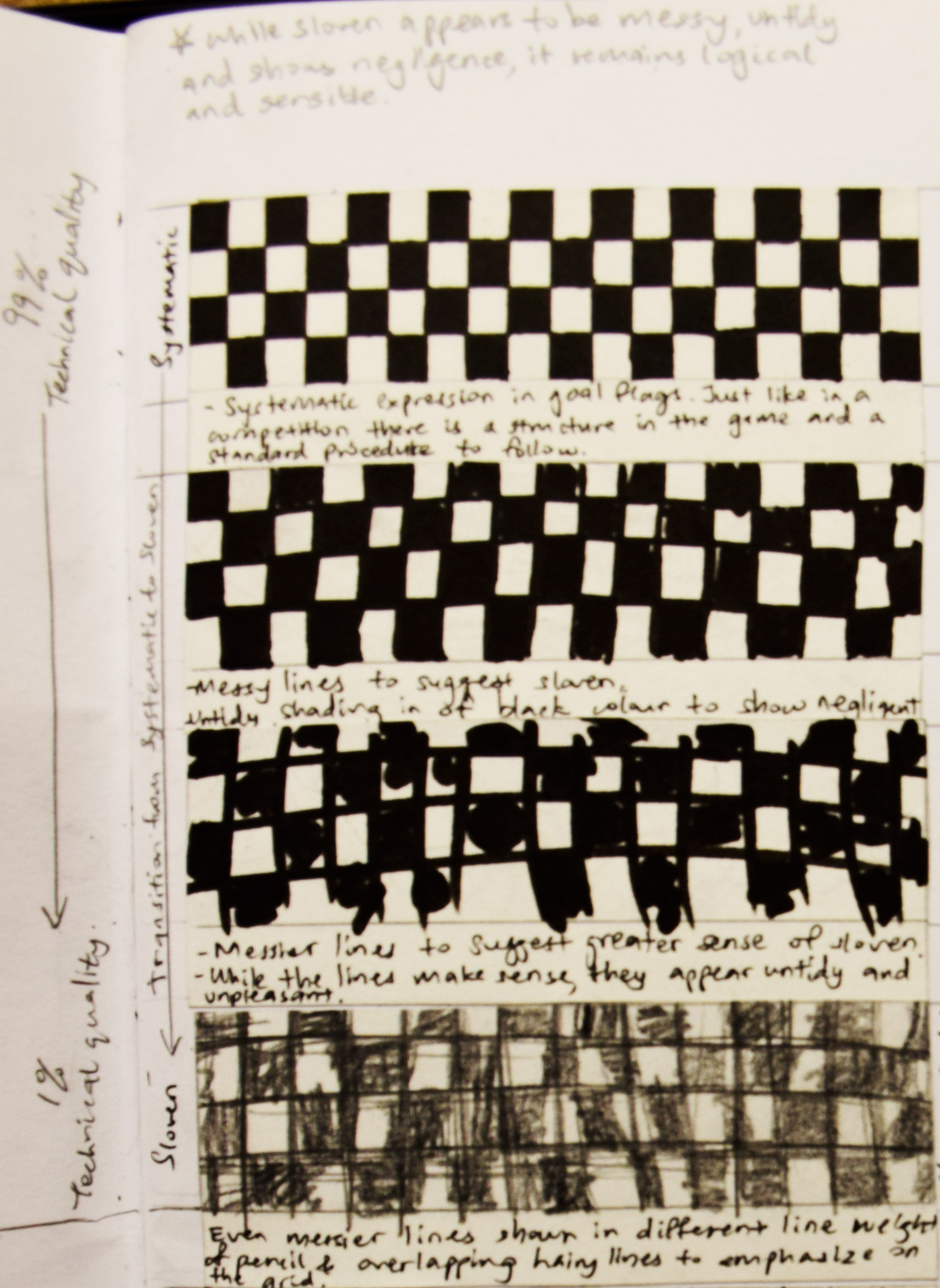
Medium: 2B pencil on paper.
Process: Free hand drawing of squares in a chequer arrangement.
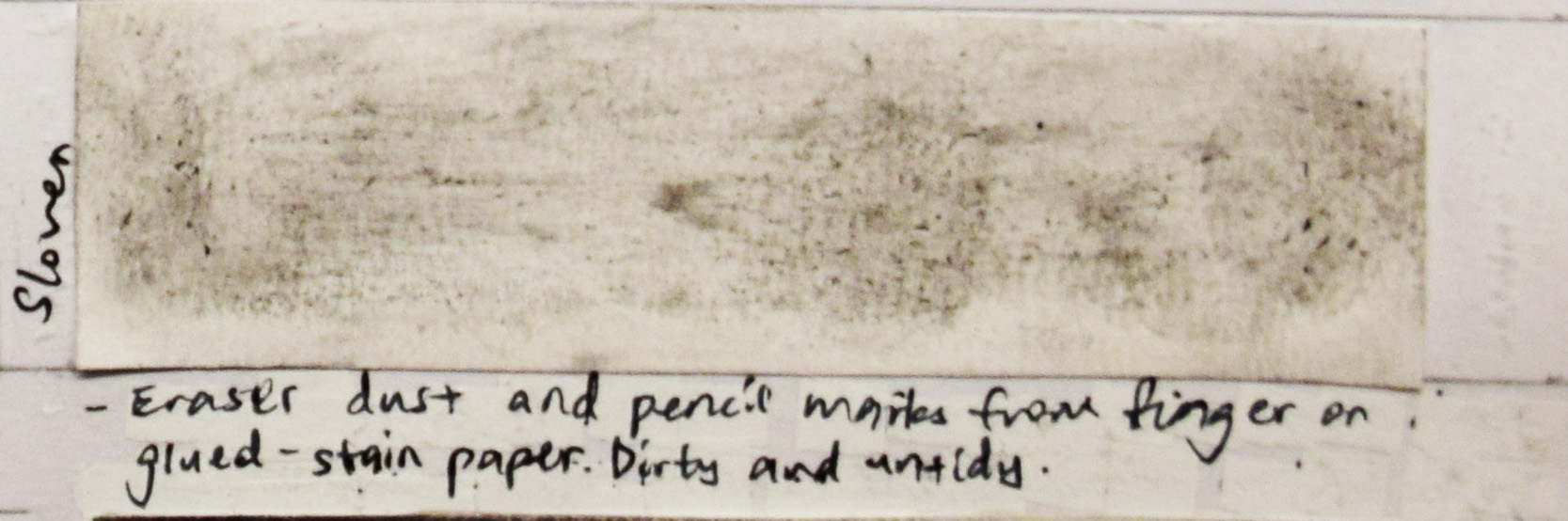
Evaluation: Choice of pencil instead of pen for its greater smudging effect. The smudges represents a sloven person in an act of drawing. My intentional placement of the subject for sloven next to the subject for systematic is to cast a comparison between the two roles. I wanted to show how sloven is not all about being messy, it can have a logic too. In my case, I was trying to replicate the systematic chequer arrangement in sloven, except it turns out to be very untidy in its overall presentation.
Medium: Black marker pen and pencil on paper.
Process: Juxtaposing curvy lines with straight line made using a pen and a pencil respectively.
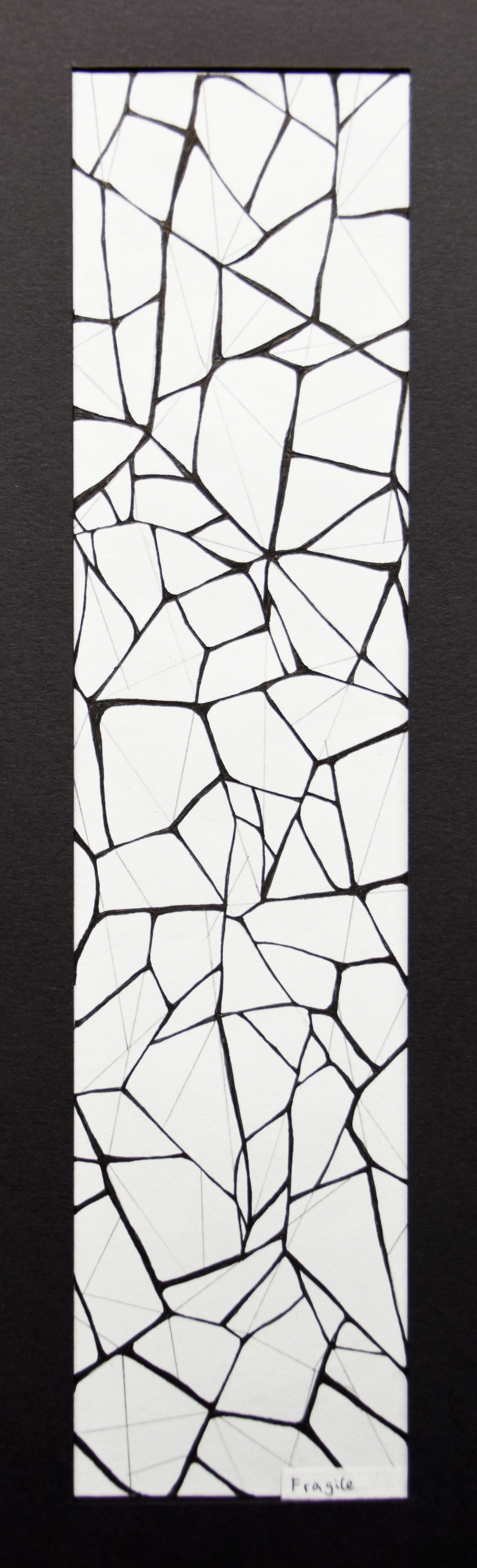
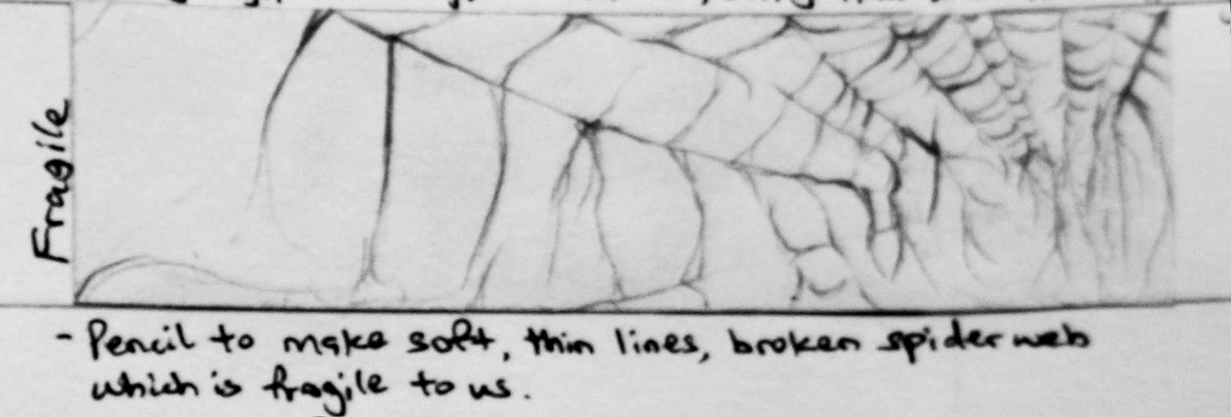
Evaluation: Observing uneven cracks and emphasising on the irregular path of cracks by having curvy lines to be thicker and darker as compared to the thin, faint, straight lines. Criss-crossing of paths in an unpredictable manner to show glass breaking naturally.
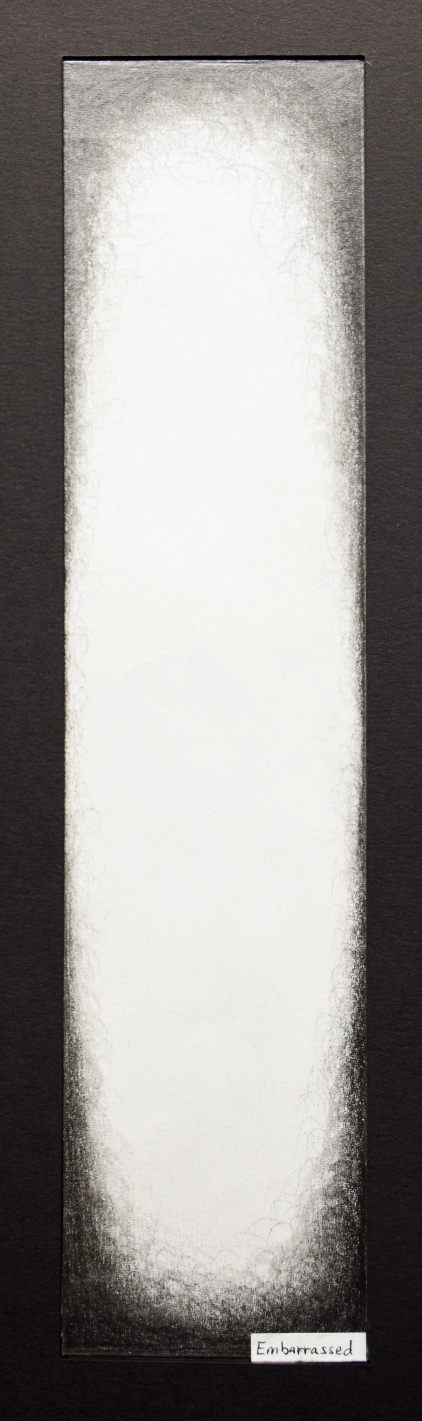
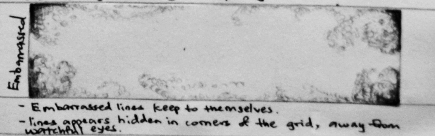
Medium: HB pencil on paper.
Process: Making short pencil strokes along the sides and at the corners of a strip of paper.
Evaluation: Embarrassment is something that I want to hide. Embarrassed represented in the lines hiding at the corners and along the sides of a paper. You can tell that something is there because the edges of the strip appear curved instead of angular, but only if you look closer. If you hadn’t looked closer, you would only see an empty white ellipse.
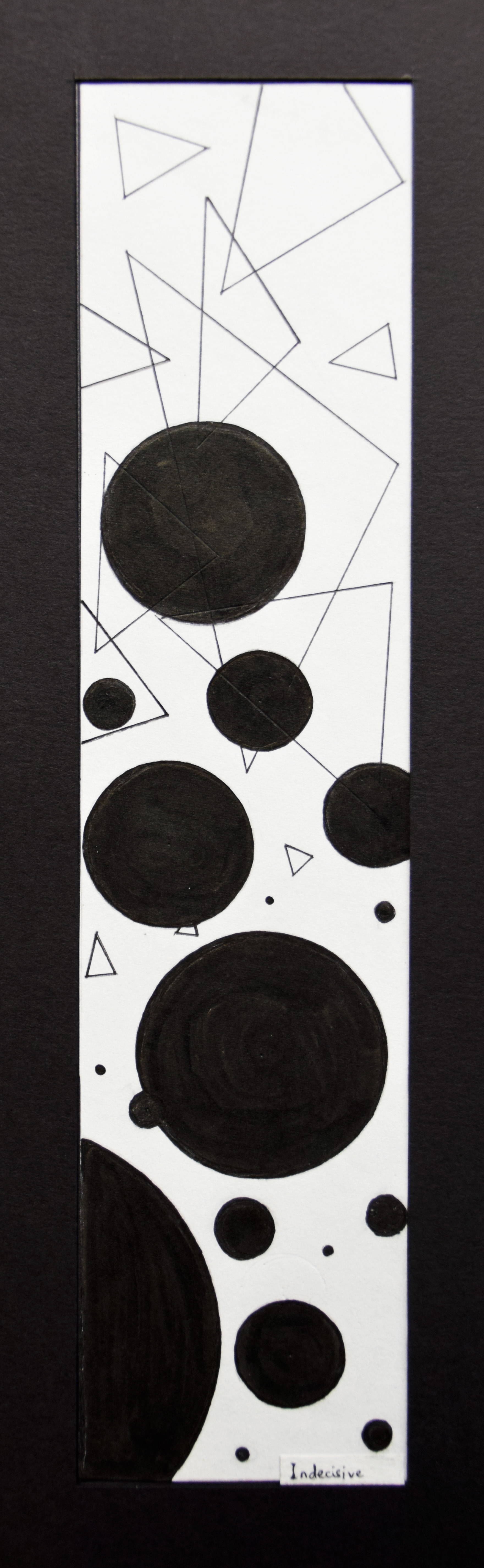
Medium: Black marker pen.
Process: Drawing circles and triangles, then shading in for circles only.
Evaluation: Incisiveness in the choice of shape. Should I use circles or triangles? Placement of circles at the bottom two-third of the strip because they appear heavy and sinking since they are solid shapes. Placement of triangles at the top one-third of the strip because they appear light and floating since they are hollow shapes.
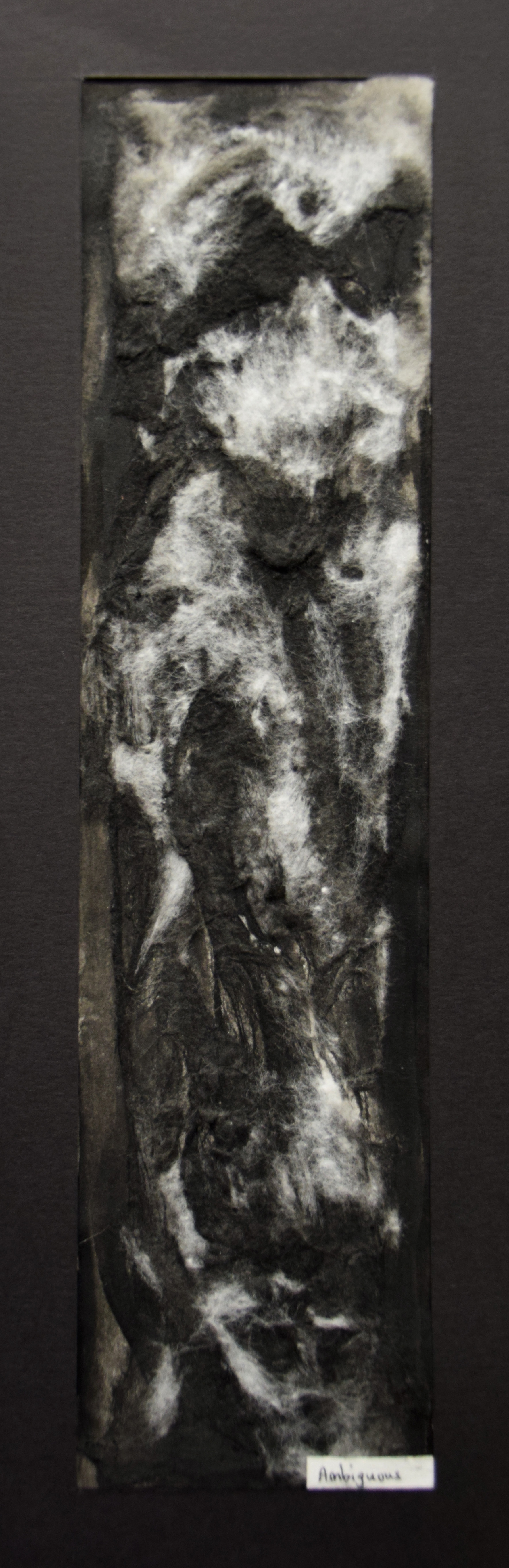
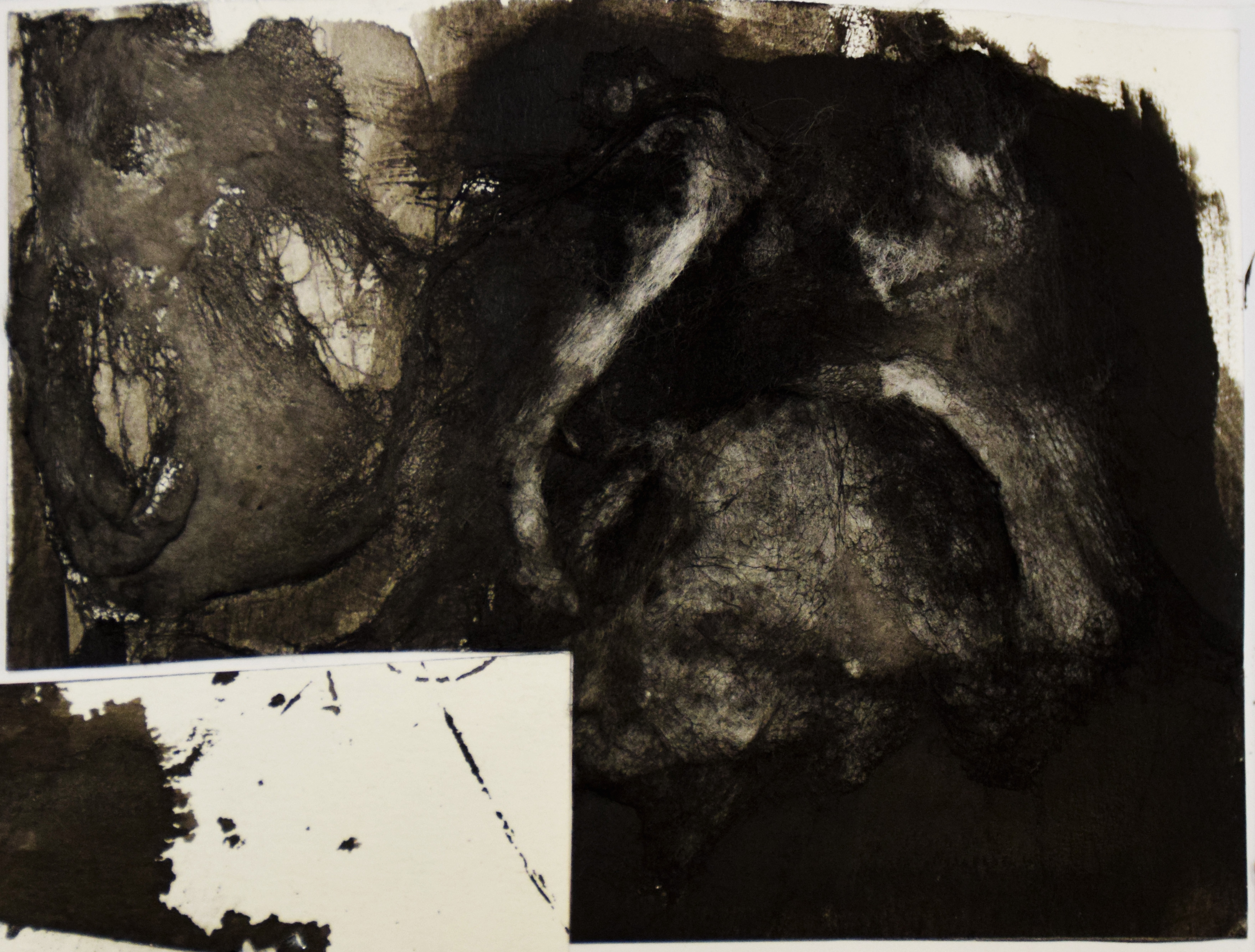

Medium: Cotton wool with black acrylic.
Process: Painting over cotton wool and placing cotton wool on wet acrylic paint repeatedly.
Evaluation: I was trying to create something smoky and hazy. I painted over cotton wool to bring out the black and placed cotton wool over wet acrylic to bring out the white. The overall effect appear ambiguous to me. Even though the white looks like it is resurfacing from the black, I cannot make sense from the form of the white to infer what the white is.
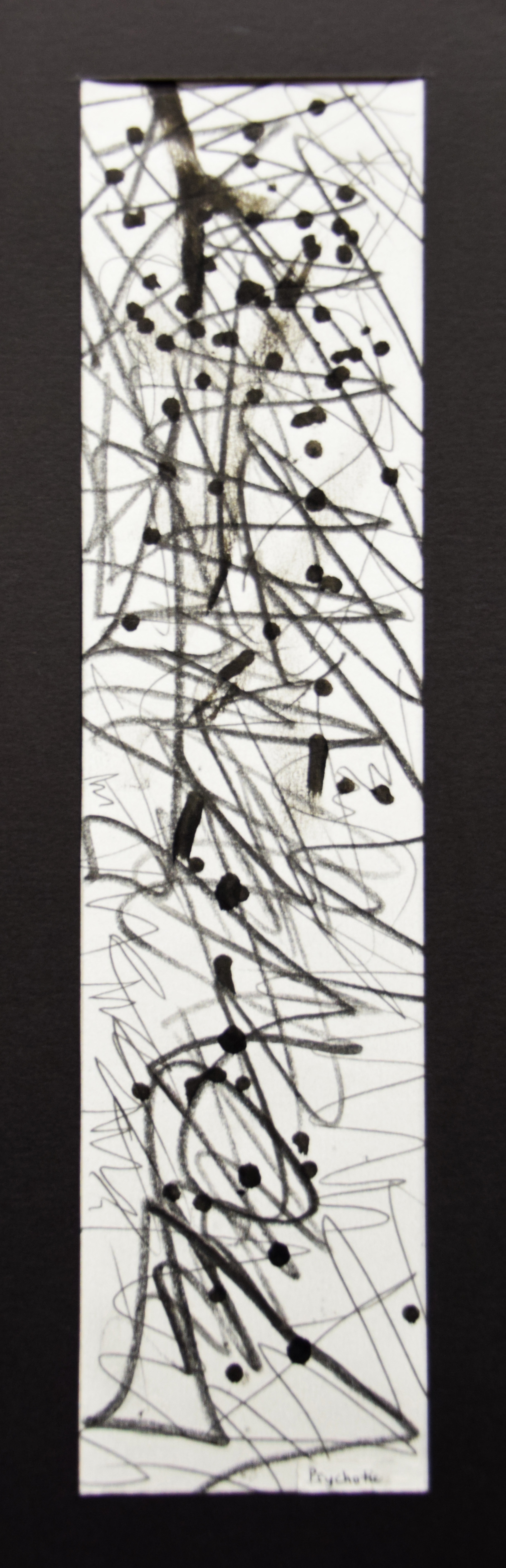
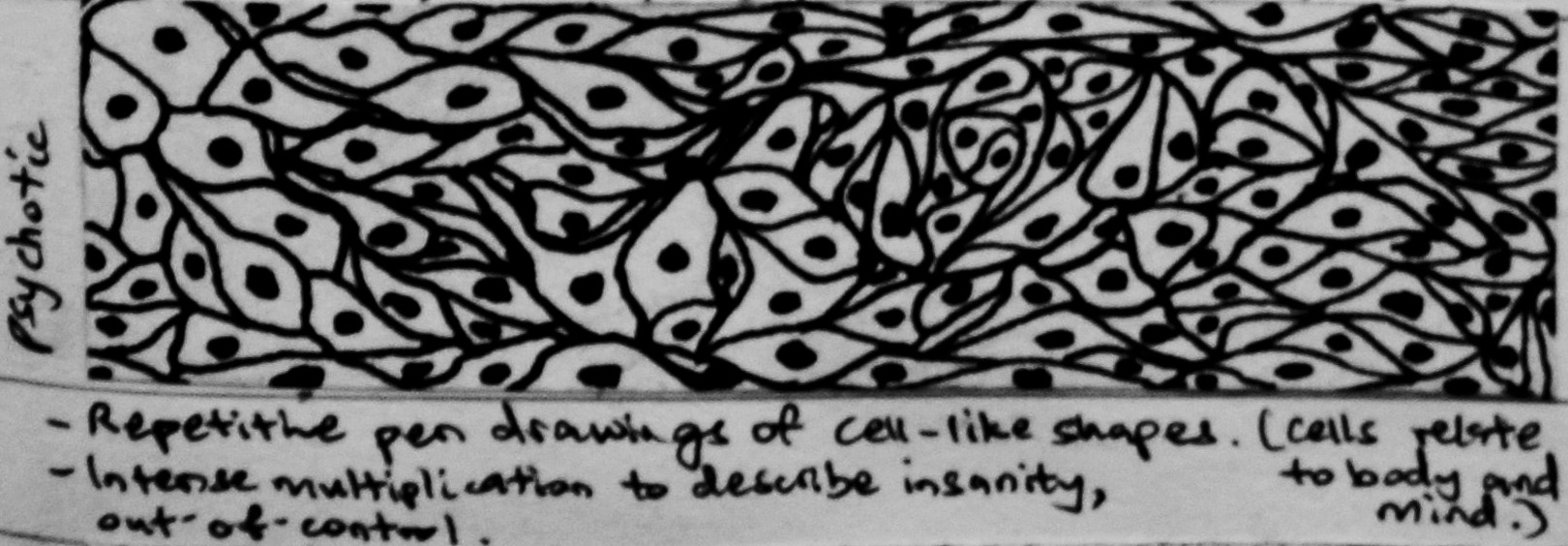
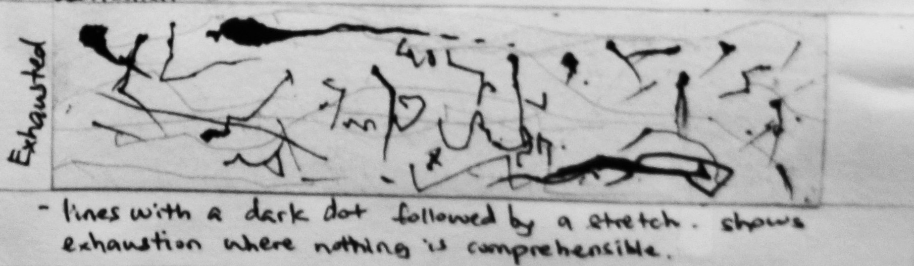
Medium: Black marker pen, 2B and 8B pencils.
Process: Acting psychotic on the paper with the tools.
Evaluation: Psychotic reflects uncontrolled emotions to me, especially anger: being angry with my surroundings and being angry with myself. Psychotic can be self-harming. Thin lines contrast with thick lines created in zig-zagged motion using 2B and 8B pencils respectively. Zig-zagged motion to suggest slashing action. Forceful application of lines in a violent manner. Dark dots created by stabbing the paper with a black marker pen. My marker pen died in the act. T.T

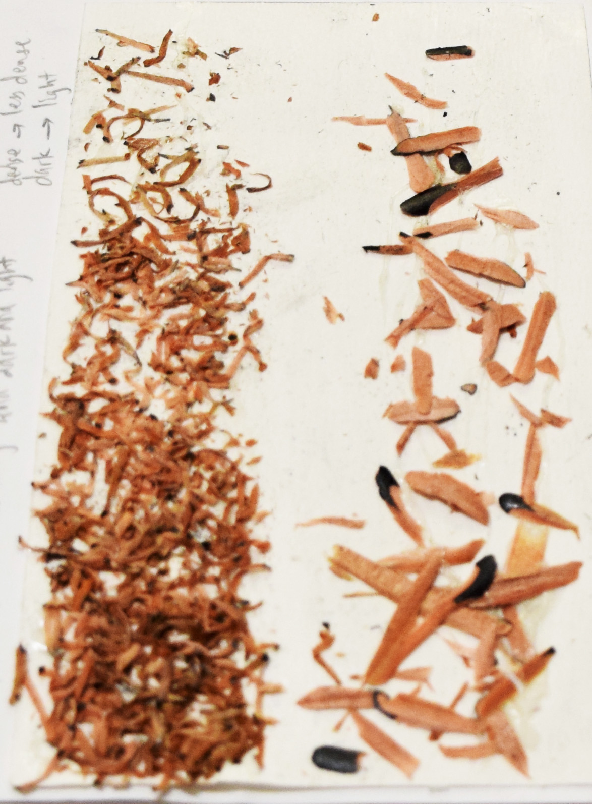
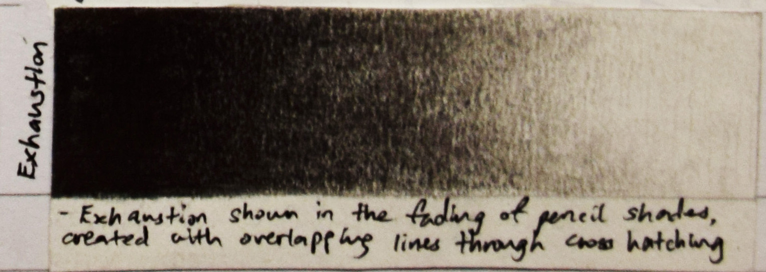
Medium: Pencil shavings glued on paper.
Process: Using three different sharpeners, one big, one small and a penknife, I sharpened my pencils to get three sets of shavings. The big sharpener gave me shredded, short and curly shavings, the small sharpener gave me thin, flat and spiral shavings, the penknife gave me thick, long and narrow shavings.
Evaluation: Exhaustion is about ‘fading out’ to me. I created fading effect by having the pencil shavings with the biggest surface area on the top of the strip (high density) and the smallest surface area on the bottom of the strip (low density). I want to convey that sharpening pencils is exhausting without using an electronic sharpener.
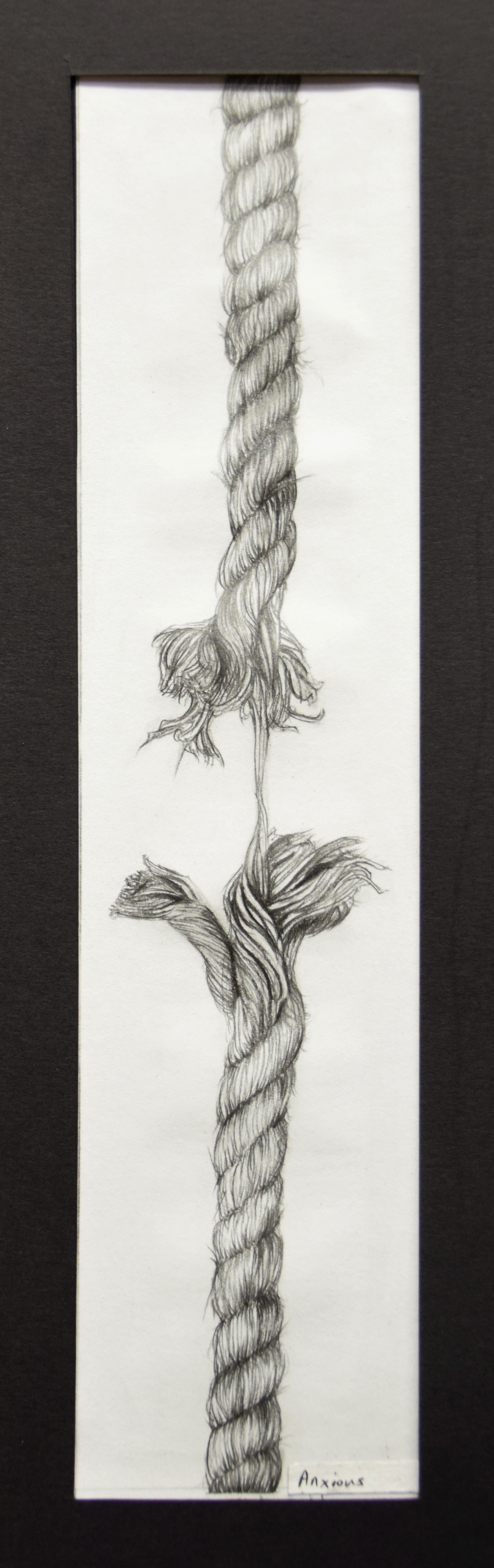
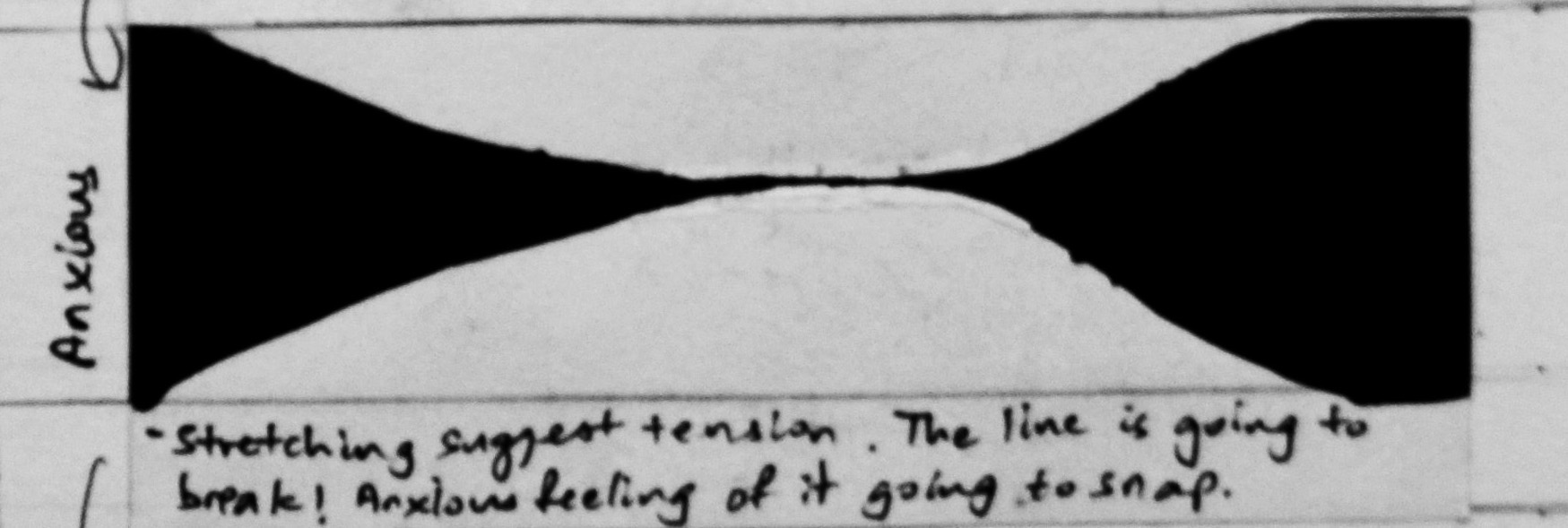
Medium: 2B pencil on paper.
Process: Observational drawing of a tearing rope.
Evaluation: The intentional vertical placement of the strip to suggest that there is something pulling the rope down, hence tearing it. It makes me worry what is going to fall (most likely heavy enough to rip the rope and heavy enough to break a skull), who is it going to fall on and when is it going to fall on the person. This is the feeling of anxiety to me.
My reflection: Thinking of how to translate 18 sets of emotions into lines through my hand was a tedious process indeed. At the beginning, I was lost with my dots. I don’t know which path I should take my dots on for a walk. During the walk, I got to know my dots better and I felt like I could empathise with them. We had fun along the way through adventurous explorations with conventional (pencil, pen, charcoal, Chinese ink) and unconventional mediums (pencil shavings). My hands became the bridge between the paper and me. I learnt to be more translucent with expressing myself to my audiences yet not losing my individuality at the same time. This four weeks long walk has been unforgettable. To all the people out there embarking on the same project: Wear your heart on your sleeves!
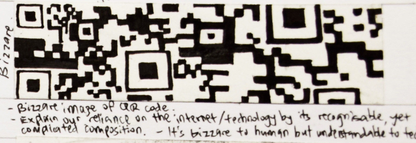
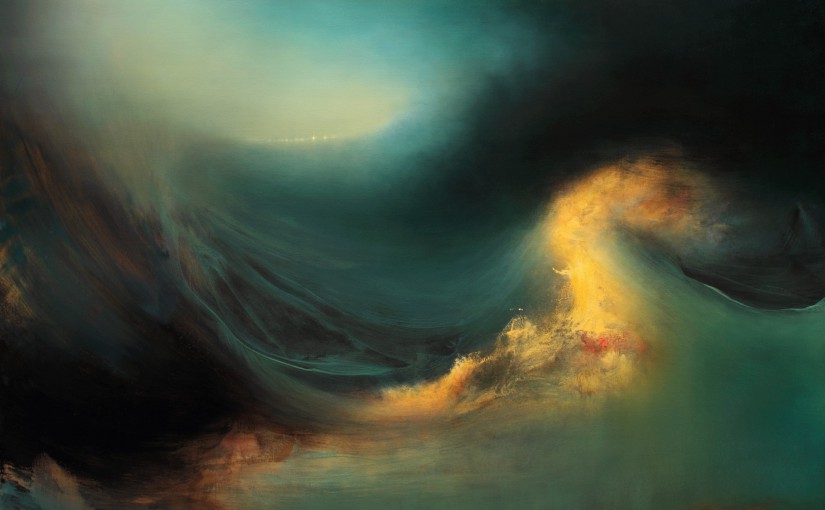
I hate turbulence
Turbulence: violent or unsteady movement of air or water, or of some other fluid. I hate turbulence. I hate turbulence on the plane, on the ship, on anything that moves. Turbulence makes me vomit. Turbulence is full of energy, it shakes me up and ignite fear in me because it makes me feel like it could consume me.