
For this project, I began by hand-drawing the buildings and figures on sketch paper before scanning them onto my computer and then refining them.
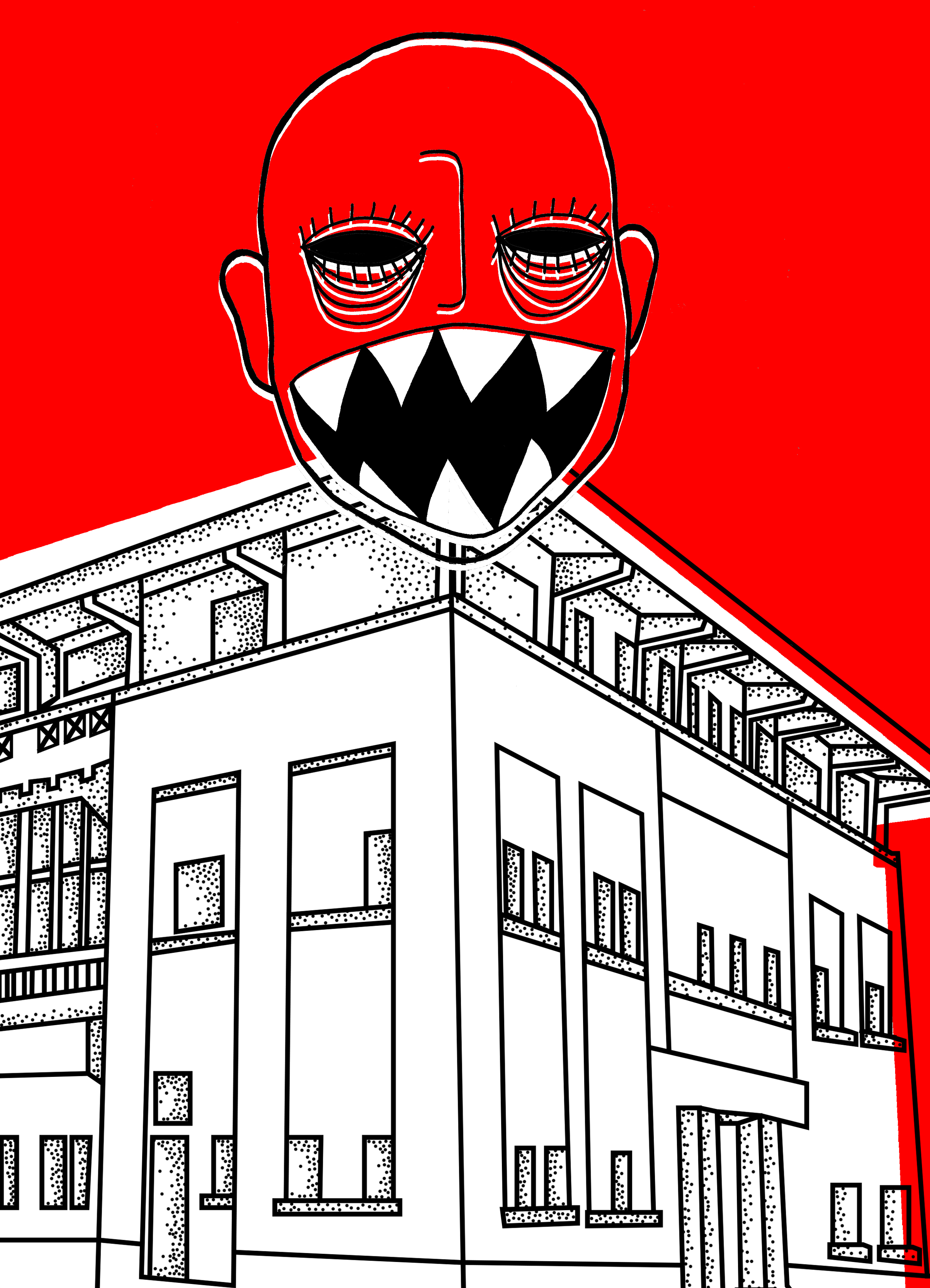
page 1 & 8 (changi prison)
sketching

Above is an outline drawing of Changi prison and a ghost which is going to end up a spread in the zine. That is why I made the building symmetrical.
editing
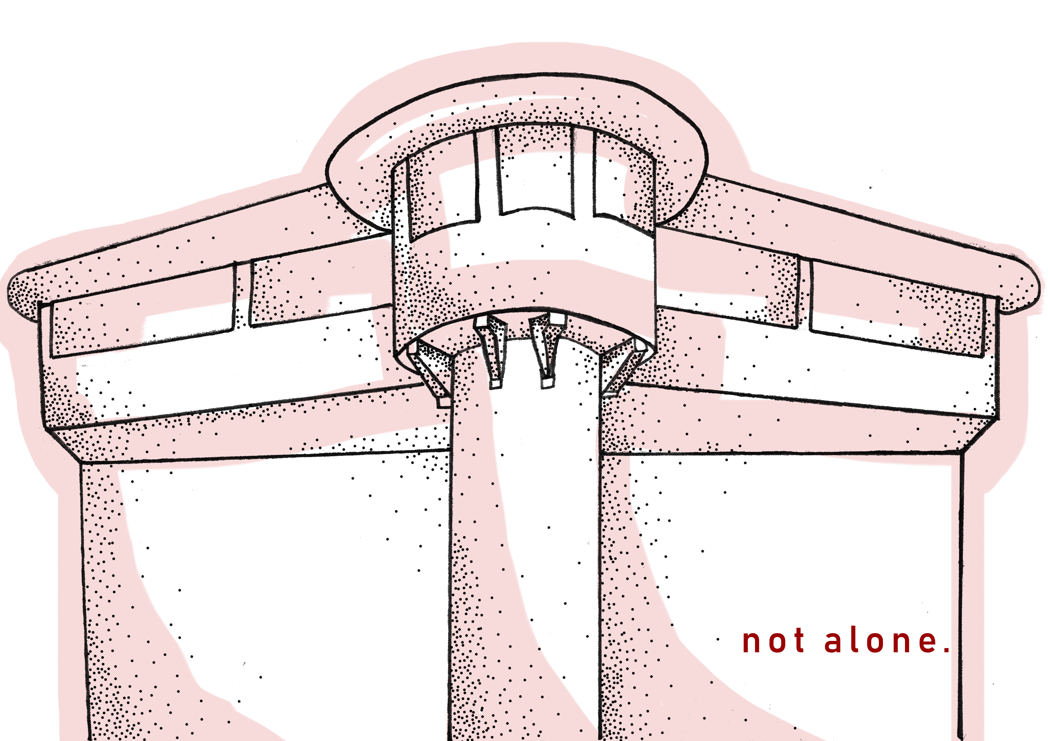
I edited the building before I did for the ghost. I added dots using photoshop to the building to give it a little dimension as it looked pretty flat before. Emulating Ruth Allen’s style, I coloured the building without filling every gap. I also coloured it outside the lines.
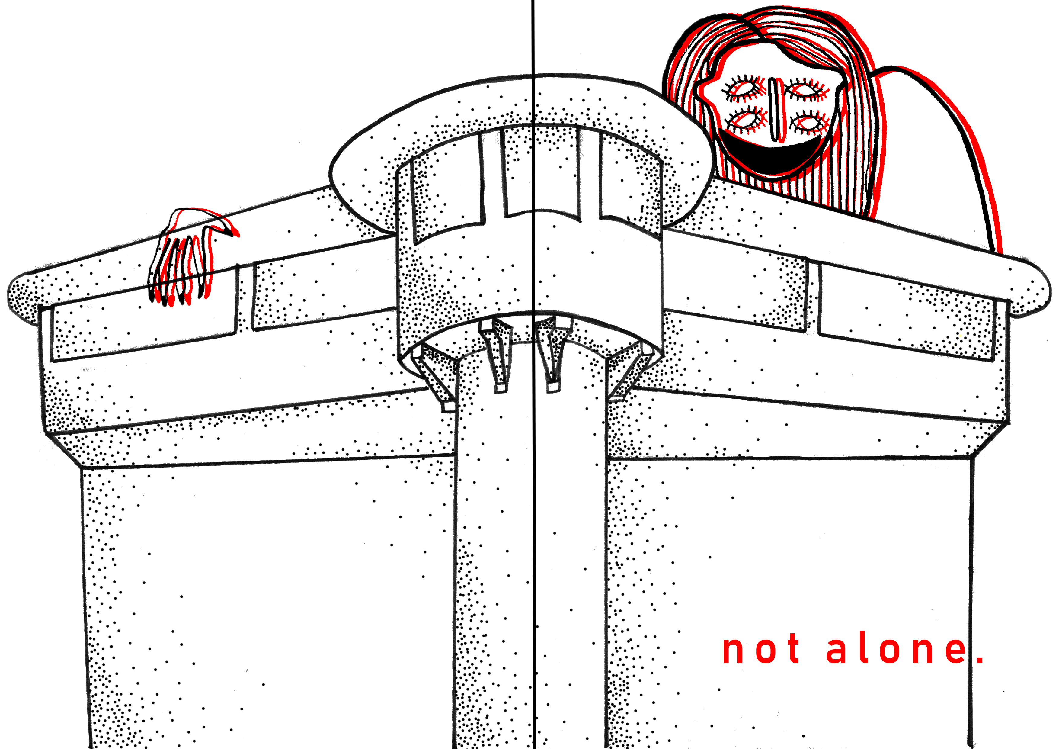
I ended up not liking the colour I placed as I felt it was not eye-catching enough so I removed it. I added the ghost that I edited. I overlapped two layers of the ghost, one of it being black and the other, red. It creates an almost 3D illusion which I really liked.

I settled with a bright red in the end for the colour of the building as it fits my theme really well. It also looks pretty pleasing to the eyes. I wanted to still emulate Ruth Allen’s style which was why I purposely did not align the colour to the lines exactly. If you did not notice, I also changed the font of the title to a rather child-like handwriting. I think it gives a more creepy feel.
page 2 & 3 (changi beach)
sketching

I sketched an image of 3 decapitated heads as a reflection of an actual image I saw as I was researching on the massacre that occurred at Changi Beach. It was a pretty unforgettable image ( try searching on google for it!) which I thought would be impactful to add to the zine. Of course, I didn’t exactly copy the real-life image since I wanted to emulate the style of Karolina Koryl. Thus, I distorted the faces making them look “melt-y” and added more eyes.
editing
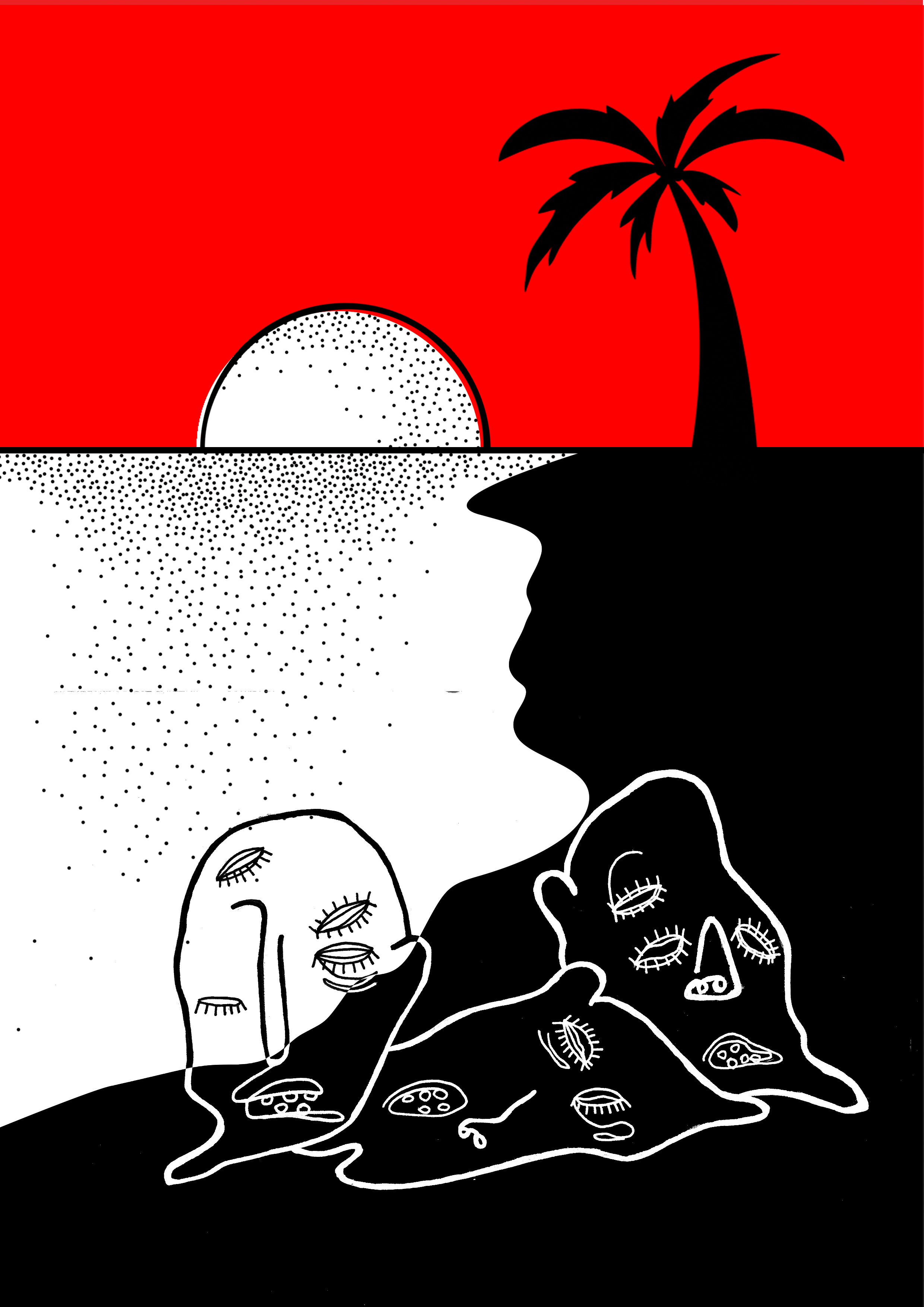
This page was quite simple to execute. I did not hand-draw the beach but used illustrator as the it only consisted of mostly lines. To make the zine consistent, I used about the same colours as the previous page.

I made this page into a spread upon Mimi’s feedback. I think it looks really cool and actually like it better as a spread.
page 4-5 (old changi hospital)
sketching

Most of the ghost stories that I have heard regarding Changi was about the infamous hospital. Thus, I wanted that page to have the most amount of ghosts which explains the sketches of many different ghosts above.
editing
I added one of the heads on a drawing of the hospital which I drew on illustrator. I initially planned for this to be a single page but ended up making it a spread as well as recommended by Mimi.
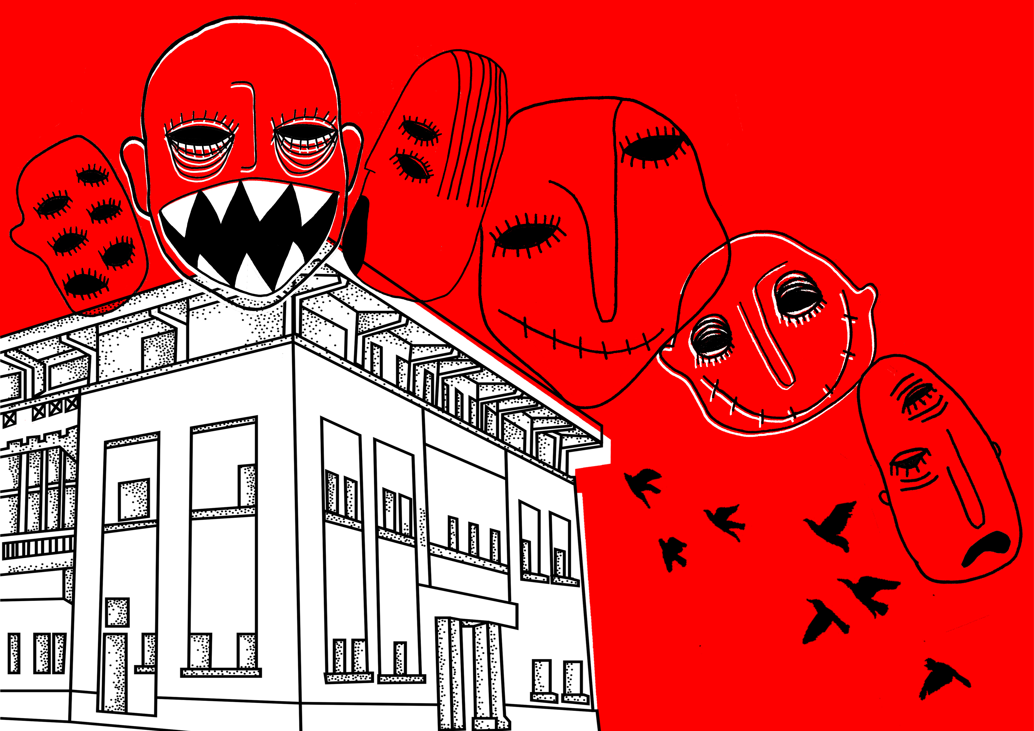
I could fit in more heads into it which is better. I spilled over the building drawing over to the next page as well to kind of create a better flow. As you can see, I also applied Ruth Allen’s style to the building.
page 6-7 (changi airport)
sketching
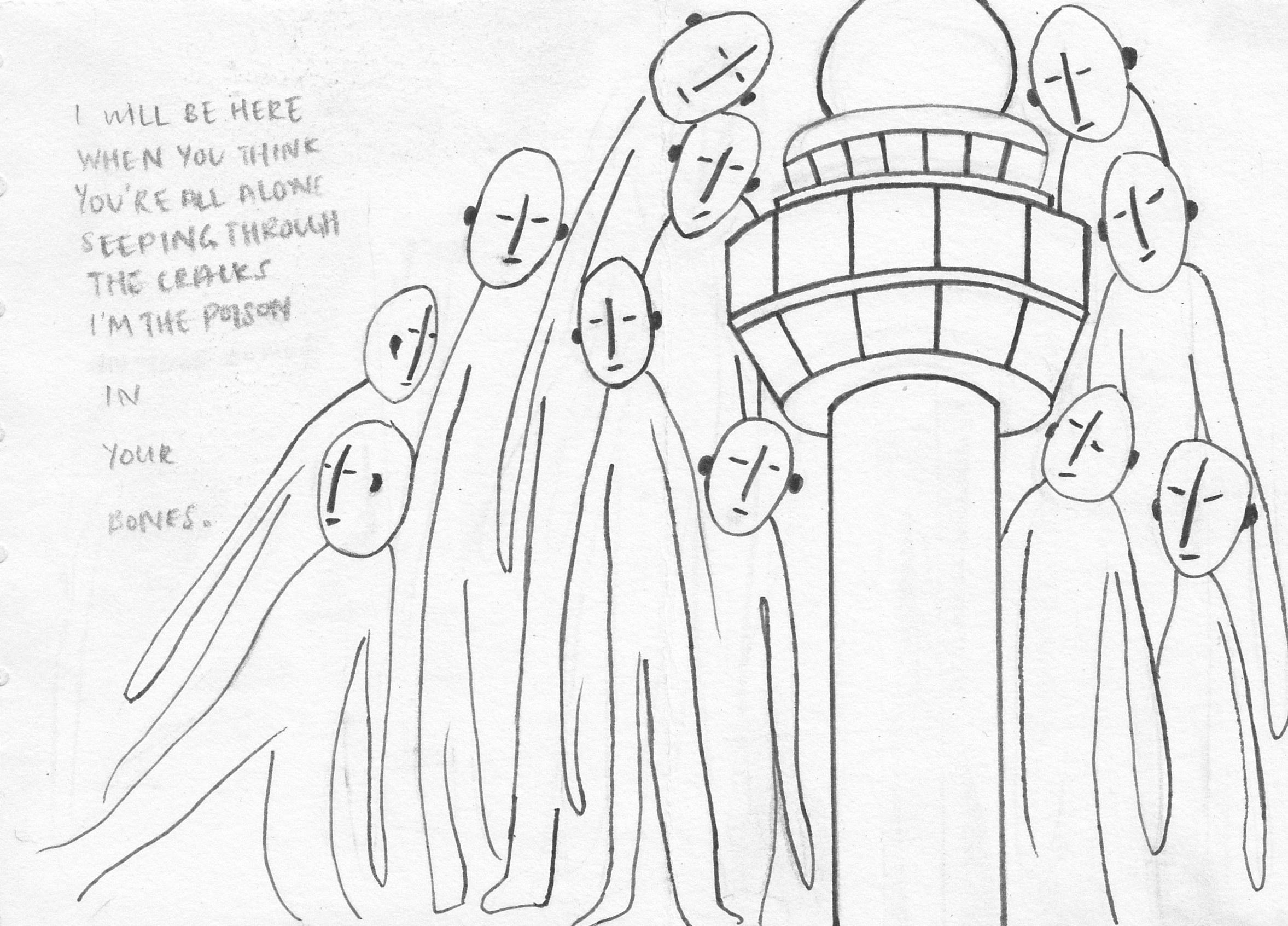
I sketched a group of uniform figures towering over and surrounding the airport. I made this the last page as I wanted it to be in a way, unexpected. I rarely hear ghost stories about the airport but it exists. That is why I made the figures less obviously scary-looking. I accompanied the drawing with a poem I found that I really liked.
editing
This particular spread went through a lot of editing. I made so many variations of it because it was the last page which I think is very important. It should leave an impact.

It does look pretty consistent with the rest of the pages. However, it was not shocking or as interesting as I wanted it to be. Thus, I made it very different from the rest of the zine.
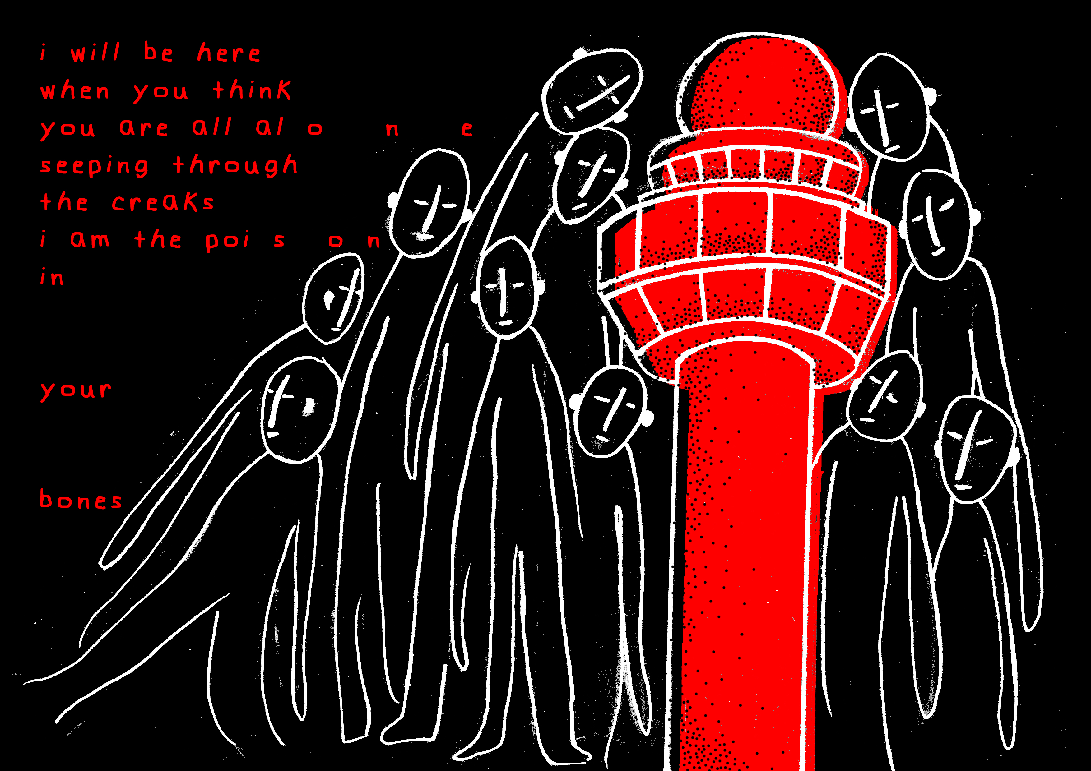
Besides the red, I inverted the colours making black the dominant colour. I really liked the vibe that this spread gave off. I consulted Mimi and showed all the variations I made and she also preferred this colourway.
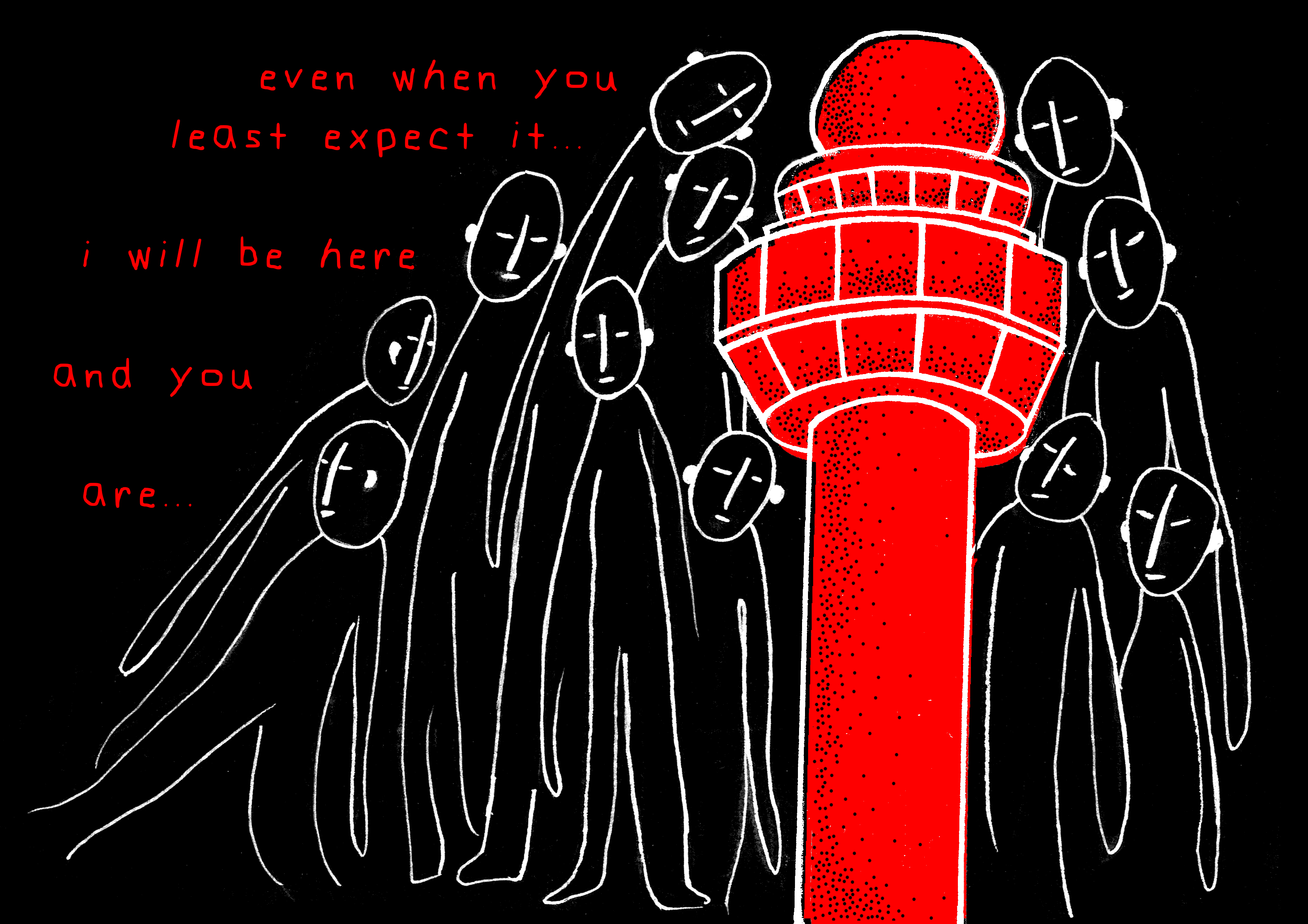
I also ended up changing the poem. I removed the poem completely and came up with something on my own. Mimi commented that my zine lacked narrative. So, I wrote something that would tie the whole zine together. The last line goes “…and you are…” which would then continue to “not alone.” on the first page.
bonus
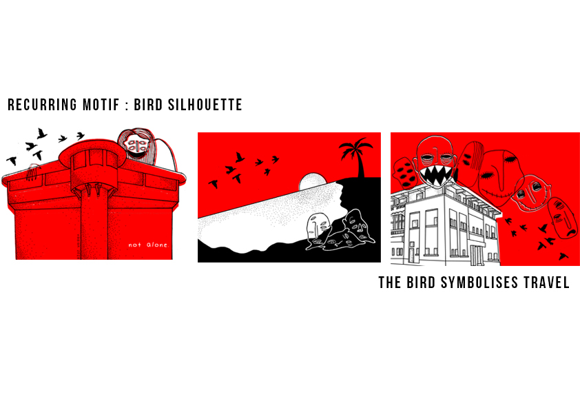
If you noticed, the silhouette of a flock of birds flying is a recurring motif in most of the pages. I wanted something to connect the pages together thus I added the birds which represent ‘travel/movement’. It is as if the viewers are following the journey of the birds to the different places in Changi.
Check out my final post to see all these pages come together!