Burning Out


Related image

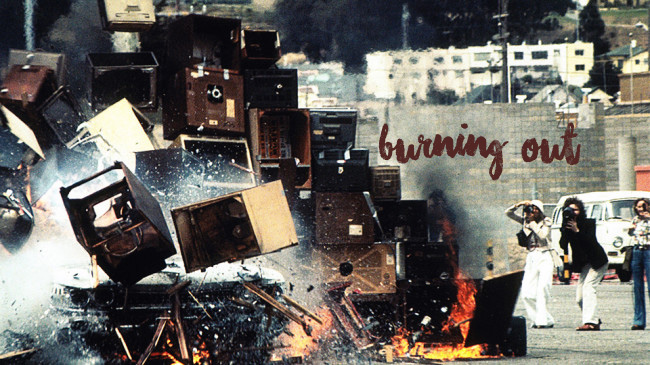
Media Burn was an art performance piece organised by a group of artists and architects called Ant Farm. In the piece, a customized 1959 Cadillac renamed the Phantom Dream Car was driven into a bank of television monitors as seen in the image above, causing an explosive collision thus the term, Media Burn. It was driven by two men (artist dummies) decked in astronaut costumes as seen below.

Image result for artist dummies media burn

The whole act also tried to imitate the dramatic atmosphere of a space launch which was why the performance was done with a live audience present. Doug Michaels, co-founder of Ant Farm as John F. Kennedy was present to do interviews as an artist-president. He made a speech about mass media monopolies on the lives of Americans.

“Who can deny that we are a nation addicted to television and the constant flow of media? Haven’t you ever wanted to put your foot through your television?” – Doug Michaels as J.F Kennedy

In an interview with Randall Packer, Chip Lord, another co-founder of Ant Farm said that the piece was first imagined in 1973 in which it took 2 years to actually be executed.

It was executed on July 4th 1975 at San Francisco’s Cow Palace. Ant Farm chose July 4th as the date of performance as they wanted the local news to come and cover it as if it was real. As seen in the video above at minute 4:28 onward, you can see footage of the stunt through news coverage by local news stations and not only through the documentations of Ant Farm’s camera crew which was shot inside of the car itself.

As a team that utilizes the art of sculpture, installation and in this case, performance to condemn American culture and mass media, this is exactly what they are doing. In Media Burn, Ant Farm uses automobile and television sets which at that time, were very prominent icons of American culture. They wanted to address the impact of the strong presence of television and cars in our lives. Burning and destroying the television sets as well as as the car in the end represents the notion of going against the political and cultural influence of the both the elements. Even though they were against the medium of media, they were able to exploit it as seen by the wide news coverage and big public crowd.

With the knowledge that Ant Farm are admirers of automobiles and such, I am intrigued by how they are able to criticize it at the same time. Ant Farm was described as “American as apple pie, but at the same time highly critical of the establishment” (Lewallen, Constance M., Still Subversive After All These Years, n.d.)


DIWO

We all know of the common term ‘DIY’ which stands for Do It Yourself. DIWO on the other hand stands for Do It With Others and it is pretty self-explanatory. It is basically an approach that enables the collaboration between people in making art. Through DIWO, people get to create collective works which shapes fresher perspectives that would not have been formed if done alone.

DIWO was created by a group called Furtherfield. The makers were intrigued by the “cultural value” of collaboration between people of different visions as compared to ideas of individual works. As such, they created an artware (a software platform) which allows different people to collaboratively work on an art piece to create meaning. This brings me to the importance of an open source network. Connection and collaboration would not be as easy if networks are privatized. Surely, the masses would not want to pay just to work with somebody else thus open source networks are important for DIWO to succeed.

Collaboration through DIWO also negates the notion of an audience. No one is solely viewing the work. Everyone is engaged in creating it. Hence, everyone involved are the artists.

This reminds me of Yoko Ono’s Cut Piece (above) which we watched a video of in the first lesson. She, the supposed artist, simply sits on stage allowing all her viewers to cut pieces of her clothes off. This best exemplifies the collaborative movement. Without her “audience” interacting with her, the performance piece would have remained stagnant. Thus, she is doing it with others (DIWO).

Throughout half the semester that has passed, I have been exposed to many collaborative projects involving the third space. Again, the third space is “the pervasiveness of distributed space… in which we are constantly connected” (Packer R. “The Third Space,” (2014) in Reportage from the Aesthetic Edge). The existence of the third space has improved the efficiency of doing it with others. Through a space accessible by today’s advanced and quick technology, we are able to be involved in DIWO in a flash.

Facebook live with a friend

One of our microprojects, the Tele-stroll is a good example. As seen in the picture above, we utilized Facebook’s live feature to create a collaborative piece called the Tele-stroll. My friend, Jasmine and I were at different areas in Singapore yet we were able to do the same things at the same time through negotiation and communication which is essentially what a third space serves to do.

DIWO also enables the creation of collective narratives. People are able to come together to put forth a message.

Screenshot 2014-08-25 13.51.38

An evident example that I have learned of in this class is an artwork called The World’s Longest Collaborative Sentence (1994) by Douglas Davis. Anyone with access to the internet could contribute to making the sentence longer. Anyone could add to the story that is being typed out. As people read previous sentences and add on to them, it creates a narrative that is made through connection and interaction.

Telematic Embrace

In class, we also did a micro-project called Telematic Embrace which is a collective narrative through the movement DIWO. We got to interact collectively through an online platform called Adobe Connect. As a class, we did a series of different poses and created beautiful images, one of which you can see above. We created the symbol “X” without even physically being directly next to each other.

All in all, I am for DIWO. I feel that it is a great way to sustain human interactions with the rise of technology that may be slowly isolating us from it. Through collaboration and negotiation, people are able to create works far beyond what they could have managed singly.

Image Making Through Type – FINAL

My final 4 compositions!

To reiterate, my concept for this project is “CHILDHOOD“. The occupations chosen come from the perspective of a child. Thus, some nonsensical, non-existent and fairly childish jobs. Read more on why I chose that concept here!

ONE – TOY FIGURE  

This idea stems from the notion that children do not know what purpose a job serves.  I’ve heard kids saying “When I grow up, I want to be a lion”. That’s not possible now is it? This basically works around the same idea. It’s not possible to become a toy figure but that’s what they want to be. So, here we are. I manipulated “nAd” into looking like a doll-like figure. This composition is kind of like a game of “Spot the letters” which is why I did not make the letters too evident. The letter “n” is represented through the hair, “A” through the dress and “d” subtly through the shoes. I want to keep the figure as the main focus thus I kept the accessories around it pretty simple.

TWO – PRINCE/PRINCESS  

This is similar to the previous “occupation” in terms of its craziness. However, it is possible to be a prince or a princess. Even if you’re not born into a royal family, it is possible to marry into one sooo hehe. Sign me up! Anyway, as you can tell, this illustration depicts the famous scene in the classic Cinderella movie where she finds herself to fit the glass slippers. This idea was suggested to me by Mimi. I manipulated the glass slippers into looking like an “n”. The prince kneeling down also shapes into another “n”. Together, it makes up “nn” which is my initials. I chose to present the job as both a prince and princess because hey, equality!

THREE – BASKETBALL PLAYER 

In primary school, I knew of a lot of my friends who aspired to be a basketball player. Not relatable HAHA. Sports CCAs in primary school were very limited in my school at least. For me, it was between soccer and basketball. I chose basketball because I thought the hoops would make quiet a decent letter “d”. I gave the ball a bouncing effect by drawing the trace behind it which I shaped into the letter “N”. Basketball players are generally really tall and have long legs so I thought the legs can be manipulated into a big capital “A”. Put it altogether and you get “NAd”.

FOUR – GAME DESIGNER 

I used my initials again as a platform for the rest of the elements. I connected both letters with a mini waterfall so as to avoid them looking too distant. I emulated Crossy Road’s block-shaped items into my game design depiction. It took a lot of extruding and beveling in Illustrator. All games consist of a setting and characters. Here, I set the game in the world of a princess hence, the castle and a beautiful little garden. In the garden sits a prince which if you notice, is the same one in my previous composition because of the same colour of clothes.  In front of the castle is actually the toy figure who is accessorized as a princess. If you can’t tell already, I wanted a little bit of all my other compositions to be in this “game” that I designed thus the additional basketball hoop on the top “N”.


♡ ♡ ♡ ♡ ♡ ♡ ♡ ♡ ♡ ♡ ♡ ♡ ♡ ♡ ♡ ♡ ♡ ♡ ♡ ♡ ♡ ♡ ♡ ♡ ♡ ♡ ♡ ♡ ♡ ♡ ♡ ♡ ♡ ♡ ♡

Image Making Through Type – PROCESS

CONCEPT 

From the start, I knew I wanted my illustrations to have an over-arching concept. So, I came up with one. The concept of childhood.

 I wanted the occupations that I decide on to be from the perspective of me when I was a child or of children in general. Most of children or me when I was a child at least, have no idea that a job is something that is suppose to garner me income to support my life. Well, that’s subjective still but I really used to think that jobs were something that you just decide you want to become and by something, I mean anything. That made me come up with nonsensical and non-existent jobs such as a princess based on the TV shows and books that children are surrounded by. Below, we have more weird ideas that I thought of:

All boiled down to my favourite 4: a toy figure, a princess/prince, a basketball player and a game designer.

ONE – TOY FIGURE  

To start off, this is my most nonsensical idea. First of all, it’s not even humanly possible to become a toy, what more be one for a job. That exactly proves my point about how children have no sense of what an occupation really is. They want to be whatever they find interest in. In this case, a toy figure that they really like.

Image result for doll packaging

I wanted to make a toy figure that was still in its packaging. I was deciding between using the typical doll boxed packaging and the hang-able packaging as you can see in the two images above. After much sketching, I preferred the latter. I manipulated the letters “NAD” into a doll-like figure to depict the toy and this was the result:

Nice.

I then went on to digitize the packaging. And of course, I wanted my toy to have a brand. So, I created my own logo and all. How extra.

Putting them all together with a few adjustments, details and rendering, we get this:

TWO – PRINCESS  

Why do children want to be princesses/princes? Disney. Of course! My personal favourite is the Cinderella movie so why would I not depict it in my composition. This was a tough one though. The rest of my compositions are pretty “block-y” while this one, I decided to make it look more like the real Cinderella movie itself. Credits to Mimi for giving me the idea to do something with glass slippers. The heel portion of the glass slippers in itself looks like the letter “N” so why not take advantage of that? Ta-da!

And I digitized it:

Can you spot the “Nn”? Yup, as mentioned, it’s the heels and also the space between the prince’s legs. But can you also spot the mistake? The colour! It turned out so ugly so I had to take the appropriate measures. I experimented with a few:


The colours were honestly just not working. The yellow… But I worked something else out:

THREE – BASKETBALL PLAYER  

This goes out to all the sporty children out there. With the pretty limited amount of CCAs back in primary school, my knowledge of sports careers were pretty limited. Basketball was really popular though and thus this choice. This was really quick to make as I really laid down the exact sketch of how the illustration would turn out.

Digitized it and BAM!

FOUR – GAME DESIGNER  

This one honestly was not planned. I initially created this illustration with the depiction of a princess in mind as you can see in the planning sketches here:

As seen in my research post, I emulated the work of Astro Oscar where he stacked letters over one another in an isometric manner. At first, I chose to work around “NAD” but I realised it was a little too much to only represent a princess.

I didn’t like it so I changed to “NN”.

Much better. Here, I added the mini waterfall to connect the letters so that it does not seem too distant.

Now, this was what I showed Mimi during my consultation. What she got from it at first was a game designer and not at all a princess. Children of today do aspire to design and create their own games, if you ask me. Example being my younger brother who loves playing games and hopes that he will one day get to make one of his own.

The isometric elements made it look like games such as Crossy Road and Habbo. So I thought, why not change it?


If you did not notice, I designed a game space that had a little bit of everything. Observe closely and you will see that the princess is actually the toy figure in my first illustration. The figure sitting in the garden area is actually the prince in the princess/prince composition as told by the colour of his clothes. More obviously, the whole space depicts a castle setting paired with a garden which is pretty representative of a princess. Additionally, there’s a tiny hint of a basketball player through the basketball hoops in the illustration.


This illustration made for a good conclusion for all my 4 illustrations which I will be explaining more closely in my finals post. Stay tuned! In the mean time, check out my research post! ♡


Image Making Through Type – RESEARCH

For this project, we were tasked to create typographic portraits using our names according to different jobs that we choose. Thank God the letters in my name are pretty easy to work around with. I’m going to be using “Nad”, my nickname and “NN” which are my initials. In hopes of becoming a graphic designer in the future, I have decided to dabble with the unfamiliar Adobe Illustrator. But first, of course, how can I start without taking inspiration from the ever so reliable Pinterest?

ONE

ALFABETO 02
Alphabet City by Ranganath Krishnamani

Alphabet City consists of illustrations that depict different urban landscapes. The artist manipulated each letter in an isometric manner to look like a space which I think is what I will be experimenting on for one of my illustrations. Although it seems a little complicated, there is no harm in trying right?

Creatures of the deep on Behance
Creatures of the deep by Astro Oscar

In this illustration, the artist stacked each letter over one another leaving just a little bit of space. At the same time, he connects each letter using different elements i.e; the stairs or the building. Also, doesn’t this illustration look like the game “Crossy Road”?

Image result for crossy road
Iphone Game: Crossy Road

This inspired me to choose Game Designer as one of my jobs.

TWO

I don't feel like doing anything
This illustration plays around with hollow space which gave me the idea to do something associated with a construction worker because we all know how construction works do take place underground.
We've recently blogged a big illustration by Adam Simpson. Here some other ones:
By Adam Simpson

In this hollow space that takes the shape of the letter “L”, the artist places furniture in it to make up a mini apartment.

THREE

Sieh dir dieses Instagram-Foto von @battery_full an • Gefällt 1,584 Mal
By John Ed De Vera

Although I said that I am planning to do this project digitally, this papercut piece inspired me to do something similar to it. It looks taxing I must admit, but I will consider.

1486743_612097872170148_81611836_n.jpg (500×647)
By Matt Chinworth

Here I found something that looks like paper but is done digitally. This made me think of newspapers which inspired me to do perhaps a newspaper article writer.


For now, I will be looking for more inspirations and consult Mimi and my friends on my ideas before I settle on 4 occupations to carry on with my project. Wish me luck! ♡

Hello World!

Image
Screenshot of the video diaries playing simultaneously

“Hello World!” or: HOW I LEARNED TO STOP LISTENING AND LOVE THE NOISE  is a video installation piece put together by Christopher Baker in 2012. First-time video diaries of over 5000 people all over the world taken from Facebook and Youtube are stitched together on a large screen as seen in the image above.

From afar, it just looks like blinks of colourful video squares and accompanied by a cacophony. That is in fact, the goal of Christopher Baker. He wanted viewers to be immersed in the cacophony while viewing an array of random personal video captures.

Audience member closing up on the installation to view an individual video

At the same time, viewers are also able to take a step closer and turn their focus to an individual speaker. This is possible because he plays around with the volumes of each speaker where he would raise the volume of one voice above the cacophony as heard in the video.

In an interview with Dazed Digital, Christopher Baker states that today’s technology which allows for people of the everyday to be heard is what inspired him for this project. He was interested in the feelings of a “vlogger” (video blogger) which made him question:

“Do they feel like they are contributing to something? Or, is it simply enough to speak and have one’s voice heard?”

In a platform so wide, it is difficult to be sure if you are contributing to anything through the vlogs that you make. You can be putting in the most effort in it, crafting the message you think is best and gathering up courage to post it  but in a sea of videos so similar, are you really heard? “Hello World!” represents this. The world of internet reduces everyone to just average. One would need to vigorously stand out to truly be heard.

This project is a great example of a collective narrative. A collective narrative refers to the “sharing and open exchange of conversation, ideas, information, and media that leads to a synthesis of voices” (Packer, Randall, Open Source Studio, IEEE Spectrum, 2015). In “Hello World!”, Christopher Baker did not create any new content from scratch. Instead, he collected readily available videos of people worldwide and pieced them together. This essentially means that the art of the project itself (the cacophony and abstract image of the collective videos) is made by the owners of those videos. He compiled the videos as they are and left it for the audience to view which creates a collective narrative. In a way, he collaborates with the audience to create a message from his project. It depends on how the audience views the piece. Thus, it is no longer the individual opinion in a personal form but “a collective activity that is highly collaborative” (Packer, Randall, Open Source Studio, IEEE Spectrum, 2015).

Telematic Embrace

Telematic embrace is honestly my favourite micro-project so far. It was actually the highlight of my day. I feel that it is an interesting way to actually understand better, the concept of a third space which is the integration of the first space (local/remote space) and second space. The whole class was tasked to enter “Adobe Connect” and switch on our webcams. While seated on our individual seats, we were able to see one another live through our little camera screens collected in the application despite not being in view of every one of us in real life itself. As seen in the picture above, we did different movements together at a time to create a beautiful image as such. The coolest thing about this experiment to me is the fact that we were all in a first and third space together, at the exact same time and this is the art of social practice. It depicts the quality of communication which enables us to carry out synchronous acts. In order for it to work, negotiation is key. Participants would have to know how to compromise and cooperate. How wonderful it is to make possible, the witnessing of the juxtaposition of two spaces. Here is another screenshot of us showing pink items that we own:

Collective pink items