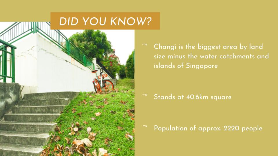
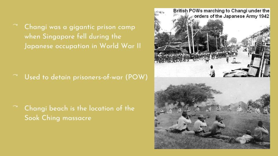
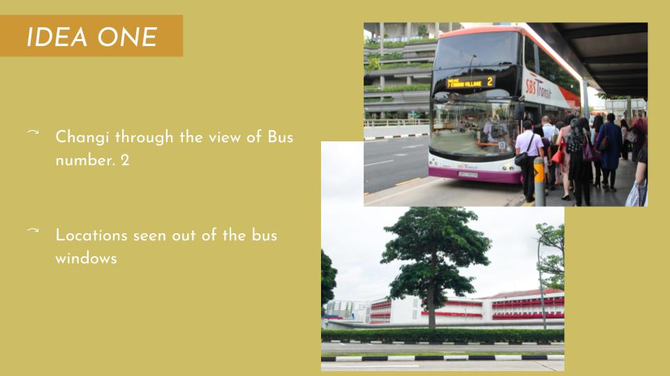
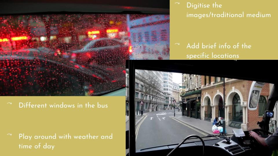
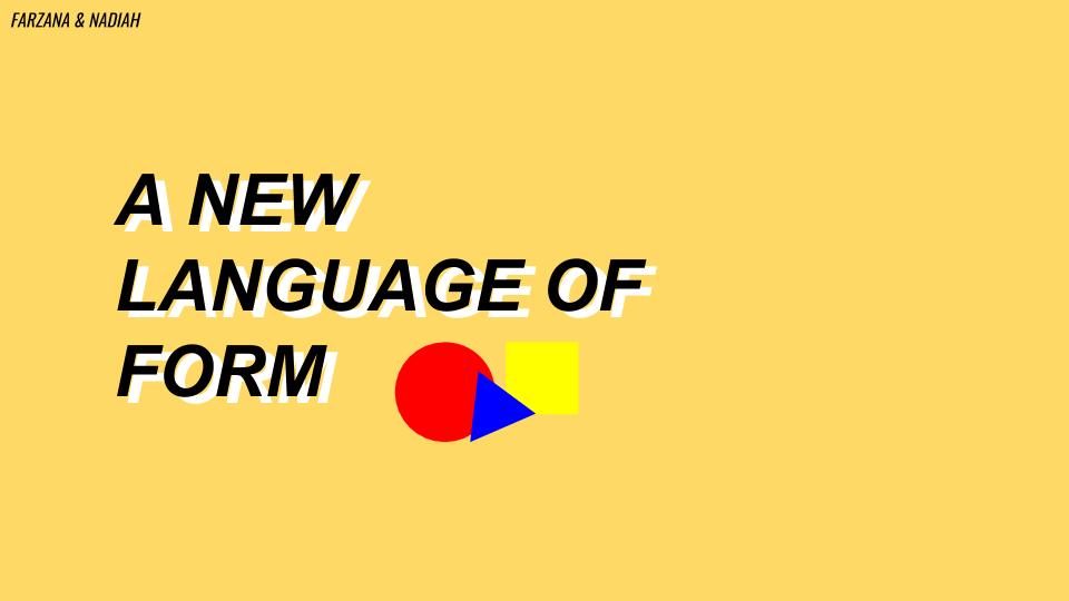
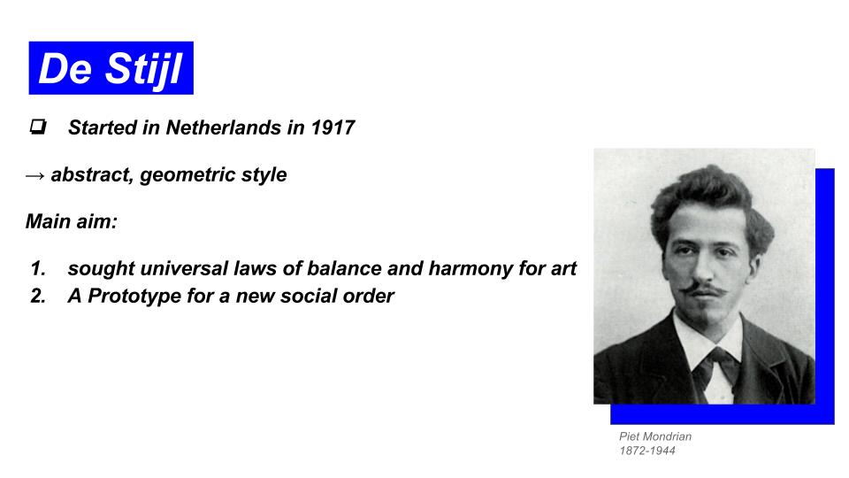
CONCEPT
From the start, I knew I wanted my illustrations to have an over-arching concept. So, I came up with one. The concept of childhood.
I wanted the occupations that I decide on to be from the perspective of me when I was a child or of children in general. Most of children or me when I was a child at least, have no idea that a job is something that is suppose to garner me income to support my life. Well, that’s subjective still but I really used to think that jobs were something that you just decide you want to become and by something, I mean anything. That made me come up with nonsensical and non-existent jobs such as a princess based on the TV shows and books that children are surrounded by. Below, we have more weird ideas that I thought of:

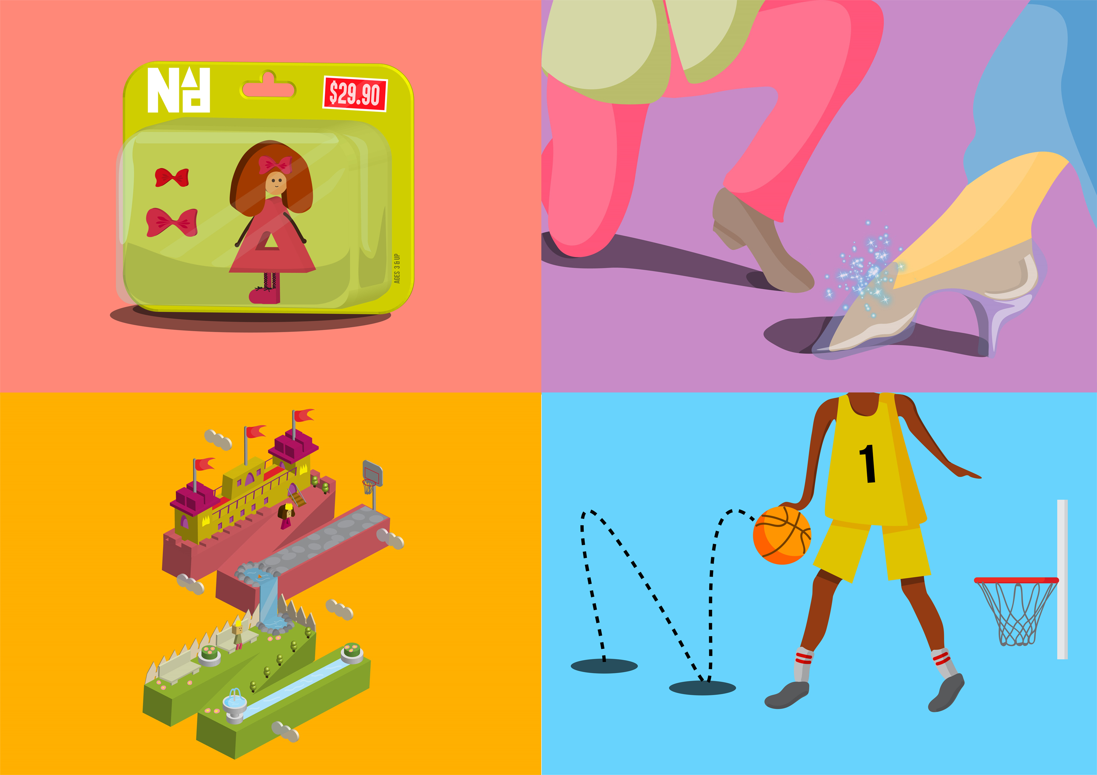
All boiled down to my favourite 4: a toy figure, a princess/prince, a basketball player and a game designer.
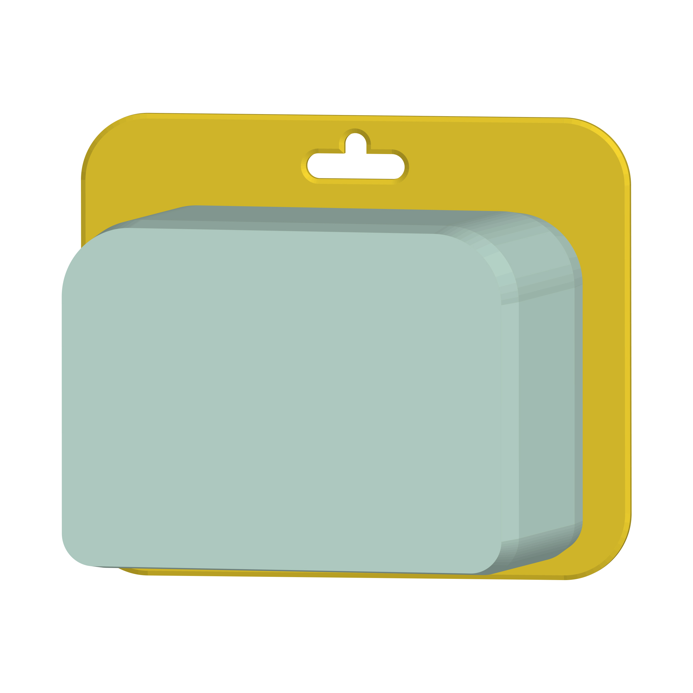
ONE – TOY FIGURE
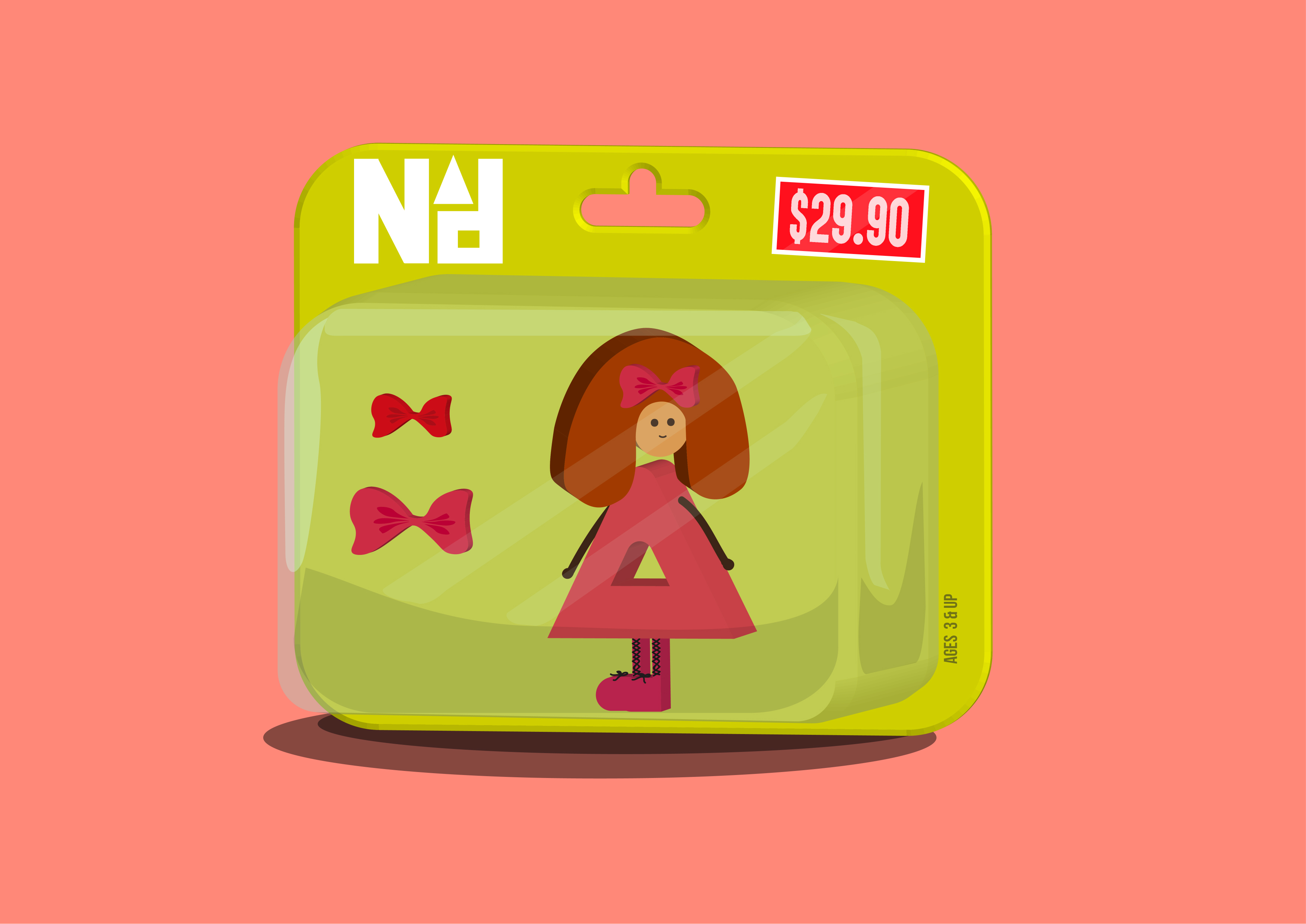
To start off, this is my most nonsensical idea. First of all, it’s not even humanly possible to become a toy, what more be one for a job. That exactly proves my point about how children have no sense of what an occupation really is. They want to be whatever they find interest in. In this case, a toy figure that they really like.
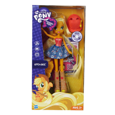
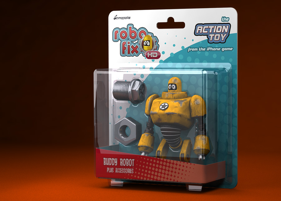
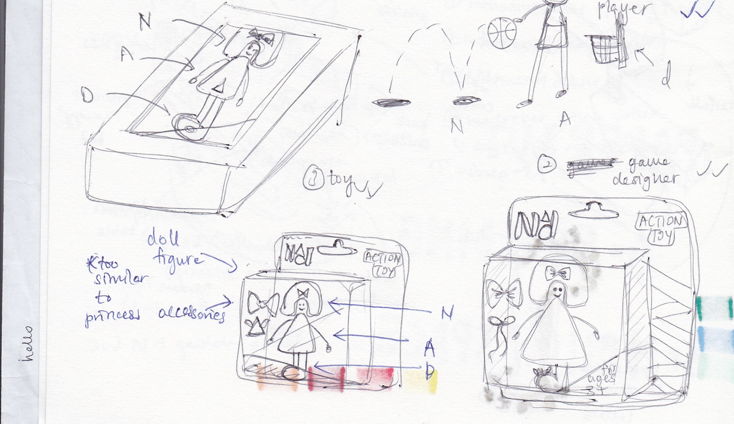
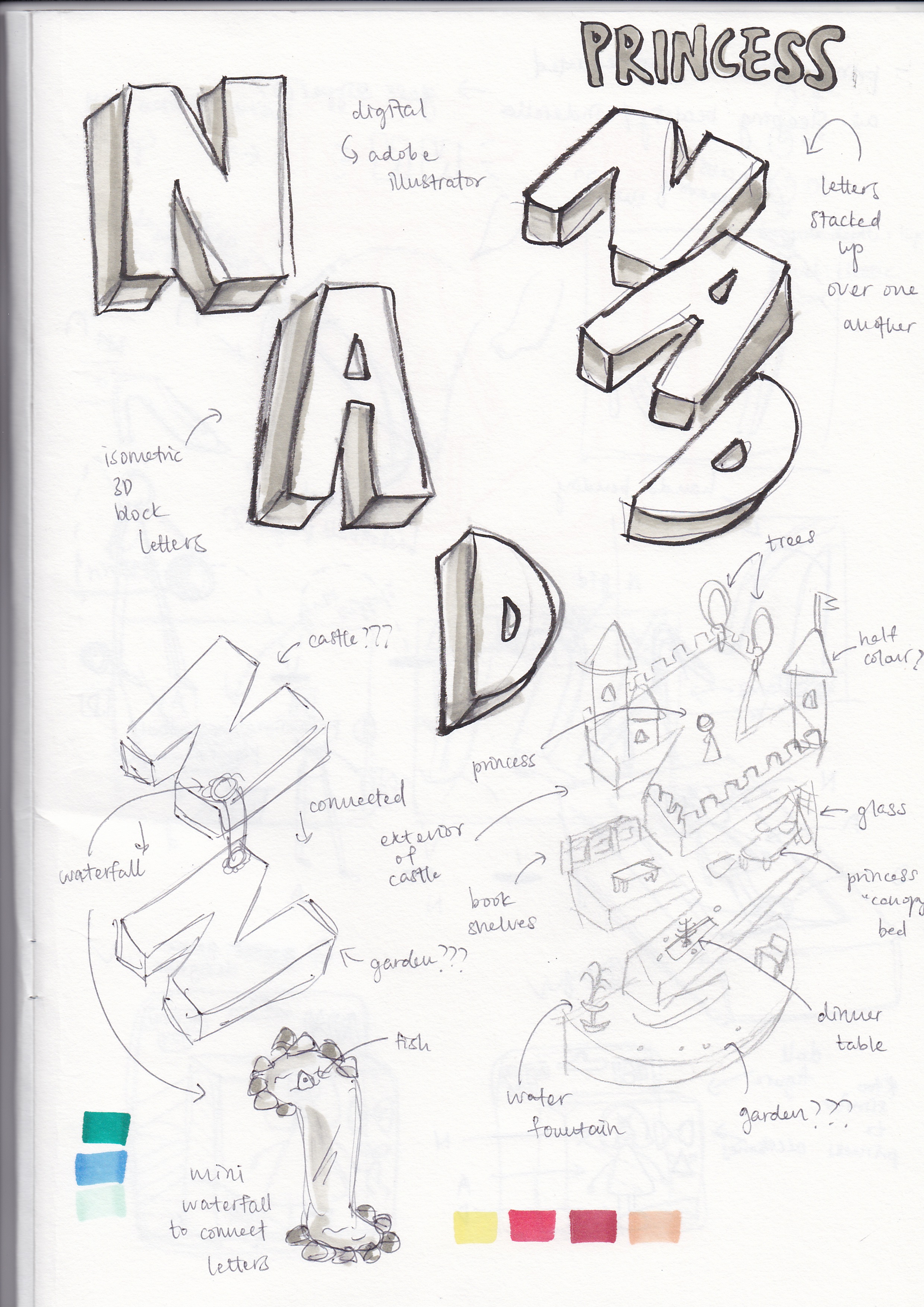
I wanted to make a toy figure that was still in its packaging. I was deciding between using the typical doll boxed packaging and the hang-able packaging as you can see in the two images above. After much sketching, I preferred the latter. I manipulated the letters “NAD” into a doll-like figure to depict the toy and this was the result:

Nice.

I then went on to digitize the packaging. And of course, I wanted my toy to have a brand. So, I created my own logo and all. How extra.

Putting them all together with a few adjustments, details and rendering, we get this:

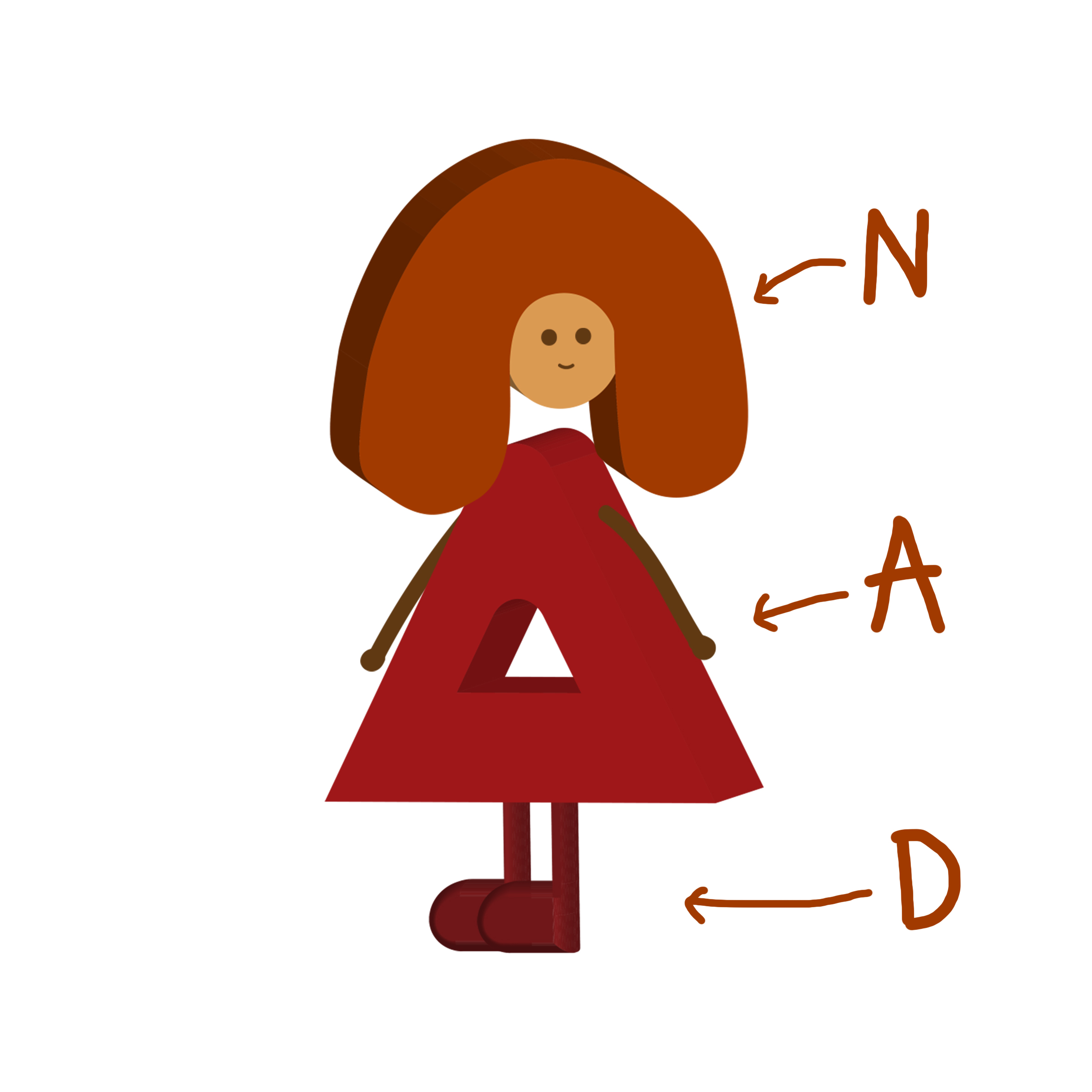
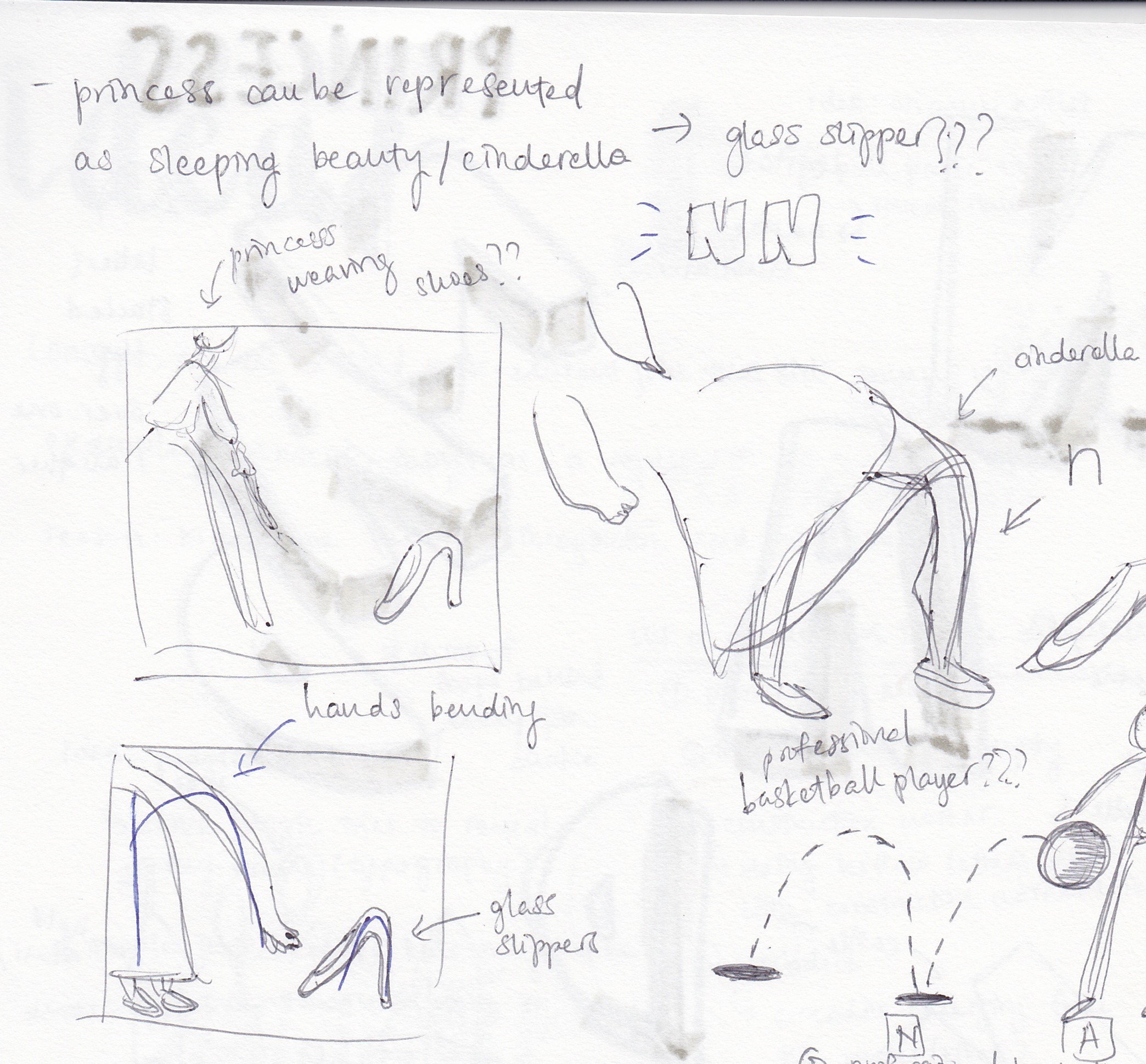
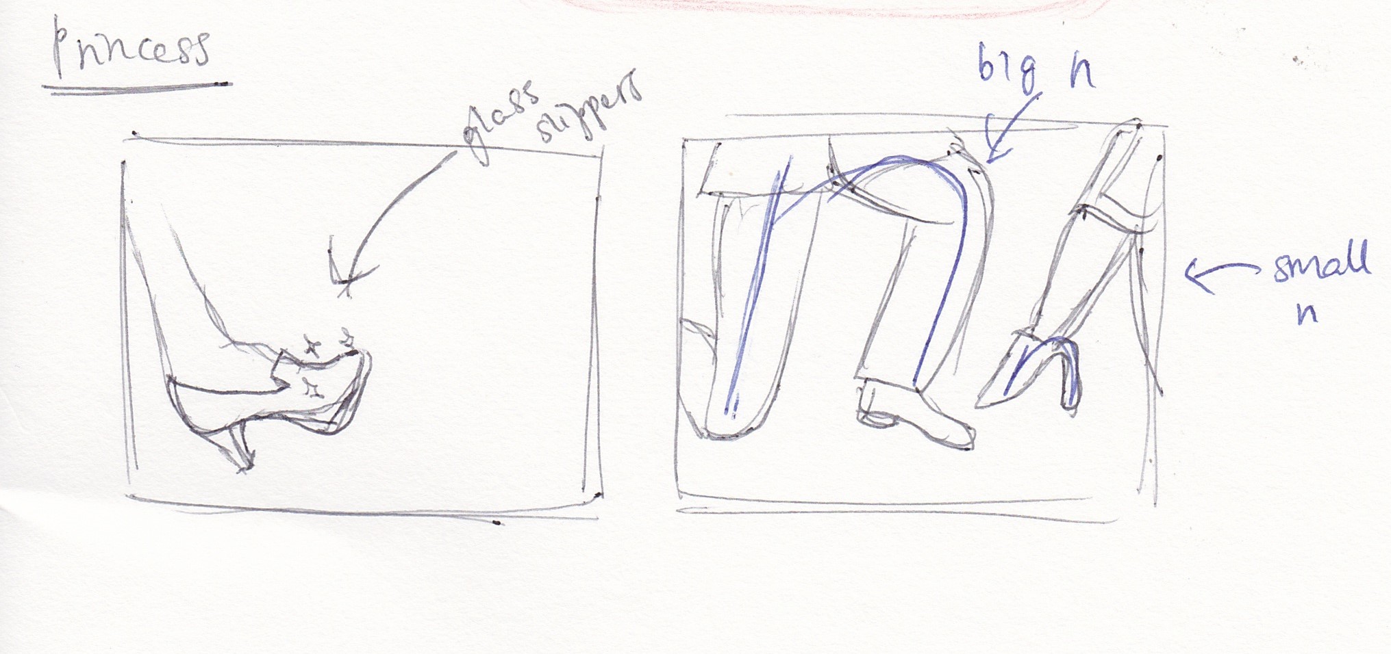
TWO – PRINCESS
Why do children want to be princesses/princes? Disney. Of course! My personal favourite is the Cinderella movie so why would I not depict it in my composition. This was a tough one though. The rest of my compositions are pretty “block-y” while this one, I decided to make it look more like the real Cinderella movie itself. Credits to Mimi for giving me the idea to do something with glass slippers. The heel portion of the glass slippers in itself looks like the letter “N” so why not take advantage of that? Ta-da!


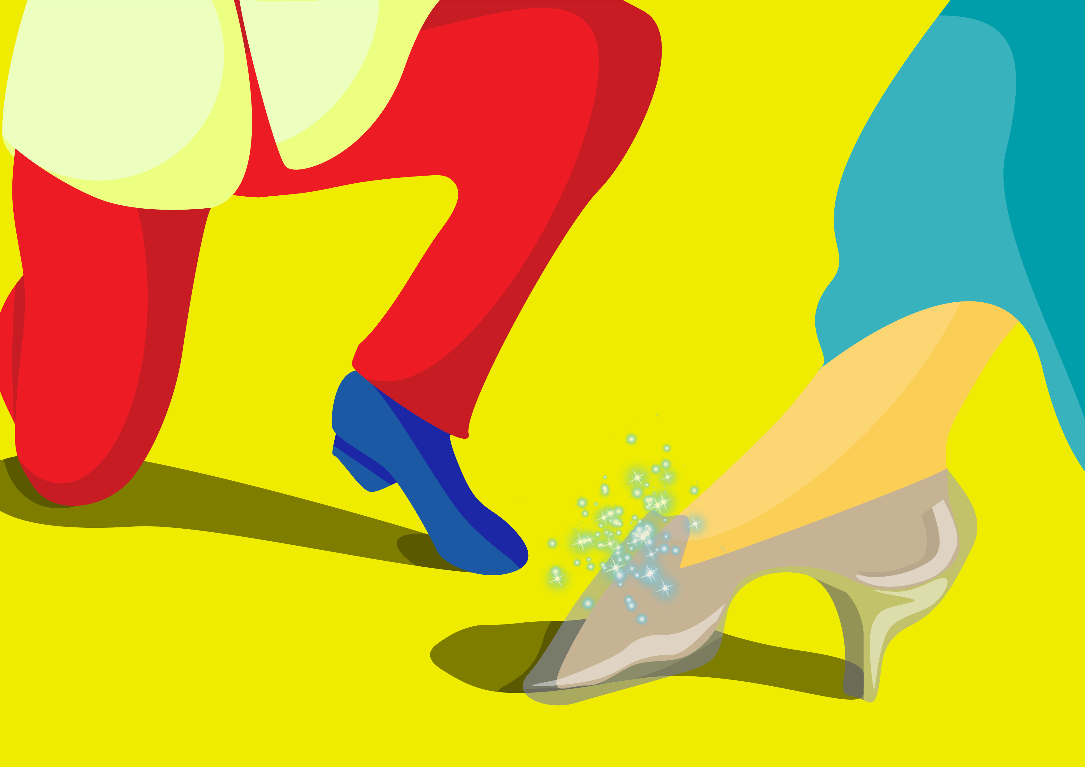
And I digitized it:

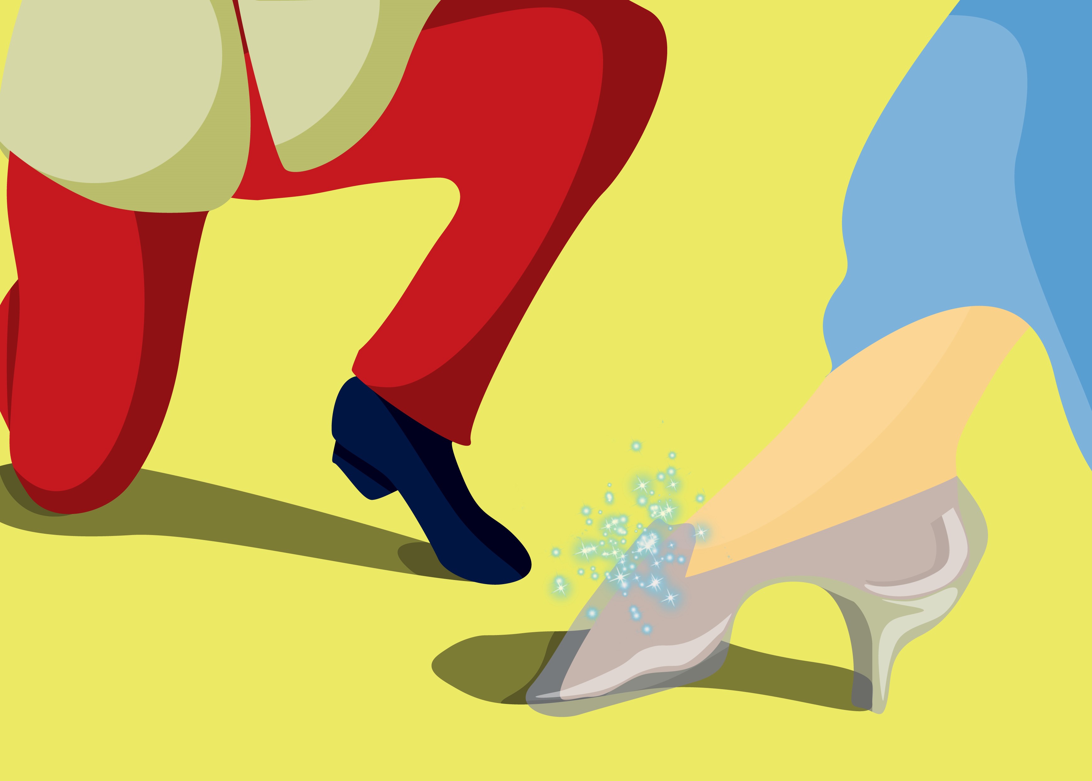
Can you spot the “Nn”? Yup, as mentioned, it’s the heels and also the space between the prince’s legs. But can you also spot the mistake? The colour! It turned out so ugly so I had to take the appropriate measures. I experimented with a few:


The colours were honestly just not working. The yellow… But I worked something else out:

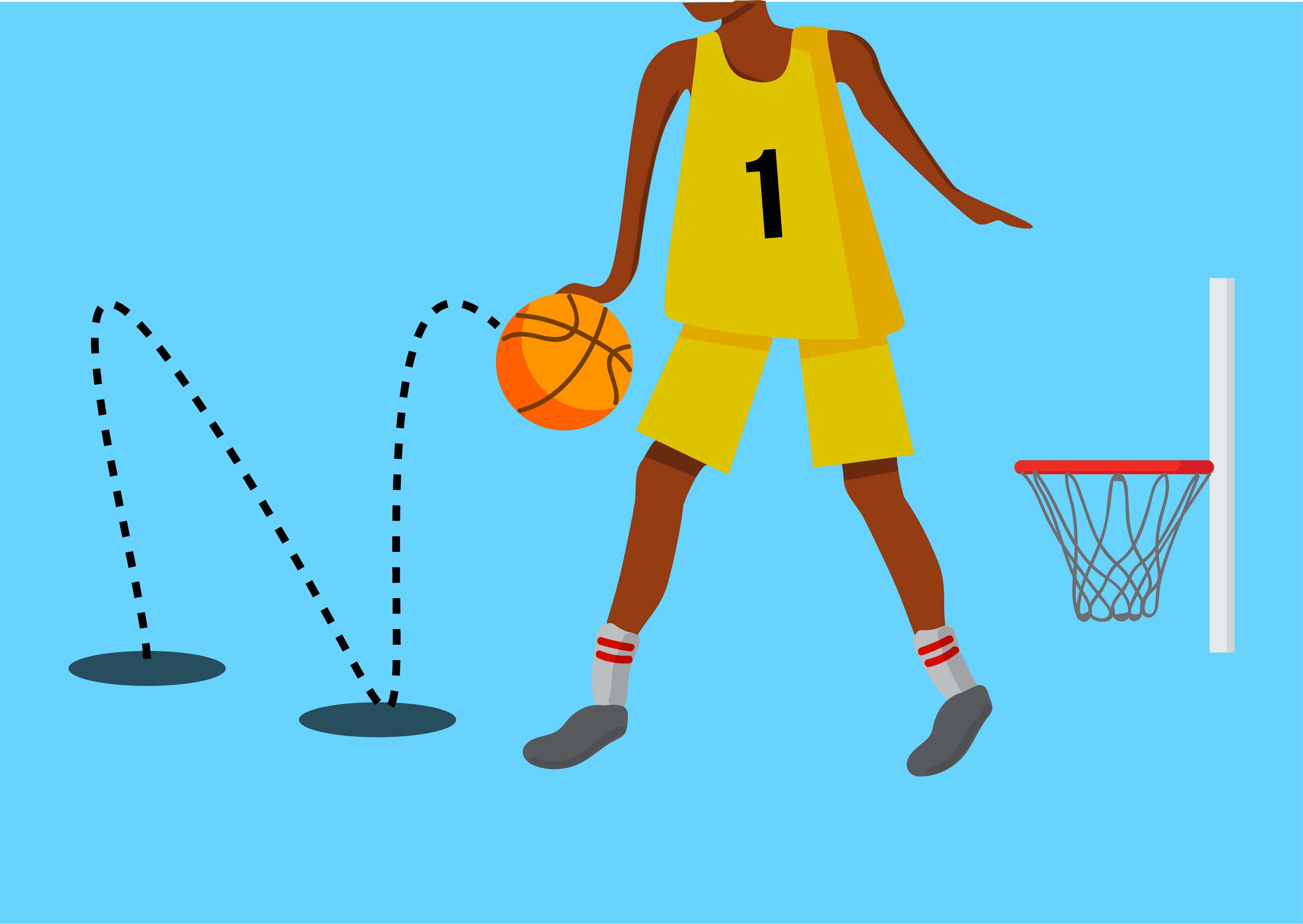
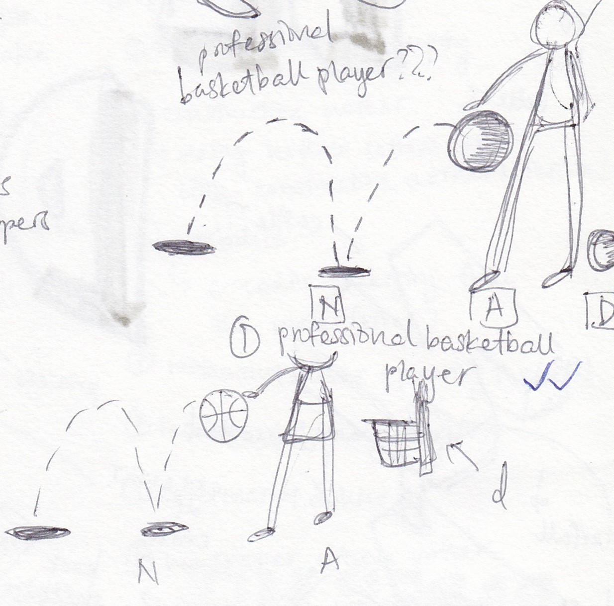
THREE – BASKETBALL PLAYER
This goes out to all the sporty children out there. With the pretty limited amount of CCAs back in primary school, my knowledge of sports careers were pretty limited. Basketball was really popular though and thus this choice. This was really quick to make as I really laid down the exact sketch of how the illustration would turn out.

Digitized it and BAM!

FOUR – GAME DESIGNER
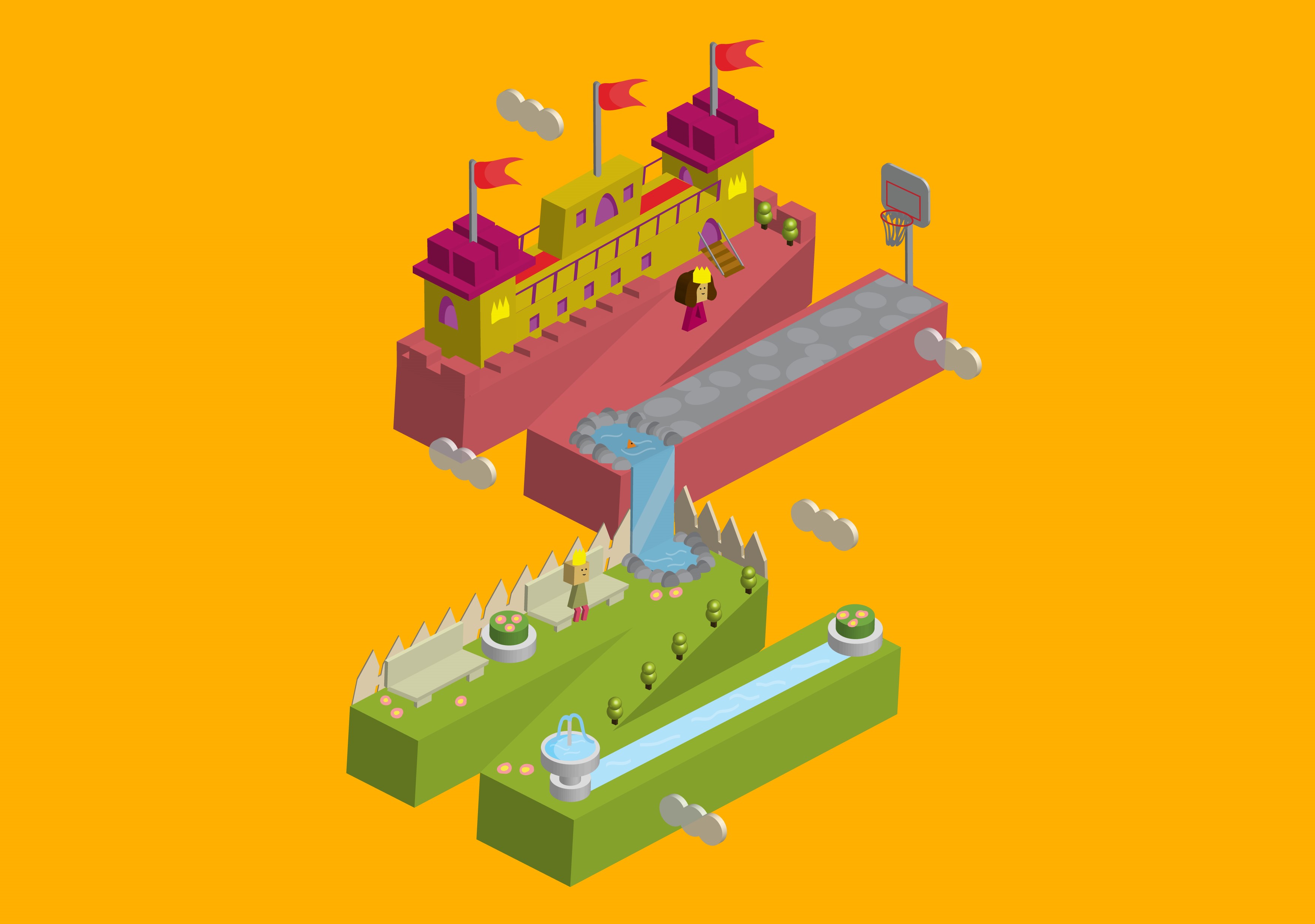
This one honestly was not planned. I initially created this illustration with the depiction of a princess in mind as you can see in the planning sketches here:

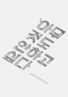
As seen in my research post, I emulated the work of Astro Oscar where he stacked letters over one another in an isometric manner. At first, I chose to work around “NAD” but I realised it was a little too much to only represent a princess.

I didn’t like it so I changed to “NN”.

Much better. Here, I added the mini waterfall to connect the letters so that it does not seem too distant.
Now, this was what I showed Mimi during my consultation. What she got from it at first was a game designer and not at all a princess. Children of today do aspire to design and create their own games, if you ask me. Example being my younger brother who loves playing games and hopes that he will one day get to make one of his own.
The isometric elements made it look like games such as Crossy Road and Habbo. So I thought, why not change it?

If you did not notice, I designed a game space that had a little bit of everything. Observe closely and you will see that the princess is actually the toy figure in my first illustration. The figure sitting in the garden area is actually the prince in the princess/prince composition as told by the colour of his clothes. More obviously, the whole space depicts a castle setting paired with a garden which is pretty representative of a princess. Additionally, there’s a tiny hint of a basketball player through the basketball hoops in the illustration.
This illustration made for a good conclusion for all my 4 illustrations which I will be explaining more closely in my finals post. Stay tuned! In the mean time, check out my research post! ♡