Ego In Different Settings

I’ve always been a person of traditional art so when I first got the project brief, I was sure that that was the direction I was going to go for. However, I saw a classmate who made her compositions using Adobe Illustrator which was something completely foreign to me but I was wowed by her works. Hence, I decided to challenge myself and take up illustrating skills that same day.

Before that, I learnt the colour theories that were essential to this project. At first, I was not sure what the different colour theories were so I just randomly picked the colours to my liking. I realised that it was so tough. I then consulted Joy who introduced me to this exact colour wheel that truly was a life-saver.

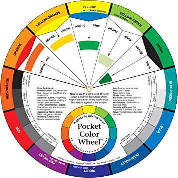
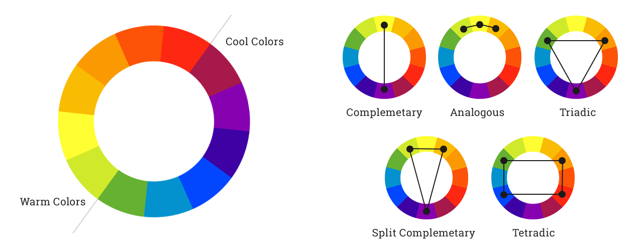
I could easily identify the different colour theories which includes monochromatic, analogous, complementary, split complementary, triadic and tetradic colours. 

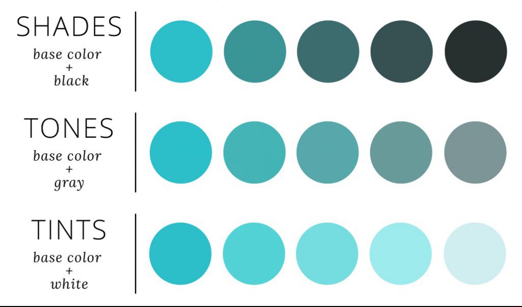
  1. Monochromatic colours are basically colours from a single base hue and extended using its shades, tones and tints. 
  2. Analogous colours are groups of three colours that are next to each other on the colour wheel, sharing a common colour, with one being the dominant colour, which tends to be a primary or secondary colour, and a tertiary.
  3. Complementary colours are pairs of colours that are opposite each other on the colour wheel and when combined, cancel each other out.
  4. Splitcomplementary colours are the variation of the complementary colour scheme. In addition to the base color, it uses the two colours adjacent to its complement.
  5. Triadic colours use three colours that are evenly spaced around the colour wheel while tetradic colours use four colours instead.

And they are represented by the colour wheels below:

For this project, I was highly inspired an Instagram illustration artists named @4ndreadesantis. The artists transforms the actual functions of everyday items in his illustrations which really intrigued me.

And that influenced by FIRST row of compositions:

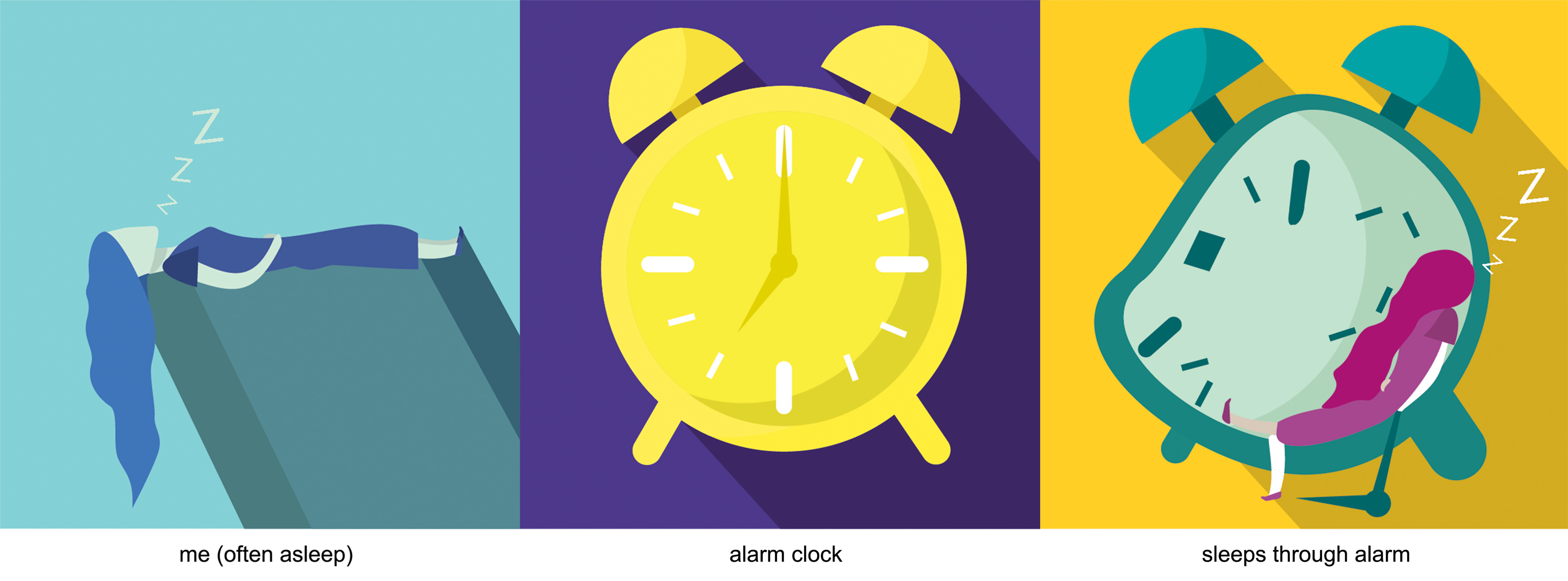
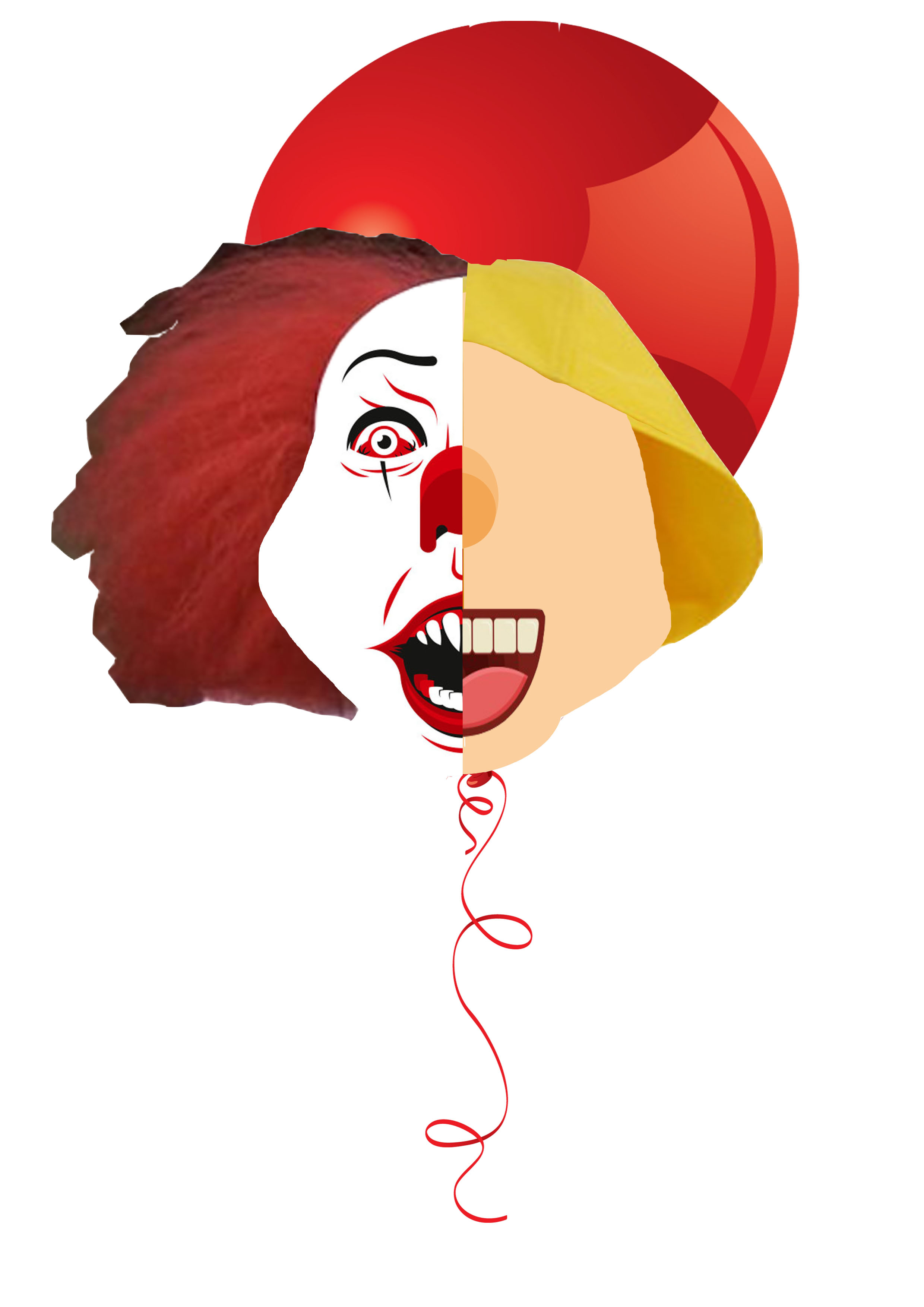
Me (often asleep) + Alarm clock = Sleeps through alarm

  1. I am a heavy sleeper. I can fall asleep nearly anywhere and at any opportunity I get. To represent that, I illustrated a woman lying down on her back, dozing off. I wanted people to feel calm while looking at the composition thus I chose analogous blue tones as blue is often associated with tranquility and calmness. Initially, it was pink because I thought it was more pleasing to my eyes. However, upon consult, I switched it to tones of blue and found that it holds more feelings. The analogous blue tone worked out well for me.
  2. I placed an illustration of a yellow alarm clock in the centre of the 2nd composition against a violet background. Yellow stimulates mental activity, and generates muscle energy just like an alarm clock that is meant to wake a person up which is why I chose it. To complement it, I used violet as referred to the colour wheel.
  3. This composition was influenced by the Instagram artist mentioned. I changed the function of the alarm clock and used it as a bed. I also distorted the alarm clock to represent how it simply does not work for a heavy sleeper like me. I snooze it too much until it renders useless. I chose blue-green for the alarm clock to give a calming affect when one looks at it. This is to represent the irony as the clock is supposed to be the thing that wakes one up. The background represents morning thus the bright yellow colour. To ensure the figure is still clear, I used red-violet to achieve the triadic colour scheme.

SECOND row of compositions:

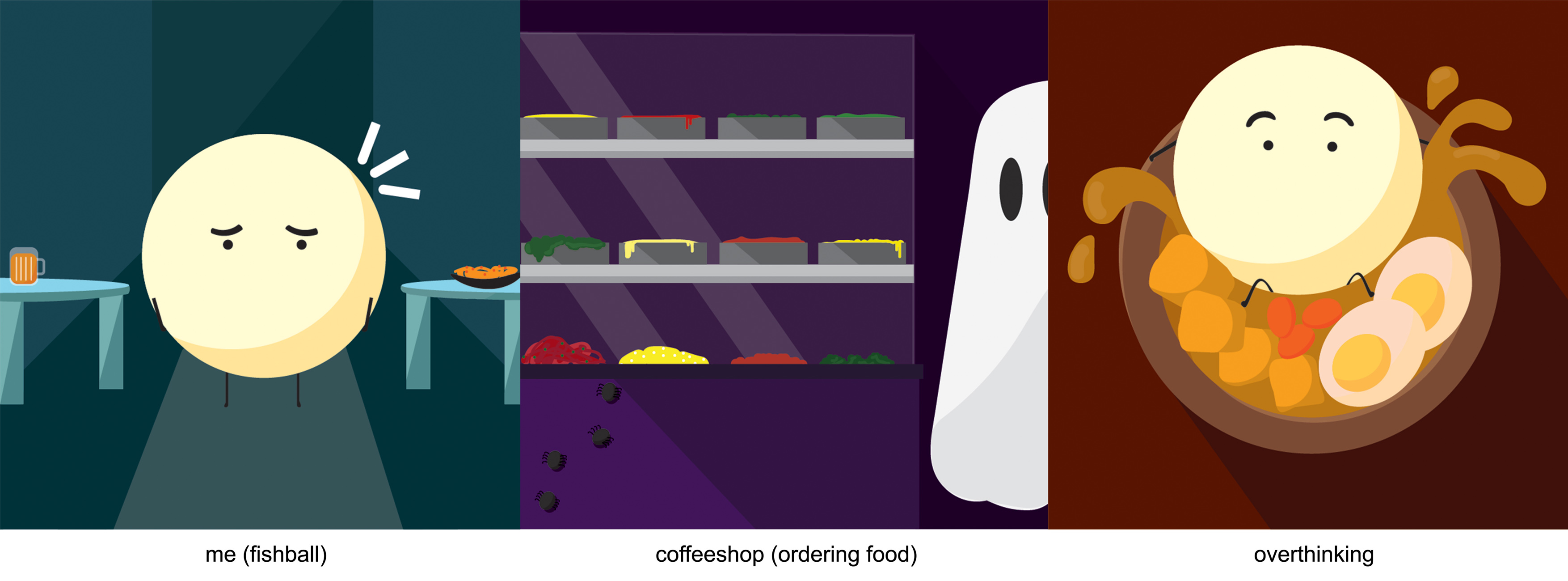
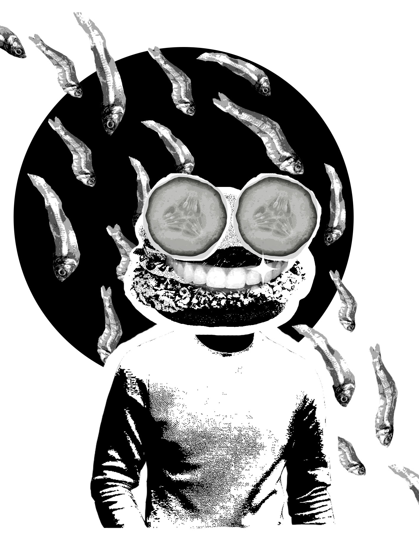
Me (fishball) + Coffeeshop (ordering food) = Overthinking

  1. I chose to represent myself through a fishball because I wanted to use a staple ingredient in many of the dishes in our local coffeeshops. Fishballs are pretty fragile and can break apart quite easily which totally pictures me. I am so anxious, I can break apart anytime. When I referred to the colour wheel, I found that the colour of a fishball is a light shade of orange and to complement it, we have the blues. Blue was perfect. The darker blues managed to give off a sombre setting to accompany the anxious feeling.
  2. I decided to be a little more experimental with this composition. I decided to try out the tetradic colour scheme which I was told was not an easy colour scheme to work with. I wanted to portray how the coffeeshop to me, is a scary place because it gives me nervous spells with the thought of having to order food. Thus, I used a dark shade of violet to give a dark and eerie vibe. To apply, the tetradic colour scheme which in these case leaves me with yellow, red and green, I applied those remaining colours to the food items on the shelves. It worked out well as it accentuated the fact that it was a coffeeshop setting despite the dark violet.
  3. I overthink A WHOLE LOT. Before ordering food in this case, I am always afraid that I might stumble on my words or worse, spill the food. In reality, nothing would actually ever happen. That was what I tried to portray in my 3rd composition. I placed the fishball that looked calm and collected in a soup that was splattering out of the bowl. In this, I decided to go with analogous warm tones being red, red-orange, orange and yellow-orange.

THIRD row of compositions:

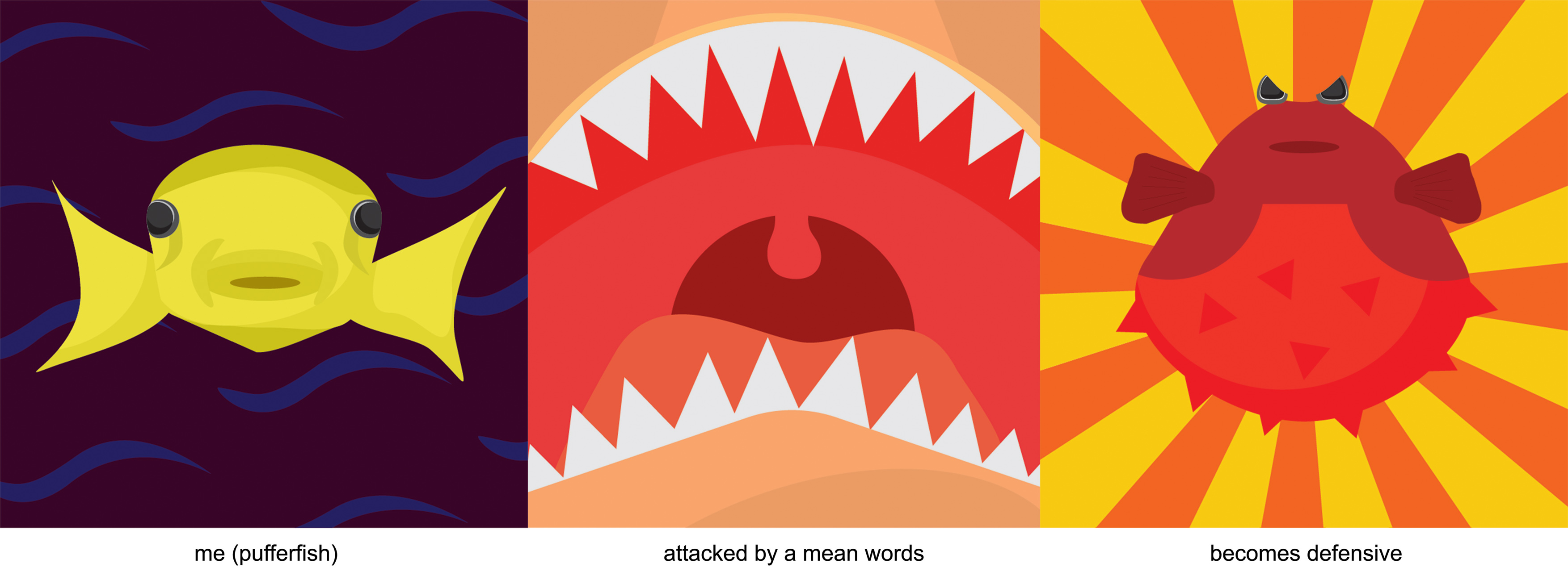
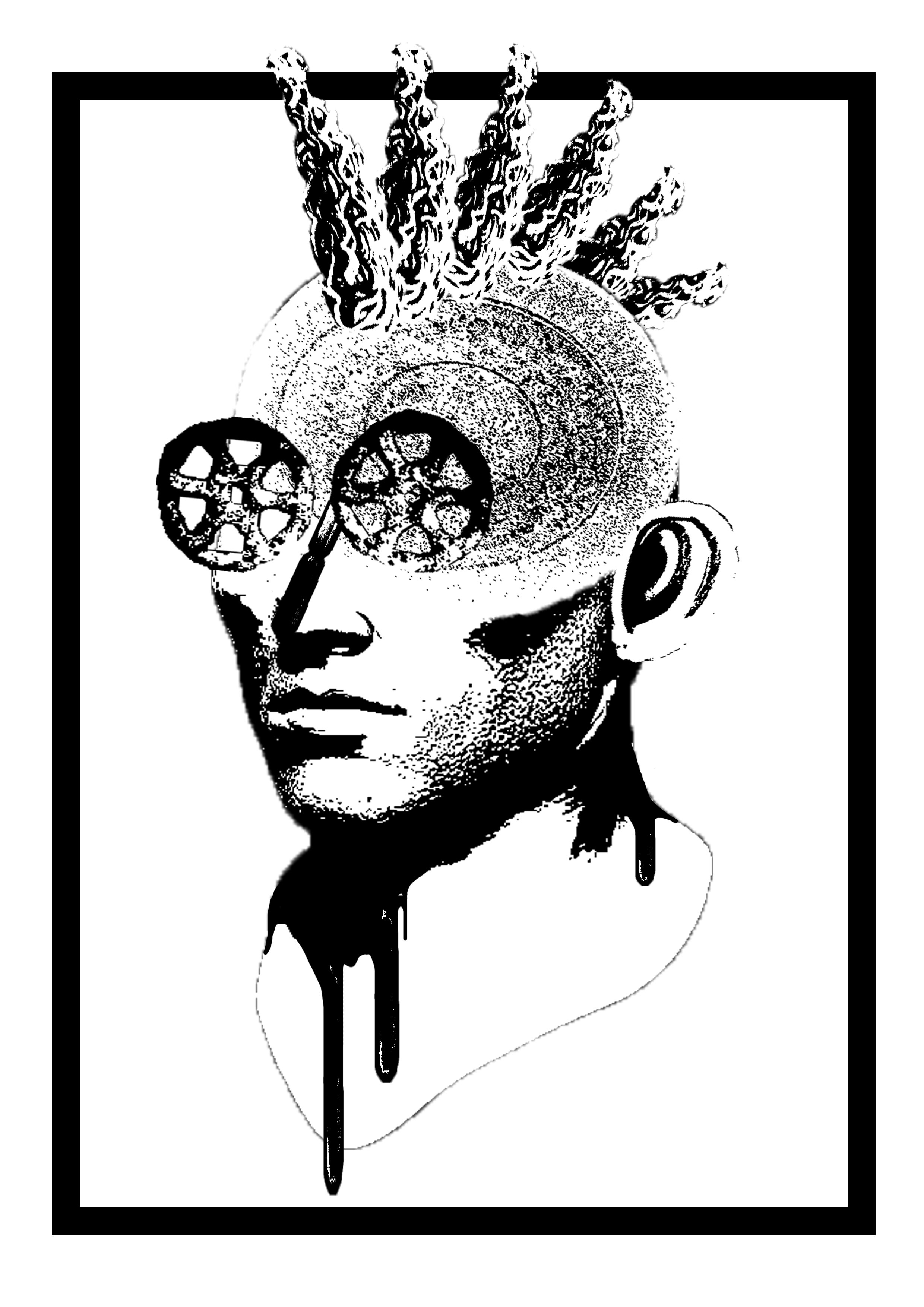
Me (pufferfish) + Attacked by mean words = Becomes defensive

  1. An “unpuffed” pufferfish looks pretty decent and harmless. In fact, it looks quite cute. Minus the cute part, I think the pufferfish represents me as a person who is reserved and quiet. I chose yellow for the fish as yellow can represent cowardice. I may look timid. To complement the yellow of the pufferfish, I tried a split-complementary colour scheme by using a dark blue and violet. The dark blue waves represent the calm water movement.
  2. The jaws poster highly influenced this composition. Instead of it being a shark, I replicated more of a human skin because I wanted to represent the mean words coming out of a human being. Thus, I used analogous colours being red, red-orange, orange, yellow-orange. It managed to capture the danger effect in the composition through the reds.
  3. When mean words are spouted towards me, I no longer remain quiet and timid. I tend to be fairly defensive thus I turn into a puffed up pufferfish where its thorns jut out as a defense mechanism. I used the same colour scheme as the 2nd composition, only brighter. The fish is red to express danger and threat which is what I become when people become mean to me. The background is a repetition of orange and yellow. Orange can represent heat which shows how I get all heated up in that situation. Yellow is an attention-getter.

FOURTH row of compositions:

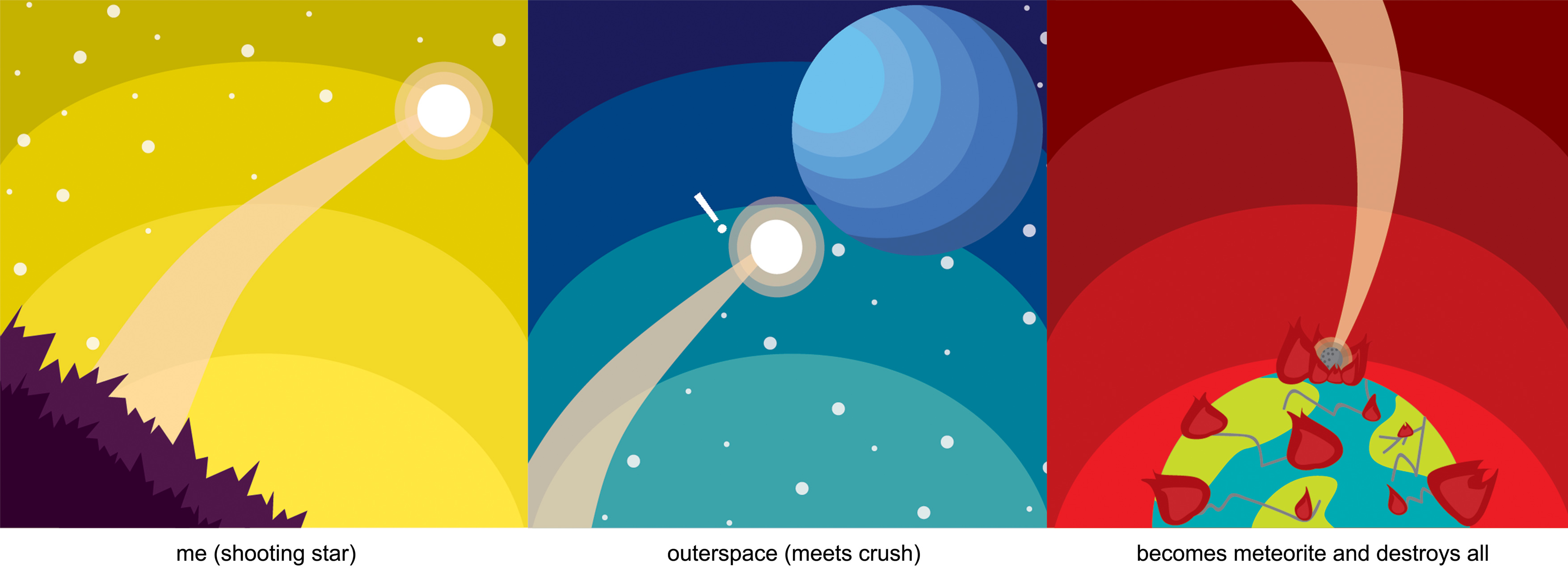
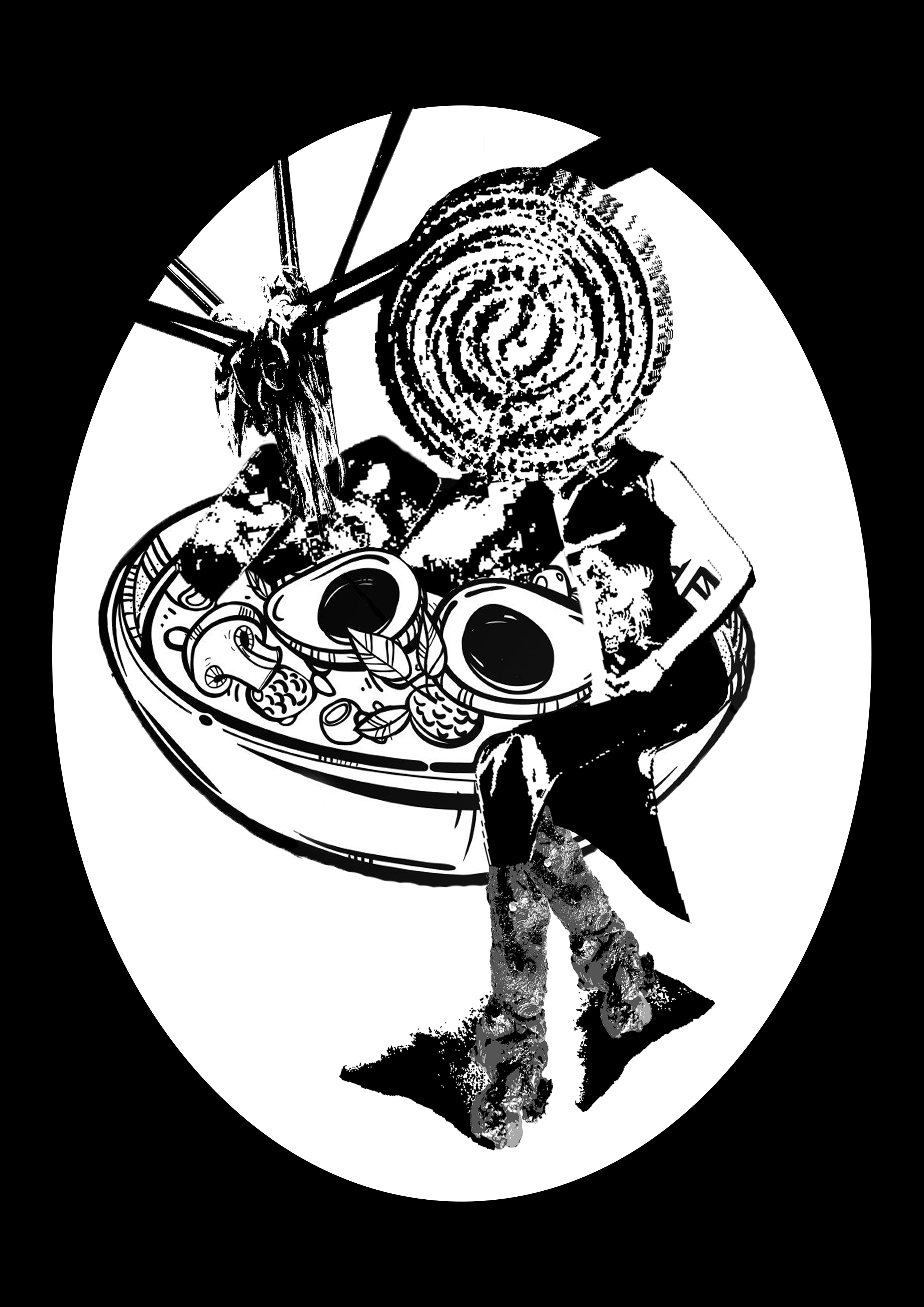
Me (shooting star) + Outerspace (meets crush) = Becomes meteorite and destroys all

  1. I represented myself as a confident shooting star when I am alone. I used yellow in majority of the composition to reflect me as a joyful and cheerful individual when I am alone. To complement the great use of yellow, I added a hint of violet as the ground of the composition.
  2. As I rise higher into outerspace where all the different planets (different people) are found, I become more timid. In this case, the star meets with planet Neptune, literally the coolest planet. Neptune represents my crush. When I meet my crush, I tend to shrivel up and become nervous. I lose all confidence. I used an analogous blue colour scheme to match with the planet which is blue itself.
  3. A shooting star can eventually turn into a meteorite and land on earth. As we all know, meteorites destroy the earth. That is what I am when I meet my crush. If I ever talk to him or face him, I tend to do unpleasant things that would destroy any bit of chance of him liking me back. Basically, I destroy everything just like a meteorite. Majority of the composition is red to express danger, war and anger. Coincidentally, the split complementary colours for red are green and blue which are colours found in an image of earth. Thus, this colour scheme worked really well.

Overall, this is the most value-adding project in Foundation 2D. I took up an entirely new skill that is honestly so much fun and will definitely help me in future works especially if I were to take up Visual Communications. And with that, thank you! Foundation 2D has been a blast!

t

Till next time!!!!!! ლ(́◉◞౪◟◉‵ლ)


Forrest Gump

[ONE]

When I first got the project brief and found out that I had to choose movie quotes, I got all too excited because if you know me, you’d know that I love watching movies. Coincidentally, that week, I watched the movie IT, twice in the cinema! So naturally, I chose a quote from that movie – “If you come with me, you’ll float too!”. The design I had in mind looked so good but when I tried to create it on Photoshop, boy, did it fail so miserably.

YES CRINGE WITH ME!

To my defense, I did not know how to operate Photoshop that well yet and I wasn’t clear of the requirements of the project. I’m only uploading this for laughs and to build up you guys’ confidence. Kidding.

On a more serious note, after reviewing with a few friends, I went on to look for new quotes after understanding that I have to work around a concept more than the literal idea of the quote itself. From then, I settled with 2 quotes that I ended up using for my final compositions with the topic of food in mind (I must have been hungry):

  1. “If you are what you eat, then I only want to eat the good stuff” – Ratatouille 
  2. “One bite and all your dreams will come true” – Snow White

Since my group’s presentation was about gestalt, a lot of my compositions are created with its laws in mind as I researched on it. Besides, I feel like several of the laws of gestalt actually encompasses the different elements of art presented by previous groups. The laws include the law of simplicity, proximity, similarity, continuity, closure, symmetry, figure and ground which you can read more on here.

[TWO]

COMPOSITION 1 (QUOTE 1)

This was my first composition based on the food concept. I really wanted to portray the “good stuff” in the quote so I had to hunt for a food item that is popular and loved. I decided to work around the popular Mcdonald’s burger, the Nasi Lemak Burger that made a comeback randomly upon popular demand. The burger was initially exclusively to commemorate National Day. Unlike other promotional burgers like the samurai burger, it actually came back a month later for no specific event but simply because it was so good. I personally felt that the burger really defined “good stuff” and so I sticked to it. To represent “you are what you eat”, I decided to use the burger as a human head.


I decided to use cucumbers as the eyes to make it more obvious that it is the Nasi Lemak Burger by making the ingredients outstanding. The same applies for the anchovies behind the figure.  For the anchovies, I applied the law of similarity and proximity which allows the eyes to group them together. I also made all the anchovies face the same direction creating an implied line. I added a black circle behind the figure to create a bit of contrast between the background and the figure.

However, this did not end up as the final composition as a result of feedback from Joy and my friends. According to them, the burger was not recognizable and they advised me to separate the components of the burger to make it clearer. The body used in the figure was also insignificant and not representative of Singapore.  Upon much consideration, I adjusted my composition and came up with this:

I replaced the body with one of a local uncle that is typically seen in coffee shops.  I also re-edited the cucumber eyes so that it would turn out better on the totebag. The anchovies are now placed outside of the circle so that it would be less of a distraction from the burger in the middle. Voila! My first final composition.

COMPOSITION 2 (QUOTE 1)

I wanted to work around a piece of food that I personally liked but I figured that it would then be less relatable. I wondered then, what food would everyone like? Childhood snacks! Not only is it delicious, it is packed with so much nostalgia. I gathered all the childhood snacks from memory and Google. Again, to really represent the quote, I incorporated the snacks such as Mamee noodle, wheel cracker, pig ear biscuit and ice pops into a human face:

I got the feedback that the border was redundant and that the composition lacked meaning. I was recommended to perhaps multiply the figure to create more of a story which I took into consideration and ended up with this:

COMPOSITION 3 (QUOTE 2)

My main focus for this quote was “dreams will come true”. Alike the previous composition, I wanted to work around a single theme and decided on festivities in Singapore; Chinese New Year, Hari Raya Aidilfitri and Deepavali. I also gathered the different food from all the festivities which includes, lontong, samosa and lohei. To represent a dream coming true, I placed a woman wearing cheongsam sitting in a bowl of what is supposed to be a bowl of lontong. I initially wanted her to be resting inside the bowl but I had much difficulty trying to find a picture of a woman sitting in that manner on Google.

Reviews were giving on how, again, the border is distracting. The components in the bowl also made it look like a ramen soup instead of lontong which was not representative of the festivities in Singapore. This is the post-edit:

COMPOSITION 4 (QUOTE 2)

At this point, I realised that all my compositions were very localized so I wanted my last one to be a little different. I decided to touch on a social problem that is more universal. It was also at this point when I realised that I have not been specifically conceptualizing my compositions. Thus, this is my first composition that I created with a story in mind.The main food item that I chose was a donut because I feel like it can be found all over the world. I wanted to work around the concept of privilege. I feel that people are so privileged to the point where they do not even notice. We are often comparing our lives with those of better quality which deters us from appreciating what we have. 

l.

The picture is divided into two triangular halves to play on perception through contrast. I wanted to show how children from 3rd world countries are often more appreciative of the littlest things. The emotion on the kid’s face looks ecstatic to represent how happy he is to enjoy only a piece of donut. On the flipside, a more stereotypical privileged kid seems to be unhappy with the sight of the donut. The well-off kid sees the donut as merely a snack or they might not even like it. The planes surrounding them are purposely cartoons to represent how the children are only innocent but fed with all these influences of the privileged lifestyles in the society. Kids were never born selfish or fussy. It is all under the influence of the circumstance that they are brought up under.

Unfortunately, this composition had no time to receive a review which leaves this as the final piece.

[THREE]

Upon realising my grave mistake of not having a concrete story behind my first 3 compositions, I tried to conceptualize each of them after the final compositions are being confirmed. This was what I presented on critique day:

FINAL COMPOSITION 1: I wanted to portray harmony in Singapore. It is merely a burger but I feel that it has oddly united a lot of Singaporeans. The unity is represented by the anchovies coming together after separating which is often the case in Singapore. We are one Singapore despite a few disputes here and there. The concept of harmony was inspired by the infamous argument between Malaysia and Singapore on the Nasi Lemak Burger when it first came out. Malaysia claimed that the Nasi Lemak is not representative of the locality in Singapore but instead, is a local dish belonging to them. Their persistence led them to re-create the burger in one of their cafes where they then compared it to Singapore’s.

Funnily, it actually brought many Singaporean netizens together as they defended Singapore for a mere burger which is so intriguing to me. Out of all the efforts that the government has put in to maintain harmony in Singapore, a burger easily made that happen in an instant.

FINAL COMPOSITION 2: Since I used an adult face to represent the childhood snacks, I was recommended by Joy to actually combine both the elements together in my concept. I added another of the same figure but made out of different childhood snacks. I purposely created a contrast between the two characters based on their looks. The one on the right seems more uptight and work-oriented while the one on the left is more laid-back through the use of the beanie (gem biscuit). I wanted to represent the life of adults in Singapore. You get to choose how you want to lead your adult life because you actually have to make your own decisions. However, the decisions that you make aren’t always the right ones. You can be the most successful businessman yet it does not guarantee happiness and vice versa for a less successful job.  Nonetheless, at any times of hardship, we should always remember that we are still the innocent and happy child that we once were. This represents the nostalgic emotion one experiences when they get to indulge in their childhood snacks.

FINAL COMPOSITION 3:  As we all know, prices of many things in Singapore has surged and that includes the food items involved in the festivities. For example, we can burgers at the recent Ramadhan bazaar being sold for up to $8. To comply to that, we can no longer enjoy as much of those food as before. We would have to ration it among the many family members during the gatherings.  This increases the rarity of the food items which makes every bite taste like heaven as we appreciate the little amount we get to indulge in. To represent so, I cramped the food items closely together to make it appear “not enough” to go around. I also only put one piece or a tiny bit of each food.

[FOUR]

SILK-SCREEN AND INKING

It is my first-time trying silk-screening and I have to admit, it is pretty complicated. For it to work out, you have to have the right contrast and colours in your design. The print on the transparency paper also has to be dark enough which was unfortunately not the case for me. It did not work out for me on the first and only 2 days we were allowed to expose our screens. Thankfully, Joy gave me the opportunity to re-expose my screen once again and it worked. Since it was all in a rush, I immediately inked my design on my totebag after only two tries on newsprint paper. Luckily, it turned out perfect to me:

Aaaand that concludes Project 2! Thank you everyone who left nice comments about my work (ノ◕ヮ◕)ノ*:・゚✧


My Line Is Emo

When I first read the project title, I had totally nothing in mind. Nothing sparked. Thus, during the first week, I created completely random marks using random items without a theme. Here is the outcome:

Marks made using thumbtacks
Mark made using an unwrapped lollipop
I tried to associate the marks with a few possible emotions

It was not until the last mark that I randomly created when an idea flashed before my eyes. I was experimenting marks with a pack of fake eyelashes that I brought. I suddenly got reminded of a moment in my life which felt like an emotional roller coaster. Heartbreak. That was it, I decided.

Marks made using fake eyelashes

The following week, I consulted Joy to learn suggestions and ideas on how I could possibly execute my project. I wanted the project to be as personal as possible. I really wanted to enable viewers to get a feel of the true emotions I experienced during the unfortunate period of my life. Joy suggested that I should work around the human anatomy to portray a few coping mechanisms. Following that, I narrowed down to the six emotions that I wanted to showcase according to my concept: Agony, Hurt, Sadness, Longing, Relief and Bliss.

Since I wanted the project to be really personal, I decided to utilize text messages I received pre-separation as the base for my marks. I rewrote them on white paper before tearing them up into pieces and then patching them back up together in a messy manner.


By using real messages that I received from “him”, I feel like it further authenticates the emotions that I wanted to portray. The “tear-effect” on the borders of the paper represents how I felt incomplete.

Agony

I chose agony to represent the initial feelings I had upon breaking up. Defined as extreme suffering, I resorted to using my fists to punch marks onto the paper to truly show my state of anger and dissatisfaction. It represents the instance where I was still taken aback by the situation and my inability to accept the reality of things.

I experimented between denser and lighter marks

I ended up making denser and closer marks in light of showing higher amount of punches to represent the extremity of the emotion. The marks were also made from differing directions to represent how the agony was felt from many different areas. Not only did I feel the emotion mentally but also physically. My brain hurt when I tried to convince myself to accept my fate. My heart hurting on the other hand, is an understatement.

Hurt

It hurt when I came to a realization that “he” was gone for good. Life began to get messy. I felt lonely. I could not sort out what I wanted to do or to have in life following the separation. To represent that while still sticking to the human anatomy theme, I decided to using my fingers. I dragged it around the paper messily to represent confusion and pain.

Similarly, the marks were made from different directions to represent how I felt the pain still from many different areas. The marks are mostly dark to represent the magnitude of the pain. As compared to the first strip, the marks in this are less dense to show how the pain was fading but at a very slow rate.

Sadness

Feeling sad is inevitable when it comes to love. Sadness is often associated with crying which is also associated with being weak. I personally strongly object that opinion. Thus, in this, I wanted to portray the strength of sadness. Crying was one of my best coping mechanisms. It felt like I was crying out and getting rid of all the memories and pain.

To represent that, I used crushed tissue paper and dipped it into black ink which I then lightly patted onto the paper. The black ink represented the remnants of my tears which meant the toxic and pain in my heart was gone through the act of crying.

Longing

Different people take different lengths of time to move on. As for me, it took quite a while. I would find myself repeatedly longing for “him”, wishing the break-up did not occur. Though, that point was the stage where I was beginning to forget his promises and words for he had been gone for too long. Thus, I decided to wrap the strip with a ply of tissue paper to create a faded effect.

To portray this emotion, again, I decided to use the drag of my fingers but this time in only one direction. The line however is not exactly straight and clean. I wanted to show how I was conflicted between missing “him” and moving on. Thus, there are a few halts between the drag which made parts of the line thicker. Towards the right of the strip, the line of ink begins to fade to show how I actually progressed in moving on. As for the tissue paper itself, some areas are torn to represent how the memories from the past still peeked through and haunted me, hindering me from moving forward.

Relief

As the name of the emotion suggests, this strip represents the stage where I was relieved that I could finally sort myself out and figure out how I was to live my life from that day on and that is to get rid of everything that reminded me of “him”. Thus for the background, instead of ordinarily compiling the torn pieces of paper, I decided to burn them and lay them quite a distance from one another. The burnt effect represents me getting rid of “him” for good. The distance on the other hand, represents the success of the plan to get rid of “him” by portraying empty spaces where most of “him” used to stay.

In this, I did not want to portray “relief” as a wholly positive emotion but one with a tinge of sadness as well.  I felt relieved but concurrently, quite sad to know that “he” is gone forever and forever is a long time. Thus, I decided to use tears again to represent the sadness in relief. I laid blobs of ink of the top of the strip before spraying water intensely onto it to create the “tear falling” effect.


Bliss

I felt bliss when I finally came to terms with the fact that he is no longer in my life. I wanted to work around the concept of “a whole new me”. After moving on, I felt like a new person who was urging to live my life and experience the world. Thus, I created the marks using what I love most: make-up and dressing up. I used the fake eyelashes to create marks that resembled the lace cuttings of a dress.

I wanted to show how I was happy again. I revived my ability to put on make-up and dress-up on my own will to look good and meet new people. This strip was all about starting anew. The background was made by patching up blank pieces of “scissor-cut” paper which represents the pureness of starting anew.

In the end, I realized that my project represented my whole journey, from start to end, of my heartbreak which was exactly what I was going for. However, there were a few challenges along the way which hindered my process. There were times I did not have the materials I needed such as crayon for my to burn to create a melt effect for the “relief” strip. I ended up substituting it with ink that I had and the spray. Besides that, I really enjoyed myself and ended up satisfied with the outcome of my project:


Mark-making

I am completely new to mark-making. I have never tried it before but for now, it sounds pretty interesting and I am excited to try it out. It is fascinating how we are able to create images using random items. The use of unconventional materials in it portrays how anything and everything can be Art.

https://lottyslearninglog.files.wordpress.com/2014/11/img_2404.jpg accessed on 17th aug 2017