Project Social Life

Project Social Life is a performance art piece done to learn what would happen if we gave control to the public to decide how our day would go. I have always thought that it is such an interesting concept ever since I saw Yes Theory’s video attached below.

Similarly, we utilized the social media application, Instagram to carry out our experiment. We also made use of the poll function in the story to get our followers to vote for decisions sent in by them to would determine how we spend our day starting from around 11am to 5pm. Each poll ran for 10 minutes before went with what was in favour.

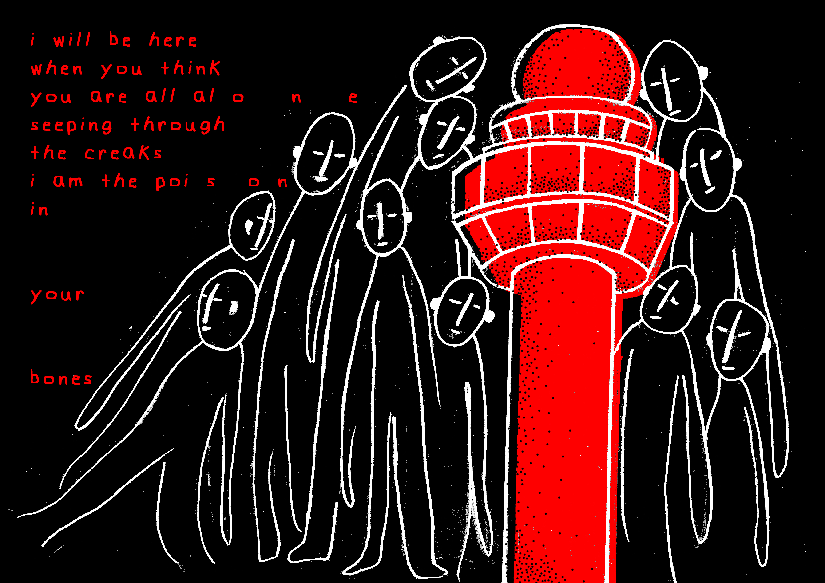
This idea stems from the notion that we get to construct a digital identity that may not be completely representative of our true selves because we are in full control of what we choose to display online. So, when all control is stripped away, how “real” can we get?

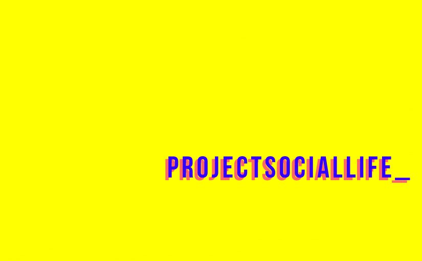
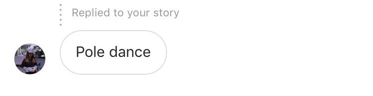
En Cui, Cecilia, Shu, Jocelyn and I first met up at ADM, our starting point. We then put out a poll on our collective page @projectsociallife_ asking the masses whether we should hang out somewhere near being Boon Lay or travel all the way to Bugis. Of course, if I still had control, I would surely choose what was convenient, Boon Lay. Unfortunately, Bugis was in favour. Apart from the regular activities such as having lunch, throughout the day, we received many interesting and funny suggestions such as:


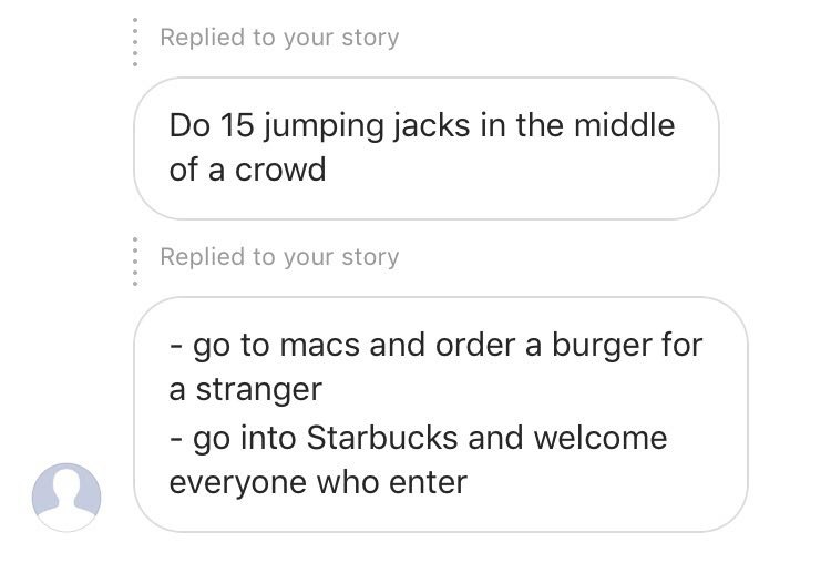
However, we did not exactly do any of the above. That to me is interesting because it shows how we cannot help but still try to maintain our digital image. We just cannot completely let go of control. We deliberately chose not to do those suggestions. Personally, it is because I am afraid of being judged by people online who would be watching the stories because again, I feel like I have a digital image to maintain.

password: projectsociallife

As such, in the final trailer above, done beautifully by Shu, you can see how we depicted a utopian narrative throughout most of the video. We only portrayed the happy bits of what went down throughout the day. Also, the quirky video style drew much reference from Carla Gannis and Paula Pinho Martins Nacif.

Given that we were shown performance art pieces by Blast Theory prior to the project, of course we took inspiration from their works. I’d Hide You gave much influence to this project. We were interested in the way the team gave control to the mass public to make decisions for them to create an outcome that could turn out in many different ways.

To be honest, before it started, I was so afraid I would have to embarrass myself in public because that is really the last thing I would want to happen. Surprisingly, nothing major happened but I had fun nonetheless.

Overall, I personally think we succeeded in exploring the social in this project by deliberately allowing followers (some strangers) to curate our day. We communicated through the DMs (direct message) to receive/accept suggestions. No doubt, there was a form of interaction. However, to accentuate that, I feel that we should have done an activity that forces us to interact with real-life public to make the project more interesting. Nevertheless, a fun project with fun people.

Locale – FINAL


And here’s my final Changi zine! YAY.

I thoroughly enjoyed this project. Honestly, my favourite project to date. It made me appreciate zines/magazines or any type of publication at all. The process behind making one is tougher than I expected. Every little detail is so important, from the arrangements of the pictures, the sizing of the fonts, the colours and so on. For this project, I had to make an abstract piece that still holds a narrative. That frustrated me so much. I kept questioning all my friends “How can an abstract work have a narrative?”. However, Mimi cleared a lot of my doubts and was a massive help to the ideation of my zine. Thank you so much.

I also struggled with Indesign quite a bit. I did the whole zine on illustrator. I think if I had more time to dabble with Indesign and actually learn how to use it properly, the zine would turn out more crisp. Nonetheless, I like how it turned out. The printing was exceptional (shoutout to Ben Quick Print Services at Sunshine Plaza), even a few of my classmates commented on how nice the ink looked! However, the paper had mixed reactions. Some people liked it while some don’t. I personally felt that it was a little bit on the thicker side. I would totally get a thinner paper if I had another chance.

As for the concept and graphics, I got mostly great comments which I am really thankful for. This project made me really happy.  To produce a zine from the design to the texts and everything by yourself is super satisfying. 3 months holiday: I’m definitely going to try making another one!

Check out how this zine came together on my research & process posts!

Locale – PROCESS

For this project, I began by hand-drawing the buildings and figures on sketch paper before scanning them onto my computer and then refining them.

page 1 & 8 (changi prison)

sketching

Above is an outline drawing of Changi prison and a ghost which is going to end up a spread in the zine. That is why I made the building symmetrical.

editing

I edited the building before I did for the ghost. I added dots using photoshop to the building to give it a little dimension as it looked pretty flat before. Emulating Ruth Allen’s style, I coloured the building without filling every gap. I also coloured it outside the lines.

I ended up not liking the colour I placed as I felt it was not eye-catching enough so I removed it. I added the ghost that I edited. I overlapped two layers of the ghost, one of it being black and the other, red. It creates an almost 3D illusion which I really liked.

I settled with a bright red in the end for the colour of the building as it  fits my theme really well. It also looks pretty pleasing to the eyes. I wanted to still emulate Ruth Allen’s style which was why I purposely did not align the colour to the lines exactly. If you did not notice, I also changed the font of the title to a rather child-like handwriting. I think it gives a more creepy feel.

page 2 & 3 (changi beach)

sketching

I sketched an image of 3 decapitated heads as a reflection of an actual image I saw as I was researching on the massacre that occurred at Changi Beach. It was a pretty unforgettable image ( try searching on google for it!) which I thought would be impactful to add to the zine. Of course, I didn’t exactly copy the real-life image since I wanted to emulate the style of Karolina Koryl. Thus, I distorted the faces making them look “melt-y” and added more eyes.

editing

This page was quite simple to execute. I did not hand-draw the beach but used illustrator as the it only consisted of mostly lines. To make the zine consistent, I used about the same colours as the previous page.

I made this page into a spread upon Mimi’s feedback. I think it looks really cool and actually like it better as a spread.

page 4-5 (old changi hospital)

sketching

Most of the ghost stories that I have heard regarding Changi was about the infamous hospital. Thus, I wanted that page to have the most amount of ghosts which explains the sketches of many different ghosts above.

editing

I added one of the heads on a drawing of the hospital which I drew on illustrator. I initially planned for this to be a single page but ended up making it a spread as well as recommended by Mimi.

I could fit in more heads into it which is better. I spilled over the building drawing over to the next page as well to kind of create a better flow. As you can see, I also applied Ruth Allen’s style to the building.

page 6-7 (changi airport)

sketching

I sketched a group of uniform figures towering over and surrounding the airport. I made this the last page as I wanted it to be in a way, unexpected. I rarely hear ghost stories about the airport but it exists. That is why I made the figures less obviously scary-looking. I accompanied the drawing with a poem I found that I really liked.

editing

This particular spread went through a lot of editing. I made so many variations of it because it was the last page which I think is very important. It should leave an impact.

It does look pretty consistent with the rest of the pages. However, it was not shocking or as interesting as I wanted it to be. Thus, I made it very different from the rest of the zine.

Besides the red, I inverted the colours making black the dominant colour. I really liked the vibe that this spread gave off. I consulted Mimi and showed all the variations I made and she also preferred this colourway.

I also ended up changing the poem. I removed the poem completely and came up with something on my own. Mimi commented that my zine lacked narrative. So, I wrote something that would tie the whole zine together. The last line goes “…and you are…” which would then continue to “not alone.” on the first page.

bonus

If you noticed, the silhouette of a flock of birds flying is a recurring motif in most of the pages. I wanted something to connect the pages together thus I added the birds which represent ‘travel/movement’. It is as if the viewers are following the journey of the birds to the different places in Changi.

Check out my final post to see all these pages come together!

Locale – RESEARCH

The location that I was tasked to make a zine on is “Changi”. When I hear the name “Changi”, I think of ghosts and all things haunted due to the countless ghost stories that have been fed to me. Thus, I wanted my zine to have a creepy/scary theme.

To start, I decided on the colours of the zine. I wanted the zine to not look too “busy” in terms of colours hence I decided on only three colours: red, black and white. I chose red as the dominant colour as it is found in most horror films/images. Red holds connotations of death/blood and danger. It is also linked to a sense of fear which is what I would like to invoke in this zine. Black and white are also incorporated in the zine upon learning that black and white actually represent death/mourning in different cultures. They also stimulate the eyes and excite senses which keeps the zine interesting. These colours would thus enhance and intensify the “fear factor” in the zine.

I was inspired by the colours of these popular horror movie posters where you can see red, black and white heavily used:

Image result for horror movie posters
A Nightmare On Elm Street
Image result for it title
IT

In the zine, I think I would lay unique “ghosts” around on the different landmarks of Changi such as the prison, beach and hospital which are more famous for ghost sightings. As I have presented, these areas are ridden with deaths having been a place of war and massacres.

10_S_doodles - Lars Henkel ||| (*d*)
By Lars Henkel
Recently came across German illustrator Evelyn Hahn. I totally love the quirky characters and weird proportions. So cool! Can someone do her a website though? :-) See more on her MySpace.
By Evelyn Hahn

Inspired by these artworks, I think I am going to go for a crowded look in the zine where the drawings are close to one another and perhaps big/vary in size.

While looking for inspiration on Pinterest, I chanced upon two artists who I think I would like to emulate their styles in this project:

  1. Karolina Koryl

Image result for karolina koryl

Image result for karolina koryl

Koryl purposely disfigures the human figures in her drawings. I liked the idea of drawing what are human beings but not exactly. She would pull/connect different parts of the face or body and even add additional parts which makes the figures disproportionate. I want the “ghosts” in my zine to still be identifiable as a human being despite looking distorted and quirky as in Koryl’s drawings.

2Ruth Allen

Image result for ruth allen

Image result for ruth allen

I like her sketchy style of drawing. It looks so quick and simple yet very eye-catching. Mostly, she uses a single colour on the buildings and does not fill them in fully. In fact, she colours out of the lines. Maybe I will emulate her style in my drawing of the different buildings.

And here’s my really ugly and rushed first sketches. I swear it gets better in my next post (I hope).

I begin figuring out the placements of the figures and buildings in the sketches below.

Check out my process post to see me make my ideas come alive!

Laptop Shoulder Bag

I wanted to make a bag catered to students in university. I had tons of ideas but eventually settled on something doable in 2 weeks. I decided to make a laptop bag since laptops are a necessity mostly in university.

I researched on the different shapes and orientations of laptop bags available.

Related image
Fitted laptop casing
Image result for laptop bag
Laptop backpack
Image result for laptop bag
Laptop casing with prints
Image result for laptop bag
Laptop shoulder bag

I decided to make a laptop shoulder bag. Of course, I wanted to make it unique and different. I thought about how in ADM specifically, the students do not need their laptops everyday given that some of the mods do not require them on the daily. What if you still wanted to bring the laptop bag but without the laptop? Would it be too big and an unnecessary waste of space? Yes.

Thus, I made a size-shifting laptop bag.

Above are the initial sketches. The way the bag closes/opens into the different sizes is through its sides. I was inspired by an accordion. However, I realised that it was not exactly possible due to the rectangular shape of the base that would not match the zigzag pattern.

Thus, I re-sketched the open/close function.

[Insert image of sketches]

I started off with a plain cardboard which I then cut into 3 equal parts.

Then, I cut slits as seen above, on the top and bottom of the middle cardboard piece.

By sewing buttons through the slit and onto the rest of the cardboard pieces, the 3 parts are attached once again. This method allows for the pieces on the side to move side-to-side which expands the size of the bag vice versa.

After folding the 3 parts into a box, I cut a piece to be attached to the side to complete the box.

Full-sized bag

I wanted it to look sleek thus I painted it black. I also added a “hook” kind of thing at the sides for easier pulling of the sides of the bags when changing its size.

Of course, how can it be a laptop shoulder bag without straps? I used cardboard as well for the straps which I wrapped with batik material to add a little fun to the plain black bag.

And here’s the final outcome!

[Insert final picture]

Reflection:


Alternative Social World

Social broadcasting is a revolutionary phenomenon which strays away from the notion of one-to-many streaming mode. Instead, it allows for many-to-many interactive experiences that bonds artists and audiences in live third space networks. Contrary to traditional media, social broadcasting promotes direct collaboration, interaction and interconnectivity as it utilises the idea of DIWO (Do It with Others). It works towards an “alternative social world” as suggested by media historian and activist Gene Youngblood who agrees that it should distribute the “experience of the broadcast through the creative work of collaborative communities” (Randall Packer. (2018) Social Broadcasting: An Unfinished Communications Revolution)

This is exemplified very clearly in the symposium that I was privileged to have attended through Adobe Connect: a webcam chat-like platform. It really intrigued me how anyone with access to the link was able to provide input and ideas live in the chatbox. This invokes discussion which widens perspectives for both the artist and viewers for the betterment of both parties.

Maria Chatzichristodoulou’s keynote address

This also encapsulates the idea of collaborative art which was explored in a keynote address in the symposium by Maria Chatzichristodoulou, a performance scholar that specializes in critiquing live Internet art. She talked about telecollaborative arts and its impacts along with many examples.

One that struck my interest was Kit Galloway and Sherrie Rabinowitz’s Hole in Space (1980) which I have in fact wrote about before here.

Passer-bys in respective areas communicating through the big screens

It is actually one of my favourite art works that Prof. Randall Packer has introduced to me the past semester. Galloway and Rabinowitz were completely ahead of their time. Not only did they think of engaging in social broadcasting in the era of television and radio, they expanded it to reach two different states. It is a literal example of an “alternative social world” where people from different states could interact through a life-sized live screen as seen in the image above. To think that to even be talking and looking at a person from another state live would have been impossible at that point in time without Galloway and Rabinowitz’s revolutionary project just amazes me. Indeed, we have come a long way technologically since projects as such. Today, we can easily reach a person at the opposite end of the world simply by the touch of a small phone screen.

I also got to watch live, an online performance by Annie Abrahams in collaboration with Antye Greie, Helen Varley Jamieson, Soyung Lee, Hương Ngô, Daniel Pinheiro, and Igor Stromajer (see image above) called “Online En-semble – Entanglement Training”. I was really excited to see an art piece by Annie Abrahams which was properly prepared following a protocol. Prior to that, my classmates and I were very privileged to have had her join our class through Adobe Connect where she read us protocols for us to carry out mini performances. It was very on-the-spot and without practice thus the results were not the best in my opinion. Even so, Annie Abrahams was the sweetest to keep commending our efforts.

I was actually surprised that the process of an online collaborative performance as such was not as easy as I thought. So much effort had to be put in to coordinate and work together. This is not including the minor technical mishaps such as the sound system and lagging screens. This was why I was really interested to watch her live performance on the first day, knowing the struggles behind producing one.

Lo and behold, it was a beautiful experience. The visuals that came out of it were fantastic as you can see in the screenshots I have taken above. Of course, we can never run away from technical issues. The amazing thing about Annie Abrahams is that she sees the beauty of the technical problems unlike many human beings. We tend to frustrate over lags and bad connections but she does not see them as a bad thing at all. Instead, she utilises it to creating something more beautiful. According to Randall Packer, in one of her online sessions, the webcam experienced technical difficulties yet she used it to her advantage by creating an eye-catching visual by getting the participants to purposely turn their cameras on and off, creating a blinking image (Randall Packer, 2018, Disentangling the Entanglements). I appreciate that she creates art out of flaws and includes it in final performance recordings to truly express the beauty of it.

The most interesting part of “Online En-semble – Entanglement Training” was when participants read out the latency in their connections as their screens are blacked off as seen in the image above. This makes the latencies the subject of the performance start. It interested me because it shows how we are all in the same online “third” space together but not actually really at the exact same time. This brings about the question of how close can the proximity of relationships exist through a third space? Will technology ever bring it to be the same as real-life relationships?

The participants variate between saying out the latencies and the word “excellent”. A comment that caught my interest was “the latencies are similar to rocket take-off voiceovers”. It made me look at the performance piece in a different perspective. This brings me back to my point on how the chat system enables fresh perspectives or feedback to be provided live.

On the second day, guest speaker Matt Adams from Blast Theory talks about the history and works of his group. Blast Theory infuses interaction into their works through the use of interactive media such as games. Their works are great examples of social broadcasting. Their works allow the interaction between the broadcasters and audience. In a way in fact, the idea of an audience is being negated. For example, in “I’d Hide You” (see video below), he gathered four participants to play a game whereby they had to run around the city to sneakily look for and take pictures of one another. Thing is, the game cannot be run without participation of the “audience” being people online and passer-bys in real life as well.

The players had to rely on the “audience” who had access to a full map of the whereabouts of other players to emerge victorious. In this case, the audience become the “artist” who decides the outcome of the game, who they want to support or defeat.

I think that this is a creative way to express the idea of doing it with others. They had to rely on collaboration to carry out the broadcast. The same goes to works of Annie Abraham and several other online performance artists as such. I do agree that we should be working towards creating an “alternative social world” given the advanced technology that we have today. To bring together people from all over the world to create beautiful pieces of art is amazing. It moves us away from the self-centered society that we cannot help to be in today’s world of consumerism.