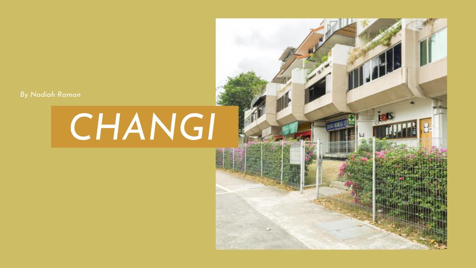

The location that I was tasked to make a zine on is “Changi”. When I hear the name “Changi”, I think of ghosts and all things haunted due to the countless ghost stories that have been fed to me. Thus, I wanted my zine to have a creepy/scary theme.
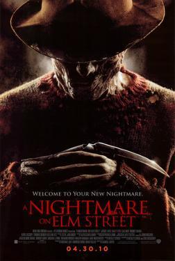
To start, I decided on the colours of the zine. I wanted the zine to not look too “busy” in terms of colours hence I decided on only three colours: red, black and white. I chose red as the dominant colour as it is found in most horror films/images. Red holds connotations of death/blood and danger. It is also linked to a sense of fear which is what I would like to invoke in this zine. Black and white are also incorporated in the zine upon learning that black and white actually represent death/mourning in different cultures. They also stimulate the eyes and excite senses which keeps the zine interesting. These colours would thus enhance and intensify the “fear factor” in the zine.
I was inspired by the colours of these popular horror movie posters where you can see red, black and white heavily used:

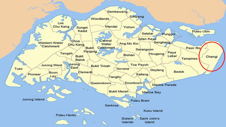
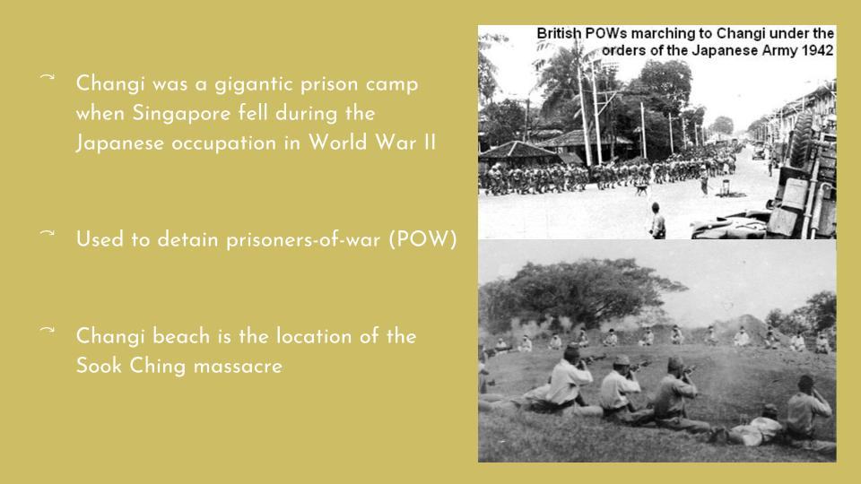
In the zine, I think I would lay unique “ghosts” around on the different landmarks of Changi such as the prison, beach and hospital which are more famous for ghost sightings. As I have presented, these areas are ridden with deaths having been a place of war and massacres.


Inspired by these artworks, I think I am going to go for a crowded look in the zine where the drawings are close to one another and perhaps big/vary in size.
While looking for inspiration on Pinterest, I chanced upon two artists who I think I would like to emulate their styles in this project:
- Karolina Koryl
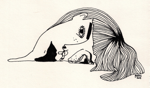

Koryl purposely disfigures the human figures in her drawings. I liked the idea of drawing what are human beings but not exactly. She would pull/connect different parts of the face or body and even add additional parts which makes the figures disproportionate. I want the “ghosts” in my zine to still be identifiable as a human being despite looking distorted and quirky as in Koryl’s drawings.
2. Ruth Allen


I like her sketchy style of drawing. It looks so quick and simple yet very eye-catching. Mostly, she uses a single colour on the buildings and does not fill them in fully. In fact, she colours out of the lines. Maybe I will emulate her style in my drawing of the different buildings.
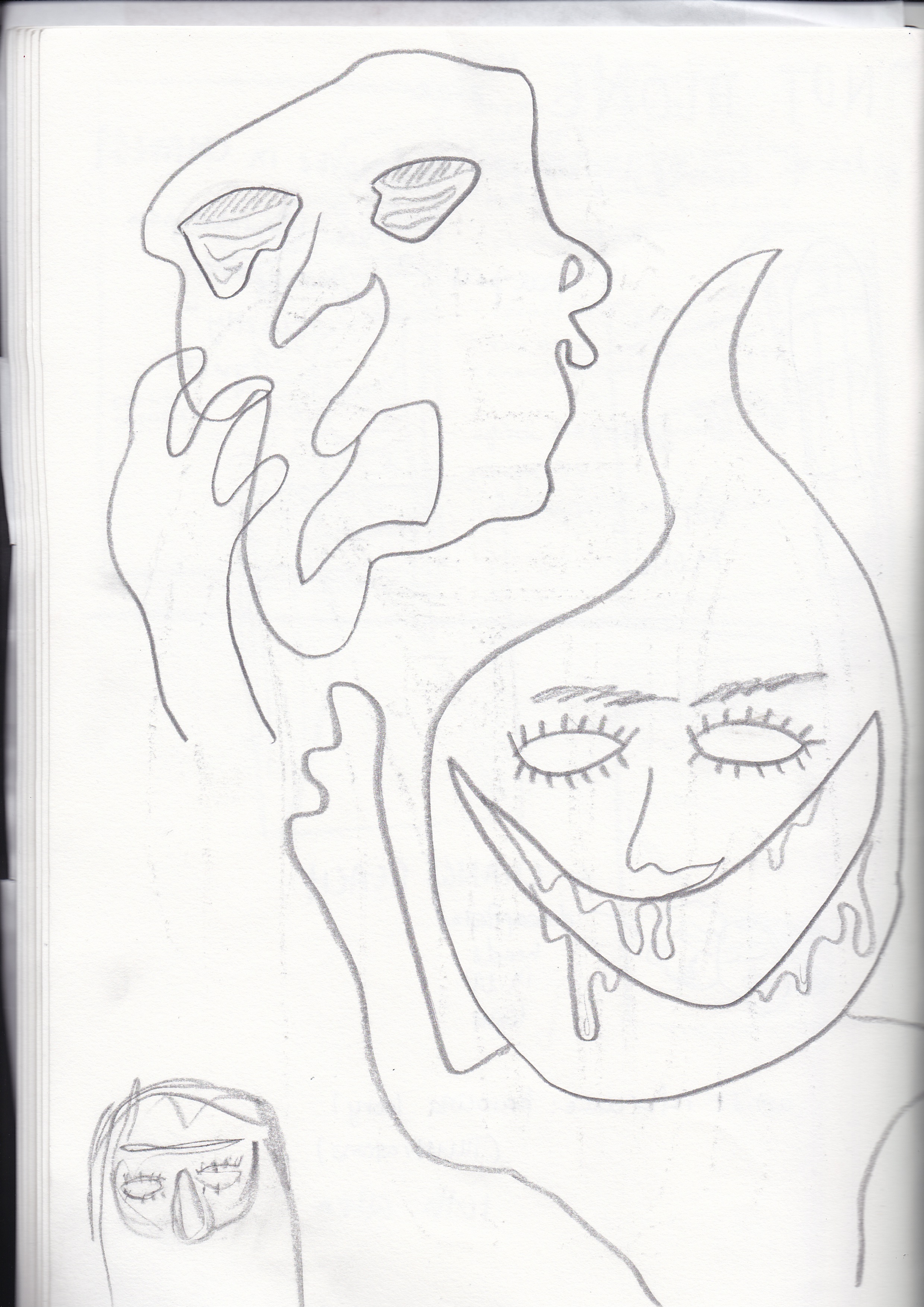
And here’s my really ugly and rushed first sketches. I swear it gets better in my next post (I hope).
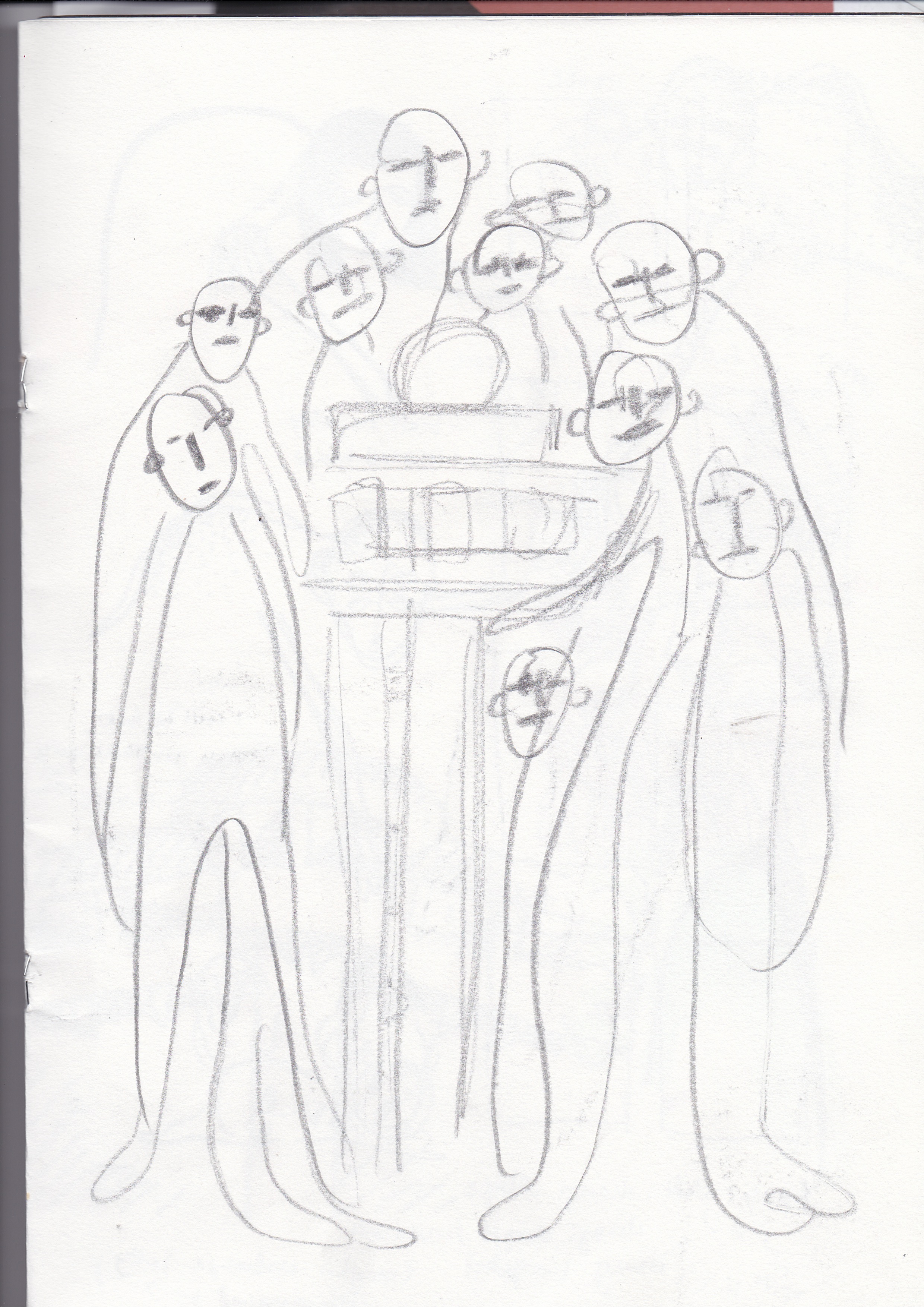
I begin figuring out the placements of the figures and buildings in the sketches below.


Check out my process post to see me make my ideas come alive!