[ONE]
When I first got the project brief and found out that I had to choose movie quotes, I got all too excited because if you know me, you’d know that I love watching movies. Coincidentally, that week, I watched the movie IT, twice in the cinema! So naturally, I chose a quote from that movie – “If you come with me, you’ll float too!”. The design I had in mind looked so good but when I tried to create it on Photoshop, boy, did it fail so miserably.
To my defense, I did not know how to operate Photoshop that well yet and I wasn’t clear of the requirements of the project. I’m only uploading this for laughs and to build up you guys’ confidence. Kidding.
On a more serious note, after reviewing with a few friends, I went on to look for new quotes after understanding that I have to work around a concept more than the literal idea of the quote itself. From then, I settled with 2 quotes that I ended up using for my final compositions with the topic of food in mind (I must have been hungry):
- “If you are what you eat, then I only want to eat the good stuff” – Ratatouille
- “One bite and all your dreams will come true” – Snow White
Since my group’s presentation was about gestalt, a lot of my compositions are created with its laws in mind as I researched on it. Besides, I feel like several of the laws of gestalt actually encompasses the different elements of art presented by previous groups. The laws include the law of simplicity, proximity, similarity, continuity, closure, symmetry, figure and ground which you can read more on here.
[TWO]
COMPOSITION 1 (QUOTE 1)
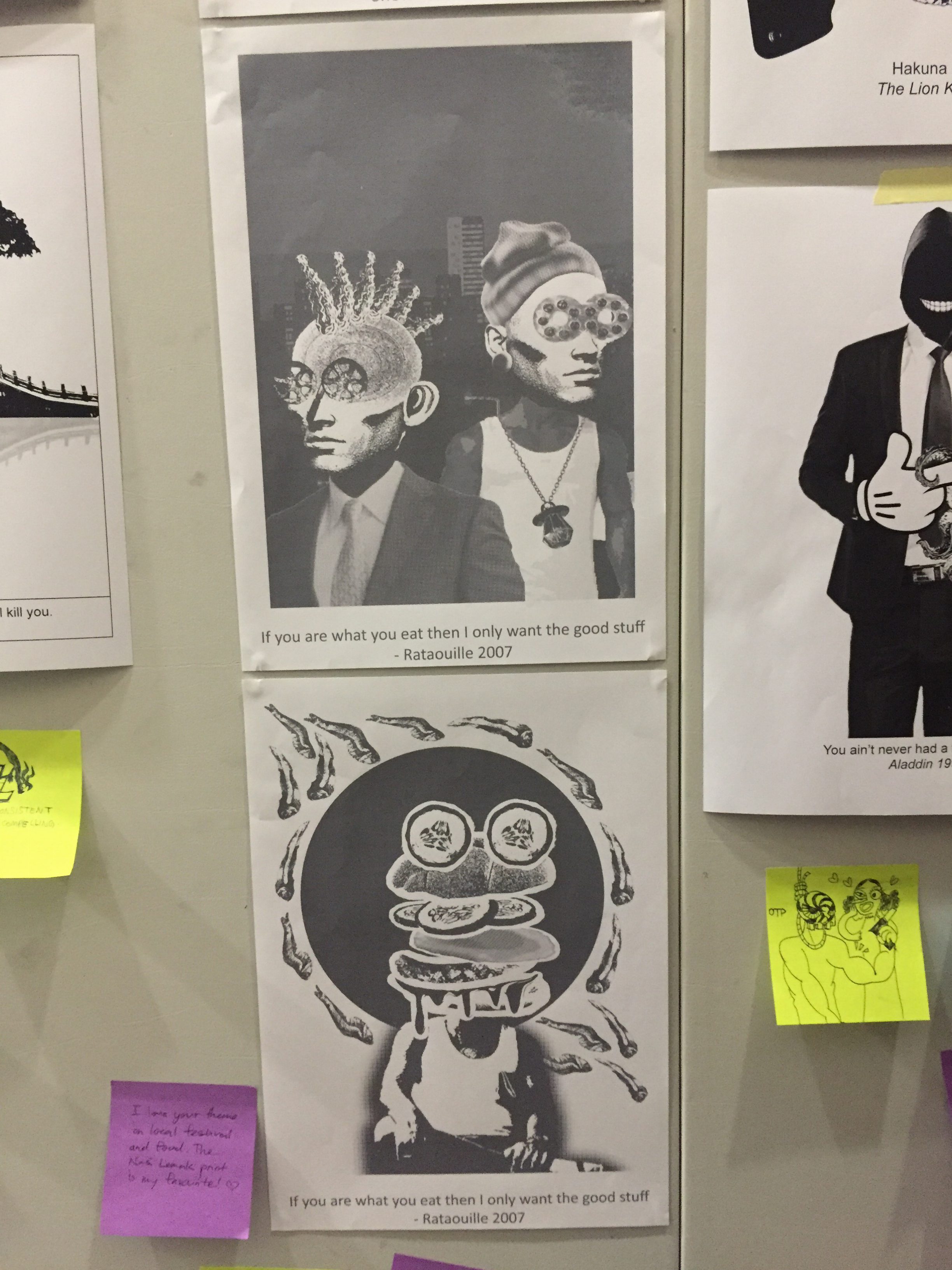
This was my first composition based on the food concept. I really wanted to portray the “good stuff” in the quote so I had to hunt for a food item that is popular and loved. I decided to work around the popular Mcdonald’s burger, the Nasi Lemak Burger that made a comeback randomly upon popular demand. The burger was initially exclusively to commemorate National Day. Unlike other promotional burgers like the samurai burger, it actually came back a month later for no specific event but simply because it was so good. I personally felt that the burger really defined “good stuff” and so I sticked to it. To represent “you are what you eat”, I decided to use the burger as a human head.
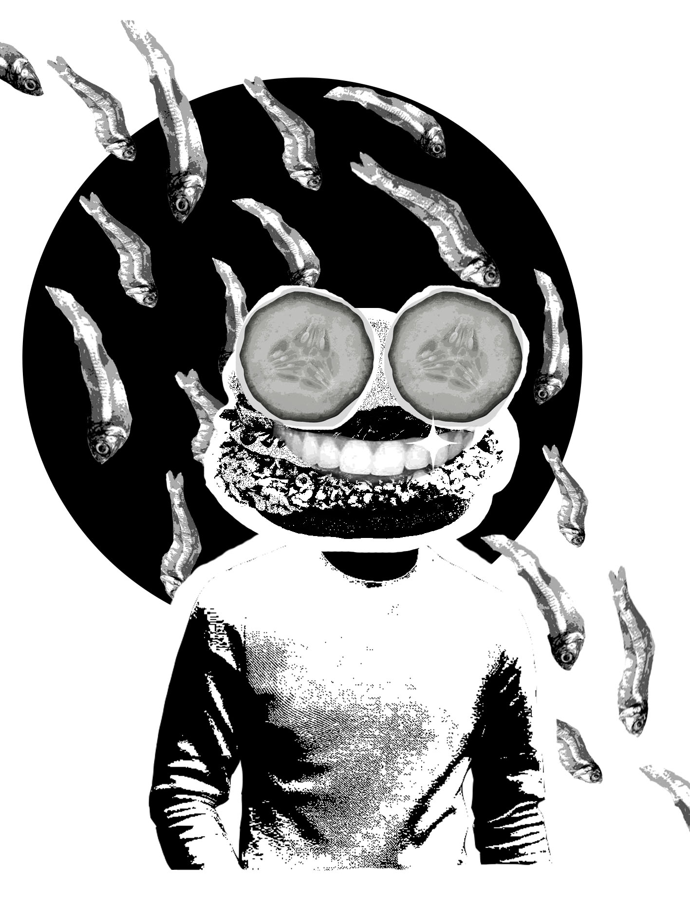
I decided to use cucumbers as the eyes to make it more obvious that it is the Nasi Lemak Burger by making the ingredients outstanding. The same applies for the anchovies behind the figure. For the anchovies, I applied the law of similarity and proximity which allows the eyes to group them together. I also made all the anchovies face the same direction creating an implied line. I added a black circle behind the figure to create a bit of contrast between the background and the figure.
However, this did not end up as the final composition as a result of feedback from Joy and my friends. According to them, the burger was not recognizable and they advised me to separate the components of the burger to make it clearer. The body used in the figure was also insignificant and not representative of Singapore. Upon much consideration, I adjusted my composition and came up with this:

I replaced the body with one of a local uncle that is typically seen in coffee shops. I also re-edited the cucumber eyes so that it would turn out better on the totebag. The anchovies are now placed outside of the circle so that it would be less of a distraction from the burger in the middle. Voila! My first final composition.
COMPOSITION 2 (QUOTE 1)
I wanted to work around a piece of food that I personally liked but I figured that it would then be less relatable. I wondered then, what food would everyone like? Childhood snacks! Not only is it delicious, it is packed with so much nostalgia. I gathered all the childhood snacks from memory and Google. Again, to really represent the quote, I incorporated the snacks such as Mamee noodle, wheel cracker, pig ear biscuit and ice pops into a human face:
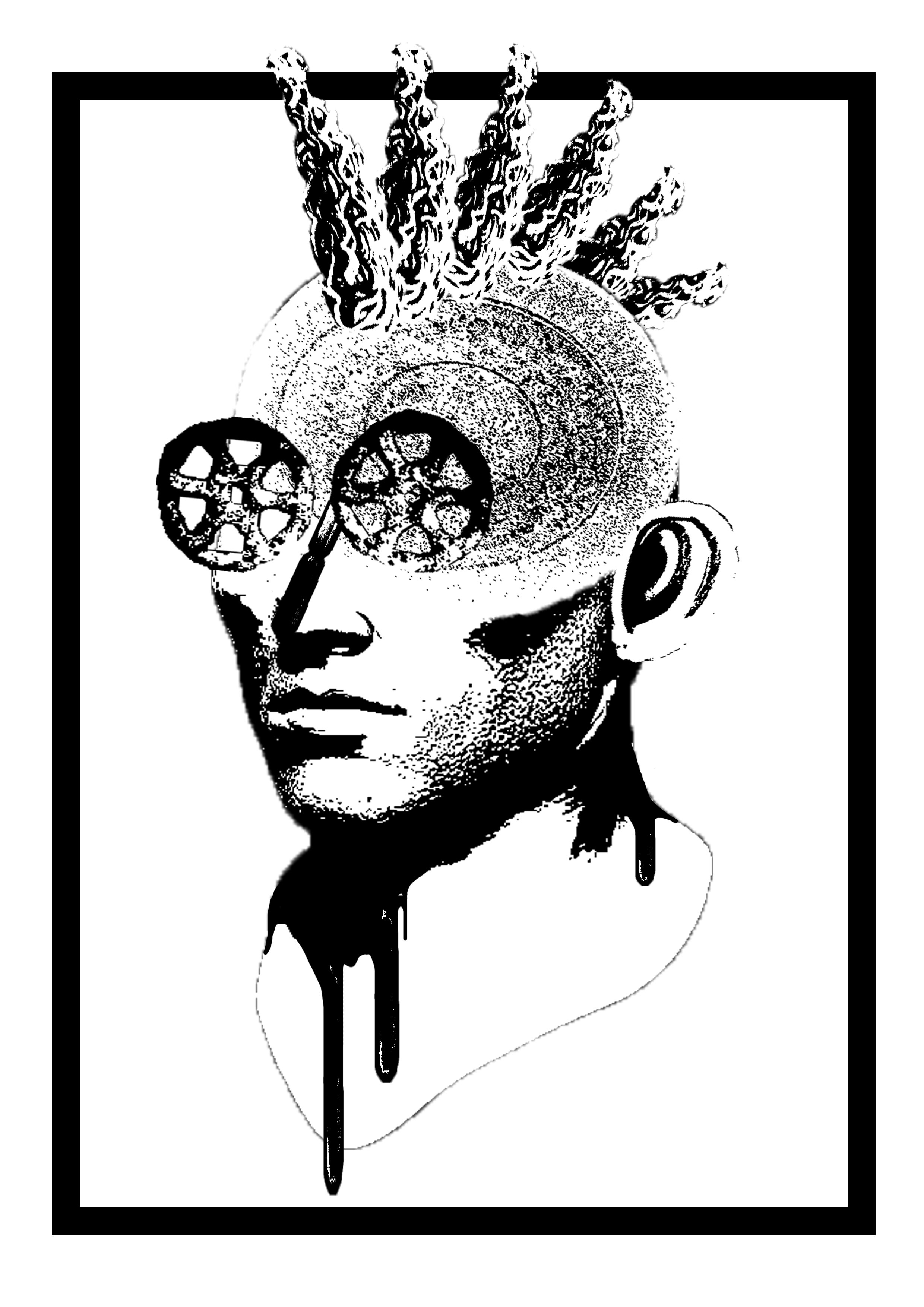
I got the feedback that the border was redundant and that the composition lacked meaning. I was recommended to perhaps multiply the figure to create more of a story which I took into consideration and ended up with this:

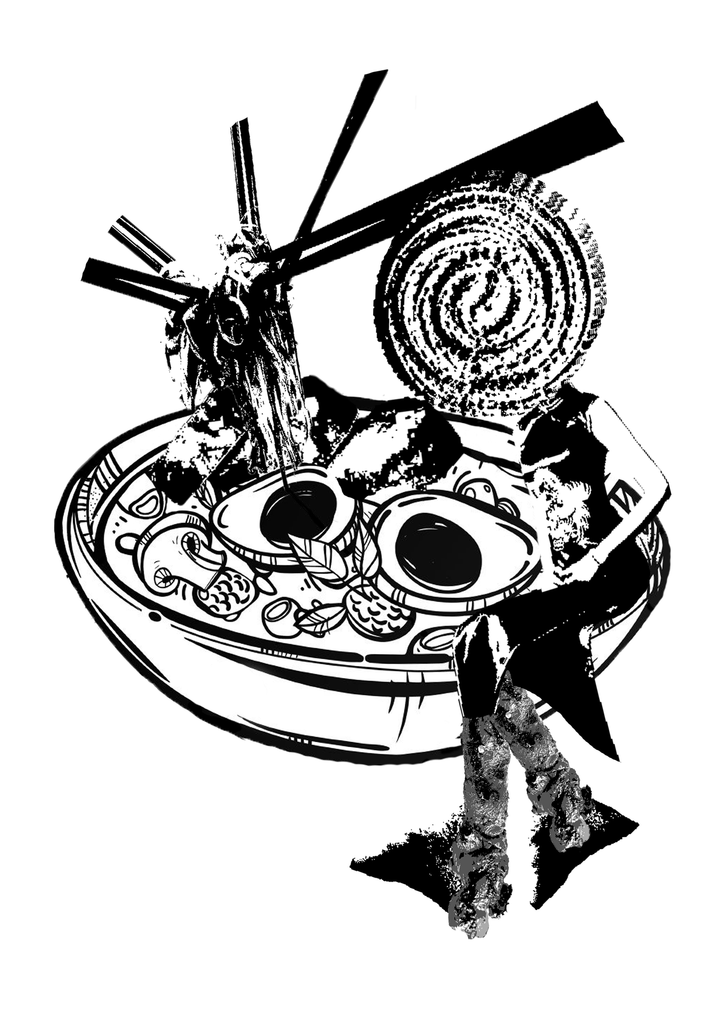
COMPOSITION 3 (QUOTE 2)
My main focus for this quote was “dreams will come true”. Alike the previous composition, I wanted to work around a single theme and decided on festivities in Singapore; Chinese New Year, Hari Raya Aidilfitri and Deepavali. I also gathered the different food from all the festivities which includes, lontong, samosa and lohei. To represent a dream coming true, I placed a woman wearing cheongsam sitting in a bowl of what is supposed to be a bowl of lontong. I initially wanted her to be resting inside the bowl but I had much difficulty trying to find a picture of a woman sitting in that manner on Google.
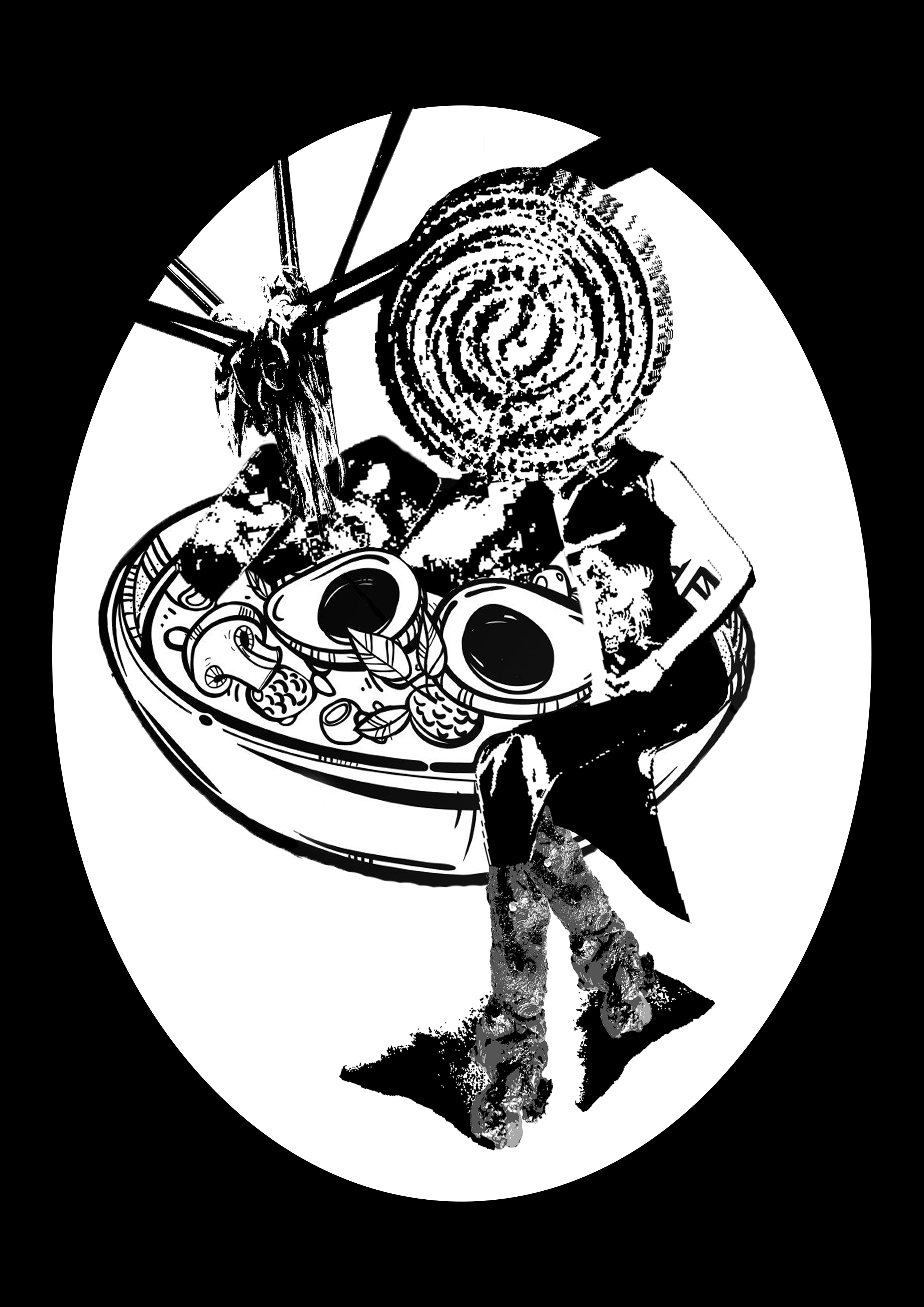
Reviews were giving on how, again, the border is distracting. The components in the bowl also made it look like a ramen soup instead of lontong which was not representative of the festivities in Singapore. This is the post-edit:
COMPOSITION 4 (QUOTE 2)
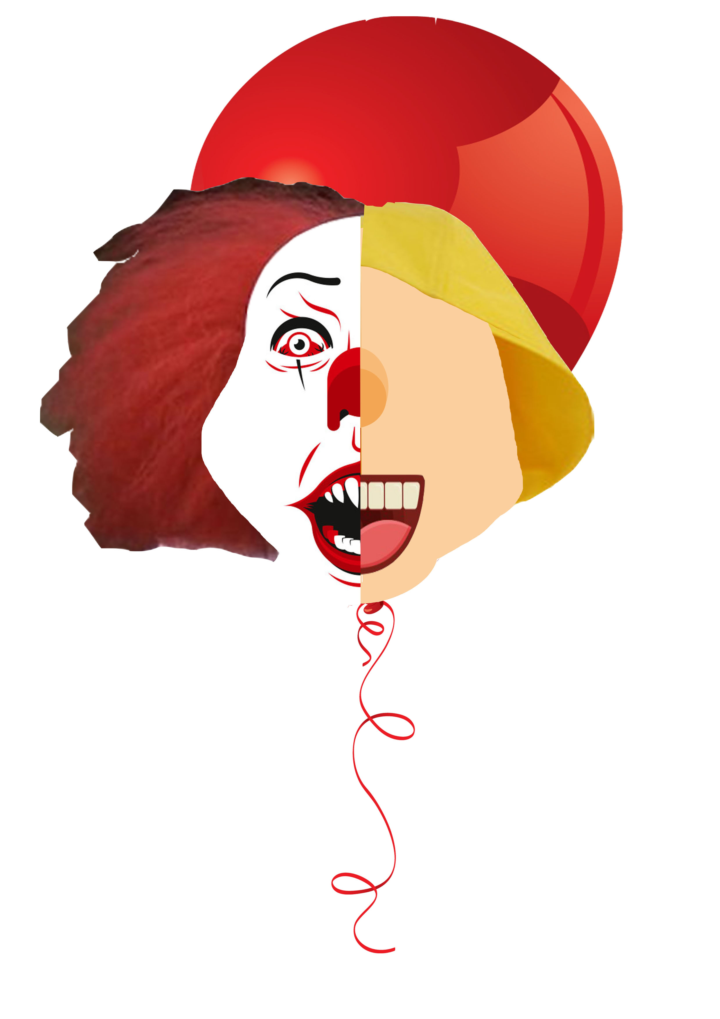
At this point, I realised that all my compositions were very localized so I wanted my last one to be a little different. I decided to touch on a social problem that is more universal. It was also at this point when I realised that I have not been specifically conceptualizing my compositions. Thus, this is my first composition that I created with a story in mind.The main food item that I chose was a donut because I feel like it can be found all over the world. I wanted to work around the concept of privilege. I feel that people are so privileged to the point where they do not even notice. We are often comparing our lives with those of better quality which deters us from appreciating what we have.
l.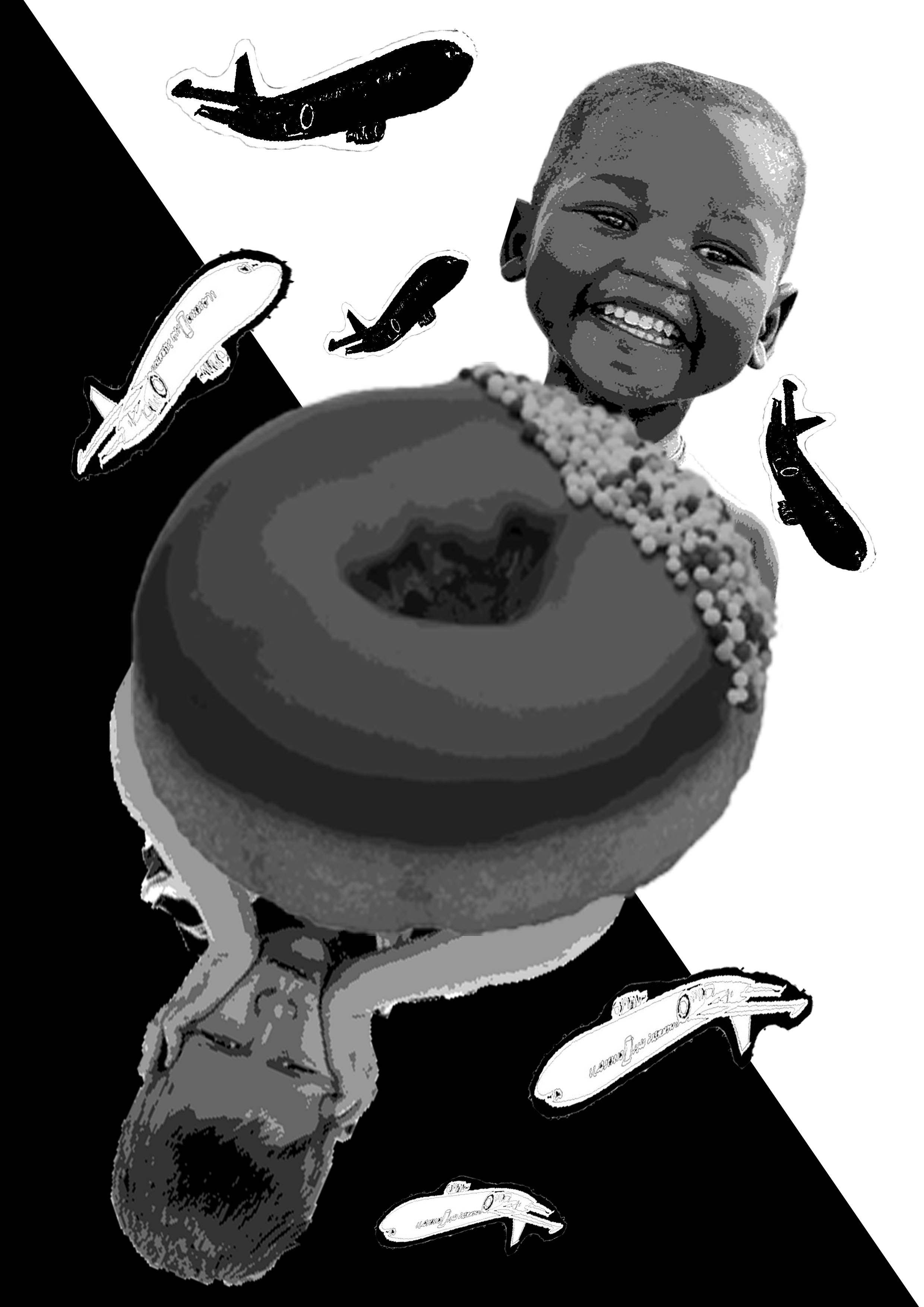
The picture is divided into two triangular halves to play on perception through contrast. I wanted to show how children from 3rd world countries are often more appreciative of the littlest things. The emotion on the kid’s face looks ecstatic to represent how happy he is to enjoy only a piece of donut. On the flipside, a more stereotypical privileged kid seems to be unhappy with the sight of the donut. The well-off kid sees the donut as merely a snack or they might not even like it. The planes surrounding them are purposely cartoons to represent how the children are only innocent but fed with all these influences of the privileged lifestyles in the society. Kids were never born selfish or fussy. It is all under the influence of the circumstance that they are brought up under.
Unfortunately, this composition had no time to receive a review which leaves this as the final piece.
[THREE]
Upon realising my grave mistake of not having a concrete story behind my first 3 compositions, I tried to conceptualize each of them after the final compositions are being confirmed. This was what I presented on critique day:
FINAL COMPOSITION 1: I wanted to portray harmony in Singapore. It is merely a burger but I feel that it has oddly united a lot of Singaporeans. The unity is represented by the anchovies coming together after separating which is often the case in Singapore. We are one Singapore despite a few disputes here and there. The concept of harmony was inspired by the infamous argument between Malaysia and Singapore on the Nasi Lemak Burger when it first came out. Malaysia claimed that the Nasi Lemak is not representative of the locality in Singapore but instead, is a local dish belonging to them. Their persistence led them to re-create the burger in one of their cafes where they then compared it to Singapore’s.
Funnily, it actually brought many Singaporean netizens together as they defended Singapore for a mere burger which is so intriguing to me. Out of all the efforts that the government has put in to maintain harmony in Singapore, a burger easily made that happen in an instant.
FINAL COMPOSITION 2: Since I used an adult face to represent the childhood snacks, I was recommended by Joy to actually combine both the elements together in my concept. I added another of the same figure but made out of different childhood snacks. I purposely created a contrast between the two characters based on their looks. The one on the right seems more uptight and work-oriented while the one on the left is more laid-back through the use of the beanie (gem biscuit). I wanted to represent the life of adults in Singapore. You get to choose how you want to lead your adult life because you actually have to make your own decisions. However, the decisions that you make aren’t always the right ones. You can be the most successful businessman yet it does not guarantee happiness and vice versa for a less successful job. Nonetheless, at any times of hardship, we should always remember that we are still the innocent and happy child that we once were. This represents the nostalgic emotion one experiences when they get to indulge in their childhood snacks.
FINAL COMPOSITION 3: As we all know, prices of many things in Singapore has surged and that includes the food items involved in the festivities. For example, we can burgers at the recent Ramadhan bazaar being sold for up to $8. To comply to that, we can no longer enjoy as much of those food as before. We would have to ration it among the many family members during the gatherings. This increases the rarity of the food items which makes every bite taste like heaven as we appreciate the little amount we get to indulge in. To represent so, I cramped the food items closely together to make it appear “not enough” to go around. I also only put one piece or a tiny bit of each food.
[FOUR]
SILK-SCREEN AND INKING
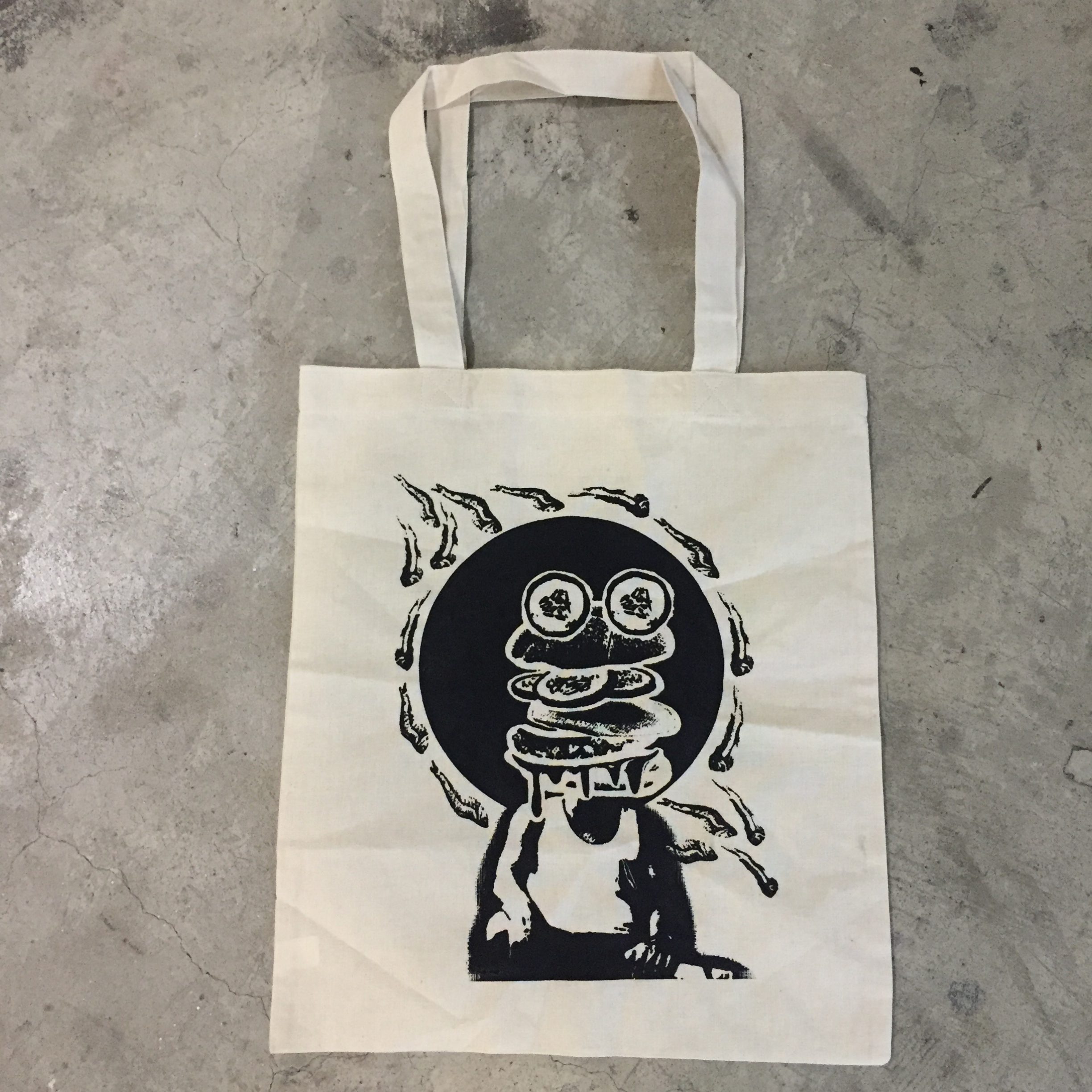
It is my first-time trying silk-screening and I have to admit, it is pretty complicated. For it to work out, you have to have the right contrast and colours in your design. The print on the transparency paper also has to be dark enough which was unfortunately not the case for me. It did not work out for me on the first and only 2 days we were allowed to expose our screens. Thankfully, Joy gave me the opportunity to re-expose my screen once again and it worked. Since it was all in a rush, I immediately inked my design on my totebag after only two tries on newsprint paper. Luckily, it turned out perfect to me:
Aaaand that concludes Project 2! Thank you everyone who left nice comments about my work (ノ◕ヮ◕)ノ*:・゚✧