I had been initially really clueless about how to do this project — what was I supposed to start with? I started researching on various elements of the jobs I have chosen, and picking elements that would best show the job. As mentioned in my research, I had already picked out various elements I wanted to pick up for my jobs. I also started looking into the types of fonts that best represented what I wanted to go for, which was like a starting point for my artwork.
Dream collector
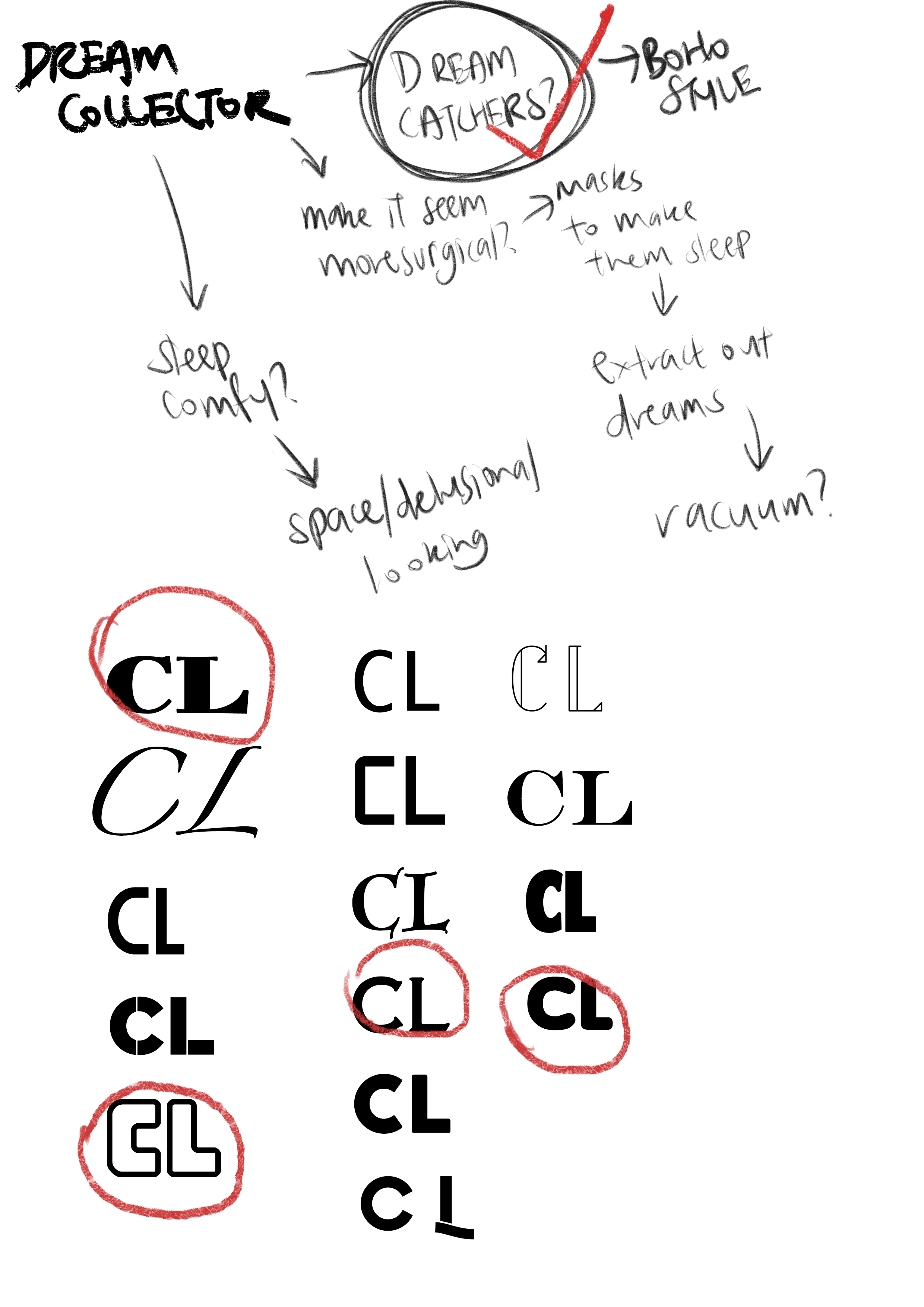
For the dream collector, I decided to use dreamcatcher elements to represent my job to collect dreams. I imagined it as something where clouds represented dreams, and they would get caught when drifting past the dreamcatcher.
References + drafts.
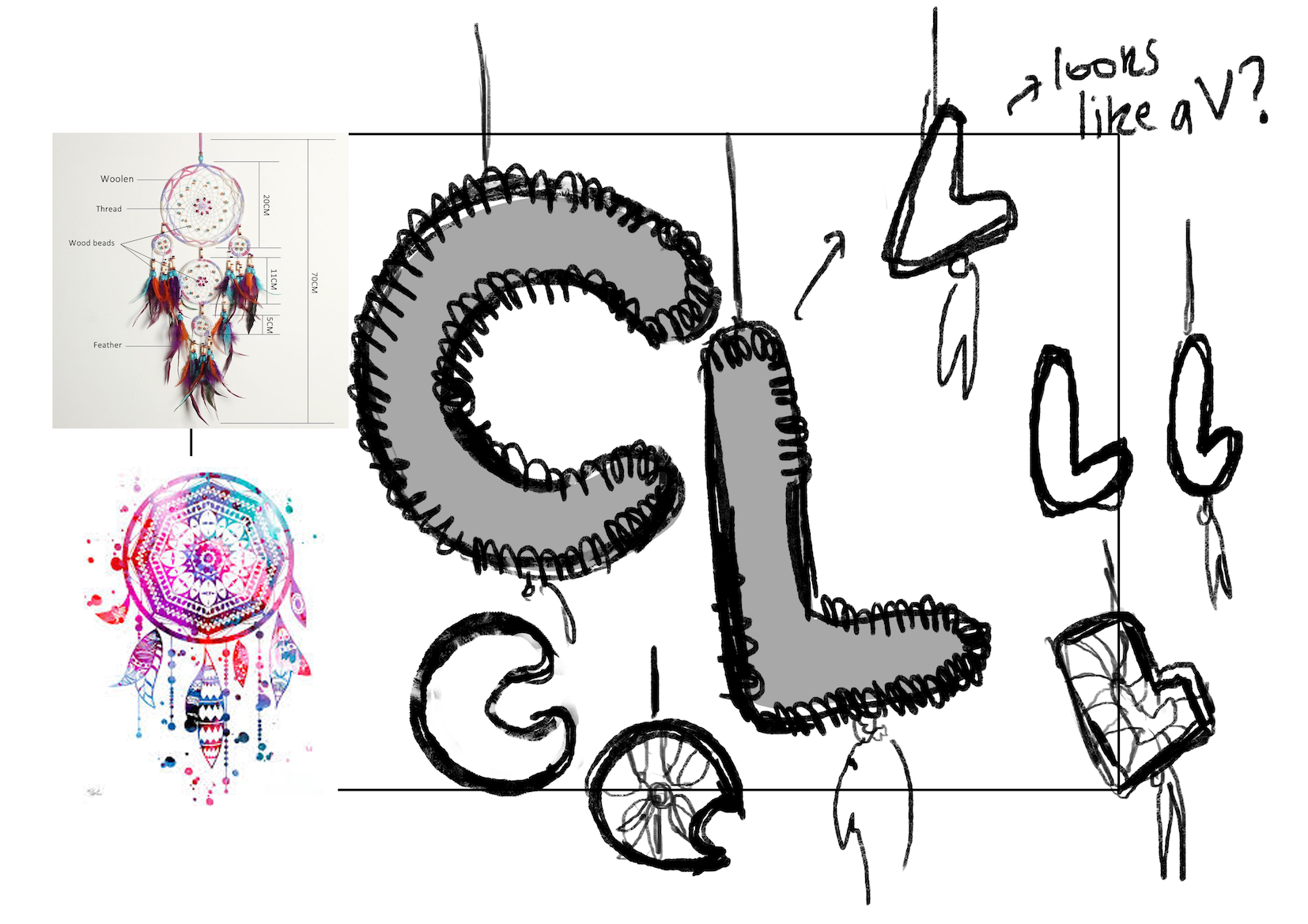
I started experimenting with how I wanted the dreamcatcher types to look like, and how the strings inside would tie up together. It was really hard figuring this out as most dreamcatchers were round. I had to google rectangular dreamcatchers and just generally stared at dreamcatchers for a very long period of time, also referencing from a dreamcatcher I received when I was younger, picking at the strings and how they were connected.
A simple look, trying to figure out how the piece would look with this font; I ended up choosing this font.
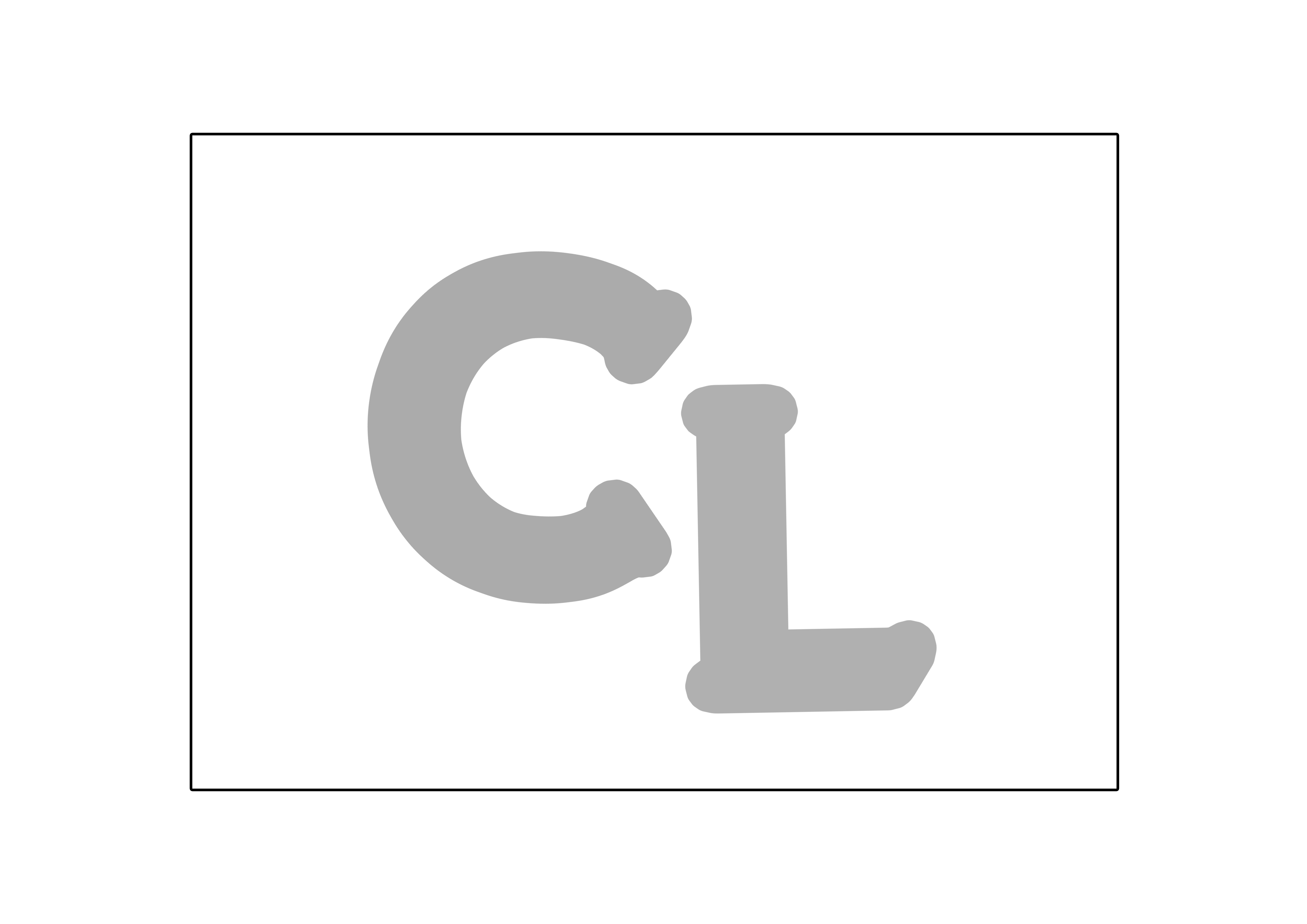
I went with this serif font: Labor Union. It was actually thinner, as shown in the first picture, but I made it thicker so that I could fit the strings that dreamcatchers had. I staggered the words, giving the look of dreamcatchers being hung from different lengths.

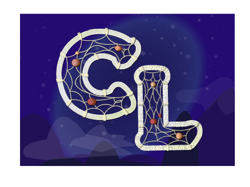
Screenshot of an earlier version.
Originally, I gave it a purple hue because I wanted to make the scene more surreal. But then I realised it looked super ‘obiang’, and threw the attention off. I also did not know how to make the beads look more realistic and I got really frustrated at some point, deciding to stop for the nth time to do another piece of work before I threw my laptop out.
Next try. Used illustrator for the background for this version.
I tried working with nightly palettes and came to this point. It still didn’t do it for me, because it felt very flat. And I was still very new to the whole brush thing on Illustrator as well, which made it very uncomfortable for me to paint anything in Illustrator. I consulted Shirley and she told me I could use any medium (kinda what I wanted to hear, because as much as I wanted to learn Illustrator, I still wanted to create something I could appreciate.)

Final piece!
I decided to go back to something I was more familiar with for the time being, using Photoshop and playing with colours and brushes to create a soft looking cloud area, texturing it and adding tiny stars to represent the night sky. I also made the words off-center, adding little feathers (learnt it on some tutorial!) and the strings to hand them with on Illustrator.
Nonetheless, this was one of my friends’ favourite pieces. It made me really happy because this was one of the hardest pieces I had as it was the most layer heavy one, and I learnt how to make a pattern brush (for the threading) and an art brush (for the feathers). I kept asking friends for opinions, resulting in all those screenshots being available, and the constant changes from colour to colour and for it to reach this final piece.
Emoji Factory Worker
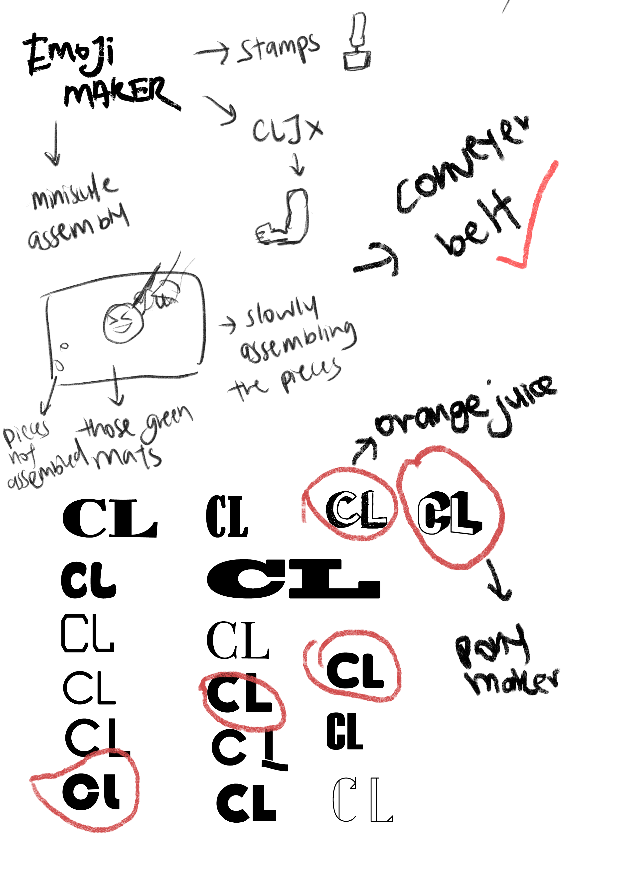
For this job, the emoji factory worker, I wanted a more 3D effect on a vector style. I was deciding between using a 2D font or prefixed 3D type fonts, such as orange juice and Pony Maker. I ended up sticking with Pony Maker, as orange juice was a bit less ‘clean’ in its look, whereas I wanted to give a vibe of a super ‘clean’ environment for factory based work.
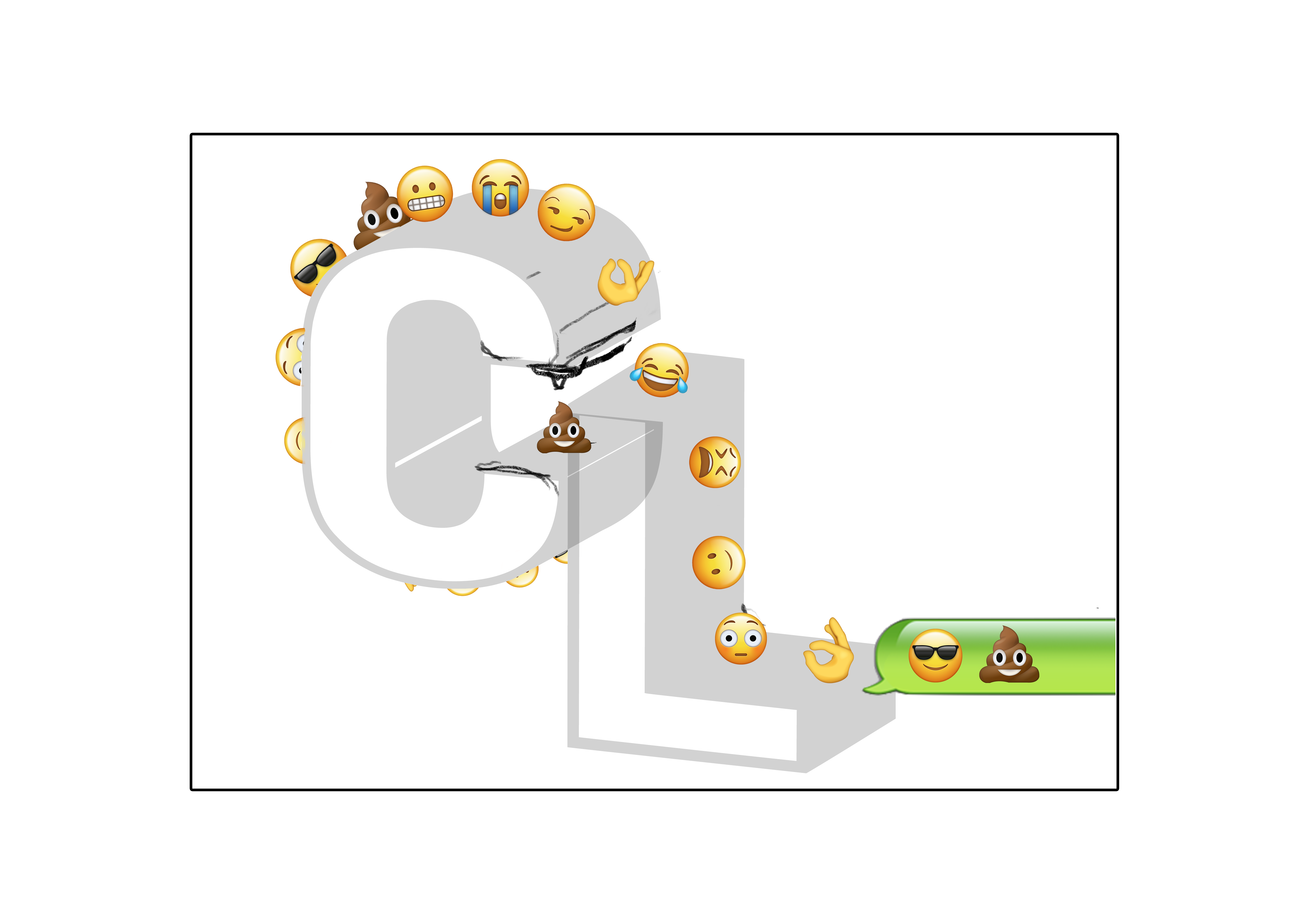
Draft.
I used some of my favourite emojis and specifically used emojis and text speech bubbles from the iPhone, as it was a recognisable element of text messaging. iPhone’s message bubbles also have not changed in years, and thus made it an iconic semiotic of smartphone texting. I also kept the L behind the C and made the L smaller, to create some sort of 3D effect.
In an attempt to learn how to play with vectors in Illustrator, I stared Super Hard at the bubbles and managed to recreate it, I would say, rather perfectly. I am proud of myself.
After consulting with Shirley, she told me to keep the number of repeating emojis to at most three, as a big variation would be confusing.
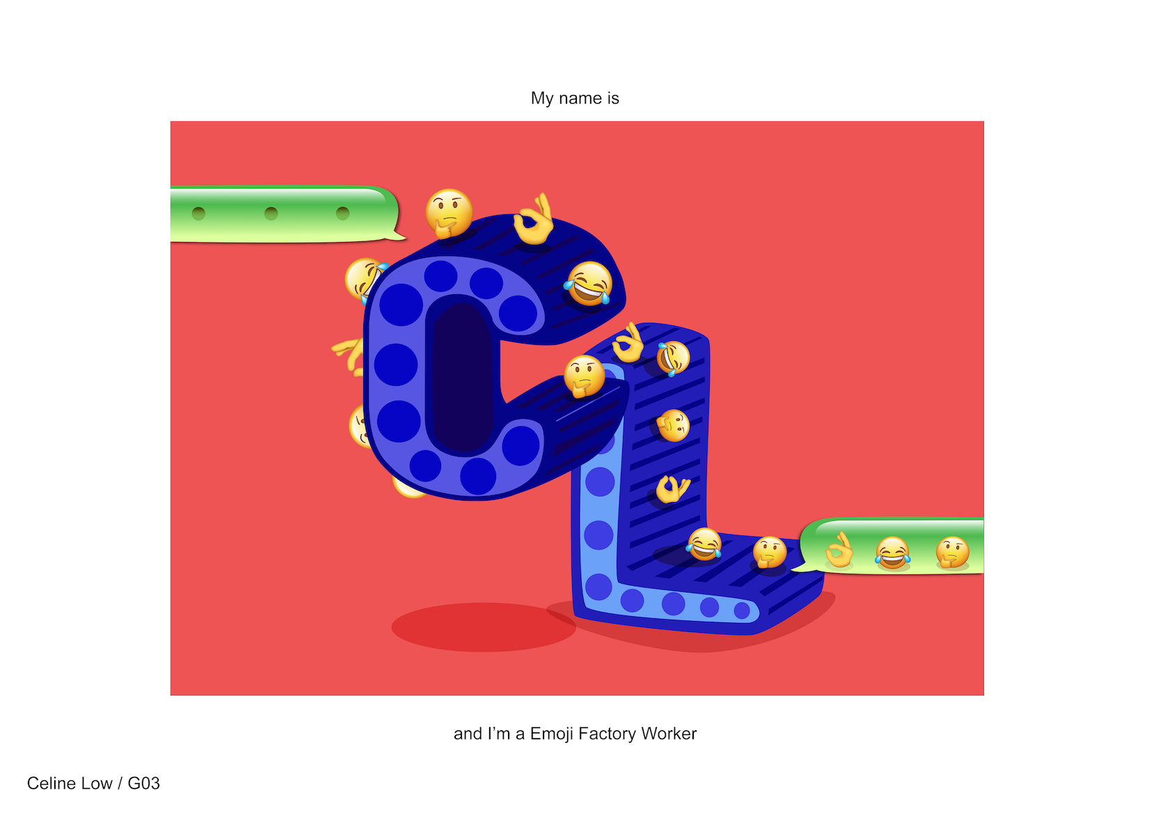
Final piece.
I kept with simple primary colours in various values, creating a very simple but varied piece. There’s red, blue, green, and then there’s yellow in the emojis. It created a very unified look with these simple colours which I think stood out better than the complex crafted pieces I did for other jobs.
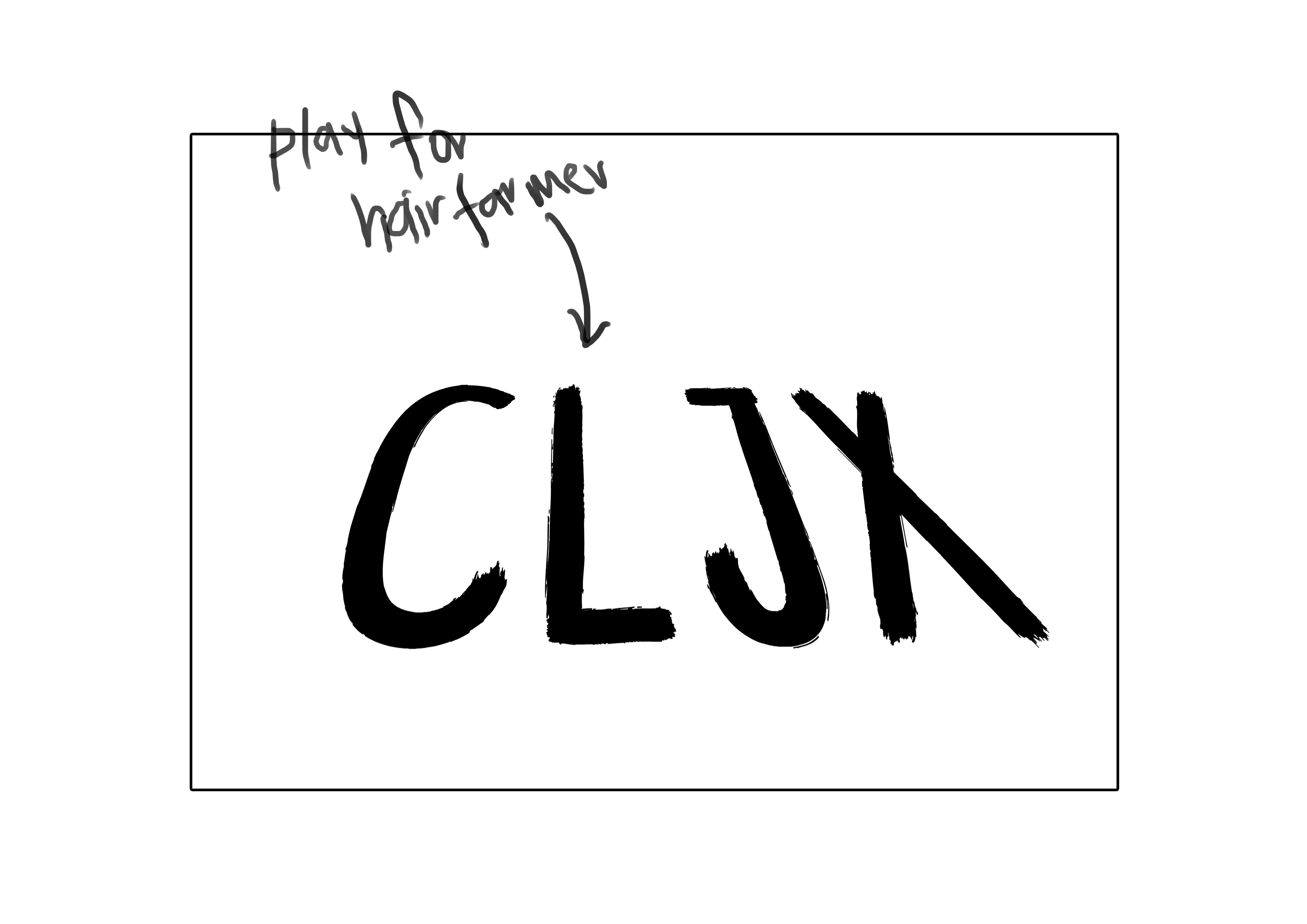
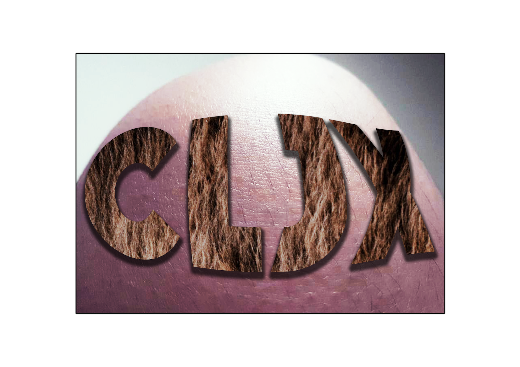
Hair Farmer
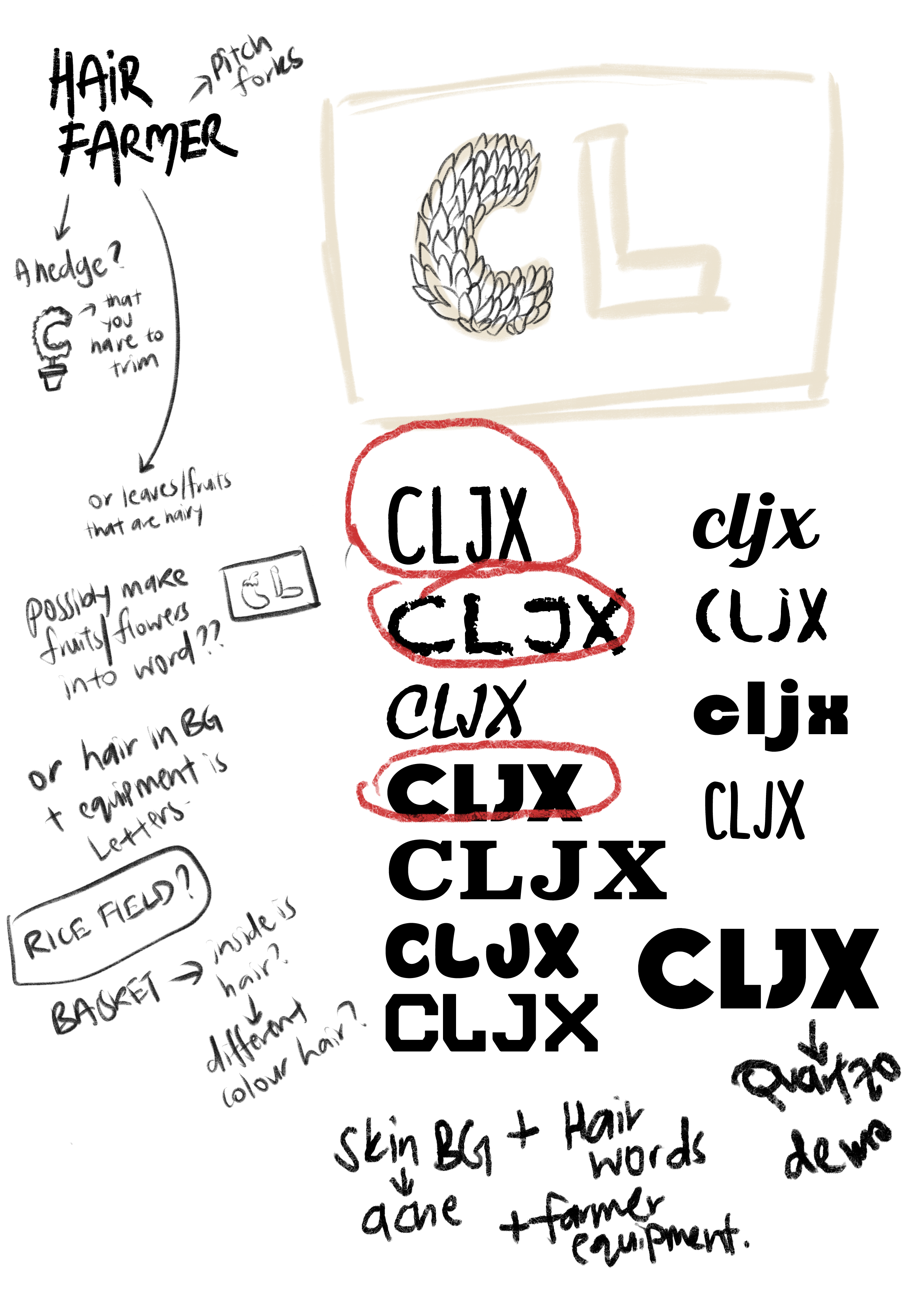
I went with putting hair on a head. I basically wanted to farm my hair on skin, for the sake of people who did not have hair. I wanted to create a skin texture with imperfections and pores and pimples. I initially went with the top middle font (cannot remember the name, I think it was Bellaboo) for a more brushy effect, like the hair was very unkempt.
First draft.
I then decided to try it out again with more textures, and used my knee for the skin texture. I also took it in such a way that hopefully looked like it was the head of a bald person.
Second draft. It honestly looks really gross.
I then realised that textures were really hard to implement as it made everything look really flat on a curved surface. I considered doing it on a more top-down flat angle, but after consultation, I realised it was still best for it to be on a curved surface, as if on a head.
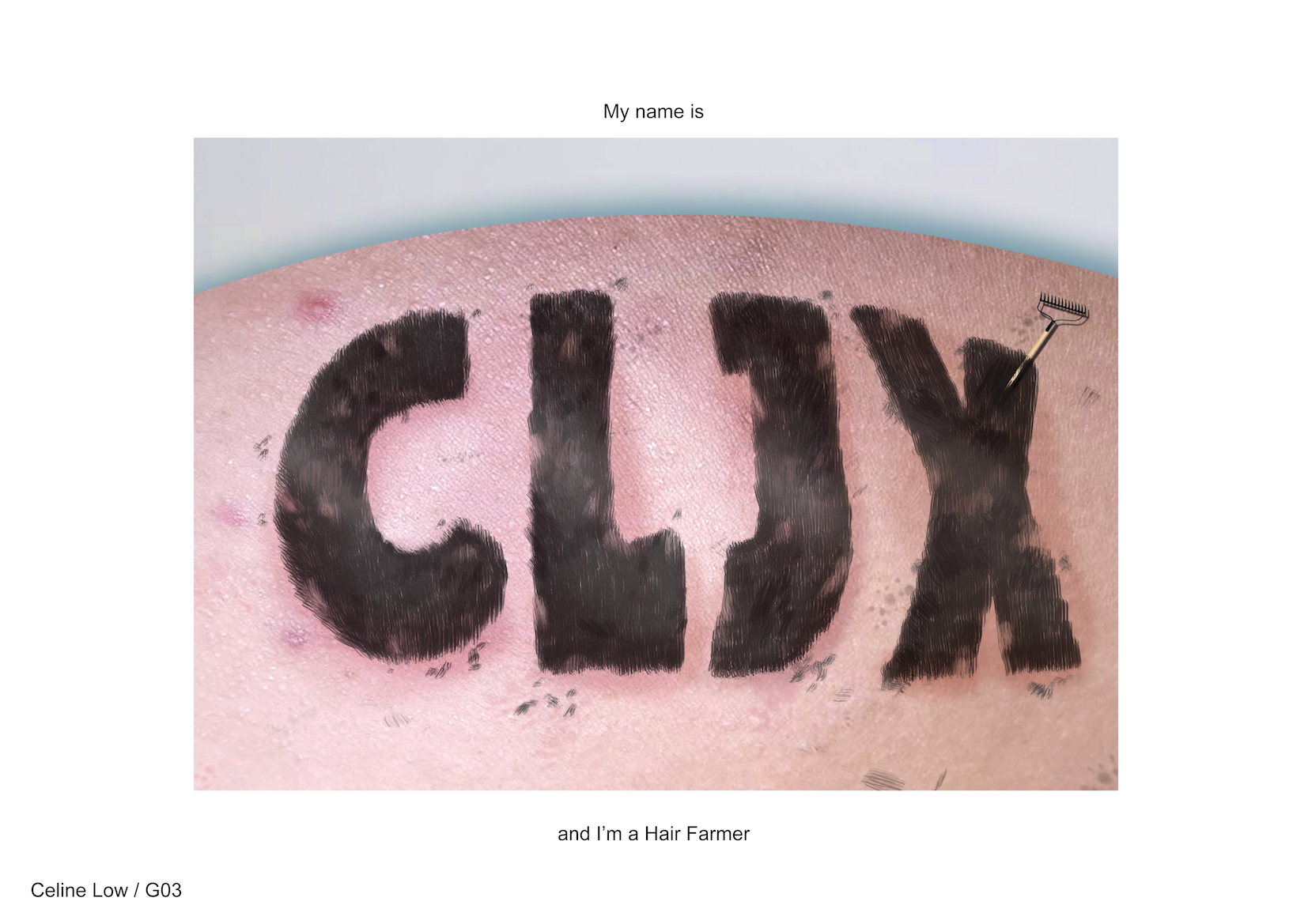
Final piece. It still looks gross to me, and friends actually got goosebumps looking at it. Credits to my brother’s back 😉
The texture of the skin was provided by my darling brother going through puberty right now. 😉 I used his back and he had pimples so it was perfect. I curved the image, adding a drop shadow for a more 3D effect, and used a hair texture brush on Photoshop to carefully trim nice hedges of hair. I also added stray pieces like how it would look when people cut grass/bushes. A rake was then stuck into it for semiotic purposes, like it was left there after a long day of work.
Neurologist
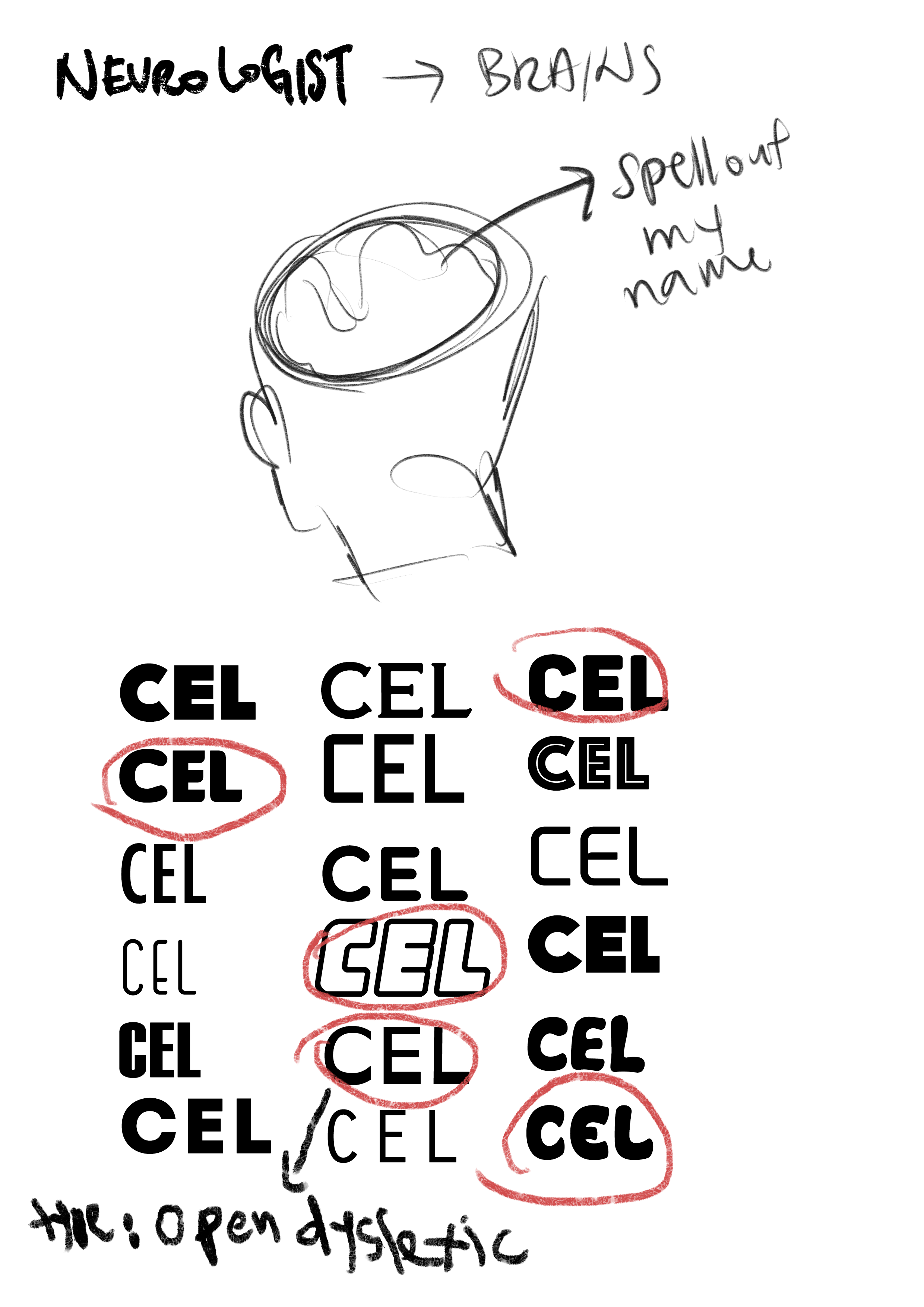
This piece took awhile for me to figure out. I basically wanted to specially form the brain matter into my name. Shirley then suggested that the letters could be “cut out” of the head instead, so that whatever negative space was going to be bald head. I wanted to use the font Open Dyslexic, because I love the irony of using that with the job neurologist.
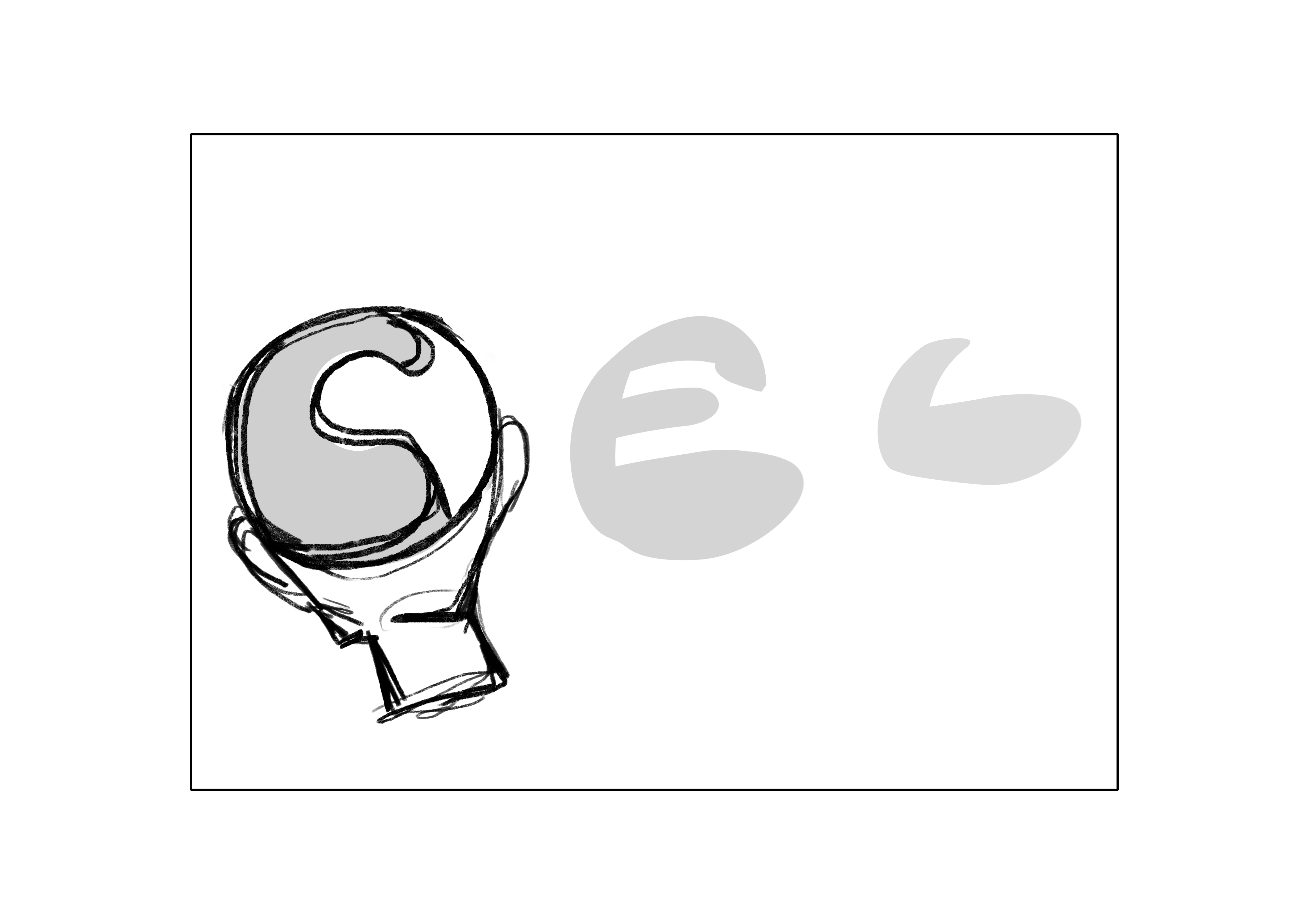
First draft. Used another font for this.
In my first draft, I had difficulty creating perspective with the heads. But the idea was more or less there. The heads would look simple, whereas the brain matter would be more on the realistic side, with bone and meat being seen along the ridges.
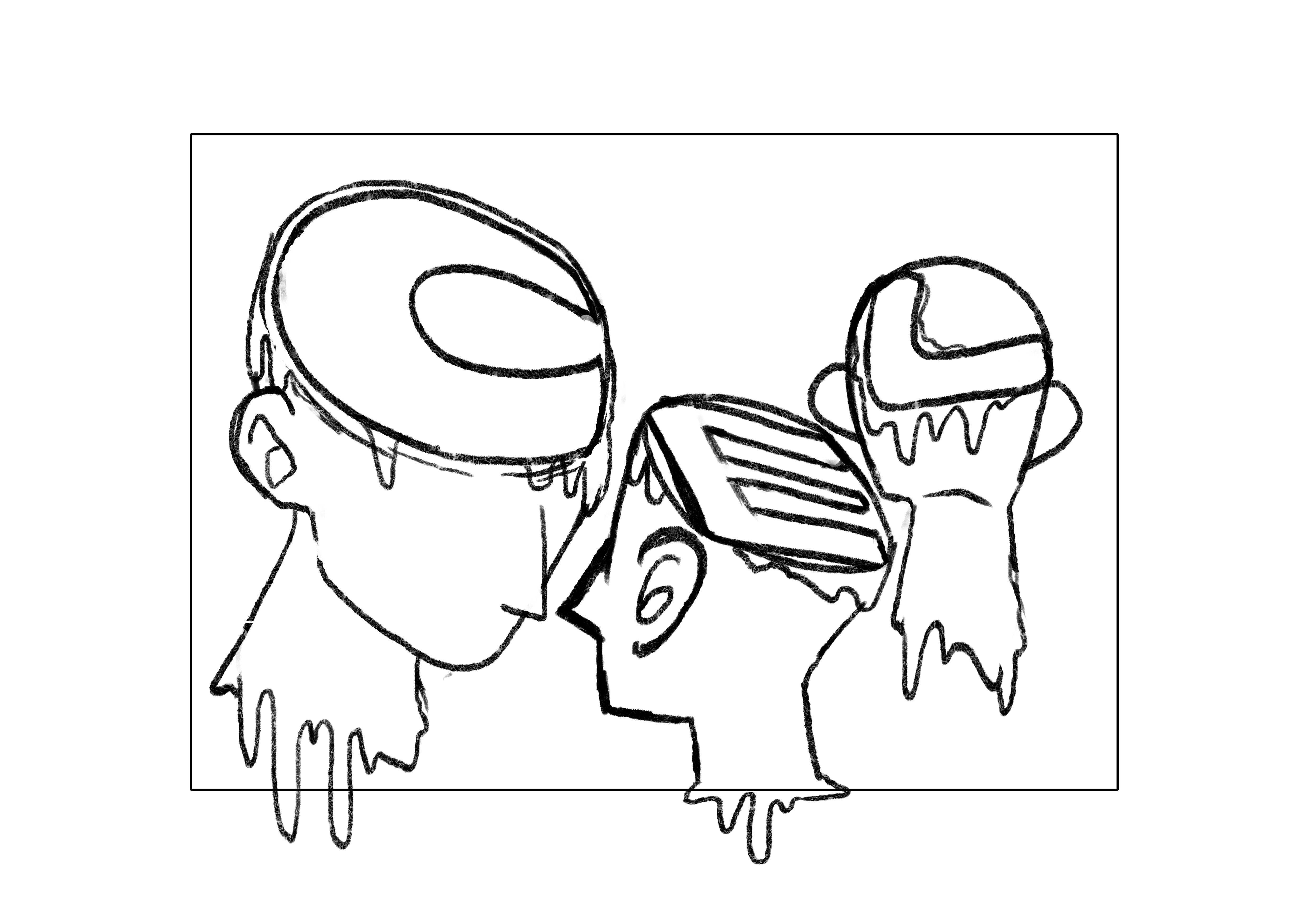
Second draft.
I then tried creating perspective with the heads, putting some heads in front to represent the first letter, and having them smaller as a sense of continuity and harmony. After consultation, I was told to further simplify these heads by removing the necks and I took away the dripping goo.
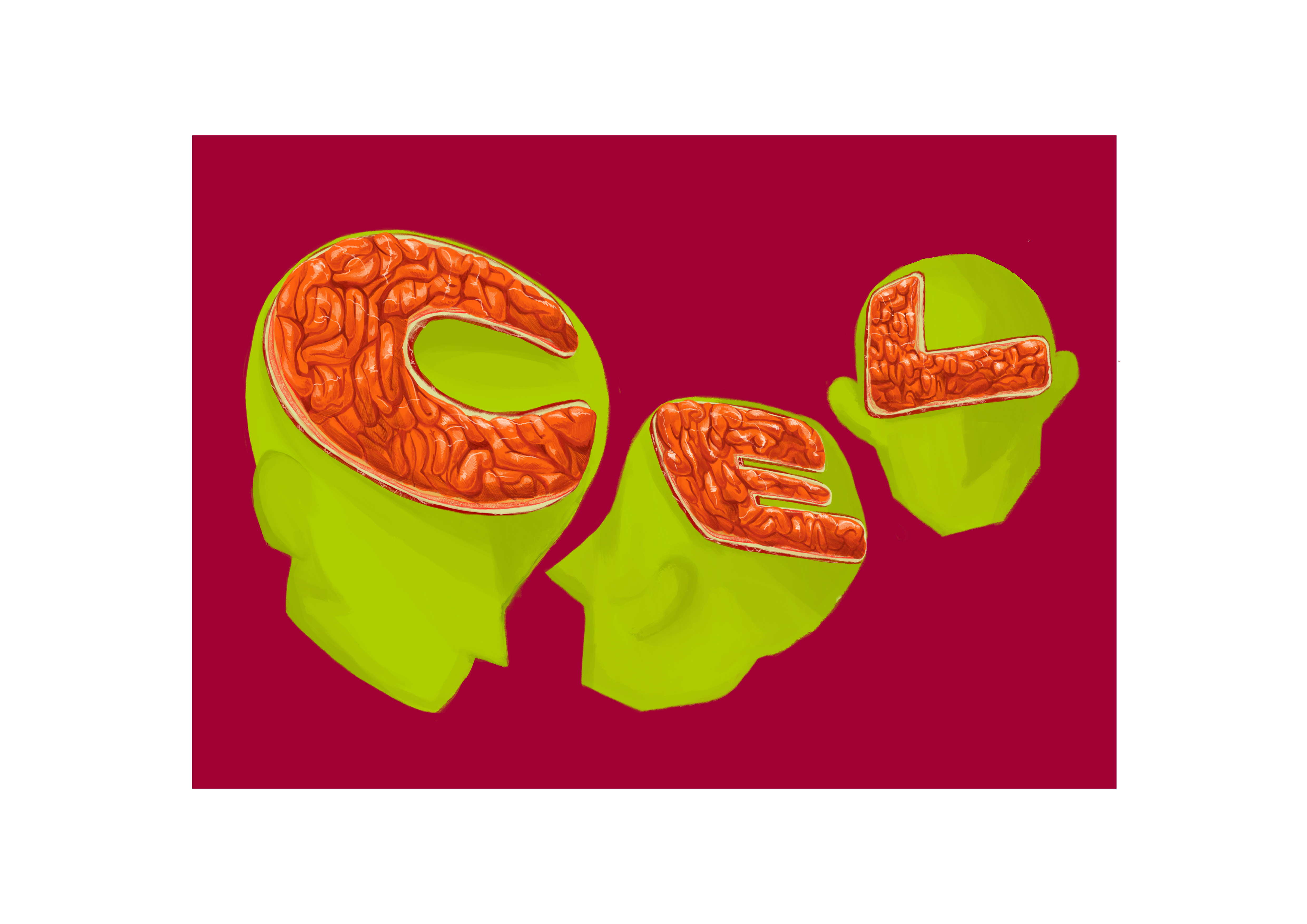
Concentrating on painting realistic brain matter, but giving it a slight sense of surrealism.
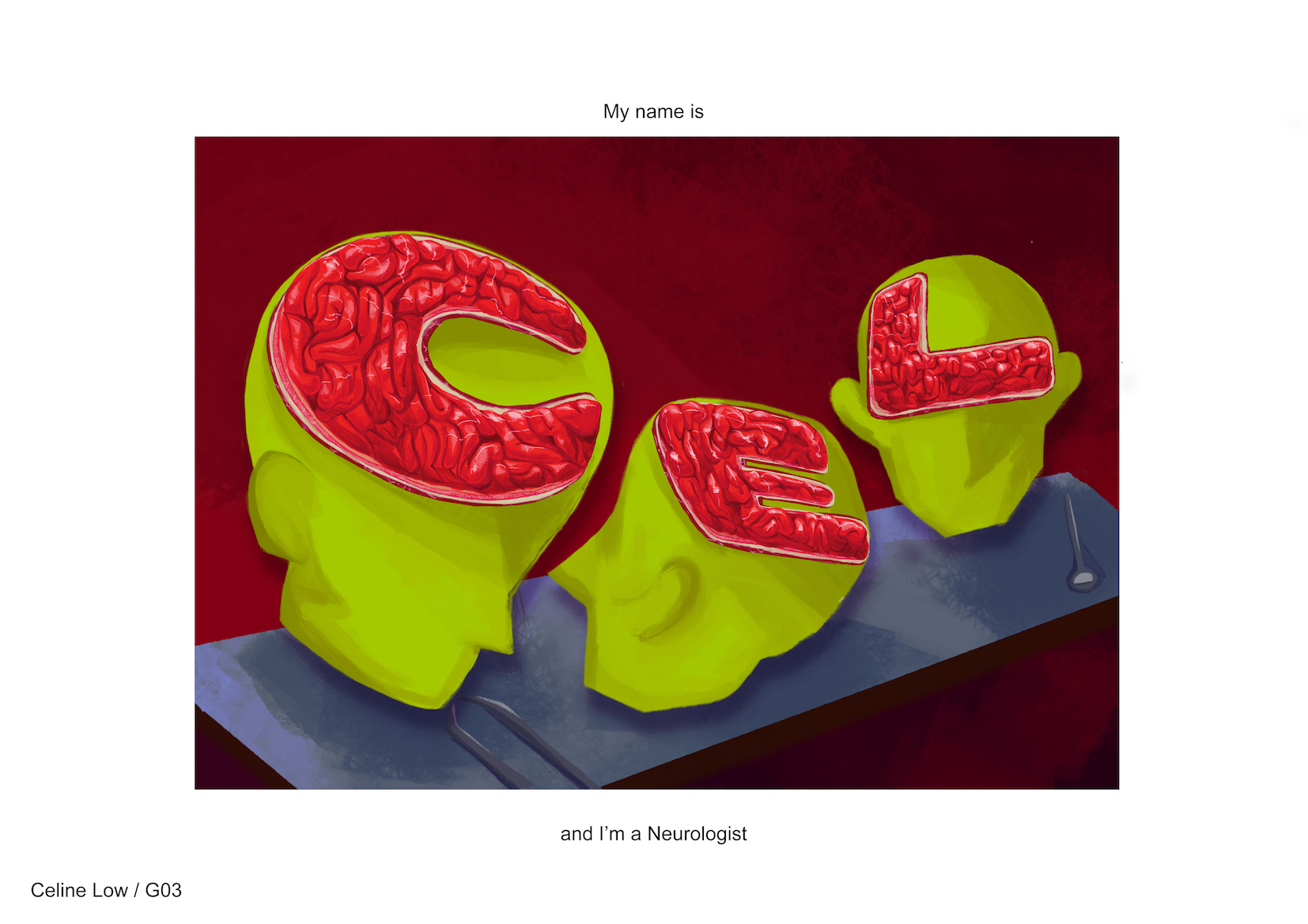
Final piece.
I added some surgery tools on a surgery table, giving it a dark background to concentrate on the visceral effect the brains had. The colours were also brought to the basic three, red, blue and green. I wanted to use green for the heads to represent a more surrealistic look, using the red background to represent blood and a blue table for how most surgical places were mostly clean and cool and metal-like.
Some of the difficulties I faced was trying to decide if I could finish all 4 pieces on Illustrator — I could not. HAHAHA. But I’m honestly proud of myself to have created two of them entirely on Ai, and I’m glad they were well-received by friends and classmates alike. One of the things I learned from doing this was really staring at the objects that I wanted to use. For example, dreamcatchers are surprisingly hard to capture, but once you do they are really intricate and beautiful pieces. Another example would be for the neurologist piece, I had to stare at brains for really long, and realise they look like chee cheong fun. All my friends wanted to eat my artpiece. I don’t know whether to be happy or confused.
Usually my artwork involves a lot of messy lines and paint and in general, I was not used to how formulated my art was with this assignment. But I am still satisfied with the result, because never have I seen such a structured art work come from my hands. I guess this was what I wanted to see, by getting into design art. But I also hope to be able to make use of my messy illustration style in future pieces as well.
Recent Comments