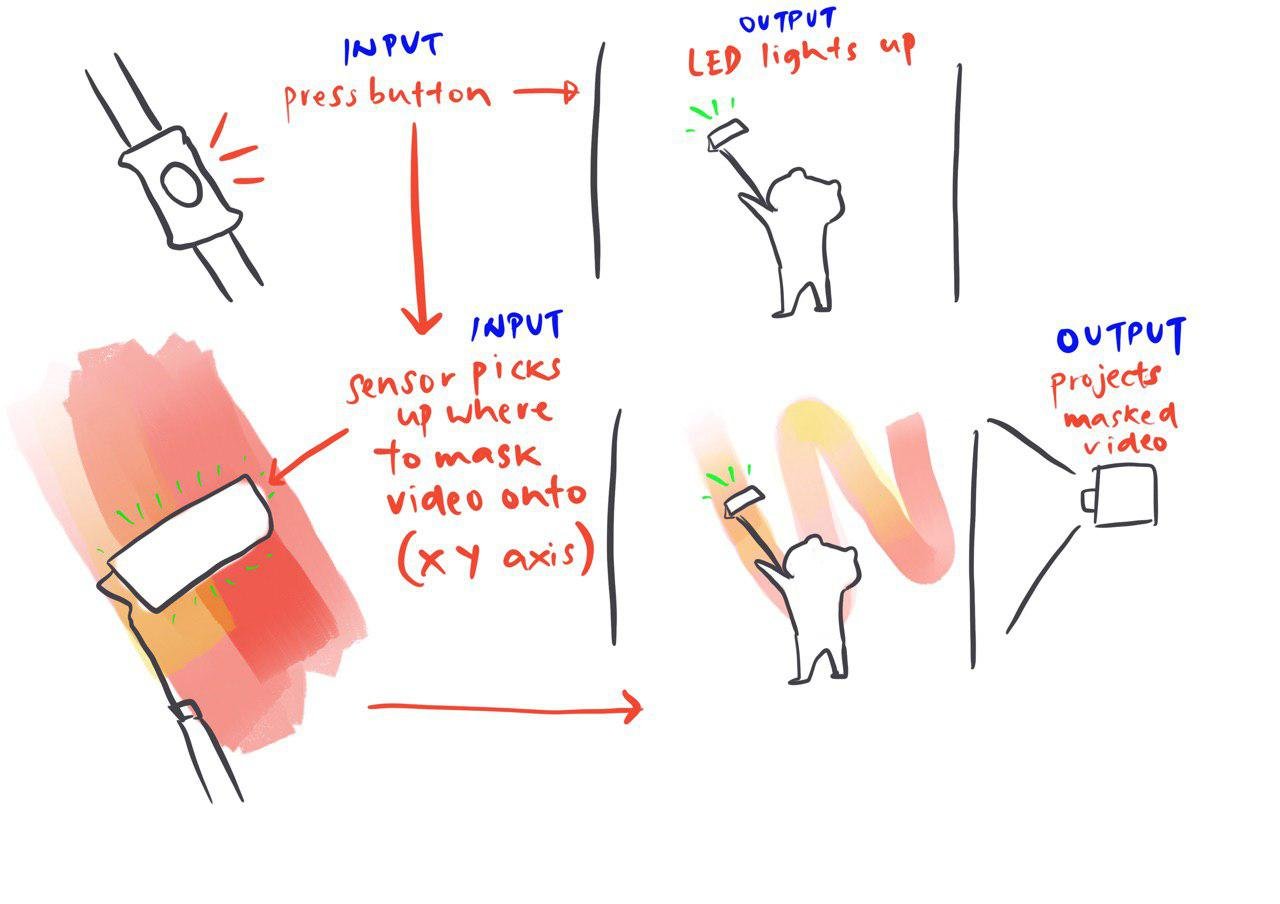
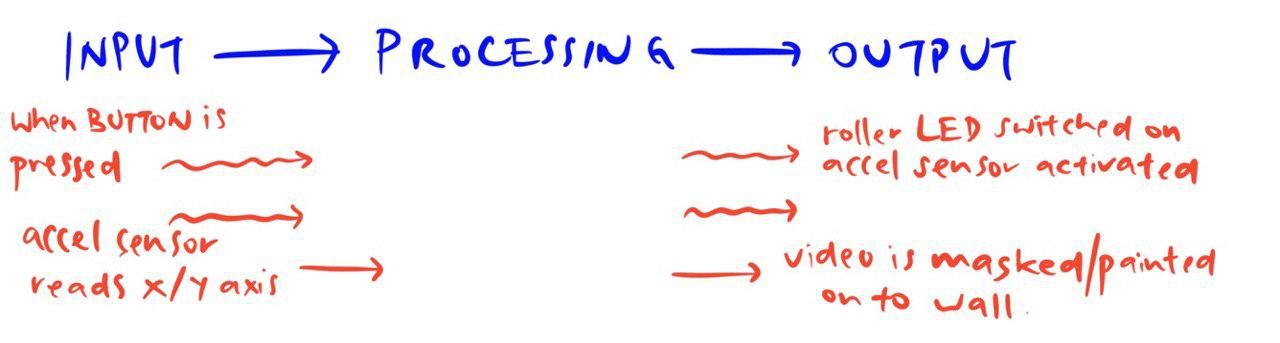
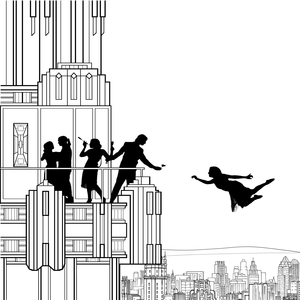
Category: My Work

Siah Armajani // a reflection

Upon entering the exhibition, I was not really expecting what I saw. Was I allowed to touch anything? Why were there pencils sticking out everywhere? Why is everything wood? What is going on? What the heck is a tomb shaped like that? This is a reading room? Can I read these books here?

There were so many questions, but if I had to put a thought as my first impression, was that it mostly looked like a kampung. The simple shapes, the wood, the specific green that screamed old. I would have thought that these were all pieces meant to be outside, but it was mentioned to be for a reading room. Again, unsure if we could go into these spaces, these tree house looking boxes, and was itching to do so just because lack of childhood, until they told us we could.

Aside from the nostalgia and outdoorsy-ness however, it didn’t make sense that they were for the outdoors. Realised the ceiling was full of holes, so it wouldn’t work as a shelter for the poor soul caught in the rain, or even shade away from the sun.

It was really from being in the spaces, sitting on those chairs did I really start understanding how they worked. The tour helped me understand it better as well. A space that was inviting, but also uncomfortably so. To read for a long period of time is a commitment, and one could not be too comfortable when reading. Everything felt like a sharp edge, you had chairs that could only turn 90 degrees and not diagonally to the tables, hard wooden backings, dark green and brown surfaces, weirdly shaped book holders, and yet, they felt ideal as spaces for reading. If I was made to read I would have gotten comfortable on my bed, and promptly fallen asleep, achieving nothing. This on the other hand, was a whole system of rules and directions, and in a sense, it gave me motivation to read, to act upon these rules and to achieve what was asked: reading.

The longer I was in this space, the better I understood it, and the more at ease I felt about it. Reading Siah Armajani’s manifesto helped me understand his thoughts for creating these spaces as well. For example, he talks about “public sculpture as not a artistic creation alone, but rather social and cultural productions based upon concrete needs.” He fulfills this purpose with the reading room, with how it is styled with basic material that indicates his culture, and directed in ways that socially affect people.

On the other hand, I was rather intrigued by Armajani’s video works. The fact that they were created years ago with his basically-oversized calculator, was very impressive. Simple with their messages, some of them created optical illusions, and I was really impressed by Line.

In conclusion, while I’m no expert in contemporary art, and really didn’t take away anything from his actual works, I did learn a few things from his manifesto, simple rules to think about when creating spaces. I think his art reflected what he felt of spaces, and I think it’s memorable to have his own rules reflected onto his art.


2 ideas // interactive spaces

Toilet Sorter

When given the brief, I was mostly unsure about how I could show any sort of movement and at the same time, provide a sense of interaction between audience and art piece. I spent a lot of time moving around spaces while thinking about this, tracing my own steps and just by being in spaces. One of the spaces that I was actively thinking in most of the time was probably the toilet.

As someone with a terrible stomach, I spend a lot of time sitting in a cubicle, and it could be what is often known as the second home. You have a toilet at home, you have a toilet outside, same thing.

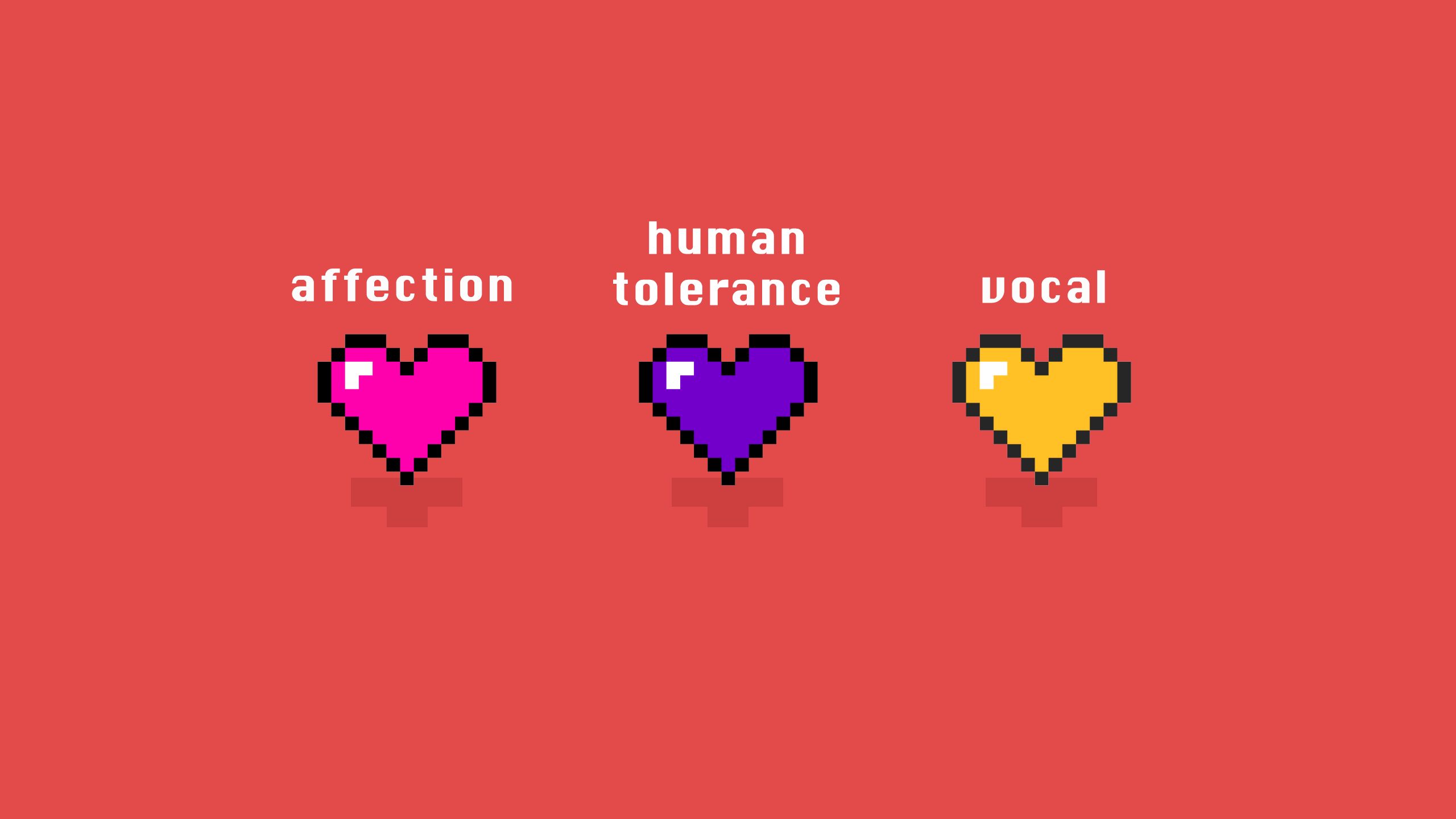
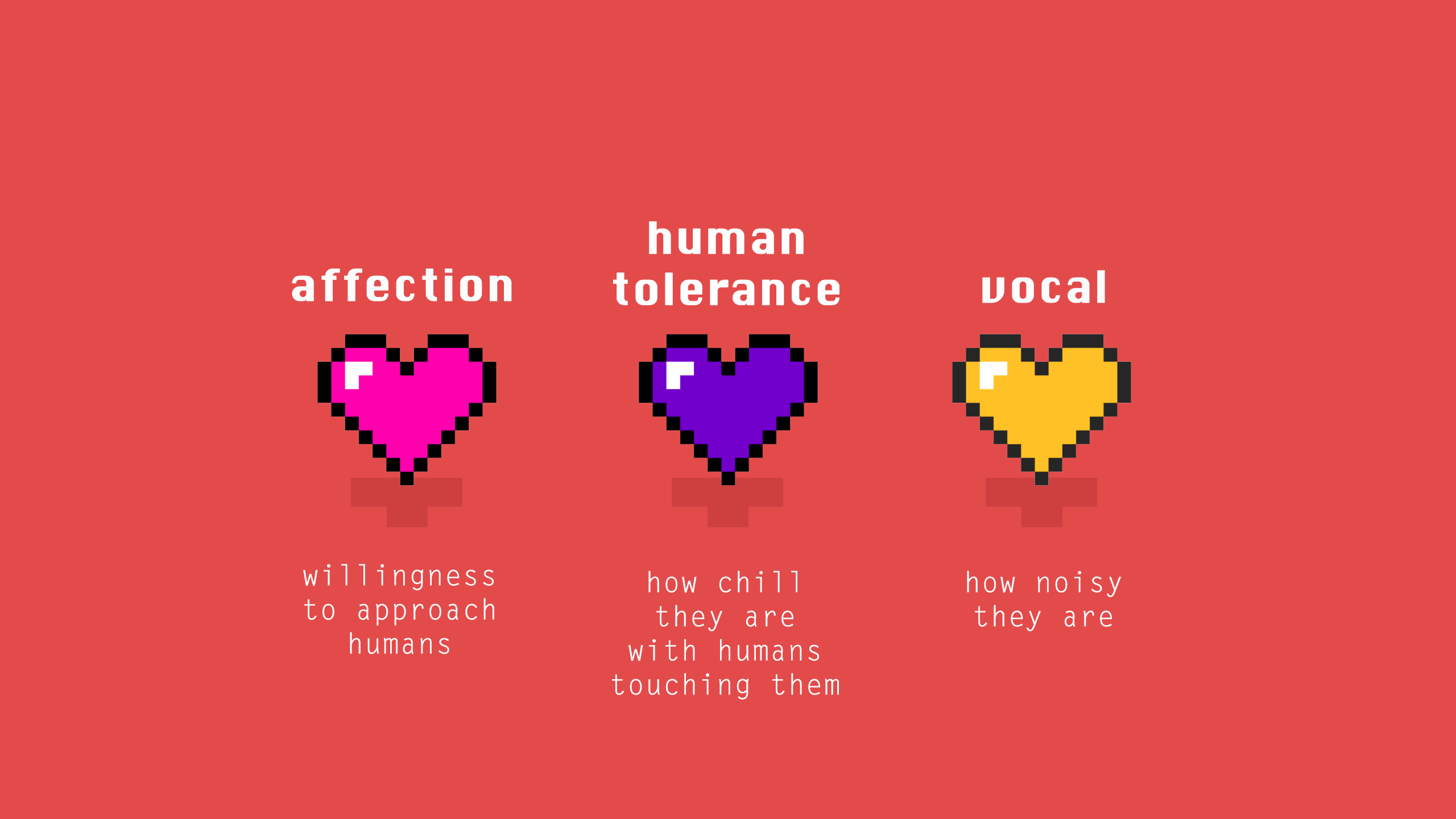
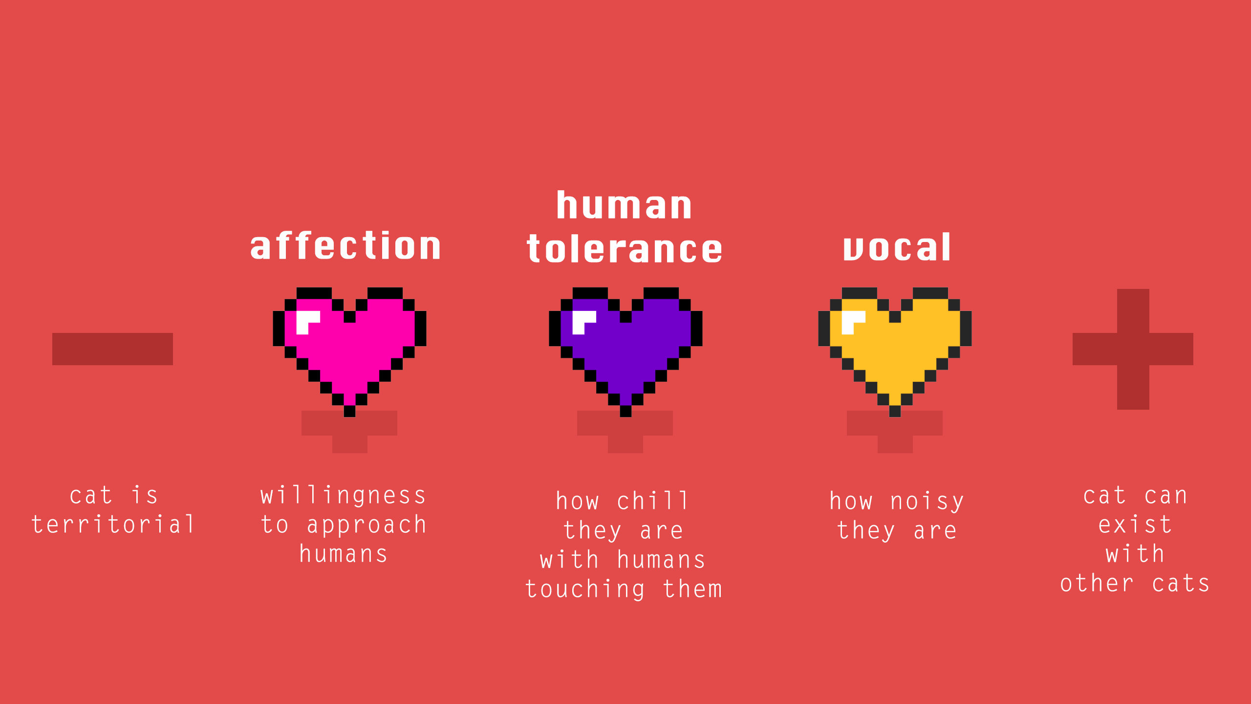
But it is not a thought often shared by everyone, and even I, as a person who frequents toilets, have preferences. I would call myself a toilet connoisseur if there were such a thing. Mostly because I enthuse about toilet paper textures, lighting, space, cleanliness, TP top up frequencies, you name it. I even have favourite cubicles within spaces I frequent and no, I’m not sharing it. One of the most important aspects to a Good Toilet is probably cleanliness, out of the many other factors. It is observed that a dirtier cubicle would not be used. I would say there is even a whole psychology to it that I’m not too fond of going through in detail. But here’s the gist of it:

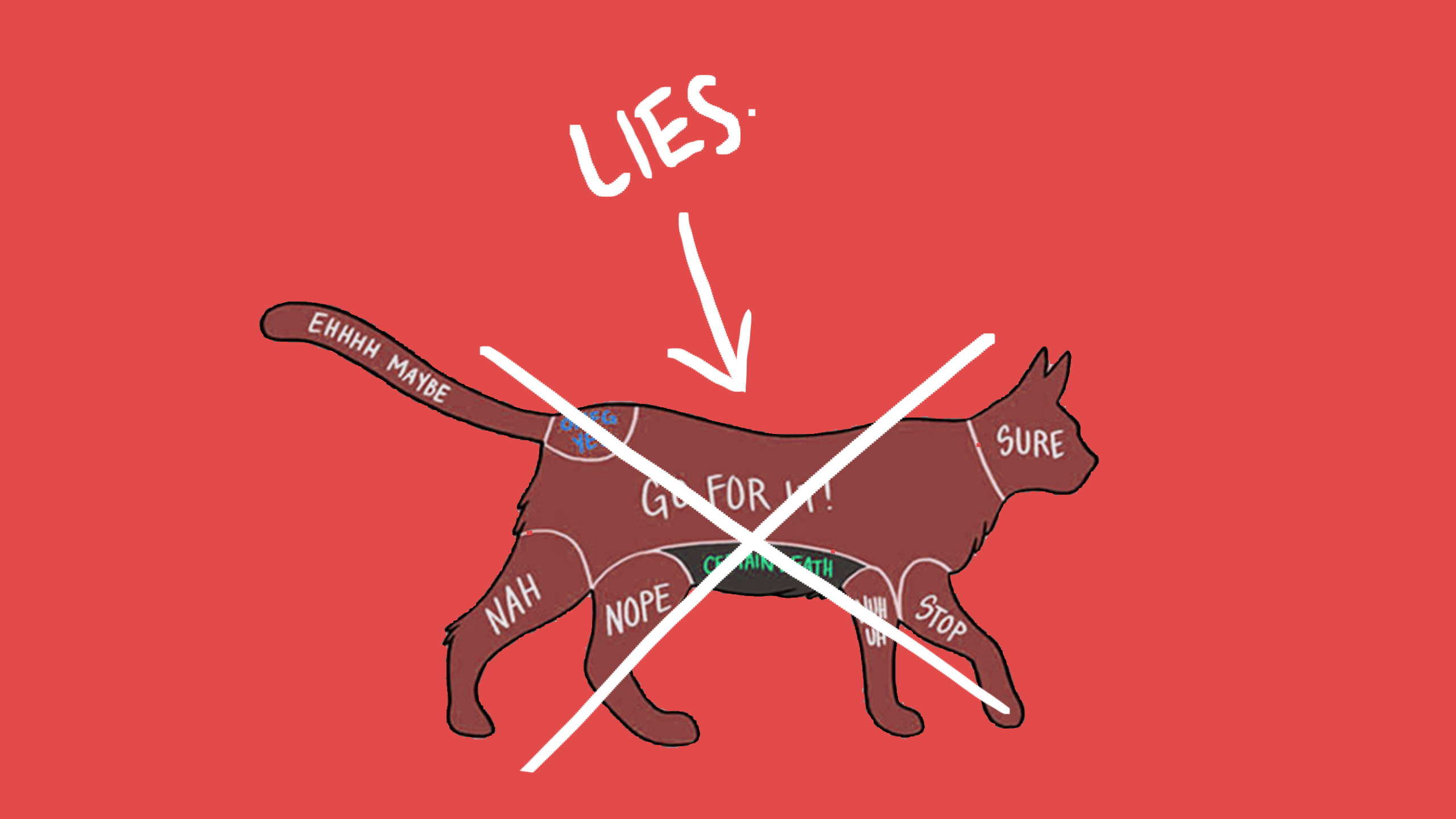
You find three cubicles: one with a wet floor, one with no TP, and one with tissue not flushed, but the seat is obviously way cleaner than the other two. What do you do? What I’d normally witness is someone grabbing their own TP from any other place to use the one with no TP, followed by someone using the wet floor cubicle and then nobody enters the remaining one, not even to try to see if flushing works. It usually means someone has been there, but probably not many. See? You can tell!

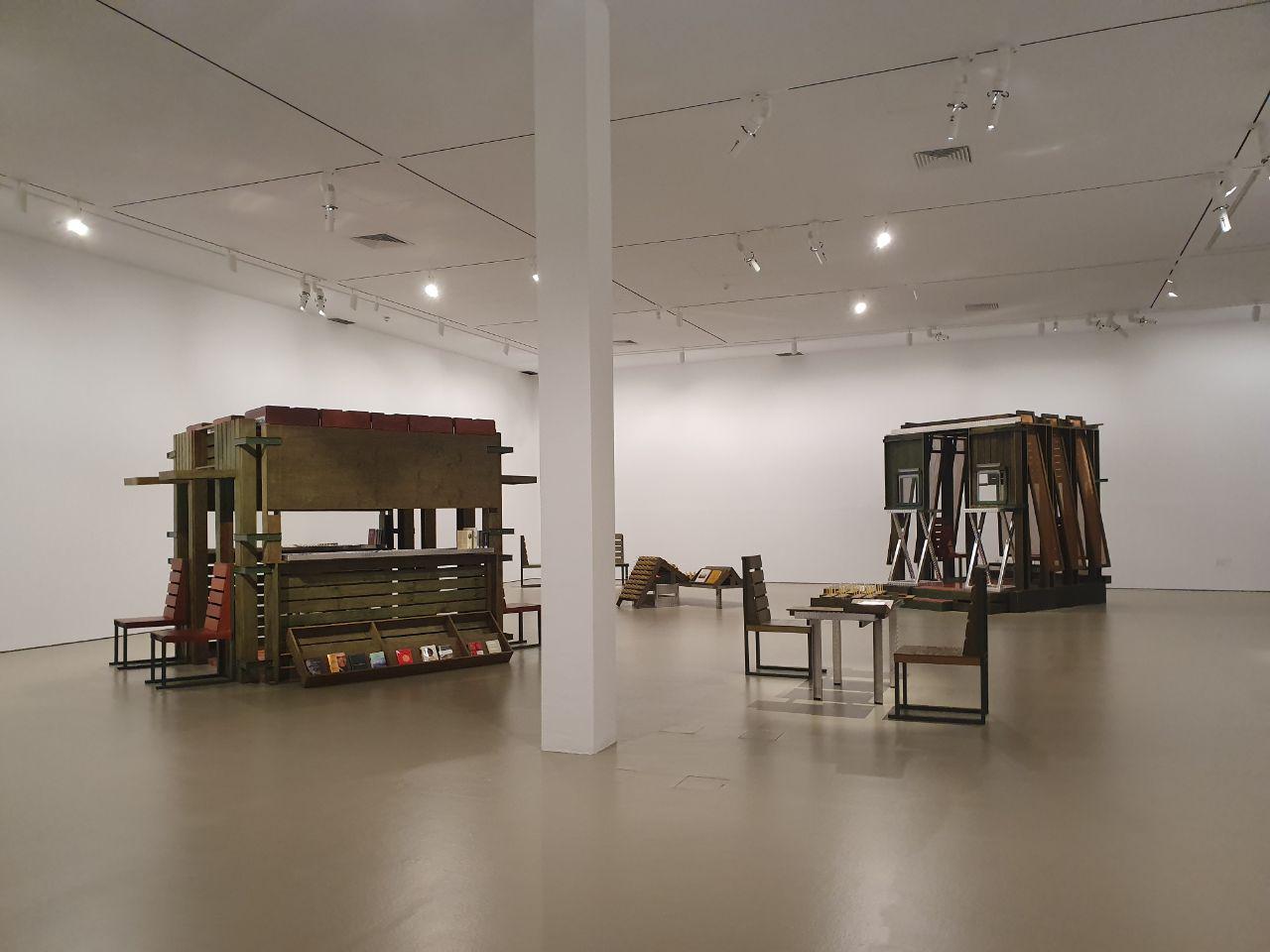
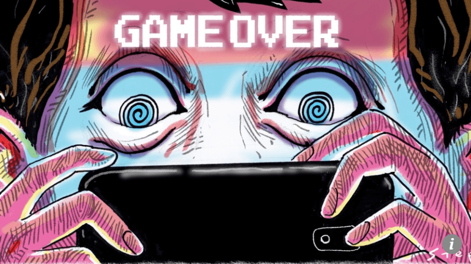
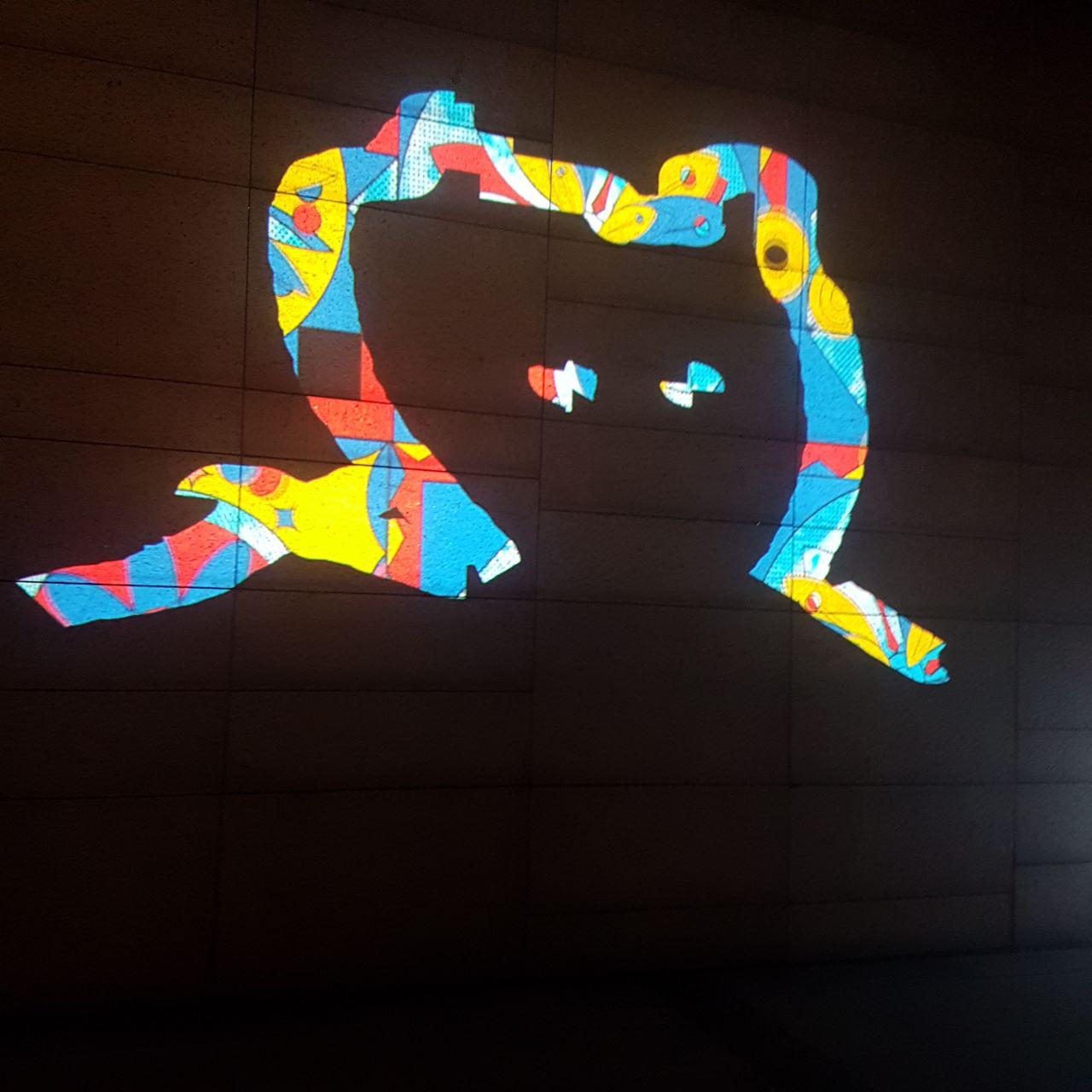
So back to my 1st idea: creating a series of used toilet cubicles for people to choose. Think of it as a statistics thing, a psychological test if you might. It will basically work like a sorter, which is basically a popular online “game” where one decides on their favourite objects/characters (mostly of TV shows and games). For example:

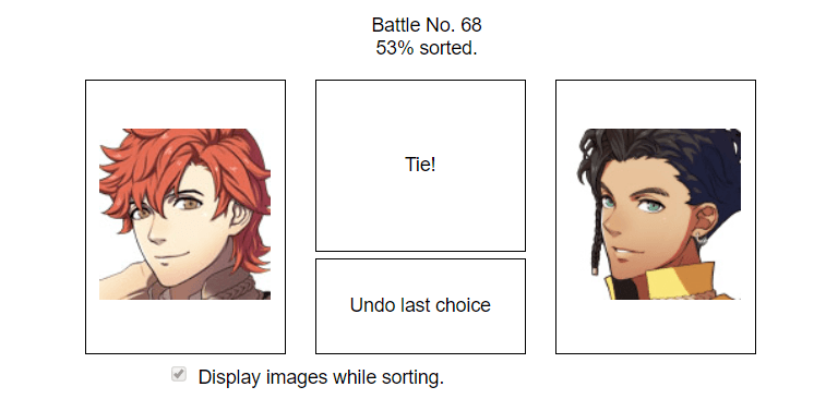
Retrieved from https://fesorter.tumblr.com/. Also I am sorry for anime men.

The participant picks between two different objects in a “battle”, and the system sorts it all out until there is a final winner.

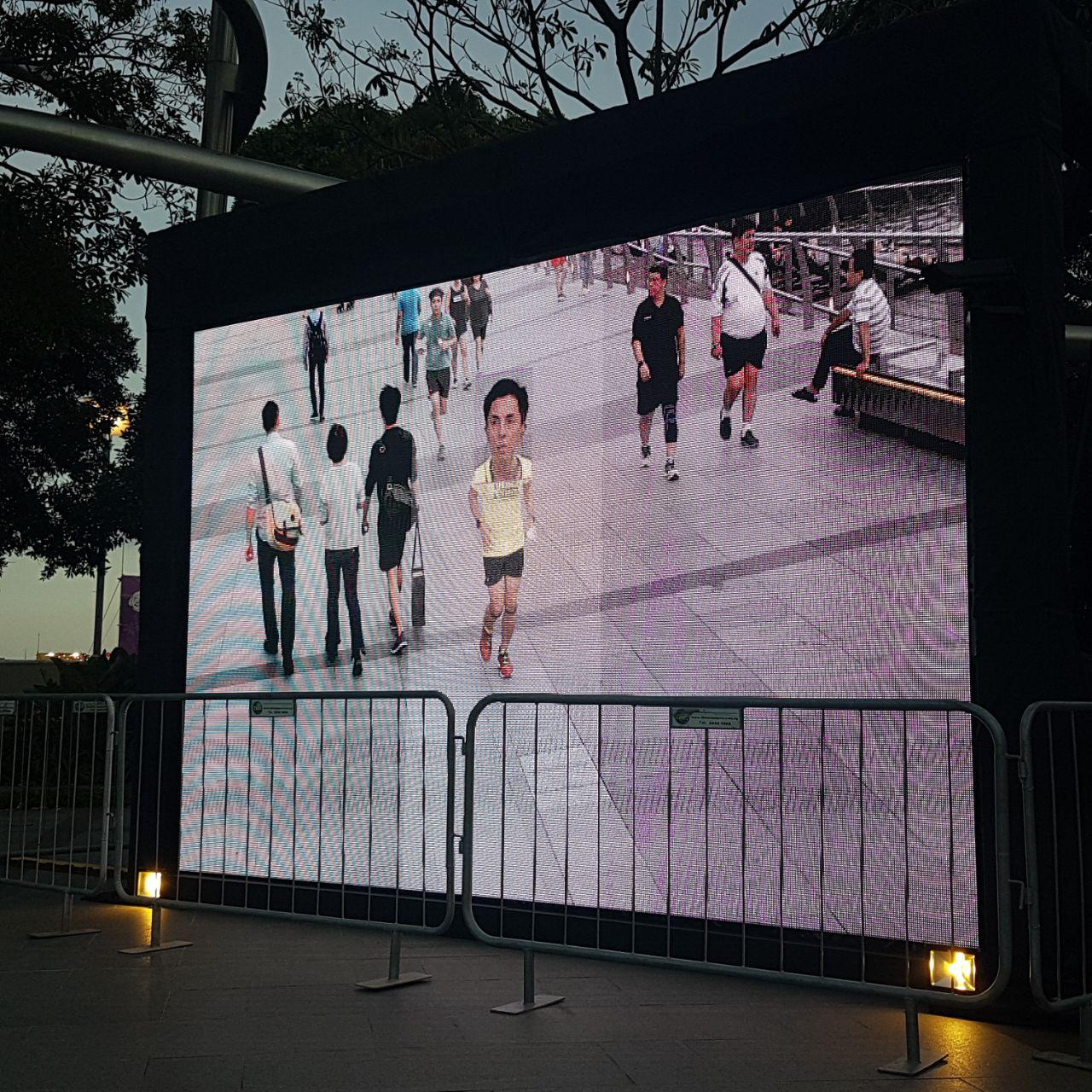
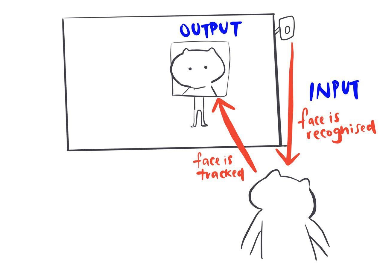
For my idea, I wish to create a screen, preferably big and extremely daunting, with two sides similar to what is seen above (just without a tie or undo choice). These two sides will showcase images of toilets with Threatening Auras, so for example, we’ll have 2 images of 2 different toilet cubicles, and participants have to decide what sort of space they will prefer to do their business in.

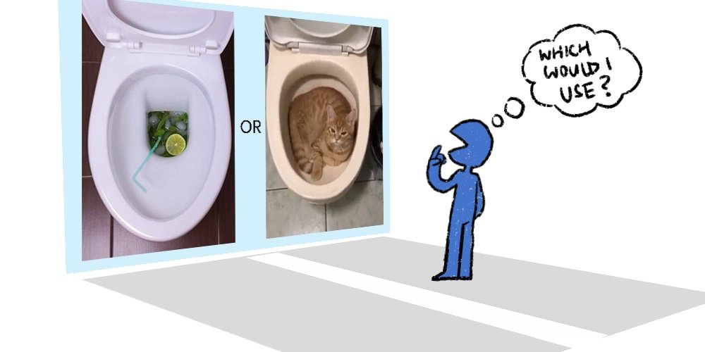
images are taken from twitter @scarytoilet (Toilets With Threatening Auras)

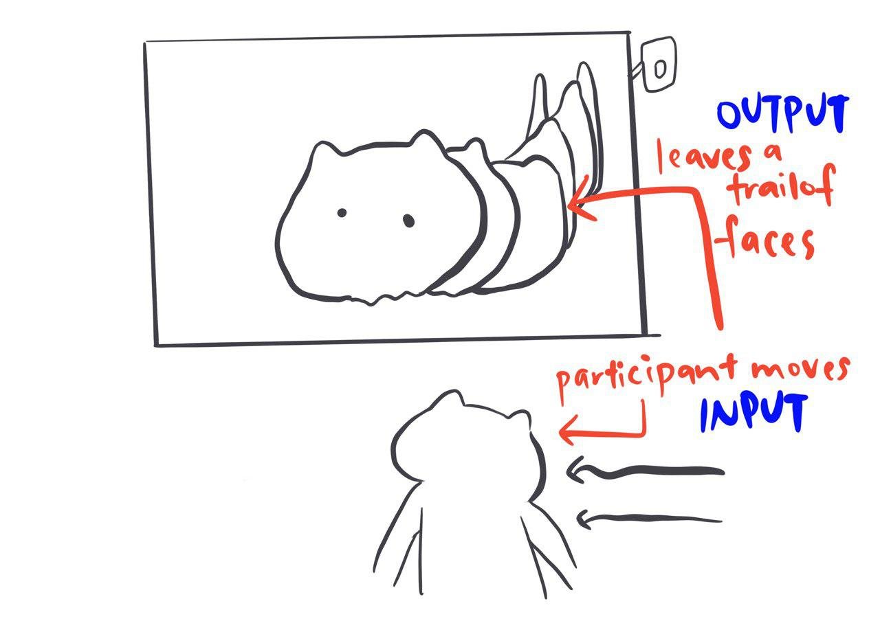
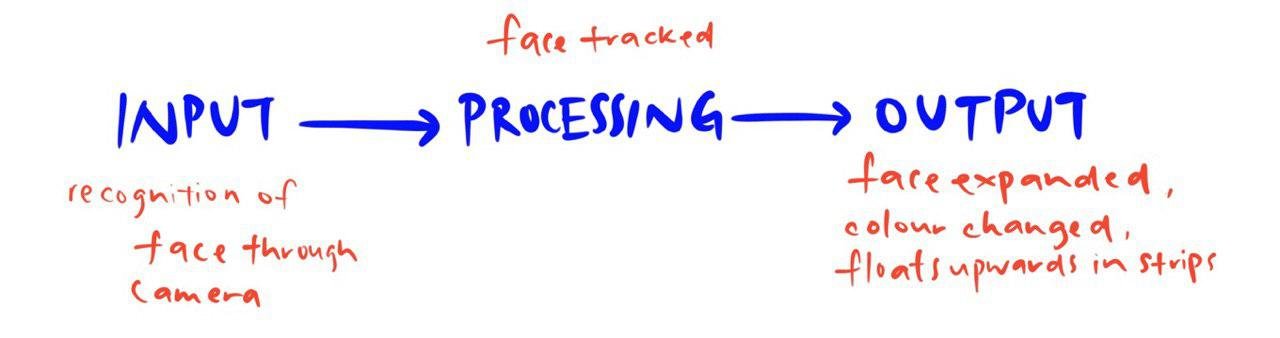
Assuming this is placed near a toilet, where most people only visit once, they walk towards the washroom, and then leave to go about their day. They will see this screen, decide on a toilet by stepping on a spot for longer than 5 seconds and leave.

The chosen toilet will remain, and a new toilet image will appear to be the next contestant. This continues throughout the day, with different participants choosing a preferred toilet. If many people decide to try out the sorter, results will show a winner toilet. That will be the toilet with the most people choosing, or “going to”. In addition, there will be runner-ups, since sorters act as a poll when they attain enough results. Alternatively, the poll does not achieve any sort of result, which shows that nobody stopped by.

This shows the movement of people in two different ways: which types of toilet which will be Most Visited, and whether this toilet sorter is even looked at to begin with. It’s something more provocative in nature, and probably disgusting, but I think it is something we all think about subconsciously. Either that or I think too much about toilet culture, more than the average person (please prove me otherwise).


Call Out Cult (COC)

We live in a generation where the internet is essential to our everyday living, and a lot of our social interaction and news comes from the internet. When I was a kid my parents would always nag about putting myself online, because eventually someone was either going to find out where you live, or dig out your dark secrets and have them thrown out to the rest of the world for them to see. And they were very right because “call out culture” became a huge thing in the 2010s. There is probably a different term for it for similar things that have happened in the past, but it is a common term used now, usually because of social media.

According to Wikipedia, call-out culture “is a form of public shaming that aims to hold individuals and groups accountable by calling attention to behaviour that is perceived to be problematic”, and this is usually on social media. There is also a variant of said term, called “cancel culture”, which is “a form of boycott in which someone who is deemed problematic is ‘cancelled’.” Often times it is the result of naive mistakes, or decade-old tweets. Here’s an example of how exaggerated it can be:

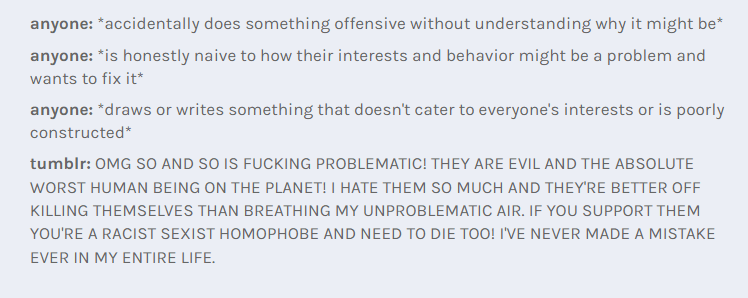
The people who instigate call-outs often “pull out receipts”, mostly consisting of screenshots of problematic content, or links to threads of said problematic content. Sometimes it goes as far as to doxxing (having private information published on the Internet), and often times these people who instigate call-outs believe they did nothing wrong.

So for my second idea, I thought about the idea of “airing dirty laundry”, and was very inspired by art that used clotheslines, such as this series of installations by Kaarina Kaikkonen.

Retrieved from https://mymodernmet.com/kaarina-kaikkonen-clothes-installations/

Retrieved from https://mymodernmet.com/kaarina-kaikkonen-clothes-installations/

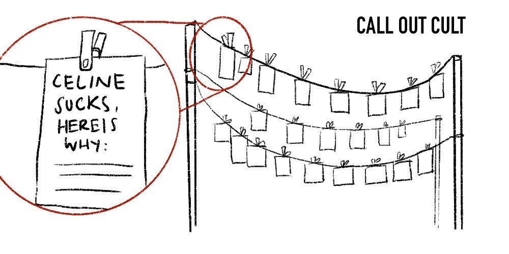
To call someone out is to basically air their dirty laundry, to trace out every single footprint they have done to be hung up for all to see. So my idea was to basically have a clothesline with call-out posts put up using pegs. Participants can hang up call-outs to someone they know, it can be as ridiculous as not liking your mother’s cooking, or something serious in the political setting. Everyone’s call-out posts would be placed on the clotheslines, and for anyone to view. Receipts can be written as well, to solidify your statement.

While there is no visible body nor movement in the artwork, it provides a history of call-outs, and these all tend to stay for a long time, and can only be made by humans. I would also think of it as a sort of installation that would make anyone either ridicule how dumb some of these call-outs would be, and question the culture of calling others out for their own selfish desires.


Future You


Retrieved from https://www.dexigner.com/news/32131

An interactive piece that I found interesting is “Future You” by Universal Everything. It is a digital interactive installation that “replicates” the human, into a sentient synthetic form. This form is mostly blob-like in nature, and whenever a different participant stands in front of the installation, the “reflection” changes, showing a new synthetic form, to represent this new participant.

While the installation is relatively simple in its interactivity, it converts one’s being to another form, giving one a sense of new, or uncanny identity. This can be perceived as a mask, or a projection of how one would be in the future.

The artwork is presented in Barbican’s AI: More Than Human exhibition, as the first thing that the public sees when they first enter. It acts as an introductory piece  to the exhibition that focuses on artificial intelligence and its predicted future, an interactive reflection of the future self. To me, the piece feels like a portal to a new future where one’s form is no longer “human”, but given a futuristic version of themselves to fit into this new world where AI might play a more important role than it does today.

Retrieved from https://universaleverything.com/projects/future-you

The screen acts as a mirror, the reflection  captured by a camera facing the participant. The camera detects various parts of the human body, and follows a rigging system attached to a variation of the reflection, then projected onto the screen. These reflections then mimic the visitor’s movements. These reflections start off as primitive, and then learn to adapt from the movements of visitors, creating a more “superior” version of themselves. Through this evolution, it generates a new visual response for each visitor, and apparently there are 47 000 variations.

Retrieved from https://universaleverything.com/projects/future-you

From what I have observed in the videos documenting audience feedback, many visitors were very interested in the project, as it was a very personal and unique experience to each and every one of them. A lot of them participated willingly through exaggerated body movement, children and adults alike.

Retrieved from https://universaleverything.com/projects/future-you

Retrieved from https://universaleverything.com/projects/future-you

The given context made a huge difference to how the project would be perceived. As someone who was aware that the context of it was an installation in an exhibition about artificial intelligence, I perceive it as a piece of work questioning this identity of artificial intelligence as it mimics life. However, should it be placed in a different context, it could mean something else entirely, or simply not have any meaning attached to it, and just be fun-driven. The ability to interact with it in a space curated about artificial intelligence gives it a sense of importance and message, I feel, that cannot be replicated in a different environment.

Principles of New Media

My Interactive 1 project is a group work with Azizah, a button-smashing game called Speedy Ecky Smashy. Our concept is inspired by arcade games like Bishi-Bashi, which is a competition of speed while pressing a few buttons repeatedly. What changes is that we want to talk about the disparity between people with a higher socio-economic status and those with a lower socio-economic status, so in order to do that, our game would be “rigged” in such a way that only one machine can win very unfairly.

1. Numerical Representation

Upon reading the Language of New Media, it states that “all new media objects, whether created from scratch on computers or converted from analog media sources, are composed of digital code“, which basically means that it is a numerical representation. This is mostly through the computer. In our project, we require digital code to make our set up work.

According to the Language of New Media, “converting continuous data into a numerical representation is called digitization“, which consists of two steps. Sampling of data occurs in regular intervals, seen in our project by the button being pressed. Each sample is then quantified, assigned to a numerical value from a range, seen in our project by the LED going on HIGH.

A new media object can go through algorithmic manipulation, making it programmable. This is portrayed in our work where we have to manipulate the code according to how unfair our game is going to be, how many button presses are required to reach a certain level before they get to win.

2. Modularity

When explained by the Language of New Media, it states that modularity allows “all elements to be stored independently, and can be modified at any time without having to change the “movie” itself”.  These objects can also be combined into larger objects without losing their independence. In reference to our project, our code shows modularity, as they can be edited individually without affecting the rest of the code.

Also, the code can be used with any sort of button or input that read things digitally, and likewise, an output that reads digitally. It does not have to be buttons and LED lights all the time. We can also add more output to the entire set up, or maybe even more buttons and it would still work the same according to the code given.

3. Automation

With the first two principles, humans can be removed from a certain part of the interactivity. There are many types of automation, and with our project I feel that there is not much currently, although we can implement more to it. For example, an arcade game will reset over a period of time automatically, for a new participant to play.

Or having the light constantly move when it is not in used, like how it is done here.

4. Variability

Variability is when a new media object can become a different version, often automatically assembled by a computer, which makes the principle of variability closely linked to automation. Variability is not possible without modularity, as the elements have to maintain their separate selves and be assembled into various sequences for variability to occur. I feel that there is variability in the way we can take away or add elements to our project with the help of modularity.

Variations that we can add can perhaps be coins added into the machine dictating the next part of the narrative depending on how many coins are added. Automation occurs when deciding on which machine received more coins, and will label that machine as the “richer, more privileged” individual, and give them a advantage when the buttons are mashed, letting the participant win easily.

This is a project that makes use of several buttons and an arduino, but can be played differently, showing various variations while using the same modules.

The participants can also change the variations of our project by deciding to play all the way, or to find out different ways to perceive the game.

5. Transcoding

Based on the fact that to “transcode” something is to translate it into an other format, the assumption is that in our project a physical form of using buttons is translated into digital code,  and then out through a physical form again using LEDs and sound.

When talking about the cultural vs computer aspect, we as the artist, make use of this code to transform this analogue format. We take a simple game and put meaning into it (disparity).


week 3: Stylized Self Portrait // process + final

The first assignment for Illustration for Designers was to create a stylized self portrait. I was kind of glad that it was stylized, as I was never really fond of my face. I remember creating a self portrait for class in foundation year and well, that did not go too well. I was relieved that realism was not something encouraged, because I, for the life of me, can’t seem to draw in a realistic way ever. Not to mention to pick out every single flaw on my face when doing realism? I’d rather fail my assignment, which I think I did.

However, as it was a stylized project, I thought I could skip out on drawing a face entirely. You know, because you never actually see your face ever. But I realise we had to actually have something representing us in the piece, preferably with a face. I couldn’t escape it, could I? I decided that my art had to reflect who I am as a person. While I did make an extensive list of things I liked, I felt vulnerable as a person, and as an artist, I wanted to make use of that. When I am nervous and shy outside, I tend to look at my phone a lot and immerse myself in the digital world to avoid talking to people, or to quickly pass time before I can leave. So likewise, I wanted to show that in my work, of being a closed-up individual who would rather drown herself in a screen than deal with the complexities of human nature. At least there is a face now, even if it’s distracted by a phone.

I had several other concepts as shown, one with a laptop head instead, because if I am not on my phone, I am probably on my laptop. It was kind of the idea of being a clam, with how clams could just shut themselves in. Yep, I am an introverted clam. Cliche. On the screen of the laptop sits my actual face, as I work on a computer for my studies.

Thumbnails

When I first started on the thumbnails, I thought it was rather necessary to give a sense of… Bust-ness. The idea of being able to see face and neck, and well, whatever else I can show that was similar to a statue bust.  But upon showing Lisa my idea, she showed me an artwork by Craig Stephens in an article about phone addiction (ain’t that fitting). It shows a very closed up image of a person looking a their phone, with their eyes seemingly hypnotised.

Retrieved from https://www.scmp.com/comment/insight-opinion/article/2130139/switch-smartphones-save-children-tech-addiction

Many of my classmates said that the top left image seemed like it was something from a storyboard instead as well, rather than a self portrait. With that in mind, I made the other thumbnails closer in composition. I went with the middle-left thumbnail as my go-to draft, and started working on a bigger piece. I wanted to show off my nose I guess, because many have defined me as someone with a pretty non-button nose. I felt like it was just huge and a part of my face that was hard to miss.

I also added glasses, because I’m basically impaired without them, and also gave me a good reason to not draw my eyes (they are puny enough as is). I could also add a little bit of details of what was on my phone screen too.

Done on Procreate.

As I started drawing, I realise I did not know how much to show in the portrait, as well as how reflections worked against my glasses. I thought it would not be too hard to try snapping a few references, even if I had to deal with staring at my face. I used my iPad to take these pictures, so I could hold my phone up to my face as a gauge of how it would look from such a low angle.

Pardon my face. And huge nostrils.

I did not like how the phone looked in the shots, because it was just kind of… there. So I decided to rotate my phone so my fingers were visible and one could tell that I was holding a phone.

I was playing a game while trying to get this shot. Proof that my concept is Legit.

The references helped a lot with deciding how I looked. I could just take the important parts (phone, glasses, messy layered hair, big nose) and throw away the parts I was slightly more insecure about, right? (That’s Everything. I am insecure about Everything.) I started doing a rough sketch of how it would turn out. During consultation, I mentioned that the vibe I was going for was going to be more Gorillaz. My art as a teen was very inspired by Jamie Hewlett’s sketches and art of Gorillaz, and I wanted to try emulating that into my work again, through the strokes and colours for my self portrait.

Retrieved from https://www.edmtunes.com/2018/06/gorillaz-to-debut-new-album-the-now-now-via-live-stream-this-weekend/

Initial Sketch

Once I was satisfied with the supposed anatomy, I did another sketch on top of the draft. May I also note that I have shaky hands which is why my art can never be straight and nice. But that is fine, someone once told me that it’s special to me.

Refined Sketch

Once I was satisfied with the style, I lined over it again, with different line thickness, and added minor details. I wanted to give a sort of icky look to the entire thing, choosing to make my skin green (I know, similar to Murdoc from Gorillaz) and a colour that went well with icky (purple). I was contemplating between a complimentary palette, and this, but went with this for the more icky feeling. The green I used at first was more yellowish for a more sickly look. Why I chose to represent myself this way, was mostly because that was how I viewed myself, and to create a sort of cool, dark atmosphere, and warm colours did not do that trick.

Finalised Linework

Base Colours

While rendering, I found it hard to stick to the two colours at first, as I was not too good at painting and colours in general. But this was the final result.

Version 1, final.

After consulting Lisa through email, I decided to turn up the shine contrast on my glasses, and made more detailed reflections. I tried blending back to the purples and greens I wanted to use as well, as the initial glow on the hair was way too bright and did not fit well with the whole piece.

Version 2, final.

So this is my current progress. While I’m satisfied with my current result, I’m sure there would have been many more ways I could have done this better, or different. I’m new to the iPad even though I have had it for awhile now, and am glad I could use this opportunity in class to use it and test brushes out. I wish to do more conceptual paints on Procreate as I found it very fun to use, and I was very inspired by the many different stylized ways you could do portraits. I might want to work on some of the ideas I had planned out in my thumbnails in the future, and am satisfied to have been able to test/challenge myself even within this simple project.

Research Critique 2 – i Light Singapore 2019

Facey Thing

“But first, let me take a selfie.” These words from the viral #Selfie song characterise our current trigger-happy iGeneration and are satirised by Facey Thing.

Love me,

Facey Thing is a tongue in cheek interactive art installation that contemplates the seemingly innocuous selfie culture and its potential surveillance hazards. The installation is a large screen that displays real time footage from a black surveillance camera on the right. It is intentionally set up in an area with heavy footfall, meaning that even if you choose not to actively interact with the installation, you are still forced to walk by it and engage with it passively as you will be displayed on the screen. This underscores that even if one does not personally take part in the selfie culture, total avoidance of it is largely impossible.

The installation tracks the faces on participants close to the screen. Once the face is engaged long enough, it will be recognised and blow up to ten times the original size. This mocks the inane logic found in spy movies of “zoom in and enhance the image!”. Every time the participant moves, the blown up face will be captured frame by frame. Eventually, it will turn into shades of blue, green and purple and float up to the top of screen and out in various pixelated strips.

Old faces start to blur and float up.


Video: https://youtu.be/gXPgXJvjhIg


Facey Thing is a fun installation that gets polarising reactions from passersby; some enjoyed seeing their faces enlarged on the screen while others intentionally shielded their faces from the camera as they passed by. As aforementioned, this installation contemplates the potential hazards of the selfie culture. Sharing photos and personal information have become such a norm in our society that the dangers of such a practice is often forgotten and overlooked. Selfies (and the information revealed in its accompanying captions) can be used as tools of surveillance and oppression, a theme explored in the dystopian novel 1984. However, just because they can does not necessarily mean they will. The art installation also mocks the overt paranoia and fear about surveillance. “Zoom and enhance” is still impossible with current technology and even if you are being passively monitored, you should not be too worried unless you are doing something illegal, like murder.


Overall, this is my favourite interactive art installation at iLights and it made me ponder the balance we have to achieve between celebrating life and memory-making and not revealing so much information that a stalker could potentially find me.

Bonus:


Shades of Temporality

Painting a wall can be fun, especially the result of it is a surprise. That is the experience when you interact with Shades of Temporality, an art installation version of a kinder egg. The installation starts off as a blank, normal wall. Participants can use one of the giant paint rollers to ‘paint’ over the wall. While pressing on a button on the paint roller, the ‘paint’ is projected on the wall in real time wherever the top of the roller was. The artwork is cleared via an iPad on the side.

Button at the bottom of paint roller. Hold onto it while painting!

A tourist trying to write “Heart Singapore” but I think they ran out of space.

The paint is patterned and constantly moving and changing. This not only makes the artwork very dynamic, but also adds in an element of fun and surprise as you would not know beforehand the patterns and end result.


Video: https://youtu.be/Iqu8hSAoiKY

Shades of Temporality is a stunning installation celebrates artistic freedom. There is no pressure for participants to paint the wall ‘right’ or in a specific pattern. Furthermore, as there are many paint rollers available, it also encourages people to collaborate with one another in creating an art piece. As the artwork can be easily erased with just a tap on the iPad, Shades of Temporality emphasises the impermanence of art. This temporality is not necessarily negative as it allows us to focus and enjoy the present, and once the art is completed and cleared, to start afresh with nothing holding us back.

My art piece!

Research Critique 1 – Understanding Interactivity

Retrieved from https://www.flickr.com/photos/marcwathieu/1795073497/

The first artwork I have chosen is made by Masaki Fujihata, known as Beyond Pages (1995 – 1997).  In this piece of work, the audience enters a space that sets a scene of a dark room. There is a physical desk that one can interact with, that has a digital screen that projects a book. The audience member is made to sit on a chair. To interact with this book, one must use the pen provided, which triggers the turning of pages and the manipulation of images within said pages.

Why do you find this artwork or project intriguing?
As one interacts with the book given to them with the special pen, the images change accordingly. For example, an apple when tapped, will produce a biting sound, followed by the imagery of it being bitten into, exposing its insides. This gives the sense of it having been eaten despite it being in a ‘different realm’, which I find very interesting.

What is the situation or interaction created for the viewer?
The viewer is absorbed into the scene, such as one is absorbed into a book when reading. By interacting with the images on the book, it would either manipulate said images, or cause a reaction by an object nearby.

What is the intention of this interaction?
As Jeffrey Shaw says: “Beyond Pages definitively and convincingly shows us that our information spaces are no longer bound within their traditional wrappers (book, stage, screen, canvas, etc.) – instead they can manifest themselves as ubiquitous presences that move between and link together the totality of things in a new imaginary of being.”
This explains the title of the artwork, “Beyond Pages”, where a book is not conformed to its pages, and can exist as more than its paper self.

What is the role of the viewer?
The viewer has to be present in the chair, and interact with the piece using the designated pen. They react to the piece according to their own experiences, watching as a lamp lights up through a light switch present in the book, or a clock speed up when a hourglass is turned.

Who has control over the outcome of the artwork or project? Is it the creator / artist or the viewer/audience?
The creator plays a bigger role in creating the piece, as every interaction is pre-programmed to work a certain way. However, the audience plays a definitive role and the viewing of this artwork. The interaction does not have to be done linearly for the desired effect, but it is up to the viewer to decide what way they wish for the piece to do. This allows the viewer to experience their own thoughts and feelings about the artwork, and for them to have their own opinion on what they might think the artwork might be about.


Retrieved from https://www.snibbe.com/digital-art#/projects/interactive/fallinggirl/

The next artwork is Scott Snibbe’s Falling Girl (2008). It is an immersive interactive narrative installation that allows the audience to be part of a story about a young girl falling off a skyscraper.

Why do you find this artwork or project intriguing?
The artwork tells a narrative, while also being interactive.

What is the situation or interaction created for the viewer?
As the young girl falls, she reacts to people who are in the skyscraper. These people are seen as silhouettes in the apartment windows, who are of the audience captured by a camera. The viewer is allowed to do anything they wish in front of the wall which would then be projected in a designated window, which the girl reaches out to.

What is the intention of this interaction?
The installation is part of a series known as “Visceral Cinema”, in which the language of film is translated into meaningful narrative interactive experience, where one’s emotions are evoked while also being aware of their own body’s experiences.

What is the role of the viewer?
The viewer’s body plays an intimate role in the narrative, and they are rewarded with a sense of presence within the film. The shadows all act as neighbours witnessing the falling of a girl. This compels them to better understand the work, and to watch it to the end where by the girl eventually reaches the ground.

Who has control over the outcome of the artwork or project? Is it the creator / artist or the viewer/audience?

The creator has greater control over the outcome, as the experience is rather linear. Within the piece itself, there are periods of time which none of the viewers can interact with, as it is part of the story that has been planned beforehand. The ending remains the same no matter the number of viewers. Only the experience of the audience changes based on their perception of the piece, along with the aesthetic of the artwork depending on what the audience does.

Retrieved from https://www.snibbe.com/digital-art#/projects/interactive/fallinggirl/


Come up with 2 thoughtful questions in your essay that will benefit the class with regards to this week’s topic on interactivity.

  1. Where does interactivity start and stop in a linear interactive narrative?
  2. How can one allow the audience to have greater control over the outcome?


References:

https://homemcr.org/app/uploads/old_site/media/Art/Exhibition%20guides/Masaki%20Fujihata%201.pdf

https://www.mutualart.com/Article/Masaki-Fujihata/8B2D0D6728BA17CB

http://artelectronicmedia.com/artwork/beyond-pages

https://www.snibbe.com/bio/

http://archive.bampfa.berkeley.edu/exhibition/scott_snibbe


Essay: osmose

I will be talking about Osmose (1994 – 1995) by Char Davies on the topic of Immersion.

About the Artist


Retrieved from http://www.immersence.com/osmose/

Char Davies is a Canadian contemporary artist whose works are known for their immersive behavior, typically in Virtual Reality (VR). She is a known world leader of said medium, and was a pioneer in using biofeedback in VR, which looks into psychological signals that occur during the experience of virtual reality. This was because of her background in studying liberal arts before transferring into fine arts. Before delving into virtual reality, Davies was a painter, and also a scuba diver.

In 1987, Davies became involved in the founding of Softimage, a special effects company that featured in films such as Jurassic Park and the Matrix. She was the founding director, the first vice-president and director of visual research. With her immense experience in virtual reality and many other fields, her work of Osmose became an outstanding piece that was very unique compared to many others during its time.

About the Artwork

Osmose is an immersive interactive virtual reality environment that makes use of stereoscopic 3D computer graphics and spatialized sound through real-time interaction. This is done by having the user wear a suit. The user has to wear a head-mounted display and a motion-tracking vest that has three sensors. In order to move, one has to use their breath to move, and their balance to tilt to a preferred direction, as a primary means of navigating. This enables the user to experience a computer-generated space unlike that of how VR works where one would press buttons, as they are suspended in a space that they have to walk into, not to mention the scenes of otherworldly nature and abstract settings. This was inspired by Davies’ previous experience with scuba diving, like how one would tilt their body when trying to swim in a a certain direction while in the ocean.

Retrieved from http://www.immersence.com/osmose/

Retrieved from http://www.immersence.com/osmose/

Her painter skills were also evident in her work of Osmose. In this immersive artpiece, there are 12 different “worlds” created. Most if these world-spaces are based on the metaphorical aspects of nature, along with the digitalized world of text and code. As a painter, Davies’ style was known as painterly; painted objects would always be ambiguous in nature, hinting at a form that would exist in the real world, but subtly so, constantly moving between the represented, and the abstractions. In Osmose, particles would often float around slowly, the colours were often subdued and there was a lot of transparency in the nature around, breaking boundaries between objects and suggested fluctuations between said object and ground. Compared to most artists who would strive for realism in a virtual space, Davies has instead, bring the user to a space that is entirely different from that of the real world, an experience that could never be found if not for the creativity of another, and to be immersed in this space that another has built upon while floating within it as an experience that is certainly once in a lifetime.

Retrieved from http://www.immersence.com/osmose/

An interesting graphic used would be her use of grids along a forested world, which shows the digital, mathematical side in creating this world. It was seemingly real, and yet, the grids give off the sense that one was in virtual reality, creating a unique sight that immersed one into being in a digitalized world.

Retrieved from http://www.immersence.com/osmose/

Alongside the user, would be other spectators who could see both the floating user immersed in Osmose, and the screen of what the user could see. They can see how the user is affecting the space, and how the space does the same to the user, as the user has to breathe in order to move, sway in order to direct and turn their head in order to get a view of what is around them. The spectators then can grasp the connection between the two.

Retrieved from http://www.immersence.com/osmose/

Articles in relevance to the Artwork

In relevance to Ivan Sutherland’s article, “The Ultimate Display“, he mentions this:

“There is no reason why the objects displayed by a computer have to follow the ordinary rules of physical reality with which we are familiar.

This is shown by Davies’ work, as she does not try mimicking how the world looked, but rather, picked out elements that were similar to represent a whole new type of world. With the power of Virtual Reality, there would be no need for a second reality of the same sort, but rather, a reality that was made entirely new for its viewer, or more to say, its new inhabitant.

This is continued on by Scott Fisher’s article, “Virtual Environments“, in which he says:

“The main objective is to liberate the user to move around in a virtual environment, the availability of multiple points of view places an object in context and thereby animates its meaning. They are free to choose their own path through available information rather than remain restricted to passively watching a ‘guided tour’.”

Although Fisher talks about this in regards to how visual display technology was to better represent a ‘direct experience’ in this quote, he mentions how a user was ‘free to choose their own path’. This is portrayed well in the various spaces Davies’ has created in Osmose, where the user could explore however they wanted to, as long as they moved on their own accord. This is in comparison to the spectators watching at the side between user and screen, who would, presumably, be seen as watching a ‘guided tour’.

Conclusion

Osmose is an artistic immersive piece that was, in a way, bringing one’s self into a painting and to travel through it. Davies’ has successfully created an environment that envelopes its users into its imagery, creating an alternate world that one can be immersed in. It is an intimate space for an individual as they travel solo in an unknown, unreal land. From her piece, we can tell that immersion does not only take on a visual goggle of reality, but a painted space that has then played a heavy part in evoking emotional responses from people.

References

  • Char Davies. (2018). Retrieved from https://en.wikipedia.org/wiki/Char_Davies
  • Osmose. (2018). Retrieved from http://www.immersence.com/osmose/
  • Sterling, B. (2018). Augmented Reality: “The Ultimate Display” by Ivan Sutherland, 1965. Retrieved from https://www.wired.com/2009/09/augmented-reality-the-ultimate-display-by-ivan-sutherland-1965/
  • Multimedia – From Wagner to Virtual Reality. (2018). Retrieved from http://www.w2vr.com/archives/Fisher/Environment.html
  • Char Davies (2002). Changing Space: Virtual reality as an Arena of Embodied Being (1997). (2018). Retrieved from http://www.immersence.com/publications/char/2002-CD-Multimedia-Wagn-VR.html#3
  • Osmose (1994-1995). (2018). Retrieved from http://www.immersence.com/publications/1997/1997-MuseeDeMonterrey.html

locale // marsiling research

I decided to go to Marsiling for my location.

In my initial plan, I had intended to go to Woodlands Town Garden, as it was recently closed down. After taking pictures for a few hours and heading to a friend’s house nearby, I realised that the neighbourhood was full of cats.

I decided to go on a second trip to fully understand their personalities. They were all very different and in my head I tried to personify them into company stereotypes.

Along with that I decided to give “stats” to each cat, for how they reacted to their surroundings.

There was a common rumour that all cats liked to be patted on the butt just before their tail. It was very wrong with the cats in Marsiling. Only a quarter of the cats allowed me to touch them, and only a quarter of those cats liked the butt-patting.

My initial idea on the get-go was to make a tabloid magazine on my assumptions of the cats. To basically create a super obnoxious looking zine that represented the whole ‘Company of Cats’.

My other ideas were to make use of the stats that I have found, and build a fantasy world. But after consultations, I decided to go with the tabloid zine.

I looked up on zine aesthetics that I wanted to try out, and referenced tabloid covers a lot.

Retrieved from pinterest