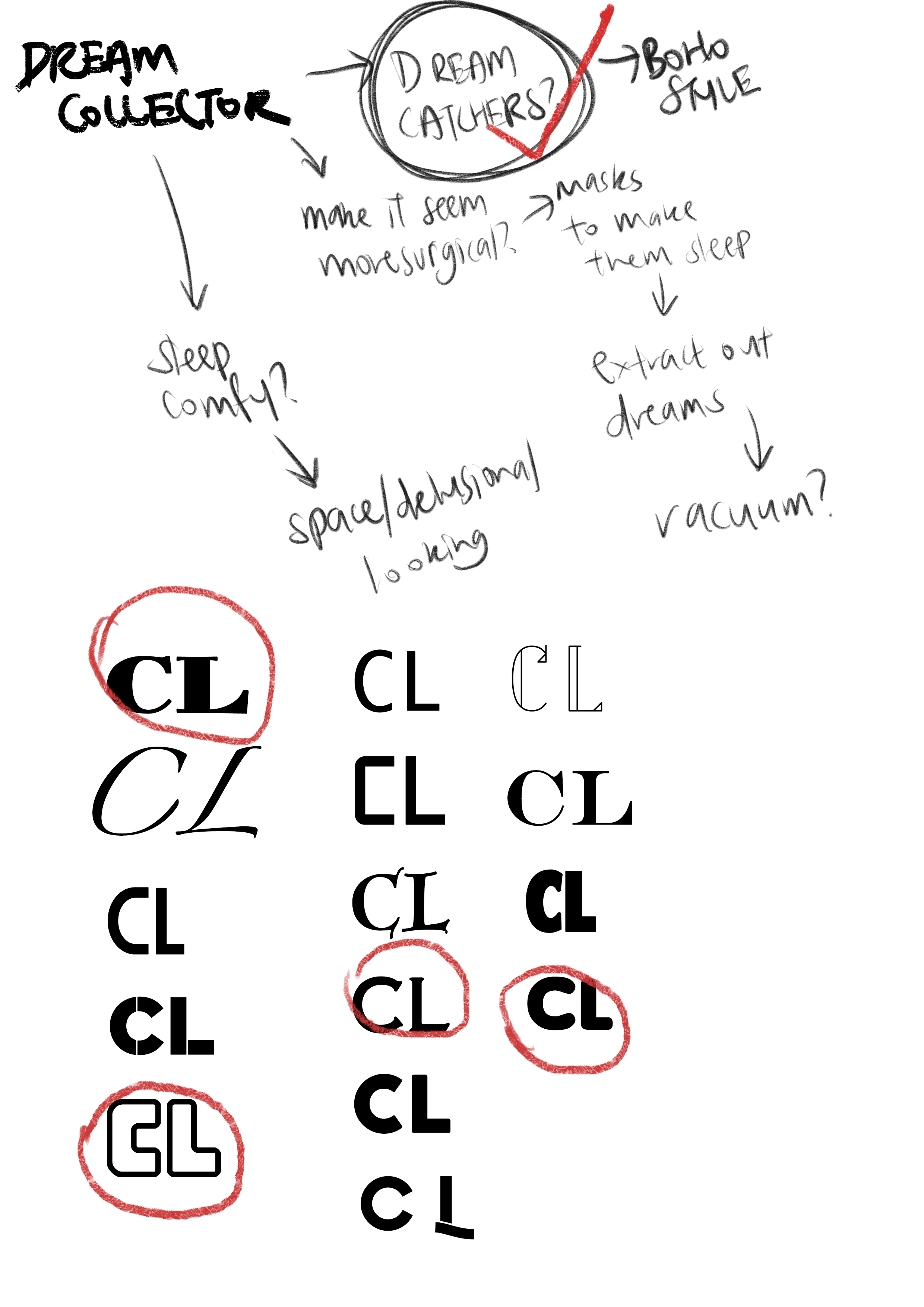
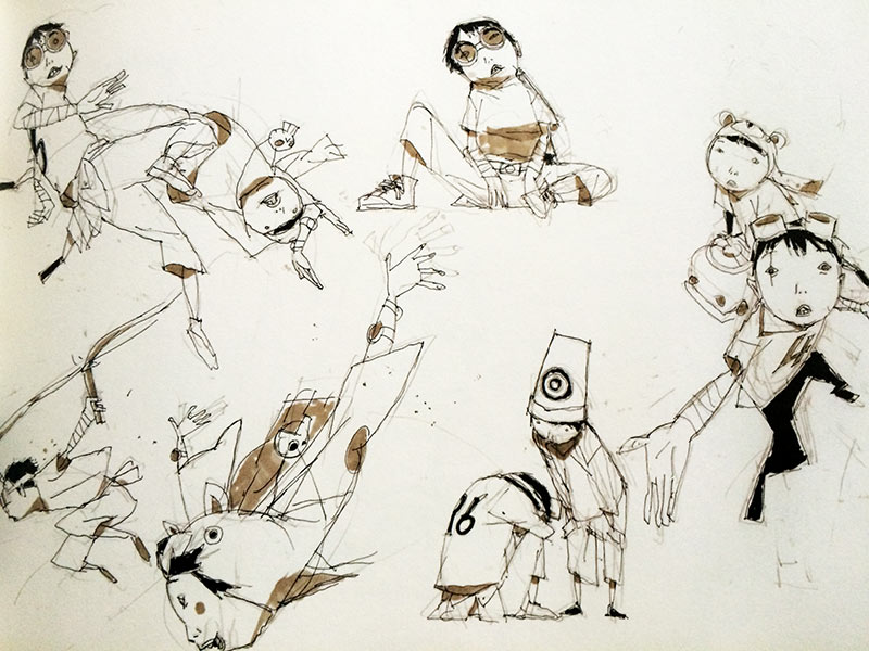
With Assignment 1 done, we have been immediately briefed for our next assignment: Forrest Gump!
So the first thing we had to do: find movie quotes. And I had just the most perfect ideas in my head. I have recently been in love with musicals; and there have been a few really good ones that came from movies, or were made into movies. So I decided to find quotes from Heathers (1988) and Hairspray (2007).
One thing I like about these two movies are how they tackle various societal norms in the 1960s and 1980s. In Heathers, they made use of black comedy to talk about how suicide got overly popular in creating some sort of emotional sensation. Despite the movie representing something from the 1980s, I still felt like it was something relevant in today’s society, as if nothing has changed in the past 50 years.
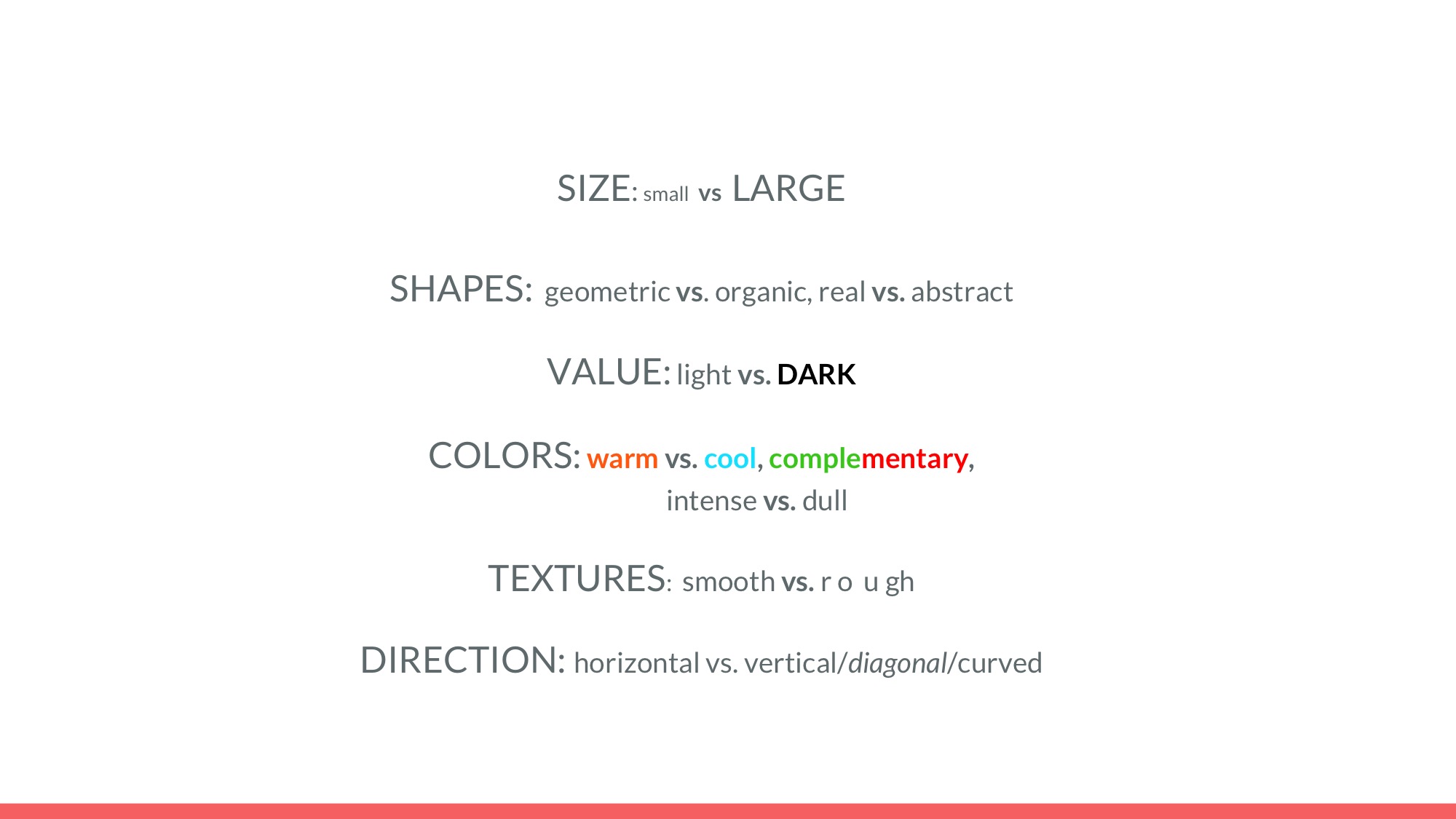
Here are some of the quotes I have picked. In order to better understand the quote and how i interpret it, I will break the keywords down to aid my search for pictures.
And pardon the language used in some of my quotes. I like how direct it can get sometimes.
https://media.giphy.com/media/ZZ8JgdJZadObS/giphy.gif Retrieved on 16 September 2017
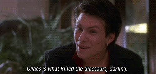
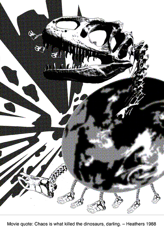
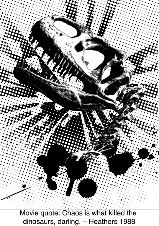
J.D.: Chaos is what killed the dinosaurs, darling.
(Heathers, 1988)
This could be interpreted in many ways, and one would be to take it literally. But I’m going to try looking at it in a more figurative sense, and put what J.D. had said in context to understand the phrase better.
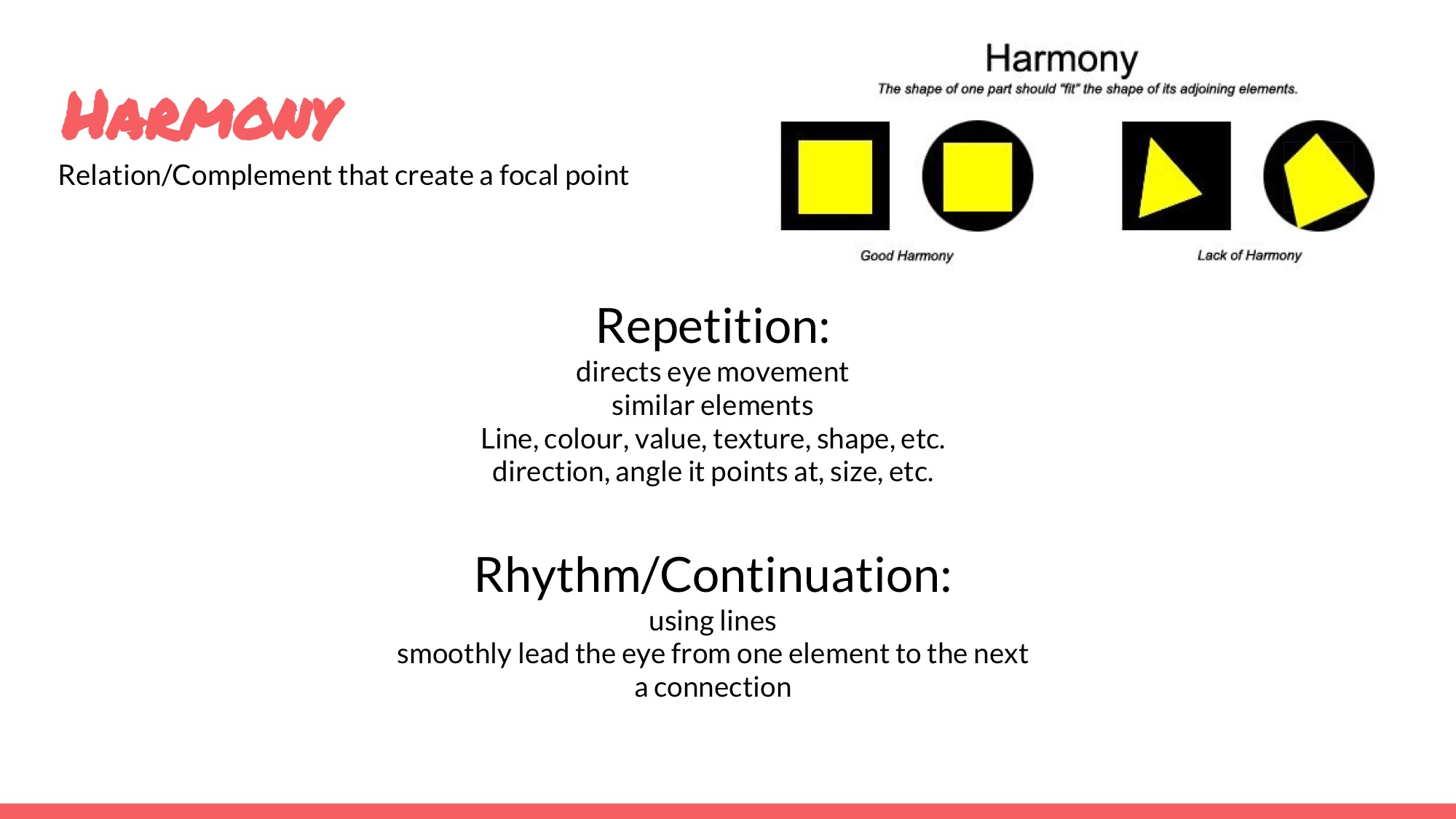
He mentions how he wanted to destroy society so that it can be built anew, into something where all different types of people could work together in harmony. He’s basically referencing this to how dinosaurs became extinct; which allowed for the Ice Age to have happened, followed by evolution to have eventually resulted in homosapiens existing.
Without the initial chaos, nothing would have changed. And he was willing to go as far as to cause an explosion in school for that to happen. He wanted society to ‘wake up’ from its chains of societal judgement. He states it matter-of-factly, as if it was only logical that killing everyone would result in change, just like how the dinosaurs died off.
Now looking into the various keywords!
Chaos
Chaos could mean the Big Bang. Chaos could also mean many people clashing into each other. Chaos in general, is a sense of disarray. But what J.D. wanted was an explosive sort of chaotic. He wanted things to end. So chaos could mean bombs.
Killed the Dinosaurs
So the dinosaurs are dead. I can try representing them with something not dinosaur-like, but I would prefer having dinosaurs in my print. So I picked some dinosaur fossils along with some dinosaur engravings to represent them.

https://68.media.tumblr.com/cb58af985002f797bb5ad58cbde310ad/tumblr_oqqd738j7z1uwkhb9o1_500.gif Retrieved on 16 September 2017
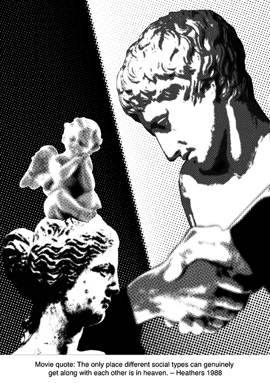
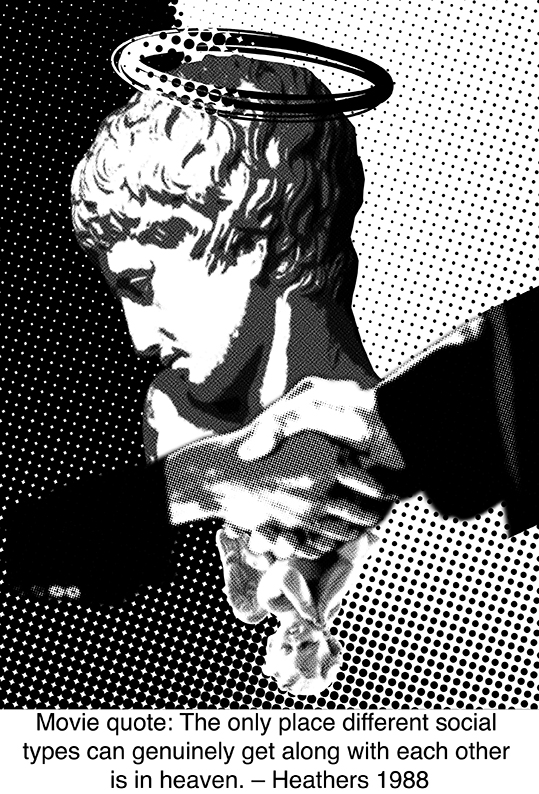
J.D.: The only place different social types can genuinely get along with each other is in heaven.
(Heathers, 1988)
A quote that resonates deeply in me; as someone who has difficulty blending well into places such as school. JD basically mentions that different people will never truly be friends with one another unless they were dead, and thus making any sort of interaction among various cliques impossible. As a loner in school, he lives with his own set of values, often stubborn and unwilling to change himself, and often blamed society for the problems that came his way. He had wanted to blow up the school in an attempt to prove a point to his concept of ‘society’, as if society had done him wrong by being the way it was.
In a way, I had thought that it did make sense; I didn’t agree with how most of society worked outwardly, where nobody truly understood one another. Someone would commit suicide, and everyone would make a pity post on facebook in some sort of attempt to prove that it wasn’t their fault, and that they ‘had been there when the victim had been alive’. He wanted to change that; he had wanted to get rid of a generation that thrived on being superficial beings.
So here are some of the keywords I picked out and explained further.
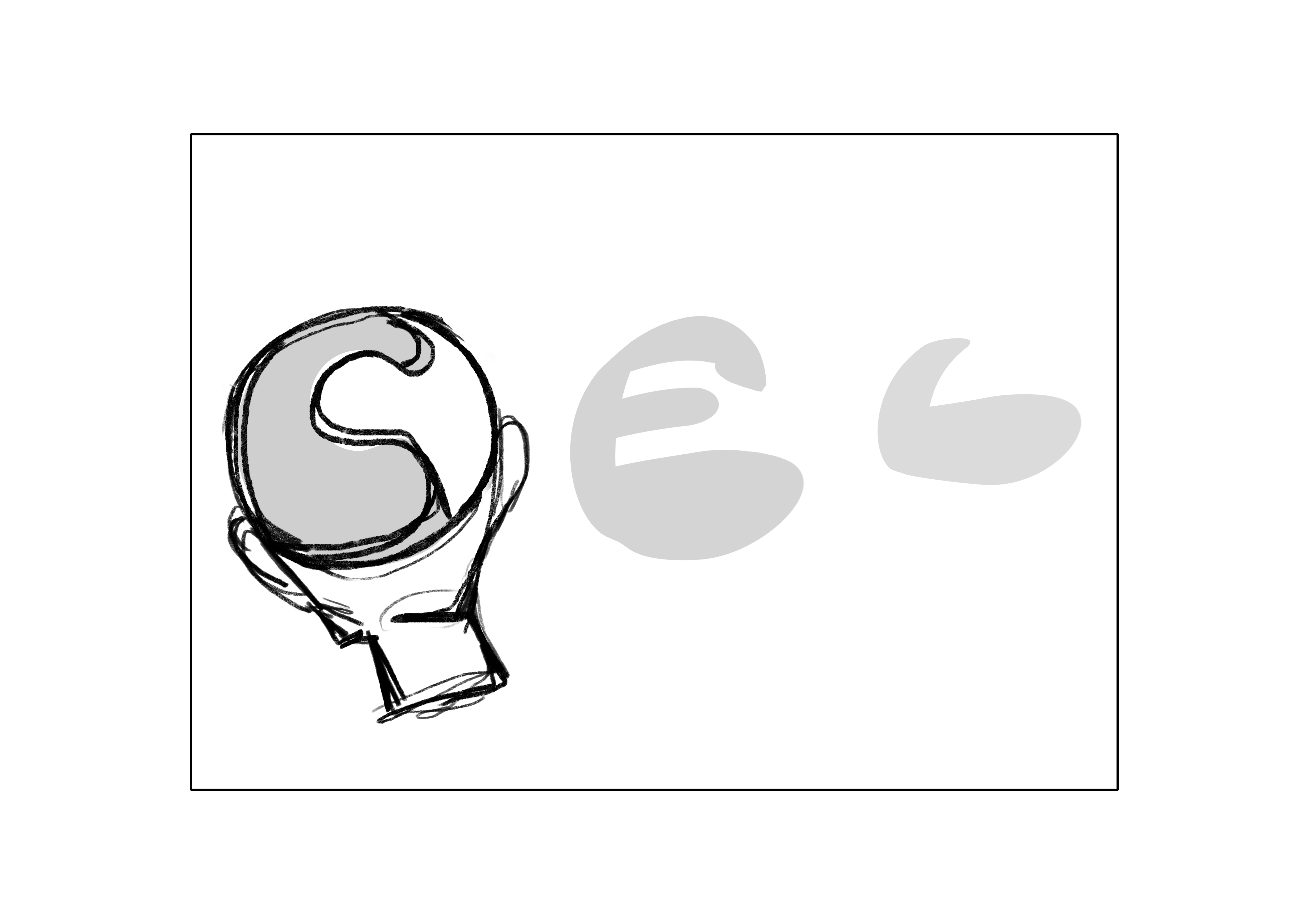
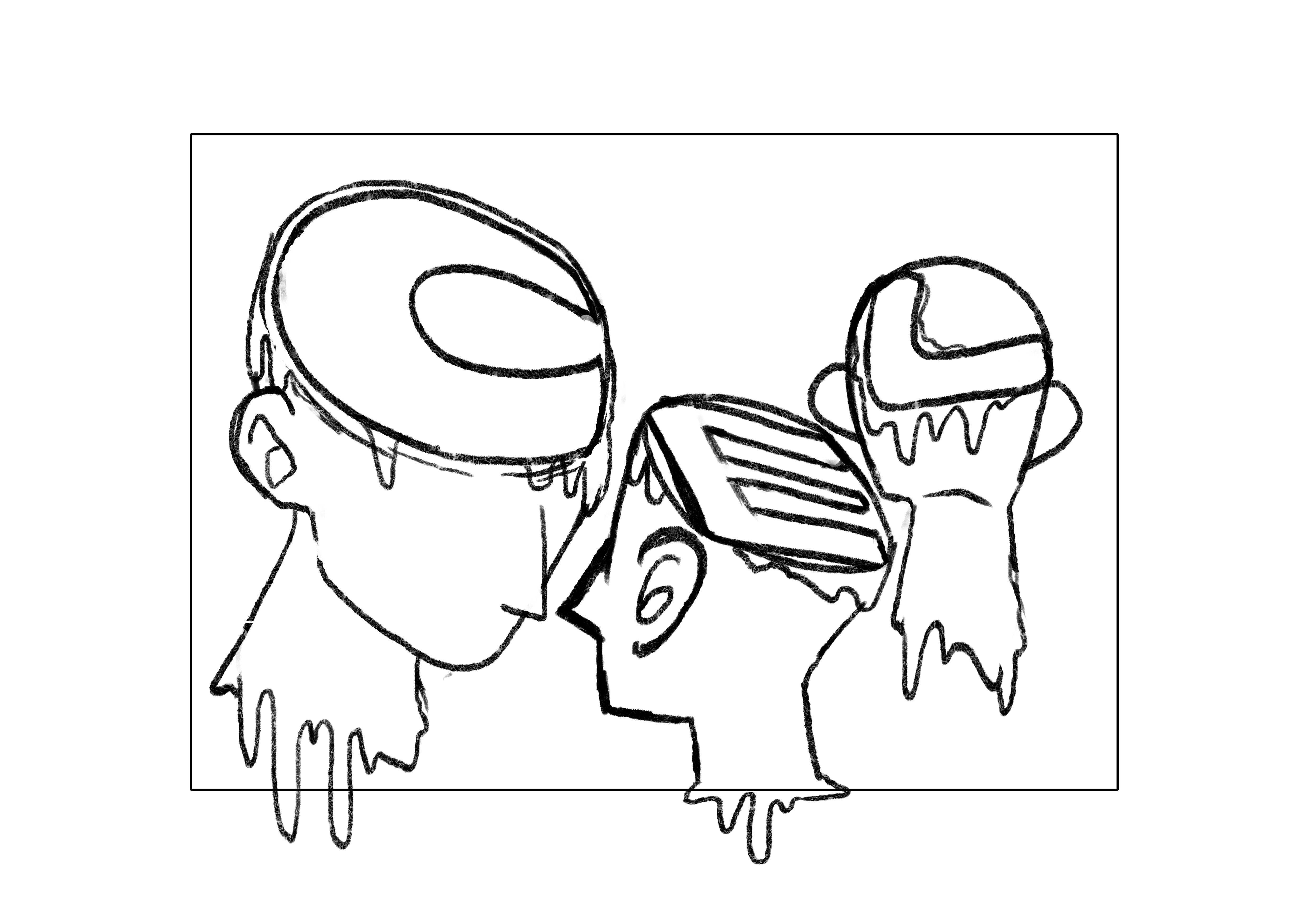
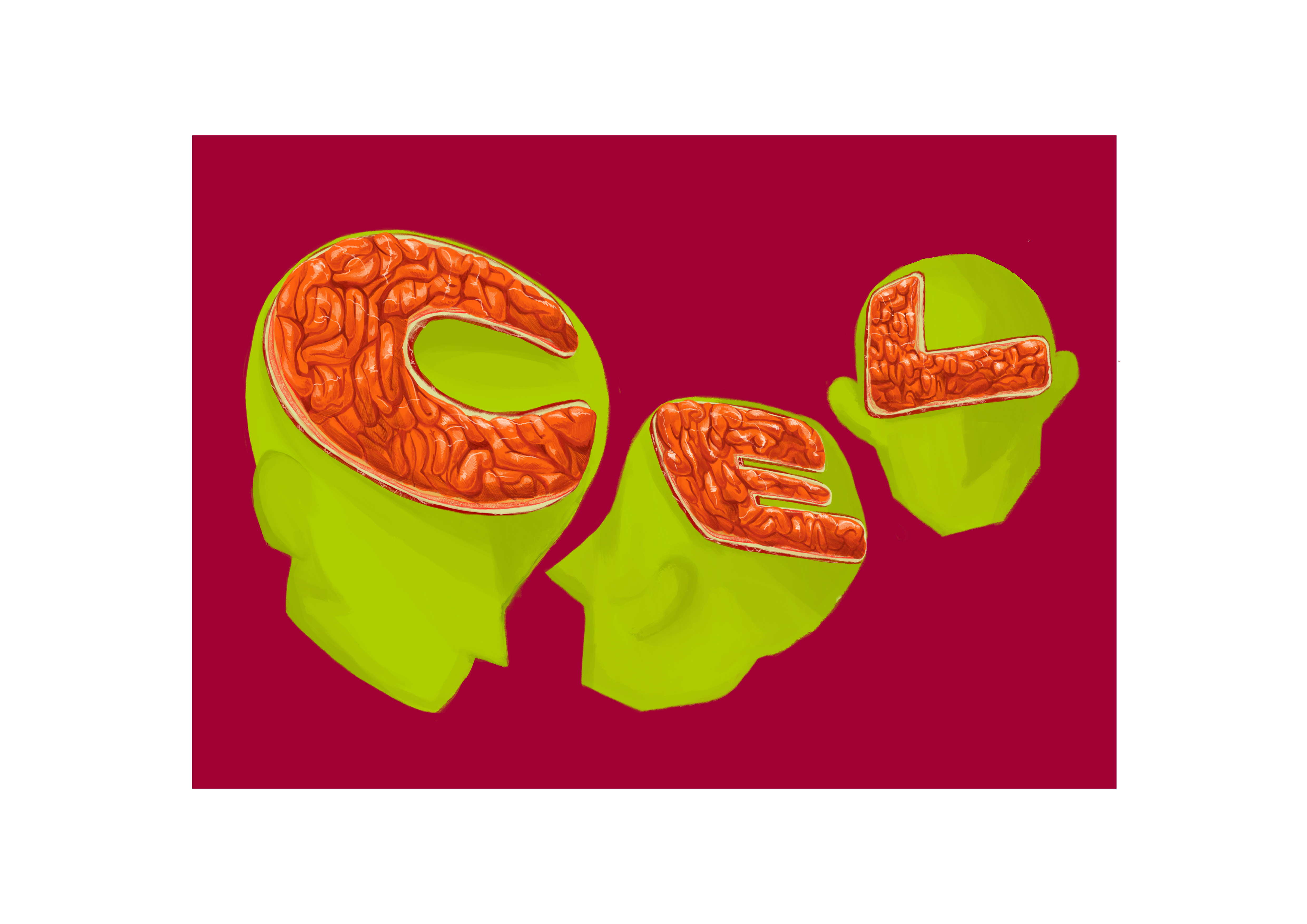
Different Social Types
I’d see this as different stereotypes in typical American high school fashion. There are the nerds, jocks, cheerleaders, band geeks, goths, etc. I’ll separate them into more iconic parts that represented these groups of students in school. I’ll also attempt giving an animal representation to each group. Of course, they are not accurate depictions of said groups; just how I’d like to see them in a 60’s context.
Nerds:
Commonly associated with glasses, books, sweater vests, brains and buttoned shirts with bowties. Otherwise, there were also gaming nerds, who were associated with laptops, game consoles and headphones, or generally introverted/lazy. Possibly linked to dolphins, pigs, etc.
Jocks:
Commonly associated with varsity jackets, good bodies, sports, or could possibly be looked at as generally bigger dogs such as golden retrievers/German shepherds.
Cheerleaders/Popular girls:
Prim and proper. Commonly associated with makeup, slim figures, pompoms, and gossip in the girls toilet. Could be seen as either cats, or snakes.
Goths:
Commonly associated with skulls, drugs, cigarettes, metal accessories, etc. Could possibly be associated with animals such as vultures, reptiles, etc.
I will stick with these 4 main stereotypes for now!
Get Along
Getting along could mean a lot of things. But simply putting in this context, it would mean living together in harmony with everyone in a society.
It could be represented by hugs, handshakes, or hearts. Wow, so many Hs. Just like how there are three Heathers.
Typically, getting along can be represented by peace. Peace can be seen as doves, the peace symbol, Earth as a whole, nature, etc.
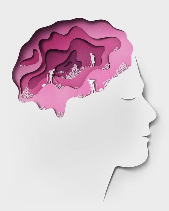
Heaven
Heaven is commonly represented with clouds, pearly gates, halos, angels, gods, and so on. To be honest, that’s just a very typical setting given with religious annotations and context given to it. Would there by any way to truly explain what Heaven is? Each religion had their own variation of this, so maybe I could try mixing this up a little?
Besides the idea of clouds and an eternity of good times, Heaven, in other religions, could be represented by a temporary place of sensual pleasures, before being reincarnated. It can also be explained as paradise, where there are gardens, and families reunite happily over lots of foods and drinks.
https://img.buzzfeed.com/buzzfeed-static/static/enhanced/webdr02/2013/1/17/13/anigif_enhanced-buzz-1784-1358445874-1.gif
Retrieved on 16 September 2017
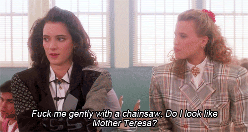
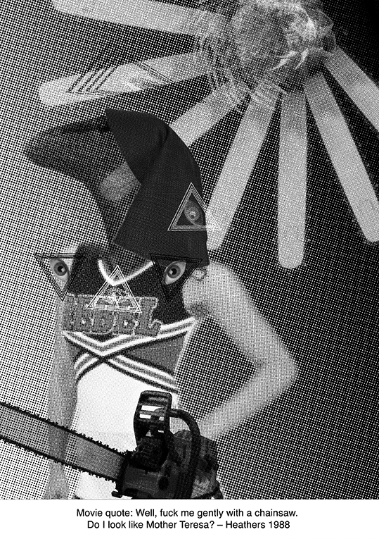
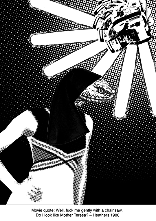
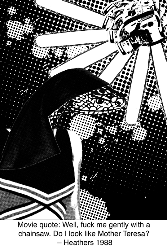
Heather Chandler: Well, fuck me gently with a chainsaw. Do I look like Mother Teresa?
(Heathers, 1988)
An iconic phrase in the movie; that eventually got used in the musical as well. Heather Chandler looks in disbelief at Veronica Sawyer, as if she had just said gibberish. She then makes up an equally as crazy sentence, in a whole sense of sarcasm. And I live by sarcasm and irony; thus explaining why I want to use this quote. Bless Heather.
Heather, being the Most Popular Girl In School™, had her influences in all corners of the school. Her word was Final, and if she didn’t like what was going on, she could change it because everyone listened to her. She had her looks, and she had her charisma and she was only a junior in high school.
This gave her all the right to be a mega bitch, and she could do anything she wanted. She could curse all she wanted and she could grab any boy and have them smitten with her.
Mother Teresa
Aside from the obvious vulgarity and the even more painful description of being plunged deep with a chainsaw, she mentions sarcastically; the idea of her seeming in any way like Mother Teresa.
In a sense, Heather was like Mother Teresa. If anything, she had the charisma that was similar to that of Mother Teresa, how she’d be praised for things she has done, but also criticized by a minority for her various actions. But given her general lifestyle, it was probably better to say that she was an anti version of Mother Teresa.
Besides the usual holy things that could be associated to Mother Teresa, I could also make it seem a little more devil-like. Or just anything that went against how Mother Teresa would have been like, in all sense of Catholic Christianity. Of course, there should be limits to how I do this, because this is going to be on a tote bag. Can’t get too political here.
Chainsaw
Chainsaws have been linked to DC’s Harley Quinn and generally just manic pixie girls in skimpy cheerleading outfits for the longest period of time. It’s funny how it got referenced in such an old movie; as if it was also a thing in the past to have chainsaws on cute girls.
Along with all these obvious points, I also want to show how Heather Chandler was basically a snake in disguise, given her rude attitude towards Veronica whereas she remained disgustingly nice to most others. (Nothing against snakes, however. I love them.) Snakes were commonly represented as someone who was very cunning and two-faced, especially in many western cultures.
HAIRSPRAY (2007)
https://68.media.tumblr.com/0c241c619240c9b89731042db984cc94/tumblr_nogjegrYd61r7pxxqo1_500.gif Retrieved on 16 September 2017
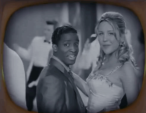
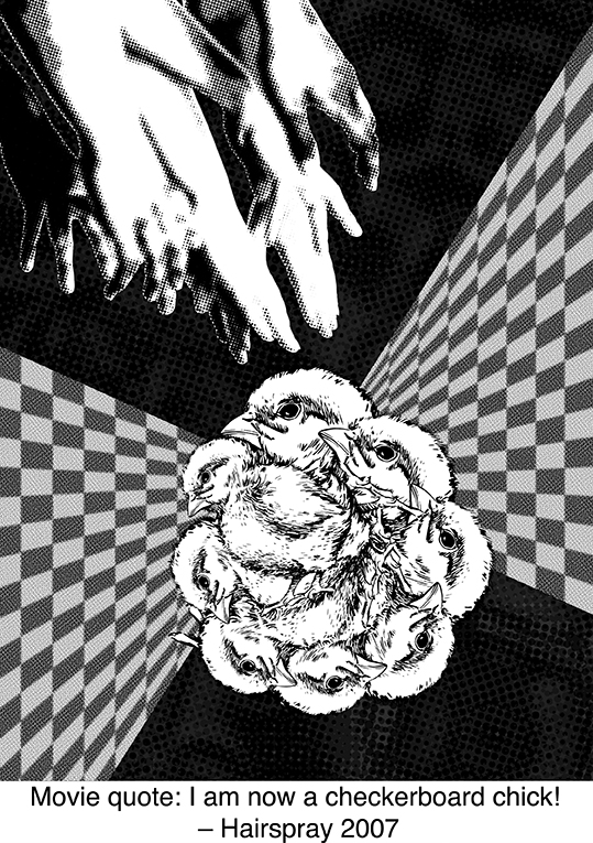
(Hairspray, 2007)
During a time when courting someone of a different colour was shunned upon, Penny Pingleton dared to announce that she was dating a black man on live television, and even kissed him. Living in her house with an extremely overprotective mother, Penny was a sheltered girl who could never experience anything too ‘dangerous’ for her. In a you-only-live-once attempt, she yells excitedly that she was now an integrated girl who would date a non-white guy.
The phrase is literally talking about someone being black and white. And chick would basically be slang for a beautiful girl, like how people use the word lassie.
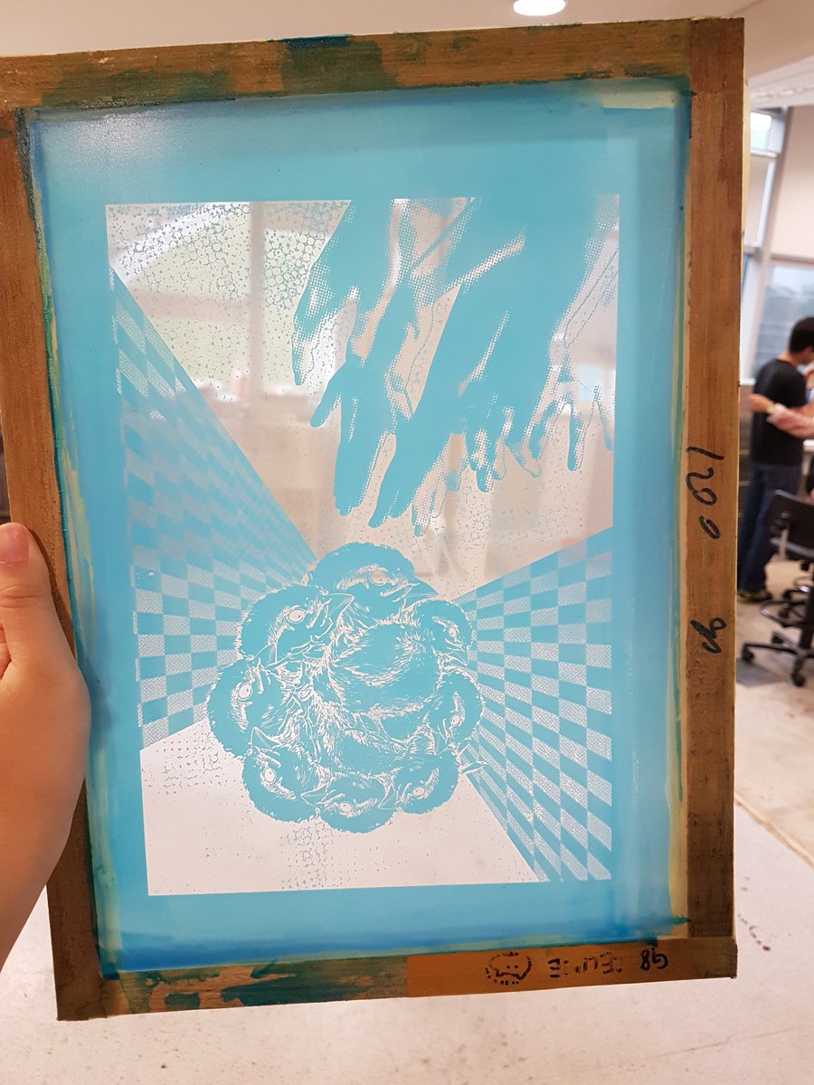
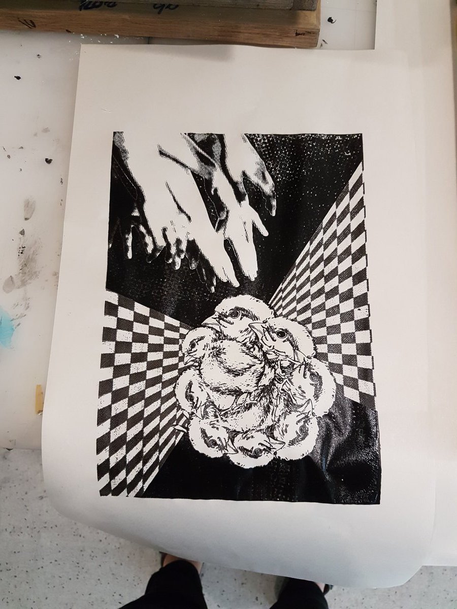
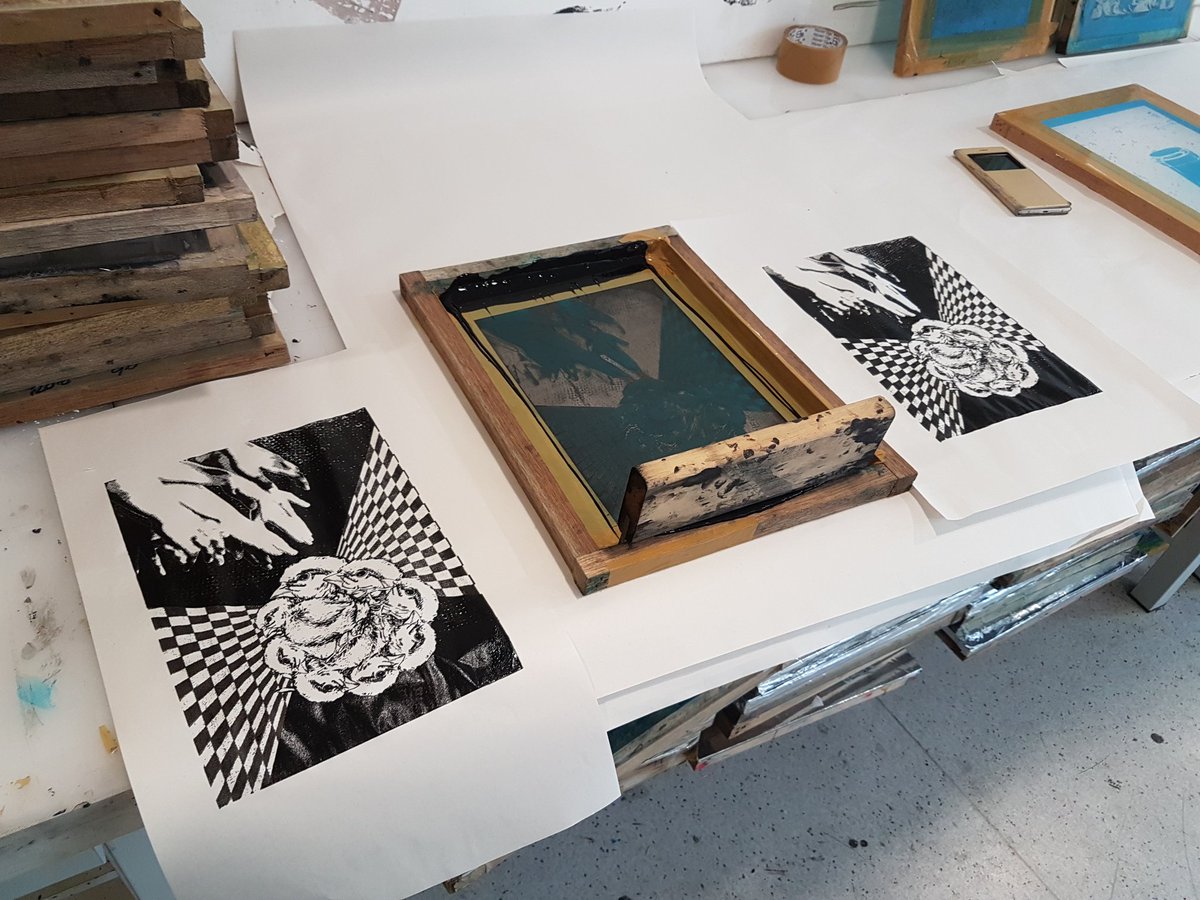
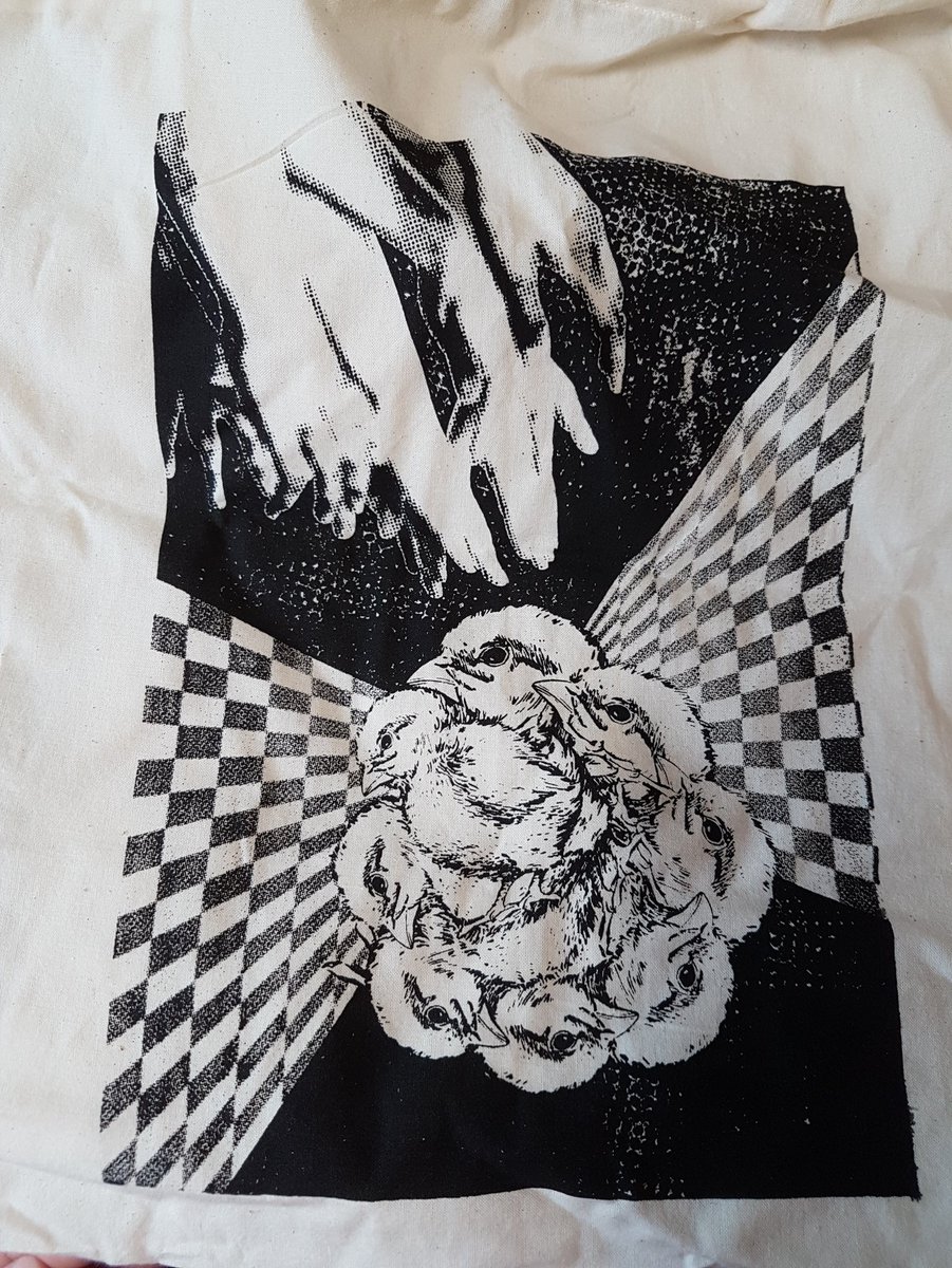
I want to try something more literal with this one, and make a pun out of it. Because hens and chicks. Hands. And Cheeks. Haha. Ha.
But anyyy way. I look forward to playing around with the compositions! Hopefully I will come up with something that would look fabulous on a tote bag. 🙂


Recent Comments