Stanley Morison

morison

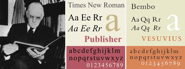
Stanley Morison was the one that designed Times New Roman, the font that becomes a practical default for many systems. While it looks dated and ugly, it is very practical and versatile. This typeface allows easy reading in both web and print because of its small serifs that makes it easier to read.

Type in the wildddddddddd

Found these on a day I was on my night run.

The Mall Museum title is Modern Style Serif due to the lack of bracketed serifs
Popeyes logo type is an altered grotesque sans serif
Found this at McDonalds, the rustic typeface is a textures geometric sans serif due to its squarish look.
STENCIL TEXT!!! very common geometric sans serif signage in stencil mode
The Heigh clearance signage looks abit rounded but still very uniformed. Grotesque Sans serif
Looks rounded but not too angular, grotesque sans serif?
A very rounded slab serif
Humanist Sans Serif

For an existing Instagram looking for type in the wild :

https://www.instagram.com/publicnoticesg/