2D – Colour Lighting Reference

This music video of Ravyn Lenae has a very good way of lighting black people. With the use of turquoise and magenta, it illuminates the skin of black people very well. this is because black people have cool undertones usually, unlike white people that have warm undertones usually.

A Look at How HBO’s ‘Insecure’ Lights Black Actors so Well

2D – More artist references

http://malikafavre.com

I have been a fan of Malika Favre since forever. Seeing her work decorate the walls of Sephora is such an awe.

I love how she can be so minimal and so detail at the same time. Her work while vector, is so expressive with the use of colour. I really love her work. Teehee.

http://www.yusukenakamura.net/

Yusuke Nakamura is another vector artist known for his album covers for the Japanese Rock band, ASIAN KUNGFU GENERATION. His distincstyle is his character design juxtaposed by detailed and complex illustrations. I love his use of that black outline mixed with the vibrant colours and well-composed artwork.

http://marumiyan.com/

Another artist which I have been following very closely is Marumiyan, who has been moving towards 3D works lately. His 2D works are well illustrated vector works supplemented with stock vectors of flowers. The stylistic beauty of it lies with the composition and the bright vibrant use of colours. He also uses the idea of gestalt to create a high contrast figure combined with vibrant colours for facial details.

https://www.yukariterakado.com/w

Another artist I like is Yukari Terakado.

She has a strong sense of portrait works which I enjoy the feminine qualities of of her work.

http://www.mynameistran.com/

Another artist which I love and want to try to emulate is Tran Nguyen.

She has well composed portraits which she supplements with unrelated objects and it creates a different setting. I love the expression of her characters. There is an idea of forlorn and strength and her sense of scale is amazing as well, composing figures that are just unimaginably striking.

http://victo-ngai.com

Victo is an award winning illustrator known for her simple and striking graphics, the great use of perspective, colour, and composition. She uses this to her advantage to create complex, yet well composed images to sell her story. I really like her works because there’s a very good use of colour palette and she is able to go the gradient work so well without making it look too metallic.

2D – Some Artist References

http://www.kawaguchielly.com/

I like her work. Her line work is very exquisite and I can see the form. I guess I need to find filters that gives such exquisite quality of line work. Although she draws them herself, I think her composition is something to think of.

http://www.jamesjean.com/

James Jean’s monochromatic work is really an awe to see. It is high detailed and it has a very simple line quality to them.


2D – And another bites the dust.

My last quote to explore,

So, my little Amélie, you don’t have bones of glass. You can take life’s knocks.

This was when Mr Dufayel told Amelie that she would need to get out of her comfort zone to pursue the man she loves. She cannot wait anymore and she can take it because she isn’t made of glass like Mr Dufayel.

Draft 1. The most literal and banal. Literally you are made of bones, the world will knock you but you won’t break. Obviously it looked too simple.

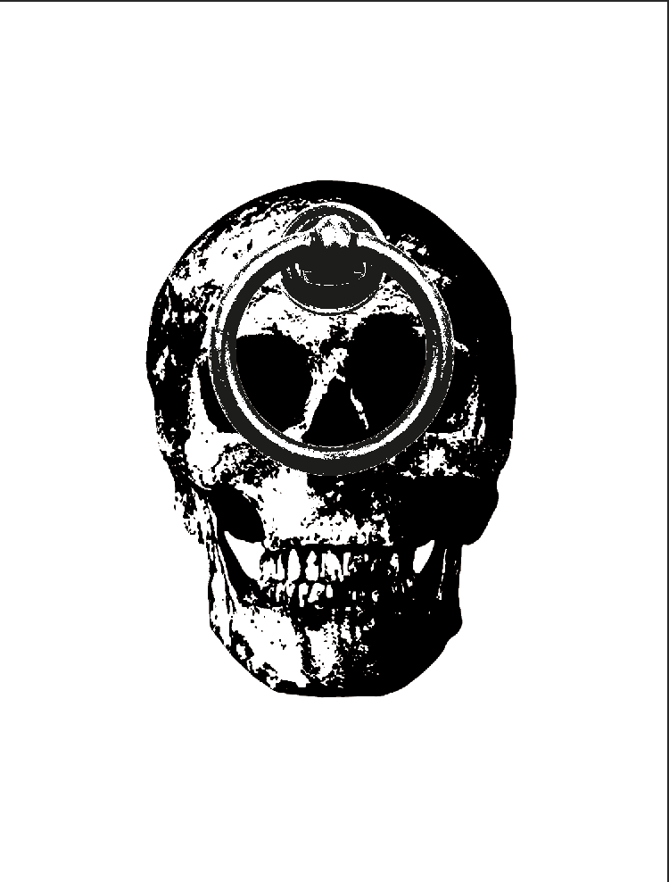
Draft 2, I then explored the idea of knocking on a skull and what better way to illustrate this than a door knocker. It seemed a little too plain, so I added “people” to knock the door after.

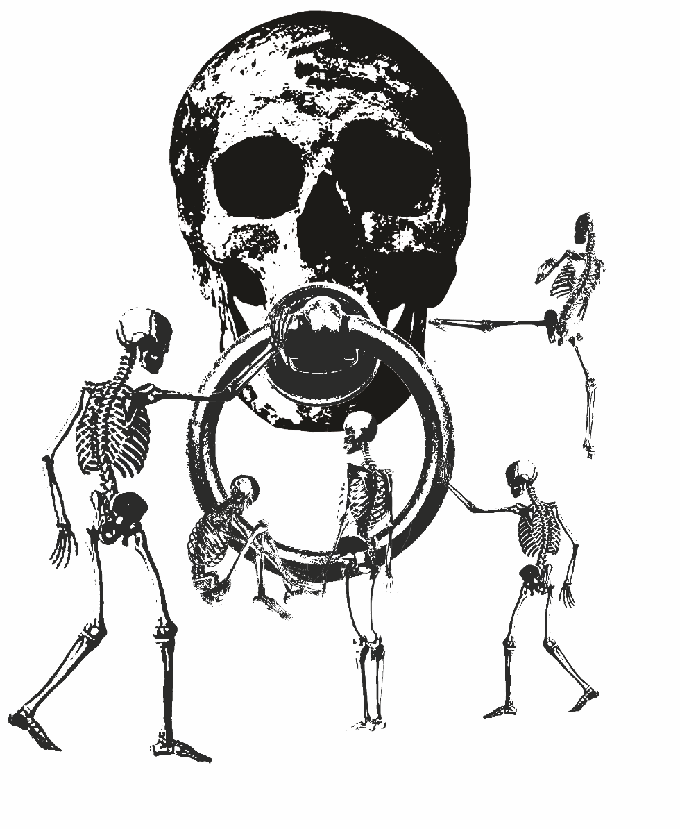
Draft 3, I really liked that this work wasn’t as symmetrical as my previous few works and there was interaction and movement to it. I do feel however, it does not encapsulate the quote anymore.

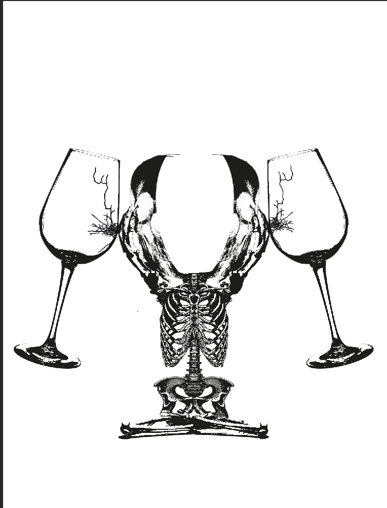
Out of whim, I created a draft 4, which was a wine glass that was made of bones. It looked more like a chalice, but you get the drift. I did this because I thought wine glasses were fragile and that it being made of bones would augment the idea. However, I did not take into account that I need to show life knocking.

It brings me to draft 5. However, this then makes me feel like “Amelie” personified by the bone wine glass is hurting the glass objects when knocked onto it. It then reverses the idea to Amelie being to strong and hurting Dufayel, which is… incorrect.

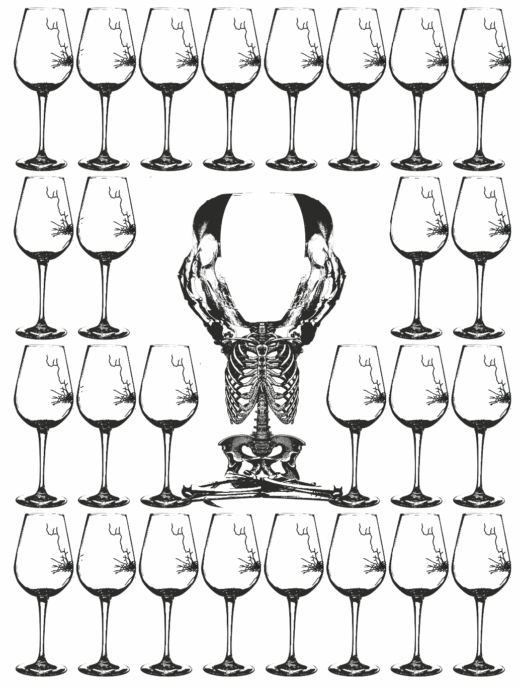
Draft 6, I then recalled an idea of repetition to show strength and emphasis. I decided to repeat the broken wine glasses around the bone-glass. In the it shows that no matter what, the glass shatters but the bones remain intact. I guess I made my point here.

After consulting Mimi, she said that my chalice looks too photoshopped and I should make it more crafted instead of a human body. I should also make the glasses smaller to make the chalice stand out.

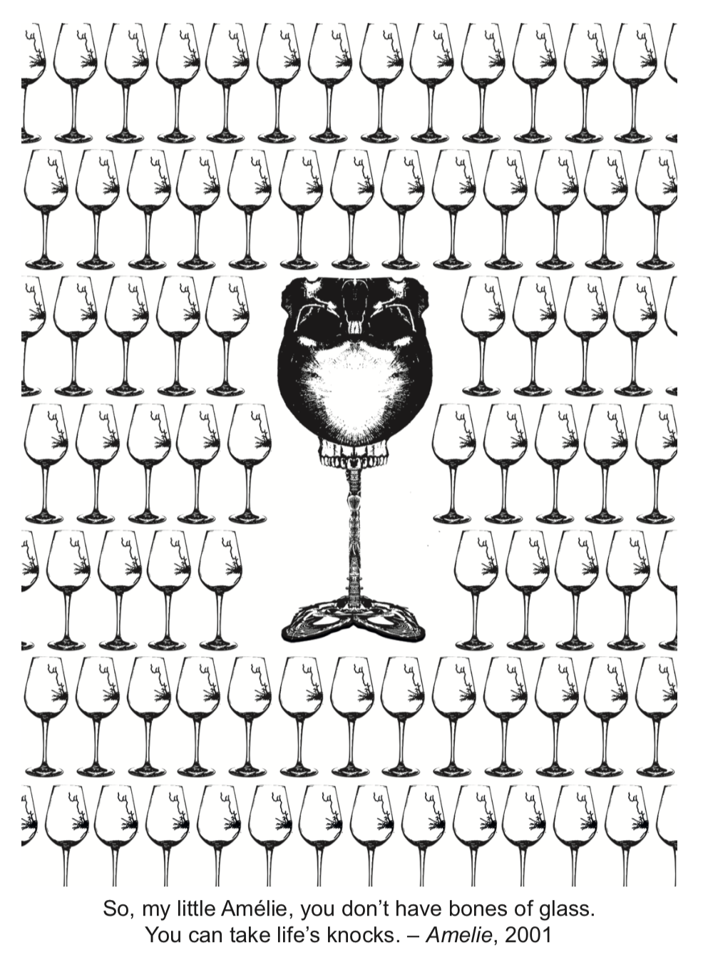
Using segments of a human skeletal system, I re-crafted the chalice to look more like a glass than a skeletal system. I also used the idea of emphasis to augment the intention of strength. Overall I am quite happy how this turned out. It’s not my usual route to do something like this. I would either go full illustrative or full pattern, but this is a simple idea which resulted from me editing concept execution to be concise.

Post-assignment. I really learnt how to be concise with myself. I need to keep doing that so that I can be a stronger designer, balancing ostentatiousness with good design. I think the pit fall of many people is that they want their works to look pretty and grandeur, but their concept breaks apart and their work needs to be heavily explained. The design no longer speaks for itself.

Overall, I want to reach the level in which people get my work without the need of explanation. They get my intentions and they get my designs.

2D – One more to the list.

One more to the lit of quotes to ideate.

Everybody wants to be us.

Well no surprise, this was from Devil Wears Prada when Andrea told Miranda about some guys ploy to replace her and Miranda shocks Andrea that Miranda had already calculated and sacrificed her pawns wisely. In which Andrea responds that she didn’t want to become like Miranda, but Miranda said the line and Andrea walks off in self-realisation.

Draft 1, where I put a Marilyn Monroe onto a screen with paparazzi shooting her. As usual, from the beginning, the idea is way too simple. Although I want to depict the idea of beauty and fashion and desire.

The next Draft, I used the leading fashion lady herself, Anna Wintour and how in evolution, even monkeys wanted to be her, I think this was very clear but at the same time this was very simple and needed more layering. It didn’t look aesthetically pleasing as well.

The next draft was inspired by runway and how we are chasing for the latest fashion trend or the latest runway collateral. This was a bit confusing because the paparazzi silhouette didn’t show well. The Elizabethan girl was very well juxtaposed and the hands looked a bit too awkward. I did like the flag effect that followed through with the idea though.

I then had a sudden stroke of genius one night. I recalled a friend talking to me about her FYP many years back about how we are sheep to the media, blindly following trends, how we wanted to be like what the media portrayed.

My next draft would be this. A pin-up pose model enclosed in a TV set with a herd of sheep following her. I made her a wolf because the media preys on our attention. To supplement the idea of attention, I used the paparazzi photo to enhance the idea. I think this encapsulates the idea of the quote. Although I wish it could be augmented to be large in length, it does look very pleasing and I do like the juxtaposition between the engraving texture and the threshold effect.

Following this, I consulted Mimi and she told me to lighten the background and to edited the sheep so it does not look so patchy.

I inverted the silhouette to that the engraved mesh parts would more of a grey tone. However, I do think that it looked better darker. It looks like a TV static which is to what I like. It really does speak the quote, but I think that the background should’ve remained the previous one.


4D – The Semi-Autobiographical Life of Mary Aw Yong


Art Science Museum Visit

Corrine Mauriad FAKE|REAL ME Lightbox Photograph


The initial impression of the work would be that it would be about Asian beauty stereotypes. I think it leaves a curious taste in the viewers palette as South Korea is known for its plastic surgery. I think the artist is curious about the beauty standards. While these 3 women are inherently different from one another, they have chosen a common beauty denominator to look a like. I think the first reaction to see through this was that the three women had different facial shapes, something that people who go through plastic surgery would commonly not alter and it reflects back to the Korean Wave that had hit internationally with the celebrities looking alike. The use of lightbox photography was a clever medium. It highlights the “perfect” look like an illuminated wanted poster.

I think after reading the text, it didn’t sway me much as it was very similar to what I had thought initially. I think that those who had prior knowledge about the culture in S. Korea would get this work immediately, but those who did not would require text to assist. Overall, I think it didn’t require as much resolution in the communication.

Jaemin Park When We All Live to 150 Mixed Media Installation

I think when I first saw the work, I thought it was just a family tree to depict genealogy. I did not associate it with lifespan or about old age until I saw the secondary images and read more about the work. I thought it had a tongue in cheek quality and a parody of genes. This was due to the common usage of Family Trees to depict genes and heredity. This was a creative use of multiple mediums from photography to a large format poster to a small booklet to augment the idea of a brochure to a longer lifespan.

After understanding the work, it did not relate to my initial perception of the work. This was because the work was in fact an imagination of the world if the life expectancy would be moved to 150. I think this might be a challenge to resolve. It could be a curatorial issue. I might present the photographs first before the family tree and brochure.