Sell your location. ABSTRACT!
To be honest this was such a mind boggling assignment! I had to sell a location abstractly. But I guess my consultation with Joy was pretty helpful in a sense that she narrowed me down to focusing on order in disorder and disorder in order.
I tried digital painting, it didn’t work…
So I decided to appropriate images and collage it ala Forrest Gump last sem.
This was what I ended up with! I added more distortion to talk about order in disorder and disorder in order. This was my centrefold, showing the transition of order to disorder.
for another page i tried this at first. But Joy told me the colour wasn’t working and that I needed to show more order in disorder and more mess.
I decided to change my colour, make it more crinkled and go crazy with it!
Was really proud of this page! I made the rip a rip!
This was my first draft which Joy said, MORE!!! and also have some disorder in order as well.
Yeap, gone crazy.
Lastly! Was the cover.
I had to further augment these to order in disorder and disorder in order. But at the same time I need to understand which image for order and which image for disorder.
I decided to use the gate for disorder because behind the gate with an open door is when the prostitutes would tease the men and haggle prices before opening for them to go in. While a shut door is just a shut door with no business or no meaning except for its flavour in the neighbour hood.
This was the amount of distortion and text setting that I settled with. But after some consultation with my peers, I decided to make order, more orderly.
this was my final cover page.
Didn’t enjoy this project as I felt that the interpretation and purpose was too varied. I rather something less fleeting and more grounded. But I did enjoy playing with semiotics on order and disorder and it was something different from what I usually do, which is straight out coloured flashy illustrations and graphic play.


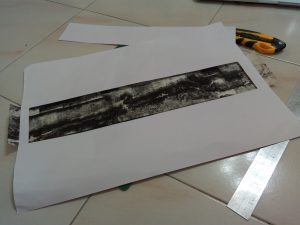
 Exhibit A, I tried using the roller to give a swishing effect to show sensuality and intertwining for “lust”. But it was only concentrated on the side, it didn’t roll nicely, but the effect was still intended, I could still see a soft intertwining effect. Secondly, I tried to layer another feeling on top of the feeling of sensuality. This was because I felt that a singular stroke or line was not enough to represent the complexity of emotions, therefore I added more rigid, repetitive lines on top of the swishes. I think that it achieved an intended effect, but there is more to work on in terms of finding the right layer.
