JOB 1) ARCHITECT
My name is
and I’m an Architect.
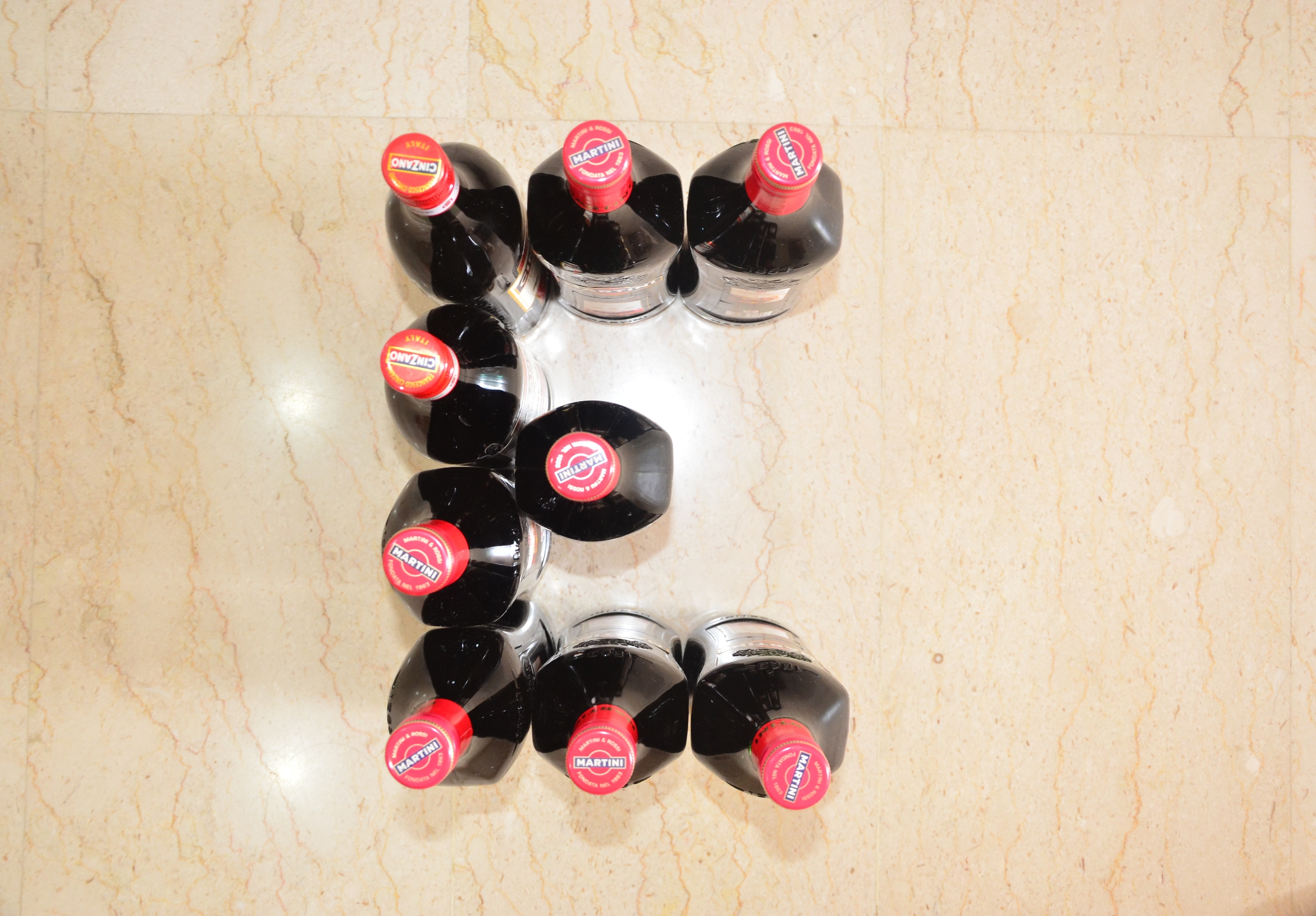
JOB 2) WINE DEALER
My name is
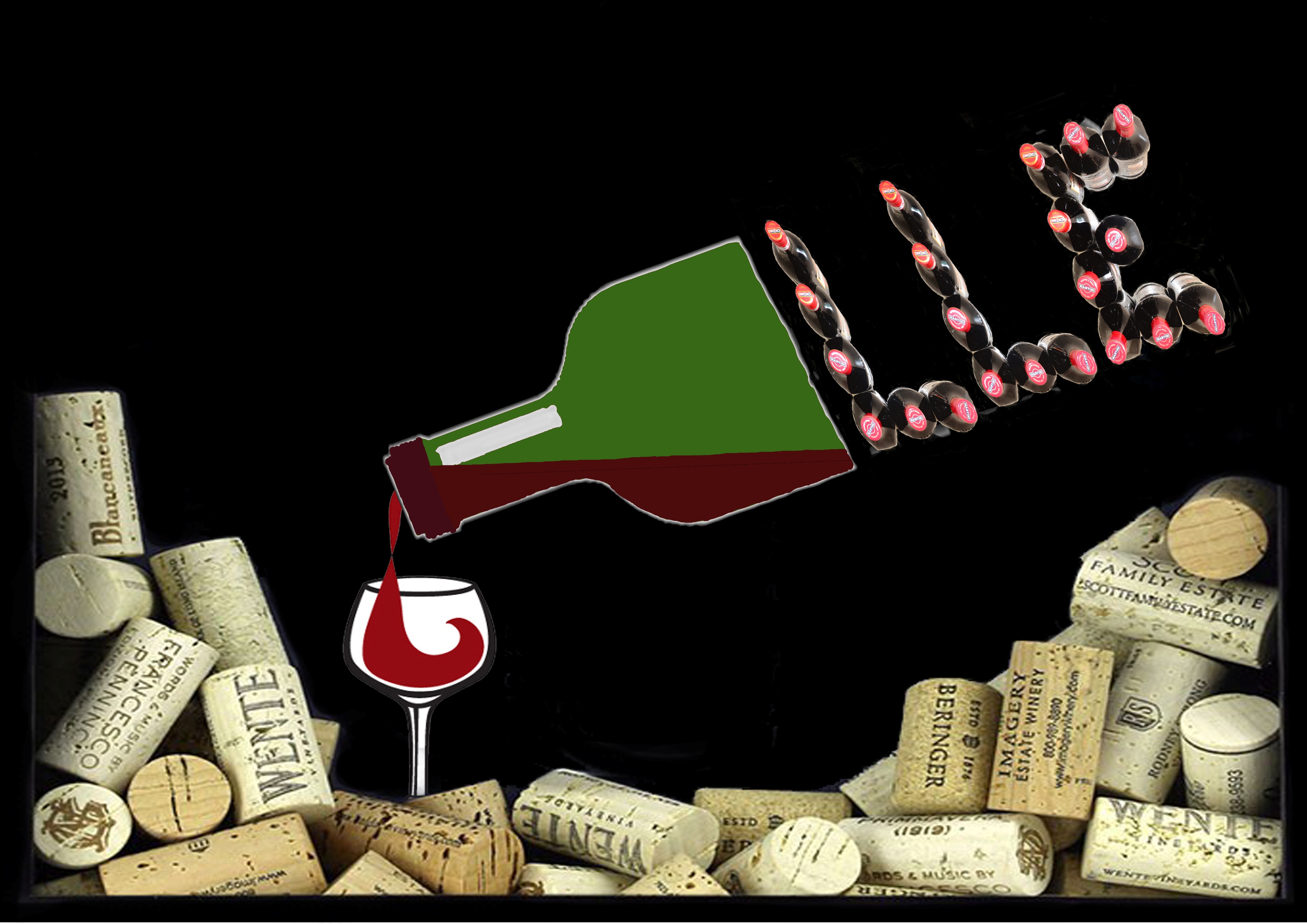
and I’m a Wine Dealer
Inspirations:


Photographed at home using new wine bottles:

JOB 3) ELECTRICIAN
My name is

and I’m an Electrician
JOB 4) IT PROGRAMMER
My name is

and I’m an IT Programmer
Reflections:
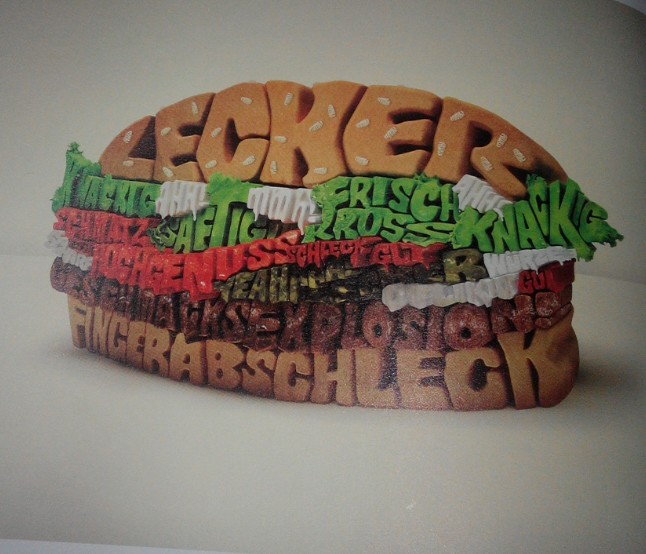
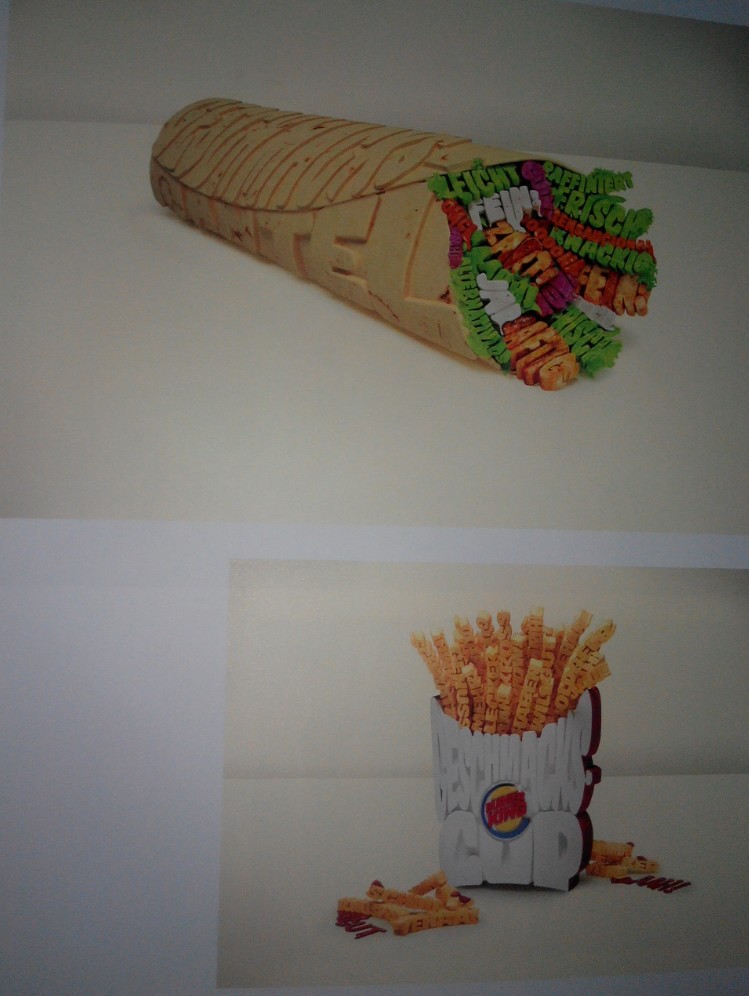
Initially when i first receive the brief, I was at loss of what to choose and how to approach it. Gradually I researched and pondered over and decided to use several techniques to help myself, including photography, collage, manual mark marking and digital editing. Using these combined techniques really helped me learn a lot since I usually do either manual or digital. In this project, I have also ventured into a less familiar field in terms of the mark making tools which were starkly different from semester 1. (Not leaves, twigs, rollers, sponges etc anymore but nails, screws, springs, wire coils threads etc). The project also lead me to think about how the flexibility of typography and how making use of the right items can give u a different type. The learning curve was rather steep for me since from the start till the mid of the project, I did not really grasp the requirements fully, leading to failed attempts such as the branding logo made for the Wine Dealer. It was then that I realised that I had misinterpreted the requirements of the project. However, this also serve as a good platform for me to explore and with every mistake made, I learn. Furthermore, I also learn that simplicity is really important as well since I have the tendencies to stray towards more abstract and complicated designs. The overall experience for this project was enriching and I really enjoyed exploring, be it using the materials, researching into books or even embracing my mistakes and finding ways to improve.