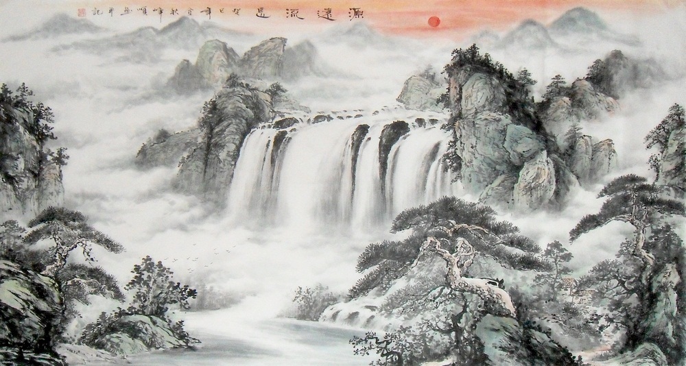
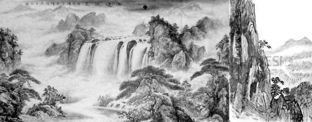
In general , Guo Xi describes how a painter should consider landscape, from the mood of the image to the technical details of what constitutes a good painting. He first explains what are the key features of a painting before stressing on the importance of the painter’s attitude when painting a landscape. He then dives into giving advice on how to create a good painting, looking at them through an appropriate lense and that going in person to the site itself actually helps in discovering the important details for the painting.

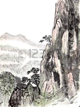
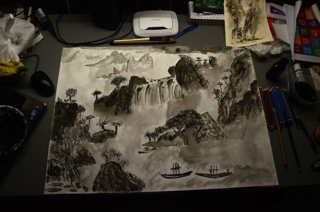
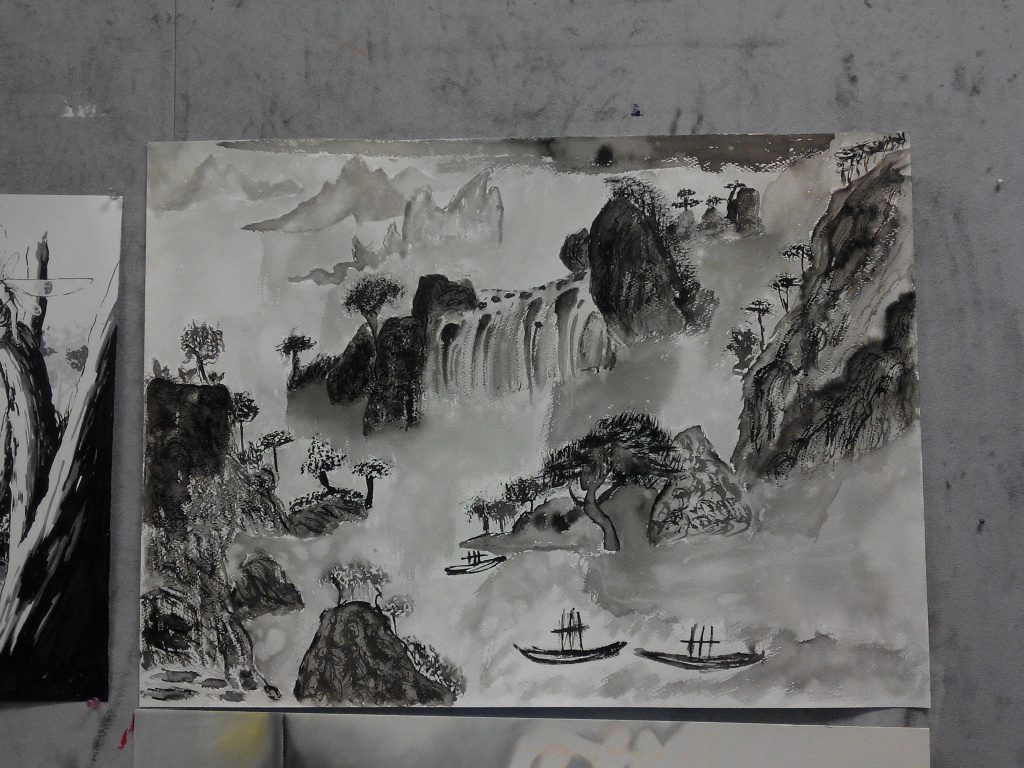
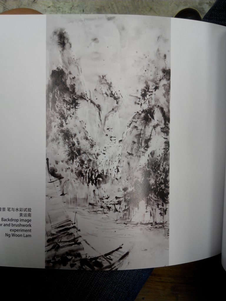
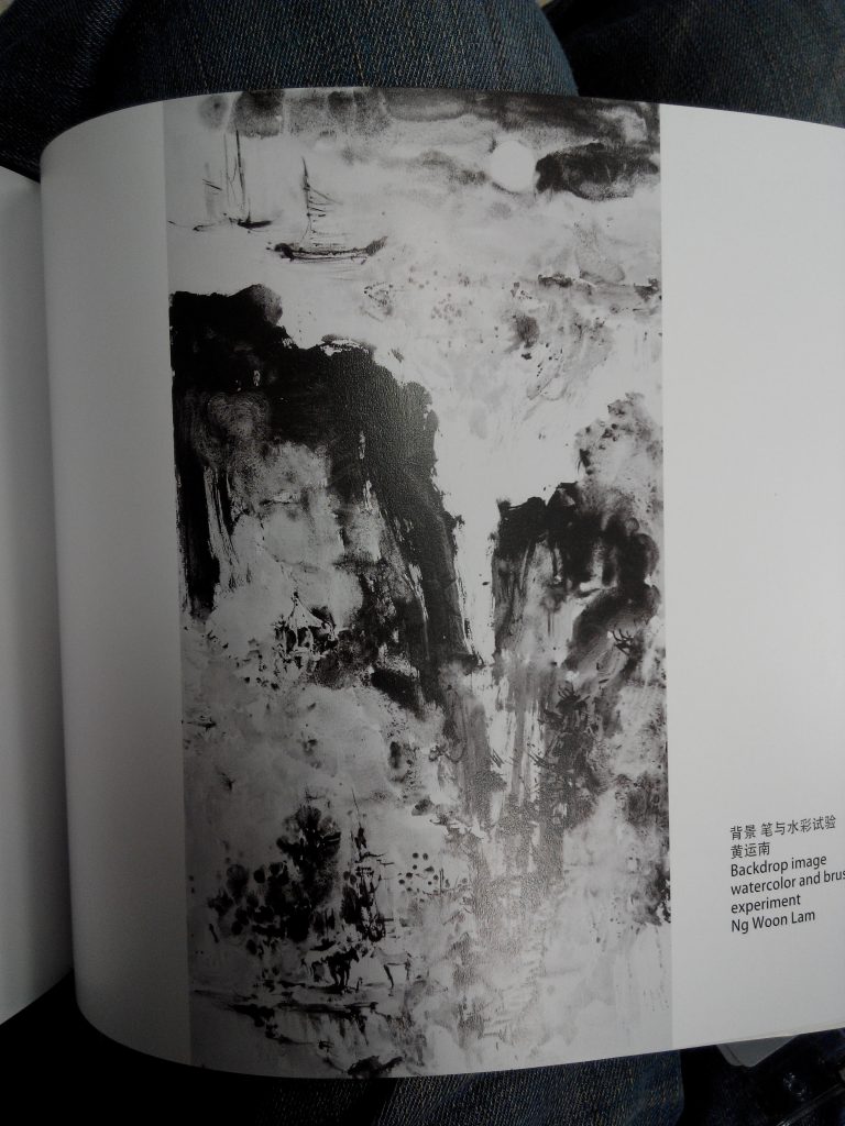
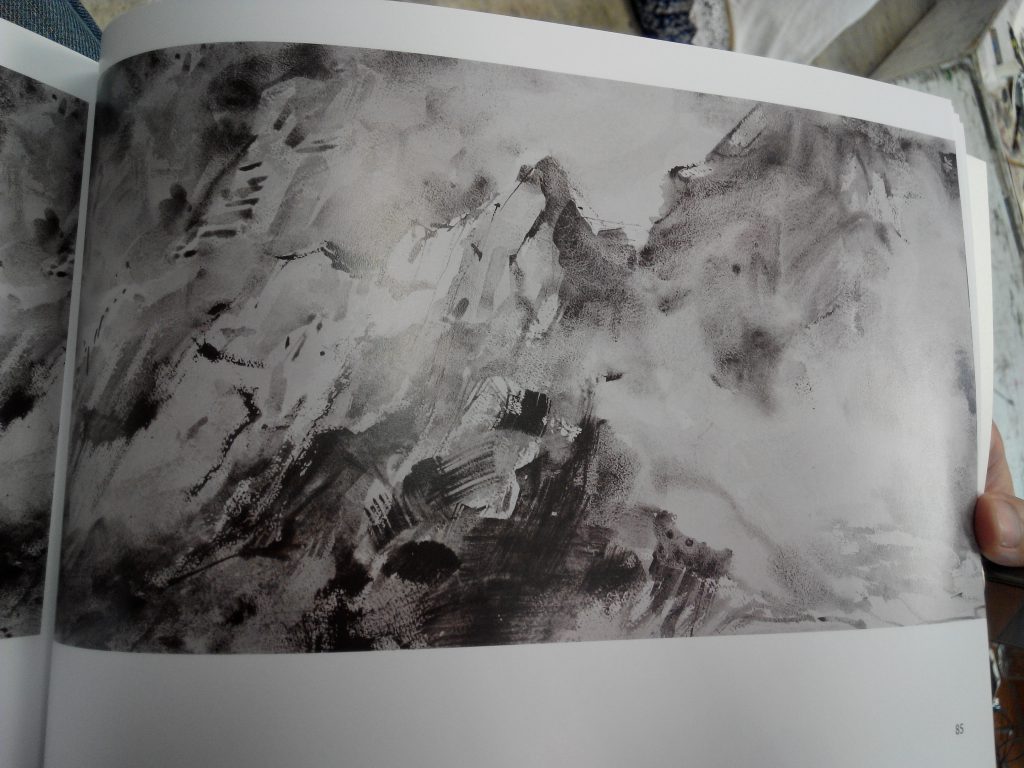
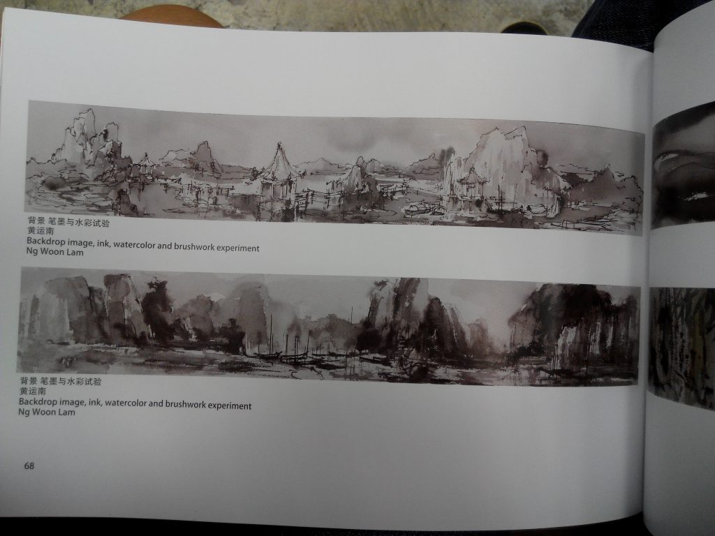
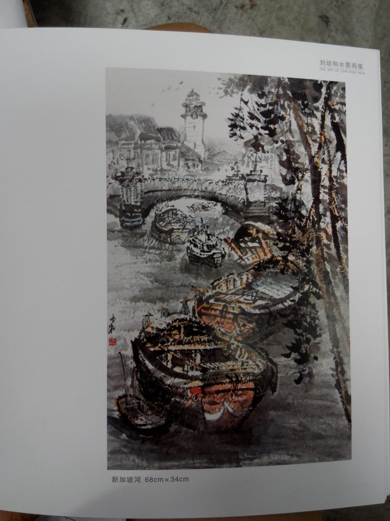
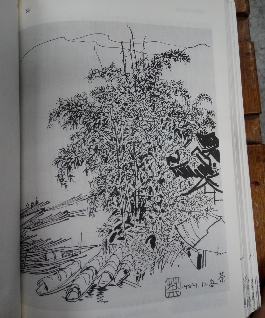
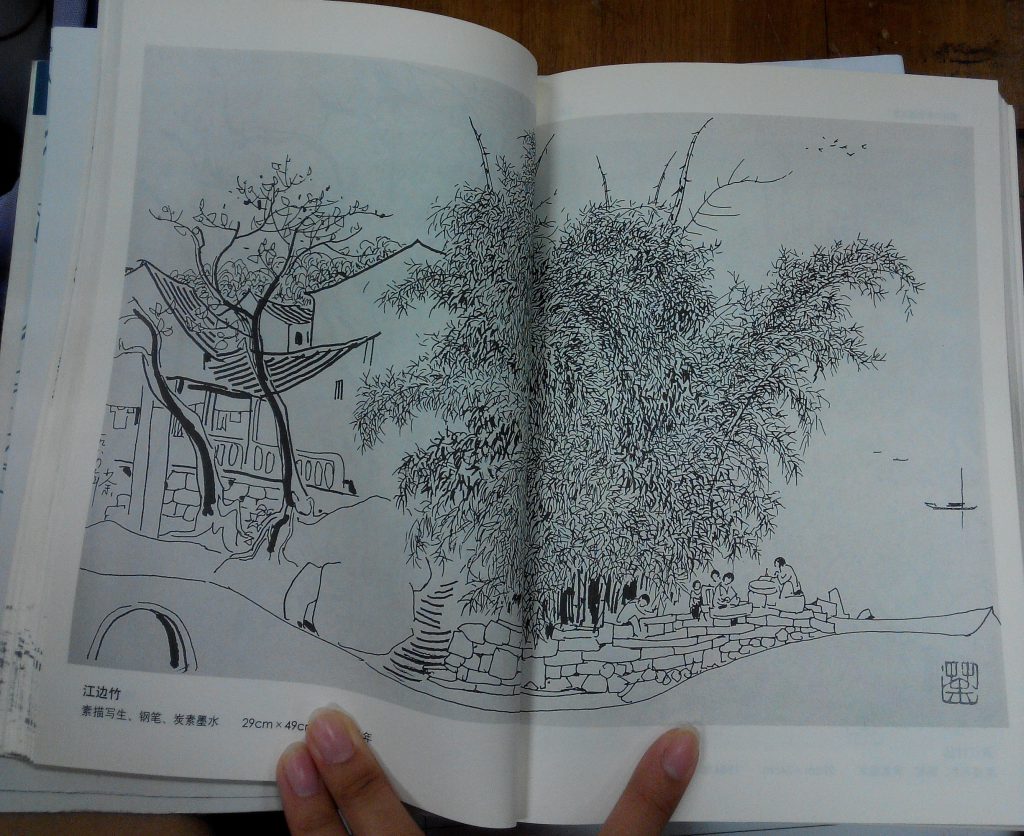
There are repeated stresses on the accurate gauge of the sense of distance and the need to create multiple facades / perspectives for the key subject matter through distance, angle and time. Technical details of the type of distance and their functionality are explained with respect to high distances, deep distances and level distances. The proper gauge of size and their proportions are also mentioned as well. Hiding some details actually enables the painting to have depth and a sense of hierarchy which are two important aspects in chinese paintings.

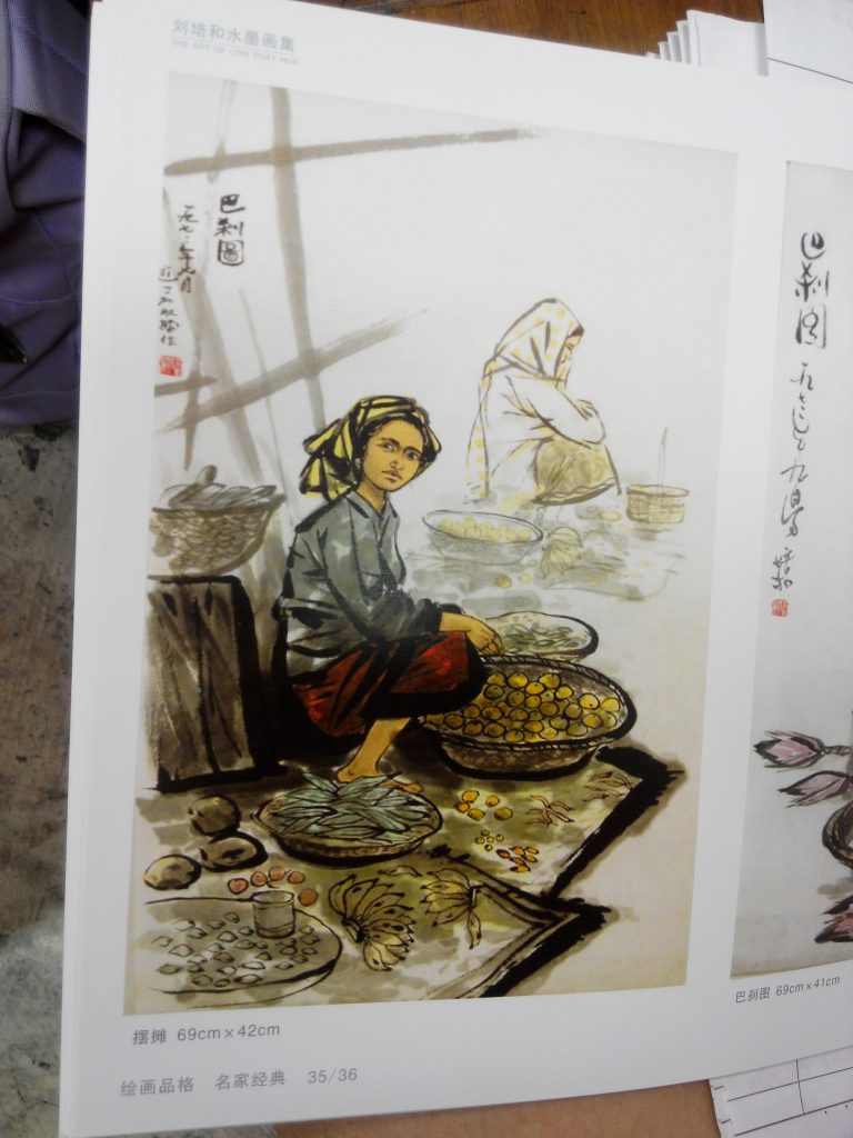
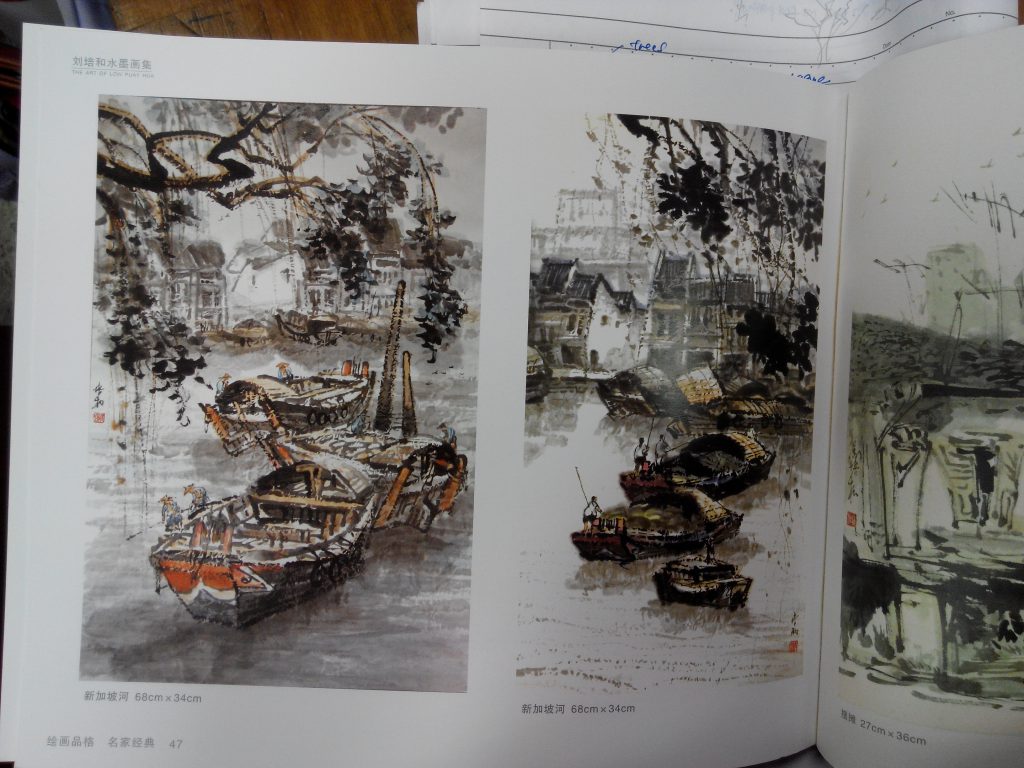
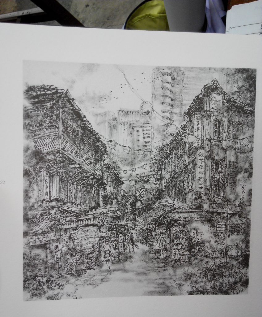
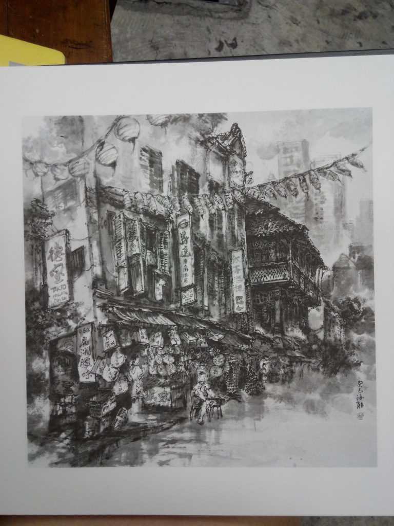
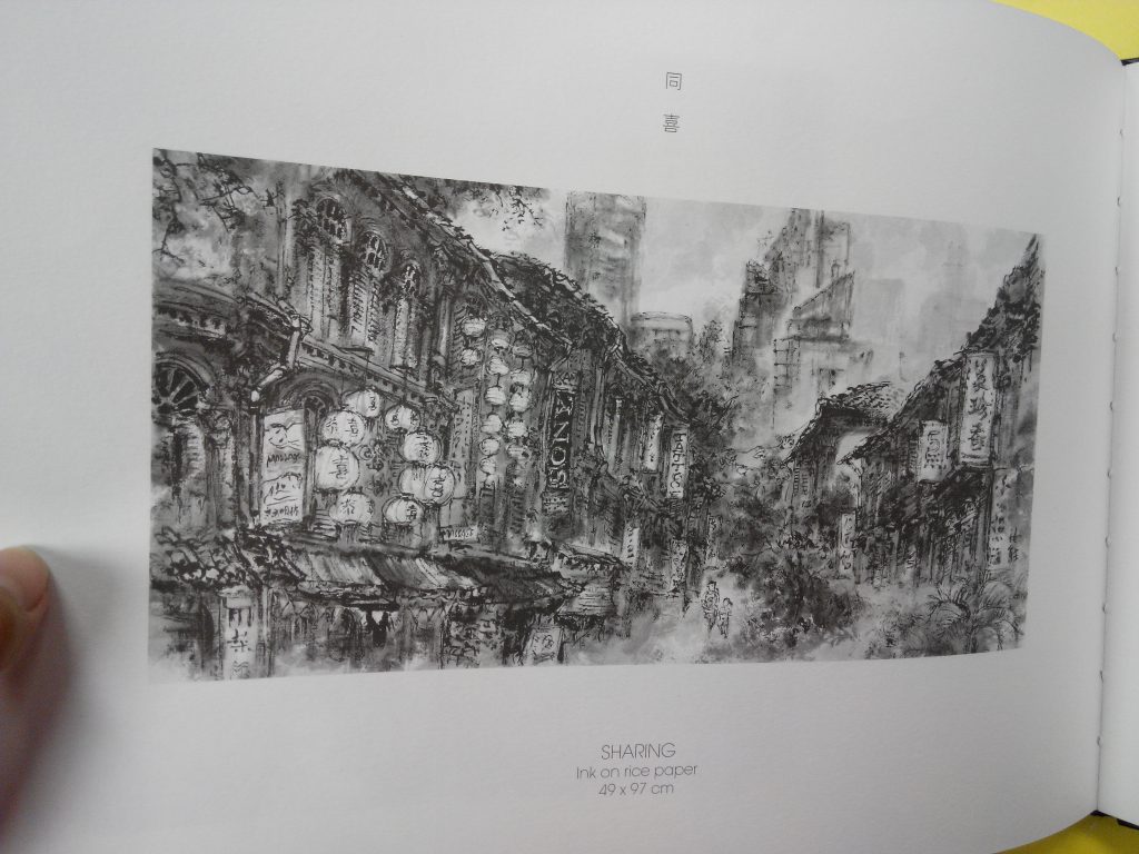
Overall, I felt that it is a good read that has the general public as its target audience. It gives us an overview of what chinese painting is about and what are the crucial features that makes up a decent piece of chinese painting. I feel that the tonality (ranges of grey), shades (ranges of black)  and space (between lines or blocks) are also important characteristics of a good painting that gives a sense of distance and depth to it. These can also create different textures that will form the multiple perspectives/ facade characteristics mentioned by Guo Xi.

Initially, Prof Woon Lam told me to work on a few small pieces so that they will be easier for me to manage since I am still kind of struggling with the techniques. However after much thought, I felt that I should challenge myself to do an approximately A1 size one instead. I have also decided to use watercolour paper.

Reference Images for the final:

chi-painting-2

chi-painting-1

Combined photoshopped image and rough composition:

edit-final-fd

Since the A1 size is rather spacy, I found 2 paintings that can fill up the space more evenly. I could have just enlarged my previous composition but I don’t really have the confidence to work on large components yet. I found that small elements were easier for me.

Process: 

wanted-2

This was my pencil outline sketch of the composition. I adopted this method after Prof Woon Lam recommended that perhaps I can try to do a light pencil sketch of the objects first before painting with chinese ink so that I would not miss out details I originally wanted and the shape would not be too far off.


wanted-3

This is the final piece. I have attempted to create texture through many layers (especially through the dry brush technique), first starting off with the very light and faded tone first and subsequently making it darker gradually. I also realised that it took some time for each layer to dry on the watercolour paper. (Relatively slower than on rice paper, but the good thing is I can wash off some errors on this while I cannot do the same on rice paper) However, I have difficulties creating the smooth transition feel between each object (something I am actually conscious about).

img_20161117_090853

After presenting my piece in class, Prof Woon Lam did comment on the poor transition between the objects, something I need to improve on. However, he also mentioned that there were various textures created on the mountains, something I felt a little happy about (at least I have some improvements from the experiments).

Reflections:

It was intriguing and challenging at the same time, trying out a different medium, something I am not familiar with for the final piece. Personally I feel that an individual learn more while stepping out of their comfort zone and attempt something new. It was through the various experimentations and meeting “dead ends” that I roughly pick up the right techniques (still have a lot a lot more to learn) and the appropriate methods to approach the medium. Although the final piece did not turn out to be as well as expected, the learning was what made the process enjoyable and fruitful. I am extremely thankful for having a friendly and patient tutor like Prof Woon Lam who will not hesitate to guide you whenever needed. I always look forward to having FD lessons throughout the semester and I feel that each lesson was kind of filled with a little element of surprise and that I will take away something new with every lesson. It has been rather enriching semester!


img_20161117_082848

These are part A of the books I borrowed from the library as reference and inspirations for my final project. 

img_20161117_165348

These are part B of the books i borrowed and actually based on these 3 books for the final composition.

img_20161103_101805  img_20161117_165645

Mountains from “Perception and Delusion” and the traditional ships are from “John Constable-oil sketches”, I intended to combine these 2 for the final composition.

experimentations-2

These 2 were experiments no.2. I still cannot get the hang of the brush technique and it turned out that I was still contouring the mountains. Also, the size of my ships were too big relative to the mountains and it looked weird. There was little sense of texture as well since the tones throughout the mountains were too inform. After consulting Prof Woon Lam and his help on editing on the left piece, I got a better sense of how to create texture on the mountains. 

experimentations-2-copy

Experiments no 3. I also attempted watercolour besides chinese ink. However, the effects were horrible and techniques used were incorrect, resulting in the very light and dry look on the right. Prof Woon Lam also commented that “Dayler Rowny’s Simply Watercolour” has too little pigments and that I should use more to create enough water colour pigments for the painting. (If not, might as well get the more expensive single tube kind) Prof Woon Lam used my watercolour set to demo the piece on the right for me. I did not know that I have to wet the paper first before applying the colour, hence explaining the extremely dry look on mine. The painting I showed him from the “Watercolour Today 2013” book was done using the wet on wet technique.

After much thought, I have decided to use chinese ink as a medium for my final project.

Selected pieces from the various materials shown in class: 

img_20161103_101805    img_20161103_101809

img_20161103_101952

img_20161103_101728

These few pieces really captured my attention and they inspired me to try something I have never try before- chinese painting. I feel that instead of producing something I am more familiar with such as pencil, charcoal, painting etc, perhaps it will be enriching to attempt something new. I am not too sure about adding colours yet. (Probably add some watercolour after doing up the black and white first)

Some books passed around in class:

img_20161027_095328

img_20161027_095336

img_20161027_095345

img_20161027_091133

(and many more)

Other materials that captured my attention while looking through the books passed around in class:

img_20161027_090900

img_20161027_091017

img_20161027_091024

img_20161027_091253


img_20161027_091237

img_20161027_091307

img_20161027_091314

img_20161027_091528

img_20161027_091532

img_20161027_094546

img_20161027_094617

img_20161027_094846

img_20161027_094849

img_20161027_104836