What We Sea In You?

(Group: Rochele and Ling Ern)


This is how our installation looks like from afar.

Close up view of our installation. When we checked out installation, surprisingly, there are people who used the installation as we only left 2 or 3 cards as a sample on the foam. This is a good sign! 🙂

Met people using our installation when I went to check our progress!


Class Presentation Time:


Reflections:

Initially after choosing the brown table, we wanted the users to attach the cards on the glass panel. However, this method also has the same cons as the strings and panels idea I mentioned in my progress post. Hence, we decided to go along with the foam idea.

I felt that I learnt quite a fair bit from this project and that an installation really needs good planning. There were many factors to consider, for instance: the feasibility, the accessibility, the scale, is it user friendly, how to make it more appealing, what attracts/ makes people compelled to use it, will it cause inconvenience to library goers, will they appreciate the installation or does it help them in any way, the amount of space needed, point of view from the librarians etc. This is my first installation and it was definitely a good experience for me. I do look forward to do more installations in the future. I also want thank Michael for his constructive comments and encouragement!


Here’s to the end of year 1! 😀


What We Sea In You? Installation Process

(Group: Rochele and Ling Ern)


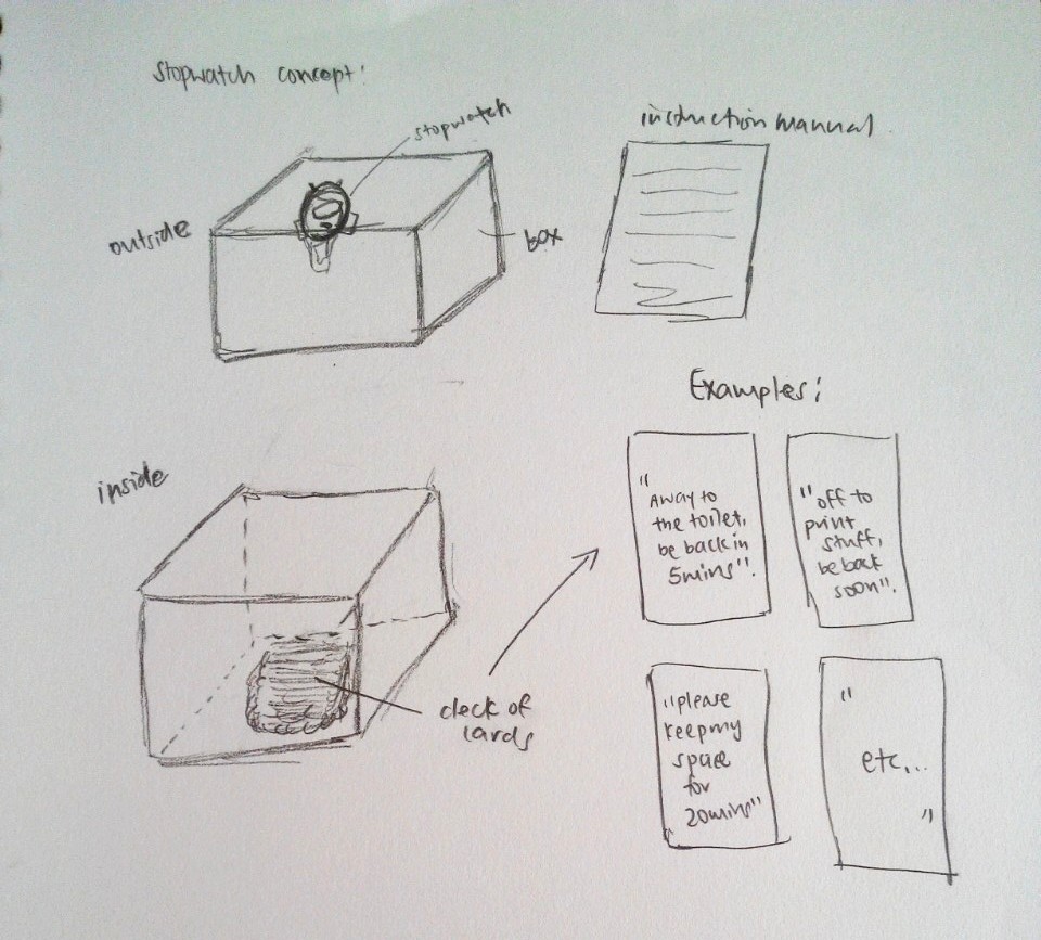
After our first consultation with Michael, we realised that there were quite a few technical difficulties with our decided proposal “I Chope Like That!”

Firstly, it was difficult to ensure that the mechanism of the Chope Card box will work properly. The original idea was to place the chop cards within the box with a pop open lid mechanism using a stopwatch. When the user activates the stop watch, he or she will be able to retrieve the cards from within the box. However, it was not easy to develop the mechanism. Also, there is a maximum cap on the number of laps a stop watch can take, meaning this will be a limitation on the number of users per box. In this case, for it to work, ideally, each seat should have a box in front of them. However, this will be rather cost heavy and hence not an ideal installation. Due to time management and lack of sufficient knowledge to solve the technical difficulties, we came up with another idea.


Final Proposal:

“What we sea in you?” 

Inspired from the cloud installation from my research installation list for this library project, we decided to do something that promotes an exchange of art. Besides, from our survey in the library earlier on for this project, we realised that quite a number of people find that the library is too quiet for comfort and that it becomes somehow uninviting since the people around are all strangers but they do feel awkward if they make the first move to communicate. This leads to the fact that the interaction between the library goers are really quite low. Through this installation, we hope to create a livelier environment whereby library goers are about to immerse themselves in the installation which simulates nature, in this case, the sea, as well as have an indirect interaction with the people around them.  This interaction in enabled via an exchange of art movement (one to one exchange) as mentioned earlier where library goers can take a piece of someone else’s art card off the board with every piece of art card they create and place on the board.

Initially, we wanted to create a vertical hanging area on the panels (somewhat like a laundry line) at this area:

We were thinking of coiling some thicker twine around the panels and provide some mini pegs for them to hang their  cards on the strings. We also felt like attaching some fairy lights on the strings (since there is a socket nearby) to enhance the visibility of our installation.

However after much thought, we realised that putting up this way is a little cliche. People may feel an aversion towards this method as their artwork will be openly displayed in public. For those who are not confident of their artwork, they probably will not contribute or participate since it involves “baring” their work so openly. Hence we changed our location and chose the brown table instead.

Getting inspired by this

we decided to make a similar platform for the library goers to slot their cards into the silts made. This led on to the production process of our installation.


MAKING IN PROGRESS:

(I did more of the physical production while Rochele did more on the digital production)

1) Marking out the shape of the form we wanted. In this case, we feel that the shape M gives us a more even and spreaded area for the silts.

2) Me cutting the foam!

3) Notice the awkwardly vertical chunk of foam at the side with the grey duct tape? We were facing technical difficulties through our cutting process as the upper metal bar was not fully secured and it was slightly tilted downwards, resulting in our foam cutting into odd shapes. Hence, we used another piece of foam to push the bar upwards to make life easier for us.

4) It was not easy to maneuver around the thin wire cutter with this big block of foam and we kind of lost count how many times the wire broke and failed us. Perhaps the foam was too thick?

5) I then carried on to cut the foam stamps into interesting shapes.


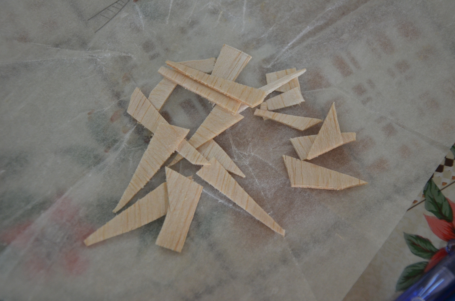
6) We collated a small pile of usable foam stamps I cut.

7) We tried making the slits from the foam cutter and realised that it was not very easy to do so. Perhaps, a penknife will be more suitable for the job instead.

8) I created a mock up with silts to see if it works.


9) With our foams cut, we then proceeded to do up the cards. We cut out the still image and pasted them on each of the coloured blank cards. (x 100 cards)

10) Subsequently, I wanted to make a foam box with a cavity in the middle to contain the markers for the installation.  I intentionally cut the waves like edges to simulate the waves at the beach. However, the cavity was not properly done and we both figured that getting a box for the stamps and markers will be neater this way.


PROCEED ON  TO LOOK AT THE FINAL INSTALLATION: https://oss.adm.ntu.edu.sg/liml0074/4dii-library-installation-final-what-we-sea-in-you/

Zine, a research project about a place in Singapore I am unfamiliar with. After doing some on site research, we are to produce a short zine on the location we are assigned to, in this case for me, Mandai. “Beyond Trees” is a zine containing 5 things you probably missed out about Mandai.


FRONT:

LEFT:

BACK:

RIGHT:

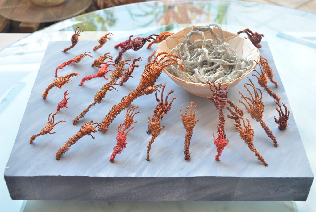
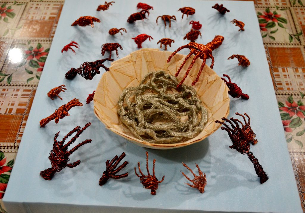
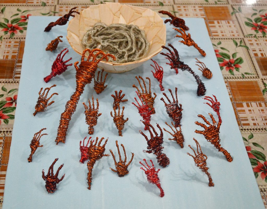
Title of Sculpture: The Enwreathed

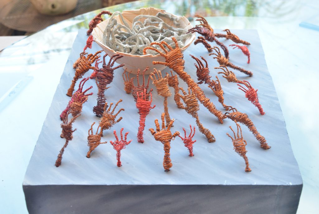
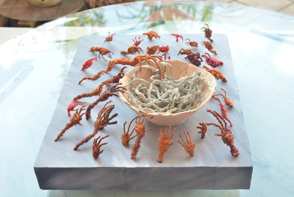
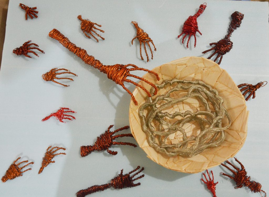
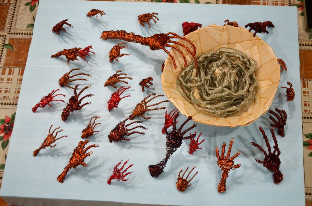
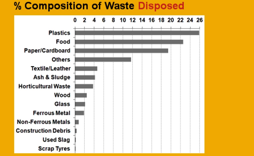
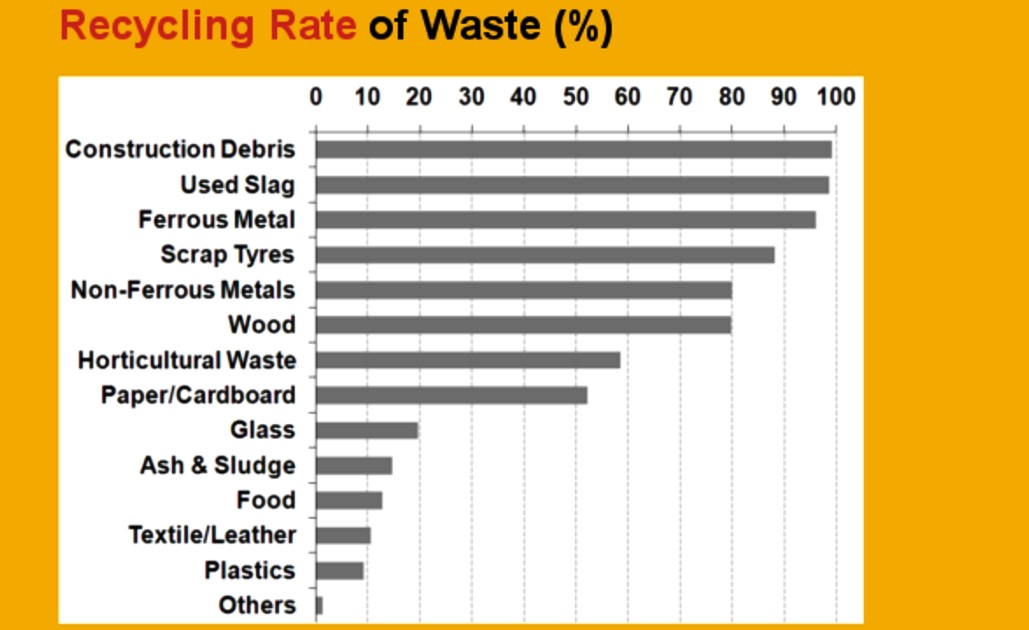
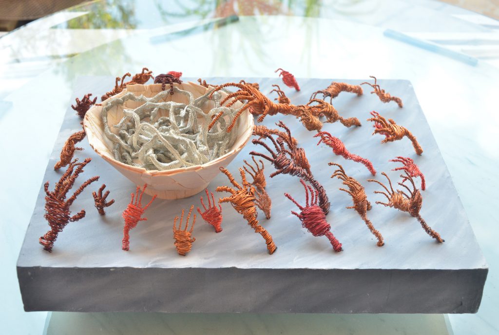
Concept Brief: The Enwreathed is a sculpture made to raise awareness in regards to the consequences of persistent food wastage. Unlike other types of waste which have high recycling rates, food waste has a high disposal rate and a very low recycling rate. The key to mitigate the prevailing problem is to reduce food wastage as far as possible. With the bowl of food as the centre of attention, many wired hands of different sizes and colour are seen coming out from the ground, reaching towards the bowl. This is representative of the viscous cycle of a global food crisis, throughout different countries, races and religion, including Singapore. These existing problems are further worsened by food wastage, causing a more pronounced reduction in our scarce food supply, resulting in the increasing number of people facing a more intense competition to fight for their source of sustenance.

This sculpture is mainly made of balsa wood, copper wires and steel mesh. The bowl is made up of cut up pieces of balsa wood glued together, forming the curvature for the bowl. Each piece of the balsa wood represents a different country, hence all the pieces of balsa wood adding up to the bowl eventually represents the world. The steel wire mesh represents the limited global food supply. The hands were all manually twisted from copper wires into different sizes and lengths to represent the different types of people in the world, reaching out for the food in the middle of the bowl.

Inspiration for my sculpture:


Description of concept development and inspiration:

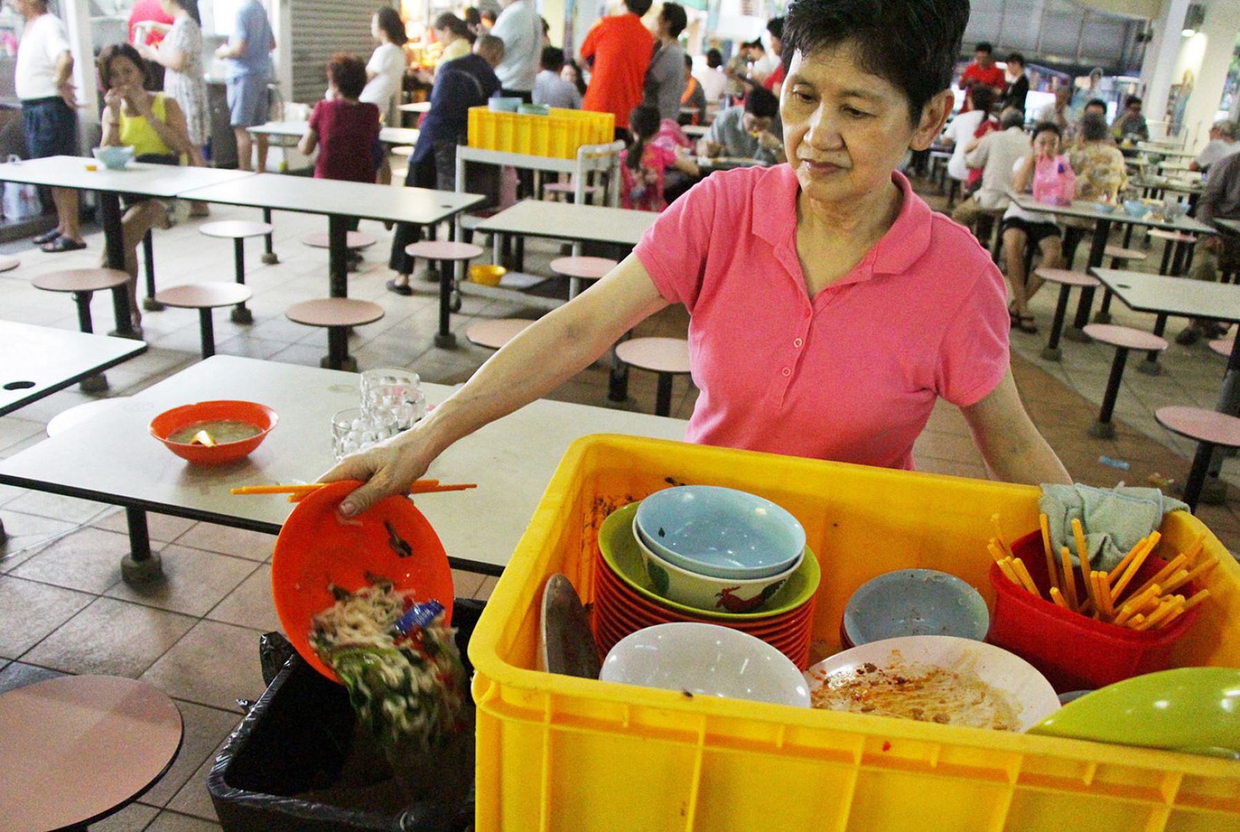
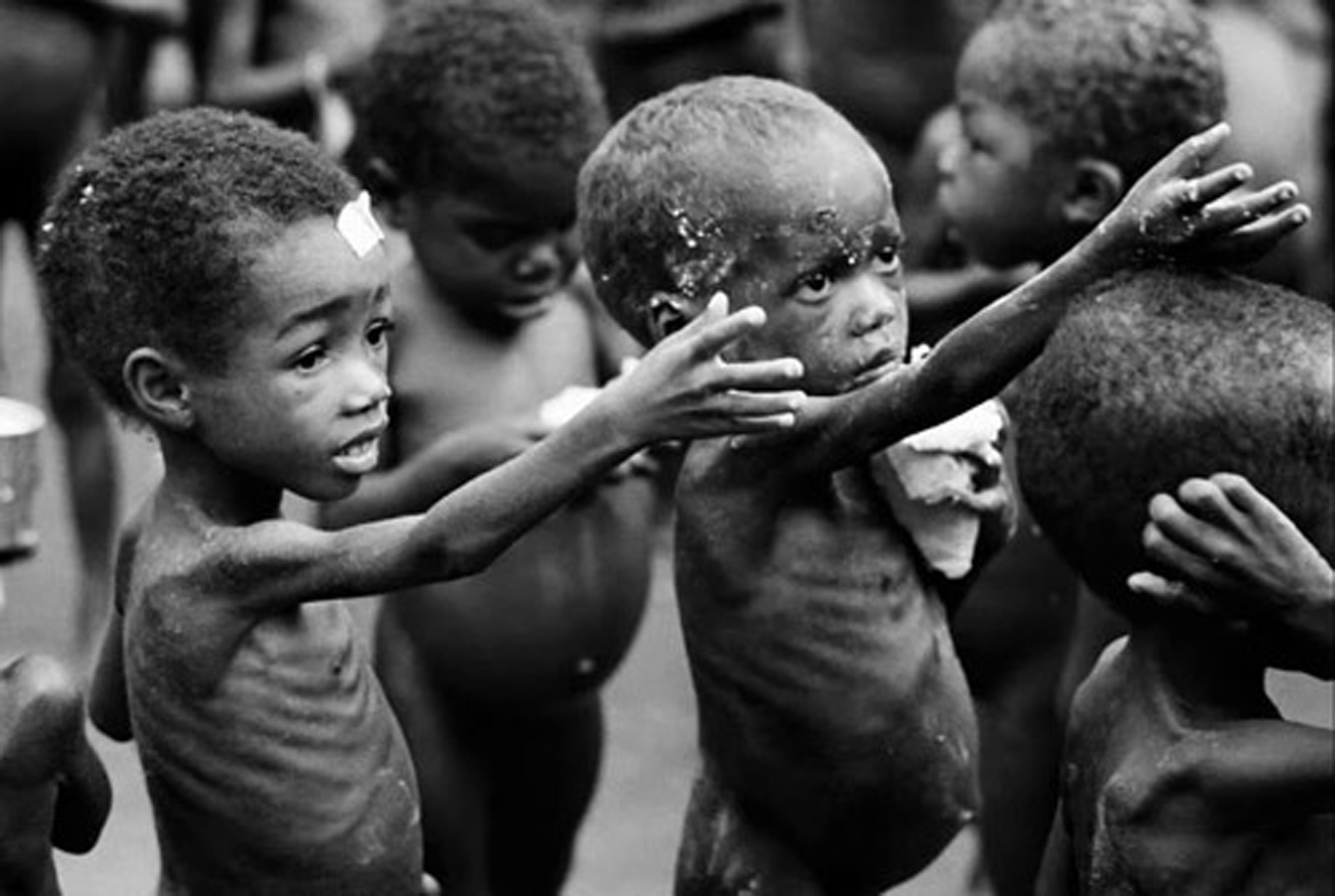
My inspiration for my sculpture comes from the following two images, namely one depicting world hunger and the other depicting food wastage, a common sight at the hawker centers in Singapore. Having witnessed many people leaving their seats with leftover food on the tables over the years, this issue has been troubling me deep down all along. Other than giving constant gentle reminders to family and friends, this provided me with a good opportunity to express my concern and my power as an individual to allow people to be more conscious of their behaviour.


Process and Development of Sculpture:

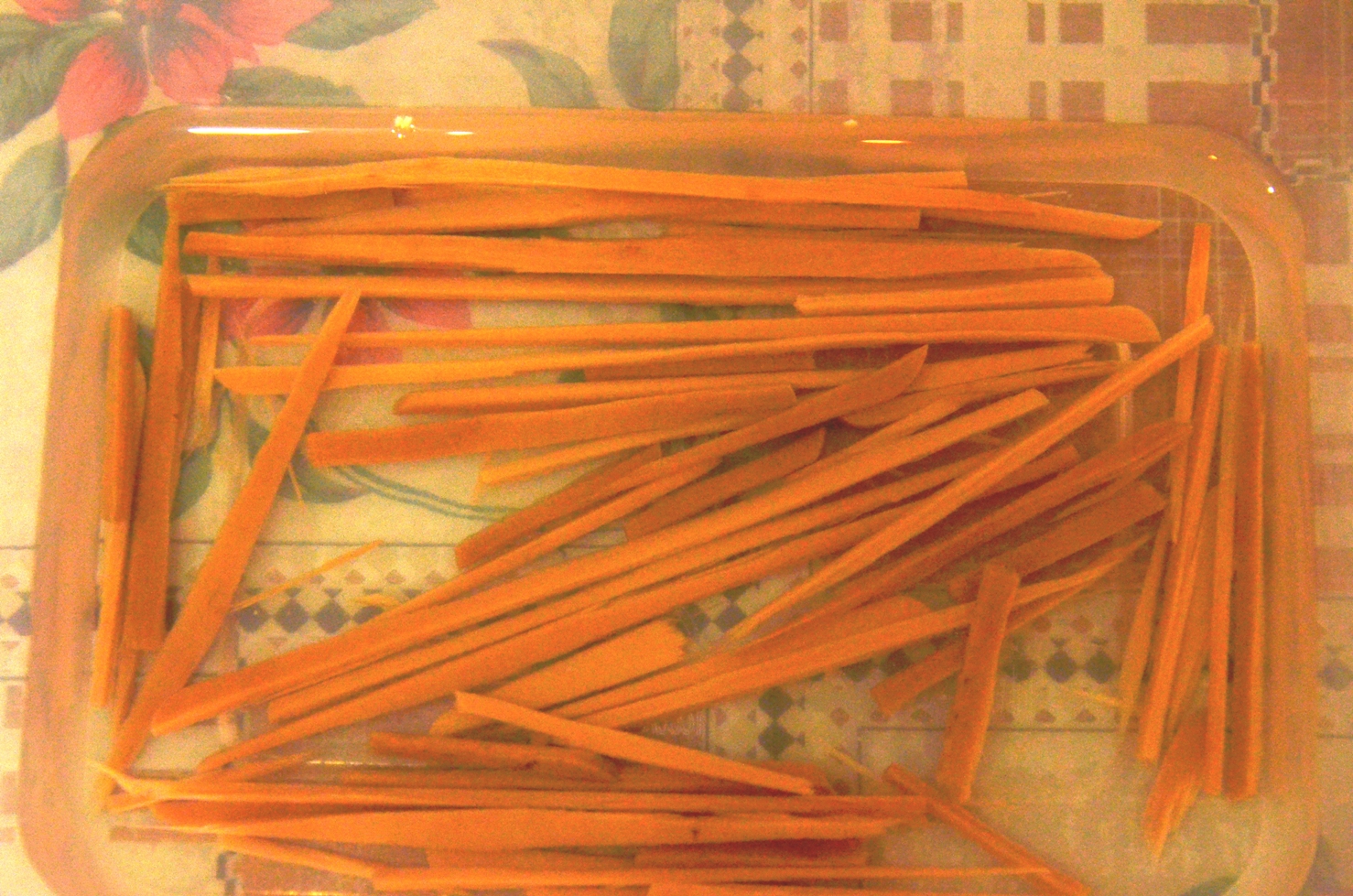
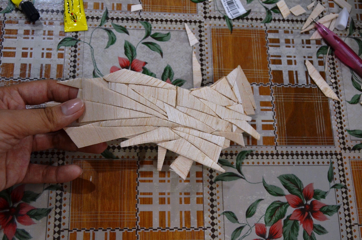
Initially, I tried using the ice creams sticks I painstakingly cut up to create the bowl I wanted through soaking them in boiling water. However, it did not work out as expected as the wood was too thick. Then, I went to acquire some balsa wood (a more ideal choice) for my project.


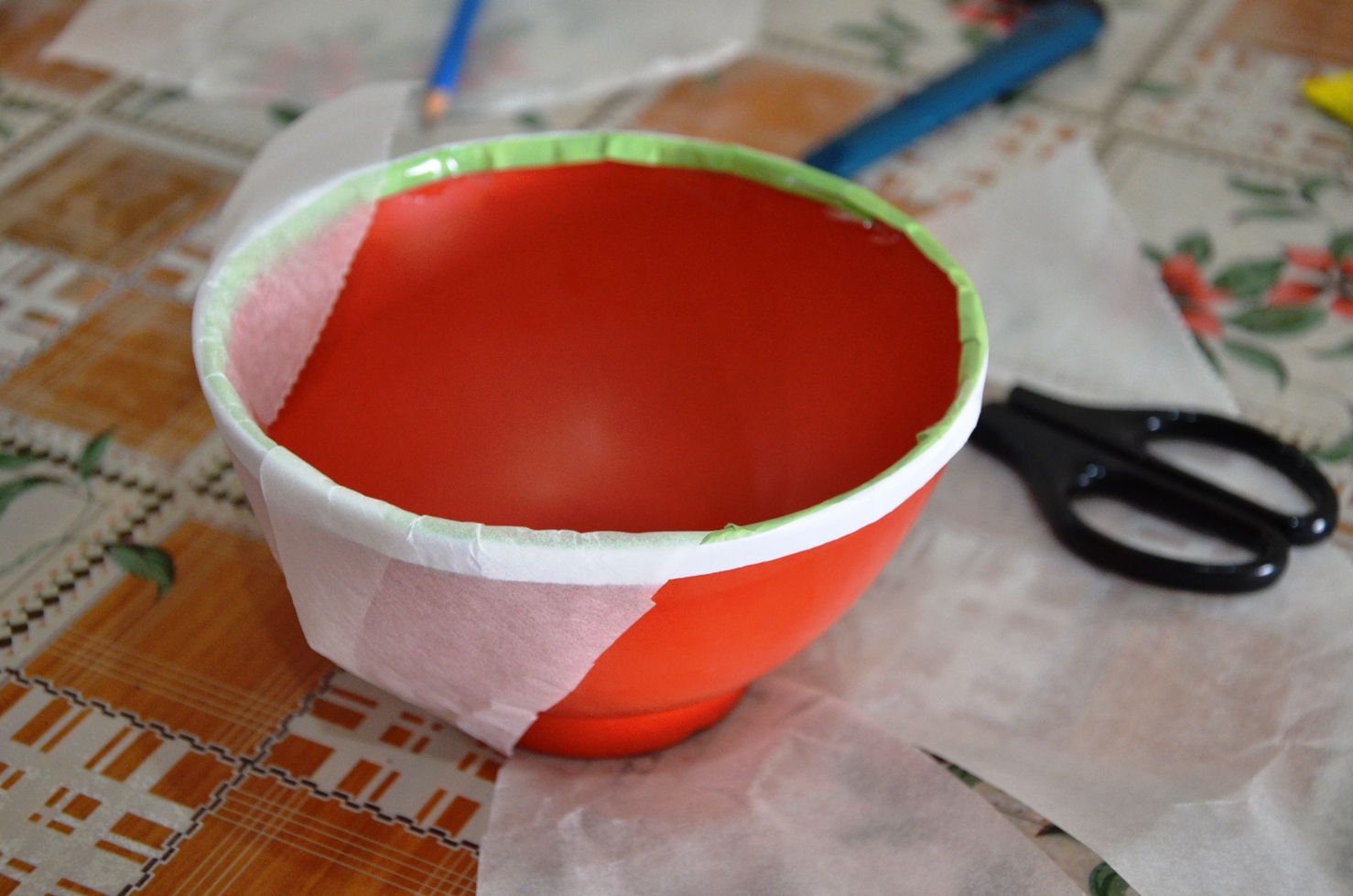
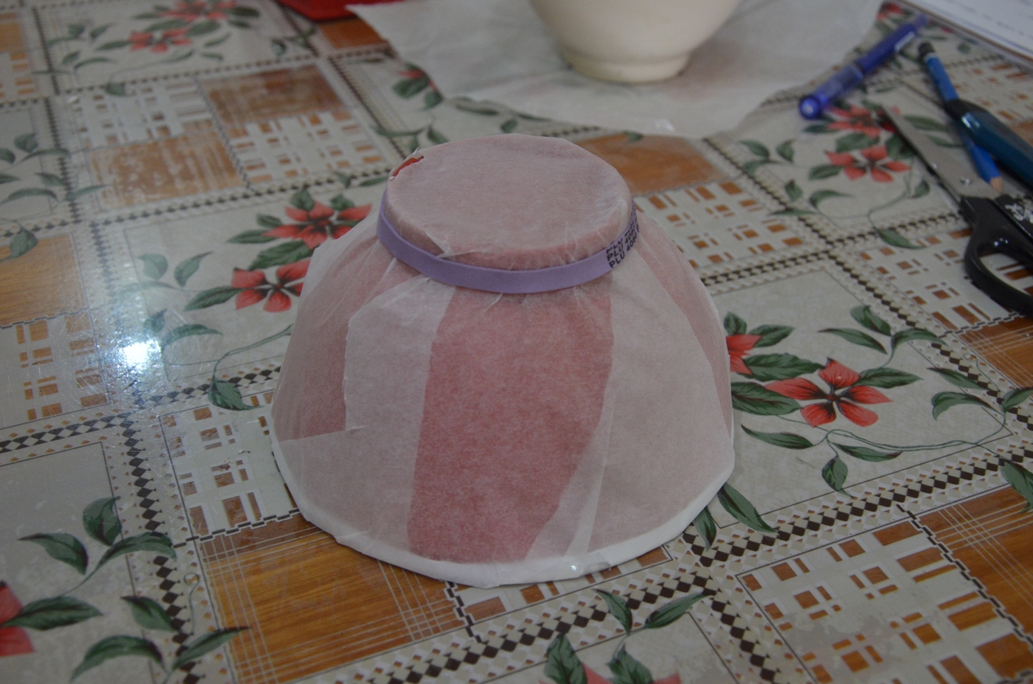
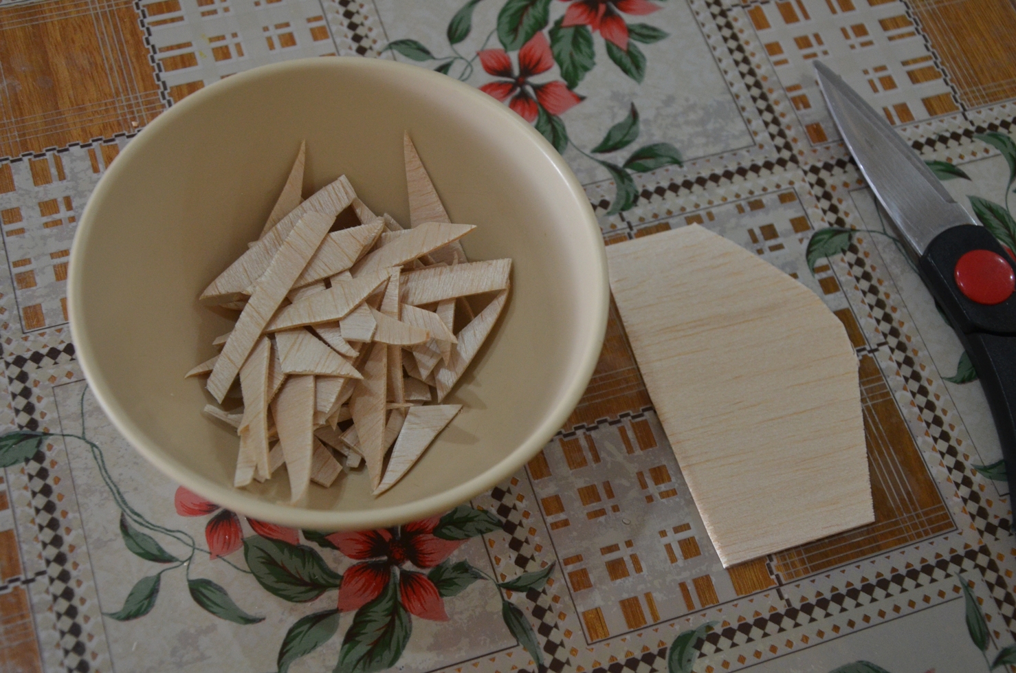
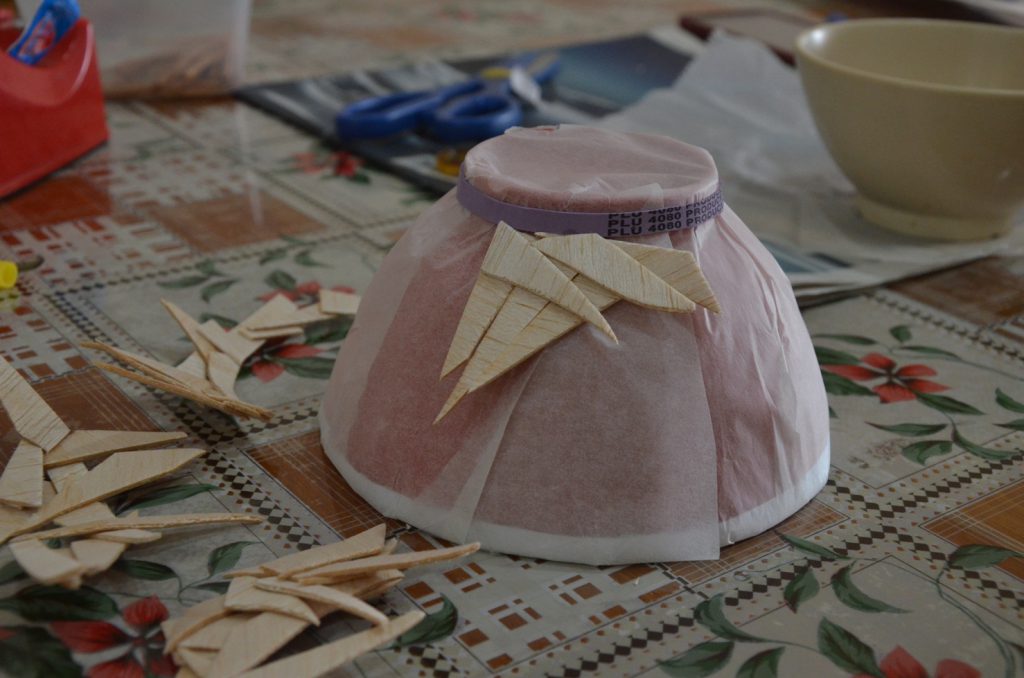
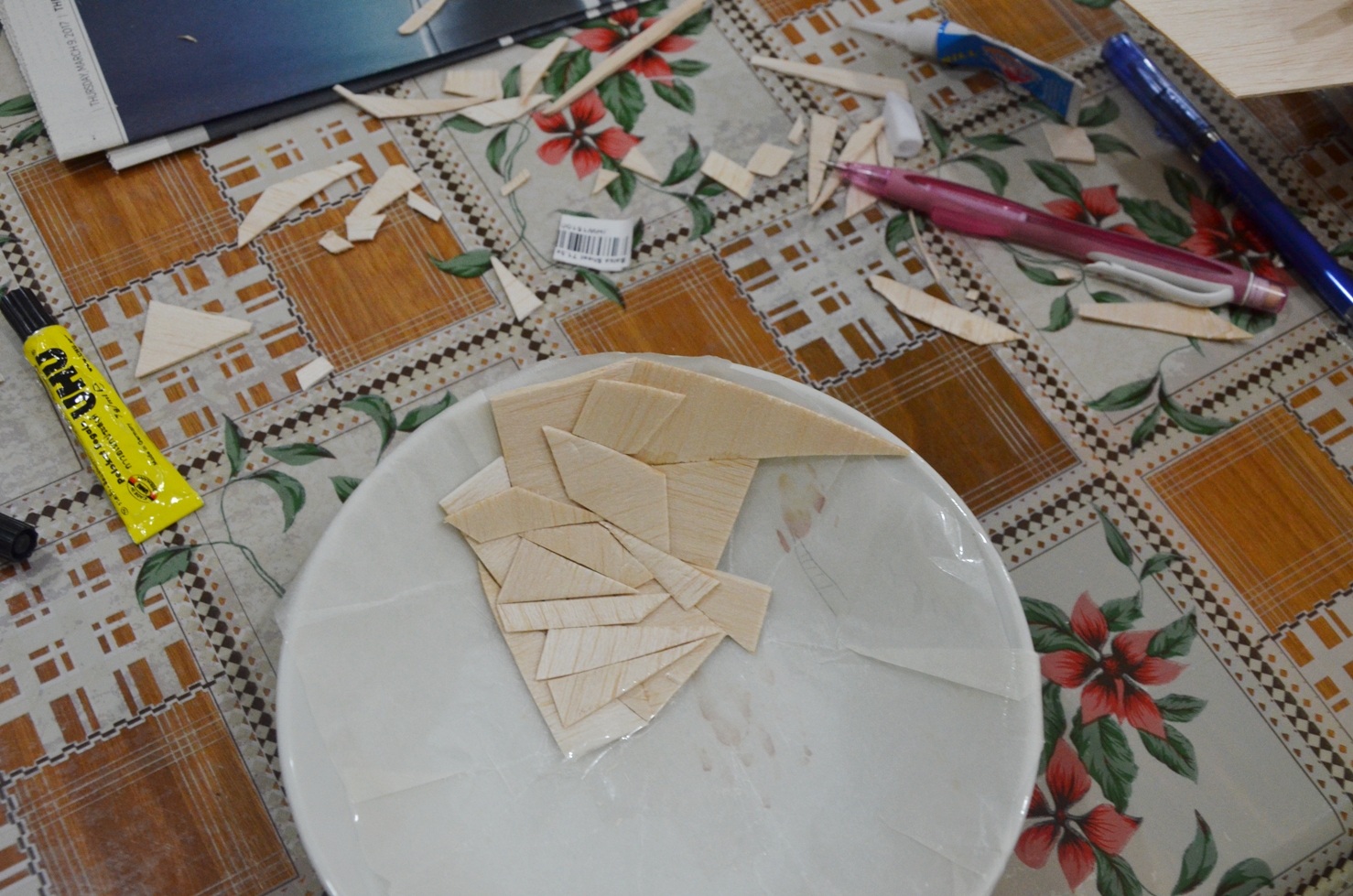
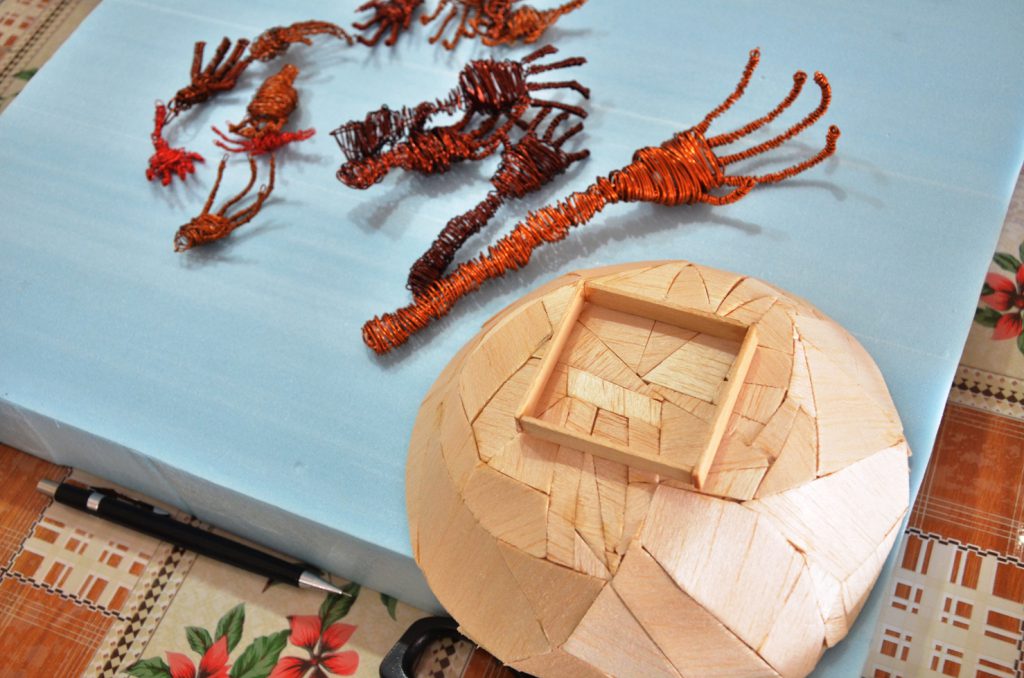
I wrapped a bowl with non stick cooking parchment paper before cutting up the balsa wood into small pieces so that I can glue them together against the bowl to form the shape needed.


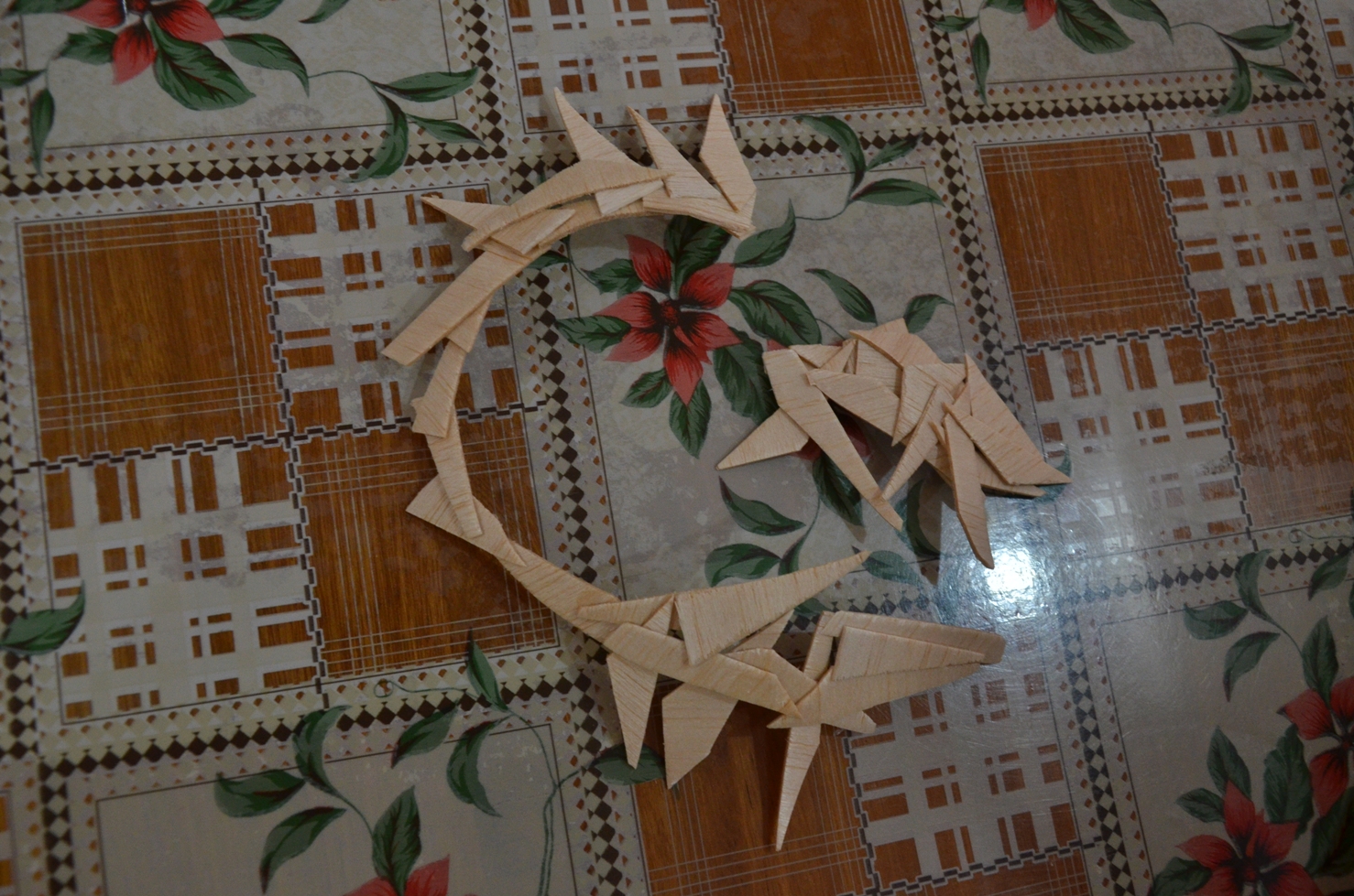
However, this method did not work out as it was extremely difficult to hold the pieces there without any support other than the glue. It resulted in the picture below as one of the joins broke, causing the piece to fall apart.

The picture below shows my second attempt at making this work. However this still proves to be rather difficult, hence I have decided to change my approach.

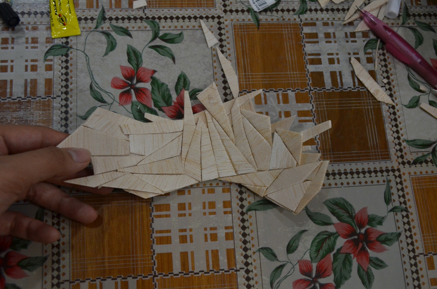
Part of the curvature achieved.


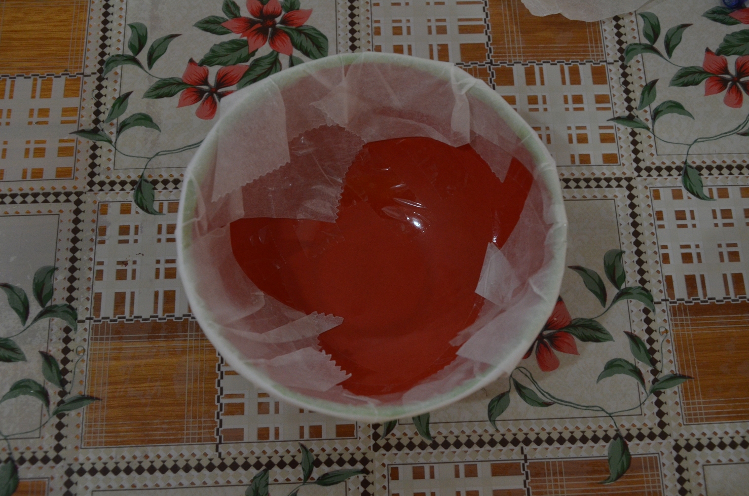
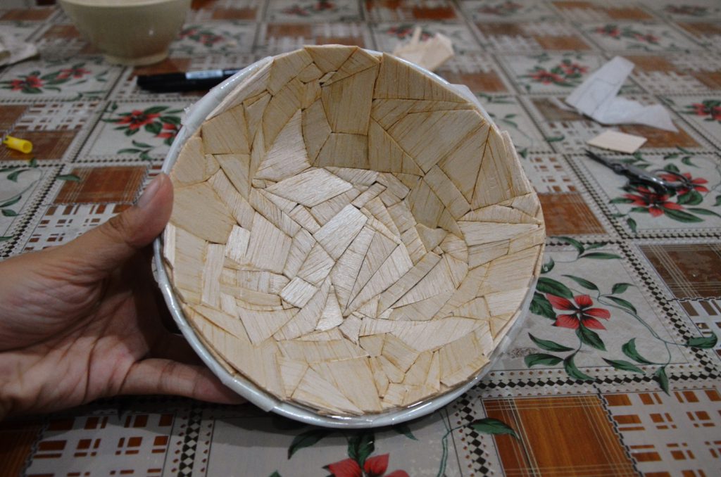
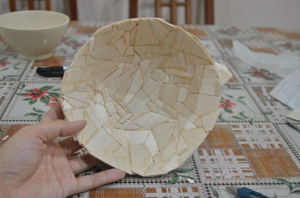
This is my third attempt with a different approach. I did the opposite and lined the parchment paper on the inner surface of the bowl instead and started to glue the balsa pieces together. Due to the support given by the bowl, it was much easier this time.

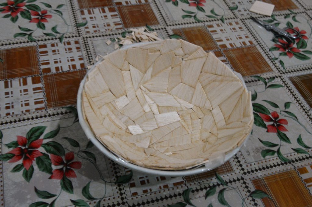
Two layers of the bowl completed.


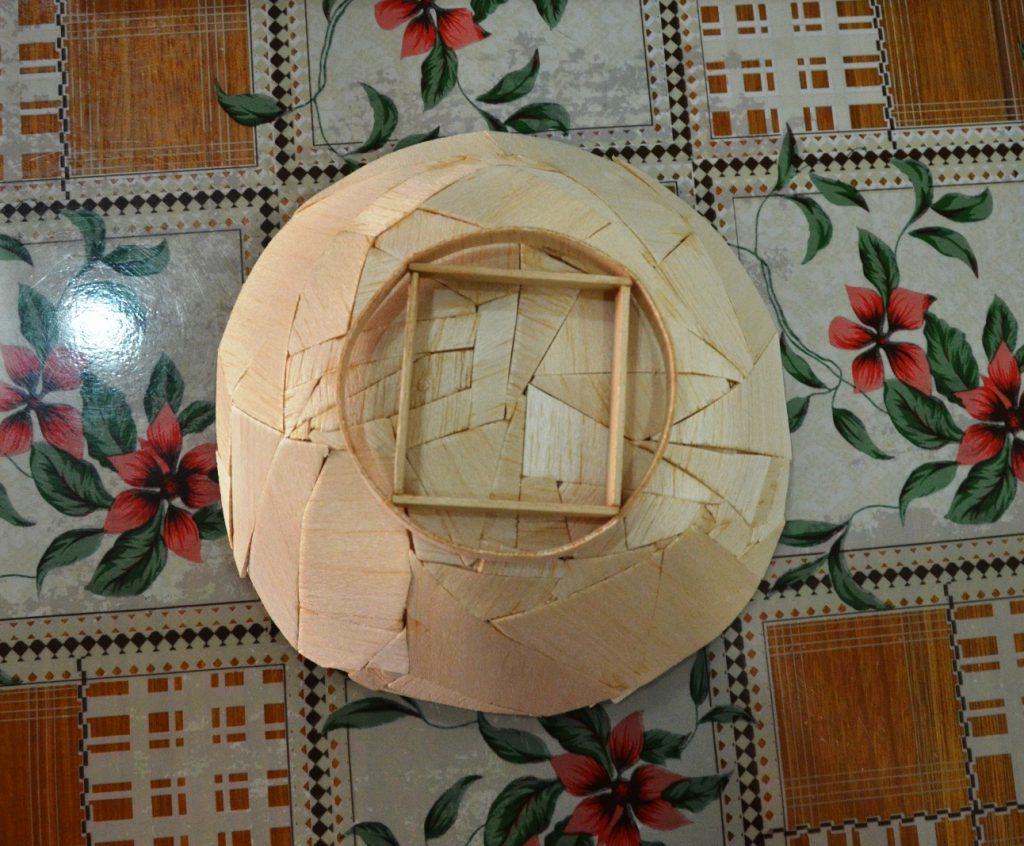
Balsa bowl taken out from the “mould”, aerial view.

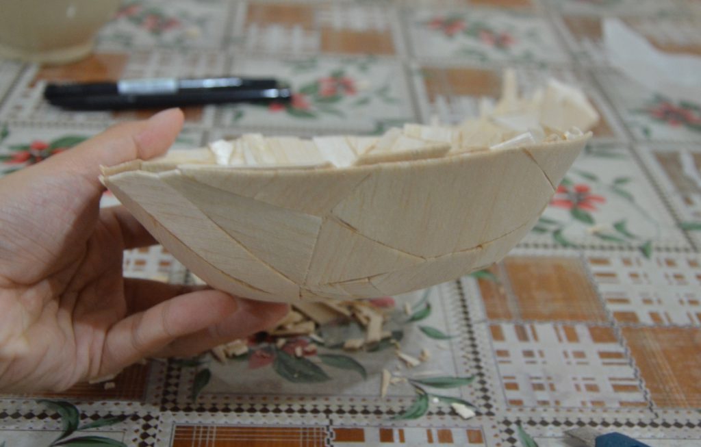
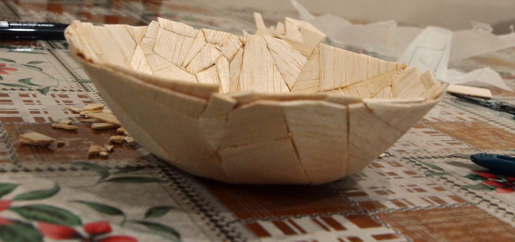
Side view.

Notice the two layers mentioned.

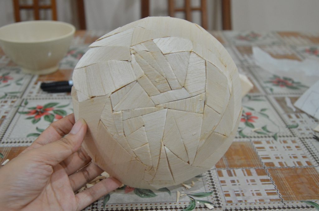
Back view.

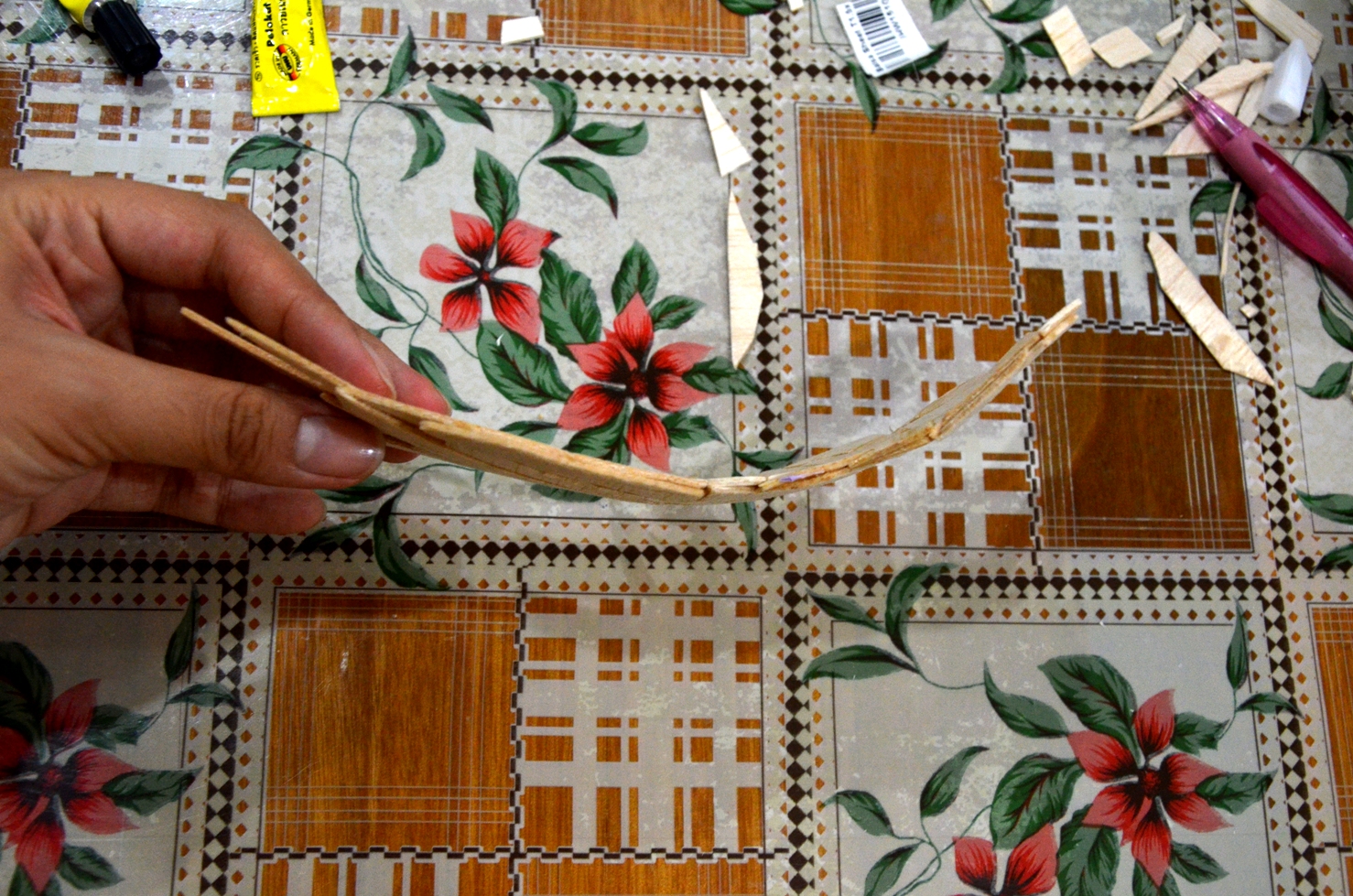
I cut up some ice cream sticks into 4 short sections and glued them together to form a square before attaching it to eh base of the bowl to create the mini “stand”. Subsequently, I cut up 4 pieces of (almost) identical strips of balsa wood and attached it, bent, to the ice cream sticks at each junction to create the curvature I wanted.

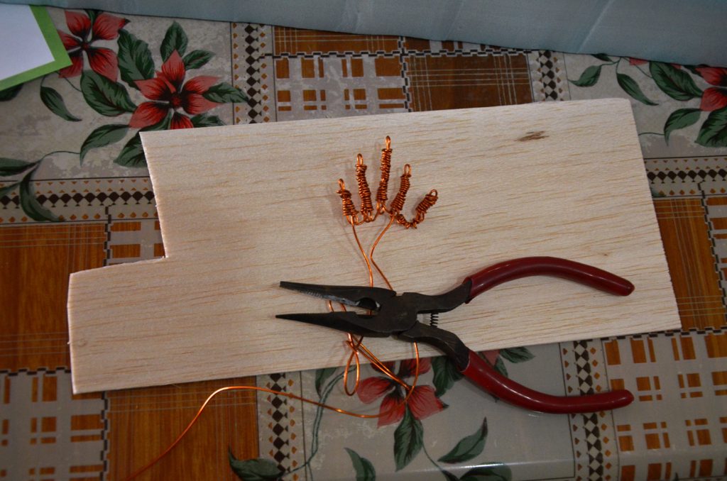
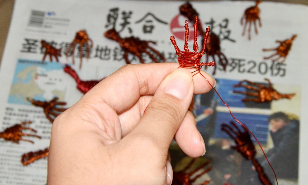
After I am done with the bowl, I proceeded on to fold my hands using copper wires.


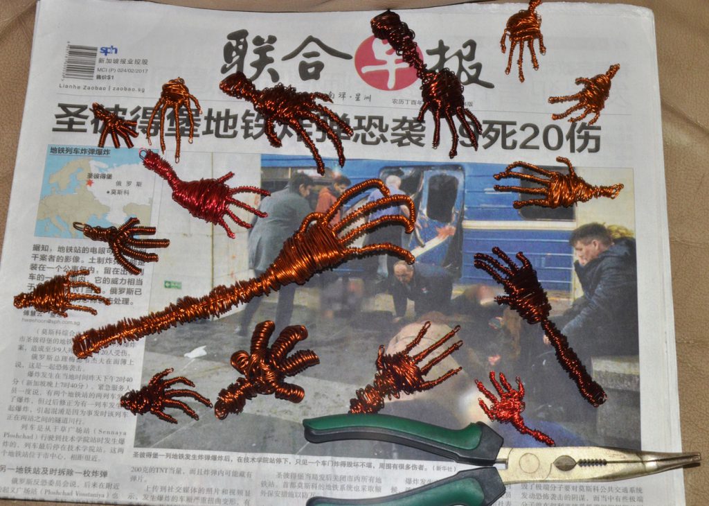
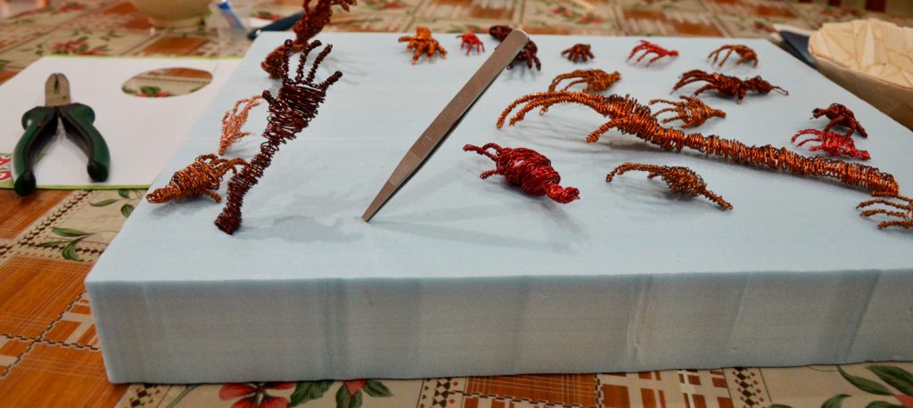
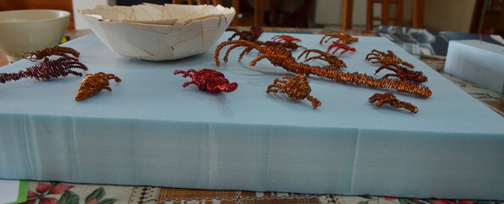
Fast forward the process many times with some variation (some thicker wires, some thinner, some bigger hands, some smaller etc), I get a small pile of hands.


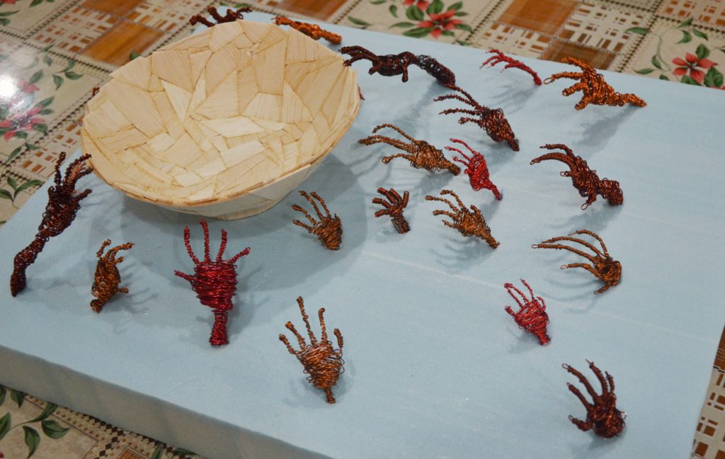
Creating a comfortable layout on the foam which acts as a base, simulating the ground. I have also placed some steel wire mesh in the bowl to simulate food.

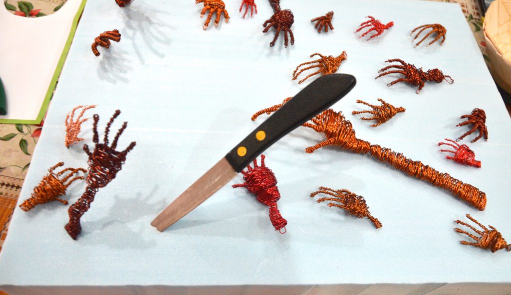
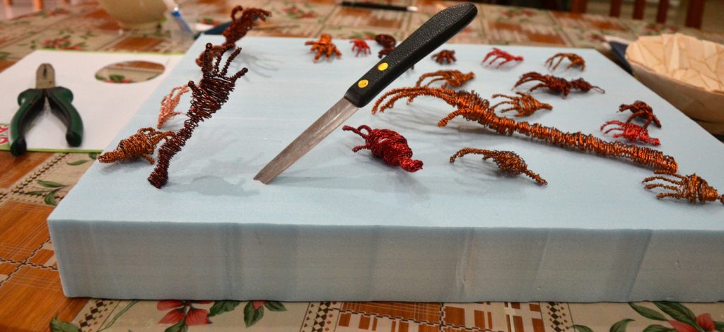
After glueing the bowl to the base,  I began attaching the hands by stabbing the foam with a sharp knife followed by opening the silt to a suitable size by a tweezer.


Attaching in progress.

Final draft model done.


However, after the review in class, Prof Peter mentioned that the blue foam base for mine was not ideal and suggested that I paint the foam instead. Besides, the hands looks a little too scattered. Probably I can move then closer to each other to have a cluster feel to have a more sense of urgency.

This leads to my next post on my final model.


Link to my Final Model: https://oss.adm.ntu.edu.sg/liml0074/3dii-final-project-zer0-waste-final-model/


Inspiration Image References:

http://www.todayonline.com/sites/default/files/styles/photo_gallery_image_lightbox/public/22396714.JPG?itok=Nu6Ox804

https://userscontent2.emaze.com/images/19fb99cb-c03a-4938-bc6e-a4e52279491f/f9dbaf1e10e2b0bb888004cd88d24e65.jpg

ZER0 WASTE SCULPTURE IDEATION: 


Background Research: 

Waste Statistics In Singapore 

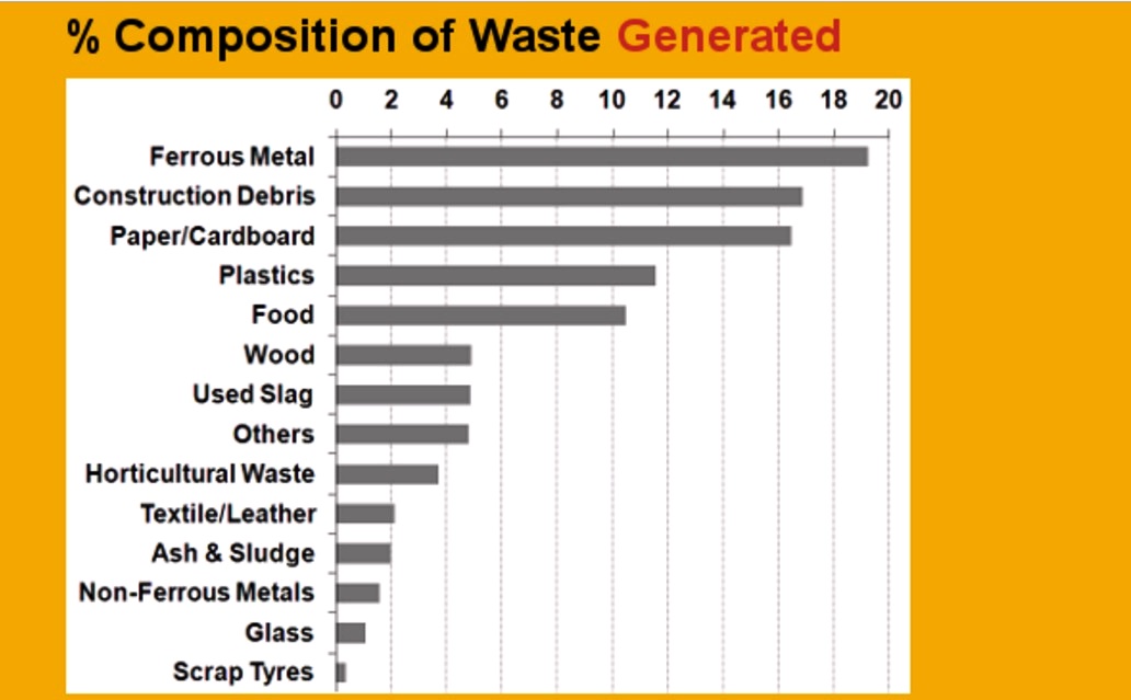
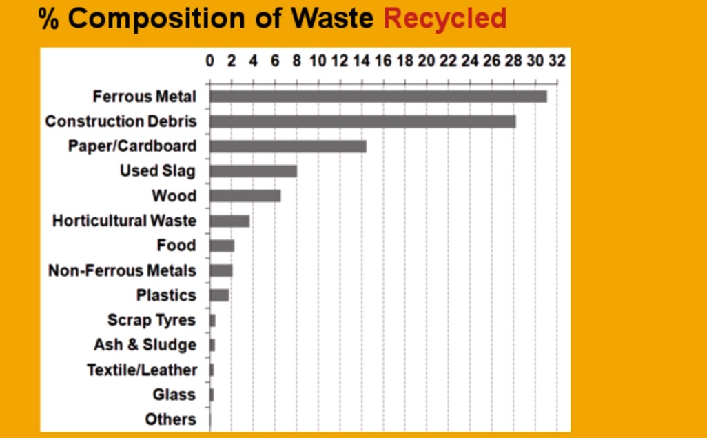
At first, construction debris caught my attention but I decided to look further.


Then I realised that food waste contributes quite a significant percentage of it.


Right here, I noticed that the percentage of food waste recycled is actually very low given the perishability of the products.

I felt that amongst the different types of waste, food waste is something that is close to

heart for most of us, if not, all of us. Since everyone can definitely play a part in reducing

food waste,  there is a need to bring heightened awareness to this topic and that people should

be constantly reminded that they are in total control of the amount of food they order

in order to reduce food waste.

Hence, this led to a few of my sculpture ideations.

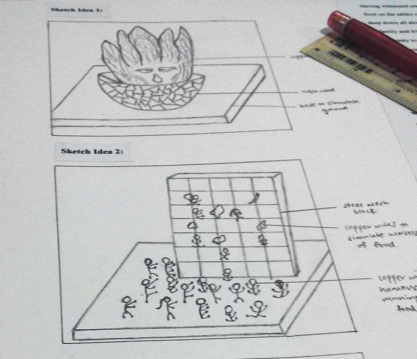
1) The Screaming Cabbage (First Sketch Box)

Initially, my idea is to have a huge screaming cabbage seated in the middle of the bowl. The bowl the cabbage is sitting in will be made from pieces of balsa wood joined together while the screaming cabbage will be made from copper wires. However, I feel that it lacks the significant impact that shouts out the audience about the dire consequences of food wastage.

This led to my second ideation sketch.


2) The Scale (Second Sketch)

My second sketch involves many human figurines (made from copper wires) climbing up a wired steel mesh with morsels of food attached to it, fighting for food. However, the height and scale of it may be a little difficult for the target audience, in this case, the general public to appreciate. This is also similar to rock climbing which may cause the public to misinterpret the sculpture. Hence, I went on to develop my third idea.

3) The Enwreathed

My third idea involves this sculpture with many hands reaching out for the bowl  containing food. I find that this sculpture has the strongest impact and shouts out to the audience, relaying the message relatively well. Hence, I have decided to take this idea through.

(Refer to my next post for the development of the third idea)


Reference Statistics: http://www.zerowastesg.com/2015/03/18/singapore-waste-statistics-2014/


Link to Final Project Progress Documentation:

https://oss.adm.ntu.edu.sg/liml0074/3dii-final-project-zer0-waste-process-documentation/

QUE SERA GALLERY:

Que Sera is a project whereby students get to design a type using their own initials. We get to explore on what constitutes a good typography and what elements we can use to make it an effective one. In this project, we are to depict our future aspiring jobs using our initials and our type creation.


“I am an IT Programmer”

“I am an Electrician”

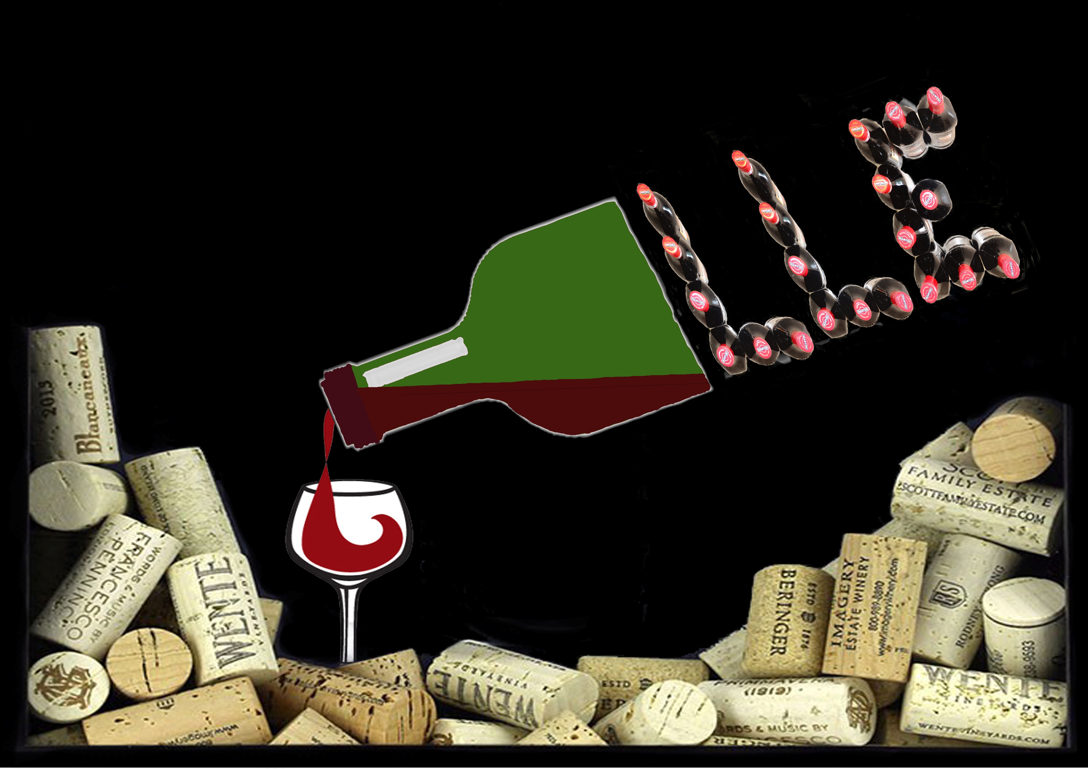
“I am a Wine Dealer”

“I am an Architect”


It was my first time using indesign, hence I was extremely unfamiliar with it and had to learn from scratch. After the crash course from Tutor Shirley about Indesign, I felt more confident and began to do more self exploration. My zine process with be illustrated as shown below:

It will be shown through a progressive change for each page throughout my different versions.

COVER PAGE:

Initially I had no idea what to do for a cover page. Hence I came up with a “deadpan” look one like the one above.

Subsequently, I began to use more visual elements in my design but they made the zine look rather messy.

This is how my zine looked like after my first consultation. Elements used are simplified and the titles are all put together for ease of reading.

I then came up with another version on on own, wanting a sense of hierarchy to my cover.

This is how my final cover looks like after editing.


LAYOUT  PAGE 2/3: 

My original intention was to use this doll with 5 pins on it to mark out the 5 things about Mandai. However, the first thing that Tutor Shirley said when she saw this was ” you want to curse someone is it? Voodoo doll??” Then I realised my mistake in choosing this doll.

After which I decided to fill my 2/3 page with the birds as my subject matter. This is how the first attempt looks like.

Then I altered the text a little and created some emphasis on some words that seemed more important. However, after my consultation, I realised that this is actually a big nono.

I too learnt that my text should all be in one area and not all over the place. Hence I amended my text’s location and added white borders to my pictures to have a better sense of harmony.

The pictures at the bottom seem a little squeezy after that, so I removed one of them and enlarged the rest with more spacing between my text as well.

This is the version 2 of the bird sanctuary page I created.

This is the final layout I have decided to go with in the end.


LAYOUT PAGE 4/5: 

Once again, this is the very first attempt for using the rectangle tool after the crash course.

I also tried to make use of some gradient effect as well. However, I realised that it can be distracting and thus removed it thereafter.

Pulling images into my layout in the raw state.

My attempt to add borders and shapes to my images and well as a title.

I played around with the different typeface and colour for the title as well as the texts in my layout. However, the feedback was that the caps title seems “angry” and I better change it to some other typeface. Also, deciding that white is not a good idea which actually breaks the sense of consistency, i changed it to black in the following picture below.

Again, I placed emphasis on some words which is not ideal at all and added white borders to my pictures.

I then shifted my text to one area as they should not be all over the place as mentioned in the previous layout.

Seeing that there is not much progress for version 1, I began to start on a version 2 instead. I also made conscious effort to let my pictures have a sense of hierarchy.


Eventually, this is my final layout for page 4/5 for my zine.


LAYOUT PAGE 6/7:

Again, this is my first attempt.

Adding title and pictures into it as usual.

Once again, text flying everywhere. Not ideal at all. Pictures seem rather cramped.

Trying to make use of white borders to help but they are not helping much either.

Tidied up the pictures and texts. Looks slightly better now.

However, I still went on to do my version 2.

This is how the final layout for page 6/7 looks like for my zine.


BACK COVER: 

My first attempt at making a back cover page. I didn’t want it to look complicated hence I reused the same picture. I also want the viewer to have a ‘one glance to end’ kind of feel then the layout is as such.

I then proceeded to add some final text on it.

However, considering that the majority part of the zine is better in version 2, I also went along with the version 2 of my back cover.

This is the final back cover for my zine after adding some social contact.
Reflections: 

I felt that this project really allows me to gain exposure on how to create a mini magazine on my own with a totally unfamiliar software. I learnt a lot through redoing and amending my zine with the feedback I received. Things like the typeface, fonts, colour, placement of pictures and texts, visual hierarchy etc are all very important in a zine and I am really glad I tried many ways and means to get this project done. My initial intention was to do a zine purely on Mandai Crematorium and the comparison between an army’s officer’s procession versus a civilian one. But then it resulted in a very dark aura around my zine, something I didn’t want, hence I changed my subject matter to the 5 things you probably didn’t notice in Mandai. At first my title page was just as literal but subsequently I changed it to a more indirect one “Beyond Trees” since many people think that Mandai has nothing but trees over there. Despite having many doubts and insecurities, it was a chance for exploration, experimentation which actually made me enjoy the process.