Exposing our screens:

img_20161005_094230

img_20161005_094159

We were brought into the dark room with an empty silkscreen and were told to attach our transparencies (2 sheets together) onto the silkscreen before facing it down on the exposing machine which will first vacuum the screens before exposing it to strong light. Afterwhich, the screens will be ready to be washed by the water jet in another room.

img-20161005-wa0006

My first silkscreen design.

img-20161005-wa0014

Failed trial prints on newsprint. Most of the just appear pitch black and the halftone could not be seen at all. Though I managed to get the halftone once as shown on the bottom right, it felt extremely insecure.

img-20161005-wa0008

Turned out that a couple of us in the class also stripped off their first design since they were  not satisfactory. Also, we did not realise that the first tub of betastrip used was expired and hence quite a few of us spent futile effort over a good half an hour trying to scrub off the design.

img-20161005-wa0012

Process of stripping off the first design.

img_20161012_083804


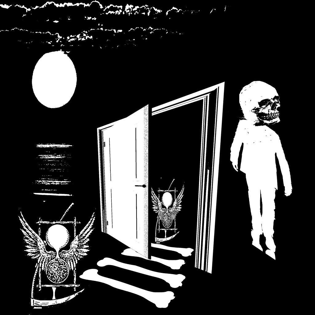
Notice that there is a “ghost” image on the screen!

img_20161012_122852

Subsequently, I came up with a second design and proceeded on to expose it again the next lesson. It also made me realise that I didn’t take a photo of my first exposed design last week. (:( )

img_20161012_122844

I tested it on the newsprint and it seems to be pretty fine. At least the prints were much sharper this time round as compared to the first.

img_20161012_122237

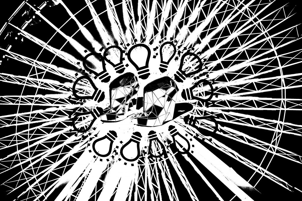
This is my first trial tote bag. Other than the slightly smudged phoenix, the rest of the print seems pretty fine. The method I used was to ask Minh to hold the silkscreen frame diagonally and I scraped the squeegee with one hand downwards directly. Also, I realised from the trial newsprint that I should do the scraping of ink upside down instead of just the original direction of the design. This is to prevent the ink from smudging at the tips of the light bulbs where the thin lines are rather crucial details.

img_20161012_122349

This is the actual tote bag. One side of it was pretty smudged (will be uploaded tmr). Minh recommended that I use a bigger squeegee to scrape the inks with two hands instead of my original method. The method did not turn out well for my design.

After getting a shock (because my trial print was not that bad), I allowed the surface to dry off before trying it again on the other side which thankfully turned out to be pretty good.

img_20161012_125734

We then washed out screens and stripped the designs off using the betastrip. My “ghost” image proved to be rather dark though. ( 😛 )

Reflections:

This is the first time I am creating designs on my own and it has been an enriching experience thus far. I became more familiar with the photoshop functions and managed to successfully design something out of it. Although the process of amending and rethinking my designs were rather arduous, it was nonetheless enjoyable in a way.

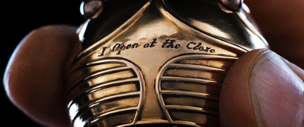
I chose 2 quotes from the Harry Potter series since I am a hardcore HP fan. At some point in time, I actually wanted to change the 2 other quotes since I find to rather hard to design. However, I persevered on and designed the Harry Potter ones first since it held more of my interest. After designing those 2, gradually I find it easier to come up with ideas for the rest of the 2 quotes.  Through the process, I also found editing on photoshop getting easier as I progress with the designs.

The process of the silkscreen proved to be rather fun, from evening out the emulsion to water jetting the screens to finally spreading ink and trying to manual print them. This is something I had never done before and perhaps will never get exposed to if not for this project, I am hence very thankful for this experience.
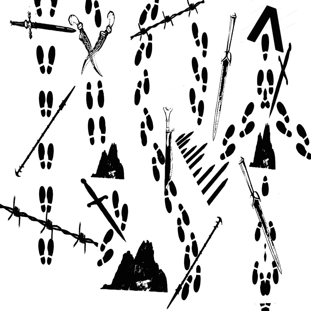
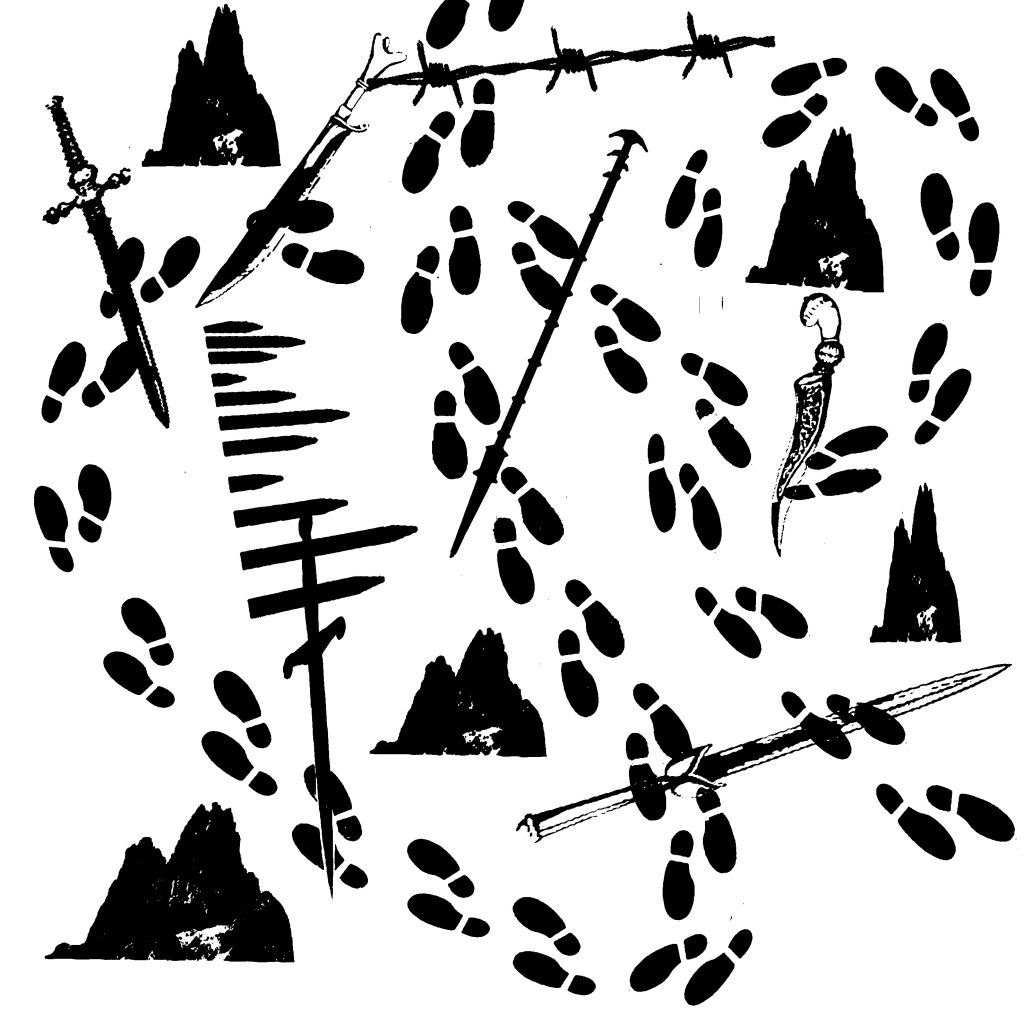
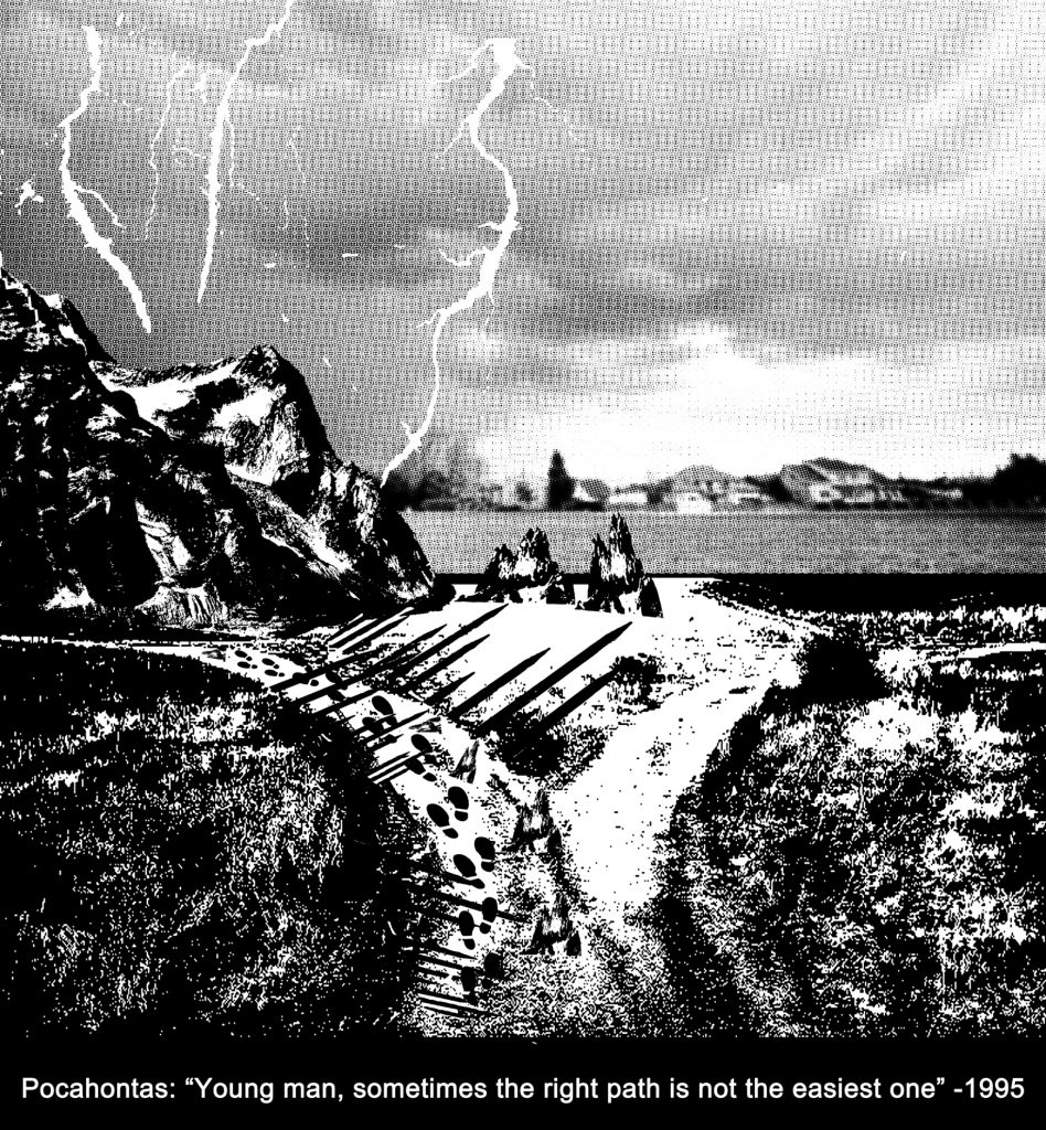
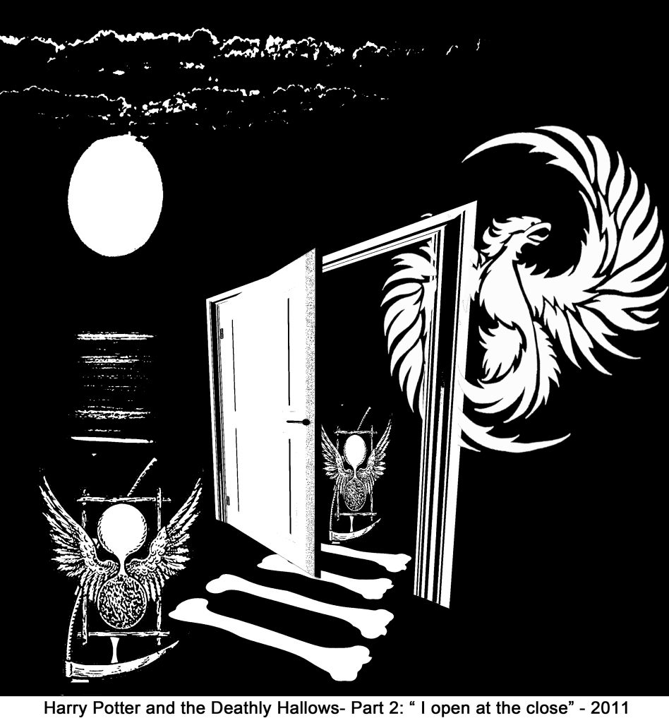
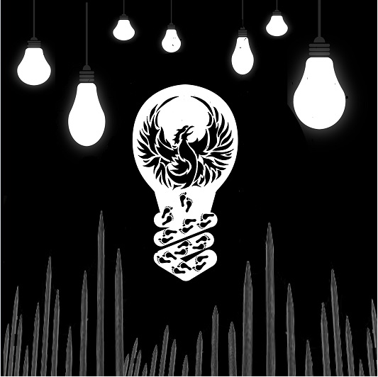
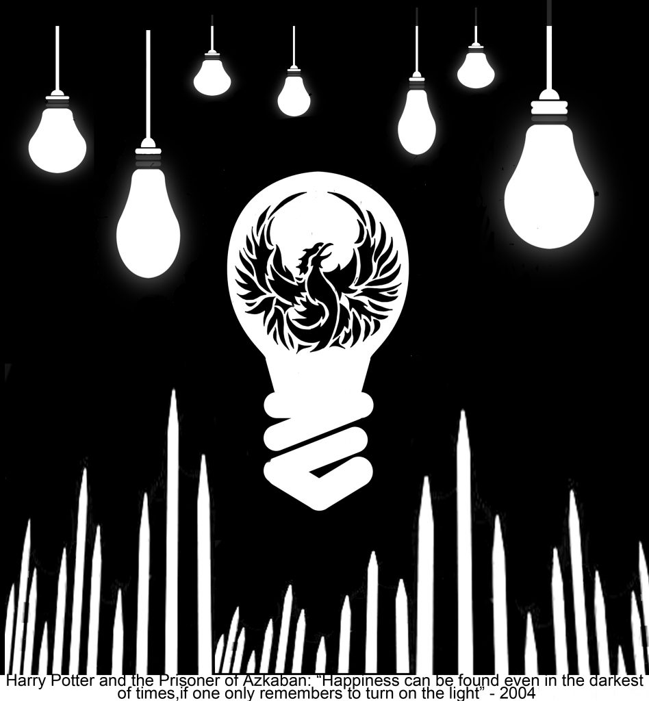
“Sometimes the right path is not the

easiest one”~ Grandmother Willow 

Design 1:

foot-pritns

The original idea of this design is to form paths using footprints and how each path is temporarily blocked by obstacles which is the interpretation of “not the easiest”. Ancient swords, spears and barbwires were used to bring out the vintage feel Prof Mimi wants. There are also boulders involved to represent larger obstacles.

However, the comments were that the footprints were too random and that the path is not clearly represented. Besides, all the objects are quite randomly placed as well, giving the feeling that they are “floating” in the air with the fluff and unstable feel. Hence, this lead to the amended design 2.

Design 2:

footprint-edited-2

This is the amended design from 1. I attempted to make the path clearer by making the footprints start from the middle top of the design and it goes in 2 loops (bigger and smaller) and ends at the lower right of the design. I also cut down on the variation of the obstacles used to reduce the complicated feel of the design.

However, the comments were that the path of the footprints were once again unclear and it seems to be messy instead. The “random” feel, although lessened, still exists and probably would not be an ideal design for the quote. This leads me to my 3rd design.

Design 3: 

2nd-design

This is the third design for this quote. I decided to have a different approach instead. The dark background represents the “tough” situation one is in and everything seems gloomy for her. I then design it in a way to make her cross the broad river with strong currents through different actions. From the first pose with an “energised” feel to the second pose with the “persevere on” attitude to the third pose with the “i need to be cautious” attitude in the precarious situation on the boulder and finally to the last pose with the “tired but somewhat victorious” after the treacherous path.

However, comments for this design are such that the background contain way too many details which prove to be slightly messy and perhaps would not be an ideal for a printed design. It is quite literal and safe but lacks the vintage and ancient element feel to it. Also, the path seems rather simple, the obstacles are too minimal to even fit the quote properly. Hence this leads to my 4th design.

Design 4:

mountain-path-min

This is the fourth design for this quote. Again, I took another different approach whereby the obstacles were made to be seen clearly such as the huge mountains, the lighting, the spears, small boulders and barbwires. The footprints are then included inside to simulate someone walking through this treacherous path.

This was my original design for the tote bag. I used this design to expose my screen for the first time and it turned out well on the silkscreen. However, when I printed onto the newsprints for test prints, it turned out to be half black instead and the half tone was not seen at all. Technically, the halftone failed and all the small details across the design were pitch black. I had to erase this design using the betastrip and re-expose it the next lesson. This leads to my amended design 5.

Design 5: 

fiinalised-quote-2-with-text-copy

This is the fifth design for this quote. I altered the dark grey mid tone to a much lighter one as shown above. Although it is edited, I still feel that it would not be ideal for the silkscreen which lead to my choice of the “light bulb” design for the tote bag.

” The seaweed is always greener in somebody else’s lake” ~Sebastian

 finalised-quote-4-with-text

The idea for this design is based on comparison which is represented by the half black and half white components. since there is the idea of a “lake’ in the quote, I feel that the general setting should be a lake in a more remote location with mountains instead of any modern buildings around it. In this case, the animal chosen will be a land animal (pig) instead to juxtapose with “seaweed” in the quote. In this design, the pig is situated in the white area (reality) versus the black area (imagination). Once again, this presents the idea of a comparison which is the interpretation of the quote. Since “the grass is greener on the other side” is a more commonly known phrasing than this quote, it can also be somewhat juxtaposed with the old phrase “pigs can fly” which thus explains my choice of this animal. The wings are hence another form of comparison.

” I open at the close” ~ Harry Potter

Design 1: 

sunrise

This symbol on the left is an ancient symbol of death. It also contains wings which is closely linked to the golden snitch in the Harry Potter movie. A small path is then formed by bones, leading “death” to a door. Eventually, a form of resurrection occurs whereby a man emerged with a skull. This is somewhat representative of the process of “rebirth” and a new start when you find a dead end in a situation which is my interpretation of the quote.

Design 2: 

edited-open

Since the quote is similar to the other Harry Potter quote I chose, I find that they do have some similarity involved which is the idea of “hope” and “rebirth” which translates to the use of a phoenix over here as well. This design looks cleaner than the first and the link between the two movies is also clearer. The reason why i chose a dark background was to represent the overall “close” first which then eventually leads to the “open” with positive spaces for close and negative spaces for open.


” Happiness can be found, in the darkest of times, if one only remembers to turn on the light.” ~ Albus Dumbledore

Design 1: 

oss-tote-bag-quote-copy

The spokes of the ferris wheel originally form the various paths in the dark that eventually lead the lighted centre with the pair of shoes which represent the process of walking through the path to reach the centre.

Comments were that the shoes in the middle were too distracting because of the lines within, making it seem complicated, yet geometrical simultaneously. The light bulbs are also of different sizes which may be distracting for the viewers as well although the ferris wheel forms a nice sense of space around the central of the design.

Personally i find the overall design a little distracting and the specific placements were not uniform. Coupled with the general comments from others, I decided to redesign it.

Design 2: 

grey-spikes-bulb-without-footprints

From bottoms up, the obstacles and the “dark times” were represented by traditional spears. The main focus should be the biggest light bulb in the centre with the phoenix as the focus. The phoenix is actually an ancient symbol representing “hope” and “rebirth”  which is used to represent ” happiness” in the quote. As we move higher up, the various small to bigger light bulbs were placed strategically to give a sense of space. The different sizes of the light bulbs represents the different level of happiness one feels.

Design 3: 

bub-with-foot-prints-grey-spikes

Perhaps influenced by the previous design of the paths quote, I actually added footprints into this to simulate the person “walking” to his or her happiness. However, the feedback I received for this was that the footprints look rather odd, like it came out of nowhere and hence did not fit the overall supposedly clean design in general.

Design 4:  

finalised-quote-tote-with-text

This is the design i eventually used for my tote bag. Personally, I find the design rather clean looking and has a “concise” feel to it. I also realised from the previous designs that the spikes and ends of the lightbulbs are dark grey in colour which made it very unsuitable for normal printing, much less a tote bag. Learning from the previous experience that the grey mid tones came out pitch black for the mountain prints, I quickly made all the spikes and the ends of the light bulbs completely white instead.


Remnants is a continuation of the series “Routine”.  It is a series of photographs documenting the belongings left behind by my grandfather. Many of them are everyday objects that we have shared together, are used to and have thus taken their presence for granted while others are his personal belongings with a hint of nostalgia. The process of creating this series allowed me to reflect on how we gradually take things for granted and assume that a person is going to there as long as we need them to be until he or she really leaves us. It reminds us of the importance of appreciating them before they are gone forever.

The series consist of his photos, tracing his youth, carefully placed in between pictures of his belongings. I hope to bring out his character and snippets of his life through such a placement while reminiscing the joyful times we once had together.

dsc_3645


dsc_3633

dsc_3628

dsc_3314

dsc_3376

dsc_3539

dsc_3616

dsc_3620

dsc_3516

dsc_3676

dsc_3661

dsc_3398

dsc_3573

dsc_3570

dsc_3386

dsc_3652

dsc_3343

dsc_3349

dsc_3471

dsc_3332

dsc_3405

dsc_3649

dsc_3598

dsc_3546

dsc_3482

dsc_3657

dsc_3605

dsc_3416

dsc_3438

dsc_3672

dsc_3669

dsc_3659

dsc_3654

dsc_3666

dsc_3681

Additional photos that were not used eventually:

dsc_3575

dsc_3673

dsc_3626


vision-compressed (PDF folder of the initial idea)

ViSiON is a series of photographs that narrates how my view of the world changes as I grow up. From the younger and vulnerable self to the curious and inquisitive me to the times when I trip and fall and finally to the gradual maturation during the process of picking myself up. This is a process of growing up and I would like to use nature to depict the narrative for my series.

However, after the consultation with Prof Robert, he mentioned that it will be better if there is a more obvious link to my first project (Routine) since the images chosen for ViSiON were too literal and lacked the space given to the audience to think about the work. Besides, the images chosen were “too pretty” for the series. He then suggested that I can do an “observational study” of my grandfather in greater detail, such as taking pictures of this belongings (mass obsessive study) and perhaps include some of his older photos. This then lead to the development of my 2nd series, Remnants.

dsc_3268

Prior to this trip to NTU CCA, I have only been to art galleries such as the National Museum of Singapore, Singapore Art Museum etc, so this first trip to CCA (a film exhibition) was rather refreshing to me. When I first stepped into the exhibition, I was a little overwhelmed by the extremely dim lighting and had a slight sense of discomfort maneuvering in the darkness.

dsc_3230

I remembered having to sit on rather uncomfortable benches while watching The Scene of Crime, a beautifully crafted, slow paced and immersive film.

img_20160927_152715

Initially, I could not really understand the random images flashing past with occasional text appearing and I felt like walking away when the others did after a while. img_20160927_153442

However, I chose to stay and watch till the end of the film, hoping to grasp something out of it.

img_20160927_152536

The scene of crime is a film portraying the resistance of local communities to the industrial interventions that have been taking place in the state of Odisha since 1999.   In this war by the state against its own land and people, the film takes me to a place that is systematically pillaged by mining and other industries. The industrial exploitation of Odisha creeps into existence without any particular concern for the immeasurable humans and environmental repercussions of these developments and Amar Kanwar dedicated his time for a prolonged investigation of the situation before coming up with this eventual exhibition that acts like a bridge, connecting the people there and the outside world, calling upon international awareness.

img_20160927_152548

img_20160927_152654

img_20160927_153241

The rather slow paced of the film allows the audience to enjoy the film in greater detail instead of the faster paced film we are now more used to. It leaves some space for the audience to process their thoughts before piling on the next information to them.  The consistent style of minimal talking gives a comfortable atmosphere for the thought processing as well. After sitting through the film, I could get a vauge idea of what Amar Kanwar is trying to portray and I remembered leaving the film screening area with a heavy heart.

Subsequently, I walked around the exhibition, around the evidences section where many news articles, petitions with finger prints and photographs were put up. dsc_3241

The sense of reality hit me hard after seeing all these coupled with the film earlier.

dsc_3242

dsc_3243

dsc_3244

dsc_3246

dsc_3247

dsc_3251

Proceeding to the seed room, I was amazed by the different types of grains shown in little brackets attached to the wall. As I walked around, I began to realise that in the recent past, Odisha had over 30,000 varieties of traditional paddy see with an assured stable yield of fifteen to twenty quintals of rice per acre but now Odisha only has 20 high yielding varieties of the paddy that dominate all rice cultivation due to the creation of adverse planting conditions and exploitation of the land by industries.

dsc_3259

The Sovereign forest attempts to reopen discussion and bring forth responses to these crime, politics, human rights and ecology involved in this case.  While it is not easy for a first timer like me to understand the exhibition fully, it is still considered successful since I can get a rough idea of what it is all about and that Amar Kanwar has managed to narrate the story telling through different mediums, ranging from film, to photography and to artifacts etc. Overall, it was a very thought evoking experience with a strong lasting impact on its audience.

img_20160927_153852

1)  Anya Aleksandrova – Graphic Designer & Illustrator. Moscow, Russian boomz  huggz                   There are overlapping techniques in the first design which i eventually used for my “path” quote (tote bag) with intersecting daggers and obstacles with the footprints. The 2nd design showed that literal sense works effectively as well which is also the basis of my design for the tote bag.


2)  Michael Kutsche- German Illustrator

michael-k

This image gave me an idea of the lower to higher, big to small and close to far perspective which I implemented for the “path” attempt #1. I also thought of using the repetitive method here for the “light” quote using repetitive light bulbs but after thinking it through, I didn’t quite like the idea as it significantly lacks the “dark” component.

3) Brian Despain- American Illustrator 

incredible-illustrators-brian-despain-skeleton

He made use of anthropomorphism, which is the attribution of human traits, emotions, and intentions to non-human entities. I used this for the “I open at the close” quote where i used a skull instead of a human face. (minor tweaks)

4) Ecuadorian artist Javier Perez

instagram-experiments-javier-perez-4

instagram-experiments-javier-perez-9

instagram-experiments-javier-perez-11

instagram-experiments-javier-perez-11

He combined everyday objects with his simple illustrations to create a series of imaginative and unexpected composite drawings. The attempt to humanize the objects inspired me for the “seaweed” quote which then made me add wings to the pigs.


1)  Harry Potter and the Deathly Hallows- Part 2

dh1_golden_snitch_i_open_at_the_close

Movie Synopsis:

Harry, Ron, and Hermione continue their quest of finding and destroying the Dark Lord’s three remaining Horcruxes, the magical items responsible for his immortality. But as the mystical Deathly Hallows are uncovered, and Voldemort finds out about their mission, the biggest battle begins and life as they know it will never be the same again.

2) Harry Potter and the Prisoner of Azkaban

happiness-dumbledore

Movie Synopsis:

It’s Harry’s third year at Hogwarts; not only does he have a new “Defense Against the Dark Arts” teacher, but there is also trouble brewing. Convicted murderer Sirius Black has escaped the Wizards’ Prison and is coming after Harry.

3) The Little Mermaid

seaweed

Movie Synopsis:

In Disney’s beguiling animated romp, rebellious 16-year-old mermaid Ariel is fascinated with life on land. On one of her visits to the surface, which are forbidden by her controlling father, King Triton, she falls for a human prince.

4) Pocahontas

302-pocahontas-quotes

Movie Synopsis:

This is the Disney animated tale of the romance between a young American Indian woman named Pocahontas and Capt. John Smith, who journeyed to the New World with other settlers to begin fresh lives.


References:

http://www.imdb.com/title/tt1201607/plotsummary

http://www.imdb.com/title/tt0304141/

https://www.google.com.sg/webhp?sourceid=chrome-instant&ion=1&espv=2&ie=UTF-8#q=pocahontas+movie+synopsis

https://www.google.com.sg/webhp?sourceid=chrome-instant&ion=1&espv=2&ie=UTF-8#q=The+Little+Mermaid+movie+synopsis