” Happiness can be found, in the darkest of times, if one only remembers to turn on the light.” ~ Albus Dumbledore
Design 1:
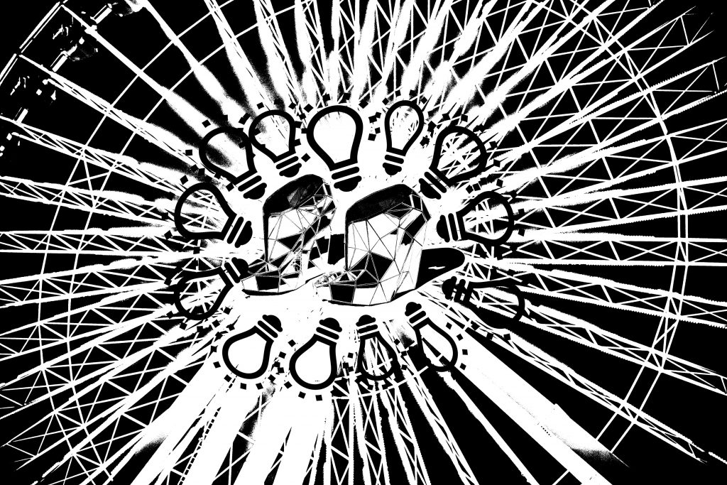
The spokes of the ferris wheel originally form the various paths in the dark that eventually lead the lighted centre with the pair of shoes which represent the process of walking through the path to reach the centre.
Comments were that the shoes in the middle were too distracting because of the lines within, making it seem complicated, yet geometrical simultaneously. The light bulbs are also of different sizes which may be distracting for the viewers as well although the ferris wheel forms a nice sense of space around the central of the design.
Personally i find the overall design a little distracting and the specific placements were not uniform. Coupled with the general comments from others, I decided to redesign it.
Design 2:

From bottoms up, the obstacles and the “dark times” were represented by traditional spears. The main focus should be the biggest light bulb in the centre with the phoenix as the focus. The phoenix is actually an ancient symbol representing “hope” and “rebirth” which is used to represent ” happiness” in the quote. As we move higher up, the various small to bigger light bulbs were placed strategically to give a sense of space. The different sizes of the light bulbs represents the different level of happiness one feels.
Design 3:
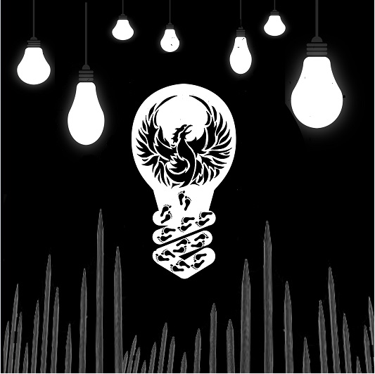
Perhaps influenced by the previous design of the paths quote, I actually added footprints into this to simulate the person “walking” to his or her happiness. However, the feedback I received for this was that the footprints look rather odd, like it came out of nowhere and hence did not fit the overall supposedly clean design in general.
Design 4:
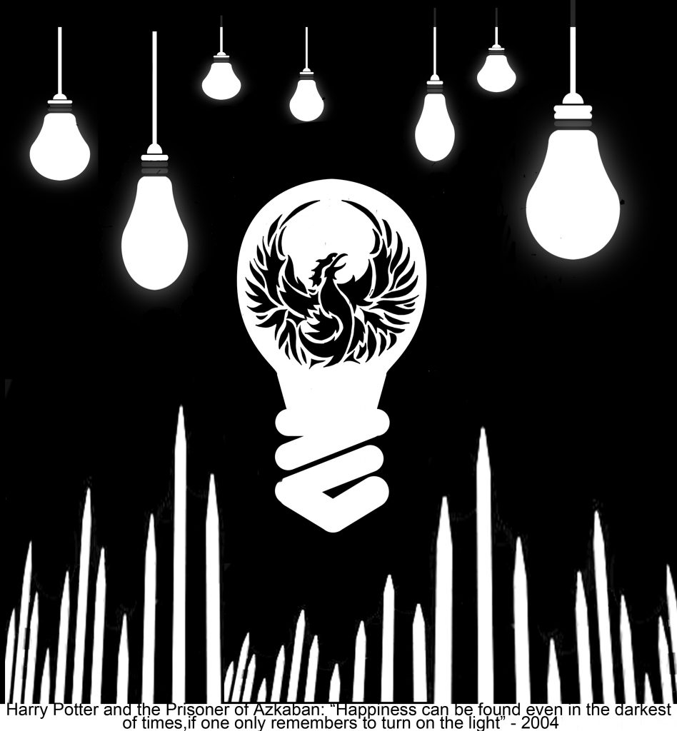
This is the design i eventually used for my tote bag. Personally, I find the design rather clean looking and has a “concise” feel to it. I also realised from the previous designs that the spikes and ends of the lightbulbs are dark grey in colour which made it very unsuitable for normal printing, much less a tote bag. Learning from the previous experience that the grey mid tones came out pitch black for the mountain prints, I quickly made all the spikes and the ends of the light bulbs completely white instead.