” I open at the close” ~ Harry Potter
Design 1:
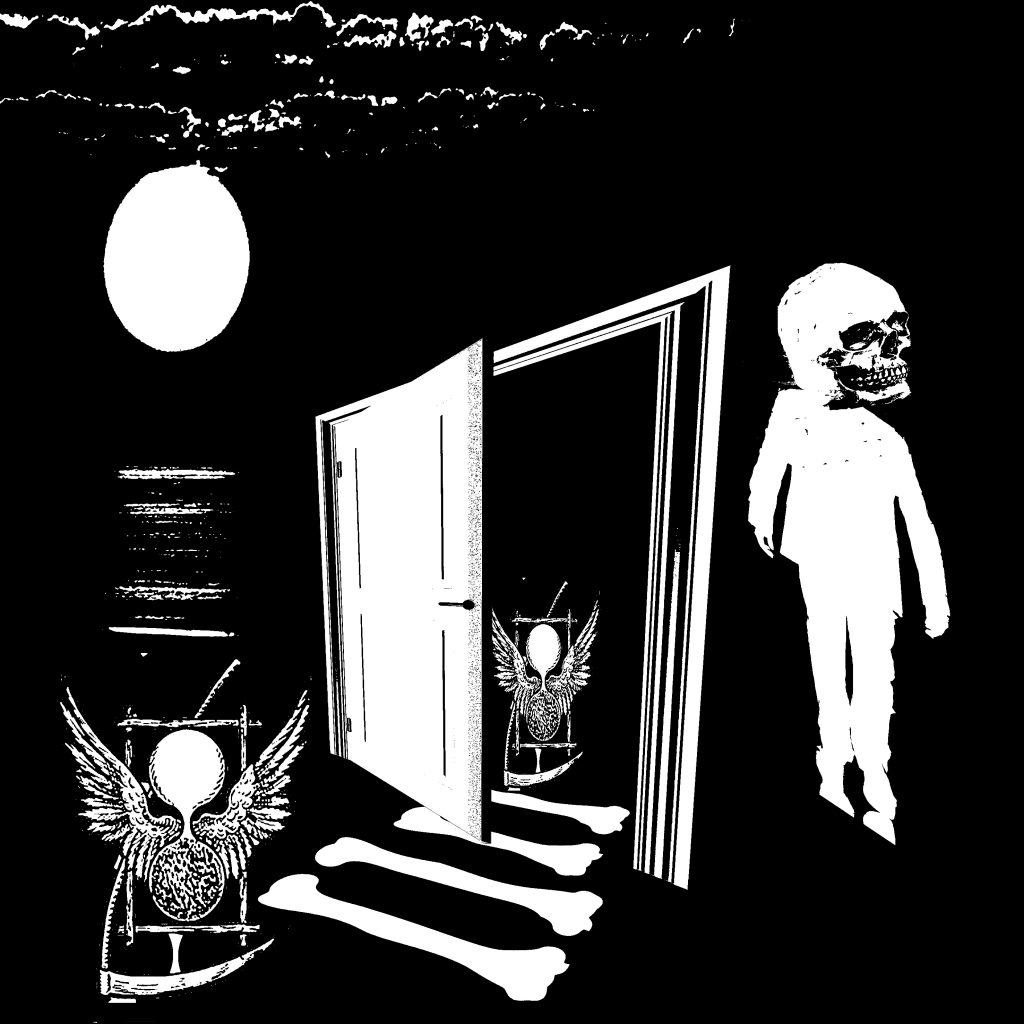
This symbol on the left is an ancient symbol of death. It also contains wings which is closely linked to the golden snitch in the Harry Potter movie. A small path is then formed by bones, leading “death” to a door. Eventually, a form of resurrection occurs whereby a man emerged with a skull. This is somewhat representative of the process of “rebirth” and a new start when you find a dead end in a situation which is my interpretation of the quote.
Design 2:
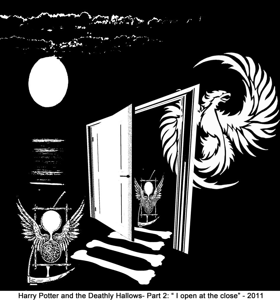
Since the quote is similar to the other Harry Potter quote I chose, I find that they do have some similarity involved which is the idea of “hope” and “rebirth” which translates to the use of a phoenix over here as well. This design looks cleaner than the first and the link between the two movies is also clearer. The reason why i chose a dark background was to represent the overall “close” first which then eventually leads to the “open” with positive spaces for close and negative spaces for open.