“Sometimes the right path is not the
easiest one”~ Grandmother Willow
Design 1:
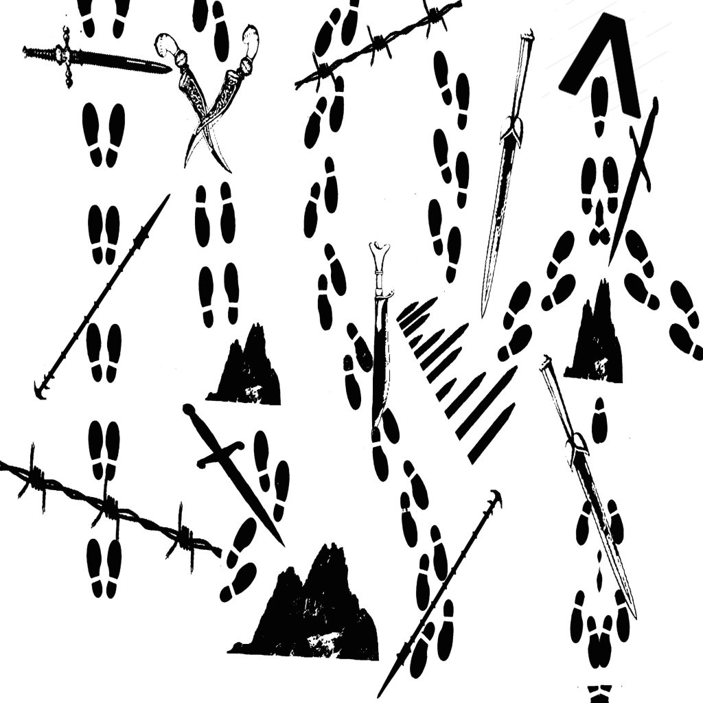
The original idea of this design is to form paths using footprints and how each path is temporarily blocked by obstacles which is the interpretation of “not the easiest”. Ancient swords, spears and barbwires were used to bring out the vintage feel Prof Mimi wants. There are also boulders involved to represent larger obstacles.
However, the comments were that the footprints were too random and that the path is not clearly represented. Besides, all the objects are quite randomly placed as well, giving the feeling that they are “floating” in the air with the fluff and unstable feel. Hence, this lead to the amended design 2.
Design 2:
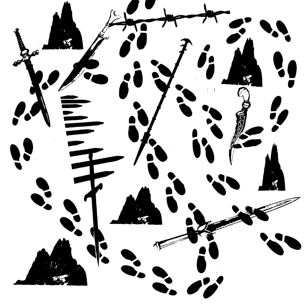
This is the amended design from 1. I attempted to make the path clearer by making the footprints start from the middle top of the design and it goes in 2 loops (bigger and smaller) and ends at the lower right of the design. I also cut down on the variation of the obstacles used to reduce the complicated feel of the design.
However, the comments were that the path of the footprints were once again unclear and it seems to be messy instead. The “random” feel, although lessened, still exists and probably would not be an ideal design for the quote. This leads me to my 3rd design.
Design 3:
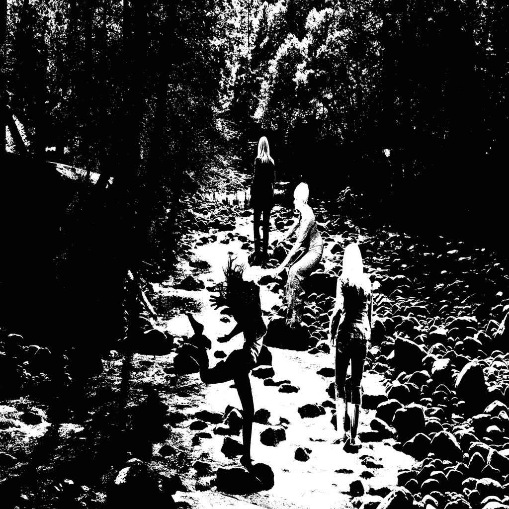
This is the third design for this quote. I decided to have a different approach instead. The dark background represents the “tough” situation one is in and everything seems gloomy for her. I then design it in a way to make her cross the broad river with strong currents through different actions. From the first pose with an “energised” feel to the second pose with the “persevere on” attitude to the third pose with the “i need to be cautious” attitude in the precarious situation on the boulder and finally to the last pose with the “tired but somewhat victorious” after the treacherous path.
However, comments for this design are such that the background contain way too many details which prove to be slightly messy and perhaps would not be an ideal for a printed design. It is quite literal and safe but lacks the vintage and ancient element feel to it. Also, the path seems rather simple, the obstacles are too minimal to even fit the quote properly. Hence this leads to my 4th design.
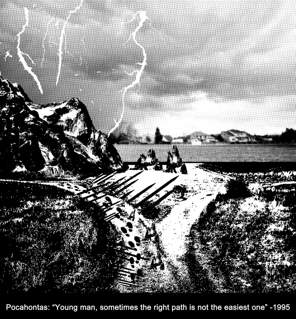
Design 4:
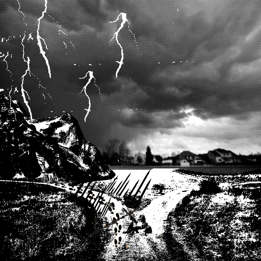
This is the fourth design for this quote. Again, I took another different approach whereby the obstacles were made to be seen clearly such as the huge mountains, the lighting, the spears, small boulders and barbwires. The footprints are then included inside to simulate someone walking through this treacherous path.
This was my original design for the tote bag. I used this design to expose my screen for the first time and it turned out well on the silkscreen. However, when I printed onto the newsprints for test prints, it turned out to be half black instead and the half tone was not seen at all. Technically, the halftone failed and all the small details across the design were pitch black. I had to erase this design using the betastrip and re-expose it the next lesson. This leads to my amended design 5.
Design 5:
This is the fifth design for this quote. I altered the dark grey mid tone to a much lighter one as shown above. Although it is edited, I still feel that it would not be ideal for the silkscreen which lead to my choice of the “light bulb” design for the tote bag.